The AB Testing JavaScript that powers tests is powerful, but can lead to many unintended consequences.

Conversion Sciences offers a pretty amazing ability to our clients: A completely “turnkey” conversion optimization testing service. By “turnkey” we mean that our clients don’t need to do anything to their website in order for us to analyze the site, design creative, develop code, QA, test, review and route traffic to winners.
Why is this? Don’t we need new pages designed? Interactions with IT? Release schedules? Sprints?
The reason we have this “phenomenal cosmic power” is that our AB testing tools take control of each visitor’s browser. The changes are made on the visitors’ devices, so the website doesn’t have to be modified.
Well, not until we’ve verified that a change brings in big money.
While this makes us feel all high and mighty, it comes with a big drawback.

The Magic and Mania of JavaScript

All of the major browsers have a scripting engine built into them. It allows programs to be run inside the browser. The programming language used is called JavaScript. It’s JavaScript that makes websites interactive. Website developers use JavaScript to make text accordion when you click a heading. It is used to rotate images in a carousel.
Unfortunately, developers use JavaScript to do silly things, like parallax animations.
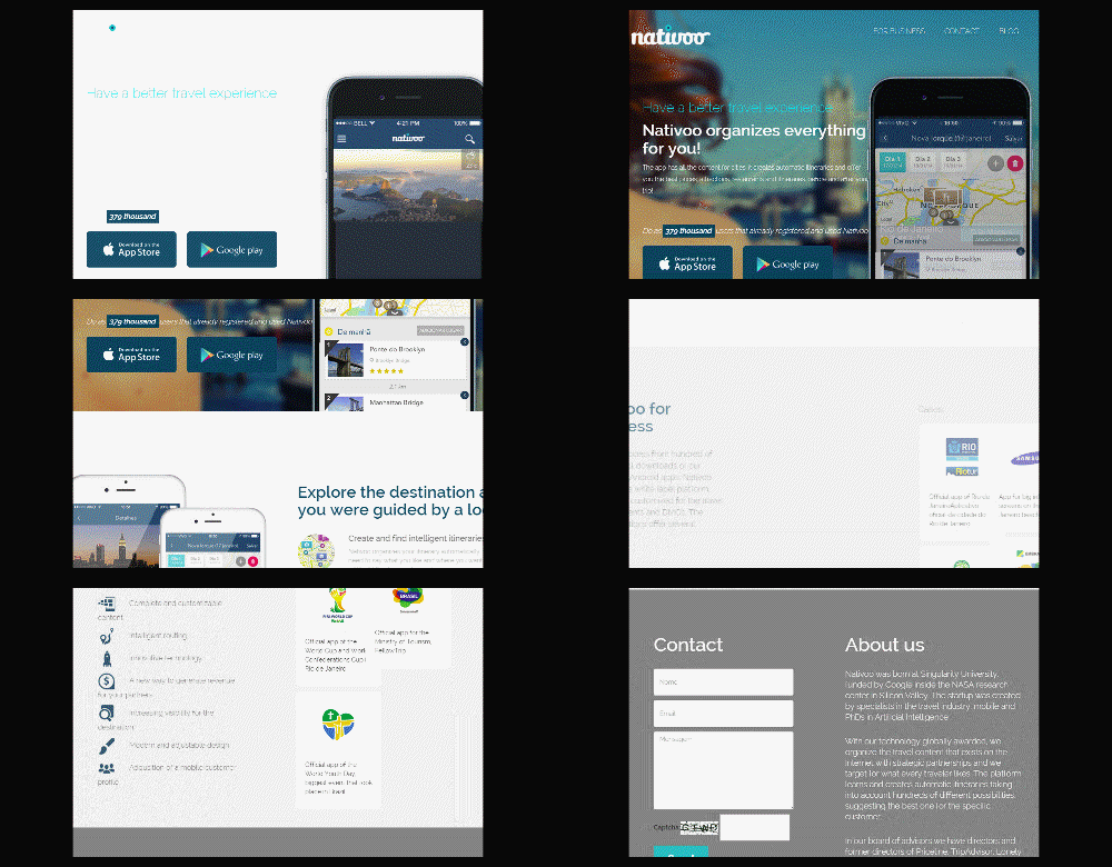
This unnecessary "parallax" motion may be reducing the conversion rates for this site.

This unnecessary “parallax” motion may be reducing the conversion rates for this site.

And then there’s this.

Don't use JavaScript animations just because you can.

Don’t use JavaScript animations just because you can.

Yes, JavaScript gives us the power to make our websites harder to use.

JavaScript is Used in AB Testing Software

Our developers use JavaScript to modify a website when you visit it. The AB testing software “injects” our JavaScript into the browser when the page is loaded.

First the web page is loaded as is from the webserver. Some visitors will see only this default version of the website.

For some visitors, our JavaScript is then injected and executed. The AB Testing software determines who sees the default web page and who will see a variation of the page.

Phenomenal Cosmic AB Testing Power

We can change almost anything about a page using AB Testing JavaScript.

We change the headline to something different.

We change the order of a rotating carousel, or slider.

We hide elements…

AB Testing flicker can be cause by simply removing elements.

AB Testing flicker can be cause by simply removing elements.

and insert them as well.

We insert video.

We completely change the look of a website.

We completely change the look and feel of this site. The test showed the white site performed the same as the brown site.

We completely change the look and feel of this site. The test showed the white site performed the same as the brown site.

AB Testing JavaScript is a Step Toward Personalization

If we wanted, we could deliver a different website to every visitor who arrives. If you’re thinking “personalization” at this point, then you have an idea of where our industry is heading.

AB testing produces the data that makes personalization truly work.

Here are my instagraphic notes from a presentation by Chris Gibbins at Conversion Conference 2016 on using AB testing and personalization.

Instagraphic shows why and how to use AB Testing for personalization.

Instagraphic shows why and how to use AB Testing for personalization.

AB Testing Flicker, Flash, Blink and Ghosting

Unfortunately, JavaScript can introduce an error into our AB tests. Because we always load the website “as it is” on the server first, there is a possibility that the visitor will see the original for a fraction of a second before our changes get executed.
This has been called a “flash”, “flicker”, and a “blink”. It can have a significant effect on test results.

With AB Testing JavaScript, Flash is not cool.

With AB Testing JavaScript, Flash is not cool.

The problem with this AB testing JavaScript flicker is that it won’t be there if a change is made permanent on the site. Our tests may say the new change generated more revenue, and we’ll change the website to make that change manifest. But there will be no flicker. This means there is another variable in our test.
Was it the new headline we tested or was it the flicker that made more people buy?


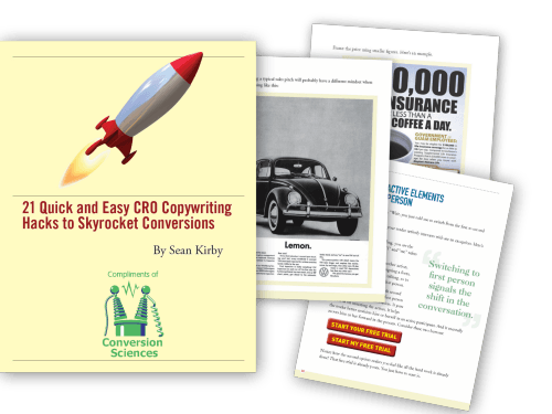
21 Quick and Easy CRO Copywriting Hacks to Skyrocket Conversions

21 Quick and Easy CRO Copywriting Hacks

Keep these proven copywriting hacks in mind to make your copy convert.

  • 43 Pages with Examples
  • Assumptive Phrasing
  • "We" vs. "You"
  • Pattern Interrupts
  • The Power of Three

"*" indicates required fields

This field is for validation purposes and should be left unchanged.


The Human Eye is Drawn to Motion

Our eyes and brains have evolved to make motion important. When something moves, our eyes and brains work hard to figure out if the thing moving is edible, if it will eat us, or if we can mate with it. Technology has moved faster than evolution. Even though we’re looking at a website, where there is no immediate source of food, fear or fornication, our lizard brains continue to favor motion.

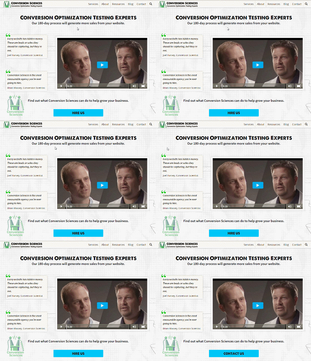
Imagine this scenario. We are testing the text on a button. That means that for some of our visitors, the button will change. Others will see the default button text. Then we’ll see who buys the most.

The changing element on this page draws your eye, and can make the page impossible to focus on.

The changing element on this page draws your eye, and can make the page impossible to focus on.

If there is a flicker, flash or blink when the text changes, the button will be immediately more visible to those visitors who see it. More of them will see the call to action. This may make more of them consider buying than those who simply scrolled past. If this new treatment generates more revenue, we are left with the question, “Was it the text or was it the motion that created the lift in sales?”

We won’t know until we push the new text onto the server and do a post-rollout analysis to see the real lift. At this point, we may find that the text didn’t increase purchases. It’s a real bitch.

How many buttons have been change because of flicker?

AB Testing Software Tries to Eliminate Blinking

The AB testing software that we use works to eliminate this blinking and flashing. The issue is so important that Convert Insights has patented their method for eliminating “blink”.

AB testing software like Optimizely, Visual Website Optimizer, Adobe Test, and Marketizator, load asynchronously, meaning that they load our changes as the page loads. This makes it easier for changes to be made before the visitor sees the page.

How Convert Insights Eliminates “Blink”

“The first thing this snippet does is hide the body element for max. 1.2 seconds (this can be set), this prevents blinking of elements already visual on the site that load under 1.2 seconds (we have yet to get a client that loads faster than this). During the 1.2 seconds, the SmartInsert(R) technology search and replaces DOM-elements every couple of milliseconds and loops through the entire available DOM-elements in the browser of the client. After all elements are replaced the body hidden attribute is set to display the site again either at 1.2 seconds or when the signal is given that all elements have been replaced (or DOM-ready).
Everybody can see how this technology works by loading our Chrome Extension.”
— Dennis van der Heijden, Convert.com

Eliminating Flash Flicker and Blink in AB Tests

In addition to this, our developers can do things that reduce and eliminate flicker and blink. Every test you do has different issues, and so a variety of tactics can be used to address them.

Avoid Google Tag Manager

Don’t use a Tag Manager like Google Tag Manager to serve your AB testing JavaScript software tags. Add them to the page manually. Tag managers can counteract the asynchronous loading of the tool and delay when changes can be made.

Make Changes with CSS

If the change can be made with the cascading style sheets (CSS), we favor making changes with CSS over using JavaScript. CSS can make changes to an element – like an image or font – that can be applied before an element displays.

Modal Dialogs and Overlays

Modal dialogs usually don’t display until the visitor takes an action. They can be edited before they are shown without flashing.

Use a Timer for DOM Changes

All of the images, headings, copy, widgets, and forms are stored in the browser in a big database called the DOM (Document Object Model). When JavaScript makes changes to the DOM, the content on the page changes. The DOM is slow-loading, as you can imagine.

Our developers will set a timer in JavaScript to check for when a changing element is loaded. By watching for our element to be loaded, we can execute a change it before the DOM – and the page – is loaded.

For the AB Testing Software to Load Our Changes Immediately

The AB testing software provides a synchronous loading mode. Optimizely and VWO use different approaches for this.

Rethink the Test

Sometimes, we have to go back to the drawing board and design a test that doesn’t cause flash-inducing changes. We will refactor a test to eliminate items that cause a flash or flicker.

Delay Display of the Content

We can delay the display of the content until the DOM is loaded and all elements have been changed. This causes a different kind of issue, however. The visitor sees a blank page or blank section for longer if they get the page with the change.

In one case we added a spinning wheel to indicate that the page is loading.
loading_small

Insert Placeholders Using Fast CSS

When inserting elements, we’ll use CSS to insert a placeholder, then use JavaScript to modify the element after the page has loaded. This reduces redrawing of the page when elements are inserted.

We created a blank box in CSS to minimize AB Testing Flash on this mobile website.

We created a blank box in CSS to minimize AB Testing Flash on this mobile website.

Optimizing for Mobile

Mobile pages load more slowly. This is because visitors don’t always have a high-quality connection when visiting from the festival, or from inside the walls of a bank while standing in line. For mobile devices, flash can be an even bigger issues.

Fortunately, the tactics we use on the desktop also work on mobile websites. But don’t forget to QA your test treatments on 3G and 4G connections. You may find flicker and blink on mobile devices that didn’t appear on your desktop.

Great JavaScript Developers are a Must

We spend a considerable amount of our time making sure our JavaScript and CSS changes are like the “native” implementation would look.  It’s one of the things that makes testing hard. Our team has the experience to ensure your tests aren’t falling victim to flicker, flash, blink or ghosting. Best in class Developers are one of the things that help to make use the most effective Conversion Optimization Agency on the planet!

If you’d like our team to take over the effort of developing your AB tests, contact us for a free consultation and an overview of our process.

Talking about useful AB testing tools to the readers of this blog may be like preaching to the choir. But if you are new to this blog, or new to conversion optimization in general, you may be wondering which AB testing tools you can start using without making a huge investment. Fortunately, there are some AB testing tools out there that are either free or won’t cost you any additional money because you already have them – you just don’t know it yet.
In this post, we’re going to look at AB testing tools that you may have had all along and how to use them to optimize different aspects of your marketing strategy for conversions.

Useful Website AB Testing Tools

Since most people will want to do AB testing on their website, we’ll start with the tools you can use here. Did you know that if you have fewer than 50,000 unique visitors per month, you can use tools like Optimizely for simple AB testing for free? It’s a really simple tool to use. You just sign up for your free account and start up a website project.

Create a project with Optimizely for free when you have fewer than 50,000 visitors a month

Create a project with Optimizely for free when you have fewer than 50,000 visitors a month

Once you’ve entered your URL, you will be taken to a screen where you can immediately start creating a variation to test on your website.

Create a variation for your AB test

Create a variation for your AB test

Once you’ve created your variation, you click the Start Experiment button and get the code you need to add to your site.

Start your Optimizely experiment

Start your Optimizely experiment

You will set up a goal so you know which variation leads to the most conversions.

Create a goal for your AB testing experiment

Create a goal for your AB testing experiment

And then sit back and wait for visitors to come to your website to determine which variation gets the most conversions!
If you’re stuck for ideas on what to test on your landing page, you can try the common elements – headlines, subheads, images, calls to action, etc. – as well as some creative options listed in our landing page testing ideas post.
If you have more than 50,000 visitors each month, or would prefer to not add another tool to your toolkit, you can also look into Google Analytics Content Experiments. This allows you to conduct testing with your Google Analytics.
To start, you go to Behavior > Experiments for your website and click the Create Experiment button. Then you define the experiment you want to perform, starting with the goal of your test. You will use your Google Analytics goals to ultimately determine which variation of your AB test is the winner.

Create an experiment in Google Analytics

Create an experiment in Google Analytics

The key difference between Google Content Experiments and your average AB testing tool is that you have to create an additional page on your website that has the variation, whereas most AB testing tools (like Optimizely) will let you “edit” your page in their editor. So depending on what you want to change, it may be an easy or difficult process to create that second page.

Setting up variants in Google Analytics may require more steps than using a traditional AB testing tool like Optimizely.

Setting up variants in Google Analytics may require more steps than using a traditional AB testing tool like Optimizely.

Next, you will receive the code you need to insert on your website to start your experiment.

You code for your AB test in Google Analytics

You code for your AB test in Google Analytics

Finally, you will confirm that the code has been installed and you will start your experiment. Once your experiment is completed, Google Analytics will declare a definitive winner.

Alternatives to AB Testing Your Own Website

An alternative to doing AB testing on your own website is to monitor the tests of others. There’s a free way to do it and a paid way. First, you can try to find your competitor’s website history in the Internet Archives. The downside to the free is that you’ll have a lot of clicking to do.

The Internet Archive brings you the tool Wayback Machine which lets you see how a website appeared on a particular date.

The Internet Archive brings you the tool Wayback Machine which lets you see how a website appeared on a particular date.

The other option I mentioned in my landing page testing ideas post, Rival IQ, allows you to see your competitor’s website history in a much easier to digest format.

RivalIQ is a paid tool for viewing website histories.

RivalIQ is a paid tool for viewing website histories.

There’s a good chance that if you look through your competitors designs over the last couple of years, you’ll see subtle changes to headlines, images, colors, etc. that will relate to some AB testing. So instead of testing on your own, you can learn from their tests and pave your own unique way from there.

Email Marketing AB Testing

If you are running email marketing campaigns, chances are you are using a popular email marketing software platform that likely has an AB testing component built in. MailChimp, for example, allows you to select an AB testing campaign and then allows you to test four aspects of your email campaign: the subject line (highly recommended), the from name, the content, and the send time.

AB testing options in MailChimp

AB testing options in MailChimp

You can choose a certain percentage of your recipients to test with and you can choose click rate, open rate, revenue, or other goals to judge the results of your testing. For example, if you chose to test subject lines, you would simply enter two subject lines for your recipients instead of one.

AB testing email subject lines in MailChimp

AB testing email subject lines in MailChimp

Or, if you were going to test two different types of newsletter content (such as a text-only email versus an HTML newsletter), you would get two email templates to send to your recipients.

AB test your email content

AB test your email content

Most email marketing software offers AB testing. At the bare minimum, you can at least test your subject lines. Some go further with the from name testing, email content testing, send time testing, and other forms of AB testing.
But considering that your subject line is the make or break point of whether someone opens your emails, it’s safe to say that so long as you have the option of testing that, you are good!

Alternatives to AB Testing Your Own Email

There is a simple and free way to monitor your competition’s email and potentially see what headlines are working for them – just sign up for their emails. And be sure to at least open them. If you just ignore them, some will automate you out of their main line of emails. And that might mean you’ll miss out on some good subject lines!
Bonus tip: if your competition is using email marketing software like Infusionsoft, ActiveCampaign, or others that allow automations, you should open the emails and click on the links on occasion. You may get to see one of their automation funnels in action too!

Blog Content AB Testing

Similar to email AB testing, blog content performance can rely heavily on one specific element: the title. If you choose a great blog title, people will click through and read your post from your blog’s homepage, search engines, social networks, and other sources. If you choose a bad blog title, then you may not get an clicks or readers at all.
That’s why AB testing your blog post titles can be a crucial key to the success of your content marketing strategy. If you have WordPress, Nelio A/B Testing is a tool you can use to do just that.
While it’s not free, it starts at $29 a month for websites with 5,000 views per month. And it will allow you to test crucial elements of your blog, beyond just the headlines of your blog posts.

You can use Nelio A/B Testing to test WordPress blog content

You can use Nelio A/B Testing to test WordPress blog content

For serious publishers, WordPress website owners, and WooCommerce website site owners, this can be a powerful AB testing tool that can help you test a variety of things that other testing tools simply can’t.

Alternatives to AB Testing Your Own Blog Headlines

Going back specifically to blog headlines, if you don’t want to test your own, there are ways of finding out the best headlines for a specific topic. The free way would be to use BuzzSumo – even without an account, you can usually get the top five to ten headlines about a specific topic based on social sharing.

Find the top headlines for a topic using BuzzSumo

Find the top headlines for a topic using BuzzSumo

If you don’t mind paying, a similarly priced tool that offers even more information that you can try or compare to BuzzSumo is Impactana. Both start at $99 per month, but Impactana goes a step further by allowing you to see headlines that are not popular based on social shares alone, but also based on views, backlinks, comments, and other metrics (based on the type of content).

Impactana uses more metrics than BuzzSumo to show you the top headlines for topics

Impactana uses more metrics than BuzzSumo to show you the top headlines for topics

This can give you a strong idea of what headlines and content generate the most social buzz, search authority, traffic, and audience engagement.

Social Media Ad Campaign AB Testing

While social media advertising is not free, AB testing for some social media ad platforms is because it’s built right in. Take Facebook, for example. You can create an Ad Campaign, an Ad Set that is targeted to a specific audience through specific placements, and multiple Ads under that set that help you test variations so you can determine which one drives the most conversions.
Here’s how the process looks in the standard Facebook Ads Manager. First, you will start by choosing your ad objective.

Choosing your ad objective in Facebook

Choosing your ad objective in Facebook

Then you will name your Ad Campaign.

Naming your Facebook ad campaign

Naming your Facebook ad campaign

Next, you will define your Ad Set by choosing your target audience, ad placements (the desktop news feed, the mobile news feed, Instagram, etc.), and setting your budget.

Defining your Facebook Ad Set

Defining your Facebook Ad Set

Before you continue, you can save the name of your Ad Set.

Your budget and schedule for your Facebook ad

Your budget and schedule for your Facebook ad

Finally, you will configure your first Ad.

Configuring your Facebook ad

Configuring your Facebook ad

Once you’re finished with your first ad creative, you will place your order. Once you do, that ad will go into review and you will get the option to create a similar ad.

After finishing your order for your Facebook ad, you're ready to get set-up for your variation

After finishing your order for your Facebook ad, you’re ready to get set-up for your variation

This will allow you to create another Ad under the same Ad Campaign and Ad Set. You will get the option to modify the Ad Set if needed.

Modifying your Facebook ad set

Modifying your Facebook ad set

Otherwise, you can click Continue to create your next Ad variation. This will bring up the same Ad you created before so you can create your variation by changing one specific element, such as the image, originating page, the headline, the text, the call to action, the news feed description, or the display link.

Change the element you want to test in your Facebook ad AB test

Change the element you want to test in your Facebook ad AB test

Once you have made your variation and placed your order, you will again get the option to create a similar ad or to continue to your Ads Manager. You can also decide to add more variations from the Ads Manager by clicking on the Create Similar Ad button.

You can add more variations by clicking Create Similar Ad

You can add more variations by clicking Create Similar Ad

The downside, as you can see above, is that you can’t name the individual ad variations. Therefore, unless you’ve changed the images between them, they all look the same in the Ad Manager view. Hence, to know which variation in terms of originating page, the headline, the text, the call to action, the news feed description, or the display link is working, you will have to click through to the winning variation and view the post to learn from it.

It's easy to toggle off an ad if it's not working out

It’s easy to toggle off an ad if it’s not working out

The upside, however, is you can easily toggle off the losing variation of your ad based on its performance.
But overall, this is a great way to use AB testing in your Facebook Ad Campaigns. And it’s the simplest way as it doesn’t require you to use Power Editor, although if you are more comfortable in Power Editor, it can be done there as well.
If you use LinkedIn Ads, they also offer an option for creating variations with their text and image ads. Fortunately, their variations editor is even simpler. Start by going to LinkedIn Ads Manager, select your LinkedIn advertising account, create a new Campaign, and then select Text Ads.

How to begin a LinkedIn ad campaign

How to begin a LinkedIn ad campaign

Start by giving your campaign a name.

Name your LinkedIn ad campaign

Name your LinkedIn ad campaign

Next, you will create your first ad.

Creating your first ad

Creating your first ad

When you save your first ad, you will get the option to continue or create up to 100 variations of your ad.

After you create your ad, LinkedIn makes it easy to create your variations

After you create your ad, LinkedIn makes it easy to create your variations

When you click to create another ad, you will be able to create an entirely new ad from scratch to test different URLs, headlines, descriptions, and images.

Building your LinkedIn ad variations

Building your LinkedIn ad variations

Once you are finished creating your variations, you will continue through the campaign creation process to select your target ad audience and set your ad campaign budget.

Select your targeted audience and your budget

Select your targeted audience and your budget

Once you have finished creating your campaign, you will get a clear view in your ads dashboard of how each of your ad variations are performing. This will allow you to learn what works and what doesn’t quickly, as well as allow you to toggle the losing variations off.

Your dashboard will tell you how your ad variations are performing

Your dashboard will tell you how your ad variations are performing

Alternatives to Doing Your Own Social Media Ad AB Testing
There are two free alternatives when researching paid advertisements. The first is Moat. Moat allows you to look at other companies display banner ads. While this isn’t specific to social media ads, it can help you learn about the images and ad copy that big brands use to drive paid traffic to their websites.

Use Moat to discover what your competitors are doing with their ad testing

Use Moat to discover what your competitors are doing with their ad testing

If you notice particular imagery, copy, calls to action, button colors, or other elements have been used over and over again, you can assume that said elements have been doing well, considering you can almost guarantee big brands are testing the elements that they are paying for.
The second resource you can tap into that is specific to Facebook is the AdSpresso Facebook Ads Gallery. Simply sign up for their newsletter and start searching for brands that advertise on Facebook. Not only will you get to see the variations of ads they have used over time, but you can click on their ads to get some pretty good details about the ads.

AdSpresso shares a lot of valuable information about Facebook ads

AdSpresso shares a lot of valuable information about Facebook ads

Between these two resources, you should learn a lot about how to create a successful ad campaign on social media and beyond. And they’re both better options than sitting around and refreshing your Facebook or LinkedIn news feed, hoping to see some ads from your competitors.

In Conclusion

As you can see, between free and premium tools, there are various ways to A/B test many aspects of your online marketing beyond just your landing pages. Be sure to look at the different aspects of your online marketing strategy and think about the ways you should be testing it to improve your results today!

About the Author

Kristi HinesKristi Hines Headshot is a freelance writer, blogger, and social media enthusiast. You can follow her latest tweets about business and marketing @kikolani or posts on Facebook @kristihinespage to stay informed.

At Conversion Sciences, conversion optimization is so important that we think every site should benefit from it. We take every chance to teach businesses about it. The AB testing process is an important part of conversion optimization and is within reach of almost any business that prizes data-driven marketing.

Conversion rate optimization (CRO) is a systematic process for increasing the rate at which website visitors “convert” into leads and customers.

When visitors arrive at your site, you want them to take a certain action. You might want them to subscribe to your mailing list, purchase a product, call your company, make a donation, fill out your contact form, or any number of things. CRO seeks to maximize the percentage of visitors who perform this desired action.

And as traffic becomes more and more expensive to acquire, CRO continues to become a bigger and bigger deal for online businesses.

When to Use Conversion Optimization

Conversion optimization has become an important part of digital marketing because available tools are becoming easy to use and inexpensive. Businesses generate more sales from the same traffic.

Businesses will turn to conversion optimization when:

  • Search ads, like Adwords get too expensive.
  • Their organic search traffic isn’t growing fast enough.
  • They aren’t getting enough revenue from their email list.
  • They want to compete with bigger companies on the Web.

Conversion optimization gives the business more control over its own destiny, increasing revenue and delighting more customers. AB testing is a powerful tool in the conversion optimization game.

Understanding Conversion Optimization

At a high level, a website’s basic revenue model looks like this:

Traffic x Conversion Rate = Revenue

Let’s say you are getting 100,000 visitors each month and converting 3% of them into customers. In order to double your revenue, you can either (A) double traffic by getting 100,000 extra visitors each month, or (B) increase your conversion rate from 3% to 6%.

As you can imagine, it is usually much cheaper to fix a few things on your site and increase the conversion rate than to increase traffic by 100,000 people. And this is based on a simple three variable formula.

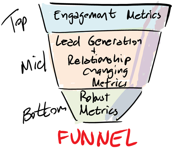
In reality, many websites and online enterprises consist of numerous steps in a complex chain of conversion funnels.

Conversion funnels are complex, and it's easy to lose someone along the way without CRO and AB testing.

Conversion funnels can be complex, and it’s easy to lose someone along the way without CRO and AB testing. Image credit: Digital Marketer

Low conversion rates at any point in this lengthy funnel can gut revenue totals, and consequently, optimizing the conversion rate even slightly throughout the multiple stages of this funnel can result in a massive increase in overall revenue.

The AB Testing Process

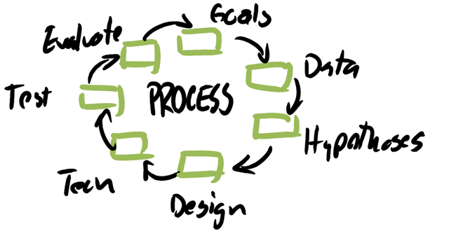
The best data-driven marketers take a systematic approach to optimize a website’s overall conversion rate. And while that approach is fairly complex, the core process includes the following:

  1. Data gathering & analysis
  2. Hypothesizing & Prioritizing
  3. Design & Run AB Tests
  4. Interpretation & implementation

To summarize, you begin by gathering intelligence on the your target audience. Next, you predict a series of website changes that will improve the overall conversion rate and then test those changes with a live audience. You run tests to confirm or refute your predicions. Finally, you implement changes that improve the conversion rate and discard those that don’t.

1. Data gathering & Analysis

The CRO process begins with gathering and analyzing both quantitative and qualitative data in order to achieve a well-rounded understanding of the website’s target market and how they are engaging with the site.

Data software, surveys, and usability tests are often used to collect and analyze this data.

2. Hypothesizing & Prioritizing

Once data has been collected, it’s time to hypothesize a series of site changes that will potentially increase conversions. Each idea for increasing conversion rate is called a hypothesis, or “educated guess”. These predictions are usually based off the data collected, “best practices”, and the personal experience of the data-driven marketer. The hypotheses you focus on will be based on your core testing strategy.

Changes are then made and compared against the original site in front of a live audience using a AB testing.
Each hypothesis should have the form:

If we    describe change   , we expect more visitors to    describe desired outcome    
as measured by   metric   .

For example:

If we add “Free shipping on all orders” to our product pages, we expect more visitors to purchase as measured by revenue per visit.
If we include the phone number in our headline, we expect more visitors to call as measured by web-based phone call rate.

Taking the time to write out each your hypotheses ensures:

  1. That you are testing something very specific.
  2. That you are testing something that results in a desired outcome.
  3. That you can measure the results.

Conversion Sciences enters our hypotheses into a spreadsheet and rates each on a scale of 1 to 5 for four categories:

  1. Based on my experience, how big of an impact do I expect this hypothesis to have? (1-5 with 5 being a big impact)
  2. How much traffic sees the page on which this hypothesis applies? (1-5 with 5 being a lot)
  3. How much evidence do I have that this hypothesis is really a problem? (1-5 with 5 being most)
  4. How hard is the test to implement? (1-5 with 1 being best)

Add 1, 2 and 3, then subtract 4 to get your hyopthesis weight. Do this for each test to get a ranking and sort the spreadsheet by weight. Those hypotheses with the highest weighting will jump to the top. These are your “low-hanging fruit”, the first things you should test.

3. Designing & Running AB Tests

This is where the new tools come into play. AB testing tools offer ways to change your website for some visitors, while leaving it the same for others. The tools allow you to do this without changing your website because the changes are made in the visitors’ browsers.

One visitor will get a page (A) as it is, then the next will get a version of the page (B) with your change. The tools manage this so that about the same number of visitors see each page. These AB testing tools then report on which version generated the most revenue and tell you how much more revenue you would expect to get.

If the original generates more revenue — we call it the Control — you can be assured your change would have hurt your site. If the modified version generates more revenue — we call it a Treatment — then you’ve found an improvement and can code it into the site.

AB Testing tools have a learning-curve. Most offer “WYSIWYG” interfaces for changing elements. Some tests will require that you have a resource familiar with Javascript, HTML and CSS.

4. Interpretation & Implementation

After running a series of AB tests, results are analyzed and interpreted and additional tests may be run. The goal is to identify a slate of changes that yield statistically significant improvements in the site’s overall conversion rate.

Verified improvements are implemented as permanent changes to the website, and then new hypotheses may be made and tested until the target conversion rate is achieved.

What You Can Do With an AB Test

When evaluating page elements to test and improve, CRO specialists typically start with “best practices”. Best practices are techniques that tend to work for many websites. Testing page elements based on best practices will often improve the site’s conversion rate immediately, and they provide a good baseline from which the data-driven marketer can plan and implement more tailored tests.

It’s important to note here that “best practices” do not work for every site. Especially on your mobile site, there really aren’t any best practices. This is why AB testing is so important.

That said, it’s good to have a basic understanding of best practices when attempting to optimize conversions on a website.

1. Develop an Effective Value Proposition

Your website must convey a value proposition that gives the visitor a reason to stay and explore. The value proposition is constructed out of copy and images.

The value proposition doesn’t have to be unique, but it must describe the reason you occupy space on the Web. It should include who your offering is targeted at and why they should care about it.
Your value proposition may also include pricing, delivery, return policy, and what make you unique.

Each of your visitors will come in one of four modes: Competitive, Methodical, Humanist, or Spontaneous.

  1. COMPETITIVE visitors are looking for information that will make them better, smarter or more cutting-edge. Use benefit statements and payoffs in your headings to draw them into your content.
  2. METHODICALS like data and details. Include specifics and proof in your writing to connect with them.
  3. HUMANISTS want information that supports their relationships. They will relate to your writing if you share the human element in your topic.
  4. SPONTANEOUS visitors are the least patient. They need to know what’s in it for them and may not read your entire story. Provide short headings for them to scan so that they can get to the points that are important to them.

Your goal is to write copy directed at whichever of these groups visit your site.

In addition to understanding what motivates your audience to buy, it’s also important to understand what stands in the way of them making that decision.

Most buyers can be broken down into two categories based on two different fears:

  1. Transactional buyers
  2. Relational buyers

Transactional buyers are competitive bargain hunters whose greatest fear is paying a dollar more than they need to. They aren’t looking for “cheap”. They are looking for the greatest possible value they can find for the lowest possible price.

In order to appeal to transactional buyers, your copy should be focused features, price, and savings. 

Relational buyers, on the other hand, are focused entirely on quality. Their greatest fear is buying the wrong thing, and they are more than happy to seek out expert help and pay a premium in order to assure they receive a quality product.

In order to appeal to relational buyers, your copy should be benefits focused with educational content, copious social proof, ratings, and reviews to demonstrate that selecting your product is a guaranteed win.

Things to test:

  • The language on links and buttons.
  • Headlines and subheadings.
  • Wording of discounts and specials.
  • Description of return policy and shipping policy.
  • Adding bullets and highlights to copy.
  • Change copy that talks about your company into visitor-focused copy.

Remember that nobody cares about your business or products until they’ve found what they are looking for. People only care about how your business can solve THEIR problems. Remember to keep the copy and messaging consistently focused on the customer on every platform and at every point of interaction. Personal stories and intros have their place and can be quite effective, but again, only when the context is customer benefit.

For further reading, check out these great value proposition examples and the case studies on their implementation.

2. Design to Help Your Visitors Choose What’s Next

Design is important to your conversion rate but not for the reasons most people think. Your site’s design should be focused two things:

  1. Highlighting your persuasive copywriting
  2. Helping the visitor choose to act or to take the next step in their journey

Visitors should have an idea of what your landing page is all about with five seconds of arriving. They should then be taken through a streamlined journey rather than needing to browse around and find their own way.

A simpler, more intuitive, and more straightforward site design a great place to start.
Things to test:

  • Making links and buttons with calls-to-action stand out.
  • Move important information, such as free shipping offers “above the fold.”
  • Swapping columns.
  • Increasing the size of images.
  • Placing security badges near the “Add to Cart” button.
  • Increasing the font-size of important information like price and stock.

These are some places to start.

3. Focus on Entry Pages

A good conversion funnel isn’t just a webpage. It’s a combination of ads, search results, blog posts, email marketing, social media, webinars, and much more. Each of your campaigns will bring visitors to your site on different pages. Start on these pages and find look for ways to help visitors choose the next step.

For ecommerce sites, product pages are often the entry page for search traffic.

For ecommerce sites, product pages are often the entry page for search traffic.

For many sites, the most common entry pages will be:

  • The Home Page
  • Category and Product Pages for ecommerce sites
  • Post pages for blogs
  • Signup pages for webinars, reports and other offers

The Behavior > Site Content > Landing Pages report in Google Analytics will tell you which pages are your most frequently visited entry pages.

Google Analytics offers a list of entry pages, which they call "Landing Pages"

Google Analytics offers a list of your entry pages, which they call “Landing Pages”

If you can get more visitors into your site from these entry pages, reducing your bounce rate, you will have more opportunities to win prospects and customers.

Conclusion

AB testing is a tool that is within reach of more and more marketers. It is powerful because it

  • Ensures you aren’t making changes that hurt your online business.
  • Helps you understand what your visitors are really looking for.
  • Disciplines you to make smaller stepwise changes to your site.

To continue your journey into the world of CRO, check out Conversion Sciences Free CRO Training.

If you have any questions or if you noticed I left out some key info, don’t hesitate to let me know in the comments. And of course, don’t forget to share this post with any of your colleagues who could benefit from an introduction to AB testing.

Joel Harvey, Conversion Scientist™

Joel Harvey, Conversion Scientist™


This post is excerpted from Designing from the Mobile Web 2.0 by Joel Harvey. Joel discusses what he’s been learning through the tests that Conversion Sciences has done for the mobile web. You can begin to take these as new hypotheses in your business so that your mobile devices and your mobile traffic is converting at higher and higher levels.
I’m sure mobile’s on the top of your mind.
We have tested hundreds of mobile hypotheses over the last couple of years and we’ve learned a lot. There’s still a lot that we don’t know.
We’re going to share some of the key things that we’ve learned along the way with you and show you what you need to be focusing on to start driving wins in your mobile traffic.
[mobile-web-20]

What Mobile AB Tests Can You Try Right Now?

What are some of the things you can AB test right now to start driving higher mobile conversions?
Here are the hypotheses we’ve tested and things that we’ve seen give us increases across dozens of mobile websites. Some of them are very site specific like the offer link and the copy. This is one thing that yields big results in any business and there’s no one rule of thumb that we can share.
However, there are some things you can do with layout and with execution that, with the right words and the right elements, work across almost many mobile sites.

  1. Sticky Headers and Footers
  2. Persistent Calls to Action
  3. Footer Content
  4. Optimizing for the Right Goals

1. Sticky Headers and Footers

For anybody that doesn’t know, what we mean by a “sticky” header or footer, we mean a “bar” of content that persists at the top of the screen. It sticks even when the visitor scrolls.
By locking this on the screen as people scroll we always keep in their view. Just making the existing header sticky, we saw a 9% increase in phone calls for this site. We’ve seen this on ecommerce sites, increasing form fill completion and purchases.
For a follow-up test, we simply added a call to action. The text delivered a relatively large increase in phone calls on top of the increase from adding the sticky header.
There are a number of things you can put into a header.

  • Calls to action
  • Search boxes
  • Add-to-cart button
  • A menu icon
  • The company logo
  • Shipping policy

Over time this has continued to evolve and conversions have increased.
In our experience, sticky footers, or bars that persist across the bottom of the screen, may work better for your audience. We recommend that you try them both.

2. Persistent Calls to Action

Persistent calls to action or parachutes are offers that remain on the screen as the visitor scrolls. These are usually found as the footer.
It’s very similar to a sticky header.

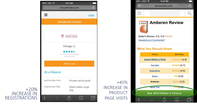
The site at left enjoyed a 20% increase in registrations from a sticky header. The site at right saw a 45% from top and bottom stickies.

The site at left enjoyed a 20% increase in registrations from a sticky header. The site at right saw a 45% from top and bottom stickies.


Since we found that these parachutes work well as top “stickies” and bottom “stickies, we wondered if we could do both. Our original thought was that it took up too much screen real estate, that it was too much to keep in front of the visitor. However, we found that in most cases you can have both and they’re very complimentary to one another.
We recommend testing to find the right call to action first, and then testing a persistent, or “sticky” call to action.
So why do we call it a parachute?
We call it a parachute because we know that mobile visitors will scroll much farther down a page and much faster than desktop visitors. This is an interesting fact: Mobile visitors are more likely to see all of the content on your page than a desktop user, especially if you have a lot of content and it’s a long page. You can see this in your own scroll maps and in session recordings.
The problem is that they do it fast and they sometimes get lost. Having a parachute someplace for the them to parachute out of this purgatory they’ve gotten themselves into is proving to be very helpful.

Check Your Tel-Links

The Safari mobile browser doesn’t necessarily do a fantastic job of identifying phone numbers and turning them into click-to-call, or tel-links.
Anywhere where you have a phone number on your site, make sure you’ve explicitly written the tel-link around that phone number.
In the example above, we found this site didn’t have click-to-call. We tested adding the tel-link functionality explicitly, and we saw a 20% increase just in clicks to call. It makes sense. You’re on your mobile device. You don’t have to put it down, write the number down, and then type it in.
There are phones built into these mobile devices, aren’t there?

3. Footer Content

This issue dovetails in with what we were just saying about how far a mobile visitor will scroll.
Mobile visitors are much more likely to see the footer of your site. They bounce on the bottom after fast scrolling. On the desktop the footer of the site is this graveyard of crap that we throw into the bottom. It’s the detritus of the site. It usually includes the privacy policy and some legalese, things that are not really going to compel anybody to take action.
Yet, the visitors that scroll to the bottom of your page may be very interested. What are you telling them? “Copyright 2015?” This is not really a deal closer.
We saw on our scroll map reports that about 50% of mobile visitors reach the bottom of these pages. Page footer are rarely inspiring.

“You’re here. Desktop version. Back to top. Copyright.”

Why not do something a little bit more compelling? We changed this to reiterate the value proposition. Why should someone call, and how we can this company help?
We saw about an 8% increase in calls with this very simple change.

The Footer on Mobile is not a Graveyard

We’ll take 8% lifts all day and night.
Mobile will make up between 40% and 60% of almost anybody’s traffic at this point in time. We see some outliers, but more or less that’s the range. So let’s just say it’s 50%.
An 8% increase on mobile is a 4% increase on your entire business. There’s not many things that you can do to magically get a 4% increase for your entire business. This is an example of one of those things you can do.
It’s the beauty of conversion optimization. It’s a huge lever to grow your business. Something as simple as making an offer in the footer to reiterate your value proposition can have a meaningful impact on your business.
Get people to take action once they get to the bottom of that page.
[mobile-web-20]

4. Optimize for the Right Goals

What mobile goals are you optimizing for? Are they the right ones?
Conversion for your mobile visitors should look different than conversion for your desktop visitors. One of the ways to really leverage the growth in mobile is to understand and accept that.
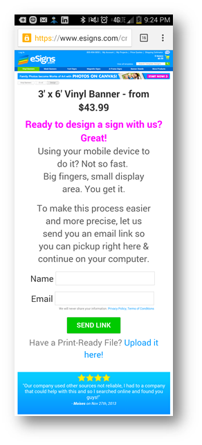
One of our clients, eSigns.com, allows visitors to design vinyl banners and other signs for their event, yard, etc. It’s a phenomenal tool and a great site. Unfortunately, it is Flash-based tool, and it doesn’t work on iOS or Android devices. Even if it did work, visitors are less likely to design a banner or a sign on their small-screen mobile device.
Essentially we had this mobile dead end. Mobile traffic simply could not convert. eSigns had become resigned to ignoring their mobile traffic.
But we said, “What could we do with this traffic?” We chose to focus on getting email addresses instead.
We shifted our objective.

We used an entrance overlay to entice visitors to give us their email address.

This mobile entrance overlay enticed mobile visitors to give us their email address.


Instead of saying, “We need to get more conversions and more immediate revenue out of mobile visitors,” we said, “Let’s just focus on getting your email address”. We could tell from upstream indicators that these people are really just kicking tires.
Remember, we’re addressing a consideration set. We decided to do something to remain in their consideration set. Ask them to give us their name and email address. In return, we offered to email them a link to this page so they can come back to it later, on their desktop, when they are ready to do the design.
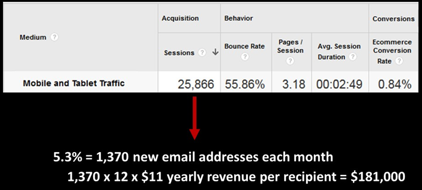
The results are that 5.3% of the visitors gave us their name and email address. Not bad, especially for an unoptimized experience. Each person who completed this form received an email with a link to that page, and the link was specially coded so we could track it and track those visitors.
Of those who got our email, we found that 26% of the recipients of this email clicked back to the site. Now this didn’t really result in an immediate boost in revenue from those clicks, but it lit a fire under their email list growth rate. They gathered almost 1,400 new email addresses in the first month of this test.
This is a business like many of your businesses that ultimately live and die by their email list. Building your email list gives you control over your own destiny. The marginal cost of delivery is almost zero. Not just for every single recipient of your email, but for every email. It’s so cheap to create new customers and satisfy repeat customers.
To get an idea of just how valuable these new email addresses were, we calculated the value of every recipient of eSign’s emails. We’re fond of a metric whenever we’re evaluating an email called revenue per recipient (RPR).
Collecting emails from the mobile deadend delivered an estimated $200,000 in additional annual revenue.

Collecting emails from the mobile deadend delivered an estimated $200,000 in additional annual revenue.


For eSigns, we calculated that the average annual revenue per recipient to be $11. With an average of 1,400 new email addresses per month, we’re generating almost $200,000 in additional annual income. Instead of ignoring mobile traffic, we took a longer-term approach by getting their email address, and using email to convert them.
Take a hard look at what your mobile visitors will be willing to do to begin a conversation with you.

Do This Now

These are our main premises. We hope you agree.

  • That mobile is a one of the fastest growing channels for your online business.
  • That mobile doesn’t have to convert at levels lower than desktop.
  • That mobile visitors want and need a unique mobile experience.
  • That there are no best practices and that you should test.

If you buy into our beliefs, these are the things you should try right now on your mobile traffic.

  • Optimize your header and determine if a sticky or non-sticky header works better.
  • Start testing those persistent calls to action – those parachutes. Test placement, test color, test language, and test the page you’re sending them to.
  • Take a hard look at the footer content on your mobile device right now and ask yourself, “If this is the last thing that someone sees on this page, am I compelling them to take action?” If the answer is no, the next question is, “What could we do here to compel them to take action?”
  • Ask yourself, “Are we optimizing for the right goals on mobile? Do we really believe that doing X and Y is what we want people to do on our desktop site. Is the best use of our optimization efforts on mobile?” Then test some alternative goals.

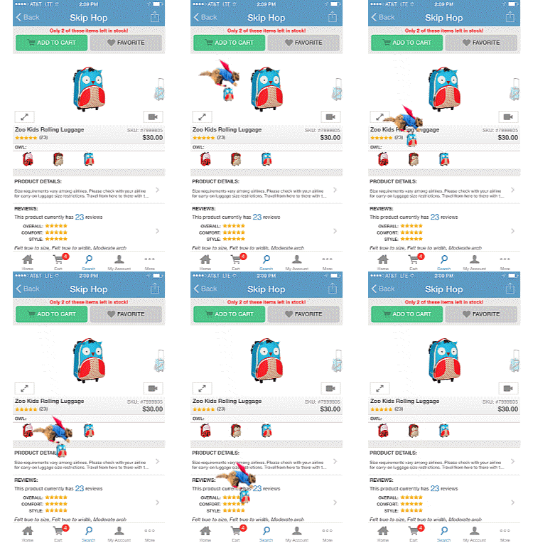
Once you’ve nailed your mobile experience, you can start having fun with your mobile site, like this add-to-cart animation.

You can have fun when you've delivered the mobile experience your visitors want.

You can have fun when you’ve delivered the mobile experience your visitors want.

The law of unintended consequences states that every human endeavor will generate some result that was not, nor could have been foreseen. The law applies to hypothesis testing as well.

In fact, Brian Cugelman introduced me to an entire spectrum of outcomes that is helpful when evaluating AB testing results. Brian was talking about unleashing chemicals in the brain, and I’m applying his model to AB testing results. See my complete notes on his Conversion XL Live presentation below.

Understanding the AB Testing Results Map

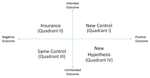
In any test we conduct, we are trying everything we can to drive to a desired outcome. Unfortunately, we don’t always achieve the outcomes we want or intend. For any test, our results lie on one of two spectrums defining four general quadrants.

Map of possible outcomes from hypotheses 

Map of possible outcomes from hypotheses.

On one axis we ask, “Was the outcome as we intended, or was there unintended result?” On the other axis we ask, “Was it a negative or positive outcome?”

While most of our testing seeks to achieve the quadrant defined by positive, intended outcomes, each of these quadrants gives us an opportunity to move our conversion optimization program a step forward.

I. Pop the Champaign, We’ve Got a New Control

With every test, we seek to “beat” the existing control, the page or experience that is currently performing the best of all treatments we’ve tried. When our intended outcome is a positive outcome, everyone is all smiles and dancing. It’s the most fun we have in this job.

In general, we want our test outcomes to fall into this quadrant (quadrant I), but not exclusively. There is much to be learned from the other three quadrants.

II. Testing to Lose

Under what circumstances would we actually run an AB test intending to see a negative outcome? That is the question of Quadrant II. A great example of this is adding “Captcha” to a form.

CAPTCHA is an acronym for “Completely Automated Public Turing test to tell Computers and Humans Apart”. We believe it should be called, “Get Our Prospects to Do Our Spam Management For Us”, or “GOPDOSMFU”. Businesses don’t like to get spam. It clogs their prospect inboxes, wastes the time of sales people and clouds their analytics.

However, we don’t believe that the answer is to make our potential customers take an IQ test before submitting a form.

These tools inevitably reduce form completion rates, and not just for spam bots.

CAPTCHAS make sure you are not a spam robot

CAPTCHAs reduce spam, but at what cost?

CAPTCHAs reduce spam, but at what cost?

So, if a business wants to add Captcha to a form, we recommend understanding the hidden costs of doing so. We’ll design a test with and without the Captcha, fully expecting a negative outcome. The goal is to understand how big the negative impact is. Usually, it’s too big.

In other situations, a design feature that is brand oriented may be proposed. Often a design decision that enhances the company brand will have a negative impact on conversion and revenue. Nonetheless, we will test to see how big the negative impact is. If it’s reasonable, then the loss of revenue is seen as a marketing expense. In other words, we expect the loss of short-term revenue to offset long term revenue from a stronger brand message.

These tests are like insurance policies. We do them to understand the cost of decisions that fall outside of our narrow focus on website results. The question is not, “Is the outcome negative?” The question is, “How negative is the outcome?”

III. Losers Rule Statistically

Linus Pauling once said, “You can’t have good ideas without having lots of ideas.” What is implied in this statement is that most ideas are crap. Just because we call them test hypotheses doesn’t mean that they are any more valuable than rolls of the dice.

When we start a conversion optimization process, we generate a lot of ideas. Since we’re brilliant, experienced, and wear lab coats, we brag that only half of these ideas will be losers for any client. Fully half won’t increase the performance of the site, and many will make things worse.

Most of these fall into the quadrant of unintended negative outcomes. The control has won. Record what we learned and move on.

There is a lot to be learned from failed tests. Note that we call them “inconclusive” tests as this sounds better than “failed”.

If the losing treatment reduced conversion and revenue, then you learn something about what your visitors don’t like.

Just like a successful test, you must ask the question, “Why?”.

Why didn’t they like our new background video? Was it offensive? Did it load too slowly? Did it distract them from our message?

Take a moment and ask, “Why,” even when your control wins.

IV. That Wasn’t Expected, But We’ll Take the Credit

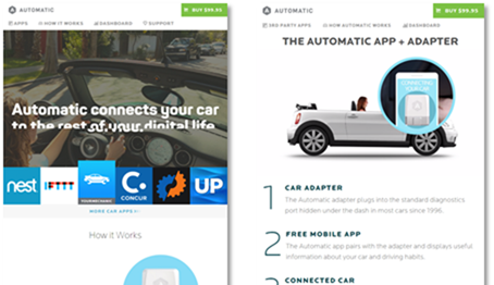
Automatic.com was seeking a very specific outcome when we designed a new home page for them: more sales of the adapter and app that connects a smartphone to the car’s electronic brain. The redesign did achieve that goal. However, there was another unintended result. There was an increase in the number of people buying multiple adapters rather than just one.

We weren’t testing to increase average order value in this case. It happened nonetheless. We might have missed it if we didn’t instinctively calculate average order value when looking at the data. Other unintended consequences may be harder to find.

This outcome usually spawns new hypotheses. What was it about our new home page design that made more buyers decide to get an adapter for all of their cars? Did we discover a new segment, the segment of visitors that have more than one car?

These questions all beg for more research and quite possibly more testing.

When Outcomes are Mixed

There is rarely one answer for any test we perform. Because we have to create statistically valid sample sizes, we throw together some very different groups of visitors. For example, we regularly see a difference in conversion rates between visitors using the Safari browser and those using Firefox. On mobile, we see different results when we look only at visitors coming on an Android than when we look at those using Apple’s iOS.

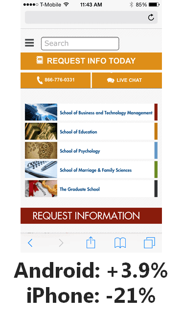
3.9% more Android users converted with this design, while 21% fewer iPhone users converted.

Android users liked this test but iPhone users really did not.

In short, you need to spend some time looking at your test results to ensure that you don’t have offsetting outcomes.

The Motivational Chemistry and the Science of Persuasion

Here are my notes from Brian Cugelman’s presentation that inspired this approach to AB testing results. He deals a lot with the science of persuasion.

My favorite conclusions are:

“You will get more mileage from ANTICIPATION than from actual rewards.”

“Flattery will get you everywhere.”

I hope this infographic generates some dopamine for you, and your new found intelligence will produce seratonin during your next social engagement.

Motivational Chemistry infodoodle by Brian Cugelman at ConversionXL Live

Motivational Chemistry infodoodle by Brian Cugelman at ConversionXL Live


After reading our Ultimate A/B Testing Guide, we thought you might want to take advantage of a few creative approaches to landing page AB testing. They go beyond basics to improve your digital marketing ROI.

There are a surprising number of AB tests smart marketers can run on their landing pages to ensure they’re getting the highest conversion rates possible. You already know you can experiment with different landing page elements for conversion rate optimization. Headlines, subheads, calls to action, and design elements can all be considered when building your testing hypotheses’ list.

Now, let’s kick it up a notch with these nine approaches for landing page AB Testing that may inspire you to create your own unique AB tests.

1. Create Targeted Landing Pages for A B Testing

Let’s say you are launching an advertising campaign. And you want to know what page will convert best: a generic one or a highly targeted to the audience and message. For this split test you could have ad variations that would use your generic landing page and one or more targeted landing page versions.

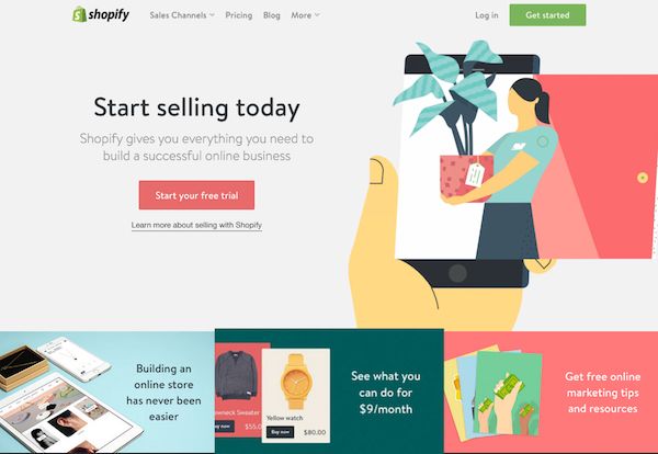
For example, if Shopify did an AB test between their generic vs. targeted landing pages in an advertising campaign, the control would apply to anyone looking for an eCommerce solution.

Shopify’s homepage with a generic target audience would be the control in this AB test.

Shopify’s homepage with a generic target audience would be the control in this AB test.

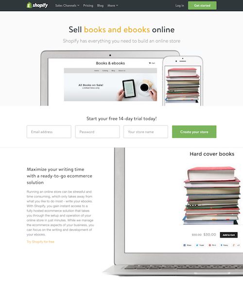
For a variation or version of a landing page, they could use their page that targets booksellers.

This landing page addresses the ecommerce needs of a specific audience.

This landing page addresses the ecommerce needs of a specific audience.

To maximize your conversions with this test, analyze your customer database to determine who your best customers are and create targeted landing pages focused on those specific groups of customers. If you do a quick Google search for Shopify’s landing pages you can see they have created targeted landing pages for their top customer segments.

Different landing pages convert different demographics and interests.

Different landing pages convert different demographics and interests.

You can use these as examples of how to create targeted landing pages for your top customer groups and demographics.

2. Landing Page AB Testing: Experiment with Animated Headlines

Headlines can make or break your landing page, as they are the first words that capture your visitor’s attention. It’s a simple AB test that can make a dramatic impact on conversions, and it can be done using most AB testing tools.

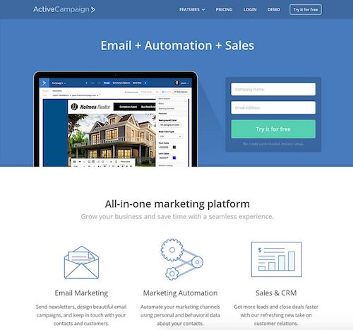
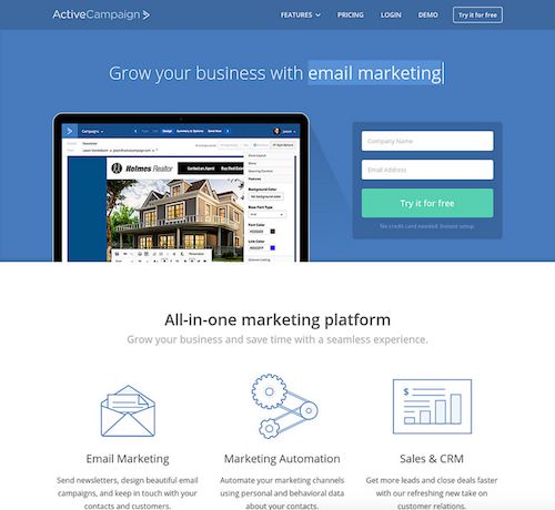
The key to the headline AB test is to change nothing but the headline. For example, you can see how ActiveCampaign changed from a simple headline about their features…

Test your headlines. ActiveCampaign's headline about features.

ActiveCampaign’s headline about features.

…to a better headline about the benefits their customers can expect when using their service.

Headline about benefits.

Headline about benefits.

This change proved to be a winner, as they have kept it since 2015 with a constantly changing message about their benefits. Therefore. test your headline.

This animated headline with benefits proved to be a winner

This animated headline with benefits proved to be a winner

3. Landing Page Split Test Idea: Vary Featured Homepage Products

In most cases, your homepage will be the most popular landing page on your website. Hence, it will be a page where you should do extensive AB testing.

One test you can do to see if you can increase conversions is simply changing your featured product.

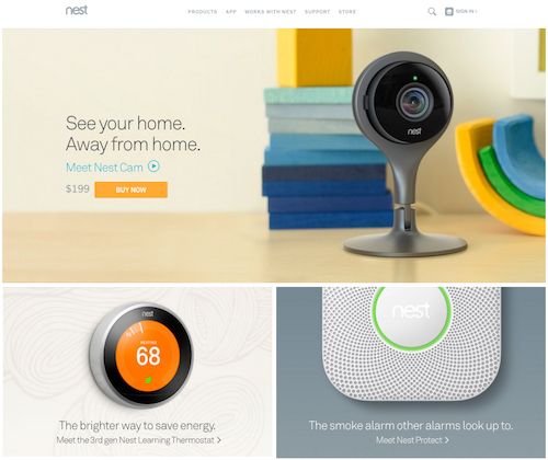
Nest does this by swapping out its popular monitoring camera (formerly Dropcam)…

Landing page split test idea: Nest featuring its Nest Cam on the homepage

Nest featuring its Nest Cam on the homepage.

…with its popular thermostat controller.

Landing page ab testing idea: Nest featuring its thermostat on its homepage

Nest featuring its thermostat on its homepage

This test is currently running (as noted by the ?alt=1 at the end of their homepage URL), so we’ll have to see which one wins in the end.

In some cases, you may want to change your featured product based on the one that is currently getting featured coverage in the media. Or whether that coverage is positive or negative.

4. Creative Landing Page AB Testing Idea: Explore Different Stories

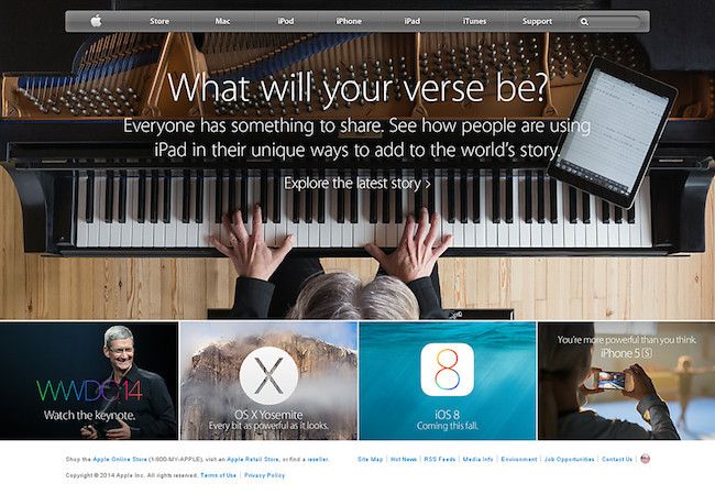
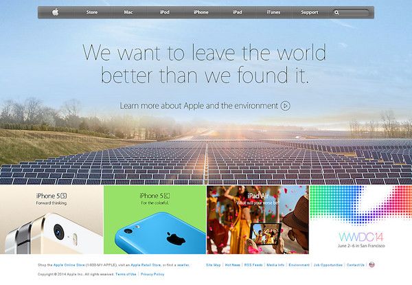
Do stories resonate with your customers and if so, which stories translate into the most sales? Find out through AB testing. Apple did this in this past by running multiple campaigns on their website, social media, and television ads featuring stories about musicians…

Apple’s landing page story appealing to musicians

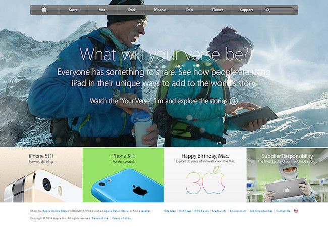
…explorers…

Apple’s story appealing to explorers

Apple’s story appealing to explorers

…environmentalists…

Apple’s story appealing to environmentalists

Apple’s story appealing to environmentalists

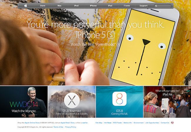
…parents…

Apple’s story appealing to parents

…and many other page visitors. The goal was to show how their products could help tell everybody’s story. No matter what they did or how much of an impact they made in the world.

Apple ultimately went back to a homepage focused on its latest products, but without AB testing, Apple couldn’t just assume that approach would convert the highest.


21 Quick and Easy CRO Copywriting Hacks to Skyrocket Conversions

21 Quick and Easy CRO Copywriting Hacks

Keep these proven copywriting hacks in mind to make your copy convert.

  • 43 Pages with Examples
  • Assumptive Phrasing
  • "We" vs. "You"
  • Pattern Interrupts
  • The Power of Three

"*" indicates required fields

This field is for validation purposes and should be left unchanged.


5. AB Testing your Landing Page: Shift the Focus to One Product at a Time

Landing pages have better conversion rates when there is one, clear call-to-action; sometimes that CTA is buying a product. But when your top landing page is your homepage, you can’t focus on just one product, right?

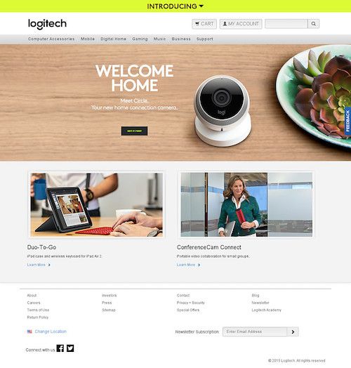
Maybe you can. In the past, Logitech had a pretty standard homepage that offered up all of its products all at once to homepage visitors.

AB Test your Landing Page: Logitech’s original, more traditional homepage

Logitech’s original, more traditional homepage

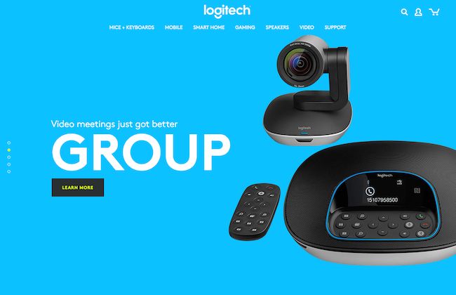
But now, Logitech gives visitors a tour through their top products, one at a time.

Landing page focusing on a single product.

Logitech’s new homepage focusing on a single product

In a few moments, you are completely immersed in a particular product and its main benefit, thanks to this new landing page. It’s definitely a way of landing page AB testing you will want to try if you have a few products you can highlight in this fashion.

6. Transform Your Hero Image to Video

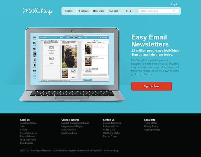
You know that great image of your product that you use to compel people to sign up or buy? Why not convert it into a video that dives even deeper into exactly what happens with that feature of your product. MailChimp made that change with their landing page, going from a screenshot of their newsletter designer…

Mailchimp’s landing page with an image of newsletter editor

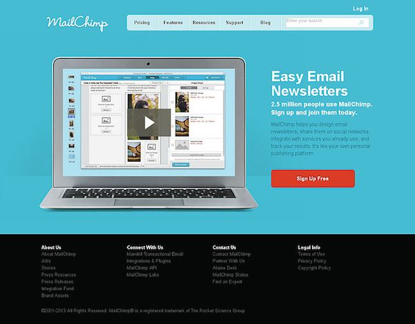
…to a video of how their newsletter designer worked.

Video of their newsletter editor increased Mailchimp's landing page conversion rate.

Video of their newsletter editor increased Mailchimp’s landing page conversion rate.

Instead of hoping that an image would convince visitors that their newsletter designer was easy to use, as the landing page claimed, the video was right there to prove it.

While their current landing page features a different, shorter animation, it still features one that demonstrates the ease of use of their newsletter designer. Thus proving that since 2012, video and animation on the landing page beats a screenshot for conversions.

7. Try a Change of Scenery: AB Testing Landing Page Copy vs Image

Sometimes it’s not text or functionality that will make your site convert better, it’s simply imagery that matches the story of your value proposition. Zillow experimented with this idea by changing the background of its search.

One variation was a neighborhood overview with home sale prices, which actually contradicts the line below the image about looking for rentals.

AB testing landing pages message: Zillow’s background showing homes with their prices isn’t relevant to people looking for rental property. Especially with a message at the bottom of the page specifically written for renters.

Zillow’s background showing homes with their prices isn’t relevant to people looking for rental property. Especially with a message at the bottom of the page specifically written for renters.

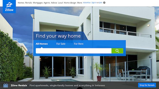
Another variation used an image of a specific home, which could appeal to both for sale and for rent searchers.

AB testing landing pages: Zillow’s new image says “home” whether you’re buying or renting

Zillow’s new image says “home” whether you’re buying or renting

It seems that they have stuck with the individual home view as it works with what most searchers are looking for.

8. Landing Page A B Testing Basics: Rearrange the Elements

It may not be your product, your service, your copy, your CTA button, your colors, or other elements on your page that are lowering your conversions. It may simply be the order in which they are presented.

Just like when you rearrange all the furniture in your house because it just doesn’t quite feel right, you might want to do the same with your landing page.

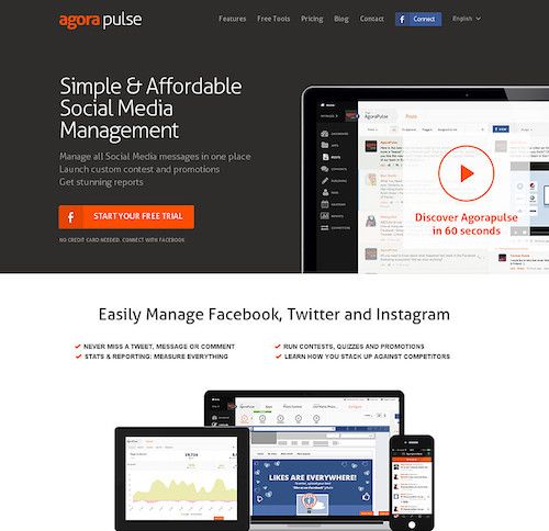
Take AgoraPulse, for example. They went from this…

AgoraPulse home page before ab testing

AgoraPulse home page before ab testing

…to this.

AgoraPulse home page after split test

AgoraPulse home page after split test

It’s easy to see why the latter layout works. It flows right into starting your free trial after a simple and convincing headline and subhead. And for visitors still not convinced they should convert, there’s simple video and bullet points to convince them to click that call to action button.

9. Copy Your Competitors

The most creative AB tests might be ones you don’t run on your own website. In addition to AB testing tools, there are tools that will alert you to when your competitors make changes to their websites. Potentially based off of their own AB Testing landing page experiments.

Rival IQ monitors your competitor’s website to see if changes have been made to it recently. The entry level plan allows you to track up to 15 companies. You’re able to track each company’s website design history along with their social media accounts, organic search rankings, and paid search traffic.

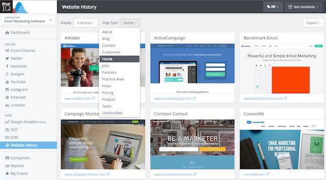
In the website history dashboard, you can view a variety of web pages from your competitor’s websites.

In the website history dashboard, you can view a variety of web pages from your competitor’s websites.

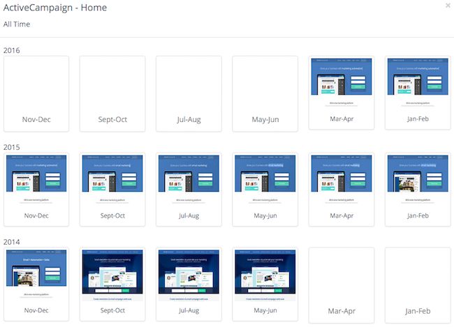
Depending on how long the company has been in Rival IQ’s database, you can get a couple of year’s worth of design history from each company.

ActiveCampaign’s design history over a few years

ActiveCampaign’s design history over a few years

When you click on a particular month, you see the breakdown of when particular changes occurred. As well as the ability to click upon a particular design to see the full landing page.

Zeroing into the competitor's design changes.

Zeroing into the competitor’s design changes.

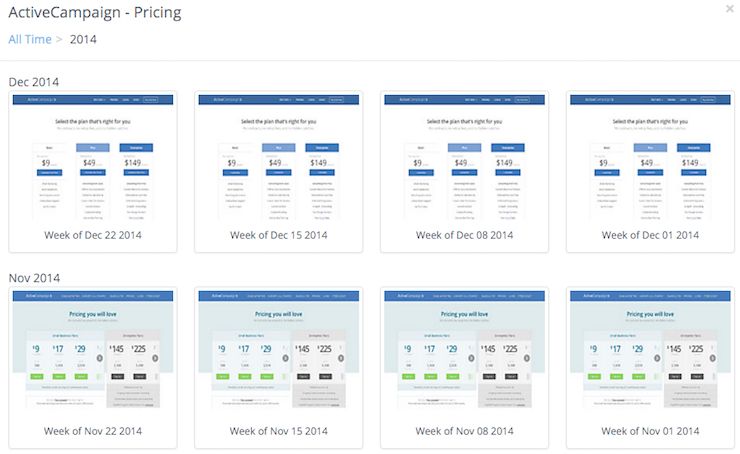
This will give you an idea of what AB tests a competitor has run in the past. Based on the length of time a competitor has stuck with a particular design, you will know which test was the presumed winner. That is, it was statistically significant in terms of increasing their conversions. Be it for their homepage, pricing page, features page, or other significant landing pages.

ActiveCampaign's pricing page history

ActiveCampaign’s pricing page history

In addition, you can sign up for email alerts when your competitors make major changes to their website. This will let you know when your competitors have run new tests on their website and made changes based on their results. Or you may even see the tests themselves in action as the pages change from their original to alternative versions.

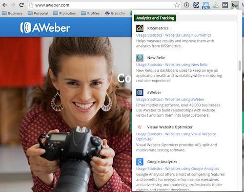
If you have a lot of competitors, and you’re not sure which to monitor, use the BuiltWith Google Chrome extension. It will help you find out if a particular competitor’s website is using AB testing software. Chances are, the ones that are will be the ones that will be making frequent changes.

BuiltWith browser extension for analytics and tracking

BuiltWith browser extension for analytics and tracking

What are your unique approaches to Start A B testing your landing page?

If you’ve already done the standard AB tests on your landing pages, then we hope that these additional split test ideas will further help you increase website conversions. Just like it has for the brands and online businesses mentioned here.

Have you been running or reading about some interesting AB tests? We’d love to hear about them in the comments.

AB Testing is only effective when you’re testing something meaningful. This is especially true on small-screen devices we call smartphones, or “Mobile” generically.

Talia Wolf believes that the root of every conversion = Human Behavior. We certainly wouldn’t argue with her. She also believes that emotion is at the core of human behavior. Her strategy for designing web pages that leverage emotional triggers was one of our favorite at ConversionLX Live.

I took notes on her presentation and share them here as an instagraph infographic.

AB Testing Inspiration using Emotional Triggers Infographic

AB Testing Inspiration using Emotional Triggers Infographic

Four Steps to AB Testing Inspiration

The infographic covers the four steps of her process.

  1. Emotional Competitor Analysis
  2. Emotional SWOT Analysis
  3. Emotional Content Strategy
  4. Testing

Emotional Competitor Analysis

According to Wolf, this step helps you understand “where the market is emotionally”. It also shows you where you fit.

Choose ten to fifteen competitors (or as many as you can) and rate each one by four criteria.

  • What their base message is.
  • How they use color.
  • How they use images.
  • What emotional triggers they appeal to.

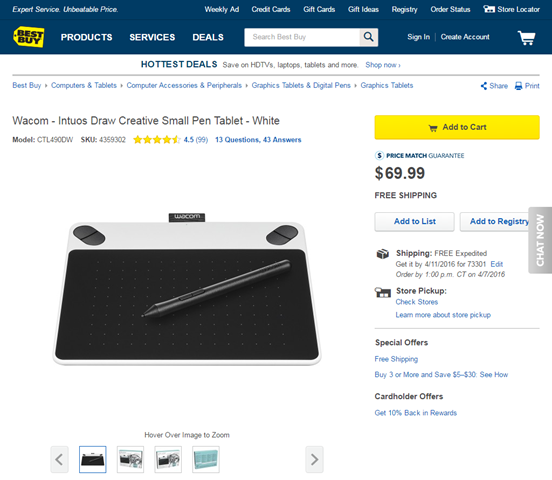
One of our Content Scientists was recently looking for a new Wacom graphics tablet. She likes to doodle. All of the retailers offered the tablet at the same price, so the only differentiator would be message, color, images, and emotional triggers.

Here are some of the sites she visited before buying.

Best Buy communicates emotions of service and trust on its product pages.

Best Buy communicates service and trust on its product pages.

Message: Best Buy’s is trust and safety. They offer star ratings, price match guarantees, free shipping and more to show safety.

Color: The dark blue color of their site says “Trust” and “Logic” but may also say “Coldness” and “Aloofness”.

Images: In an ecommerce environment, high-resolution images are usually helpful to buyers. Interestingly, they offer pictures of all sides of the box.

Emotional Triggers: Trust us to sell the right product at the right price.

Rakuten communicates emotions of spontineity and action on its product pages.

Rakuten communicates emotions of spontineity and action on its product pages.

Message: Shopping is Entertaining! We sell lots of things, and just give you the facts. This is an informational presentation with detailed headings, stocking status.

Color: Red is excitement, passion. It can also mean aggression and stimulation.

Images: Use of icons (promotions, shipping, credit card). Limited product images.

Emotional Triggers: Spontaneity. You’ve found the product. Take action.

Emotional S.W.O.T.

SWOT stands for Strengths, Weaknesses, Opportunities and Threats. It’s a common way to generate market strategies in almost any context. Wolf asks us to consider these from an emotional standpoint.

As the infographic shows, the strengths and weaknesses pertain to our business. Do we have a strong message? Are we using color and images powerfully? What emotional triggers are we tripping. The opportunities and threats relate to the industry we are in. Our emotional competitor analysis helps us define these.

Emotional Content Strategy

When we look at our emotional strengths and weaknesses, we can ask the question, “How do we want to make our customers feel?” This helps us define our emotional content strategy and related hypotheses.

In our examples above, Best Buy wrote their own product summary description. Rakuten uses the manufacturer-supplied copy and images. Best Buy communicates “Trust” by focusing on service. Rakuten focuses on “Act Now” with availability and price information. If we wanted to find a unique emotional content strategy, we might focus on building relationships. Messaging and images might showing employees who care and customers who are happy.

AB Testing

Regardless of how much research we do, we can never be sure we’ve hit the right combination until we do a test. Wolf recommends creating two treatments to test.

The first is based on our competitors’ approaches. The second is based on our research on emotional triggers and content. Each combines five aspects:

  1. Emotions
  2. Elements
  3. Words
  4. Visuals
  5. Color

If emotion is at the heart of purchases, then understanding how to integrate emotional triggers into our persuasive designs is critical to success.

Here are six tips for getting your A/B testing right. These were captured at Affiliate Summit West 2016 and presented by Digital Marketer’s Justin Rondeau.

Focus on Process Not Hacks

Don’t just try what others  say works. Have a process that allows you to know your MARKET.

Your A/B Testing effort should focus on process.

Your A/B Testing effort should focus on process.

Measure Multiple Metrics that Matter

Measure the right metrics for the part of the funnel you’re testing

You'll track different kinds of A/B testing metrics depending on where your visitors are in the sales funnel.

You’ll track different kinds of metrics depending on where your visitors are in the sales funnel.

Use Analytics to Identify Problems

Don’t just test anything. Use analytics to identify problem pages.

Take the Guesswork out of A/B Testing

Take the Guesswork out of Testing

Fix What’s Broken. Only Test What’s Ambiguous

If it’s broke, don’t bother testing it. Just fix it.

Test Persuasive and intuitive issues. Sometimes test Usability. Otherwise just fix the problem.

Test Persuasive and intuitive issues. Sometimes test Usability. Otherwise just fix the problem.

Schedule a Finite Time to Stop

Don’t expect your tests to just run until they’re successful or lose. Testing has an opportunity cost.

Conversion Optimization is about meeting user expectations.

Conversion Optimization is about meeting user expectations.


This instagraphic was captured live by Brian Massey of Conversion Sciences.
 
Applying Optimization Fundamentals Infodoodle-Justin Rondeau-Affiliate Summit West 2016 600x2288

Applying Optimization Fundamentals Infodoodle from Justin Rondeau’s Affiliate Summit West 2016 presentation.


Here’s a common question: “How do you increase conversions when you only get a small amount of traffic?”

The first answer is, go get more traffic.

The closer your conversions are to zero, the closer your conversion optimization efforts will be to guessing.

You can do statistical optimization using split testing if you have enough conversions, but this usually comes with more traffic.

The second answer is to get more conversions so you can do conversion optimization to get more conversions. Which came first, the conversion or the optimizer?

This last point is, of course, the proverbial “rub.”

Here’s how to get started if you are running low-traffic websites.

Get Accurate Data

Be sure your analytics is setup properly. I offer an analytics setup checklist to help with Google Analytics. You’ll want to avoid blind spots such as overlay windows, tabbed content, and subdomains on separate analytics accounts.

You’re going to need a good source of data when you start picking things to test.

Compare your analytics data to a secondary dataset. Compare lead conversions to your CRM. Compare transactions reported to your accounting system. Your analytics should be within 15% of reality. Don’t be afraid to install a secondary analytics package to verify your main analytics setup.


21 Quick and Easy CRO Copywriting Hacks to Skyrocket Conversions

21 Quick and Easy CRO Copywriting Hacks

Keep these proven copywriting hacks in mind to make your copy convert.

  • 43 Pages with Examples
  • Assumptive Phrasing
  • "We" vs. "You"
  • Pattern Interrupts
  • The Power of Three

"*" indicates required fields

This field is for validation purposes and should be left unchanged.


Get Some Qualitative Data

Low-traffic websites need to get more qualitative data. Right now, the one-stop-shop for qualitative data is HotJar. It offers click-tracking, session recording and feedback surveys. For alternatives, check out the ConversionDashboard.com.

Low-traffic Websites Use Serial Tests

If you don’t have the conversions to do split testing, you’ll want to do serial testing. This simply means making a single small change to your site and letting it run for at least two weeks. Since you have solid analytics (see above), you can see if there is an improvement in performance.

Measure More Than Conversions

There are some predictive metrics that you can use to gauge the performance of your serial tests.

  1. Bounce rate on landing pages
  2. Click-through-rate on key internal pages
  3. Add-to-cart for ecommerce sites
  4. Form completion percent
  5. Abandonment rate (basically the opposite of the last two)

Time on page, time on site, and pages per visit are to be taken with a grain of salt. Increasing these may correlate with lower conversion rates.

Start with the Message

Nothing works until your value proposition is strong. I recommend testing changes to your value proposition.

Nothing works until your value proposition is strong. I recommend testing changes to your value proposition. I’ve done hundreds of free strategy consultations over the years. Most of the time, I ask the consultee to tell me about their business. Typically, I get a concise, clear statement of the offering and value.

Rarely does this clarity appear on the website.

Sit with a copywriter and tell your story. Then, don’t edit them. Whatever they come up with, try it.

You should also test:

  1. Headline
  2. Call-to-action button text
  3. Pictures. If you can’t write a meaningful caption for an image, change it.
  4. Add sub-headlines
  5. Add bulleted lists

Don’t bury the lead. A great headline — called the “lead” — is the core of a strong value proposition. Often the headline that would best “grab” a reader is buried somewhere in the copy.
Find the headline that gets visitors to read your value proposition, and you’ll have the cornerstone of conversion in place.

Look for Big Wins

You’re going to have to find what we call “big wins.” This means that your change increased conversions by more than 50%. Rich Page wrote on low-traffic testing. My comment on his post was as follows:

You can also split testing with less than 100 conversions. You just need really big wins. If you have a treatment with 20 conversions and another with 40 conversions, a 100% difference is something you can probably bank on, even with such small numbers. However, if one treatment got 20 conversions and the other got 30, that 50% increase is too close to the margin of error and shouldn’t be considered an improvement (even though it feels like a win).

Technically, it’s OK to make a treatment with, say, a 30% increase the new control. Just know that you’re not likely to continue to see such an increase with small transaction amounts.

Ditch Your Outliers

You’re going to have to eliminate “outliers” in your data. Outliers include extreme orders in ecommerce sites and rushes of leads from activities such as email blasts and bursts of word of mouth.
For an ecommerce site, you should look at orders that are one or two standard deviations away from the mean.
So, what does that “mean?”
Here is two weeks of daily sales data for a site that gets about one sale per day.

There are two obvious outliers: One day with no sales in the first week, and one with $160 in sales the second week. Statistically, a 16% increase is irrelevant, but the point is driven home when you calculate the standard deviation range.
For this data, an outlier will be lower than $27.90 or higher than $86.89.

When we remove outliers we see a drop in sales of six percent. This is statistically uninteresting as well, but illustrates how outliers can affect results.
If you’d like to see how I calculated the min and max, download Example of Outliers-Conversion Scientist-low-traffic post.

Don’t Let it Run

Split testing can be done on low-transaction sites. However, don’t let the test run for more than, say, six weeks. The results just aren’t reliable. There are too many other variables mucking with your data over such long timeframes.

Always Be Testing

Just because you have few transactions per month doesn’t mean you can’t be learning. In fact, not learning may well be the reason you have few transactions per month. Never stop trying things, and use good data to decide what you keep and what you throw away.
Feature image by Shaun Garrity via Compfight cc and adapted for this post.

Today’s question is at the heart of AB testing. “How do you decide what elements of a site to test?” We call the test “hypotheses.”
But, a better question is, “How do you determine what NOT to test.”

It’s relatively easy to come up with ideas that might increase your conversion rate. We typically come up with fifty, seventy-five, one-hundred or more ideas for each of our client sites. Filtering through this list is the hard part.

Conversion-Scientist-Podcast-Logo-1400x1400


Subscribe to Podcast

The Five Steps

In this week’s podcast, I take you through the five steps we use to determine what to test on a website.

  • Step One: Look for Evidence
  • Step Two: Rate the Traffic
  • Step Three: How Hard is it to Test?
  • Step Four: What does experience tell you?
  • Step Five: Bucket the Winners

We’re pretty good at picking low-hanging fruit. Last year 97% of our clients continued working with us after our initial six-month Conversion Catalyst program that uses this approach.

Each of our hypotheses gets an ROI score using the following formula:

ROI = Evidence + Traffic Value + History – Level of Effort

Once we’ve ranked all of our hypotheses, we classify them into buckets.

The top ten hypotheses reveal an interesting pattern when you bucket them.

The top ten hypotheses reveal an interesting pattern when you bucket them.

Bucketing Your Hypotheses

I also talk about how we classify hypotheses into buckets.

  1. User Experience: For hypotheses that would alter the layout, design, or other user interface and user experience issues.
  2. Credibility and Authority: For hypotheses that address trust and credibility issues of the business and the site.
  3. Social Proof: For hypotheses that build trust by showing others’ experiences.
  4. Value Proposition: For hypotheses that address the overall messaging and value proposition. Quality, availability, pricing, shipping, business experience, etc.
  5. Risk Reversal: For hypotheses that involving warranties, guarantees and other assurances of safety.

This helps us understand what the primary areas of concern are for visitors to a site. Are there a lot of high-ranked hypotheses for Credibility and Authority? We need to focus on building trust with visitors.

There’s much more detail in the podcast and my Marketing Land column 5 Steps to Finding the Hidden Optimization Gems.

© Copyright 2007 - 2025 • Conversion Sciences • All Rights Reserved
Conversion Sciences® and Conversion Scientist® are
federally registered trademarks of Conversion Sciences LLC.
Any unauthorized use is expressly prohibited.