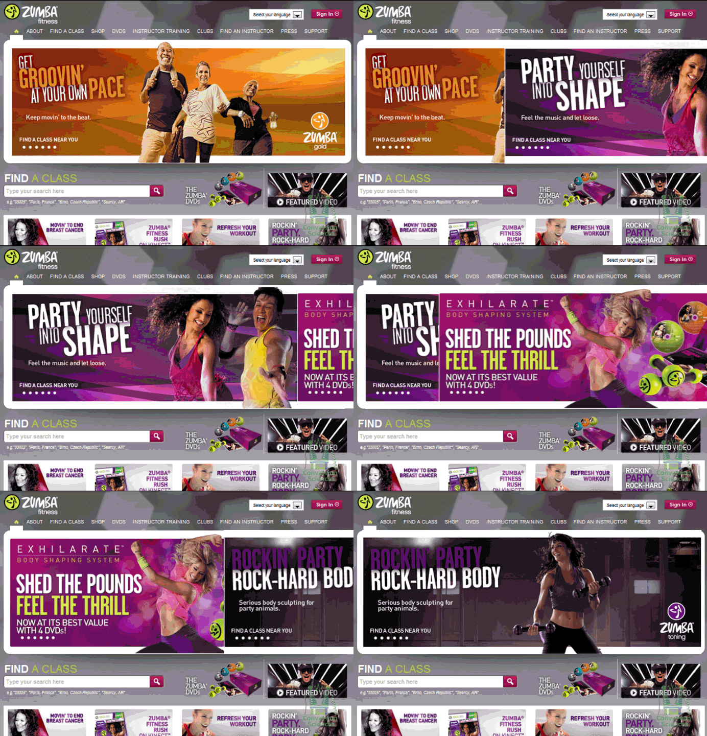
Your Rotating Headers Don’t Have to Kill Your Conversion Rate
It’s like a virus on the web: Rotating Headers, also called “Carousels” or “Sliders”.
Designers recommend them.
Content Management Systems provide widgets to implement them.
And everyone is copying their competitors, which makes them spread.
Those of us that test websites know one thing: We can almost always get a higher conversion rate with a static image then with rotating header images.
Why Rotating Headers Hurt Conversion
There are two primary reasons that sliding header images hurt conversion.
1. Load Times
It takes a long time to load each image. Header images are generally large. Multiply that by three or four or five and you have a slooooow loading page.
2. Motion is Irresistible
Try to read this sentence with the image above moving constantly.
Our brains are programmed to pay attention to things that move. When something moves, your “Lizard Brain” must ascertain if it is something we can eat, be eaten by or mate with.
Every time the header images slides or fades, we stop reading the page and look up. We can’t help it.
Why static images are scary
Static images require us to think hard about our value proposition. They require tough decisions because you must pick one image in a key location on your home page, category pages and landing pages.
Don’t try to hedge your bets with a rotating smorgasbord. Decisions are hard.
Fear not. We have been able to beat a static hero image with a rotating “slider” on more than one occasion. If you’re attached to your slider, we’re here to help you out.
Creating Rotating Headers That Work
This process only works if you know how to do A/B testing.
If you don’t, please, just use static images for your pages. Better yet, let us help you get setup for testing.

This is a slider we optimized for custom sign maker. It started off with some advantages over most sliders we see on the Web.
First, the size of each image is relatively small, taking up one column width and measuring in at 519x 319 pixels.
Second, the rotation is a slow fade, not a sudden slide.
Third, the fade time is 10 seconds, which is quite long compared to other sliders we’ve seen.
Since we believed that a static image would perform better than the rotating images, we set out the see which of the panels would generate the most sales. We tested each image against the rotating banner as the control using Optimizely.
Here’s how they turned out. Only one panel beat the rotating image with high statistical significance.

The others were inconclusive.
This was unexpected. So, we did a follow up. If we changed the order of the images, could we develop a rotating image that beat a static image?
We gave it a try, ordering the panels like this:
In our test, the rotating header beat the static image by 61% with a confidence of over 99%.
What Does This Mean?
Does this mean that rotating sliders are the way to go? We have distilled the following best practices that have worked for us in other tests.
1. Make each image as small as possible so the page loads quickly.
2. Use a long interval between images.
3. Use a fade instead of a slide to minimize motion distraction.
4. Start the rotation with your highest performing images.
5. If you can’t test, go with a static image.
Don’t spread the virus. Be smart about your rotating messages.


The visitors could be judging “quality” simply based on the animations and multiple slides. That is certainly the way that many designers/clients view it. So, why not create one animated slide that animates in certain elements like a hero image, value proposition and CTA button? Then you get the best of both worlds. The appearance of quality and a faster loading home page.
Great idea, that’ usually what I do. Don’t have conclusive results, but so far it seems they are working better.
@Jason I’m not sure I’d want my CTA button only appearing one-third of the time. Did I misunderstand your idea? I’m also not sure that designers’ objectives are closely aligned with the site visitors’ objectives. I think that’s why static images generally outperform sliders. Interested in Brian’s thoughts.
Ah finally someone speaks out in defence of image sliders :) Nice test! Always best to put value proposition stuff in them, particularly first slide!
Thanks for this Brian. I like sliders, but I can see how the fast movement can be off putting. Your tips are very helpful for making some adjustments that will make them more user friendly.
Hello Brian great article! I’ve been reading research online was great interested. I’m a professional photographer redesigning my website and I’m trying to navigate slider carousel slideshow versus hero image. I offer multiple services family portraits, headshots, pet photography and choosing one hero image is difficult because the image IS my product it is not focused as an ad for my product. Would you suggest your feedback above would work for a professional photographer? Most research I read suggest avoid the slider and use a hero image. Thank you for your advice http://www.karenvaismanphotography.com
Karen, Most of the amazing photos in your carousel will never be seen. Put them on the page and let the visitor scroll through! Then they can find the one that relates to them. Put one of your amazing testimonials next to each.
Write a caption for each image that explains why it’s good, and link to “Learn more”. I would prefer “Schedule a sitting” as a call to action. Why be coy?
What to do with the hero shot? Put an image of your book there. That is what the copy is about.