As a Conversion Scientist, I used my background in Conversion Rate Optimization and Landing Pages to create the first draft of my OkCupid profile, the landing page of me. I utilized the chemistry of a successful landing page formula to make sure I hit all the known conversion points. OkCupid’s setup will limit me in the type of test I do. We’ll be doing pre/post testing so I started by putting my best page up, letting it run for two weeks and calculating my “pre” conversion rate.
This is a key piece of knowledge for any business ready to test – know your base conversion rate.
During the first 14 days my profile was live, I had 104 visitors with nine messages. Those nine messages resulted in four qualified leads. My starting overall conversion rate is 8.65%. My qualified lead conversion rate is 3.84%.
My first stop in testing was a critique with an expert in landing pages. Lucky for me, I work for one. Sometimes, it’s difficult to asses your own work, so calling in an outside expert is always a great place to start.
The Conversion Scientist, Brian Massey, was nice enough to do one of his famous live critiques. In his video critique he pointed out blind spots and a few things that might be troubling.
If you’re not ready to call in an expert, there are tools you can use to give you a better sense of what might be happening. As a Conversion Scientist, I always start with analytics, click-tracking heatmaps, and screen capture sessions. These data points allow me to come up with a hypothesis list.
When creating a hypothesis list for a client, analytics is always the first stop. It allows me to identify key pages and performance metrics. I look at landing pages, all pageviews, audience channels and conversion metrics for each. This is where I start to see patterns and look for what pages I should be testing.
Questions to ask when looking at analytics:
- Where are visitors coming from?
- Which pages are they landing on?
- Which pages get the highest traffic?
- What are the key pages in the funnel?
- Are there pages with high exit or bounce rates?
I use this data to compile a list of key pages I want to look at more closely.
With OkCupid — and most landing pages — it’s pretty easy to know what to target. Visitors are coming from /match or /quickmatch pages and coming to my profile landing page.
Once I know what pages I will focus on, I switch to another set of tools. Heatmaps and Session Recordings provide a lot of insight into where visitors are getting hung up. The data these tools generate is a hot bed for hypothesis generation.
They allow me to see if a key call-to-action is in blind spot or if something on my page is getting surprise attention. Check out the Conversion Lab for a list of awesome conversion tools options.

21 Quick and Easy CRO Copywriting Hacks
Keep these proven copywriting hacks in mind to make your copy convert.
- 43 Pages with Examples
- Assumptive Phrasing
- "We" vs. "You"
- Pattern Interrupts
- The Power of Three
"*" indicates required fields
Normally the resources I can install on a client’s website inform the hypothesis list and the recommendations I come up with, so I have to be creative by relying on my own experience and on an expert’s opinion, namely Brian Massey.
Here are a few hypotheses from his analysis.
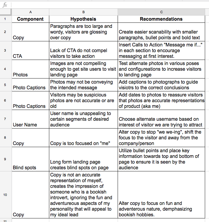
I create a list of hypotheses to test when I begin optimizing
Brian’s critique gave me some great ideas on what to test. I know that my copy needs a bit of work, as does my landing page’s scannability. This is the first hypothesis I’m testing:
Hypothesis: If I change the copy to be about the visitor, instead of myself and improve scannability with bold text and paragraph breaks I can improve conversions.
I carefully changed all of the “I” statements and made them about the visitor. I also added more paragraph breaks and highlighted key words in my text allowing a visitor to more easily scan my profile.

My revised profile
When testing, it’s important to isolate as many variables as possible, so for now the copy is the only thing I changed. I could have swapped out my headshot for a party shot, but if I see an increase in conversion rate, I won’t know if it’s the photo or the copy that’s improving my numbers.
For our testing purposes, my primary goal will be to beat my qualified lead conversion rate of 3.84%, but I will be tracking my overall conversion rate and visitor count as well.
I’m going to want to test more than one hypothesis to get this profile just right. For my next test, I’ll focus on images. Choosing the right images are vital to the success of a landing page, maybe even more so on this particular type of landing page. Since my next test will focus on the images. I did some research, scouring the internet for articles from online dating experts and determined the best profile photos were a smiling woman looking at the camera, showing some skin but not too much skin.
I had a small selection of photos I thought would fit the bill so I decided to take an informal poll of men that fit the type I was looking for: I asked a bunch of my guys friends to help me choose a photo. The photo of me in a black sleeveless dress smiling warmly at the camera was the clear winner. I filled out the rest of my profile photos with a variety of activities and a few shots of me dressed up a bit to show that while I may wear a lab coat to work, I do clean up okay for a night on the town.
This first test isn’t about the images, but after Brian’s critique, I knew that my images might not be saying what I wanted them to say. For this initial pre/post test, I left the photo winners from my poll as they were but added captions to clarify what I wanted the viewer to get from each image.
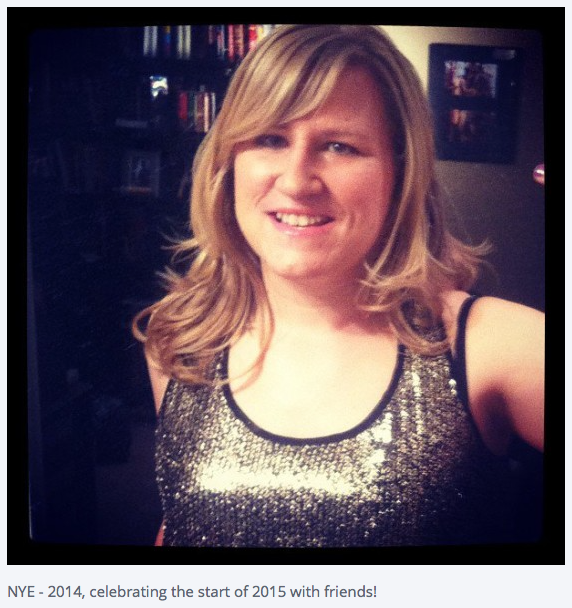
I’ve shared what I was doing when this photo was taken and also indicated that it’s a fairly recent photo.
With my changes made and my visitor count ticking up, there’s nothing to do but wait and see. We’ll check back in a week (and I’ll look every day in between) to see how my text changes have fared. With any luck (or in my case, with science), I’ll have upped that 3.8% conversion rate.