5 Welcome Email Tests To Turn Tryers into Buyers
Welcome email tests that will help begin the onboarding process that turns tryers into buyers and buyers into long-term subscribers.
Email is still the most effective strategy for onboarding visitors. By “onboarding” we mean:
- Getting tryers to use the product so they can become buyers
- Getting buyers to use the product so they become long-term subscribers
- Getting repeat buyers to share their appreciation of the product
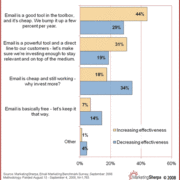
Yes, email is important to your business. It can’t be done through Facebook or Twitter. It can’t be done through SMS. Maybe it can be done through direct mail. Maybe.
The first step in these processes is the ubiquitous Welcome Email. It gives customers a first impression of your business. Guides them through your product. And demonstrates the value that you can bring them. It’s what takes them from trial to paying user to a repeat user to a evangelist.
In fact marketers who utilize welcome emails find that they have a substantial effect on their conversions with some even experiencing up to a 50% conversion rate when implementing them into their onboarding marketing strategy. Impressive, huh?
Welcome emails aren’t as straightforward as you would think, however. They need to be tested. From timing to subject line, rigorously A/B testing the different aspects of your emails is a sure fire way to build the most effectual onboarding strategy for your business.
Today, we are going to focus on one aspect of welcome email A/B testing – Content.
Content is what entices your user to click-through and act. You need to get it right.
Welcome Email Tests to Engage Customers
Here are five A/B tests you should be doing on your content to optimize your onboarding emails and get users converting from trial to lifetime customers.
1. Test Simple vs. Hyper-Stylized Design
Let’s begin with design.
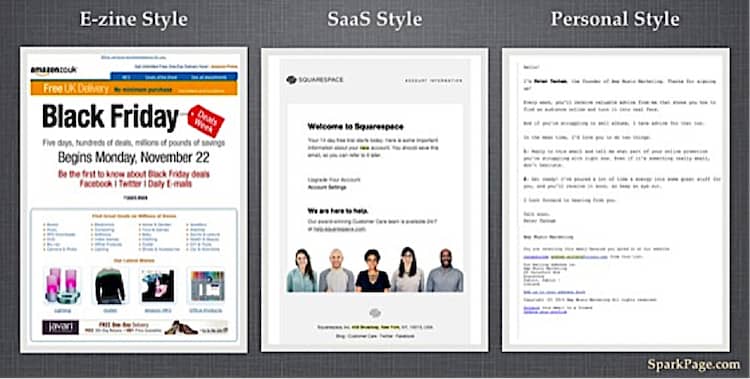
No matter how well-written your emails are, if it the look isn’t right the effectiveness will be hampered. Emails can be as simple or flamboyant as you wish. Generally they are divided into three types:
- The first type is E-zine style. It’s flashy, hyper-stylized with images and bold font taking centre stage.
- Next is SaaS style. It’s cleaner and simpler yet still professional.
- And finally Personal. This has no branding, no design. Just a straightforward email.
It’s up to you to test what works best for your business.
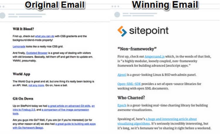
An interesting design case study comes from SitePoint, a specialist in content for web developers. After sending out over 40 newsletters, their campaign started to look a little lackluster.
Their initial emails were uncluttered and pared back in design. And they wanted to continue with this look but update it and get more clicks.
So they ran an A/B test.
The first thing they tested was the template, and the results were positive with an initial 16% rise in click through rates.
Next they tested images – should they include them or keep it plain text? SitePoint already had a hunch that their customers didn’t care for them and wanted a text only email. This assumption proved to be inconclusive as the results were 118 vs. 114 clicks in favor of no images.

This inconclusive test demonstrated that readers didn’t prefer nor mind images in their welcome email.
These welcome email tests were just the first round of experimenting for SitePoint. They went back to the drawing board and tested everything again. They experimented with images and templates until they found what worked best.
The winning email retained the simple look of their original email. It was just updated, more attractive to readers and most importantly, increased their click-through rate.
Contrasted to this is Wishpond. After extensive testing of their own emails, they discovered images were just what their audience wanted. Using images produced a 60% higher click-through rate versus just using text alone.
These two contrasting examples are just to illustrate the fact that there is no single best design for all businesses.
There is no one template fits all.
You need to test to discover what your customers like and what drives results.
2. Test A Single Call to Action
When you send out your welcome emails we are betting you have one goal in mind – getting customers to use your product.
All too often we see businesses sending emails with multiple links and requesting customers do numerous actions. It’s confusing and will distract your user from your goal.
So here’s a challenge – try restricting your welcome emails to have only one call-to-action,
That’s exactly what Optimizely did.
In 2014 they began rigorously testing all aspects of their emails. One of the tests had a goal of increasing click-throughs on the call to action.
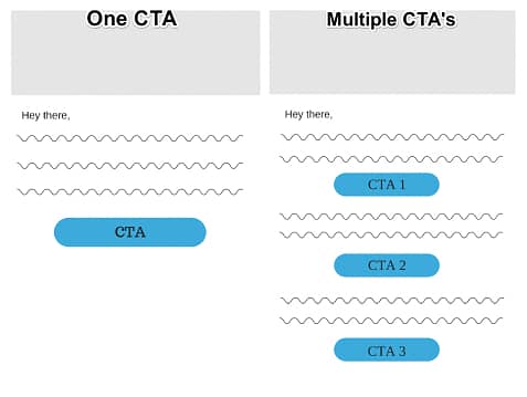
To do this they sent out two emails. The first having only one CTA, while the second had multiple.
There was one clear winner. The email with only one CTA produced substantially more click-throughs with a 13.3% increase.
Narrowing down your email to one call to action can be a tough task. You have a limited amount of onboarding emails to send. Yet you have so much to say.
Try removing any unnecessary call to actions you have in your emails and just focus on what you believe is most important.
Ask yourself what is the most important thing you want your customer to do after receiving this email and make this your call to action.
Then test.
3. Test Urgency Inducing Copy
When sending welcome emails to onboard your users there are some tactics you can use to convert those trial users into paying customers.
One method is urgency. Using a sense of immediacy in your email to get your customer to act now.
MarketingExperiments tested the effects of urgency in their email campaigns.
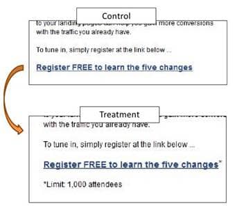
They planned a Web Clinic Invite and sent out two emails. One was just the simple invite. The other however, had three extra urgency inducing words – Limit 1000 Attendees.
The email containing the urgency had a 15.4% increase in click-throughs. Pretty impressive figures considering the only difference was 3 words!
When sending welcome emails, urgency can be incredibly valuable.
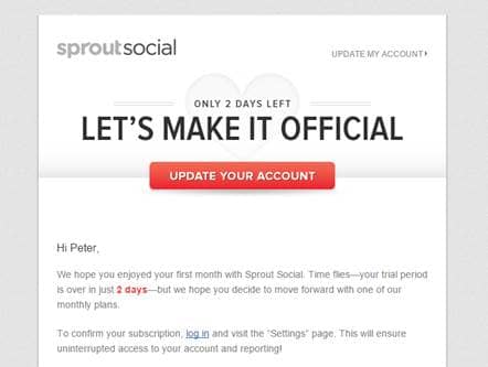
Here is another example of urgency from Sprout Social.
To get trials to convert to paying customers they use copy to imply urgency and encourage users to act now.
They use phrases such as “Only 2 days left” and “Time Flies – your trial period is over in just 2 days”. It shouts “act now or you’ll miss out!”
It’s a clever way to optimize your emails and get more customers converting.
4. Testing Email Length (How Long Should a Welcome Email Be?)
When a customer signs up you want to tell them everything about your business.
Explaining every feature and what you offer in a long winded email is going to show them the value of your business, right? Well probably not.
Conversely, saying too little can be problematic also. Customers might feel under informed and might not act at all.
Research has shown that the average open time for an email is only 15-20 seconds.
With such a small window of time, you need to test how long your emails should be to have the maximum impact.
iMedia Connection decided to carry out tests, with two versions of an email promoting an upcoming conference.
One email was verbose, containing all of the information about the conference within it as well as links to the website.
The other was half the length, with only a short description and a link to a website containing the information.
The shorter email proved to be more appealing. iMedia Connection reported that not only was the open rate on the shorter higher at 30% vs. 20% but the click-through rate was also higher at 11% vs. 5%.
Short, brief content was the winner here but that might not always be the case. Getting your emails length right must be tested.
Good ab testing will help you find the perfect balance between being informative while also being concise.
5. Welcome Email Tests: Test Personalization
Personalization is one of the most effective techniques to increase conversions from emails. Using a customer’s data to appeal to their interests has been proven to work time and time again. And it isn’t as complicated as you may think.
DoggyLoot, an online store experienced astonishing success when they began personalizing their email’s content.
They recognized that Rottweiler owners wouldn’t want the same emails as Chihuahua owners. So they began to segment in the simplest way possible.
They began collection “doggie data” by asking owners one simple question – is their dog small, medium or large?
Based on this data, they created three email segments based on dog size. Each segment received an email that had products that were suited to their dogs.
The results were impressive to say the least. The personalized emails that were targeted at large dog owners had a click through rate that was 410% higher than the average.
Personalization doesn’t have to be complicated. Just find whatever works for your business.
Doggyloot just asked the right questions on signup, enabling them to segment their audience with relative ease.
Whether you just add a user’s name or build comprehensive buyer personas, testing personalization can be a real asset to your welcome emails.
5 Welcome Email Tests To Turn Tryers into Buyers: Summary
These 5 A/B tests and case studies are guidelines. Some may work for your business while others might make no impact at all.
It is important to focus on how customers are reacting to your email content. Measuring click-throughs and conversions is essential. See what makes statistical significance, gets users converting and becoming lifelong customers. For more advanced A/B tests read our Ebook “Welcome Your First Million Users: The Ultimate Guide to A/B Testing Your Welcome Emails”.
- 5 Welcome Email Tests To Turn Tryers into Buyers - March 9, 2015

