Effective Luxury Landing Pages: Page Critique
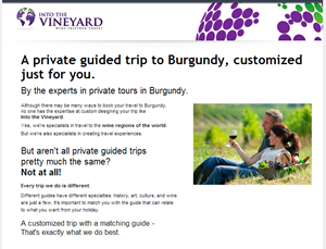
Well-heeled travelers will enjoy a private guided tour of the world’s various wine-making regions. Colin Simpson of Into the Vineyard arranges these advantures for them. Into the Vineyard tours are tailored and personalized to the individual, setting themself apart from other packaged, run-of-the-mill wine vacations.
Colin came to us with a landing page built on Unbounce.
They have had fairly good success with these landing pages, boasting conversion rates of over 5% and more. Colin had a number of questions for Conversion Sciences about how to optimize his landing page to see a lift in conversion rate while maintaining high lead quality.
Many of our suggestions are included in the annotated infographic image included in this post. However, one of his questions was one that we are asked all the time. Its answer is important for you to understand when you create your own landing pages.
Is the placement of the form too far down the page?
The short answer is “No.” This may be contrary to the above-the-fold or very-close-to-the-fold rule many of you follow, but there are good reasons to place your form towards the bottom of your landing page.
Into the Vineyard offers a luxury item and appropriately uses a value-building approach. Furthermore, part of the value of their offer is the ability to customization the product. Bombarding visitors with a form too early not only gives them no time to appreciate the luxury of the offer but also may elicit feelings of impersonality.
This is something to consider if you are in the luxury market. Even if a form placed “below the fold” produces a lower volume of leads than would one above the fold, you may find these leads to be better qualified. They have not only read your content to the bottom but they also know what they are going to receive in exchange for their information.

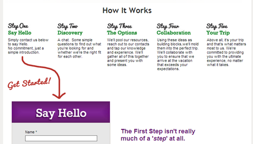
Laying out the steps of the process puts many visitors at ease. The use of the red arrow draws the visitor to take action.
We saw this strategy work very well in split testing for a similar company, a company that sells golf tours to Scotland and England.
A landing page that added the steps of the process after filling out the form generated a 300% increase in leads.A landing page that added the steps of the process after filling out the form generated a 300% increase in leads. Note that this was not the only change to the page.
The bottom line is that the content of your landing page must make a clear offer, regardless of form placement, and your copy must support the offer, not just your product or company. Into the Vineyard does an excellent job of explaining what will happen if a person fills out the form.
The long answer to Colin’s question is “I’m not sure, let’s test it.” One of the awesome perks of using the Unbounce tool to create landing pages is its A/B testing feature.
For most online websites, A/B testing is the most reliable way to know where to place a form on your page to maximize leads and sales.
When you create your own landing pages, consider your market. Are you in the luxury market where your visitors may need a little more information to get excited and convert? Or, are you using this landing page to give the visitor a freebie in exchange for their information?
These two situations will lend themselves to different form placement. If you have the traffic, test the difference because no two business are the same and what works may not work for all.
More recommendations


