
5 Components of a Landing Page for a "Cold" Email List: A Critique
There are few challenges more daunting than mailing to a purchased email list. In fact, I usually recommend against it. Nonetheless, it is often the only way to access a specialized audience, and list purveyors continue to lie about the value of their list.
If you are creating landing page for an offer to a purchased mailing list, you will have to work extra hard.

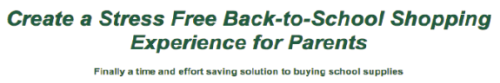
The top portion of the Stress Free School Supplies Page works hard, but fails to nail the “lead.”
Such is the case with Stress Free School Supplies. The owner of the business is a former teacher and understands the problem schools have in getting parents to purchase the necessary supplies for the year.
Her offer is that she will create a custom list on Amazon.com for each school. This allows parents to buy everything they need with a click. Her business will also provide the flyers and emails needed for reaching out to parents.
Her audience is a purchased list of school administrators, whose job it is to solve this parents / supplied problem.
Any competent landing page will:
- Makes an offer.
- Provides a way to take action, typically using a form.
- Delivers tangible proof.
- Earns your visitors trust.
- Shows relevant images.
For a “cold” email list the page must master two of these components: the Offer and Trust.
The initial questions for those who receive are, “How does this work?” and “Can I trust you?” Only then do you get permission to make the sale.
An Offer that Makes Visitors Want to Stay
 The offer is the primary value proposition, the reason the visitor should buy — or at least the reason they should keep reading. For a cold email list, the offer must reach out and grab the reader by the throat.
Is the offer relevant to the reader?
Currently the primary offer reads “Create a Stress Free Back-To-School Shopping Experience for Parents.” This headline is directed more towards parents than it is to school administrators.
While I’m sure that school administrators love their kids’ parents, I bet we would do better if we wrote a headline that addressed their pain, rather than the parents’ pain. The key to a great headline is understanding the administrators’ pain.
- That students will be showing up to school without proper supplies.
- Teachers will have to accommodate unprepared students during a chaotic time.
Establishing Trust

Trust in this case has two components:
- How does this work?
- Are you legitimate?
“How it works” is buried in this case; the paragraph below the offer is dense, non-specific and lacks clarity.
Amazon is a powerhouse brand, familiar and trusted. Since Stress Free School Supplies is an affiliate, we suggested “borrowing trust” from Amazon and using their logo on the page. Currently the logo is buried in the fine print low on the page.

Why is this logo buried low on the page?
We also suggested logos from any PTA associations she may belong to as well as any business associations (BBB). Another suggestion was to put a face to the company. Doing this increases lead generation conversion rates because people know they will be dealing with a real person not a computer automated recording and begins building that trust.
We usually do not recommend social media icons on landing pages. Stress-Free School Supplies needs trust symbols, and we suggested she keep them on the page. However, we recommend moving them to a less prime location than directly under the form.
Enticing Action

The for is the way school administrators to taking action. The goal of the form is to make it easy for administrators to sign up for the service without looking like a “squeeze” page.
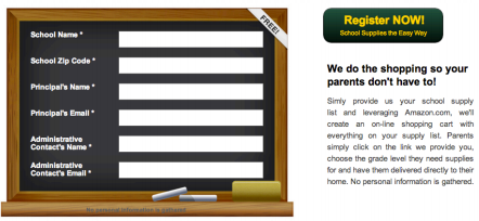
The submit button for this form is in a strange and confusing place.
This form currently has six blanks, including 2 emails and a zip code. The more personal information you request on a form, the more abandonment you will experience. We suggested to her that requiring only their email would help to heighten form fills. But, the main issue with this form is not the blanks, but the button to submit the form.
The call-to-action button was lost on this page. It was up and to the right of where we had just finished filling out the form. If someone had scrolled down while filling out the form, they may miss this entirely. We suggested moving the CTA button under the form, which they have recently done.
Providing Proof

Currently the proof is given by testimonials and the FAQs. However, The FAQs are at the bottom of the page, so 50% of people won’t make it that far and the testimonials are lost in a milky way around a vibrant picture that grabs the eyes attention to it, not the testimonials. A suggestion would be to put pictures of the individuals to these testimonials to drawl the eye and create an emotional response. Another good example of proof would be adding the number of orders filled.
Show the Product

What do the images on this landing page do for conversion? Bottom Line:“The goal of the images are to help me visualize owning and having whatever it is you offer.” The image in the page header is of school supplies. An image near the middle of the page shows… school supplies. This is not really why administrators sign up. Here the image takes away from the testimonials near it.

The Caption for this image may be “This is what school supplied look like!”
In Summary, this landing page needs to knock the offer out of the park and establish trust quickly. It’s the value proposition to its viewers through better targeted copy and adding an image that will explain the process.
For more information, please read: Discover the Chemistry Behind a Successful Landing Page [Infographic]

Expertise: conversion rate optimization, AB testing, marketing strategy, digital marketing, analytics, landing page design, computer programming, entrepreneurship
Speaking: IBM, Inbound, LeadsCon, Content Marketing World, Affiliate Summit, and more
Books and Training: Your Conversion Creation Equation, Video CRO, Marketing Videos that Convert, CRO Best Practices
As Seen On: ClickZ, Search Engine Land, Marketing Land, Conversion Sciences Blog, Intended Consequences podcast
Education: Texas A&M University, BS Computer Science and Management
- Using AI to Chat with your Online Business - July 10, 2026
- Your Ads Are Making Promises Your Landing Page Experience Doesn’t Keep - July 1, 2026
- Using AI to Generate Copy that Converts - June 15, 2026


