4 Mobile AB Testing Ideas that Worked for Our Clients
This post is excerpted from Designing from the Mobile Web 2.0 by Joel Harvey. Joel discusses what he’s been learning through the tests that Conversion Sciences has done for the mobile web. You can begin to take these as new hypotheses in your business so that your mobile devices and your mobile traffic is converting at higher and higher levels.
I’m sure mobile’s on the top of your mind.
We have tested hundreds of mobile hypotheses over the last couple of years and we’ve learned a lot. There’s still a lot that we don’t know.
We’re going to share some of the key things that we’ve learned along the way with you and show you what you need to be focusing on to start driving wins in your mobile traffic.
[mobile-web-20]
What Mobile AB Tests Can You Try Right Now?
What are some of the things you can AB test right now to start driving higher mobile conversions?
Here are the hypotheses we’ve tested and things that we’ve seen give us increases across dozens of mobile websites. Some of them are very site specific like the offer link and the copy. This is one thing that yields big results in any business and there’s no one rule of thumb that we can share.
However, there are some things you can do with layout and with execution that, with the right words and the right elements, work across almost many mobile sites.
- Sticky Headers and Footers
- Persistent Calls to Action
- Footer Content
- Optimizing for the Right Goals
1. Sticky Headers and Footers
For anybody that doesn’t know, what we mean by a “sticky” header or footer, we mean a “bar” of content that persists at the top of the screen. It sticks even when the visitor scrolls.
By locking this on the screen as people scroll we always keep in their view. Just making the existing header sticky, we saw a 9% increase in phone calls for this site. We’ve seen this on ecommerce sites, increasing form fill completion and purchases.
For a follow-up test, we simply added a call to action. The text delivered a relatively large increase in phone calls on top of the increase from adding the sticky header.
There are a number of things you can put into a header.
- Calls to action
- Search boxes
- Add-to-cart button
- A menu icon
- The company logo
- Shipping policy
Over time this has continued to evolve and conversions have increased.
In our experience, sticky footers, or bars that persist across the bottom of the screen, may work better for your audience. We recommend that you try them both.
2. Persistent Calls to Action
Persistent calls to action or parachutes are offers that remain on the screen as the visitor scrolls. These are usually found as the footer.
It’s very similar to a sticky header.
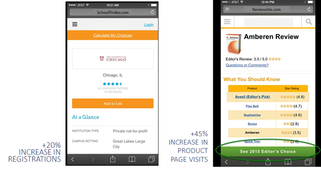
The site at left enjoyed a 20% increase in registrations from a sticky header. The site at right saw a 45% from top and bottom stickies.
Since we found that these parachutes work well as top “stickies” and bottom “stickies, we wondered if we could do both. Our original thought was that it took up too much screen real estate, that it was too much to keep in front of the visitor. However, we found that in most cases you can have both and they’re very complimentary to one another.
We recommend testing to find the right call to action first, and then testing a persistent, or “sticky” call to action.
So why do we call it a parachute?
We call it a parachute because we know that mobile visitors will scroll much farther down a page and much faster than desktop visitors. This is an interesting fact: Mobile visitors are more likely to see all of the content on your page than a desktop user, especially if you have a lot of content and it’s a long page. You can see this in your own scroll maps and in session recordings.
The problem is that they do it fast and they sometimes get lost. Having a parachute someplace for the them to parachute out of this purgatory they’ve gotten themselves into is proving to be very helpful.
Check Your Tel-Links
The Safari mobile browser doesn’t necessarily do a fantastic job of identifying phone numbers and turning them into click-to-call, or tel-links.
Anywhere where you have a phone number on your site, make sure you’ve explicitly written the tel-link around that phone number.
In the example above, we found this site didn’t have click-to-call. We tested adding the tel-link functionality explicitly, and we saw a 20% increase just in clicks to call. It makes sense. You’re on your mobile device. You don’t have to put it down, write the number down, and then type it in.
There are phones built into these mobile devices, aren’t there?
3. Footer Content
This issue dovetails in with what we were just saying about how far a mobile visitor will scroll.
Mobile visitors are much more likely to see the footer of your site. They bounce on the bottom after fast scrolling. On the desktop the footer of the site is this graveyard of crap that we throw into the bottom. It’s the detritus of the site. It usually includes the privacy policy and some legalese, things that are not really going to compel anybody to take action.
Yet, the visitors that scroll to the bottom of your page may be very interested. What are you telling them? “Copyright 2015?” This is not really a deal closer.
We saw on our scroll map reports that about 50% of mobile visitors reach the bottom of these pages. Page footer are rarely inspiring.
“You’re here. Desktop version. Back to top. Copyright.”
Why not do something a little bit more compelling? We changed this to reiterate the value proposition. Why should someone call, and how we can this company help?
We saw about an 8% increase in calls with this very simple change.
The Footer on Mobile is not a Graveyard
We’ll take 8% lifts all day and night.
Mobile will make up between 40% and 60% of almost anybody’s traffic at this point in time. We see some outliers, but more or less that’s the range. So let’s just say it’s 50%.
An 8% increase on mobile is a 4% increase on your entire business. There’s not many things that you can do to magically get a 4% increase for your entire business. This is an example of one of those things you can do.
It’s the beauty of conversion optimization. It’s a huge lever to grow your business. Something as simple as making an offer in the footer to reiterate your value proposition can have a meaningful impact on your business.
Get people to take action once they get to the bottom of that page.
[mobile-web-20]
4. Optimize for the Right Goals
What mobile goals are you optimizing for? Are they the right ones?
Conversion for your mobile visitors should look different than conversion for your desktop visitors. One of the ways to really leverage the growth in mobile is to understand and accept that.
One of our clients, eSigns.com, allows visitors to design vinyl banners and other signs for their event, yard, etc. It’s a phenomenal tool and a great site. Unfortunately, it is Flash-based tool, and it doesn’t work on iOS or Android devices. Even if it did work, visitors are less likely to design a banner or a sign on their small-screen mobile device.
Essentially we had this mobile dead end. Mobile traffic simply could not convert. eSigns had become resigned to ignoring their mobile traffic.
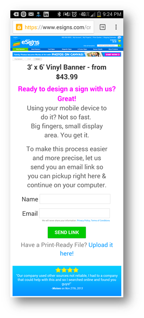
But we said, “What could we do with this traffic?” We chose to focus on getting email addresses instead.
We shifted our objective.
Instead of saying, “We need to get more conversions and more immediate revenue out of mobile visitors,” we said, “Let’s just focus on getting your email address”. We could tell from upstream indicators that these people are really just kicking tires.
Remember, we’re addressing a consideration set. We decided to do something to remain in their consideration set. Ask them to give us their name and email address. In return, we offered to email them a link to this page so they can come back to it later, on their desktop, when they are ready to do the design.
The results are that 5.3% of the visitors gave us their name and email address. Not bad, especially for an unoptimized experience. Each person who completed this form received an email with a link to that page, and the link was specially coded so we could track it and track those visitors.
Of those who got our email, we found that 26% of the recipients of this email clicked back to the site. Now this didn’t really result in an immediate boost in revenue from those clicks, but it lit a fire under their email list growth rate. They gathered almost 1,400 new email addresses in the first month of this test.
This is a business like many of your businesses that ultimately live and die by their email list. Building your email list gives you control over your own destiny. The marginal cost of delivery is almost zero. Not just for every single recipient of your email, but for every email. It’s so cheap to create new customers and satisfy repeat customers.
To get an idea of just how valuable these new email addresses were, we calculated the value of every recipient of eSign’s emails. We’re fond of a metric whenever we’re evaluating an email called revenue per recipient (RPR).
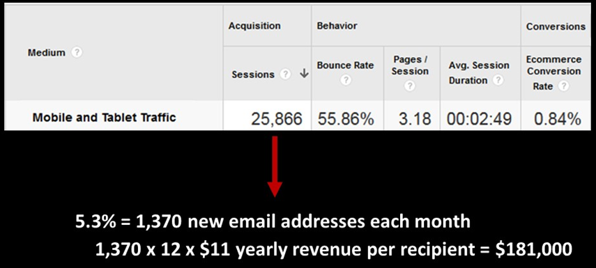
Collecting emails from the mobile deadend delivered an estimated $200,000 in additional annual revenue.
For eSigns, we calculated that the average annual revenue per recipient to be $11. With an average of 1,400 new email addresses per month, we’re generating almost $200,000 in additional annual income. Instead of ignoring mobile traffic, we took a longer-term approach by getting their email address, and using email to convert them.
Take a hard look at what your mobile visitors will be willing to do to begin a conversation with you.
Do This Now
These are our main premises. We hope you agree.
- That mobile is a one of the fastest growing channels for your online business.
- That mobile doesn’t have to convert at levels lower than desktop.
- That mobile visitors want and need a unique mobile experience.
- That there are no best practices and that you should test.
If you buy into our beliefs, these are the things you should try right now on your mobile traffic.
- Optimize your header and determine if a sticky or non-sticky header works better.
- Start testing those persistent calls to action – those parachutes. Test placement, test color, test language, and test the page you’re sending them to.
- Take a hard look at the footer content on your mobile device right now and ask yourself, “If this is the last thing that someone sees on this page, am I compelling them to take action?” If the answer is no, the next question is, “What could we do here to compel them to take action?”
- Ask yourself, “Are we optimizing for the right goals on mobile? Do we really believe that doing X and Y is what we want people to do on our desktop site. Is the best use of our optimization efforts on mobile?” Then test some alternative goals.
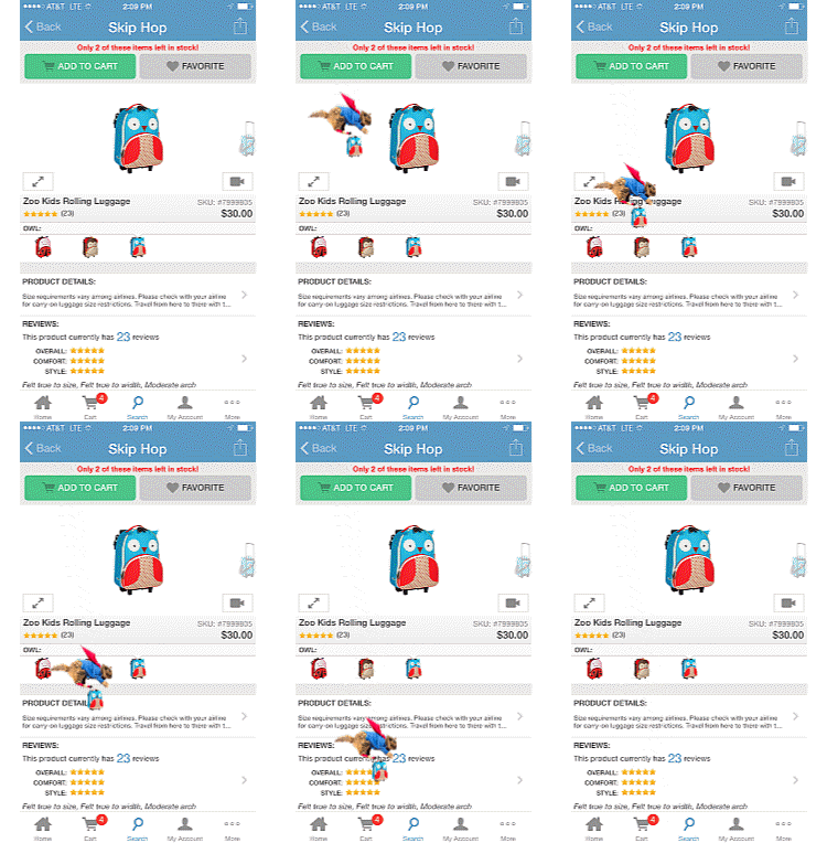
Once you’ve nailed your mobile experience, you can start having fun with your mobile site, like this add-to-cart animation.



Trackbacks & Pingbacks
[…] be your goal. Sometimes conversions aren’t possible with mobile. Brian Massey & the team at Conversion Sciences understood this and ran a brilliant […]
[…] Source https://conversionsciences.com/blog/mobile-ab-testing-guide-for-the-mobile-web/?utm_medium=feed&u… […]
Comments are closed.