infographics

A well-crafted landing page is one of the most powerful tools in digital marketing, capable of turning casual visitors into loyal customers. But if you’ve ever created a landing page, you know how much strategic planning and execution they require. 

At Conversion Sciences, after years of perfecting the art and science of landing page optimization, we’ve identified six essential elements that can transform an ordinary landing page into a high-performing asset. This guide will explore these elements in detail, share actionable tips, and provide real-world insights to help you master landing page optimization.

What Makes a Successful Landing Page?

Landing pages are stand-alone web pages designed to perform two jobs:

  1. Keep the promise made in the ad, email, social post, or link that preceded the page.
  2. Ask your visitor to do something, like filling out a form, downloading a resource, or purchasing. 

Unlike homepages, which serve multiple purposes, landing pages focus on a single goal. This specificity makes them one of your most effective tools for converting visitors into leads or customers.

Need some inspiration? Browse our Lead Generation Landing Page Examples.

No time to learn it all on your own? Check out our turn-key Conversion Rate Optimization Services and book a consultation to see how we can help you.

The Benefits of Well-Optimized Landing Pages

We’ve seen the difference even small improvements in landing page performance can make. Here are three of the top outcomes you’ll experience when your landing pages are doing their job.

1. Maximize ROI

Most web pages don’t convert — they’re not designed to. But landing pages are designed to convert. They outperform popups, signup boxes, and wheels of fortune for opt-ins, with a 23% conversion rate.

landing page performance compared to popups, signup boxes, and wheels of fortune

Landing pages outperform other lead generation tactics with a 23% conversion rate.

 Across all industries, the average landing page conversion rate is 2.35%, according to Wordstream. But the top 10% of landing pages achieve conversion rates of 11.45% or higher, depending on the landing page type.

Landing Page Conversion Rate Benchmarks

Benchmarks for landing page conversion rates vary widely by industry, but these are the averages.

2. Simplify Decision-Making

The human brain craves simplicity, especially when faced with choices. High-converting landing pages capitalize on this by reducing cognitive load. They use clear calls-to-action (CTAs), concise copy, and a streamlined design to guide visitors toward a single desired outcome.

Imagine landing on a page that bombards you with navigation menus, multiple CTAs, and walls of text. It’s overwhelming, right? Now compare that to a page with a single, bold CTA — like “Sign Up Now” — and enough information to convince you to act. This simple page removes distractions, making it easier for visitors to decide.

You can thank Hick’s Law for this insight. It tells us that the more choices you offer, the longer it takes for someone to make a decision. And it explains why a simplified landing pages can move visitors quickly down the conversion funnel. 

💡 In one of our projects, simplifying the layout of an eCommerce landing page led to a 15% reduction in bounce rates and a corresponding increase in sales.

3. Enhance Engagement

Grabbing and holding a visitor’s attention is no small feat. High-converting landing pages achieve this by delivering tailored content that speaks directly to the visitor’s needs and interests.

Take, for instance, an online retailer promoting a seasonal sale. A landing page promoting winter apparel with targeted messaging — like “Stay Warm and Save Big This Winter” — is far more engaging than a generic sales page. Add to that personalized content, such as product recommendations based on browsing history, and the page becomes a magnet for conversions.

Engagement isn’t just about content, though. The design and user experience play crucial roles. Eye-tracking studies show that users focus on areas with clean layouts, contrasting colors, and compelling visuals. By optimizing these elements, you can create a page that captivates visitors and keeps them moving toward your goal.To increase engagement, design and the user experience are key. For example, when we improved UX/UI for Boingo, they saw a 2x increase in sales and a 38% lift in overall revenue.

Boingo landing page

Optimizing UX/UI gave Boingo a 2x increase in sales and a 38% life in overall revenue.

Creating a Successful Landing Page

It’s easy to obsess over landing page best practices: Is this the right font? Is the color theme too loud, not loud enough? Too many options? Not enough options? What is with this border?

But bottom line, a landing page is ultra-simple. It keeps a promise and entices visitors to take action. That’s it. So let’s break down the basic components of a landing page and what you need to think about for each.

1. A Compelling Offer

Your offer is the foundation of your landing page. It’s the “why” behind the action you want visitors to take. To make your offer irresistible:

  • Make it About Them: Focus on your visitor and what they want.
  • Address Pain Points: Let them know you understand their challenges.
  • Present a Solution: Give them a painless way to solve their problem.

A compelling offer is clear and compelling. At its most basic, it tells you what you’ll get if you take action. For example, a SaaS company might offer a free trial with messaging like, “Get 14 days of unlimited access—no credit card required.”

Look at how simply Netflix presents its offer:

  • What you want/get: Unlimited movies, TV shows, and more
  • Cost: “Starts at $6.99.”
  • Risk reduction: “Cancel anytime.”
Netflix landing page, which highlights an offer, cost, risk reduction, and optin form.

Netflix has a streamlined landing page that makes it easy to say yes.

2. A Simple Form

Forms are where conversions happen, but they can also be where visitors drop off. To increase form completion rates:

  • Keep It Minimal: Ask only for essential information. An email address is often enough to start a relationship.
  • Provide Context: Use microcopy to explain why you’re asking for certain details.
  • Use an “invitational” CTA on the button: “Get Started” creates less friction than a transactional CTA like “Buy Now.”

Pro Tip: Our clients have seen conversion rates increase by up to 40% after reducing their forms from six fields to three. The more form fields your visitor has to fill out, the more friction they feel, and the less likely they are to convert. 

If in doubt, look at Google’s homepage:

Google's plain, white landing page

Google’s landing page is ultra simple with no friction

The offer is implied: search for anything. The form has just one field. And its buttons, “Google Search” and “I’m Feeling Lucky,” are invitational. 

This simple white page makes a complete landing page. But of course, for your landing pages, you’ll want a few more conversion elements, so let’s explore those elements and how they will help you create a successful landing page.

3. Persuasive Copy

Not all visitors arrive ready to convert. Even slight objections can prevent them from taking action. Clear, compelling copy answers objections, builds trust, and explains why taking action today is smarter than waiting.

Short, text-based descriptions of the landing page offer can make a difference. Keep in mind persuasive copy doesn’t focus on your business or even the product. Always talk about what’s in it for the visitor. 

  • Speak directly to their concerns: use empathetic language to acknowledge potential doubts.
  • Build confidence: highlight benefits with stats or testimonials.
  • Emphasize simplicity: reassure them that completing the action is quick and easy.

At Conversion Sciences, we’ve seen as much as a 42% lift in conversions after increasing a landing page’s persuasive power. (Here are some of our persuasive writing techniques.)

But persuasive copy isn’t your only option. Media can also make a difference. Studies have found that 9 out of 10 people want companies to create more videos, and 38.6% of marketers report that videos positively impact their conversion rate.

Whether you’re using text or video, try to create urgency so people take immediate action. Phrases like “Limited Time Offer” or “Only 5 Spots Left” can help — just make sure the urgency is real. If you’re selling a digital product, you can’t run out of inventory, but you can make your offer available only until midnight.

Quick Tip: Generic statements don’t drive action. To persuade, you need to be ultra-specific. Notice how the numbers in these examples draw the eye:

  • A fitness coach promoting a meal plan: “Discover the secret to losing 10 pounds in 30 days—no fad diets required.”
  • A trainer promoting an online course: “Join 11,377 professionals who’ve leveled up their careers with our training.”

4. Proof and Trust Elements

Trust is the linchpin of online conversions. Without it, even the most compelling offer can fail. To establish trust:

  • Leverage Social Proof: Add testimonials, case studies, or customer reviews.
  • Show Trust Badges: Highlight SSL certificates, security seals, or payment logos.
  • Use Recognizable Logos: Display well-known client or partner brands to boost credibility.

Example: After adding trust elements to an ecommerce client’s product pages and optimizing key elements of their value proposition, they saw an 18% lift in revenue per session, a 12% growth in customer acquisition rate, and a 6% increase in average order value. Proof and trust can significantly improve a landing page’s performance.

c

Galeton ecommerce landing page

This Galeton ecommerce landing page highlights quality ratings to prove the quality of their products and increase trust.

5. Relevant Images

Visuals aren’t just about aesthetics; they play a critical role in conveying value and enhancing understanding. Effective images:

  • Illustrate the Offer: Use screenshots, product photos, or mockups to make intangible offers feel tangible.
  • Enhance Emotional Appeal: Choose images that resonate with your audience’s aspirations or pain points.
  • Avoid Stock Clichés: Generic visuals can undermine trust and authenticity.

It doesn’t matter whether you sell a physical or digital product — an image makes it “real.” Rendering downloadable resources, like eBooks or white papers, as physical items in images helps users perceive them as tangible and valuable.

Example: Amy Porterfield presents screenshots from her online business courses on desktops, tablets, and phones. This quickly communicates the depth and accessibility of her training.

Amy Porterfield's landing page with a graphic of her course in different sized devices

Even if you sell a digital product, you must “make it real” with graphics

6. Clean and Focused Design

Design can make or break your landing page. A cluttered layout confuses visitors, while a clean design keeps them engaged. Key principles include:

  • Use Contrast for CTAs: Make your call-to-action button stand out with bold colors.
  • Optimize for Mobile: With over half of web traffic coming from mobile devices, responsive design is a must.
  • Reduce Distractions: Remove unnecessary navigation or external links that might lead visitors away.

Pro Tip: Even if you love your design, your visitors may not. Take Jaguar’s logo redesign.

Jaguar's 2024 logo redesign

Jaguar’s new logo met with resistance from their loyal fans

As it enters “The New Era” of electric cars, Jaguar felt a redesign was in order. Many consumers disagree. LinkedIn posts call it a “car crash” and “downgrade branding” and predict harm to their brand:

Most landing pages don’t get the backlash Jaguar’s rebrand got, but it’s a good illustration of why we design pages for our visitors, not our own preferences.

To understand what visitors like (and don’t like), our Conversion Scientists® use heatmaps and user testing tools like Hotjar. If people avoid any part of the page, there’s likely something wrong with the layout or design, and these tools tell them where they can refine the landing page design to improve conversions. 

Why guess when you can know? CRO tools provide the insights and data you need to make smart optimization decisions. 

Here’s our scientific breakdown of these elements:

Here are the steps you can take to create a controlled Landing Page reaction in your digital laboratory.

The Chemistry of a Successful Landing Page Infographic

Please include attribution to our website with this graphic.

Landing Page Best Practices: Expert Tips for Landing Page Mastery

Creating a landing page that converts is only the first step. To maximize results, you need to continually refine and optimize every aspect of the page. This second half of the article dives deeper into the strategies and tools used by top marketers to fine-tune their landing pages for peak performance.

Optimization requires regular testing, data analysis, and a willingness to iterate based on user behavior and industry trends. The difference between a good landing page and a great one often lies in the details — small adjustments that have a disproportionate impact on conversions. From mastering A/B testing to understanding how different metrics influence your strategy, this section equips you with the knowledge and tools to take your landing pages to the next level.

Note: A/B testing isn’t always the most appropriate CRO technique. Listen in as our Scientists discuss the different types of CRO for different needs.

Landing Pages for Different Goals

Not all landing pages are created equal. Tailoring your approach to specific objectives can enhance performance:

  • Lead Generation: Offer a clear value exchange, like an eBook or webinar for minimal information.
  • eCommerce: Showcase product images, highlight key features, and include trust signals like secure payment icons.
  • Affiliate Marketing: Focus on relevance and clarity to drive click-throughs and conversions.

Example: One of our clients in the SaaS space increased lead generation by 35% after optimizing their landing page with a simplified form and enhanced trust elements.

Metrics That Matter

Short description of six marketing metrics: impressions, clicks, visits, bounces, abandons, and conversions

To measure the success of your landing page, track these key performance indicators (KPIs):

  • Conversion Rate: The percentage of visitors who complete the desired action.
  • Bounce Rate: The percentage of visitors who leave without taking action.
  • Time on Page: A higher duration indicates strong engagement.

We recommend using tools like Google Analytics, Optimizely, or Crazy Egg can help you monitor these metrics and identify areas for improvement.

Tools and Resources for Landing Page Success

Some basic tools that will help you optimize your landing pages are:

  • Unbounce: For creating and testing landing pages without coding.
  • Hotjar: To analyze user behavior with heatmaps and session recordings.
  • VWO: For A/B testing to see what resonates with your audience.

When you’re ready to up your conversion game, check out our list of 20 AB testing tools recommended by CRO pros.

Best Practices for Ongoing Optimization

Creating a successful landing page isn’t a one-time task. Continuous improvement is key. Here’s how to stay ahead:

  • Regular Testing: Use A/B testing to evaluate headlines, CTAs, and layouts.
  • User Feedback: Gather insights from surveys or heatmaps to understand user behavior.
  • Content Updates: Keep your page fresh by aligning it with current campaigns or trends.

We’ve seen the impact of incremental improvements on a landing page’s performance. But if you’re curious to know how it will improve your results, submit the Conversion Optimization Upside Calculator, and we’ll do the calculations for you. 

Final Thoughts: Creating a Landing Page That Converts

Creating a high-performing landing page doesn’t happen by chance — it requires strategy, testing, and attention to detail. By focusing on the six essential elements outlined above, you can craft simple landing pages that consistently deliver results.

If you’re ready to take your landing pages to the next level, let us help you. Level up your skills with our Conversion Rate Optimization Training. Or ask about our fully-managed CRO services.

Contact us today for a free consultation.

Experience a lift on your contact form conversion rate. Know what form of form you should have on your lead generation site. These best practices designed to increase contact form conversion will definitely help.

Contact forms are the most common way of beginning a conversation between a company and a prospect. In this article, we’ll show you how to get more prospects to fill out your form without reducing the quality of those leads.

What’s the big deal with forms? They have fields. You fill out the fields and you get something you want.

So, why do so many of your visitors fail to fill out your forms?

There is some psychology and some science to getting more form fills, whether you are trolling for leads or asking your visitors to buy something. The folks at SingleHop have done a study and it is exactly what we’ve seen in our testing of contact forms. You’ll learn a lot about increasing contact form conversion from this little infographic.

Contact Form Fields: How Many is Too Many?

As a general rule, the more fields you have, the lower your conversion rate. However, the leads you do acquire will be better qualified. The best way to find the right mix is to A/B test your contact forms.

Generally speaking and to increase contact form conversion, you should avoid:

  1. Fields that ask for qualifying information that can be found out on a phone call, such as purchase timeframe.
  2. Drop-down fields that may not contain an answer accessible to the visitor, such as title.
  3. Drop-down fields that imply something, such as number of employee ranges.
  4. “None of your business” fields, such as mobile phone, yearly revenue or social security number.

Best Practices to Increase Contact Form Conversion

While you may think your website is selling your product or service, what it’s really selling is a sales call. You must convince the visitor to complete your form.

There are four components that will help you achieve this.

Build Trust

You can build trust by including your phone number and contact information. Sometimes they will call you.

On a mobile device you should optimize for phone calls.

Provide Social Proof

Your contact page should present testimonials and endorsements to make visitors feel comfortable completing the contact form.

Add Value

Make sure you are building value. What’s in it for the visitor if they fill out the form?

  • Who will contact them? A salesperson? A consultant?
  • Will there be a hard sell?
  • How long will the call be?
  • What questions will be answered?

Sell the call to increase contact form conversions.

Use Risk Reversal

You can significantly remove barriers to completion by simply presenting your privacy policy on the form. While these are rarely read, they indicate that you care enough to have one.

Lead generation solutions that deliver. Contact us to generate more and better leads fast.

Get the Call to Action Right

On a contact form, the call to action usually lives on the contact form button. The call to action should communicate what will happen when it is clicked.

Studies indicate that using first person improves conversion rates. Test changing “your” to “my”.

For example “Download your free report” is second person. “Download my free report” is first person.

Experience a lift on your contact form conversion rate. Know exactly what form of form you should have on your lead generation site. Infographic.

Contact forms infographic.

The Best Lead Capture Forms

The best contact forms don’t assume the visitor wants to fill out the form. Only lonely people fill out such forms.

Instead, your form should give visitors a good reason to complete the form, and build trust with them and explain the value of completing the form.

This is an important step in their journey to solve a problem.

Treat it as such.


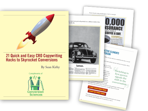
21 Quick and Easy CRO Copywriting Hacks to Skyrocket Conversions

21 Quick and Easy CRO Copywriting Hacks

Keep these proven copywriting hacks in mind to make your copy convert.

  • 43 Pages with Examples
  • Assumptive Phrasing
  • "We" vs. "You"
  • Pattern Interrupts
  • The Power of Three

"*" indicates required fields

This field is for validation purposes and should be left unchanged.


 All you ever wanted to know about performing website due diligence and how to not doo due diligence when buying sites.

I’m at the Ungagged Conference and enjoyed sitting in on a presentation by Bryan O’Neil of Flippa.com.

Are you looking for a Website, or a Web Business?

— Bryan O’neil, Flippa.com

Website Due Diligence Issues to Consider

When considering investing in a web business, consider the following.

  • Traffic source: Is it dependent on free search?
  • Proft
  • On-going development: Does it require additional investment?
  • Dependence on Third-party API’s: Facebook, Twitter and others can change access to data at any time.

There are other considerations for website due diligence as well.

Calculate Revenue per Visit

The Revenue per Visit (RPV) is the revenue generated by a site divided by the number of visitors. If this number is small, you may have trouble building traffic, because the cost of the traffic is higher than the revenue.

For a better analysis, consider measuring Profit per Visit.

Avoid Traffic Arbitrage

If the site is not something you would use, you might have a business built on traffic arbitrage. Arbitrage is acquiring traffic, and then sending it advertisers or affiliates for more than you paid.

This is not a web business.

Does the Website have a Future?

Sites with a limited future are not a good long-term investment. When performing website due diligence, be careful of sites that are at the mercy of time or other businesses.

Websites that focus on a single event have a built in expiration date.

Sites that fix something in someone else’s product can be eliminated by upgrades to that product.

Sites tat provide a product that is simply “better” than the competition can be marketed out of existence

Websites that depend on loopholes should be avoided, as loopholes can be closed.

Avoid trying to figure things out after you buy.

— Bryan O’neil, Flippa.com

Website Due Diligence: 7 Business Buying Myths

O’Neil offer seven myths about buying a business that you should avoid.

Myth #1: The site’s backlink profile is important

Dependence on organic traffic is dangerous.

Myth #2: Financial verification is most important

Businesses with good financial verification can fail if they don’t have a future.

Myth #3: Escrow can save you from a bad decision.

Escrow is where you give money to a third party during a period of inspection and verification.

Do your due diligence before you enter escrow. Don’t make yourself a target for scammers.

Entering escrow also tie up your capital, limiting your options.

Myth #4: Website due diligence is just too expensive.

Due diligence is expensive, especially if done by a third party.

But, when you compare it to the purchase price, it can be quite affordable.

Calculate your Website Due Diligence Percent:

DDP = Cost of Due Diligence / Purchase Price of Website.

Myth #5: Screen shots are viable proof of financial performance.

Business owners can forge screen shots showing success. This is a sign of a scammer.

Make the seller jump through hoops.

— Bryan O’neil, Flippa.com

Myth #6: Your broker can do due diligence.

Avoid any broker that claims they have done due diligence for you.

Brokers work for the SELLER.

Myth #7: You can rely on apps to do your website due diligence.

Nope. You need the human element in the process.

Due Diligence when Buying Websites by Bryan O’neil of Flippa.com

Here is my instagraph infographic of his presentation on due diligence mistakes when buying Websites.

Avoid Doo Due Diligence When Buying Websites - All About Website Due Diligence: Advice from Flippa.com

Due Diligence when Buying Websites by Bryan O’Niel


21 Quick and Easy CRO Copywriting Hacks to Skyrocket Conversions

21 Quick and Easy CRO Copywriting Hacks

Keep these proven copywriting hacks in mind to make your copy convert.

  • 43 Pages with Examples
  • Assumptive Phrasing
  • "We" vs. "You"
  • Pattern Interrupts
  • The Power of Three

"*" indicates required fields

This field is for validation purposes and should be left unchanged.


If your website has a glorious design and drives huge traffic but you’re still not getting enough leads, you need to get serious about conversion rate optimization and these 46 conversion rate optimization hacks will help you get there.
Conversion rate optimization is a systematic process of increasing the percentage of your website’s visitors that take the desired action on a certain page. This includes optimizing the landing pages and the website overall, using real-time analytics, tested design, and psychological elements, in order to turn your website visitors into customers.
Don’t make a rookie mistake! Not every one of these “hacks” will work for your website.

How to  Apply Conversion Rate Optimization Hacks

There is a very defined process for applying conversion optimization hacks. It goes something like this.

List Relevant Conversion Rate Optimization Hacks

List all of the hacks below that apply to your website. I recommend downloading the Conversion Sciences Hypothesis List Spreadsheet.
Toss out the ones that you’ve already tried or tested (delete them from your spreadsheet).

Do Your First Ranking of Conversion Optimization Hypotheses

Rate each of the remaining ones by level of effort (LOE), expected impact, and traffic affected. Our spreadsheet will calculate a weight for each idea.
Those that lie at the top of your list are ready to be researched.

Fix the Conversion Optimization Hacks that are Broken

Is it clear that some of these conversion rate optimization hacks needs immediate attention?
For example Hack 1: Increase Your Page Speed may be near the top of the list. It can have a high impact (based on other studies), and it affects all traffic.
To collect more data, you could look at your bounce rate. A high bounce rate may indicate a slow website, especially on mobile. You could also visit WebPageTest.org and get a grade on your page speed.
If the data says your site is slow, this would be a hack worth fixing. It will have a high value for “proof” in the spreadsheet.
If the data says your site is loading quickly, then you have low evidence and this idea may drop to the bottom of the ranking. Move on.
Other candidates for “just fix it” include

  • Technical problems on any page
  • Bad layouts due to responsive web design
  • #8 Remove CAPTCHA from forms. Don’t has your customers to manage your spam problem.
  • #16 Let Customers Checkout as Guests
  • #21 and #24 Reduce Form Fields

Research Your Top Conversion Rate Optimization Hacks

Find ways to research each of the hacks that are at the top of your list.
For example, if hack #16: Let Customers Checkout as Guests is high on your list, you could look at analytics to see if the “Login or Create an Account” page is a big source of abandonment. If it is, it gets more proof points.  If not, maybe it isn’t a problem.
You would also implement an exit-intent popup for this “Login or Create an Account” that asked, “What kept you from buying today?” If lots of visitors admit that they didn’t want to create an account, this idea would get more proof points.

AB Test the Most Promising Ones

The most promising ideas that don’t fall into the “fix it” category get an AB test. This will tell you which conversion rate optimization hacks will improve the site and by how much. It is the best data you can collect.
Have a look at Website Builder’s  “46 Conversion Rate Optimization Hacks” infographic below and for a list of effective hacks for increasing your conversion rates.

46 Conversion Rate Optimization Hacks

About the Author

Josh Wardini - 46 Conversion Rate Optimization Hacks

Josh Wardini, Editorial Contributor and Community Manager at websitebuilder.org. With a preliminary background in communication and expertise in community development, Josh works day-to-day to reshape the human resource management of digitally based companies.

Do online reviews really matter, and do they make a difference to your business? The answer is yes, they absolutely do.
Consumers increasingly use reviews left by other consumers as part of their pre-purchase research efforts, and a bad review can have serious effects on your sales.

Herd shopping psychology plays an ever effect on consumers’ behavior online. Groupon is a wonderful example of that, with deals kicking in only if a certain amount of people pay for them. Research shows that the more people have already opted in on a deal, the likelier it is new visitors will commit to it.

User reviews are not so far removed from this phenomenon.

Over 80% of people said that positive reviews would encourage them to purchase a product. The same number of people changed their minds about purchasing after reading as little as one or two negative reviews.

Fake & Negative Reviews

Unfortunately, fake reviews exist, and they exist in a massive abundance. Competitors have been known to leave bad reviews on products posing as disgruntled customers, That is why more needs to be done to help consumers identify a fake review.

You are bound to get a negative review at some point during your business career. That’s simply the reality and nature of the world. It can be devastating for a business, but most people recognize that everyone makes mistakes. A couple of bad reviews aren’t going to put the nail in your coffin and close your business down.

Here are just some of the facts why online reviews are not to be ignored:

  • 68% of millennials trust online reviews, with positive ones producing an 18% average uplift in sales
  • Consumer reviews are more trusted than descriptions that come from other manufacturers, nearly 12 times more.
  • 90% of consumers read less than 10 reviews before forming an opinion about a business which means these decisions being made are made quickly, without much hesitation.
  • The top five industries to be affected negatively by online reviews are restaurants, hotels, doctor’s offices, hospitals and hair salons.

Negative reviews aren’t all bad; these have been known to create a buzz around your business and increase its exposure, unlike fake reviews that have been so outlandishly obviously fake and ridiculous that they go viral.
Want to learn more about how online reviews can make or break your business? Check out our infographic.

User Reviews are the King

User Reviews are the King

About the Author

Josh Wardini, Editorial Contributor and Community Manager at websitebuilder.org. With a preliminary background in communication and expertise in community development, Josh works day-to-day to reshape the human resource management of digitally based companies.

With a limited amount of money in your marketing budget, spend it on things which are going to give you the best return on investment. These email marketing facts tell you why email remains a great way to spend your money.

Unfortunately, many people wrongly think that this type of marketing is dead. The amount of emails I get in my inbox each day says otherwise. Here are some facts about email marketing to prove my point:

  1. 205 billion emails are sent each day. This is expected to rise to 246 billion by the end of 2019.
  2. Email is still one of the most widely used methods of communication despite the wide range of platforms and apps available.
  3. Although Facebook is an important tool for marketing, email marketing is the most direct and personal way to reach and interact with your target audience. People are more likely to sign up for your email list than they are to interact with you on Facebook. In fact, companies still employ third-party email marketing services to assist them with this aspect of eCommerce.
  4. Your customers want updates. Don’t just settle for one sale per customer, you want multiple sales. Your customers want to hear from you and want email updates about your brand. Don’t let them forget about you, give them what they want!
  5. Emails have a larger ROI. For every $1 spent on email marketing, an average $38 is returned – this is very important if you have a limited budget.
Want to learn more about email marketing? Check out our infographic below.

Email Marketing Facts

Email Marketing Facts

Mobile ecommerce is transforming online shopping, especially during the holidays. Here are some eye-opening statistics in an infographic.

Most businesses are giving away their mobile visitors. Either they don’t provide a mobile-friendly experience or they have a responsive site that doesn’t give mobile visitors anything different.
This is an opportunity for you. Mobile visitors will be one of your fastest-growing segments. However, the mobile experience is unique and mobile visitors want something designed for their on-the-go, thumb-driven searching and buying. Those businesses that deliver a special mobile experience for their visitors will steal many holiday shoppers this year, and more next year.
If you are on the fence about adopting a mobile app as part of your marketing strategy, take a look at what mobile commerce will mean to businesses this holiday season.
Bizapps Holiday Infographic

1
92% of Consumers Shop with Smart Phones

With 9 out of 10 Americans owning a smartphone, it’s understandable that 92% of consumers will search for holiday gifts using their phones. Mobile ecommerce is here, and it’s here to stay.
People nowadays have to cope with busy, crazy lives and they search for ways to save time. How often do you hear people stressed about Christmas shopping? Mobile apps give consumers opportunities to simplify their lives, and the number of active mobile shoppers taking advantage of that simplicity continues to grow.

2
Time on Mobile Increases During the Holidays

November and December are the best months for retailers to increase their mobile revenue streams. These two months see more sales than other months, and 47% of customers prefer using a mobile app for shopping during this time of year. In fact, for the first time in history, smartphones and tablets have higher online penetration than desktop computers.

3
Mobile Generates Revenue

This year, Black Friday ecommerce sales hit $3.34 Billion, with mobile sales topping the billion dollar mark for the first time in history. Consumers spent an incredible $1.2 Billion via their mobile devices, a 33% increase from 2015.
Surprisingly, despite this continued growth in mobile commerce, 98% of companies still lack a mobile app designed for expedited customer shopping.

4
Mobile Apps Can Influence Every Part of the Sales Funnel

Small retailers often underestimate the importance of mobile apps—especially during the holidays. They certainly make shopping much simpler, but the benefits that they offer regarding affordable marketing and customer engagement cannot be overlooked either.
To put it simply, 71% of online shoppers prefer searching for products in retail stores using their app. Creating a pleasant shopping experience is important for businesses of all sizes. Think about your shopping habits. You are not the only consumer who searches for products online before later purchasing them. Everyone wants to save money, and mobile apps are a great way to make sure you are getting the best deal out there this holiday season.

Conclusion

If there is any time of year where businesses can’t afford to ignore mobile commerce, it’s the holiday season. As the trends continue to shift toward mobile, you cannot afford to overlook its potential.
If your mobile sales are under-performing, contact Conversion Sciences for a free consultation, or if you don’t have a mobile app, come check us out at Bizness Apps. Check this out if you need last minute holiday marketing ideas for ecommerce.

andrew-gazdeckiAndrew Gazdecki is the founder and CEO of Bizness Apps — making mobile apps affordable and simple for small businesses. We’re a do-it-yourself iPhone, iPad, Android & HTML5 app platform that allows any small business to simultaneously create, edit, and manage mobile apps without any programming knowledge needed. 
The law of unintended consequences states that every human endeavor will generate some result that was not, nor could have been foreseen. The law applies to hypothesis testing as well.

In fact, Brian Cugelman introduced me to an entire spectrum of outcomes that is helpful when evaluating AB testing results. Brian was talking about unleashing chemicals in the brain, and I’m applying his model to AB testing results. See my complete notes on his Conversion XL Live presentation below.

Understanding the AB Testing Results Map

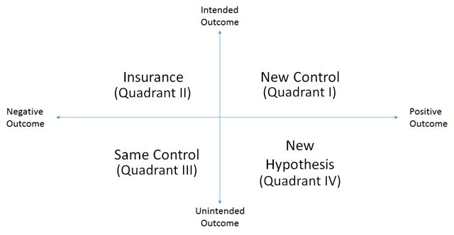
In any test we conduct, we are trying everything we can to drive to a desired outcome. Unfortunately, we don’t always achieve the outcomes we want or intend. For any test, our results lie on one of two spectrums defining four general quadrants.

Map of possible outcomes from hypotheses 

Map of possible outcomes from hypotheses.

On one axis we ask, “Was the outcome as we intended, or was there unintended result?” On the other axis we ask, “Was it a negative or positive outcome?”

While most of our testing seeks to achieve the quadrant defined by positive, intended outcomes, each of these quadrants gives us an opportunity to move our conversion optimization program a step forward.

I. Pop the Champaign, We’ve Got a New Control

With every test, we seek to “beat” the existing control, the page or experience that is currently performing the best of all treatments we’ve tried. When our intended outcome is a positive outcome, everyone is all smiles and dancing. It’s the most fun we have in this job.

In general, we want our test outcomes to fall into this quadrant (quadrant I), but not exclusively. There is much to be learned from the other three quadrants.

II. Testing to Lose

Under what circumstances would we actually run an AB test intending to see a negative outcome? That is the question of Quadrant II. A great example of this is adding “Captcha” to a form.

CAPTCHA is an acronym for “Completely Automated Public Turing test to tell Computers and Humans Apart”. We believe it should be called, “Get Our Prospects to Do Our Spam Management For Us”, or “GOPDOSMFU”. Businesses don’t like to get spam. It clogs their prospect inboxes, wastes the time of sales people and clouds their analytics.

However, we don’t believe that the answer is to make our potential customers take an IQ test before submitting a form.

These tools inevitably reduce form completion rates, and not just for spam bots.

CAPTCHAS make sure you are not a spam robot

CAPTCHAs reduce spam, but at what cost?

CAPTCHAs reduce spam, but at what cost?

So, if a business wants to add Captcha to a form, we recommend understanding the hidden costs of doing so. We’ll design a test with and without the Captcha, fully expecting a negative outcome. The goal is to understand how big the negative impact is. Usually, it’s too big.

In other situations, a design feature that is brand oriented may be proposed. Often a design decision that enhances the company brand will have a negative impact on conversion and revenue. Nonetheless, we will test to see how big the negative impact is. If it’s reasonable, then the loss of revenue is seen as a marketing expense. In other words, we expect the loss of short-term revenue to offset long term revenue from a stronger brand message.

These tests are like insurance policies. We do them to understand the cost of decisions that fall outside of our narrow focus on website results. The question is not, “Is the outcome negative?” The question is, “How negative is the outcome?”

III. Losers Rule Statistically

Linus Pauling once said, “You can’t have good ideas without having lots of ideas.” What is implied in this statement is that most ideas are crap. Just because we call them test hypotheses doesn’t mean that they are any more valuable than rolls of the dice.

When we start a conversion optimization process, we generate a lot of ideas. Since we’re brilliant, experienced, and wear lab coats, we brag that only half of these ideas will be losers for any client. Fully half won’t increase the performance of the site, and many will make things worse.

Most of these fall into the quadrant of unintended negative outcomes. The control has won. Record what we learned and move on.

There is a lot to be learned from failed tests. Note that we call them “inconclusive” tests as this sounds better than “failed”.

If the losing treatment reduced conversion and revenue, then you learn something about what your visitors don’t like.

Just like a successful test, you must ask the question, “Why?”.

Why didn’t they like our new background video? Was it offensive? Did it load too slowly? Did it distract them from our message?

Take a moment and ask, “Why,” even when your control wins.

IV. That Wasn’t Expected, But We’ll Take the Credit

Automatic.com was seeking a very specific outcome when we designed a new home page for them: more sales of the adapter and app that connects a smartphone to the car’s electronic brain. The redesign did achieve that goal. However, there was another unintended result. There was an increase in the number of people buying multiple adapters rather than just one.

We weren’t testing to increase average order value in this case. It happened nonetheless. We might have missed it if we didn’t instinctively calculate average order value when looking at the data. Other unintended consequences may be harder to find.

This outcome usually spawns new hypotheses. What was it about our new home page design that made more buyers decide to get an adapter for all of their cars? Did we discover a new segment, the segment of visitors that have more than one car?

These questions all beg for more research and quite possibly more testing.

When Outcomes are Mixed

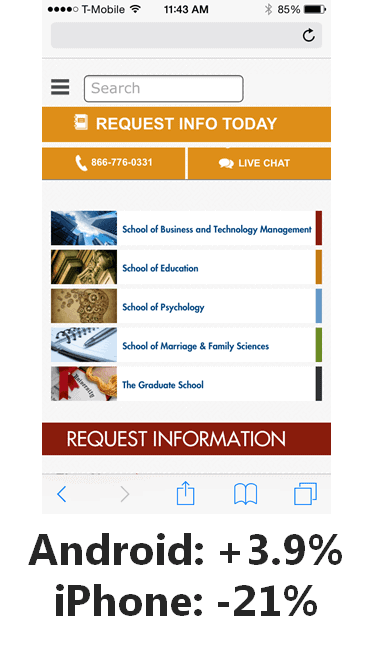
There is rarely one answer for any test we perform. Because we have to create statistically valid sample sizes, we throw together some very different groups of visitors. For example, we regularly see a difference in conversion rates between visitors using the Safari browser and those using Firefox. On mobile, we see different results when we look only at visitors coming on an Android than when we look at those using Apple’s iOS.

3.9% more Android users converted with this design, while 21% fewer iPhone users converted.

Android users liked this test but iPhone users really did not.

In short, you need to spend some time looking at your test results to ensure that you don’t have offsetting outcomes.

The Motivational Chemistry and the Science of Persuasion

Here are my notes from Brian Cugelman’s presentation that inspired this approach to AB testing results. He deals a lot with the science of persuasion.

My favorite conclusions are:

“You will get more mileage from ANTICIPATION than from actual rewards.”

“Flattery will get you everywhere.”

I hope this infographic generates some dopamine for you, and your new found intelligence will produce seratonin during your next social engagement.

Motivational Chemistry infodoodle by Brian Cugelman at ConversionXL Live

Motivational Chemistry infodoodle by Brian Cugelman at ConversionXL Live


Here are six tips for getting your A/B testing right. These were captured at Affiliate Summit West 2016 and presented by Digital Marketer’s Justin Rondeau.

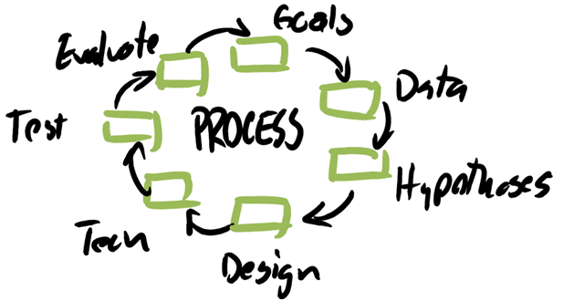
Focus on Process Not Hacks

Don’t just try what others  say works. Have a process that allows you to know your MARKET.

Your A/B Testing effort should focus on process.

Your A/B Testing effort should focus on process.

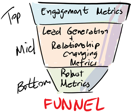
Measure Multiple Metrics that Matter

Measure the right metrics for the part of the funnel you’re testing

You'll track different kinds of A/B testing metrics depending on where your visitors are in the sales funnel.

You’ll track different kinds of metrics depending on where your visitors are in the sales funnel.

Use Analytics to Identify Problems

Don’t just test anything. Use analytics to identify problem pages.

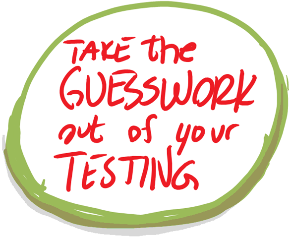
Take the Guesswork out of A/B Testing

Take the Guesswork out of Testing

Fix What’s Broken. Only Test What’s Ambiguous

If it’s broke, don’t bother testing it. Just fix it.

Test Persuasive and intuitive issues. Sometimes test Usability. Otherwise just fix the problem.

Test Persuasive and intuitive issues. Sometimes test Usability. Otherwise just fix the problem.

Schedule a Finite Time to Stop

Don’t expect your tests to just run until they’re successful or lose. Testing has an opportunity cost.

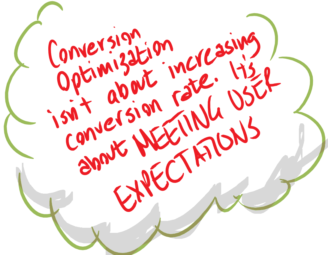
Conversion Optimization is about meeting user expectations.

Conversion Optimization is about meeting user expectations.


This instagraphic was captured live by Brian Massey of Conversion Sciences.
 
Applying Optimization Fundamentals Infodoodle-Justin Rondeau-Affiliate Summit West 2016 600x2288

Applying Optimization Fundamentals Infodoodle from Justin Rondeau’s Affiliate Summit West 2016 presentation.


It can often seem that conversion optimization conflicts with brand and image marketing. In some cases, this is true. A recent infographic from the New Jersey Institute of Technology’s Online Master in Business Administration program (NJIT) got us to thinking about the importance of branding to any conversion optimization effort.

How a Conversion Scientist Thinks of Brand-Building

For the purposes of conversion optimization, brand is critically important. If we’re talking about a landing page, a website, an email or an ad, brand can communicate some important information in the blink of an eye.

For us, brand is a container for trust, credibility and authority.
For us, brand is a container for trust, credibility and authority. Brand marketers will tell you to put the company logo and tag line on every communication. A Conversion Scientist uses brand symbols primarily to communicate authority and credibility.
A brand symbol is a hook on which brand experiences are hung. Conversion Sciences has benefited from its brand symbol — the lab coat — and we work diligently to hang positive brand experiences on this symbol when we write, teach, and speak. We give lab coats to our clients so they can associate our business-changing results with this important brand symbol.
Companies who have invested in brand recognition over decades and have protected their brand symbols have a significant advantage over less-known brands. These brand symbols communicate a complex set of impressions quickly.
From a budgeting standpoint, building brand is very expensive. It requires paying for millions of impressions with little expectation of short-term increases of revenue. It also takes time.
We believe that conversion optimization is a brand-building activity. Conversion-based brand building works on the assumption that there is no better brand experience than finding what you are looking for. As you improve the conversion rate and revenue per visit of your website, you are, by definition, giving your visitors better experiences. These experiences are associated with your brand symbols and build brand quickly and powerfully.

Brand Building in Digital Environments

Because conversion optimization relies on data, and since digital environments are data-rich, these digital environments are ideal for conversion-based brand building. Your investment in optimizing online properties is an investment in brand.
The infographic acknowledges that there are three moments in the buying process when companies come into contact with new and existing clients.

There are potential touchpoints with new and existing clients before, during, and after a purchase.

There are potential touchpoints with new and existing clients before, during, and after a purchase.


Each of these can be optimized to increase conversions and sales.


  1. Before purchase, using proper navigation, search and “affordances” to guide the visitor to their desired outcome.
  2.     

  3. During purchase ensuring that completing the transaction is intuitive and surprise-free.
  4.     

  5. After purchase optimization influences up-sells, repeat purchases, and enables sharing.

Be Careful with Consistency

The infographic tells us that “Consumers Expect Consistency” across channels and devices. This is a lie.

90 percent of customers expect their experience with a brand to be the same across every marketing channel

90% of customers expect their experience with a brand to be the same across every marketing channel


Consumers expect consistent quality of experiences and consistent use of brand symbols. However, our testing shows that they want very different experiences when they are in different contexts. Desktop visitors want a more intense experience with more choice and deeper information. Smartphone visitors want immediate access to solutions.
Quality experiences across devices become a consistent builder of brand value.

Optimizing Touchpoints

There are different kinds of people coming to each of your touchpoints. They are often the same person coming in different modes.
Search Engine Watch tells us that certain types of searches are more common on Bing than on Google – finance and automotive for instance. You probably already know that mobile iOS users behave differently than Android ones, but have you made the connection about how their searches differ?
Ninety-seven percent of Millennials touch at least two devices every 24 hours, and many of them interact with even more devices.

Millenials are multi-device creatures.

Millenials are multi-device creatures.


That’s a lot of opportunity for touchpoints just from search.

Social media platforms prime visitors in different ways meaning online experiences must be tailored to each. For example, Instagram is poised to be a better organic marketing option than Facebook for many companies.
Screen Shot 2015-11-25 at 9.58.22 PM
Customers expect to find you on all of the major social media platforms, but how much effort should you use in maintaining your presence? Our answer is to be only on those platforms for which you have the resources to optimize the experience. The default social experience may negatively impact your brand.
Each platform has a distinct purpose that should dictate how much time and money you must invest in it. Your most important task when you invest in new digital marketing is to go back to the original concept of branding, no matter how complicated contemporary marketing may seem. Your new and existing customers will know what to expect from you based on past experience, and today’s experience is tomorrow’s past experience.
Thanks to NJIT’s MBA program for sharing.
NJIT-MBA-Branding-Across-the-New-Digital-Environments-Infographic

Feature image by Hanna_Elise via Compfight cc and adapted for this post.

© Copyright 2007 - 2024 • Conversion Sciences • All Rights Reserved
Conversion Sciences® and Conversion Scientist® are
federally registered trademarks of Conversion Sciences LLC.
Any unauthorized use is expressly prohibited.