
Better, Stronger Faster: How Better Landing Page Copy Increased Conversions By 42%
“Gentlemen, we can rebuild him. We have the technology….”
So goes the introduction to The Six-Million Dollar Man, a hugely popular show in the late 70s.
I always think of this line when it comes to optimizing copy, whether I’m working on entire websites, ebooks, or stand alone landing pages.
Unlike the bionic man, though, optimizing landing page copy isn’t about implants and augmentations. It’s about stripping everything down to its core to evaluate what works and what doesn’t.
Sometimes, you still get superhuman results with less, not more.
There are two things to keep in mind when writing persuasive copy:
- Copy dictates design.
- Clarity always wins.
I kept these two concepts in mind when I rewrote the main landing page for SolarPulse[1] last year.
The results? A 42% lift in conversions.
Here’s how I did it…
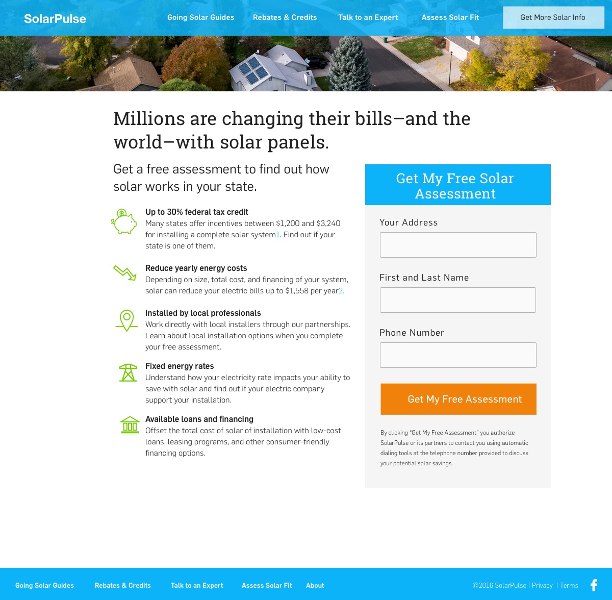
The Original, Underperforming Page
To begin, we needed to understand how people got here, why they were here, and what we needed to tell them.
The original version of SolarPulse’s main landing page (written by their engineers *shudder*) looked like this…
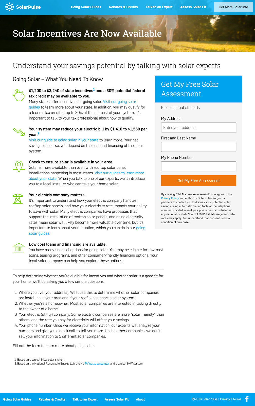
SolarPulse Landing Page Original
When I put myself in the shoes of a first time visitor, nothing on this page is particularly persuasive, eye-catching or moving. Keeping in mind that a writer IS NOT the ideal customer, I can go meta on the whole thing and start by evaluating my own reactions to the page.
- The first thing I notice is that it’s way too long. There’s too much copy to read, and it feels like work, so I want to bounce. This is never a good reaction.
- The second thing I notice is that I don’t know where to look. I’m drawn to the sign-up form, but I don’t even know what it’s for because I haven’t read the copy, so I skip it.
- The third thing I notice is that there are a lot of footnotes. That feels like legal stuff which makes me want to run.
- The fourth thing is that I like the icons. They can stay.
Ultimately, I’d leave this page to find a competitor’s page that requires less of me.
If I’m interested in solar and I want more information about how it benefits me (and, ultimately, how to make it happen), this page isn’t making life easy. I’m out.
Now, I know the problems. Next, I have to fix them…
With a project like this, the general framework of the page won’t change. The first thing I do is mock up the general elements of the page in a Google Doc by creating tables and pulling screenshots of the ones I want to keep.
Like this:
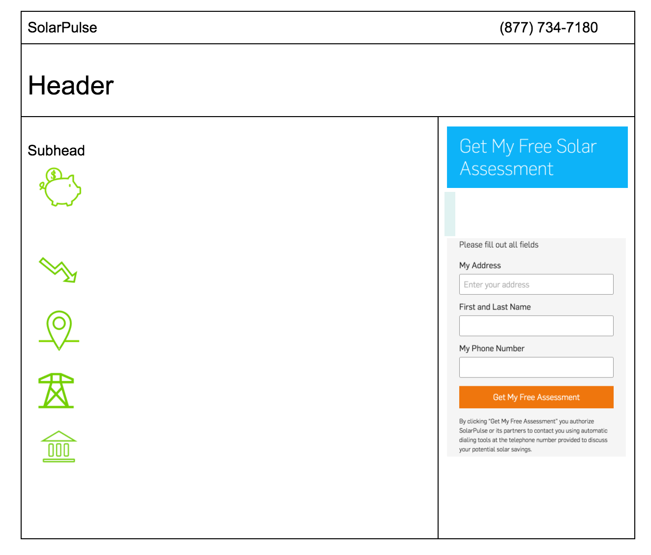
Page elements I definitely want to keep
From there, I focus on writing shorter, clearer, more impactful copy for each icon. That means I treat each section as if it’s one mini-project, with no regard to the rest of the page (for now). My goals here are two-fold:
- Lead with the most persuasive benefit available
- Provide a “quick hit” of information in the shortest, clearest way possible.
Each of these sections has to tell it’s own story while being informative. I treat each icon’s copy separately because someone may or may not go through all of them. I need each piece to carry its weight, regardless. I can’t control how much a visitor will read, but I can control how crisp each one is on it’s own.
The initial result is something like this:
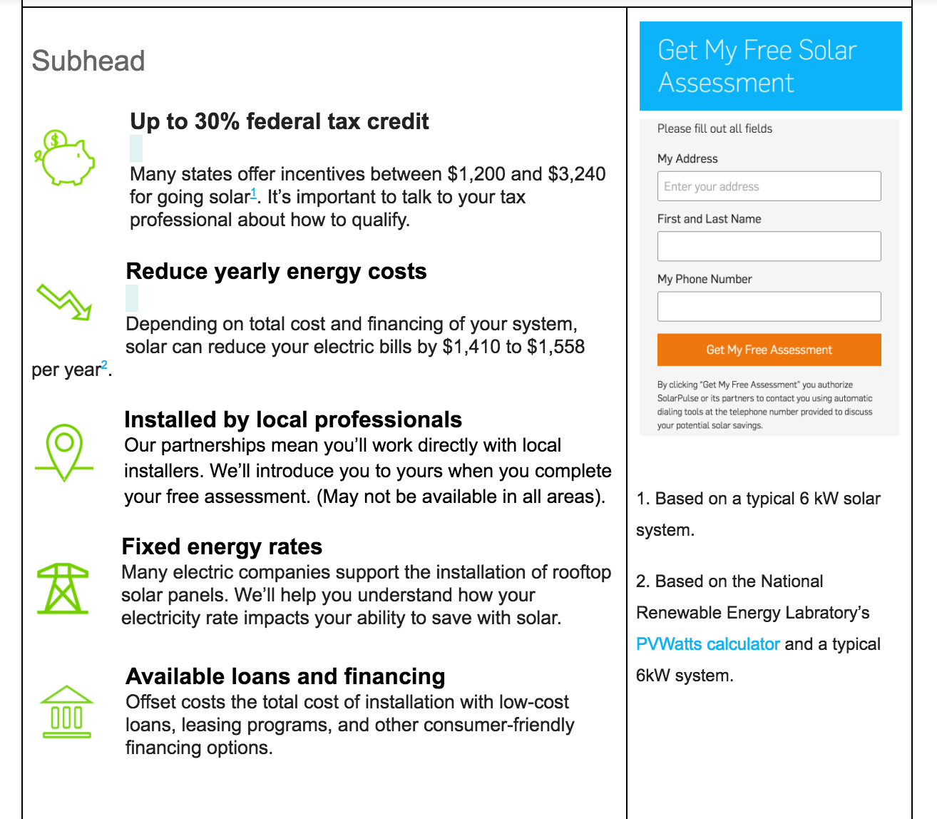
Concise copy makes information transfer easier for visitors
From there, I turn my attention to the lynchpin of the entire page…
The Heading and Subhead
At this point, you know good headings, subheads, and headlines are crucial to improving conversion rates (and A/B testing them is simple), but the actual process of creating the right ones can get messy.
Writing headings and subheads, for me, looks like this:
- Brain dump
- Refine
- Criticize
- Refine
- Refine
- Choose
Sometimes, subheads become headings. Sometimes, headings become subheadings. Sometimes, I chop one in half and add it to another. It becomes a puzzle. My job is to rearrange the pieces until it creates a picture.
Writing Headings
That said, everyone’s approach to writing headings and subheads is different. I prefer a stream of consciousness approach where I write as many ideas as I can for up to 30 minutes. I try to fill a blank piece of typing paper if I can (yes, I do this on paper).
Then, I cull the word-herd down to a handful of my best options.
From there, I get super critical and cut, cut, cut, while keeping in mind I have just a few seconds to get their attention, so benefits needs to be clear. The trick is to cut without losing meaning.
Writing Subheadings
If the heading is about the big idea (sometimes in the form of a question) of the entire page, then the subhead should answer the “what’s in it for me” question.
Since I already created rough versions of my bullet points next to my icons, I can answer this question easily.
What is this section about? Learning more about solar panels for my home. Boom. Subhead options for days. Just play around with the phrasing until you land on the right one.
Unscientific? For sure. Does it work? Absolutely.
Eventually, I end up with something that looks like this:
Playing with headline and subhead options
In the case of this particular project, I looped the designer and the project lead back into the copy so we could work on the heading and subhead messaging.
In addition to making minor design changes, we also incorporated a couple of keywords that were important to the SEO value of the project.
After a few rounds of back and forth, omitting, adding, clarifying, etc., the final version looked like this…
SolarPulse Landing Page Final
A Final Comparison: Better Landing Page Copy = +42%
As a refresher, here are the two pages, side by side.
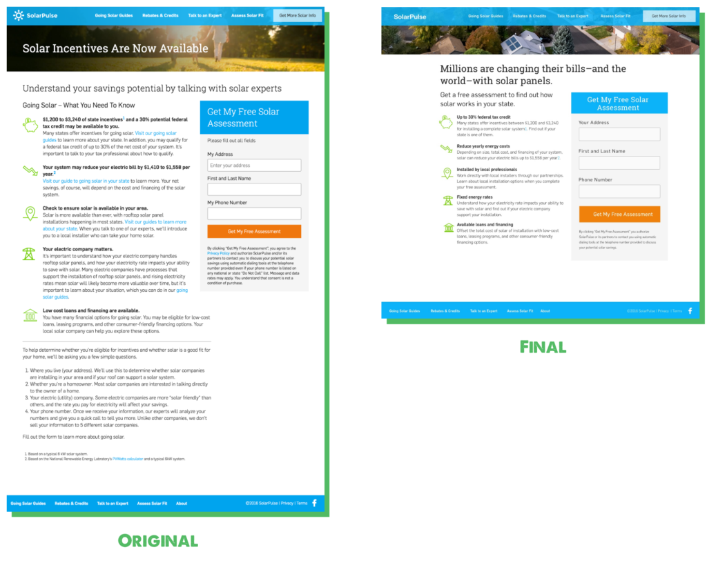
You’ll notice how much cleaner and shorter the final version is compared to the original.
I worked hard to convince them to lose all the footnotes, instead working them into the actual text wherever it was relevant. We also cleaned up the navigation bar (in some cases, you shouldn’t even have one) and changed the image at the top of the page.
Minor design changes + clearer, benefits-focused copy = 42% conversion lift!
The final point I’d make here is that I didn’t follow any formulas or templates to get these results.
Did I think my version would be better than the original? Of course! But there’s no definitive way to know how it will perform until you test it. And those tests must be based on the foundational elements of conversion and psychology.
Stick to best practices, and—just like the Six-Million Dollar Man—your copy will be “Better…stronger…faster.”
[1] Full disclosure: Despite my results on this and other content on their site, SolarPulse was recently shuttered by its parent company.
 Chris Cooper is a conversion copywriter and content strategist based in Denver, CO. He owns Real Good Writing where he helps tech and SaaS companies write B2B copy that people actually want to read. When he’s not getting more customers for his clients, he’s fighting a tireless battle for proper use of the oxford comma. Visit www.rgwriting.com or connect on Twitter @ElCoopacabra.


Shorter, Clearer, Punchier!
Chris I totally enjoyed this article, and its illustration of your work process.
I am very much in agreement with your approach, likely as a result of a brief journalistic experience at a young age. After seeing your form I deduce that my own writing process should definitely be tightened up :-)
Continue the good fight for disambiguation of serial terms!
Glad you found it helpful, Dennis. I’m always working to tighten up my own process too! Happy to have a friend in the oxford comma debate :)
Guess there is a science to it, even if it doesn’t seem very scientific sometimes
I think that’s one of the easily debunked myths: that people are just guessing when it comes to writing. With the right combination of research and experience, there’s always a method to our madness, right? ;)
Great landing page insight! Writing on paper works the brain in different ways. The synergy of writing and typing headlines leads to great results.
Love writing on legal pads! In fact, my first step when writing anything is going to paper (with an old school #2 pencil) and jotting down all my ideas. There’s definitely something to it.
The goal of a website and landing web page are pretty different
Yes! Treating home pages like landing pages (or vise versa) is a common problem. It’s important to understand a visitor’s task when they’re checking out one or the other. Landing pages are so much more specific.
my first step when writing anything is going to paper (with an old school #2 pencil) and jotting down all my ideas. There’s definitely something to it.