
9 Lessons On Home Page Optimization From A Multiple Choice Test
When my daughter was choosing colleges to apply to, two of the key drivers in her decision were here scores on the SAT and ACT. These aptitude tests, in part, determined two things:
- Her ability to answer multiple-choice questions.
- Her ability to get into certain colleges.
I was interested in the psychology of this staple of standardized testing: the multiple-choice test. As it turns out, my curiosity was rewarded, because the psychology of the multiple-choice question can be applied to your website home page.
Stay curious, marketers!
The goal of a multiple-choice question should be the opposite of the goal for a home page. The best home pages are designed to steer you towards one correct answer. The test question is designed to catch the person who is guessing and steer them toward multiple wrong answers.
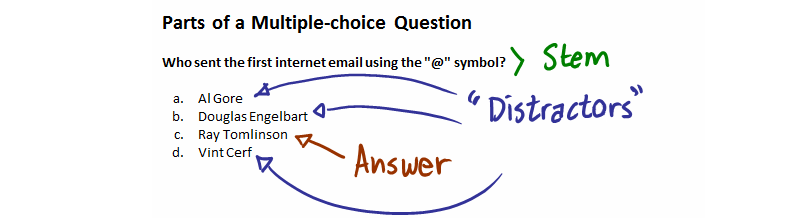
The components of a multiple-choice question
Unfortunately, when we evaluate our clients’ home pages, we often find that they are testing their visitors, too. These pages seem designed to punish visitors for guessing wrong.
Is your home page secretly trying to test your visitors?
Lesson #1: The Job Of The Home Page
The job of the home page is thus: “Help me choose.” Its primary goal is to get the visitor into the site and on the right path — not to distract or confuse.
Too often, the home page is just a place for billboards. It is treated like a truck stop on the side of a highway, yet neon lights are rarely required.
If your website is not well-designed, a visitor will find your home page despite your greatest efforts — for if you had done well, they would have landed somewhere more specific to their needs. The homepage is the default, the easy find, the quick hit. It’s best to get visitors off of it and into your site as quickly as possible.
Most home pages are fraught with political intrigue. Every department wants a piece of it. This is why home pages come to resemble the walls of a subway station, plastered with ads and handbills.
If your website can’t decide which answers to present, does it make sense to present them this way?

Now rotating banners don’t seem so smart.
If your home page is designed to help visitors find the right answer out of multiple potentially correct ones, then it should follow the form, but not the function of a multiple choice question.
Lesson #2: Why Did You Visit Our Website Today?
Ultimately, your home page answers the question, “Why did you visit our website today?” What you have to decide is which answers you want to provide links for.
Any answer that makes sense is considered the “right” answer. Any answer that doesn’t is considered a distractor.
Home page: Why did you visit our website today?
Visitor: To share it on Facebook.
Few visitors would claim that they came to your site so they could add it to their Facebook news feed. We consider social media links distractors. However, many home pages place them in a prominent position.
Home page: Why did you visit our website today?
Visitor: To check prices on a product I want.
Clearly, this is a desired action for an e-commerce site. This is a “right” answer.
Identify the stem, the answers, and the distractors on your home page and you will find opportunities to optimize.
What Else Can We Learn From Multiple Choice Tests?
I found a checklist on the Scholastic website for designing multiple-choice tests. Let’s select some of the principles from the list to see if your home page is — for better or worse — designed like a multiple-choice test.
3. Use Answer Choices That Are Believable Or Could Make Sense
It is important that the links, images and navigation are believable and make sense. This is self-evident. There is a caveat to the phrase “make sense,” and that is this: The choices must make sense to your visitors, not just to you. Navigation choices and calls-to-action should be written in the voice of the visitor for best results.
Use proof to enhance believability. Bold claims and hyperbole may sound impressive, but left by themselves, they don’t make for believable choices.
4. Always Write The Correct Answer First
The home page corollary is to “put answers to immediate questions above the fold.” Someone who is coming to repurchase a product shouldn’t have to scroll down before they can login. Those visitors coming for a sale should see a link to the sale page at the top.
Visitors ready to take action should see options immediately. Visitors who are browsing or looking for education on your product or service (top of the funnel) are more likely to scroll down.
5. Always Have A Minimum Of Three Answer Choices, But No More Than Five
On a home page, it’s hard to know how many options to offer. However, if you could narrow your choices to less than five, you’d be doing very well.
If a multiple choice question was a home page, it might look something like this:

What if your home page was laid out like a multiple choice question?
Oli Gardner of Unbounce uses the metric “Attention Ratio,” which is the ratio of total possible actions (links) to desired actions. It shouldn’t be hard to calculate this for your home page.
If a home page looked like a typical multiple-choice question, it might look like JShoes.com.

J Shoes has a relatively low Attention Ratio. A typical homepage has an Attention Ratio of 40:1 or greater. © 2015 JSHOES.COM
The J Shoes home page gets pretty close to “five or less” choices. Unfortunately, the big graphic in the center isn’t clickable. The little arrows in the upper right of the hero shot don’t work in Chrome.
6. Vary The Position Of The Correct Answer
On your home page, don’t vary the position of the correct answer. For returning visitors, predictability is important. For new visitors, familiarity is helpful. Your site should function similar to other sites like it.
Familiarity will help your visitors choose.
FinishLine.com completely changed the look and feel of their website. They lost $3 million in sales in just weeks and restored the old site to their perplexed visitors.

FinishLine.com completely changed their website in 2013 with disastrous results. © 2014 The Finish Line, Inc.
If you visit FinishLine.com today, though, you’ll see that they have significantly reduced their attention ratio (as compared to the “Before” picture above).
7. Avoid Using Distractors With Minute Differences
Your site needs a “visual hierarchy” in which the “right” answers are more prominent than distractors. The top questions your site will answer should be the most visually conspicuous items on the page.
Anything else is a distractor.
If your web design firm recommends something like a parallax design, recommend them to your competitors. Any design the doesn’t contribute to the visual hierarchy is counter-productive. How do moving stars support the home page message for Alquimia WRG?

The stars move with the cursor. Can you tell what this site sells?
Over-developed websites are slow to load. This directly impacts conversion rates. No matter how cute the treatment, if your home page requires a “Loading” message, you’re probably in trouble.

Making your “Loading” message cute won’t make it less irritating to impatient visitors. © 2013 PSCU.
8. Avoid Using Answers That State All Of The Above, None Of The Above, Or A And B
One of the important jobs of interactive design is to come up with a logical grouping of pages. If you try to do everything on your home page, you are probably going to confuse your visitors.

GreenMan.net has an effective top navigation, but the body of the home page tries to do everything. © 2014 Potplant Limited.
Don’t ask your home page to do more than it should, or visitors will never find what they are looking for.
9. Organize The Answers In A Logical Order, I.E., Alphabetical, Numerical, Shortest To Longest
Logic is a good idea, but only for a portion of your visitors. In broad terms, there are deliberate decision-makers and quick decision-makers coming to your home page. You need to have answers for both.
A logical navigation and categorization structure is key for deliberate visitors. Linked pictures, search boxes and other tools that allow the visitor to jump into the site are key for spontaneous visitors.
In general, we want the answers for quick decision makers to be near the top, but can put information for the deliberate decision makers lower on the page and deeper in the site.
Don’t ask your quick decision makers to hunt for what they are looking for. They can only stand so many distractors before they bolt.
The Helpful Multiple Choice Home Page
To design a home page that gets visitors into your site, start by identifying your key questions (stems), identify the answers your visitors are looking for, and eliminate distractors.

Expertise: conversion rate optimization, AB testing, marketing strategy, digital marketing, analytics, landing page design, computer programming, entrepreneurship
Speaking: IBM, Inbound, LeadsCon, Content Marketing World, Affiliate Summit, and more
Books and Training: Your Conversion Creation Equation, Video CRO, Marketing Videos that Convert, CRO Best Practices
As Seen On: ClickZ, Search Engine Land, Marketing Land, Conversion Sciences Blog, Intended Consequences podcast
Education: Texas A&M University, BS Computer Science and Management
- Your Traffic Fell 30 Percent. Your Targets Did Not. - September 3, 2026
- How to Filter Bot Traffic in Google Analytics With Ask Advisor - August 20, 2026
- Using AI to Chat with your Online Business - July 10, 2026


Great article Brian. OMG the parallax designs!!!! Who comes up with this shit? lol
The list of things designers are excited about goes on and on. And so many of them may be hurting conversion. Big background videos, big hero shots, big carousels.
Great article Brian and thanks for the detail. The worrying thing is most e-commerce store owners / managers NEVER put themselves into the eyes of their customers. They simply design stuff, think it looks cool and never measure it. Or they just throw everything at the wall and hope something gets clicked.
Site owners need to get their message across in a clean and concise way. Yes, they need to engage but the messaging and imagery needs to be consistent and not detract from the aim of the page – to drive a click-thru.
I won’t even waste my breath with those fricking design agencies that get paid a fortune for coming up with some outrageous design that lacks any sort of user-friendliness. :-)
I think you hit the nail on the head. E-commerce store owners / managers trust the agencies to make all of the decisions, and they don’t integrate important business issues into the mix. Our vision is to empower managers with data directly, so they can call “bull” when a design serves the ego of the designers over the needs of the business.
Brian, I would love to see how many companies actually bother investing time in the research process before they design and build. I bet it doesn’t even cross their mind. Most of them are already sold on aesthetics.
In my experience, they usually need to back-track (like FinishLine) when the site has gone live and it’s not delivering the uplift they expected.
Of course, a lot of the guys who are a bit smaller (generally start-ups or SMEs) who tend to run with a Shopify or Magento site that has a standard template.
Making changes to those templates are usually prohibitively for those on a limited budget.
I also try to educate and help people to look into these things from the start. It saves headache further down the line.
Great article. Thanks for the advice. Regarding distractions. What is your opinion on the live chat functionality from companies like Lucky Orange. Since your last advice about contact forms I’ve moved my focus more phone calls. Would such a function distract from that or make it easier to request a call back? Would really appreciate your advice http://www.luckyorange.com/chat.php
Louw, live chat can add another distraction to a site. But we also find that adding chat can improve trust and credibility, even for those that don’t use it. For those that have a quick question of have become exasperated because they couldn’t find an answer, it can be a lifesaver. The other benefit of live chat is the information you get on what visitors ask. This can point to deficiencies in your website.
Regarding phone calls, there are those who prefer to call, those who would never call, and those on the fence. Live chat may work against you in some of these segments, but it is worth testing. I would probably not put live chat on the mobile version of your site.
Have you read our eBook on designing for the mobile web? https://conversionsciences.com/offer/mobile-web-ebook/
Thank you