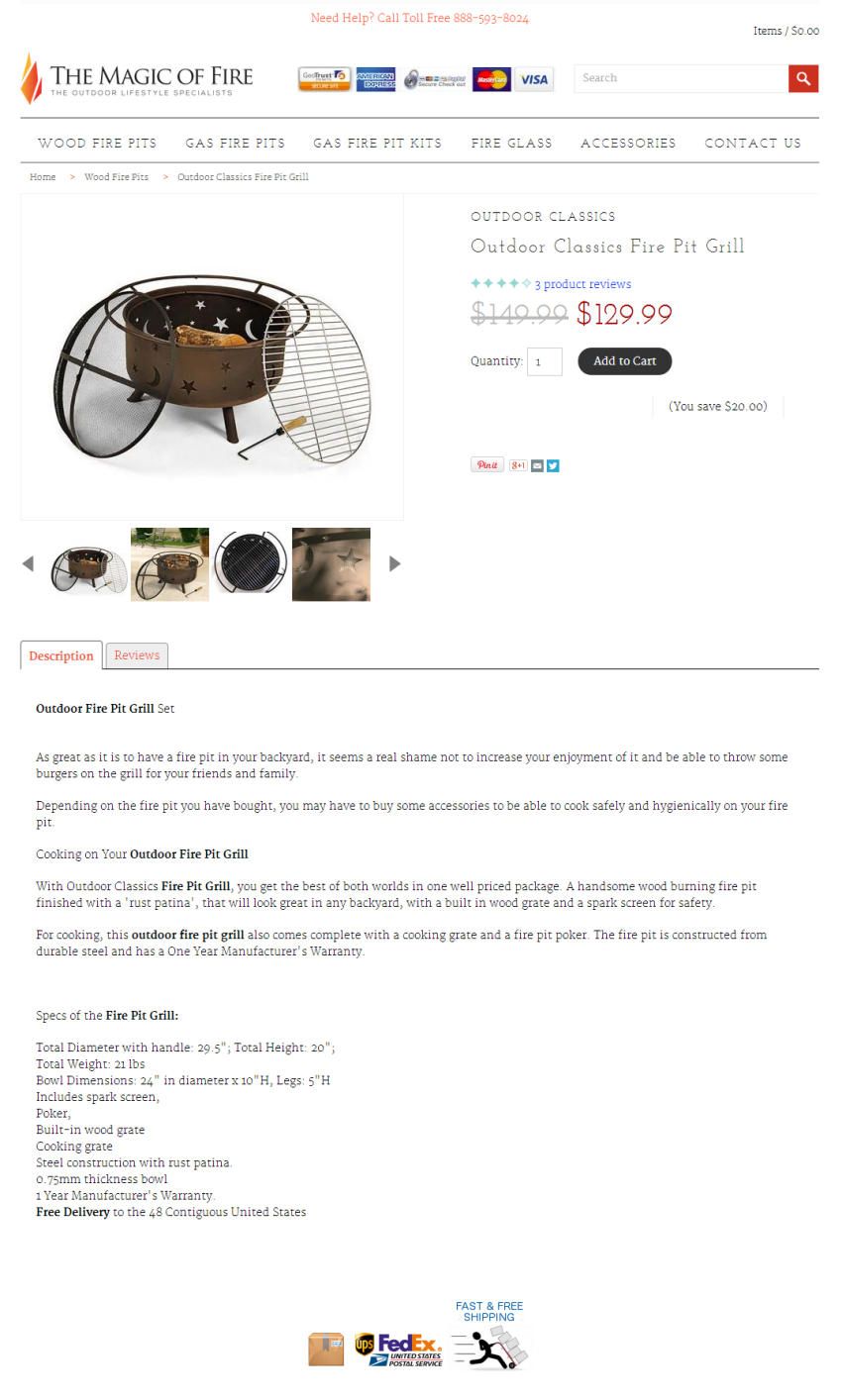
Sales funnel or full funnel conversion optimization? Which should you use and when? It all depends on what you want to understand.
Full funnel conversion optimization – or the Conversion Sciences Profit Funnel™ – provides the analysis and insights needed to help positively impact your business bottom line. Analyzing a sales funnel helps improve those issues found in a specific buying process.
There is nothing wrong about analyzing a sales funnel conversion rate or a sales funnel model for a specific segment of a customer journey. But your online business will definitively benefit from performing a Profit Funnel™ or full-funnel conversion optimization as well.
A highly experienced team of conversion experts can leverage both models when optimizing, instead of narrowing the view and hurting profits. An inexperienced conversion consultant will only see a siloed series of sales funnels, evaluate them independently and make decisions based on their own unique ROAS instead of their interactions.
Let’s review the key differences between sales funnel and full funnel conversion optimization or Profit Funnel™. We’ll begin with a great example of both models, a definition of a full marketing funnel. Finally, we’ll cover their differences in scope and the metrics used by each funnel.
Happy customers means returning customers. The starting point for full funnel conversion optimization is the customer blueprint and guess whose CRO audit services include a map of the customer journey for your online shop?
Example of Sales Funnel vs Full Funnel Conversion Optimization
Imagine an addiction treatment center that offers both low-cost at-home testing kits and treatment programs. Their at-home drug testing kit sells for $10, and it costs $5 to manufacture and ship. Their treatment programs start at $15,000.
They have an effective social media presence, paid campaigns to engage and attract their target market. And they also provide valuable resources for people with addiction problems and for their loved on their website. These range from informational articles to online quizzes to help find out whether or not one is suffering from an addiction and what is the best course of action.
Ok. Time to tackle sales funnel optimization. If they analyze their PPC sales funnel they will realize that it is costing them $20 in ad spend to convert each home testing kit sale. This added to the manufacturing and shipping costs may lead them to determine that this $10 sale is costing the company $25. But they are not looking at their profit margins, they are simply calculating Return on Ad Spend or ROAS.
Thus, they may decide to turn off the ad spend and stop this failing campaign because they “lose” $15 per sale. Or they may attempt to improve a Google Ads campaign that is already performing quite well.
But what if this addiction treatment center looks at the full-marketing funnel or Profit Funnel™ instead?
They would find that 20% of their customers have repeated their kit purchase every 3 months.
By the same token, they have not estimated the impact that their content development and social media efforts have on those conversions. And they were attributing the sale to the last touch-point.
As the buyer journey is not limited to a single channel, analyzing a single sales funnel could narrow your business focus and marketing assessment scope.
Moreover, this treatment center finds that 2% of the people who purchase their $10 test later sends a loved one to their center for a $15k treatment program. Those $20 in ad spend for each testing kit sale got the family to notice their services and inquire about their drug-rehab program. Therefore, for every 100 tests they sell, an average of 2 patients will join their treatment program generating a minimum of $30,000 in revenue.
Before I became the CMO, I was more focused on how we were spending our marketing budget than on how marketing could help drive long-term business objectives.But thinking like this holds businesses back. Marketing should be valued for its long-term potential, rather than its short-term efficiencies.
So, What is Full Funnel Conversion Optimization or Profit Funnel™ Optimization?
As we have noticed, a full funnel evaluates the 360 degree customer journey with a company or brand. Its goal is not only to acquire a customer but also to understand, nurture and improve their relationship and experience with the brand.
It focuses on not only pre but post-transaction because it takes into account how this will affect the probability of increased number of subscription renewals or sales, lower customer rotation, lower customer acquisition costs, and increased profit margins.
As we can clearly see, even though it’s called a funnel, this model looks more like an infinite loop with many potential touch-points throughout the buyers journey, over time and across a multitude of devices and online/offline experiences.
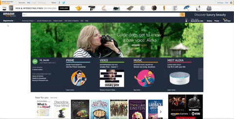
Have you even thought of people interacting with your site or buying from you via Alexa? Photo: Grant Ritchie via Unsplash.
1. Sales Funnel vs Profit Funnel™ or Full Funnel Optimization: Differences in Scope
One of the main differences between sales funnel and a full funnel conversion optimization is its scope. The oftentimes narrow span of a sales funnel is overshadowed by the number of elements or touch-points that a Profit Funnel™ considers.
Let’s check them out.
Single Path vs Infinite Loop: Are you optimizing for Omni channel yet?
The most evident difference between the sales and the Profit Funnel™ models lies in their reach. Highly restricted to a specific conversion path for the sales funnel versus a very broad view of the customer journey for the latter.
While most sales funnels are focused on a single transaction (such as a lead, sale or subscription) the full funnel or Profit Funnel™ acknowledges the entire lifetime of a potential customer or client. Its purpose is to allow us to take a step back and look at the entire customer journey or full marketing funnel and help optimize by what is most profitable without discarding the customer experience.
One Decision Maker vs Multiple Stakeholders
Have you been optimizing for a single decision-maker? Maybe you were leaving some marketing personas out of the equation. The higher the ticket price, especially for B2Bs, the higher the likelihood of having more than a single decision-maker involved in the purchasing process. Most companies will include different stakeholders’ input through the funnel and each one of them may further or delay that coveted B2B sale.
Sales funnel conversion optimization targets one person. Profit funnels recognize there is often more than one decision-maker.
Conversion Sciences Profit Funnel™ recognizes and accounts for this fact. Trying to optimize a single funnel to convert this lead is short-sighted, when understanding the 360 degree customer journey and optimizing for it, will significantly increase conversions and boost profit margins.
We often find – when auditing a client’s conversion efforts – that their sales funnels don’t include mobile customers. Addressing this gap via mobile conversion optimization efforts has increased their profits manyfold.
The Profit Funnel™ recognizes the value of determining which of those platforms holds the highest potential for each particular conversion and finding a way to best optimize each path.
Sales funnels often focus on increasing conversions on a certain page on either mobile, tablet, or desktop. Thus, leaving out the reality that customers will interact with your brand, product or service in multiple ways and through as many devices as exist.
Have you even thought of people interacting with your site or buying from you via Alexa?
Full Funnel Conversion Optimization Enables a More Personalized Online Experience
The data-driven strategy of optimizing the full marketing funnel helps you identify consumer segments. Behavioral information can be collected in-store, online, and post-visit. The insights derived from this analysis helps you craft and deliver online personalized experiences to boost conversions and increase their contribution to your bottom line. All the while deriving insights to improving your marketing strategy.
“You are engaging with the consumer on an intimate level — they are telling you what products are interesting. That customer data is one of the most important things to grow your brand.” – Kate Kibler, Timberland’s VP of direct-to-consumer.
For high-traffic sites, Conversion Sciences offers the latest martech stacks – ML and AI-powered – via the Conversion Catalyst AI™. Our Conversion Catalyst AI™ builds a predictive model that identifies which visitors are ready to buy, and delivers the perfect experience so that they are more likely to buy from you. So you can deliver the most optimized experience be it on your website, on wearable devices, voice search, augmented-reality or any of the myriad of experiences the IoT brings us.
Full funnel analysis and optimization will deliver a more cohesive personalized experience to your online customer segments.
2. Sales Funnel vs Full Funnel Conversion Optimization Metrics
It’s hard to take a look at your full marketing funnel and try to gauge how well it’s working besides ROI and profit margins. But following those metrics without fully understanding which effort or efforts made the difference, is no way to run a business either. But lucky you. Full funnel is optimized with your bottom line in mind and a bespoke full funnel attribution will help you identify what’s helping and what’s hindering your conversions.
Therefore, the difference between sales funnel and full funnel conversion optimization is that you will end up concentrating your marketing spend on those efforts who bring in profitable returns. Much better than looking at a measly conversion rate. right? ;)
Sales funnel conversion optimization targets one person while Profit funnels recognize there is often more than one decision-maker.
ROAS vs ROI
Are you narrowing your business focus down to sales funnels and conversion rates? Are you making decisions that affect your whole business by a simple ROAS? Or are you leveraging a 360 degree customer blueprint to improve your company’s profit margins?
In the addiction treatment center example, when the sales funnel was not profitable (its ROAS was negative), they could have shut down the ad campaign. But when they looked at the full funnel (in-patient treatment registrations), the ad investment was profitable and it justified the initial losses in the funnel. It had a positive ROI.
Thus, by using both metrics, you can isolate those efforts whose ROAS may be positive but not their ROI, which takes into consideration not a single digitally advertised campaign but how each contributes to the business profit margins. And you can spare from killing efforts with negative ROAS because, in the end, their revenue-generating power is much larger than the one calculated from the revenue from ad campaign/cost of ad campaign.
By doing so, you change the focus to driving business performance, not just advertising performance.
Single Attribution vs Custom Attribution
Going back to the addiction treatment center example. There are things they do that contribute to their bottom line – such as informational blog posts, quizzes, etc. But their attribution model assigned the conversion value to a single Google Ads campaign.
People have several contacts with a brand before they even consider converting on that landing page, clicking on that PPC ad or that Instagram shoppable image. Which means that any and all contributions along the 360 degree funnel, or full funnel or Profit Funnel™ must be taken into account and their value toward each of the conversions (testing kit purchase, treatment) attributed properly to measure its impact on revenues and on profit margins.
While a single touch attribution model is a fast and simple way to allocate credit to a campaign, full funnel must use a bespoke or custom attribution model to understand what is working and what is not.
It’s common yet dangerous and naive to make assumptions about which touchpoint to attribute credit for a conversion. Oftentimes these assumptions are created from unrecognized personal bias and proven false through data analysis. This is one of the biggest reasons that analyzing all metrics is vital to a company’s long-term success.
It can be dangerous to delay asking for the sale on your website. Optimizing for buyer intent helps you ask at the right time.
You should hire me. I’m good at what I do, have helped some pretty awesome companies achieve killer results, and I reckon I could help you achieve similar levels of success. If you’ve got copywriting or PPC optimization needs, I’m your man. Click here to pay your deposit now and secure my revenue increasing services!
Crappy pitch, right? Even overlooking the dreadfully generic benefit, poor copy, and woeful CTA there’s still something important missing.
An omission which would stop you from reaching out and laying down that deposit I so desperately want.
That something is your complete lack of knowledge and trust in me.
99% of the people who read this will never have heard of me. They’ll have no idea who I am, only a vague idea of what I do, and absolutely no inkling as to whether or not I’m good at it (save for my poorly worded benefit brag).
This is first contact for you and I. And for a first contact, that pitch is far too aggressive.
Unfortunately, this is the exact approach I see countless brands across the globe making day after day. They think all they need is a hard pitch, a well optimised landing page, and some relevant traffic.
But that’s not how sales are made.
No one makes big purchase decisions based on impulse. It might work for low cost items, but for big-ticket products or high end services you’ve got to foster a little trust before a pitch will be effective.
You’ve got to establish yourself as an authority; a provider of the highest quality. Only then will a hard pitch for high-priced products work.
This is the element missing from so many campaigns. It’s the element that not only makes the sale, but keeps your customers coming back to you time and time again.
It’s a shame that more business don’t focus on building relationships. And if I had to hazard a guess why, it’s because very few understand that…
Not all your Leads are Ready to Purchase
In fact, very few are at the point where they’re ready to open their wallet.
If you’ve spent any time in marketing and sales you’ll have heard the statistics. It takes anywhere between 6 and 12 touchpoints with customers to make a sale. You’ve probably also seen countless images like the below.
There’s an element of truth to these beliefs. The view of a wholly linear sales funnel might be outdated, but the principle stands.
People don’t trust you enough to purchase after a single interaction.
Check the modern consumer’s browsing habits and you’ll see what I mean. Modern users jump from site-to-site, they use various devices, abandon, reengage, and complete purchase journeys at completely random times.
It’s honestly a bit of a mess. But figuring out how to make the most of the modern consumers scatterbrained approach to online purchases doesn’t have to be. And it all begins with…
Ignore the Concept of Touchpoints
When you follow the old linear journey and the belief that you must have X touchpoint for the sale it blinkers your focus.
The thought of there being a set number of touchpoints to make users purchase is absolute bullshit. I don’t walk into a store 6 times and on the 7th feel as though I must buy something simply because I’ve hit my touchpoint limit.
The same is true for the online purchase journey. People don’t buy based on the number of touchpoints alone. They purchase based on value.
Let’s put this in real terms, I recently assisted a client in optimising their PPC campaigns. When I took over, all campaigns targeted industry related keywords before directing users to the primary landing page.
If we imagine the client was in the real estate space, that meant searches like the below all directed to the same page:
What are the house sale processes in [area]
the best real estate broker in [area]
what’s in [neighborhood] for [kids/elderly/students]
The client believed that if customers stopped by his site often enough, they were eventually bound to hire him. He thought this repeated hard pitch was guaranteed to wear his customers down until they bent to his will.
It didn’t work well for him because, whilst he had a frequently visited site, it offered no value.
If he had instead offered something of value related to the user’s search, then people would have remembered him. Something like:
An eBook/guide explaining the house sale process
A sales page explaining why he was the best
A neighborhood guide that detailed all relevant areas
Taking this approach gives people what they want. It offers the value they’re searching for and would raise him in their estimation.
You have to shift focus to the customer. You have to examine the reason the user comes to your page/site, understand the problem they’re facing, and optimize to address that problem.
Keep the promise made in the ad, email or link that brings visitors to the page. We call this the Offer.
Get the visitor to take action on the offer.
The offer is what I want to bring attention to here. People at different stages of the customer journey need different things from you.
Your traffic generation makes a promise that attracts them, your pages need to reflect and deliver on that promise.
So the first step is to stop directing users with different needs to a single hard sales page. You first need to optimize each page for buyer intent.
What Do I Mean Buyer Intent?
I’m sure you’re aware of the different stages of awareness and how they impact the length and detail of your landing pages.
If you’re not, I’ll offer a very quick explanation. Basically, the less aware someone is of your brand, the longer your landing page usually is.
Someone who’s having their first contact with your brand will need more information before they take any action.
On the other hand, someone who knows your brand well, understands the products you offer, the benefits, and maybe has bought something from you before won’t need as much information. All they need is the bare essentials of the product and offer.
It’s some killer advice. But, it’s excluded something something the marketing community has generally overlooked.
Buyer Intent
Length of page is great when considering the stages of awareness, but it doesn’t take buyer intent into consideration. Not all people buy products for the same reason.
Some products and services are indeed universal and customers from all walks of life purchase for the same reason. In those cases, you only have to consider the stage of awareness.
The above would resonate with all people suffering from substance abuse. It’s a perfectly optimized page for those seeking help because intent, in this case, wouldn’t deviate between different people.
But in cases where buyer intent will differ, you have to consider what the user’s intent is and optimize accordingly.
I’ve chosen an extremely obvious example to highlight this in Upwork. Upwork is a great place to hire cheap freelance work (and a terrible place to offer freelance services).
The site ranks well for all terms relating to freelancing on both the client and freelancer side.
However, they have two distinct sides to the site. One is optimised for those who are looking to hire a freelancer, the other is for those looking for work.
Upwork optimized each of these pages for different buyer intent.
Both are optimized for different intent. They’re focused on a service which overlaps, but are completely different in their approach because they’re trying to convert two distinct groups of people.
I know this example is something of a copout because, whilst the services overlap, they have very different demographics with different goals.
However, it proves the point that the same service can have different pages targeting different buyer intent. Each one is aimed at providing a high level of value to its respective audience.
Optimizing for buyer intent in this way should be a common practice in every business’s marketing.
For example, eCommerce product pages should be optimised not just for the product, but also for who might be shopping. A woman shopping for jewelry herself will need different information than her partner who’s buying it as a gift.
Unbounce have good examples of this. They’ve built campaigns (from the look of it both PPC and SEO campaigns) that direct users to pages that mirror explicit needs and the search terms users are using.
For example, a search for “consulting landing page builder” directs to the below page which is set up to sell their consulting specific landing page templates.
This page is targeted specifically to consultanta building landing pages
Pop in a similar search for “SaaS landing pages” and you get the below.
This page is similar to the previous, but targeted at SaaS businesses.
Both are specific to the search term and offer the answer the user is looking for.
The service wouldn’t change as the end goal is still to get the user to sign up for an Unbounce account where, if I’m not mistaken, they’d get access to all of the free templates outlined on both pages.
The difference is simply in focusing on the need of the customer. If you want to implement something similar to the above, here’s what you need to do.
Focus on the Immediate Value
I’m a huge proponent of the one page, one purpose rule.
Whatever you’re selling, your landing page should only have one purpose. Anything more and you’ll just end up confusing yourself, and your customers.
However, buyer intent will dictate that immediate conversion goal. Let’s again imagine that my goal is to understand landing pages and that I’m a complete newbie to marketing.
My first search might be “what is a landing page?”, with that search I’d find the below ads.
There is one ad for “What is a landing page?” on the results page.
Thsi page does not tell the reader what a landing page is.
The intent for me was to educate myself on the basics of landing pages. Does this page do that?
No (the dictionary response did a better job)! Again, it’s focused only on the sale and getting people to sign up.
It tells me that I can try a free landing page and create a stunning site, but doesn’t answer the question I asked. If I were truly seeking for information on landing pages, I’d bounce almost immediately and forget Wix within minutes.
What they should have done was provide something that educated me on the basics of landing pages.
That could be a comprehensive beginner’s guide blog post or even an eBook/guide behind an email gate.
The value for people at the highest level of awareness is not being answered here. And there’s a huge gap that could be filled.
What about those later in the purchase journey for landing page services searching “how to create a highly optimised landing page”
Search results for “how to create a highly optimised landing page”
There’s a couple of potentials in here. The WordStream result is the highest relevant result so we’ll use that in this example. If I click though, I find the below.
This page is highly relevant to the search term “how to create a highly optimised landing page”
Does this answer the question I asked and is it targeted at those with an intent to learn more about the perfect landing page?
Hells yeah it is.
It’s exactly what I’d need at this stage. I’m looking for information on what makes a great landing page, and that’s exactly what I’m being offered. If this were a real search, I’d likely stop my search here to see what this guide is all about.
If they’d linked to the main WordStream page and tried to sell me their service I’d leave because I’m not interested in purchasing just yet. But no, they perfectly answered my question and offered the value I need.
Whether you’re running PPC campaigns or are optimising your SEO to bring in relevant traffic, ask yourself about the user’s intent. Ask yourself what’s the most valuable thing you can offer them right then and there. What’s the offer they won’t be able to refuse?
Stop thinking about the sale, and start thinking about the value.
Once you’ve done that, you’ll create more valuable touchpoint that create a longer lasting positive image of your brand. And once that touchpoint is down, you need to focus on the next step.
Build a Solid Follow Up Based on Previous Action
We all know email as the ROI king. As such, much of the follow-up information out there is focused on how to build relevant email sequences.
It’s all great advice and can really help in driving revenue numbers up. However, it’s also something that’s been covered time and time again.
What I want to cover is a tactic I recently stumbled across from Ezra Firestone of Smart Marketer. It’s a relatively simple idea (as all great ideas are) that details how to offer value through some smart retargeting. A strategy which helped Ezra sell 84,000 units in three months.
There’s that hard sell mentality of “well, they looked at the product so shove it down their throats until they buy”.
But with Ezra’s method you’re focusing on providing a more logical user journey packed full of value.
You can see how the initial video ad kicks things off. Ezra explains that he breaks things down by the engagement.
If they watch less than 25% then they’re not retargeted and tagged as a poor lead.
Between 25-75%, he’ll retarget them with more value building content. Something to establish the brand and product in a favorable light.
Over 75% consumed indicates a highly interested user, and so they’re sent to a long form sales page.
Ezra only pushes the sale on those who are most interested and most likely to convert. For those who aren’t ready, he focuses on the value they need to make an informed purchase decision.
This pre-sell engagement tracking and retargeting is an incredible way to build value with your customers and, for Ezra, led to $18,000,000 in sales form a single page.
It’s also not just a viable method for eCommerce. If we look once again at the WordStream example above we can apply the same processes.
They could track all users to that landing page (which I’m sure they are) and track how many make it through to the “thanks for downloading” page. Those who don’t might benefit from a retargeting campaign that either linked back to that page, or one with more information that offers the same download.
For those that download, you could retarget with the next logical step in their customer journey.
After downloading the basics of landing pages, you could retargeted with an eBook or article on the best landing page services for beginner CROs and copywriters through Google Display Network, Facebook Ads, and of course the follow-up email campaign.
You could also see if user’s are ready for the hard sell at that point.
This multi-touch campaign focuses on value. It provides the user with multiple touchpoints but, unlike most campaigns, doesn’t feed everyone you’ve contacted to your sales page.
Instead, it offers them the next logical step ensuring they take it with your brand. You’re still hitting those multiple touchpoints, but you’re packing each one with value which builds more trust in you and your brand.
Multiple Touchpoints Build Trust, But Only if Optimised into a Comprehensive Customer Journey
Each step you optimize needs to be focused on the immediate value the consumer is most looking for. However, you also need to keep your eye on the overall conversion goal.
As a starting point I’d recommend starting as close to the money as possible. Look at how you can optimize the sale and work backwards. Doing so brings more immediate gains, but it also means that with each subsequent optimization you’re simply adding more fuel to the fire.
You’re not optimising a stage for which there is no logical follow up established.
So stop focusing only on grabbing the sale. Look at the immediate value you can offer and build it into your wider conversion funnel. Do that, and you’ll see more people buying from you and becoming long term advocates of your brand.
Etsy.com is good at selling niche products. Here are 10 ideas you can apply to your ecommerce site.
As of November 2017 the Etsy marketplace had 31 million active product listings, created by 1.9 million unique sellers.
At any given time, there are between 20 to 25 million active buyers on the site, and consumers purchased an incredible $2.64 Billion worth of products from the site in 2016.
While Amazon.com’s mastery of commodity products makes it the undisputed king of ecommerce, Etsy.com is any many ways the queen, having established itself as the go-to marketplace for all things niche, boutique, and custom made.
Today, we’ll be looking at 10 profitable lessons on selling niche products, courtesy of Etsy’s astounding success.
Lesson 1. Cart abandonment emails increased sales by $24 Million.
A lot can happen between the moment a customer adds a product to their shopping cart and they moment they hit “confirm purchase”.
A Baymard Institute study identified the following top reasons behind shopping cart abandonment.
High shipping, tax and other charges (61%)
Required account creation (35%)
Complicated checkout (27%)
There’s various things you can try to decrease shopping cart abandonment:
Offer free shipping
Ad trust symbols
Make the checkout process more streamlined
Add social proof throughout the checkout process
Offer a compelling return guarantee
But one of the best strategies for reducing cart abandonment actually comes after the abandonment takes place. This strategy was used by Etsy to increase sales by $24 Million.
Cart abandonment emails.
A report from Salescycle says that around 30% of the clicks generated on cart abandonment emails result in purchases. In this talk, Etsy’s former CEO explains how conversions improved when they started sending cart abandonment emails 5 days after abandonment.
This tactic alone increased Etsy’s total sales by 1%. And while that may not seem like a large number, at $2.4 Billion in sales in 2015, that’s a $24 Million increase in sales.
For most of us, 5 days is a tad too long to wait. Consumers have short memories, and you might benefit from shortening the followup time and sending your emails sooner. Most of the successful case studies I’ve reviewed send their emails in the 1-3 day range.
Furthermore, the more specific and personalized you can be in your email, the higher your conversion rate will be.
For example, include products that were in the cart, like in this email from Jack Wills:
Personalized abandonment emails
You can also create a sense of urgency like in this example from Google. This is very easy to do if you offer a limited time discount as part of your abandonment email.
Google uses cart abandonment emails, tool.
Finally, don’t throw in the towel after sending one email. Sending multiple emails can mean more clicks. Try a 3 email sequence and see how it performs.
2. Continuous A/B testing increased conversions by 457%
“Experimentation at Etsy comes from a desire to make informed decisions, and ensure that when we launch features for our millions of members, they work. Too often, we had features that took a lot of time and had to be maintained without any proof of their success or any popularity among users. A/B testing allow us to tinker with small pieces and measure if those pieces are moving in the right direction. We can say a feature is worth working on as soon as it’s underway, or even before, having measured the impact of small changes on our buyer and seller experiences.”
The team runs tests in an attempt to improve UX across different verticals be it their mobile app, product interface or anything else.
For example, the team changed the way people experienced Etsy on tablets to closely mimic the user-experience on PCs, both being large-sized screens.
Like desktop like tablet
In another instance, after hearing complaints about the mobile checkout process, they optimized the flow to make it simpler. The design and the development teams work hand-in-hand to roll out these changes which are tested on a big segment of the daily traffic before rolling them out sitewide.
While Etsy hasn’t shared any of their specific data, we can pull some hard numbers from another site.
Over a period of 10 months, digital marketplace Fiverr ran approximately 400 A/B tests, resulting in a conversion increased of 457%.
Testing isn’t a guessing game. With the right framework, you can achieve consistent wins, like we do for our clients here at Conversion Sciences. Click here to download our proven conversion framework that results in an average 20% boost for our clients in the first 3 months.
According to multiple studies, placing videos on product pages is a proven way to increase conversions. Home retailer OrganizeIT found that visitors who watched videos were 144% more likely to purchase a product. Adding product videos to your top selling products could be a great place to start.
You can also go in more of a content marketing direction, as Blitsy does well. They have a prominent section on the site called ‘inspiration’ with video tutorials that feature products available for purchase on the site.
The videos aren’t on product pages, but Blitsy leverages videos to educate visitors who may want to skip the hard work and order something from the site or get inspired to purchase craft supplies from the site. Either option is a win-win.
Video is key to Blitsy’s strategy.
B. Test button copy, messaging and size.
There are a lot of little things you can test on a product page. Just look at the below example.
This product page makes the savings obvious.
Savings is displayed in large and clear font followed by a large add to cart button that’s in stark contrast to everything else. I really like how they introduce the old pricing as “was” and strike it out.
The rule for button color is this: Choose a color that is not in the color palette of the page. In this case the add-to-cart button could be almost any color but pink, black or light blue. Red, green or purple would certainly stand out.
Test and see what works for you.
3. Highly visible reviews increase orders by 10-50%.
User reviews are one of the most powerful tools in your eCommerce arsenal.
Since a large majority of people trust online reviews as much as they trust a recommendation from a friend it makes sense to invest in acquiring and promoting reviews. It also helps that reviews can drive a 10 to 50% increase in orders. Just 15 good reviews is enough to make most people trust the review content, and this threshold results in a noticeable spike in sales.
According to a Harvard study, each additional review star on sites like Yelp results in a 5-9% improvement in product revenue.
Purchases on Etsy are fueled by a 5 star rating system that display review counts and dates for individual stores. You can an example for one Etsy store below:
Prominently displayed reviews with plenty of white space
Notice the bright colors, large font, and plentiful white space. These reviews are meant to be read. They aren’t just there to fulfill an item on a checklist.
Meanwhile, in the example below, the review count is small and monochromatic.
Monochromatic review
Telling you to publish reviews is hardly re-inventing the wheel, but take this is a reminder that not all review displays are created equal.
4. Include an estimated or guaranteed ship/arrival date
With custom products, there can be a long time gap from start to finish. Etsy gives an estimate of how long it’d take to create a product and ship it. This lowers cancellation rates and reduces buyer anxiety.
Estimate to build and ship
BHPhotoVideo (quirky name) follows on the same footsteps. The “order now to ship tomorrow”— call to action kills two birds with one stone— playing on urgency and giving a shipping estimate in-tandem.
Order now to ship tomorrow
You can also try a few additional techniques to improve conversions related to shipping.
A. Offer free shipping
The biggest hurdle that 61% people cite to purchasing online is shipping and associated costs. Free shipping makes a large part of the iceberg dissolve.
Probably free shipping is one big reason why Amazon prime members outnumber free members. As of last count there are 63 million people who hold the prime membership.
Blitsy, ensures that free worldwide shipping is the first thing visitors see.
Worldwide shipping is prominent
Throughout the homepage you’ll find instances that highlight free worldwide shipping.
B. Introduce an element of urgency
For instance, here’s what happened when I visited BH again. This time I only had 10 minutes to make the purchase.
A countdown timer that urges the visitor to purchase a product he’s interested in can definitely tilt the scales in your favor.
Another example.
Limited time
5. Utilize geo-targeted messaging.
On Etsy product pages you can always see geo-targeted messaging that mentions the country of the visitor. Example:
Targeted messaging
This is a small example and nowhere near the vast capabilities of geo-targeted messaging on offer today.
Let’s analyze a familiar scenario. Familiar because most of us have experienced the bane of retargeting ads.
For some reason, ads from the site eLabelz have been shadowing me since the past few days.
However, they’re wasting their ad budget.
They don’t ship to where I live. Plus their currency targeting is off.
Missed targeting
Targeting me with some unfamiliar currency, SAR in this case, puts me off as soon as I visit the site.
Changing the currency to match the currency of the country your visitors live in is crucial to get more conversions. It alleviates some of the fears and questions like if they’ll ship to their country or not.
With IP based targeting you can automatically figure in and add shipping costs for the customer to his country and in his currency.
For example, Bed Bath and Beyond targets me with a pop-up as soon as I visit the site that tries to placate most of my fears with international shipping viz— customs duty and shipping costs.
They then proceed to show all products in my currency.
Better targeting
When running geo-targeted campaigns here are few ideas you can use:
Change the language according to the visitor’s country of origin.
Show products on the homepage according to the season in that place. Works really well for clothing stores.
6. Make returns and exchanges easier
Most stores on Etsy outline a return policy which makes buyers confident about their purchase. The freedom to return what they don’t like is a big purchase driver.
Here’s an example.
Returns and exchanges
A Wall Street Journal research reported that a third of all internet transactions are returned.
The trend’s in the upswing because a lot of millennial shoppers now buy stuff to try them out.
And that’s one reason to provide hassle-free returns.
The second reason—despite many shoppers returning purchases, they remain loyal to brands that provide a better experience.
A four-year long study tracked spending habits of buyers at two large online retailers and found that introducing a free return policy increased average spend by $620 on one store and $2500 at the other.
Everything said and done, it won’t be easy to introduce easy returns. You’d have to calculate shipping costs and allocate a part of the marketing spend to factor in for losses. But ultimately easy returns start paying for themselves and the surge in sales would make up for the losses.
Many online craft stores provide easy returns like the example below from Folksy.
Easy return policy
7. Exploit trends as they occur
During early 2000s, indie craft shows mushroomed all over the US— a time when an online marketplace for crafts wasn’t even a distant possibility, but a big need.
Coincidentally, this was a time when to-be Etsy founders were working on a community forum for crafters. Users on the site one after the other were all saying the same thing— they wished for a place where they could sell crafts. The consensus was Ebay “sucked,” and fees were too high.
That was the opportunity.
The founders jumped head-first and created a new avenue for craftsmen. Etsy lists over 30 million items as of today.
You don’t need a crystal ball to identify trends and jump on the bandwagon before anyone else. Google trends, news and forum talk is often enough.
Fugoo capitalized on Bluetooth technology to introduce world’s first waterproof Bluetooth speakers much before stalwarts like Apple or Google could smell the trend. By the time design and product teams get past red tape in corporate, startups like Fugoo can milk on a trend and establish themselves as industry leaders.
It need not always be a trend. It can also be a popular overarching theme.
For instance Nine Line an apparel retailer has a patriotic color to its line of clothing. The site especially espouses veterans.
Exploiting trends
Further down the road, they realized that the patriotic angle was well-received by Americans as a whole and not just veterans.
Patriotism shines through their tees, promotional emails, homepage and product copy and even product packaging.
They also hire only veterans.
With a 3-year growth spurt of 4,402% and $14 million in revenues, anyone can see how solid the strategy is for them.
For custom products, there are a number of avenues for fresh ideas.
For instance, the Craft and Hobby Association runs an annual trade show that packs insights from hundreds of successful craftsmen. That and similar trade-shows can give you a swipe-pack full of ideas enough for a year.
8. Feed personalized suggestions to return customers
Machine learning and customer feedback helps Etsy show personalized listings that make sense to the buyer.
Starting 2013, they began offering personalized recommendations and it immediately improved conversions.
Personalized Suggestions
94% of senior-level executives believe that personalization is the lynchpin of marketing. Online shoppers reflect that sentiment in that 59% of them attribute personalization to the ease of finding relevant products.
Needless to say that a lack of onsite personalization can hamper shopping experience.
Amazon aces on-site personalization on more than one front. Considering how much they upsell and downsell, it’s safe to assume that they generate a lot of sales thanks to their recommendation algos.
Not only is the homepage customized to a shopper’s tastes, showcasing products they’re interested in; there’s also a browsing history they can access to get back to anything they looked at before. On the customer’s shopping cart, price changes and changes in availability are promptly made available.
Consider another example.
The majority of the traffic to Build.com comes from affiliates. People click on the affiliate link and are redirected to Build. But this often left visitors wondering if the coupon had actually been applied. To counter this and improve conversions, Build created personalized CTAs that changed depending on the site that drove the traffic.
Personalized call to action
This step alone helped them lift conversions by 6%.
9. Improving page load speed increased conversions by 27%
There’s more than one reason to come up to speed with regards to your page speed.
If your site doesn’t load fast enough you’re effectively sinking sales. Etsy loads under 1.56s with a low page size of 1.5mb.
Improve load times
AliExpress found that when they reduced load time of their pages by 36%, conversions increased 27%.
Page speed also dents your conversion in other deceptively innocuous ways. A mobile visitor may still scroll the site if takes longer than 4 seconds to load.
But since the elements didn’t load, they’re well likely to miss out on special offers and promos that you’ve on the top. That can hurt.
That’s to say if Michaels (craft deals site) didn’t load their site quick enough, many mobile visitors wouldn’t see their richly done promo deals.
Rich promo deals with fast load time
QuBit’s survey of 60,000 eCommerce consumers found that a slow loading page is a major factor driving them away from the site.
According to their estimates, the number of abandoners who quit due to slow load times alone would result in an annual loss of £1.73 billion GBP.
Using a CDN, optimizing images that you’ve tons of and ensuring you’ve a mobile-friendly version of your store are a few steps in the right direction.
10. Highlight special events, limited time offers, and new arrivals
Be it Black Friday, Cyber Monday, Christmas or any special occasion Etsy includes custom CTAs on the homepage. This boosts sales and something you ought to consider for your store as well.
Highlight events
Hold your horses though.
Etsy isn’t the perfect lead to follow in this case.
Their CTA merges with the color and feel that the rest of the site carries. It doesn’t stand out— which is last thing you want for a CTA.
As such it can be and is easily ignored.
It wouldn’t be an overstatement if I said that they did a piss poor job at crafting CTAs. It feels like since everybody is offering a sale on Cyber Monday they too had to do something.
In contrast, ArtFire’s homepage ticks all conversion optimization boxes.
Example of great conversion optimization
The homepage holiday offer hogs all the spotlight. The messaging is in place and stands in stark contrast to the surrounding dark colored them.
When you click through to the CTA you find an assortment of categories that further leads to products like the ones below.
Click through to categories
And then drop the ball. There’s no attempt to interest me as a potential buyer. Sure, a few items have SALE written next to them but it doesn’t answer how much I am saving.
That’s a potential deal-breaker.
When people click through to the CTA, it would do well to offer discounted set of aggregated deals.
Blitsy does it best. The discount amount is highlighted in bold pink and the sub-headlines call the offers limited time. The font size could be bigger but still that’s an example you can follow.
Blitsy does it best
One more example.
Blitsy does it best
Pay attention to how they highlight the new price by striking out the old price. There are countless occasions, days, and events when you can run special promos.
Or just announce an inventory clearance.
10 Profitable Lessons On Selling Niche Products from Etsy.com Conclusion
As with any technique, it’s important to test and see what works.
Don’t be disappointed if some of your marketing promos fall flat on the face. It’s only when you analyze your failures that you learn.
Try some of the ideas that we have compiled so carefully and let us know how it worked out for you.
Testing isn’t a guessing game. With the right framework, you can achieve consistent wins, like we do for our clients here at Conversion Sciences. Click here to download our proven conversion framework that results in an average 20% boost for our clients in the first 3 months.
You want to optimize your ecommerce site, but where do you begin? What do you look for? What page elements are worth evaluating? This Uber complete 110-point ecommerce conversion optimization checklist holds the answer.
At Conversion Sciences, we have an ecommerce conversion optimization checklist that our team goes through when evaluating a new client website. And today, we’re going to share that ecommerce CRO checklist with you. This checklist includes virtually everything you’ll want to consider optimizing. And because we know you’ll want to test what’s working and what’s not, here’s the ultimate A/B Testing Guide to help you put together your very own A/B testing campaign.
This is not a list of everything you should test. It’s a list of everything you should consider testing. Optimizing an ecommerce site requires testing strategy and prioritization. It would take an eternity to test every single item on this list using proper testing procedures and this CRO checklist will help identify and prioritize conversion optimization opportunities.
If there is anything on your site worth testing, I can tell you with 99% certainty that it’s on this list. So, go through it, take your pick and start your ecommerce site conversion optimization work.
To make navigation easier, we’ve broken our ecommerce conversion optimization checklist into 8 sections. Select one or simply scroll down to start with #1.
Let’s take a look at some sitewide elements on your ecommerce site and make sure they don’t hinder conversions. We’ll cover sticky elements such as, dropdown menus, supernav dropdown menus, navigation order, links and copy, visual cues, value proposition, dropdown or model shopping cart. sitewide search, related items, header and footer content, channel-dependent pages and elements, modals for email collection and discounts, and live chat. Quite a jam-packed section but we did promise a complete 110-point ecommerce optimization checklist.
1. Sticky Elements
Sticky Header
Sticky elements are items that remain fixed on the screen as the users scrolls up or down. The most commonly stickied page element is the header navigation bar. It definitely helps navigate your ecommerce site.
Stickied elements tend to attract focus and distract from other page elements, which means they can work both for and against you. Therefore, they should be included in your testing – especially on your mobile or cross-device testing.
Elements to Consider in a Sticky Header or Footer
In case you were wondering what to turn into a sticky element, here are a few to consider:
Website Top Navigation Menu
Directional Navigation (Main Shopping Categories)
Search Icon or Search Field
Add to Cart / View Cart
Click to Call button / Subscribe / Live Chat
Company Logo
Social Links
Elements that can be added to mobile and desktop stickies.
2. For Best Ecommerce Site Navigation, Check your Dropdown Menus
Dropdown Menu
Dropdown menus are pretty straightforward and a staple of ecommerce sites and websites in general. They offer a quick understanding of the site’s information architecture and ready access to subcategories.
3. “Supernav” Dropdown Menus on Ecommerce Websites
“Supernav” Dropdown Menu
If you look at many of the largest online retailers, you will notice that certain dropdown menus expand into large fields with more items and added visual elements. We called these “supernavs” here at Conversion Sciences and they can be a powerful tool for highlighting specific offers, deals and product categories. They could be difficult for a visitor’s eyes to parse, so test carefully.
4. Site Navigation UX: Hover or Click?
Should your ecommerce dropdown menus open as soon as the user’s mouse cursor hovers over them? Or should they activate upon an actual click? It may not seem like a big difference, but it’s a potential item to test for. If poorly implemented, they can be a barrier to site navigation.
5. Test Navigation Order on Menus and Sub-Menus
One of the most common problems we encounter is sub-optimal navigation ordering. Categories aren’t properly selected and ordered. Menus and menu item placement seems almost random. There is an argument for placing the most clicked navigation items toward the left or top. You can determine this using a heatmap report from CrazyEgg, HotJar, ClickTale and similar user and a/b testing tools.
6. Don’t Forget to Add Navigation Links
Another common problem we encounter is a lack of obvious navigation links to popular products or product categories. Ecommerce stores include feature images and headlines somewhere on the front page, but forget that they need to be added to the primary menus as well. Redundancy is not a vice, and when discussing your bread and butter products, it’s typically a virtue.
7. Change Link Copy
Your main navigation communicates your offering. Choosing the right words helps those who never click on your navigation. When testing navigation language, it is common to see an increase in conversions but no increase in clicks on the navigation elements we’re testing. Thus, ecommerce site navigation is a way to communicate your value proposition and offering.
After determining that all the right links are present, look at the word choice for each link. Is there a more accurate or intuitive way to define that category or other link heading? Could you be more specific? More general? Are certain categories selling like crazy when the user enters the website directly via the product page but rarely being clicked on via navigation?
8. Visual Cues
Visual Cue
Visual cues are visual elements that point the eye in a specific direction. Make sure that your visual cues are working for you rather than against you.
9. Add a Value Proposition to your Ecommerce Site
It’s amazing how many ecommerce websites completely lack any discernible value proposition. While creating a unique value proposition can be a bit more difficult for stores offering numerous products, it doesn’t mean you should skip it altogether. Look for ways to define your value and pitch why visitors should continue shopping on your site at every opportunity.
Are you quickly giving the visitor a reason to stay?
Are you the cheapest, highest quality, or do you have the biggest selection?
Do you have a generous return policy or warranty?
Do you serve a niche in the marketplace?
Do you have a unique brand voice?
10. Shopping Cart Dropdown or Modal
Shopping Cart Dropdown
When a customer clicks on that shopping cart icon in the navigation bar, what happens? Are they taken straight to the checkout page or does clicking trigger a dropdown or modal window display? Customers wishing to review their shopping cart might prefer a dropdown. Customers wishing to get straight to checkout might be annoyed by the extra click. You’ll need to test to know how your visitors are responding.
Pro tip: Be sure to instrument your cart dropdown or overlay for tracking by analytics. It’s part of the purchase funnel.
11. Sitewide Search
Similar to navigation dropdowns, the search bar is a huge part of how visitors interact with an ecommerce website. Should yours be bigger? Should the written prompt be different? How should it fit into your layout? These are all important questions to ask when evaluating your overall navigation layout.
What to consider when optimizing your ecommerce sitewide search.
12. Related Items Based On User History
Upselling will definitely help increase your average order value. Test suggesting alternative or related products to your visitors. Where and how are you suggesting those products?
Related Items Based On User History
13. Online Store Header Content
If a visitor doesn’t find what she’s looking for in the body of a page, she will return to the top of the page. Your header should provide a next step.
Elements to consider in the Header
Company Logo
Value Proposition
Return Policy (if it’s part of your unique value proposition)
Navigation
Phone Number
Search
Click to call (Mobile)
Subscribe
Live Chat
Checkout/Cart
Clearance
Login
Sitewide Promo / Offers / Specials
14. Don’t Forget to Optimize the Footer Content for Conversions
In its lonely home at the bottom of the page, footer elements don’t get seen as much by visitors. Unless they know that’s where they’ll find the link to the information they’ve been searching for. Consider all of the elements you would consider for the header plus contact methods, privacy policy and DMCA, social media accounts, among others. Check your heatmap reports as well. You might be surprised by the number of clicks you’re getting in your footer.
15. Channel-Dependent Pages & Elements
A group of power shoppers was recently discussing one major apparel retailer’s retargeting ads campaign. They unanimously condemned those ads that featured a product that would lead to a page where that product was not even displayed. Keep the promises you make to your visitors.
What can you offer visitors coming in from different traffic channels? Are they directed to channel-specific pages? Are they served dynamic content? This can have a massive impact on your success in converting users from each channel.
16. Email Collection Modal
Email subscribers purchase from your online shop at a significantly higher rate than social followers or new visitors. The question is how do you plan to attract new subscribers? While users claim to find them annoying, popup modals tend to be very effective at converting visitors into subscribers.
Email Collection Modal: Attract new subscribers with a modal window.
17. Discount Modal
Discount Modal
For ecommerce sites, one of the most effective types of modals is the discount modal. Users are already there to buy. Accepting a discount is a no-brainer. This 110-point ecommerce conversion optimization checklist is getting better by the minute, right?
18. Live Chat
Live chat and Chatbots have become effective tools to boost sales for eCommerce stores. It can be auto-prompted or offered in the Help section, and it’s definitely on the list of things we recommend to test on this ecommerce conversion optimization checklist.
Live chat for ecommerce stores.
#2. Ecommerce Site Homepage Optimization Checklist
19. Hero Shot
Your homepage’s hero shot is the above-the-fold area incoming visitors see as soon as they arrive. It’s one of the most important pieces of real estate on your website, and a top priority for split testing.
Should you utilize dynamic elements like sliders or other moving graphics? Or should you keep the page static? It’s important that you catch visitors’ attention here, but what that attention catches on is equally important.
Rotating carousels slow load times and only improve conversion rates if ordered properly and times perfectly. Large video backgrounds can bring a page to its knees, making the site seem slow and cumbersome.
21. Homepage Header Navigation
While many sites choose to keep their navigation consistent across the entire website, if there is any page where customization can be beneficial, it’s the homepage. This is the gateway to your business, and experimenting with different looks and functions on this specific page can be beneficial.
22. Homepage Value Proposition
Just like you need to emphasize your value throughout the website, it is especially important that you present unique value on the homepage, and more specifically within the hero shot. Some ecommerce stores emphasize quality. Others emphasize price. Others emphasize special offers like discounts or free shipping. You’ll need to test to know what works best with your audience.
Unique value proposition on an ecommerce site homepage.
23. Should You Add A Video?
Homepage Video
Promotional videos provide a fairly consistent boost to website conversion rates, although I have yet to see many examples of them being tested on eCommerce stores. If you are struggling to differentiate your brand, it’s definitely something to think about and consider testing for. Be cognizant of increases in load time.
24. Primary CTA
Does your homepage have a primary Call to Action (CTA) or a handful that stand out? If so, how can those be optimized? If not, should you have one or more?
25. Should You Highlight Popular Products?
Online retailer featured popular products.
Should you highlight popular products or products you are looking to push? How prominently? Where on the page?
26. Should You Highlight Special Deals?
If you are advertising a promotion in the marketplace, your main landing pages should mention the promotion. You can highlight special deals on the homepage, category pages, product pages, and even in the cart. Consider a small deals bar, big hero shot, or sidebar displays.
Highlight special deals on your ecommerce site to increase conversions.
27. Should You Include Testimonials?
Customer or influencer testimonials can build trust and advance the value proposition on almost any page of the website.
Website optimization checklist: Believable testimonials can build trust.
28. Should You Highlight Top Categories?
Should you promote specific products or highlight product categories? Should they be displayed in your hero shot or somewhere else on the page?
Online retailer category optimization checklist.
#3. Product Category Optimization
29. Faceted Search
Ecommerce faceted search. Help customers buy from you.
Faceted search allows browsers to adjust their selection criteria on the fly, allowing for very customized searches. If you offer a large inventory and don’t have faceted search, it’s something worth re-evaluating.
Consider testing the order of faceted search categories. Also play with unrolling some categories in the facet menu by default.
30. Sidebar Navigation
Sidebar navigation is one of those things that can help or hurt. While sidebar lists can guide a visitor to the products they are looking for, the tyranny of choice can make a page overwhelming. Sidebar navigation may help on some pages and hurt on others. Our testing indicates that it really depends on your site and your audience.
31. Adjust Image Sizes
In general, more detailed images perform better than stock manufacturer images. Ecommerce layout is all about maximizing the value of limited space. Are your images too small to make an impact? Are they too big, obscuring other important information?
32. Category CTAs
Should you just list your categories or include CTAs to prompt entrance? Are your category CTAs effective or do they need to be improved?
Are your category CTAs effective or do they need to be improved?
33. List View or Grid View?
Product page grid view.
Product list layouts are easier for comparison shopping.
On category and search results pages, visitors will have a preference for grid layouts or stacked list layouts. List layouts are easier for comparison. Grid layouts fit more products onto the screen. You may give visitors an option.
34. Modify Row & Column Count?
For sites with heavy traffic, sometimes something as simple as modifying the number of rows or columns can impact your conversion rate. Should you have 8 products per row or 3?
35. Category Page Product Information
Deciding what to display on category pages is critical and worthy of a series of tests. What product information should you display with each item? The options are almost limitless.
Product Image
Product title
Product description
Star rating
Price
Product options
Stock availability
Video or animation
Badging
Every audience will react differently.
36. What Type of Information Should Be Filterable?
There are many different ways to classify and categorize products. If you don’t offer enough filters, you can make searching difficult for users. If you offer too many options, you can create unhealthy friction in the browsing experience.
37. Endless Scroll or Pagination?
Do you break categories with hundreds of options into pages or do you use endless scroll? Most large retailers currently use pagination, but that doesn’t mean it’s the right choice for every eCommerce business.
38. Should You Include Special Badges?
Consider including special product badges to increase ecommerce sales.
Editor’s choice, top picks for 2019, new items, bestsellers etc. Should you include special badges or keep all things equal?
Consider some of these.
New
Editor’s choice
Clearance
Popular
Best Seller
Limited Time
Hot Item
Free Shipping
Save 25%
#4. Product Page Optimization Checklist for Ecommerce Sites
39. Primary Product Image
Your primary product image might just be the most important single element of your product page. Does the image optimally display the product? Is it high quality? Is it big enough?
Where should the Add to Cart or other CTA button go on the page? How big should it be? What color should it be? What should the copy say?
41. Price Placement
Where should you list the price? How big and bold should it be? Should you make it look discounted even when it isn’t?
42. Product Reviews & Ratings
User reviews have become a core part of eCommerce, as modern consumers place more and more weight in feedback from other consumers. Should you display reviews or ratings? If so, where? How obvious should they be? Should you only show reviews if they meet a certain threshold?
Product page optimization checklist for ecommerce websites: reviews and ratings.
43. Product Value Proposition
Should you dive right into the product description or include a one or two sentence product value proposition?
44. Shipping & Return Policy
Are your shipping and return policies obvious or hard to find? Do they encourage trust in your brand or make users skeptical? Weak policies can result in lower conversions, particularly with first-time customers.
45. Product Sizing Chart
Are you including a sizing chart to help potential buyers understand your product dimensions? If so, is this enhancing the user experience? If not, should you add one?
46. Cart Success Modal or Navigate to Cart?
Cart Success Modal
When a customer selects “Add to Cart”, does a modal popup or does it take them off page and directly to checkout? Modals tend to make it easier for users to continue shopping, while direct checkout navigation is more streamlined when you are expecting a single purchase.
47. Related Item Fields
When users are looking at a product, are you suggesting related or alternative products for them? This is Amazon’s #1 methods for increasing cart size.
Related items. Ecommerce conversion optimization checklist.
48. Detail Sections
Truncated Content
We believe that the Product Page should provide all of the information necessary for the visitor to buy. How you fit this information onto the product page is a question worthy of testing.
The options are many.
Visitors know how to scroll, so it may be find to simply list everything out, like Amazon. The question then becomes, what order?
You may have success with tabs or rollout sections that reveal the information with a click. Heatmap reports will give you an idea of which sections are most important. The most important should be open by default. Sections can be ordered top-to-bottom by visitor interest.
It’s important that key information is displayed pre-click, but it’s also important that non-essential information is available without being distracting.
49. Additional Social Proof
In addition to reviews, there are other forms of social proof that can be experimented with on your product pages. This could look like social sharing, displaying how many customers have already bought the product, influencer testimonials, etc. While reviews are fairly ubiquitous, other specific types of social proof might be even more powerful in your niche.
50. Trust Indicators
Could additional trust indicators improve your product page conversion rate?
Ecommerce product optimization with trust indicators.
51. Add to Wishlist
Wish lists let customers tell you exactly what to sell to them. If you don’t have a wishlist feature on your site, you should probably add one.
52. Additional Image Thumbnails
In addition to the primary product image, it’s important to evaluate additional images and the thumbnails displaying them. Are you including enough additional images? Do the image thumbnails displayed do a good job of showing off the product? Are they in the best possible order?
Ecommerce product information optimization: Additional image thumbnails.
53. Project Scarcity
Are you including signs that indicate the product is scarce or in danger of running out? Whether legitimate or not, projecting scarcity on your product page can sometimes increase the conversion rate.
54. In Stock or Out of Stock?
Should you include copy indicating when a product is in stock or out of stock?
55. Image Hover
Image Hover
Should users be able to explore an image by hovering their mouse over it, or should you require them to click to explore the image?
56. Display Shipping Time
Should you display the estimated shipping time on the product page or wait until the customer begins checkout?
57. Promotion Messaging
Should you display special promotions on the product page, and if so, where?
#5. Shopping Cart Optimization
58. Proceed to Checkout Button
Where should the Proceed to Cart or other CTA button go on the page? How big should it be? What color should it be? What should the CTA copy say?
Ecommerce convert from cart: proceed to checkout.
59. Cart Page or Straight to Checkout?
Should clicking on the shopping cart icon take users to a cart preview page or skip straight to the first page of checkout?
60. Continue Shopping Button
Where should the Continue Shopping button go on the page? How big should it be? What color should it be? What should the CTA copy say?
61. Discount Code Validation
Discount Code Validation
What happens when invalid discount codes are entered? Is the automated validation system bug-free and optimized to keep users engaged with the checkout process? Have you tried giving users who enter invalid codes a small, limited-time discount to encourage them to make the purchase?
62. Product Descriptions
Should you include product descriptions on the cart page? If so, how long should they be?
63. Product Images
How big should the product images be on the cart page? Where on the page should they go? Can you use them as a visual cue to draw users’ eyes to your primary CTA?
64. Upsell Items
Should you include related items, recently viewed items, or other upsell-focused items to the shopping cart page? If so, where on the page should you places them?
Test upsell items when optimizing cart conversion rates.
65. Visual Contrast & Hierarchy
Shopping cart CRO checklist: What will be your visual hierarchy?
You might notice that Amazon’s shopping cart page is very monochromatic. It all sort of looks the same, and while it’s not necessarily confusing, it doesn’t draw your eyes to anything in particular. Meanwhile Yandy.com’s shopping cart has contrasting colors with a very distinct visual hierarchy. The eye is clearly drawn to the checkout box in the middle-right of the page. Which style will work best for you?
66. Payment Options
Are you offering enough payment options? Are you letting your customers know about the options you currently provide? Should you make additional payment options obvious at the beginning of the checkout process like Yandy.com, or should you reveal them more subtlety when it’s time to process payment?
67. Shipping Time
Should you reveal estimated shipping time on the cart page or attempt to use it here as a selling point? Or should you save it for another point in the checkout process?
68. Shipping Cost
Should you display the shipping cost (or lack thereof) on the cart page or save it for elsewhere in the checkout process?
69. Price Display
How should you display product pricing on the cart page? Should it be highlighted? Minimalized? Should discounts be displayed next to the original price?
How to improve shopping cart experience with price display.
70. Project Scarcity
Are you including signs that indicate the product is scarce or in danger of running out? Whether legitimate or not, projecting scarcity on your cart page can sometimes increase the conversion rate.
71. Trust Indicators
Could additional trust indicators improve your cart page conversion rate?
72. Remove Navigation?
One question you have to ask is where in the checkout process (if anywhere) should navigation options be removed. Having general navigation options can sometimes be distracting and prompt cart abandonment. Should you remove navigation on the cart page or after users begin the checkout process?
73. Promotion & Coupon Entry
Should you allow users to enter promo codes and coupons on the cart page or wait to provide that option on the payment processing page or some other page in the checkout process?
74. Cart Visual Design
Could a redesign improve your conversion rate? Are parts of your cart page visually unappealing? Does the page design reflect your brand? Should it be more design heavy or more minimalist?
Shopping cart redesign checklist: choosing a visual design.
75. Quantity Change Functionality
Should users be able to change the quantity of a given item in their cart from the cart page? Adding this functionality often enhances the user experience.
76. Multiple CTAs
How many CTAs are displayed on your cart page? How many should their be? Should their be multiples CTAs for the same link? Should their be multiple different CTAs? You’ll need to test to find out.
77. Add to Wishlist
Should you provide users with the option to add cart items to their Wishlist from the cart page?
#6. Ecommerce Checkout Optimization
78. Guest Checkout
Should you require all users to create an account or allow a guest checkout?
Ecommerce guest checkout optimization guest.
79. Add “Use Billing/Shipping Address” Checkbox
Most consumers have a billing address identical to their shipping address. Including a relevant checkbox that lets them copy/paste improves the user experience. At this point, most consumers expect this feature and will be annoyed if it’s not available, potentially even to the point of abandoning the checkout process.
Optimize the checkout process for conversions: Use billing address.
80. Shipping ETA
Should you display the estimated time of arrival (ETA) before the order is placed? If so, there are quite a few different options and placements for offering shipping options and presenting the ETA.
Test offering shipping options and estimated delivery dates.
81. Validation Errors
Validation Errors
Validation errors and their accompanying notifications are a fundamental part of the checkout user experience. Any errors or sub-optimal elements can significantly hurt your conversion rate. Make sure that error notifications are obvious and specific, helping users quickly enter the correct info and proceed with checkout.
82. Checkout Copywriting
The copywriting throughout your checkout process is incredibly important. It’s not enough to just write something and leave it. If you want optimal results, you have to test.
83. Remove Sitewide Navigation?
One question you have to ask is where in the checkout process (if anywhere) should navigation options be removed. Having general navigation options can sometimes be distracting and prompt cart abandonment. Removing them, however, can sometimes annoy customers. You’ll need to test before you make a call.
84. Create Account Prompts
If you make account creation optional, where should you prompt guests to create an account? Should you prompt them multiple times or just once?
85. Add Trust Indicators
Could additional trust indicators improve your checkout conversion rate?
86. Add Risk Reversal Indicators
Money-back guarantees. Return policies. Quality assurance. Consumers fear risk, particularly when they are first ordering from your business. Highlighting policies that lower risk for the consumer is a great way to increase conversions.
Policies that lower risk for the consumer are a great way to increase conversions. Money-back guarantee.
87. Abandonment Remarketing Strategy
Do you have a pixel collecting data on your checkout page for remarketing ads? If not, you should.
88. Checkout Order Form
When collecting data from users, there is essential data that absolutely MUST be collected to deliver the product, and then there is non-essential data that is helpful for segmentation and marketing. The first category is just a matter of optimization. How can you request that info in the best possible way? The second category requires you to find a balance. How much can you ask for without creating too much friction?
89. Single vs. Multipage Checkout
There are case studies where splitting up the checkout process to multiple pages increased conversions. There are case studies where condensing the process to one page increased conversions. You’ll need to test to find out what works best for your audience.
90. Add Progressing Tracking
Letting users know where they are in the process and how far they have to go can encourage them to stick with you, particularly if your checkout process is longer than two pages. This can take the form of breadcrumbs or a progress bar or some other form of visual progress indication.
Reduce cart abandonment rate if checkout process is longer than two pages. Progressive tracking.
91. Custom Checkout or 3rd Party Solution?
It used to be that a custom built checkout was the only viable solution for creating a top-of-the-line checkout experience, but that simply isn’t the case anymore. Nowadays, there are some very high quality 3rd party solutions that have hundreds of built-in integrations for any service or function you could possibly think of. In fact, if your custom checkout was built more than 5 years ago, it is very likely you will benefit from switching over to a 3rd party solution.
92. Separate Checkout Subdomain?
Should you include your checkout under domain.com/checkout or checkout.domain.com?
93. 1 Column or 2 Column?
Is there any significant performance difference between a single column checkout and a double column checkout?
Test your checkout process performance with Conversion Sciences’ ecommerce optimization checklist.
94. Sticky Order Summary
Will a sticky order summary enhance the experience for consumers and increase conversions?
95. What To Expect Next
Telling visitors what to expect next at each stage of the checkout process can enhance trust and reduce abandonment. How can you do better at setting expectations throughout your checkout process?
96. CTA Buttons
We’ve touched on CTA buttons a number of times already, but they are just as important to test within the checkout process as they are everywhere else.
97. Promotion Code Entry
If you incorporate coupons and discounts into your marketing, it’s important that your promo code entry field is easy to find.
#7. Account Dashboard CRO
99. Order Status
The goal of virtually any ecommerce business is to create repeat customers. You want people coming back to your site as often as possible, and one way to help facilitate this is with an active dashboard that provides up-to-date information on the status of customer orders. Are you providing your customers with the information they want?
Account Dashboard CRO to create repeat business. Order status dashboard.
100. Value Building Copy
The account dashboard is prime real estate for customer retention. It’s the portal through which returning customers will interact with your site or attempt to close their account. It’s a great place to have value building copywriting designed to keep them on your customer list. When was the last time your revisited this copy?
101. Reorder & Upsell CTAs
The dashboard is also a great place to upsell customers with special offers and data-based recommendations. Are you taking advantage of this?
Would some of your customers buy more if they had a bulk order option?
103. Default Subscriptions
For subscription revenue models, are you providing users with a clear path to upgrade or modify their subscription? Are you re-enforcing the value from within the account dashboard or are you trying to retain customers by making cancellation difficult?
#8. Optimizing your Ecommerce Thank You Page Checklist
104. Add Survey
Converting a visitor into a buyer is really just the first step. What you do from here forward is equally, if not more important. Attempting to collect additional information about your new customer is one way to kickstart that next stage in the relationship with a better understanding of the customer.
Optimizing your ecommerce Thank You page.
105. Immediate Upsell
Is the most profitable post-sale option an immediate upsell? Or will that turn off new customers? This is a MUST TEST. Post-sale customers are already in purchase mode and might be in prime position for an upsell, but upselling can also backfire, so again… MUST TEST.
106. Email Signup
While email addresses are often collected during checkout, that doesn’t mean customers want to get your emails. Following up with an incentivized email signup offer prepares customers to receive future emails from you that aren’t strictly order related.
Thank You page email signup.
107. Encourage Social Sharing
Certain niches attract highly engaged customers who will happily advertise their purchase to friends, family, and followers. Are you giving these customers easy access to share about their purchases on social media? Is your open graph data setup correctly so that auto-click sharing generates attractive posts?
108. Account Creation
If you offer guest checkout, the Thank You Page is a great opportunity to prompt customer account creation. Is that the best use of this real estate for your business?
The Thank You Page is a great opportunity to prompt for customer account creation.
109. Encourage Referrals
Referrals are THE highest converting marketing channel in existence. If you can get your customers referring your product to their friends and family, you are virtually guaranteed additional customers. Have you tried utilizing your Thank You Page to encourage referrals?
110. Confirmation Email
Confirmation Email on the Thank You page.
Everything you can do via the Thank You Page you can also do via the confirmation email. Check out our confirmation email writeup here.
Are you still here?
That was a lot to cover, and there is no way you’re going to remember it all. If you think this is something you’ll use in the future, go ahead and download the checklist PDF below.
Download the Complete 110-Point Ecommerce Optimization Checklist
The Complete 110 Point
Ecommerce Optimization Checklist
Discover how top retailers hit 10% conversion rates by using these eCommerce optimization tips that increase trust and interest from customers.
The global average conversion rate for eCommerce stores is 2.32%. Some online stores, however, manage to get rates as high as 10%. Just how do they do it?
Some may attribute it to the quality of their products. Others might point to the quality of their traffic. But if you dig deeper, you’ll find that the world’s top retailers invest in creating an optimized experience for their customers.
For a store struggling to convert browsers into customers, there’s a lot to be learned from these eCommerce retailers. So in this post, I’ll show you how some of the world’s best performing stores use conversion rate optimization to get more customers.
1. Retail Conversion Tips: Reassure eCommerce Customers of their Financial Safety
Curious to find out how the world’s top retailers grow their conversion rates? A third of your customers hesitate to punch in their credit card details because of recent data breaches at major retailers. Reassuring customers that that their credit card information is safe at all times is a proven way to improve conversion rates.
For example, when you try to checkout on Alibaba.com, you see a bunch of badges assuring the buyer of the store’s security credentials:
Alibaba’s security credentials
On NewEgg.com, you’ll see similar badges on the site’s footer:
New Egg’s credentials
On ThinkGeek.com, there’s a separate section on its website detailing the site’s payment security protocols:
Think Geek’s payment security protocols
WalMart.com has a separate section on its website to educate customers about its privacy and security policies.
Some of your customers prefer to use their credit cards, some others like to use their existing Paypal balance. By limiting available payment options, you make it harder for customers to finish their purchase. In fact, one survey found that 56% of customers expect multiple payment options at checkout.
Take a look at the number of payment options Alibaba offers through Alipay:
Alibaba payment options
Note that Alipay also localizes the payment form. If you’re accessing the site from China, you’ll see methods that American customers don’t.
Note that Alipay also localizes the payment form. If you’re accessing the site from China, you’ll see different methods available to you than a US-based customer
Amazon isn’t far behind either. It also offers multiple payment options on its checkout page:
Amazon’s payment options
Most payment processors will let you accept payments via credit cards, debit cards and even bank transfers. You can also integrate Paypal on the checkout page to give customers another option to buy your products.
3. Great eCommerce Optimization Tips: Make Cart Contents Visible at all Times
“What items are in my cart right now?” This is a question your customers have likely asked themselves as they browse through your products.
To get an answer, they have to click on the ‘Cart’ icon and navigate away to another page. This halts the customer momentum and creates friction in the purchase process.
Remove this friction by making the contents of your visible at all times.
For example, once you add a product to your cart on Quiksilver.com, you can see the cart contents by simply moving your mouse over the cart button.
Hover view of shopping cart on Quicksilver
Macy’s does the same. After adding a product to the cart, the cart contents are shown by hovering the mouse over the shopping bag icon.
Hover view of Macy’s shopping cart
Customers easily see what all they’ve already added to their cart without navigating away from the page.
4. Enhance Trust by Emphasizing Awards, Testimonials and Certifications
With revenues of $2.6B, NewEgg is one of the largest private companies in America. Yet, NewEgg uses several trust markers on its site to assure customers of its legitimacy.
Scroll to the site’s footer and you’ll see a link to its awards and rankings. On this page, NewEgg offers a comprehensive list of all the recognition it has received:
NewEgg’s many awards and certifications
In an industry (computer parts sales) where authenticity is crucial, such external validation helps assure that customers of the retailer’s trust worthiness.
NorthernTool.com takes a different approach – it highlights how the business has been “family owned and operated” for 30 years in its footer:
Northern Tool offers assurance by stating how long it has been operating
Try creating a similar page on your site listing any public recognition you might have received. This can be a blurb from a prominent publisher, an award, or a testimonial.
5. Retail Conversion Tips: Use HTTPS/SSL to Enhance eCommerce Security
After the recent string of data breaches at major retailers, your customers are obviously nervous about data security.
Adding a SSL certificate to your site – particularly the checkout pages – can help restore some of their confidence.
This is particularly true for users on modern browsers like Chrome or Firefox which highlight SSL certificates in the address bar.
Take a look at the SSL certificate visible on NewEgg after you add a product to your cart:
New Egg’s SSL certificate
This is a quick, cheap way to give your store a much needed security boost.
6. Humanize your Company to Increase Trust
If you scroll down to the footer at Overstock.com, you’ll see something unique: a link to the CEO’s Twitter feed.
Overstock gives you an easy way to access its CEO
Remember: people like buying from other people, not faceless corporations. For large businesses like Overstock, this is a particularly big problem. Adding the CEO’s Twitter feed on the homepage shows that there are real people with real values behind the business.
That’s just one way to humanize your store. Another way is to tell customers your origin story, your mission and your key people on your About page.
Here’s how Zappos does it:
Zappos humanizes itself by proving it has a sense of humor
By calling its CEO/COO/VPs “monkeys”, Zappos tells the customer that it doesn’t take itself too seriously.
Zappos takes this far beyond the About page. It also offers customers and other business owners tours of its offices, conducts Q&A sessions to help them understand Zappos’ culture, and shares its reading lists and core values with site visitors.
Sharing information about your company’s culture has a humanizing effect
You don’t have to go that far, of course. Even something simple as a company blog can go a long way in creating more trust.
For example, take a look at Patagonia’s employee blog: The Cleanest Line.
Patagonia’s employee blog shares their outdoor adventure experiences and insights; it doesn’t directly sell any Patagonia products
7. eCommerce Optimization Tips: Offer Unique Methods to Visualize or Test Products
Putting up high resolution imagery is old hat in conversion optimized design. To stand out from the competition, you have to find more compelling ways to help customers test or visualize your products.
MyHabit’s (an Amazon deals site) 360-degree videos are a great example of this. The video plays seamlessly when a customer hovers over the video button, showing off the product in rich detail.
360 degree views on My Habits
Not all products require a video or 360-degree images though. For stores with limited items, creating dedicated landing pages is a great idea as well.
See how Apple does it for all its products:
Apple uses clean and unusual shots to display its products
Of course, not all product presentations have to be visual in the traditional sense. Costco sells printers by mailing prospective customers a sample page from the printer.
A mailed test page is a clever way to show customers how the product performs without setting up a physical store
This is a clever way to show the customer how the product actually performs without actually setting up a physical store.
8. Assure Customers of Free Shipping at a Single Glance
In a survey of holiday shoppers, 93% of respondents said that free shipping drove them to take action. Free shipping also ranked as the second biggest factor in eCommerce purchases.
Telling customers front and center about your shipping policies is a good way retain visitors. Place this declaration in a highly visible area above the fold, preferably before customers have even had a chance to browse through your products.
For example, ASOS shows its shipping policies right below the navigation menu:
ASOS’s prominent shipping policies
This tells both local and international customers whether it’s actually worth spending time on your store.
JCPenney does something similar – you can see exactly how much you need to spend to get free shipping.
JCPenney’s shipping policy
This acts as an incentive as well. Customers who are unwilling to pay for shipping might bump up their order value to avail free shipping benefits.
Stores with physical locations can go a step beyond free shipping and highlight in-store pickup on their homepages as well.
For example, on Macy’s, you’ll see a big banner advertising its order-online, pickup in-store policy:
It’s also a good idea to highlight your return policy if you’re selling products customers are anxious buying online. For example, AutoZone gives customers assures customers that they can return their purchases in any store, no questions asked.
AutoZone’s shipping polices
9. Create Product Pages that Fit your Customer Personas
Your customers will use your store in different ways. Some will dig through technical specs, while others will browse through dozens of reviews before pulling the trigger.
Creating product pages that fit each of your customer personas is crucial for a high-converting eCommerce experience.
For example, NorthernTool.com gives visitors an option to print out reviews for the product:
Being able to print easily is important for Northern Tool’s personas
This is necessary since a lot of NorthernTool’s customers are older people who prefer to read on paper instead of a computer/smartphone screen.
In contrast, NewEgg’s customers are very tech savvy. To appeal to these users, NewEgg gives a detailed rundown of each product’s technical specifications:
Technical depth might overwhelm users on another site, but New Egg’s personas demand it in order to make a purchasing decision
Such technical depth might overwhelm users on another store, but for NewEgg’s savvy customers, this is a necessity for making a purchase decision.
10. eCommerce Optimization Tips: Help Customers Buy with Guides, Ideas and How-Tos
Creating content that helps customers choose products offers three benefits:
Helps your store get social shares and traffic.
Increases eCommerce conversion rates by helping customers choose a product that fits their requirements.
Increases average order value by recommending higher priced products to customers.
This strategy is particularly effective for stores that sell difficult-to-buy products such as DIY supplies, computer components, etc.
For example, Lowe’s creates a ton of content aimed at helping DIY enthusiasts. This content is displayed prominently on the nav bar under “Ideas & How-Tos”.
Lowe’s free how-to guides
eBay takes things one step further by letting users create guides of their own. Such user-generated content (UGC) helps eBay attract a massive amount of targeted search traffic.
User generated content UGC helps eBay attract a massive amount of targeted search traffic
Kate Spade ditches the buying guide in favor of a Tumblr blog. This blog curates styles, pictures and even quotes that help customers choose while also propagating the Kate Spade brand.
Kate Spade Tumblr
For a number of upcoming retailers, content is the foundation of their entire store. For example, men’s fashion retailer MrPorter was originally a blog that turned into a store. Even today, its online magazine is the central focus of the store.
MrPorter’s online magazine
Creating such helpful content can be a potent strategy for getting more traffic, more conversions and bigger orders.
10 eCommerce Conversion Optimization Tips from the World’s Top Retailers Summary
Globally, conversion rates for eCommerce stores vary considerably. While a few stores struggle to get 2-3% conversion rates, top retailers convert as many as 10 out of every 100 visitors.
To get such high conversion rates, top retailers use a number of tactics. These range from mitigating customer risk to creating quality content that helps people choose the right products. By using similar tactics on your store, you can radically increase conversion rates and boost your revenue without a change in your traffic or product-line.
Key Takeaways
Use security badges, multiple payment options and third-party rankings, awards and certifications to underscore your store’s safety and trustworthiness.
Reduce friction in the buying process by making your cart visible at all times.
Tell customers about your shipping and return policies as soon as they land on your site.
Create product pages that address FUDs specific to your customer personas.
Create content that helps customers buy in order to get higher conversion rates and more traffic.
We can hear the bells! With just a few days left in summer, parents are now easing their way out of summer camps, Disney vacations, and scrambling to prep their kids for the new school year.
Retailers reliant on the back to school rush have run out of time to prepare.
How have online retailers done in the months leading up to this peak period in their sales? Our report gives us a hint.
Preparing for Peak Season
There are two ways an online retailer can make the peak season it’s most successful.
Buy more traffic.
Increase the revenue earned per visitor.
We can determine the amount online retailers are spending for clicks on back-to-school keywords. We can also snoop to see if their websites are configured to maximize revenue from that traffic.
This report is meant for managers of websites with a strong seasonal component. While the report specifically addresses the back-to-school shopping season, the conclusions can be applied to bathing suit sales, Valentines retailers and any online retailer that gets a bump during the holidays.
Online Retailers Vulnerable to Competitors
At least 95% of competing organizations are collecting website analytics. However, only 13% of these organizations have a website optimization tool installed.
Organizations with larger ad spends are more likely to have website optimization tools installed. Oddly enough, those spending above $50,000 a month in online ads are sloppy. They barely out-spend retailers spending as little as $5000 per month on website optimization tools.
The largest segment of retailers is keeping up with bigger spenders in terms of website optimization tool use.
The website optimization tools we look for in the report are:
Click-tracking tools (also called heat map tools) that track where a prospects are clicking and how far they are scrolling. This reveals functional problems on specific pages.
Screen Recording tools will record visitor sessions for analysis.
Split testing, or A/B testing tools allow marketers to try different content and design elements to see which generate more inquiries.
Site Performance tools help companies increase the speed with which a website loads. Page speed correlates with conversion performance.
Social Analytics track the performance of social interactions relating to the site, such as likes, shares, and social form fills.
User Feedback tools provide feedback directly from visitors on the quality of the site and content.
There are a number of questions to be raised from this data. Do they not have the budget because they don’t invest in website optimization, or do they have fewer tools because they don’t have the budget?
We believe that the lessons learned here can be applied to any online retail business with seasonal sales. Download this report for free by clicking the image below. Let us know what you think.
Ecommerce website decisions are often made without thinking about the impact on sales. In this article, we show you an unfortunate example of this and offer four lessons your ecommerce website can learn from them.
What is the last thing you want your visitors to see when checking out?
This, maybe?
This is the wrong page to see in a checkout during the holidays.
This is the page we found when we clicked a button that is very important to a Fry’s Electronics, named “In-store Pickup”. It is the button visitors use to check out if they want to pick something up at one of Fry’s stores.
The In-store Pickup button in the lower right generated the error.
This is one of the most important buttons on the site, doubly so near Christmas when shipping gifts becomes an iffy proposition.
Fry’s has gone to in the hopes of getting visitors to click this. It’s a shame it doesn’t work all the time.
We were able to get past it by starting over. Then, they did this:
Frys.com requires visitors to confirm their email address and think up a password.
If I’m picking up in the store, why do I have to create an account?
Creating often results in higher abandonment rates. It seems that something as innocuous as picking a password can generate enough friction to scare off ready buyers.
The highest converting sites offer a guest account, and still ask for a name and email address.
For Fry’s, the value of creating an account is gaining the contact information of a person who might become a repeat customer.
However, the visitor doesn’t see the value of creating an account until the step asking for a credit card. Fry’s will save my credit card for me. Unfortunately, many buyers won’t ever see this.
The advantage of creating an account is that Frys.com will save my credit card information.
I let them bully me into this because I was buying a product that was hard to find. Otherwise, I may have chosen another retailer.
Our advice to Fry’s is to call Conversion Sciences and then consider some rules for shopping cart success.
The Complete 110 Point
Ecommerce Optimization Checklist
Never, ever, ever have errors in your Shopping Cart.
It’s just crazy. We make hundreds of changes to websites each year, and we don’t break the site (knock on wood).
Fry’s will never see this error. Yes, it’s eleven days before Christmas. Yes, I can tell them exactly how to recreate it over and over and over.
For us, QA takes a room full of devices of every (popular) make and model. Old iPads. New iPhones. Old Windows XP machines. Internet Explorer versions. Android versions. Safari versions.
The Conversion Sciences QAtion Station has devices, operating systems and browsers from all eras.
Part of our job is knowing which ones to test.
I’m running a garden variety version of Windows 8 and a Chrome browser. I shouldn’t get this error.
If you require that your visitors create an account, sell them on why.
Explain that you’ll keep their information on file, that you’ll be able to contact them if something goes wrong with the order, that they will be able to track their order. Hell, offer them a discount for creating an account.
Otherwise, you’re asking too much.
Guitar Center offers a guest checkout and a social sign-in.
Offer in-store pickup.
I wouldn’t have gone with Fry’s if my son’s keyboard was available elsewhere, but now that I know I can pick products up, I’m checking Fry’s first.
If you have a retail presence, invest in the store pickup model. Sears does a great job with the in-store pickup service.
Tell me the shipping cost before I checkout.
Many buyers will add something to the cart and enter checkout just to find out the cost of shipping. In Fry’s case, this behavior cause the error.
I went to check-out and to see if it could be shipped before Christmas. When I saw that they wanted me to create an account, I went back and decided to pick it up. When I clicked the in-store pickup button, KABOOM! I got an error.
So, not only is their site broken, but the requirement to create an account drives visitors to the broken path. More people seeing this error because they have to create an account before seeing the shipping costs. This means more will go back and click the deadly “in-store pickup” button. Worse, many will just say, “No thanks.”
This is why free shipping and flat-rate shipping is so powerful. It removes this variable from the visitor’s equation. It’s done; taken care of; not an issue; put to bed; signed off on.
That’s what we want for our visitors.
The most determined visitors will get through just about any poorly designed checkout process. The rest? It’s a coin toss, one that ecommerce sites will lose more often they want to.
The Complete 110 Point
Ecommerce Optimization Checklist
High shopping cart abandonment rates are frustrating. So, we rounded up 10 eCommerce checkout usability techniques to charm your visitors into shopping on your site again and again!
There are many good reasons for shopping online rather than in person. But, even for those who regularly navigate the pitfalls of the Internet rather than the crowds at the malls, there are some frustrations that send customers screaming into another room, vowing to never again push the “Proceed to Checkout” button.
Well, maybe not really, but there are frustrations for online buyers that are better avoided if your intent is to maintain a healthy conversion rate. Statistics show that online shopping carts are often abandoned. Frequently cited complaints from regular shoppers include the following:
Unexpected add-on charges during checkout
High shipping charges
Complicated checkout procedures
Inefficient or time-consuming processing
Excessive security checks or, conversely, concerns about security
Unacceptable delivery options
If you suspect that your conversion rate should be higher, but you are unsure how to boost your sales figures, there are some relatively simple strategies you can try.
A usability study of the top 100 e-commerce sites produced the following statistics: There were an average of 5.08 steps required for checking out, and 24% of the sites required previous account registration.
Logical and not surprising, right? Other findings, however, were a bit surprising. Two-fifths of the sites asked for validation of addresses, half requested the same information twice or more, and even the top 100 sites violate eCommerce checkout usability techniques and guidelines about one-third of the time.
So, what’s a customer to do? Mutter a few angry words and flee the site seem to be common reactions.
“Keep It Simple” tops all eCommerce Checkout Usability Techniques
The KISS principle was a catchword for all sorts of business advice back in pre-Internet days, but it applies very well to online checkout. Your customers are busy people, and they want to run into your virtual store and be on to other pursuits in a minimum amount of time. It’s your merchant responsibility to help them do that. Your return? Their money and their eternal gratitude. And, likely, return visits!
Consider the following improvements to your site and your checkout procedures if your conversion rate is slipping. Monitor the results, and see what works for you. Think like your busy customers, and seek to make checkout as simple, as user-friendly, and as efficient as it should be.
The Effect of Language
A key skill most face-to-face salespeople have to master is “asking for the sale.” The way you direct your customers through your checkout process can make a difference.
Make it clear: Rather than a “Submit” or a “Next” button, consider a “Payment Options” icon or a “Pay Now” button. Having clear calls to action gives the user no reason to think and also gives them clear instruction on what to do next and also what to expect.
Consider a Single-Page Checkout for your eCommerce Site
A single page checkout may seem more complicated than breaking it down into several steps and pages. However, this simple move into a single page checkout may improve purchases greatly. UX Magazine reported that a French e-commerce site changed from a multi-page checkout to a single page checkout and conversions increased by 67%!
An example of a one page checkout.
Editor’s Note: We find that your audience may have a different preference when it comes to single-step checkout. Try both on your visitors before committing to one or the other.
Provide Several Payment Options
The kinds of payment available will depend on the price of your product line and your buyer profile. But offering choices is good and is likely to increase your customer base. So consider them carefully. Having options for credit cards and services similar to PayPal, for example offer the user more diverse payment options.
The key here is to let your visitors pay in the way they trust most= by offering payment choices. eCommerce checkout usability techniques.
Make it Easy for First-time Buyers and for One-time Buyers
While requiring an account in order to purchase makes sense from your side of the fence, it can be an unnecessary bother for the customer who simply wants to order an item and move on. If you require a lengthy account set-up, you may lose a quick sale, whereas from a quick sale there is a good possibility that you might gain a repeat customer.
After issuing the sales confirmation, ask if the customer would like to open an account, you will be surprised how often the answer is yes at that point. After all, they are already invested into your company if they feel that the level of service that they have received is good and timely, this increases dramatically.
Keep buyers on your site, and be consistent with your branding
If you direct customers away from your site in order to register check out or complete the payment procedure, you may lose them. Just don’t do it!
Third-party shopping carts can make a visitor feel like they’re getting scammed. They often suffer from limited customizability as well.
Only Request Essential Information
Don’t raise suspicions by asking for anything that is unrelated to this specific sale. You can collect background information at another time, in another place — or not. But, the business at hand is completing a transaction, and anything that distracts from that goal has no place on the checkout page.
Instill Trust
Gain your customer’s confidence by having an SSL Certificate; reassure your buyers that you do not share any personal information, and comply with the standards of the PCI Security Standards Council. Display your security badges proudly on your site.
Improve Site speed
Make sure your site is up to date, that the loading speed is fast and that operation is efficient. A savvy online buyer with money to spend will not tolerate wait time.
Even boutique sellers should have state-of-the-art Internet connectivity and be lightning-fast (as much as possible) around the world. It is a shrinking globe after all, and e-commerce is global.
The checkout page should be as attractive and as well-designed as the rest of your website.
Ask for Needed Information only Once
If your site requires a second set of address details for ‘Billing Address’ on your checkout form for example, auto-fill the form to save the customer time and effort.
You will gain a loyal fan base by making the procedure so unexpectedly efficient.
Try Free Shipping
Try free shipping to lower shopping cart abandonment.
This seems to be the best catalyst for increasing sales. It is, from all reports, more of an incentive to a buyer than special offers, price reductions or “bundling” offers. If you can’t offer free shipping to everyone all the time, try it on a limited basis. And always be upfront about your shipping charges: Don’t spring those charges only on the checkout page.
Finally, take a lesson from the old-timers: Ask for the sale. Issue a clear call to action on your website in the product descriptions or on an appropriate page. Take a lesson from sites like Amazon. Be unambiguous with buttons such as “Add to Basket,” “Continue Shopping,” or “Checkout Now.” For the success of your business, learn how to simplify your checkouts.
Author Bio: Owen Sondergaard is an avid blogger and data enthusiast. Owen writes for CAMO Software who provides multivariate analysis software solutions.
We were very surprised by the marquee results of a TrustRadius survey on Conversion Rate Optimization.
While 72% of the companies surveyed have implemented some CRO processes, only 18% of them consider CRO as “Part of their DNA”.
We would speculate that many of these 18% of companies are in very competitive commodity industries, such as travel, office supplies, and pet apparel. In other words, they had to optimize or die.
These aren’t the only industries in dire need of optimization, however. While CRO isn’t a zero-sum game, you do not want to find yourself playing catch-up with your competitors. As this survey shows, CRO is a key competitive advantage online, just as SEO has been.
TrustRadius is in a unique position to conducted a survey of businesses. They offer some of the most helpful reviews of business software on the Web, and were able to get 4100 companies to complete the survey. This is statistically significant stuff.
Here are some of the highlights from their survey.
58% of companies spend more than $10,000 per year on digital analytics, while 44% spend that much per year on A/B testing tools.
59% of companies have plans to spend more this year than in the previous year on digital analytics tools, but only 48% plan to increase spending on A/B testing tools. Download the TrustRadius Buyers Guide to see what they are spending that money on.
The vast majority of companies (91%) use between two and ten digital analytics tools regularly.
As Conversion Scientists, we obviously eat this stuff for breakfast. We’ll show you how much money you could be making with our 120-day Conversion Catalyst™ program. It’s free, and it’s invaluable. Jump on a call with us at (888) 961-6604. You’ll be glad you did.
We have a scientific name for guarantees, warranties and generous return policies: Risk Reversal.
Magic of Fire offered an amazing guarantee. It goes something like this:
“Shipping is free. If you trust us enough to buy from us, we promise that, if you have any issues with your product or our service, we’ll pay to ship your item back at our expense and refund your purchase price.”
Now, can you find this promise on their product page?
Magic of Fire Ecommerce Product Page
I put it through our Scanning Electron Microscope and eventually found a “Free Shipping” logo near the bottom of the page. I eventually found a link to their return policy, with the text “100% Satisfaction.”
Cliche is not flaunting. Avoid language like “Satisfaction Guaranteed” and “No Risk” and “No obligation.” These no longer mean anything.
If you’ve got it flaunt it.
Risk Reversal Means Never Having to Say Goodbye
When you purchase from a glass and cement store (nothing is brick and mortar anymore), you know that you have an easy out if you don’t like what you bought. You’ll march right in there, slam it down on the customer service desk and demand your money.
Not so much online.
This makes buyers delay hitting that checkout button. They procrastinate, surf other parts of your site and wait for circumstance to save them from making the final decision.
This is especially true if you’ve done a poor job building trust and credibility with your site. The fear is that they will get a lump of coal deposited on their doorstep when they expected a snuggly with a heart-shaped pattern. And they will have no store to storm into.
Transactional buyers fear that shipping fees will ruin their great deal, especially if they want to return it (and they will return anything they don’t like).
“Risk reversal” turns “risky” into “safe.”
I recommended that Magic of Fire bring their fantastic return policy right up next to the Add to Cart button on their all-important product pages. I also recommended that they make their free shipping available all over the site, especially in the checkout process.
These two changes alone should deliver a significant boost in conversion rates and revenue per visit.
Does Risk Reversal Really Work?
Magic of Fire’s Mark Oakley called me for a free consultation. After meeting Mark over Skype and hearing his shipping and return policies, I bought a beautiful “star and moon” fire pit for my house.
Zappos has the most famous risk reversal story in the online world. Their 365 day return policy with shipping both ways is one reason their sales reached $1 billion in ten years. That’s amazing growth for a commodity apparel store.
Are you flaunting it?
This is just one mistake that businesses make when selling online.
Businesses who have great products or services with amazing value propositions and great reputations continue to struggle online.
We’re the people who change that.
Jump on a call with us at (888) 961-6604. It’s free, and we’ll show you how much money you could be making with our 120-day Conversion Catalyst™ program.
Update
Mark has apparently taken my advice to heart, placing his free shipping offer all over the site and adding risk reversal near his “Add to Cart” button.
Magic of Fire sitewide free shipping offer.
The feature free shipping in a visible place on the product pages as well.
Magic of Fire free shipping offer on the Product Page.