
4 Important Checkout Lessons From Frys.com
What is the last thing you want your visitors to see when checking out?Ecommerce website decisions are often made without thinking about the impact on sales. In this article, we show you an unfortunate example of this and offer four lessons your ecommerce website can learn from them.
This, maybe?
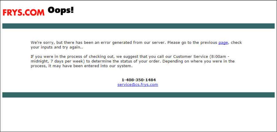
This is the wrong page to see in a checkout during the holidays.
This is the page we found when we clicked a button that is very important to a Fry’s Electronics, named “In-store Pickup”. It is the button visitors use to check out if they want to pick something up at one of Fry’s stores.

The In-store Pickup button in the lower right generated the error.
This is one of the most important buttons on the site, doubly so near Christmas when shipping gifts becomes an iffy proposition.
Fry’s has gone to in the hopes of getting visitors to click this. It’s a shame it doesn’t work all the time.
We were able to get past it by starting over. Then, they did this:

Frys.com requires visitors to confirm their email address and think up a password.
If I’m picking up in the store, why do I have to create an account?
Creating often results in higher abandonment rates. It seems that something as innocuous as picking a password can generate enough friction to scare off ready buyers.
The highest converting sites offer a guest account, and still ask for a name and email address.
For Fry’s, the value of creating an account is gaining the contact information of a person who might become a repeat customer.
However, the visitor doesn’t see the value of creating an account until the step asking for a credit card. Fry’s will save my credit card for me. Unfortunately, many buyers won’t ever see this.

The advantage of creating an account is that Frys.com will save my credit card information.
I let them bully me into this because I was buying a product that was hard to find. Otherwise, I may have chosen another retailer.
Our advice to Fry’s is to call Conversion Sciences and then consider some rules for shopping cart success.
The Complete 110 Point Ecommerce Optimization Checklist

Free. Click to Download
Never, ever, ever have errors in your Shopping Cart.
It’s just crazy. We make hundreds of changes to websites each year, and we don’t break the site (knock on wood).
Fry’s will never see this error. Yes, it’s eleven days before Christmas. Yes, I can tell them exactly how to recreate it over and over and over.
For us, QA takes a room full of devices of every (popular) make and model. Old iPads. New iPhones. Old Windows XP machines. Internet Explorer versions. Android versions. Safari versions.

The Conversion Sciences QAtion Station has devices, operating systems and browsers from all eras.
Part of our job is knowing which ones to test.
I’m running a garden variety version of Windows 8 and a Chrome browser. I shouldn’t get this error.
If you require that your visitors create an account, sell them on why.
Explain that you’ll keep their information on file, that you’ll be able to contact them if something goes wrong with the order, that they will be able to track their order. Hell, offer them a discount for creating an account.
Otherwise, you’re asking too much.

Guitar Center offers a guest checkout and a social sign-in.
Offer in-store pickup.
I wouldn’t have gone with Fry’s if my son’s keyboard was available elsewhere, but now that I know I can pick products up, I’m checking Fry’s first.
If you have a retail presence, invest in the store pickup model. Sears does a great job with the in-store pickup service.
Tell me the shipping cost before I checkout.
Many buyers will add something to the cart and enter checkout just to find out the cost of shipping. In Fry’s case, this behavior cause the error.
I went to check-out and to see if it could be shipped before Christmas. When I saw that they wanted me to create an account, I went back and decided to pick it up. When I clicked the in-store pickup button, KABOOM! I got an error.
So, not only is their site broken, but the requirement to create an account drives visitors to the broken path. More people seeing this error because they have to create an account before seeing the shipping costs. This means more will go back and click the deadly “in-store pickup” button. Worse, many will just say, “No thanks.”
This is why free shipping and flat-rate shipping is so powerful. It removes this variable from the visitor’s equation. It’s done; taken care of; not an issue; put to bed; signed off on.
That’s what we want for our visitors.
The most determined visitors will get through just about any poorly designed checkout process. The rest? It’s a coin toss, one that ecommerce sites will lose more often they want to.
The Complete 110 Point Ecommerce Optimization Checklist
Free. Click to Download

Expertise: conversion rate optimization, AB testing, marketing strategy, digital marketing, analytics, landing page design, computer programming, entrepreneurship
Speaking: IBM, Inbound, LeadsCon, Content Marketing World, Affiliate Summit, and more
Books and Training: Your Conversion Creation Equation, Video CRO, Marketing Videos that Convert, CRO Best Practices
As Seen On: ClickZ, Search Engine Land, Marketing Land, Conversion Sciences Blog, Intended Consequences podcast
Education: Texas A&M University, BS Computer Science and Management
- Using AI to Chat with your Online Business - July 10, 2026
- Your Ads Are Making Promises Your Landing Page Experience Doesn’t Keep - July 1, 2026
- Using AI to Generate Copy that Converts - June 15, 2026


Another great post Brian. Few things are more useful than real examples (good & bad) from real sites we encounter. A little usability testing goes a very long way.
Thanks for the kind words, Tom. There is a lot of money being left on the table all over the internet.
Dang. That’s rough stuff for Fry’s. You need your system to be flawless come holiday season.
I like how you turned a common, relatable experience into a gut-check for webmasters. This is NOT something we want happening this time of year.
One irony is that I found a similar problem on Guitar Center as well (my positive example above). I was spending over $500 with them! The money they are throwing away will more than pay for a us to come in and find these issues.
wow. You’d think companies of that size would be doing regular user-experience testing. Really baffling. Were you able to make contact with them, fix their problem and get paid?
The opportunity is for smaller company who can out QA and out-convert bigger-budgeted rivals.
We sent a support ticket to Fry’s but didn’t try to contact Guitar Center. This rarely bears fruit as support teams will find and fix the problem, but won’t do anything about finding the other problems that inevitably lurk on their site.
That makes sense. Thanks Brian!