10 Customer-Delighting eCommerce Checkout Usability Techniques
High shopping cart abandonment rates are frustrating. So, we rounded up 10 eCommerce checkout usability techniques to charm your visitors into shopping on your site again and again!
There are many good reasons for shopping online rather than in person. But, even for those who regularly navigate the pitfalls of the Internet rather than the crowds at the malls, there are some frustrations that send customers screaming into another room, vowing to never again push the “Proceed to Checkout” button.
Well, maybe not really, but there are frustrations for online buyers that are better avoided if your intent is to maintain a healthy conversion rate. Statistics show that online shopping carts are often abandoned. Frequently cited complaints from regular shoppers include the following:
- Unexpected add-on charges during checkout
- High shipping charges
- Complicated checkout procedures
- Inefficient or time-consuming processing
- Excessive security checks or, conversely, concerns about security
- Unacceptable delivery options
If you suspect that your conversion rate should be higher, but you are unsure how to boost your sales figures, there are some relatively simple strategies you can try.
A usability study of the top 100 e-commerce sites produced the following statistics: There were an average of 5.08 steps required for checking out, and 24% of the sites required previous account registration.
Logical and not surprising, right? Other findings, however, were a bit surprising. Two-fifths of the sites asked for validation of addresses, half requested the same information twice or more, and even the top 100 sites violate eCommerce checkout usability techniques and guidelines about one-third of the time.
So, what’s a customer to do? Mutter a few angry words and flee the site seem to be common reactions.
“Keep It Simple” tops all eCommerce Checkout Usability Techniques
The KISS principle was a catchword for all sorts of business advice back in pre-Internet days, but it applies very well to online checkout. Your customers are busy people, and they want to run into your virtual store and be on to other pursuits in a minimum amount of time. It’s your merchant responsibility to help them do that. Your return? Their money and their eternal gratitude. And, likely, return visits!
Consider the following improvements to your site and your checkout procedures if your conversion rate is slipping. Monitor the results, and see what works for you. Think like your busy customers, and seek to make checkout as simple, as user-friendly, and as efficient as it should be.
The Effect of Language
A key skill most face-to-face salespeople have to master is “asking for the sale.” The way you direct your customers through your checkout process can make a difference.
Make it clear: Rather than a “Submit” or a “Next” button, consider a “Payment Options” icon or a “Pay Now” button. Having clear calls to action gives the user no reason to think and also gives them clear instruction on what to do next and also what to expect.
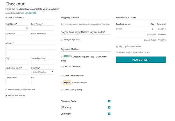
Consider a Single-Page Checkout for your eCommerce Site
A single page checkout may seem more complicated than breaking it down into several steps and pages. However, this simple move into a single page checkout may improve purchases greatly. UX Magazine reported that a French e-commerce site changed from a multi-page checkout to a single page checkout and conversions increased by 67%!
Editor’s Note: We find that your audience may have a different preference when it comes to single-step checkout. Try both on your visitors before committing to one or the other.
Provide Several Payment Options
The kinds of payment available will depend on the price of your product line and your buyer profile. But offering choices is good and is likely to increase your customer base. So consider them carefully. Having options for credit cards and services similar to PayPal, for example offer the user more diverse payment options.

The key here is to let your visitors pay in the way they trust most= by offering payment choices. eCommerce checkout usability techniques.
Make it Easy for First-time Buyers and for One-time Buyers
While requiring an account in order to purchase makes sense from your side of the fence, it can be an unnecessary bother for the customer who simply wants to order an item and move on. If you require a lengthy account set-up, you may lose a quick sale, whereas from a quick sale there is a good possibility that you might gain a repeat customer.
After issuing the sales confirmation, ask if the customer would like to open an account, you will be surprised how often the answer is yes at that point. After all, they are already invested into your company if they feel that the level of service that they have received is good and timely, this increases dramatically.
Keep buyers on your site, and be consistent with your branding
If you direct customers away from your site in order to register check out or complete the payment procedure, you may lose them. Just don’t do it!
Third-party shopping carts can make a visitor feel like they’re getting scammed. They often suffer from limited customizability as well.
Only Request Essential Information
Don’t raise suspicions by asking for anything that is unrelated to this specific sale. You can collect background information at another time, in another place — or not. But, the business at hand is completing a transaction, and anything that distracts from that goal has no place on the checkout page.
Instill Trust
Gain your customer’s confidence by having an SSL Certificate; reassure your buyers that you do not share any personal information, and comply with the standards of the PCI Security Standards Council. Display your security badges proudly on your site.
Improve Site speed
Make sure your site is up to date, that the loading speed is fast and that operation is efficient. A savvy online buyer with money to spend will not tolerate wait time.
Even boutique sellers should have state-of-the-art Internet connectivity and be lightning-fast (as much as possible) around the world. It is a shrinking globe after all, and e-commerce is global.
The checkout page should be as attractive and as well-designed as the rest of your website.
Ask for Needed Information only Once
If your site requires a second set of address details for ‘Billing Address’ on your checkout form for example, auto-fill the form to save the customer time and effort.
You will gain a loyal fan base by making the procedure so unexpectedly efficient.
Try Free Shipping
This seems to be the best catalyst for increasing sales. It is, from all reports, more of an incentive to a buyer than special offers, price reductions or “bundling” offers. If you can’t offer free shipping to everyone all the time, try it on a limited basis. And always be upfront about your shipping charges: Don’t spring those charges only on the checkout page.
Finally, take a lesson from the old-timers: Ask for the sale. Issue a clear call to action on your website in the product descriptions or on an appropriate page. Take a lesson from sites like Amazon. Be unambiguous with buttons such as “Add to Basket,” “Continue Shopping,” or “Checkout Now.” For the success of your business, learn how to simplify your checkouts.
Author Bio: Owen Sondergaard is an avid blogger and data enthusiast. Owen writes for CAMO Software who provides multivariate analysis software solutions.




Hi Owen, I know KISS is an old approach, but I have always believed it to be a viable one! It is frustrating when checking out takes so long! I feel like scream just let me buy it!
WooCommerce is easy to use. The eCommerce and Dropshipping platform use WooCommerce as it has a customization option. You can set up your store on WooCommerce with ease, even if you don’t have technical expertise.