Mobile Ecommerce Checkout: Maximizing Conversions
Concerned with your mobile ecommerce checkout conversion rates? Discover how to maximize these seemingly fickle mobile visitors.
There are approximately 50 million mobile-only users in the US alone. That’s roughly one in five American adults who are “smartphone-only” internet users.
If all they have is a smartphone that’s what they will use to shop from someone. And that someone better be your ecommerce site. How? Maximizing mobile ecommerce checkout conversions. Here are some of the top strategies we use in our eCommerce Optimization Services to convert these mobile visitors into shoppers you may want to test on your online store.
And don’t miss out on our “bonus track” that shows you how to test your mobile checkout flow to boost conversions at the end of this article.
Gauge Mobile Ecommerce Checkout Success: the Add-to-Cart Rate
When we think about mobile ecommerce sites we tend to imagine small versions of our desktop sites. The screen is smaller. The images are smaller. The conversion rate is smaller.
Even as mobile traffic is eclipsing that of desktop and tablet visits, our mobile conversion rates remain low. We typically see mobile ecommerce conversion rates that are one-fourth to one-half that of desktop rates.
You could just say that people don’t buy your products on mobile devices, but there is a metric that says this isn’t so. It’s the Add-to-Cart Rate.
Mobile visitors are adding products to their carts. According to research the add-to-cart rate for smartphone users is only 25% lower than it is for desktop users.
When mobile visitors are adding products to their carts at higher rates than they complete checkout, we could say we have an abandonment problem.
Begin the Conversation on Maximizing Mobile Conversions
Just because a mobile buyer isn’t ready to checkout, you shouldn’t assume that you can’t begin a conversation with them. Offer to help them out in exchange for a first name and an email.
This tactic won’t be unfamiliar to most ecommerce sites.
- Email me this cart
- Save this cart
- Get a discount in Facebook Messenger
- Get a discount code
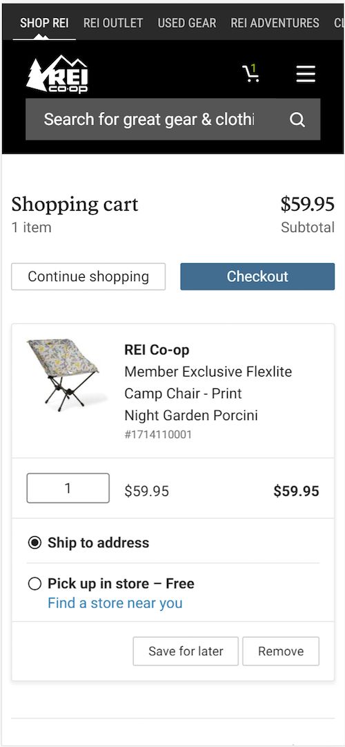
REI offers a “Save for Later” button in their cart. Clicking this takes the visitor to the account creation page. Nice save, REI.
Asking Visitors to Create an Account: Do or Do Not?
Which happens first? A visitor trusts you enough to create an account before they buy, or they buy and that builds the trust they need to create an account?
The truth is that you have a segment of each of these visitors coming to your site. You need to understand which is larger.
For some visitors, asking them to create an account with you to buy is going to be too much. It exacerbates the fact that buying or entering information on a mobile device is more difficult and the buyer is often victim to distractions around them.
Having an account can be a liability. If customers have an account and forget their password, they they are likely to abandon their carts. You need to know the abandonment rate at the account creation step. This will tell you how big your problem is.
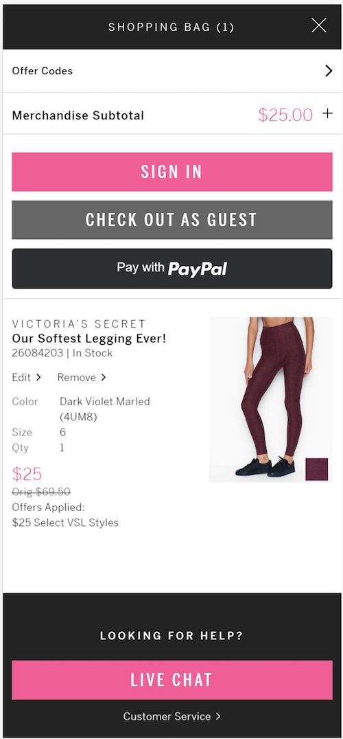
The good news is that there are ways to increase conversions for these mobile shoppers. Check out the following example from Victoria’s Secret. A smooth and simple transition from shopping checkout to account creation.
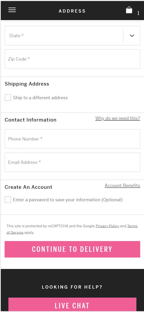
Victoria’s Secret still asks the visitor to create a password after all information has been entered.
Want more guest checkout inspiration? Check out these rocking mobile guest checkout tactics by major online retailers.
Always test account creation. The negative impact can be substantial, even taking into account future purchases of those who do create an account.
Mobile Ecommerce Checkout: Change the Order of Entry
When working with human beings, it is often surprising how changes that seem inconsequential can have a big impact. Changing the order of your cart is one of those things.
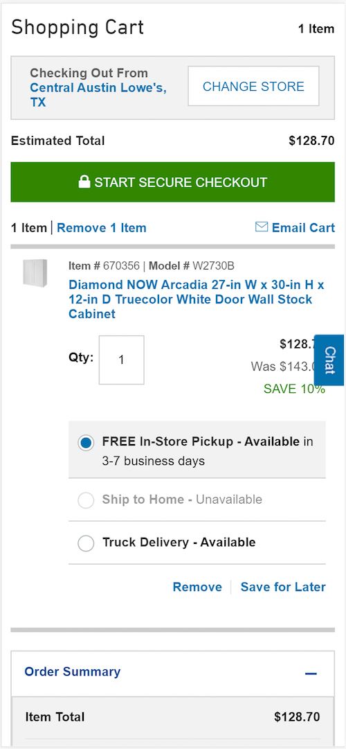
For example, look at Lowe’s mobile checkout. They ask for the credit card information before they ask for the buyer’s billing address.
Why on earth might this be better than asking for the billing or shipping address first like (almost) everyone else?
Who knows. It may require the buyer to dig out their credit card. That increases the sunk cost perception. At this point, they might as well finish entering the address — and anything else you ask.
I can’t tell you that this will work for your audience, but it is certainly part of our playbook for maximizing mobile conversions.
Proper Use of Discounts
Automatically applying discounts not only eliminates one more step on the mobile ecommerce checkout, but it will entice your customers to keep moving forward.
How to Offer Third-party Payment Options and Boost Mobile Conversions
If entering your name, address, credit card number is a pain on a mobile device, you would think that using third-party payment systems might be a boon for mobile ecommerce checkout. After all, these services have your address and multiple purchase options on file, options that include direct deductions from your bank account.
Nonetheless, we find that simply offering Paypal and Amazon often won’t improve mobile checkout completion rates as much as we would expect.
Part of the reason may be when these options are offered. If the option to pay with Paypal is made after the visitor has entered their billing address, then a big part of the reason to use Paypal — to avoid entering the address — is lost.
Etsy offers a Paypal payment option, but they do it after the billing address has been entered on the smartphone device.
REI, on the other hand, offers both Paypal and Venmo payment options, and does so early in the mobile checkout process. Note that this also removes the requirement that the visitor create an account.
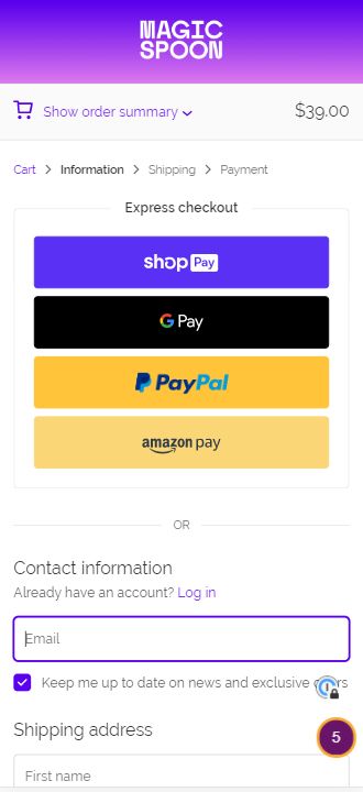
You can explicitly position these payment methods as “Express Checkout”, “Fast Mobile Checkout”, or “Fastest on your phone”.
Use Trust and Proof in your Mobile Ecommerce Checkout to Boost Sales
This is true for both big-screen checkout as well as mobile. Remind your customers that this transaction is safe and secure.
Yes, you have less screen space to deal with on a mobile device. Nonetheless, you should test the following elements in your checkout.
These elements should generally be non-clickable. Don’t take your visitor out of the buying process. If you need more space to express something like your return policy, use a modal dialog box that opens over the mobile checkout screens.
Return policy
Summarize your risk reversal strategy. This can include anti-spam policies.
Your value proposition
Offer a bulleted list of your key differentiators, such as free shipping, free training, free installation, fast service, years in business, etc.
Galeton reiterates their guarantee and return policy right below the Checkout button.
Testimonials
Yes, you can use testimonials in mobile checkout to reinforce the sale.
Customer support rating
If you have high marks on your net promoter score, brag a little.
Certifications. Make sure your certifications are there in the checkout. An example includes Google Trusted Store.
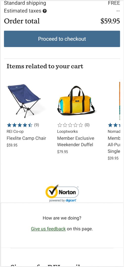
Security badges. Remind them that this is a secure transaction.
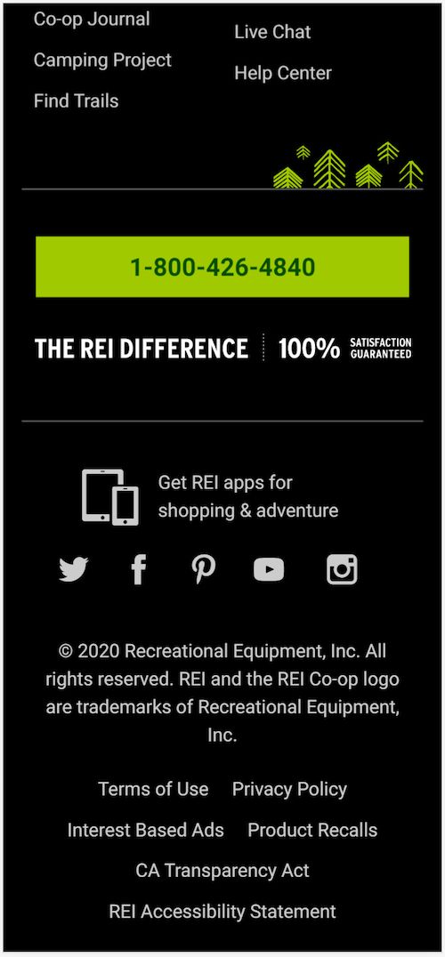
Phone number. You can build trust by putting a phone number in your checkout and avoid losing a sale. Use the right call to action and you may save sales with phone calls. Even if few buyers use the phone number, it can add credibility. It says, “Yes, we’re here for you.”
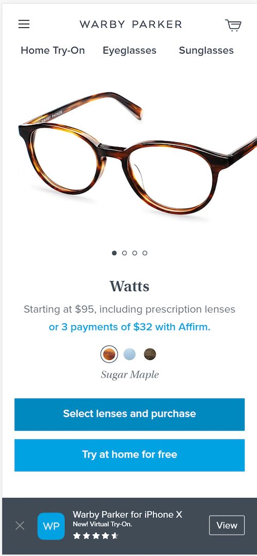
REI may lose some of the benefit as they bury their phone number in the footer. Warby Parker, on the other hand, offers a variety of contact methods throughout their cart.
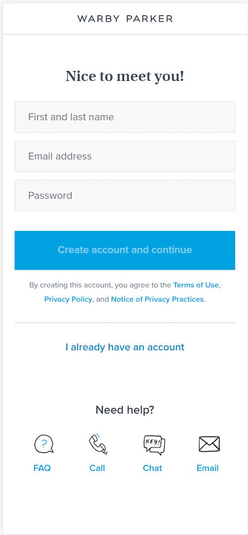
Warby Parker offers a number of ways to complete the transaction if the customer has doubts or prefers them. Discover how to increase mobile ecommerce checkout conversions.
Live Chat. Test this. We don’t yet have evidence that it can improve mobile ecommerce checkout completions, but it could save some abandoners.
Be careful how these kinds of tools render on smartphones.
Optimize Mobile Checkout Element Placement: Experience a Lift in Conversions
With limited space, it’s important to decide where to test these elements on your shop’s mobile checkout. Here are some placement options for highest impact to experience a conversion boost.
Near call-to-action buttons
Test security badges, customer support ratings, and your return policy above or below buttons such as “Continue”, “Preview”, and “Complete Purchase”.
When a customer decides to buy, there is a natural desire to delay the decision before thumbing the button. We always want to “think about” our decisions involving money. You can counter this with an affirmation of the transaction.
We have written the most extensive guidelines for placement, copy and design of your mobile call-to-action buttons to increase conversions. Check it out.
Near requests for personal information
When a mobile visitor is about to submit personal information to you, there is a natural hesitation. Giving you their email address, physical address, credit card number, or CVV number can feel intrusive.
This is another great place to inject risk reversal messages, testimonials, and a reminder of your value proposition.
In a “sticky” header or footer
Sticky elements are very important in a mobile interaction. One of the first things we address on a mobile site is the contents of the sticky elements.
The header or footer that is always on screen should probably change when the visitor enters the mobile shop checkout process. This is a great place to test trust builders.
Almost any of these elements can be placed in a header or footer. Don’t underestimate the number of things you can place in a sticky header or footer.
As a stand-alone sticky element
Elements such as security badges, certifications, and ratings can be individual elements that stay on screen. These are typically at the bottom. Be careful that these elements do not take the visitor away from the checkout process.
Can I Increase my Mobile Store Checkouts with Apps?
We see apps as a retention and loyalty tool. Apps do have advantages. Apps can provide a more controlled environment, such as making the phone vibrate when you purchase.
If your app provides a feature that can’t be duplicated online, you may consider promoting it on your site.
Word of Caution: In case you were wondering about an app effectiveness in acquiring new customers, we don’t have any experience that indicates this, even if the shoppers are familiar with the brand. Besides, an app requires two high-commitment conversions: one to install that app, and then one to buy.
In essence, an app becomes part of your offering, a part of a beloved product line. If you have a rabid tribe of enthusiastic customers, the app may be your best retention and repurchase strategy.
Bonus Track: How to Test and Develop your Mobile Checkout
Imagine that your website’s mobile version is strictly targeted at aliens, beings from another world. These beings have oversized thumbs. They live on a world near black hole, so time changes much more slowly. And their world is covered in volcanoes, so there are always distractions around them.
This pretty much sums up your mobile shoppers. They are VERY different from your desktop and tablet visitors.
As such, you should test your mobile ecommerce checkout separately. Letting it evolve independently from your desktop checkout as you learn more about your smartphone visitors.
You can create a different mobile checkout experience in several ways.
Modify your Responsive Web Template for small screens
Your developers will be able to add, remove, and modify elements based on the size of the screen being reported by your visitors’ browsers.
Use third party add-ons that target mobile
Ecommerce sites like Shopify offer plugins that can implement elements such as exit-overlays and sticky headers and footers.
Use Javascript and change things in the browser
There are a number of testing and personalization tools that will allow you to change mobile checkout elements in your visitors’ browsers. You can shape the mobile checkout experience in this way to maximize mobile conversions.
Live User Testing
Would you like to see just how difficult your mobile checkout process is for visitors? If so, we recommend virtually looking over your visitors shoulders.
We are fortunate to live in a golden age of marketing tools. Services like Validately and UserTesting will bring people to purchase something from your website on their smartphone, while recording and talking through their experience.
You will have at least one “palm-to-forehead” moment watching these videos.
And then you can make it easier for your mobile customers to go through your ecommerce checkout process.






People from an older age demographic that are now using smart phones more hate forms more than anything so having a call to action to just “call” to complete your order vs. having to go through the checkout themselves offers a big boost to a lot of companies.