
How Many Steps Should Your Online Checkout Have? [CASE STUDY]
SwellNoMore is one business that changed its cart for technical reasons, and ended up changing their visitors behavior in the process.
How many steps should your checkout process have? There are conflicting theories.
Some believe that every click, every step offers visitors another chance to abandon the process. They believe that the checkout process should have as few steps as possible.
Others believe that the long forms found on single-step checkouts intimidate visitors, driving them to abandon the process.
Unfortunately, most businesses let their shopping cart software decide for them.
Abandonment rate measures percentage of visitors that begin the checkout process, but never make it through to complete the purchase. A high abandonment rate is very undesirable.
The Battle for Higher Conversion Rates
SwellNoMore.com offers a natural supplement designed to reduce swelling in the face, abdomen and feet. It’s about reducing water retention. The folks behind Swell No More contacted us because they needed to increase visitor retention, however.
They had done what many of you have done to increase sales on their site.
They had hired designers to come in and revamp their landing page. Twice. In both cases, the redesigned pages decreased the conversion rate.
Here you can see the original, current control and the redesigned page that cut conversion rate to about 1/3. Click the images to enlarge them.
 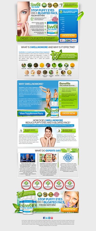 | |
| The redesigned landing page on the right did not generate as many sales as the original on the right. | |
They did the smart thing and went back to the original.
They tried an editorial approach to educate their visitors. This reaches a more methodical audience, but doesn’t perform well.

Click to Enlarge: The editorial style landing page.
While they were waging this battle, they got blind-sided by a change that they had to make for technical reasons.
Having a Change of Cart?
See what I did there?
Swell No More has a traditional online store, and their landing page used the same cart as this store.
Until they changed it.
The old cart offers a two-step checkout process that hid fields until needed. For instance the fields to input shipping address were hidden unless the “Shipping information same as billing information” checkbox was unchecked. Likewise, the fields for credit card information were hidden unless the radio button for Credit Card was selected.
 |  |
| Unnecessary fields are hidden in the original cart (right) making the process seem simpler. Click images to enlarge. | |
This seems to have made the checkout process seem faster and simpler.
Compare this to the new cart featuring a one-step checkout process and no hidden fields.

The one-step online checkout presented an intimidating page.
This checkout page follows many of the best practices for online checkout:
- The order is shown, including the product images.
- The “Risk-free Guarantee” at the top and “Doctor Trusted” bug on the right reinforces the purchase.
- Trust symbols are placed near the call-to action button.
- All costs have been addressed, including shipping and taxes.
Nonetheless, this cart had a significantly higher abandonment rate then the multi-step cart, but it is not sufficient to blame the steps alone. Fewer visitors were getting through to complete their purchase.
Things That Can Impact Checkout Abandonment
Every time we change something and collect results, we gain information we can put to use on our site. Keep in mind that we are not finding answers, only hypotheses.
Conversion Sciences will run the controlled split tests needed to turn a hypotheses into a reliable, revenue-building result. Start optimizing.
Here are some hypotheses that might explain the difference.
- The form on the single-step checkout was too intimidating. Hide fields or return to a two-step process. Or do both.
- The more explicit risk reversal message on the old cart was more trustworthy.

A detailed return policy can increase conversion rates in your checkout process.
- The trust symbols placed above the fold made buyers feel more comfortable.

Trust symbols lend your page legitimacy, increasing many buyers’ comfort.
- The PayPal logo, missing from the new checkout page, made buyers feel more comfortable.

Third-party financial logos allow your page to “borrow” trustworthiness from known brands.
- Placing the shipping and tax information above the fold was more clear.

One of the biggest reasons buyers abandon checkout is that they don’t know the final cost of their purchase.


Look Beyond the Technical Aspects of Your Cart
Too many shopping carts have been built by engineers and not by professionals experienced in human interfaces. These carts may meet the technical requirements you need, but may chase away the very customers you serve.
No checkout process fits all.
Look for flexibility in your cart vendor so that you can test and tweak to your cart’s desire. Ask them if they have tested their cart in businesses like yours. Ask them what research they have that shows their abandonment rates are low.
Take control of your abandonment rates to increase sales of your products and services.

Expertise: conversion rate optimization, AB testing, marketing strategy, digital marketing, analytics, landing page design, computer programming, entrepreneurship
Speaking: IBM, Inbound, LeadsCon, Content Marketing World, Affiliate Summit, and more
Books and Training: Your Conversion Creation Equation, Video CRO, Marketing Videos that Convert, CRO Best Practices
As Seen On: ClickZ, Search Engine Land, Marketing Land, Conversion Sciences Blog, Intended Consequences podcast
Education: Texas A&M University, BS Computer Science and Management
- Your Ads Are Making Promises Your Landing Page Experience Doesn’t Keep - July 1, 2026
- Using AI to Generate Copy that Converts - June 15, 2026
- AI: Why Your Website is Now a Training Tool - February 5, 2026


Interesting article….thanks for posting!
Wouldn’t it be nice if there was just a standard answer that always applied? We have a one page checkout and it converts like a champ, but now you’re making me wonder…
“Change of cart” Great turn of phrase, Brian. You’re a pro writer.
Don’t rush to change. We don’t want to “break your cart.” For every multi-step winner out there there is one single-step winner.
One big problem is that nobody has a cart that makes it easy to split test this. Idiots.