The Most Important Questions to Ask About Your Mobile Visitors
When we stand up a website, perhaps the most valuable question we can ask about our visitors is, “What triggered them come to our website? What problem are they trying to solve?”
The question is different when someone comes on their smartphone.
The question is, “What triggered them to come to our website from where they are? What problem are they trying to solve right now?”
When you add the “where” and “right now” components, it is clear that your mobile site has to answer a very different question.
I was inspired to talk about this when I was looking for a Chinese Restaurant near my office.
How to define a Mobile User
How do you define a mobile user?
Is it the operating system they use (Android or iOS)?
Is it the size of their screen?
Is it the device they visit with?
I would argue that the best definition of a mobile user is if they need an answer where they are or right now.
When I was looking for a Chinese Restaurant near my office, I picked up my smartphone even though I had a full-powered PC right in front of me.
Why did I do this?
Because my phone is my “where” device. It can tell Google exactly where I am as a reference.
It is also my “right now” device. When someone asks a question that I don’t know the answer to, I Google it on my phone. Not my laptop.
Old habits die hard.
So, what did I get from my where and now search?
A mobile site that doesn’t quite get me
For the person who is searching for a Chinese Restaurant from their mobile device, there are a few predictable questions. Your business has a similar set of predictable questions as well.
Here are the key questions for desktop and mobile devices:
|
Desktop/Tablet Questions |
Mobile Questions |
| Where are you? | How far are you from where I am now? |
| What are your business hours? | Are you open now? |
| Do you deliver? | Do you deliver to where I am now? |
| What is on your menu? | Does your menu meet the requirements of the people with me now? |
| Do you have a nice environment? | Will I be embarrassed when we all show up? |
| What is your phone number? | What do I do if I don’t find an answer to my above questions? |
So, how does the Chinese Restaurant Shu Shu’s mobile website fare in meeting my needs?

Shu Shu’s wins with a nice big click to call button. I may not need this now, but this is the way to display a phone number for a device that is a phone. Dialing is so last decade.
The two other big buttons on the first screen are both helpful and baffling. The map icon shows a map of the store location. “Where” is a natural mobile question. But, “Where is your Google Plus profile” is not a natural first question. So why is that the second most important item on the top screen?

The value proposition, “Fresh Ingredients, Clean Environment, Healthy Eating!” is not a common mobile question. In fact, this value prop introduces the concept of a not-clean restaurant. If it wasn’t a problem, why bring up “clean?”
The menu button answers an important question and one of the early ones. But why send people off to Yelp!? It seems that this would encourage comparison shopping.
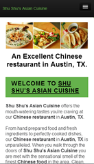
And then came the text. Do I need to know that “Shu Shu’s Asian Cuisine offers the mouth-watering tastes you’re craving at our Chinese restaurant in Austin, TX?”
No, I don’t. This is SEO copy, and it has no place in a mobile experience. This is a downside of the responsive design.
Unfortunately, it just keeps going.
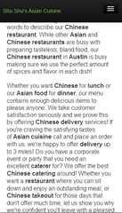
Finally, I get to something that speaks in the language of smartphones: images.
Well, one image.
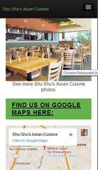
Let’s have some more pictures, please.
And we finally get to the map, with a link to “View on Google Maps.” This is how we can answer the question, “How far are you from where I am now?”

Adding a coupon-like sweetener is smart. However, the responsive design changed the aspect ratio of the image, making the site look cheap.
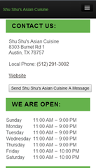
Next are the facts about address and hours of operation, complete with a link to “Website.” I thought we were already there?
Design for the Bottom Bounce
Finally, we hit bottom. Smartphone users have busy thumbs that generate lots of scrolling. Scroll tracking shows that many mobile visitors will “hit bottom.” This part of the page can be as critical as the first screen.

Choose wisely what you put at the bottom. I wouldn’t recommend sending bouncers off to social media. In fact, I would repeat the click-to-call phone number, place a clickable address, and maybe a way to take action here. A “Place an Takeout Order” button or “Email this to Friends” button would be good considerations.
I would also consider placing ratings and reviews here if possible.
All in all, this mobile site eventually delivers answers to most of the mobile user’s questions. The effectiveness is hampered by the responsive design that
- Inserts unnecessary elements.
- Slows the load time significantly.
- Mutilates some images.
In this case, a responsive design is probably not the right choice from a purely functional standpoint. However, it is easy to maintain, and restaurants don’t usually have the staff to manage multiple sites.
You don’t have to run a restaurant
The questions are the same, even if you don’t run a restaurant. However, there are differences for sites that have “considered” purchases, such as high-ticket products or business services.
What can you teach the mobile designer right now, where they are? Are they in a meeting being asked about solutions like the ones you provide?
We think that cross-device calls to action can be a big help.





Hi Brian, thanks for posting this. I think that our mobile visitors are a group that we must pay more attention to. I think that they are the future so examining this is going to be very worthwhile.
Kostas, thanks for the comment. We’re in high gear because we see valid mobile traffic growing for our customers, even those that don’t sell mobile-friendly products.