10 Profitable Lessons On Selling Niche Products from Etsy.com
Etsy.com is good at selling niche products. Here are 10 ideas you can apply to your ecommerce site.
As of November 2017 the Etsy marketplace had 31 million active product listings, created by 1.9 million unique sellers.
At any given time, there are between 20 to 25 million active buyers on the site, and consumers purchased an incredible $2.64 Billion worth of products from the site in 2016.
While Amazon.com’s mastery of commodity products makes it the undisputed king of ecommerce, Etsy.com is any many ways the queen, having established itself as the go-to marketplace for all things niche, boutique, and custom made.
In an ecommerce environment where small, niche brands continue to gain collective market share, there is a lot we can learn from Etsy on how to effectively sell niche products to consumers.
Today, we’ll be looking at 10 profitable lessons on selling niche products, courtesy of Etsy’s astounding success.
Lesson 1. Cart abandonment emails increased sales by $24 Million.
A lot can happen between the moment a customer adds a product to their shopping cart and they moment they hit “confirm purchase”.
A Baymard Institute study identified the following top reasons behind shopping cart abandonment.
- High shipping, tax and other charges (61%)
- Required account creation (35%)
- Complicated checkout (27%)
There’s various things you can try to decrease shopping cart abandonment:
- Offer free shipping
- Ad trust symbols
- Make the checkout process more streamlined
- Add social proof throughout the checkout process
- Offer a compelling return guarantee
But one of the best strategies for reducing cart abandonment actually comes after the abandonment takes place. This strategy was used by Etsy to increase sales by $24 Million.
Cart abandonment emails.
A report from Salescycle says that around 30% of the clicks generated on cart abandonment emails result in purchases. In this talk, Etsy’s former CEO explains how conversions improved when they started sending cart abandonment emails 5 days after abandonment.
This tactic alone increased Etsy’s total sales by 1%. And while that may not seem like a large number, at $2.4 Billion in sales in 2015, that’s a $24 Million increase in sales.
For most of us, 5 days is a tad too long to wait. Consumers have short memories, and you might benefit from shortening the followup time and sending your emails sooner. Most of the successful case studies I’ve reviewed send their emails in the 1-3 day range.
Furthermore, the more specific and personalized you can be in your email, the higher your conversion rate will be.
For example, include products that were in the cart, like in this email from Jack Wills:

Personalized abandonment emails
You can also create a sense of urgency like in this example from Google. This is very easy to do if you offer a limited time discount as part of your abandonment email.

Google uses cart abandonment emails, tool.
Finally, don’t throw in the towel after sending one email. Sending multiple emails can mean more clicks. Try a 3 email sequence and see how it performs.
2. Continuous A/B testing increased conversions by 457%
AB testing certainly isn’t a new topic here at Conversion Sciences. It’s also not a new topic at Etsy, where the team has been fostering a culture of continuous split testing.
This culture was initiated for the same reasons you are pushing for an increased optimization budget this next year: informed decision making and data-driven growth.
“Experimentation at Etsy comes from a desire to make informed decisions, and ensure that when we launch features for our millions of members, they work. Too often, we had features that took a lot of time and had to be maintained without any proof of their success or any popularity among users. A/B testing allow us to tinker with small pieces and measure if those pieces are moving in the right direction. We can say a feature is worth working on as soon as it’s underway, or even before, having measured the impact of small changes on our buyer and seller experiences.”
The team runs tests in an attempt to improve UX across different verticals be it their mobile app, product interface or anything else.
For example, the team changed the way people experienced Etsy on tablets to closely mimic the user-experience on PCs, both being large-sized screens.

Like desktop like tablet
In another instance, after hearing complaints about the mobile checkout process, they optimized the flow to make it simpler. The design and the development teams work hand-in-hand to roll out these changes which are tested on a big segment of the daily traffic before rolling them out sitewide.
While Etsy hasn’t shared any of their specific data, we can pull some hard numbers from another site.
Over a period of 10 months, digital marketplace Fiverr ran approximately 400 A/B tests, resulting in a conversion increased of 457%.
So what should you test?
A. Test landing and product page videos.
According to multiple studies, placing videos on product pages is a proven way to increase conversions. Home retailer OrganizeIT found that visitors who watched videos were 144% more likely to purchase a product. Adding product videos to your top selling products could be a great place to start.
You can also go in more of a content marketing direction, as Blitsy does well. They have a prominent section on the site called ‘inspiration’ with video tutorials that feature products available for purchase on the site.
The videos aren’t on product pages, but Blitsy leverages videos to educate visitors who may want to skip the hard work and order something from the site or get inspired to purchase craft supplies from the site. Either option is a win-win.

Video is key to Blitsy’s strategy.
B. Test button copy, messaging and size.
There are a lot of little things you can test on a product page. Just look at the below example.

This product page makes the savings obvious.
Savings is displayed in large and clear font followed by a large add to cart button that’s in stark contrast to everything else. I really like how they introduce the old pricing as “was” and strike it out.
The rule for button color is this: Choose a color that is not in the color palette of the page. In this case the add-to-cart button could be almost any color but pink, black or light blue. Red, green or purple would certainly stand out.
Test and see what works for you.
3. Highly visible reviews increase orders by 10-50%.
User reviews are one of the most powerful tools in your eCommerce arsenal.
Since a large majority of people trust online reviews as much as they trust a recommendation from a friend it makes sense to invest in acquiring and promoting reviews. It also helps that reviews can drive a 10 to 50% increase in orders. Just 15 good reviews is enough to make most people trust the review content, and this threshold results in a noticeable spike in sales.
According to a Harvard study, each additional review star on sites like Yelp results in a 5-9% improvement in product revenue.
Purchases on Etsy are fueled by a 5 star rating system that display review counts and dates for individual stores. You can an example for one Etsy store below:

Prominently displayed reviews with plenty of white space
Notice the bright colors, large font, and plentiful white space. These reviews are meant to be read. They aren’t just there to fulfill an item on a checklist.
Meanwhile, in the example below, the review count is small and monochromatic.

Monochromatic review
Telling you to publish reviews is hardly re-inventing the wheel, but take this is a reminder that not all review displays are created equal.
4. Include an estimated or guaranteed ship/arrival date
With custom products, there can be a long time gap from start to finish. Etsy gives an estimate of how long it’d take to create a product and ship it. This lowers cancellation rates and reduces buyer anxiety.

Estimate to build and ship
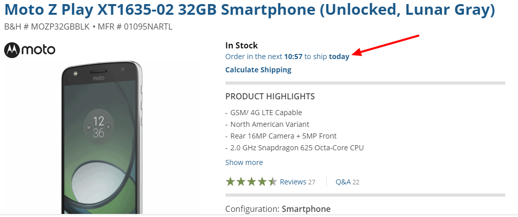
BHPhotoVideo (quirky name) follows on the same footsteps. The “order now to ship tomorrow”— call to action kills two birds with one stone— playing on urgency and giving a shipping estimate in-tandem.

Order now to ship tomorrow
You can also try a few additional techniques to improve conversions related to shipping.
A. Offer free shipping
The biggest hurdle that 61% people cite to purchasing online is shipping and associated costs. Free shipping makes a large part of the iceberg dissolve.
Probably free shipping is one big reason why Amazon prime members outnumber free members. As of last count there are 63 million people who hold the prime membership.
Blitsy, ensures that free worldwide shipping is the first thing visitors see.

Worldwide shipping is prominent
Throughout the homepage you’ll find instances that highlight free worldwide shipping.
B. Introduce an element of urgency
For instance, here’s what happened when I visited BH again. This time I only had 10 minutes to make the purchase.

A countdown timer that urges the visitor to purchase a product he’s interested in can definitely tilt the scales in your favor.
Another example.

Limited time
5. Utilize geo-targeted messaging.
On Etsy product pages you can always see geo-targeted messaging that mentions the country of the visitor. Example:

Targeted messaging
This is a small example and nowhere near the vast capabilities of geo-targeted messaging on offer today.
Let’s analyze a familiar scenario. Familiar because most of us have experienced the bane of retargeting ads.
For some reason, ads from the site eLabelz have been shadowing me since the past few days.
However, they’re wasting their ad budget.
They don’t ship to where I live. Plus their currency targeting is off.

Missed targeting
Targeting me with some unfamiliar currency, SAR in this case, puts me off as soon as I visit the site.
Changing the currency to match the currency of the country your visitors live in is crucial to get more conversions. It alleviates some of the fears and questions like if they’ll ship to their country or not.
With IP based targeting you can automatically figure in and add shipping costs for the customer to his country and in his currency.
For example, Bed Bath and Beyond targets me with a pop-up as soon as I visit the site that tries to placate most of my fears with international shipping viz— customs duty and shipping costs.
They then proceed to show all products in my currency.

Better targeting
When running geo-targeted campaigns here are few ideas you can use:
Change the language according to the visitor’s country of origin.
Show products on the homepage according to the season in that place. Works really well for clothing stores.
6. Make returns and exchanges easier
Most stores on Etsy outline a return policy which makes buyers confident about their purchase. The freedom to return what they don’t like is a big purchase driver.
Here’s an example.

Returns and exchanges
A Wall Street Journal research reported that a third of all internet transactions are returned.
The trend’s in the upswing because a lot of millennial shoppers now buy stuff to try them out.
Still, 48% of millennials feel returns are a hassle.
And that’s one reason to provide hassle-free returns.
The second reason—despite many shoppers returning purchases, they remain loyal to brands that provide a better experience.
A four-year long study tracked spending habits of buyers at two large online retailers and found that introducing a free return policy increased average spend by $620 on one store and $2500 at the other.
Everything said and done, it won’t be easy to introduce easy returns. You’d have to calculate shipping costs and allocate a part of the marketing spend to factor in for losses. But ultimately easy returns start paying for themselves and the surge in sales would make up for the losses.
Many online craft stores provide easy returns like the example below from Folksy.

Easy return policy
7. Exploit trends as they occur
During early 2000s, indie craft shows mushroomed all over the US— a time when an online marketplace for crafts wasn’t even a distant possibility, but a big need.
Coincidentally, this was a time when to-be Etsy founders were working on a community forum for crafters. Users on the site one after the other were all saying the same thing— they wished for a place where they could sell crafts. The consensus was Ebay “sucked,” and fees were too high.
That was the opportunity.
The founders jumped head-first and created a new avenue for craftsmen. Etsy lists over 30 million items as of today.
You don’t need a crystal ball to identify trends and jump on the bandwagon before anyone else. Google trends, news and forum talk is often enough.
Fugoo capitalized on Bluetooth technology to introduce world’s first waterproof Bluetooth speakers much before stalwarts like Apple or Google could smell the trend. By the time design and product teams get past red tape in corporate, startups like Fugoo can milk on a trend and establish themselves as industry leaders.
It need not always be a trend. It can also be a popular overarching theme.
For instance Nine Line an apparel retailer has a patriotic color to its line of clothing. The site especially espouses veterans.

Exploiting trends
Further down the road, they realized that the patriotic angle was well-received by Americans as a whole and not just veterans.
Patriotism shines through their tees, promotional emails, homepage and product copy and even product packaging.
They also hire only veterans.
With a 3-year growth spurt of 4,402% and $14 million in revenues, anyone can see how solid the strategy is for them.
For custom products, there are a number of avenues for fresh ideas.
For instance, the Craft and Hobby Association runs an annual trade show that packs insights from hundreds of successful craftsmen. That and similar trade-shows can give you a swipe-pack full of ideas enough for a year.
8. Feed personalized suggestions to return customers
Machine learning and customer feedback helps Etsy show personalized listings that make sense to the buyer.
Starting 2013, they began offering personalized recommendations and it immediately improved conversions.

Personalized Suggestions
94% of senior-level executives believe that personalization is the lynchpin of marketing. Online shoppers reflect that sentiment in that 59% of them attribute personalization to the ease of finding relevant products.
Needless to say that a lack of onsite personalization can hamper shopping experience.
Amazon aces on-site personalization on more than one front. Considering how much they upsell and downsell, it’s safe to assume that they generate a lot of sales thanks to their recommendation algos.
Not only is the homepage customized to a shopper’s tastes, showcasing products they’re interested in; there’s also a browsing history they can access to get back to anything they looked at before. On the customer’s shopping cart, price changes and changes in availability are promptly made available.
Consider another example.
The majority of the traffic to Build.com comes from affiliates. People click on the affiliate link and are redirected to Build. But this often left visitors wondering if the coupon had actually been applied. To counter this and improve conversions, Build created personalized CTAs that changed depending on the site that drove the traffic.

Personalized call to action
This step alone helped them lift conversions by 6%.
9. Improving page load speed increased conversions by 27%
There’s more than one reason to come up to speed with regards to your page speed.
If your site doesn’t load fast enough you’re effectively sinking sales. Etsy loads under 1.56s with a low page size of 1.5mb.

Improve load times
AliExpress found that when they reduced load time of their pages by 36%, conversions increased 27%.
Page speed also dents your conversion in other deceptively innocuous ways. A mobile visitor may still scroll the site if takes longer than 4 seconds to load.
But since the elements didn’t load, they’re well likely to miss out on special offers and promos that you’ve on the top. That can hurt.
That’s to say if Michaels (craft deals site) didn’t load their site quick enough, many mobile visitors wouldn’t see their richly done promo deals.

Rich promo deals with fast load time
QuBit’s survey of 60,000 eCommerce consumers found that a slow loading page is a major factor driving them away from the site.
According to their estimates, the number of abandoners who quit due to slow load times alone would result in an annual loss of £1.73 billion GBP.
Using a CDN, optimizing images that you’ve tons of and ensuring you’ve a mobile-friendly version of your store are a few steps in the right direction.
10. Highlight special events, limited time offers, and new arrivals
Be it Black Friday, Cyber Monday, Christmas or any special occasion Etsy includes custom CTAs on the homepage. This boosts sales and something you ought to consider for your store as well.

Highlight events
Hold your horses though.
Etsy isn’t the perfect lead to follow in this case.
Their CTA merges with the color and feel that the rest of the site carries. It doesn’t stand out— which is last thing you want for a CTA.
As such it can be and is easily ignored.
It wouldn’t be an overstatement if I said that they did a piss poor job at crafting CTAs. It feels like since everybody is offering a sale on Cyber Monday they too had to do something.
In contrast, ArtFire’s homepage ticks all conversion optimization boxes.

Example of great conversion optimization
The homepage holiday offer hogs all the spotlight. The messaging is in place and stands in stark contrast to the surrounding dark colored them.
When you click through to the CTA you find an assortment of categories that further leads to products like the ones below.

Click through to categories
And then drop the ball. There’s no attempt to interest me as a potential buyer. Sure, a few items have SALE written next to them but it doesn’t answer how much I am saving.
That’s a potential deal-breaker.
When people click through to the CTA, it would do well to offer discounted set of aggregated deals.
Blitsy does it best. The discount amount is highlighted in bold pink and the sub-headlines call the offers limited time. The font size could be bigger but still that’s an example you can follow.

Blitsy does it best
One more example.

Blitsy does it best
Pay attention to how they highlight the new price by striking out the old price. There are countless occasions, days, and events when you can run special promos.
Or just announce an inventory clearance.
10 Profitable Lessons On Selling Niche Products from Etsy.com Conclusion
As with any technique, it’s important to test and see what works.
Don’t be disappointed if some of your marketing promos fall flat on the face. It’s only when you analyze your failures that you learn.
Try some of the ideas that we have compiled so carefully and let us know how it worked out for you.
- 10 Profitable Lessons On Selling Niche Products from Etsy.com - January 8, 2018


