10 Proven Ways To Immediately Optimize Your Pricing Page
Looking for proven ways to optimize your pricing page? I invite you to read these sure-fire 10 tips to increase conversions fast.
“Yes, I’m very interested in purchasing your product, and I just clicked the button taking me to your pricing page.”
What does that mean?
It means the $50 you invested in finding me and getting me to your landing page paid off. It means the $1,500 you invested in creating a high-converting landing page did its job.
Most importantly, it means I’m a very warm prospect evaluating your pricing plans and very likely considering an immediate purchase.
Aaaaaand I’m gone…
Before Diving into the 10 Proven Ways To Immediately Optimize Your Pricing Page
There are a lot of places you can lose someone in your funnel, but the pricing and checkout pages are where it hurts the most. The people who arrive here are the most primed to purchase, and while re-targeting campaigns can help mitigate the damage, ultimately, we want to maximize the rate at which these warm prospects become immediate customers.
In fact, after analyzing 89 successful SaaS startups, one angel investor cited time invested in optimizing the pricing page as the #1 indicator of conversion rate.
Yet unlike checkout pages, the pricing page rarely gets the focus it deserves.
Today, we are going to shine a big fat spotlight on the pricing page and teach you how to optimize your pricing page to create a high-converting edition on the first try.
1. Offer a Money-Back Guarantee or a Free Trial
One of the biggest friction points that prevents prospective buyers from purchasing is trust. This type of doubt can be multifaceted and is often referred to as FUD (fears, uncertainties, and doubts). It can be expressed as questions like:
- What if I don’t like it?
- What if it’s difficult to learn?
- What if it isn’t suitable for my purposes?
- What if I pick the wrong pricing plan?
- Can I trust this brand to deliver on their promises?
- Can I trust that my transaction will be secure?
- Can I trust that my investment won’t be a waste?
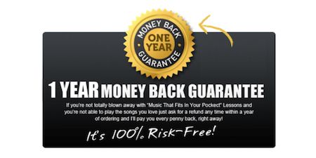
One of the easiest ways to alleviate these trust-based fears is to offer a money-back guarantee or a free trial. These types of offers make the customer feel like their risk is significantly reduced, and their actions follow suit.
Marketer Neil Patel ran a number of different pricing page offers and found that adding a money-back guarantee increased sales by 21% and total revenue by 6.4%. Adding a free trial performed even better, doubling signups and resulting in 15% additional revenue.
Of course, it’s possible that a company could promise a refund and then fail to deliver, but this type of behavior is much more easily sniffed out via due diligence, and most consumers generally tend to trust that if a company promises a refund, they will deliver.
If your brand is not well known in your industry, you will have to break through some trust issues. Trust symbols give your visitors a visual signal that your site is safe and that your business is legitimate.
Some examples of trust symbols are:
2. Display Transaction Security Badges
While money back guarantees and free trials make the customer feel less at risk from the company, that’s not the only point of concern.
The Nilson Report estimated that last year total credit card fraud worldwide topped $24.71 billion and Experian reported that e-commerce alone saw a 33% spike in credit card fraud. This upward trend has buyers extra cautious when it comes to doing business online and has forced sites to put in extra effort to alleviate security concerns.
As a result, displaying security badges can give potential customers confidence that the checkout process will be safe and secure. A study done by Atcore, a Danish digital marketing agency, found that adding trust symbols to their ecommerce site improved conversions 32%.
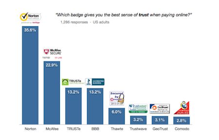
Not all security badges are create equal, however. A survey performed by the Baymard Institute found that Norton led the pack in customer recognition and feelings of safety when it comes to paying online.
3. Display Social Proof
In many ways, the same things that enhance your landing pages will optimize your pricing page as well. Just like social proof can help motivate that first click, it can also motivate each subsequent click throughout your conversion funnel.
This continues on that thread of building trust. 88% of consumers trust online reviews as much as a personal recommendation. When you include things like testimonials, reviews, and other forms of social proof, it’s like having a friend sitting next to your prospect and saying stuff like, “Oh yeah, this is what you’re looking for,” and “This is totally going to solve that problem you’ve been having,” at every step of the conversion journey.
Leadpages’s pricing page offers a solid look at this principle in action. Their page displays real customer reviews that highlight different pain points their potential customers might be experiencing such as pricing concerns, product effectiveness, and conversion rates.
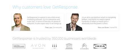
GetResponse’s pricing page does a great job of weaving in several different forms of social proof, including influencer testimonials, brands of well-known customers, and the total number of users.
Conversion Sciences has already covered social proof thoroughly in their landing page best practices, so I won’t belabor the point, but suffice it to say that what improves conversions on your landing pages will often improve conversions on your pricing page as well, and for many of the same reasons.
4. Re-order your pricing plans
Experiment with ordering your pricing plans from most expensive to least expensive. This one is pretty simple, and there’s not much to say except that there is data to suggest this is worth a split test, so check out this AB Testing Guide.
A study performed by ConversionXL found that when you place the more expensive options on the left, participants tended to spend more time analyzing the features and benefits of the leftmost plan and less time doing so on the rightmost plan. The results showed a 6% increase in conversions when the most expensive plan was leftmost and a 10% increase when the second most expensive option was placed first.
5. Highlight a “Recommended” Option
Suggesting a price point that satisfies the bulk of your visitors can boost conversions by helping reduce the paradox of choice.
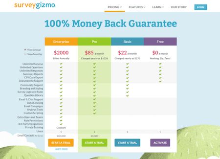
A study performed on pricing preference versus layout designs for the site Surveygizmo concluded that site visitors focus more quickly and longer on a highlighted plan. The research also found that in a scenario where the most expensive plan was ordered first, and the recommended plan was highlighted in the second position that the recommended plan (shown below as the Pro plan) was chosen more often than in any other scenario.
To make the most out of this strategy, make sure that your recommended plan offers a superior value-to-cost ratio over lesser plans. It should entice people who would prefer to pay for the lesser plan to purchase it because it is such an obviously better value.
6. Utilize Charm Pricing
“Charm pricing” is pricing that ends in digits that are non-zero such as 9, 7, or 5.
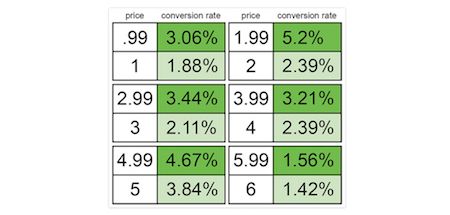
An analysis of price point and product being sold on Gumroad’s massive creator marketplace discovered that charm pricing resulted in considerably higher conversion rates for the exact same product.
From a psychological point of view, Gumroad’s team theorizes that since we read left to right, we tend to process the first number in a price and tend to block out the rest of the price. They also mention studies that correlate charm pricing with consumers believing they are receiving a discount.
Simply put, charm pricing is a fairly universal practice for a reason, and if you’d decided to buck the trend and just be “straightforward”, you might want to reconsider.
7. Write Strategic Pricing Plan Names
How much time did you spend thinking about the names for your pricing plans?
The main goal of a pricing plan name is to help communicate who its intended for and make the customer who selects it feel like they are making the right choice. You want customers to instantly know which plan is designed for them.
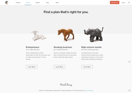
There are upsides and downsides to choosing standard names versus more original and fun names, but one way to have the best of both worlds is to use more standard, descriptive names while incorporating fun illustrations that highlight your business’ personality.
Mailchimp shows us a decent example of this in action below.
8. Write less and use more white space
In everything you do online, simplicity and clarity should be your core values. Visually complex websites don’t perform well in most cases. In order to help users process the info on our page, we want LESS clutter. Less text. Less options. Less distracting design features. The only thing we want more of is white space.
The following should be our target in most cases:
- Minimal text that is benefit driven
- Bullet points to focus attention and allow for scanning
- An above-the-fold design highlighting important points and CTA’s
- A layout that makes it easy to compare options
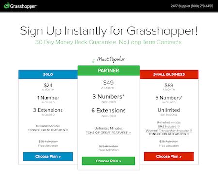
Grasshopper offers a great example of our target design aesthetic. It’s simple, clean, clear, and allows readers to quickly process the presented information without feeling confused or overwhelmed.
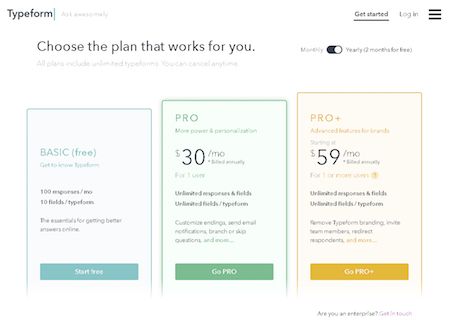
Another great example comes from Typeform. Rather than coming off sales-y, their pricing page comes off as helpful with useful one-liners describing their plans such as “Get to know Typeform,” “More power & personalization,” and “Advanced features for brands.” Each plan builds upon the last, the layout makes it easy to compare, and the entire presentation is simple and visually appealing.
9. Offer fewer options to reduce analysis paralysis
There was a fairly famous study done on the detrimental effect more choices can have. The study was conducted by a pair of Columbia and Stanford University professors on the subject of jam. This research duo concluded that people purchased more jam when fewer options were made available to them. In fact, conversions shot up 10x when choices of jam offered to shoppers were reduced from 26 varieties to only 6.
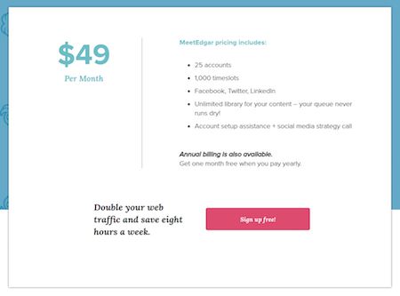
The same dynamic has been seen in a number of pricing page studies, and it’s one of the reasons you rarely see more than 4 options being presented on a pricing page. Some companies have even taken this element to the extreme with great success. MeetEdgar, for example, has offered only one plan on their journey to $4 million ARR.
The sweet spot for most business seems to be 3 pricing options, but like everything, you’ll need to test in order to know what works best for your unique business.
10. For international audiences, provide automatic currency conversion
The internet has expanded the once limited reach of local business owners to encompass the entire global market. As such, you are likely missing out on some key conversions if you aren’t offering some sort of exchange rate calculator or alternative pricing page design for other countries.
Take this survey performed by Y Combinator into consideration. They asked, “Would you buy a service that bills only in € (euros)?
- 72 people said “€ is OK”
- 65 people said “€ is OK but I would really prefer $ if possible”
- 19 people said “€ is not OK at all”
- 6 people said “I would not buy in $, but only in €”
Out of 159 possible votes, 84 (roughly 53%) would rather pay in dollars instead of Euros. If your audience deals in more than one currency, adding those options to your pricing page can enhance your conversion rate.
A great example of this in action comes from Australian company Quad Lock which lets users select from 6 different countries/unions and will change the site’s currency to match.
Summary: 10 Proven Ways To Immediately Optimize Your Pricing Page
If you have a pricing page, it’s a core piece of your conversion funnel.
Today, we’ve highlight some ways to immediately optimize this page, but at the end of the day, there no such thing as a perfect pricing page. Some of these tips may work for your business and some may not. The most important thing to remember is to test early and test often.
We would love to get your feedback as well, what changes have you made to boost conversions on your pricing page? Tell us in the comments below.
- 10 Proven Ways To Immediately Optimize Your Pricing Page - October 4, 2017
- 5 Essential Qualities of a High-Converting Promotional Video - May 26, 2017
- How To Persuade People Without Trying: 8 Ways To Be Naturally Influential - April 18, 2017








Thanks for the share Alex.
Which of these ways really made the difference for you?
Hey Filip, great question!
Above all else, I believe analysis paralysis is the problem most pricing pages have and definitely used to be my problem. Decreasing my pricing options from 5 to 3 increased my conversions 18%.
Often we get caught up thinking people want more options and that we will attract more customers by offering more. But in reality giving people fewer choices will help them make a decision rather than getting caught up in paralysis analysis and never pulling the trigger. Hope this helps! Thanks for reading.
This is some serious stuff.. I’m glad i found this blog. Thanks and keep doing the awesome job :) 7downloads.com
Amazing diary and extremely fascinating stuff to procure here! I absolutely learned masses from reading through variety of your earlier posts additionally and set to drop a discuss this one!
Good article. Thanks!
Thanks for the share Alex!!