Which Pictures Convert Best? Your Guide To High-Converting Images
When used poorly, images work against us, but when used correctly, they can do things in our customers’ minds that our copywriting cannot. As a Conversion Optimization Agency, we use images all the time for storytelling and persuasion.
In the next 10 minutes, we’re going to look at why images are so important and review 6 case studies that demonstrate how images can make or break our conversion rates.
We’ve also put together a downloadable, best-practice checklist for choosing the right images in 5 key scenarios:
- Product images
- Hero shot images
- Landing page images
- Social post images
- Content images
These guidelines are compiled from 20 different expert sources. Download the checklist here:
Why Images Are Critical To Conversion
As we’ve talked about many times before, direct response copywriting is a key ingredient of breaking down your audience’ mental barriers. But it’s not the only tool in our toolbox.
Images are powerful. VERY powerful. Here’s why:
#1. Our brains process images faster than text
A study by MIT neuroscientists discovered the human brain can identify images seen for as little as 13 milliseconds. In comparison, it takes humans 100 milliseconds to blink.
This means that before you blink once, your brain has processed almost 8 images.
Our brains process images 60,000 times faster than text. What this means practically is that images are actually the first thing people ‘read’ on your landing page.
#2. The brain is predominantly a visual organ
According to the same MIT scientists, 90% of information transmitted to our brain is visual, with the remaining 10% divided between the rest of our senses. Our eyes are our primary way of consuming and understanding information.
By utilizing images correctly in your marketing and sales, you’re playing to the brain’s strength, so to speak. You’ll get your audience to grasp your message faster and in ways you can’t pull off via copy alone.
#3. Most people are visual learners
Research from Pearson Prentice Hall shows that 65% of people are primarily visual learners. They respond more to visual demonstration than auditory explanations or even hands-on, tactile learning.
In practice, this means that failing to visually demonstrate your offer will put you at a disadvantage with 65% of consumers.
Obviously, that’s not ideal. We want every advantage available to us when optimizing our websites and online funnels.
Now that we understand why images and visualization are so important, let’s look at how we can practically make images work for us on our websites.
#1. Using Images To Visualize Benefits Increased Revenue Per Visitor By 17%
One of the best ways to use images in marketing is to help customers visualize the benefits they’ll receive.
What does success look like for them when they choose your product or service? Is there a way to visualize that success with an image?
A great case study of this in action comes from Behave.org. While the original image helped visualized the product, the team wanted to test an image that more clearly visualized the product’s benefit to the consumer.
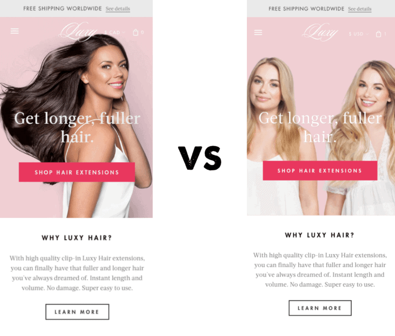
The decided to test an image of a model before and after adding the brand’s hair extension product.
This change was intended to better display the changes (or benefits) the products brings to the wearer, and new image got results.
With a test size of 23,000 visitors, split 50/50 across the old and and new versions, the “before & after” approach increased page click-throughs by 7.93% and more importantly, increased revenue per visitor by 17.61%.
Interestingly, these results only held true for desktop traffic.
On mobile, where the new design was a bit cramped on smaller screens, the simpler original photo performed better, with the new image, decreasing click-throughs by 0.67%, and revenue by 27.69%.
The original image still displays the benefits of the product, and in our analysis, the mobile results suggest that for mobile users, simplicity is superior to other conversion factors.
In other words, take advantage of the added space on desktop and tablet, but prioritize simplicity on smartphones.
#2. A 28% Increase In Product Image Size Resulted In A 63% Conversion Lift
While size and quality aren’t as important as relevance, both qualifications matter when creating images.
Bigger images typically mean greater visibility, deeper emotional connections, and better-looking pages. When it comes to product images specifically, a larger, higher-quality image can provide a significantly superior shopping experience for customers wanting a clearer idea of the product before purchasing.
When Skinner Auctions tested a product image increase of 28%, they boosted page sales by 63%, despite the bigger image pushing the content below the fold as seen below.

Example of AB Test in which larger images increased conversion rate. Source
Of course, bigger isn’t unilaterally bigger. Overly large images can be distracting or harm load speeds. In order to stay on the right side of this equation, follow these recommendations from WordStream:
- Resize the image yourself (as opposed to having the browser resize it)
- Compress the image in Photoshop, an online compressing tool or even in Paint
- Experiment with different image file types (PNG vs. JPG) to optimize quality without sacrificing load times.
- Leverage page caching as much as possible.
#3. Adding A Smile Increased Sales By 10%
People are attracted to other smiling people. This law of reality is about as universal as it gets, and it’s been applied to marketing many, many times.
In one simple, five-week split test, Alwin Hoogerdijk of Collectorz.com saw a 1.3% increase in signups and a 9.9% boost in sales when he compared a serious and a smiling face on his landing page.
Version A
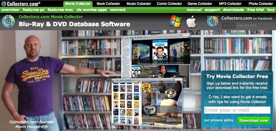
Example of an image in which the model is not smiling. Source
Version B
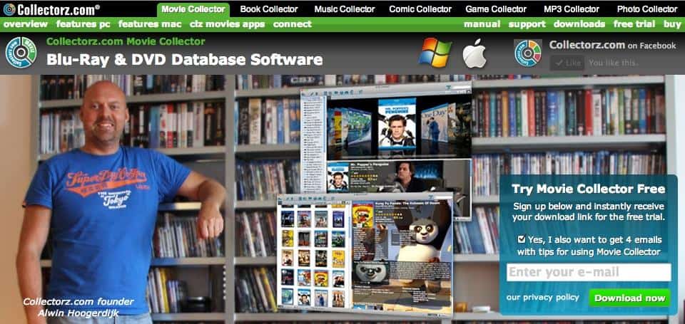
Example of an image in which the model is smiling. Source
Notice his big smile on the winning version?
Neuroscience marketing studies show that smiling makes one look warm, attractive, likeable, and approachable. The same report shows that a smile is a trust booster. People are more likely to trust you and be influenced by you when you’re smiling.
Plus, people are hard wired to follow other people’s gaze as this eye-tracking study shows. Take advantage of this fact and use eyes as visual cues to direct visitor’s eyes to specific areas of your page.
A good illustration of how to use a stare to guide visitors’ eyes comes from this Wordstream optin page.

Example of using eye direction to focus attention in an image. Source
See how she’s focused on the form? This draws the visitors’ eyes to focus on the sign up form as well. You can also use a person’s body as a directional cue not just the eyes.
To boost conversions, give your images a human touch.
#4. Switching From Stock Photos To Real Shots Increased Lead Signups By 45%
Listen, you’ve read this before… undoubtedly. But if you look at your own marketing materials, there is probably a decent chance you are using a few stock photos.
Why?
Because taking quality photos of your team, equipment, business, etc. is somewhat challenging. There are a few hurdles to jump, whereas stock photos are easy, and you probably have a great eye for picking the good ones, right?
The problem is that you are thinking in terms of downside. “This stock photo isn’t THAT bad and surely won’t hurt my conversion rate.”
But when creating a landing page, we shouldn’t be thinking in terms of “not hurting” our conversion rate. We should be thinking in terms of enhancing our conversion rate.
As we discussed earlier, images are incredibly powerful, and your site’s images should be an ASSET to your page, not simply a neutral force. If you are aiming for neutral, you are missing out.
And there’s some good news here.
You don’t need high resolution, professionally produced photos to enhance your page’s conversion rate. Just taking real photos of relevant parts of your business can do wonders.
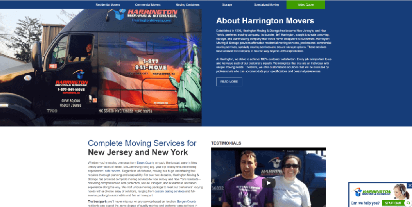
For example, Harrington Movers improved conversions by 45.45% when they replaced their stock photos with a shot of their crew. They also tested with a shot of their trucks, and saw similar results.
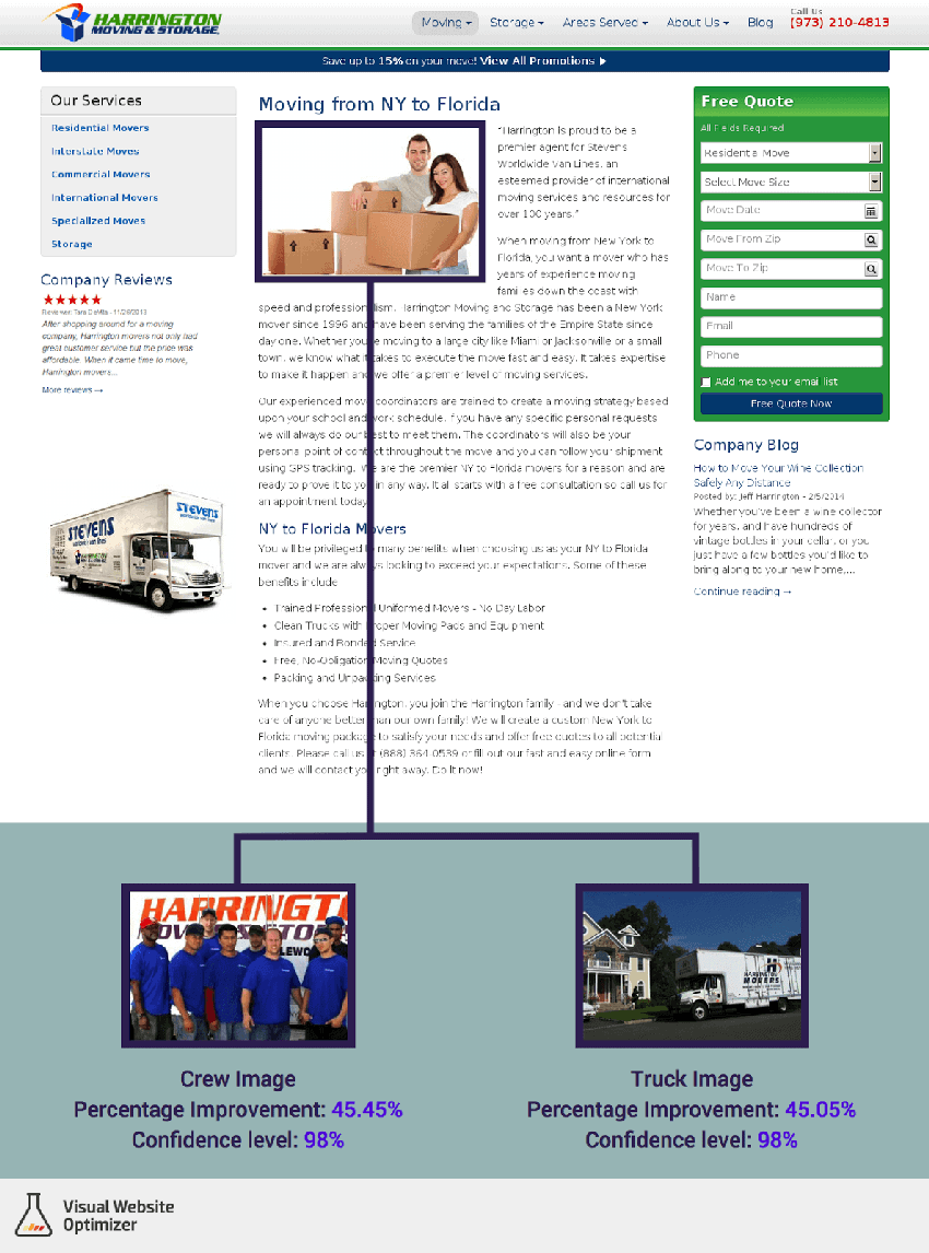
AB test example in which images of real people or a truck worked. Source
Notice that these shots are the type you could take with your smartphone. They key is understanding why these images work. They aren’t design element to enhance your page. They are a way for potential customers to visualize key pieces of your business.
When you are hiring a trucking company, what are the only three points of contact with the business?
- The driver
- The truck
- Customer service in the event of a problem
By choosing images that visualize 2 out of 3 of these contact points, the company was able to help readers visualize the brand’s value.
And while we don’t have the data on this, they’ve since redesigned their site with more real shots of crew and equipment.
Images can and should be working FOR your business.
#5. Using The Right Colors Increased Opt-Ins By 132%
Color has a powerful psychological influence on the brain. A journal by Satyendra Singh revealed that people make snap judgements about about both products and people within 90 seconds of their initial interactions, and between 62-90% of that assessment is based on colors alone.
Coca cola knows how to use colors to impact buyers.

Coca Cola knows how to use color to impact buyers. Source
The color red isn’t an accident here. It has a number of powerful psychological effects.
Alertness, romanticism, vitality… these are central feelings targeted in Coke’s marketing, as further articulate through their taglines, “Open happiness,” “Taste the feeling,” “The Coke side of life.”
The colors are used in conjunction with the copy to create feelings.
And while branding isn’t always directly measurable, we can see evidence of color’s profound impact in more measurable tests.
We sometimes like to make fun of the poorly run tests claiming massive improvements from small changes, but just two years ago, Leadpages saw a green CTA beat a yellow CTA and increase opt-ins by 132.41% when they did the following split test.

The original form with yellow call to action button. Source

This form with a green call to action button performed much better. Source
While colors are powerful, their use is not simplistic. The same color doesn’t have the same emotional effect on every human being every time. A study by Joe Hallock showed different genders favor different colors and even different age groups like different colors!
The central point here is that color matters, and being intentional about the colors you use can have a profound impact on your marketing.
#6. Aligning Images With Copy Boosted Revenue By 108%
Aligning persuasive copy with strategic images makes for the perfect marketing marriage.
Show the benefits. Speak to the pain. Sell the solution.
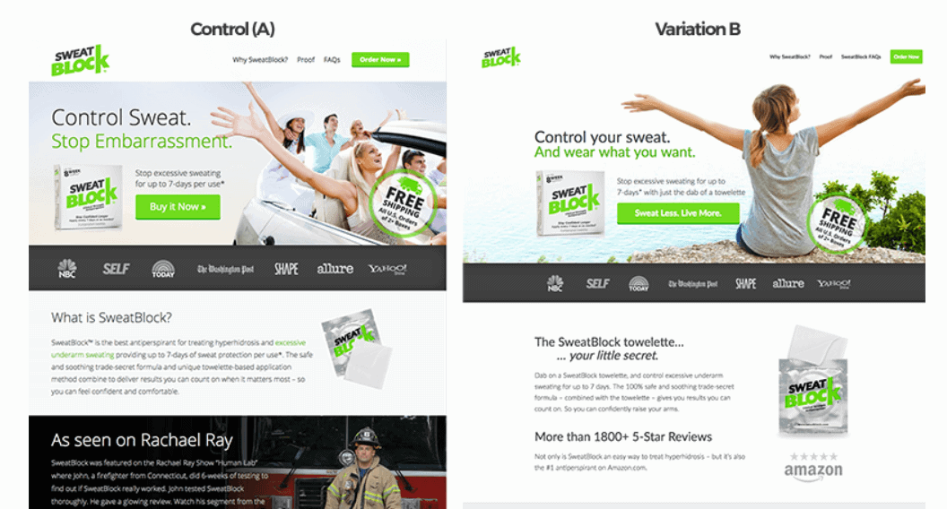
That’s the strategy SweatBlock took in revamping its homepage and the result was a 108% lift in revenue.
While the new version isn’t a massive conceptual departure from the original, it does a better job both in terms of the copy and the image, better aligning the two around the benefits of the product.
Best Practices For 5 Key Scenarios
Now that you understand why images are powerful and how to choose the right ones, it’s time to get one step more practical.
Different scenarios call for different types of images, so we’ve gone through 20 different expert sources to put together a best practice cheat sheet. We cover the following 5 key scenarios:
- Product images
- Hero shot images
- Landing page images
- Social post images
- Content images
Download the cheat sheet below. Or, want to hand the work off to a team of experts? We have a range of conversion optimization services that can specifically help you optimize images (along with whatever else needs to be optimized!).
Image Best-Practices Sheet
- AB Testing Research: Do Your Conversion Homework - December 8, 2018
- 8 Elements of a High Converting Squeeze Page - June 21, 2018
- 10 Conversion Lessons For Online Retail from Amazon - November 29, 2017






Great article. There’s a few things in here I hadn’t thought of before and can’t wait to try out!
Thanks John, glad you found it helpful! Would love to hear how your image experiments work out.
Good article. Could you give tips for using images for a B2B service company? I am tired of using photos of happy people in offices.
B2B services can be a bit trickier. I’ve opted to ditch photos and go with screenshots and graphics on my own website for that reason, and custom/relevant graphics seem to be pretty common in the B2B service space.
It really just depends on where the value is coming from. If you are the value, high-res pics of you in authority- building scenarios is always a great way to go.
Ex. https://jacobmcmillen.com/professional-copywriter/
Great article! This helps me a lot, keep it up.
Thanks Joseph, glad it was helpful!
Love this article Jacob. So, in summary, positive images with results or a perception of happiness deliver the goods. It’s rather like the Apple vs Samsung phone battle. Apple won the war because they images and video that showed what you could have with their phone whilst Samsung blurted on about mega pixels and screen resolutions which few consumers really understood.
As I keep telling my clients, it’s not about you and how good your products are. It’s about your customers and showing how you can take their pain away and change their lives. Images are the best way to do this.
Matt
Exactly, well said Matt. Customers really don’t care about your business, they care about what they can get from your business, and pictures should help them visualize that.
This is the precise weblog for anybody United Nations agency should obtain out regarding this subject. You notice such plenty its nearly arduous to argue with you. You utterly place a clean spin on a subject that’s been written regarding for years. Nice stuff, just nice!