8 Elements of a High Converting Squeeze Page
Lead generation is the lifeblood of online business and most lead generation is done via email collection.
If you grow a list of prospects who’re interested in your promotions, your business grows too. However, before you make money from your list you’ve got to get people on it. Whether you want people to download your lead magnet, sign up for your latest webinar or volunteer to test your product, you first need to persuade them to part with their highly guarded personal details – that’s no small feat.
No wonder the average opt-in rate across industries is hovering around a mere 2%. After investing a fortune in Facebook advertising, PPC ads, outsourced content, content management software, site design, and more, you only net two leads per 100 visitors. Two leads… NOT customers mind you.
Surely, your business deserves better.
Today, we’re going to cover the eight elements of a high converting opt-in page so you can boost your opt-in conversion rates and get a better return on your content marketing investment.
Ready to dive in?
Element #1: A short pre-headline to draw them in
When your prospect arrives on your opt-in page she wants to know if she’s in the right place. If she feels lost, she’ll click away. Use the apex of your page to make her stick around.
And, depending on who you ask, you have five seconds or less to do that. But how do you do it? Here’s three ways to instantly attract your reader when she lands on your page so she stays on.
#1. Name the target audience
For example, Attention dog owners, Attention Content Marketers etc.
When you name your audience you get a nod from the prospect, “Yep that’s me.” Handled correctly, this small first yes will ultimately lead to the big yes of a signup later on.
#2. Name the type of lead magnet
For example, Free Special Report, Free Training Webinar etc.
The specificity of your offer increases desire and the likelihood of the prospect staying on so as to get it.
#3. Name the referral site
Naming the referral site on your page makes your prospect feel like a diva and warm up to you and your offer.
Amy Harrison rolls out a red carpet for her Copyblogger readers. She makes them feel the love by welcoming them: specifically, heartily, personally.
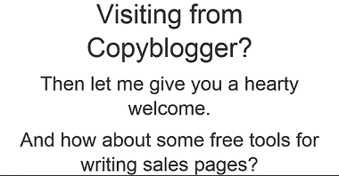
Your pre-headline has four main purposes:
#1. To help your prospects understand your offer…fast.
#2. To alienate those who are not a good fit for your offer.
#3. To attract those who are perfectly suited to your offer.
#4. To build rapport with your audience in an instant.
A great pre-head will keep readers on your signup page.
Element #2: A benefit-rich headline to make them want to read more
Once your prospect hangs around, use your headline to show her how your offer will benefit her and improve her life. Promptly address her concerns so she lingers on the page or you’ll lose her by the door. Quickly address her pain, paint the desired future for her, or pique her curiosity so she can’t help herself but read on.
In short, tell your prospect what’s in it for her.
Jacob McMillen’s headline is ultra-specific and has a solution that’s tailor-made for cash-strapped businesses – that’s a big benefit that’ll keep his target audience glued to the page.
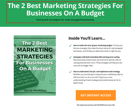
Source
Not only that. Your headline must also tie in nicely to the traffic source. That way the prospect’s conversion journey becomes smoother thus generating better results for your business. Jacob McMillen does this superbly as the source page to the above landing page shows:
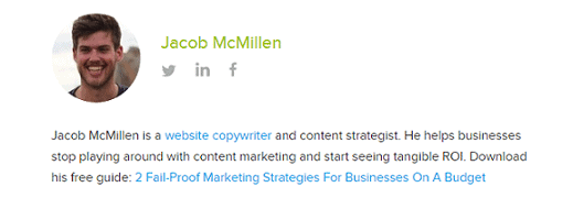
Notice how his CTA, the last words in his bio, are the first words on the landing page? This way the byline is perfectly coupled to the landing page thus increasing conversions. When a reader clicks his bio and lands on the landing page she smoothly continues her conversion journey – because of harmony between the two pages, conversions are likely to be higher.
On the flip side, a copy mismatch between the source page and the signup page tanks conversions.
Element #3: A few lines of crisp copy to pull them further down the page
You’ve done well if your prospect is still on your page thus far.
Your next few lines should give specific points about your offer. Show her how your offer will scratch her itch or push her towards her dream. Do that and she’s more likely to give you her details.
Use bullet points or short paragraphs. Your bullets should be:
- Clear- use simple direct language so the prospect easily grasps your offer.
- Crisp- keep your points brief and to the point to keep the prospect engaged.
- Catchy- use attention-getting words to give details about your offer.
Smartblogger nails their bullet copy on this sign-up page for an upcoming webinar.
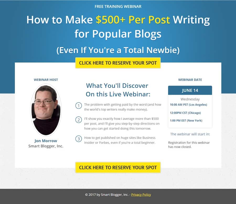
The three bullets tell you exactly what you’ll get on the webinar in a simple engaging way without laboring the point. If you’re going for the minimalist approach even a single line will do. The amount of copy on the body of your opt-in page depends on three key factors.
#1. How aware is your prospect about you and your offer? The more aware she is about you and what you do the less copy you need and vice versa.
#2. What works best for your niche? Study the most successful signup pages in your niche and do likewise.
#3. How complex is the problem you’re trying to solve for the prospect? The more complex the problem, the more copy required to convince prospects to sign up.
Element #4: A pro-looking image to help them visualize what they’ll get
Our brains process images up to 60,000 times faster than text.
To woo your prospect so she says yes to your proposal (offer), show her what she’ll get. Use a picture of the product or of people expressing the feeling you’re targeting. Pictures of animals work well too if your context allows it.
John Nemo’s book shot dominates his opt-in page on purpose. You can almost smell the LinkedIn cash splashed on the cover.
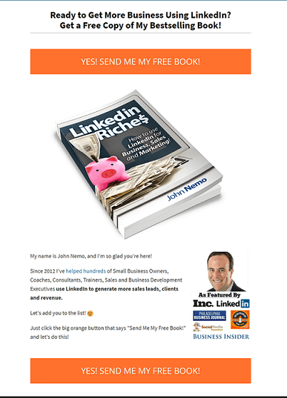
A word of warning about pics: don’t just include a picture because you like it…that won’t help your cause. Only include a picture if it’s relevant to your offer.
Element #5: A signup field(s) to capture their personal details
You’re almost there now… your prospects cursor is hovering over the signup field. Now comes the big question…how much info do you want from her?
Numerous tests show that, in most cases, the fewer the signup fields, the higher the conversion rates. That’s why most sites simply ask for an email address and/or name only as shown in the Marketing Sherpa lead generation graphic below.
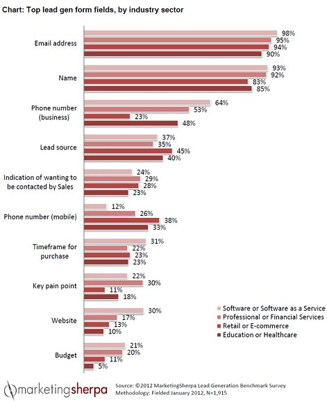
Of course, you can ask for more than that if you want a more targeted list. Although your conversions may dip, the quality of your list will improve. Ask for what you need and no more. This makes filling the fields more desirable. You can always ask for more details later.
But, as with everything digital, conduct split tests to see what works for you and your audience instead of blindingly jumping on the bandwagon. In many cases, tests have shown that increasing the number of fields actually raised conversions.
Element #6: A bit of social proof to earn their trust
It’s natural. No one wants to go first. People do what they see other people do. That’s why social proof is a vital ingredient to the success of your page. Here are some three quick-and-easy ways of incorporating social proof into your signup page:
#1. Display your list numbers if they’re substantial
To nudge people over the sign-up line, you can use big numbers associated with your following. However, be careful as numbers can be a double-edged sword. If your numbers are small, social proof will still work, but against you! No-one wants to be a part of something small and insignificant.
Social Media Examiner uses their massive list to good effect to inspire people to join their list.
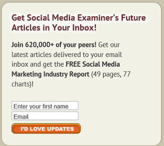
Surely, on seeing the 620 000+ social media marketing peers on Social Media Examiner’s list, a prospect will be enticed to sign up.
#2. Splash customer testimonials generously on the page
Testimonials multiply your clout score thus making it easy for people to take up your offer. Henneke Duistermaat, of Enchanting Marketing, does a neat job.
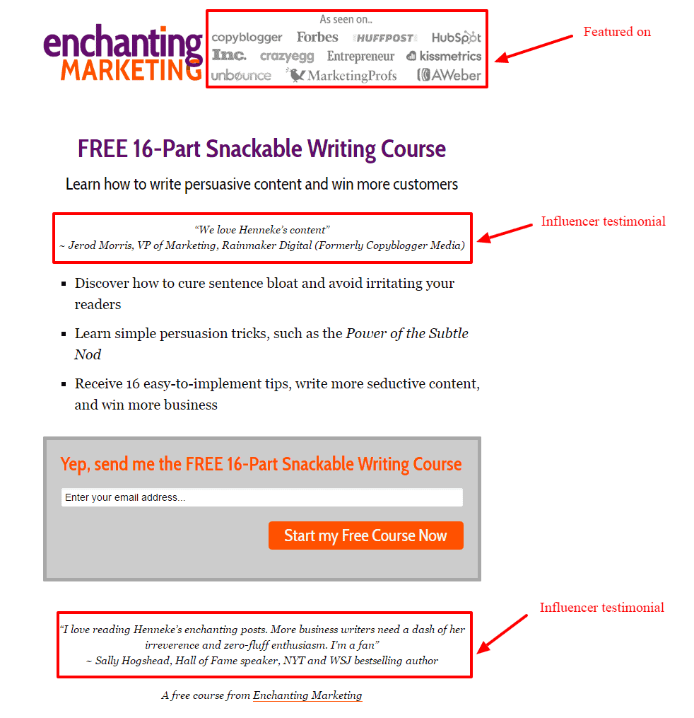
Not only does she head the page with a rich list of big sites she’s been featured on, she sandwiches her offer between two testimonials from heavyweights in her niche. Prospects are more likely to trust her word and gobble up her course.
#3. Point to influencer endorsements and press mentions
To get prospects to sign-up for a free trial, Get Response leads with an imposing figure of their current users and then they underline their authority in their space by quoting two influencers.
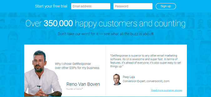
This is likely to cause more people to take their software for a spin.
Element #7: A privacy statement to assure them their info is safe
Because cyber-crime is rampant, your prospect is uneasy. Hardly a day goes by without someone being scammed or spammed online. Allay her fears…wrap your arm around her and let her know you’re not one of the bad guys. Tell her you won’t peddle her email address nor send the alien stuff she didn’t ask for.
A brief statement such as ‘We respect your privacy and will never share your info’ is enough as Neil Patel does.
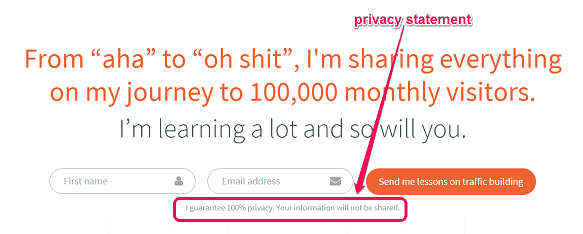
Feel free to get creative with the phrasing. Or, if you’re not feeling inspired, simply write ‘privacy policy’ and link to your full-blown privacy policy. And, oh, a privacy statement also serves a more personal and practical purpose: failure to include one might land you in trouble with the law.
Basically, your privacy statement should assure your visitors that their info is safe. Only when they feel you’re trustworthy will they be swayed to give you their personal information.
Element #8: A strong call to action (CTA) to compel them to click
Your call to action marks the finishing line of the sign-up race. Give it some thought.
Your button copy should be specific, simple and reader-focused. Tell the prospect exactly what she’ll get if she signs up. Don’t try to be cute, clever, or cryptic, or you’ll lose out. And please, don’t make the rookie mistake made by many content marketers – using the dismal default CTA copy e.g. signup, subscribe, or download.
Don’t leave your visitors wondering what they are clicking the button for.
Sign up. For what?
Subscribe. To what?
Download. What?
A simple formula, coined by Joanna Wiebe, will help you ace your button copy. Just fill in the blank: I want my reader to __________________.
Your answer becomes your CTA. For example:
I want my reader to:
- Book a free call…becomes…Book my free call.
- Get a free quote…becomes…Get my free quote.
- Reserve a spot on webinar…becomes…Reserve my webinar spot.
Here’s a great example of powerful button copy pulled from this very site’s homepage:
The CTA is clear, simple, direct, benefit-focused, and urgent – all the hallmarks of a powerful call to action that converts.
Make the desired action simple and easy smoothly guiding the prospect towards your goal without much work or resistance. Use energetic verbs and the first or second person to make the CTA personal and bump up your conversions. Once your reader clicks on your button, you’ve won and now have a precious lead in your funnel.
Opt-in pages are crucial to the overall success of your business that you should seriously consider outsourcing the task if you don’t have the time or the expertise to craft them yourself.
Conclusion
Getting signups is an essential bridge in your inbound digital marketing efforts. It’s the magic link that turns browsers into subscribers, subscribers into buyers, and buyers into brand evangelists. In short, it’s the gateway into your funnel. As a serious growth-focused business owner, take time to work all these elements into your page so you increase the likelihood of success. Then you’ll hear the sound of clicks not crickets for a change.
- AB Testing Research: Do Your Conversion Homework - December 8, 2018
- 8 Elements of a High Converting Squeeze Page - June 21, 2018
- 10 Conversion Lessons For Online Retail from Amazon - November 29, 2017




Great article, Jacob!! I’ve created landing pages in the past and have noticed that a catchy headline, descriptive CTA and a simple lead capture form with relevant fields are the best ways to improve the conversion rate of a landing page.
Great article, one of the best I have read about squeeze page building!