
Conversion Optimization Examples: Homepage Carousel vs None

Here are 3 conversion optimization examples of how to kill the “slider”.
This is not a post about how carousels kill conversions. They can, but it’s not about that.
This post is about doing what’s best for the people who want to buy from you on your site.
Every CRO and savvy eCommerce manager I have ever met hates carousels. In fact, we’ve never actually blogged about it because EVERYONE ELSE already did. Bringing up carousel flaws would be akin to bringing up the Hindenburg’s.
What we at Inflow will do, however, is document the death of the carousel. But before we do, let’s talk about its birth.
Blame Yahoo! if you want
It seems like the carousel has been around forever, at least in Internet terms. Broad adoption started in the summer of 2009 after Yahoo introduced it on its homepage.

If your site still has a rotating carousel, perhaps you still have a Nokia phone? You can check your email on it, you know!
From that point on, every website felt free to:
- Whisk away copy while it was still being read
- Randomly change calls to actions
- Remove control from the user actions
- Create “banner-blindness”
- Periodically attract attention no matter how irrelevant to the viewer.
- Slow page load time with multiple big images
So, for some, it might not be a surprise that there is a better way to structure an eCommerce homepage.
The death of the (unnecessary) carousel
In our 2018 Best in Class Comparative Matrix for eCommerce, we saw only 6 out of 10 sites still used the homepage hero carousel. That number is less than half of what it was 2 years earlier.
The reason why is simple: it was never the best option for most of the sites that did it, and that statement is still pretty much true.
Optimization Away from Carousels
So, how does a site transform its homepage from having a carousel? Here are three conversion optimization examples for removing carousels.
Zappos.com
Before
A year ago, Zappos was sporting a left category nav, hero carousel and a couple of static promo areas to the right. That made it jam-packed with options.


After
Zappos simplified things by ditching the carousel, the left nav on the homepage and instead focusing the homepage on the things customers want most. They are still testing this bad boy with over 5 major variants identified, so check back in February to see the winning combination. ;)
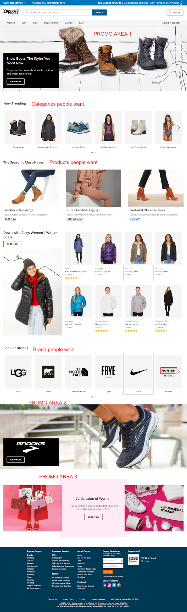
So apparently, Zappos.com never needed a slider. Note that they kept the slides, but moved 2 of them to the bottom of the site in favor of stuff users most want (a lot of which was not even on the homepage of this eCommerce behemoth just a year ago).
There’s a big lesson here for those willing to learn it and kill their carousel.

UnderArmour.com
Before
Under Armour had a carousel last year, alternating between two and three slides.

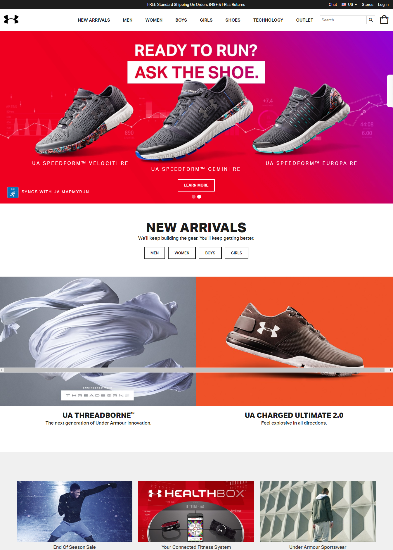
After
Over the past year, they have MADE ONLY ONE CHANGE on their homepage. That was to ditch the carousel.


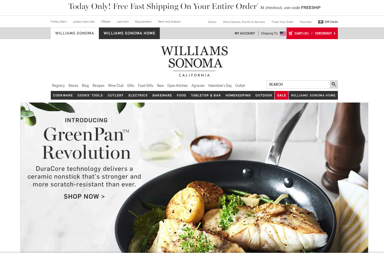
Williams Sonoma
Before
Williams Sonoma made some minor navigation changes over the past year and added lazy-load to the homepage, which widened it a bit.


After
For the most part, the only significant change to the homepage was REMOVING THE CAROUSEL.

Take-Away
If you were to take the lead from these 3 best in class sites, you would blindly get rid of your eCommerce site’s carousel. But wait!!!
You can see below that there are still 6 out of 20 Best-in-Class eCommerce sites that are standing by their carousel. You bet they have tested their homepage over the past year.


So Why?
The answer is that the carousel, as they have it, is right for them and their audience. For now, at least, until something tests better.
This is why we test.

- Conversion Optimization Examples: Homepage Carousel vs None - June 28, 2018


Trackbacks & Pingbacks
[…] post Conversion Optimization Examples: Homepage Carousel vs None appeared first on Conversion […]
Comments are closed.