
The Complete 110-Point Ecommerce Optimization Checklist You’ve Been Waiting For
You want to optimize your ecommerce site, but where do you begin? What do you look for? What page elements are worth evaluating? This Uber complete 110-point ecommerce conversion optimization checklist holds the answer.
At Conversion Sciences, we have an ecommerce conversion optimization checklist that our team goes through when evaluating a new client website. And today, we’re going to share that ecommerce CRO checklist with you. This checklist includes virtually everything you’ll want to consider optimizing. And because we know you’ll want to test what’s working and what’s not, here’s the ultimate A/B Testing Guide to help you put together your very own A/B testing campaign.
This is not a list of everything you should test. It’s a list of everything you should consider testing. Optimizing an ecommerce site requires testing strategy and prioritization. It would take an eternity to test every single item on this list using proper testing procedures and this CRO checklist will help identify and prioritize conversion optimization opportunities.
If there is anything on your site worth testing, I can tell you with 99% certainty that it’s on this list. So, go through it, take your pick and start your ecommerce site conversion optimization work.
Ecommerce Conversion Optimization Checklist Navigation
To make navigation easier, we’ve broken our ecommerce conversion optimization checklist into 8 sections. Select one or simply scroll down to start with #1.
The Complete 110 Point Ecommerce Optimization Checklist

Free. Click to Download
#1. Ecommerce Sitewide Conversion Optimization
Let’s take a look at some sitewide elements on your ecommerce site and make sure they don’t hinder conversions. We’ll cover sticky elements such as, dropdown menus, supernav dropdown menus, navigation order, links and copy, visual cues, value proposition, dropdown or model shopping cart. sitewide search, related items, header and footer content, channel-dependent pages and elements, modals for email collection and discounts, and live chat. Quite a jam-packed section but we did promise a complete 110-point ecommerce optimization checklist.
1. Sticky Elements

Sticky Header
Sticky elements are items that remain fixed on the screen as the users scrolls up or down. The most commonly stickied page element is the header navigation bar. It definitely helps navigate your ecommerce site.
Stickied elements tend to attract focus and distract from other page elements, which means they can work both for and against you. Therefore, they should be included in your testing – especially on your mobile or cross-device testing.
Elements to Consider in a Sticky Header or Footer
In case you were wondering what to turn into a sticky element, here are a few to consider:
- Website Top Navigation Menu
- Directional Navigation (Main Shopping Categories)
- Search Icon or Search Field
- Add to Cart / View Cart
- Click to Call button / Subscribe / Live Chat
- Company Logo
- Social Links

Elements that can be added to mobile and desktop stickies.
2. For Best Ecommerce Site Navigation, Check your Dropdown Menus
Dropdown Menu
Dropdown menus are pretty straightforward and a staple of ecommerce sites and websites in general. They offer a quick understanding of the site’s information architecture and ready access to subcategories.
3. “Supernav” Dropdown Menus on Ecommerce Websites
“Supernav” Dropdown Menu
If you look at many of the largest online retailers, you will notice that certain dropdown menus expand into large fields with more items and added visual elements. We called these “supernavs” here at Conversion Sciences and they can be a powerful tool for highlighting specific offers, deals and product categories. They could be difficult for a visitor’s eyes to parse, so test carefully.
4. Site Navigation UX: Hover or Click?
Should your ecommerce dropdown menus open as soon as the user’s mouse cursor hovers over them? Or should they activate upon an actual click? It may not seem like a big difference, but it’s a potential item to test for. If poorly implemented, they can be a barrier to site navigation.
5. Test Navigation Order on Menus and Sub-Menus
One of the most common problems we encounter is sub-optimal navigation ordering. Categories aren’t properly selected and ordered. Menus and menu item placement seems almost random. There is an argument for placing the most clicked navigation items toward the left or top. You can determine this using a heatmap report from CrazyEgg, HotJar, ClickTale and similar user and a/b testing tools.
6. Don’t Forget to Add Navigation Links
Another common problem we encounter is a lack of obvious navigation links to popular products or product categories. Ecommerce stores include feature images and headlines somewhere on the front page, but forget that they need to be added to the primary menus as well. Redundancy is not a vice, and when discussing your bread and butter products, it’s typically a virtue.
7. Change Link Copy
Your main navigation communicates your offering. Choosing the right words helps those who never click on your navigation. When testing navigation language, it is common to see an increase in conversions but no increase in clicks on the navigation elements we’re testing. Thus, ecommerce site navigation is a way to communicate your value proposition and offering.
After determining that all the right links are present, look at the word choice for each link. Is there a more accurate or intuitive way to define that category or other link heading? Could you be more specific? More general? Are certain categories selling like crazy when the user enters the website directly via the product page but rarely being clicked on via navigation?
8. Visual Cues

Visual Cue
Visual cues are visual elements that point the eye in a specific direction. Make sure that your visual cues are working for you rather than against you.
9. Add a Value Proposition to your Ecommerce Site
It’s amazing how many ecommerce websites completely lack any discernible value proposition. While creating a unique value proposition can be a bit more difficult for stores offering numerous products, it doesn’t mean you should skip it altogether. Look for ways to define your value and pitch why visitors should continue shopping on your site at every opportunity.
Check out these 10 value proposition upgrades that increased conversions by at least 100%
Value Proposition Quiz
Are you quickly giving the visitor a reason to stay?
- Are you the cheapest, highest quality, or do you have the biggest selection?
- Do you have a generous return policy or warranty?
- Do you serve a niche in the marketplace?
- Do you have a unique brand voice?
10. Shopping Cart Dropdown or Modal

Shopping Cart Dropdown
When a customer clicks on that shopping cart icon in the navigation bar, what happens? Are they taken straight to the checkout page or does clicking trigger a dropdown or modal window display? Customers wishing to review their shopping cart might prefer a dropdown. Customers wishing to get straight to checkout might be annoyed by the extra click. You’ll need to test to know how your visitors are responding.
Pro tip: Be sure to instrument your cart dropdown or overlay for tracking by analytics. It’s part of the purchase funnel.
11. Sitewide Search
Similar to navigation dropdowns, the search bar is a huge part of how visitors interact with an ecommerce website. Should yours be bigger? Should the written prompt be different? How should it fit into your layout? These are all important questions to ask when evaluating your overall navigation layout.

What to consider when optimizing your ecommerce sitewide search.
12. Related Items Based On User History
Upselling will definitely help increase your average order value. Test suggesting alternative or related products to your visitors. Where and how are you suggesting those products?

Related Items Based On User History
13. Online Store Header Content
If a visitor doesn’t find what she’s looking for in the body of a page, she will return to the top of the page. Your header should provide a next step.
Elements to consider in the Header
- Company Logo
- Value Proposition
- Return Policy (if it’s part of your unique value proposition)
- Navigation
- Phone Number
- Search
- Click to call (Mobile)
- Subscribe
- Live Chat
- Checkout/Cart
- Clearance
- Login
- Sitewide Promo / Offers / Specials
14. Don’t Forget to Optimize the Footer Content for Conversions
In its lonely home at the bottom of the page, footer elements don’t get seen as much by visitors. Unless they know that’s where they’ll find the link to the information they’ve been searching for. Consider all of the elements you would consider for the header plus contact methods, privacy policy and DMCA, social media accounts, among others. Check your heatmap reports as well. You might be surprised by the number of clicks you’re getting in your footer.
15. Channel-Dependent Pages & Elements
A group of power shoppers was recently discussing one major apparel retailer’s retargeting ads campaign. They unanimously condemned those ads that featured a product that would lead to a page where that product was not even displayed. Keep the promises you make to your visitors.
What can you offer visitors coming in from different traffic channels? Are they directed to channel-specific pages? Are they served dynamic content? This can have a massive impact on your success in converting users from each channel.
16. Email Collection Modal
Email subscribers purchase from your online shop at a significantly higher rate than social followers or new visitors. The question is how do you plan to attract new subscribers? While users claim to find them annoying, popup modals tend to be very effective at converting visitors into subscribers.

Email Collection Modal: Attract new subscribers with a modal window.
17. Discount Modal

Discount Modal
For ecommerce sites, one of the most effective types of modals is the discount modal. Users are already there to buy. Accepting a discount is a no-brainer. This 110-point ecommerce conversion optimization checklist is getting better by the minute, right?
18. Live Chat
Live chat and Chatbots have become effective tools to boost sales for eCommerce stores. It can be auto-prompted or offered in the Help section, and it’s definitely on the list of things we recommend to test on this ecommerce conversion optimization checklist.

Live chat for ecommerce stores.
#2. Ecommerce Site Homepage Optimization Checklist
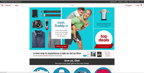
19. Hero Shot
Your homepage’s hero shot is the above-the-fold area incoming visitors see as soon as they arrive. It’s one of the most important pieces of real estate on your website, and a top priority for split testing.

Ecommerce homepage hero image conversion optimization checklist.
20. Dynamic or Static Heroes?

Dynamic Hero Shot
Should you utilize dynamic elements like sliders or other moving graphics? Or should you keep the page static? It’s important that you catch visitors’ attention here, but what that attention catches on is equally important.
Rotating carousels slow load times and only improve conversion rates if ordered properly and times perfectly. Large video backgrounds can bring a page to its knees, making the site seem slow and cumbersome.
21. Homepage Header Navigation
While many sites choose to keep their navigation consistent across the entire website, if there is any page where customization can be beneficial, it’s the homepage. This is the gateway to your business, and experimenting with different looks and functions on this specific page can be beneficial.
22. Homepage Value Proposition
Just like you need to emphasize your value throughout the website, it is especially important that you present unique value on the homepage, and more specifically within the hero shot. Some ecommerce stores emphasize quality. Others emphasize price. Others emphasize special offers like discounts or free shipping. You’ll need to test to know what works best with your audience.

Unique value proposition on an ecommerce site homepage.
23. Should You Add A Video?

Homepage Video
Promotional videos provide a fairly consistent boost to website conversion rates, although I have yet to see many examples of them being tested on eCommerce stores. If you are struggling to differentiate your brand, it’s definitely something to think about and consider testing for. Be cognizant of increases in load time.
24. Primary CTA
Does your homepage have a primary Call to Action (CTA) or a handful that stand out? If so, how can those be optimized? If not, should you have one or more?
25. Should You Highlight Popular Products?

Online retailer featured popular products.
Should you highlight popular products or products you are looking to push? How prominently? Where on the page?
26. Should You Highlight Special Deals?
If you are advertising a promotion in the marketplace, your main landing pages should mention the promotion. You can highlight special deals on the homepage, category pages, product pages, and even in the cart. Consider a small deals bar, big hero shot, or sidebar displays.

Highlight special deals on your ecommerce site to increase conversions.
27. Should You Include Testimonials?
Customer or influencer testimonials can build trust and advance the value proposition on almost any page of the website.

Website optimization checklist: Believable testimonials can build trust.
28. Should You Highlight Top Categories?
Should you promote specific products or highlight product categories? Should they be displayed in your hero shot or somewhere else on the page?

Online retailer category optimization checklist.
#3. Product Category Optimization
29. Faceted Search

Ecommerce faceted search. Help customers buy from you.
Faceted search allows browsers to adjust their selection criteria on the fly, allowing for very customized searches. If you offer a large inventory and don’t have faceted search, it’s something worth re-evaluating.
Consider testing the order of faceted search categories. Also play with unrolling some categories in the facet menu by default.
30. Sidebar Navigation
Sidebar navigation is one of those things that can help or hurt. While sidebar lists can guide a visitor to the products they are looking for, the tyranny of choice can make a page overwhelming. Sidebar navigation may help on some pages and hurt on others. Our testing indicates that it really depends on your site and your audience.
31. Adjust Image Sizes
In general, more detailed images perform better than stock manufacturer images. Ecommerce layout is all about maximizing the value of limited space. Are your images too small to make an impact? Are they too big, obscuring other important information?
32. Category CTAs
Should you just list your categories or include CTAs to prompt entrance? Are your category CTAs effective or do they need to be improved?

Are your category CTAs effective or do they need to be improved?
33. List View or Grid View?

Product page grid view.

Product list layouts are easier for comparison shopping.
On category and search results pages, visitors will have a preference for grid layouts or stacked list layouts. List layouts are easier for comparison. Grid layouts fit more products onto the screen. You may give visitors an option.
34. Modify Row & Column Count?
For sites with heavy traffic, sometimes something as simple as modifying the number of rows or columns can impact your conversion rate. Should you have 8 products per row or 3?
35. Category Page Product Information
Deciding what to display on category pages is critical and worthy of a series of tests. What product information should you display with each item? The options are almost limitless.
- Product Image
- Product title
- Product description
- Star rating
- Price
- Product options
- Stock availability
- Video or animation
- Badging
Every audience will react differently.
36. What Type of Information Should Be Filterable?
There are many different ways to classify and categorize products. If you don’t offer enough filters, you can make searching difficult for users. If you offer too many options, you can create unhealthy friction in the browsing experience.
37. Endless Scroll or Pagination?
Do you break categories with hundreds of options into pages or do you use endless scroll? Most large retailers currently use pagination, but that doesn’t mean it’s the right choice for every eCommerce business.
38. Should You Include Special Badges?

Consider including special product badges to increase ecommerce sales.
Editor’s choice, top picks for 2019, new items, bestsellers etc. Should you include special badges or keep all things equal?
Consider some of these.
- New
- Editor’s choice
- Clearance
- Popular
- Best Seller
- Limited Time
- Hot Item
- Free Shipping
- Save 25%
#4. Product Page Optimization Checklist for Ecommerce Sites
39. Primary Product Image
Your primary product image might just be the most important single element of your product page. Does the image optimally display the product? Is it high quality? Is it big enough?

Product page conversion checklist: Primary product image.
40. Add to Cart Button
Where should the Add to Cart or other CTA button go on the page? How big should it be? What color should it be? What should the copy say?
41. Price Placement
Where should you list the price? How big and bold should it be? Should you make it look discounted even when it isn’t?
42. Product Reviews & Ratings
User reviews have become a core part of eCommerce, as modern consumers place more and more weight in feedback from other consumers. Should you display reviews or ratings? If so, where? How obvious should they be? Should you only show reviews if they meet a certain threshold?

Product page optimization checklist for ecommerce websites: reviews and ratings.
43. Product Value Proposition
Should you dive right into the product description or include a one or two sentence product value proposition?
44. Shipping & Return Policy
Are your shipping and return policies obvious or hard to find? Do they encourage trust in your brand or make users skeptical? Weak policies can result in lower conversions, particularly with first-time customers.
45. Product Sizing Chart
Are you including a sizing chart to help potential buyers understand your product dimensions? If so, is this enhancing the user experience? If not, should you add one?
46. Cart Success Modal or Navigate to Cart?

Cart Success Modal
When a customer selects “Add to Cart”, does a modal popup or does it take them off page and directly to checkout? Modals tend to make it easier for users to continue shopping, while direct checkout navigation is more streamlined when you are expecting a single purchase.
47. Related Item Fields
When users are looking at a product, are you suggesting related or alternative products for them? This is Amazon’s #1 methods for increasing cart size.

Related items. Ecommerce conversion optimization checklist.
48. Detail Sections

Truncated Content
We believe that the Product Page should provide all of the information necessary for the visitor to buy. How you fit this information onto the product page is a question worthy of testing.
The options are many.
Visitors know how to scroll, so it may be find to simply list everything out, like Amazon. The question then becomes, what order?
You may have success with tabs or rollout sections that reveal the information with a click. Heatmap reports will give you an idea of which sections are most important. The most important should be open by default. Sections can be ordered top-to-bottom by visitor interest.
It’s important that key information is displayed pre-click, but it’s also important that non-essential information is available without being distracting.
49. Additional Social Proof
In addition to reviews, there are other forms of social proof that can be experimented with on your product pages. This could look like social sharing, displaying how many customers have already bought the product, influencer testimonials, etc. While reviews are fairly ubiquitous, other specific types of social proof might be even more powerful in your niche.
50. Trust Indicators
Could additional trust indicators improve your product page conversion rate?

Ecommerce product optimization with trust indicators.
51. Add to Wishlist
Wish lists let customers tell you exactly what to sell to them. If you don’t have a wishlist feature on your site, you should probably add one.
52. Additional Image Thumbnails
In addition to the primary product image, it’s important to evaluate additional images and the thumbnails displaying them. Are you including enough additional images? Do the image thumbnails displayed do a good job of showing off the product? Are they in the best possible order?

Ecommerce product information optimization: Additional image thumbnails.
53. Project Scarcity
Are you including signs that indicate the product is scarce or in danger of running out? Whether legitimate or not, projecting scarcity on your product page can sometimes increase the conversion rate.
54. In Stock or Out of Stock?
Should you include copy indicating when a product is in stock or out of stock?
55. Image Hover

Image Hover
Should users be able to explore an image by hovering their mouse over it, or should you require them to click to explore the image?
56. Display Shipping Time
Should you display the estimated shipping time on the product page or wait until the customer begins checkout?
57. Promotion Messaging
Should you display special promotions on the product page, and if so, where?
#5. Shopping Cart Optimization
58. Proceed to Checkout Button
Where should the Proceed to Cart or other CTA button go on the page? How big should it be? What color should it be? What should the CTA copy say?

Ecommerce convert from cart: proceed to checkout.
59. Cart Page or Straight to Checkout?
Should clicking on the shopping cart icon take users to a cart preview page or skip straight to the first page of checkout?
60. Continue Shopping Button
Where should the Continue Shopping button go on the page? How big should it be? What color should it be? What should the CTA copy say?
61. Discount Code Validation

Discount Code Validation
What happens when invalid discount codes are entered? Is the automated validation system bug-free and optimized to keep users engaged with the checkout process? Have you tried giving users who enter invalid codes a small, limited-time discount to encourage them to make the purchase?
62. Product Descriptions
Should you include product descriptions on the cart page? If so, how long should they be?
63. Product Images
How big should the product images be on the cart page? Where on the page should they go? Can you use them as a visual cue to draw users’ eyes to your primary CTA?
64. Upsell Items
Should you include related items, recently viewed items, or other upsell-focused items to the shopping cart page? If so, where on the page should you places them?

Test upsell items when optimizing cart conversion rates.
65. Visual Contrast & Hierarchy

Shopping cart CRO checklist: What will be your visual hierarchy?
You might notice that Amazon’s shopping cart page is very monochromatic. It all sort of looks the same, and while it’s not necessarily confusing, it doesn’t draw your eyes to anything in particular. Meanwhile Yandy.com’s shopping cart has contrasting colors with a very distinct visual hierarchy. The eye is clearly drawn to the checkout box in the middle-right of the page. Which style will work best for you?
66. Payment Options
Are you offering enough payment options? Are you letting your customers know about the options you currently provide? Should you make additional payment options obvious at the beginning of the checkout process like Yandy.com, or should you reveal them more subtlety when it’s time to process payment?
67. Shipping Time
Should you reveal estimated shipping time on the cart page or attempt to use it here as a selling point? Or should you save it for another point in the checkout process?
68. Shipping Cost
Should you display the shipping cost (or lack thereof) on the cart page or save it for elsewhere in the checkout process?
69. Price Display
How should you display product pricing on the cart page? Should it be highlighted? Minimalized? Should discounts be displayed next to the original price?

How to improve shopping cart experience with price display.
70. Project Scarcity
Are you including signs that indicate the product is scarce or in danger of running out? Whether legitimate or not, projecting scarcity on your cart page can sometimes increase the conversion rate.
71. Trust Indicators
Could additional trust indicators improve your cart page conversion rate?
72. Remove Navigation?
One question you have to ask is where in the checkout process (if anywhere) should navigation options be removed. Having general navigation options can sometimes be distracting and prompt cart abandonment. Should you remove navigation on the cart page or after users begin the checkout process?
73. Promotion & Coupon Entry
Should you allow users to enter promo codes and coupons on the cart page or wait to provide that option on the payment processing page or some other page in the checkout process?
74. Cart Visual Design
Could a redesign improve your conversion rate? Are parts of your cart page visually unappealing? Does the page design reflect your brand? Should it be more design heavy or more minimalist?

Shopping cart redesign checklist: choosing a visual design.
75. Quantity Change Functionality
Should users be able to change the quantity of a given item in their cart from the cart page? Adding this functionality often enhances the user experience.
76. Multiple CTAs
How many CTAs are displayed on your cart page? How many should their be? Should their be multiples CTAs for the same link? Should their be multiple different CTAs? You’ll need to test to find out.
77. Add to Wishlist
Should you provide users with the option to add cart items to their Wishlist from the cart page?
#6. Ecommerce Checkout Optimization
78. Guest Checkout
Should you require all users to create an account or allow a guest checkout?

Ecommerce guest checkout optimization guest.
79. Add “Use Billing/Shipping Address” Checkbox
Most consumers have a billing address identical to their shipping address. Including a relevant checkbox that lets them copy/paste improves the user experience. At this point, most consumers expect this feature and will be annoyed if it’s not available, potentially even to the point of abandoning the checkout process.

Optimize the checkout process for conversions: Use billing address.
80. Shipping ETA
Should you display the estimated time of arrival (ETA) before the order is placed? If so, there are quite a few different options and placements for offering shipping options and presenting the ETA.

Test offering shipping options and estimated delivery dates.
81. Validation Errors

Validation Errors
Validation errors and their accompanying notifications are a fundamental part of the checkout user experience. Any errors or sub-optimal elements can significantly hurt your conversion rate. Make sure that error notifications are obvious and specific, helping users quickly enter the correct info and proceed with checkout.
82. Checkout Copywriting
The copywriting throughout your checkout process is incredibly important. It’s not enough to just write something and leave it. If you want optimal results, you have to test.
83. Remove Sitewide Navigation?
One question you have to ask is where in the checkout process (if anywhere) should navigation options be removed. Having general navigation options can sometimes be distracting and prompt cart abandonment. Removing them, however, can sometimes annoy customers. You’ll need to test before you make a call.
84. Create Account Prompts
If you make account creation optional, where should you prompt guests to create an account? Should you prompt them multiple times or just once?
85. Add Trust Indicators
Could additional trust indicators improve your checkout conversion rate?
86. Add Risk Reversal Indicators
Money-back guarantees. Return policies. Quality assurance. Consumers fear risk, particularly when they are first ordering from your business. Highlighting policies that lower risk for the consumer is a great way to increase conversions.

Policies that lower risk for the consumer are a great way to increase conversions. Money-back guarantee.
87. Abandonment Remarketing Strategy
Do you have a pixel collecting data on your checkout page for remarketing ads? If not, you should.
88. Checkout Order Form
When collecting data from users, there is essential data that absolutely MUST be collected to deliver the product, and then there is non-essential data that is helpful for segmentation and marketing. The first category is just a matter of optimization. How can you request that info in the best possible way? The second category requires you to find a balance. How much can you ask for without creating too much friction?
89. Single vs. Multipage Checkout
There are case studies where splitting up the checkout process to multiple pages increased conversions. There are case studies where condensing the process to one page increased conversions. You’ll need to test to find out what works best for your audience.
90. Add Progressing Tracking
Letting users know where they are in the process and how far they have to go can encourage them to stick with you, particularly if your checkout process is longer than two pages. This can take the form of breadcrumbs or a progress bar or some other form of visual progress indication.

Reduce cart abandonment rate if checkout process is longer than two pages. Progressive tracking.
91. Custom Checkout or 3rd Party Solution?
It used to be that a custom built checkout was the only viable solution for creating a top-of-the-line checkout experience, but that simply isn’t the case anymore. Nowadays, there are some very high quality 3rd party solutions that have hundreds of built-in integrations for any service or function you could possibly think of. In fact, if your custom checkout was built more than 5 years ago, it is very likely you will benefit from switching over to a 3rd party solution.
92. Separate Checkout Subdomain?
Should you include your checkout under domain.com/checkout or checkout.domain.com?
93. 1 Column or 2 Column?
Is there any significant performance difference between a single column checkout and a double column checkout?

Test your checkout process performance with Conversion Sciences’ ecommerce optimization checklist.
94. Sticky Order Summary
Will a sticky order summary enhance the experience for consumers and increase conversions?
95. What To Expect Next
Telling visitors what to expect next at each stage of the checkout process can enhance trust and reduce abandonment. How can you do better at setting expectations throughout your checkout process?
96. CTA Buttons
We’ve touched on CTA buttons a number of times already, but they are just as important to test within the checkout process as they are everywhere else.
97. Promotion Code Entry
If you incorporate coupons and discounts into your marketing, it’s important that your promo code entry field is easy to find.
#7. Account Dashboard CRO
99. Order Status
The goal of virtually any ecommerce business is to create repeat customers. You want people coming back to your site as often as possible, and one way to help facilitate this is with an active dashboard that provides up-to-date information on the status of customer orders. Are you providing your customers with the information they want?

Account Dashboard CRO to create repeat business. Order status dashboard.
100. Value Building Copy
The account dashboard is prime real estate for customer retention. It’s the portal through which returning customers will interact with your site or attempt to close their account. It’s a great place to have value building copywriting designed to keep them on your customer list. When was the last time your revisited this copy?
101. Reorder & Upsell CTAs
The dashboard is also a great place to upsell customers with special offers and data-based recommendations. Are you taking advantage of this?

Ecommerce dashboard testing checklist: dashboard upsell.
102. Bulk Order Options
Would some of your customers buy more if they had a bulk order option?
103. Default Subscriptions
For subscription revenue models, are you providing users with a clear path to upgrade or modify their subscription? Are you re-enforcing the value from within the account dashboard or are you trying to retain customers by making cancellation difficult?
#8. Optimizing your Ecommerce Thank You Page Checklist
104. Add Survey
Converting a visitor into a buyer is really just the first step. What you do from here forward is equally, if not more important. Attempting to collect additional information about your new customer is one way to kickstart that next stage in the relationship with a better understanding of the customer.

Optimizing your ecommerce Thank You page.
105. Immediate Upsell
Is the most profitable post-sale option an immediate upsell? Or will that turn off new customers? This is a MUST TEST. Post-sale customers are already in purchase mode and might be in prime position for an upsell, but upselling can also backfire, so again… MUST TEST.
106. Email Signup
While email addresses are often collected during checkout, that doesn’t mean customers want to get your emails. Following up with an incentivized email signup offer prepares customers to receive future emails from you that aren’t strictly order related.

Thank You page email signup.
107. Encourage Social Sharing
Certain niches attract highly engaged customers who will happily advertise their purchase to friends, family, and followers. Are you giving these customers easy access to share about their purchases on social media? Is your open graph data setup correctly so that auto-click sharing generates attractive posts?
108. Account Creation
If you offer guest checkout, the Thank You Page is a great opportunity to prompt customer account creation. Is that the best use of this real estate for your business?

The Thank You Page is a great opportunity to prompt for customer account creation.
109. Encourage Referrals
Referrals are THE highest converting marketing channel in existence. If you can get your customers referring your product to their friends and family, you are virtually guaranteed additional customers. Have you tried utilizing your Thank You Page to encourage referrals?
110. Confirmation Email

Confirmation Email on the Thank You page.
Everything you can do via the Thank You Page you can also do via the confirmation email. Check out our confirmation email writeup here.
Are you still here?
Download the Complete 110-Point Ecommerce Optimization Checklist
The Complete 110 Point Ecommerce Optimization Checklist
Free. Click to Download

Expertise: conversion rate optimization, AB testing, marketing strategy, digital marketing, analytics, landing page design, computer programming, entrepreneurship
Speaking: IBM, Inbound, LeadsCon, Content Marketing World, Affiliate Summit, and more
Books and Training: Your Conversion Creation Equation, Video CRO, Marketing Videos that Convert, CRO Best Practices
As Seen On: ClickZ, Search Engine Land, Marketing Land, Conversion Sciences Blog, Intended Consequences podcast
Education: Texas A&M University, BS Computer Science and Management
- Your Ads Are Making Promises Your Landing Page Experience Doesn’t Keep - July 1, 2026
- Using AI to Generate Copy that Converts - June 15, 2026
- AI: Why Your Website is Now a Training Tool - February 5, 2026


Great checklist, thanks so much.
Sure thing, thanks!
Really nice list. I like that it’s actually list of things to consider rather than list of hints. Just like you wrote: some things may work for same cases. Thanks for sharing it!
Thanks Adam, glad you liked it!