
Why The Visual Cues On Your Site Are All Wrong (And How To Fix Them)
When it comes to page design, I’m fond of saying that we don’t need a designer as much as a draftsman. Their job is less about making things attractive and more about getting a visitor’s eyes to the right parts of a webpage.
What do I mean by “right parts?”
I mean that a visitor must know how to digest a page. They must know that they are in the right place, and why. This is the job of the headline and sub-headline.
They must know what choice they are being asked to make. Should they continue on in their journey? Buy something? Get the hell out?
They must know where to find answers to burning questions.
Designers are playing a game of tilt-ball, where the visitor’s attention must be carefully guided around obstacles and pitfalls. Literal pits to fall into.

Using visual cues, designers are playing tilt-ball with a visitor’s eyes.
Designing a Web page is like a game of tilt-ball.
If the ball is a visitor’s eye, then visual cues provide the “gravity” that move the ball along the board.
This column is not for designers. It is for managers and marketers who are tasked with ensuring that the designs they get for their landing pages, ecommerce sites and home pages are competently designed to perform.
Need help making your landing pages perform better? Our Conversion Scientists® have a bank of 20,000+ test ideas proven to boost results. Learn more about our turn-key conversion optimization services and book a consultation to see how we can help you.
Pitfalls: Where the eyes get stuck
When someone says a page looks “cluttered”, the culprit is probably poor use of visual cues. Many of the pages we design have the job of “Help me choose.” This means that they must help the visitors choose a next step, a product, whether to sign up or not, or whether to leave.
1. Bridges to Nowhere
Two of the greatest visual cues you an employ are photos and arrows. Our love of images comes from big glossy spreads in magazines, where the images may be all that is seen as readers browse idly under their hair dryers.
Web readers are in a very different context.
Images and arrows are used gratuitously, to fill space or the “break up” a page. These elements will always draw the eye, but are they drawing the eye to a dead end?
What’s the Point?
Arrows are powerful sources of visual gravity. But they lose their power when they point to things that aren’t exciting, or are only exciting to the owner of the website.

This visual cue, an arrow, deadends at a weak call to action.
The arrow promises something important. The button text breaks that promise.
This creates a visual bridge to nowhere.
Visually, arrows point to the most pertinent part of the page. If that doesn’t excite the reader, then the rest of the page seems unimportant.
If you’re going to use an arrow, make it point to something exciting for the visitor. The arrow below points at something a bit more exciting:

The arrow points to the way to get the offer. Source
Arrows don’t have to point to extraordinary offers. They can be used as simple guides to increase scrolling, as long as they are working in the interest of the reader.

This arrow serves the visitor, letting them know that more follows.
Arrows come in many forms. Here a simple chevron increased booking in this AB test.

Adding a simple chevron arrow increased scrolling and conversions. Source.
Even words can be used as pointing devices.

Words can be used as visual cues to guide the eye. Source
Helpful tip: Point to something that is exciting to the reader, not just something you want them to see. Or better yet, make what you want them to see the most exciting thing on the page.
2. Faces of Death
Images of people will suck attention away from almost any important text on a page. This is why so many designers’ use of images works against the business.

Faces are visualy attractive to humans. Source Tobii Technology
Faces draw our eyes. If someone attractive is looking at us, we look back.
We’ve written before about how stock photography and other forms of “business porn” are both a wasted opportunity on a page. Images will powerfully advance the value proposition of any page.
Images are also powerful visual cues when used correctly, yet too often, they’re dead ends.

This human face draws the eye, but doesn’t do anything with it.
This image succeeds in enticing visitors to look away from the primary call to action.

Adding a caption indicating that this is a real person adds credibility.
With a caption, this image becomes a credibility builder and explains the “Watch Video” offer.

Consider adding calls to action in your captions and in-image copy.
The direction of the eyes can be used as a visual cue. In the following image, the model guides the visitor toward the site’s navigation, but away from the primary call to action. Her body directs our gaze away from the copy as well. This is probably not an effective visual cue.

The gaze and body position are visual cues that, in this case, direct attention away from the copy.
In the following page, the model is looking generally in the direction of the call to action. This image needs a caption below or overlaid on it to make it an effective visual cue.

The eyes draw attention to the offer, but this image needs a caption.
Bryan Eisenberg uses an image to direct attention to the main offer on his website. Notice the subtle finger pointing downward in the following image.

Bryan Eisenberg uses his hero image to draw attention to the subscription offer on his home page.
Repeat your offers in and near images for maximum impact.

The visual cue is an image and the in-image messaging calls the reader to action.
3. Motion for Motion’s Sake
Probably the most powerful visual cue is motion, any kind of motion. Like images, moving things can draw the visitors into a hole from which they never escape.
The most common source of motion on business websites today is the image carousel. This is a staple of the web because marketers can’t make hard decisions, or because politics require that everyone get a piece of limited home page real estate.
In our AB tests, we often find that removing rotating carousel images improves conversion rates. In situations where carousels win, the major contributor is the first slide. The second contributor to a winning carousel is a slow fade transition.
In other words, make the carousel look like a static image.
The reasons that a carousel might underperforms is threefold.
- Constant motion diverts the visitors’ eyes keeping them from getting into the page’s message.
- The burden of multiple large images increases page load time so much that it affects conversion rates.
- Technical issues prevent the carousel from displaying properly in certain browsers, devices and screen sizes.
There is a lot to lose with this kind of visual cue.
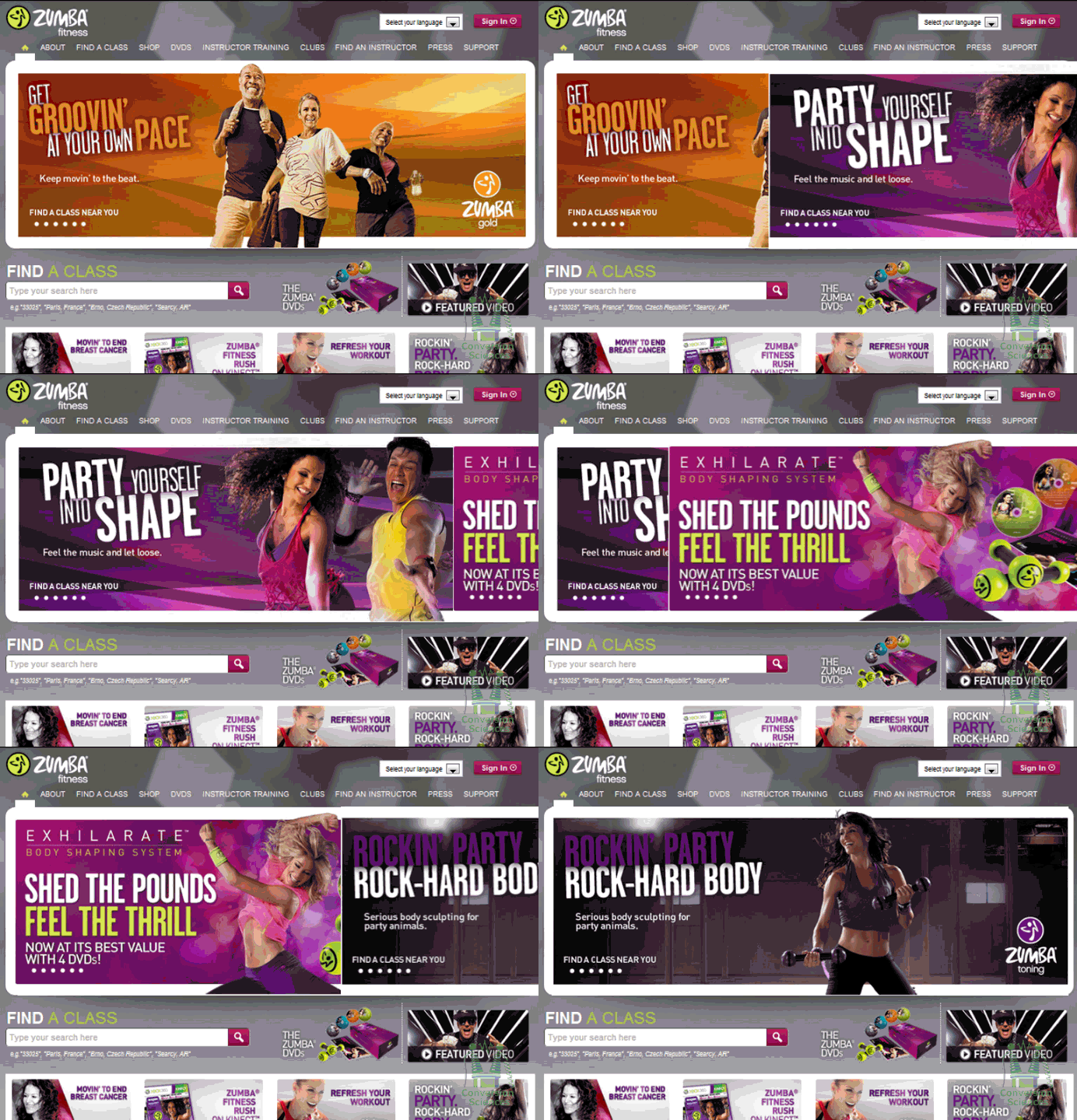
Rotating carousels of images have proven to be negative visual cues.
Carousels are also used to rotate customer logos, to slide through customer testimonials and to reveal products.
Carousels are all signs of indecision on the part of the business that owns the website.
While the rotating carousel does appear to be on the way out, it has been replaced with an even worse motion –based visual cue: full-size video animation.
The video in this animation is 1.5MBytes, a massive hit to load time. And it’s blurred out. What does this communicate?

Motion without purpose can have a chilling affect on conversion rate. Source
Designers justify this with unsupported statements like these:
Stunning video or animation in the background can easily make people stop and stare, then examine it, increasing the time they spend on the site, and hopefully lead to more interaction with the contents [sic] on the site.
The argument is that, if visitors stop and stare, it increases time on page. This, the errant thought continues, results in more interaction with the page. Here’s the punch line. The motion reduces engagement with everything else on the page, but only if the visitor is around long enough for it to load.
Businesses seem to be buying this.
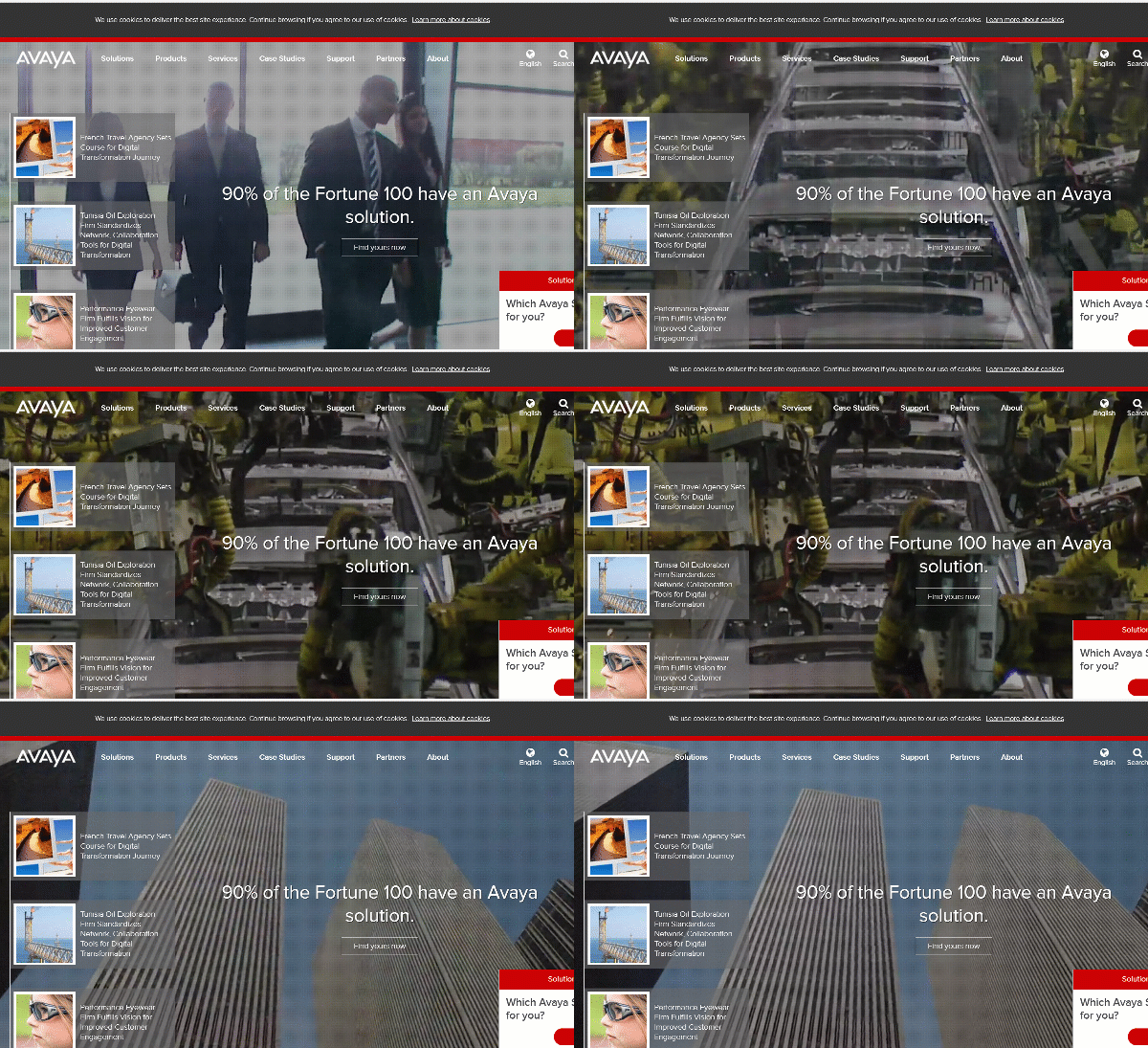
Walking people. A factory. Big buildings. Was this background image really necessary?
The same thinking is used to justify parallax animations – that a more interesting page increases engagement. Our testing experience is that engagement often increases as conversion rate decreases. As it turns out, engagement is also a measure of how confused a visitor is.
The proper use of motion as a visual cue is to draw attention to something important.
 If you don’t think that this sentence is important, then you are not human.
Nonetheless, if you’re going to use motion, use it to draw attention to something valuable.
In the animatiTest-na-anskioznost.gifon below, you can see how the popup “shakes” to indicate that the visitor made an error in entering data. This is actually helpful to the visitor.

Here, motion is used in the service of the visitor.
Motion is SUCH a strong visual cue, that it can quickly overwhelm a visitor.

Unnecessary entrance animations prevent the reader from focusing.
This parallax implementation only serves to hide content, making the page look blank at one point.

There is no gain in hiding content just so you can add motion to its reveal.
In affect, many of today’s parallax designs end up looking like this to the visitor.

This entire page is a collection of visual cues, rendering all of them ineffective.
4. Gestalt Principles and Poor Grouping
The human mind likes to group things. When things can’t be grouped, the visitor has to work too hard to comprehend and prioritize a page. This is what we typically call “clutter”.
Grouping of things is another important visual cue. It is a combination of Gestalt Principles used in design, and can entail similarity, proximity, and enclosure.
Two places where grouping is an important visual cue are ecommerce category pages and SaaS pricing pages.

Visually, this category page is hard to group correctly. Green boxes denote some possible visual groupings.
Adding some visual cues creates enclosures, communicating what objects are grouped.

Adding grid lines helps group items on a page. Green boxes indicate visual grouping.
In the following example, the enclosure leaves out the product pricing, description and star rating, but the white space creates enough separation.

The enclosure strategy here excludes the titles, pricing and star rating.
The enclosure here doesn’t serve the reader.

Without visual cues, we group things in unexpected ways. Green boxes indicate visual groupings.
With the addition of white space, we can influence the way visitors group things visually.

The introduction of space here causes items to be grouped into rows. This is easier for the brain to parse.
5. Product Pages & Limited Information
This page uses visual cues to prevent grouping.

This pricing page uses visual cues to help the visitor choose. Source
First, the arrow points to a call to action, “Try it free!” The hand-written script makes the offer stand out. That is, visitors don’t group it with the rest of the text.
Next, the “Plus” column is highlighted in a different color and labeled “Most Popular” in red. This is important, because we would otherwise group all four together. This visually anchors the decision to the top higher-tier options. The choice goes from “Choose the best” to “Choose between Plus and the others.”
When we don’t provide visual cues, our visitors may not feel they have enough information to make a choice.

This pricing page offers no visual cues to “Help me choose.”
Pricing pages often rely on lists of features to differentiate. Unfortunately, they don’t realize that they are creating arbitrary groupings simply with the text they choose.
Here’s a list with inadvertent groupings.

Blue and black boxes denote visual grouping by text length.
The visitor will read the first item in the group. If it doesn’t interest them, they move to the next group, not the next item. We can see this behavior in heat map reports and session recordings.
Mangers should always ask, “Have we used visual cues to help our visitors choose?”
Content is the Best Visual Cue
From the visitor’s point of view, the best visual is the content that she is looking for, right? So visual cues should not be used in place of content. BH may have transformed Foundr Magazine, but there is more missing on this page than an “e”. This page relies on an arrow to indicate where the visitor can find the menu for the site. What would be a better visual cue than an arrow?
A menu.

This implementation relies on a small visual cue to reveal key information.
As conversion optimizers, we are not fans of content hidden simply for the sake of design. Progressive reveal is rarely beneficial and only works in specific use cases.
Managers should say, “No” to hiding important content from decision makers.
Shape as a Visual Cue
We all know that we should click on buttons. But what is a button. In the image below, there are three buttons. Which is clickable?

The three call to action buttons on this page perform differently as visual cues.
One is a white border around a menu item. One is a white rectangle with a call to action. The other is the classic arrow indicating video is available. Of the three, the video arrow is the most recognizable as a button, something you can click on.
With the advent of flat design, shape and shading are used less and less to indicate clickable elements. However, designers are returning to some of the shapes that made things look clickable.
Which element below is clickable, the “Enterprise” button or the “Sign Up” button?

Which of these blue elements is clearly a button?
The blue area containing “Enterprise” is a title. It is not clickable. The blue shape with the rounded ends is clickable, and is shaped like a button to indicate that.
Which is clickable here?

Six styles of buttons, from most to least visually clear.
In general, the shape with rounded edges and shading indicating a physical button will give the visitor a clearer message that an they can take action.
Text as Visual Cue
The way you create text can be a visual cue. The myriad opportunities to maximize this ROI are often wasted. Some designers espouse a minimalist approach, minimizing the amount of information that is encapsulated on a page. Others evangelize a more comprehensive style. These two approaches are neither right nor wrong. Research by usability expert Jakob Nielsen found that fifty-two percent of screen space was completely wasted in 2013, more than in 2001.
We Are Now In Control Of Your Eyes
Jakob Nielsen says that in 2013, half of all screen space above the fold was wasted.
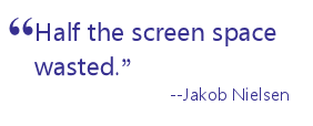
Based on what you’ve read, can you tell me specifically how much screen space is wasted according the study by Jakob Nielsen?
A. 50% of the screen space
B. 52% of the screen space
The most accurate answer is B, or 52%. If you chose A, don’t be sad. It was by design.
You should have answered A, because I hid the more accurate answer in the opening paragraph of this section. The first line is uninteresting, just repeating the heading. Then comes a 34-word sentence with many multisyllabic words (See what I did there?). The important stat was written out because numbers jump off the page.
This paragraph is a visual pitfall.
To support the more general, less accurate answer, I used an unexpected heading, “We are now in control of your eyes.” I highlighted that “Half” of the screen space is wasted using a pull quote and linked text. These are visual cues.
The scanning eye will tend to land on textual cues.
- Headings and subheadings.
- Highlighted text, Bold, Italicized, or Colored.
- Bullets or numbered text. Like this.
- Short paragraphs.
- Shorter lines.
It’s not that people don’t read, it’s that they favor text that is easier to read.
It’s Easy When You Know What You Want
None of this is a result of my training in UX, psychology or persuasive writing. I knew that there was one thing that I wanted you to see, and another that I did not.
You might start by looking first at what doesn’t work for you.
Rethink filler images or remove them. Consider if branding images need to be so large. Rewrite headings to tell scanners what’s on the page. Eliminate long paragraphs, long sentences and business speak.
Then see where you are. Odds are that your page will have improved immensely, as measured by your accountant.
Understanding what’s important on any page and then applying some tricks to focus your visitors’ attention is a great way to get what you want and to help them find what they are looking for.

21 Quick and Easy CRO Copywriting Hacks
Keep these proven copywriting hacks in mind to make your copy convert.
- 43 Pages with Examples
- Assumptive Phrasing
- "We" vs. "You"
- Pattern Interrupts
- The Power of Three
"*" indicates required fields

Expertise: conversion rate optimization, AB testing, marketing strategy, digital marketing, analytics, landing page design, computer programming, entrepreneurship
Speaking: IBM, Inbound, LeadsCon, Content Marketing World, Affiliate Summit, and more
Books and Training: Your Conversion Creation Equation, Video CRO, Marketing Videos that Convert, CRO Best Practices
As Seen On: ClickZ, Search Engine Land, Marketing Land, Conversion Sciences Blog, Intended Consequences podcast
Education: Texas A&M University, BS Computer Science and Management
- Your Traffic Fell 30 Percent. Your Targets Did Not. - September 3, 2026
- How to Filter Bot Traffic in Google Analytics With Ask Advisor - August 20, 2026
- Using AI to Chat with your Online Business - July 10, 2026


Got me on Nielsen quote… nice.
It’s not hard when you know how to use visual cues. Thanks for commenting.
Well said. Detail is GOOD. Content is GOOD.
There needs to be a fight back against all these dumbed down, minimalist, HUGE picture – Content-lite, guesswork, stress-inducing, regressive websites.
Rant over ?
The best example above of unthinking, disrespectful design is the shopping site – with no borders around the product.
Is the clickable link under the photo, the description, the price?
Just make a border. How hard is that ?
I agree that “Faces draw our eyes” – but that split second distraction is SOOO annoying – because that portrait is rarely useful.
My eyes are instantly drawn to “Extraordinary Collaboration” – then wonder “what the hell is that about? (i.e. lack of context)”
I had to look specially to see the differences – alongside the person – but it made no difference to my understanding.
I’m sure Paul Chapman is a “good bloke” – but I really don’t care.
The priority is “What does he DO?”
DON’T make me work (scroll especially – or click) to find out.
Thanks, Tarian.
If you were running a company the size of Paul’s, who is CIO of Box, you’d want to know that it was him in the picture. That’s what makes testimonials effective.
Sorry, I disagree with the obsession with HUGE photos – even more when it is a (pointess) portrait.
see https://www.acwilgar.co.uk/
Billy Wilgar created his company from scratch.
His photo is buried in the website.
The Companies purpose – and services are front and centre.
I find any animations like carousels as annoying – but that’s a separate point.
Is the main message/service clear?
Is there plenty of content / context visible without extra effort?
But I shouldn’t dwell on one criticism – when the main messages of this article should be pushed at all these minimalist, flat, web-destroying designers.
Designing a website is like a magician’s act in Las Vegas, Nevada. The best web design company in Las Vegas, Nevada uses visual cues to guide users effectively. Just as a magician captivates with gestures, web design psychology captivates with colors, layouts, and call-to-action buttons, creating an engaging online journey.
I love the magician example. Remember that illusions are very scientific… and psychological.