ecommerce optimization

What is the job of an optimizer? Is it just improving conversion rates? If not, what is the goal of a CRO professional and what are the steps of conversion optimization?

Brian Massey, the Conversion Scientist, shares the steps of conversion optimization. He is the founder of Conversion Sciences, and author of the book “Your Customer Creation Equation”.

If you are new to conversion optimization or if you need to take your website conversion to the next level, Brian’s book is a fantastic foundation. It will help you understand the way an optimizer looks at the world and looks at a website.

What is the Goal of Conversion Optimization or CRO?

Let’s start off by talking about what conversion optimization means to me. I don’t see my job as just improving conversion rates, but getting the most value out of every visitor to your website.

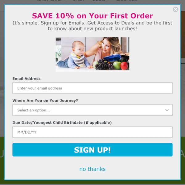
In a lot of situations that might mean a conversion to a sale. But even on an e-commerce site, we might want to connect with visitors who aren’t yet ready to buy, so we try to get them to join an email list. We can get value from them by asking them for their name and email address in exchange for fantastic information, a discount, or something else of value.

In the mobile world, a conversion may look like a phone call. Click-to-call is a powerful way for prospects to take action when away from their phone.

There are a number of things we can do to get value from our visitors, and for us, everything is on the table.

The reason I want to lead the life of a conversion optimizer is because we do wonderful things for online businesses. This is probably why we’re so well-liked.

Benefits of conversion optimization. Brian Massey, the Conversion Scientist, shares the steps of conversion optimization.

Benefits of conversion optimization.

Benefits of Being or Having a Conversion Optimizer

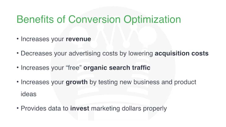
First of all, we do increase the revenue from the traffic that you’re getting. The net result of that is that it decreases your acquisition costs, your advertising spend.
If more of those clicks that you’re paying for turn into customers, then you get a positive return on your ad spend.

Having a site with high conversion rates often means people are staying on your site longer. They are buying more often. They are typically visiting more pages. Google understands this and rewards you with higher rankings. If people are staying on your site and not “pogo sticking” back to the search results page, well, your organic ranking will likely go up.

We, of course, increase your growth because we don’t just test what goes on your pages. We can test pricing, we can test bundling, we can test new features — we can test the things that are core to your business.

And we provide the data that makes you smarter at identifying where you should be investing your advertising and marketing dollars.

We’ll know which channels are converting best, which things you’re doing well and which you are not. And you can adjust your marketing spend accordingly.
So, conversion optimizers really are wonderful for a business.

Knowing which path your users are taking is a starting point to increasing the revenue from the traffic that you're getting.

Do you know which path your users are taking?

Logically, we might think that a path through our website should look a certain way, but in truth, the visitors want something different.

It’s our job to understand what that desire path is. For instance, in a park like this, people may be avoiding the paved path because it’s concrete which is harder on your knees when you’re running than dirt. It may not just be because it’s the shortest distance.

We want to understand the visitors’ motivations. That is what I spend my days doing. My whole job is to make sure that I’m not using mental shortcuts to make decisions.

Our biases keep us from providing the experience our users want. Steps to conversion rate optimization.

Cognitive bias codex.

The 3 lbs. of gray matter between our ears is just packed full of biases, shortcuts, and stereotypes. These biases, stereotypes and shortcuts, cause us to think we’re doing the right things when we’re making decisions about design, or about our products, or about our pricing.

But in truth, we’re doing it wrong for our users. We take shortcuts. We’re not really connecting with what our users want. This whole method, the steps to conversion optimization, is designed to keep us from relying on our biases to make decisions.

The Importance of the Optimizer

When you’re optimizing, you play a really important role in the design process and in your company. You are the one who is double checking the assumptions that are being made. You are the one making sure that those assumptions are what our visitors and our customers want.

When you're optimizing, you play a really important role in the design process and in your company.

The optimizer plays a key role in the design process and in their company.

The Benefits of Conversion Optimization

An optimizer has many benefits. They save time. There’s nothing that wastes more time than launching a campaign, spending your marketing budget on that campaign and then not having it work. So, by doing a little extra work on the front end, collecting some data, you can make sure that your campaigns are going to be more successful so you don’t have to start over and relaunch them.

The Value of Data (and its many uses)

Data is a great way to deal with what we call helicopter executives, executives who feel that maybe the team isn’t making the right decisions. They feel that they have to come in and review your creative and your campaigns, making changes to what you’re doing. Of course, their assumptions are based on the same biases that anyone’s are.

If you are able to say, “Well, we have some data that says this is the best thing,” then they’re more likely to think, “OK, this makes sense. Go ahead.”

You’ve just removed one cook from the kitchen.

How a conversion optimizer should handle agencies and teams.

How a conversion optimizer should handle agencies and teams.

Oftentimes you’ll get creative from your agency and think, “Is this really effective creative?” Your agency may present you with options and ask you to choose. As an marketer, your answer should always be “I don’t know, go collect some data to find out which one of these ideas is most likely to be the best choice”. This should be the job of your agency’s experimenter. This is a powerful way to manage teams effectively.

Steps to Conversion Optimization: Gathering Good Competitor Ideas

We like to take ideas from our competitors and from other websites that we like, but we often steal bad ideas. Just because our competitors are using them doesn’t mean they’re working.

An optimizer wants to take ideas and test them before stealing them. At Conversion Sciences, we say, “Steal like a scientist.”

Digital Marketing Careers Require Experimentation

If I haven’t made the point abundantly clear, people with the skills of an optimizer are very valuable. And right now these skills are hard to find and expensive. In a few years, these skills are going to be absolutely required. So, if you don’t have these skills, you’re not going to be able to work in premiere digital marketing roles, in digital product management, or run a business that requires the web to succeed.

Experimenters Can Take More Chances

As a conversion optimizer, you can take more chances because you know how to create experiments that allow you to be more creative.

Experimenters take these really creative ideas that would otherwise sound risky, find a way to collect some data, and then understand whether or not that idea is actually going to improve things. You also avoid implementing a bad idea. We call this a “design insurance”.

You don’t have to always play it safe with your campaigns. You can come up with crazy ideas and experiment before you actually launch and take all of the risk.

Being able to take more risks, a CRO expert can get more leads, more sales, and lower acquisition costs.

Being able to take more risks, a CRO expert can get more leads, more sales, and lower acquisition costs.

And, of course, you get more leads, you get more sales, you lower your acquisition costs, you grow your business.

That’s what most people want from their conversion optimizer. But conversion optimizers are so much more valuable.

My day deals almost exclusively with ideas. Ideas for how to improve a website, ideas for how to improve a customer’s journey, ideas for what kind of content we should be putting on the page, ideas for how we should discount, ideas for how we should lay out a page. Ideas for what we should be doing and advertising. For almost anything that’s going to be seen or experienced by the user, there are ideas for improving it.

How to Find the Right Ideas: good reasons to kill ideas

I’m going to walk you through the process of figuring out which ideas are the right ideas.

When we first start with a client, we go through their website and perform an analysis. This includes an analysis of  their existing data. We come up with a very long list of what looks like really good ideas for improving the conversion rate.

Our job is to kill some of those ideas and get them off the list so that we can move on to the ones that are good ideas. In fact, the scientific method that I use on a daily basis is designed around this.

The job of an experimenter is to come up with ideas and then find out why that idea is wrong. When you test a hypothesis, you are actually testing against the null hypothesis trying to prove that idea won’t improve things. If you can’t, despite trying everything, then you’ve got a winner.

So, what are the good reasons to kill ideas? We evaluate ideas based on these criteria. Is there a reason that we should keep this idea on the list?

Reasons to Kill an Idea

1. That’s a lot of work

Some ideas require too much work to test and implement. We might say the website needs to be redesigned. That’s very risky because it changes everything. And so we’ll often just pull that idea out right away.

Ironically, this is the way most website redesign is done. 90% of the market is still redesigning websites this way.

They start by hiring a creative agency or bringing in a creative team. That team does a little research at the beginning of the process, and then they make all sorts of design changes based on that research. Then, they push it all out and hope that they made the right choices.

That’s very risky, and so full-scale redesigns don’t stay on our list very long.

2. It’s too small of an idea

Some ideas just aren’t that impactful. For instance, if we had an idea to change something in the footer of a page, we can tell from our heatmap reports that few visitors are seeing the footer area. We would say that’s too small of an idea. It doesn’t have enough of an impact and we’ll drop it from the list.

Likewise, changing the color of a button or changing the font of our headings are low-impact changes. We tend to just get rid of these ideas.

3. No one is seeing it

There are pages on your site that are important to the customer’s journey, but not a lot of visitors are visiting it.

For example, sometimes FAQ pages can be really important to our visitor’s journey. If we had a hypothesis that said we’re going to change the order of FAQ questions, but we looked in analytics and saw that few visitors were actually visiting the FAQ page, we would say it’s probably not a good thing to test.

On the other hand, few people are seeing the checkout process on an ecommerce website, but those visitors are in the process of buying. In this case, we want to keep checkout ideas at the top of our list.

4. I don’t have any data on it

For each idea on my list, I have to ask myself, “Can I find some data on this idea.” This is the question we ask ourselves over and over and over. If I can’t find data on an idea, or I can’t generate data on that idea, then it’s not a testable idea.

A good example might be things on a website that encourage people to visit a physical store. There are technologies to track this cross-channel behavior, but it’s very expensive technology. Even if we have really good ideas about how to drive more people to the brick and mortar store, we really don’t have a way of collecting success data related to that idea. So, that would be something that we would eliminate because we don’t have the data.

Steps of Conversion Optimization: Gather Existing Data

Let’s talk about sources of data. Once we’ve gone through our list, we’ve got things on it which we think are good ideas. We think they are easy to implement or can be implemented in a reasonable amount of time. We think people are visiting those pages, and we think we can find some data on them.

One of the first places I like to look when I’m building a landing page are the client’s paid search ads.

Steps of Conversion Optimization: Gather Existing Data.

Steps of Conversion Optimization: Gather Existing Data.

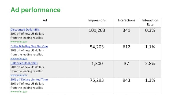
Using this made-up example for the U.S. Mint — that’s the part of the US government that prints money — let’s pretend that they’re offering 50% off dollar bills.

Now, you might think this is a crazy offer, better than anything you have. But the truth is that we all have an amazing offer: a great product or service that’s priced right. It saves time. It saves money. It solves a problem. Yet, you still have trouble converting people. Well, don’t be too discouraged, because the U.S. Mint would have trouble giving a dollar bill away for 50 cents.

Go to your paid search team or your advertising team and ask them for a spreadsheet with the last six months or a year’s history of ads.

  • How many impressions they generated
  • How many interactions they generated
  • How many conversions they generated

Go through the data and look for those ads that had a lot of impressions or more importantly, had a lot of impressions AND conversions.

If we look at the third one in our example above, we see it has an interaction rate of 2.8%. That seems like the highest rate, but it was only 37 interactions. This sample size is a little bit too small for us to have confidence in. I’m more interested in those that have 612 or 943 conversions.

It seems that “50% off dollars for a limited time” has a better conversion rate than “Dollar Bills: Buy one, get one.” When I write copy for my landing page, I’m going to favor language that includes “50% off”.

I would not be as excited about “Discounted Dollar Bills” because it had a 0.3% conversion rate and a high enough number of interactions that we can believe that this data is probably accurate.

You see how I can use our ads to understand which words, which headlines, I should be using in my landing pages and in my copy. It’s on my list.

Social media Ad Performance and Conversion Data

We can do this with social media as well. For instance, if we want to put a video on the landing page or video on our homepage, video ads can help us understand what people are interested in.

Use a tool like Ahrefs or SEMrush to look at our competitors’ ads. Find out what words they’re using and if they have a lot of keywords that they’re using.

Previous Email Campaigns Data

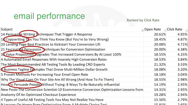
Email campaigns are another great source of data. I looked at the subject lines for emails that Conversion Sciences sends. We send emails for new blog posts all the time. I wanted to know which subjects — which titles of our blog posts — were getting the most clicks. I took six months of data and I ranked it based on their click through rate.

Previous email campaigns data: email subject performance.

Previous email campaigns data: email subject performance.

Looking at the top ten, we see “writing”, “copywriting”, “persuasion”, “value proposition”, “persuade people”, and “business taglines”. My audience is interested in the words that influence conversions.

I was a little surprised, but we were able to use this data to produce a free copywriting report on how to write copy for conversion writing, and this converts very well for us.
Download these 21 quick and easy CRO copywriting hacks.

Download these 21 quick and easy CRO copywriting hacks.

In this case, the data really did point us in the right direction. The data created a hypothesis, an idea, and then gave us the data that said you should launch this. Then we used the conversion data, the number of leads that we’re generating on our website, as the final proof that this was a good idea.

Steps of Conversion Optimization: User Testing

Another step in conversion optimization is user testing. Everybody thinks that a conversion optimizer spends most of their time split testing. This is the best data we can generate, the best tools that we can use. But in truth, I want to gather data faster and doesn’t require me to use precious visitor traffic.

We only want the most important and best ideas to go to AB testing while using user testing to figure out which of my creative ideas is best.

Our user testing includes things like a 5-second study. A 5-second study works great when I have three or four different headlines and three or four different images that I want to consider for a landing page.

We’ll use a service like UsabilityHub or Helio and we’ll ask for 25 people to come and look at each of our mockups. The 5-second test works like this: test subjects get to see the mockup for five seconds and then it disappears.

But five seconds in the human brain is quite a long time. After the five seconds is up, we’ll ask questions like,

  • Does this business seem credible?
  • What do you think this business does?
  • Do you know what we were asking you to do?
  • Where would you click if you were going to take action?
  • Can you remember any of the bullets or any specific information on the page?

We can score these twenty five people in each of these areas. The image and headline combination that scored the best tells us that it’s probably the best idea.

We now have some data from real world people that is telling us which idea to take to an AB test. There might be a couple of these that score well. So, we want to take the two best ideas to an AB test, but it also means we don’t have to test the others and waste traffic on those.

There are a number of tests that you can use for user testing. Usability hub or Helio, offer a question test where the visitor gets to look at the page as long as they want and answer questions.

A first click test measures how quickly someone can find where they’re supposed to click based on the prompt that you give them. How many of them get it right in test layout or how clear the call to action is on your page.

User testing tools like UserZoom or UserTesting.com allow us to set up a scenario and ask the visitor, for instance, to go through and purchase on a website. We watch them as they try to complete the task. We see where they get confused, where they get tripped up. They’re talking out loud as they’re going through it.

You’re going to see issues in these user tests that you wouldn’t catch otherwise. It can be very enlightening. We can really learn quite a bit from that user testing videos.

More Data Sources: User Intelligence Tools & Reports

Another step of conversion optimization is to look through user intelligence reports. User intelligence is different from user testing.

User testing uses strangers and pretenders. These are people who aren’t actually trying to solve a problem, but we’re using them as a focus group to play with our creative and see how effective it is at communicating with human beings.

User intelligence tools are actually watching your visitors as they interact with your website.

Analytics has the most obvious user intelligence data. Google Analytics is a great behavioral database. It’s all the people who are coming to your website to try to solve a problem. It shows you where they landed, what channel brought them, what pages they visited, how long they were there, where they left, if they bought, how many of them bought, what their computer setup was, what browser they’re on — all of this information is in Google Analytics.

It’s a great database for asking questions. I probably spend at least 10 to 20 percent of every day in analytics, and if I’m working on an analysis, I’ll spend the entire day in analytics, it’s such a rich source of data.

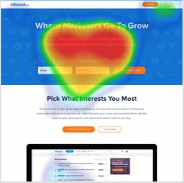
The other thing we use is what are called heatmap reports. They tell us how far the visitors are scrolling when they visit a page, where their mouse is moving on a page, and where they’re clicking. These are great tools for answering specific questions about a page.

You don’t have to be a Ph.D. in science to understand them. If you can read a weather radar map, you can read a heat map.

Here is an example.

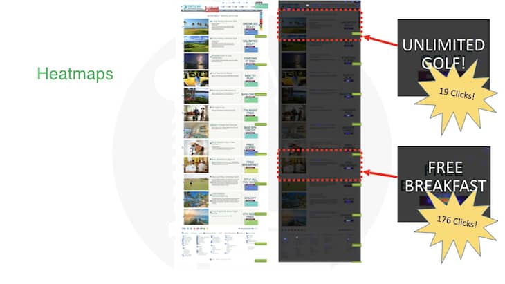
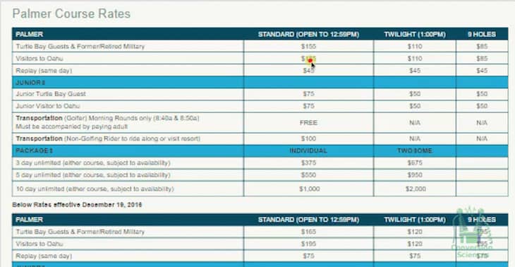
Heatmaps of a website page for golf resort in Hawaii.

Heatmaps of a website page for golf resort in Hawaii.

This is a resort in Hawaii, a golf resort. They assumed that since it’s a golf resort, people who are considering booking a room are going to be interested in golf.

On this page, which lists all their specials, they listed the golf specials at the top. When we went in and looked at where people were clicking on this page, we found out that “Free Breakfast” was most clicked item, even though free breakfast is down near the bottom of the page.

People don’t behave the way you think. What is the cost of breakfast? At this resort, it might be 40 or 50 bucks. If you’re going to save a couple of hundred dollars on golf, it would seem to be a better value, right? Not according to the visitors.

These are the sorts of insights that conversion optimizers love to find.

I also spend time watching session recordings. With session recordings you get to watch visitors as they’re working through your site. You see where their mouse is moving and what they’re clicking on. It takes a while, but you find things that you wouldn’t otherwise discover.

Session recording of golf rates page.

Session recording of golf rates page.

If you watch a bunch of these, you begin to understand what’s bothering your visitors. If I’ve got a specific idea that I’m trying to remove from the list, I’ll spend some time watching session recordings.

Sticky heatmap.

Sticky heatmap.

A more advanced conversion optimization strategy is running an eye tracking study. Now, this doesn’t work directly with your website, but you can bring people from your website if they’re willing to take a look. And it’s just amazing that this technology exists because eye-tracking studies used to be so hard.

Submit a mockup to a company called Tobii, and they’ll bring 25, 50, 100 people to look at it. They’ll record what the visitors see on the page using laptop cameras. Laptop cameras have such high resolution that we can tell where people’s eyes are looking on the screen.

We can see what people linger on, what ideas they like, what offers they like, and where there are images that stop them on the page. This information is really valuable if you’re trying to critique your page layout.

Gamification: AB Testing

The last thing that I spend time on is AB testing. Because if we’re going to take something to an AB test, as it’s the best data we can collect, we only want to take the best ideas. And it takes quite a bit of work to get AB test results.

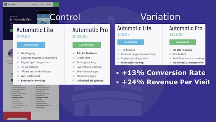
Here is an example of one that we did. We worked with a company called Automatic and they had a plug that plugs into your car and connects your phone to your car’s computer. They came out with this new Pro version, but everybody was buying the Lite version.

Why wouldn’t people buy the Pro version? Sure, it’s more expensive, but it’s so much better. Maybe we’re not communicating how much better it is effectively.

We did a “Thank you” page popup survey asking, “What made you choose Lite instead of Pro?” We found out that people didn’t understand the value of the Pro features.

We created a version of the product page was simpler. It was a shorter list of features, and we only highlighted the things that were most different. This is something you should consider any time you’re offering multiple plans or products on a pricing page.

We designed an AB test. One half of the visitors saw the original page, which we call the Control. The other half saw our variation. The result was a 13% increase in conversion rate for our variation. We also saw an increase in revenue per visit because more people were buying the Pro version.

After A/B testing, we saw a 13% increase in conversion rate by removing information from the page.

A/B Testing: automatic pro vs lite.

This achieved exactly what we wanted. The data we collected during the AB test was very reliable, because these tests are designed to eliminate as much randomness as possible.

What are the Steps of Conversion Optimization Summary

If you are going to be a successful digital marketer, you are going to be an experimenter. Your ability to use the tools and data of the trade will determine your future in a data-driven marketing economy.

Trying to capture your share of holiday shoppers but think it’s too late? Get inspired with these last minute Holiday marketing ideas for ecommerce.

Attention is scarce and many brands are trying to vye for it. Most big brands start thinking about their holiday marketing ideas in March. Yes, you read it right.

But if you haven’t done so, feel free to steal some of these last minute holiday marketing ideas for ecommerce. We also have a chapter on how to prepare holiday marketing campaigns for “March Madness” at the end of the article.

7 Holiday Marketing Ideas for Ecommerce Stores to Quickly Boost Sales

Retail season is upon us. Surprise!

Come again?! Yes it’s true. Between the months of November and late December, many businesses who generate significant profit online will experience an increase in traffic and (hopefully) sales.

How do you know if your website is fully prepared to take advantage of the holiday rush? Instead of Santa Claus loading up his sleigh with merchandise from your warehouse, you could see an increase in shopping cart abandonment, low sales, and a whole lot of tears in your eggnog.

Most online businesses generate the majority of the year’s profit during the holiday season. And this year, digital spending is set to high with online holiday sales to surge 25-35%. This can make ecommerce sites a little nervous. Business managers get conservative, locking down the site and taking no risks for months before the blessed start of the shopping season.

They seem to be just waiting until the season is over with their eyes closed, praying to the retail gods that things will go well.

Table of Contents

Don’t be that guy this year. Pick the right strategies with the perfect amount of holiday spirit to optimize in time for the retail season. Here’s how some of the top online retailers prepare for the holiday rush. These are high-stakes, low risk Holiday marketing ideas for ecommerce stores that you can put in place at the last minute.

1. Holiday Marketing Idea: Don’t Jump Into A Total Site Redesign

Many medium and small business owners think they have to redesign their website with a holiday theme. The fact of the matter is “If it ain’t broke, don’t fix it.” What you think is broken is often perfect to your visitors.

Instead, enhance what’s already been working on your website. A stepwise website redesign can deliver additional revenue quicker and avoid a disastrous site relaunch.

Many business websites have to change for their holiday campaign, but you don’t redesign with each holiday.
Website Redesign is like Holiday Decorations

When you are pretty busy, other parts of our lives suffer. In my case, it was decorating for the Christmas Season.

And in an unexpected way, this relates to your website.

I found myself with Christmas getting near and my Halloween decorations were still up. Before you laugh, isn’t this the same way you feel about your website? It’s needed a redesign for a while, but other priorities keep getting in the way.

That’s exactly how I felt.

There is little that can be done with Halloween decorations when preparing for Christmas… or is there?

There is little that can be done with Halloween decorations when preparing for Christmas… or is there?

This is not a traditional Christmas image.

But, since I was short on redecorating resources, I decided to redesign my decorations the way I would redesign a website: a little at a time.

I used small steps in my decoration redesign. I found some Christmas doll sweaters to put on my skeletons. Here’s the result.

This may seem a disturbing choice for Christmas decoration, but what does the data say? See how website redesign is like holiday decorations.

This may seem a disturbing choice for Christmas decoration, but what does the data say? The Tim Burton approach worked well for holiday decor.

Rather than taking down the skeletons and spending money on new decorations, I took a more creative approach. I added a special twist of my own to the decor. When my 17-year old daughter and her friends came by the house, I received positive reviews and praise. Remember, the opinion of your visitor matters the most.

It’s unexpected, unique and didn’t require a decoration redesign. This is the same approach we recommend for your website.

You may think your site needs a re-do. You may feel it’s dated, familiar, or too old.

As we like to say in the business, “Your opinion doesn’t matter.”

It’s the opinion of your visitors that matters, and they may not see your site with as critical an eye as you. They may even love it as it is.

What are the Right Reasons to Redesign your Online Store?

There are two really good reasons for a site redesign:

  1. Your brand is changing completely.
  2. Your site is not maintainable and needs a new foundation.

If you aren’t facing one of these two situations, consider a stepwise redesign.

We’ve been able to modify a site completely using testing tools before the business committed to the redesign.

test a complete redesign before investing in development. Taigan redesign.

We were able to test a complete redesign for this ecommerce site before committing it to code.

We found with this test that the redesign would not be expected to have a negative effect on revenue. Perfect last minute Holiday marketing idea for your online shop.

  • Test the navigation design.
  • Test a revised value proposition on your home page.
  • Test a new layout for each of your important pages.
  • Test a new checkout process.
  • Test a new ecommerce category page layout.
  • Test a new mobile layout.

Piece by piece, you’ll learn what improves your bottom line and what doesn’t. We call this data-driven creative.

Faster Results than a Full Website Redesign

Doesn’t this testing process take more time than a redesign?

We’ve accompanied several clients through redesign. A website is a complicated piece of software. We’ve rarely seen a redesign finished in less than twice the time predicted.

So, no, our approach is faster.

And, as you find wins, you get to enjoy higher conversion rates, higher revenue and more leads as the ecommerce site is redesigned.

Enjoy Your Holidays and Your Redesign

Don’t take our word for it. Author and optimizer Rich Page cited a Hubspot study that found one third of companies who implemented a redesign were unhappy with the results.

This doesn’t have to be you.

Having the resources to make your website a better place for your visitors is a great advantage over your competition. Let the competition spend months on one big shot.

Meanwhile, you can learn what your visitors want and deliver more of it time after time, until you own a site that the competition will have trouble keeping up with. Merry Christmas!

Our conversion-centered website redesign method guarantees results in weeks, not months. Jump on a call with the Conversion Scientists and get started on the road to website redesign success.

2. Ecommerce Holiday Marketing Idea: Identify Where Your Conversions are Coming From

We work with many ecommerce companies, from high-end jewelry and gloves to furniture sales. Our job is to analyze this behavior and data to best optimize your online business. So, we’ll share a little secret that can be easily implemented to generate last minute holiday marketing ideas for your ecommerce business.

The Channel Report in Google Analytics helps us locate streamlined conversions and where clients see significant sales by traffic source. With the Overview section, you can create an Advanced Segment to locate which are the specific sources of your visitors and how those visitors navigate your online store to become a customer.

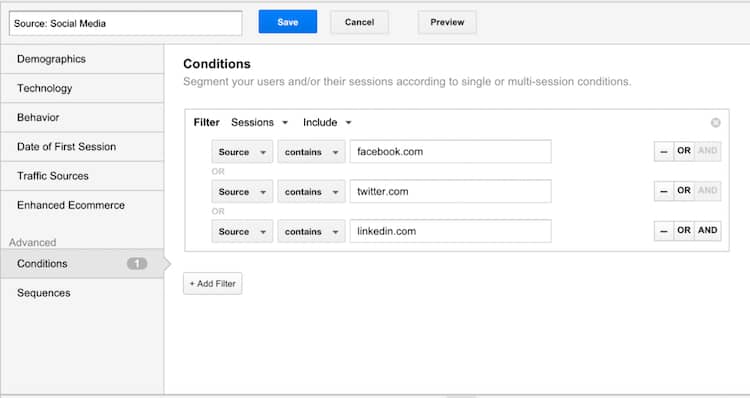
Let’s say we want to focus on our Facebook, Twitter and LinkedIn social efforts. Here’s how we set up one advanced segments:

This is how we traditionally set up segments in Google Analytics to analyze site conversions better.

This is how we traditionally set up segments in Google Analytics to analyze site conversions better.

Now that you know where your conversions originate, you need to understand what components on your site help with these conversions.

If we want to see which landing pages converted best, we would create an Advanced Segment that highlights our goal URL. Perhaps your home page needs to be better optimized. Maybe you could cut back on ads to landing pages that deliver unfavorable results.

We can also gather data on which devices lead to more conversions, whether these are new or returning visitors, and how many sessions each channel produces. It’s important to understand the type of traffic that comes to your site, how visitors navigate through your site, and which features deliver the most conversions. This data will help you better craft your Holiday ecommerce strategy.

3. Boost Holiday Sales: Lay Out Your Conversion Roadmap and Retargeting Ads

One reader sent us this story:

I was once asked to be a groomsman for my best friend’s wedding. Great, I thought. Bachelor parties, booze, and a whole lot of money down the toilet.
We recently had a fitting at The Men’s Warehouse. Look at us! Aren’t we a great bunch of guys?

Groomsmen conversion roadmap. While getting fitted for tuxes for our friend’s wedding, we decided not to rent shoes.

While getting fitted for tuxes for our friend’s wedding, we decided not to rent shoes.

After all was said and done, we decided to not to rent shoes for $20. Think about it: that’s almost the price of half a decent shoe. Since most guys can use a good new pair of shoes, we decided to check out several online shoe stores to find the right style and avoid another brutal trip to the mall. Let’s be real, no one enjoys shopping with six other dudes that have absolutely no sense of style.

We scoured the web and came upon a pair of great looking shoes on Nordstrom.com, but we said no to purchasing. They were just too expensive.

The retail giant, however, was kind enough to fill my Facebook newsfeed with wonderful retargeting ads. Thanks a lot for the added temptation.

Facebook retargeting ad from Nordstrom.

After leaving Nordstrom.com without purchasing an item, I was retargeted on Facebook.

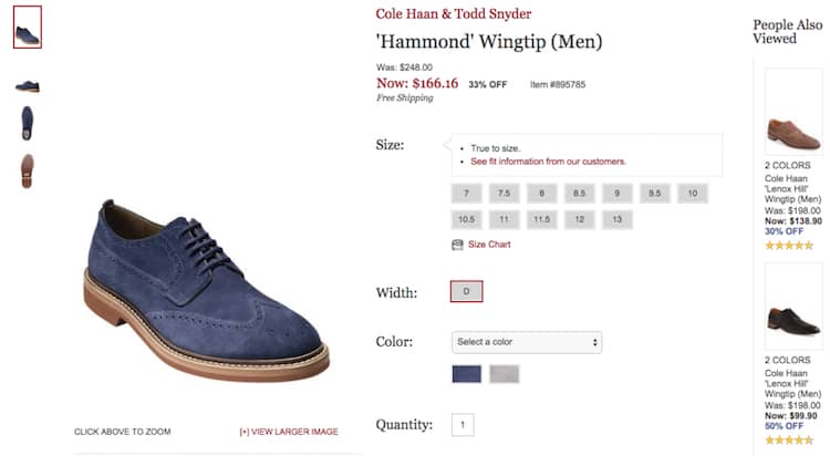
Did I mention that we were shopping for a “wingtip” style shoe. This fact wasn’t lost to Nordstrom. They tracked my shopping activity and knew what I was looking for.

Since my initial search on their website just didn’t ring up a sale, they retargeted me with a similar wingtip shoe that was significantly marked down in price. I clicked on the ad that took me directly to a well crafted landing page.

Landing page for the Nordstrom Facebook retargeting ad.

Nordstrom knew I was looking for a wingtip style shoe and have even recommended several pairs that are more affordable.

Had this shoe been in the wedding party’s price range, we would have definitely become customers. Not only did it fit the overall wedding’s motif but it was a killer shoe. It was also discounted, a big plus.

Nordstrom took it one step further.

Nordstrom included a “People Also Viewed” section to the right of this page, listing two additional wingtip style shoes in a more affordable price range.

Well done guys, well done. Unfortunately for Nordstrom we were still too cheap to buy, but it was still a solid effort.

Remember to lay out exactly how you will navigate a variety of customers through your funnel. Think of your email subscribers, returning visitors, new visitors, and don’t forget your impulse buyers. Read this article if you need help creating a funnel.

Once you’ve segmented your visitors, analyze their behavior. Did they convert? Which items did they purchase? What was their overall spend?

By knowing these key statistics, you can craft better retargeting ads and email offers that resonate with their buying habits.

Nordstrom.com knows their stuff. What kind of ads will you be showing site visitors, customers, or shoppers who abandoned their cart?

Don’t let sales slip on by. How can you turn lost opportunities into revenue this holiday season?

4. Not so Last Minute Holiday Marketing Idea: High Converting Social Media Giveaway Campaigns

You need some ammunition for the Holiday retail season that brings in new customers and sales. Early fall is a great time for executing high converting lead generating campaigns. We’re talking social media giveaways, contests, and special offers. Those that build nice email lists for future email blasts.

You can still implement these campaigns during the holidays and use the email lists for promotional sales all year round. At the very least, you will get some interested visitors.

Let’s take another look at our friends at Nordstrom.com.

I noticed they were having a special giveaway on their site. It didn’t look obnoxious like some online giveaways, and I was intrigued by the red letters at the top left corner of the site that said “Want a $1,000 Gift Card?” YES. I DO. So I clicked on it.

Holiday marketing ideas for ecommerce: Nordstrom giveaway campaign.

Click the red letters! Win money.

Once I read the official rules, I was taken to an additional landing page to sign up for the giveaway.

High converting social media giveaways for the holidays.

Keep your giveaways simple. Too many rules or procedures turn people away.

This contest has a very particular call-to-action (CTA): write a review for one of their products you’ve purchased. Once entered, I was sent an email with a CTA to continue shopping.

Nordstrom is using a loophole (the purchase was made before the sweepstakes began) to bypass U.S. regulations that state you have to provide a way to enter the giveaway without requiring a purchase. So, be careful when crafting the rules for campaigns like this one. Do not get into legal trouble.

Be creative with your giveaways. Don’t make the contest too complicated, and always offer an incentive to those who enter, like a special coupon filled with holiday cheer. They are not likely to win, but you will, especially since you were able to get their email address for later.

Again, you want your email list to be as fat as possible come next holiday season, especially if you find that your list converts higher than your site traffic.

5. Structure Your Email Blast With Offers that will Increase your Holiday Sales

Dial up the value on your email blasts for the holidays. People who give you their email address are inviting you to their already very full inbox, so make the most of it. The offers below can translate into high converting email marketing campaigns.

Promote a New Arrival

Some shoppers love to splurge on the latest and greatest, especially during the holidays. Let them know about this at the top of your email or include it in the subject line.

Local Austin jeweler Kendra Scott has a unique approach to their email blasts. In this email we see the new arrival promo both on the email preview and the main message.

Increase holiday sales email blast. Kendra Scott Austin jeweler.

This is an email promo for Kendra Scott’s new Mystic Bazaar collection.

Suggest a Bestseller as the Perfect Holiday Gift

You know this product will sell with or without a marked down price. You can sell this product with your eyes closed, so why not include it in the email?

Boost holiday sales. Promote a bestselling product or service on email blast. CountryOutfitter.com knows their boots sell. Each week they include a different style of boot in their email blasts.

CountryOutfitter.com knows their boots sell. Each week they include a different style of boot in their email blasts.

Theme Your Emails to Upsell or Cross Sell

Furniture salesmen increase their commissions by including add-ons that compliment the purchase, from furniture displays to the final sales pitch.

“Would you also like some table lamps, a rug, and perhaps this painting of a naked man to compliment your one-of-a-kind love seat from Romania?”

Someone willing to drop a small (or medium) fortune on a couch is likely to be willing to drop even more to make sure the couch isn’t sitting in an empty living room – or worse, a living room where the other decor doesn’t compliment the couch. That’s where the money comes from.

Here’s a great example of how one online retailer themes their email blasts similarly to furniture store displays. This particular campaign was all about skulls.

Holiday themed emails to cross sell and upsell.

Holiday themed emails to cross sell and upsell.

And you can’t buy a skull sweater without getting the matching purse and mug. Do you really want to be the fool with the skull sweater drinking out a cat mug and carrying a hobo bag? Absolutely not.

You must purchase the matching accessories!

You must purchase the matching accessories!

Even better, every item in this email is 20% off. HotTopic, eat your heart out.

Offer Incentives to Increase Cart Size: A Coupon Code or Free Shipping

Adding a coupon code or a free shipping incentive (like “get $50 off a purchase of $100 or more” or “free shipping when you spend $50”) will help visitors spend a specific amount of money or help them purchase an item that is designed to be a quick money maker.

Incentives to increase holiday cart size: discounts and free shipping. CountryOutfitter.com includes a free pair of flip flops with the purchase of $75 or more.

CountryOutfitter.com includes a free pair of flip flops with the purchase of $75 or more.

Be Newsworthy: Leverage off of a Current Story

Adding a brand related news story to an email blast can help drive serious traffic. Here’s how a competitor of CountryOutfitter.com’s email blast looked like the day Miranda Lambert and Blake Shelton announced their divorce.

The divorce announcement in their email subject line, along with a photo of the couple at the top of the email. A great way to increase open rates and click through rates.

Relevant news can help increase email open and click through rates. Miranda Lambert & Blake Shelton divorce, but Country Fashion retailers are making money.

Miranda Lambert & Blake Shelton divorce, but Country Fashion retailers are making money.

This email was more than just the Country Music story of the day. When visitors opened the breaking news email, they noticed this retailer offered free shipping for all orders $75 or more.

Below the breaking news image was a “Shop Now” image directing traffic to a product page. Although this traffic may not be interested in shopping and would much rather read up on Miranda Lambert and Blake Shelton, you can still segment this surge in traffic for retargeting ads (remember the Nordstrom.com example?) to country music lovers.

6. Time is of the Essence: Give Shoppers an Incentive to Buy Now

Set an expiration date to your coupons, create limited time offers, or activate that retargeting ad that will make visitors come back and hopefully turn into buyers.

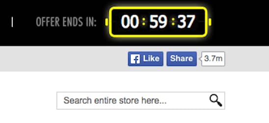
One of the most interesting timed offers was a feature on RebelCircus.com. At the top of the site, there was a ticker that gave shoppers exactly one hour to make a purchase to take advantage of a discount coupon.

Website offer with expiration date. You’ve got one hour to make a purchase! The agony.

You’ve got one hour to make a purchase! The agony.

When I returned to the site less than an hour later, the clock was still ticking. They definitely get a thumbs up for creating a sense of urgency when shopping.

Can a dog lover resist this timed offer as a holiday gift? Truly great holiday marketing campaign.

Can a dog lover resist this timed offer as a holiday gift? Truly great holiday marketing campaign.

7. Final Holiday Marketing Ideas for Ecommerce: Analyze your Data and Prep For Next Year

This can be the fun part, or the not so fun part, depending on how the season went. Gather your data from Google Analytics. Dissect the info and highlight the pros and cons of your online retail marketing campaigns. Where did you see more conversions, email signups, and social media engagement, and how did this affect your overall strategy?

Your marketing plan should always continue to change and refine itself over the seasons. Your approach this year could be different from next year’s. But when you just can’t get the answers right, or no longer have the time to optimize give Conversion Sciences a call. We’d be happy to bring good tidings of joy to your business this Holiday Season.

Ecommerce March Madness: Get your Holiday Marketing Ideas Ready

Every March, the annual college basketball tournament inspires basketball binge-watching behavior known by most as “March Madness”.

The other kind of March madness is the period of time in which ecommerce companies begin to think about the holiday shopping season again.

“Didn’t we just finish the holidays?” they ask. Yet, they remember the last minute scrambling they had to do the previous year to come up with high converting Holiday marketing ideas.

It’s easy to ignore the holiday shopping season. November seems so far away. But the Holidays are about ecommerce upsets, when the little guy can out-sell the big guy.

Upsets don’t just happen. You have to prepare for them. If you haven’t done so yet, feel free to steal some of these last minute holiday marketing ideas for ecommerce.

Time to Start Thinking About the Holiday Season: Preparation Meets Inspiration

The mental and physical preparation that goes into engineering your own upset takes time. The summer is your off-season. How will you train?

  • New products
  • New offers
  • More traffic
  • Crank up the Conversion Rate

The products and offers are the picking, shooting and dribbling fundamentals. These require a honed knowledge of game fundamentals.

Driving traffic is like selling tickets. A winning season means more fans. Ultimately, you don’t have control of prices, game times and TV schedules. As an ecommerce site, you invest in traffic knowing that it can change at any time (and probably has). Also, don’t forget to check out these effective eCommerce Marketing Strategies, they might inspire you.

Working on the conversion rate is where it all comes together. This is building strength and endurance for the team.

With website optimization, as the revenue you generate from every visitor goes up, your site improves. You own it. The goal is to generate more sales from the same traffic. Make your ad spend count.

If you increase your conversion rate by 7% a month, you will have doubled your conversion rate within a year. That’s a serious upset to your competitors.

It’s time to work on your fundamentals. We are the drill coaches that get you there. Have a conversation with a Conversion Scientist and let us show you how you can move into brackets you never thought you’d be playing in.

Shopping cart abandonment is the most heartbreaking of conversion killers. it is also a fertile place to increase the performance of your website.

Shopping cart abandonment is like cholesterol: There is a good kind and a bad kind. For each there is a strategy for reducing the impact of abandonment on your business.

Good abandoners leave because they aren’t done with their shopping process.

Bad abandoners leave because you surprised them or didn’t provide the information they were looking for.

But it’s 2020, and the number of smartphone dependent shoppers has grown considerably. Thus, we will add one more layer of complexity to the shopping cart abandonment recovery strategy: desktop vs mobile visitors. Why it happens and what to do about it.

Cart Abandonment Rate Formula

The shopping cart abandonment rate formula is quite an easy Key Performance Indicator (KPI) to calculate. Divide the total number of completed purchases by the number of shopping carts created within the same period. Subtract the resulting number from one and multiply by 100 to get the abandonment rate percentage.

Abandonment Rate Calculation Example

  • Total number of completed purchases: 335
  • Total number of shopping carts created: 500
  • Cart abandonment rate: ((500-335) / 500) * 100 = 33%

Definitely not a bad shopping cart abandonment rate. Only 33 out of 100 customers are leaving their carts behind. Do you experience high add to cart but low conversion rates? Keep reading.

Top 7 Cart Conversion Optimization Solutions: How to Eliminate the Causes of Cart Abandonment Consider the following tactics to optimize your online shop cart conversion rate. They may help you reduce or eliminate the causes of shopping cart abandonment.

Top 7 Cart Conversion Optimization Solutions to Eliminate the Causes of Cart Abandonment.

The difference between mobile and desktop visitors

“A growing share of Americans now use smartphones as their primary means of online access at home. Today roughly one-in-five American adults are “smartphone-only” internet users – meaning they own a smartphone, but do not have traditional home broadband service.”

Source: Surveys conducted 2013-2019. Data for each year based on a pooled analysis of all surveys containing broadband and smartphone questions fielded during that year.

Traditionally, the desktop computer is a research tool and the smartphone is a dopamine delivery system.

These are two very different uses of internet attached computers.

For someone on a desktop, adding your product to their cart is the end of a journey. For the mobile user, the add to cart is to see how it will feel.

For a growing segment of our population, this is changing. For more and more people, the smartphone is their only source for communication, research, and dopamine. Reliance on smartphones for online access is especially common among younger adults, non-whites and lower-income Americans.

For this reason, we are not going to assume that most mobile visitors are “just shopping.” We are going to look at the causes of checkout abandonment and provide a playbook for eliminating them.

There are also consumers who only buy your products on desktop computers. They would not even think to pick up their phone and buy what you sell.

Let’s dive into how to reduce shopping cart abandonment and improve conversions.

Why do Shoppers Abandon the Checkout Process?

Just as science has identified “good cholesterol” and “bad cholesterol,” there are “good” and “bad” abandoners among your website’s visitors.

The Good Abandoners

Good abandoners leave you as part of their process. They are walking all the way to the edge of buying, even though they are not ready to buy. They are imagining purchasing from you. Yet, they fully intend to continue comparing your offering to alternatives when they start the checkout process.

And they may be hoping you’ll hang on to their selections for when they return. Wish lists and persistent shopping carts are a big help to these abandoners. More on that later.

The challenge is to get them to come back and buy when they are done. We cover some of the strategies for retargeting this visitor later on this article.

The Bad Abandoners

Bad abandoners leave you because they didn’t like what they saw after they got started. These abandoners are bad for you because they are lost opportunities. They were going to buy, but you chased them away with your checkout process.

Your purchase process confounded them, introduced new fears, or asked them to do something they weren’t ready to do, like create an account. Many of these abandoners started the process simply because they didn’t have all the information they needed to make their decision.

This kind of abandonment can be treated by improving the checkout process and by using pricing and shipping strategies.

The five primary “drivers” of Desktop cart abandonment

According to Forrester Research’s report “Understanding Shopping Cart Abandonment,” the five primary “drivers” of cart abandonment are:

  1. Shipping and handling costs were too high. (Bad abandoners)
  2. The shopper wasn’t ready to purchase the product. (Good abandoners)
  3. The shopper wanted to compare prices on other sites. (Good abandoners)
  4. Product price was higher than the shopper was willing to pay. (Bad abandoners)
  5. The shopper wanted to save products in his cart for later consideration. (Good abandoners).

Let’s look at what causes bad abandons and then talk about encouraging actual purchases.

High shopping cart abandonment rates are conversion killers. But they are also a fertile place to increase your shop's performance. Read on!

High shopping cart abandonment rates are conversion killers. But they are also a fertile place to increase your shop’s performance.

Understanding Mobile Abandonment

There are two kinds of abandoners: Those who were never going to buy and those who would have bought if only…

  • If only they could be sure their discount was applied.
  • If only they hadn’t been surprised by shipping.
  • If only the final price hadn’t been too high.
  • If only the form had been easier to enter their discount code.
  • If only there was somebody to talk to.

And there are some things that aren’t under your control, but are a particular problem for smartphone users…

  • If only my table hadn’t become available.
  • If only the movie hadn’t started.
  • If only my lunch hour had been longer.

The Impact of Distractions on Mobile Checkout

We have dedicated a whole article to maximizing mobile ecommerce checkout conversions. Take a look.

Top 7 Cart Conversion Optimization Solutions: How to Eliminate the Causes of Cart Abandonment

Consider the following tactics to optimize your online shop cart conversion rate. They may help you reduce or eliminate the causes of shopping cart abandonment.

1. Free Shipping/Free Return Shipping

When a visitor is ready to take action, they instantly begin doubting the sanity of their decision. This is the time to reassure them. Your return policy and shipping offers are great ways to remove their doubts. Getting stuck with a product you don’t want is a real fear, no matter how inexpensive the purchase.

Shipping costs are not usually refunded. Even if you have a generous return policy, buyers can see this as a risk. If your profit margins allow for free shipping both ways, great. Otherwise, adjust your pricing strategy.

In a few words, you should tell them that buying from you is  safe if this does not turn out to be a good purchase.

2. Lack of follow up actions after add-to-cart

What do you do when someone adds a product to the cart?

The typical ecommerce site takes the visitor to the Cart page. The problem with this approach is that it takes the visitor out of their shopping experience, maybe before they’ve finished buying.

The answer is typically a “Continue Shopping” button, that takes them to some part of the online retailer site.

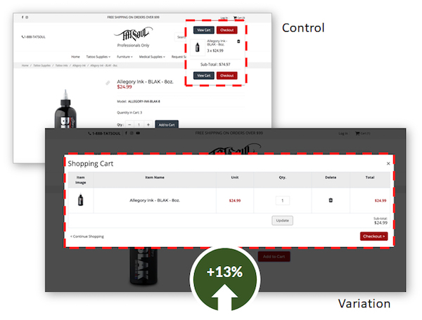
By making the cart popup overlay larger, we increased conversions by 13% for TATSoul.

By making the cart popup overlay larger, we increased conversions by 13% for TATSoul.

But, when a visitor has reached a product page, they are at the bottom of a rabbit hole. It may have involved a search, several category pages, and several product pages. They don’t want to start over.

To solve this problem, ecommerce sites have begun keeping them on the product page after they click Add to Cart, keeping their rabbit hole intact. However, if no visible acknowledgement is given, the visitor loses some of the satisfaction of their action. Or they may think the site is broken. Or they did something wrong.

Make sure that you give your potential buyers a clear signal that they’ve done something amazing. BJ Fogg recommends that you celebrate their action in some way. This should increase the likelihood that they will complete the purchase. These are two examples that signal to the visitor that they have done something amazing.

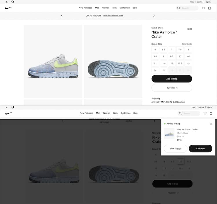
After the click to buy, Nike adds an overlay to the product page and shows a timed checkout link.

After the click to buy, Nike adds an overlay to the product page and shows a timed checkout link.

Nike hovers a Checkout overlay for a few seconds leaving the shopper in the same product page unless they click the “View Bag” or the “Checkout” button.

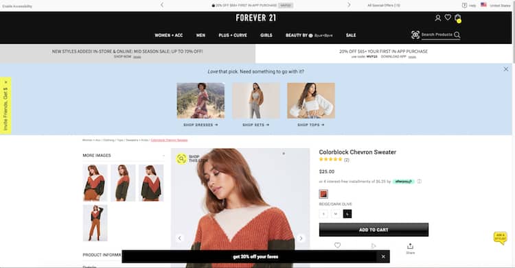
Or this one from Forever21 that tells their potential buyers they have done something amazing. Complimenting their taste, reiterating their offer to increase cart size (coupon code) and showing them product suggestions.

Forever21 does not lack on follow up actions after add to cart: promo codes and related products.

After showing the same overlay to the potential buyer, Forever 21 goes one step further.

3. Unsaved Carts

If I come back to the site, I expect my cart to still be there. Saving the visitor’s cart is an important part of abandoned cart remarketing strategies, in which an email or an ad brings them back to their selections.

Save the cart – by implementing a perpetual shopping cart – and find ways to encourage visitors to return.

4. Offer Live Support, Loyalty Programs

Your visitors will buy from you if you treat them well. They will buy again and again. Your willingness to be there for them both before and after the sale will determine their long-term value and your success.

The cart is a great place to show them you care. Have someone available on the phone or in a chat to answer their last minute questions. Let them know that this purchase is part of a reward program that shows you appreciate them.

There is an entire segment of your visitors that care about their relationship with you. Be a good relationship partner.

5. Exit Intent Offers

Remind them about the promotion you are currently offering just before they leave. Stop abandonment on its tracks. On Exit intent pop ups could help you with abandoned shopping bag recovery. Check out these 7 Best Practices for Using Exit-Intent Popovers.

6. Enable Guest Checkout

Maybe your customer doesn’t want to commit to you, yet. Offering guest checkout could make a difference in your cart optimization efforts. Instead of asking them to create an account, test and implement these Guest Checkout Tactics to Grow Ecommerce Sales (with Examples and Ideas) 

7. Ask your customers why they are leaving their cart behind

There are many tools to choose from that enable you to set up a short visitor survey to simply ask why they are leaving without checking out. This is a great use of exit-intent overlays. These can be delivered using Justuno, OptinMonster, Optimonk and other tools.

Cart Abandonment Solutions

Ok. We eliminated the causes but that doesn’t completely get rid of the problem. There will still be abandoners.

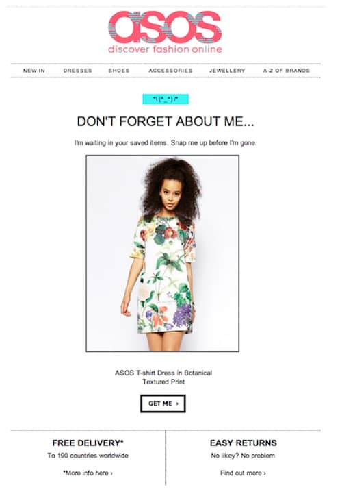
The most popular cart abandonment solution is the abandoned cart email or email recovery campaign. A great way to re-engage if you were able to get your prospective customer to give you their email. We promise to bring you a new article with the best abandoned cart emails cart and abandonment email examples soon.

ASOS example of abandoned cart email for their email recovery campaign, the most popular cart abandonment solution.

ASOS example of abandoned cart email for their email recovery campaign, the most popular cart abandonment solution.

To help you on your quest to lower your shop’s abandonment rate, we will also include examples of abandoned cart text messages, subject lines and email sequence.

If they don’t respond to your emails, not everything is lost. You can always implement an ad retargeting campaign. There are tools that even offer cross-device and cross-platform compatibility and mobile retargeting.

What is a Good Abandonment Recovery Rate?

According to the Baymard Institute, the average abandonment rate on online shoppers is 69.57%. In plain terms, 695 people out of 1,000 are abandoning their carts. A good abandonment recovery rate will be between 10% and 30% of revenue.

If you’d like to boost your website’s bottom line and gently nudge your customers through the checkout process, book a free site review with us.

We’ll take a look at your site free of charge.

Concerned with your mobile ecommerce checkout conversion rates? Discover how to maximize these seemingly fickle mobile visitors.

There are approximately 50 million mobile-only users in the US alone. That’s roughly one in five American adults who are “smartphone-only” internet users.

If all they have is a smartphone that’s what they will use to shop from someone. And that someone better be your ecommerce site. How? Maximizing mobile ecommerce checkout conversions. Here are some of the top strategies we use in our eCommerce Optimization Services to convert these mobile visitors into shoppers you may want to test on your online store.

And don’t miss out on our “bonus track” that shows you how to test your mobile checkout flow to boost conversions at the end of this article.

Gauge Mobile Ecommerce Checkout Success: the Add-to-Cart Rate

When we think about mobile ecommerce sites we tend to imagine small versions of our desktop sites. The screen is smaller. The images are smaller. The conversion rate is smaller.

Even as mobile traffic is eclipsing that of desktop and tablet visits, our mobile conversion rates remain low. We typically see mobile ecommerce conversion rates that are one-fourth to one-half that of desktop rates.

You could just say that people don’t buy your products on mobile devices, but there is a metric that says this isn’t so. It’s the Add-to-Cart Rate.

Mobile visitors are adding products to their carts. According to research the add-to-cart rate for smartphone users is only 25% lower than it is for desktop users.

When mobile visitors are adding products to their carts at higher rates than they complete checkout, we could say we have an abandonment problem.

Begin the Conversation on Maximizing Mobile Conversions

Just because a mobile buyer isn’t ready to checkout, you shouldn’t assume that you can’t begin a conversation with them. Offer to help them out in exchange for a first name and an email.

This tactic won’t be unfamiliar to most ecommerce sites.

  • Email me this cart
  • Save this cart
  • Get a discount in Facebook Messenger
  • Get a discount code

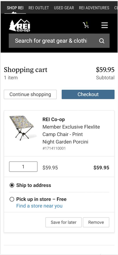
REI offers a “Save for Later” button in their cart. Clicking this takes the visitor to the account creation page. Nice save, REI.

Maximizing Mobile Conversions: REI offers a

REI offers a “Save for Later” option in their cart.

Asking Visitors to Create an Account: Do or Do Not?

Which happens first? A visitor trusts you enough to create an account before they buy, or they buy and that builds the trust they need to create an account?

The truth is that you have a segment of each of these visitors coming to your site. You need to understand which is larger.

For some visitors, asking them to create an account with you to buy is going to be too much. It exacerbates the fact that buying or entering information on a mobile device is more difficult and the buyer is often victim to distractions around them.

Having an account can be a liability. If customers have an account and forget their password, they they are likely to abandon their carts. You need to know the abandonment rate at the account creation step. This will tell you how big your problem is.

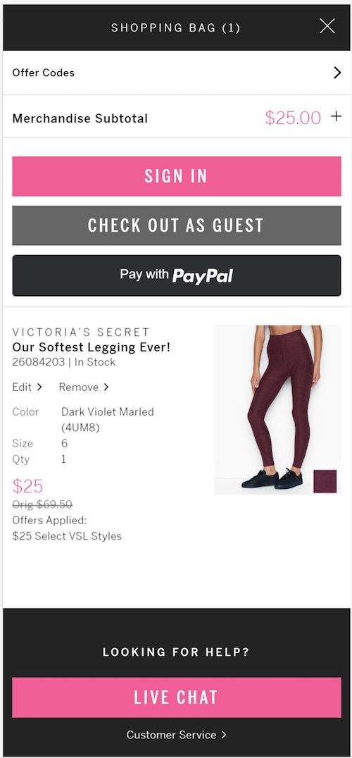
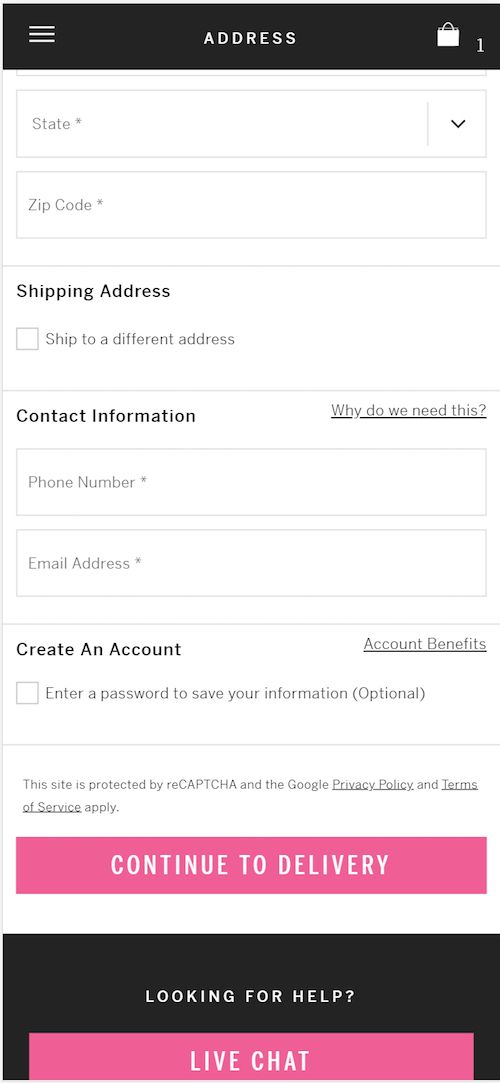
The good news is that there are ways to increase conversions for these mobile shoppers. Check out the following example from Victoria’s Secret. A smooth and simple transition from shopping checkout to account creation.

Mobile ecommerce dilemma: create an account or guest checkout to maximize conversions?

Victoria’s Secret offers a guest checkout.

Victoria's Secret mobile ecommerce checkout example. Victoria's Secret asks the visitor to create a password after all information has been entered.

Victoria’s Secret still asks the visitor to create a password after all information has been entered.

Want more guest checkout inspiration? Check out these rocking mobile guest checkout tactics by major online retailers.

Always test account creation. The negative impact can be substantial, even taking into account future purchases of those who do create an account.

Mobile Ecommerce Checkout: Change the Order of Entry

When working with human beings, it is often surprising how changes that seem inconsequential can have a big impact. Changing the order of your cart is one of those things.

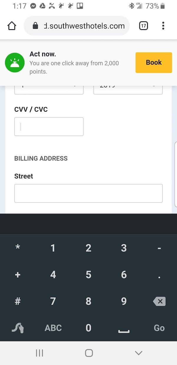
For example, look at Lowe’s mobile checkout. They ask for the credit card information before they ask for the buyer’s billing address.

Why on earth might this be better than asking for the billing or shipping address first like (almost) everyone else?

Who knows. It may require the buyer to dig out their credit card. That increases the sunk cost perception. At this point, they might as well finish entering the address — and anything else you ask.

Lowe’s asks for the credit card number before the billing address in their mobile checkout.

I can’t tell you that this will work for your audience, but it is certainly part of our playbook for maximizing mobile conversions.

Proper Use of Discounts

Automatically applying discounts not only eliminates one more step on the mobile ecommerce checkout, but it will entice your customers to keep moving forward.

How to Offer Third-party Payment Options and Boost Mobile Conversions

If entering your name, address, credit card number is a pain on a mobile device, you would think that using third-party payment systems might be a boon for mobile ecommerce checkout. After all, these services have your address and multiple purchase options on file, options that include direct deductions from your bank account.

Nonetheless, we find that simply offering Paypal and Amazon often won’t improve mobile checkout completion rates as much as we would expect.

Part of the reason may be when these options are offered. If the option to pay with Paypal is made after the visitor has entered their billing address, then a big part of the reason to use Paypal —  to avoid entering the address — is lost.

Etsy offers a Paypal payment option, but they do it after the billing address has been entered on the smartphone device.

How not to offer third party payment options: Etsy offers the Paypal option only after the mobile visitor has entered the payment details.

Etsy offers the Paypal option only after the mobile visitor has entered the payment details.

REI, on the other hand, offers both Paypal and Venmo payment options, and does so early in the mobile checkout process. Note that this also removes the requirement that the visitor create an account.

How to Offer Third-party Payment Options and Boost Mobile Conversions: REI offers PayPal and Venmo at sign-in.

REI offers PayPal and Venmo at sign-in.

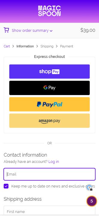
You can explicitly position these payment methods as “Express Checkout”, “Fast Mobile Checkout”, or “Fastest on your phone”.

Magic Spoon leads with

Magic Spoon leads with “Express Checkout” options on their mobile shopping cart.

Use Trust and Proof in your Mobile Ecommerce Checkout to Boost Sales

This is true for both big-screen checkout as well as mobile. Remind your customers that this transaction is safe and secure.

Yes, you have less screen space to deal with on a mobile device. Nonetheless, you should test the following elements in your checkout.

These elements should generally be non-clickable. Don’t take your visitor out of the buying process. If you need more space to express something like your return policy, use a modal dialog box that opens over the mobile checkout screens.

Return policy

Summarize your risk reversal strategy. This can include anti-spam policies.

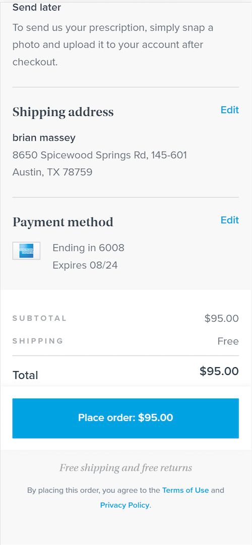
Maximize conversions on your mobile shopping cart checkout. Warby Parker reminds visitors of free shipping and returns near the

Warby Parker reminds visitors of free shipping and returns near the “Place order” button.

Your value proposition

Offer a bulleted list of your key differentiators, such as free shipping, free training, free installation, fast service, years in business, etc.

Galeton reiterates their guarantee and return policy right below the Checkout button.

Mobile ecommerce checkout best practices: Galeton spells out their generous return policy right below the Checkout button on mobile phones.

Galeton spells out their generous return policy right below the Checkout button on mobile phones.

Testimonials

Yes, you can use testimonials in mobile checkout to reinforce the sale.

Customer support rating

If you have high marks on your net promoter score, brag a little.

Certifications. Make sure your certifications are there in the checkout. An example includes Google Trusted Store.

Security badges. Remind them that this is a secure transaction.

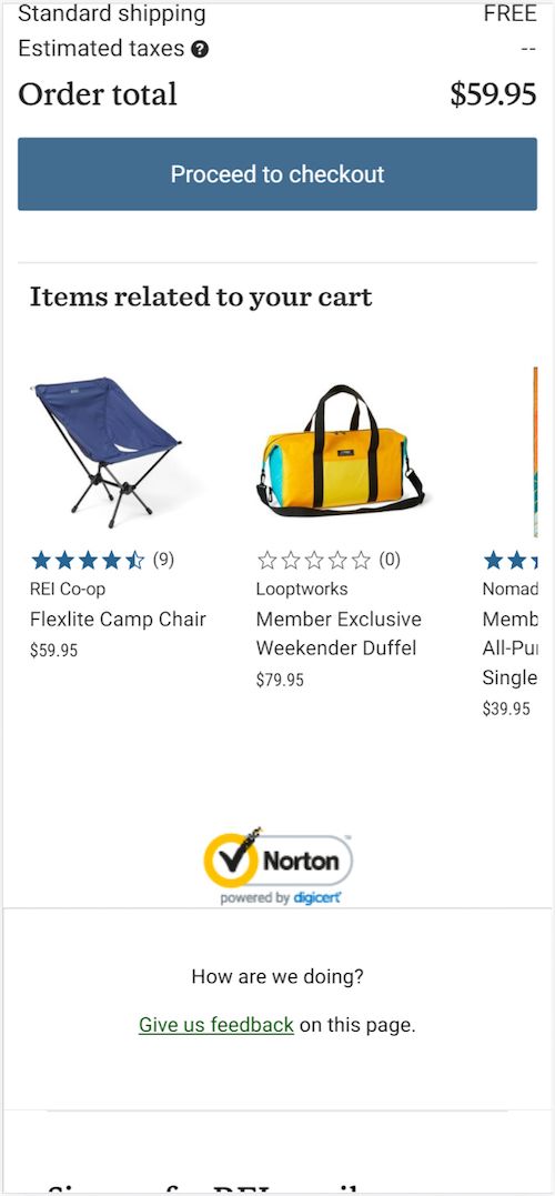
REI uses a Norton security badge to express the security of their site.

REI uses a Norton security badge to express the security of their site.

Phone number. You can build trust by putting a phone number in your checkout and avoid losing a sale. Use the right call to action and you may save sales with phone calls. Even if few buyers use the phone number, it can add credibility. It says, “Yes, we’re here for you.”

REI may lose some of the benefit as they bury their phone number in the footer. Warby Parker, on the other hand, offers a variety of contact methods throughout their cart.

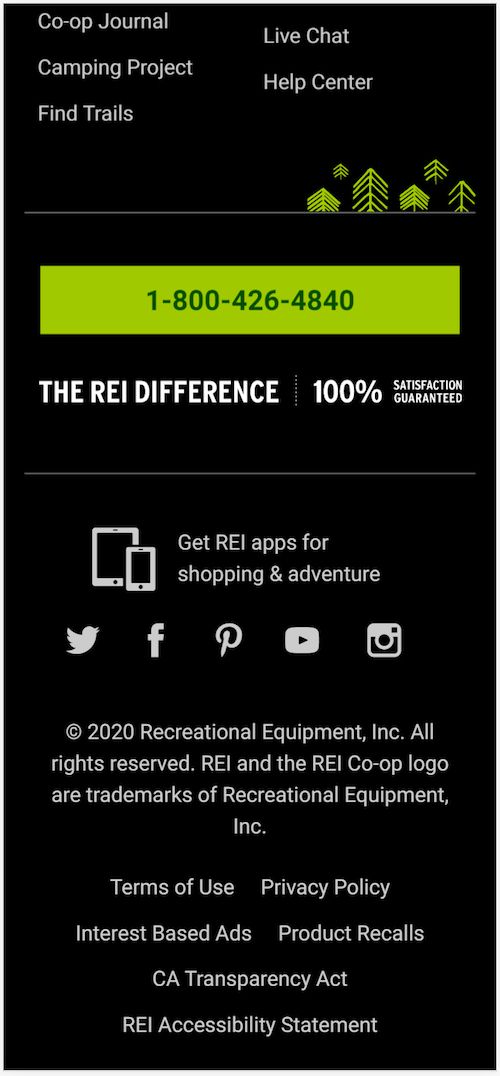
REI buries their phone number way down in the footer.

REI buries their phone number way down in the footer.

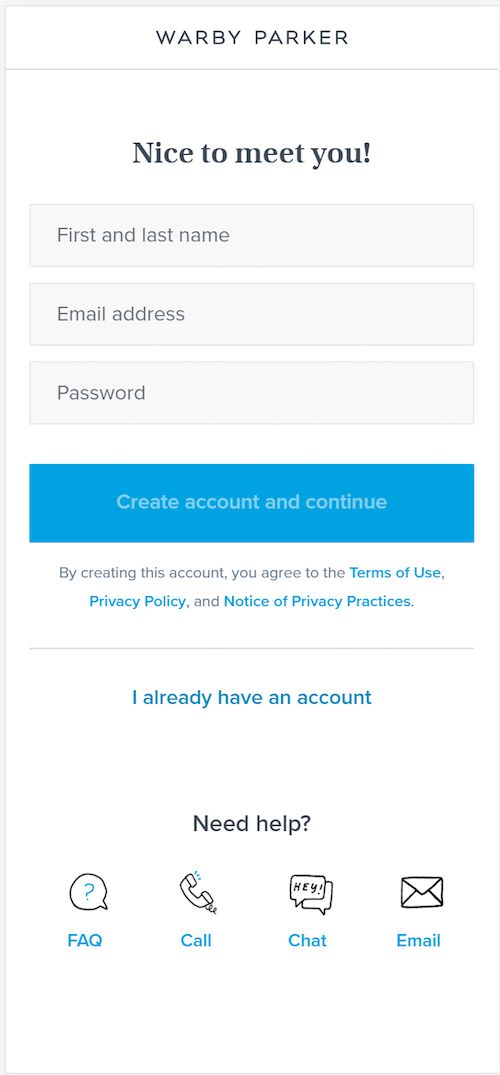
Warby Parker offers a number of ways to complete the transaction if the customer has doubts or prefers them. Discover how to increase mobile ecommerce checkout conversions.

Warby Parker offers a number of ways to complete the transaction if the customer has doubts or prefers them. Discover how to increase mobile ecommerce checkout conversions.

Live Chat. Test this. We don’t yet have evidence that it can improve mobile ecommerce checkout completions, but it could save some abandoners.

Be careful how these kinds of tools render on smartphones.

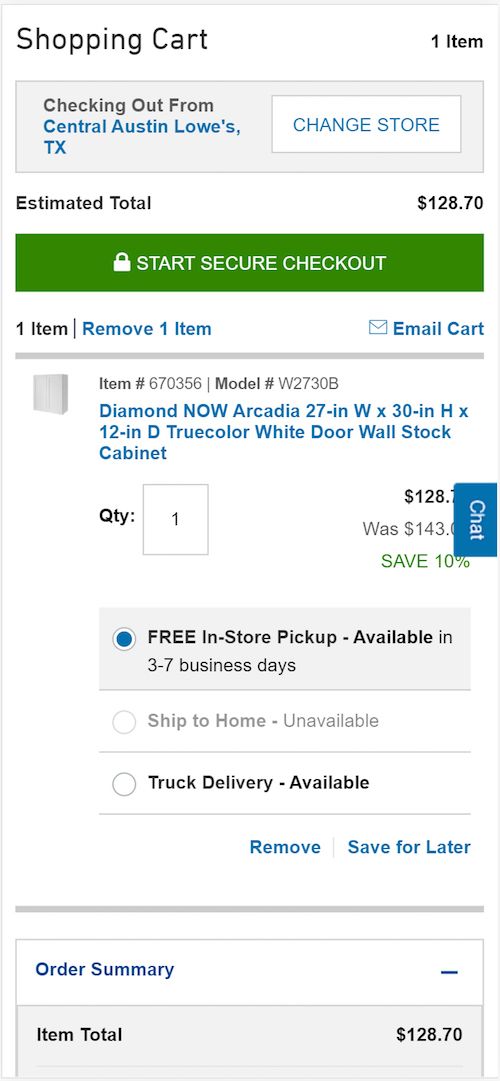
Even a small Chat badge can get in the way of key information on a mobile device.

Optimize Mobile Checkout Element Placement: Experience a Lift in Conversions

With limited space, it’s important to decide where to test these elements on your shop’s mobile checkout. Here are some placement options for highest impact to experience a conversion boost.

Near call-to-action buttons

Test security badges, customer support ratings, and your return policy above or below buttons such as “Continue”, “Preview”, and “Complete Purchase”.

When a customer decides to buy, there is a natural desire to delay the decision before thumbing the button. We always want to “think about” our decisions involving money. You can counter this with an affirmation of the transaction.

We have written the most extensive guidelines for placement, copy and design of your mobile call-to-action buttons to increase conversions. Check it out.

Near requests for personal information

When a mobile visitor is about to submit personal information to you, there is a natural hesitation. Giving you their email address, physical address, credit card number, or CVV number can feel intrusive.

This is another great place to inject risk reversal messages, testimonials, and a reminder of your value proposition.

In a “sticky” header or footer

Sticky elements are very important in a mobile interaction. One of the first things we address on a mobile site is the contents of the sticky elements.

The header or footer that is always on screen should probably change when the visitor enters the mobile shop checkout process. This is a great place to test trust builders.

Almost any of these elements can be placed in a header or footer. Don’t underestimate the number of things you can place in a sticky header or footer.

As a stand-alone sticky element

Elements such as security badges, certifications, and ratings can be individual elements that stay on screen. These are typically at the bottom. Be careful that these elements do not take the visitor away from the checkout process.

Can I Increase my Mobile Store Checkouts with Apps?

We see apps as a retention and loyalty tool. Apps do have advantages. Apps can provide a more controlled environment, such as making the phone vibrate when you purchase.

If your app provides a feature that can’t be duplicated online, you may consider promoting it on your site.

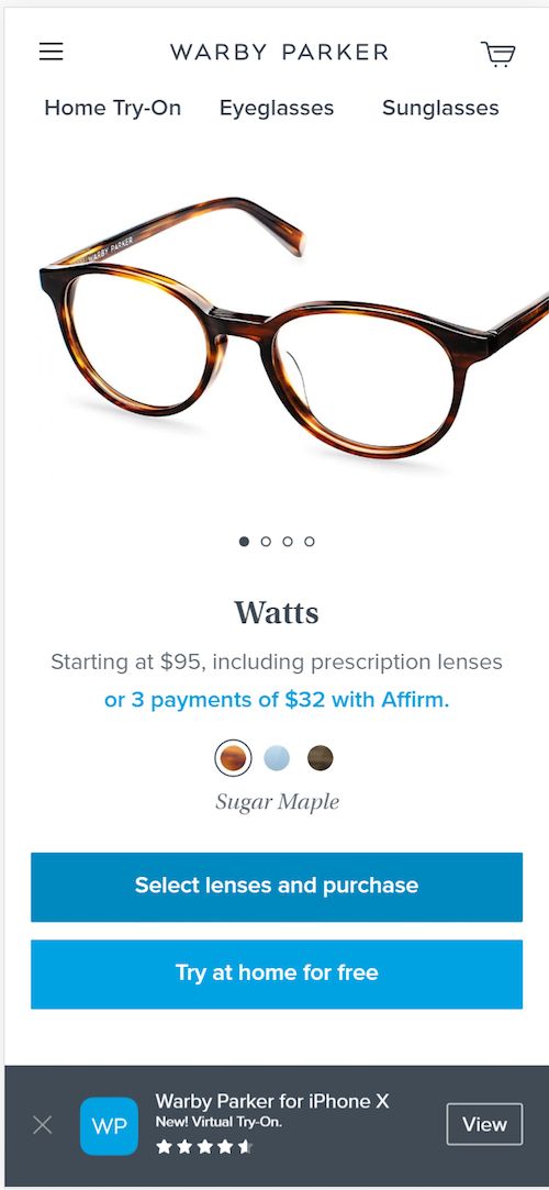
Warby Parker offers their app in a sticky footer featuring their “Virtual try-on” feature.

Word of Caution: In case you were wondering about an app effectiveness in acquiring new customers, we don’t have any experience that indicates this, even if the shoppers are familiar with the brand. Besides, an app requires two high-commitment conversions: one to install that app, and then one to buy.

In essence, an app becomes part of your offering, a part of a beloved product line. If you have a rabid tribe of enthusiastic customers, the app may be your best retention and repurchase strategy.

Bonus Track: How to Test and Develop your Mobile Checkout

Imagine that your website’s mobile version is strictly targeted at aliens, beings from another world. These beings have oversized thumbs. They live on a world near black hole, so time changes much more slowly. And their world is covered in volcanoes, so there are always distractions around them.

This pretty much sums up your mobile shoppers. They are VERY different from your desktop and tablet visitors.

As such, you should test your mobile ecommerce checkout separately. Letting it evolve independently from your desktop checkout as you learn more about your smartphone visitors.

You can create a different mobile checkout experience in several ways.

Modify your Responsive Web Template for small screens

Your developers will be able to add, remove, and modify elements based on the size of the screen being reported by your visitors’ browsers.

Use third party add-ons that target mobile

Ecommerce sites like Shopify offer plugins that can implement elements such as exit-overlays and sticky headers and footers.

Use Javascript and change things in the browser

There are a number of testing and personalization tools that will allow you to change mobile checkout elements in your visitors’ browsers. You can shape the mobile checkout experience in this way to maximize mobile conversions.

Live User Testing

Would you like to see just how difficult your mobile checkout process is for visitors? If so, we recommend virtually looking over your visitors shoulders.

We are fortunate to live in a golden age of marketing tools. Services like Validately and UserTesting will bring people to purchase something from your website on their smartphone, while recording and talking through their experience.

You will have at least one “palm-to-forehead” moment watching these videos.

And then you can make it easier for your mobile customers to go through your ecommerce checkout process.

Here are 6 very smart ecommerce strategies that will help you minimize the impact of COVID-19 on your business revenues. Take notes.

We like to make business decisions with data. We’ve looked at the data that is available about the coronavirus, COVID-19. Based on our analysis, we believe there is going to be a change in character of the web traffic for many of our ecommerce customers.

These challenging times have already impacted supply chain and will continue to have a serious economic impact on businesses in the future. But there’s always winners, even during recessions.

  • The closing of physical stores may drive more online business. We want you to be ready for this.
  • The closing of offices, factories, and warehouses may disrupt supply chains. We want you to be ready for this, too.

As always, we want to help you minimize the negative impact of COVID-19 pandemic on your ecommerce store and embrace the positive.

Don’t Go Down Without a Fight: Six COVID-19 Ecommerce Strategies from Smart Businesses

According to behavioral economics, our memories are enhanced during periods of high emotion. The uncertainty created by the coronavirus and its financial impact is putting all of us into an emotional state.

What you do now will be remembered by your customers and prospects more than at any other time in your relationship.

Adding some certainty back into the equation is a great way to position your online shop for a big big recovery.

We work with a variety of businesses all of which are grappling with the same question:

How are we going to survive this (and maybe even thrive)?

We thought we would share some of the ecommerce strategies they’re putting in place to cope and recover.

Pull back. Save money. Cut expenses. Slash programs. Wait and see. Your competitors are pulling back. Make the most of this. These are strategies every business in America is facing, even if you are unaffected by the virus. These are strategies in times of uncertainty.

These are defensive strategies.

There are offensive strategies you can implement as well. Your approach will determine if you take market share during this time or not.

If you are getting slammed by new online shoppers, you need to cut acquisition costs and support your existing customers. If demand for your products has cratered, you need to eek as much value from this traffic that isn’t buying right now. They will buy again. We promise.

Here’s what the smartest ecommerce businesses are doing right now in the face of the coronavirus.

1. Best Ecommerce Strategy to Minimize CoronaVirus Impact on Revenues: Reposition Your Products for New Visitors

More than eight in 10 (85.6%) respondents ages 60 and older said they were likely to avoid shopping centers and malls. That’s not surprising given that COVID-19 has hit older people the hardest, but it may have an unintended consequence on their shopping habits. emarketer

When your customers change, your messaging should change.

Flexispot was quick on their feet. The world shifted and now the world needed to setup their home workspaces. Flexispot shifted with them.

Best ecommerce strategies to minimize Covid-19's impact on revenues: Flexidesk before and after image

Flexidesk before and after image.

Be careful with this. You don’t want to make tone-def mistakes like many companies. This can come across as profiteering.

Not so Smart Ecommerce Strategies: Pure Herbal bad corona virus example Bobby Hewitt

Pure Herbal may appear to be profiting from a bad situation. Source Bobby Hewitt

2. Traffic Dropping? Focus on Existing Customers to Minimize Impact of COVID-19 on Revenue

Why spend money on acquiring new customers if they just aren’t buying. Spread some love on your existing customers.
Free products. Free advice.

What could you do during this time to make your existing customer feel loved.

Most businesses are simply telling their customers whether or not things are business as usual. Others are using this to let their customers know that they’re with them.

IKEA’s ecommerce marketers sent an email to their IKEA Family members offering advice on how to setup an office space in their home.

Smart ecommerce strategies on times of coronavirus: IKEA emailed existing customers offering tips on setting up a home office.

IKEA emailed existing customers offering tips on setting up a home office. Source Dennis van der Heijden

3. Smart Ecommerce Strategies when Conversions are Down: Grow the List

People aren’t spending money like they were a few weeks ago. This doesn’t mean you can’t get value from them.

Use this time to build your list. The most successful ecommerce companies are very good at email.

Conversion Optimization is getting the most value from every visitor to your website.

Here are some options for building your list when visitors aren’t buying.

Offer Content Instead

Offer something of value directly related to your customers. Of course, the virus itself is fair game. How will people who normally buy your products go on without them?

It will be quite easy to create a small report “Six alternatives to ___________ during the COVID-19 outbreak”. Insert your product.

Why would you tell your visitors how to live without your product? If they need your product, but aren’t able to buy right now, you’re doing them a real favor.

You don’t have to go to this extreme. But you must offer relevant content, something that will entice qualified visitors to share their name and email address.

When things begin to recover, the people on your list will be well-qualified future customers. And you will have their name and email address.

Offer Free Products: Think of them as Free Trials

Here’s another smart ecommerce strategy to minimize the pandemic’s impact on your revenues. If you can’t sell it, give it away. At least you’ll be building a list of future buyers and taking market share from your more timid competitors.

One of those sectors that will boom as more employees work from home is online video conferencing. One company sells online video conferencing, virtual meeting rooms and secure instant messaging.

Even though business is booming, they are offering their service for free to non-profits and healthcare professionals. Why? To help the cause and to gain customers who may buy after the crisis recedes.

Minimizing the impact of COVID19 on ecommerce stores when conversions are down: RingCentral home page notice.

RingCentral home page with an excerpt from their coronavirus offer page.

Popups and Sticky Bars

When you enter an ecommerce site, you are likely to get a popup offering you a discount code in exchange for your email address. If people have stopped buying, however, discounts won’t work.

Replace them with your content or free product offers.

Sticky bars are another way to inform your visitors that you are offering things for which they may want to give you their email address.

The beauty of these solutions is that they can be implemented easily without changing your entire website. Services such as Optimonk, OptinMonster, Hello Bar make it easy to implement these on your site with minimal IT intervention.

We recommend trying these approaches:

  1. “Welcome mat.” Opens when the visitor arrives.
  2. “Jilted lover.” Also called an exit-intent overlay, it displays when a visitor is leaving the site.
  3. “Wheelie popper.” Popup that appears when the visitor scrolls a certain distance down the page.
  4. “Poptart.” These ads pop up after a certain amount of time passes. Like a toaster pastry.

4. Media Strategy 101: Do you need to advertise products that are going to sell out anyway?

We did an analysis for one client who was getting rushed by new online buyers. We found that most of the purchases were coming through paid search ads. The acquisition cost of this traffic ate up much of their profit compared to organic search, email and other channels.

So, they responded by decreasing their ad spend and letting the other channels buy.

5. Getting Slammed? Focus on profitable traffic.

Several of our clients are getting slammed right now. Some for obvious reasons. Some for reasons we can’t fathom.

This creates a problem, however. In a worst-case scenario, the virus will shut down the factories and warehouses that are needed to replenish depleted inventories.

The solution: maximize profits on the inventory you have.

We don’t consider it ethical to jack prices up in order to decrease demand. The demand is going to be there regardless of the price.

But you may want to reduce spending on high-acquisition-cost channels in favor of lower cost channels.

6. Unexpected Ecommerce Strategy to Minimize COVID-19’s Impact on Revenue: Digital end-caps

End-caps are the displays you see at the end of the aisle in grocery stores. They are used to increase product sales, like putting gum and candy at the checkout stand. You can use this technique in your digital store.

For example, promote in-stock products on the pages of out-of-stock products.

One of our clients sells industrial safety gear online for manufacturing and construction. They stock respirators, gloves, and other products in high demand due to the virus. They also sell products that aren’t getting depleted, such as spill containment kits and work gloves.

The in-demand products are bringing a whole new segment of visitors to their online store. Just because there is a virus doesn’t mean that these new visitors don’t need those other products.

By strategically placing messaging over products that are depleted, the company can position in-stock products for purchase. They are also communicating their offering to a whole new group of visitors that may not have been familiar with their brand.

Who’s going to do all of this?

If you don’t have the resources to implement these marketing strategies, let us help.

For several of our clients, dropping traffic volume means we can’t run as many tests as usual.

We have excess capacity.

Our COVID-19 response package is inexpensive and can be implemented very quickly.

  1. Review your analytics to determine where you should stop spending and where you should double down.
  2. Identify the strategies from this list that apply to your business.
  3. Setup the necessary tools to support the strategy.
  4. Design several versions of the creative and copy.
  5. Launch, monitor and measure.
  6. Adjust based on the data.

We can offer all of this for a lot less than the money you’re losing right now. Why? Because we hope that, when things return to normal, you’ll want some more of our data-driven strategies on your site.

Jump on a call with us today to see if you qualify for this amazing offer.

Who better than a scientist to come up with the best definition of conversion rate optimization ever? Read on. Be the Judge.

What exactly is conversion rate optimization? You’ve read about it over and over, but you may not have a proper understanding of how to apply it to your ecommerce store or to your online lead generation efforts.

Today we will cover not only the best definition of conversion rate optimization ever written, but its benefits and impact on profit. Plus, best practices and how and where to learn CRO. We’ll also answer some of the most frequently asked questions on the topic.

What is Conversion Rate Optimization or CRO?

Conversion rate optimization, or CRO, is the process of maximizing the value you get from every visitor you bring to your website.

The value you get from every visitor is expressed as a rate – the famous “conversion rate“.

And the reason it’s called conversion “rate” optimization is that, in general, we are trying to increase the rate at which site visitors become buyers, subscribers, leads or callers.

Now, most people believe their website only has one conversion rate. The truth is, it has several. Therefore, conversion rate optimization, or CRO, attempts to improve each of these conversion rates – either by increasing value or reducing the associated costs (e.g. ad spend).

How does this process work? CRO is the process of making changes to a website, and measuring how those changes increase or decrease the conversion rate.

Today we will cover not only the best definition of conversion rate optimization ever written, but its benefits and impact on profit. Best practices, how and where to learn CRO and some FAQs on the topic.

Drawing of a digital laboratory by Conversion Sciences.

To accomplish this, we use data to understand how changes to your website affect the behavior of visitors and measure conversions.

Let’s dive in a little deeper.

The Applied Definition of Conversion Rate Optimization

The number of potential customers, visitors or traffic we get to our site will grow, decrease or fluctuate over time. It is generally believed that the rate at which these visitors convert will be more consistent over time than changes in traffic.

This is only partially true.

For example, you may decide that your home page will be better if you put images of your products near the top of the page. You can make this change and see if you get more sales.

But what if traffic decreases on the day that you make the change? You would get fewer sales due to the lower traffic, and it may look like your change was to blame. The percentage of buyers – the conversion rate – may have gone up. But lower traffic caused the total number of conversions or transactions drop.

Let’s assume you make a change to your site the night before Black Friday – the biggest shopping day of the year in the US. And you get a massive increase in sales. You might think that your conversion optimization change was the reason for it. But it was the market that changed.

“Hidden variables” – changes in traffic, in your competitors’ offers, changes in your advertising – can lead you to make bad choices. Fortunately, we have a complete set of methods and disciplines to ensure we don’t make bad decisions as we find out what our customers really want from our website.

Why is Conversion Rate Optimization Important?

As the digital world grows, it becomes harder and more expensive to attract visitors to your website. Organic traffic requires an investment in infrastructure and content. Advertising prices are rising on each new platform: Google, then Facebook, then Instagram, then…

Getting value from this hard-won traffic is the key to sustained online growth. Extracting value means converting visitors to email subscribers, leads or shoppers who add something to their carts or to return customers.

Finally, we want to eliminate those visitors who would not use your solution or buy from you because they cost resources.

In every case, the relationship changes. It converts to something new, and this is a conversion. Our goal with conversion rate optimization is to maximize the percentage of visitors that we convert into customers, and therefore grow our online business.

Benefits of Conversion Rate Optimization

The first benefit of conversion rate optimization is generating more revenue from your website’s current traffic. The second benefit is increased conversions, maximizing ROI, ROAS, cost reduction, and cost streamlining. But this is only the beginning.

A good conversion rate optimization program will also:

  • Get more visitors to return
  • Get more customers to buy again
  • Tell you what your best visitors want – and don’t want
  • Help you understand the different kinds of visitors to your site
  • Get your customers to advocate for your business

The data you gather about the people coming to your website is a massive competitive advantage. One that you can leverage for on-going growth and higher customer satisfaction.

What scientific knowledge is fundamental to conversion rate optimization and where can i learn CRO?

What scientific knowledge is fundamental to conversion rate optimization and where can i learn CRO?

Conversion Rate Optimization Best Practices

Every successful conversion rate optimization program starts by collecting data and generating hypotheses to evaluate and test. Of course, at Conversion Sciences we have been coaching, writing how-to guides and defining CRO best practices for decades. Here are a few to get you started:

Feel free to visit our CRO Articles & Guides blog section for more articles. Or if you’d rather have our scientists help you, you may want to check out our CRO Services.

Is Conversion Rate Optimization for eCommerce the same as it is for Lead Generation?

The CRO process for ecommerce sites is exactly the same as it is for lead generation websites. It is based on a scientific method and it is designed to keep us from making bad decisions based on a small amount of data that may seem sensible.

Whether you are optimizing for an ecommerce store or for a lead generation site, your questions are the same:

“How much revenue am I generating from the visitors to my website?”

The way you measure success is different for lead generation and ecommerce sites. So, this requires a change in the way you calculate value.

For an ecommerce site, calculating value is easier than for a lead generation site because the transaction happens on the actual website. So, it’s very easy to attribute a visit to an ecommerce transaction. Besides, a visitor can complete a transaction in one visit. You measure value instantly based on the amount each person purchases.

For a lead generation website, the sale happens at some point after the visitor has left the website. You only know the true value of a new customer later, and often the sale happens over the phone or in person.

When we make changes to an ecommerce website, we can see the results almost instantly. However, changes made to a lead generation website may drive more leads, but are these leads as good? Are they turning into customers at the same rate? To answer these questions, a bit more work is required to value leads than buyers.

What Scientific Knowledge is Fundamental to Conversion Rate Optimization?

Analytics. Scientific method. Statistics. This is the fundamental knowledge you should have. Or learn. Or hire.

Sometimes, analytics isn’t enough. In this case, we need to figure out how to generate the data we need. This can be done by conducting experiments. We devise a hypothesis, figure out how to test it, and then run the test until we have some statistical confidence in the data.

The biggest obstacle to a high converting website is sitting between your ears. Our brains are festering lumps of bias.

We tend to make decisions in our daily communication projects based on what we think is effective. Not on what our audience actually wants. We tend to call “effective” those things that match our preconceived notions. What we’ve seen most recently. What matches our most emotional events – big wins and big losses.

Confirmation bias and availability bias blind us to what our audience is really telling us. The conversion rate optimization process is designed to prevent these biases from influencing our decisions.

To do this, we rely on data and experimentation.

The other important thing you need, besides scientific knowledge, is curiosity. If you aren’t curious, you probably won’t care enough to take time to experiment, to feed your curiosity.

Where can I learn Conversion Rate Optimization?

Everyone learns differently.

If you are new to conversion optimization, I recommend my book, Your Customer Creation Equation.

Some prefer to learn by reading and studying. We’ve tried to make sure that our website is a reference that answers the questions that will come up as you explore conversion optimization.

If you’re like me, you prefer to learn from specific examples and then generalize the learning. This is the mark of a highly intelligent learner. I espouse this process in my online courses, which are geared toward self-teachers. I use video and examples to illustrate larger concepts.

Ultimately, your web visitors are unique. They are unlike any other audience, even your direct competitors. The best lessons you will learn will be found in trying new things, measuring precisely and improving your conversion rates.

Would you like to know why your mobile visitors don’t buy from your ecommerce site? Brian Massey, the Conversion Scientist®, unveils the mystery – and tells you what to do about it.

If you are like most ecommerce sites, you’re getting more mobile visitors, but the conversion rates are significantly lower than your desktop and tablet visitors – a lot lower.

Find out how to reverse this trend, increase your sales, and learn to love the small screen.

Understand your mobile ecommerce website visitors

Let’s take stock of your mobile visitors. What are they really like? This will require some analytics work. Even if you aren’t yet comfortable with analytics, get a Google Analytics login and follow along.

Are tablet visitors mobile or non-mobile?

Tablet visitors are generally happy with a desktop-like experience because they have large screens. However, tablet visitors are often in a “lean back” context, browsing for entertainment rather than to accomplish a goal. If your tablet visitors have conversion rates and average order values similar to your desktop visitors, you can regard them as, what I call, “non-mobile” or “big screen” visitors.

Look at your mobile visitors and non-mobile (desktop plus tablet) visitors separately.

Why your mobile visitors don’t buy from your ecommerce site: Questions to ask

To fully understand why your mobile visitors don’t buy from your ecommerce site, answer each of the following questions. There are no right or wrong answers.

1. Is your mobile traffic growing?

Look at the total number of visits (or sessions) for mobile and all visitors over time. Then look at the last month. Google Analytics has a report (Audience -> Mobile -> Overview) that will show you the percentage of these visitors to your site.

The Google Analytics Mobile Overview report shows mobile traffic (green line) is clearly trending up as a percentage of all traffic (blue line).

Figure 1: The Mobile Overview report shows mobile traffic (green line) is clearly trending up as a percentage of all traffic (blue line).

Has the percentage of mobile visitors changed over time? Is this percentage bigger or smaller in more recent months?

2. Does your mobile traffic convert lower than your desktop traffic?

How much do you make from each mobile visitor? Look at the revenue per visit or session value for mobile visitors and compare this to non-mobile visitors. You’ll find this by clicking the Ecommerce tab in the Mobile Overview report.

Choose the Ecommerce view to see average session value reports.

Choose the Ecommerce view to see average session value reports.

If your mobile visitors are converting less or spending less per transaction, you will see it in these metrics.

Report showing the average order value for mobile is less than desktop. Figure 2: In this example, the average order value for mobile visitors is only $0.20 compared to $3.75 for desktop visitors.

Figure 2: In this example, the average order value for mobile visitors is only $0.20 compared to $3.75 for desktop visitors.

You may want to analyze a longer period of time if you have seasonality in your ecommerce business.

3. Do your mobile visitors convert in other ways?

Look at non-ecommerce conversions, including email, subscriptions, registrations, phone calls, and social messenger permissions. Compare these conversion rates to your big-screen or desktop conversion rates.

report showing registration rates for mobile vs desktop visitors. Looking at Goal Set 1, we see that mobile visitors have a lower Registration rate (last column) than desktop visitors.

Figure 3: Looking at Goal Set 1, we see that mobile visitors have a lower Registration rate (last column) than desktop visitors.

4. Do your mobile visitors buy as much their desktop counterpart on the first transaction?

Look at your average transaction size, or average order value. Is it larger or smaller for mobile visitors? In Figure 2, we can see that the average order value for this online store is considerably smaller for mobile visitors ($46.60) than for desktop visitors ($160.43).

5. What channels make up your mobile traffic?

Do you have more mobile customers coming from email and social media?

While more visitors from YouTube are coming on desktop, the opposite is true for Facebook visitors.

Figure 4: While more visitors from YouTube are coming on desktop, the opposite is true for Facebook visitors.

6. What is your ecommerce cart abandonment rate?

This is the number of visitors who add to cart, but don’t check out.

CAR = Transactions / Sessions with Add to Cart

Related Reading: Mobile Call-to-Action Buttons: Best Guidelines for Placement, Copy, and Design

7. What is your mobile checkout abandonment rate?

This is the number of visitors who start to check out, but don’t complete the process.

COAR = Transactions / Sessions with clicks on Checkout

Answering these questions will help you determine the particular behavior of your small-screen visitors. When you are campaigning for resources, you need to be able to tell the story of your mobile visitors.

Report showing mobile visitors have higher abandonment rates than desktop.

Report showing mobile visitors have higher abandonment rates than desktop.

In the example above, we see that mobile visitors have much higher Cart Abandonment (75.66%) and Check-Out Abandonment (68.88%) rates than desktop visitors (52.43% and 37.62% respectively).

This is an indication that this mobile checkout process may have some issues.

The reasons your mobile visitors aren’t buying from your ecommerce site

It costs more to buy on a small-screen mobile device because it takes longer and it extracts a psychological price. There are three major reasons your conversion rate is lower for smartphone users.

  1. Your mobile visitors are coming with a lower level of urgency. They are standing in line, waiting for a table, or checking out of a group conversation.
  2. Your responsive website template assumes a mobile site is just a small desktop site. It’s just too hard to checkout.
  3. Your website is too slow. Mobile visitors have to wait much longer for a slow site because their connections have lower bandwidth.

Conversion Rate Optimization Tips: Mobile visitors aren’t here to buy. Don’t fight it

Mobile users are likely to have a “lean back” attitude compared with your big-screen visitors. For a portion of your visitors, their shopping experience is less urgent, driven more by opportunity than by purpose.

Mobile visits are more often sourced by interruptions than by intent-driven search advertising. They are clicking through, based on a recommendation on Instagram, clicking on your Facebook ad, or coming from your abandoned cart email. In these cases, they are responding to an interruption. They may have a need for your product, but they weren’t shopping intentionally. They were interrupted.

Visitors coming from a search engine are intentional. They are signaling that they are actively trying to solve a problem.

Your mobile traffic is more likely to come from interrupt-driven sources: email and social media websites. Accept this, and move on.

“If you are investing more in the cheap clicks of social media, you are going to attract more “lean back” mobile visitors.”

Start a conversation instead

If you have a large percentage of mobile visitors coming from interrupt-driven campaigns and they are not converting, don’t focus on the sale. Focus on getting an email address or permission to communicate via a social messaging app, like Facebook Messenger.

What call to action would a mobile visitor respond to?

Content: Offer sizing guides, buyers guides, style guides, installation, and how-to videos in exchange for an email address.

Save my work: Offer to store the items they’ve added to their cart in exchange for an email. We call this a “screen hopper”. They may be more willing to buy later when they are checking emails on their computer at work. Offer to send them a link to their wish list via Facebook Messenger. Just know that their return visit will probably be on their smartphone.

Join our community: Offer to make your more passionate mobile visitors a part of an exclusive community.

Discounts. Offer a future discount in exchange for their email address or permission to send them a message.

Don’t redo the whole site. Land mobile visitors on specially designed pages in your online store.

Focus on getting the second visit.

It’s hard to complete forms on a smartphone

Forms are frustrating. They take the joy out of the purchase. No one likes entering their address once, let alone twice. And we tend to make more mistakes on a mobile keyboard. It’s not hard to track form errors in analytics. If you do, you will likely find more errors from mobile visitors.

The reason mobile is harder is the input method: 2 thumbs vs. 10 fingers for a keyboard. And on-screen keyboards aren’t tactile. There’s no feedback. Mistakes happen more often, extracting a psychological price.

Your clue that you have a user-experience problem is a high checkout abandonment rate (see above). If so, you should help your mobile visitors out.

Watch some screen captures

The recommendations I give here may or may not be affecting your visitors. Before you begin making changes to your site based on my rantings, find out which issues are affecting you.

The best way to do this is by watching screen recordings. I KNOW IT’S BORING. But it will take you less time to watch 100 of your visitors interact with your checkout than to make all of my recommended changes.

Screen recordings are pretty easy to get these days. Look at tools such as CrazyEgg, Sessioncam, Mouseflow, and Hotjar.

I recommend watching 50 to 100 visits that include a checkout or an abandonment. The best tools will let you search for these particular recordings. As you watch, tally the number of visitors who struggle, and notice which fields trip them. Star the visits that result in an abandonment. You’ll want to play these for your development team later.

Reduce the form fields

It may seem obvious that you need a credit card billing address, expiration date and CVV number. But, do you really?

Can you get this information from PayPal, Apple Pay, Visa Checkout, or some other service?

Use the right mobile keyboards

There is no good reason to make me enter sixteen numbers using a QWERTY keyboard. The number targets are tiny. Give me the numeric keypad.

The same goes for entering a phone number, CVV, expiration date, PIN, and US postal codes. Use the numeric keypad please.

Choosing the wrong keyboard may be the reason mobile visitors don't buy from your ecommerce site. Use the numeric keyboard for numeric fields.

Figure 5: Use the numeric keyboard for numeric fields.

If you want my email address, please use the email keyboard. It doesn’t require me to do anything special to enter “@”, “.” or “.com”.

Eliminate the endless drop-downs

How many countries are there in the world? If you are choosing your country on a mobile device, you know there is a lot, about two minutes worth of scrolling through a dropdown. I’m from the United States. I have to scroll to the bottom of a long list of countries to find “United States”.

If you don’t ship to Mars and Venus, they shouldn’t be on the list.

Your mobile visitors know the abbreviation for their country. Let them enter “USA” or “Canada” or “UK”.

Also, I’m from Texas, which means I scroll through 40 states. I hate your state dropdown, but not as much as those poor souls from Wyoming.

Avoid fancy fields on mobile forms

There’s been a trend toward auto-formatting fields. Phone numbers magically get parentheses around the city code. Dashes magically appear.

Fancy fields fail too often on mobile devices. If you have the resources to continuously QA all of the new browsers on all of the new devices coming out, you’re probably okay.

Cover the exits

Use exit-triggered, or exit-intent popups to make a final pitch to your mobile visitors. These popups appear when your mobile visitor tries to leave the site. This is a great place to offer to continue the conversation, save the cart, or provide a discount.

Use trust and proof in your mobile ecommerce checkout

You can’t make mobile visitors wait

I often hear that web visitors have the attention span of a goldfish. Mobile visitors could have the patience of a redwood tree and still abandon your page because it doesn’t appear to load.

Your mobile site is slow. This is because no one has a 4G connection to the internet, even if they’re standing right under the cell tower. Have you tested your website with the WiFi turned off? Probably not.

Your mobile site must be snappy. Google considers a mobile page speed slow if it takes more than 2.5 seconds to load over a 4G connection. There is nothing more painful than having to wait for the information needed right there and then when on a smartphone. Even a goldfish won’t hang around if you’re not responding quickly.

Barriers to Sales in Mobile Ecommerce Websites: Someone else designed my shopping cart

You will run into some barriers in optimizing your mobile checkout.

We’ve all been told to think “out of the box.” But “out of the box” shopping carts do not let us customize for our mobile visitors.

Third party services such as Shopify and BigCommerce do their best to give you a strong starting point. But you’ll need resources to customize their default experience for mobile.

Integration with third-party payment options requires work. Services like PayPal and Stripe need to balance security with integration that looks seamless. This is just the first step toward mobile-optimized checkouts.

Your mobile website isn’t a mini desktop site

Google successfully convinced most online businesses to go to a responsive web template with its Mobilegeddon threat. As I said in “Is Google Using Mobilegeddon to Lead You Astray?”, a responsive desktop website only gets you part of the way there.

  • Mobile visitors want more than a mini-me of your desktop site. They want:
  • Smaller forms.
  • Faster load times. Have you tried using your mobile site outside of your corporate WiFi network?
  • Thumb-driven content. Sliders and carousels work on mobile.
  • Custom keyboards for numbers, email addresses and text.
  • Location-based content, like maps.

Mobile visitors want something fundamentally different. Give it to them. Expect to make changes to the way your responsive template works. After a period of testing, your mobile site will evolve away from your big-screen site. That’s as it should be, and it’s the only way to get your mobile site converting as high as your desktop site.

Related Reading:

A must-read guide to increase your Shopify store conversion rate – better yet, conversion optimization rates – with step by step instructions. Check it out.

There is no denying that increasing your Shopify store conversion rate will lead to a growth in sales and revenue, assuming your traffic remains constant. That is why we crafted this complete guide for those Shopify store owners or marketers that want to take their ecommerce site to the next level.

Let’s cover a few of the basics first and then we can dive into how to increase your Shopify store conversion rate steps.

Enabling Google Analytics for your Shopify store

You can’t improve your conversion rate unless you enable measurement. Fortunately, Shopify has you covered.

Shopify offers a satisfactory implementation of Google Analytics Enhanced Ecommerce tracking. This tracks visitors as they view items in your store, add things to their cart, remove items, and go through checkout.

You’ll need this to track the metrics you’re interested in. For example, the “Google Analytics Ecommerce / Shopping Behavior” report tells you your abandonment rates.

Shopify implements enhanced ecommerce to track shopping behavior in google analytics. Out-of-the-box Shopify Google Analytics integration calculates your abandonment rates for you.

Out-of-the-box Shopify Google Analytics integration calculates your abandonment rates for you.

What Is a Good Ecommerce Conversion Rate For a Shopify Store?

Every ecommerce business on Shopify sells a unique product to a unique audience. There really are no industry benchmarks that you can rely on.

Besides, your Shopify store has more than a single conversion rate. You can have conversion rates for different types of visitors, customers, traffic sources, devices, geos, and customer journey paths.

Any improvement to any of these conversion rates will help you increase your Shopify store conversion rate.

But if your sitewide conversion rate is below one percent, you will struggle to make advertising profitable. At two percent to three percent, you can say that you’ve found a solid mix of traffic and shopping experience for your audience.

To get above this level – to reach the five to ten percent sitewide conversion rate – you have to get good at selling to return visitors. This includes those who have bought from you before, as well as those who have visited but haven’t bought yet.

Ultimately, the best conversion rate for your ecommerce business is one that is better than last year at this time. We are going to tell you how to optimize your Shopify store for higher conversion rates.

How to Increase Your Shopify Store Conversion Rate

As we mentioned earlier, your ecommerce site doesn’t have just one conversion rate. It has several, each depending on the source of the traffic and where they land.

For example, look at the difference between your New Visitors and your Returning Visitors. For most Shopify stores, your returning visitors will have a much higher conversion rate than your new visitors.

This makes sense.

And this is why your Shopify dashboard has the “Return customer rate” metric. Return visitors mean repeat purchasers. Return visitors may also be new customers who are more ready to buy.

You want more return visitors.

So, there are some key realizations that every high-converting Shopify site owner must understand to improve the overall business.

Realization #1: You can’t increase your conversion rate unless you decrease your abandonment rate.

The Abandonment rate of your site is about the opposite of your Conversion Rate. It tells you how many potential shoppers came to your online retail store, but didn’t purchase. Basically, you cannot increase your conversion rate without decreasing your abandonment rate.

Your sitewide abandonment rate is calculated by the number of visitors who leave your site divided by the total number of visitors to your site.

Abandonment = Visitors who don’t buy / All visitors to your site

To make this more interesting, you can consider only non-bounce sessions.

What is the difference between bounce rate and abandonment rate?

The bounce rate tells you how many people left your site immediately after arriving. Abandonment tells you how many people left your site without buying or subscribing.

Bounce rate is a good measure of your traffic qualify and your landing page experience. Abandonment rate is a good measure of your entire shopping and buying experience.

There are two additional ways to calculate your abandonment rate that are very helpful for Shopify ecommerce store owners: Cart Abandonment and Checkout Abandonment.

  • Cart Abandonment = Visitors who added something to their cart but did not buy / All visitors that added something to their cart
  • Checkout Abandonment = Visitors who started to checkout but did not buy / All visitors who started checkout

Cart abandonment includes checkout abandoners, but each tells a different story about your Shopify site.

Visitors often add items to their Shopify cart in order to calculate the total cost of their purchase. Cart abandonment is often simply a part of their shopping process.

On the other hand, those who abandon the checkout process are sending a different signal altogether. They started the purchase process and got spooked for some reason. We can treat each of these visitors differently.

It’s important to understand the difference between your cart abandonment rate and your checkout abandonment rate. Each of these abandoners are called segments of your visitors and they have to be treated differently to be able to boost your Shopify store conversion rate.

Realization #2: Email (and its cousins) is critical to ecommerce success, no matter what generation your visitors are.

If return visitors are so important to the success of your Shopify store, how can you get more of your visitors to return? Get their email address. Every Shopify store owner must be good at email and at building an email list. The stand-out businesses gets email right.

Email has a couple of cousins. These are pixels and text messages.

Pixels set a cookie on your visitors’ browsers, allowing you to target ads at them elsewhere on the web.

Text messages are like email, but with a 90% open rate (as opposed to email, whose open rates often below 30%). None yet has the ROI of email, however.

All of these play a role in getting visitors back to your Shopify store for another shot at a purchase. There are three segments of visitors you’ll want to target with these strategies: customers, abandoners and mobile visitors.

How to increase your Shopify store conversion rate: upspringbaby uses a discount to get remarketing email addresses.

Upspringbaby uses a discount to get remarketing email addresses.

How to Increase Shopify Purchases for Customers

Promotional email may not seem sexy, but it is a proven way to increase the long-term value of customers by getting them to buy more, or offering them other products they may be interested in.

Like brand advertising, email has a direct measurable effect and an indirect effect. The direct effect is when recipients click on the email and buy. The indirect effect is to keep top of mind with your brand. They may come to you through search when they are ready to buy, but thought of you because of the email.

If you have some chops with analytics, take a look at a segment of return visitors who came through organic search or through branded search ads. You can call these awareness-influenced visitors.

Email services like Klaviyo have tight integrations with Shopify. If no direct integration exists (hello, Mailchimp), there is probably an app that will integrate with your email service provider.

So, start crafting those promotional emails to increase your Shopify store conversion rate amongst your customer base.

How to Increase Shopify Conversions for Abandoners

There are two strategies you can put in place for catching visitors who abandon your website: keep them from abandoning and get permission to communicate with them after they leave.

Implement Shopify Permission Marketing

Abandonment remarketing is one of the first strategies every Shopify store manager should implement. This involves collecting a visitor’s email address or setting a cookie on their browser. Or both.

Both of these strategies require you to be good at getting abandoners back to your store. One uses advertising, the other uses email.

First, pixel all of your visitors. The most popular pixels are Google Ads and Facebook. However, you may also find your visual shoppers on sites like Pinterest and Instagram if your products are in the fashion, decor, or food industries. These pixels gives you the ability to craft remarketing ad campaigns to help these visitors see your products again on those social media networks or while they are performing online searches.

Next, select an email service provider that has abandonment remarketing features. This has two parts.

  • A popup app to get an email address.
  • A series of emails that gets visitors back to your site.

We have a client that uses the Justuno app to generate popups. They integrate with email service provider Klaviyo, which delivers a series of emails enticing abandoners to return.

How to Keep your Visitors from Abandoning your Shopify Store

What reasons would you give a visitor to give you their email address? Here are some strategies.

Offer a discount

When a visitor arrives to your site offer a discount in exchange for their email address. This is one of the most popular ways to prime your site to support abandonment emails.

NOTE: Offering discounts may seem like an easy way to overcome buyer objections, but you may want to focus on building value on your site with copy and images before offering discounts.

Offer to save their cart

Throw up an exit-intent popup in your cart and checkout process that offers to save their cart and send a link, so they can come back and finish. Yes, your cart is persistent, but that doesn’t mean you can’t sell this as a benefit.

Pacific Coast offers to let you save your cart. Shopify store save your cart example to help boost your conversion rates.

Pacific Coast offers to let you save your cart.

Offer content

Offer a buyer’s guide or how-to guide to help in their search for products and solutions. Someone who is leaving your site is often comparing you to other solutions. Be the one that helps them choose. Solid and complete product descriptions, measuring charts, and guides can help your shoppers take the desired add to cart action.

How to Increase your Shopify Store Conversion Rate for Mobile Visitors

If you look at your Shopify store results for mobile visitors, you’ll realize two very disturbing things: They have much lower conversion rates and they are more than half of your visits.

And if you are successful with email and Facebook ads most of these visitors will come to your site on smartphones. Disturbing.

Mobile visitors don’t buy for two main reasons: They aren’t in a situation where it’s easy to buy or they find it too difficult to purchase on their mobile devices.

Related reading: Mobile Call-to-Action Buttons: Best Guidelines for Placement, Copy, and Design

We recommend that you focus on different conversions for small screen visitors. Feature click-to-call or chat for those that will, and focus on getting an email address or permission to send a message.

Cheapstairparts presents a phone number in a sticky header. We show you how to increase your Shopify store's conversion rates.

Cheapstairparts presents a phone number in a sticky header.

The goal of click-to-call should be obvious. They have a phone app built into their handset. For those who won’t call, we need to get another chance to invite them back when they are in a better place to buy. That’s the role of email, Facebook Messenger messages and text messages.

You may cause buyers to take the easy way out, but the positive effect of getting more of your mobile visitors back can outweigh the negative impact.

As always, test these strategies on your Shopify store and see which ones improve your mobile conversion rate.

How to Increase Shopify Store Conversion Rate on Your Landing Pages

Your Shopify store conversion rate is a function of two main factors: the type of visitors you are driving to your site and the shopping experience they have once they land on your ecommerce shop.

If you are using paid ad campaigns to attract new visitors, or to draw abandoners, give thought to where you bring them. Choose the right landing pages for your ads as this can help you increase your Shopify store conversion rate.

The best decision depends on the visitor’s source and the promise made.

Should your Shopify Homepage be the Landing Page?

This is one of the most common landing pages on your site, but makes the visitor work the hardest. The home page is designed for every kind of visitor, and as such serves none of them perfectly.

A Shopify Product Page as a Landing Page

If you are investing in Google Shopping Ads, this is the destination where visitors will have the best shopping experience. For people clicking on specific products, it is an ideal place to land. They can add to cart without a lot of effort.

Conversion Rate Optimization advice: Use product pages as landing pages for any product-specific ads to increase your add to cart conversion rate.

Using a Collection or Search Results page as a Landing Page

This is often a poor substitute for a dedicated landing page. If you are having a special on a class of product, you can drive traffic to these pages. However, they require the visitor to do a lot of work to choose with confidence. The more specific your offer, the less appealing these pages are and the lower your conversion rate.

When to Create a Custom Landing Page on Shopify

Use Shopify pages as dedicated landing pages when you have specific offers in your ads. For example, if you have a discount on a certain brand or category of product, don’t send the visitor to a collections page. Bring them to a page that reinforces the ad and lists the products that are discounted.

Leverage the Shopify Blog to Increase Store Conversions

Blog pages can be great sources of organic search traffic. Don’t forget to advertise your products on these pages! In the content, beside the content, and in overlays. Choose the products relevant to the blog post topic.

Your Cart as a Landing Page

If you are bringing abandoners back to your site, their cart may be the best place to bring them. You may try to persuade them to checkout by offering free shipping or a discount. But beware of some choices that can hurt your conversion rate when setting up your Shopify store. Here is one of them.

Don’t CAPTCHA your customers

Shopify gives you the option of using Google reCaptcha on your store. This may reduce some of the spam you receive. But it is putting the burden of managing your spam problem on your customers.

Shopify allows you to setup RECAPTCHA but this is not recommended to increase conversions.

Shopify allows you to setup RECAPTCHA but this is not recommended.

And it is one more step in your process. One more potential mistake that can convert buyers to abandoners.

Shopify Apps that Can Help Lift your Store’s Conversion

There are plenty of ecommerce business apps in the Shopify’s App Store for you to try and test to see if they can help you get a boost in conversions, sales and revenues.

Some very well known examples are Yotpo for rating and reviews, Chatty People, Swatchify, natural language processing site search apps like InstantSearch+, among others. Look for some that leverage AI and personalization to easily deliver targeted shopping experiences.

We are currently working on an article to cover these Shopify Apps in more detail. Sign up for our newsletter to be amongst the first ones to be notified.

Too Many Shopify Apps can Slow Down your Store and Lower your Revenues

Each app that you add to your Shopify store slows your store’s page load time. This is just unavoidable. Slow load times often mean lower conversion rates, especially for your mobile visitors who access your ecommerce website over 3G or 4G.

If you can configure your site using your theme or a tag manager, choose that before adding another application. For example, you can add one of many pixel apps to your site from the Shopify app store. But a better way is to using the Online Store -> Preferences page in Shopify. Don’t get drawn into an app by features you may never use.

Whenever you add a new app, I recommend running several pages of your site through the free website site speed analyzer from Google. You will see an overall speed classification, compare with your competitors, and your potential revenue if you improved your Shopify store’s page load speed.

You’re also going to have to focus on elements that optimize conversion rates in any type of online retail shop. Feel free to read and download our Complete 110-Point Ecommerce Optimization Checklist. It will help you increase your Shopify store conversion rate.

Test and implement these guest checkout tactics to reduce cart abandonment, grow ecommerce sales and conversion rates, and have your customers complete the purchase.

As a customer, do you really want to create an account for every single website you interact with? Absolutely not. On the other hand, if you are a customer, you want these online retailers to know who you are. This is why a website without a guest checkout is regarded as a “conversion killer”.

Having a guest checkout is one way to keep people from leaving your ecommerce site before they buy.

You may be worried about losing that connection with the customer. But don’t fear. If you implement some of these guest checkout ideas, you will be able to continue the conversation – even if they say they can’t stay for long as of now.

Let’s review these guest checkout tactics to help us grow sales and improve the user experience. It’s jam-packed with examples and ideas from a group of top US ecommerce sites we evaluated to illustrate this article.

Guest Checkout Tactics: What can I do to increase my ecommerce conversion rates?

34% of the users in a Baymard Institute study abandoned an order because they were not offered an ecommerce guest checkout option.

Guest checkouts are an increasingly standard feature of most ecommerce sites today. But what sets the real winners apart is the checkout experience or the finesse with which they give the customer a choice between registering and proceeding as a guest.

If we ignore the segment of visitors that are “just browsing”, and look at the remaining reasons for abandonments, we get the above distribution. Source: Baymard Institute cart abandonment rate statistics.

Baymard Institute cart abandonment rate statistics.

If we ignore the segment of visitors that are “just browsing”, and look at the remaining reasons for abandoned carts, we get the above distribution. Source: Baymard Institute cart abandonment rate statistics.

1. Create account after purchase

Ironically, the only bit of additional information an ecommerce site needs is a password to create an account. Anyone paying with a credit card is providing their name, and it is standard practice to provide an email address for receipts and order updates.

Allow guest shoppers to create an account after the purchase is complete. Most of the information will have been filled in, and it would probably be a matter of adding a couple of fields. This will certainly help raise conversion rates, and may have only a small impact on the number of accounts your customers create.

Did you know that your customers are more likely to create an account after they purchase? This may seem counter-intuitive, the best time to ask someone to do something for you is right after they’ve purchased. They like you more because they chose you.

If you want to take it a step further, offer a guest checkout only and tell them they can create an account later, if they so desire.

Victoria’s Secret secret (and subtle) approach to account creation. Guest checkout tactics to grow ecommerce sales.

Victoria’s Secret secret (and subtle) approach to account creation.

2. Express payment options or social signups

A good way to complement a guest checkout, which will also save time filling out forms, is to offer a social signup or PayPal as the payment method. Notice how your customers can then go through the checkout without having to enter lots of details.

Not only will these options make for a smooth checkout UX, they will have a big impact on mobile checkout rates. No matter how short you make your forms, nothing beats a pre-filled option, especially when you are doing it on your phone.

Be careful, though. Not everyone trusts ecommerce websites with their social data. Thanks, Cambridge Analytica. Instead of “Login with LinkedIn”, try language like “Auto-fill from LinkedIn.”

Add this AB test to your mobile conversion optimization list, and see if you can grow the number of completed orders with express sign-ups.

3. Save your details for the next time

The smartest ecommerce sites give visitors clear reasons for creating an account at the time of purchase. They know repeat customers spend 67% more than new customers.

Of all the guest checkout tactics, this is the one I favor the most. Nothing pushy about signing up for an account or registering for future savings. Just a plain “would you like to save your details for the next time?” Why not? If I enjoy your products, I will definitely be coming back to your shop.

Do you offer a customer loyalty program? Well, there’s no better time to promote the incredible benefits of your program than right after a purchase.

Conversion Sciences Pro Tip: Craft a special exit-intent pop-up on your thank-you page that invites your new customer to enjoy the benefits of having an account. An exit-intent popup appears when the visitor is about to leave your site. This is a good time to offer something like, “Let us save your details and earn loyalty points.”

Nothing is more worrisome than your website conversion rate dropping. You’ll want to know why, so you can fix it. Breathe. Here’s where to check.

Watching your conversion rate drop is not fun. It will make you lose sleep until you know what’s causing it. And maybe worse until you see it climbing back up again.

Fortunately, any drop in conversion rate has an explanation and one or more solutions.

Bringing it back may be just a matter of time, but just waiting is never a good answer. Sudden drops in conversions can be quite frustrating if you do not know where to dig. Do you agree?

It may be some of the obvious culprits that are to blame for your website conversion rate dropping – website redesigns, landing page changes, new offers, pricing, promos, or sales. But if it’s not obvious, keep calm. Go through this checklist and get it taken care of.


Keep calm and read this post if your conversion rates are dropping.

Keep calm and read this post if your conversion rates are dropping.

1. Those Devilish Tracking Codes

It happens. You may believe your analytics tracking codes, also called tags, are working and reporting on your conversions without a hitch. You may find that’s not the case anymore. Incorrectly installed tracking codes could be the cause of your conversion rate dropping.

Maybe they got corrupted when making small tweaks to your site or when implementing a new campaign or when versioning a landing page.

Retrace your steps. Try to remember what you have modified lately. Yes, this is when you’ll realize you should make it a habit to use Google Analytics’ Annotations. This is a great way to easily find the changes you’ve made, changes that may have broken your tracking.

To make sure all of your analytics tracking codes work as they should, we recommend Google Tag Assistant. This is a plugin for your Chrome browser. It will tell you if your tracking is setup properly on any page of your site. Heed the recommendations in the tool. Nothing should be misconfigured.

Here are some places to look:

  • Did you launch any new landing pages? If so, are the tracking codes setup on them?
  • Did you release any new offers? Make sure you’re creating goals in Google Analytics for all of your reports, demos, trials and purchases.
  • Did you add any third-party tools to your site or ecommerce plugins? Make sure they are properly integrated with Google Analytics.

2. Conversion Rate Dropping due to Lack of Browser Compatibility?

Google Analytics has very handy reports to identify where the problem may lie. Check for a significant drop in conversions for a particular browser. Your major browsers include Chrome, Safari, IE, Firefox & Edge and on mobile, Android and iOS.

Found it?

Browser testing: Target Chrome 71.0.3578.98 / Windows 2008 R2.

Browser testing: Target Chrome 71.0.3578.98 / Windows 2008 R2.

Now we test the Target website on Chrome 51.0.2704.103 / Windows 2008 R2. Notice the differences.

Now we test the Target website on Chrome 51.0.2704.103 / Windows 2008 R2. Notice the differences.

Finally, Target website tested on Firefox 30.0 / Debian 6.0.

Finally, Target website tested on Firefox 30.0 / Debian 6.0.

Test your checkout flow, your forms, on-exit intent pop-ups, even your landing pages with that browser. Keep in mind that not all browsers behave in the same way on every operating system. Therefore, you have to check on Windows, Mac and Linux, at the very least. Has some of your website’s CSS or Javascript become obsolete?

Google Analytics has a very handy report for this: Audience > Technology > Browser

Google Analytics browser report.

Google Analytics browser report.

Then select the Ecommerce report. You’ll be able to look for browsers that underperform.

If it’s not a particular browser, check for mobile, tablet, desktop or amp technical bugs or issues. Is an element of your responsive landing page now hidden from view on a mobile device?

3. Don’t Underestimate Website Performance

If your server or your CDN are experiencing glitches, or your website is suffering from a sudden slow down in page load speed, you may not have dropped your organic rankings yet but your customer UX has degraded.

Moreover, your visitors are currently sending those unhappy experience signals to search engines. Ouch!

Check the Search Console coverage report to make sure you didn’t have any 500 internal server error. If so, talk to your hosting company or sys admins to have them resolve it.

Google Search console coverage report. Is your server or CDN misbehaving? Could this be the cause of your conversion rate dropping?

Google Search console coverage report. Is your server or CDN misbehaving? Could this be the cause of your conversion rate dropping?

Now take a look at the Google Analytics speed reports and compare it with the previous period. A slowdown of the average server response time will point to a need for additional server resources or to a software upgrade. If the average page load time is the one that has increased and you are running a CMS like Magento, Shopify or WordPress, start digging into extensions, plugins and image sizes.

Improve visitor experience by addressing page load speed issues.

Improve visitor experience by addressing page load speed issues.

I guess, pinpointing why your website conversion rate is dropping can get a bit technical, huh?

4. Have you Forgotten to Optimize for Mobile Devices?

Ok, you already checked that your site was displaying correctly when you checked for technical issues. But, it’s possible that your mobile customers require a different conversion experience than the one you crafted for your desktop users.

Access Google Analytics and compare traffic for devices under Mobile Audience overview year over year. Maybe it’s time to contact our Mobile CRO experts. We wrote the book on it.


5. Your Marketing Personas Changed Behaviors

Usually, customer behavior takes quite a long time to reflect negatively on your conversion rates. So, concentrate on other issues unless you’ve noticed your conversion rate dropping for a while.

If the latter is the case, maybe it’s time to take a fresh look at your marketing personas. Times do change.

6. Conversion Rate Dropping with a Traffic Increase?

A decline in traffic volume can obviously decrease the number of conversions and possibly your online shop conversion rate. But what if there’s an increase in traffic? Yes, even an increase in traffic can badly affect a website’s conversion rates.

First things first. Make sure you identify the traffic source that has experienced a decrease in conversion rate. Is it the same as the one whose traffic volume increased? Remember to check their landing page functionality. If that’s not the problem, review a few of these scenarios.

6.1 Paid Traffic Increase

A lower conversion rate with a paid traffic increase could be pointing to non-relevant campaign targeting or to a lack of understanding what will persuade your visitors to buy or try your products or services.

Maybe you need to put things in perspective and understand that in some occasions such as Black Friday, prospects perform a lot of comparison shopping. Therefore you may experience much higher traffic driven by your social or ppc campaigns but a decline in conversion rates. I bet you are spending more on these campaigns as well, aren’t you?

Optimize your ad copy and landing pages accordingly so your site won’t be left behind in this increased competition and avoid significantly lower conversion rates.

Answer this, have you been running the same campaign for a long time? People are clicking but not converting? Maybe it’s time to change the landing page.

Examine each step of your funnel and look for weak points. Arm yourself with Heat Maps. They can definitely help you identify what your visitors are seeing or missing. Engage in split testing and get those conversion rates back up.

6.2 Sudden Surge in Social or Organic Traffic Volume

A spike in social or organic traffic may be attributed to the creation of clickbait blog posts. The problem with these articles, is that while traffic may increase, these visitors tend not to convert – at least not immediately. You will experience a perceived “drop” on conversion rates as a similar number of conversions are being diluted in higher traffic. Social traffic tends to react faster than organic, so look for correlations there first.

6.3 The Attack of the Bots or Ghost Spam

Bots can also generate a sudden growth in direct or referral traffic. It’s quite easy to identify those bots on analytics – unless they were spectacularly well coded. This is rarely the case. Bots don’t have gender, age and they have 100% bounce rate.

They will produce the same effect as any spurt in irrelevant and non-converting traffic: declining conversion rates.

6.4 Are You Emailing Less?

Email is one of the highest converting traffic sources for most businesses. If you have reduced the frequency of email or have changed the kind of email you are sending, this may impact you overall conversion rates.

Nothing more worrisome than your website conversion rate dropping. Evidently, you’ll want to know why so you can fix it. Breathe. Here’s where to check.

Nothing more worrisome than your website conversion rate dropping. Evidently, you’ll want to know why so you can fix it. Breathe. Here’s where to check. This image has been designed using resources from Freepik.com.

7. Blame Seasonality for Your Conversion Rate Dropping

Does your conversion tend to drop at this time of the year? Seasonality usually causes a very rapid change in conversion rates and it may be accompanied of lower traffic or not.

If your traffic has not changed, compare with last year’s data and see if you are following trend. We tend to think of seasonal changes as holiday times but professional services like website design tends to drop during those times.

One of the most interesting seasonality drops I have ever seen happens in the wedding services industry every New Year’s eve. I guess one celebration offsets the planning of the other. So, tread carefully when making website changes without considering these seasonal effects or they could play against you.

The same seasonality may affect traffic, therefore always keep track of decreases or increases in seasonal trends.

8. When your Competitors Cause your Conversion Rate to Drop

If your conversion rate is dropping and you cannot find anything wrong with your site or with your actions, you may want to check what your competitors are up to.

Maybe they are running a special discount or a promotion that drives conversions away from you. Monitor their actions and respond accordingly. This may help you address some of the conversion loss.

Of course, lower conversion rates don’t mean as much as Return on Investment (ROI), so don’t leave that metric aside, You may be alarmed because you see your conversion rate dropping but in the end, that’s not what really matters What counts is your bottom line. Looking at a single conversion rate could be narrowing your view of the business, especially on this day and age of omnichannel marketing.

And, if all else fails, you can hire Conversion Sciences for a CRO Audit. Having a pair of expert eyes analyze your site, your 360 degree customer journey and review your conversion rates is always a plus.

© Copyright 2007 - 2024 • Conversion Sciences • All Rights Reserved • Conversion Scientist® is a federally registered trademark owned by Conversion Sciences. Any unauthorized use is expressly prohibited.