
Is Google Using Mobilegeddon to Lead You Astray?
The Threat: Mobilegeddon, Google’s search algorithm change that would penalize mobile websites that weren’t “mobile friendly”.
There is little as scary to an online business as having your source of traffic threatened. However, Google put some resources in place and is making recommendations to businesses to help them become mobile-friendly.
The recommendations will not help you become mobile-friendly. They will make you Google-friendly. Google calls something “mobile-friendly” if a website fits into a small screen, if the fonts are large and if the content remains largely in tact. We call a site “mobile-friendly” if it entices more visitors to buy, call or fill out a form.
The two often aren’t the same.
Google’s Webmaster’s Mobile Guide recommends responsive web design, or RWD. We don’t believe that RWD is the right answer. In my new column Is Google Using Mobilegeddon to Scare Website Owners into Bad Decisions? I explain why responsive web design is a poor strategy for mobile websites.
Here’s a simple example. I was invited to attend a webinar. It had a great slate of speakers and a topic I was keenly interested in. I got the email on my cell phone, as many of us do. The registration page was responsive. It morphed to fit my mobile screen, resizing images, stacking sections… and then this.
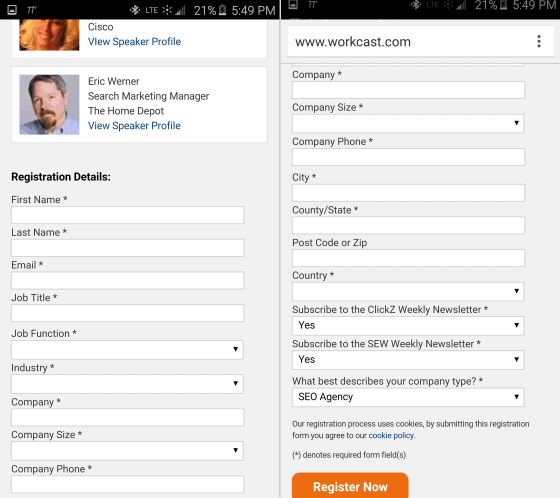
This form required two screen shots to capture all of the sixteen fields.
It’s hard to fill out forms on a mobile device. Despite my excitement about the topic, “Advanced Conversion Strategies for Mobile Search,” I didn’t register. I intended to go back and register from my laptop, but had forgotten all about it within 30 seconds.
The punchline is that a webinar discussing great mobile experiences essentially asks mobile visitors to go away, and a LOT of desktop visitors, too. Workcast.com, the host of this monstrous form, thinks their job is to host webinars. Those of us that do webinars know that their job is to generate leads.
I would have offered an autofill via linked into get the form started. I would have removed the address fields on mobile. I would have removed Industry, Company Size and a description of the company. Make the sales people do a little research for crying out loud.
The point is this: Mobile visitors expect a mobile experience. Responsive design delivers a smaller desktop experience. No thanks, Google.
Read my entire rant on Marketing Land.

Expertise: conversion rate optimization, AB testing, marketing strategy, digital marketing, analytics, landing page design, computer programming, entrepreneurship
Speaking: IBM, Inbound, LeadsCon, Content Marketing World, Affiliate Summit, and more
Books and Training: Your Conversion Creation Equation, Video CRO, Marketing Videos that Convert, CRO Best Practices
As Seen On: ClickZ, Search Engine Land, Marketing Land, Conversion Sciences Blog, Intended Consequences podcast
Education: Texas A&M University, BS Computer Science and Management
- Using AI to Chat with your Online Business - July 10, 2026
- Your Ads Are Making Promises Your Landing Page Experience Doesn’t Keep - July 1, 2026
- Using AI to Generate Copy that Converts - June 15, 2026


