
From Viral to Buy: Designing Buyer Journeys [CASE STUDY]
Online retailer iNature Skincare® sponsored a video that turned into a phenomenon.
Released on October 29, 2014, the Comfortable: 50 People 1 Question video had garnered over 4 million views within two weeks.
iNature Skincare had sponsored a viral hit.
Unfortunately, sales did not rise as much as one would think. Why not? It is not uncommon for viral videos to fail as buy-ral videos.
We took a look at their site and felt that they hadn’t mapped the visitors journey appropriately.
The Visitor’s Journey
In this case the visitor’s journey starts with being moved by the video. It should then move to becoming aware of the brand, to understanding why the brand sponsored this video, to considering their products, and then to purchase.
I feel good. I want to feel good some more.
After viewing the video, we feel pretty good. Or sad. Or nostalgic. These feelings aren’t typical when considering skin care products.
As viewers, our first response is to get more of this feeling. The most common way to extend the feeling is to share with others. This is clearly happening.
However, iNature Skincare should be enabling this next step. I would have liked to know why iNature sponsored this video.
How does my feeling relate to the sponsor?
iNature Skincare’s viral video is benefiting other brands, brands not nearly as closely aligned with it.
For me, PS Print is getting the love from this video because they are advertising here. This is most likely a retargeted ad. I think iNature Skincare should be here.

Other advertisers are getting the benefit of this viral video through advertising.
My recommendation was that iNature Skincare should ask the producer to add an overlay or advertise on the video with a message that says, “Why did iNature Skincare asked 50 people this question? Our story.” This would run before the filmmaker, Jubilee Project had a chance to make their pitch at the end.
This ad would allow visitors to take the next step in the journey. If you were producing such a video, you would want to use the end of the video to bring the viewers to the next step.
The sponsor shares my values.
The ad would need to bring the visitor to a page that answered the question posed.
Every ad should bring the visitor to a page that continues the journey. Home pages are notoriously bad at that.
The page should communicate that there was a reason for the effort, and tie the message to it’s products. We really don’t have to work too hard to do this. The message, in words and pictures would be:
We chose to sponsor this video because one of the people interviewed was clearly impacted as a child by acne and eczema. Our products could have helped. We’re still working on the Mermaid Tail.
If I have skin problems, my next question should be, “Really? How?”
The sponsor can solve a problem I have.
iNature Skincare has strong proof of the effectiveness of its products. It has an award-winning package design that lends it credibility. But we must honor the visitor’s journey.
Now is the time to begin building out the company’s value proposition in words and images.
I felt that the compelling proof found in a study was their most powerful statement of the power of the product. This study was small. Eight babies were treated with their product and the results measured on two scales. The before and after pictures are available on the site.
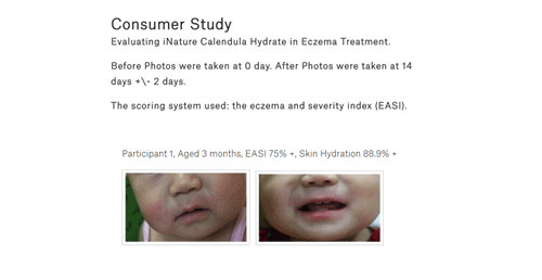
This page offers compelling evidence of the safety and effectiveness of the products. Click for full image.
The results on this page are unclear, but the pictures are powerful. The product is effective and save enough for babies.
What product did this? Unfortunately, iNature Skincare leaves the visitor hanging on this page. This is an ideal time to introduce the product that had such an impact and offer more information. This could be done in the right sidebar area of the page.
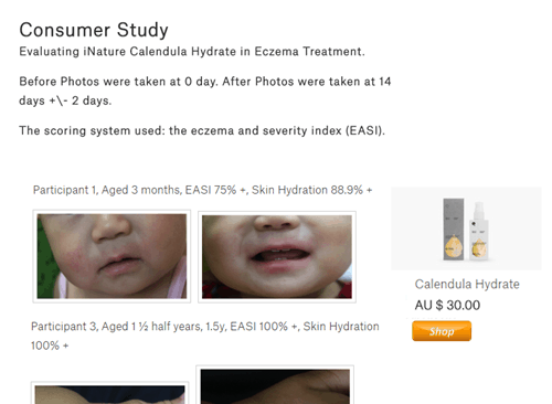
A mockup of the Consumer Study page with a next step for the visitor.
I would also add products at the bottom of this page.
I can afford the product that solves my problem.
The visitor now needs to do a cost/benefit calculation. It’s time to introduce the product and complete the value building process. For iNature Skincare, the product page does a good job.
I recommended putting a picture of the product used and a link to learn more about the product. The page that featured the product was imperfect, but provided a good deal of information.

The iNature Skincare product page.
This was a good next step because after providing the product information and the price, the presented the next step in the visitor’s journey.
Should I buy now? Can I delay?
The next step in the journey is the choice. So far, the question in the visitor’s mind – “Should I go on?” – has been an easy one to answer. Each click offered more relevant information in the journey.
Visitors that don’t have skin problems have fallen away. Now we are talking to those who need our product.
It’s time to bring them to choice.
This is the job of the call-to-action button. For most ecommerce sites, “Add to Cart” tests well as the call to action. It is presented here in bold read.

This is the traditional next step in the buyer’s journey for ecommerce sites.
The button is very wide, and almost doesn’t look like a clickable button. It also lies well down the page. It could be missed. Nonetheless, it offers a natural next step in the visitor’s journey, an important final step.
If, at this point, the visitor does not purchase, then we can assume that
a) they just weren’t ready
b) we didn’t do a good enough job of building value
Price is rarely the issue. When I tell you that your product is too expensive, they mean that you didn’t do a good enough job explaining the value to me.
Could iNature Skincare entice more of these lost visitors to buy?
The Complete Journey
We’ve mapped out a journey from first exposure through to purchase.
- A good feeling from branded content
- Discovering a brand that shares my values
- The realization that the brand solves a problem I have
- Understanding the product’s value proposition
- The decision to buy
- Finalizing the transaction
Each point along the way holds an opportunity for optimization. Here are some opportunities for iNature Skincare to improve these waypoints.
Let Your Visitors Find Their Own Journey
For many visitors, we will not know where their journey started. So, we have to make it easy for them to create their own journey.
iNature Skincare as a non-standard design. The navigation bar is in a sticky band along the bottom, instead of along the top as is expected by most visitors.
This cuts 110 pixels off of the page height, space which could be used to further the value proposition.

The floating navigation bar at the bottom of the takes up precious space.
Every page on the site needs to offer a next step toward evaluating the products. There are no next steps on the Our Story, About, Dry Skin or Before and After pages.
Every page should answer a question and continue the journey.
If you are stuck on designing your buyer journey, I recommend you buy Buyer Legends from Bryan and Jeffrey Eisenberg. They outline a process for laying out powerful stories that marketers can actually implement.

21 Quick and Easy CRO Copywriting Hacks
Keep these proven copywriting hacks in mind to make your copy convert.
- 43 Pages with Examples
- Assumptive Phrasing
- "We" vs. "You"
- Pattern Interrupts
- The Power of Three
"*" indicates required fields

Expertise: conversion rate optimization, AB testing, marketing strategy, digital marketing, analytics, landing page design, computer programming, entrepreneurship
Speaking: IBM, Inbound, LeadsCon, Content Marketing World, Affiliate Summit, and more
Books and Training: Your Conversion Creation Equation, Video CRO, Marketing Videos that Convert, CRO Best Practices
As Seen On: ClickZ, Search Engine Land, Marketing Land, Conversion Sciences Blog, Intended Consequences podcast
Education: Texas A&M University, BS Computer Science and Management


Funny. They took your advice, verbatim. I’m sure they got your approval to use the “Why we sponsored this video…” Great suggestions.
I’ll find out if their conversion rates have improved and publish results here.