Marketers have always relied on testing.
But let’s be honest. It’s probably only in the last few years that they’ve begun discussing conversion rates rather than golf scores over a beer.

The Austin #CRO community is a dedicated bunch:
@peeplaja @jtrondeau @mercertweets @bmassey
The level of measurement and testing that we now have wasn’t even possible in the “old” days. Now that it is, CRO (conversion rate optimization) is clearly a “thing”.
And yes, I’ve got the data to back that up!
According to Econsultancy, in the last five years, the number of companies using A/B testing has more than doubled. Two-thirds (67%) of the companies surveyed use A/B testing, making it the top optimization method used today. Compare that to five years ago, when only a third of businesses were testing.
You might say it’s the golden age of conversion optimization.
Cool thought, I know. And it sounds like it should benefit businesses across the board. But that’s not what we’re seeing.
Whenever any tactic becomes a “thing,” it gets adopted by newbies and wanna-bes as well as the pros. So beware! You could be paying good money for “website optimization” services from an agency who just learned last month how to run a test.
The Truth About Testing and Website Optimization
The truth is, CRO is hard. You can’t learn it in a month, and you won’t be an expert until you’ve done it for years.
Let me say that again: It takes YEARS to become a pro.
What does that mean? It means lots of agencies are making mistakes without even knowing it because they’re so new to the game. Here are some of the mistakes we see most often.
1. “Best practices” landing pages
Best practice is NOT the same thing as conversion rate optimization. PPC agencies, SEO agencies, UX and UI people—they’re all claiming to do CRO.
But calling it CRO doesn’t make it so. Here’s what Brian Massey told me the other day:
“Here at Conversion Sciences, we’ve stopped doing best practices consulting because it’s so unreliable. Even if someone asks for it, we won’t sell it to them.
As brilliant as we are, when we implement best practices, we’ll be wrong on half of them.
Every audience is different. You have to test to know what’s working. Period. End of story.”
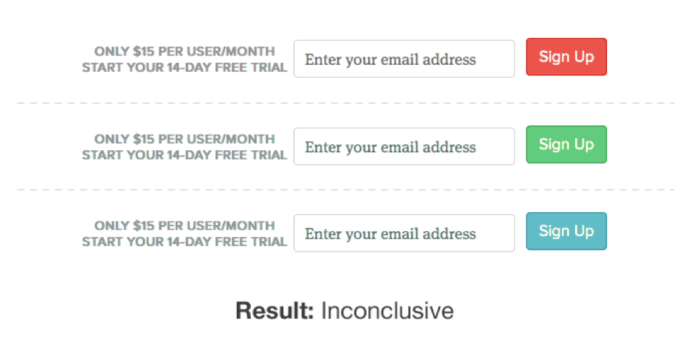
As an example, best practice says videos are good and sliders, or carousels, are bad. It says that sliders distract visitors, are hard to read, ya-da-ya-da-ya-da. Not so, according to a DeviceMagic case study, published by VWO.
This test pitted a slider against a video to see which would work better on the home page.

DeviceMagic was pretty sure the sliders were a better fit for their purposes, but they knew better than to make the change without testing. Interestingly, the video seemed to be an early winner. But after reaching statistical significance, the slider was the clear winner.
- Conversions from homepage to signup page increased 35%.
- Subsequent signups increased 31%.
Another example comes from one of my own projects. I had been commissioned to rewrite a collection of landing pages and, sadly, discovered that we were using best practice as our guide. The results? We nailed SEO, but conversions dropped to half of what they were before the rewrite.
Agencies fall into the same trap. They hear that something is working on another website, and they adopt it, no questions asked.
A landing page built on best practices rather than a solid testing strategy isn’t going to get you the results you’re looking for.
If it does, it was just dumb luck!
2. Testing the Wrong Things
When you rely on hearsay rather than data, it’s easy to make another mistake as well—testing the wrong things.
Experienced Conversion Scientists™ know which data gives them the insights they need. And they know which tools will give it to them.
Some agencies try to shave expenses by cutting out the data-collection tools—things like click testing, heatmaps and user-session recording tools. As a result, they don’t have the data to make smart decisions about what to test. These agencies pick something out of the blue to test instead of using analytics to figure it out.
In other words, they’re testing for the sake of testing.
Science should be based on hypotheses, not guesses or busy work. So you gotta ask, if your tests aren’t based on data, what’s the point?
Honestly, that’s the case for a lot of tests. Alex Turnbull, Groove’s founder, gives a great example of this. He lists some tests that are often considered “easy wins.” But for Groove, he says, they were pointless.
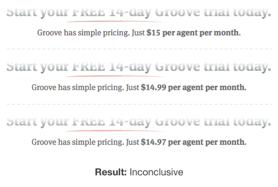
Typically, these tests are the first tests newbies try to run, not because they’re relevant to the website or the audience, but because they seem like easy wins. Remember: trust the data, not someone else’s results.
3. Reliance on Self-Reported Data
Data is important. But you can’t depend on just any data.
Self-reported data—such as responses from focus groups, user testing, surveys, and forum feedback—is gathered from people’s stories, not their behavior.
The problem is people lie.
They may not mean to, but they do. If you ask them how they spend their money, they give a best-case scenario or what they wish to be true. Not the absolute truth.
Compare their answers to your analytics and you get another story. The real story.
That’s why Conversion Scientists don’t put much stock into self-reported data. Qualitative data (self-reported) is great for generating hypotheses, but it needs to be validated with testing.
Here’s where you need to be careful: A lot of agencies (especially UX and UI) redesign a site using only self-reported data. A true Conversion Scientist uses analytics and split testing to verify assumptions before deciding they’re true.
The Marks & Spencer 2014 redesign proves the point: Costing £150 million (about $230 million), this redesign took two years and led to an 8% decrease in online sales.
Based on the fact that this project took two years, I’m guessing that most decisions were made from self-reported data plus the design team’s own opinions.
It’s unlikely A/B testing was involved because testing delivers incremental changes rather than one massive change. And it allows you to mitigate technical errors, because you know for certain whether the changes you’re making are helping.
DigitalTonic says it well in their analysis of the redesign:
“Drastic changes can never be monitored meaningfully and you won’t be able to separate the variables that are causing the positive or negative impact on conversions. With testing on your current site prior to redesign, you will hit a local maxima meaning that you have optimised the site as best as you can in its current incarnation. It’s at this stage that you would take the learnings and move towards the global maxima with the redesign process.”
The issue here is really about behavioral versus attitudinal data. Look at this chart, which illustrates the landscape of 20 popular research methods, and you can see why this is such a common mistake. Self-reported data looks like a scientific approach.
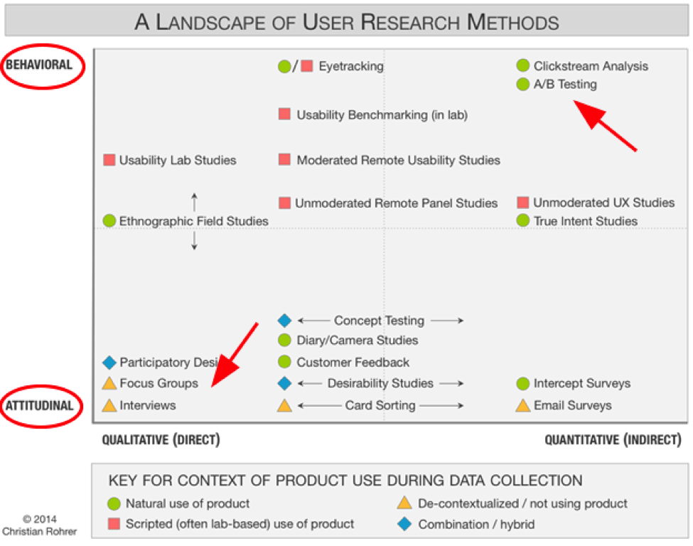
Behavioral versus attitudinal testing
Surveys and focus groups give useful information, but since the data is both attitudinal and qualitative, it should never be the foundation for testing.
Use it to help you develop smart hypotheses. Use it to understand your users better. But alone, it’s not valid. Behavioral (or quantitative) data is your most reliable source of information.
As Christian Rohrer states, “While many user-experience research methods have their roots in scientific practice, their aims are not purely scientific and still need to be adjusted to meet stakeholder needs.”
4. Not Understanding the Scientific Process
Agencies are time and materials companies. They bill by the hour. Understandably, they want every hour of their employees’ time to be accounted for and assigned to a winning project.
The problem is, this focus on the bottom line can actually dampen results.
Scientists need time to be curious, follow their hunches and understand the reason things are happening. A successful A/B testing agency needs to give them that time, even if some of those hunches turn out to be pointless.
In the long run, it’s cheaper to eliminate hypotheses early, before testing. If experienced Conversion Scientists are given time to “play,” they can usually do that with analysis alone, saving time and money.
In other words, a few hours of analysis beats 2 weeks of testing every time.

True inspiration requires time. Time to follow dead ends. Time to dive into the data. Time to think and ask questions. If your agency doesn’t allow that, be aware, you’re probably not getting the best results.
5. Offering a Completely Done-For-You Model
This one sounds more like a premium service than a mistake. But when it comes to CRO, it reads more like a mistake.
Some agencies believe they have more “job security” if they make the client completely dependent on them. So they do it all: collect the data, make the hypotheses and, supposedly, deliver results.
Alone.
There’s no collaboration with clients. Which means they’re only using half the information they should be using to create hypotheses.
Here’s the thing: The best results come when the agency and client work together. The agency has the expertise to collect the data, but the client has the intimate knowledge of the customer. It takes both.
Seriously. If your agency is doing everything for you, they may be creating issues rather than solving them.

Does your agency see you as a money tree? Collaboration, rather than DFY services get the best results.
6. Not Bothering to Influence the Client Culture
Similarly, some agencies appear to collaborate with the client, but they draw the line before influencing client culture.
In reality, there’s a huge advantage to having an agency work so closely with you that they actually change the way you do things.
True collaboration involves getting together on a frequent basis and discussing ideas. Over time, you begin to see the thought process that goes into each website optimization effort. You begin to understand how to make decisions based on data and to value the insight numbers can give you.
When that happens, whether you consider yourself a numbers person or not, you’re hooked.
That’s the point at which you stop making random marketing decisions. Instead, you call your agency and ask what data needs collecting and when you can start testing. (Congratulations! You’re a conversion geek!)
As we talked about before, a done-for-you or non-collaborative service may not be giving you the best results—and they may be charging premium rates to do so.
Always remember, you’re the resource for testing. Not many agencies actually try to influence your company’s culture. Make sure yours does.
7. Not Staffing for CRO
This is a biggie. An agency that doesn’t staff for CRO shouldn’t offer CRO. You see, the best Conversion Scientists are skilled in two areas. They’re good with numbers and they’re excellent communicators.
Good with numbers. Getting high marks in high-school math isn’t enough. Conversion Scientists are masters of data and statistics.
They know when numbers are reliable and when they’re not. So they know how long to run a test and when the results are statistically valid. They know when the math is bad, which means you can be sure you’re getting positive results.
But being good with numbers isn’t everything. Great Conversion Scientists are also…
Excellent communicators. All too often, Web developers are recruited to do analytics, and sure they understand the numbers—but not much else.
It takes a conversion optimizer to turn data into stories. Frankly, that’s where the magic happens.
At Conversion Sciences, the team spends much of their time going through the numbers to tease out the stories. If there’s a hole in the plot, they design a test to figure out what’s missing. The goal is to find the story in the data—and tell that story well.

Conversion optimizers are fortune tellers
If you think about it, conversion optimizers are really fortune tellers. They predict the future based on the data your site gives them. Is your agency converting analytics to customer stories? If not, you may be dealing with Web developers rather than conversion optimizers.
8. Failing to Test Before Going Live
Pros test and validate everything before going live. That avoids costly mistakes like Finish Line’s 2012 Web redesign, which cost the chain around $3.5 million in sales and a huge hit to its reputation.
Four days before Black Friday, Finish Line launched a freshly redesigned website, supposedly planning to “reinvent the shopping experience.” Instead, customers complained about lost orders and other technology glitches, and Finish Line had to revert back to the old design just prior to the Christmas shopping season.
Granted, that level of mistake isn’t likely for smaller brands, but bad usability can still impact reputation and profitability.
My guess is a brand agency was responsible for that redesign. It would have been smarter to work with conversion optimizers, who understand how to use data to decide on incremental changes, validating each one before moving on to the next.
9. Making Rookie Mistakes
Since CRO is now a “thing,” everyone and their office cat now offer website optimization services. Most don’t know the difference between conversions and sales, which means they’re making a lot of mistakes.
Now don’t get me wrong. We all make our fair share of junior mistakes when we’re starting out—things like delivering results without statistical validity, not analyzing traffic enough, and the like.
But this is the “golden age” of conversion optimization. Don’t you want pro results?
Again, not everyone who claims to be a conversion optimizer is. Unless your team is experienced and has a structured approach for improving conversions, they’re likely making some mistakes that could be easily avoided—if they were more experienced.

Pro CROs use a structured approach to improving conversions.
Download a free copy of our eBook Four Rookie CRO Mistakes to Avoid at All Costs.
Website Optimization Mistakes Bottom Line
As you can see, mistakes are more common than not. That’s because website optimization is hard work.
If you want to get the big results CRO promises, you need an agency that has the experience and know-how to do it right. Period. (BTW, I recommend talking with Conversion Sciences about whether they can help.)
What CRO fails have you seen? And what are you doing to keep from making bonehead testing mistakes? Share in the comments below.


The Cognitive Biases that Infest Your Website Redesign
Conversion-Centered DesignI state that, “A redesign is a big ball of bias-driven assumptions” in my September Marketing Land column The Biases that Drive Crazy Decisions. A large part of the column is dedicated to the biases found in website redesigns. These include Pro-innovation Bias, Stereotyping, Overconfidence and Blind-spot Bias.
Subscribe to Podcast
In the 1990s, we had GIF animations, blinking and scrolling text, and any number of fonts appearing on pages.
Sometimes, you just need to start over on your design.
These were implemented for no other reason than because we could.
When carousels, or sliders were added to Web templates, they began to appear everywhere, despite the fact that they tend to hurt conversion. We’re still getting rid of them one site at a time.
Rotating banner from Zumba.com
We’ve recently survived a short bout with parallax scrolling sites. Fortunately, this trend seems to be waning on business sites.
Parallax animations are distracting and don’t help conversions.
These techniques seem to be built to serve the designer’s ego at the expense of the potential buyer.
Parallax animations are distracting and don’t help conversions.
More recently, we’re seeing a pro-innovation bias with the proliferation of “flat” design template. These designs result in long, banded pages. I recently reviewed 47 WordPress templates. All but two were in this flat style.
You may find this post difficult to read. It is. It is a collection of design choices made under the influence of the pro-innovation bias. This is only one of twenty I researched.
My Marketing Land column uncovers several more biases that may be infecting your website.
Feature image by ethanhickerson via Compfight cc and adapted for this post.
9 Website Optimization Mistakes Even Smart Agencies Make
Conversion OptimizationMarketers have always relied on testing.
But let’s be honest. It’s probably only in the last few years that they’ve begun discussing conversion rates rather than golf scores over a beer.
The Austin #CRO community is a dedicated bunch:
@peeplaja @jtrondeau @mercertweets @bmassey
The level of measurement and testing that we now have wasn’t even possible in the “old” days. Now that it is, CRO (conversion
rateoptimization) is clearly a “thing”.And yes, I’ve got the data to back that up!
According to Econsultancy, in the last five years, the number of companies using A/B testing has more than doubled. Two-thirds (67%) of the companies surveyed use A/B testing, making it the top optimization method used today. Compare that to five years ago, when only a third of businesses were testing.
Cool thought, I know. And it sounds like it should benefit businesses across the board. But that’s not what we’re seeing.
Whenever any tactic becomes a “thing,” it gets adopted by newbies and wanna-bes as well as the pros. So beware! You could be paying good money for “website optimization” services from an agency who just learned last month how to run a test.
The Truth About Testing and Website Optimization
The truth is, CRO is hard. You can’t learn it in a month, and you won’t be an expert until you’ve done it for years.
Let me say that again: It takes YEARS to become a pro.
What does that mean? It means lots of agencies are making mistakes without even knowing it because they’re so new to the game. Here are some of the mistakes we see most often.
1. “Best practices” landing pages
Best practice is NOT the same thing as conversion rate optimization. PPC agencies, SEO agencies, UX and UI people—they’re all claiming to do CRO.
But calling it CRO doesn’t make it so. Here’s what Brian Massey told me the other day:
“Here at Conversion Sciences, we’ve stopped doing best practices consulting because it’s so unreliable. Even if someone asks for it, we won’t sell it to them.
Every audience is different. You have to test to know what’s working. Period. End of story.”
As an example, best practice says videos are good and sliders, or carousels, are bad. It says that sliders distract visitors, are hard to read, ya-da-ya-da-ya-da. Not so, according to a DeviceMagic case study, published by VWO.
This test pitted a slider against a video to see which would work better on the home page.
DeviceMagic was pretty sure the sliders were a better fit for their purposes, but they knew better than to make the change without testing. Interestingly, the video seemed to be an early winner. But after reaching statistical significance, the slider was the clear winner.
Another example comes from one of my own projects. I had been commissioned to rewrite a collection of landing pages and, sadly, discovered that we were using best practice as our guide. The results? We nailed SEO, but conversions dropped to half of what they were before the rewrite.
Agencies fall into the same trap. They hear that something is working on another website, and they adopt it, no questions asked.
If it does, it was just dumb luck!
2. Testing the Wrong Things
When you rely on hearsay rather than data, it’s easy to make another mistake as well—testing the wrong things.
Experienced Conversion Scientists™ know which data gives them the insights they need. And they know which tools will give it to them.
Some agencies try to shave expenses by cutting out the data-collection tools—things like click testing, heatmaps and user-session recording tools. As a result, they don’t have the data to make smart decisions about what to test. These agencies pick something out of the blue to test instead of using analytics to figure it out.
In other words, they’re testing for the sake of testing.
Science should be based on hypotheses, not guesses or busy work. So you gotta ask, if your tests aren’t based on data, what’s the point?
Honestly, that’s the case for a lot of tests. Alex Turnbull, Groove’s founder, gives a great example of this. He lists some tests that are often considered “easy wins.” But for Groove, he says, they were pointless.
Typically, these tests are the first tests newbies try to run, not because they’re relevant to the website or the audience, but because they seem like easy wins. Remember: trust the data, not someone else’s results.
3. Reliance on Self-Reported Data
Data is important. But you can’t depend on just any data.
Self-reported data—such as responses from focus groups, user testing, surveys, and forum feedback—is gathered from people’s stories, not their behavior.
The problem is people lie.
They may not mean to, but they do. If you ask them how they spend their money, they give a best-case scenario or what they wish to be true. Not the absolute truth.
Compare their answers to your analytics and you get another story. The real story.
That’s why Conversion Scientists don’t put much stock into self-reported data. Qualitative data (self-reported) is great for generating hypotheses, but it needs to be validated with testing.
Here’s where you need to be careful: A lot of agencies (especially UX and UI) redesign a site using only self-reported data. A true Conversion Scientist uses analytics and split testing to verify assumptions before deciding they’re true.
The Marks & Spencer 2014 redesign proves the point: Costing £150 million (about $230 million), this redesign took two years and led to an 8% decrease in online sales.
Based on the fact that this project took two years, I’m guessing that most decisions were made from self-reported data plus the design team’s own opinions.
It’s unlikely A/B testing was involved because testing delivers incremental changes rather than one massive change. And it allows you to mitigate technical errors, because you know for certain whether the changes you’re making are helping.
DigitalTonic says it well in their analysis of the redesign:
“Drastic changes can never be monitored meaningfully and you won’t be able to separate the variables that are causing the positive or negative impact on conversions. With testing on your current site prior to redesign, you will hit a local maxima meaning that you have optimised the site as best as you can in its current incarnation. It’s at this stage that you would take the learnings and move towards the global maxima with the redesign process.”
The issue here is really about behavioral versus attitudinal data. Look at this chart, which illustrates the landscape of 20 popular research methods, and you can see why this is such a common mistake. Self-reported data looks like a scientific approach.
Behavioral versus attitudinal testing
Surveys and focus groups give useful information, but since the data is both attitudinal and qualitative, it should never be the foundation for testing.
Use it to help you develop smart hypotheses. Use it to understand your users better. But alone, it’s not valid. Behavioral (or quantitative) data is your most reliable source of information.
As Christian Rohrer states, “While many user-experience research methods have their roots in scientific practice, their aims are not purely scientific and still need to be adjusted to meet stakeholder needs.”
4. Not Understanding the Scientific Process
Agencies are time and materials companies. They bill by the hour. Understandably, they want every hour of their employees’ time to be accounted for and assigned to a winning project.
The problem is, this focus on the bottom line can actually dampen results.
Scientists need time to be curious, follow their hunches and understand the reason things are happening. A successful A/B testing agency needs to give them that time, even if some of those hunches turn out to be pointless.
In the long run, it’s cheaper to eliminate hypotheses early, before testing. If experienced Conversion Scientists are given time to “play,” they can usually do that with analysis alone, saving time and money.
In other words, a few hours of analysis beats 2 weeks of testing every time.
True inspiration requires time. Time to follow dead ends. Time to dive into the data. Time to think and ask questions. If your agency doesn’t allow that, be aware, you’re probably not getting the best results.
5. Offering a Completely Done-For-You Model
This one sounds more like a premium service than a mistake. But when it comes to CRO, it reads more like a mistake.
Some agencies believe they have more “job security” if they make the client completely dependent on them. So they do it all: collect the data, make the hypotheses and, supposedly, deliver results.
Alone.
There’s no collaboration with clients. Which means they’re only using half the information they should be using to create hypotheses.
Here’s the thing: The best results come when the agency and client work together. The agency has the expertise to collect the data, but the client has the intimate knowledge of the customer. It takes both.
Seriously. If your agency is doing everything for you, they may be creating issues rather than solving them.
Does your agency see you as a money tree? Collaboration, rather than DFY services get the best results.
6. Not Bothering to Influence the Client Culture
Similarly, some agencies appear to collaborate with the client, but they draw the line before influencing client culture.
In reality, there’s a huge advantage to having an agency work so closely with you that they actually change the way you do things.
True collaboration involves getting together on a frequent basis and discussing ideas. Over time, you begin to see the thought process that goes into each website optimization effort. You begin to understand how to make decisions based on data and to value the insight numbers can give you.
When that happens, whether you consider yourself a numbers person or not, you’re hooked.
That’s the point at which you stop making random marketing decisions. Instead, you call your agency and ask what data needs collecting and when you can start testing. (Congratulations! You’re a conversion geek!)
As we talked about before, a done-for-you or non-collaborative service may not be giving you the best results—and they may be charging premium rates to do so.
Always remember, you’re the resource for testing. Not many agencies actually try to influence your company’s culture. Make sure yours does.
7. Not Staffing for CRO
This is a biggie. An agency that doesn’t staff for CRO shouldn’t offer CRO. You see, the best Conversion Scientists are skilled in two areas. They’re good with numbers and they’re excellent communicators.
Good with numbers. Getting high marks in high-school math isn’t enough. Conversion Scientists are masters of data and statistics.
They know when numbers are reliable and when they’re not. So they know how long to run a test and when the results are statistically valid. They know when the math is bad, which means you can be sure you’re getting positive results.
But being good with numbers isn’t everything. Great Conversion Scientists are also…
Excellent communicators. All too often, Web developers are recruited to do analytics, and sure they understand the numbers—but not much else.
At Conversion Sciences, the team spends much of their time going through the numbers to tease out the stories. If there’s a hole in the plot, they design a test to figure out what’s missing. The goal is to find the story in the data—and tell that story well.
Conversion optimizers are fortune tellers
If you think about it, conversion optimizers are really fortune tellers. They predict the future based on the data your site gives them. Is your agency converting analytics to customer stories? If not, you may be dealing with Web developers rather than conversion optimizers.
8. Failing to Test Before Going Live
Pros test and validate everything before going live. That avoids costly mistakes like Finish Line’s 2012 Web redesign, which cost the chain around $3.5 million in sales and a huge hit to its reputation.
Four days before Black Friday, Finish Line launched a freshly redesigned website, supposedly planning to “reinvent the shopping experience.” Instead, customers complained about lost orders and other technology glitches, and Finish Line had to revert back to the old design just prior to the Christmas shopping season.
Granted, that level of mistake isn’t likely for smaller brands, but bad usability can still impact reputation and profitability.
My guess is a brand agency was responsible for that redesign. It would have been smarter to work with conversion optimizers, who understand how to use data to decide on incremental changes, validating each one before moving on to the next.
9. Making Rookie Mistakes
Since CRO is now a “thing,” everyone and their office cat now offer website optimization services. Most don’t know the difference between conversions and sales, which means they’re making a lot of mistakes.
Now don’t get me wrong. We all make our fair share of junior mistakes when we’re starting out—things like delivering results without statistical validity, not analyzing traffic enough, and the like.
But this is the “golden age” of conversion optimization. Don’t you want pro results?
Again, not everyone who claims to be a conversion optimizer is. Unless your team is experienced and has a structured approach for improving conversions, they’re likely making some mistakes that could be easily avoided—if they were more experienced.
Pro CROs use a structured approach to improving conversions.
Download a free copy of our eBook Four Rookie CRO Mistakes to Avoid at All Costs.
Website Optimization Mistakes Bottom Line
As you can see, mistakes are more common than not. That’s because website optimization is hard work.
If you want to get the big results CRO promises, you need an agency that has the experience and know-how to do it right. Period. (BTW, I recommend talking with Conversion Sciences about whether they can help.)
What CRO fails have you seen? And what are you doing to keep from making bonehead testing mistakes? Share in the comments below.
5 SEO Insights Pivotal to Optimizing Your Website for Conversion
Conversion OptimizationSearch engine algorithms are evolving at higher paces than ever before. The frequent updates to these algorithms – especially Google’s search algorithm updates – have made it harder to “game” the system using Search Engine Optimization (SEO). This has forced companies to bring at least one SEO specialist on board in order to gain and keep high rankings for their websites in the search engine results pages (SERPs).
At the same time, advances in data-collection tools has made conversion rate optimization (CRO) one of the highest returns on the marketing investment (ROI). Ironically, CRO is one of the most underused activities in the marketing department.
This paradox becomes apparent once you consider that obtaining the click that brings someone to your website is only the first step toward converting the visitor into a paying customer. From this perspective, CRO carries the burden of managing the entire user interaction, as opposed to SEO, which arguably only brings the visitor to the “front door.”
SEO and CRO Are Meant to Work Hand-in-Hand
With SEO, the basic point of focus is the webpage. In conversion optimization, the central concept is a PPC ad and a matched landing page. Nevertheless, the principles of search engine and conversion rate optimization are undeniably compatible. In fact, here are a few fundamentals that apply to both SEO and CRO:
SEO Factors Inform CRO Efforts
The SEO field has been revolving around the standards imposed by search engines, especially Google’s ranking factors. Some of these are documented by Google, some are relatively obvious, others are not confirmed, and some sit at the brink of speculation or wishful thinking.
Since SEO revolves around ranking factors, which basically dictate the actions and tools needed in this field, it’s only natural that the SEO insights most relevant to CRO are rooted in these ranking factors.
1. Focus on User Behavior
Conversion optimization is data-driven, much like SEO. Web analytics are your greatest asset, but you will need to do additional research into user behavior. Segmentation analysis becomes quite important. Ask yourself this: “How do different segments interact with your website, and how can you optimize their particular experiences?”
The user interaction factors most likely to be useful in CRO and impact on conversion optimization are:
Average session duration in Google Analytics
If you’re having trouble differentiating dwell time, session duration, and bounce rate, read this article published by Neil Patel on Search Engine Journal. It will clarify the topic.
2. It’s Not Just the Landing Page, It’s Also the Website
Conversion optimization extends beyond single pages, creating what we call conversion paths throughout the website. SEO dictates that breaking up content into multiple steps is usually a bad idea. CRO specialists tell us that multiple-step landing pages can convert better, by engaging respondents in a mutually productive dialogue and facilitating proper segmentation. For this reason, some form of consensus needs to be achieved in order to allow both SEO and CRO specialists to reach successful results.
Some of the site-level SEO factors most likely to influence CRO are:
Google’s mobile friendly tags
Also, keep in mind that Google has precise standards for evaluating what constitutes mobile friendly design. Google WebMaster Central offers details about mobile friendly requirements. To assess your website’s current mobile performance, check out this Mobile Friendly Test.
21 Quick and Easy CRO Copywriting Hacks
Keep these proven copywriting hacks in mind to make your copy convert.
"*" indicates required fields
3. If Content Is King, the Webpage Is Its Kingdom
In both SEO and CRO, content is king. In SEO, this wins you links. In conversion optimization, it wins you customers. You should never allow technical aspects to eclipse what is truly important: compelling value propositions and meaningful brand experiences.
Page-level SEO factors that will prove crucial for conversion
Using keywords correctly throughout webpages is critical when trying to improve your search engine ranking and your conversion rates as part of your online marketing strategy. Keywords must be used in:
A great page layout influences rankings and conversion, if not directly as a quality signal, at least by scoring in the “user friendly category.” This keeps readers coming back for more. The page layout on highest quality pages makes the main content immediately visible.
Content length. While life on- and off-line speeds up and our attention span keeps narrowing, you would expect content to get shorter in order to efficiently catch the attention of users. On the contrary, long articles rank and convert better than short ones. Review the results of an A/B testing experiment conducted by Neil Patel, demonstrating the superior efficiency of long copy.
4. Build Links, Build Trust, Build Rapport
One of the driving goals of SEO is link building. Conversion optimization deals with links mostly in terms of conversion paths. Landing pages usually do not contain links themselves other than for the call to action (CTA). However, many SEO factors concerning link building can apply to CRO in crucial ways. Here are some examples:
You have the option to disavow links
5. Your Brand Needs a Social Identity to Attract and Convert
In terms of the decision to purchase, user behavior has been shifting toward a multi-source, multiple stage process over the last few years. Regardless of how persuasive your landing pages are and how well they bring customers to the realization that you have the answer to their specific needs, your brand needs to back up its claims with a healthy social media presence and an SEO effort that encompasses social factors. Here are a few of the factors that can inform CRO specialists on what needs to be done:
A link shared on multiple accounts will be more valuable than the same link shared multiple times on one account.
Wrapping It Up
Looking ahead, experts predict a major detachment from traditional ranking factors to a much deeper analysis of perceived site value, authority, structured data, and social signals. Automation is transforming digital marketing, turning SEO and CRO into much more precise and effective fields in the process. Ideally, within this decade Google’s services and search algorithm will evolve to a level that will allow us to fully customize our proposals according to our customers’ buying cycles.
Feature image licensed by Bgubitz through Creative Commons and adapted for this post.
4 Ways to Get a CRO Budget for Next Year
Conversion Marketing Strategy, Conversion OptimizationIf you ever went to the government and asked them what your fair share of taxes should be, they would first ask you how much you made last year.
And that would likely be the answer.
Likewise, a conversion optimizer would probably be the last person to ask how much to budget for conversion optimization. “How much budget do you have?”
Nonetheless, I’m going to give you the tools to add conversion optimization to your budget next year. Then, when you call us next year, you’ll be ready.
Where to Get Your CRO Budget
One key question you need to ask is, where will I get my CRO budget? I have some suggestions.
1. From IT
The basis of any conversion optimization effort is a sound analytics and measurement foundation. This consists of tools that slide under your website and are bolted in place. This is IT stuff.
Our research has shown that most businesses’ websites have some level of implementation of analytics. You don’t want to be left behind. This is a crucial behavioral database that will be invaluable as you begin to vet ideas for testing.
2. From the Things You Should be Testing Anyway
It is a golden age of marketing. We have more tools, data sources and shiny objects to drive our online businesses than any marketers have ever had. We can mobile gamify our ratings and review process using direct visitor feedback to drive personalization throughout our content funnels.
In other words, we’re overwhelmed, and the first sign of a marketing department that is overwhelmed is the decision to redesign.
Put the redesign money into an optimization program and see immediate results.
There is a good way to get your head around all of the things you could be doing to your site. You could test the ideas. Instead of blindly pouring money into exit-intent popovers, live chat, or personalized recommendations, you should test them. We have seen these work and we have seen them fail.
Your conversion optimization team will know how to use data to make good decisions on where to spend your money. Budget for optimization first.
3. From Your Ad Spend to Get a CRO Budget
Paid search is a great way to generate qualified traffic. However, our success in search causes our fundamentals to “regress”. It becomes harder to increase traffic, and the new traffic often is less qualified, less profitable.
When you spend more, get less traffic and make less money, it’s time to try optimization.
This may seem like a no-brainer, but there is a period of sweat and anxious hand-wringing.
You see, conversion optimization takes time. There is a very real dip in performance. When you reduce spending on ads you reduce your traffic and your revenue. For a period of time, your revenue drops until your optimization efforts get traction.
It might look something like the graph below. This assumes a modest 5% increase in revenue per visit (RPV) each month for one year, and that 8.9% of ad spend, or $8900, is invested in optimization each month. In this example, we began with a conversion rate of 1.7%.
If you can make it through a short valley of death, borrowing from your ad spend can be very profitable.
Monthly revenue dips due to the reduction in PPC traffic. Revenue returns to baseline levels in month four. Revenue is positive in month six compared to investing in PPC only.
The Return on CRO (green line) turns sharply north, even though we are still investing 8.9% of ad spend each month.
This is what powers conversion optimization. You have a compounding effect working in your favor, but you have to invest on the front end.
Send me an email if you want to see all my assumptions.
It’s this four-to-six month dip that marketers and managers fear. How do you sell a drop in revenue to your boss?
4. Pony Up
The other option is to reach into your own profits and slap down some cash on your conversion optimization team.
I’m not going to sugar coat this. There are three costs you must deal with when investing in optimization.
The Components of a Conversion Optimization or CRO Budget
The Software
The first cost is the least bothersome. Conversion optimization requires a certain amount of data to succeed.
The competition in the marketplace is pretty brutal. Each year, we get more functionality from cheaper and cheaper tools. At a minimum, you’ll want a good click-tracking tool, a good session recording tool, a strong analytics database and a split-testing tool.
Depending on your traffic, these can be had for a few hundred dollars each month up to several thousand dollars each month.
The Team
None of these tools matter if you don’t have someone to pull the levers, turn the knobs and read the graphs. The main functions found on a conversion optimization team are:
It is possible to have one super-amazing person who can do all of this. It is the death-knell of your conversion optimization program to ask someone to do all of this in addition to another job. Your PPC person is not going to be able to do all of this and their job too.
The Opportunity Costs
There is a cost to testing that is not seen in reports. It’s the cost of losing treatments. In any list of “good” ideas for increasing your conversion rate and revenue per visit, fully half will actually do more harm than good. We don’t know which of our ideas are “losers” until we test them. When we test, some percentage of your visitors will see these losers, be turned off, and won’t buy.
This is lost revenue. With proper management, this downside can be minimized, but it is the cost of doing business. It’s the price of admission, the overhead, the burn, that funny smell in the kitchen.
It’s hard to budget for this particular line item, but it should be part of your discussion.
Be Clear About Your Upside
If I haven’t scared you off, there is good news. We call it the upside, the green bling, statistical bignificance, and sometimes we just dance.
You should understand what your statistical significance is. You must know the answer to the question, “What happens if my conversion rate goes up a little?” We call this a Basic Unit of Upside.
Click for a Conversion Optimization Upside Report that does the math for you.
We offer our Conversion Optimization Upside Report to help you understand your upside. It calculates what your yearly increase in revenue would be if you only added 0.1 to your conversion rate or revenue per visit. Plug in a few numbers and you’ll see what small changes mean for your bottom line.
A Little More Motivation to Get a CRO Budget
For most businesses, conversion optimization is a ten-thousand-dollar a month investment or more. Many businesses are spending a whole lot more than that.
If conversion optimization is on your “maybe next year” list, consider what might happen if you give your competitors a year’s head start on you.
The business with the highest conversion rate has the lowest acquisition cost and can profitably boost bids on their paid advertising. Plus, Google favors high-converting landing pages when assigning ad placement.
With a realistic understanding of the costs of conversion optimization and a real appreciation for the potential upside, you should be able to make the case for adding it to your shopping list this year.
Feature image by frankieleon via Compfight cc and adapted for this post.
The CRO + SEM Agency: Challenges and Opportunities
Conversion Marketing StrategyWill CRO agencies adopt SEM, or will SEM agencies integrate CRO?
The perfect storm of online business, the peanut butter and jelly, the gin and tonic, the Abbot and Costello will be SEM and CRO. The reason is that the conversion rate of any business is calculated by dividing transactions (leads, sales or calls) by the number of visitors overall. Those businesses with the highest conversion rates enjoy both targeted, qualified visitors and optimized websites.
High converting sites optimize both sides of the equation.
Both organic and paid search traffic represents visitors who have expressed a certain intent. If you can deliver an on-site experience to match that intent, you will gain customers at a lower and lower acquisition cost.
What kind of agency is going to deliver this one-two punch? Will a CRO agency adopt the search marketing services and bring them to market or will a search agency adopt full-stack website optimization practices?
Brian Massey of Conversion Sciences and Jim McKinley of 360Partners will debate this question in their free Webinar on September 17th The CRO + SEM Agency: Challenges and Opportunities.
The conversation will begin with violent agreement on the importance of bringing these two practices together. We will examine the trends in search marketing and website optimization.
Then things will get interesting. These two industry veterans will tackle some of the harder questions.
Watch the webinar on-demand.
Increase Conversions on Low-Traffic Websites
CRO Tests | Multivariate | AB TestingHere’s a common question: “How do you increase conversions when you only get a small amount of traffic?”
The first answer is, go get more traffic.
You can do statistical optimization using split testing if you have enough conversions, but this usually comes with more traffic.
The second answer is to get more conversions so you can do conversion optimization to get more conversions. Which came first, the conversion or the optimizer?
This last point is, of course, the proverbial “rub.”
Here’s how to get started if you are running low-traffic websites.
Get Accurate Data
Be sure your analytics is setup properly. I offer an analytics setup checklist to help with Google Analytics. You’ll want to avoid blind spots such as overlay windows, tabbed content, and subdomains on separate analytics accounts.
You’re going to need a good source of data when you start picking things to test.
Compare your analytics data to a secondary dataset. Compare lead conversions to your CRM. Compare transactions reported to your accounting system. Your analytics should be within 15% of reality. Don’t be afraid to install a secondary analytics package to verify your main analytics setup.
21 Quick and Easy CRO Copywriting Hacks
Keep these proven copywriting hacks in mind to make your copy convert.
"*" indicates required fields
Get Some Qualitative Data
Low-traffic websites need to get more qualitative data. Right now, the one-stop-shop for qualitative data is HotJar. It offers click-tracking, session recording and feedback surveys. For alternatives, check out the ConversionDashboard.com.
Low-traffic Websites Use Serial Tests
If you don’t have the conversions to do split testing, you’ll want to do serial testing. This simply means making a single small change to your site and letting it run for at least two weeks. Since you have solid analytics (see above), you can see if there is an improvement in performance.
Measure More Than Conversions
There are some predictive metrics that you can use to gauge the performance of your serial tests.
Time on page, time on site, and pages per visit are to be taken with a grain of salt. Increasing these may correlate with lower conversion rates.
Start with the Message
Nothing works until your value proposition is strong. I recommend testing changes to your value proposition. I’ve done hundreds of free strategy consultations over the years. Most of the time, I ask the consultee to tell me about their business. Typically, I get a concise, clear statement of the offering and value.
Rarely does this clarity appear on the website.
Sit with a copywriter and tell your story. Then, don’t edit them. Whatever they come up with, try it.
You should also test:
Don’t bury the lead. A great headline — called the “lead” — is the core of a strong value proposition. Often the headline that would best “grab” a reader is buried somewhere in the copy.
Find the headline that gets visitors to read your value proposition, and you’ll have the cornerstone of conversion in place.
Look for Big Wins
You’re going to have to find what we call “big wins.” This means that your change increased conversions by more than 50%. Rich Page wrote on low-traffic testing. My comment on his post was as follows:
Technically, it’s OK to make a treatment with, say, a 30% increase the new control. Just know that you’re not likely to continue to see such an increase with small transaction amounts.
Ditch Your Outliers
You’re going to have to eliminate “outliers” in your data. Outliers include extreme orders in ecommerce sites and rushes of leads from activities such as email blasts and bursts of word of mouth.
For an ecommerce site, you should look at orders that are one or two standard deviations away from the mean.
So, what does that “mean?”
Here is two weeks of daily sales data for a site that gets about one sale per day.
There are two obvious outliers: One day with no sales in the first week, and one with $160 in sales the second week. Statistically, a 16% increase is irrelevant, but the point is driven home when you calculate the standard deviation range.
For this data, an outlier will be lower than $27.90 or higher than $86.89.
When we remove outliers we see a drop in sales of six percent. This is statistically uninteresting as well, but illustrates how outliers can affect results.
If you’d like to see how I calculated the min and max, download Example of Outliers-Conversion Scientist-low-traffic post.
Don’t Let it Run
Split testing can be done on low-transaction sites. However, don’t let the test run for more than, say, six weeks. The results just aren’t reliable. There are too many other variables mucking with your data over such long timeframes.
Always Be Testing
Just because you have few transactions per month doesn’t mean you can’t be learning. In fact, not learning may well be the reason you have few transactions per month. Never stop trying things, and use good data to decide what you keep and what you throw away.
Feature image by Shaun Garrity via Compfight cc and adapted for this post.
Sliders, Greeters, and Headlines – Dos and Don’ts
Conversion-Centered DesignLast week was back-to-school for students all over the country, and they’ll soon be held accountable for how they spent their three months of freedom: exams and essays on their summer reading will be graded any day now.
We stayed productive and sharp the past few months between trips to the beach because we’ll always be students at heart, and here’s the proof. For Further Study…Summer Reading Edition!
Conversion Conference: The Ultimate Cheat Sheet for Writing Compelling Headlines
We almost always test headlines on the landing pages we optimize. It’s how we get some of our best wins to increase conversion rates. This orthography is a great primer for writing headlines that you can test on your pages.Getting headlines right is so important that someone in a webinar once asked me about some of my favorites. I answered that question by giving some tips of my own and also sharing some pretty ineffective headlines (plus how to avoid writing them).
Jeremy Said: Let’s Talk About Image Sliders and Conversions
Rotating headers, called “sliders” are losing their favor on landing pages. Ultimately, this is a good thing. But these hedges don’t have to be conversion killers.
In the article’s summary of our tests on sliders, we’ve been able to make rotating hero images work by first testing the order. A large part of the increase in revenue per visit was from putting the most important panels first.
Notice that the two panels that delivered the best result were offer oriented (Same Day Shipping and Super Saver Shipping). It’s possible that we could remove the conceptual panels (“Make a bold outdoor impression” and “Leader in digital mesh banner printing”) without impacting the revenue per visit. This would save some load time.
Read more about the actual research behind sliders and how they affect conversion rates.
Olark: How Clever Greeters Increase Conversion Rates
What is the equivalent of a good headline when you’re talking about online chat? It’s the questions your greeters ask. Like headlines, greeter questions provide better results when they are:
Often, being relevant and specific is surprising enough to meet the last requirement: unexpected.
Read more about how greeters can increase conversions.
Dear America, Don't Worry About Mobile Commerce [INFOGRAPHIC]
Ecommerce CRO“We’ve got mCommerce covered. Sincerely, the rest of the world.”
What if I told you that there was an under-served segment of your marketplace, a segment that is growing three times faster than your current visitors? What if I told you this segment was using mobile apps at an alarming rate?
Would you be interested in knowing more about this segment? Worldwide venture capital firms are investing in this segment, more than any other right now.
Yes, it’s the mobile commerce segment, that portion of your visitors that will purchase from their phones, install apps for your marketplace and fuel the growth of all of our industries. Mobile commerce is exploding in the US, but this growth pales in comparison to other countries.
If you think mCommerce is important outside the US because they have more mobile users to begin with, you may be missing the point. All countries have a lot of mobile users, and that portion willing to buy on their phone or tablet is growing. While the rest of the world would like to see us resting on our desktop laurels, you can’t afford to oblige them, according to this infographic.
The global trend in online shopping favors mCommerce over desktop eCommerce. That’s not to say that eCommerce isn’t also growing – both mobile and desktop online shopping are steadily increasing, but mobile growth eclipses desktop with a projected growth that’s 300% greater than traditional eCommerce over the next few years.
mCommerce is expected to grow at 300% the rate of traditional eCommerce
mCommerce is such an international trend that you might be surprised to see that several of the top mobile retailers of 2014 are companies that would be unfamiliar to the average American shopper. (Though the number one retailer is hardly shocking.)
The top 10 mobile retailers of 2014
It’s true that this mobile trend is all over the world – some Scandinavian countries will see growth of over 50% – but there’s one part of the world that is seeing increases at an especially aggressive rate.
China has the highest number of mobile shoppers
With China’s ever increasing role in our international economy, its number of mobile shoppers compared to other countries is to be expected, and the rest of Asia isn’t far behind.
Asian users are dominating the mobile marketplace
We’ve spent a lot of time talking about why we like adaptive web design (AWD) better than responsive web design (RWD) for mobile websites, and one trend we are seeing is the tendency for successful mobile websites to look and behave like apps, so the popularity of apps over browser could signal a change in approach for some companies.
Mobile shopping through apps
Check out the full infographic, courtesy of Coupofy.com.
Feature image by Philippe Put via Compfight cc and adapted for this post.
Hypotheses: Deciding what to Test
CRO Tests | Multivariate | AB TestingToday’s question is at the heart of AB testing. “How do you decide what elements of a site to test?” We call the test “hypotheses.”
But, a better question is, “How do you determine what NOT to test.”
It’s relatively easy to come up with ideas that might increase your conversion rate. We typically come up with fifty, seventy-five, one-hundred or more ideas for each of our client sites. Filtering through this list is the hard part.
Subscribe to Podcast
The Five Steps
In this week’s podcast, I take you through the five steps we use to determine what to test on a website.
We’re pretty good at picking low-hanging fruit. Last year 97% of our clients continued working with us after our initial six-month Conversion Catalyst program that uses this approach.
Each of our hypotheses gets an ROI score using the following formula:
ROI = Evidence + Traffic Value + History – Level of Effort
Once we’ve ranked all of our hypotheses, we classify them into buckets.
The top ten hypotheses reveal an interesting pattern when you bucket them.
Bucketing Your Hypotheses
I also talk about how we classify hypotheses into buckets.
This helps us understand what the primary areas of concern are for visitors to a site. Are there a lot of high-ranked hypotheses for Credibility and Authority? We need to focus on building trust with visitors.
There’s much more detail in the podcast and my Marketing Land column 5 Steps to Finding the Hidden Optimization Gems.
Seasonal Online Retailers’ Optimization Habits
Ecommerce CROWe can hear the bells! With just a few days left in summer, parents are now easing their way out of summer camps, Disney vacations, and scrambling to prep their kids for the new school year.
Retailers reliant on the back to school rush have run out of time to prepare.
How have online retailers done in the months leading up to this peak period in their sales? Our report gives us a hint.
Preparing for Peak Season
There are two ways an online retailer can make the peak season it’s most successful.
We can determine the amount online retailers are spending for clicks on back-to-school keywords. We can also snoop to see if their websites are configured to maximize revenue from that traffic.
This report is meant for managers of websites with a strong seasonal component. While the report specifically addresses the back-to-school shopping season, the conclusions can be applied to bathing suit sales, Valentines retailers and any online retailer that gets a bump during the holidays.
Online Retailers Vulnerable to Competitors
At least 95% of competing organizations are collecting website analytics. However, only 13% of these organizations have a website optimization tool installed.
Organizations with larger ad spends are more likely to have website optimization tools installed. Oddly enough, those spending above $50,000 a month in online ads are sloppy. They barely out-spend retailers spending as little as $5000 per month on website optimization tools.
The largest segment of retailers is keeping up with bigger spenders in terms of website optimization tool use.
The website optimization tools we look for in the report are:
There are a number of questions to be raised from this data. Do they not have the budget because they don’t invest in website optimization, or do they have fewer tools because they don’t have the budget?
We believe that the lessons learned here can be applied to any online retail business with seasonal sales. Download this report for free by clicking the image below. Let us know what you think.