
Landing Page Templates that Maximize Conversions
What to look for in a high-converting landing page template.
A friend of mine recently offered me an expensive Giant brand road bike that he wasn’t using in exchange for some help on his website.
He runs a local carpet cleaning service in San Marcos, Texas just south of the Conversion Capital of the World. He hadn’t spent much time on his website, and wanted to update it. While we don’t necessarily recommend redesigns, I felt this one needed a face lift.
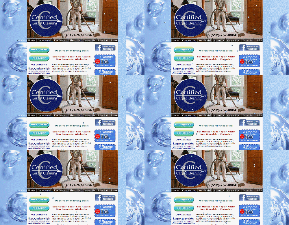
Sometimes, you just need to start over.
I love the bubbles, but I doubt they are helping conversion rates. I haven’t seen animations like this since the 1990s. The background image slows load time and confuses the eye. The graduated fill on the buttons makes them all but unreadable.
Don’t laugh at my friends design. Here is a WordPress theme I recently reviewed. Check out the stars.
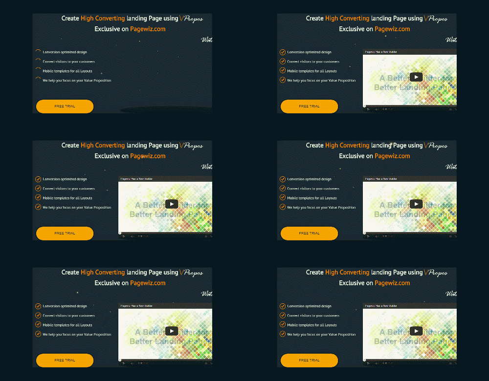
These stars don’t move the value proposition forward. Maybe it works for NASA.
Then there’s this:

Animation for animations sake is not helpful for scanners. Note the slow loading of the background image.
My friend needed a new theme for his WordPress site.
Fortunately, I had been asked to be a judge in the ThemeForest PageWiz template contest. More specifically, my task was to pick the themes that would make the best landing page templates.
I’ll tell you how I ranked these themes based on my experience, based on tests we’ve conducted here at Conversion Sciences, and based on my work as an online marketer who uses WordPress in my business.
47 Landing Page Templates, One Winner
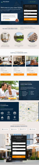
The typical “Banded Sales Page” delivers the value proposition for a page in separate sections, or bands.
I reviewed 47 different PageWiz landing page templates created by designers. I was tasked with picking one I felt embodied the best practices in conversion-centric landing page design.
The goal of a landing page is to:
1) Keep the promise of an ad, email or link.
2) Get the visitor to take some action, to convert.
Most of the themes I reviewed followed a common pattern, one I call a “banded sales page.”
These are designed to unfold like a sales letter: Big promise at the top, and an unfolding story, or value proposition, as you scroll. Key parts of the story are separated into sections, often with bands of color or images to identify them.
The support for the value proposition is like that found in an old-style sales letter: claims, features and proof. Trust builders, such as testimonials and client logos are also an important part of the this style.
Most themes chose big images for background filler. This is an unfortunate choice, because slow load times mean lower conversion rates. It looks cool, but you know what’s cooler? More sales.
This style of page templates doesn’t provide a significant amount of space for copy, and this may be to their detriment. Instead, they provide bite-sized information to build the value proposition, perfect for scanning the page. These bite-sized sections are most commonly presented in bands of different background colors.
For example, the Landing Page Elements Theme wastes a lot of valuable space for a rather irrelevant image.
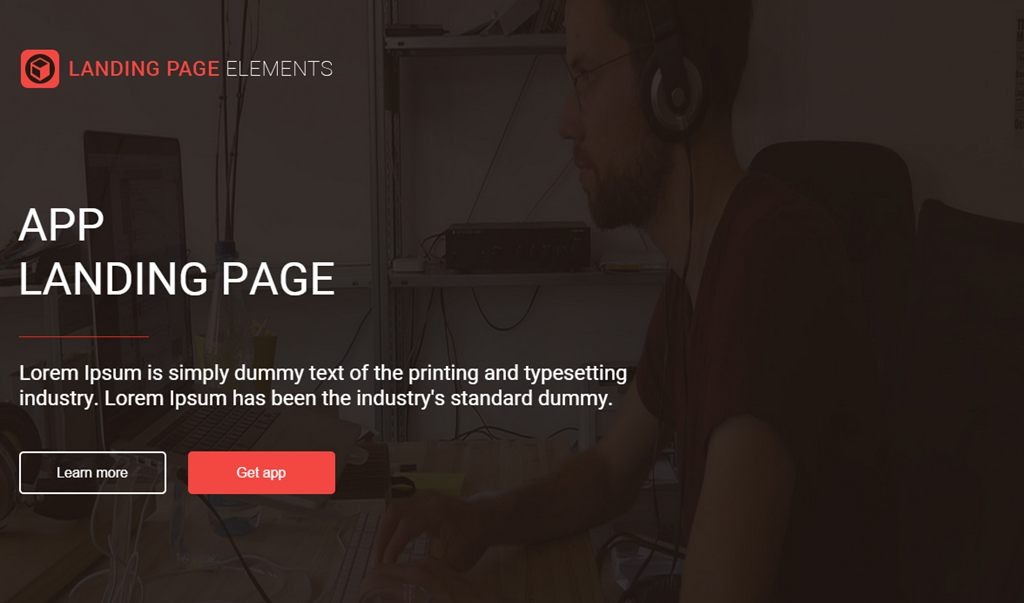
Large images take a long time to load and often don’t move the value proposition forward.
Some of the themes used parallax scrolling features, which we have not tested, but which may actually add friction to the experience, reducing conversions.
The Theme Should Serve Your Market
The landing page really needs to serve it’s audience. I found the highest scoring templates to be those that were for specific kinds of businesses: fitness, real estate, conferences, travel.
My pick is the Avira Homes template because of its creative calls to action and excellent mobile experience. It suffers from big images and almost fell out of the running.
Mobile Friendly is a Must
I’ll get this out of the way now. No responsive design made my list of top templates. I know it’s an easy way to get a mobile site, but mobile is different than desktop. Design a separate template for mobile.
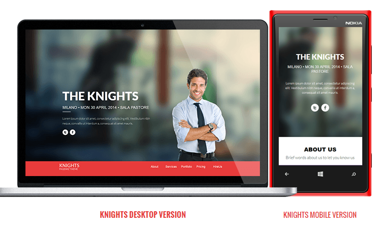
Look for a landing page template that supports a separate mobile experience.
The Knights Theme offers a mobile theme separate from their desktop implementation.
Mobile Visitors Want Different Content
I made mobile support an important part of the criteria, because it is a growing traffic source for almost any industry. Most themes relied on responsive designs. Others had dedicated mobile templates. Many themes actually break when displayed on phone-sized screens.
We favor designs with dedicated mobile designs, as responsive designs have myriad problems for landing pages. Responsive designs often don’t make sense as desktop content is stacked in non-intuitive ways. These mobile sites also tend to load slower than their dedicated mobile cousins.
Most desktop themes won’t offer a map on their home page or landing pages. For mobile visitors, where we are is important. Maps are a great addition to your mobile experience.
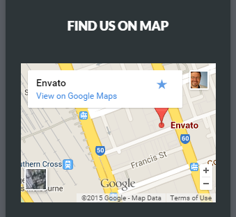
Mobile-oriented content like maps are often lost in responsive designs.
Mobile visitors also want bigger buttons, click-to-call functionality and mobile-focused calls to action. Notice how the Avira site (my winner) offers click to call as the first-screen call to action in their mobile theme. Their desktop site offers a form and the “Contact Me” button.
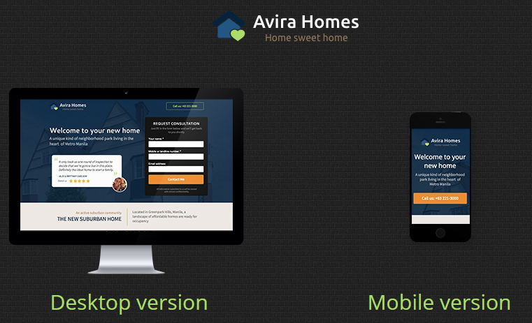
Avira’s separate mobile app is designed for a uniquely mobile experience.
The Avira Real Estate Theme was my choice for overall winner.
The Page Should Load Fast
I was happy to see that none of these pages had scrolling hero images, called sliders. These slow load times and can distract readers from the information on the page.
The slow load time of the VPropos theme left us with nothing to watch.
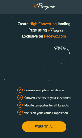
The slow load time of this theme left us with nothing to watch.
The Theme Should Make Good Use of the First Screen
It is important that a landing page communicate that the visitor can take action on the page. It should be done early. There is a segment of your visitors that are looking to take action. They don’t want to read, they want to put things in motion.
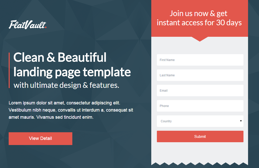
The FlatVault theme makes good use of the top of the page using calls to action.
In contrast to the landing page templates with large images, I felt that FlatVaulth did a good job of utilizing the top portion of the page, with not one but two calls to action.
The Copy Should Be Easy to Read
I favor designs with dark text on light backgrounds for readability. Knockout text is hard for eyes over 40 to read. Pages that are mostly dark cause our pupils to widen. This larger aperture makes focusing more difficult. That’s why we squint when we are trying to read small text. It makes our aperture smaller.
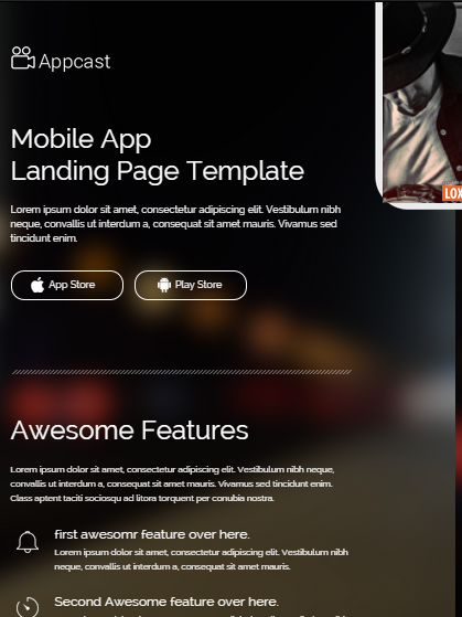
Light text on a dark background is more difficult for older eyes that have trouble focusing.
The App Cast Theme may be best for young eyes.
A good designer uses color to guide the eye. The use of the same color makes it harder to locate the information that is important. For example, pricing tables job is to help us choose. In this pricing table, it’s clear that the center offering is more important, but the color choices make it hard to compare across offerings.
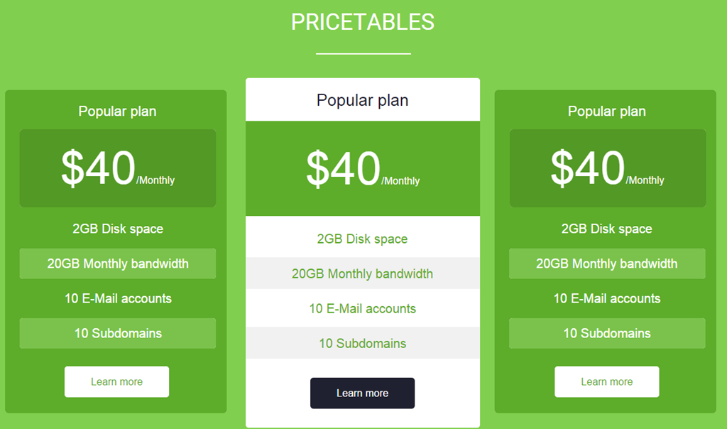
The poor color choices make it hard to compare options.
The Landing Elements Vol 2 Theme make poor color choices.
Contrast is your friend, especially when your presenting headlines and calls to action.
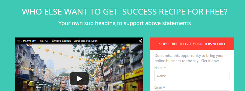
The headline and call to action are difficult to read here because of a low contrast between background and text.
The green and red backgrounds offer a low contrast background for the headline and form’s call to action in the Brom theme.
Make Good Use of Images and Video
If a theme didn’t explicitly support video, I didn’t hold it against theme. Several did. Video is all over the map in terms of whether it works or not. It is a powerful medium that can work for you or against you.
Images are powerful ways to move the value proposition of the site forward. Unfortunately, designers often punt, using filler stock images instead of well-thought out pictures. Unfortunately, theme builders really can’t offer one image that communicates well for all of the possible sites their theme may ride on.
The Cube Consulting Theme makes good use of image placement here.
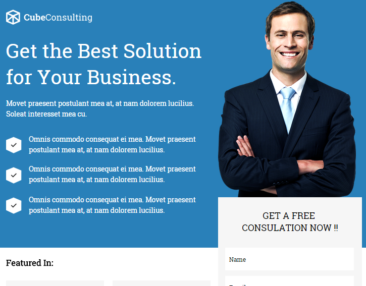
This image is in the right place, but is clearly a stock image. The human eye knows when it sees what we call business porn.
The man in this theme is what we call “business porn.” It is a stock image, not someone who works at the company or is a customer. The placement of this image is smart. It anchors the call to action form visually which partly covers the image.
A better image would have been looking down at the form, or to the value proposition at the left. We tend to linger on faces, especially when they are looking right at us. If we’re looking at a face, we’re not reading the offer text or the calls to action.
Be careful of images that work against you.
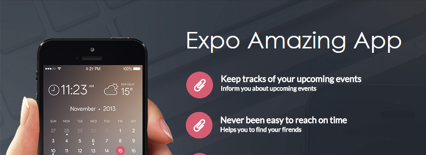
The dot-matrix background and gratuitous keyboard image only work to make the text hard to read in this image.
The Expo Theme uses a dot-matrix background that messes with the eyes and makes the text harder to read. Why is there a keyboard in the background?
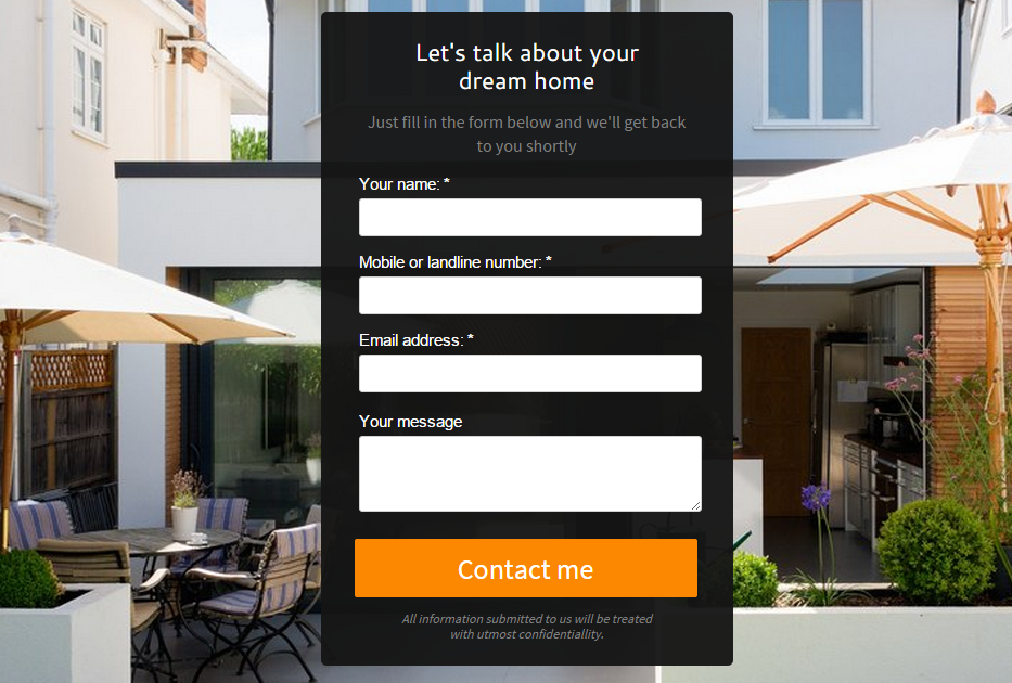
This background image conflicts with the call to action, confusing the eye.
One problem of our winning theme, Avira, is the poor choice of a background image. This image conflicts with the call to action form.
Shapes
The shape of your images can have impact as well. After viewing over 40 different themes with the banded designs, I found these curved images refreshing.
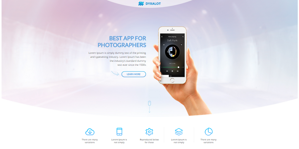
The shape of your images can draw the eye to important page components.
The Dyxalot Theme curved hero image draws the eye to the center where the key messages are.
Avoid Useless Images
If I have to find a large, high-resloution image that’s relevant to my visitor and figure out how to not screen it back, that’s a theme that is too much work.
This design is typical of the designs that waste precious real estate at the top of the page with nothing relevant.
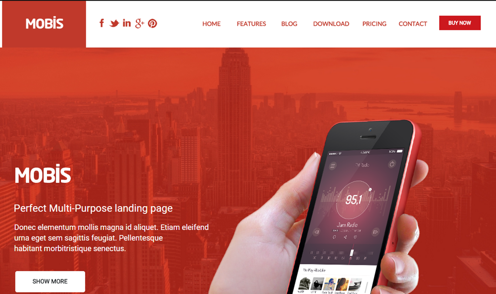
A lot of space was dedicated to red buildings in this theme. What’s the message?
The Mobis Theme wastes a lot of space with a background picture of buildings. Unecessarily large images push your value proposition and calls to action down on the page, where they are less likely to be seen.
Make Images Clickable
Make images clickable, even if there’s a button below. These are not.

Clicking on the buttons works, but the images are not clickable. Don’t get in your visitors’ way.
The MyCourse Theme should make their images clickable.
Calls to Action
Calls to action should be the most visually prominent items on the page.
The use of arrows and button colors that clash with the other colors on the page signal that the call to action should be addressed by the visitor.
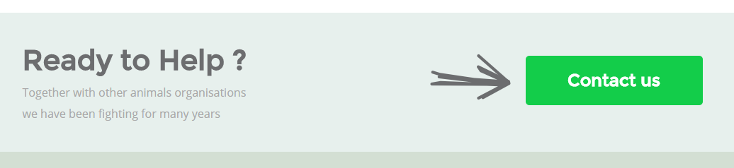
High contrast buttons and arrows signal to the visitor that they should address the call to action.
The My Earth Non-profit Theme enhances the visibility of the call to action.
More Calls to Action
For long banded pages, they should be frequent. You never know when your visitor is seeing the content that pushes them to take action in a long-scrolling landing page.
Our winning theme, Avira, offered a variety of calls to action, from the ability to inquire about specific properties to general inquiries. It invited visitors to call and offered lead generation forms at the top and bottom of the page.
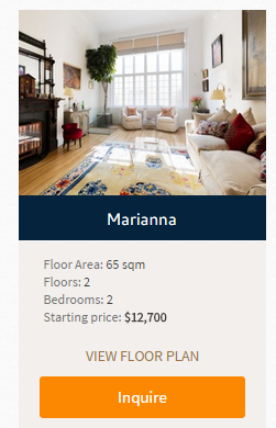
You never know when copy or an image is going to incite a visitor to act. Use frequent calls to action.
Your Forms Should Behave
Form behavior should make completion intuitive and natural. When someone hits tab in your form, they should be taken to the next field, not another part of the page.
The form for the Urane Theme looks like this:
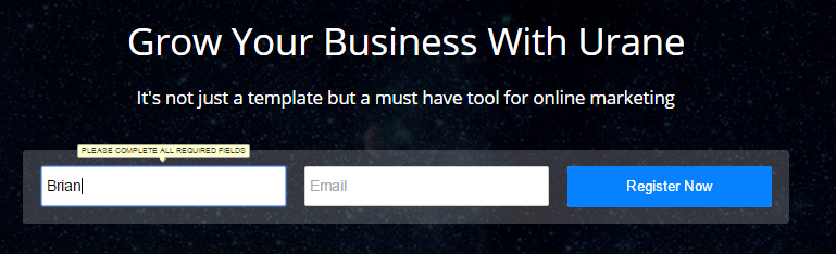
Be careful if you use the tab button here (and most of us do).
When I type my name and click Tab, it jumps to a random part of the page.
Surprise behaviors will kill your conversion rates.
Use a Dripping Pan
If someone reads your page to the bottom, this is a pretty good sign that they are interested. Themes should repeate the call to action at the bottom of the page. We call this a dripping pan because it catches the juices to make gravy.
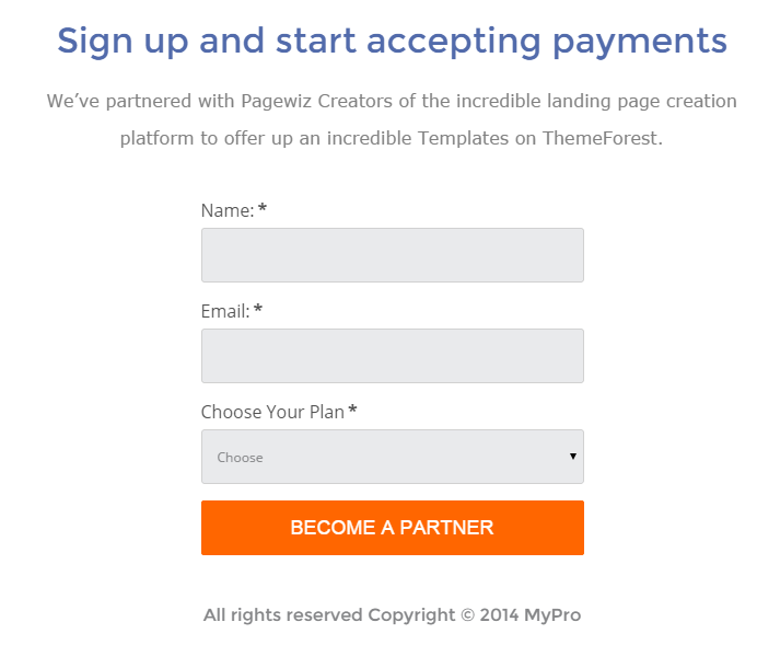
This form appears at the bottom of the page. It’s a dripping pan.
The dripping pan for the MyPro Affiliate Theme offers a complete form and call to action.
App Store Buttons
If you’re doing a theme for an app download, the call to action is to visit an app store. I recommend that you not redesign these buttons. They should be recognizable as clicks to the Google Play store and iTunes app store.

The most recognizable app store button designs are used across the Web.
The Dyxalot Theme makes this call to action almost invisible.
These download calls to action are almost invisible
The App Cast Mobile Theme offers company logos, not app store logos.

Are these company logos or app store download buttons?
The Volax Theme offers more clues that this is an app download, but this is not a fimiliar image for the app stores.
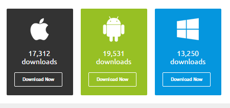
The addition of download counts adds social proof, but what am I downloading exactly?
Plan for Proof and Trust
Presenting proof is very important, and several themes offered interesting ways to present proof. Claims made in your copy must be supported by a benefit and proof.
The Expo theme presents a place for proof points
The Expo theme presents a place for proof points.
Websites can “borrow” trust from other brands by showing logos, seals and badges. Client logos, partner logos, and even the logos of credit cards all conspire to build trust with visitors. Themes that support this were ranked higher in my judging.

Websites can “borrow” trust from clients, partners and media outlets by displaying their logos
Unfortunately, the MyPro Theme made a poor choice for the background of these trust building logos.
Induce Scrolling
One of the concerns with banded pages like those in this competition is that every scroll can look like the bottom of the page. Visitors may never scroll further to see the persuasive content lower on the page.
Themes that induced scrolling were ranked higher on my list.
The Upfold Theme provides several scrolling queues. The v-shaped header image invites visitors to scroll down.
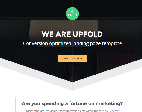
A simple arrow-shaped image can induce scrolling, making your copy more effective.
Connective lines between sections signal visitors that there is more to see. This keeps people scrolling.
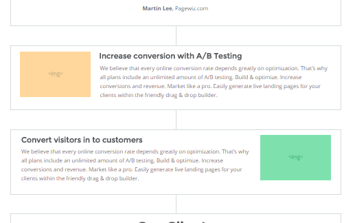
Subtle connective lines signal that there is more information to follow as the visitor scrolls.
Consider Introducing Scarcity
If your offer has a deadline, you can use countdown timers to introduce “scarcity.” This communicates that an offer is about to expire and that the visitor should take action immediately.
Countdown timers are effective, and several themes incorporated them into their pages.
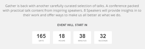
Count down timers can introduce scarcity into the visitor’s decision making process.
The Pagewiz Event Conference Meetup Theme places a countdown timer in the body of the page.

Scarcity is a natural fit for events.
Elect! Political Charity Conference Theme places a countdown timer right below the hero image.
Social Distraction
The most common distraction I see on landing pages is social media icons. Traffic is never free. Even search traffic requires you to optimize and develop content. If you’ve paid for a visitor to come to your site, why send them off to Mark Zuckerberg? He’s god enough traffic.
The social icons are muted, but shouldn’t be at the top of the page competing with the call to action.
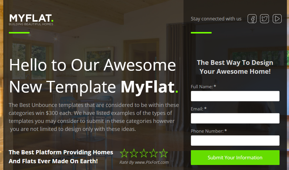
The social icons are muted here, but save them for the thank you page.
The social icons on the FlatBox Theme are the most visible (and thus the most important) items above the fold.

The social media icons really pop on this dark background. The message is that these are the most important things on the page.
Only use if social media is a great source of visitors for your site. Instead of a dripping pan at the bottom of the page, FlatBox offers a smorgasbord of distractions.
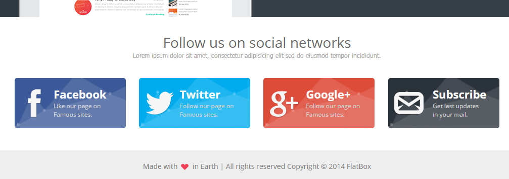
Most businesses aren’t good at turning likes and follows into business. Save these buttons for the thank you page.
The best use of social media I saw was the RealGym Theme, my runner up. This use of social media turns gym trainers into social sales people
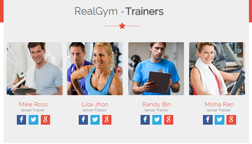
Here the social icons support the business model directly by turning trainers into social salespeople.
Help Me Choose a Plan
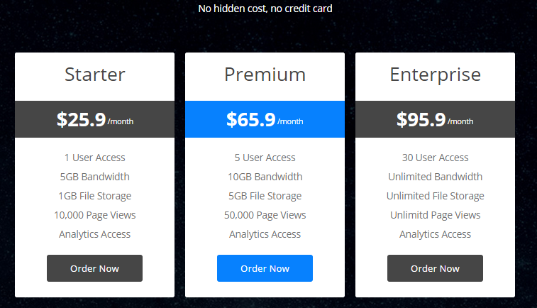
If you offer multiple levels of service or product tiers, the job of your pricing matrix is to, Help Me Choose. Your landing page template should highlight one price package to help my visitors choose.
The Mobis Multipurpose Landing Page Theme offers three colors, none of which is more prominent than any other.
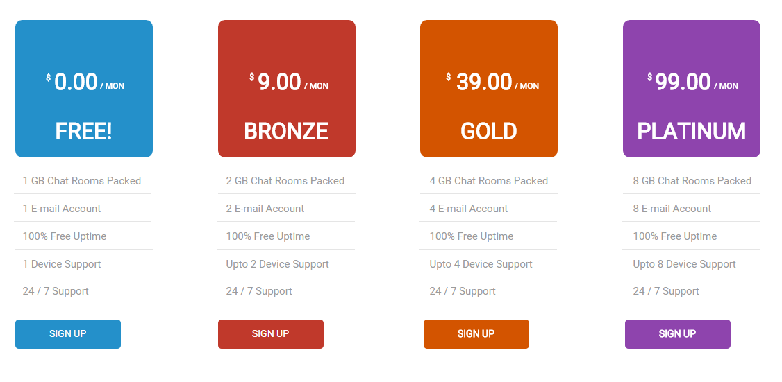
Which of these is most popular? Which should I choose? It’s hard to tell.
The Urane Theme offers a highlighted choice.
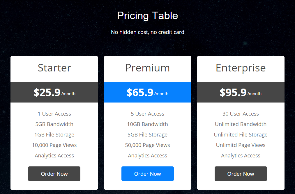
This design says,”I should pay attention to the middle one, and not just choose the cheapest.”
Pricing tables that make it easy to compare features will improve conversion rates.
The Landing Elements Vol 1 Theme offers banding to help guide the eye across features.
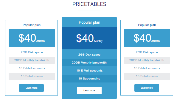
Alternating colors help guide the eye and aid in comparing features.
Pricing tables should not attempt to sell features. You should only select a few criteria–three or four–to be placed in the pricing table. Let the copy do the rest of the selling.
Use helpful names as well.
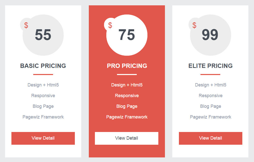
Choose the descriptive names for your feature levels.
The Flat Vault Theme suggests “Basic”, “Pro” and “Elite” levels. These generic names are translated as “Cheap”, “Expensive” and “Only for big companies”. Be more clear in your naming. Choose names that convey relevant value.
No Template is Going to Have It All
This is a lot to consider when picking a theme. None of the landing page templates I reviewed scored perfect on all counts.
Your business may have special needs. If building trust is important, focus on themes that support trust and proof. If you serve mobile visitors, be sure to use a separate theme for your mobile site.
For almost any site, Readability, Calls to action, and Load Time are going to be critical.
Any theme you produce will need to be optimized for your unique visitors. Contact Conversion Sciences for a free consultation on your site.
Now I can ride my new bike and know that I selected the best template for my carpet-cleaning friend.
Here’s the dripping pan.

21 Quick and Easy CRO Copywriting Hacks
Keep these proven copywriting hacks in mind to make your copy convert.
- 43 Pages with Examples
- Assumptive Phrasing
- "We" vs. "You"
- Pattern Interrupts
- The Power of Three
"*" indicates required fields

Expertise: conversion rate optimization, AB testing, marketing strategy, digital marketing, analytics, landing page design, computer programming, entrepreneurship
Speaking: IBM, Inbound, LeadsCon, Content Marketing World, Affiliate Summit, and more
Books and Training: Your Conversion Creation Equation, Video CRO, Marketing Videos that Convert, CRO Best Practices
As Seen On: ClickZ, Search Engine Land, Marketing Land, Conversion Sciences Blog, Intended Consequences podcast
Education: Texas A&M University, BS Computer Science and Management
- Your Traffic Fell 30 Percent. Your Targets Did Not. - September 3, 2026
- How to Filter Bot Traffic in Google Analytics With Ask Advisor - August 20, 2026
- Using AI to Chat with your Online Business - July 10, 2026


Bryan this is great presentation of the page elements required, and those that should be excluded, for a successful, high-converting website. Basically you’ve created a concise short course for Landing Page design.
My next step is to make a feature list of those characteristics you mention and evaluate WordPress themes for their ease of implementing them. Unless, that is, you’ve already chosen the best converting WordPress theme :-)
I chose the Aviri template, but it is specific to Real Estate. What is your business?
Also, I don’t recommend responsive themes, unless you just don’t have the resources to manage a desktop and mobile site.
Very thorough post Brian! Great examples. As a reminder with maps on mobile landing pages, if the map is interactive, make sure it doesn’t fill the entire viewing area. Otherwise, a person can be using their finger or thumb to try to scroll through the page and hit that and be stuck simply panning north & south in the map itself. You have to take care to make any interactive map be small enough there is always space above or below it (or to the side) for people to scroll the page on a small phone.
I thought I had discovered all of the ways to get stuck on mobile. never thought of this one. How many popovers have kept me from moving forward (or backward) on a mobile site? Too many.
Wow! Very thorough. Thanks for the info. I’m working on updating my site and this has been very helpful!
Thanks, Patt. Let us know if see a lift in conversions.
Great post, Brian! Can you recommend any good WP landing pages that work well with Google AdWords and Bing Ads? I’ve run into tracking issues with plugins in the past, so I’ve always been skeptical of paying for any and thus have a really crappy landing page that I created.
This is actually open to anyone. And also, I did try and set up UTM tracking, but that was not working either. It might be my theme, but I did not know if this was an issue for anyone else.
I tried using Inbound Now
Greg, I’ve tried several landing page plugins for WordPress, and each has some issue that makes it unworkable. Either they don’t easily support the theme design (Premise), or they don’t support analytics well (LeadPages). Our solution was to design our own landing page template for our theme. Even this approach leaves sitewide navigation active on the landing pages, often a source of abandonment.
If you discover something, let us know.
Brian
That’s a shame. I was about to pay for one of the landing page plugins, but I emailed the creator and asked if it would pass the PPC data, but they never addressed that issue.
Brian, we have recently released an HTML Landing Page template after consulting with CRO Experts. Our HTML Page Builder will also be release very soon and WordPress version is in the pipeline as well. We would really appreciate if you can review our Template and provide your expert advice/feedback. Link to the theme is here http://bit.ly/1PlzZSr and if you are interested we can give you full 8 pages template to download as well. Thanks and look forward to hearing back from you.
I trust your CRO experts, and I’ll leave the link here for our readers. Thanks!
Brian thank you so much for your feedback and I really appreciate for the link. I am also have free Giveaway of the First Landing Page (the orange one) from the same package of 8 LP. I can share the link here if you allow me. I didn’t wan’t to share it without your permission. Thanks
Sam,
Feel free to share if it’s not time-limited for our readers.
Brian
Brian, Thank you so much, here’s the link to the Free Giveaway of our Premium HTML Landing Page Template – http://bit.ly/1OjXHyu and there are more free download available on my profile if anyone interested.
Nice Collection, Thanks!
But in IMHO. We can include all this things to landing page and keep on testing it. its all about conversion rate optimization in the end. I worked with one clickbank affiliate website where we tried to include everything but it was not converting at all. The problem is the age group I’m targeting is not used to fancy things and advanced stuff. I just switched back to basic simple and clean design with less features it made wonders. So I always believe in testing once everything is done.
Baskarla, we often suffer from “novelty bias” in which something that a designer likes gets put on the page. Things like parallax scrolling, animating text onto the page, big hero videos. So I welcome your “back to basics” approach.