If you are anything like me, you’ve made your fair share impulsive purchases online.
Unlike trekking into brick-and-mortar, I never get on the Internet with the intent of pulling out my credit card. Yet, inevitably, I’ve got two food delivery subscriptions and a blouse from the JCrew factory store shipping out tomorrow.
Are your visitors like me? How much of your business comes from impulsive behavior? Most importantly, are you converting your impulse visitors before their craving to buy passes?
In this post, I will show you how to quantify the number of impulse buyers on your site using Google Analytics, and I will also share strategies on how to get them to convert.
The Impulsive Buyer
We define an impulsive buyer as someone who is poised to take action. These are our spontaneous buyers, more likely to be relational than transactional. They may not be impulsive in life, but are behaving in their spontaneous mode on your site right now.
What makes an impulsive buyer impulsive?
- They perceive the risk of taking action as low.
- They perceive the value of taking action as high.
- They perceive the cost of shopping as high.
- FOMO: Fear of missing out may drive their behavior.
- Familiarity with your products makes a purchase decision easy.
- Repeat buyers simply restocking will act as if they are impulsive.
For these visitors, leaving a browsing session without having pulled the financial trigger is like leaving the confessional before they’ve received their prescription of penitential prayers. It’s a complete waste of time and fundamentally misses the point of the exercise.
For these buyers, you should dedicate a portion of your site to mitigating risk, building value, pointing the way to purchase, creating scarcity, and spelling out the facts.
Impulse buyers aren’t the crazed shoppers that can be found assaulting each other in the Walmart on Black Friday.
Impulse buyers aren’t the crazed shoppers that can be found assaulting each other in the Walmart on Black Friday. These buyers may be thoughtful and methodical in their approach. However, they will buy from someone today, unless no alternatives present themselves.
If they don’t buy from you now, they will most likely not return.
Finding Impulse Buyers in the Data
Impulse buyers don’t announce themselves upon arrival at your website, but they leave footprints in your digital sand. To start, we’re looking for those one-hit wonders, the drive-by shoppers. Google Analytics tracks this behavior for us with the “Time to Purchase” report.

Where to find time to purchase in Google Analytics
Impluse buyers are, by definition, those visitors who purchase within their first visit. Thus, we want to know which transactions are completed on our site within a single session.
The number of sessions it takes to convert
For an ecommerce website, a single-session percentage of more than 80% indicates that quick buying behavior is contributing to your overall conversion rate. You’re probably serving your impulse buyers well.
If single-session conversions make up less than 60% of your total transactions, one of two things is happening.
- You are selling something that methodical customers are going to purchase, such as appliances or a college education.
OR
- You are not satisfying the impulse-buyers’ craving before it passes.
Google Analytics makes it easy to track impulse buyers on your site. Create an advanced segment for those visitors who purchase in one session.
When you look at your Google Analytics reports through the lens of this segment you will see how impulse buyers are impacting your business.
 are a significant portion of all revenue (orange line) for this ecommerce business.")
Impulse Buyers (blue line) are a significant portion of all revenue (orange line) for this ecommerce business.
Use this segment to answer other questions as well. In the graph below, it is clear how an email promotion to existing buyers affects the impulse buyer segment.

Email campaigns appeal to return and repeat buyers (orange line) and less so to first-time impulse buyers (blue line).
How did these visitors get to your site? Where did they land? Did they use site search or navigation to get to a product page? What items did these quick buyers purchase?

Sessions with Searches: Search is clearly not important to most impulse buyers for this site.
Answering these questions will help to develop a map of impulse behavior on your site.
With this blueprint, you’ll be able to pinpoint the areas of your site that attract impulse buyers and begin to test conversion optimization efforts that focus on them.
Reducing Risk
When customers are poised to buy, they do a risk assessment. Impulse buyers love low-risk transactions. This is the job of what we call risk reversal tactics.
A risk reversal tactic is anything that takes the risk out of a transaction. Risk reversal comes in many forms.
- Money-back guarantees
- Warranties
- Trust symbols, such as the BBB logo
- Ratings and reviews
- Free shipping offers
- Low-price guaratees
Often sites signal that they can’t be trusted without even realizing it. They hide their return policies, or make them so complex that they become meaningless. They don’t display free shipping offers in a prominent place.
Impulse buyers have a quiet voice in their head asking “Is this a good idea?”. What can you do to make sure the answer to that question is always “Yes”?
Case Study: JetPens
The vaguest, most theoretical thing you should be doing is making people feel good about giving you their personal information. Trust symbols must be obvious but subtle enough to avoid that “Trust me! Trust me! Trust me!” vibe that we get from used car salesmen, so incorporate them as naturally as possible.
Take Jetpens.com, an online store selling Japanese pens and stationery.

JetPens naturally decreases risk reversal with the trust symbols on their checkout screen.
This store is somewhat specialized, so it doesn’t have the same degree of trusted name recognition as an office supplies store like Staples or Office Depot. One way it resolves the issue is having the Google Trusted Store symbol in the lower right corner. It sticks to every page, not just the checkout screen.
This is called “borrowing trust.” Sites can borrow trust from current clients, credit card companies, and certification organizations like Google and Buyer Safe.
Increasing Order Size
While you may see free shipping as a pricing issue, it really acts to reduce risk. It reduces anxiety about spending money on a website. It is can also increase the average order of impulse buyers.
JetPens offers free shipping for orders over $25, and they make it really easy for you to hit that mark.
You know exactly how much you need to spend to get free shipping.
There’s no need for their impulse buyers to do any math.
In lieu of free shipping, it pays for your site to be up-front about what shipping will cost. This takes the surprise out of the transaction, reducing cart abandonment.
JetPens uses a Calculate Shipping button for just this purpose.
You don’t even have to leave the checkout page to fill your cart to hit the $25 mark.
Getting to the $25 mark that signals free shipping is pretty good motivation for most people to spend more money, but once someone is in the checkout screen, do you really want them to leave it? By placing a few items from account holders’ wish list at the bottom of the page, JetPens makes it easy for impulse buyers to double-down. Customers see how much more they need to spend and a great suggestion for how to get there.
If the visitor hasn’t added anything to their wish list, why not add a few inexpensive suggestions of your own?
Case Study: ModCloth
With online retail, shipping information needs to be easy to find. Free shipping isn’t the only reason people convert: they’ll also be more likely to buy if they think it will be easy to return what they bought. Someone doing lots of research on a product may be willing to hunt around for money-back guarantees, but impulse buyers need trust symbols to be much more in-their-face.
ModCloth, an online women’s clothing store, uses the top of its website to embed lots of different trust symbols.
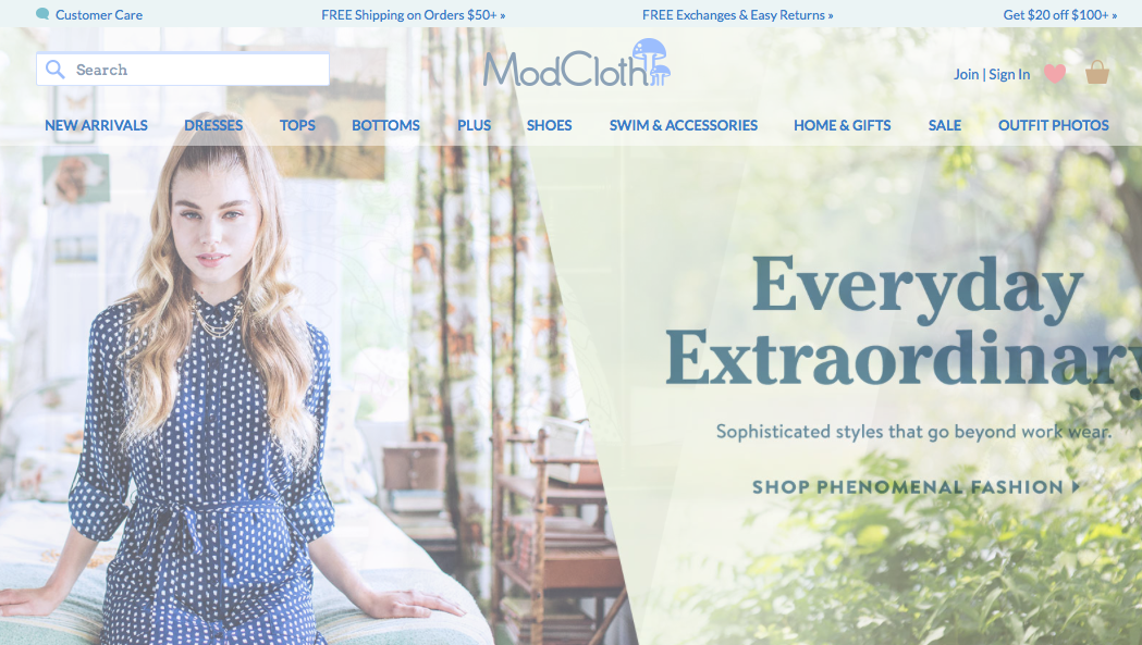
The top of ModCloth’s website covers lots of trust-building bases.
Customer care and shipping information is at the top of every page, and when you visit the page on returns and exchanges, it’s also pretty easy to understand.
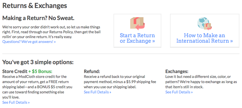
ModCloth’s return policy
Someone in a hurry to spend money may not make it all the way to this page, but she’ll know it’s there, and she’ll know that exchanges are free without even clicking. Why wouldn’t she spend her money if it’s that easy to get rid of something that didn’t work out?
Introducing Scarcity
Scarcity is a term that includes limitied supplies, limited-time engagements, exclusivity and qualifications to buy. It imparts a sense of urgency to a shopping session, and impulse buyers are just looking for excuses to act. Give your impulse buyers excuses to act by making it clear that she will be missing out if she doesn’t buy right now. Remember, impulse buyers see the shopping process as expensive and don’t want to waste their time.
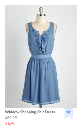
Dwindling stock makes this item much more attractive.
Only one Window Shopping Chic Dress left?! What am I going to wear when I go window shopping this weekend if that dress doesn’t end up in my closet!
Many impulse buyers like feeling like they’re part of an exclusive group. It feeds their egos and justifies the elitist tone they use when they brag about how the rest of us weren’t able to wear the right window shopping dress.
Increasing the Perceived Value of an Impulse Purchase
Free gifts and bonuses add value to a perceived purchase. The gift doesn’t have to be an extraordinary offer. It provides another excuse to act, often increasing urgency.
SheIn hits that impulse buying nail on the head not once, but twice. First, a popover tells you that there’s an opportunity for a free gift.
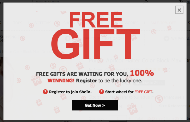
Free gift offer from SheIn
But here’s the fun part. You have to start a wheel for a free gift. So it’s a game!

Shoppers play a game to get a free gift.
This strategy works for pretty much any kind of business, not just retail. SheIn asks you to join a mailing list order to have the chance at spinning the wheel to get a free gift, so it’s a lead-generating strategy.
The Gift of Game
Gamification is much beloved by millennials, a group renowned for their impulsive buying behavior. Quizzes and games make even the most mundane tasks so much more interesting. Let’s say I’m looking for new running shoes, so I search “What kind of shoes should I buy?”
One result is from the American Orthopaedic Foot and Ankle Society. The name alone seems pretty trustworthy. What do they have to say about what shoes I should buy?
Running shoe buying guide
Yikes. This isn’t even half of the article! Luckily, I have another option to help me find the answer to my question.
Runner’s World shoe quiz
Runner’s World magazine makes things so much easier! First I take a short quiz, then it spits out a shoe suggestion for me.
Running shoe suggestion
Runner’s World doesn’t want to sell me a shoe, but if I were on a retail site selling running shoes, how awesome would it be to be able to click “Add to Cart” from this page?
Go Mobile or Go Home
This weekend I had a movie night with some friends at my house because we urgently needed to watch the first Magic Mike movie. We didn’t want to miss any major plot points when we watched the soon-to-be-released sequel.
I rented the movie on my phone using the Google Play Movies & TV app. I tapped the purchase button, and openly lamented to my friends how easy it was to throw my money away. I mean disgustingly easy. Three taps and four bucks of my hard-earned money was gone, replaced by the privilege of having two days of access to a movie I hope my mom never finds out I watched.
First tap
2nd tap…and 3rd tap my money is gone
Voila, I made a purchase I kind-of-but-not-really regret. Your website could have that purchase!
On mobile, fewer people are doing research. They’re either buying, or they’re leaving. I wanted that Magic Mike movie, and I wanted it right then. More obstacles would have meant using a different app or just watching a different movie I already own.
Buying something from you should be as easy as renting a movie on my phone.
Park the things you know about your desktop users. Think about the needs of your mobile visitors as if they were a different animal. They’re not unicorns or dragons or anything, but you wouldn’t put a leash on a cat. They just won’t stand for it.
As an example, Victoria’s Secret realized that promo codes are to mobile users what pull cords are to blow dryers. They’re not the right tool for the job.
Victoria’s Secret doesn’t ask mobile visitors to enter a promo code.
Impulse Abandoners
Impulse buyers become impulse abandoners when your site doesn’t serve their need to take action. The moment they perceive that a transaction is low value, that the effort is too high, that a purchase is risky or that there is no urgency to take action, they become less impulsive.
It is not manipulative to feed their need for speed. Giving impulse buyers the rationale to act is exactly what they want from you. Why deny them?
Feature image licensed under Creative Commons and adapted for this post.


Your Own Conversion Optimization Team
Conversion OptimizationWe’re proud of our website optimization family here at Conversion Sciences and display this fact proudly on our fictitious mobile conversion vehicle, CRO-1. This represents the team we put on each of our clients when we look for more revenue on the site.
The Data Scientist is a strange duck. We’re not talking about someone who spends all their time in spreadsheets, charts and graphs. This is a person who knows how to generate good questions from data. Questions like, “What do our best buyers have in common?” and, “Why are so many people abandoning on step two?” and, “What would happen if we changed the call to action?”
A great data scientist knows where to look for answers to business-changing questions. In some cases this requires a split test to get the best bona fide answers to burning questions. Yet, a good data scientist knows how to use data to decide what NOT to test.
Your data scientist can’t be a spreadsheet socialite. They need to pull their head out of the data and communicate insights with clarity. They will direct the actions of the developer and designer. They will persuade site owners to try new things and measure results.
For this reason, we call our data scientists Conversion Scientists. Data is just one part of what they do.
Optimization Team: Someone Who can Make Testing Tools Dance
If the data scientist is responsible for what gets tested, the Developer is responsible for how it gets tested. The developer gets her god-like power from the multivariate and split testing tools available on the market today. In the hands of the right developer, these tools allow one to present a different experience to each visitor to a site.
This person is capable if dissecting web pages, laying the pieces out on the floor, and reassembling them, all in the blink of an eye. He is comfortable with the vagaries of the different browsers on the market that often drive lesser talents into crying fits of rage.
CRO Team: Someone to Walk Your Visitors Around a Page
While we admire designers with creative minds, we work with designers of a different stripe. We seek data-driven creativity in our designers. Whether we’re redesigning an entire landing page or developing product images, our designers have to be able to park their egos at the door and let the visitors guide them. These designers understand a little motion or a couple of design flourishes can have a negative impact on conversions.
Our designers job is to guide the visitors’ eyes to the important parts of a page, in the right order. They use their knowledge of color, font, white space, negative space, juxtaposition and visual cues to take a visitor by the hand and introduce him to the content on the page.
Conversion Optimization Team: Loyal and Reliable Tools
I’m fond of saying that we are in a golden age of online marketing tools. Inexpensive, feature-filled software allows us to answer almost any question we have about our visitors and our websites. Our digital laboratory is bursting with analytics tools, click-trackers, session recorders, multivariate and split-testers, simulators and more.
The best of these tools greets you at the door and is always glad to see you. And they occasionally poop on the floor. There are many companies out there with the tools, but not the team. It’s great to have a pet, but we recommend having someone train it for you.
The Supporting Cast of the Optimization Team
The rear window of CRO-1 isn’t big enough to represent all of the people we rely on when optimizing a website. A well rounded team will have ready a good copywriter, an expert in email marketing, a paid search advertising guru, a search engine optimizer, an analytics monster and more. It takes a village.
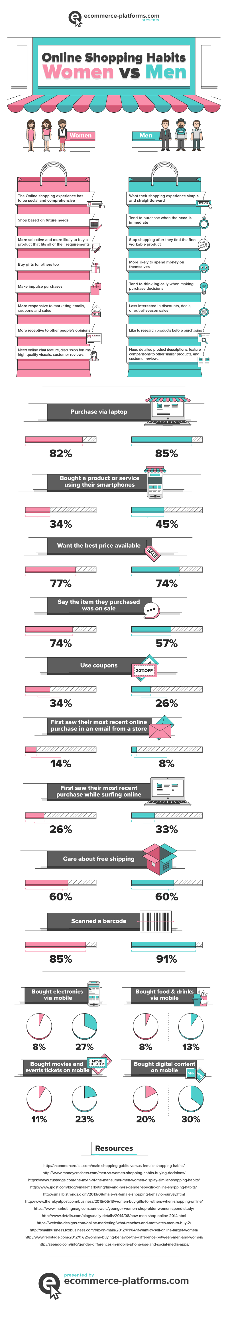
Data Reveals Shocking Truth: Men and Women Shop Differently [INFOGRAPHIC]
Ecommerce CROIf it’s backed by data, it’s not sexist. At least that’s what we tell ourselves. If the data says it’s true, it’s not stereotyping. We all know men and women shop differently. Except when they don’t. So this daring infographic, conspiring with the numbers to perpetuate some of our favorite stereotypes definitely caught our eye.
We were intrigued because you could replace the word “Men” with “Relational Shopppers” and the word “Women” with “Transactional Shoppers” and this infographic would still make sense.
We’ve written about relational versus transactional buying behaviors before. Did you tune us out? Just like a man, amiright ladies?
If we were to take the low road, we’d gleefully embrace the stereotypes presented here. However, we’ve chosen to take this opportunity to redirect our attention to two important buying behaviors that you can use to increase sales on your website.
Yes, there are real differences between men and women. Take a few deep breathes if this comes as a shock.
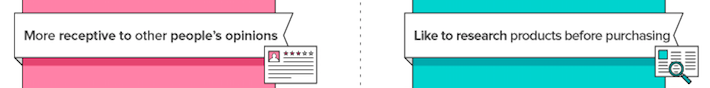
The infographic from eCommerce Platforms affords us the view that men and women tend to fall on either side of the transactional/relational buying divide. Women tend to be more transactional whereas men are more relational.
What’s transactional about women’s shopping preferences? According to the infographic:
And what’s relational about men’s shopping preferences?
Different buying behaviors of men versus women (women are pink and men teal)
Some statistics that sum it up best tell us that price is less important to men that it is to women. The greatest fear of a transactional shopper is paying too much and, as women are more likely to do, will shop longer to get a bargain. Relational shoppers see the shopping process as part of the cost. Like men, they will pay more to reduce shopping time.
Women’s behaviors are in pink; men’s in teal.
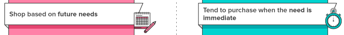
That stereotype that women love the experience of shopping holds up if we’re to believe that they shop based on future needs and that they are more likely than men to be shopping for other people as well as themselves. It’s the opposite for relational shoppers and men. Shopping needs to be easy and uncomplicated.
Move Past the Stereotypes
Not every woman is a transactional shopper and not every man is relational. But designing for your stereotypically transactional woman will pay off for transactional men as well. Relational shoppers will respond to relational buying cues regardless of their sex.

As I studied this infographic, I couldn’t help but think about my own (female) shopping behaviors. I mentally went through a checklist for each item that supposedly applied to me and which did not. Turns out, I’m kind of a dude.
With this realization, I was immediately taken back to my middle school and high school days when my older, cooler brother asked me to go to the mall with him. If that was the road to his approval, obviously I was going to be into shopping. New favorite hobby, right? Wrong. I hate shopping!
I went back through the entire infographic, checking off his behaviors this time. Turns out, he’s kind of a girl.
For the most part, I’m pretty girly and he’s a bro, but we don’t fulfill gender expectations when it comes to online shopping. What stuck out the most to me is that my needs are immediate and his rarely are. If you don’t have an immediate need, why else would you be looking to spend money except that you enjoy the experience?
It’s the same idea with impulse buying or being logical with your purchases. I almost always spend a lot of time mulling over whether I actually need something, and I try to think through all of the ways that buying a particular item is going to make my life easier or how often I’ll use it if I buy it.
A more subtle character trait is how we choose what we’re going to buy.
Here are a few of my brother’s most trusted review sources.
My brother’s review sources
Nope, you don’t know these people. They’re just a bunch of his friends. On the other hand, I used to be a librarian, so the reviews I trust look a little different.
My review sources
I also noticed an area where marketers could easily get my brother to spend more money.
He has never really been into social media, but he recently joined Instagram, and it felt like our family dynamic changed overnight. I now get a play-by-play of his life complete with as many hashtags as he can imagine.
Documentation of a very successful shopping trip
Since he’s still new to social media his hashtags are mostly jokes, but eventually he’s going to realize that he can use them so that they’re searchable. When that day comes, I’m sure I’ll be flooded with hashtags about Yeti coolers, Bud Lite with Lime, and whatever brand makes those flip-flops with the beer bottle opener in the sole. He will absolutely love sharing and being able to see how other people are using all of the things he loves.
Since I’m on the other end of the spectrum, I don’t have a Facebook screenshot to share about the Warby Parker at-home try-on sunglasses that just came in the mail. You just won’t find me posting about my online shopping experiences. Instead I’ll be posting cute pictures of my cat.
This is Frankie, and she’s wearing a cute hat.
What’s the moral of the story?
There is actual data to support the claim that, in general, the shopping behaviors of men and women are different. But there is also plenty of evidence that stereotypes don’t always hold up or that individuals are complex in their buying behaviors. And even that transactional versus relational shopping behaviors are situational.
When it comes to increasing conversions for your own business, being able to generalize about your buyers could be helpful, but not as helpful as using data specific to the visitors of your own website, not just the internet as a whole. What if all of your customers are just like my brother and me?
Thanks to ecommerce-platforms.com for sharing.
Close the Conversion Gap. Cater to the Impulse Purchase
Conversion OptimizationIf you are anything like me, you’ve made your fair share impulsive purchases online.
Unlike trekking into brick-and-mortar, I never get on the Internet with the intent of pulling out my credit card. Yet, inevitably, I’ve got two food delivery subscriptions and a blouse from the JCrew factory store shipping out tomorrow.
Are your visitors like me? How much of your business comes from impulsive behavior? Most importantly, are you converting your impulse visitors before their craving to buy passes?
In this post, I will show you how to quantify the number of impulse buyers on your site using Google Analytics, and I will also share strategies on how to get them to convert.
The Impulsive Buyer
We define an impulsive buyer as someone who is poised to take action. These are our spontaneous buyers, more likely to be relational than transactional. They may not be impulsive in life, but are behaving in their spontaneous mode on your site right now.
What makes an impulsive buyer impulsive?
For these visitors, leaving a browsing session without having pulled the financial trigger is like leaving the confessional before they’ve received their prescription of penitential prayers. It’s a complete waste of time and fundamentally misses the point of the exercise.
Impulse buyers aren’t the crazed shoppers that can be found assaulting each other in the Walmart on Black Friday. These buyers may be thoughtful and methodical in their approach. However, they will buy from someone today, unless no alternatives present themselves.For these buyers, you should dedicate a portion of your site to mitigating risk, building value, pointing the way to purchase, creating scarcity, and spelling out the facts.
If they don’t buy from you now, they will most likely not return.
Finding Impulse Buyers in the Data
Impulse buyers don’t announce themselves upon arrival at your website, but they leave footprints in your digital sand. To start, we’re looking for those one-hit wonders, the drive-by shoppers. Google Analytics tracks this behavior for us with the “Time to Purchase” report.
Where to find time to purchase in Google Analytics
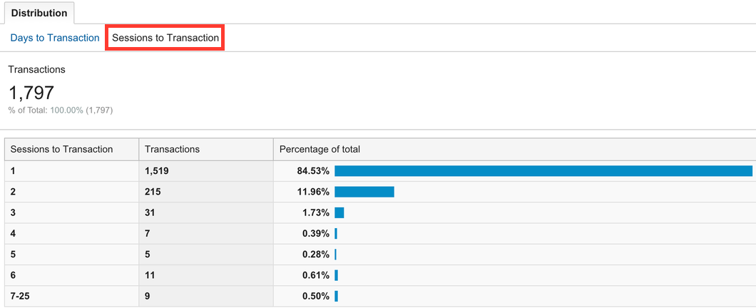
Impluse buyers are, by definition, those visitors who purchase within their first visit. Thus, we want to know which transactions are completed on our site within a single session.
The number of sessions it takes to convert
For an ecommerce website, a single-session percentage of more than 80% indicates that quick buying behavior is contributing to your overall conversion rate. You’re probably serving your impulse buyers well.
If single-session conversions make up less than 60% of your total transactions, one of two things is happening.
OR
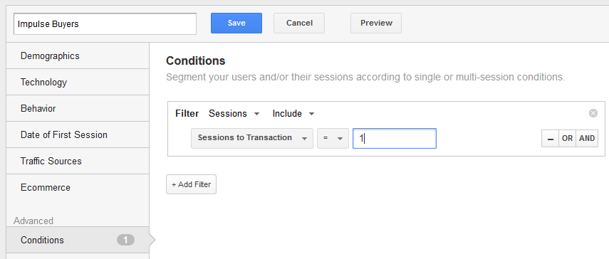
Google Analytics makes it easy to track impulse buyers on your site. Create an advanced segment for those visitors who purchase in one session.
When you look at your Google Analytics reports through the lens of this segment you will see how impulse buyers are impacting your business.
Impulse Buyers (blue line) are a significant portion of all revenue (orange line) for this ecommerce business.
Use this segment to answer other questions as well. In the graph below, it is clear how an email promotion to existing buyers affects the impulse buyer segment.
Email campaigns appeal to return and repeat buyers (orange line) and less so to first-time impulse buyers (blue line).
How did these visitors get to your site? Where did they land? Did they use site search or navigation to get to a product page? What items did these quick buyers purchase?
Sessions with Searches: Search is clearly not important to most impulse buyers for this site.
Answering these questions will help to develop a map of impulse behavior on your site.
With this blueprint, you’ll be able to pinpoint the areas of your site that attract impulse buyers and begin to test conversion optimization efforts that focus on them.
Reducing Risk
When customers are poised to buy, they do a risk assessment. Impulse buyers love low-risk transactions. This is the job of what we call risk reversal tactics.
A risk reversal tactic is anything that takes the risk out of a transaction. Risk reversal comes in many forms.
Often sites signal that they can’t be trusted without even realizing it. They hide their return policies, or make them so complex that they become meaningless. They don’t display free shipping offers in a prominent place.
Impulse buyers have a quiet voice in their head asking “Is this a good idea?”. What can you do to make sure the answer to that question is always “Yes”?
Case Study: JetPens
The vaguest, most theoretical thing you should be doing is making people feel good about giving you their personal information. Trust symbols must be obvious but subtle enough to avoid that “Trust me! Trust me! Trust me!” vibe that we get from used car salesmen, so incorporate them as naturally as possible.
Take Jetpens.com, an online store selling Japanese pens and stationery.
JetPens naturally decreases risk reversal with the trust symbols on their checkout screen.
This store is somewhat specialized, so it doesn’t have the same degree of trusted name recognition as an office supplies store like Staples or Office Depot. One way it resolves the issue is having the Google Trusted Store symbol in the lower right corner. It sticks to every page, not just the checkout screen.
This is called “borrowing trust.” Sites can borrow trust from current clients, credit card companies, and certification organizations like Google and Buyer Safe.
Increasing Order Size
While you may see free shipping as a pricing issue, it really acts to reduce risk. It reduces anxiety about spending money on a website. It is can also increase the average order of impulse buyers.
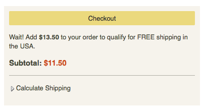
JetPens offers free shipping for orders over $25, and they make it really easy for you to hit that mark.
You know exactly how much you need to spend to get free shipping.
There’s no need for their impulse buyers to do any math.
In lieu of free shipping, it pays for your site to be up-front about what shipping will cost. This takes the surprise out of the transaction, reducing cart abandonment.
JetPens uses a Calculate Shipping button for just this purpose.
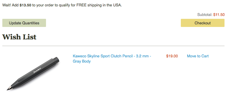
You don’t even have to leave the checkout page to fill your cart to hit the $25 mark.
Getting to the $25 mark that signals free shipping is pretty good motivation for most people to spend more money, but once someone is in the checkout screen, do you really want them to leave it? By placing a few items from account holders’ wish list at the bottom of the page, JetPens makes it easy for impulse buyers to double-down. Customers see how much more they need to spend and a great suggestion for how to get there.
If the visitor hasn’t added anything to their wish list, why not add a few inexpensive suggestions of your own?
Case Study: ModCloth
With online retail, shipping information needs to be easy to find. Free shipping isn’t the only reason people convert: they’ll also be more likely to buy if they think it will be easy to return what they bought. Someone doing lots of research on a product may be willing to hunt around for money-back guarantees, but impulse buyers need trust symbols to be much more in-their-face.
ModCloth, an online women’s clothing store, uses the top of its website to embed lots of different trust symbols.
The top of ModCloth’s website covers lots of trust-building bases.
Customer care and shipping information is at the top of every page, and when you visit the page on returns and exchanges, it’s also pretty easy to understand.
ModCloth’s return policy
Someone in a hurry to spend money may not make it all the way to this page, but she’ll know it’s there, and she’ll know that exchanges are free without even clicking. Why wouldn’t she spend her money if it’s that easy to get rid of something that didn’t work out?
Introducing Scarcity
Scarcity is a term that includes limitied supplies, limited-time engagements, exclusivity and qualifications to buy. It imparts a sense of urgency to a shopping session, and impulse buyers are just looking for excuses to act. Give your impulse buyers excuses to act by making it clear that she will be missing out if she doesn’t buy right now. Remember, impulse buyers see the shopping process as expensive and don’t want to waste their time.
Dwindling stock makes this item much more attractive.
Only one Window Shopping Chic Dress left?! What am I going to wear when I go window shopping this weekend if that dress doesn’t end up in my closet!
Many impulse buyers like feeling like they’re part of an exclusive group. It feeds their egos and justifies the elitist tone they use when they brag about how the rest of us weren’t able to wear the right window shopping dress.
Increasing the Perceived Value of an Impulse Purchase
Free gifts and bonuses add value to a perceived purchase. The gift doesn’t have to be an extraordinary offer. It provides another excuse to act, often increasing urgency.
SheIn hits that impulse buying nail on the head not once, but twice. First, a popover tells you that there’s an opportunity for a free gift.
Free gift offer from SheIn
But here’s the fun part. You have to start a wheel for a free gift. So it’s a game!
Shoppers play a game to get a free gift.
This strategy works for pretty much any kind of business, not just retail. SheIn asks you to join a mailing list order to have the chance at spinning the wheel to get a free gift, so it’s a lead-generating strategy.
The Gift of Game
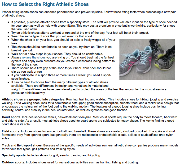
Gamification is much beloved by millennials, a group renowned for their impulsive buying behavior. Quizzes and games make even the most mundane tasks so much more interesting. Let’s say I’m looking for new running shoes, so I search “What kind of shoes should I buy?”
One result is from the American Orthopaedic Foot and Ankle Society. The name alone seems pretty trustworthy. What do they have to say about what shoes I should buy?
Running shoe buying guide
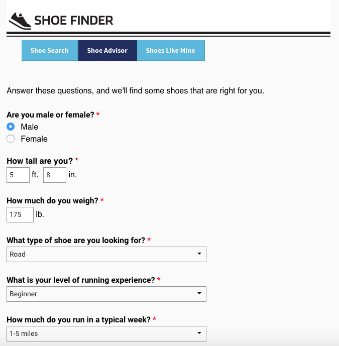
Yikes. This isn’t even half of the article! Luckily, I have another option to help me find the answer to my question.
Runner’s World shoe quiz
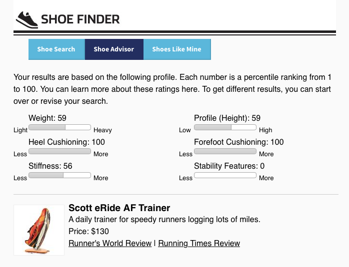
Runner’s World magazine makes things so much easier! First I take a short quiz, then it spits out a shoe suggestion for me.
Running shoe suggestion
Runner’s World doesn’t want to sell me a shoe, but if I were on a retail site selling running shoes, how awesome would it be to be able to click “Add to Cart” from this page?
Go Mobile or Go Home
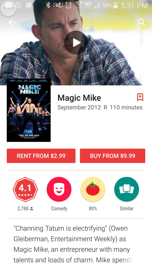
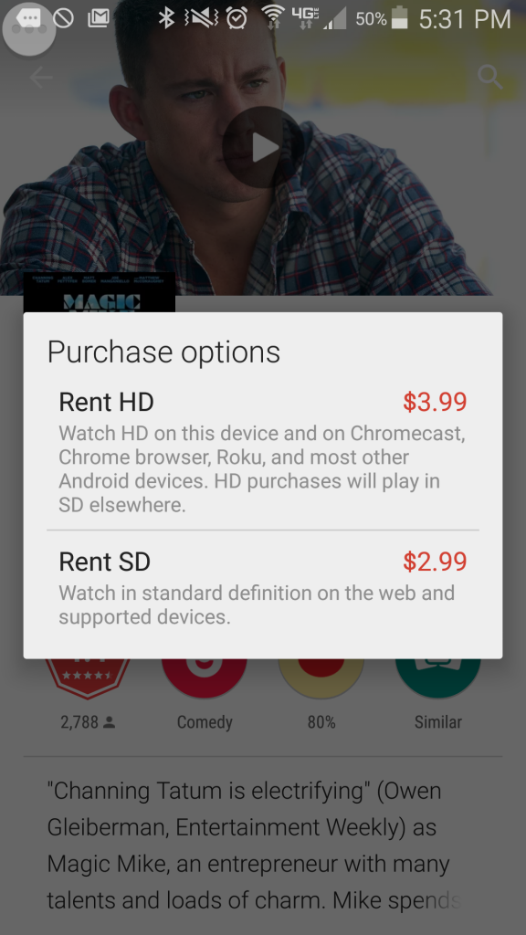
This weekend I had a movie night with some friends at my house because we urgently needed to watch the first Magic Mike movie. We didn’t want to miss any major plot points when we watched the soon-to-be-released sequel.
I rented the movie on my phone using the Google Play Movies & TV app. I tapped the purchase button, and openly lamented to my friends how easy it was to throw my money away. I mean disgustingly easy. Three taps and four bucks of my hard-earned money was gone, replaced by the privilege of having two days of access to a movie I hope my mom never finds out I watched.
First tap
2nd tap…and 3rd tap my money is gone
Voila, I made a purchase I kind-of-but-not-really regret. Your website could have that purchase!
On mobile, fewer people are doing research. They’re either buying, or they’re leaving. I wanted that Magic Mike movie, and I wanted it right then. More obstacles would have meant using a different app or just watching a different movie I already own.
Buying something from you should be as easy as renting a movie on my phone.
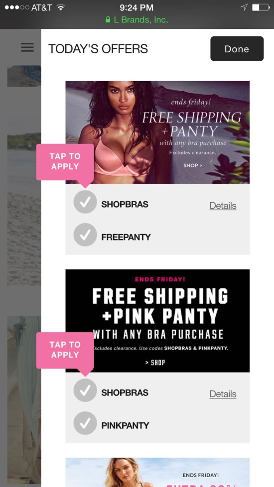
Park the things you know about your desktop users. Think about the needs of your mobile visitors as if they were a different animal. They’re not unicorns or dragons or anything, but you wouldn’t put a leash on a cat. They just won’t stand for it.
As an example, Victoria’s Secret realized that promo codes are to mobile users what pull cords are to blow dryers. They’re not the right tool for the job.
Victoria’s Secret doesn’t ask mobile visitors to enter a promo code.
Impulse Abandoners
Impulse buyers become impulse abandoners when your site doesn’t serve their need to take action. The moment they perceive that a transaction is low value, that the effort is too high, that a purchase is risky or that there is no urgency to take action, they become less impulsive.
It is not manipulative to feed their need for speed. Giving impulse buyers the rationale to act is exactly what they want from you. Why deny them?
Feature image licensed under Creative Commons and adapted for this post.
Exclusive Mobile Design Insights from Dozens of Split Tests [Webinar]
CRO Tests | Multivariate | AB TestingThe Mobile Web is still in its infancy. Today, alleged “mobile best-practices” are nothing more than successful desktop strategies scaled to a smaller screen. But people behave differently on small-screen devices than they do when they are sitting at a computer.
Conversion Sciences has begun to see what Mobile Web 2.0 will look like. Having completed dozens of mobile design split tests, key trends have begun to show themselves. Much of what we have learned flies in the face of conventional beliefs.
This is why we test.
Our approach to mobile design is controversial because, as scientists, we can’t just accept traditional wisdom at face value. We need evidence.
Joel Harvey will be reveals the results of dozens of tests we’ve completed. Insights are based on real tests. No gut instinct here. Watch Mobile 2.0: Judgment Day to learn what he has discovered. He shares:
Watch the replay on demand in its glorious entirety.
Don’t ignore your mobile traffic. It can be a real revenue generator sooner than you think.
Landing Pages: Grilling The Conversion Scientist™
Landing Page OptimizationIt was a dark room with on of those overhead lights above a lone chair. This was the room Joe Kerschbaum found to interview me at the Hero Conference in Portland Oregon.
Subscribe to Podcast
He proceeded to grill me about Landing Pages the special way we build them backwards. You can hear the recording here. We talk about
We learn that pretty pages often aren’t the highest converting pages. If pretty always won, I’d be president by now.
3Q DIGITAL DOWNLOAD EPISODE 13: CONVERSION OPTIMIZATION
21 Quick and Easy CRO Copywriting Hacks
Keep these proven copywriting hacks in mind to make your copy convert.
"*" indicates required fields
Image, Proof, Trust, Offer and Form: Parts of a Successful Dating Landing Page
Landing Page OptimizationThis is the next segment of our series on how a dating profile is like a business landing page. This series is written by Conversion Scientist Megan Hoover.
A few weeks ago when I decided it was time to optimize my dating life, I took the first step by creating a list of the qualities I’d like to attract with my profile. It’s an approach I also take in optimizing websites. I need to understand the qualities of an ideal business prospect, one that is likely to convert on the site.
Once I knew who I was looking for, I had to figure out how I’d find him in the sea of non-contenders. I came up with the (quite literal) Formula For Love.
P(first date) = db x (∑ti x 2∑tomg)
Here, P is the probability of a first date. The variable db is a one or zero, zero if there is a deal breaker. The variables ti and tomg are scores for traits that are important, and very important respectively.
Now that I know how I’ll qualify a lead, it’s time to get out my beakers and scales and use the chemistry of landing pages formula to create the landing page of me – aka fill out the big scary blank profile that will attract the kind of man I’d like to go out with.
The chemistry of the landing page
A blank page. It might be time to refill our wine glasses. Go ahead, I’ll wait.
The dating site I’ve chosen, OkCupid, gives me a series of open ended questions to fill out. There’s the vague “Self-Summary” section, the slightly less vague “What I’m doing with my life” section followed by a few more sections with more directed prompts: “The six things I could never do without”, “I’m really good at”, “The first thing people usually notice about me”, and “My favorite books, movies, shows, etc.”.
At the very end of the template is my offer and a way to take action, which I will discuss below.
Avoid Distractions
As a girl faced with the daunting task of creating a dating profile, the template is a huge relief. If you’ve ever been tasked with creating a landing page — or writing a blog post — you’ve probably been intimidated by the blank page, too. Your palms sweat, you get up 15 times to use the restroom and refill your coffee. So a corporate web template is the blank-page-sweaty-palm cure, right? It’s not so blank.
It may help with your dating profile, but it’s not a good idea for a business landing page. In the formula for creating a winning landing page, a template is not your friend. In fact, it’s likely to cause a massive chain reaction that will cause the whole experiment to fail.
Like a dating profile, a business landing page should be singularly focused. If you start with your corporate template, it’s already full of stuff like unrelated navigation and social media icons. In other words, it’s full of distractions that can take a visitor away from your primary purpose.
If he does, the chances of me converting my dream guy into a date go way down.
We want to start our landing page with a clean slate, a pure webpage. Then add an offer and a form.
Have a Great Offer
I’m stuck using a template on OKCupid, against my scientific knowledge. At least OkCupid’s template gives me a form with the call to action “Send a message” and a place to create an offer: the “You should message if” section.
As a marketer, it’s my job to make the offer compelling so that my dream suitors click that little blue button and make first contact.
Don’t break the promise that got your visitor to the page. In the case of a dating profile, the promise is a my main profile photo, user name, age and location. I’ll need to choose a photo that best represents my personality and will line up with what I present in my profile.
Promise: Trail loving Austin adventurer with a mountain bike.
Offer: A tour of the best mountain biking trails in Austin.
The Offer Should Match the Ad
For your business, make sure to think about where your visitors are coming from. Are they coming from an ad where the image displays a purple t-shirt? Then they should see a purple t-shirt on the landing page. Did you advertise 50% off of $1 bills, then your landing page needs to offer 50% off of $1 bills. Keep your promise.
Forms that Convert and Qualify
What about the form? I’m still using OkCupid’s template, so I don’t have any control over the form. In a perfect world I customize my form to help me pre-qualify some of my leads. Consider what information you actually need or want from you leads/purchasers. Sometimes, asking for more information can raise the barrier to entry and lower the number of leads you’ll receive.
Think carefully about what information is absolutely necessary for the next step as you create your form. And don’t be afraid to A/B test form length and content. Sometimes more is better, but sometimes less is. Start with a well thought out form with all relevant information to get your visitor to the next step and then test more or less information.
So now what? I’ve got an offer and I’ve got a form. I’m done right?
Technically, yes, I’ve got a dating profile and you’ve got a landing page, but will it convert?
Unlikely.
It’s time for us to dig out our goggles because we’re about to heat things up and add the catalysts.
21 Quick and Easy CRO Copywriting Hacks
Keep these proven copywriting hacks in mind to make your copy convert.
"*" indicates required fields
Provide Proof
Put your protective gloves on for this one, we’re about to add a dash of proof.
We have to demonstrate that what we’re saying is true. Have you sold 13 billion hamburgers? Say that. It’s even better if you say 13,982,534,121 hamburgers sold. Do you have a customer that is well known or willing to lend you a quote or their logo?
I asked a few ex-boyfriends if they’d give a reference, but thought better of actually posting those on my profile.
Since posting logos or quotes on a dating profile isn’t going to work, I have to rely heavily on copy to provide proof. The more specific I get the better proof I’ll provide. Instead of saying, “I enjoy mountain biking” I can say, “I ride my Contessa Scott every Sunday at Walnut Creek Park”.
Instead of “I enjoy volunteering with animals,” I would say “Jake the Tank is my favorite four-legged Jog-a-Dog companion.”
I can utilize profile photographs. “I love to travel” is vague, but a photo of me on top of the Great Wall of China is better proof of that enjoyment. We’ll talk more about images in a minute.
Proof makes visitors feel more comfortable taking action by overcoming their objections. It’s the logical argument that supports an emotional decision.
So what are my potential dates’ objections? Do I have anything in common with this person? If I message her will she respond? Is she looking for the same thing I am? Will I be wasting my time by messaging her? Is she even a real person?
In your business, what are your visitors’ potential objections? What would stop a visitor from filling out your form or making a purchase on your site?
In the online dating world a big red flag is a blank profile. How serious is a guy if he can’t even be bothered to write a few paragraphs about himself? The same goes for businesses. A blank page with nothing but a form isn’t enough for a visitor to take you seriously.
When writing copy for a landing page there should be just enough to overcome objections and no more. Dating profiles are no different. Data shows that shorter profiles in a conversational style get far more attention than long resume-style profiles do.
Build Trust
My most powerful trust builder will also be copy. The tone of my copy needs to be friendly and approachable, overcoming the fear of rejection, and I need to make sure I mention exactly what I’m looking for and some specific things my ideal date would have in common with me.
Some common visual ways to add trust to your business landing pages are your company logo, recognized affiliate logos – Visa/Mastercard are common in eCommerace – and certifications. Do you have a Better Business Accreditation? What about Norton antivirus?
A word of caution on trust symbols: too much can come off sketchy. Have you ever been to a site that just rams trust down your throat with pop-ups, stickies, and giant logos? It starts to feel like you’re on a used car lot and not one of the fancy “certified pre-owned” ones.
In my dating profile I’ll need to avoid ramming my niceness, smarts or creativity down anyone’s throat. If I mention in each section that “I’m super nice” by the time they get the message portion they might be wondering if I’ve just set them up to receive a really insulting reply.
OkCupid has another trust tool that often gets overlooked: the “how often do they respond” bar. If one of the biggest fears of dating is rejection, having a yellow or green bar can up the chances of a person messaging. Being too selective with replies can tear away trust that you’re serious or could send the signal that only models with Ph.Ds should apply.
OkCupid’s trust tool shares how often everyone responds to messages
Do you respond within 24 hours to all inquires? Do you have a chat or phone number customers can utilize? These types of communication standards go a long way to assure visitors that they can trust your business.
We’ve overcome most of our visitors’ major objections by building trust with copy and images, and they’re almost ready to contact us or buy from us. How can we push them over the edge?
Show the Product
The final component of a landing page is the images. Studies show that it is the most important component of a dating profile, and it’s the first thing on a dating profile.
One of the biggest fears people have in online dating is their date looking totally different in person than they do online. I can build trust by choosing recent photos without any fancy filters and by adding a date to my photos to assure nervous suitors that I probably haven’t gained 100 pounds since March of 2015, and that I look okay without the wonders of photoshop.
This is true for both online dating sites and your business landing page. OkCupid won’t even show my profile to users if I don’t have a photo.
Without an image, my dating landing page doesn’t exist.
If your product is tangible it’s pretty easy. But if you offer a service or a downloadable PDF it might be more difficult. Choose an image that allows visitors to imagine what it will be like after they’ve completed the offer.
Video is classified just an image delivered at 30 frames per second usually with audio.
The same goes for my dating profile. To attract the kind of man I want to date I need to choose images that are fun, active, and show me – no photos of that hot friend I talked about earlier. I need my potential suitors to be able to imagine meeting me in person and having a good time doing something we both love. Your photos should capture the same feelings.
A Complete Page
If you want to get a reaction from your visitors, you have to have all of the components. We started with a pure webpage (or as pure as possible) and added and created an offer and a form thinking carefully about how our potential customers/suiters arrived at this landing page. We spruced the landing page up with a bit of proof and trust and carefully added appropriate images. Voila! We’ve mixed up the perfect landing page (aka dating profile) to attract the customer we want – in my case someone to hold my lab coat.
If you’re finding my project entertaining, you should also check out Amy Webb’s Ted Talk and book.
21 Quick and Easy CRO Copywriting Hacks
Keep these proven copywriting hacks in mind to make your copy convert.
"*" indicates required fields
Building a Website Optimization Business [AUDIO]
Conversion OptimizationBrian the Conversion Scientist is always excited to share his knowledge about website optimization. He’s also an entrepreneur just like his clients. Dr. Jeremy Weisz from INspired INsider interviewed Brian about his highest and lowest points leading his business.
Brian talks about client negotiations, how he feels about his employees (hint: nothing but good feelings!), and advice for making a better website.
Listen to the full podcast or read the transcript: it’s educational and unexpectedly touching.
Subscribe to Podcast
Transcript
Jeremy:
Brian, since it’s INspired INsider, I wanted to hear about what’s been a really low moment and how you pushed forward through it, and then on the flip side a proud moment.
Brian:
I think our lowest moment would have to have been when we signed up a do a pay for performance. We had a deal where we were being paid a retainer, and we also got a bonus based on how much we increased their conversion rate.
And as you can imagine on a complex site, it’s really hard to determine how much of a conversion rate increase is due to the market, how much is due to promotions the company was going to do anyway, and how much of it is due to us. But we came up with the formula that would take several different measurements and average them, and if it went to this certain point then we got a certain percentage of revenue.
We had a month go by, and there was a huge increase; it looked like our bonus was going to go through the roof. We had just started, and we know we didn’t make any changes. So we started working vigorously and the next month, they had some specials, and again we had a bonus that was just through the roof.
We felt like we had to stick by our guns because that was the agreement. I mean if every time the bonus coincidentally was in our favor was early on – rather than being lower early on – then we wouldn’t have much of a leg to stand on for future agreements like this one, which by the way we don’t do anymore.
It ended up being a very confrontational negotiation. It came to a good settlement, and we lost a customer. We lost a very interesting customer at that. So that was kind of the low point.
Jeremy:
You mean that they said it wasn’t due to you, so they didn’t want to pay you the bonus?
Brian:
That’s right.
Jeremy:
That’s painful.
Brian:
We said “You might be right it: it may not be due to us or not all of it, but the agreement says this is how we calculate the bonus.” That was the agreement: we’re going to calculate it using this formula. We had offered to cap it, and they said “No, we want you guys to be motivated to really make us rich.” And I think we could’ve, and I wish we had been able to keep going with them.
Jeremy:
How do you navigate that type of negotiation because it is a client relationship, but then also you deserve to be paid a certain amount. I’m sure this happens all the time in a lot of business type of situations. How did you come to the table, and how did you handle the negotiation? Is that an easy process?
Brian:
I think probably the most important thing we did is we got on a plane and flew out there. Being face-to-face made it more confrontational but realistically confrontational. There’s an amazing ability of the human mind to read somebody’s face, so that’s what we decided to do rather than trying to read their voices and faces over the phone. I think that was probably the most important thing.
We never wavered, but we did compromise. We didn’t get the full bonus, but we told them what we were willing to take. We did a good job making our case for it. And you know I think that’s all you can do.
Jeremy:
What would you tell someone if they experience the same situation – someone backs out of an agreement? What advice do you have for them?
Brian:
We talked about litigation, but we didn’t see that as a tactic, and we didn’t use it. I think holding the other side to their highest – even when they get heated and when they sound irrational to you – assume that they’re working for the best, and they’re working for the fairest.
There’s a fundamental difference in the way people will behave if you expect a certain thing from them.
Even in a business situation sometimes somebody’s job is on the line, and they negotiated a bad deal with you. We had one other situation where they said “We didn’t know you were going to charge so much. We didn’t quite understand the agreement.” It was a much smaller amount of money, but hold them to their highest and plan ahead of time where your concession points are. Tell them how much you’re willing to concede and concede slowly. So if you’re talking about $100,000 deal, your concession points are going to be in the $99,000 or $98,000 range.
And don’t worry about seeming unreasonable. You can keep going, but that’s where really where you find out where their concession point is. Find a compromise that you both feel like “I can take that.”
Jeremy:
Lesson learned. Now you don’t do pay for performance.
Brian:
Pay for performance has potentially two outcomes with the wrong organization. I wouldn’t rule it out categorically, but number one, you are wildly successful with them, and you become too expensive to be kept on.
Or number two, you don’t you have inclusive tests for a long period of time, so you’re not making any money with them. Your employees begin to think “Well I’m making money over here with this other client, so I’m going to spend more time on that.” So it never actually gets its fair shake past some of those early failures.
So no it doesn’t work. We do flat rate, fixed price consulting. We don’t even do hourly. It’s a flat rate. It gives us the freedom to do as much as we need to do to delight the customer. And so that’s what you want. You want someone who has the resources to really put a lot of money in your pocket.
Jeremy:
I can see with the first deal the guy made with you that they want you to be motivated, so they didn’t want to cap it which I would think makes perfect sense.
So what about the proudest moment?
Brian:
I think that there have been a number of proudest, but for me the proudest has been really over the last six months. We’ve brought on a new Conversion Scientist, and we’ve had one who has been with us for longer, but the two of them really have delighted clients. They’ve been able to come in, get up the learning curve on reading the tealeaves that are the analytics and all the other research that we do, then consistently deliver wins.
In one case, we started off very rough. We had a couple of inconclusive tests. These were language tests, and we were changing the language on buttons for a barcode company. The control beat everything. We were struggling to get statistical significance because there was also a little bit of “Should we go with this conclusion or not go with this conclusion?” It just felt very rough, so to be able to turn that around and turn it into tripling the conversion rate, it just feels great. We were running on kind of a high.
We’re in demand, and our process is really working. We do have tough clients in other sectors, but it just feels great to see other people catch the disease that I got back in 2006 of “Oh my gosh! This brings everything together!” The data, the technology, the development, and the entrepreneurial side. We’re really scrambling to make more money for our clients, so to see that excitement pop up in your employees feels really good.
Jeremy:
Is it hard to get clients to listen? When you triple conversions they probably say “I’m all ears” but before that in the initial tests, I would think it’s hard to convince them you should do things a certain way for a long time if you have these inconclusive paths.
21 Quick and Easy CRO Copywriting Hacks
Keep these proven copywriting hacks in mind to make your copy convert.
"*" indicates required fields
Brian:
There is a lot of back and forth. Some clients begin to get excited and they come up with their hypotheses, and then we say “We have some of this data from a previous test” or “We saw this over here that says it’s probably not a good hypothesis”. But then other times a client will come to us with a great hypothesis, and we’ll think “Oh my gosh why isn’t that on our list?”
That conversation usually works out well, but what is harder are situations like when we had a client that sold sports memorabilia online. Customers were going to the purchase page and adding something to cart. They’re buying; they are going through the process. Then customers change the state that they live in, so the terms of the shopping cart change, and one of those little twirling rings goes off while it’s going to the database and grabbing the new tax information.
In Internet Explorer, that twirling ring didn’t go away, and it was spinning right next to the credit card number field. Imagine this: you’re about to enter your credit card number, but you’re not about to enter it until the browser says it’s ok. It’s spinning about 30 seconds then another twirling ring pops up, and now you’re thinking “I’m not going to give my credit card to these bozos”. Thirty seconds later, another twirling ring. So you have three of these spinning things.
We decided to design some java script, and we fixed it. We actually ran a test because we wanted to see how big of an impact this was having because this problem was at the buy point.
It was costing them over $1,000,000 a year in revenue!
Jeremy:
Wow that’s amazing.
Brian:
We presented this to them, and they were like “ok”.
So then we were thinking, “Wait a minute, what’s going on here? Why aren’t they more excited?” When we see a test that delivers a 25% increase, when we put it on the site it’s generally going to see a 10-12% increase in actual. There are a lot of other things come into effect and change the results, and you know 25%? That seems ok.
So with the sports memorabilia company, we were thinking, we just made you a million and a half dollars, worst case, and you’re not really reacting. That’s more perplexing to us, when they have no reaction.
Sometimes the person you’re dealing with within an organization is more worried about their job instead of what we’re doing. In enterprise organizations it really is about career advancement, and you can tell that this is not something that they think is going to help get them ahead. They’re just not as excited.
Jeremy:
It’s not their business.
Brian:
It’s an individual or someone who reports directly to the CEO or something. So that’s more frustrating. We’re rah rah’ing, and it’s silence on the other end, and you’re wondering what’s going on. They should be hiring a marching band and marching through our office.
Jeremy:
They’re covering the phone and just screaming or something.
Brian this has been an absolute pleasure. Where can we point people towards? Where should people go to check out more?
Brian:
You know everything we learn, we write about. We’re really a teaching organization because that’s what it’s going to take to get more of these websites up and optimizing. So come to Conversion Sciences.
We post several times a week there: case studies, head-scratchers, things we’ve learned, audio, there’s a lot of video, we’ve got a podcast if you like to listen to things on the commute. And you know we’ve got the data that answers some of the questions that I know are burning in your little brains.
Jeremy:
Conversion Scientist. Yeah, I was reading one this morning: why no one is reading your emails. That was a good one.
Brian:
Everything is fair game.
Jeremy:
So any final thoughts?
Brian:
Entrepreneurs: those of you who are embarking on any business right now are going to have a website to support it. I can’t think of an exception. And you’re going to go hire a web developer or maybe do that yourself. And a designer to tell you what to do. A marketer today is not going to be able to go off and do that anymore but the good news is that the data is readily available.
Even if you’re a little afraid to get a little math-y and maybe understand a little statistics, I strongly recommend that you go and poke around in analytics. Make sure that you’ve got Google Analytics – which is a free tool – installed and start building this database so you can test yourself. That’s where it all starts. Start poking around; I know us entrepreneurs are pokers. We’re going to get to know just enough about a space that we feel confident either winging it or competently hiring someone who can do it for us. You need to be doing that on the site because it will accelerate your growth, especially out of the gate when those few precious leads, few precious sales, few precious users will make or break your business.
Jeremy:
Awesome Brian, thank you so much I really appreciate it.
Brian:
Thanks for having me man. Glad I could come.
UX vs. CRO Webinar Replay
Conversion OptimizationThe knockout punch came near the end of the webinar. Who won, UX or CRO?
Watch the Webinar Replay
Listen to the Podcast
We shot this webinar because I had two things happen in the past year that made me wonder if we shouldn’t be doing more UX as a part of our CRO efforts.
First, we helped redesign a client site using conversion optimization. During the redesign, the client experienced significant increases in demos and sales of its software. To date we’ve almost tripled their demo requests.
Then, I happened across a landing page that I felt was very well done. When I asked the designer of that page how they had arrived at that design, Adam Treister told me they had done a UX process on it. And he had documented the process in a Udemy course. The page increased enrollment clicks by 246%.
Two different approaches. Two great results. I invited my UX friend Sarah Jabeen of DiscoverSTEAM to debate this with me. How are these two process different? How are they the same?
There is only one way for you to find out.
Subscribe to Podcast
21 Quick and Easy CRO Copywriting Hacks
Keep these proven copywriting hacks in mind to make your copy convert.
"*" indicates required fields
Is Google Using Mobilegeddon to Lead You Astray?
Conversion-Centered DesignThe Threat: Mobilegeddon, Google’s search algorithm change that would penalize mobile websites that weren’t “mobile friendly”.
There is little as scary to an online business as having your source of traffic threatened. However, Google put some resources in place and is making recommendations to businesses to help them become mobile-friendly.
The recommendations will not help you become mobile-friendly. They will make you Google-friendly. Google calls something “mobile-friendly” if a website fits into a small screen, if the fonts are large and if the content remains largely in tact. We call a site “mobile-friendly” if it entices more visitors to buy, call or fill out a form.
The two often aren’t the same.
Google’s Webmaster’s Mobile Guide recommends responsive web design, or RWD. We don’t believe that RWD is the right answer. In my new column Is Google Using Mobilegeddon to Scare Website Owners into Bad Decisions? I explain why responsive web design is a poor strategy for mobile websites.
Subscribe to Podcast
Here’s a simple example. I was invited to attend a webinar. It had a great slate of speakers and a topic I was keenly interested in. I got the email on my cell phone, as many of us do. The registration page was responsive. It morphed to fit my mobile screen, resizing images, stacking sections… and then this.
This form required two screen shots to capture all of the sixteen fields.
It’s hard to fill out forms on a mobile device. Despite my excitement about the topic, “Advanced Conversion Strategies for Mobile Search,” I didn’t register. I intended to go back and register from my laptop, but had forgotten all about it within 30 seconds.
The punchline is that a webinar discussing great mobile experiences essentially asks mobile visitors to go away, and a LOT of desktop visitors, too. Workcast.com, the host of this monstrous form, thinks their job is to host webinars. Those of us that do webinars know that their job is to generate leads.
I would have offered an autofill via linked into get the form started. I would have removed the address fields on mobile. I would have removed Industry, Company Size and a description of the company. Make the sales people do a little research for crying out loud.
The point is this: Mobile visitors expect a mobile experience. Responsive design delivers a smaller desktop experience. No thanks, Google.
Read my entire rant on Marketing Land.
How Many Customers Are You Losing Due to Responsive Web Design?
Conversion-Centered DesignThe increasing popularity of a variety of devices to access the internet—ranging from small handheld phones to tablets and laptops—have led web designers and marketers to work on approaches to make the devices more compatible with Internet usage. They are studying ease of scrolling and navigation, visual appeal, support of different screen sizes, richer experiences and faster page loads.
Adaptive Web Design (AWD) and Responsive Web Design (RWD) are different methods that arrive at the same solution. RWD is the hotter and more popular approach now, but before you decide to jump on the bandwagon, take a look at AWD. It may prove to be a better and more far-sighted approach for mobile web design.
At the heart of it, both AWD and RWD are two different ways of approaching the same goal: to create effective and impactful, functional and customized web design which can be easily visualized on any device. But as you read on, you will find that it may be the more complex and resource intensive AWD which may be a better option for designers in the long run.
The Difference Between RWD and AWD
Responsive Web Design
RWD is the popular design choice right now. It is a dynamic rendering of a web page based on fluid changes in layout according to the screen size and resolution. Thus, the design is responds to the screen size dynamically and instantly.
The images are flexible in size and the use of fluid grids is necessary. There are changes in the width of the elements in response to changing window sizes. This kind of web design makes use of queries to detect devices, so it is useful for advanced phones with certain operating systems versions.
Ethan Marcotte introduced this strategy. The basis behind it was the permanent state of impermanence in the web design world —the web design has to keep evolving and shaping itself in response to changes. Thus, the advantage of this design is this: the same design can be used for viewing the website on different devices. This change in design is made possible by changes in the width and number of columns for storing text (container fields) in the code for the web page. RWD is a real-time, dynamic, changing web design.
An example of RWD is that used by Barnes and Ernst, debt management experts in the UK. As you can see [need figure reference, or move images closer], the content is configured keeping in mind the interests of desktop and mobile users. Because of the increase in mobile users who were accessing their website through their smart phones, the company introduced mobile-specific search advertising and subsequently mobile-optimized websites.
Their aim was to deliver the required information to customers in a speedy way, without pushing down too much information. Based on their long-term goals and requirements, they went with the RWD one-size-fits-all approach: a single platform for all devices. Through this approach, they were able to optimize their site experience without the hassle of creating multiple websites. The site makes use of the smart-phone technology (touch/swipe), JavaScript, fluid queries, and flexible queries.
Baines and Ernst responsive web design on a desktop
Baines and Ernst responsive web design on mobile
Adaptive Web Design
AWD requires several different formats of the website — often different templates — to be made and kept ready for different devices, unlike RWD. The version of the website displayed to the viewer is based on several factors such as the location, kind of device and OS. AWD requires more up-front effort and development, but it offers a customized experience for mobile audiences. AWD is the better option for marketers who are into content-rich marketing and who need to deliver content of all kinds to their audience.
Avenue 32’s adaptive web design on a desktop
Avenue 32, a top-notch luxury retail brand, has made use of AWD to design its websites suitable for smart phone and tablet. The use of AWD has helped the brand create a visually and functionally engaging and rich experience, which matches its desktop website, which is content-rich and engaging.
This creates an equally rich mobile experience, in which customers experience content from wherever they may be. When you compare the desktop and mobile versions of the website, you can see that the content is more or less the same, but has been arranged in a way best seen on a desktop or mobile screen.
Avenue 32’s adaptive web design on mobile
The URLs for both websites can be the same (dynamic serving) or through use of different URLs (mobile specific and desktop specific, for instance), so the website visitors see is determined by the kind of device and operating system being used. Use of predesigned and customized landing pages may save time and glitches, which may otherwise happen in a dynamic RWD system.
Why is AWD the Design Choice with the Advantage?
Use of AWD makes accessing Internet pages more efficient. Pages load much more quickly with AWD, which improves the user experience and has been proven to increase conversion rates. This is because only those files which are required are transferred from server to mobile device. Optimum media files can be chosen that are suitable for the device and browser. This is how AWD delivers specific user experiences. Unlike AWD, RWD is more limited in generating optimized user experiences.
Adaptive web design can be used for older mobile phones unlike responsive web design which needs the latest technology and recent phones plus use of CSS queries. The reason AWD doesn’t need the latest technology is because it makes use of client or server side code to detect the devices. This is good for the lower-end phones and older generation mobile phones which are not CSS optimized and thus do not have the ability to understand media queries and translate them.
Why is it important for a website to be accessible on many generations of mobile technology? Even if a company is located in an affluent part of the world where there is a rapid turnover in technology, huge parts of the global population – in Africa and Asia, for instance – do not have the financial means to have the newest smart phone. You would be putting your company at risk of missing out on new markets that may want what you’re selling but can’t access it easily.
You can easily deliver content to low-end mobile phone users in these countries who have much lesser bandwidth, poorer batteries and possess less power by using AWD. Adaptive means your marketing efforts lead to maximum inclusiveness.
Another advantage of AWD over RWD is that responsive web design may not be able to integrate all advertisements into every possible screen resolution as it dynamically adjusts itself. This problem is less of an issue with AWD since advertisements of all kinds can be tailored into it.
One example of the power of AWD is in the way Future Insights website generates pages. As you can see, the best customized webpage shows up for each device.
Future Insights’ set of webpages
All you need to do is to make one master version of the website, which can be tailored to make many minor versions of it. Thus, AWD offers many advantages without the drawbacks of RWD. AWD’s emphasis is on the overall functionality of the device rather than just the design. Sites using AWD can be more user-focused for mobile devices.
If you dream of achieving wider mobile Internet reach, don’t jump on the responsive bandwagon with out taking a hard look at adaptive mobile design.
About the Author