As a scientist, I’m obsessed with data in every aspect of my life. I calculate wait times in lines based on number of customers and speed of the checkout clerk. I check multiple spreadsheets and websites to optimize cash back rewards and airline points before purchasing anything.
So when I decided it was time to look for a lab coat that matches mine, joining an online dating site with plenty of data points was the perfect choice for me.
My Online Dating Profile: The Most Romantic of Landing Pages
An online dating profile is essentially a lead generation landing page, so it’s the perfect platform to create an optimization project that’s entertaining to read about as well as fairly practical for me: a single woman looking for a dating partner.
Before we can attract the ideal date (or customer), we need to know how to measure “ideal”. Most of our visitors won’t be the ideal. We need to have a good understanding of our base qualifications and the deal-breakers that mark a visitor as outside our target market.
One of the most difficult questions a business can answer is, “Who do I not want to focus on?” or, “Who am I willing to let go of to better serve my best prospects?” If we try to speak to everyone with our value proposition, it gets watered down so much that we don’t engage any visitors effectively.
This is essential for efficiency in time and cost of acquisition.
You don’t want your sales staff spending hours with leads that will never be customers.
And I don’t want to spend hours with men that will never be a good date for me.
With this in mind, I’m putting aside the idea of a “match” in favor of looking for “leads”. However, not everyone is a good “lead” for me.
For this experiment to work I needed to be armed with a list of traits that could easily be spotted from a dating profile or early interaction, and a site with a lot of data points to examine.
I chose the free site okcupid because it has a large user base in my target market (Austin, TX) and uses both quantitative and qualitative data points which will make sussing out a qualified lead much easier.
With all this data at my fingertips, the job I have before me is to put together a rating system that will allow me to quantitatively judge what is a fairly subjective task.
But how do I do that?
The (Quite Literal) Formula for Love
For a dating landing page, I need to be able to numerically rate a lead – someone who messages me – instead of using my intuition, and I need to be able to gauge whether I’m attracting the kind of person I want to spend time with. Otherwise, I’m just congratulating myself on receiving mountains of messages with no regard to quality.
We experience the same challenges on landing pages. Our conversion rate tells us how many visitors respond to an offer, but we need another way to determine whether or not our page is engaging qualified prospects: quantity and quality.
Fortunately, my work as a data-driven analyst has prepared me for the task… I hope.
For my lead rating system, I will rate the profile based on observable evidence in his profile and initial message.
I’ve organized my rating system into three different levels:
- Free of deal-breaker traits (db) rated as a 0 or 1
- Traits that are of importance to me (ti) rated on a scale from 0 to 1
- Traits that are of critical importance to me (tomg) rated on a scale from 0 to 1
Note: this is weighted more heavily in our formula
It all boils down to this First Date Probability formula:
P(first date) = db x (∑ti x 2∑tomg)
Deal-Breakers
The deal-breaker variable is binary. If a curious courter has even one deal-breaker trait, his First Date Probability goes to zero.
In both the dating world and the business world, deal-breakers are pretty important. They quickly eliminate prospective paramours from the running early on. Businesses, however, don’t often incorporate these all-or-nothing deal-breakers in lead scoring algorithms.
What are the deal-breakers in your online business? We all want web prospects that have a problem you can solve, and who have the money to pay for it.
Common business deal breakers include:
- Title: They don’t have the authority to make the decision.
- Purchase Timeframe: They aren’t ready to buy in a reasonable time.
- Location: We can’t service their city.
- Language: We can’t communicate with them.
- Budget: They can’t afford us.
At my company, we really can’t do scientific optimization unless a prospect gets 200 transactions or leads from the web in a month. For us, this is a deal-breaker.
Asking about deal breakers in your lead generating landing page forms is one way to let visitors know that they are in the wrong place. They won’t waste your time and you won’t waste theirs.
Deal-breakers for me include:
- Younger than 25 or older than 45
- Already in a relationship or not interested in monogamy
- Living outside of Austin, Texas
- Smokers
I would score these with a zero if I find them in his profile.

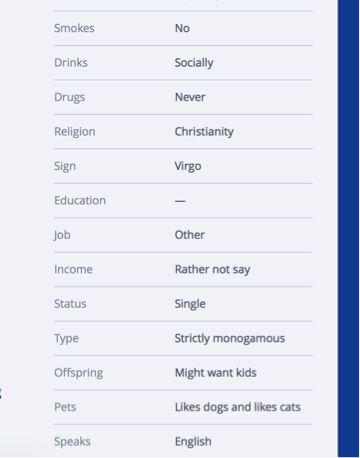
Finding evidence of my deal-breakers is pretty easy on okcupid as these are simple questions provided in a basic profile. Either you’re a smoker, or you’re not. Here are some of my answers, totally spelled out for me – 37, non-smoker, Strictly Monogamous, Lives in Austin, Texas.
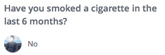
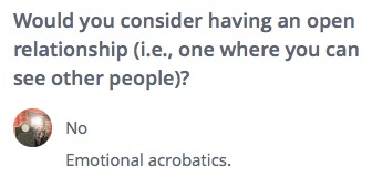
If a lurking Lothario contacts me who is prison-bound for living out the storyline of Psycho, I will say “no” to a date and consider none of the other attributes. If these items are present, the inquirer receives an appropriate rating of 0.
For our experiment, anyone who contacts me outside of this range will still be considered a lead, but they’ll just be an unqualified lead. In business, these are the folks we just can’t help. They might get a short, polite email or a referral to a more suitable business.
Important Traits (ti)
This next group of traits aren’t deal-breakers. I’m willing to make compromises here, though they’re still important.
In my formula, I will find a value for important traits (ti) by finding the sum of rated items. Some items will get a negative rating, meaning a score of one will be subtracted from the total.
- Negative Rating: If there is a religious mismatch, a prospective Romeo will get a negative rating. It’s important that we have similar values.
- College graduate – Tells me he values and respects education. And he can read. I’m most turned on by smarts, so someone with a well exercised brain is a must.
- Adventurousness – Not afraid to try new kinds of foods, sky-diving, road trips — almost anything you couldn’t do in your cubicle.
- Love of travel – Traveling is part of being adventurous, but it’s also a distinct part of my rating system. I have friends all over the country and would like to hear more about interesting places.
- Appreciates dry/sarcastic humor – My sarcastic voice sounds a lot like my regular voice (bonus points for Joss Whedon fanboys and knowing where that line comes from)
- Creative and appreciates art – Creative hobby a plus! (I dance, love the theater, paint and write – I want someone that can come with me to the theater or an art museum.)
- Healthy/physically active lifestyle – It isn’t about body type; it’s about lifestyle. I’d love to find someone who will join me at the gym or go hiking with me.
You can that rating leads based on these traits isn’t going to be as straightforward as the deal-breakers, but it can still be pretty clear whether someone is stacking up well.
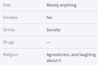
This snippet of standardized questions helps me get an idea of how this person feels about his religious beliefs. It’s actually a two part question answered by choosing your answer from a drop down menu. Part one is choosing the religion, and part two is where you choose the degree to which you follow the religion.
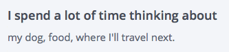
This question is open-ended, but this guy still managed to cover one of my important traits and also a critically important trait by mentioning his dog.
It won’t always be easy to assign a value, however. Sometimes I’m going to have to look at the profile as a whole to make a decision. This next profile gave me some mixed messages.
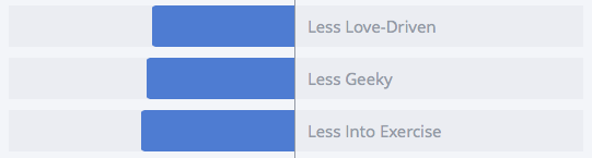

When you answer standardized questions on okcupid, it will use your answers to rank you among other users of the site. In the bar graph above, the midline represents the average okcupid user, so this person is much less into exercise than the average person.
But he has also indicated that he rides his bike often in his response to an open-ended question. Since I’m looking for someone who lives a healthy lifestyle, maybe not exercising is ok. It could mean that he just really hates going to the gym, but he loves being an active person.
Critically Important Traits (tomg)
- 27-37 years of age
- Loves dogs – I own a giant dog named Remus and he’s here to stay.
- Negative Rating: Negativity and pessimism.
- Career oriented – My ideal match has his own career and professional direction because he’ll understand my own ambition, and we’ll be able to encourage and support each other.
- Enjoys quiet evening at home – I love being downtown or out where the action is, but I need quiet and mellow to recharge and be my best.
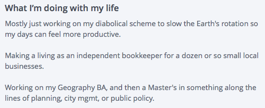
If this person contacted me, he would be a strong lead based on this small part of his profile. Humor? Check. Career oriented? Check! Education? Check. There are many personality traits I’m looking for that I didn’t include in my rating system because I wasn’t sure I’d be able to find solid evidence without meeting in person, but this guy is also demonstrating some strong elements of the Type A personality I really like.
Deciding whether someone is negative or pessimistic will be another item that requires looking at the big picture. It’s one of those “know it when you see it” traits, but strong indicators are lists of unacceptable attributes in another person and making repeated comments about how past relationships have ended poorly.
Scoring Qualified Leads
So now what? We have a bunch of leads that aren’t obvious mismatches. How do we determine which ones to spend our time and energy on? Who will have the highest ROI?
For our experiment we’ll count a lead as anyone that initiates contact. We’ll then rank our leads based on the following system:
Qualified lead: Scores a one on all deal-breakers (meaning there aren’t any deal-breakers I could find)
These are the profiles I’ll take time to look at and see if they’re worth spending time on.
Ideal candidate: Scores zero on all negative ratings and ones across the board other than that. We can skip the screening portion and start lobbying hardcore.
Candidate Level 1: Scores in the top third of my formula.
I will devote time and energy talking to this person and getting to know him with an emphasis on setting up an in-person meeting sooner rather than later.
Candidate Level 2: Scores in the middle third of my formula.
I will respond to his message and ask leading questions. He may have other qualifications that are not on the list that appeal to me, so he might be worth an in-person meeting.
Candidate Level 3: Scores in the bottom third of my formula.
These are the leads that are worth talking to if times are lean. If lead flow is up, and we’re swimming in qualified leads, these will fall to the bottom of the pile. We’ll get to them if we have the time and resources to do so.
Case Study
To see how well my equation works on a real person, I’m putting it to the test. The screenshots below are from a single profile. He hasn’t messaged me, so he doesn’t count as a lead for my experiment, but he should be good practice for my rating system.
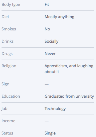
I’ve started with profile basics looking for deal breakers.

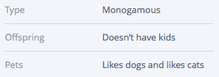
Deal-Breaker Traits
- Younger than 25 or older than 45: 1
- Already in a relationship or not interested in monogamy: 1
- Living outside of Austin, Texas: 1
- Smokers: 1
He’s off to a good start, so now I’m moving on to look for important traits. Some of them popped up in his profile basics.
Important Traits
- Negative Rating – Religious mismatch: 1
- College graduate: 1
He’s agnostic, and I’m Episcopalian. We might be able to make it work, however, which is why this trait isn’t a deal breaker.
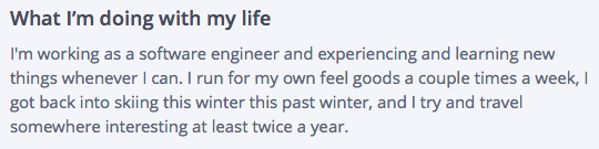
- Adventurousness: 1
- Love of travel: 1
- Healthy/physically active lifestyle: 1
He describes himself as fit in his profile basics which made me think he probably leads a pretty healthy lifestyle, but this paragraph made me certain.
He also has a tone here that seems humorous when he says he runs for his own “feel goods”. I wanted to give him a score of one based on that line, but it seemed like it would be based on fairly thin evidence. His self-summary gave me more data to make me think a score of one is appropriate.
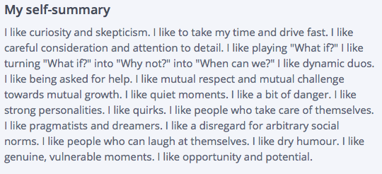
- Appreciates dry/sarcastic humor: 1
- Creative and appreciates art: 0
I looked for responses to questions about art, photos that could be in a museum, mentions of favorite artists, but I didn’t see anything artistic.
He didn’t nail all of my Important Traits in his profile, but I still found evidence of most of them. Now for Critically Important Traits.
Critically Important Traits
- 27-37 years of age: 1
- Loves dogs: 1
- Negative Rating – Negativity and pessimism: 0
I found his age and pet ownership status in his profile basics.
Of course I can’t prove the null hypothesis with negativity since I’m trying to figure out whether he isn’t a positive person, so it’s possible that he’s a pessimist. That’s what makes this trait one of the more difficult ones to score – but there wasn’t enough evidence to give him anything other than a zero.
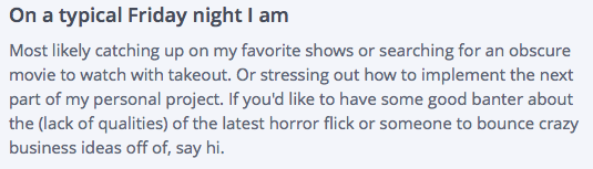
- Career oriented: 1
- Enjoys quiet evening at home: 1
If he wants to spend Friday night talking about business ideas, I can say with confidence that he’s a career oriented person. Takeout, movies, and TV shows all sound like a solid night in to me.
Now I can plug in some numbers into my formula.
P(first date) = db x (∑ti x 2∑tomg)
db = 1
∑ti = 3
∑tomg = 4
P(first date) = 1 x (3 x 2(4))
P(first date) = 24
He is a candidate level one using my criteria. Let’s hope he sends me a message!
Attracting Ideal Qualified Leads
It may turn out that people aren’t up front about something I thought they would be or that a particular flaw that bugs me turns out to be so common that I would be remiss to keep paying attention to it. So I may need to make adjustments here and there in my description of an ideal lead.
The process of creating my rating system, however frustrating, was a good experience because knowing what I’m looking for is half the battle. I now know what I’m aiming for in my profile/landing page, and I can share things about myself more strategically. I won’t be lying on my dating profile, so when I say I’m being strategic, I’m not changing who I am to meet someone – I’m simply emphasizing certain things about myself and not mentioning other things.
Best foot forward, right? Your landing pages should do the same. If you’re a family-oriented small business, but your ideal lead isn’t, why share that information? It’s still important, of course, but it’s ok to withhold information that doesn’t get right to the point.
Now you know quite a lot about what I’m looking for, but you know relatively little about me personally. To find out more, you know what to do: subscribe to my series! You know you want to…


Nail the Top of Your Landing Page for Surprising Results [VIDEO]
Landing Page OptimizationThe long-scrolling flat style landing page is all the rage this year. This style of landing page suffers from some problems, however.
With the right approach, you can make these pages high-converting landing pages. Here’s how.
In my recent CrazyEgg Webinar How to Reverse-Engineer a High-Conversion Landing Page, I reviewed twelve landing pages using my “backward landing page” framework.
One stood out.
Here’s an excerpt of that presentation featuring the Body Language for Entrepreneurs landing page from Udemy.
21 Quick and Easy CRO Copywriting Hacks
Keep these proven copywriting hacks in mind to make your copy convert.
"*" indicates required fields
Nail the Top of the Landing Page
The purpose of the top of the page is to give the visitor reasons to explore the rest of the page. It’s the headline, the offer and the hook for the page.
Include all Supporting Components
Five components and one contaminant to avoid in a landing page.
There are five basic components – Offer, Form, Proof, Trust and Image – and one contaminant to avoid (Abandon) in a landing page, which I outline in the CrazyEgg video.
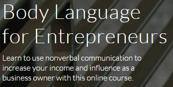
The Body Language for Entrepreneurs includes all of them at the top, with no opportunities to abandon, such as social media icons, site navigation, or search.
Offer
Your offer is the promise and pricing that this page provides a visitor. A complete offer is perhaps the most critical element of the landing page equation.
Form
The landing page should quickly make it clear that the visitor can take action to get closer to solving their problem. The form should have a way to act and an effective call to action.
The call to action should answer the question, “What will happen if I complete the form and click the button?”
Proof
Support the claims made in your value proposition with proof.

Trust
Building trust builds credibility and authority. Your logo plays a role on a landing page: a trust-building role.


Often symbols can be used to borrow trust from other entities. This is what Body Language for Entrepreneurs did.
Image
A lot of space was dedicated to red buildings in this theme.
If you’re going to slow the load speed of your landing page with a big background image, you better make it count. Designers like to use stylish backgrounds for effect. That’s fine, but not on a landing page.
Images should advance the value proposition. In the Body Language for Entrepreneurs landing page, they show the presenter. That’s relevant. Will I enjoy spending five hours with this person? Do they look credible? It’s all answered with the background image?
Furthermore, they use video, which is image at 30 frames per second. Consider video if you don’t have an effective image that explains your value proposition.
Abandon
There is only one link in the upper area of the Body Language for Entrepreneurs page. It lets the visitor see all of the 56 reviews in the Proof section.
It actually doesn’t qualify as Abandon because it opens in a popover window. The visitor never leaves the page. Very smart.
The Udemy logo is NOT linked. Very smart.
Keep the visitors you paid good money to acquire. Don’t send them elsewhere or they will be gone forever.
Does This Design Really Work?
I asked Adam Treister, Growth Marketing Manager at Udemy to tell me how he arrived at this design and how this page was performing for him.
It was no accident.
Adam documents the process in his excellent Udemy course User Experience Design: The Accelerated UX Course.
The original page looked like this:
The original Udemy landing page for ad traffic.
After several iterations using UserTesting.com, VerifyApp.com, Google Consumer Surveys, and CrazyEgg, they tested the profile photo using PickFu.com. Finally, Adam’s team did a split test using Optimizely.
How did this process work for them? They saw a 246% increase in clicks with the new page. That’s not a typo.
Why This Might Not Work on Your Landing Pages
Every audience is different. They have different goals, needs for information, and are coming on a variety of different platforms. Images and words are powerful
The best way to ensure that your landing page works is to test the components: Offer, Form, Proof, Trust, and Image.
If your landing page is generating at least 150 transactions a month, Conversion Sciences will provide the complete testing team to find the highest-converting combination. Get a complete testing team for the price of a part-time employee.
Request a consultation and we’ll let you know how to make your landing pages surprise you.

"Isn't Mobile-friendly Like Being Pregnant?" Questions about the Mobile Web
Conversion-Centered DesignElliott asked the question, “Isn’t mobile-friendly like being pregnant?” during my SEMRush webinar Mobile Test Results: What Mobile Web 2.0 Will Look Like. His point was that Google, with its Mobilegeddon update, will grade you as mobile friends or not.
I would turn that question around. “Is your mobile website Google-friendly and is it visitor-friendly?” The two are different. Basically, Elliott, your mobile website needs to be pregnant with twins.
The primary metric for a Google-friendly site is rank in search and ad placement. The primary metric for a visitor-friendly mobile site is how much money your business is making from mobile visitors.
Following are some additional questions that we didn’t have time to answer during the webinar. You can watch the webinar in its entirety right here on this page.
More Questions
You keep mentioning responsive design. I’m looking at adaptive: how will adaptive fair in the Mobile Web 2.0 world?
Shelle, we believe that it doesn’t matter as long as you can customize the mobile experience – and specifically the small-screen experience. For example, this site is built on a responsive design. It is easy for us, however, to add and remove content based on the screen size: desktop, phone or tablet.
What is the difference between “responsive” design and “adaptive” design?
We call a website “adaptive” if it changes based on the form-factor of the device viewing it. Websites that offer separate “m.domain.com” sites are adaptive. While the domain doesn’t have to change, the template that the site displays does. The desktop website and mobile website are separate sites, though they read from the same content database.
We call a website “responsive” when the mobile site is a version of the desktop site that morphs to fit smaller screens. Typically, page elements are resized, removed and restacked using CSS and JavaScript.
The litmus test for us is this: Was the mobile site designed by humans to optimize the mobile experience, or is the template making the decisions about how to present page elements? The former is adaptive, the latter is responsive.
With some work, a responsive site can be customized to be as effective as a dedicated adaptive mobile site. It’s not about the technology. It’s about the fundamental differences between the mobile offering and desktop offering.
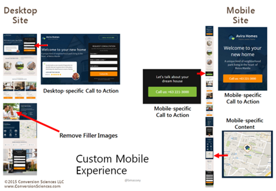
In the following graphic, we see a desktop site and a mobile site. Forms work well on the desktop, but not as well on mobile. Here click-to-call buttons have replaced the form for the mobile site.
Mobile users will more often be looking for directional information. Maps should be integrated into mobile sites where appropriate.
Mobile sites need mobile-specific calls to action and mobile-specific content.
Is Google treating [adaptive] mobile websites the same as responsive ones?
Guy’s question is difficult to answer definitively, but it appears that both approaches meet its requirement. Google’s Webmaster’s Mobile Guide actually recommends responsive designs.
We believe that if you’re serious about mobile business, you’ll put the resources behind maintaining two experiences. It appears that Google is looking at font size, button target size, and similar clues to mobile-friendliness.
Will banner ads survive on mobile?
Jan asks a good question. Only the future will tell. Banner ads, however, have followed us across all media, from print, to billboard, to web pages and now to mobile devices. How effective they will be is yet to be seen. Jan commented, “Can we nuke that stupid ‘Game of War’ pop-up?”
Mobile devices offer many more opportunities to present offers. Notifications, map interfaces and text messages come first to mind. We’ll have to see where banner ads stand against these other forms of advertising.
What about the Google Mobile Site Test? Is that the same?
Wasim, I recommend that we all do some research with Google’s Mobile-Friendly Test. Both of our responsive sites have passed this test. Try some of your competitors adaptive and responsive sites to see how they fair in Google’s eyes.
We’re Still Figuring out What Mobile Web 2.0 Will Look Like
The conclusions we’re coming to are based on tests we’ve done so far. We all have more to learn, and every website will be different. Subscribe to The Conversion Scientist Blog to learn what we’re discovering with our tests.
A Formula for Rating Lead Quality [A Dating Landing Page]
Landing Page Optimization, Lead GenerationAs a scientist, I’m obsessed with data in every aspect of my life. I calculate wait times in lines based on number of customers and speed of the checkout clerk. I check multiple spreadsheets and websites to optimize cash back rewards and airline points before purchasing anything.
So when I decided it was time to look for a lab coat that matches mine, joining an online dating site with plenty of data points was the perfect choice for me.
My Online Dating Profile: The Most Romantic of Landing Pages
An online dating profile is essentially a lead generation landing page, so it’s the perfect platform to create an optimization project that’s entertaining to read about as well as fairly practical for me: a single woman looking for a dating partner.
Before we can attract the ideal date (or customer), we need to know how to measure “ideal”. Most of our visitors won’t be the ideal. We need to have a good understanding of our base qualifications and the deal-breakers that mark a visitor as outside our target market.
One of the most difficult questions a business can answer is, “Who do I not want to focus on?” or, “Who am I willing to let go of to better serve my best prospects?” If we try to speak to everyone with our value proposition, it gets watered down so much that we don’t engage any visitors effectively.
This is essential for efficiency in time and cost of acquisition.
And I don’t want to spend hours with men that will never be a good date for me.
With this in mind, I’m putting aside the idea of a “match” in favor of looking for “leads”. However, not everyone is a good “lead” for me.
For this experiment to work I needed to be armed with a list of traits that could easily be spotted from a dating profile or early interaction, and a site with a lot of data points to examine.
I chose the free site okcupid because it has a large user base in my target market (Austin, TX) and uses both quantitative and qualitative data points which will make sussing out a qualified lead much easier.
With all this data at my fingertips, the job I have before me is to put together a rating system that will allow me to quantitatively judge what is a fairly subjective task.
But how do I do that?
The (Quite Literal) Formula for Love
For a dating landing page, I need to be able to numerically rate a lead – someone who messages me – instead of using my intuition, and I need to be able to gauge whether I’m attracting the kind of person I want to spend time with. Otherwise, I’m just congratulating myself on receiving mountains of messages with no regard to quality.
We experience the same challenges on landing pages. Our conversion rate tells us how many visitors respond to an offer, but we need another way to determine whether or not our page is engaging qualified prospects: quantity and quality.
Fortunately, my work as a data-driven analyst has prepared me for the task… I hope.
For my lead rating system, I will rate the profile based on observable evidence in his profile and initial message.
I’ve organized my rating system into three different levels:
Note: this is weighted more heavily in our formula
It all boils down to this First Date Probability formula:
P(first date) = db x (∑ti x 2∑tomg)
Deal-Breakers
The deal-breaker variable is binary. If a curious courter has even one deal-breaker trait, his First Date Probability goes to zero.
In both the dating world and the business world, deal-breakers are pretty important. They quickly eliminate prospective paramours from the running early on. Businesses, however, don’t often incorporate these all-or-nothing deal-breakers in lead scoring algorithms.
What are the deal-breakers in your online business? We all want web prospects that have a problem you can solve, and who have the money to pay for it.
Common business deal breakers include:
At my company, we really can’t do scientific optimization unless a prospect gets 200 transactions or leads from the web in a month. For us, this is a deal-breaker.
Asking about deal breakers in your lead generating landing page forms is one way to let visitors know that they are in the wrong place. They won’t waste your time and you won’t waste theirs.
Deal-breakers for me include:
I would score these with a zero if I find them in his profile.




Finding evidence of my deal-breakers is pretty easy on okcupid as these are simple questions provided in a basic profile. Either you’re a smoker, or you’re not. Here are some of my answers, totally spelled out for me – 37, non-smoker, Strictly Monogamous, Lives in Austin, Texas.
If a lurking Lothario contacts me who is prison-bound for living out the storyline of Psycho, I will say “no” to a date and consider none of the other attributes. If these items are present, the inquirer receives an appropriate rating of 0.
For our experiment, anyone who contacts me outside of this range will still be considered a lead, but they’ll just be an unqualified lead. In business, these are the folks we just can’t help. They might get a short, polite email or a referral to a more suitable business.
Important Traits (ti)
This next group of traits aren’t deal-breakers. I’m willing to make compromises here, though they’re still important.
In my formula, I will find a value for important traits (ti) by finding the sum of rated items. Some items will get a negative rating, meaning a score of one will be subtracted from the total.
You can that rating leads based on these traits isn’t going to be as straightforward as the deal-breakers, but it can still be pretty clear whether someone is stacking up well.


This snippet of standardized questions helps me get an idea of how this person feels about his religious beliefs. It’s actually a two part question answered by choosing your answer from a drop down menu. Part one is choosing the religion, and part two is where you choose the degree to which you follow the religion.
This question is open-ended, but this guy still managed to cover one of my important traits and also a critically important trait by mentioning his dog.
It won’t always be easy to assign a value, however. Sometimes I’m going to have to look at the profile as a whole to make a decision. This next profile gave me some mixed messages.
When you answer standardized questions on okcupid, it will use your answers to rank you among other users of the site. In the bar graph above, the midline represents the average okcupid user, so this person is much less into exercise than the average person.
But he has also indicated that he rides his bike often in his response to an open-ended question. Since I’m looking for someone who lives a healthy lifestyle, maybe not exercising is ok. It could mean that he just really hates going to the gym, but he loves being an active person.
Critically Important Traits (tomg)
If this person contacted me, he would be a strong lead based on this small part of his profile. Humor? Check. Career oriented? Check! Education? Check. There are many personality traits I’m looking for that I didn’t include in my rating system because I wasn’t sure I’d be able to find solid evidence without meeting in person, but this guy is also demonstrating some strong elements of the Type A personality I really like.
Deciding whether someone is negative or pessimistic will be another item that requires looking at the big picture. It’s one of those “know it when you see it” traits, but strong indicators are lists of unacceptable attributes in another person and making repeated comments about how past relationships have ended poorly.
Scoring Qualified Leads
So now what? We have a bunch of leads that aren’t obvious mismatches. How do we determine which ones to spend our time and energy on? Who will have the highest ROI?
For our experiment we’ll count a lead as anyone that initiates contact. We’ll then rank our leads based on the following system:
Qualified lead: Scores a one on all deal-breakers (meaning there aren’t any deal-breakers I could find)
These are the profiles I’ll take time to look at and see if they’re worth spending time on.
Ideal candidate: Scores zero on all negative ratings and ones across the board other than that. We can skip the screening portion and start lobbying hardcore.
Candidate Level 1: Scores in the top third of my formula.
I will devote time and energy talking to this person and getting to know him with an emphasis on setting up an in-person meeting sooner rather than later.
Candidate Level 2: Scores in the middle third of my formula.
I will respond to his message and ask leading questions. He may have other qualifications that are not on the list that appeal to me, so he might be worth an in-person meeting.
Candidate Level 3: Scores in the bottom third of my formula.
These are the leads that are worth talking to if times are lean. If lead flow is up, and we’re swimming in qualified leads, these will fall to the bottom of the pile. We’ll get to them if we have the time and resources to do so.
21 Quick and Easy CRO Copywriting Hacks
Keep these proven copywriting hacks in mind to make your copy convert.
"*" indicates required fields
Case Study
To see how well my equation works on a real person, I’m putting it to the test. The screenshots below are from a single profile. He hasn’t messaged me, so he doesn’t count as a lead for my experiment, but he should be good practice for my rating system.
I’ve started with profile basics looking for deal breakers.
Deal-Breaker Traits
He’s off to a good start, so now I’m moving on to look for important traits. Some of them popped up in his profile basics.
Important Traits
He’s agnostic, and I’m Episcopalian. We might be able to make it work, however, which is why this trait isn’t a deal breaker.
He describes himself as fit in his profile basics which made me think he probably leads a pretty healthy lifestyle, but this paragraph made me certain.
He also has a tone here that seems humorous when he says he runs for his own “feel goods”. I wanted to give him a score of one based on that line, but it seemed like it would be based on fairly thin evidence. His self-summary gave me more data to make me think a score of one is appropriate.
I looked for responses to questions about art, photos that could be in a museum, mentions of favorite artists, but I didn’t see anything artistic.
He didn’t nail all of my Important Traits in his profile, but I still found evidence of most of them. Now for Critically Important Traits.
Critically Important Traits
I found his age and pet ownership status in his profile basics.
Of course I can’t prove the null hypothesis with negativity since I’m trying to figure out whether he isn’t a positive person, so it’s possible that he’s a pessimist. That’s what makes this trait one of the more difficult ones to score – but there wasn’t enough evidence to give him anything other than a zero.

If he wants to spend Friday night talking about business ideas, I can say with confidence that he’s a career oriented person. Takeout, movies, and TV shows all sound like a solid night in to me.
Now I can plug in some numbers into my formula.
P(first date) = db x (∑ti x 2∑tomg)
db = 1
∑ti = 3
∑tomg = 4
P(first date) = 1 x (3 x 2(4))
P(first date) = 24
He is a candidate level one using my criteria. Let’s hope he sends me a message!
Attracting Ideal Qualified Leads
It may turn out that people aren’t up front about something I thought they would be or that a particular flaw that bugs me turns out to be so common that I would be remiss to keep paying attention to it. So I may need to make adjustments here and there in my description of an ideal lead.
The process of creating my rating system, however frustrating, was a good experience because knowing what I’m looking for is half the battle. I now know what I’m aiming for in my profile/landing page, and I can share things about myself more strategically. I won’t be lying on my dating profile, so when I say I’m being strategic, I’m not changing who I am to meet someone – I’m simply emphasizing certain things about myself and not mentioning other things.
Best foot forward, right? Your landing pages should do the same. If you’re a family-oriented small business, but your ideal lead isn’t, why share that information? It’s still important, of course, but it’s ok to withhold information that doesn’t get right to the point.
Now you know quite a lot about what I’m looking for, but you know relatively little about me personally. To find out more, you know what to do: subscribe to my series! You know you want to…
What 80% of Ecommerce Shoppers Want From Your Site [INFOGRAPHIC]
Ecommerce CROWhat are online shoppers looking for? No matter what you’re selling, knowing the answer to this question is the first step to figuring out how to give them what they want.
Though 50% of the people in a survey said they wanted more shipping options, our tests have shown that too many choices reduces sales.The Conversion Scientists here spend their time testing ecommerce sites, and they know that the recommendations in this infographic can work for your online store. But not always.
For example, you should be careful about offering more shipping options.
Online shopping is constantly growing, and now over two thirds of consumers shop online at least once a month. A whopping 0% never shop online, that is, 0% of people who respond to shopping surveys. Don’t you love statistics?
Numbers like that are pretty solid motivation to figure out exactly what’s going to make a person press the buy button, and an illuminating infographic sharing tips and trends for eStores is a great place to start.
It probably comes as no surprise that offering free shipping helps nudge people into spending money, but it may be surprising just how much it matters. For 80% of online shoppers, free shipping makes them more likely to buy something. More than three fourths of online shoppers will add items to their shopping cart if it means not paying for shipping.
With the US spending billions of dollars in ecommerce, how much money are you losing by not offering free shipping?
Customers are also much more likely to convert if they know they can easily return an item they no longer want.
This is another factoid with a catch. You must state your “shipping both ways” return policy such that the visitors see and understand it. This usually takes some testing of language and placement. Too many ecommerce sites have an amazing return policy that is invisible to their shoppers.
Of online shoppers, at least half of them will use their smartphone or tablet to make purchases over the course of three months. Having a mobile strategy is crucial to serving those potential customers, especially since many of them won’t do any comparison shopping if they’re using an app to shop.
Will any of these ideas work on your ecommerce site?
Feature Image Photo Credit: Fosforix via Compfight cc
Conversion Rate Optimization is Good for a Laugh with Joanna Wiebe and Brian Massey [WEBINAR]
Conversion-Centered DesignWhy are these conversion rate optimization experts laughing?
At first, the questions sounded pretty serious: “How often should you be emailing your customers?” “What’s the best wording for a CTA (call to action)?” “What should every conversion rate optimization team include?”
Brian Massey and Joanna Wiebe of Copyhackers teamed up to answer questions like these in their off-kilter but on-track Ask Me Anything About CRO webinar. If you didn’t get to watch the original broadcast, then don’t worry. This was too much fun not to share here.
These conversion optimization experts are having too much fun.
Who’s on their CRO Dream Team?
Brian says,
“A CRO Dream Team includes a data scientist, a front-end developer, and a designer who won’t get all creative-y” and will just design what you’re looking for. It doesn’t hurt to have an investor paying the bills either. Joanna’s team also includes a traffic guru, analytics guru, UX pro, copywriter, and a conversion director.CRO tips for email marketing.
Bottom line: send more emails. One of the biggest problems that Brian has seen is that companies simply aren’t sending enough of them.
If you’re worried about spamming your subscribers, dial up the value on what you’re sending them. You will be training your customers that your emails are worth opening, so no matter how often they see something from you in their inbox, it will be worth reading.What should a CTA say to increase clicks?
It turns out, the magic word for a successful CTA is “get”, as in “Get a free quote”. Visitors to your site are trying to accomplishing something, and the wording on a CTA should be telling them how to do it. Using first person on a CTA button also does well – as in “I want to…”. Make sure you tie the wording into the headline on your page so that your messages match.
Watch the Recorded Webinar
For answers to more questions – like how many product options you should include on your page, how to show trustworthiness on a landing page, and how to make sense of heat mapping data – and some landing page critiques, watch the recorded webinar above.
Turn an Image into a Landing Page Power Up
Landing Page OptimizationOli Gardner will make you blush when he rips your landing page copy from its safe HTML home and shows you what it says as a plain text file.
I got to thinking, what if we just pulled the images from your website? Would they be able to tell the story of your value proposition?
The Role of Images on a Web Page
Too many designers see images as a way to break up the copy on a web page. They use filler images, stock photos and silly graphs that have no meaning.
Images are a powerful way to convey your value proposition – the reason that a visitor should consider your offer. This is true for landing pages as well as your home page.
The impact on a landing page can be extreme.
Images draw the eye. When your visitors first arrive, these are the elements that get seen first as they scan the page. Images can immediately ask the first question your prospects have, “Am I in the right place to get what I’m looking for?”
Images should compliment, support and enhance the copy on the page. Any image that doesn’t move the value prop forward is hindering it.
Pull the images from your page and take a look.
The Image-only Version of Your Landing Page
If you were to pull just the images from your site, would they tell your story? Here are the images from a site offering information on annuities.
What does your landing page say in pictures?
It starts off great. The main image has a stock model representing the target audience.
Adding text to an image makes it relevant to your message.
Adding text to an image is a simple way to give it power. Furthermore, the model is looking at the information you want them to read. If a model is staring at the visitor, the visitor tends to focus more on the face, and less on the messages on the page.
This is essentially an in-image caption.
Captions Get Read
One of the most read portions of your landing pages is the caption. Unfortunately, most pages don’t use captions. Captions explain the image in more detail, moving the value proposition forward for the reader.
Captions are a great place to repeat the offer on the page.The Caption Test
The best way to test to see if your captions are helpful is to ask a stranger to write a caption for it. How would our annuity page fare?
Graphics without meaningful information don’t move your value proposition forward for the reader.
Caption Test: “Get complex information about something.”
The heading for the copy next to this is, “What are the fees associated with an annuity?” This should be repeated as the caption.
The remaining images don’t do so well.
Is this a happy customer? An employee? We can tell the difference between a model and a real person.
Caption Test: “I will meet attractive older men. Sooo handsome.”
The copy headline next to this image reads, “What if I need access to the principal in my annuity?” The answer may have made this handsome man smile, but the image really doesn’t support the point. This would not work as a caption.
Another lost opportunity to communicate something valuable.
Caption Test: “Time is running out for you and your little dog too!”
What are your images bringing to mind in your reader’s mind?
The copy next to this image reads, “How long will I be able to receive income from my annuity?” This would work as a caption. But with the power that an image has for conveying a message, I think this page could do much better.
Images that Work
In general, your images should strive for the following characteristics.
Use real people when possible: employees, clients and spokespeople are great choices.
Use real employees, customers or spokespeople in your images. This one needs a caption.
Use text on the image and as a caption to advance your value proposition.
Don’t be afraid to repeat offers in captions and on-image text.
This image makes great use of in-image text and an offer in the caption.
Design images that support the copy on the page.
This image uses in-image messaging that supports the copy on the page.
Direct the gaze of people in images to offers, forms or other important parts of the page.
This model is looking at the form, the most important part of this landing page.
For software products, choose screen shots that don’t make your product look intimidating.
Screen shots should focus on key features of your software offering.
Spend as Much Time on Your Images as Your Copy
Utlimately, if you spend as much time on your images as you do your copy, you will find creative ways to power conversions on your landing pages, home pages… all pages.
Images courtesy ICIMS, Expert Market and TheStreet.com.
Best Practices are Killing Your Mobile Conversion Rates
Conversion OptimizationThe BestPracticlopse may be eating your mobile conversion rates.
Brian Massey and Joel Harvey have been making waves at conferences from Portland to Boston. Their presentations have been killing some of the sacred cows of mobile website design.
Joel will be at it again this week in Las Vegas at Conversion Conference.
Joel’s presentation on Mobile Design Essentials is going to be controversial, and how you treat mobile visitors is going to change as a result of what he has to say.
The data is there to support some of their controversial positions.
You don’t really have just one mobile website. You have ten or twenty or thirty. Each operating system, browser and screen size generates a different interpretation of your site.
Joel Harvey makes the point that if your site is broken, your visitors’ phone is broken.
Joel was rated a top speaker at Conversion Conference in 2014. Join his session on Thursday May 14 at 10:30am and for a fun and enlightening presentation.
The Ultimate Question for Website Optimization
Conversion-Centered DesignWhat would happen if you suddenly pulled the plug on your website optimization efforts? The question behind the question is, “How much has website optimization contributed to our online sales?”
We all know that the results we see in our tests don’t reflect reality when rolled out to the website. So, how much faith should we put into test results?
My Marketing Land column The Nagging Little Question Of Conversion Optimization I explore all of the things that make our actual results different from that predicted by testing.
And I tell you what happened to one company when they removed the months of optimized changes from their site.
Subscribe to Podcast
The Massey Observer Effect states that,
This means that what our tests tell us are going to be somewhat inaccurate. This is just one reason that the results of our tests won’t be seen when rolled out onto the website.
You’ll learn how to overcome several sources of error in our tests.
I go into detail on each of these, explaining why these issues is important and how to overcome them when doing website optimization for leads and sales.
Photo © 2015 Third Door Media, Inc. All rights reserved.
This Website Redesign Got 250% More Leads Before it Was Finished
Conversion-Centered Design, Lead GenerationWe recently began the split-testing process for a B2B eCommerce company. This is only remarkable because we signed this deal over a year ago. What happened to delay testing so long?
A website redesign.
The four-month redesign turned into a six month redesign and then into a 14-month redesign. This is not unusual in our experience. The new design has launched and, after all this time, the conversion rate and revenue per visit remained about the same.
We see this as good news. Too often, redesigns actually decrease site performance for a period after launch. There are storied website redesign disasters, such as FinishLine and Marks&Spencer.
Nonetheless, the conversion optimization testing was delayed. They can never recover the revenue or the lost testing time. Let’s see then how this website redesign got 250% more leads before it was finished. Step by step.
How to Make More Money During Your Website Redesign
Conversion Scientists look at websites quite differently. You may see a valuable online revenue engine. We see a laboratory for growing sales in petri dishes, and then scaling that to business-changing proportions.
When Wasp Barcode came to us, our vision fell on the ears of a brave and daring team. The approach allowed them to grow the number of live demos by more than 200% in just a few months.
Download and Read the entire case study: This Website Redesign Got 250% More Leads Before it Was Finished-Wasp Barcode
Then, we went to work in a very unusual way.
Wasp Barcode sells inventory and asset tracking solutions. Their most profitable offering is a complete inventory- or asset-management system that may include software, scanners, and labelers for the things businesses need to track. The most effective way to help their prospects choose the right system is with a live demo. During this demo, a sales person will walk the visitor through their software and answer any questions they have.
We did a stepwise redesign, in which all of the assumptions about the new design were tested to ensure that they had a positive or at least neutral impact on demos. Our approach was this:
Step One: Test Things that Can Be Used in the Website Redesign
Our first step was to find the calls to action that would move more visitors to request a demo. This was a series of tests to find out what language should be placed on buttons. For example, we learned that language offering “Free Live Demo” or “Free Consultation” generated more clicks to the demo landing page and more completed demos.
Step Two: Test the New Page Design on a Portion of the Site
Their design team integrated what we learned into a redesign for one of the site’s product category pages. We tested this new design against the existing category page, the control.
Our tests showed that the new design did a great job of getting more visitors to the Demo Request page. By driving more visitors to this page, we had more resources to test lower in the funnel.
Step Three: Optimize the Demo Landing Page
We then went to work on the Demo Request Page, a page on which the prospect can complete a form requesting a Live Demo.
Our tests here revealed that removing video and adding a product shot increased form completions significantly.
This key landing page went through several tested iterations to reach a high-converting design.
The redesign was just getting started, and we had already begun generating significantly more demo requests for the business.
Step Four: Move to Another Section of the Site and Repeat
The Wasp design team designed another category page for the next section of the site. They integrated elements that visitors were clicking on frequently, such as feature lists.
While the visitors in this section of the site behaved somewhat differently, we saw a positive lift in visits to the Demo Request page. This page was optimized, and delivered more demo requests to the sales team.
The step-by-step Wasp Barcode website redesign sped up.
The Wasp design team then took what we had learned and redesigned the home page. This drove a significant increase in visits to the high-converting Demo Request page.
250% Increase in Demos over Six Months
Most website redesigns would still be sitting on a staging server. Wasp has enjoyed significant increases in demos during their first six months. Together, we rolled their redesign out step by step, testing along the way to ensure each change had a positive or neutral impact.
Breaking the Rules of Website Redesign
During our stepwise rollout, we violated this rule. But when we have completed the process, providing this consistent experience, we can expect another increase in demos.
This approach also allowed us to change the design for different sections of the site. Those visitors looking for Inventory Management solutions are fundamentally different from those looking at Asset Management tools. One design would not have worked well for both.
Not everything we tried increased the conversion rate, and the Wasp team made adjustments accordingly.
Let Us Guide Your Site Redesign
21 Quick and Easy CRO Copywriting Hacks
Keep these proven copywriting hacks in mind to make your copy convert.
"*" indicates required fields
Why Conversion Optimizers Should Think Like a Marine
Conversion OptimizationEvery Marine goes through two weeks of basic marksmanship training. Before they fire a single live round, they spend an entire week sitting in the grass, aiming at a white drum and squeezing the trigger until they hear the metallic “click” of the firing pin.
Marines re-learn how to breathe, sit, stand, kneel and squeeze – basics that each of us learned as infants. But to be a great marksman, you have to do them with more focus and intention. Mastering fundamentals and having the discipline and mindset to apply the techniques is what leads to excellence.During this week of “dry fire,”
Have you ever spent a lot of money on a website and had disappointing results? Did it fail to “accomplish its mission?” You probably had the right technology, the right server and a beautiful design.
But as the Marine Corps recognizes, what matters most is not the best rifle, but the right rifleman. Accomplishing your mission isn’t about having the prettiest website in the world, but about having a disciplined conversion optimizer with the right mindset applying proven techniques that lead to excellence.
The Marines are notorious for training excellent marksmen. They taught me how to shoot when I was 18. Almost 25 years later, I picked up an AR-15 and placed every round in the bulls-eye after my initial calibration shots. The discipline, techniques and mindset overcame 25 years of dormancy. Who is driving your website design? Do they have the discipline, techniques and mindset to deliver targeted, accurate changes? Or are they firing randomly into the wind like a Hollywood movie?
Marksmanship Training for Marine Recruits
Proper Fundamentals Change Outcomes
“Although equipped with the best rifle in the world, a unit with poorly trained riflemen cannot be depended upon to accomplish its mission. . . On the other hand, a well trained rifleman has confidence and can usually deliver accurate fire under the most adverse battle conditions. It is the latter who can best contribute to mission accomplishment.” – U.S. Marine Corps Rifle Marksmanship Manual
Patience Before You Fire
One of the challenges that faces online marketers is patience. As we work with our clients throughout a discovery process, their eyes light up as new revelations come into focus. Once a company has decided they want to invest in conversion optimization, they want to change everything and change it instantly.
The slow, well-aimed shot is essential both to conserve resources and to be effective. Our focus is on having the discipline that leads to mission accomplishment.We understand that excitement. But this is where you want to spend more time aiming than shooting. Isn’t that a paradox? In preparing Marines for a fast and chaotic environment, they continually teach the virtue of slow, well-aimed shots.
Managing Resources
The value of slow, well-aimed shots becomes clearer when you understand the math behind the situation. The M16 has an effective firing rate of 850-1000 rounds per minute. If you are firing rapidly (Hollywood style), you need to carry around 30 pounds of ammunition for every minute of rapid fire. As you can see, that load of ammunition quickly overburdens the rifleman trying to carry it, especially considering that most of those rounds don’t hit their intended targets.
The same is true for your businesses. Rapid firing changes to a website consumes enormous resources. With a majority of resources diverted to these scattershot changes, the essential business mission is in jeopardy. A seasoned conversion optimizer won’t rush a bunch of changes, but instead will take slow, well-aimed shots to maximize the impact.
Using Data to Improve Accuracy
A seasoned conversion optimizer will take the time to understand your customers, dig through your analytics, study user behavior and formulate the best strategy to hit your targets.
For example, once we form an initial hypothesis, we start working on a “B” version of the web page to test against the “A” version. Before sending the page live, we perform additional user testing on a number of metrics. One test we run, the “5-second test,” helps measure the clarity of a page among other things. More than once, we have caught issues that would have been detrimental and were able to address them before sending the page live.
All of these steps take time. But it makes sense to be patient if you want to see meaningful, revenue-generating changes on your website. Look for conversion optimizers who work like Marine rifle experts and take the slow, well-aimed shots. These are the people who will help you accomplish your mission.
About the Author
Craig Andrews is the Principal Ally and founder of internet marketing agency allies4me. He has over 25 years of experience in search engine optimization, internet marketing software, and social media strategies.
You can connect with Craig Andrews on Google+ and LinkedIn. You can find allies4me on LinkedIn, Google+, Facebook, and Twitter.