"Isn't Mobile-friendly Like Being Pregnant?" Questions about the Mobile Web
Elliott asked the question, “Isn’t mobile-friendly like being pregnant?” during my SEMRush webinar Mobile Test Results: What Mobile Web 2.0 Will Look Like. His point was that Google, with its Mobilegeddon update, will grade you as mobile friends or not.
I would turn that question around. “Is your mobile website Google-friendly and is it visitor-friendly?” The two are different. Basically, Elliott, your mobile website needs to be pregnant with twins.
The primary metric for a Google-friendly site is rank in search and ad placement. The primary metric for a visitor-friendly mobile site is how much money your business is making from mobile visitors.
Following are some additional questions that we didn’t have time to answer during the webinar. You can watch the webinar in its entirety right here on this page.
More Questions
You keep mentioning responsive design. I’m looking at adaptive: how will adaptive fair in the Mobile Web 2.0 world?
Shelle, we believe that it doesn’t matter as long as you can customize the mobile experience – and specifically the small-screen experience. For example, this site is built on a responsive design. It is easy for us, however, to add and remove content based on the screen size: desktop, phone or tablet.
What is the difference between “responsive” design and “adaptive” design?
We call a website “adaptive” if it changes based on the form-factor of the device viewing it. Websites that offer separate “m.domain.com” sites are adaptive. While the domain doesn’t have to change, the template that the site displays does. The desktop website and mobile website are separate sites, though they read from the same content database.
We call a website “responsive” when the mobile site is a version of the desktop site that morphs to fit smaller screens. Typically, page elements are resized, removed and restacked using CSS and JavaScript.
The litmus test for us is this: Was the mobile site designed by humans to optimize the mobile experience, or is the template making the decisions about how to present page elements? The former is adaptive, the latter is responsive.
With some work, a responsive site can be customized to be as effective as a dedicated adaptive mobile site. It’s not about the technology. It’s about the fundamental differences between the mobile offering and desktop offering.
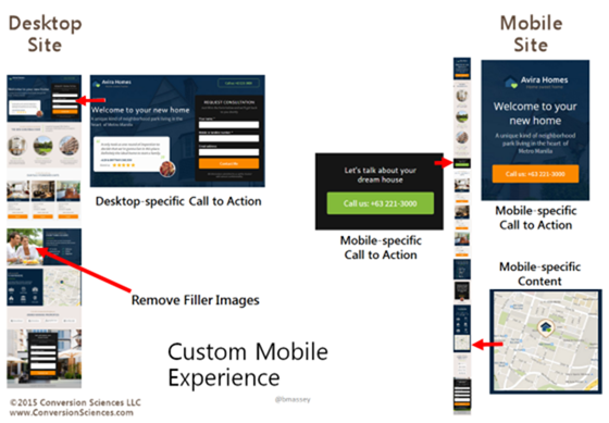
In the following graphic, we see a desktop site and a mobile site. Forms work well on the desktop, but not as well on mobile. Here click-to-call buttons have replaced the form for the mobile site.
Mobile users will more often be looking for directional information. Maps should be integrated into mobile sites where appropriate.

Mobile sites need mobile-specific calls to action and mobile-specific content.
Is Google treating [adaptive] mobile websites the same as responsive ones?
Guy’s question is difficult to answer definitively, but it appears that both approaches meet its requirement. Google’s Webmaster’s Mobile Guide actually recommends responsive designs.
One of the benefits of RWD is that you’ll only need to maintain one version of your site instead of two (i.e., you won’t need to maintain the desktop site at www.example.com and the mobile version at m.example.com
We believe that if you’re serious about mobile business, you’ll put the resources behind maintaining two experiences. It appears that Google is looking at font size, button target size, and similar clues to mobile-friendliness.
Will banner ads survive on mobile?
Jan asks a good question. Only the future will tell. Banner ads, however, have followed us across all media, from print, to billboard, to web pages and now to mobile devices. How effective they will be is yet to be seen. Jan commented, “Can we nuke that stupid ‘Game of War’ pop-up?”
Mobile devices offer many more opportunities to present offers. Notifications, map interfaces and text messages come first to mind. We’ll have to see where banner ads stand against these other forms of advertising.
What about the Google Mobile Site Test? Is that the same?
Wasim, I recommend that we all do some research with Google’s Mobile-Friendly Test. Both of our responsive sites have passed this test. Try some of your competitors adaptive and responsive sites to see how they fair in Google’s eyes.
We’re Still Figuring out What Mobile Web 2.0 Will Look Like
The conclusions we’re coming to are based on tests we’ve done so far. We all have more to learn, and every website will be different. Subscribe to The Conversion Scientist Blog to learn what we’re discovering with our tests.


Hi Brian, thanks for the informative posts & webinar. The topic of mobile responsive/adaptive is a burning one, and I’m enjoying your recent write ups and talks about it. So much so I went ahead and wrote about it myself, mentioning your appreciated opinion: http://www.pagewiz.com/blog/conversion-rate-optimization/mobile-landing-page
Thanks!
Thanks, Kobe. Great article.