Responsive, Adaptive, & Mobile Optimized Websites: The Make or Break Differences
So you just read an article on how your website needs to be mobile responsive. That makes sense. More people are using their phones these days than ever before. It would be wise to have a site that adjusts to a mobile user’s needs.
But then you stumble across a new headline, this one talking about the need for a separate “mobile optimized” website. Is that the same thing as responsive?
Now there’s a new article talking about “adaptive” sites, and another one demanding you use “dynamic” web design to reach mobile users.
SO. MANY. TERMS.
Why web-design people? Why?
Each of these terms describes a method for delivering your website content to mobile users. Today, we are going to break down the differences between each one, so you can finally understand what’s going on the next time you talk with your website designer.
Before we begin, if you aren’t convinced that mobile design matters, check out this article on Why You Can’t Ignore Mobile Traffic.
The Different Types Of Mobile Website Development
While mobile web development is an ever-expanding field, there are three common classifications you are likely to come across.
- Responsive Design
- Adaptive Design (aka Dynamic Serving)
- Separate, Mobile-Optimized Design
Each of these are different, but it’s likely you will hear them being used interchangeably at times, which can add to the confusion.
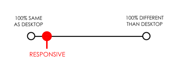
To simplify things and provide a visual baseline, I’ve created the following spectrum:

This spectrum helps us understand the method we’re using to deliver website content to users.
Each end of the spectrum represents an extreme. On the far left, we have the exact same site delivered to users on every device. In other words, there is no mobile site developed at all.
On the far right, we have a completely different site being delivered to mobile users with no crossover.
Each of the web development methods we’ll discuss fall within this spectrum.
1. Responsive Web Design

Responsive web design delivers a comparatively similar experience to a desktop experience.
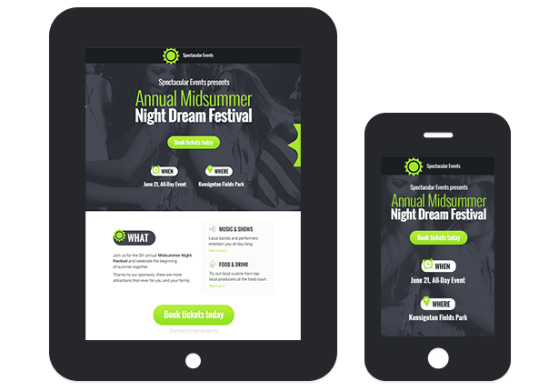
Responsive web design delivers the exact same website across every device, with the ONLY difference being layout.
Responsive design uses “fluid grids” to adjust site content to any possible screen size, allowing for an optimal viewing experience regardless of the device been used. This is particularly useful in a world where new devices with new screen sizes are created every other day.

Whether the site is being viewed on a tablet, smartphone, or desktop, all the elements are the same with responsive web design.
Responsive web design keeps all the elements of your site the same on every device.
- Same headlines
- Same copywriting
- Same CTAs
- Same everything
The only difference is that the layout adjusts for easier mobile consumption, typically arranging everything for quick, up-and-down scroll navigation. So instead of users having to scroll from left to right to see an image or repeatedly zoom in and out, the site images and elements automatically resize and rearrange to intuitively fit the screen being used.
Responsive design rearranges the exact same website for optimal viewing on any device.
On the plus side, responsive sites are cheap to build, easy to maintain and work for any screen size. You make one website and it works for every device. They are also great for SEO as there is no content overlap.
On the downside, responsive sites do not offer a fully mobile-optimized experience, as you are still offering essentially the same content to mobile users. When over half of your web traffic is probably coming via mobile device, this can mean you are leaving tons of mobile conversions on the table.
2. Adaptive Web Design (aka Dynamic Serving)

Adaptive web design does not necessarily deliver the exact same content to desktop and mobile users
While responsive web design delivers essentially the same website to all users, adaptive design, also know as “Dynamic serving”, delivers separate content to users based on their device.
For example, an adaptive designer might create three different designs, each with customized HTML & CSS, for desktop, tablet, and smartphone users. If a desktop user, smartphone user and tablet user were to browse the website, they would all see something fundamentally different while being on the same URL.
These separate designs can be 100% different or simply 10% different. The point is that separate HTML & CSS are being “served” to each device, allowing you to deliver a customized experience.
As you can see in the above image, the desktop, tablet, and smartphone displays all have fundamentally different content. Since they all have the same URL, we say this is an adaptive design.
Unlike responsive design, adaptive doesn’t use fluid grids to deliver flexible content across any device. Instead, it manually creates separate layouts for predefined screen sizes and displays the appropriate selection.
If the three categories of devices had standard sizes, this would be great, but as you can see…

Designing for every device is very difficult.
There are more devices out there than you could ever design for, and this can put adaptive designers at a disadvantage. For devices you don’t design for, the experience won’t be optimal.
Here’s a fantastic gif from CSS-Tricks that illustrates the difference between experiencing a responsive vs adaptive design as you change screen sizes. Responsive is on top and adaptive on the bottom.

Responsive design is demonstrated first, adaptive web design second.
Adaptive design delivers a separate experience to predefined devices via the same URL.
On the plus side, adaptive design keeps everyone on the same URL while allowing you to provide a targeted, optimized experience to mobile users.
On the downside, dynamic design is technically complex and can be more expensive, as you are essentially designing a separate site for each device.
3. Designing a Separate, Mobile-Optimized Site

Mobile optimized sites deliver a very different experience than desktop.
While the term “mobile optimized” can mean a variety of things, when it’s time to design your mobile website, creating a mobile optimized site implies creating a separate, distinct website for your mobile users.
Unlike dynamic serving, this won’t take place via the same URL. Instead, it is most frequently accomplished via a subdomain, such as m.rootdomain.com or something similar.
By rerouting mobile users to a separate website, you can completely control their mobile experience. And as we’ve learned from past discussions on mobile CRO, if you aren’t creating a mobile-centric experience, you won’t reach mobile viewers effectively.

Mobile users, and particularly smartphone users, behave very differently than desktop users.
Having a separate, mobile-optimized site can allow you to better reach a mobile audience.
Mobile optimized design delivers a separate experience to mobile users via a different URL.
As an additional upside, Google recognizes mobile-specific subdomains as being mobile-friendly and factors that favorably into its search results. In other words, it can have a positive impact on your SEO results.
You’ll want to be careful. If you forget to add the appropriate “canonical” tags, you can actually hurt your SEO results, as the search engines will penalize the mobile site as duplicate content. Many designers don’t think about marketing or SEO in their designs (this is exactly why I began offering design to my copywriting clients), so be sure to inquire about this while vetting a potential designer.
Conclusion
I hope this has helped you gain a better understanding of web design and better equipped you to work with designers in the future.
Before we finish, it’s important to understand that many people use the terms we’ve mentioned here incorrectly.
Google treats “adaptive” and “responsive” interchangeably in its search results and many non-designers or sudo-designers with a cursory understanding will often use “adaptive” when they are discussing a responsive design. I myself mixed these terms up regularly until I got fed up with the poor-converting designs my copywriting clients were dealing with, and invested in creating a design solution for them.
“Mobile optimized” is not a term limited to the design world, so be sure to clarify that you are meaning a separate, URL-distinct mobile website when working with a designer.
Photo Credits
- Responsive web design by GetResponse
- Adaptive web design by Inflexion
- Devices by Jeremy Keith
- Smartphone stats by NextFly
- AB Testing Research: Do Your Conversion Homework - December 8, 2018
- 8 Elements of a High Converting Squeeze Page - June 21, 2018
- 10 Conversion Lessons For Online Retail from Amazon - November 29, 2017


As we wrap up another year of web design it’s important to slow down and take a look at what trends will stick around. keep it up
Good article written. I got clear understanding of Responsive vs Adaptive Design.