infographics

There is a lot of ugly in this infograph, ugly truths about conversion killers.
What is it that is keeping your visitors from converting into buyers? Why are your shopping carts empty and left circling  in the wind?
You might be shocked at some of the statistics that CWCS discovered while creating their awesome infograph.
Did you know?

  • 57% of customers will abandoned your website if it takes more than 3 seconds to load. Let’s face it, people are bound and determined to eventually run their lives at the speed of light. 3 seconds might as well be 22 minutes.
  • 26% of your visitors will leave your site if they are being forced to register. Surprised? For as public and outgoing as the world is (selfies, check-ins, and so on), people still do not like to share personal information with complete strangers  – until their trust is earned.

For more incredibly insightful information and useful stats, please enjoy this killer infograph by CWCS.

Conversion Killers – Is your Website Losing you Money? – An infographic by the team at CWCS

Conversion Killers – Is your Website Losing you Money?


The conversion rate for your site is the number of conversions divided by visitors. Quality traffic is half of the equation (the bottom half). No matter how well optimized a site is, if the traffic isn’t qualified, conversion rates will fail. Small changes in your conversion rate can mean big changes in your revenue.
For more information, check out “How to Budget for Conversion Rate Optimization” and then Give the calculator a try.


George Washington. Abraham Lincoln. Ulysses S. Grant. Alexander Hamilton. Benjamin Franklin. Andrew Jackson.

We know their names. We know what they have done for the United States of America. Some were great Presidents who led the United States through epic battles, others broke through the barriers of segregation. One was the very first US Secretary of the Treasury. One even invented swim fins, the lightning rod, musical instruments, and bifocals; and that is just barely scratching the surface.

BUT did you know that ALL of them can help us with our money marketing math?

Which of these things are you looking at every month (or more often):

  • Are you just getting some George Washington discipline or are you asking segmenting questions that bring the Benjamins?
  • Have you calculated your conversion rate and determined its value?
  • Have you looked at the bad news of abandonment rate?
  • Are you looking at your Revenue Per Visit (RPV) and what it can do for you?

Your success depends on making high-dollar  decisions.  Benjamin Franklin also invented the concept of “paying it forward” and the President’s (and others) are here to do just that. Take a look at this infograph and ask yourself where you are in your Math Marketing Journey?

President's Money Marketing Math Infograph

For more information, please read President’s Day Marketing Money Math.

Is your landing page converting? Is it converting well? Do you know why? Do you know why not?

You can get wrapped around the axel, obsessing over the all of the things we recommend here at Conversion Sciences. Is this the right font? Is the color theme too loud, not loud enough? Too many options? Not enough options? What is with this border?

After countless hours, you finally hit publish. And you wait. And you continue to wait. You leave your analytics dashboard open, hitting refresh every minute, sometimes more, to get updates in real time.  You start to get frustrated as you notice that traffic is landing on your page, but no one is taking action. Why is no one taking action?

The bottom line is this: A landing page keeps a promise and entices visitors to take action.
We’re trying to get a reaction from our visitors with a landing page.

As scientists, we study reactions using our Periodic Table of Website Optimization Elements. We understand the science behind landing page optimization. Just like in chemistry, we first learn how components combine to form new elements. Once we understand these basic reactions, we are ready to create a landing page that:

  • Makes an offer.
  • Provides a form.
  • Delivers tangible proof.
  • Earns your visitors trust.
  • Shows relevant images.

Warning: These compounds are highly reactive and can be dangerous.

Here are the steps you can take to create a controlled Landing Page reaction in your digital laboratory.
The Chemistry of a Successful Landing Page Infographic

Please include attribution to our website with this graphic.

Champagne Fountain Your presentation will set off a cascade of content.

It was a few paragraphs from my book in a Chapter entitled “How Content Fuels Conversion.”

It started off pretty well, but it ended in a lie.

Amid my discussions of video and images; of draftsmen and imagemakers and storytellers appeared a few lines. They’re there on page 92.

Digital content has legs. One item of content can be cascaded into a variety of channels like a fountain of champagne glasses at a wedding.

For example, how many opportunities do your employees get to present at conferences, training sessions, seminars, and webinars? Film them and record good quality audio. This bubbly content fills the top glass of your cascade.

Have someone edit the video into a series of shorter videos, ripe for YouTube and other video services. You’ve just filled the next layer of glasses.

Share the slides used on slide-sharing services such as Slideshare and Scribd. Voila—another, wider layer glasses fills  with sparkling champagne.

For just a few dollars, the video can be transcribed. Lay this out as a report or white paper and distribute it for lead generation. Another layer of glasses fills.

I go on to describe how this transcription turns into blog posts, social media posts and more. I then go on to tell the lie.

The transformations discussed in this example are often not time-intensive.

The truth is, that they are not as time-intensive as creating the content from scratch. But these transformations do take time.

My idea has been stolen

Since the publication of the book, I’ve tried to get someone to steal my idea so that I would have a resource to turn to. I’ve had conversations with a number of agencies and freelancers about why content is like champagne. Businesses are creating the champagne every day. They just need glasses, stacked just so to turn it their content into an online party.

Dust off one of your presentations

How many people saw that webinar you recorded last quarter? Most webinars draw less than 100 viewers. There are a lot more people out there who won’t watch a webinar, but who are qualified prospects. I invite you to dust off your webinar or presentation and turn it into a Slideshare presentation, blog posts, a report, an eBook – you choose the package.

Most importantly, create the content landing pages and social media posts that generate sales and leads. After all, this content is only valuable if it grows your business.

Every so often, your CEO is asked to speak about some aspect of the market. Every now and then, your tech guru is asked to talk about how brilliant your technology is. And how many times is your sales team pitching to audiences about your fantastic offering? Each of these moments is an opportunity for a cascade of content for your marketing efforts.

Is your presentation cascadeable?

Here’s how you can tell if your content is a good match for the cascade:

  • Do you have recorded audio or video of the presentation? Slides are rarely enough to convey the understanding needed for someone to do a good job creating content. The quality of your audio need only only be good enough to generate a transcript.
  • Do you have presentation slides? Video and recorded webinars don’t provide the resolution needed for visuals.
  • Is your presentation just slides full of bullets? These kinds of presentations don’t typically make for good visual content such as infographs, eBooks and reports.

Other than that, there’s no risk in uploading your presentation for us to look at. We don’t ask for a credit card.

The Audience is Bigger Than The Room

The audience that initially heard the presentation is tiny compared to the audience for the cascade of content it will generate.

  • Cascade content is shared with a larger audience via email and social networks.
  • Cascade content increases frequency with multiple slices from the same presentation.
  • Cascade content engages more of the audience through text, audio and images.


Photo courtesy paulodonnel on Flickr under the creative commons.

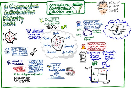
Maturity Models were all the rage at Conversion Conference Chicago 2013, but they can make you feel like you’re living with your marketing parents — immature.
Don’t feel bad. We didn’t get a perfect score and we do this for a living (see below for how we score).
Maturity models aren’t a way to judge you and your inadequacies. Maturity models are ways to identify your strengths and plan to build on them.
Both Tim Ash of Sitetuners and Michael Parizek of avast! put forward maturity models for us, and I was on hand to capture Michael’s presentation using my innovative Instagraph (instant infograph) technique.

Instagraph-Conversion-Maturity Model CCC13The Content Maturity Model presented by Michael Parizek of avast!

So, how does Conversion Sciences score on the model? Parizek identified seven criteria in his maturity model.

People

This is an area that we feel strongly about at Conversion Sciences. We have an experienced Conversion Scientist doing the work for every business that hires us. We like to say, “You’ll be working with ‘The Guys’.” We would benefit from some more formal methods as we grow our lab staff, both in number and in capabilities.
Score: 4 out of 5

Tools

It is a golden age of conversion tools. There are lots of ways to measure sites, complete tests, and even spy on your competitors. We score highly on this because these tools exist for us to build on.
Score: 4 out of 5

Knowledge

How you manage what you learn from your testing is perhaps the biggest challenge. For most of us, means it stays in the heads of our optimization team. But what happens when there is turnover? Maintaining personas as a living representative of what you know about your customers is a great way to preserve knowledge.
Score: 3 out of 5

Activities

What do you do first? We generate a list of hypotheses based on your analytics, chat transcripts, reviews and interviews with customer-facing employees. Then we rank them in a similar way to Parizek’s model, but with more endices. You may like his simple graph of Impact vs. Feasibility for prioritizing ideas.
Score: 5 out of 5

Processes

Our Conversion Catalyst process that works for businesses in almost any industry. It is a thorough front-end evaluation followed by a fast-test process. Our goal is to find winners on your site within 120 days.
However, this process isn’t effective in slower-moving environments and in situations where wins on the website aren’t closely tied to bottom-line revenue.
Score: 4 out of 5

Testing

We use a test cycle approach. If one of our test hypotheses is a winner, we do another set of tests to see if we can get it even better. If a test is a loser, we can test something else.
This cycle gives us the freedom to find promising rabbit holes and follow them all the way to Wonderland.
Score: 4 out of 5

Sponsors

The key to success is always having a strong internal sponsor at our clients with the authority to get things done. We know how to make this individual a hero. We don’t move forward without this commitment from our clients.
Score: It depends
How do you score on each of these?
Which ones are you working on next?
Let us know in the comments.
[bookpromo]

The brilliant minds over at Blog Growth posed  an important question recently; What’s the best price for your products?
While consumers think prices are decided arbitrarily, there is a lot of work that goes into determining the price point for a product.
Check out the amazing infographic Blog Growth put together to break down the science of pricing.
TheScienceOfPricing_Infographic
 
To read the whole post, check out Blog Growth.
 

INFOGRAPHIC Crafting the Subject Line that Gets Your Email Read – Litmus

We’ve seen in email tests that subject lines can have implications far beyond the open rate. We’ve seen two identical emails with identical landing pages have the same open rates and the same click-through rates (CTR), but one generated more sales than the other.

What’s the difference? The subject line.

In short, subject lines are important. And they are difficult to write.

Build a Conversion Rate Heatmap by Hour & Day of Week in Google Docs

When we dig into a site’s analytics, we try a number of different approaches to the data. Sometimes interesting things pop out, and sometimes the data looks “as expected.

“This is an analysis we are going to start adding to our analysis: Heatmap of Conversions by Hour of Day. We will modify it for our ecommerce clients (as we track Revenue per Visit, or RPV).

You might try this and see if there is an interesting pattern in your data.

It’s Not My Job: Why Marketing is Broken

@TheGrok (Bryan Eisenberg) is one of the founders of the performance marketing movement — we’ve called it conversion marketing. He has the cred to ask the hard questions.

In this very impactful article, he asks “Really, is this so hard to do?” of the email marketers whom he sees as “broken.”These examples should leave you with a feeling of, “Oh yes. I get it now.”

That can be a very valuable feeling.

read more

Dennis van der Heijden is in an enviable position. He is able to see the results of hundreds of split tests through his awesome split testing service, Convert Insights at Convert.com.

He’s noticed a few things about how successful businesses are at finding winning tests.

These numbers plus his ideas on why some have tests that frequently yield conversion rate lifts while others don’t is the subject of my Instagraph. This was recorded live at Conversion Conference East 2012 in Ft. Lauderdale, Florida on October 10.
Here is a time-lapse video of the creation of the Instagraph.

Here is the final result.

[bookpromo]

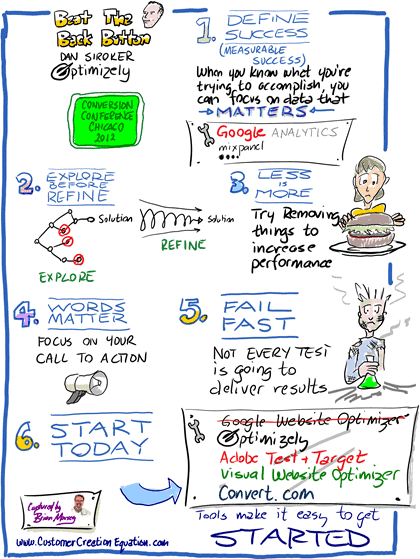
Dan Siroker, Founder of testing platform Optimizely offers six key ways to improve the conversion performance of your pages. This was captured live at the Conversion Conference Chicago 2012 by yours truly.
Dan Siroker-Beat the Back Button-CCC12-INFOGRAPH
CLICK TO ENLARGE

  1. Define Success
  2. Explore before you refine
  3. Less is More
  4. Words Matter
  5. Fail Fast
  6. Start Today

More Infographics

[bookpromo]

© Copyright 2007 - 2024 • Conversion Sciences • All Rights Reserved