Use content to connect your social batteries to social landing pages and get customered. Improve your social media conversion rate. Read on
They friend you. They fan you. They pin you. They follow you.
BUT how often to they customer you? How often do they buy, subscribe, or register? How often can you get your fans and followers to convert?
When you get customered, your business grows, you gain another social influencer, and you get proof that your social media strategy is delivering what your social network wants.

They “liked” Me
BUT

They didn’t “customer” me.
Getting customered is an important part of the social media life cycle, and it’s also one of the trickiest. First, you need to recognize the potential within your social networks.
The possibilities Within Your Social Networks: Improving Your Social Media Conversion Rate

Your social networks store potential, like a battery stores voltage. What you need to do to charge your social battery:
- Get Noticed
- Get Liked
- Get Followed
- Get Connected
Sounds great, right? But, how do you hook up to the juice that turns that potential into leads and revenue? Tapping this potential requires that you connect your social battery to something of interest to both you and your social aficionados.
Use Content for Wires
As you know, there is a plethora of content out there and it comes in many forms. Content might be blog post links on Twitter, contests on Facebook, and product pictures on Pinterest. Without the content, no one is going to find their way back.
Many of us already have content strategies for our social networks, but what gets people to customer us when they visit? How can we get engage our customers?
Content. Content drives engagement.
Connect Them to Your Landing Pages
Unfortunately, once read, content is quickly dismissed. No matter how great your content is.
Keep in mind that most visitors spend only a few seconds on a new site deciding whether to engage further with the content or to click the “Back” button. So if your landing page is forming the bridge that introduces your new visitors to the rest of your site’s content, it’s vital that this page be as compelling as possible in getting new visitors to investigate further.
What is the next step for me as a visitor and potential customerer of your business?
The secret is to treat your content pages as social landing pages.
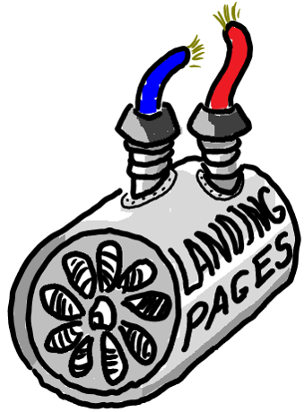 A landing page is a single minded page designed to do two things:
- Keep the promise made by the link that was clicked.
- Get the reader to do something that benefits them and your business.
A Social landing page, then, is a single minded page designed to:
- Deliver the content promised.
- Get the reader to customer you.
Both pages have content that delivers on a promise and a call to action that entices readers to do something wonderful.
Where do Social Landing Pages Live?
Social media landing pages live anywhere you are drawing social visitors.
- Your blog content pages have the content, but do they have the call to action? Is the call to action where it can be seen? – Add calls to action in or near the content.
- Your email signup pages have the call to action, but do they have the content that makes signing up appealing? – Give subscribers a better reason to sign up than “Get on another mailing list.”
- Your lead generation pages, offering gated content have the call to action, but do you talk about the content you are offering, or do you talk about our company and your products instead? – Any page to which your friends, fans and followers might come in search of education or entertainment qualified as a social media landing page.
- Product pages on eCommerce sites, are another frequent social media landing page. The call to action is invariably there: Add to Cart.
Ask yourself the following questions about your social landing pages:
- What content topics generate the most engaged visitors?
- Will more visitors comment if you simply ask them to?
- Where should your conversion beacons be: in the sidebar column, before or after the post or in the copy?
- What offers draw more clicks on your conversion beacons?
The Anatomy Of A Great Social Landing Page
Unlike its counterpart, the social landing page isn’t focused getting on one action from a visitor; it has to manage four different kinds of conversion. Do your social landing pages manage all four?
Social media strategies have become a boon to search marketers. Social media builds backlinks from authoritative sites, creates a stream of keyword-rich content and drives direct traffic to key pages.
While the “media” part of social media is almost completely free; the “social” part is quite expensive.
The “social” part of social media requires generating a steady menu of content and participating in the conversations generated around that content.
“Social” media isn’t cheap, but the things we do to generate great search engine results—creating content, encouraging conversations—are exactly the things that boost conversion rates and drive sales. This is what readers of this column are interested in.
Increasing conversion rates around social media requires that we change our tactics. I’m going to introduce you to the “social media landing page” and show you why you need to use this proven tool.
A different kind of conversion
For most of us, there is one kind of conversion. It happens when a visitor to our site fills out a form or completes a purchase. It is when a stranger becomes a prospect and a prospect becomes a customer.
In the realm of social media, a conversion can be quite different.
Dave Evans, in his book Social Media Marketing: An Hour a Day defines three stages that a social influencer must go through to create word-of-mouth messages for our businesses.
He starts with a small number of individuals who have purchased our products or services. Ironically, we have to “convert” these customers into users of our products, so that they have the authority to speak about our offering. We then help them form an opinion of us—preferably a favorable one—with the ultimate goal of getting them to talk about their experience.
We will also want to give those that hear these messages a way to interact with us.
Needless to say, a traditional landing page isn’t going to get us there. These pages are designed to entice action long after the post-purchase process has run its course.
Unlike its counterpart, the social media landing page isn’t focused getting on one action from a visitor; it has to do more.
Don’t worry: you probably see social landing pages every day. See if you can guess where I’m going with this.
Conversion to user
The social media landing page must educate a customer on how to use your product or offering in their situation. Therefore, the page must have an educational component.
Articles, videos and reviews with a “how to” or “10 ways to” orientation are classic examples, and you’re probably already generating such content for your search strategies.
Conversion to opinion-holder
It stands to reason that, if someone uses your product or service, they are going to form an opinion of it. However, studies tell us that “social proof” can often override personal experience in our perceptions. Therefore, a social landing page should expose the opinions of others.
Testimonials are the time-honored tactic for communicating social proof, but savvy social networkers want more specific, transparent and relevant commentary from people in their social graph. The social landing page must expose social gestures—comments, retweets, subscriptions and “likes”—to influencers seeking to make a statement with their opinion.
Conversion to talker
Once someone in authority has formed an opinion of our brand and offering, our landing page must provide them with a way to spread their message. Fortunately, there are myriad ways for visitors to our landing page to share their opinion, from comments to TweetMeme buttons.
Have you identified a page design that provides all of the moving parts outlined here? If you said a blog, a forum or a Facebook page, you are right on target. Each of these provides opportunities to educate visitors and allows influencers to spread the message through comments and posts.
Conversion beacons bring new visitors full circle
All of this will do little more than grow our social graph. How do we get new visitors—those influenced by our customers to consider our offering?
Conversion beacons tell visitors how to start interacting with us. These are classic offers, ads or forms that will often lead to traditional landing pages. These form the link back to the traditional sales funnel.
It is the conversion beacons that offer us a measurable way to calculate ROI, as these drive new leads and purchases.
Optimize your social landing pages and boost your social media conversion rate
Now that you know how important these pages are, give your blog or Facebook page another look.
Every good conversion scientist knows that testing is the quickest way to get better at online marketing, and the same is true for social landing pages. However, social landing pages aren’t as easy to test as traditional landing pages.
In my next column, I’ll show you the tools and tactics I use to measure the effectiveness of my social media marketing campaigns.
Original article on social media landing pages was published on Search Engine Land
Remember that these are Social Visitors
Given that your visitors are coming from a social network, they will be more likely to want to see social content with the product information. You should oblige them.
- Consider star ratings and reviews for your products.
- Use social proof. How many others have customered (bought) this product? How many friends, fans and followers do you have?
- Don’t invite them to become a friend, fan or follower. They already are. The only choice they should have is to customer you.
It’s one thing to get people to friend, fan, follow, and flatulate. It’s quite another to get them to customer you. Use content to connect your social batteries to social media landing pages and get customered.
Images by Brian Massey
Podcast: Play in new window | Download
“Getting Customered: Improving Your Social Media Conversion Rate” was recorded at Engage Mexico 2013 in Puerta Vallarta.
Can’t get enough? Download our
Get Customered: Social Media Conversion Rate PowerPoint Presentation.
Half of our optimization ideas are wrong. You should hire us anyway.
CRO Tests | Multivariate | AB TestingWe find out which half will work.
How can it be that a team with our experience, intelligence and good looks could be wrong so often? It’s a mystery to us.
The truth is, that the audience for any website is unique. Given two sites selling the exact same product, you cannot assume that what works on one will work on the other.
People are complex. Groups of people are only slightly less complex.
This is why our optimization process is so powerful. We let your visitors decide what works best, and they vote with their money or their contact information.
We call it the Conversion Catalyst.
Why We Win
We live by a few mantras at Conversion Sciences to guide our decisions.
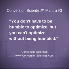
No matter how smart we think we are, the only thing that matters is what gives your visitors a better experience on your site. Don’t get caught up in the words “better experience.”
Visitors vote with their dollars. A good experience is one in which more visitors find what they need, want, or think they want. The person we are trying to impress really is the person that counts the income.
It’s not that we’re humble, but testing has a way of humbling you.
We’d like to humbly offer to optimize your website.
Let us make your accountant smile.
You can get a free strategy session with a Conversion Scientist. We’ll help you see the possibilities for your visitors.
Conversion Killers Exposed [INFOGRAPH]
Conversion OptimizationThere is a lot of ugly in this infograph, ugly truths about conversion killers.
What is it that is keeping your visitors from converting into buyers? Why are your shopping carts empty and left circling in the wind?
You might be shocked at some of the statistics that CWCS discovered while creating their awesome infograph.
Did you know?
For more incredibly insightful information and useful stats, please enjoy this killer infograph by CWCS.
Conversion Killers – Is your Website Losing you Money?
The conversion rate for your site is the number of conversions divided by visitors. Quality traffic is half of the equation (the bottom half). No matter how well optimized a site is, if the traffic isn’t qualified, conversion rates will fail. Small changes in your conversion rate can mean big changes in your revenue.
For more information, check out “How to Budget for Conversion Rate Optimization” and then Give the calculator a try.
Unexpected Website Formulas of the Conversion Scientist
Conversion-Centered DesignThe things that make a website work are not always obvious until someone points them out. Myth and legend reign without data. Brian Massey introduces you to the unexpected website formulas that will help turn your website around.
And he does it all with science.
Not just any science either – Conversion Sciences. Brian shares his unexpected formulas to help create winning websites. You didn’t think they lab coat was just for show, did you?
Brian presented at March’s AUSOME Meetup and shared 18 surprising ways to make sure your website is WINNING. Everything From landing pages to “business porn,” Brian walks you through the Do’s and Don’ts of having a website that relies on conversions.
The Unexpected Website Formulas Slides
MarketingProfs PRO Seminar: Chemistry of a Landing Page
Landing Page OptimizationIf you miss the mark when creating your landing pages, you could lose a visitor or potential customer – forever.
As scientists, we study reactions using our Periodic Table of Website Optimization Elements. We understand the science behind landing page optimization.
The Inert Gases of Your Low Converting Web Pages: How to Get a Reaction from your Visitors [AUDIO]
Conversion Marketing StrategyMarketers need a common vocabulary and notation for the things we’re doing online. We need to understand the elements that we can introduce and the ways they react with each other.
At Conversion Sciences, we stole the notation of chemists. They have a clear notation, like the notation for how vinegar reacts with baking soda.
Marketing reactions are like baking soda and vinegar.
Here’s our periodic table of the online marketing elements:
The periodic table of marketing elements.
The bottom line is this: We want to get a reaction from our visitors.
When we aren’t generating reactions on our site, we can see the results clearly:
So, what do we do about it?
Eliminating Inert Gases
In our periodic chart, there is a section called the “Inert Gases.”
The inert gases-Bordom, Hot Air, Melium, Abondon
The Inert Gases – Bordom, Melium, Hot Air, and Abandon – contaminate the pages on your website and can be detected through your analytics.
Find out how to eliminate the Inert Gases from your web site with this month’s Marketing Land column, 4 Elemental Problems with Low converting Web Pages.
Listen to the Column
Subscribe to Podcast
The ultimate question is this: How will small changes in conversion rate affect my yearly revenue? This is the promise of understanding your BUU.
21 Quick and Easy CRO Copywriting Hacks
Keep these proven copywriting hacks in mind to make your copy convert.
"*" indicates required fields
How to Budget for Conversion Rate Optimization
Conversion OptimizationMore and more companies are putting Conversion Rate Optimization (CRO) into their online marketing budgets.
We like to call ourselves “The most measurable agency you’ll ever hire.” The reason is that we rely on analytics and testing to do our job. We have to know if we’re creating more revenue for a business. If we know you know.You should, too.
CRO — or website optimization, or revenue optimization — increases revenue, leads and subscribers. It also decreases the cost of all of your marketing. It reduces your acquisition cost by turning more visitors into leads and buyers.
However, CRO is one of the most measurable activities marketing will do.
Estimating Your Budget
The thing about conversion optimization is that small changes in conversion rate — we prefer to measure revenue per visit (RPV) — deliver big changes in sales. It can be hard to get your head around.
To help you understand the annual impact of small changes in your revenue per visit, we’ve created the Conversion Rate Upside Calculator. It will tell you how much more revenue you will make per year with small changes in your RPV.
The report tells you:
It’s a great report on the state of your online business, and the potential future you have in store.
Three Questions
Just three questions is all it takes to see how much your business will benefit from optimization.
Small changes in your conversion rate can mean big changes in your revenue. Give the optimization calculator a try.
Call us anytime at (888) 961-6604
Email us in the lab at
[hide_email TheLab@ConversionSciences.com]
*All data entered is kept confidential
President’s Money Marketing Math [Infograph]
Lead GenerationGeorge Washington. Abraham Lincoln. Ulysses S. Grant. Alexander Hamilton. Benjamin Franklin. Andrew Jackson.
We know their names. We know what they have done for the United States of America. Some were great Presidents who led the United States through epic battles, others broke through the barriers of segregation. One was the very first US Secretary of the Treasury. One even invented swim fins, the lightning rod, musical instruments, and bifocals; and that is just barely scratching the surface.
BUT did you know that ALL of them can help us with our money marketing math?
Which of these things are you looking at every month (or more often):
Your success depends on making high-dollar decisions. Benjamin Franklin also invented the concept of “paying it forward” and the President’s (and others) are here to do just that. Take a look at this infograph and ask yourself where you are in your Math Marketing Journey?
For more information, please read President’s Day Marketing Money Math.
Get Customered: Improving Your Social Media Conversion Rate [AUDIO]
Conversion OptimizationThey friend you. They fan you. They pin you. They follow you.
BUT how often to they customer you? How often do they buy, subscribe, or register? How often can you get your fans and followers to convert?
When you get customered, your business grows, you gain another social influencer, and you get proof that your social media strategy is delivering what your social network wants.
They “liked” Me
BUT
They didn’t “customer” me.
Getting customered is an important part of the social media life cycle, and it’s also one of the trickiest. First, you need to recognize the potential within your social networks.
The possibilities Within Your Social Networks: Improving Your Social Media Conversion Rate
Your social networks store potential, like a battery stores voltage. What you need to do to charge your social battery:
Sounds great, right? But, how do you hook up to the juice that turns that potential into leads and revenue? Tapping this potential requires that you connect your social battery to something of interest to both you and your social aficionados.
Use Content for Wires
As you know, there is a plethora of content out there and it comes in many forms. Content might be blog post links on Twitter, contests on Facebook, and product pictures on Pinterest. Without the content, no one is going to find their way back.
Many of us already have content strategies for our social networks, but what gets people to customer us when they visit? How can we get engage our customers?
Content. Content drives engagement.
Connect Them to Your Landing Pages
Unfortunately, once read, content is quickly dismissed. No matter how great your content is.
Keep in mind that most visitors spend only a few seconds on a new site deciding whether to engage further with the content or to click the “Back” button. So if your landing page is forming the bridge that introduces your new visitors to the rest of your site’s content, it’s vital that this page be as compelling as possible in getting new visitors to investigate further.
What is the next step for me as a visitor and potential customerer of your business?
A Social landing page, then, is a single minded page designed to:
Both pages have content that delivers on a promise and a call to action that entices readers to do something wonderful.
Where do Social Landing Pages Live?
Social media landing pages live anywhere you are drawing social visitors.
Ask yourself the following questions about your social landing pages:
The Anatomy Of A Great Social Landing Page
Social media strategies have become a boon to search marketers. Social media builds backlinks from authoritative sites, creates a stream of keyword-rich content and drives direct traffic to key pages.
While the “media” part of social media is almost completely free; the “social” part is quite expensive.
The “social” part of social media requires generating a steady menu of content and participating in the conversations generated around that content.
“Social” media isn’t cheap, but the things we do to generate great search engine results—creating content, encouraging conversations—are exactly the things that boost conversion rates and drive sales. This is what readers of this column are interested in.
Increasing conversion rates around social media requires that we change our tactics. I’m going to introduce you to the “social media landing page” and show you why you need to use this proven tool.
A different kind of conversion
For most of us, there is one kind of conversion. It happens when a visitor to our site fills out a form or completes a purchase. It is when a stranger becomes a prospect and a prospect becomes a customer.
In the realm of social media, a conversion can be quite different.
Dave Evans, in his book Social Media Marketing: An Hour a Day defines three stages that a social influencer must go through to create word-of-mouth messages for our businesses.
He starts with a small number of individuals who have purchased our products or services. Ironically, we have to “convert” these customers into users of our products, so that they have the authority to speak about our offering. We then help them form an opinion of us—preferably a favorable one—with the ultimate goal of getting them to talk about their experience.
We will also want to give those that hear these messages a way to interact with us.
Needless to say, a traditional landing page isn’t going to get us there. These pages are designed to entice action long after the post-purchase process has run its course.
Unlike its counterpart, the social media landing page isn’t focused getting on one action from a visitor; it has to do more.
Conversion to user
The social media landing page must educate a customer on how to use your product or offering in their situation. Therefore, the page must have an educational component.
Articles, videos and reviews with a “how to” or “10 ways to” orientation are classic examples, and you’re probably already generating such content for your search strategies.
Conversion to opinion-holder
It stands to reason that, if someone uses your product or service, they are going to form an opinion of it. However, studies tell us that “social proof” can often override personal experience in our perceptions. Therefore, a social landing page should expose the opinions of others.
Testimonials are the time-honored tactic for communicating social proof, but savvy social networkers want more specific, transparent and relevant commentary from people in their social graph. The social landing page must expose social gestures—comments, retweets, subscriptions and “likes”—to influencers seeking to make a statement with their opinion.
Conversion to talker
Once someone in authority has formed an opinion of our brand and offering, our landing page must provide them with a way to spread their message. Fortunately, there are myriad ways for visitors to our landing page to share their opinion, from comments to TweetMeme buttons.
Have you identified a page design that provides all of the moving parts outlined here? If you said a blog, a forum or a Facebook page, you are right on target. Each of these provides opportunities to educate visitors and allows influencers to spread the message through comments and posts.
Conversion beacons bring new visitors full circle
All of this will do little more than grow our social graph. How do we get new visitors—those influenced by our customers to consider our offering?
Conversion beacons tell visitors how to start interacting with us. These are classic offers, ads or forms that will often lead to traditional landing pages. These form the link back to the traditional sales funnel.
It is the conversion beacons that offer us a measurable way to calculate ROI, as these drive new leads and purchases.
Optimize your social landing pages and boost your social media conversion rate
Now that you know how important these pages are, give your blog or Facebook page another look.
Every good conversion scientist knows that testing is the quickest way to get better at online marketing, and the same is true for social landing pages. However, social landing pages aren’t as easy to test as traditional landing pages.
In my next column, I’ll show you the tools and tactics I use to measure the effectiveness of my social media marketing campaigns.
Original article on social media landing pages was published on Search Engine Land
Remember that these are Social Visitors
Given that your visitors are coming from a social network, they will be more likely to want to see social content with the product information. You should oblige them.
It’s one thing to get people to friend, fan, follow, and flatulate. It’s quite another to get them to customer you. Use content to connect your social batteries to social media landing pages and get customered.
Images by Brian Massey

Podcast: Play in new window | Download
“Getting Customered: Improving Your Social Media Conversion Rate” was recorded at Engage Mexico 2013 in Puerta Vallarta.
Can’t get enough? Download our Get Customered: Social Media Conversion Rate PowerPoint Presentation.
21 Quick and Easy CRO Copywriting Hacks
Keep these proven copywriting hacks in mind to make your copy convert.
"*" indicates required fields
Brian Massey, Beyond the Lab Coat [AUDIO]
Conversion OptimizationThe original Conversion Scientist sat down with host of the Big Value Big Business podcast, James Lynch, to discuss everything from how he makes a terrible employee, to finding your own gimmick, to the inter-workings of a conversion scientist.
Some highlights from the interview include:

“It takes a combination of experience, skill and neurosis to end up being a Conversion Scientist.” – Brian MasseyGrab your pen and paper, learn something new, and enjoy the latest edition of Big Value Big Business Podscast with James Lynch.
Podcast: Play in new window | Download
Subscribe
Read and download the Transcript
My Internet Marketing Oedipus Complex: The Confirmation Bias
Persuasion ScienceThis is a guest post by Craig Andrews.
Sorry, no salacious stories about sons killing their father and sleeping with their mother. But in Oedipus Rex, Sophocles had insights about Online Marketing more than 2 millennia before the internet. The play’s hero had a tragic flaw that plagues all of us. It is our Confirmation Bias or Oedipus Complex.
The Greek tragedy opens with Oedipus, the King, telling the people he knows the source of their pain. It turns out that he is the source of their pain.
At some point, we all approach our internet visitors the same way Oedipus approached the Thebans. We are absolutely convinced we know why our website visitors have come and what they yearn for. But if we don’t continually test and challenge our assumptions, we are just as guilty as Oedipus.
The Origin of Our Complex (our Confirmation Bias)
We are passionate about our business and our customers. We invest time in serving and understanding our customers. When this makes us over confident, we can miss important insights. Even in looking at our website analytics, we can find data that confirms what we believed. This “confirmation bias” can cause us to quit scouring data when we find the data that supports our hypothesis. We must press further.
As an example, a client was convinced their customers wouldn’t visit the website using mobile phones. Yet 5 months after launching a new site, 1/3rd of their website conversions were from mobile phones. In another instance, we saw sustained double-digit organic traffic growth and assumed it was due to Google.
Turns out Google traffic was dropping while traffic from other search engines was rising. Haunted by the words of Oedipus – “I know why you have come” – I was wrong. Continuing with the wrong assumption without correction would have resulted in additional lost traffic from the world’s largest search engine.
No Fate But What We Make
Oedipus thought his ruin was the product of fate. We should not. Rather, we must continually test and challenge our assumptions.
In the digital world, every customer touch offers an opportunity to learn more:
Don’t Gouge Your Eyes Out!
Take action and put a plan in place. Effective plans should include 2 types of testing: testing a new hypothesis and challenging an existing belief.
New hypothesis testing is familiar – it’s classic conversion optimization. But testing to continually challenge existing beliefs is what really helps to avert our Internet Marketing Oedipus Complex. Our existing beliefs, held too tightly, can get us in deep trouble.
Our team recently improved a client’s home page bounce rate 10%. Immediately, conversions started shooting through the roof. Initially we thought the changes to the home page were an overwhelming success. It seemed logical. Change followed by success, right? We chose to challenge our belief. After digging into the analytics, we discovered a few things:
We found our answer in analytics under Behavior => Site Content => Landing Pages. This lets us track conversion rates based on the first page visited on the site.
Our focus was on the Home Page and Page “T” but ignoring Page “R”. Again, it seemed logical. The Home Page receives more than half of the site traffic and one of our home page changes directed traffic to Page “T.” Our confirmation bias initially led us to ignore the 39% improvement on Page “R” where we have a significant number of conversions. But without changes Page “R” seems to be seasonal.
Now We Know (More) Why They Have Come
This discovery put a finer point on what we reported to the client. Instead of promising the client continued conversions at the new rate, we showed them how some of the higher conversion rate would be seasonal. Now the client is happy because they have permanent changes that increased the conversion rate. They also have realistic expectations for the future.
As a conversion optimizer, we now have a new hypothesis to test. There may some seasonal surge in this one category. We record that and study it next season. If it is indeed a seasonal surge, then we can tune the website and email campaigns for this newly discovered seasonality, giving the client a strategic advantage they didn’t have before.
This is the power of challenging existing assumptions. In addition to perfecting our view of reality, it opens new opportunities. With these new opportunities, we can find new and innovative ways to increase conversions in our digital media channels.
Do you yearn for success?
When Oedipus discovered the reality of the situation, he gouged his eyes out so he wouldn’t have to see it. To be effective, we can’t fear the truth. We must pursue understanding even if it results in abandoning a strongly held belief that we want to remain true. That means we need to:
When Oedipus proclaimed he knew what the Thebans yearned for, he was speaking from his gut and intuition. Intuition is a useful tool, but let’s let the data proclaim what our website visitors are yearning for. By avoiding our confirmation bias or Oedipus Complex we lay the path to greater insights and greater profitability.
About the Author
Craig Andrews is the Principal Ally and founder of internet marketing agency allies4me. Andrews brings extensive scientific and marketing expertise to allies4me. Over the last 25 years, his experience has spanned search engine optimization, internet marketing software, biomedical and semiconductors. Andrews is backed by a team of marketing allies who support start-ups to Fortune 500 companies.
In recent years, clients have been seeking guidance from allies4me on Social Media strategies. Rather than jumping on the latest hype, Andrews sought to understand Social Media through solid metrics across large data sets. The result is an unconventional and insightful approach to Social Media. Testing and data driven decisions advise all areas of allies4me work. Solid metrics and disciplined parsing of data is where allies4me clients find results.
You can connect with Craig Andrews on Google+ and LinkedIn. You can find allies4me on LinkedIn, Google+, Facebook, and Twitter.