Brian Massey posed a great question to me the other day: If you could ask your site visitors only one question, what should it be? I love this question because it distills pre-conversion user research down to its essence: how can you best glean the “why” motivations behind what your users are thinking – and, equally importantly, the concerns they may be feeling – early in their experience? And how can you choose a question that, after you analyze user responses, will be actionable – will allow you to confidently make and test design updates that better address these concerns and improve your conversions?
In this article I’ll focus on what question to ask, and in a future article I’ll unpack where and how you should ask this question.
Start with the research end in mind
Start with the insights goal you’re trying to achieve by asking the question. Are you trying to expose the general concerns or questions (what marketers call “objections”) your visitors may have, or are you more interested in learning something more specific, such as whether your Product Detail page is missing any key information? If you’re new to user experience research, or your website hasn’t undergone any significant usability testing, you should typically start with the “general” goal and ask more open-ended questions.
In this article I’ll assume that you are asking the question of a person who doesn’t yet know and trust your brand and is early in her shopping experience (e.g. just arrived on your website or landing page). A different question – or set of questions – would apply for your converted customers.
First, avoid asking the wrong questions
First, let’s talk about questions you shouldn’t ask. The prospect is already on your site, so clearly your marketing has worked (at least partially). So early in the experience you should avoid asking marketing questions like:
- How did you first hear about us?
- What prompted you to start looking for this type of service?
- What other competitors are you considering?
Instead, focus on the questions most tied to your research goals, and that uncover questions and concerns that would negatively affect your visitor engagement and conversion. Save the marketing questions for further down your sales funnel – for example, on order confirmation pages, in your social media channels, or on your email response pages.
Some possible questions
OK, let’s finally get to the question you should ask. Based on my experience leading research projects for six Fortune 500 clients, and my recent survey of the latest user feedback solicitation tools, here are my top 5 possible questions (in no particular order), along with some pros and cons for each:
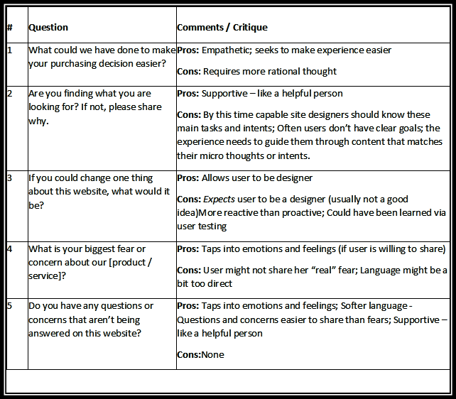
Drumroll, please…
In my opinion, the #1 question I would ask is Question #5. Coming in a “Close 2nd” is Question #4.
The two questions are really variations on the same theme. By asking either of them you are communicating, “I value you as a potential customer and am truly interested in learning where our website is missing the mark relative to your needs, wants and expectations. This question is specifically not calling attention to your offer, it’s not “going for the close”, and it’s not asking your visitors to be designers; it’s simply saying “we care, we want to improve your experience, and we’re listening.”
A key thing to remember: for many shopping scenarios, “making a positive brand impression” or “building brand memory” is as important as closing a sale or generating a lead. Connect with the visitor first; sell to her later. Another thing to bear in mind: with the rapid growth of mobile devices usage, prospect experiences are often multi-touch: the prospect hits your website on their iPad the evening of Day 1, briefly visits your site during lunch on Day 2, and again visits your site during an afternoon coffee break on Day 2. So, except in some small dollar amount, single widget sales cases, it’s not a “once and done” interaction (or if it is, it shouldn’t be).
A sample scenario
Let’s say that Judy, a middle-aged woman from Austin, is shopping for a place to board her dog Max while she’s on vacation. She’s willing to pay extra for a better facility and service. After doing a web search for “dog boarders austin,” she lands on www.campbowwow.com.
Judy’s main concerns are:
- Pricing – how much will it cost for the week?
- How much play time her dog will get
- How clean the kennel is kept
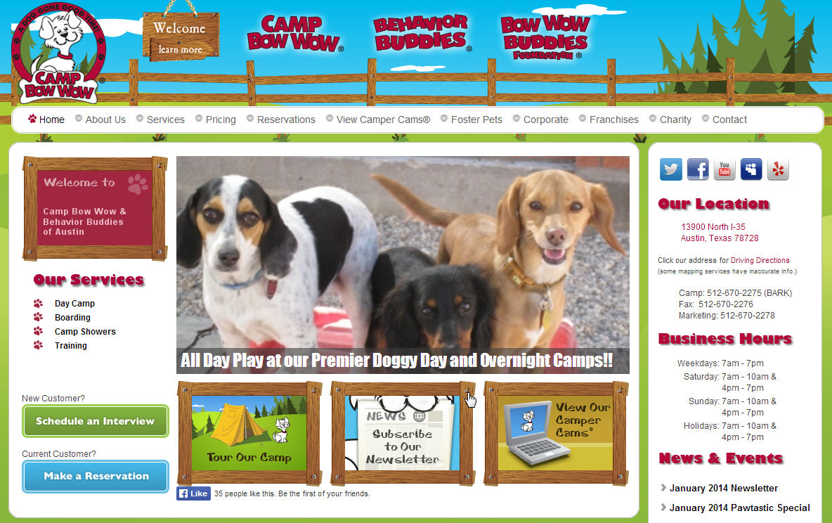
Judy sees that these questions are not answered on the top half of the home page. After about 10 seconds of scanning, she’s a bit disappointed and clicks her browser’s Back button. End of experience – for now and perhaps forever.
If our “one question” were asked, she’d have the choice (and who doesn’t like choices?!) to express her questions and concerns. Even if Judy decides to go with another dog boarder this time, there’s a decent chance that a thought like, “Ah yes… Camp Bow Wow… they were the ones who asked for my input,” will get lodged in her longer-term memory. If she were not completely satisfied with the other boarder’s services or staff, a couple weeks before her next trip she might just give Camp Bow Wow a call.
Summing up
Whether or not you consider your organization “customer centric”, you need to start a dialog with your prospects. And the sooner you can do this, the better (both in the experience, and on your website release roadmap). By doing so you’ll discover expectations that your site is not meeting so that you can better address them through user experience and copy updates, and thereby grow your bottom line.
About the Author
Mark is the Owner and Research Director at Hallmark Experience, an agency that focuses on voice of prospect research, usability testing and expert design reviews. He’s had the privilege to work with top brands like Macys, Kaiser Permanente, American Express and AutoZone, as well as smaller, fast-growing companies in the San Diego area. You can reach him here.


A New Kind of Marketing Battery: Google's New Smart Lists
Web AnalyticsMarketing Batteries: These are powerful online devices that can actually store attention. Marketing batteries get charged up on the attention that you pay for by running ads, by investing in SEO, by doing press releases, by blogging, by creating webinars.
Google defines remarketing as “a feature that lets you reach people who have previously visited your site, and show them relevant ads across the web or when they search on Google.”All you have to do is tap into them after they are charged.
Customer Batteries contain the energy of those who bought from you.
Subscriber Batteries contain then energy of those who have subscribed to your lists.
Then there are Social Batteries, that store the energy of those who have like, followed, connected, plussed or pinned you. These batteries are easy to charge, but hard to get a current out of.
There has always been a gap between reliable Subscriber Batteries and skittish Social Batteries. Until now.
You can now build and charge a Visitor Battery. This is done using a technique called “Remarketing” or “Retargeting.”
Google (and other ad networks) can keep track of those who have visited your site, but didn’t buy, subscribe, or like you. When a visitor comes to your site, a cookie is set in their browser. Then Google keeps a list of these visitors, and watches for that cookie when someone comes to another site. When Google sees that a person has been to your site, they can run one of your ads.
It works, and retargeted ads perform quite well compared to regular text and banner ads.
Not everyone who comes to your site is qualified to buy your product or service. Some came there on accident. Others were looking for something else.
Google smart lists seeks to identify those visitors who are more likely to be actually interested in your product.
Last week, the tech savvy site announced the launch of a new type of remarketing list in Google Analytics called Smart Lists. Simply stated, Smart Lists predict which users are most likely to convert during a later visit.
Screenshot of Google Smart List Feature
These are built using machine learning across websites that have opted to share conversion data, and make use of a plethora of signals, including:
Based on their on-site actions, Analytics is able to regulate your remarketing campaigns to align with each user’s value, according to the specific company. Now when creating a new remarketing list, you’ll have the option to have Analytics manage your list for you – automatically.
According to Google, “for best results, make sure your Google Analytics goals and transactions are being imported into AdWords, then combine your Smart List with Conversion Optimizer
Remarketing Newbies
Smart List is a great way to get started with solid performance results. As you get comfortable with remarketing, you can modify your ads and apply a variety of remarketing best practices.
Remarketing Connoisseurs
You are most likely employing a sophisticated list strategy already. Google is aware of this and gearing up to extend this signal directly for your current lists as an optimization signal used in AdWords bidding.
According to Google, they will be continuing to iterate on these models in order to help users better understand and act on their data. They are also working on surfacing these signals elsewhere in your reports and in the product so you can dive into what factors help predict whether a user will likely convert.
We have a new kind of Marketing Battery: The Visitor Battery. Simplify the decision making process of creating remarketing lists with “Smart Lists with Google Analytics”. For more information on Remarketing with Google Analytics, visit here.
Science: It's Not Just for High School Anymore
CRO Tests | Multivariate | AB TestingIn his blog post announcing a new version of Visual Website Optimizer, Paras Chopra makes it clear that they want to bring the scientific method to online marketers.
We’ve been doing this since 2006.
Scientists and engineers have been using the scientific method of research-based experimentation for hundreds of years to make the world a better place. With VWO, we want to bring that philosophy to the world of marketing.”Paras says, “
He also says something that I think is somewhat profound:
This is analogous to our motto of “Rigorous creativity.” It means that the human side of marketing doesn’t get pushed aside by numbers and spreadsheets. If we use data to understand the human animal better, we will become powerful, compassionate online marketers and business owners.
VWO is just a tool, one we like and use. Let us show you how to use a little science to become the online business you’re capable of becoming.
Have a conversation with a Conversion Scientist.
Build an Audience for your Video in 7 Days
Conversion Marketing StrategyThis is a guest post by Mike Tyler.
A leader without an audience is just a man yelling things.
There comes a time when every marketer faces the decision of whether to pursue video as part of their marketing strategy. The difficulties in this venture come in several forms. For example, you’ll need to determine what style of video to use, how you’re going to deliver it to your target demographic, and how you’re going to measure the success of the project.
This article is going to talk about a small but critical piece of your campaign’s success.
That is, how to build a better audience for your video.
After all, what’s the point of producing a Grammy worthy production if it sits hidden in the dark depths of YouTube?
Here are a week’s worth of tips that can help you engage more people (assuming you have a video already made).
Day 1
Write good copy. You need to create a headline that is engaging enough for people to open it. Why would people want to open your link? Be specific. If you’re selling baby shoes and people clicking your video don’t have kids, that is a misplaced resource. As cliché as it is, there are reasons why you still see ads that say “Lose 5 pounds today!” or…
This also goes for descriptions. Explain the purpose of the video and what people can get if they watch it.
For more on how to do so, check out David Ogivly’s 6 tips on writing copy that sells.
Day 2
Upload your video to YouTube (the second largest search engine behind Google) and Vimeo, This is obviously an obvious step. However, a step that people often miss is using proper SEO formatting, annotations, and hashtags. Remind people to subscribe. If you have other videos, make sure they are in a playlist nearby. The crisper and clearer this is, the higher you will show up on search results.
Day 3
Share your video on social networks such as Facebook and Twitter. If you have a newsletter, add it in. If you have a blog, write a blog on it.
Get some friends to like and share it. This will exponentially increase your exposure.
Forbes states that 59% of executives would rather watch a video than read text. And that 75% of C-level executives watch at least one business video a week.
Day 4
Eliminate text from a page on your site and add your video instead. Our opinion is that you should also A/B your site with a video and without.
This will show you the effects a video has on your site. Studies have shown that video attracts 2-times as many monthly visitors, doubles time on your site, and has a 157% increase in organic traffic from search engines.
Day 5
Put aside a budget and use Google AdWords to drive traffic. In a study, Google found YouTube ads increased viewership to websites by 20%.
or
Put aside a budget to use on YouTube Trueview. These are the ads that show up when people play YouTube videos. The way it works, you are only charged when a person watches the entire clip.
Day 6
Find ways to create backlinks to your video. Backlinks are links that bring a clicker to your website & video. The more backlinks there are, the most chances you have that someone will come see your video.
Another advantage of backlinks is that Google uses backlinks as part of their measurements that determine the pagerank of your site/video. The more backlinks you have, the higher your video will show up on keyword searches.
Day 7
See if you can benefit from YouTube Fan Finder. Depending on your video content and how often you create video, YouTube might even promote your channel for free.
 Always pushing his own limits,Mike Tyler, has a track record for success in both business and in the creative worlds. He found his inspiration to battle for what he believes in on a trip around the world. His dedication to perfection, professionalism and focus have helped put Mike on the map as a rising force. Traveling around the world following the surf and living like the locals can do wonderful things to a person. For Mike the people and places rekindled a passion that brought him back to Vancouver. Mike’s focus is people, with a peerlessly sharp eye for detail, Mike Tyler brings a personal touch to his client’s work. You can connect with Mike on LinkedIn or Google+.
You should create video often. A study claims that a YouTube partner who has been regularly uploading videos has increased his earnings by 300% over the course of 8 weeks.
Creating the universe in 7 days is pretty difficult. Finding an audience for your videos shouldn’t be.
If You Could Ask Only One Question of Your Visitors, What Should It Be?
Conversion Marketing StrategyBrian Massey posed a great question to me the other day: If you could ask your site visitors only one question, what should it be? I love this question because it distills pre-conversion user research down to its essence: how can you best glean the “why” motivations behind what your users are thinking – and, equally importantly, the concerns they may be feeling – early in their experience? And how can you choose a question that, after you analyze user responses, will be actionable – will allow you to confidently make and test design updates that better address these concerns and improve your conversions?
In this article I’ll focus on what question to ask, and in a future article I’ll unpack where and how you should ask this question.
Start with the research end in mind
Start with the insights goal you’re trying to achieve by asking the question. Are you trying to expose the general concerns or questions (what marketers call “objections”) your visitors may have, or are you more interested in learning something more specific, such as whether your Product Detail page is missing any key information? If you’re new to user experience research, or your website hasn’t undergone any significant usability testing, you should typically start with the “general” goal and ask more open-ended questions.
In this article I’ll assume that you are asking the question of a person who doesn’t yet know and trust your brand and is early in her shopping experience (e.g. just arrived on your website or landing page). A different question – or set of questions – would apply for your converted customers.
First, avoid asking the wrong questions
First, let’s talk about questions you shouldn’t ask. The prospect is already on your site, so clearly your marketing has worked (at least partially). So early in the experience you should avoid asking marketing questions like:
Instead, focus on the questions most tied to your research goals, and that uncover questions and concerns that would negatively affect your visitor engagement and conversion. Save the marketing questions for further down your sales funnel – for example, on order confirmation pages, in your social media channels, or on your email response pages.
Some possible questions
OK, let’s finally get to the question you should ask. Based on my experience leading research projects for six Fortune 500 clients, and my recent survey of the latest user feedback solicitation tools, here are my top 5 possible questions (in no particular order), along with some pros and cons for each:

Drumroll, please…
In my opinion, the #1 question I would ask is Question #5. Coming in a “Close 2nd” is Question #4.
The two questions are really variations on the same theme. By asking either of them you are communicating, “I value you as a potential customer and am truly interested in learning where our website is missing the mark relative to your needs, wants and expectations. This question is specifically not calling attention to your offer, it’s not “going for the close”, and it’s not asking your visitors to be designers; it’s simply saying “we care, we want to improve your experience, and we’re listening.”
A key thing to remember: for many shopping scenarios, “making a positive brand impression” or “building brand memory” is as important as closing a sale or generating a lead. Connect with the visitor first; sell to her later. Another thing to bear in mind: with the rapid growth of mobile devices usage, prospect experiences are often multi-touch: the prospect hits your website on their iPad the evening of Day 1, briefly visits your site during lunch on Day 2, and again visits your site during an afternoon coffee break on Day 2. So, except in some small dollar amount, single widget sales cases, it’s not a “once and done” interaction (or if it is, it shouldn’t be).
A sample scenario
Let’s say that Judy, a middle-aged woman from Austin, is shopping for a place to board her dog Max while she’s on vacation. She’s willing to pay extra for a better facility and service. After doing a web search for “dog boarders austin,” she lands on www.campbowwow.com.
Judy’s main concerns are:
Judy sees that these questions are not answered on the top half of the home page. After about 10 seconds of scanning, she’s a bit disappointed and clicks her browser’s Back button. End of experience – for now and perhaps forever.
If our “one question” were asked, she’d have the choice (and who doesn’t like choices?!) to express her questions and concerns. Even if Judy decides to go with another dog boarder this time, there’s a decent chance that a thought like, “Ah yes… Camp Bow Wow… they were the ones who asked for my input,” will get lodged in her longer-term memory. If she were not completely satisfied with the other boarder’s services or staff, a couple weeks before her next trip she might just give Camp Bow Wow a call.
Summing up
Whether or not you consider your organization “customer centric”, you need to start a dialog with your prospects. And the sooner you can do this, the better (both in the experience, and on your website release roadmap). By doing so you’ll discover expectations that your site is not meeting so that you can better address them through user experience and copy updates, and thereby grow your bottom line.
About the Author
Mark is the Owner and Research Director at Hallmark Experience, an agency that focuses on voice of prospect research, usability testing and expert design reviews. He’s had the privilege to work with top brands like Macys, Kaiser Permanente, American Express and AutoZone, as well as smaller, fast-growing companies in the San Diego area. You can reach him here.
Heartbleed Has Taken Trust Away from Your Website
Conversion Marketing StrategyWe have begun tracking the Heartbleed Bug across the Internet, and wanted to update you with information to help you minimize the impact on your conversion rate and your sales.
The Heartbleed bug is a major setback for ecommerce sites, online services, and subscription sites, even if your site is not affected by the bug.
Heartbleed is an error in an encryption library used by many companies. This library, called Open SSL, is used to encrypt information such as your username and password between your browser and your servers so others can’t listen in. Because of the Heartbleed bug, others have probably been listening.
Visitor Trust Has Been Shaken
Basically, any site that has a login could be using this buggy Open SSL library to encrypt our login information.
It doesn’t matter if your site isn’t affected. The perception is that every site is affected.
Your visitors are now approaching your site with less trust.
Even if you aren’t affected by the Heartbleed bug, visitors will approach you with higher levels of trepidation.
You need to act.
Make it Easy to Change Passwords
Restoring trust to a person who is frustrated by the amount of work this bug has created for them is critical. If you take it seriously, you can gain trust faster than competing sites.
As we speak, your visitors are deleting their memorized passwords and cookies. They are going to come to your site as a stranger.
They may have forgotten their passwords. This is OK, as it is recommended that we all change all of our passwords. Nonetheless, you should make it easy for visitors to recover and change their password.
Your forgotten password functionality should contain a few important features.
Make it easy for them to recover their account and change their password. That builds trust.
Announce That Visitors are Safe
Once you’re sure that your site is not vulnerable (either through a patch or because you don’t use the broken SSL libraries) you need to make it clear to your visitors that this is the case.
Again: even if your site never suffered from the bug, you need to let visitors know that their info is safe.
The Heartbleed logo is going to become well known among those who are concerned. In the image at left, I’ve incorporated the logo into a “Heartbleed Safe” badge. The logo will draw the eye and the message is that they can buy from you and login without worry.
Clicking the badge should take the visitor to a page telling them how to change their password. You can also advise them to delete their cookies and passwords in their browser. This will make them safer, and make it harder for them to do business on your competitors’ sites, if the competition hasn’t read this column.
Give them the basics on Heartbleed. Some resource are given below.
Don’t Forget Email. Be sure the send an email to your subscribers or account holders. Link them to the resource page you created for the badge.
Resources
Announcements are or should soon be coming from host platforms such as InfusionSoft, Drupal, Joomla. We have announcements from Amazon and Yahoo that may apply to you. If you are on Shopify, people are talking about Heartbleed. If your code is on Github, you need to take action.
We’ll update this list as new resources come online.
UPDATE: We have confirmed that split testing tools Optimizely and Visual Website Optimizer have patched their systems. It is a good time to update you passwords with them.
Heartbleed.com
There are several sites that allow users to check your site for the Heartbleed bug. These systems may not be 100% accurate and may finger your site incorrectly. Make sure your site is OK.
LastPass Heartbleed Checker
Filippo.io Heartbleed Checker
Brian Massey
What is Your Basic Unit of Upside?
Conversion OptimizationThis number — The Basic Unit of Upside, or BUU — offers simple insight into the effect of website optimization on your business.
Subscribe to Podcast
My new Marketing land article answers some burning questions for your business. If these questions aren’t burning in your mind, then why not?
The ultimate question is this: How will small changes in conversion rate affect my yearly revenue? This is the promise of understanding your BUU.
21 Quick and Easy CRO Copywriting Hacks
Keep these proven copywriting hacks in mind to make your copy convert.
"*" indicates required fields
My Most Popular Landing Page Presentation LIVE Online
Landing Page OptimizationMy presentation “The Chemistry of the Landing Page” has been seen by thousands of (lucky?) marketers and business people. I think it’s one of my best.
 Would you like to have your landing page reviewed by me? I promise that I’m gentle.
The reason I think it is so popular is that it’s different every time. Each time I do it, I critique a different bunch of actual landing pages.
I start off by boiling the process of building a landing page into five components. Then I show you what makes people leave. Attendees usually start kicking themselves when at this point in the presentation.
But the fun starts when we start applying this to real landing pages. Things always get interesting.
But even if you end up feeling a little embarrassed about your page – and everyone does – wouldn’t more sales, leads and subscribers make it worth the discomfort?
I recommend you submit your page for my April 10 presentation right now.
http://conversci.com/LandingPageWebinar
We start at 2:00 pm EDT on Thursday, April 10. The Webinar will be recorded.
PEOPLE LOVE THE LIVE PAGE CRITIQUES. So will you. You’ll never look at another landing page the same way.
Here’s a little sample of the questions I’m going to tackle.
Won’t you join us? Even if you can’t attend live, register to see the replay, which will be recorded.
http://conversci.com/LandingPageWebinar
Let’s have some fun and make more sales.
Best regards,
Brian Massey, the Conversion Scientist
3 Must-Use Facebook Ad Tactics for 2014
Conversion Marketing StrategyThis is a guest post by Simon Campbell
Facebook is not only the most popular of the many social networks; it’s also the most prone to changes. What worked well just a few short months ago on the site may not be the best formula to try in 2014.
Changes in the News Feed have been among the most recent from the site. With a much larger emphasis on quality content that weights well via Facebook’s unique algorithm, marketers are forced to up their engagement tactics in order to survive inside of News Feeds without being missed, ignored or forced out.
Along with other changes, such as the sheer size of the mobile market today, anyone’s Facebook ad tactics should be updated. Not overhauled, just tweaked to remain a relevant and engaging brand on the site.
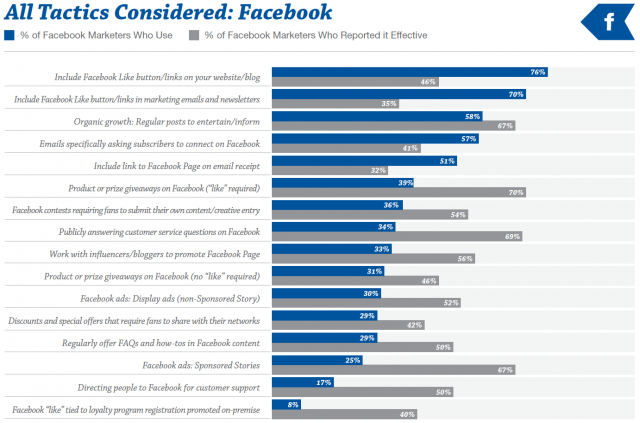
The Audience Growth Survey: Subscribers, Fans, & Followers – Report #22 by ExactTarget a Salesforce.com company
3 Must-Use Ad Tactics for Facebook Marketers
1: Find the Right App
Facebook presents many tools to help marketers achieve success without having to venture offsite for much of anything. However, creating, testing, tweaking and targeting content is exceedingly difficult to do without some third-party assistance. Marketers looking for a sharper edge this year should try to find a third-party ad-management application that offers freedom and ease of use.
What you’re looking for in the right ad-management app includes:
The end results is an easily programmable app that allows you to create, change, test and launch entire ad campaigns on a schedule you select, using ads you personally deem appropriate for the task. Every other tactic’s success depends in large part on the app you select for your ads.
2: Expand on Proven Organic Content
While paid advertising will, by design, always trump organic reach, many marketers find that some of their best ongoing success comes by way of everyday posts that ultimately build an organic following. Due to changes with Facebook’s Promoted Posts feature, you can now take an ad that was already popular and really kick it into overdrive with a bit of paid targeting.
Used in conjunction with your ad-management app to fine-tune the targeting, a Promoted Post can provide you with a litany of benefits, including:
Along with greater reach comes greater recognition. Using a Promoted Post in 2014 is one of the safest, most affordable, and effective forms of Facebook advertising.
3: Target Small
Although niche marketing is a tried-and-true principle of advertising that doesn’t change much on a year-on-year basis, 2014 presents a couple of solid reasons to quickly narrow your advertising focus. With more brands, more mobile users, and many more advertisements, focusing on direct niche marketing allows you to target those most likely to engage. This offers quality control abilities you wouldn’t otherwise have.
When setting up your next advertising campaign, think about:
Targeting small, and in spurts, allows you to quantify your efforts easily and without must hassle. After seeing which group is most responsive to a certain ad type, you can begin expanding your efforts to draw more interest from more areas.
Bonus Tip: Tracking Advice
No matter the type of app you’re using, the type of ad you’re releasing, or the size of the market you’re targeting, your progress must be tracked in order to ensure the success of your tactics. Releasing an ad campaign and letting it run its course without a watchful eye could result in disaster.

Use Facebook Insights to your advantage to view your engagement numbers, such as Likes, comments, shares, etc. You can view an assortment of graphs to tell you if you’re heading in the right direction.
Using the right app for ads is also going to give you an easy way into Google Analytics. This is a more in-depth analysis of how your campaign is doing. You can track URLs, create separate landing pages, and pretty much customize the system for optimum convenience.
Tracking allows you to tweak when necessary, to cut your losses if needed, and to double-down on working tactics. A campaign that’s not being tracked is a campaign doomed to failure.
About the Author: Simon Campbell, a writer from a Facebook ad campaign tool – Qwaya. He loves to write different topics about social media and participates in some communities and forums. If you have more social media marketing questions, feel free to ask Simon on Twitter
Our Improved Conversion Upside Report
Conversion OptimizationWe’ve redesigned our Conversion Upside Report so you can more quickly understand how much you should be investing in website optimization. We’ve used color and short commentary on six different criteria to help you understand where your site is on the spectrum of online businesses.
The Upside Report analyzes the current state of your online business and evaluates your readiness for an optimization program.
Every website will eventually add optimization to their tool belt. The question is when and how much should I spend?
The Conversion Upside Report seeks to answer that question.
All you need are the answers to three questions:
At a glance, the report tells you some important things.
These are the questions you should be asking now if you want to have future success online.
Get your Conversion Upside Report and let me know what you learn.
Brian Massey, Conversion Scientist
The Scent that Increases Online Sales
Ecommerce CROWe test just about everything we can here at Conversion Sciences. We are always surprised by what new technologies teach us about people, even if the technologies aren’t widely available.
 We’ve been fortunate to participate in a trial of the new oPhone, a device manufactured by Vapor Communications. The oPhone transmits scent across the Web, right to the desks of shoppers and to their olfactory receptors. Vapor has put the device into a large group of beta testers who keep it attached to their computers while they go about their daily tasks.
We designed a test to understand which scents drove more sales of which products on a client site that sold a variety of products. Would a leather scent sell more shoes? Would a male cologne make women buy more?
We designed a system that would send one of ten different scents to any individual oPhone beta users that visited a client website. They were never told when they were visiting an oPhone enabled site.
The scents we tested were leather, lavender, bubble gum, Old Spice cologne, new car, pine, Febreze®, Chanel No. 5, mint, and no-scent. Each of these scents required that we have a separate oPhone attached wirelessly to a one of ten computers. These were then routed through our testing software for delivery to the oPhones attached to the beta testers’ computers.
Why odor is different from our other senses
Odor is of particular interest to us because of the way the brain processes odors. It is the only one of the five senses that bypasses the thalamus, the traffic-cop of the brain. Smells, it seems, have free and direct access to the limbic system – the “lizard brain” – and the neo-cortex, where memories and experiences are stored. This, it is believed, is why smells are able to transport us to places we’ve been before, affecting our moods, emotions, and appetite.
Smell requires fewer “clicks” to reach it’s destination.The oPhones device both “records” scents and “plays them back.” It will accept a scent in the form of a gas, spray or aerosol. The devices analyze the odor and transmit a signature to the host computer who then controls when that signature is sent (scent?) to the visitor’s computer via IP triangulation. If the visitor’s computer is connected to an oPhone, the odor is reproduced for them.
As our tests reached statistical significance, the “Old Spice cologne” odor was winning for all products in all categories, far above the other eight scents and the control (no scent).
“Why was mint so successful in driving sales?” we wondered. So we played the scent back on our oPhone.
It wasn’t Old Spice.
The subtle, yet nostril-inflaming aroma was quickly identified as belonging to the methane family of gases. Methane is rare in urban society, outside of the water closet.
One of our scents goes awry
It seems that keeping track of ten oPhones and ten computers and ten test treatments proved too much for the person setting up these tests. An investigation revealed that one of the team members dropped an oPhone into their lab coat pocket in a rush to get off to the bathroom.
During their extended visit to the loo, our test assistant was back in the lab capturing scent samples from each of the oPhones. She didn’t notice that one was missing. As far as we can tell, she captured a smell signature from the oPhone sitting in the pocket of his bowl-clearing colleague. It was supposed to be the “Old Spice” odor.
Of course, we were relieved to have discovered the error. We would have had trouble convincing people that this guy had the odoriferous secret to sales of almost any product.
We were also able to recommend some dietary changes to our colleague. Something just wasn’t right there.
Nonetheless, we were left with a puzzle. Why did a scent that no one would consider odorable win so handily in our tests.
Relief is a powerful motivator
We believe that the issue at work here is “relief.” Whatever our oPhone-stealing colleague had eaten the night before, the central compound in the odor was methane. This is true for all of us. After years of daily visits to our porcelain sculpture gardens, our brains learned to associate methane with a feeling of relief; a lighter feeling; a feeling that our vertical leap is maybe a few centimeters higher. All of these feelings were accompanied by one distinct smell: methane.
Methane means “things are good” to our limbic brains.
We speculate that people are tense when they shop. Perhaps the olfactory signal that relief has arrived made them feel more comfortable buying online. It could be true.
Another hypothesis is that the odor made them feel that they needed to empty their carts quickly, before they “had an accident.”
None of these conjectures can be verified without more testing.
What scent do you think we should test next? Let us know in the comments before April Fools day is over.