online sales conversion

Interested in setting up your own conversion marketing laboratory? Run your own secret science experiments? Brian Massey, the Conversion Scientist, will tell you how.

Sometimes it’s better to ask forgiveness than permission

Warning: this information will make you a more successful marketer, but may also put your immediate job in jeopardy.

To be a true hero, you must have two things:

  1. An arch nemesis
  2. A secret

Unfortunately for those of us in marketing, our nemesis is often the organization in which we work; that Dilbert inspired, plodding structure full of people that think they know how to market. Such a beast is often resistant to our most powerful weapons, such as positive results.

The best way to defeat such a daunting foe is through patience and stealth. As marketers, we must build our strength, our knowledge and our skills.

How to set up your conversion marketing laboratory.

How to set up your conversion marketing laboratory.

Your Secret Conversion Marketing Laboratory

I propose that you consider building your own secret conversion marketing laboratory, your own Xanadu. This is the place you go to explore new marketing strategies and ask questions that others may not have the guts to ask.

Questions like:

  • What if we used more copy on our landing pages?
  • What if we tried an interesting headline?
  • Would audio or video increase our conversion rates?
  • Will social media work in our business?

These are the questions that take time to sell internally, especially when you don’t have the data. These are the concepts that IT is designed to thwart. It’s time to unshackle yourself. Build your own conversion laboratory.

Rules of Engagement

Now, as heroes, we want to do good in the world. This means doing no harm to our organization’s brand. We don’t want to work against our organizations already plodding attempts to communicate.

We want to minimize cost – most of us aren’t Bruce Wayne – and maximize automation. This will make our time in the lab most productive.

I cover all of the guidelines in my Search Engine Land column Setting Up Your Own Conversion Lab, Part 1.

Why Do We Need A Conversion Marketing Laboratory?

Because conversion marketing is a momentum game. It requires trying things to find out what works best. It requires rapid question-test-analyze-question cycles. And sometimes we have to test unintuitive assumptions to understand our audience.

Without the lab, there are blocks to momentum.

IT has their gatekeepers that slow our testing cycles. Management wonders why we aren’t writing a press release or blog post.

While most marketing departments think they know best, our lab lets our visitors tell us what they want. This is powerful knowledge. There are some big wins to be found in the lab, especially at the beginning.

The Secret Conversion Laboratory

Your secret conversion lab should be set up with a few best practices to be successful.

Consistent measurement trumps accurate measurement. Conversion marketing means making decisions based on data. Analytics provide that data.

We aren’t interested in an analytics implementation that is accurate down to the visitor. Instead, we want analytics that are sufficiently correlated to reality.

This is scientist-speak for “when things change, our measurement changes by about the same amount.” When more people visit, our metric “visits” goes up by about the same percentage. It mirrors reality.

Don’t waste your precious time trying to get accuracy in measurement. Good enough is good enough.

Most analytics systems are easy to set up, or are competently integrated into most of the online services you’ll be using in your lab.

Equipment cost must be “under the expense line”. The secret lab is, by design, not going to be a budget line item. That defeats the purpose.

Instead, you need to select tools that are free or cheap enough to purchase and implement without going through the budget process. They need to be expensible.

Avoid IT obstacles. The equipment you use in your conversion lab must not require IT resources to set up and use. IT is too often a bottleneck.

We will be selecting tools that almost any marketer can use. With a little practice and some training videos, you will be able to implement almost any test you can imagine.

It should be highly automated. We must get our marketing duties done with excellence, so our conversion lab can’t take a large chunk of our precious time. If you’re off in the lab for hours at a time, people will begin to wonder. It draws attention.

We will be looking for tools that automate the lab, and solutions that collect and aggregate data for us.

Your efforts should not harm the live web site. Our goal is to become better at marketing for our companies. As such, we should do no harm. Our lab should not:

  • Violate company brand guidelines
  • Compete with corporate sites on the search engines
  • Take significant financial chances
  • Violate compliance requirements in regulated industries
  • Circumvent or disregard your company’s privacy and permission policies

Basically, we want to do small tests, learning things we can use to help the company sell more and dominate online.

Beakers, Bunsen Burners and Mass Spectrometers

We are fortunate to have many of the tools needed in our lab available for free or at low cost.

You will need tools to:

  • Create and host content of many types.
  • Put measurement equipment in place
  • Heat up your experiments with traffic sources
  • Select the right content management system to host your experiments

Cape and tights are not required

It may be tempting the done a hero’s uniform once you begin to feel the power of what you learn in your lab. Honestly, It’s best to stay under the radar.

Let us know which tools you find in your lab in the comments, and please share any interesting results you get from your experiments.

Read on if you are interested in learning how to build your own conversion optimization team or contact us for a free consultation.

Originally published on the Search Engine Journal

Shopping cart abandonment is the most heartbreaking of conversion killers. it is also a fertile place to increase the performance of your website.

Shopping cart abandonment is like cholesterol: There is a good kind and a bad kind. For each there is a strategy for reducing the impact of abandonment on your business.

Good abandoners leave because they aren’t done with their shopping process.

Bad abandoners leave because you surprised them or didn’t provide the information they were looking for.

But it’s 2020, and the number of smartphone dependent shoppers has grown considerably. Thus, we will add one more layer of complexity to the shopping cart abandonment recovery strategy: desktop vs mobile visitors. Why it happens and what to do about it.

Cart Abandonment Rate Formula

The shopping cart abandonment rate formula is quite an easy Key Performance Indicator (KPI) to calculate. Divide the total number of completed purchases by the number of shopping carts created within the same period. Subtract the resulting number from one and multiply by 100 to get the abandonment rate percentage.

Abandonment Rate Calculation Example

  • Total number of completed purchases: 335
  • Total number of shopping carts created: 500
  • Cart abandonment rate: ((500-335) / 500) * 100 = 33%

Definitely not a bad shopping cart abandonment rate. Only 33 out of 100 customers are leaving their carts behind. Do you experience high add to cart but low conversion rates? Keep reading.

Top 7 Cart Conversion Optimization Solutions: How to Eliminate the Causes of Cart Abandonment Consider the following tactics to optimize your online shop cart conversion rate. They may help you reduce or eliminate the causes of shopping cart abandonment.

Top 7 Cart Conversion Optimization Solutions to Eliminate the Causes of Cart Abandonment.

The difference between mobile and desktop visitors

“A growing share of Americans now use smartphones as their primary means of online access at home. Today roughly one-in-five American adults are “smartphone-only” internet users – meaning they own a smartphone, but do not have traditional home broadband service.”

Source: Surveys conducted 2013-2019. Data for each year based on a pooled analysis of all surveys containing broadband and smartphone questions fielded during that year.

Traditionally, the desktop computer is a research tool and the smartphone is a dopamine delivery system.

These are two very different uses of internet attached computers.

For someone on a desktop, adding your product to their cart is the end of a journey. For the mobile user, the add to cart is to see how it will feel.

For a growing segment of our population, this is changing. For more and more people, the smartphone is their only source for communication, research, and dopamine. Reliance on smartphones for online access is especially common among younger adults, non-whites and lower-income Americans.

For this reason, we are not going to assume that most mobile visitors are “just shopping.” We are going to look at the causes of checkout abandonment and provide a playbook for eliminating them.

There are also consumers who only buy your products on desktop computers. They would not even think to pick up their phone and buy what you sell.

Let’s dive into how to reduce shopping cart abandonment and improve conversions.

Why do Shoppers Abandon the Checkout Process?

Just as science has identified “good cholesterol” and “bad cholesterol,” there are “good” and “bad” abandoners among your website’s visitors.

The Good Abandoners

Good abandoners leave you as part of their process. They are walking all the way to the edge of buying, even though they are not ready to buy. They are imagining purchasing from you. Yet, they fully intend to continue comparing your offering to alternatives when they start the checkout process.

And they may be hoping you’ll hang on to their selections for when they return. Wish lists and persistent shopping carts are a big help to these abandoners. More on that later.

The challenge is to get them to come back and buy when they are done. We cover some of the strategies for retargeting this visitor later on this article.

The Bad Abandoners

Bad abandoners leave you because they didn’t like what they saw after they got started. These abandoners are bad for you because they are lost opportunities. They were going to buy, but you chased them away with your checkout process.

Your purchase process confounded them, introduced new fears, or asked them to do something they weren’t ready to do, like create an account. Many of these abandoners started the process simply because they didn’t have all the information they needed to make their decision.

This kind of abandonment can be treated by improving the checkout process and by using pricing and shipping strategies.

The five primary “drivers” of Desktop cart abandonment

According to Forrester Research’s report “Understanding Shopping Cart Abandonment,” the five primary “drivers” of cart abandonment are:

  1. Shipping and handling costs were too high. (Bad abandoners)
  2. The shopper wasn’t ready to purchase the product. (Good abandoners)
  3. The shopper wanted to compare prices on other sites. (Good abandoners)
  4. Product price was higher than the shopper was willing to pay. (Bad abandoners)
  5. The shopper wanted to save products in his cart for later consideration. (Good abandoners).

Let’s look at what causes bad abandons and then talk about encouraging actual purchases.

High shopping cart abandonment rates are conversion killers. But they are also a fertile place to increase your shop's performance. Read on!

High shopping cart abandonment rates are conversion killers. But they are also a fertile place to increase your shop’s performance.

Understanding Mobile Abandonment

There are two kinds of abandoners: Those who were never going to buy and those who would have bought if only…

  • If only they could be sure their discount was applied.
  • If only they hadn’t been surprised by shipping.
  • If only the final price hadn’t been too high.
  • If only the form had been easier to enter their discount code.
  • If only there was somebody to talk to.

And there are some things that aren’t under your control, but are a particular problem for smartphone users…

  • If only my table hadn’t become available.
  • If only the movie hadn’t started.
  • If only my lunch hour had been longer.

The Impact of Distractions on Mobile Checkout

We have dedicated a whole article to maximizing mobile ecommerce checkout conversions. Take a look.

Top 7 Cart Conversion Optimization Solutions: How to Eliminate the Causes of Cart Abandonment

Consider the following tactics to optimize your online shop cart conversion rate. They may help you reduce or eliminate the causes of shopping cart abandonment.

1. Free Shipping/Free Return Shipping

When a visitor is ready to take action, they instantly begin doubting the sanity of their decision. This is the time to reassure them. Your return policy and shipping offers are great ways to remove their doubts. Getting stuck with a product you don’t want is a real fear, no matter how inexpensive the purchase.

Shipping costs are not usually refunded. Even if you have a generous return policy, buyers can see this as a risk. If your profit margins allow for free shipping both ways, great. Otherwise, adjust your pricing strategy.

In a few words, you should tell them that buying from you is  safe if this does not turn out to be a good purchase.

2. Lack of follow up actions after add-to-cart

What do you do when someone adds a product to the cart?

The typical ecommerce site takes the visitor to the Cart page. The problem with this approach is that it takes the visitor out of their shopping experience, maybe before they’ve finished buying.

The answer is typically a “Continue Shopping” button, that takes them to some part of the online retailer site.

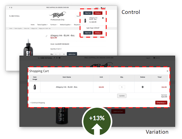
By making the cart popup overlay larger, we increased conversions by 13% for TATSoul.

By making the cart popup overlay larger, we increased conversions by 13% for TATSoul.

But, when a visitor has reached a product page, they are at the bottom of a rabbit hole. It may have involved a search, several category pages, and several product pages. They don’t want to start over.

To solve this problem, ecommerce sites have begun keeping them on the product page after they click Add to Cart, keeping their rabbit hole intact. However, if no visible acknowledgement is given, the visitor loses some of the satisfaction of their action. Or they may think the site is broken. Or they did something wrong.

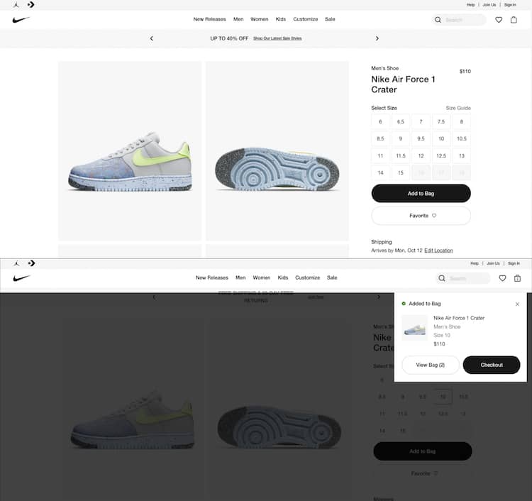
Make sure that you give your potential buyers a clear signal that they’ve done something amazing. BJ Fogg recommends that you celebrate their action in some way. This should increase the likelihood that they will complete the purchase. These are two examples that signal to the visitor that they have done something amazing.

After the click to buy, Nike adds an overlay to the product page and shows a timed checkout link.

After the click to buy, Nike adds an overlay to the product page and shows a timed checkout link.

Nike hovers a Checkout overlay for a few seconds leaving the shopper in the same product page unless they click the “View Bag” or the “Checkout” button.

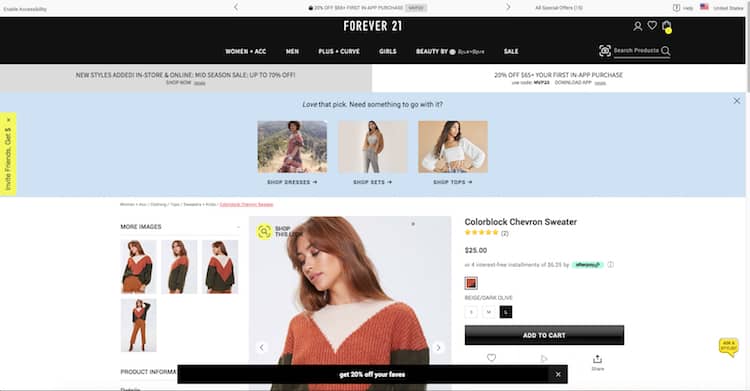
Or this one from Forever21 that tells their potential buyers they have done something amazing. Complimenting their taste, reiterating their offer to increase cart size (coupon code) and showing them product suggestions.

Forever21 does not lack on follow up actions after add to cart: promo codes and related products.

After showing the same overlay to the potential buyer, Forever 21 goes one step further.

3. Unsaved Carts

If I come back to the site, I expect my cart to still be there. Saving the visitor’s cart is an important part of abandoned cart remarketing strategies, in which an email or an ad brings them back to their selections.

Save the cart – by implementing a perpetual shopping cart – and find ways to encourage visitors to return.

4. Offer Live Support, Loyalty Programs

Your visitors will buy from you if you treat them well. They will buy again and again. Your willingness to be there for them both before and after the sale will determine their long-term value and your success.

The cart is a great place to show them you care. Have someone available on the phone or in a chat to answer their last minute questions. Let them know that this purchase is part of a reward program that shows you appreciate them.

There is an entire segment of your visitors that care about their relationship with you. Be a good relationship partner.

5. Exit Intent Offers

Remind them about the promotion you are currently offering just before they leave. Stop abandonment on its tracks. On Exit intent pop ups could help you with abandoned shopping bag recovery. Check out these 7 Best Practices for Using Exit-Intent Popovers.

6. Enable Guest Checkout

Maybe your customer doesn’t want to commit to you, yet. Offering guest checkout could make a difference in your cart optimization efforts. Instead of asking them to create an account, test and implement these Guest Checkout Tactics to Grow Ecommerce Sales (with Examples and Ideas) 

7. Ask your customers why they are leaving their cart behind

There are many tools to choose from that enable you to set up a short visitor survey to simply ask why they are leaving without checking out. This is a great use of exit-intent overlays. These can be delivered using Justuno, OptinMonster, Optimonk and other tools.

Cart Abandonment Solutions

Ok. We eliminated the causes but that doesn’t completely get rid of the problem. There will still be abandoners.

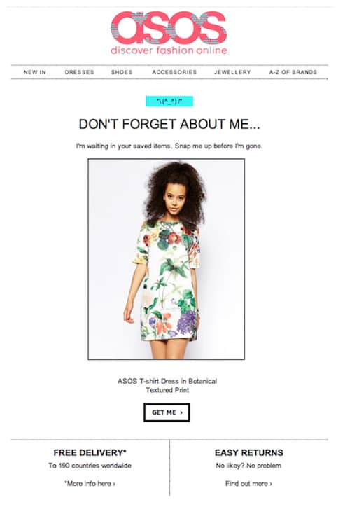
The most popular cart abandonment solution is the abandoned cart email or email recovery campaign. A great way to re-engage if you were able to get your prospective customer to give you their email. We promise to bring you a new article with the best abandoned cart emails cart and abandonment email examples soon.

ASOS example of abandoned cart email for their email recovery campaign, the most popular cart abandonment solution.

ASOS example of abandoned cart email for their email recovery campaign, the most popular cart abandonment solution.

To help you on your quest to lower your shop’s abandonment rate, we will also include examples of abandoned cart text messages, subject lines and email sequence.

If they don’t respond to your emails, not everything is lost. You can always implement an ad retargeting campaign. There are tools that even offer cross-device and cross-platform compatibility and mobile retargeting.

What is a Good Abandonment Recovery Rate?

According to the Baymard Institute, the average abandonment rate on online shoppers is 69.57%. In plain terms, 695 people out of 1,000 are abandoning their carts. A good abandonment recovery rate will be between 10% and 30% of revenue.

If you’d like to boost your website’s bottom line and gently nudge your customers through the checkout process, book a free site review with us.

We’ll take a look at your site free of charge.

Building a smooth customer journey is key to business and revenue growth. Here’s how to create a sales funnel that works in just 5 minutes.

You may not believe you already have one or more sales funnels in place, but all businesses do. Maybe it’s not working as expected. Or perhaps you would like to make it more effective. Follow these steps to create a sales funnel in 5 minutes that will have customers buying from you in no time at all.

What Is a Sales Funnel?

But first things first. Let’s quickly refresh the definition of a sales funnel.

A sales funnel is a hypothetical or ideal journey you would like a prospect to travel to become a lead or a customer. This is why sales or revenue funnels are also called “customer journeys” or “customer blueprints”.

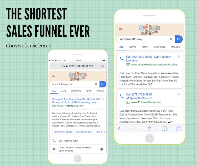
They can be as simple as a one step Click to Call Google Ad, where the button is your opt-in point or as complex as need be. Especially for those businesses where lots of lead nurturing is needed for prospects to convert.

Call only ads are best used when there's a sense of urgency to the offer. Isn't this one of the shortest sales funnels ever?

Call only ads are best used when there’s a sense of urgency to the offer. Isn’t this one of the shortest sales funnels ever?

Keep in mind, while you are building your sales funnel, that the best functioning ones are those that reduce friction. That is, they do not add unnecessary barriers or hurdles to the sales process.

Ready, Set, Let’s See How to Create a Sales Funnel in 5 Minutes

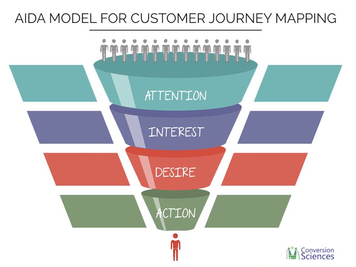
One of the sales models that is most frequently used in customer blueprints and customer journey mapping is the AIDA model, which stands for Attention, Interest, Desire, and Action. Developed by E. St. Elmo Lewis in 1898, it maps how people make purchasing decisions. And, in spite of the technological developments, its importance and effectiveness has not diminished as humans have not changed their buying decision making process since then.

Whatever tactics you use to qualify leads and drive them closer to taking the desired action will change accordingly to where the lead is within the funnel: top (TOFU), middle (MOFU) or bottom (BOFU). It essential to understand how the funnel works from the moment you make the first contact (TOFU) with your ideal future customers to the moment where you convert those leads (BOFU). Keep in mind that each one of these components depends on the others.

Creating a sales funnel is as simple as defining the desired action and the target audience and then drawing the path between those two. And as complex as making it function successfully.

Here’s how to create a sales funnel (or improve the one you have) in 5 minutes.

AIDA model applied to customer journey mapping.

AIDA model applied to customer journey mapping.

To Create a Sales Funnel First you Need to Generate Awareness

Attracting attention or generating awareness works best when you know your target audience media habits. You’ll be more successful if you advertise your brand, your products and/or services where the majority of your prospects already are.

These prospects may be currently looking for what your product or service provides or they may not. Those potential leads that are intently searching for a service similar to yours will notice relevant messages much more than those that are not.

For example, if someone is ready to upgrade to a new car, they will feel as if there are more automobile ads than usual. It’s because they are more aware. Generating awareness for your brand might be easier in this case. Funny how the brain works.

On the other hand, you may generate awareness amongst prospects with related needs. They are not looking for what you sell exactly. For example, while browsing their Facebook feed or reading a blog post, a person looking for a higher paying job may stumble upon a college or university they didn’t previously know existed.

Once you know where to find the vast majority of your audience, you can decide on a way to generate awareness about your brand. Usually these tactics range from PPC campaigns, TV or radio ads, billboards, blog posts, trade show participation, referrals, direct mail, email campaigns, online search results, all the way to super outrageous publicity stunts. You get the idea. Don’t craft the copy or the creative yet.

Have you chosen a tactic to introduce your prospects to your brand? Great! You’ve got the first step of your sales funnel covered. (Don’t overthink it) Move on to the next step.

Guiding customers through the buying stages: how to create a sales funnel that works in 5 minutes.

Guiding customers through the buying stages: how to create a sales funnel that works in 5 minutes.

Second Step: The Interest Awakens

To create a solid sales funnel, you have to drive your prospects to click, call, download, sign-up, or visit you. And even though this happens at the last stage, you need to present the reasons why your are worthy of consideration in order to make it happen.

Do you have an eCommerce site and are offering free shipping? Is your SaaS fulfilling a productivity need that is important to your lead? Or do your cars flaunt the features your prospective buyers are searching for?

Related reading: 7 Conversion Copywriting Hacks You’ll Wish You Knew About Sooner

You need to know your customers and their behaviors, habits, and motivations to cut through the noise and to offer them something they recognize as useful or relevant.

This is the time to entice and convince them as to why they need your product or service.

Third Step: Pick Me! Pick Me! or the Sales Funnel Desire Stage

You presented your benefits properly and showed value to your prospect. Now it’s time to elicit desire. Congratulations! You are in the middle of the funnel (MOFU).

Keep an eye on your goal, your lead has to desire your product or service above any other.

Hence, you should keep educating and positioning your brand as the solution to their needs and problems. This is the stage where you shine a spotlight on those benefits. Testimonials, case studies, product comparisons, and customer reviews work well here.

This is also the stage where you match your product or service benefits to the prospect’s needs to clear up any barriers to the sale. This is a critical stage in which website traffic often fails to convert.

Do not miss out on these 20 Landing Page Best Practices to Kickstart Your Conversion Lift

Fourth Step: Ask for the Sale

It seems to go without saying that any good sales funnel ends with a purchase. The biggest mistake people make when using the AIDA model, though, is to assume the sale will happen organically once the other steps have fallen into place. It won’t. Unlike an actual funnel, what goes into a sales funnel doesn’t always reemerge at the end. And people tend to not take action unless they’re asked. So, pay attention to your calls to action – the worst mistake sales people make is not ask for the close.

What’s your call to action? How will you prompt them to fill out the form, complete their shopping cart purchase, have a one-on-one call or meeting or do whatever final action you want them to take to complete their customer journey?

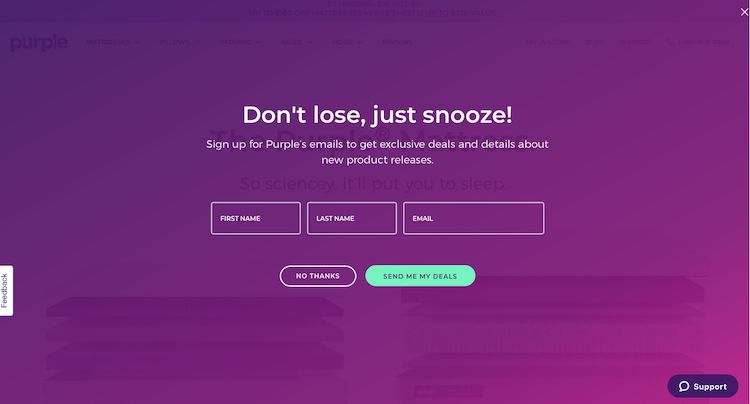
Purple mattress on exit intent pop up offer (BOFU).

Purple mattress on exit intent pop up offer (BOFU).

Maybe you’ll offer them a free assessment, or a last minute discount if they complete the transaction right away. Take a minute to decide as the BOFU stage is the most crucial since it’s where you ask for the sale.

Ta Da! 5 minutes to build a sales funnel without writing a single line of copy — yet.

Would you rather have the conversion scientists identify your customer journeys to help you build your funnels? Then, check out our Conversion Rate Optimization Audit Services.

Sales Funnel Examples

Now that we’ve created our customer journey, let’s take a look at a couple of sales funnel examples for inspiration.

I think we covered one with the call only PPC ads example. Great for a local business like a personal injury attorney or a plumber, locksmith or any organization whose concern is to make the phone ring. Another requirement for successfully using this type of sales funnel is a sense of urgency to your product or service.

Purple mattress provides visitors with a humorously informational and convincing MOFU tactic on their landing pages with their zany videos backed by scientifically proven data. We may be a bit skewed as they also wear lab coats but go ahead, play the video and tell us what you think – unless you decide to buy a mattress first. ;)

A typical lead generation sales funnel example that remains mostly on the TOFU stage is to offer a Free Book, Research or White Paper to visitors – organic or paid. Take them to the next stages of the funnel by offering a one-time offer or a free consulting session. Keep qualifying the lead and close it with a call or an in person meeting.

Once you have a funnel ready an implemented you will want to test it, so we leave you with 9 Imaginative Approaches to AB Testing Landing Pages to get you started.

Here is a list of questions you may — and should — ask before you choose the best conversion optimization consultant for your online business.

Maybe you have exhausted your resources or maybe you’d rather have CRO experts maximize your profits. Whatever your situation, it’s time to pick a conversion optimization consultant for your online business. No matter the business type – eCommerce, lead gen or subscription website – how do you know which optimization professional is the best? Better yet, how do you know which one is the best fit for your needs?

We rounded up 14 key questions to help you analyze and evaluate your prospective conversion rate optimization (CRO) consultants. Buckle up because here we go!

1. How Much will a Conversion Optimization Consultant Cost me?

Conversion optimization is an on-going process, meaning you can expect a multi-month engagement. Therefore an equally important question here is when will I start to see positive results and a good return on investment. To achieve this, try to compare their experience, the actual time they’ll invest in analysis and research for your project and, again, the return on investment. After all, their job is to increase your revenues.

Still, you want to have an idea of cost. Here it goes. Small conversion rate optimization firms can be found for as little as $2500 per month to run tests. For a full team approach, expect to pay between $5,000 and $15,000 per month. Enterprise-focused firms will charge up to $50,000 per month.

Agencies that specialize in search engine optimization, paid search advertising, social media and media buying are adding conversion optimization services to their line card because clients, like you, are asking for it. They are not necessarily conversion specialists, so they may offer conversion optimization as a part of their package for a small additional fee. So, ponder on this: Can this fee fund the resources necessary for a conversion optimization program that can make a difference on my bottom line?

A word of caution: Know what you buy into.

When it’s time to pick a conversion optimization consultant for your online business, you have to understand what their offer actually is.
Do you know how your conversion rate optimization consultant measures success? A great question to ask when you are trying to choose the agency that best fits your website needs.

Do you know how your conversion rate optimization consultant measures success? A great question to ask when you are trying to choose the agency that best fits your website needs.

2. Do I Need to Have my own Resources? How Much Time will I Have to Invest in this Project?

This will depend on the type of engagement you are looking for. Here’s an example. At Conversion Sciences we offer our clients a couple of service options.

If they prefer to hand over the conversion rate optimization portion to us, we furnish them with a full CRO team. No company resources needed. Just plan to spend an hour with your conversion consultant each week on an ongoing basis and a bit more while we learn about your online business. Feel free to learn more about our Fully-Managed CRO Services or as we like to call it: the Plug-n-Play Approach to Revenue Increase. (Yep, shameless plug)

If they have an internal conversion team already in place, or they don’t have sufficient traffic to warrant full time engagement, our clients can opt for our Conversion Rate Optimization Audit. They will even walk away with a thorough analysis of your customer journey. Discover more about these ad-hoc services here. Do expect to invest time and internal resources for this type of project.

Our advice, always ask this question. It will help you better compare and find the best CRO consultant for your website.

3. How will you Measure Success?

A great question that separates the wheat from the chaff. Let’s explain.

This is the best answer a CRO consultant can give you: “We will improve bottom-line metrics such as leads generated, transactions, or subscribers and that’s how we will measure success.”

It incentivizes your conversion consultant to look at the bottom line as their measure of success. And it also aligns the conversion consultant goals with your business goals.

Be careful of optimizing for secondary measures, such as clicks to a page with a form, bounce rate, the time visitors spend on your site or the number of pages they visit on average. It is often easy to improve these and not improve bottom-line metrics such as leads generated, transactions, or subscribers.

4. Can you Guarantee Results or a Conversion Rate Increase?

Should you pick a conversion rate optimization company that offers a guarantee or one that is willing to work for a percentage of the increased revenue? While these may seem like two very tempting offers, there are some downsides.

The most extreme guarantee is a pay-for-performance basis also called “I get a cut of your revenues”. On the plus side, they don’t get paid if they don’t deliver higher revenues. On the downside, they may get credit for your own promotions and not just for their conversion work. And as revenues increase, their monthly fees will look much larger to you. If conversion rates go way up, that’s good. But it means your consultant is getting paid very high fees. This can make you feel like you’re paying too much.

Therefore, even though these guarantees may feel as if they reduce the risk that you face as the site owner, they can also increase your overall investment.

Would you like a better solution?

Consider asking the conversion consultant to continue working for free if a predetermined goal is not met in a set timeframe. For example, if they can’t demonstrate a 10% increase in revenue in six months, they keep working for free. When they hit the results, they can start billing you again. Do you think they’ll accept?

5. How Much do you Know my Industry/Technology/Platform/Distribution Channel/Market?

If there’s one thing that testing teaches us very quickly, it’s that there is no such thing as a “magic formula.” Ideas that work for similar sites may not work on your audience. An orange button may work for one site, and not for another. Every audience is different.

Having said that, a conversion optimization vendor that has worked with a number of your competitors will have a playbook of ideas to consider. There will be ideas that never would have occurred to the team without the hindsight of having worked in your industry. If they also know your website platform and technology, their learning curve will be limited mostly to your product, service or business brand.

And while a solid understanding of your website platform is always a plus, industry experience can also be a hindrance. If the vendor is overly familiar with websites in your industry, they may not be able to look at your site with fresh eyes. A key advantage of external vendors.

All-in-all, a disciplined optimization process will work in any industry. Ask your vendor for some examples of novel ideas that are specific to your industry, but make sure they have a proven, repeatable process.

So, before you pick a conversion optimization consultant for your online business ask yourself if you are looking for a fresh pair of eyes, or for somebody that can quickly catch up and contribute as if they had always been a part of your team.

6. Can you Share Some Case Studies?

A case study will help you understand how the consultant helped other businesses improve the performance of their website from a lead generation, sales or subscription increase standpoint. Take case studies showing giant performance gains with a grain of salt. This can happen for you, but not always.

A consultant should always be able to facilitate and show you their case studies but you should go the extra mile and also ask to speak with their clients. While they will refer you to clients they’ve had success with, you can ask about situations in which your conversion consultant struggled.

How a consultant deals with adversity is as important as how they behave when things are good.

Should your CRO agency guarantee results or a conversion rate Increase? Discover the answer on the Conversion Scientist blog.

Should your CRO agency guarantee results or a conversion rate Increase?

7. How will you Get to Know my Target Audience and What is your Process Like?

Successful conversion consultants let the data tell them about your audience. Your analytics data, surveys, reviews, and chat transcripts can reveal many issues with you website. If that is not enough, they should resort to surveys, session recordings, heatmap reports, and A/B testing.

Any other answer from a CRO consultant could demonstrate that they do not have the optimization experience needed to perform the job.
Getting to know your target audience will be one of the first steps in the process, so make sure they share with you what the rest of the process looks like, or that is somewhere on their website. You want to know how much of your time will be spent supporting the on-boarding process and if there are any additional fees for software or special ad-hoc work.

8. Do you do Split Testing or can you Implement Personalized AI-Powered Experiences to my Visitors?

A solid conversion rate optimization consultant will be well versed on every optimization technique and tool available and will recommend the one that is the best fit for your business. Stay away from those who try to steer you towards a single solution. Unless you want a one trick pony and not a true blue pro.

Related: AI Optimization Services for High Traffic Sites

9. How do you Know what to Optimize First?

The most common framework for ranking ideas is called ICE, which stands for Impact, Confidence, and Effort. It helps collect and rank all of the ideas that will come up when starting a conversion rate optimization project.

Asking this question may weed out the weakest prospective vendors. After all, a solid understanding of methodologies demonstrates the kind of professionalism you are looking for.

10. What would you Like to Know about our Company?

Your conversion consultant will be ravenous any for data you have. Ideas come from chat transcripts, marketing research, surveys, personas, reviews, advertising data and more. Conversion consultants are uniquely able to turn your existing research into test hypotheses.

Be suspect if they don’t want to know more about YOUR business. Optimization professionals have inquisitive minds and they always want to know more. Giving them the opportunity to ask you questions allows you to dig into their curious nature and mental process.

Good consultants will have lots of answers to this question.

11. Do the People I’ll be Working with have Strong Optimization Experience?

More than likely, you had a chance to speak to the top people in this agency. They have positively impressed you. But, what does the team that will be working with you look like? Are they experienced? If they are juniors, what type of supervision will the vendor provide. You want reassurances and you should be asking these questions.

Conversion optimization is a relatively new field. There aren’t a lot of experienced conversion consultants available to hire. And this is not a set of skills that is easy to teach in the classroom.

This is where process comes in. Your consultant should be able to articulate a repeatable, proven process that has a history of positive results.
If you’re working with an agency, there is a good chance you’ll be working with a less-experienced individual. Find out how the agency backs up this individual with analytics, test design and data science. They should also be backed up by someone with strategic marketing experience. Conversion optimization is strategic as well as design-oriented.

12. How Quickly will I Get my Money Back or How Soon will I See Results?

Beware of those who can guarantee a full return on investment within a short timeframe. CRO consultants will be able to make some estimates once they start working with you and they can also share their previous and similar experiences. But that’s all they are. Estimates and experiences. And no two websites or business are completely alike.

13. Do you Work with the Tools we Bought or can Afford?

If you are now working and/or already invested in conversion optimization tools, bring up the topic on your first conversation. You will want your consultant to know you expect them to use your tools proficiently, or to have experience with similar tools from different vendors.

As far as affordability goes, we live in a golden age of marketing tools. There are many options at many price points. The consultant should be able to help you choose a tool that fits their needs and your budget.

Always consider that most conversion consultants will give you a better return on your investment in optimization tools.

Here is a list of questions you may - and should - ask before you choose the best conversion optimization consultant for your online business.

Here is a list of questions you may – and should – ask before you choose the best conversion optimization consultant for your online business.

14. What is the Consultant’s Testing Philosophy?

Each consultant will have a testing philosophy. Some favor scientific rigor. Others favor quick decisions. Here are some questions to ask them and the answers you will want to hear.

How long will you run an AB test?

No AB test should be stopped before two full weeks have passed. If you have a high volume of conversions, one week may be acceptable, but no less.

Will you stop a variation if it looks really negative?

Most conversion consultants will monitor tests and stop any variations that seem to be underperforming to avoid lost sales and fewer leads.

Do you let tests overlap?

If your prospective conversion consultant plans to run tests on multiple pages of your site, there is a risk of polluting the data and making bad calls. They should be able to visitor from getting into multiple tests.

How do you do quality assurance on tests?

The tools that conversion consultant uses give them sweeping powers to alter your site. It is surprisingly easy to break your site, even if they checked it. A thorough Quality Assurance (QA) process includes testing on multiple devices and involves several people before it goes live.

What kind of post-test analysis do you do?

Even if a test finishes and there is no winning variation, your conversion consultant can learn important things from the data. They just have to take the time to do a little more analysis, called “post-test” analysis. This should be part of their philosophy.

Can you perform multivariate tests?

If you have a high-volume site, multivariate testing is an important option. You may also want to find out if they can use machine learning AI tools to accelerate their testing.

How to Pick a Conversion Optimization Consultant for your Online Business

Final word of advice: no matter who you choose, make sure the consultant you hire is the one that is able to deliver on the strategy YOU need.

Solid CRO firms will tell you right out if they are unable to help you and may even recommend alternative solutions to your business problem, Use these questions when the time comes to pick a conversion optimization consultant for your online business. Who knows? It may even be us!

Discover how to identify what keeps visitors from converting on your site. Five factors you MUST look into to improve online conversions right now.

There’s one thing, one thing that’s keeping your visitors from converting on your site.

It may not be the only thing, but it is the primary thing that your online business isn’t delivering the results you expect. It’s where you start when you optimize your website.

So, traffic but not conversions? It’s one of these five things:

  1. The Value Proposition and Messaging isn’t clear.
  2. They perceive risk when considering taking an action.
  3. You aren’t showing up as credible and authoritative.
  4. They want to know if others have benefited from you.
  5. Your design and layout aren’t helping them digest the buffet of content you’re presenting.

Find out what keeps visitors from converting on your site and start testing to increase your conversions right now.

How to identify what keeps visitors from converting on your site.

How to identify what keeps visitors from converting on your site.

Value Proposition & Messaging

Do you think your value proposition is the one thing that keeps visitors from converting on your site? Let’s take a look at the anatomy of a value proposition. Your value proposition is composed of all of the things you do to solve a problem and is communicated by:

  1. Brand awareness
  2. Content and Copy
  3. Images
  4. Pricing
  5. Shipping policy
  6. Words used in your navigation
  7. Design elements

All of these website elements are used to let your visitors know how you solve a set of problems, and why your solution is the best choice. The one that will save the most time and money, or that will deliver the most satisfaction.

But your value proposition doesn’t have to be communicated through words and images alone. Video, audio and animations are proven ways to communicate your value to a prospect.

And herein lies the rub.

Digital media gives us the amazing ability to put anything onto a landing page that our hearts desire. And if you can do anything, how do you know which is the right element to use? Here lies the conundrum.

How to know if your value proposition is what keeps visitors from converting on your site

A high bounce rate is a sign of three things:

  1. You’re bringing the wrong traffic
  2. Your lead isn’t hitting the mark
  3. You’ve been attacked by bots

If your landing page suffers from a high bounce rate, look at the source of your traffic. Does the page keep the specific offer made in the paid ad, email, or organic search query that enticed the visitors to click on your site? If it’s your homepage, the answer is most certainly, “No.”

If you feel that your traffic is good, and is coming to a relevant page, then we should ask if the lead is hitting the mark. By “lead” I am referring to the headline + hero image.

Often, hero images are wasted on something non-concrete. The headline should act as the caption for the image it accompanies.

Don’t show a city skyline. Don’t show a person smiling at a computer. These things don’t scream for meaningful captions and don’t help conversions either.

You should also look at the words you use in your main navigation. These should communicate what your site is about in the words of the visitor, not just the structure of your website.

Still don’t know what’s keeping them from converting? Ask your visitors

If you still don’t know what is keeping visitors from converting on your site, consider using an exit-intent popup that asks one open-ended question: “What were you looking for when you came to our site?” or “Why didn’t you purchase?”

We are also big fans of putting an open-ended question on your thank-you page or receipt page: “What almost kept you from buying?” or “What almost kept you from signing up?”

Discover How Our Conversion Rate Optimization Analysis Services Work

You May Be Scaring Visitors Away: Use and Misuse of Risk Reversal

In general, more people make decisions based on fear than on opportunity. So, your amazing value proposition is destined to die in the minds of many of your prospects because of fear.

  • What if I don’t like the product?
  • What if my identity gets stolen?
  • Will a pushy salesman call?
  • Will I have to deal with tons of email?

At the heart of it all is, “Will I feel stupid if I take action right now?”

Risk reversal (and most of the following) is a set of tactics that puts the visitor’s fears at rest. It consists of things like:

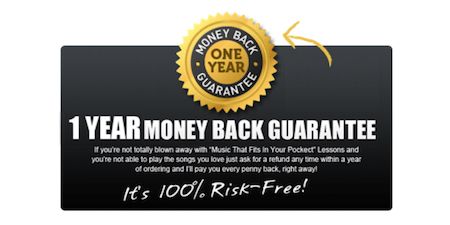
  • Guarantees
  • Warranties
  • Privacy policies
  • Explicit permissions
  • Return policies

Placing these items in clear view near a call to action can do wonders for your conversion rates.

Don’t put fears into their mind

There is a potential danger. Your risk reversal tactics can actually put fear into their mind.

For example, stating, “We will never spam you.” can actually place the concept in the mind of someone who wasn’t concerned about it. You might say instead, “We respect your privacy.” with a link to your privacy policy.

Traffic but not Conversions? Help Visitors Convert on your Site with Social Proof

Social proof demonstrates that others have had a positive experience with your brand. These take the form of:

  • Testimonials
  • On-site ratings and reviews
  • Third party reviews
  • Case studies
  • Social media shares, likes and comments
  • Comments

If social proof is your one problem that keeps visitors from converting on your site, customers don’t feel that you’re right for someone like them. Make sure you show them that they are in the group of people that benefit from you.

Negative Reviews Help

Ironically, it also serves to answer the question, “Just how bad was a bad experience with this company?” This is why negative reviews have proven to increase conversion rates on eCommerce sites. Cleaning your reviews or only posting good reviews can shoot you in the foot.

Is it Lack of Credibility & Authority What Keeps Visitors from Converting on your Site?

If you are in an industry with lots of competition, or with “bad actors” who manipulate to get sales, your one problem may be credibility and authority.

The design of your website is one of the first things that communicate credibility. But be careful. A fancy, overly-designed site may communicate the wrong idea to visitors. It may convey that you’re expensive or too big for your prospects.

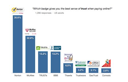
Credibility can be established by emphasizing things about your company, and by borrowing credibility from other sources such as, your clients. your payment methods, you media appearances and the like.

Brand Credibility

You gain credibility by building confidence with your brand and value proposition. How long have you been in business? How many customers have you served? How many products have you sold? How many dollars have you saved?

Brand credibility generally takes the form of implied proof.

Borrowed Credibility

Your website or landing page can borrow credibility and authority from third-party sources. Placing symbols and logos on your website borrows from these credible sources. Ask yourself:

  • Have you been interviewed or reviewed in well-know publications?
  • Have you been interviewed on broadcast media outlets?
  • What associations are you a member of?
  • What awards have you been nominated for or won?
  • Has your business been rated by consumer organizations like Consumer Reports or the Better Business Bureau?
  • Have your products been reported on by analysts such as Forrester?

Place proof of your associations on your site’s landing pages to borrow authority and credibility from them.

User Interface & User Experience: Factors that Keep Visitors from Converting on your Site

Nothing works if your visitors eyes aren’t guided through your pages.

No value proposition, no risk reversal, no social proof, no credibility stands a chance if the layout and user experience don’t help the reader understand where they’ve landed or where to go from there.

Long load time equals poor experience

The first thing to look at is site performance. If your pages load slowly, you visitors may be bouncing away. If any element requires a loading icon of any sort, you are probably providing a poor user experience.

Clutter means bad visual hierarchy

When a visitor looks at a page, it should be very obvious what is most important element and what can be looked at later. This is called a visual hierarchy.

For example, we like to make call to action buttons highly visible, so that it is clear to the reader that they are being asked to do something.

Designers use their knowledge of whitespace, negative space, font, font size, color, and placement to design an experience that is easy for the visitors’ eyes to digest.

Don’t add surprises

A good user experience has little place for novelty. Arbitrarily adding animations, fades, parallax images or scroll-triggered effects are generally unnecessary, can cause technical glitches and may actually hurt conversion rates.

How to Know “what” is Hurting your Conversion Rate

We recommend this process to determine the primary problem that keeps visitors from converting on your website.

1. Gather all of your conversion optimization ideas

Begin recording all of the ideas you have for improving the site in the spreadsheet. Sources for these ideas:

  1. Ask your team
  2. Read your customer reviews
  3. Read your customer surveys
  4. Pull from your marketing reports
  5. Read your live chat transcripts
  6. Generate heatmap reports for your key pages
  7. Watch recorded sessions

Don’t be surprised to have dozens of ideas for a website or landing page.

2. Categorize each of your ideas

The ROI Prioritized Hypothesis List spreadsheet has a column for classifying each idea.

  1. Messaging
  2. Layout/UX
  3. Social Proof
  4. Risk Reversal
  5. Credibility

There will also be some things that you just want to fix.

3. Count your conversion optimization ideas

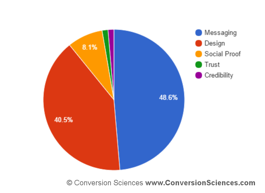
Count out how many ideas you have for each category. The category with the most ideas is probably the one problem you should address first. We use a pie chart to illustrate the different issues.

What Keeps Visitors from Converting on your Site? This site's one problem is Value Proposition and Messaging followed by Layout and UX

This site’s one problem is Value Proposition and Messaging followed by Layout and UX

4. Start working

Begin working on the ideas in the category with the most ideas.

This is a great time to start AB testing to see which of your ideas really are important to your visitors.

Your search traffic will demonstrate their approval through more sales, more leads and higher conversion rates overall.

This sounds like a lot of work

It is a lot of work. But you could consider hiring us to identify what keeps visitors from converting on your site and we will test our way to your success.

You can request a free consultation with us.

This article is an updated and revised version of our original article published on Search Engine Land.

Brian Massey

Are you a Whack-a-mole Company? You should be.

Every industry has them. Your company may be one of them. They are the whack-a-mole companies, sticking their virtual neck out, and striving to do things better, driving online sales with an evolving ecommerce conversion marketing strategy.

And they often get whacked.

But the companies I’m talking about hunker down in their holes and plan their next chance to pop out again, with more force. It’s in their blood. The Internet is becoming the place they stage their emergence.

These whack-a-mole companies may sell products that range from the common to the mundane. Zappos was a whack-a-mole company. They started out in online sales of shoes. In ten years, Zappos outshone their competitors and sold an almost $1 billion business to Amazon.

Core E-commerce Conversion Marketing Strategy. Wikipedia calls Whac-a-mole a

Wikipedia calls Whac-a-mole a “Redemption Game”

The GoodLife Team is a whack-a-mole company in the very competitive real estate market. They are small by the standards of their peers, but like Zappos, I expect them to pop out of their hole with such force that they will leave the table altogether, flying free of the hammers that seek to drive them back.

Patience and Impatience: Ecommerce Conversion Marketing Strategy for Online Sales

Whack-a-mole companies are both patient, and remarkably impatient. They are remarkably impatient to try new things. They aren’t careless. Successful whack-a-moles seek to find out what works and what doesn’t quickly.

Yet, they are patient in the long run. They know that they’re going to get whacked a few times, and they prepare for the blows. Theirs is a journey of learning and persistence.

I am drawn to these kind of companies. It is them that I find myself writing for.

Ecommerce Whack-a-moles

If you are a budding whack-a-mole in your industry and want to turn the Web into a powerful sales channel, find out how the highest-converting sites on the Web use ecommerce marketing strategy to maximize conversion rates and online sales. “Conversion” is the magic that makes you stronger than your competitors.

The E-commerce Pattern: Core Conversion Marketing Strategies

Here are the three strategies that are conversion deal-breakers for e-commerce web sites. Get these strategies right, and you should be able to optimize your way to higher conversion rates. Get any of these wrong, and you will find yourself struggling to improve.

The third of the five “core” conversion marketing patterns is the e-commerce pattern. The two patterns I’ve already discussed are the Brochure site and the Portal site. As a refresher, the Brochure pattern is a known as the “sales support” pattern. The purpose is to provide information during the sales process and tell prospects how to get more information. The Portal pattern, also known as the “advertising model” and “subscription model,” monetizes content.

For this discussion, I assume a site is generating reasonably qualified traffic and that the offering has a demand in the marketplace.

The E-commerce pattern

Also known as “online shopping,” “eRetail” and “eTail,” e-commerce sites are designed to handle the online purchase of a product or service. For purposes of this discussion, you are building a site with the e-commerce pattern if:

  • You accept payment on your website for a product or service
  • The buyer consumes the product offline. The “site as a service” pattern is targeted at businesses that deliver their product directly through the site.
  • You are selling more than one item, more than one version of an item, or more than one product line. A single item site should look at the Portal Pattern, or the up-coming “Considered Purchase” pattern.

My goal here is to explore three strategies that are conversion deal-breakers for e-commerce websites. Get these strategies right, and you should be able to optimize your way to higher conversion rates. Get any of these wrong, and you will find yourself struggling to improve.

Category pages

For sites that feature dozens or thousands of products, it is critical that visitors at all stages of the buying process find their way to specific items on your site. Category pages are the traffic cops, driving shoppers to the right product areas and eventually to the products they seek.

Are category pages more important than the home page? For visitors who are just becoming aware of your online brand, the home page serves as the top-level category page, or the “featured products” category page. A quick survey of the highest converting retail sites on the web reveal some interesting similarities in their category page and category page design.

  • The home pages are filled with specific offers. The page is essentially designed like a circular you would find in your newspaper.
  • Intuitive categories are displayed to help visitors dive deeper into the site.
  • Some sites use a BAH (big ass header) that cycles through offers. Flash banners can sink your conversion rate unless you are using them to provide specific offers.
  • Pricing is put front and center on product “ads.”
  • Copy is included with the products that are displayed. Even if there is only space for a few words, some value proposition is put forward with each product. A product image and the price often isn’t enough.
  • Search is present on every page.

Defining the right categories is critical. Most of the high-converting sites have between five and eight categories in their top-level navigation. Office Depot gets it down to four. More refined categories are listed in the left column; “specials,” “best sellers,” “brands,” etc.

For e-commerce sites that don’t have the brand strength of these large retailers, it is tempting to spend space talking about the company and its unique value proposition. Keep this brief. Avoid the temptation to add ancillary items to navigation, such as “about us.” Let your offers and categories do the talking for you.

In summary, specific offers, smart category choices and search are the hallmarks of strong category pages.

Product pages

Just as landing pages are crucial to increase the conversion rate of advertising efforts, well designed product pages are crucial for the e-commerce website. With best search engine optimization practices, product pages become the landing pages for searching shoppers.

Product pages typically ask the visitor to “add to cart” and “buy now.” These should be the most tested pages on your site.

The elements that make for a great product page differ from industry to industry, but there are some rules of thumb.

Show the product. There is a correlation between the conversion rate of a page and the number and quality of product images available.

Provide all of the information a visitor needs to say “yes.” Price, shipping, return policy, ratings and reviews; what you include on your product page depends on what you’re selling, and to whom.

Test to find the right balance of information. Providing too much information can distract buyers from clicking “buy now,” and even introduce reasons not to buy.

Product pages serve two masters: people who are already exploring your site and those who have landed there due to a search engine query. Test these pages to find your best converting product page design.

Shopping cart

E-commerce shopping carts have traditionally been a thorny issue with conversion scientists and web site optimizers. Too many businesses choose shopping cart software that is rigid and difficult to customize. Many of the most popular shopping carts on the market seem to have been designed by engineers, and they don’t consider that buyers may be on the brink of abandoning the transaction.

The purchase process is the needle point for your success. The wary shopper is always on the lookout for red flags, reasons to reconsider their purchase decision. Alarms are sounded by what is missing from your shopping cart pages.

The shopping cart is often used as an information resource. Prospects will add a product and then start the checkout process to uncover information that they didn’t find elsewhere on the site.

  • What are my shipping options and what will it cost me?
  • What will tax be?
  • Are there any catches?
  • Is the product in stock?
  • Provide this information on your product pages to reduce these informational probes into your shopping cart and decrease your abandonment rates.

Flexibility is the key with shopping cart systems. They should be easy to customize, provide places for “reinforcing” copy, and be able to answer questions like those above. If your shopping cart can support A/B split testing, all the better.

The shopping cart is so important, that almost any business should consider replacing their system if they can’t easily and quickly change the sequence, layout, button location, button text, page copy, promotion codes, trust badges, etc. As with product pages, small changes in these elements can result in big increases in conversion rates.

As of this writing, I can’t recommend any shopping carts systems that meet these criteria. Please offer your recommendations in the comments.

There are a variety of tactics to be explored within each of these make-or-break strategies: category pages, product pages and the purchase process. There are other strategies that may be equally important, and I welcome your input through the comments. Building an email list is one such strategy that comes immediately to mind. It can be a powerful conversion tool for businesses whose customers purchase frequently. I’ll write more about this strategy in my next installment when we talk about the “considered purchase” pattern.

It gives you the force to fly free of your industry Whac-a-mole table by slashing your online sales costs.

Be free, my plastic mole friends!
brian signature

Photo courtesy O Mighty Crisis Blog.

This article by Brian Massey was first published on Search Engine Land

Lead generation is the lifeblood of online business and most lead generation is done via email collection.

If you grow a list of prospects who’re interested in your promotions, your business grows too. However, before you make money from your list you’ve got to get people on it. Whether you want people to download your lead magnet, sign up for your latest webinar or volunteer to test your product, you first need to persuade them to part with their highly guarded personal details – that’s no small feat.

No wonder the average opt-in rate across industries is hovering around a mere 2%. After investing a fortune in Facebook advertising, PPC ads, outsourced content, content management software, site design, and more, you only net two leads per 100 visitors. Two leads… NOT customers mind you.

Surely, your business deserves better.

Today, we’re going to cover the eight elements of a high converting opt-in page so you can boost your opt-in conversion rates and get a better return on your content marketing investment.

Ready to dive in?

Element #1: A short pre-headline to draw them in

When your prospect arrives on your opt-in page she wants to know if she’s in the right place. If she feels lost, she’ll click away. Use the apex of your page to make her stick around.

And, depending on who you ask, you have five seconds or less to do that. But how do you do it? Here’s three ways to instantly attract your reader when she lands on your page so she stays on.

#1. Name the target audience
For example, Attention dog owners, Attention Content Marketers etc.

When you name your audience you get a nod from the prospect, “Yep that’s me.” Handled correctly, this small first yes will ultimately lead to the big yes of a signup later on.

#2. Name the type of lead magnet
For example, Free Special Report, Free Training Webinar etc.

The specificity of your offer increases desire and the likelihood of the prospect staying on so as to get it.

#3. Name the referral site
Naming the referral site on your page makes your prospect feel like a diva and warm up to you and your offer.

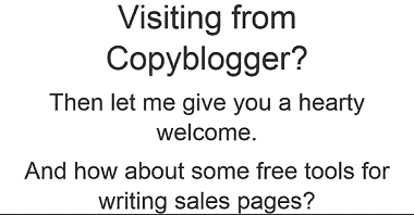
Amy Harrison rolls out a red carpet for her Copyblogger readers. She makes them feel the love by welcoming them: specifically, heartily, personally.

image1 3

                                 Source

Your pre-headline has four main purposes:

#1. To help your prospects understand your offer…fast.

#2. To alienate those who are not a good fit for your offer.

#3. To attract those who are perfectly suited to your offer.

#4. To build rapport with your audience in an instant.

A great pre-head will keep readers on your signup page.

Element #2: A benefit-rich headline to make them want to read more

Once your prospect hangs around, use your headline to show her how your offer will benefit her and improve her life. Promptly address her concerns so she lingers on the page or you’ll lose her by the door. Quickly address her pain, paint the desired future for her, or pique her curiosity so she can’t help herself but read on.

In short, tell your prospect what’s in it for her.

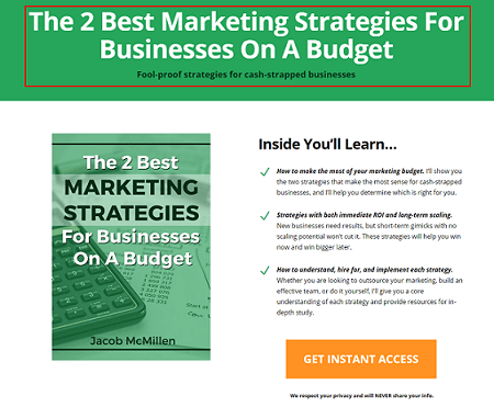
Jacob McMillen’s headline is ultra-specific and has a solution that’s tailor-made for cash-strapped businesses – that’s a big benefit that’ll keep his target audience glued to the page.

image5-2

                           Source
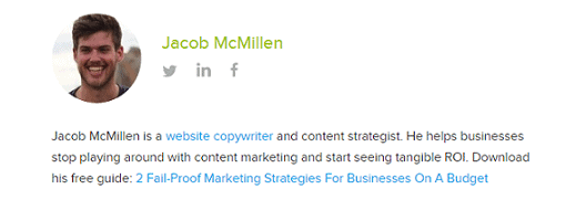
Not only that. Your headline must also tie in nicely to the traffic source. That way the prospect’s conversion journey becomes smoother thus generating better results for your business. Jacob McMillen does this superbly as the source page to the above landing page shows:

image2-1

Notice how his CTA, the last words in his bio, are the first words on the landing page? This way the byline is perfectly coupled to the landing page thus increasing conversions. When a reader clicks his bio and lands on the landing page she smoothly continues her conversion journey – because of harmony between the two pages, conversions are likely to be higher.

On the flip side, a copy mismatch between the source page and the signup page tanks conversions.

Element #3: A few lines of crisp copy to pull them further down the page

You’ve done well if your prospect is still on your page thus far.

Your next few lines should give specific points about your offer. Show her how your offer will scratch her itch or push her towards her dream. Do that and she’s more likely to give you her details.

Use bullet points or short paragraphs. Your bullets should be:

  • Clear- use simple direct language so the prospect easily grasps your offer.
  • Crisp- keep your points brief and to the point to keep the prospect engaged.
  • Catchy- use attention-getting words to give details about your offer.

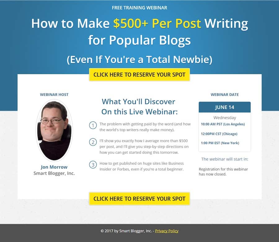
Smartblogger nails their bullet copy on this sign-up page for an upcoming webinar.

image11-4

Source

The three bullets tell you exactly what you’ll get on the webinar in a simple engaging way without laboring the point. If you’re going for the minimalist approach even a single line will do. The amount of copy on the body of your opt-in page depends on three key factors.

#1. How aware is your prospect about you and your offer? The more aware she is about you and what you do the less copy you need and vice versa.

#2. What works best for your niche? Study the most successful signup pages in your niche and do likewise.

#3. How complex is the problem you’re trying to solve for the prospect? The more complex the problem, the more copy required to convince prospects to sign up.

Element #4: A pro-looking image to help them visualize what they’ll get

Our brains process images up to 60,000 times faster than text.

To woo your prospect so she says yes to your proposal (offer), show her what she’ll get. Use a picture of the product or of people expressing the feeling you’re targeting. Pictures of animals work well too if your context allows it.

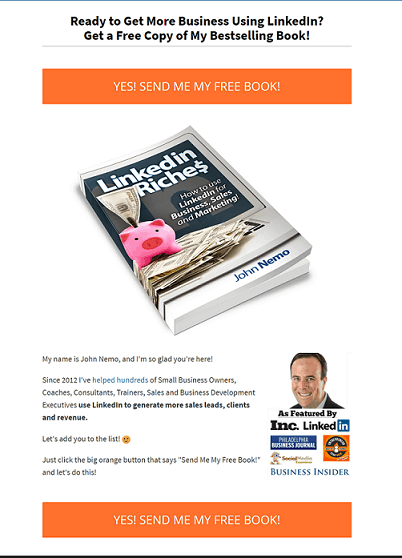
John Nemo’s book shot dominates his opt-in page on purpose. You can almost smell the LinkedIn cash splashed on the cover.

image7-3

                              Source

A word of warning about pics: don’t just include a picture because you like it…that won’t help your cause. Only include a picture if it’s relevant to your offer.

Element #5: A signup field(s) to capture their personal details

You’re almost there now… your prospects cursor is hovering over the signup field. Now comes the big question…how much info do you want from her?

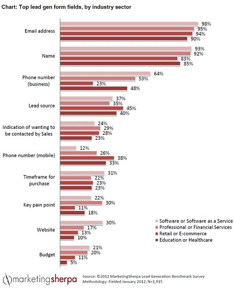
Numerous tests show that, in most cases, the fewer the signup fields, the higher the conversion rates. That’s why most sites simply ask for an email address and/or name only as shown in the Marketing Sherpa lead generation graphic below.

image8-2

   Source

Of course, you can ask for more than that if you want a more targeted list. Although your conversions may dip, the quality of your list will improve. Ask for what you need and no more. This makes filling the fields more desirable. You can always ask for more details later.

But, as with everything digital, conduct split tests to see what works for you and your audience instead of blindingly jumping on the bandwagon. In many cases, tests have shown that increasing the number of fields actually raised conversions.

Element #6: A bit of social proof to earn their trust

It’s natural. No one wants to go first. People do what they see other people do. That’s why social proof is a vital ingredient to the success of your page. Here are some three quick-and-easy ways of incorporating social proof into your signup page:

#1. Display your list numbers if they’re substantial

To nudge people over the sign-up line, you can use big numbers associated with your following. However, be careful as numbers can be a double-edged sword. If your numbers are small, social proof will still work, but against you! No-one wants to be a part of something small and insignificant.
Social Media Examiner uses their massive list to good effect to inspire people to join their list.

image4-4

Source

Surely, on seeing the 620 000+ social media marketing peers on Social Media Examiner’s list, a prospect will be enticed to sign up.

#2. Splash customer testimonials generously on the page

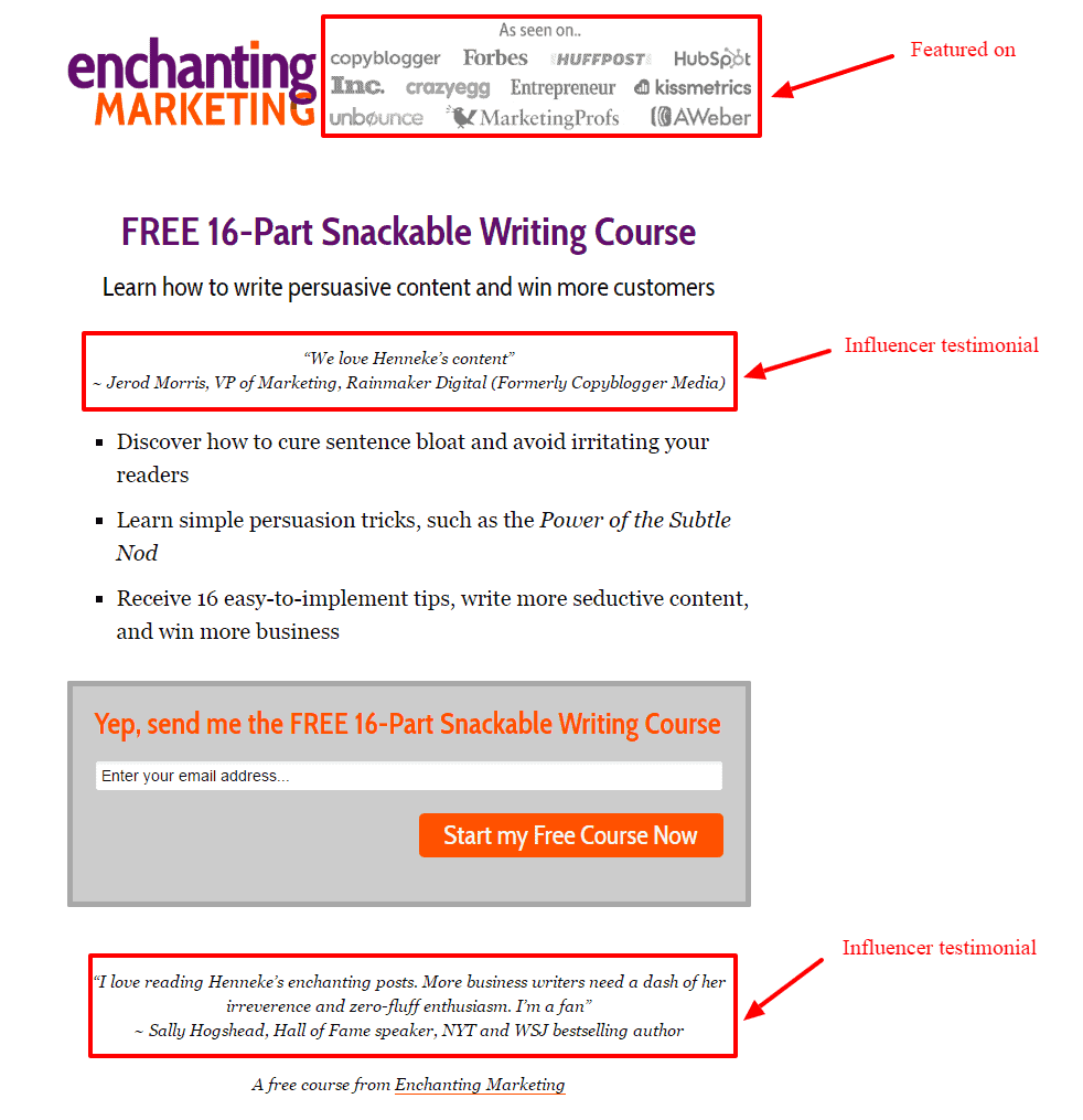
Testimonials multiply your clout score thus making it easy for people to take up your offer. Henneke Duistermaat, of Enchanting Marketing, does a neat job.

image10-3

Source

Not only does she head the page with a rich list of big sites she’s been featured on, she sandwiches her offer between two testimonials from heavyweights in her niche. Prospects are more likely to trust her word and gobble up her course.

#3. Point to influencer endorsements and press mentions

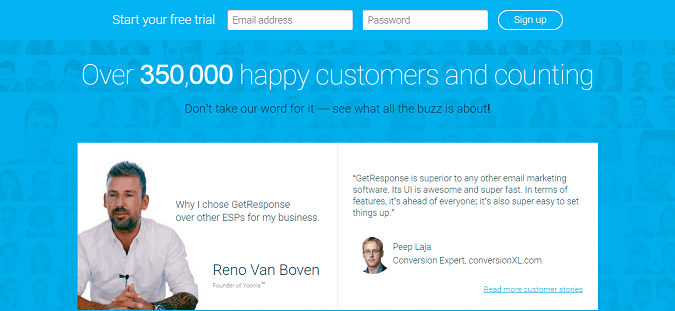
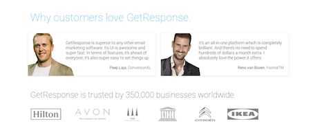
To get prospects to sign-up for a free trial, Get Response leads with an imposing figure of their current users and then they underline their authority in their space by quoting two influencers.

image9-4

Source

This is likely to cause more people to take their software for a spin.

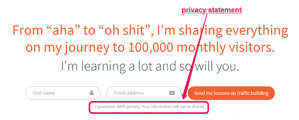
Element #7: A privacy statement to assure them their info is safe

Because cyber-crime is rampant, your prospect is uneasy. Hardly a day goes by without someone being scammed or spammed online. Allay her fears…wrap your arm around her and let her know you’re not one of the bad guys. Tell her you won’t peddle her email address nor send the alien stuff she didn’t ask for.

A brief statement such as ‘We respect your privacy and will never share your infois enough as Neil Patel does.

image6-4

      Source

Feel free to get creative with the phrasing. Or, if you’re not feeling inspired, simply write ‘privacy policy’ and link to your full-blown privacy policy. And, oh, a privacy statement also serves a more personal and practical purpose: failure to include one might land you in trouble with the law.

Basically, your privacy statement should assure your visitors that their info is safe. Only when they feel you’re trustworthy will they be swayed to give you their personal information.

Element #8: A strong call to action (CTA) to compel them to click

Your call to action marks the finishing line of the sign-up race. Give it some thought.

Your button copy should be specific, simple and reader-focused. Tell the prospect exactly what she’ll get if she signs up. Don’t try to be cute, clever, or cryptic, or you’ll lose out.  And please, don’t make the rookie mistake made by many content marketers – using the dismal default CTA copy e.g. signup, subscribe, or download.

Don’t leave your visitors wondering what they are clicking the button for.

Sign up. For what?

Subscribe. To what?

Download. What?

A simple formula, coined by Joanna Wiebe, will help you ace your button copy. Just fill in the blank: I want my reader to __________________.

Your answer becomes your CTA. For example:
I want my reader to:

  • Book a free call…becomes…Book my free call.
  • Get a free quote…becomes…Get my free quote.
  • Reserve a spot on webinar…becomes…Reserve my webinar spot.

Here’s a great example of powerful button copy pulled from this very site’s homepage:

Book a Consultaion Now is a proper Call to Action, or CTA

Book a Consultaion Now is a proper Call to Action, or CTA

The CTA is clear, simple, direct, benefit-focused, and urgent – all the hallmarks of a powerful call to action that converts.

Make the desired action simple and easy smoothly guiding the prospect towards your goal without much work or resistance. Use energetic verbs and the first or second person to make the CTA personal and bump up your conversions. Once your reader clicks on your button, you’ve won and now have a precious lead in your funnel.

Opt-in pages are crucial to the overall success of your business that you should seriously consider outsourcing the task if you don’t have the time or the expertise to craft them yourself.

Conclusion

Getting signups is an essential bridge in your inbound digital marketing efforts. It’s the magic link that turns browsers into subscribers, subscribers into buyers, and buyers into brand evangelists. In short, it’s the gateway into your funnel. As a serious growth-focused business owner, take time to work all these elements into your page so you increase the likelihood of success. Then you’ll hear the sound of clicks not crickets for a change.

These guys test the hell out of landing pages and they are masters of online sales conversion

We call them affiliate marketers, infopreneurs or online goo-roos. They push health care products, supplements, exercise tapes, and get-rich-quick schemes. At their best they are sophisticated landing page optimizers and savvy search engine technicians. At their worst they are spammers, forum trolls and comment leeches. These are the “bad boys” of online sales conversion (and they’re not all boys).

While many of us wouldn’t want to associate the hard-hitting big-promise experience with our brands, there is much to learn from these pages, and I tackled the task of cataloging some of the best techniques in my short presentation for the Uber Advanced PPC Panel at PubCon South in Dallas.

Affiliate Marketers Conversion Tips to Improve Online Sales Conversion

If you’re in the uber advanced PPC session, I am assuming you have the basics of conversion wired.

Your ads are driving people to landing pages and not the home page. The words in the heading on the landing pages match the words you used in your ads and you are doing perhaps some sort of testing to find that combination of things that works best.

When you increase your conversion rates, it makes your PPC math work better. If you can double your conversion rate from one to two percent, you have fewer acquisition costs so you can plow that money back into your bids or just reduce your spend because it doesn’t cost you as much to get a customer or lead.

So, if you are doing those things, I thought we would look at some more advanced things.

We call them affiliate marketers, infopreneurs. Some of them give the industry a bad name. But one thing is for sure, these guys test the hell out of their pages. So I thought we would look at some of their pages and review some of these affiliate marketers conversion tips.

I call them the bad boys of conversion.

Overcome your fear of long-form copy: Squeeze pages

This is a gentleman named Perry Belcher. He was indicted for selling health supplements that were ineffective to elderly people. Or at least that’s the way the DEA spun it. He received a 10 year probation, six months banned from the Internet. Shortly thereafter, he had like fifty thousand Twitter followers. This guy knows how to build an audience.

And these are the guys that get the bad reputation. But I’ve had the chance to meet Perry. He actually lives in Austin and he tests the heck out of his pages.
Let’s look at his sales page or squeeze page.

We associate these pages with spam because there are people out there using spam to drive traffic to these pages. Most of these information marketers actually build very qualified lists, and that’s why they get conversion rates as high as 70 percent on these pages.

But these are all squeeze pages. They’re called squeeze pages because they are designed to get an email address, they are designed to build their lists.

Understand the incredible importance of the headline

This particular page is from a gentleman named Ben Settle. He’s a copywriter and teaches people how to create copy on landing pages that convert well. This was 20,000 pixel high. And this is kind of the rule.

What can we learn from them, though?

Number one, the hard hitting headline in red and centered. This may not work for our clients brand, but a hard hitting, active headline is a great way to get people engaged in the page.

If we have soft headlines, they won’t read the rest of the text. The job of the headline is to get them to read that first paragraph, and then your copy can carry them along. Be clearly relevant.

And in the case of pay per click, make sure that your headline is relevant to the ad they clicked on. You want to keep your promise.

A study of four diets reveals the key to weight loss success isn’t the diet, but how closely you follow it.

Properly bolding, highlighting can boost your online sales conversion rates

This is for hypnosis products. And this is what I’m seeing a lot. The alternating bold, not bold bulleted lists being used all over the place by people who know how to convert.

The key here is to help your reader through the copy so you don’t have to necessarily use the alternating bold list. But using subheads frequently down the page allows the scanner to get into your message and pick the parts of the page that they’re particularly interested in and increases your conversion.

Check out this article for the 8 elements of a high converting squeeze page.

From the Master of Direct Mail Sales Conversion: The Johnson box

Frank Johnson, was the creator of the Johnson box. He also created the 3 page direct mail letter.

You’ve got the cut out, the coupon style look.

I’m an Aggie, which is Texas version of Polack, and I’ve actually tried to cut them out of my screen before. It isn’t pretty.

The take away here is that we want designers to make us look cool and unique from a conversion standpoint. The designer has to be good at getting the eye to our primary messages.

And inside the Johnson box, you put an important copy point. That’s where you put your offers because it is just tested and tested to continue to pull the eye. How can this be effective? It continues to work.

Explore the magic of testimonials

Testimonials will work in almost any industry. There is a science to the testimonials. The pictures will significantly increase the value of the testimonials, especially since we’re all looking for avatars in our social media.

Use testimonials. Testimonials work. Add them to your landing pages.

The guarantee or risk reversal

Zappos has this amazing guarantee. “Return the shoes at any time in a year and we’ll pay shipping both ways.”

They make it easy for you to buy four or five different sizes of the same shoe, keep the one you want and ship all the others back.

Risk reversal. Have a guarantee or a promise that removes the risk from the person taking action.

We respect your privacy is an example of risk reversal and lead generation. That tells me, “oh, the risk is lower because these guys have a privacy policy and they’re not going to spam me or sell my name to somebody else”.

One of the most tested calls to action on the Internet: The Belcher button

Or the buy button. This is the Belcher button. He claims that this has been tested through five million or more impressions and this is the control that continues to work.

Test your buttons and your call to action to increase online sales conversion rates.

Test your buttons and your call to action to increase online sales conversion rates.

So, you’ve got the price crossed out, new price, add to cart this color specifically, that particular shade, the credit card icons have to be there. And you also have to have the link below the button.

This is actually a full image, but people recognize the underlying as a link. So they know that there’s something to click there, whereas they might not recognize the button.

So, test your buttons and your call to action and you might consider starting with this design. Notice it’s in a Johnson box.

Boost your Online Sales Conversion with Lead Generation

If you’re selling something, you might consider putting something early on, something that will generate a lead. If they’re not going to buy, you might as well go ahead and get the lead.

Now, the downside of that is they fill out their information as a lead could actually reduce your buy conversions. Make use of pop overs, literally putting a box, something that has a higher contrast, that will draw the eye. And incidentally, there has to be some sort of an offer there. So you want to deliver something white paper, promise of a newsletter. There has to be something of value in that.

Capturing abandons

So they come, they don’t take action and they’ve decided to go away. Can we get another shot at them? If they try to close or navigate away from the page, they get an on exit intent message. Ask them once again, are you sure you want to leave? And you have to use these according to how easily irritated your audience is.

The abandoned cart email

If you can capture the information about the person when they clicked add to cart, if you require an email address, you can then use that email to get another chance at them.

“Hey, we saw that you left your card empty.” You can sweeten the deal with a discount. Very, very effective. A great way to get more out of the traffic that you’re driving to your site with pay per click.

Leverage Ad Retargeting on your Paid Campaign

Surfers are five to 80 times more likely to click on an ad after they’ve been to the site.

For each visitor that clicks on the ad, five to ten will come back through search or type your brand name in or your domain name in, within an hour of seeing that ad.

So this stuff can be very, very powerful. Again, you’re taking your investment in PPC and you are just making sure that that visitor has every opportunity to buy your product because it’s in their best interest.

So real quickly, the takeaways from this. Don’t be afraid of long copy and storytelling, great copywriters do an amazing job of this stuff on these long pages.

Consider asking for contact info even when if you want the sale. Pop overs might be something you want to try.

Consider offers for information as well as promotional ads. So just like the newsletter that you’re starting to get a lead, consider doing that instead of just asking them to buy the product.

Use design to draw the eye to your offers. Our friend the Johnson box is an example.

Every communication is a test. And these guys got good at this because they tested. Everything you send out should be a test, at least measure it. And if you can, try doing two versions of it. And I’m talking about emails, web pages and ads.

Don’t sell products that don’t work or you’re going to end up like this guy. And as I was doing some research on Perry, I came to this law resource. And what did I get? I got a pop up.

Don’t be fooled by the panel name. Christine Churchill, David Szetela and Wister Walcott dove deep into PPC topics. My angle was that improving conversion rates means more to spend on PPC.

Listen for yourself.

Enjoy the full audio right here.

Conversion-Scientist-Podcast-Logo-1400x1400


Subscribe to Podcast

Either way, I promise you will immediately find some new things to test on your pages.

Subscribe to The Conversion Sciences Podcast

Looking for proven ways to optimize your pricing page? I invite you to read these sure-fire 10 tips to increase conversions fast.

“Yes, I’m very interested in purchasing your product, and I just clicked the button taking me to your pricing page.”

What does that mean?

It means the $50 you invested in finding me and getting me to your landing page paid off. It means the $1,500 you invested in creating a high-converting landing page did its job.

Most importantly, it means I’m a very warm prospect evaluating your pricing plans and very likely considering an immediate purchase.

Aaaaaand I’m gone…

Before Diving into the 10 Proven Ways To Immediately Optimize Your Pricing Page

There are a lot of places you can lose someone in your funnel, but the pricing and checkout pages are where it hurts the most. The people who arrive here are the most primed to purchase, and while re-targeting campaigns can help mitigate the damage, ultimately, we want to maximize the rate at which these warm prospects become immediate customers.

In fact, after analyzing 89 successful SaaS startups, one angel investor cited time invested in optimizing the pricing page as the #1 indicator of conversion rate.

Yet unlike checkout pages, the pricing page rarely gets the focus it deserves.

Today, we are going to shine a big fat spotlight on the pricing page and teach you how to optimize your pricing page to create a high-converting edition on the first try.

1. Offer a Money-Back Guarantee or a Free Trial

One of the biggest friction points that prevents prospective buyers from purchasing is trust. This type of doubt can be multifaceted and is often referred to as FUD (fears, uncertainties, and doubts). It can be expressed as questions like:

  • What if I don’t like it?
  • What if it’s difficult to learn?
  • What if it isn’t suitable for my purposes?
  • What if I pick the wrong pricing plan?
  • Can I trust this brand to deliver on their promises?
  • Can I trust that my transaction will be secure?
  • Can I trust that my investment won’t be a waste?

One of the easiest ways to alleviate these trust-based fears is to offer a money-back guarantee or a free trial. These types of offers make the customer feel like their risk is significantly reduced, and their actions follow suit.

10 proven ways to immediately optimize your pricing page: add a money back guarantee.

Ways to optimize your pricing page: add a money back guarantee.

Marketer Neil Patel ran a number of different pricing page offers and found that adding a money-back guarantee increased sales by 21% and total revenue by 6.4%. Adding a free trial performed even better, doubling signups and resulting in 15% additional revenue.

Of course, it’s possible that a company could promise a refund and then fail to deliver, but this type of behavior is much more easily sniffed out via due diligence, and most consumers generally tend to trust that if a company promises a refund, they will deliver.

If your brand is not well known in your industry, you will have to break through some trust issues. Trust symbols give your visitors a visual signal that your site is safe and that your business is legitimate.

Some examples of trust symbols are:

2. Display Transaction Security Badges

While money back guarantees and free trials make the customer feel less at risk from the company, that’s not the only point of concern.
The Nilson Report estimated that last year total credit card fraud worldwide topped $24.71 billion and Experian reported that e-commerce alone saw a 33% spike in credit card fraud. This upward trend has buyers extra cautious when it comes to doing business online and has forced sites to put in extra effort to alleviate security concerns.

As a result, displaying security badges can give potential customers confidence that the checkout process will be safe and secure. A study done by Atcore, a Danish digital marketing agency, found that adding trust symbols to their ecommerce site improved conversions 32%.
Not all security badges are create equal, however. A survey performed by the Baymard Institute found that Norton led the pack in customer recognition and feelings of safety when it comes to paying online.

Norton leads the pack in customer recognition and feelings of safety when it comes to paying online.

Norton leads the pack.

3. Display Social Proof

In many ways, the same things that enhance your landing pages will optimize your pricing page as well. Just like social proof can help motivate that first click, it can also motivate each subsequent click throughout your conversion funnel.

This continues on that thread of building trust. 88% of consumers trust online reviews as much as a personal recommendation. When you include things like testimonials, reviews, and other forms of social proof, it’s like having a friend sitting next to your prospect and saying stuff like, “Oh yeah, this is what you’re looking for,” and “This is totally going to solve that problem you’ve been having,” at every step of the conversion journey.

Leadpages’s pricing page offers a solid look at this principle in action. Their page displays real customer reviews that highlight different pain points their potential customers might be experiencing such as pricing concerns, product effectiveness, and conversion rates.

Pricing page with social proof from Leadpages.

Pricing page with social proof from Leadpages.

GetResponse’s pricing page does a great job of weaving in several different forms of social proof, including influencer testimonials, brands of well-known customers, and the total number of users.

10 ways to optimize your pricing page.

10 ways to optimize your pricing page.

Conversion Sciences has already covered social proof thoroughly in their landing page best practices, so I won’t belabor the point, but suffice it to say that what improves conversions on your landing pages will often improve conversions on your pricing page as well, and for many of the same reasons.

4. Re-order your pricing plans

Experiment with ordering your pricing plans from most expensive to least expensive. This one is pretty simple, and there’s not much to say except that there is data to suggest this is worth a split test, so check out this AB Testing Guide.

A study performed by ConversionXL found that when you place the more expensive options on the left, participants tended to spend more time analyzing the features and benefits of the leftmost plan and less time doing so on the rightmost plan. The results showed a 6% increase in conversions when the most expensive plan was leftmost and a 10% increase when the second most expensive option was placed first.

10% increase when the second most expensive option was placed first.

10% increase when the second most expensive option was placed first.

5. Highlight a “Recommended” Option

Suggesting a price point that satisfies the bulk of your visitors can boost conversions by helping reduce the paradox of choice.

A study performed on pricing preference versus layout designs for the site Surveygizmo concluded that site visitors focus more quickly and longer on a highlighted plan. The research also found that in a scenario where the most expensive plan was ordered first, and the recommended plan was highlighted in the second position that the recommended plan (shown below as the Pro plan) was chosen more often than in any other scenario.

Highlight a Recommended Option

Highlight a Recommended Option

To make the most out of this strategy, make sure that your recommended plan offers a superior value-to-cost ratio over lesser plans. It should entice people who would prefer to pay for the lesser plan to purchase it because it is such an obviously better value.

6. Utilize Charm Pricing

“Charm pricing” is pricing that ends in digits that are non-zero such as 9, 7, or 5.

An analysis of price point and product being sold on Gumroad’s massive creator marketplace discovered that charm pricing resulted in considerably higher conversion rates for the exact same product.

Utilize charm pricing to increase pricing page conversions.

Utilize charm pricing to increase pricing page conversions.

From a psychological point of view, Gumroad’s team theorizes that since we read left to right, we tend to process the first number in a price and tend to block out the rest of the price. They also mention studies that correlate charm pricing with consumers believing they are receiving a discount.

Simply put, charm pricing is a fairly universal practice for a reason, and if you’d decided to buck the trend and just be “straightforward”, you might want to reconsider.

7. Write Strategic Pricing Plan Names

How much time did you spend thinking about the names for your pricing plans?

The main goal of a pricing plan name is to help communicate who its intended for and make the customer who selects it feel like they are making the right choice. You want customers to instantly know which plan is designed for them.

There are upsides and downsides to choosing standard names versus more original and fun names, but one way to have the best of both worlds is to use more standard, descriptive names while incorporating fun illustrations that highlight your business’ personality.

Mailchimp shows us a decent example of this in action below.

Mailchimp pricing plan names. Grow conversions.

Mailchimp pricing plan names.

8. Write less and use more white space

In everything you do online, simplicity and clarity should be your core values. Visually complex websites don’t perform well in most cases. In order to help users process the info on our page, we want LESS clutter. Less text. Less options. Less distracting design features. The only thing we want more of is white space.

The following should be our target in most cases:

  • Minimal text that is benefit driven
  • Bullet points to focus attention and allow for scanning
  • An above-the-fold design highlighting important points and CTA’s
  • A layout that makes it easy to compare options

Grasshopper offers a great example of our target design aesthetic. It’s simple, clean, clear, and allows readers to quickly process the presented information without feeling confused or overwhelmed.

Pricing page design tips.

Pricing page design tips.

Another great example comes from Typeform. Rather than coming off sales-y, their pricing page comes off as helpful with useful one-liners describing their plans such as “Get to know Typeform,” “More power & personalization,” and “Advanced features for brands.” Each plan builds upon the last, the layout makes it easy to compare, and the entire presentation is simple and visually appealing.

Design ideas for pricing pages.

Design ideas for pricing pages.

9. Offer fewer options to reduce analysis paralysis

There was a fairly famous study done on the detrimental effect more choices can have. The study was conducted by a pair of Columbia and Stanford University professors on the subject of jam. This research duo concluded that people purchased more jam when fewer options were made available to them. In fact, conversions shot up 10x when choices of jam offered to shoppers were reduced from 26 varieties to only 6.

Offer fewer options to reduce analysis paralysis.

Offer fewer options to reduce analysis paralysis.

The same dynamic has been seen in a number of pricing page studies, and it’s one of the reasons you rarely see more than 4 options being presented on a pricing page. Some companies have even taken this element to the extreme with great success. MeetEdgar, for example, has offered only one plan on their journey to $4 million ARR.

Test pricing page designs in order to know what works best for your unique business.

Test pricing page designs.

The sweet spot for most business seems to be 3 pricing options, but like everything, you’ll need to test in order to know what works best for your unique business.

10. For international audiences, provide automatic currency conversion

The internet has expanded the once limited reach of local business owners to encompass the entire global market. As such, you are likely missing out on some key conversions if you aren’t offering some sort of exchange rate calculator or alternative pricing page design for other countries.

Take this survey performed by Y Combinator into consideration. They asked, “Would you buy a service that bills only in € (euros)?

  • 72 people said “€ is OK”
  • 65 people said “€ is OK but I would really prefer $ if possible”
  • 19 people said “€ is not OK at all”
  • 6 people said “I would not buy in $, but only in €”

Out of 159 possible votes, 84 (roughly 53%) would rather pay in dollars instead of Euros. If your audience deals in more than one currency, adding those options to your pricing page can enhance your conversion rate.

A great example of this in action comes from Australian company Quad Lock which lets users select from 6 different countries/unions and will change the site’s currency to match.

Automatic currency conversion for international websites.

Automatic currency conversion for international websites.

Summary: 10 Proven Ways To Immediately Optimize Your Pricing Page

If you have a pricing page, it’s a core piece of your conversion funnel.

Today, we’ve highlight some ways to immediately optimize this page, but at the end of the day, there no such thing as a perfect pricing page. Some of these tips may work for your business and some may not. The most important thing to remember is to test early and test often.

We would love to get your feedback as well, what changes have you made to boost conversions on your pricing page? Tell us in the comments below.


21 Quick and Easy CRO Copywriting Hacks to Skyrocket Conversions

21 Quick and Easy CRO Copywriting Hacks

Keep these proven copywriting hacks in mind to make your copy convert.

  • 43 Pages with Examples
  • Assumptive Phrasing
  • "We" vs. "You"
  • Pattern Interrupts
  • The Power of Three

"*" indicates required fields

This field is for validation purposes and should be left unchanged.


Phone lead generation is still a highly effective way to reach prospects. Give these 8 advanced tactics for increasing your B2B telephone leads, sales and outbound ROI a try.

Telephone sales aren’t what they used to be. It took only 3.68 cold call attempts to reach a prospect in 2007. Today, it takes around 8 attempts, more than doubling the difficulty of landing sales over the phone.

But as you know, phone sales certainly aren’t dead. They just require a higher level of strategy and mastery. A study by Baylor University found that it takes roughly 7.5 hours to secure one referral or appointment through cold calling methods. If you only have one dedicated phone salesperson, your company could have one new appointment or referral every day via cold calling.

For most B2B businesses, where phone selling strategies are most commonly found, one lead per day per salesperson represents a very strong ROI.

Today, we’re going to help you sell over the phone like a modern pro.

Here are 8 Advanced Tactics for Increasing your B2B Telephone Sales

1. Take Timing Seriously

In sales, as in many areas of life, timing is everything. You will often accomplish more during peak hours than you do the rest of the day. So even if you are in a position that requires around-the-clock calls, it’s important to be at peak efficiency during those peak hours.

So when are those peak hours?

An in-depth study out of MIT gives us several interesting insights:

  1. The best time period to contact leads is between 4:00-6:00 p.m.
  2. The best second best time period is between 8:00-10:00 a.m.
  3. The worst time period to call is between 11:00 a.m.-2:00 p.m.
  4. The best days to call are Thursday and Wednesday.
  5. The worst days to call are Tuesday and Monday.

It’s worth checking out the study, because these aren’t insignificant differences. For example, calling on Thursday versus Tuesday increases results by an average of 50%. Calling at 4:30 p.m. versus 11:30 a.m. increases results by an average of 114%!

Timing might seem cliche, but what other tactics do you know of that can immediately double sales?

2. Call The Right People and Present them with the Right Pitch

I’m going to borrow and re-spin an example from Jason Quey.

Sid works at a large SaaS company. When it comes to larger tool purchases, he makes the decisions. However, Sid rarely creates content for the team. Tyler is in charge of content.

If your sales team is attempting to pitch a solution to the content problems Tyler is facing, appealing to Sid around those challenges won’t be effective. The best way to pitch Sid is very different from the optimal way to pitch Tyler.

The Gartner Group reports that in a company of 100-700 people, an average of 7 people are involved in buying decisions. If you aren’t tailoring your pitch around these people, you will struggle to succeed in B2B phone sales. There’s no getting around that.

3. Lay The Groundwork

We know that cold calls can work, but there’s a way to make them work better. UNC professor Dave Roberts said it best, “Cold calling is old fashioned… Aim for hot calling.” The more prepared you are when you call, the better that call will generally go.

We live in an age of the internet and social media. Before you call a prospect, Google them. Learn everything that you can before ever making the call. This can help you know what the customer’s needs are, what their objections might be, and what interests them. You may happen upon what their biggest pain is right now.

You can even make some level of initial contact before calling:

  • Connect via shared acquaintances
  • Comment on their social posts
  • Mention them in a blog post or comment
  • Etc.

There are many ways to make a superficial connection with someone that quickly turns you into a known entity versus a cold call.

4. Follow A Sales Script

There are no downsides to using a sales script… only to using one poorly.

When used correctly, having a sales script results in the following benefits:

  1. They force you to create and refine a consistent sales methodology.
  2. They allow you to provide a baseline for your entire sales team’s performance.
  3. They allow sales reps to spend less time thinking about what they’re going to say and more time listening to the potential customer.
  4. They provide talented sales reps with a strategic baseline off of which they can improvise.

To learn how to create your own sales script, check out this guide from Close.io.

5. Navigate Objections

Navigating objections is a central part of any sales process, but there can be a bit of a misunderstanding about this issue.

Some objections always need to be covered and getting out in front of them can be beneficial. For example, if your product is twice as expensive as every other competitor, it’s almost guaranteed that issue is going to come up, and addressing it before the customer does gives you the chance to frame it in a positive light.

Not all objections are created equal, however, and sometimes, bringing up certain objections simply bogs down the sales process and creates doubts that weren’t there to begin with. Instead, have a plan to overcome these objections IF they are brought up.

For more on covering objections, here’s another top notch guide from Close.io.

6. Stop Talking. Ask and Listen.

Listen. Listen. Listen.

The more your prospect is talking, the better your chance of closing the sale.

Outbound sales and inbound sales follow up are an inherently aggressive activity. You are on the offensive. You are seeking out people to sell them something. But often, the solution is simply to slow down and get out of your own way.

The best sales scripts and salespeople are focused on asking the right questions. The prospect doesn’t need you to create challenges for them. They have numerous pitfalls and problems on the path to their goals. Your job is to create a situation where the prospect is articulating those challenges… not you.

Ultimately, B2B sales isn’t about tricking people into getting a product or service that doesn’t work for them. It’s about matching beneficial solutions to the businesses that need them, and that requires a two-way conversation.

Don’t miss out on How to Pick a Conversion Optimization Consultant for your Online Business

7. Focus On Customer Value

Your goal as a salesperson is never to sell someone on a price. Your goal is to sell them on value – such incredible value that the price seems like a no-brainer.

It’s very, very important that you focus on this value BEFORE discussing pricing, for a number of key reasons.

First, if pricing is brought up first, your product/service will be evaluated as a commodity. Once a number has been mentioned, everything will be filtered through that number. You will have zero leverage in presenting your value.

Second, if you don’t pitch you value before getting to pricing, the prospect will consider the pricing based on their preconceived assumptions about the value of your product class. And remember, they aren’t currently using your product, so it’s likely they don’t consider the value to be worth the cost.

Finally, if you don’t understand the prospect’s needs before you get to pricing, you might propose a price that is too low or too high. Too high, and the conversation is essentially over. Too low, and you won’t be considered a serious player. Without getting to know the prospect first, you are playing a dangerous guessing game.

8. To Close Is To Follow-Up

You already probably know your “hook, line, and sinker.” You have your closing speech down to a science. That’s great, but just know that you will talk to a person several times before they’re ready to hear your golden pitch. According to Marketing Donut, 80% of sales require 5 (yes, FIVE) follow up calls. 44% of salespeople quit after just 1 follow up. Don’t be a quitter!

Also, stop leaving the follow-up in the customers’ hands. Don’t say, “Give me a call if you’re interested.” Geoffrey James, author at Inc. said, “I’ve read dozens of so-called sales letters and sales emails that end with a suggestion that the customer should call or contact the seller…The people who send these letters always complain that they don’t get any responses. No kidding–you’re asking the customer to do your work for you.”

Instead, change your follow-up strategy and set up a time to talk again. For instance, “I’m going to call you next Wednesday, after you’ve had time to look at everything, so that we can discuss whether it makes sense to continue discussing our offer.”

Conclusion: Upgrade Your Phone Game

Telephone sales are more challenging than ever, but they are worth the trouble. Use these 8 advanced tactics to improve your B2B sales calls and close more sales.

Do you need help increasing the number of inbound leads? Would you like your phones to ring more often? Find out how Conversion Sciences can help with results-driven lead generation solutions.

Rachel Africh Headshot

Rachel Africh

Contributor: Rachel Africh is the CMO of TheLeadsWarehouse.com and is an expert on marketing tactics and generating targeted leads that convert for sales industry professionals.

© Copyright 2007 - 2024 • Conversion Sciences • All Rights Reserved