There is a moment in time when your lead is in the perfect position to convert.
They have just told you they want to hear from you, and they are actively checking their email inbox for a message from you. The message you send them in this moment has a higher likelihood of being read then any message you will ever send them again.
Confirmation emails are probably the most wasted resource in all of email marketing. Like other transactional emails, they receive significantly higher engagement than typical bulk mailings from the same businesses.
Confirmation email open and click rates
Unlike other transactional emails, however, confirmation emails provide you with ample flexibility to engage the user with your brand. You can invite the user to “confirm” and then engage with your brand in whatever capacity you deem best.
Today, we’re going to help you stop wasting this unparalleled goldmine and start sending confirmation emails that drive conversions for your brand.
What Is A Confirmation Email?
Before we continue, let’s define what we mean by “confirmation email”.
A confirmation email is an automated email triggered by a user action and intended to confirm to the user that their action has been successfully completed. Examples of triggering events include subscriptions, purchases, inquiries, etc.
What makes confirmation emails such a powerful marketing tool is that the user typically expects to receive them and will often actively look for them.
Like with any conversion optimization strategy, the first step to optimizing confirmation emails is to identify your objective. What do you want the user to do when they receive your confirmation email?
While objectives can be as adverse as the businesses targeting them, for the purposes of this article, we’re going to focus on three specific objectives:
Immediately move the lead forward in your funnel
Position the lead for long-term conversion
Engage the lead with a personal connection
Let’s take a closer look at each objective.
1. Immediately Target The Next Conversion
This is the most straightforward objective and probably the best option “on average”. When someone signs up for anything triggering a confirmation email, they have taken a step forward in your conversion funnel and are likely in prime condition to be moved even further forward in that funnel.
The only downside to this objective is that you have little time to build trust between past conversion and new pitch, which will affect how we use it throughout our funnel. Early Funnel Implementation
If we use this earlier in our funnel, we need to make sure that we aren’t asking for much, since we haven’t had time to build trust in our brand. For example, if the user downloads a free lead magnet, you can pitch a low-cost “tripwire” product in your confirmation email.
Another great example of this concept in action comes from Dollar Shave Club. With their simple business model, you might think there is nowhere further to go once you’ve become a member, but as you can see in the below confirmation email, that’s not the case:
Confirmation email from Dollar Shave Club
As soon as you’ve become a customer, The Dollar Shave Club attempts to move you further in the funnel by making you a referrer. This is a low investment ask on their part. It costs the customer nothing to make referrals and they will be rewarded for doing so, which makes it a great early-funnel strategy. Late Funnel Implementation
This immediate conversion strategy can also be utilized later in the funnel, where you have already had time to build trust with the user. At this point, you can go for much larger purchases or much higher investment conversions. Offering something exclusive or time-sensitive can be especially effective here.
For example, let’s take a SaaS company offering several pricing tiers. After converting a lead or past customer to their highest priced tier, they might include an exclusive offer for 1-to-1 consulting on implementing or optimizing their service. Alternatively, they could offer a turnkey solution to a problem the software is designed to help solve.
2. Position The Lead For Long-Term Conversion
Attempting to immediately trigger the next conversion won’t work for every business model. Sometimes, getting the lead to take that next step requires a good deal more nurturing than you can deliver in a single email.
In this case, the goal is to utilize the lead’s momentary warmth to position them for long-term conversion. This could look like establishing authority or expertise, identifying additional information for advanced segmentation, setting clear expectations for future emails, or any number of things.
When asked what they’d like to improve, 64% of email marketers said they’d improve personalization, yet split tests have shown that asking for more information from readers tends to result in a lower lead conversion rate. If you ask for that additional information in the confirmation email, however, you can improve personalization without sacrificing lead volume.
This could be as straightforward as including a few extra data entry fields for users to fill out before hitting “confirm”. Or it could be a bit more subtle, like in this example from MailChimp.
Notice the additional optoins under “activate your account”. If a user clicks on any of those options, it will log additional information about them in MailChimp’s database and likely trigger a different followup sequence.
Targeting additional information in the confirmation email is a really easy way to get more information about your leads, setting you up for a higher conversion rate down the road.
3. Engage The Lead With A Personal Connection
The final objective we’ll discuss is in some ways a subset of #2 in that it’s more of a long-term play. At the same time, the focus is a bit different and will really only apply to certain business models, which is why I’m making it’s own category.
Engaging the subscriber with a personal connection is an objective unto itself.
Many people are subscribed to hundreds of email lists, most of which they will never check or read and will probably unsubscribe when they do happen to see one of your emails.
When get them to engage with you on a personal, 1-to-1 level, however, you become more than just another random brand spamming them with emails they’ll never read. You become a person they are interested in connecting with and following.
Brian Dean offers a great example of this:
Confirmation email from Brian Dean
Just like the rules of interpersonal connection dictate, he isn’t focused on himself and asking you to be interested. He is asking about YOU – the subscriber. What are YOU struggling with?
He also does some of the things we talked about in the last section.
He tells you what to expect
He provides additional value
He tracks what information you click to for better segmentation
He encourages you to respond to his email
And while this doesn’t work with faceless brands, it does work with personalities, especially when the personality is actually willing to engage with you.
I think I’ve sent Brian 4 or 5 emails over the last few years, and he’s responded to 3 or 4 of them, and that’s a big part of why he’s my “go to” resource for SEO, why I reference his work all the time in my articles, and why I frequently recommend his course.
Conclusion: Start Optimizing Your Confirmation Emails
Your confirmations emails can be a major asset in your email marketing funnel.
Don’t waste them.
The ideas we’ve discussed today will get you started, but be willing to run some split tests and dig a bit deeper. There are numerous options we weren’t able to list today, any of which might be a goldmine for your business.
And of course, if you’ve already found some winners, let us know in the comments!
When you think of email marketing for your eCommerce site, what comes to mind? Like most eCommerce business owners or managers, you might be thinking about the newsletters you send to your email list subscribers or the transactional emails that go out automatically once a shopper on your site completes a purchase.
But think about this:
Time and time again, email has proven to be an excellent tool to help you not only engage with your shoppers but ultimately increase conversions for your eCommerce site.
With that in mind, what if you could leverage the power of email to convert more traffic into sales?
I’m talking about using automated email responses to bolster your conversion rate optimization strategy.
If you’re wondering what email and CRO have in common, not to worry. (We’ll get to that in a minute.)
As an online retailer or eCommerce manager, your ultimate goal is to convert your site traffic into sales, right?
In this article, I’m going to share with you the powerful connection between email marketing and conversion rate optimization, plus I’m going to show you the exact four automated email campaigns you can use to drive a winning conversion rate optimization strategy for your online store.
Using Email to Convert More Window Shoppers Into Paying Customers
The scary truth about eCommerce is this: Most of your traffic isn’t converting. That’s traffic that you’ve likely put in a lot of effort to driving to your store, in the first place, whether it be from PPC, SEO, or social media.
Naturally, this is where CRO comes in.
And as you probably already know, optimizing your site for conversions is truly a science.
It takes careful examination of data to really win at CRO. And in 2017, there’s no shortage of tools at your disposal to do so.
Have a look at this eCommerce site’s analytics, for example:
In this case, nearly 90% of this eCommerce site’s traffic left without adding anything to a cart.
Generally, only about 5% of your website’s traffic will make it to your cart page, so while it’s great to implement on-site CRO tools to keep shoppers on your site for as long as possible in the hopes that they’ll complete a purchase, there’s got to me more that can be done to leverage the rest of your site traffic that’s slipped away.
At this point in digital marketing history, most retailers and marketers know about and may be using cart abandonment emails to bring back lost traffic. Cart abandonment campaigns and exit-intent technology powering on-site messaging are just two examples of how you can increase the reach of your overall conversion rate optimization strategy.
But how can you take that same approach of addressing seemingly lost shoppers who’ve expressed high levels of purchase intent and apply it to more of your site traffic to lift conversions?
The answer is Browse Abandonment Emails.
Browse Abandonment Email Campaigns: The Key to Unlocking More Conversions
Browse automated email responses can address visitors at all stages of the purchase decision.
What is browse abandonment?
As you can see, your eCommerce site traffic reaches various steps in the shopping funnel. About 30% reaches a category page; 20% reaches a product page.
When you take a look at this data, you may be asking yourself, how can I effectively convert shoppers at each step of the way rather than losing them?
The most common tactics for getting more site traffic to convert generally address the elements on your actual site.
On-site optimization is great. You can:
Add strategically placed popups to various pages and keep shoppers on your site for longer
Optimize your pages with trust signals like ratings and reviews to increase the likelihood that a shopper will purchase
Incentivize shoppers with special offers and discounts
Improve UX/UI to make it easier for your shoppers to sail through the checkout
But what about when the shopper leaves before completing the purchase? Are you just going to let them get away forever?
Enter Browse Abandonment Email Campaigns.
Similar to cart abandonment email campaigns, browse abandonment campaigns help you engage with these shoppers through automated emails that bring them back to your site. This helps you recapture the site traffic you nearly lost.
How much more?
They can be used to reach up to 5x more shoppers, bringing them back to your site to complete a purchase.
These emails are great because you can send them to the shoppers who drop off at various steps in the shopping funnel, creating more engagement and conversion opportunities, and therefore, getting more out of your site traffic.
Here’s an example.
If a shopper left after visiting your homepage, you can send a Homepage Browse Campaign.
If a shopper viewed a category but never went on to check out individual products, you can send a Category Browse Campaign.
If a shopper viewed specific products on your site yet never added any to their cart, you can send a Product Browse Campaign.
Another point in the shopping funnel you can address is your site search. If a shopper searched for a term or product keyword on your site yet never continued in their shopping journey, you can send a Site Search Abandonment Campaign, too.
Take a look at how well browse abandonment campaigns perform:
Browse abandonment email had a conversion rate six times that of newsletter email.
In this case, browse campaigns converted almost 7x higher than all other channels and campaigns, including the site’s newsletter.
Automated email had a 3x the conversion rate of the sitewide average and was the highest converting channel.
Here, the conversion rate of automated email responses beat the conversion rate of all channels by more than three to one.
What makes these automated emails so effective?
For one, these campaigns engage the shoppers who dropped off earlier on in your shopping funnel, so your reach is much greater than other email campaigns.
It gets better.
Browse abandonment emails can be highly personalized, which means they can work extremely well for any online retailer. Given that 81% of shoppers report they are highly likely to purchase from a site that sent them personalized emails, these behaviorally-triggered and highly personalized messages work.
Now that you know how browse abandonment campaigns work, I’m going to show you examples of the 4 automated emails we spoke about earlier so that you can send them to your shoppers and convert more browsers into buyers.
Capturing Emails For Automated Responses
So how do we capture emails when users are just browsing?
The simplest answer is that there is no correct answer. There are literally hundreds of lead capture strategies, with new technologies coming out every day.
That said, here are a few different methods you might use to grab browser emails:
Exit-intent popups
Discount offers
Newsletter signups
Site login
Lead magnets
Etc.
It’s also possible that you already have the user’s email address through previous engagement or the way they arrive at your site.
For example, if you run a cross-promotion with a 3rd party’s email subscribers, you can set it up so that when they click-through from the email to your website, you automatically receive their email address.
Regardless of how you collect the email address, these are some of the best automated email responses you can send to visitors after they leave your site.
Choxi showcases its best deals for homepage automated email responses.
Homepage browse emails are a great way to engage with shoppers who landed on your homepage but never went on to explore your site further. Invite them back with product recommendations that showcase your site-wide top sellers.
J. Crew can lead visitors back to the category page they favored with abandonment email.
You can send category browse emails to the shoppers who expressed interest in a category, brand or department on your site but did not proceed to view any individual products.
Peak the interest of these shoppers by displaying product recommendations that are related to the category they viewed and additional options that include site-wide top sellers.
French Connection uses automatic email responses to bring prospects back to the products they dwelt on.
Product browse emails are very similar to cart abandonment emails in that you can use them to engage with abandoning shoppers who expressed a high level of purchase intent. The kicker here is that there are a lot more of your shoppers looking at products than those who click “add to cart” so your conversion potential here is much greater.
Invite these “warm leads” back to your site by displaying the product they viewed plus related product recommendations.
Average open rate: 52%
Average CTR: 26%
Average revenue per mail sent: $3.42
Automated Campaign #4: Site Search Abandonment Email
In this Calvin Klein example, shoppers get automated emails that reflect their search activity.
Site Search emails are important because they allow you to reach out to shoppers who were clearly searching for something on your site yet for some reason they did not find what they were looking for.
Use these emails to invite back those lost shoppers and help them find what they were looking for.
Average open rate: 52%
Average CTR: 28%
Average revenue per mail sent: $2.85
The Expert CRO Strategy That Most Merchants Aren’t Using
By now, you may be asking yourself, if browse abandonment emails perform so well, why aren’t more online retailers using them as part of their CRO strategies?
Larger retailers like Amazon have been sending personalized email messages like these for ages, but smaller guys, not so much since it used to take large development and marketing teams and even larger budgets to implement strategies like this one.
Luckily, things are now changing.
With more automated personalization tools for email available to eCommerce businesses, you can now send highly-targeted, behaviorally triggered browse abandonment email campaigns to your shoppers, no matter how big or small your business might be.
This year, optimize your business for higher conversions by using the most effective marketing channel to leverage more of your site traffic, and reap the rewards all year long.
Is there magic in the animated video that is all-the-rage on the web? Should you invest in this style of video to communicate powerful messages to your visitors? Will this investment translate into higher conversion rates?
We set out to collect some data to help answer these burning questions. After all, we’re scientists.
To give you an example of what we’re talking about, here’s a video created for us by NinjaTropic to to introducing readers to AB testing as part of our comprehensive AB testing guide.
This video summarizes AB testing in just under a minute and a half. The goal of this particular article is to establish us as the source for information on this transformational tool of websites. This should make our visitors more eager to subscribe, learn and grow.
In other words, we want to generate leads that will one day turn into sales. Just like you.
Why did we think that an animated video would outperform a simple “talking head” video? Because science told us it might.
Using Animation in Video Marketing to Generate Leads and Sales
Here’s a more traditional video that explains what we’ve learned about animated video and why you should consider it.
Based on their popularity, it seems that video of a “drawn” cartoon with voice over is a great way to keep viewers engaged. We wanted to know why that was, and we wanted to know if that meant they would also be more likely to convert if they were on your website and being asked to take an action.
We ran an eye tracking study, which sought to answer these things, and what we found out was very interesting.
For hand-drawn video, the motion of the pen drawn on a whiteboard while somebody’s speaking, or of a cartoon moving, pulls the attention of the visitor. It has a very high level of engagement.
Something else we thought was very interesting was that when you include cartoons of people, which is pretty common in these kind of videos, they get the same kind of attention that a real human face attracts. The effects of the cartoon face is very much the same as a videotaped face, like the one of me talking above.
The human mind is drawn to faces and eyes, we like to watch them. Even if there’s something else going on, we always seem to return to the eyes.
Does Animated Video Convert Better?
When we did this study, we also coupled it with a split test. We tested this kind of video with talking head video like this, and with what we call slide video, which you might see given in a webinar, with static images.
What we found out was that if you put this video on a landing page, in which you have a call to action and a form to complete, the animated video converted better. In other words, more people were willing to go and fill out the form and take the next step than with talking head video or slide video.
So, if you’re considering video that’s going to call people to action, you really should consider animated or whiteboard video for your landing page. While hand-drawn video can be more expensive to produce, companies like NinjaTropic are driving the cost down with advanced tools and experienced animators.
The real question is whether any additional production cost is more than the increase in leads and sales you may get from it. The only way to know is to test it.
Generate more sales leads. Follow this sure fire 4-step process for seriously increasing inbound calls.
Phone calls don’t get cold.
Phone calls are answered and voice mails are returned. There is no CRM icebox where your contacts can be sent to chill while everyone updates their lead reports.
Even if you have highly sophisticated marketing automation campaigns that move people through the sales funnel, none of them is as efficient and successful as a human being — listening, answering questions, and handling objections.
In our experience, inbound calls are worth between 500% and 1,000% (that’s five to ten times) more in revenue than a completed contact form.
Your business wants more calls. Your sales team wants more calls.
Today, I’m gong to give you a 4-step process for drastically increasing your inbound calls.
Understanding Your Inbound Callers
Before we attempt to increase calls, we must first understand who our callers are.
There are two kinds of people coming to your website who need to talk to someone. They won’t be satisfied by completing a form or reading a report.
We know something about these two kinds of people.
The first kind has a Myers-Briggs type index including NT, iNtuiting and Thinking. Well-known consultants Bryan and Jeffrey Eisenberg call them Competitives. They are on a mission to find the things that make them better. They expect things to work logically and abhor sloppiness. They are smart and goal-oriented.
The second kind has a Myers-Briggs type index that includes N and F, iNtuiting and Feeling. The Eisenbergs call them Humanists. They don’t do business with companies, they do business with people. They seek relationship and connection. Trust and empathy are the things they look for.
When you say, “Let’s put a phone number on our site because someone might actually call,” you are thinking of these visitors. The problem is, that adding a phone number as an afterthought is exactly what these visitors don’t want. The Competitive sees it as sloppy. The Humanist sees it as stand-offish.
Increasing inbound calls is both about appealing to these users AND making it easier for everyone else to call your business as opposed to contacting you via different channels.
Leverage Your Growing Mobile Traffic
If you are equipped to accept phone calls, you have an advantage over businesses that can’t. Too many businesses are ignoring their mobile traffic because it converts at a quarter to one-half the rate of their desktop traffic.
We have more than one client whose mobile conversion rate is higher than their desktop conversion rate. This is because they accept calls.
Buried deep inside every mobile phone is a phone. That’s why we call them mobile phones. With the right testing program, we can find the right calls to action and proper placements to turn tepid mobile traffic into gold.
Regardless of where the calls are coming from, there are some important steps to take when optimizing for phone calls.
The 4-Step Process For Drastically Increasing Inbound Calls
Now that you understand your inbound callers and leveraged your mobile traffic, let’s dive into the proven 4-step process for increasing your inbound calls and generating more sales leads.
Step #1: Improve Your Website Data Tracking
In order for this to work, dear marketer, you first need to get credit for these calls. Instead of slapping the company sales number on the website, you need to be able to measure calls sent from the site. Inexpensive services will give you a unique number. We use Grasshopper for our 800 number service. Google Voice is a source of local phone numbers. Counting calls will be largely done by hand.
To tie calls back into an analytics package, we’ve worked with a number of services, including IfByPhone and Marketing Optimizer. Others on the market include Mongoose Metrics, LogMyCalls, and RingRevenue. This allows you to calculate a conversion rate with more accuracy.
The ways these packages work are different and beyond the scope of this column. Nonetheless, they let you take credit for real activity in sales.
Step #2: Perfect Your Offer
We too often think that those who would prefer a call will think of calling. It ain’t true. Someone predisposed to call still needs to understand why they should call and what to expect. The only number that doesn’t need a call-to-action is 9-1-1.
Those who bother to write an invitation alongside their phone numbers resort to engaging messages such as, “Call,” “Call us,” “Call us today,” or the daring “Contact us.” None of these offers a why or tells you what to expect. Adding an exclamation point doesn’t help.
Home Instead Senior Care is really working hard to get visitors to pick up the phone.
There are four things that you can use to make your phone number more enticing to those who would call:
1. Alignment means that your “call-to-call” mirrors the need of the visitor. Often, it is sufficient to match the invitation in the ad or link what brought them to the page.
2. Adding Emotion shows that you relate to their real non-logical pain or desire.
In the example above, “Struggling with caring for a parent” would be aligned, but not emotional.
“Feeling guilty about caring for a parent?” definitely carries emotion. If you think that this kind of message is too bold, think again. We had a 43% increase in calls for an invitation that read, “Ready to stop lying to yourself? We can help. Call …”
Emotion is a powerful tool.
3. The visitor wants Clarity about what will happen if they call. Who will be on the end of the line? Will they be an expert? Will they try to sell me or educate me? Can I call on weekends? Be clear about what will happen on the call.
4. Finally, you must build the Value of the call. Like all good calls-to-action, the call-to-call must reek of WIIFM (“what’s in it for me”). It has to promise enough to the visitor that they would prefer to call you over any alternative. Lay it out there.
These four components — Alignment, Emotion, Clarity and Value — make for effective calls-to-call, and are great for other calls-to-action as well.
Step #3: Put Things In The Right Place
Just sticking the number in the upper right corner isn’t going to get you those calls that make you powerful. The number should be there, as this is where callers look. But the other two places that make the phones ring are:
In the headline at the start of content.
About 75% down a page of content.
The following image shows a wireframe of a typical content page with proper placement of calls-to-call. We’ve tested them all over the page.
Ask for the inbound call in the headline and again about three-quarters of the way down the page.
We tested messages at the top, left, right, bottom and middle. These are the places that worked for us on several sites. Bigger and bolder text can also increase your calls.
Step #4: Make Your Contact Forms Long & Unattractive
You may have noticed an item on the wireframe image above: “Long, ‘Nasty’ Form.”
To maximize the number of calls you get and cast fewer of your visitors into the frigid desert of the CRM, make your forms long, and ask for some personal info. Yes, this is the opposite of what we tell you to do when you want visitors to fill out a form.
This will cook your noodle. When trying to maximize the number of calls we get, a long, nasty form works better than no form at all. That’s right. No form generates fewer calls.
I think this highlights the way our visitors assign a price to their time and attention. On its own, a phone call may seem “expensive.” However, when a long, nasty form is on the page, it makes the cost of taking action by form more “expensive.” The call looks cheap by comparison.
This is a pricing exercise, but the cost isn’t money. It’s time and attention.
The power of a ringing phone gets noticed. If visitors to your site start calling your sales team, it will be noticed. You need to be able to measure the calls and toot your own horn as well. Unlike leads, calls have a power beyond a graph in a PowerPoint presentation. To become an indispensable marketer, make the phone ring.
Bonus: Make Click-to-Call Prominent on Mobile
Maximizing phone calls from the web means maximizing your mobile traffic. There is an entire separate set of strategies for getting more mobile calls.
Visitors on a mobile phone are coming with a completely different mindset from those coming on a desktop computer or tablet. To understand how to engage these visitors, download Designing for the Mobile Web 2.0.
Increasing Inbound Calls Conclusion
There are three kinds of visitors visiting your website:
Those that will not call under any circumstances. They hate the human touch.
Those who are going to call because they trust the human voice explicitly.
Those who might call if given the right incentives.
When you focus your strategies on getting group 3 to call, you can enjoy significantly higher sales rates, bigger average order values and new customers that are more satisfied with their first buying experience.
Make calls a key part of your focus, and harvest more of those fickle visitors coming on mobile phones.
Searching for taglines for business growth? Take a look at these 9 business tagline examples that drove multi-million dollar growth. Understand when taglines and slogans are important and how to write a winner.
Taglines and slogans can get a bit of a bad rap in the conversion world.
In fact, depending on your company size and marketing strategy, a tagline can have an even greater impact on your total revenue than your highest converting value proposition. The key is to understand when taglines are important, why they are effective, and how to write a winner.
Today, we’re going to cover all that plus look at 9 tagline examples that helped drive multi-million dollar growth.
21 Quick and Easy CRO Copywriting Hacks
Keep these proven copywriting hacks in mind to make your copy convert.
43 Pages with Examples
Assumptive Phrasing
"We" vs. "You"
Pattern Interrupts
The Power of Three
"*" indicates required fields
When & Why Taglines Are Important
Just so we’re on the same page, a tagline is a catchphrase or slogan used to advertise a brand. It’s a short phrase or series of phrases, often presented in conjunction with the brand logo, that is intended to add meaning to the brand.
So, when is it important?
The simplest way to put this is that if branding is very important for you business, your tagline will also be very important.
Now, you might say, “Branding is important for every business,” and while you wouldn’t be wrong, the spectrum from “important” to “very important” is actually quite large.
Let me explain.
Business #1 sells clay coasters on Amazon. Their #1 marketing goal is to get their Amazon listings to show up at the top of both Amazon and Google’s algorithms for that product category, and they spend 90% of their marketing budget on PPC.
Branding really isn’t that important for Business #1.
Not everyone needs to invest in a compelling tagline.
Business #2 sells luxury cars. Their #1 marketing goal is to be top of mind year-round for consumers making between $85k – $300k per year, and they spend 75% of their marketing budget on television ads.
Branding is VERY important for Business #2.
Taglines can really help if you need to stay in your prospects’ minds.
These two examples demonstrate both ends of the branding spectrum, with most businesses falling somewhere in between.
For the purposes of this article, we’ll just say that you will typically want to use a value proposition when you are looking for a direct response and a tagline when you are looking to make a brand impression that leads to a sale down the road.
That said, a good tagline will often demonstrate similar traits to a good value proposition. The two aren’t mutually exclusive. They just have different purposes.
A value proposition’s goal is to explicitly describe why the product is the best available option for the consumer and should be purchased immediately. A tagline’s goal is to attach significant, lasting meaning to the brand in a way that resonates with the consumer.
So how do we create a compelling tagline?
How To Create A Compelling Tagline
There are 3 primary qualities every brand tagline should have:
It captures your mission
It reflects your persona
It resonates with your target audience
Your tagline is your chance to immortalize your company’s purpose in a brief phrase or series of phrases. It first and foremost needs to reflect your mission.
Your tagline is also a prime opportunity to reflect your brand’s persona or personality. It’s important that your tagline communicates an idea about not just what you do but who you are as a brand.
Finally, the goal of your tagline is to resonate with your target audience and connect your brand to a powerful set of positive emotions and ideas.
In order to best demonstrate these qualities in action, let’s take a look at several exceptional tagline examples that helped their companies create multi-million dollar brands.
1. Skyrocketing Business Profits: SoulCycle “Find Your Soul”
Co-Founders Elizabeth Cutler and Julie Rice wanted to create an exercise experience that was fun, exciting, and felt like a community. Noticing a void in the market, they opened the first SoulCycle in a former New York funeral home in 2006. Since their scrappy beginnings of handing out fliers for free classes (it was against building regulations to put up any signage), they’ve expanded to 85 locations and continue to expand to new locations in 2017.
SoulCycle’s tagline:
“Take Your Journey. Change Your Body. Find Your Soul.”
Soul Cycle’s tagline focuses very much on their target customers – fitness enthusiasts who see exercise as something physical, mental, and spiritual. The statement exudes a sense of excitement and empowerment for riders, and implies that something metaphysical can come out of an intense 45 minute stationary bike session.
The tagline is sometimes shortened to simply “Find Your Soul”, which emphasizes the brand’s mission of connected, community-based workouts.
Tagline examples: SoulCycle doesn’t say “find a cycle,” they say “Find your soul”
The key idea here is that SoulCycle plays into the innate human desire of being part of a community. It’s exceptionally smart, because how we relate to others and the world around us affects our buying decisions. This explains Soul Cycle’s customer loyalty, which has skyrocketed the business’ profits.
This tagline isn’t just a tagline either. It is reflected in everything the brand does. Cyclists ride by candlelight in ‘epic spaces’ where they feel like they’re part of a ‘tribe’, and instructors constantly howl motivational phrases and speeches at the riders.
The Business Results
Even with a costly fee of $35+ per session and minimal discounts for monthly memberships, SoulCycle has still found its niche in the world of standard gym equipment.
The business amassed a rider base of nearly half a million people by catering to their specific customers. For example, they play different music for the 5pm university crowd compared to their 6am pre-work crowd.
Their explosive growth is partially fueled from upsold products, including branded swag, bottled water, and shoe rentals, adding another $85 million in revenue on top of monthly fees.
Each franchise earns an average of $4 million per year.
TOMS shoes started when founder Blake Mycoskie went to Argentina in 2006 and saw children running around without shoes. He also took note of the Argentinian traditional shoe, the soft alpargata that TOMS shoes are modeled after. He came back to America with a vision of the “buy one, donate one” and had 250 samples made. He approached American Rag to sell the shoes, and the LA Times picked up the story. The story created a demand for nearly 10 times as many shoes as what was in stock.
TOMS shoe company was officially born.
TOMS Socially Conscious Tagline
“One for One”
Tagline examples: Tom’s pioneered the One for One business model and the tag line says it all.
TOMS tagline is incredibly powerful because of the message it communicates. Buy one pair of shoes, and one additional pair of shoes is donated to a child in need.
Not only is this a brilliant business model, as 62% of modern consumers are willing to pay more for socially or environmentally conscious goods, allowing TOMS to sell $4 worth of shoes for $40, but it also directly counters the often vague language and spending that accompanies most charities. The consumer knows exactly what is happening. The get a pair of shoes they want, and a child in Africa gets a pair of shoes they need.
This tagline hits on all the right notes. It communicates the mission and resonates with the target audience. You could even argue that it communicates a straightforward personality.
Not only that, but 86% of those customers tell their friends and family, giving socially conscious businesses like TOMS plenty of free advertising.
The phrase is also crystal clear: it describes the company’s business model in 3 words.
The Business Growth Results
The “One for One” tagline and business model has been a huge success for TOMS:
The company is now as widely known as Nike and Adidas.
They have expanded the one-for-one model to other products.
For every pair of sunglasses they sell, TOMS provides a full eye exam and prescription glasses to those in need.
For every purse TOMS sells, the company provides medical materials to help with safe childbirth.
Fastest Growing Private Company in the U.S.: “Discover a different nite out”
Powerful business tagline examples: Paint Nite is not a painting class, it’s a different nite out.
Paint Nite’s tagline is deceptively powerful. It’s communicating something very specific to it’s customer base comprised of 90% women.
By offering a “different nite out”, they’ve attracted a crowd that still want to get out, socialize, and have some libations but outside the usual scene of bars or clubs. This is a brilliant strategy as the bar and club scenes have experienced declining popularity with millennials. One study found that those under 35 felt that the traditional night out is too impersonal and too exhausting.
Paint Nite met this need by creating a fun group environment where participants have common ground to talk to one another. Sitting and painting while sipping wine requires a lot less energy than drinking and dancing until closing time, and this “differentness” is reflected beautifully in their slogan.
The Results:
It turns out Paint Nite is on to something, as demonstrated by their remarkable success:
Canada Goose began nearly 60 years ago and became popular in the 1980’s when their red down-filled coat (aka Big Red) was developed for scientists at Antarctica’s McMurdo Station. Its popularity increased further in Europe due to its decision to keep manufacturing in Canada, and Americans took to the brand when celebrities like David Beckham and Kate Upton were spotted sporting their signature coats.
Canada Goose’s tagline:
“Our uncompromised craftsmanship defines Canadian luxury.”
Even when it was vogue to move manufacturing overseas for cost reduction, CEO Dani Reiss knew that keeping the manufacturing in Canada was a huge selling point for customers, so Canada Goose reaffirmed its value proposition around that selling point.
The above tagline is more of value proposition mixed with a tagline, and a simpler version with only “Canadian Craftsmanship” can be found on the site as well.
Tagline examples: Canada Goose, Craftsmanship.
This tagline is a great example of matching mission to customer in as little as two words. “Canadian Craftsmanship” speaks volumes about both the products being produced as well as the consumers who purchase them. This focus on quality craftsmanship is further enforced by the brand’s lifetime guarantee on it’s signature products.
The Results:
Canada Goose coats are not only known for their high quality but also for being some of the warmest on the market. Because of their commitment to quality, expressed beautifully in their tagline, they achieved incredible success.
Expanded brand recognition when movie crew members were spotted wearing the coats while shooting in cold locations.
Featured on the cover of Sports Illustrated’s Swimsuit edition, modeled by Kate Upton.
Grew their revenues from $3 million in 2001, to $200 million in 2014.
5. GoPro: Be A Hero
GoPro is the brainchild of Nick Woodman who noticed that the only way to capture a surfer’s tricks was from land or on a jetski. He bootstrapped the company by selling belts decorated with beads and shells out of his van, and the prototype was born.
GoPro’s tagline:
GoPro actually has two primary landing taglines.
“Be a HERO.”
“Capture + share your world”
Both of these taglines do a great job of representing the brand, albeit in different ways.
Business tagline examples: GoPro, Be a HERO.
GoPro was invented for the purpose of capturing extreme sports like skydiving or snowboarding, and their taglines encapsulate that, inviting users to “be a hero” and take extreme action, capture their exploits on film, and then share their adventures with the world.
These taglines are very customer focused, which fits with GoPro’s marketing strategy. GoPro’s marketing revolves around user generated content, and their taglines help to invite new users to participate in sharing their GoPro captured activities with their friends.
The Results:
While GoPro has recently been having to compete with smartphone cameras and mounts, they are still a massive success:
GoPro made $150,000 in revenue from the Home Shopping Network in its first year of official sales in 2004.
As of 2016, GoPro has grown to be a $2.5 billion enterprise.
6. Stella Artois: Be Legacy
Stella Artois has a nearly 700 year history, so their taglines have evolved over the better part of a millennium.
Here’s a brief history of how the brand has evolved:
Stella has been around since 1336 and was originally brewed as a pricey, limited edition treat for Christmas. That was until 1981 when they turned their price point into a positive with a “Reassuringly Expensive” tagline. The statement worked and Stella Artois successfully flipped the narrative from “too expensive” to “classy”.
Stella Artois turned high price into a selling point.
That was until football fans realized that Stella contained a higher percentage of alcohol than other beers and began drinking it to get drunk. It caused a rift between the company’s brand and public perception as fans were pictured rioting with a Stella in hand.
To turn their image around, they repositioned themselves in 2008 with a new tagline: “A thing of beauty”. The marketing campaign displayed their ‘9 Step Preparation Guide’ that implied the consumer needed skill and a certain amount of grace to pour the perfect pint of Stella.
Stella Artois tagline:
“Be Legacy”
Last year saw another revamp in their marketing, as the company sought to make its beer appear not only more classy, but more personal.
Stella’s new tagline shows off their brand personality by reaching back into their history to the beginnings of Sebastian Artois, a man who sold all of his belongings to buy the brewery down the street.
Tagline examples that drove multi-million dollar growth: Stella Artois, Be Legacy.
They also preface their tagline with the phrase, “what will you be remembered for?”. It does a great job of targeting an emotion behind their beer that isn’t partying on a boat. You drink their beer to live life.
The Results:
Not many products survive for centuries, yet Stella Artois’ has used their branding to achieve success and longevity:
Stella is the best selling beer brand from Belgium and is sold in over 100 countries worldwide.
7. BuzzSumo: Find Shared Content and Key Influencers
BuzzSumo allows people to find the most popular content around a given keyphrase. Instead of manually searching websites for your keyword, Buzzsumo amalgamates the most popular content for that keyword, how many social shares it received, and who shared it.
BuzzSumo’s tagline:
“Find the most shared content and key influencers”
Tagline examples: BuzzSumo’s tagline is found in its interface.
This tagline doubles as a value proposition. It’s a no fluff explanation of the real value being provided by the brand. Do you want to find the most shared content? Are you looking for key influencers? Well, then you’re in the right place.
The Results:
Even though Buzz Sumo is a young business (not even 3 years old), it has gained incredible traction:
They received 160,000 “freemium” subscribers and 2,000 paid subscribers in their first year.
After 1 year of operations, Buzz Sumo generated $2.5 million in revenue.
Used and promoted by Neil Patel, Matthew Barby, and Mari Smith.
8. Headspace: Treat Your Head Right
Headspace began with a meeting between two men. Andy Puddicombe, an Englishman, became a monk after having the traumatic experience of losing two friends and a step-sister. He wanted to bring the technique of mindfulness to the masses, and created a meditation app called “Jeeves”.
At the same time, Richard Pierson, another Englishman, was burned out from his job. To help calm his anxiety, a friend of his had recommended Jeeves. Inspired by the app, he approached Puddicombe with a proposition – he’d market the meditation app in return for one-on-one meditation lessons.
The men tapped into the 1.2 trillion dollar mindfulness industry in 2010, when they brought meditation to where most people were spending their time – their phones.
Headspace’s Tagline:
“Treat Your Head Right”
Tagline examples: Headspace’s tagline makes mental health common sense.
Traditionally, the general public in North America has viewed meditation as something exclusive to monks, hippies, or other niche groups. Headspace has helped change this perception withe their broad outreach.
Through their approachable brand personality, exemplified through their tagline, they showed that meditation isn’t some ethereal experience meant only for “mystics”, but rather, something anyone can do to “treat their head right” as part of an everyday mental health routine.
The Results:
The app’s approach to meditation worked. Headspace has gained huge traction over the last few years:
It received $30 million via a Series A in 2015.
The subscription based model of pricing has resulted in the app reaching a net worth of $250 million.
Headspace has been adopted by celebrities like Richard Branson, Jessica Alba, and Lebron James, fueling its growth.
It is ranked as the highest quality “mindfulness-based” app according to the peer-reviewed Journal of Medical Internet Research.
9. Dollar Shave Club: Shave Time. Shave Money.
Dollar Shave Club was born out of a party conversation between Mark Levine and Michael Dubin, where they shared their frustrations on the high cost of razor blades. They came up with the idea to send blades via a monthly subscription box for $1 (with $2 shipping). The pair launched Dollar Shave Club’s website in 2011.
Dollar Shave Club’s tagline:
“Shave Time. Shave Money.”
Business tagline Examples: Dollar Shave Club’s tagline is the perfect pun
Dollar Shave Club showcases brand personality incredibly well in their tagline, website, and across all of their marketing campaigns, branding their company as a club for common sense, sarcastic smart alecks… you know… what every guy aspires to be.
Up until Dollar Shave Club’s existence, many had griped about the absurd cost of disposable razor blades, but very little had been done about it. Dollar Shave Club cashed in on the strategic idea of delivering blades bought in bulk but repackaged for individual use, capturing the sentiment that we all need to save time and money, even in the smallest of ways.
The Results:
Questioning consumer norms paid off for Dollar Shave Club in big ways:
Their initial ad in 2011, “Our Blades Are F***ing Great”, went viral and got
Now that we’ve seen what a winning tagline looks like, let’s review the key qualities you should include in yours:
It captures your mission
It reflects your persona
It resonates with your target audience
Create a tagline that reflects these qualities, and you’ll have secured a key piece in your branding campaign.
Need help climbing into the heads and hearts of your visitors to understand what they need and then testing your way to a powerful tagline? It might be time to hire a Conversion Agency to help take you to the next level.
21 Quick and Easy CRO Copywriting Hacks
Keep these proven copywriting hacks in mind to make your copy convert.
Copywriting is the focal point of conversion rate optimization. It’s the glue that holds the conversion funnel together. We offer ten copywriting tips to create copy that converts.
Without copywriting, your business has… well, nothing.
Unfortunately, most people (and dare I say most copywriters) are just awful at writing copy. They can tell you all the right principles and even write a fantastic blog post on the best copywriting tips, yet when it comes to actually writing the copy, all that knowledge goes out the window.
So that’s what brings us together… today.
We’ve already discussed the psychology of persuasive writing, but in this post we’re going to focus on some incredibly practical and insanely important copywriting tips that most everyone can recite in their sleep yet somehow rarely make it the published landing page.
They say that good storytellers make the best salespeople, and that’s not a hard concept to believe.
We all know those people – the people who have a way with words and make anything they’re talking about interesting. When you hear someone telling a story (and telling it well), it’s easy to feel like you’re a part of it. We get sucked into the flow of words, thoughts, and ideas.
The psychological term for this phenomenon is called “neural coupling“, and it describes how the listener’s brain patterns tend to mirror that of the speaker during communication. This coupling occurs when the listener is engaged with the flow of communication and breaks when they get distracted or are unable to comprehend what’s being communicated to them.
Now, notice this point didn’t read “tell a story”.
Storytelling has a place in marketing, but when we’re writing copy for a website landing page, telling a story in the traditional sense isn’t always the best use our limited space.
Instead of story, think narrative.
A narrative is an account of connected events, with connected being the key word here. It’s very, VERY important that every piece of copy on your landing page is connected.
Many landing pages I see today consist of a bunch of copy segments that cover a range of topics and hit on everything the site owner thought would be important to cover. In the worst cases, the site owner selected a WordPress template and then hired a copywriter to fill in the text spots.
There is no flow. There is no connection. There is no chance to create that neural coupling effect with the reader.
Instead of creating multiple segments, think through the journey you want to take your readers on. Where are they when they land on your page? Where do you want them to be when they get to your final Call to Action (CTA)?
To help you get started, here’s the narrative template I like to use with many of my clients:
Open with your value proposition to let the reader know exactly what you’re offering.
Hit on the core problems your product/service is designed to solve.
Transition into the way your product/service solves those problems.
Hit on all the key benefits that go along with using your product/service.
Paint a picture for the reader of their lives with your solution.
Call the reader to take action.
Connecting your landing page in a narrative flow will go a long way in engaging readers with your message.
2. Simplify & Condense Whenever Possible
“The most valuable of all talents is that of never using two words when one will do.”
– Thomas Jefferson
You have a limited amount of space and time to communicate your value and capture your reader’s’ interest.
55% of visitors spend less than 15 seconds viewing a landing page before deciding to leave. It’s incredibly important that you effectively communicate your core value proposition within that brief window.
You already know the importance of a great value proposition, but this condensed approach shouldn’t end after the fold. Each segment of your landing page needs to be treated as though you have an extra 15 seconds to compel the reader forward to the next section.
At no point do you the luxury of babbling. At no point can you take the reader for granted.
Every word on a landing page needs to be optimized. Every sentence needs to be intentional, clear, and concise, from the opening headline to the closing CTA.
This does NOT mean your page should be brief. It’s important that you say everything you need to say. It simply means that you should communicate everything you need to communicate in as few words as possible. Every segment needs to be the optimal version of itself.
3. Keep The Visual In Mind
When writing the copy for a landing page, it’s important to remember that the copy will be viewed within the context of a visual design.
Reading a landing page is not at all like reading a letter, a blog post, or even an email. Images, video, visual design elements, and even interactive features can be a big part of the user experience. The copy is still THE most important element, but it will be viewed in the context of the page’s design.
It’s important that you keep this visual experience in mind when writing the copy.
In other words, NO WALLS OF TEXT.
Utilize headings and subheadings.
Keep paragraphs to 2-3 sentences.
Use bullets and numbers.
Use proper spacing and kerning.
Make sure there is plenty of “white space”.
In other words, don’t do this…
This company description doesn’t talk about the reader
Visual elements like those I just recommended allow the eye to easily track from point to point without distraction. While the copy is king, it needs to play nice with the design to ensure its narrative is easy to read, follow, and comprehend.
This is why I always recommend my next point…
4. Collaborate With The Designer
When creating a new landing page, you should always have your copywriter and designer work together from the beginning. This should be standard practice for ANYONE hiring a copywriter… and yet, in my experience as a freelance copywriter, it’s very rare.
Too often, copywriting is viewed as a “fill in the gaps” activity that occurs after the website design is finalized.
This is a massive mistake. The purpose of the copy is NOT to fit the design. The purpose of the design is to highlight and facilitate the copy. If your copywriter is filling in lorem ipsum text blocks, you are seriously hampering their ability to create a compelling narrative.
Don’t use latin as a placeholder in your designs. Design should follow copy.
At the same time, copywriters (especially beginning or intermediate copywriters) can be a bit text heavy and ignorant of how to create copy segments that are compatible with modern design, resulting in the problems I mentioned in Point #3.
This is why I always recommend that clients have their copywriters and designers collaborate on landing pages simultaneously. When the two work together, the copy can be highlighted without compromising the visual design.
5. Write With Personality
Look, have you ever talked with someone who has no personality?
Yeah, that’s what it feels like to read formal copywriting.
If you are anything like everyone I’ve ever known, you will nod your head sagely and agree with this point. You probably even have a blog post on your site with this exact copywriting tip proudly displayed in a list similar to this.
This seems to be one of those points that is widely understood yet somehow flies right out the window the moment fingers hit keyboards.
The reality is that most people struggle getting thoughts to paper. By the time they are able to articulate what they’re trying to say, there’s no mental capacity left for personality or nuance, and as a result, the copy comes out sounding formal and stale.
Or worse, it’s nothing more than a paragraph full of buzz words…
This is a paragraph full of buzzwords.
Write copy like you are speaking directly to your target audience. How do they speak? How do they like to be spoken to? If you are talking to doctors, your copy might need to be academic or a bit more formal, but if you are speaking to patients on behalf of doctors, your copy shouldn’t sound like a medical conference presentation.
If you struggle with this, either hire a copywriter, pay for tone-focused editing, or write, write, write until you don’t have to think so much in order to translate your thoughts to words on a page.
6. Write Multiple Drafts
Remember in high school when you had to submit a 1st draft and then a 2nd draft and then a 3rd draft?
There was actually a reason for that, and the reason is that your 1st draft usually sucks.
Don’t believe me? Maybe you’ll believe Ernest Hemingway:
‘The first draft of anything is shit.’ – Ernest Hemingway
So yeah, stop settling for your first draft like a chump and start taking advantage of the revision process. Even better, create multiple versions of your most important talking points and then get 3rd party feedback on the variations.
And ultimately, you really don’t need to guess perfectly with your copy. The ideal copywriting strategy is to write multiple versions, each optimized around a different conversion hypothesis, and then A/B test them with real site visitors.
If you were super into Mad Men, you probably suck at digital copywriting.
Prioritize clarity over cleverness, not the Mad Men approach.
Clever copy doesn’t convert. Clear, compelling copy converts (say that 5 times fast).
Your goal as a copywriter is to clearly communicate the value of the offer, the problems it solves, and the benefits of using it to the intended user. If you can be clear and clever, that’s fine, but only one of those will pay you back for the time you spent writing it.
8. Focus On The Emotions Behind The Decision
“Sell the sizzle” and “be emotional” are pretty stereotypical copywriting tips, and while they are not universally applicable, they tend to be correct more often than not.
Human beings very rarely make decisions from a purely analytical standpoint. We are an emotional species and our emotions heavily dictate our behavior.
There are two primary ways in which emotions affect our decision-making:
Immediate emotions
Anticipated emotions
Immediate emotions are those experienced in the moment the decision is being made. These can be related to the decision itself or they can be the result of other external stimuli.
For example, if you get in a big argument with your spouse, leave angry, and then begin evaluating a purchasing decision, that anger is an immediate emotion effecting your decision-making.
Anticipated emotions are the emotions someone anticipates experiencing as a result of a given decision.
For example, if you are debating whether to purchase a new SaaS product, and you are thinking about all the time it could save you, the associated emotions are anticipated emotions.
When you are writing your copy, it’s important to think through any consistent immediate emotions that might surround your visitors’ journey to you. What motivated them to click that add or search for that keyphrase, and how might that give you a read on their immediate emotional state?
Even more importantly, how can you resonate with the problems your readers are facing and then help them genuinely imagine a positive future with your product?
This is what your copy should be focused on.
9. Write To One Person
One of the biggest mistakes businesses make with their copy is trying to communicate to everyone at once. It’s been quite surprising to me how often a business owner will come to me to write copy, and when I ask them, “Who is your target audience?” they reply, “Everyone”.
Here’s a secret. “Everyone” is NOT your target audience. In fact, The more people you are trying to fit into the same sales pitch, the less effective it will be.
The best copywriting is written to a single reader. It’s focused on a specific customer profile and the interests, needs, and aspirations that come along with that profile.
If you don’t already have that profile defined, all you have to do is go talk to your customers.
A great example comes from Sujan Patel, who spent hours upon hours reviewing customer support logs and talking directly with the customers themselves. The onboarding improvements that came from those conversations resulted in an incredible 250% lift in conversions for his business.
Write your copy to someone specific instead of using a catch-all mentality.
10. Break The Rules & Test The Results
General rules and best practices are great. When you start with what works on average, you will probably end up in a better spot than if you were to just winging it.
That said, if you do what everyone else is doing, you’ll get the results everyone else is getting. Sometimes, it’s beneficial to break the rules and try something new.
But the difference between strategic rule breaking and “winging it” is data. You should always be A/B testing your copywriting, but if you are going to break away from best practices, you absolutely need to begin A/B testing your content.
“The difference between strategic rule breaking and “winging it” is data.”
Copywriting Tips Conclusion
Okay… my sermon is delivered, and now I’m washing my hands of this.
You can’t afford to get these wrong.
Whether you write your own copy or bring in outside help, it’s critically important that you follow all 10 of today’s tips when creating your landing pages and conversion funnels.
Obviously, there are many more important tips for great copy, and I’d love to hear your favorites. Let me know your #1 copywriting tip in the comments.
Let’s explore the meaning of behavioral science and why it’s so important — more so, critical — to website design and increased conversions.
As data becomes cheaper and more accessible, behavioral science becomes an increasingly important term for anyone serious about marketing and conversion optimization.
Examples of Behavioral Science in our Everyday Lives
Many people think of behavioral science as a field of academic study or the domain of dedicated data scientists, but it’s much broader in scope than that.
In fact… it’s everywhere you look:
When you check to see how many people liked your most recent Facebook post, you’re using behavioral science.
When you decided to buy a certain pair of shoes based on their star rating, you were using behavioral science.
When you chose not to buy that espresso machine because of the reviews, you were using behavioral science.
The Billboard music charts, the New York Times Bestseller list, the Rotten Tomatoes Freshness Score, social proof, the laugh track on The Big Bang Effect. Behavioral science affects our thoughts and decision making on a daily basis.
So what is behavioral science? How did it change the website design process? And why is it a MAJOR key to increasing a website’s conversion rate?
If you’d like to learn more, watch my presentation on using behavioral science to improve conversions.
What Is Behavioral Science?
The simplest definition of behavioral science is that it’s the study of human behavior. For those of us in the digital marketing profession, behavioral science is the science of predicting the future. Understanding how people have behaved in the past will help us understand how people will behave in the future.
It encapsulates multiple fields of study, including psychology, sociology, social neuroscience, and cognitive science, and many others, and it focuses primarily on controlled observation of behavior patterns in response to external stimuli.
Behavioral science differentiates itself from fields like social science in that it is driven by rigorously obtained empirical data, and this data-driven approach is what led us to fall in love with the field here at Conversion Sciences.
Why Behavioral Science Is Instrumental In Website Redesign And Conversion Rate Optimization (CRO)
In the early years of last century (no, not the 1900’s), I was a corporate marketer responsible for generating leads and sales from the relatively new worldwide web. It was my job to create advertising, compose the emails, design the landing pages, develop the content and build the website that would attract people to us and convert these visitors into leads when they arrived at the website.
It was a frustrating job.
Because in the digital world you can do anything. Any image, any copy of any length. I could add video, animations, live chat, ratings and reviews.
Sometimes I would mash the best ideas together into a mush that only served to confused my readers.
Other times, I would have to pick one consistent message. But was it the best one? Really? I didn’t know.
This is why the carousel was born. Marketers couldn’t decide what to put on their home pages, so they just rotated through a bunch of options.
Not a good plan.
This was all frustrating because my only form of research was “launch and see.”
Launch and see (also called “launch and pray”) is the most expensive way of collecting behavioral data. An entire design has to be completed and launched before we have ANY idea if it will work.
Redesigns have become the primary way businesses test their websites: spend a lot of money, launch and see.
Analyzing Behavior to Increase Website Conversions
Fortunately, I’ve got mad programmer skillz. I wrote a little program that collected data on my visitors. Whenever they arrived at my website, I would store the source of their visit and then track them to see if they completed a form. At the time, I didn’t even know that this was called a conversion.
With this simple program, I was able to track and measure how visitors interacted on our website. I now had data with which to make informed decisions about our site content.
In 2005, Google released Google Analytics, and suddenly, an entire new realm of online behavioral science data was opened up to webmasters at no cost.
Discover How Behavioral Science Can Help Get More Website Conversions
In 2014, Marks & Spencer redesigned their apparel website. Marks & Spencer is a GBP10 billion company running food and apparel stores in the UK and Europe. In 2013 13% of their sales went through the web. That’s about $1.5 billion. With a B.
In 2014, they launched a website redesign. The effort cost GBP150 million. Today that would be about $180 million.
After two years and approximately $180 million spent, Marks and Spencer launched a new website. Source: Digital Tonic.
The UX community–and their designers–thought the redesign was “positive.”
More research would be needed for us to give a thorough UX opinion but our first thoughts are that it’s a positive redesign.
— ExperienceSolutions
The customers didn’t agree. Upon launch, the site saw an immediate 8% drop in sales. That’s about $10 million per month in lost sales. This number doesn’t take into account the loss of brand trust.
The best way to build brand online is to deliver what your visitors want.
For $180 million, we expect that they did a great deal of research into their customers and visitors. So, what went wrong?
This is the battle being waged in your business. Intuition vs. research. Best practices vs. behavioral science. Left brain vs. right brain. Both are necessary. But if you continue to find yourself struggling to get value from the visitors that you pay to bring to your site, there is an imbalance.
Intuition is our ability to apply our experience to new situations. We admire those who can discern the important aspects of something without study.
When behavioral data was expensive to acquire, most campaign planning and development time was spent in the domain of intuition. Any research was done at the beginning of the process, and this was primarily qualitative data based on surveys and focus groups.
Then the designers and developers applied the data to the best of their ability relying heavily on their intuition to make thousands of little decisions necessary to complete a project.
The “Mad Men” way of designing a website.
It is at the end of this process that true behavioral data is collected. It’s called results. If the results were positive, then the campaign can be replicated and continued. If the results were disappointing, then the campaign would be scratched, and the process would start over.
This is the classic launch and see approach.
What Using Behavioral Science Data in Website Development Looks Like
What does a campaign development process look like in an era of cheap behavioral data. For most businesses, it looks the same. But for industry leaders, it looks like this:
This is how we design a website when data is abundant and cheap. Like today.
Qualitative data is collected at the beginning. But now we can go back and test components of the campaign again and again. And we collect inexpensive quantitative behavioral data.
Intuition has its place and always will. But now we have balance. At several points along the development path, we can answer specific questions about our campaign.
Do you know how much money you’re losing to shopping cart abandonment?
Do you know how much more money you could be earning with an optimized checkout experience?
The statistics don’t lie. The average shopping cart abandonment rate currently stands at nearly 70%. That means 7 out of 10 highly qualified leads – people who like your product enough to click “Add to cart” – are being lost during the checkout process for one reason or another.
There is no better place to stop your optimization efforts than the checkout process. Today, we’re going to cover the most common reasons customers abandon ship during checkout and review the anatomy of an optimized checkout experience with the help of this incredible infographic from our friends at SurePayroll.
Let’s look at some of the key takeaways for eCommerce store owners and optimizers. If your goal is create an optimized checkout experience, the follow points are a must read.
The Top 4 Reasons Customers Abandon Shopping Carts
There are a lot of reasons a given visitor might abandon your website during checkout. Using the data listed above, we can see some major themes about what most influences cart abandonment.
1. Extras Costs & Price Ambiguity
According to consumers, the #1 reason for cart abandonment BY FAR is hidden costs that don’t show up until they have begun the checkout process. In a similar vein, the 4th most cited reason was that consumers were unable to ascertain the total cost of the transaction before starting checkout.
What this tells us is that consumers want to know EXACTLY what to expect when they begin checkout and they absolutely do not want any new information thrown at them along the way.
In some niches, costs like taxes or shipping might be expected and acceptable, while in other niches, they will be considered new information. In all cases, however, extra fees and other costs that aren’t disclosed ahead of time will often result in cart abandonment.
2. Overly Complicated Checkout Process
As we see in the infographic, consumers hate complicated checkouts. They don’t want to create an account. They don’t want to fill in layers of unnecessary information. They don’t want to jump through 5 rounds of hoops.
They want to pay you money, get their stuff, and leave.
The longer and more complicated your checkout process is, the more primed buyers will cancel their transaction instead of paying you money.
3. Checkout Has Errors
If you can’t complete checkout… you can’t complete checkout.
Usability testing and eliminating errors should always be your #1 priority. It’s simple. There’s no guesswork or strategy involved. If you’ve been dragging your feet on this, you are literally throwing away money.
Eliminate checkout errors now.
4. Lack Of Trust In The Website Or Brand
Trust is a very important piece of ecommerce. Thanks to the Wild-West-like landscape of the internet’s opening decade, many consumers have a deeply ingrained level of mistrust towards any brand or website they haven’t already bought from.
While the landscape is much cleaner today, and consumers have many levels of protection in place, those feelings of mistrust tend to surface during the checkout process.
When it’s time to actually pay money, consumers want to be confident that they will get what they paid for. During this process, any signals that can cause skepticism will likely result in cart abandonment. Even just a lack of positive trust signals can be enough to cause abandonment.
It’s important to plant a continuous stream of encouragement, proof, and other trust signals within your checkout process.
How To Reduce Abandonment & Create An Optimized Checkout Experience
Now that we’ve discussed some of the primary reasons consumers abandon ship during checkout, let’s discuss how to reduce abandonment and create an optimized checkout experience for your customers.
1. Tell Users What To Expect Before Checkout
One of the best ways to reduce care abandonment is to tell users exactly what to expect before checkout and then avoid springing new information on them during the checkout process.
For some niches, this is as simple as including the full price on the landing page. For other niches, this can be more complicated.
The travel industry has gotten pretty good at this. In a situation where there are numerous fees in place, they will included all of costs in the price users see, and make a point of clarifying that rate covers all included costs:
If the cost will depend on a future variable, then you can either clarify that a future cost is still on the table – “Shipping cost not included” – or you can change your business model to eliminate variables for the user.
2. Simplify And Streamline The Checkout Process
The checkout process should feel simple and intuitive. Sometimes there are unnecessary steps or requirements that need to be eliminated, but at the same time, putting everything on one page isn’t always the answer.
In the example below, the two-step checkout on the left converted better than the one-step checkout on the right. This is likely due to the one-page checkout overwhelming the visitor with 15+ lines of data to enter, while the 2-part checkout broke things down into more manageable sections.
When it comes to optimizing your checkout experience, it’s very important that your are incorporating a proven A/B testing framework. Simpler is usually better, but the specifics of implementation can be tricky to predict.
Here are some great examples to pull from: 8 Ecommerce Testing Examples You Should Have Tried Already
3. Eliminate All Checkout Errors
As I mentioned before, this is really simple conceptually. Eliminate errors.
Remember that while things might be running smoothly on the Chrome browser in your desktop computer, when you change browsers and devices, errors can pop up, and there are a lot of different devices being used out there.
One of Conversion Sciences clients had a strange error that only appeared for Internet Explorer visitors. The spinning “thinking” icon appeared after the visitor selected their state. But instead of disappearing after updating checkout information, a new spinning icon was added. This happened every few seconds.
This checkout error only happened on Internet Explorer. Every few seconds, a spinning icon was added to the page.
An AB test revealed that this error was costing them $1,500,000 per year. Ouch. Here’s an in-depth look at some of the shopping carts bugs that can popup in your code.
4. Build Trust Throughout The Checkout Process
It’s easy to forget that “conversion” isn’t the moment someone clicks “Buy Now” on your landing page.
It’s not a true conversion until the money has been transferred.
Accordingly, we need to view the checkout process as an extension of the landing page, and just like we want to establish and build trust on the landing page and the preceding funnel, we want to continue building trust during the checkout process itself.
There are many ways to do this, but one of my favorites can be seen below:
In this example from SamCart, the user is shown a phone number for immediate customer service, as well 4 customer testimonials with included pictures.
Instead of just hoping the user goes through with the purchase, SamCart is actively building trust on the checkout page by displaying other customers who were happy with their purchase and reminding the user that if they have any trouble, help is only a call away.
Conclusion
The checkout experience is one of the more complicated optimization puzzles you’ll tackle, which is why sound A/B testing is such an instrumental part of the process.
I hope today’s infographic has provided with you some insightful ideas for how you can optimize your website’s checkout process and increase revenue for your business.
Good landing pages will make or break your investment in advertising. Here are 20 ways break free of unreliable landing page best practices.
In today’s post, we’ll cover 20 proven landing page best practices, backed up by case studies, statistics, and data that will help you kickstart your conversion lift.
Listen. We both know that “best practices” don’t mean much.
… right?
If you aren’t A/B testing, you are leaving a ton of money on the table.
True.
BUT here’s the deal.
AB testing is a time-consuming method of conversion optimization. It’s effective, but if you can simply click “edit” and make an obvious improvement, start there.
This is why “best practices” can be very handy. They let you apply what others have learned and get quick wins when nothing is working. Plus, when you begin implementing a solid A/B testing framework, landing page best practices can give you some great ideas for your first round of hypotheses to consider testing.
Today, we’ll cover 20 proven landing page best practices complete with case studies, statistics, and data.
20 Landing Page Best Practices to Kickstart Your Conversions
Let’s begin.
1. Start with a great headline to boost conversions 41%
The headline is perhaps the most crucial element of your entire landing page. Why? Let’s ask David Ogilvy, famous advertising revolutionary, his thoughts on headlines:
“On the average, five times as many people read the headline as read the body copy. When you have written your headline, you have spent eighty cents out of your dollar.”
If this has changed in the digital age, it has only gotten worse. Now, let me hammer it home with a case study…
BettingExpert is an online betting forum where tipsters can share their experience and tips. They ran an a/b test on their headlines with three variations: One with a question, one with a benefit, and one utilizing loss aversion.
Three similar headlines on this page delivered very different results.
As you can see, the benefit headline (which spoke directly to it’s target reader’s dreams and aspirations) boosted conversions by 41.14%.
2. Add credible and strong testimonials to boost trust 12X
Have you ever seen a testimonial like this:
“These guys are the best! Definitely recommend!” – Jane Dough
You may even have used something like that in the past.
The thing is, testimonials and social proof work. Studies show nearly 70 percent of online consumers look at a review prior to making a purchase and reviews are 12-times more trusted than product descriptions and sales copy from manufacturers.
But, weak reviews can harm your conversion rates.
Frankly, most customers will write a poor review or testimonial, though they mean well.
So, use it. But, you’re probably better off asking your customers to share about their experience with you. Then crafting a strong testimonial that reflects what they said and get permission from your customer to publish it. Better yet, ask them for video testimonials.
Pro Tip: Use exact numbers in your testimonials if you can. This works due to a principle in psychology known as Ambiguity Aversion, which states that humans prefer known risks over unknown risks (i.e. we like to know what we’re getting into). Robbie Richards does this well on his blog.
A good testimonial example.
3. Action-oriented copy could increase click rates by 93%
If you’ve ever written a paper in high school, your English teacher probably told you to write in “active” voice, not “passive” voice. Why?
Because passive voice has a weak quality, is bland, and can be boring. Active language excites, energizes, and drives action. See what I did with the previous two sentences?
It turns out that your English teacher was right. Here’s why.
The company L’Axelle sells underarm sweat pads, and ran an A/B test on the product landing page. Their original page used passive headline attempting to integrate the benefit, “Feel fresh.” The second used direct language and strong verb “Put an end to sweat marks!” With language like this, the exclamation point is probably redundant.
Version A
Version A of landing page with passive call to action.
Version B
Version B of landing page with active call to action.
That simple change in copy lead to a 93% increase in clicks, for a total conversion rate of 38.3%.
4. Optimize your Landing Page: Use contrasting CTA colors to grow sales 35.81%
This seems so mundane and simple (and sometimes, it is). However, a simple change in the CTA button color can have surprisingly large effects on landing page conversion rates.
A major eCommerce site that sells hand-painted porcelain wanted to grow their business (who doesn’t?). They tested one super simple change: They made the “ADD TO CART” button green instead of blue. The result?
A 35.81% increase in sales (yes, sales, not just clicks).
Increasing the contrast of the call to action increased conversions.
Now, why did this work? Not because green is a particularly compelling color.
Changing the CTA color worked because the green gave the button some contrast.
The blue didn’t stand out at all, whereas the green pops. Our focus, then, is not on particular colors being better for CTAs than others, but on ensuring a color contrast to draw the eye.
Wondering what color to use? Try picking the opposite color (from your brand’s or landing page’s main color) on this color wheel:
Designers use the color wheel to select complimentary and contrasting colors.
In other words, if your main color is yellow, try a blue or purple CTA. If your main color is green, try a purple or red CTA.
5. Command 31.03% more people to click with actionable CTA copy
You had to have seen this coming – if action-oriented copy in your headlines and body increase click-thru rates, of course they’d work in your call to action (CTA) copy as well. The CTA is usually located on the button or link on which the visitor must click.
But, don’t take my word for it. Let’s take a look at a case study:
WriteWork offers essays and writing guides for students. Their original checkout page CTA (shown below) simply said “Create My Account”. Who wants to create another account?
However, when they changed the text to say “Create Account & Get Started”, they saw a nice 31.03% increase in conversions. Not too shabby, eh?
New call to action copy delivered a significant conversion increase in this AB test.
6. Use faces, but not near a CTA (unless they’re a top industry influencer)
The human brain is drawn to faces, eyes in particular. We have a tendency to look at faces before anything else on a webpage. This can be a good thing… or it can hurt conversions.
When it comes to using faces on a landing page, they can add credibility and trust. However, they can also distract the reader from a message or call to action button.
To get around this, only use faces of people the user is bound to recognize and trust (such as an authority in your industry) near CTAs. For maximum effect, have them looking at, and potentially even pointing to, your CTA.
Of course, you still want to put pictures of you and your team to help build trust – just don’t place them near the call-to-action button.
In a case study, Medalia Art was able to boost clicks 95.4% by replacing the images of art on their home page to images of the artists.
The images of artists outperformed products in this AB test case study.
7. Format like a boss
Just as formatting makes your blog posts more engaging, so too does formatting make your landing pages easier to navigate and understand.
What do I mean by formatting?
Use bulleted lists to state your key benefits.
Use images to give the eyes a rest from reading text.
Utilize white space to avoid extra noise and distraction.
Include headings and subheadings to break up your page.
Use directional cues (like arrows) to point the viewer’s eyes to your CTA.
Great formatting makes your landing page easier to skim–and you know most of your visitors are only going to skim–making the most important points immediately apparent.
Just as people prefer better-looking people, people prefer better-looking websites because they associate beauty with perceived trust and credibility.
Basecamp tested formatting in this landing page AB test.
Here’s one more example, for good measure: Swedish company Unionen saw a 15.8% click-through boost when they bullet-pointed their benefits:
Version A:
Version A: AB test version with a block of text with the main call to action.
Version B (15.9% Increase):
Version B: You don’t have to read Swedish to know that bulleted text and white space won.
8. Landing Page Best Practices: use spellchecker already
Having grammatical or spelling errors in your copy can seriously hurt conversion rates. It makes you appear unprofessional at best, and like a scam at worst.
Want a real-life example of how badly a small mistake can harm your business? Take a look at this case study from Practical Ecommerce on a website selling tights – correcting their spelling from “tihgts” to “tights” on their product category page shot conversions up 80%.
Bad spelling can destroy visitor trust.
In a world where tools like Grammarly and built-in spell checkers exist, there’s just no excuse not to have immaculate grammar and spelling. Take an extra ten minutes to read through your page to ensure no errors get though.
Pro Tip: I actually like to read my writing out loud at least once. This helps me catch any errors and get a better idea of the flow and overall sound of things.
9. Consider adding multiple CTAs
Multiple CTAs?! Are you crazy?
Before you scroll down and leave me a nasty comment, hear me out. I’m not talking about having a variety of buttons and forms leading to different places.
Rather, on longer pages, you should have multiple buttons and/or opt in forms that lead to the same outcome.
Having more than one chance for the customer to opt in allows them to scroll through and click at their own pace. If they don’t click your above-the-fold CTA, for example, they’ll have another chance in the middle or at the end of the article.
That said, too many buttons can cause your visitors to get decision fatigue, becoming tired of too many choices and leaving the page.
So, short rule of thumb? Place multiple CTAs on long pages, and a single one on short pages.
10. Ditch the sharing buttons (unless you only have one other option)
One of the 21 persuasion techniques for conversion optimization was something called the “Hobson’s +1 choice effect”. This effect essentially states that having over two choices can cause anxiety and negative feelings, but we also want to have the choice to choose.
As such, if you only have one option on your landing page (the CTA), adding a “Tweet this” button can help convert your potential customers, according to the choice effect. However, if you already have multiple offers, CTAs, or links in your offer, social buttons can add to the noise and reduce conversions.
Removing social sharing buttons increased conversion rate.
However, I’d like to point out two key elements here:
They had four social sharing buttons instead of one (like “Share this product” or “Tweet this”), creating too many distractions.
They also have many other choices on these pages, like clicking to a separate category or page on the website, putting them well above that ideal two-choice limit.
I’ve already said it, but I’ll say it again: you have to test these things to find out exactly what works for your product, audience, and business.
11. Highlight your guarantees to build trust
Purchasing is an emotional decision, which is then backed by logic. Therefore, once you’ve sold your target audience emotionally on your product or service, you must then provide them with logical reasons to actually get through the checkout page.
One way you can do that is to highlight your guarantees.
A money-back guarantee is an amazing way to get people to commit. It’s truly risk-free. If they don’t like it, they can get their money back.
It doesn’t have to be money back, either. Other guarantees you can try include:
A risk-free trial period.
A low-price guarantee (where you’ll refund them if they find a higher price).
A forever guarantee (where you’ll replace the product for life).
Don’t be afraid to test different guarantees, just as you we talked about testing different offers. You may find a free trial–a $1 trial to avoid credit card complications–converts better than the money back guarantee.
Pro Tip: Another way to build trust is by adding an SSL certificate to your site. That’s the green lock that says “secure” next to it. This shows your visitors their information is safe.
12. Use the inverted pyramid method (keep the most important stuff at the top of the page)
The inverted pyramid is a writing style coined by journalists. It means keeping all of the key benefits and most important takeaways at the top of the page, then getting into the details as you get further down the page.
So, your attention-grabbing claims and statistics should be used at the top of the page to get visitors engaged, then your body copy, as you go down the page, should build anticipation for your product, at which point you give your CTA.
Of course, not all landing pages will be long enough to use the inverted pyramid method, but for longer pages it works wonders. After all, only about half of all your visitors will ever even reach the bottom of your account – you need to entice them.
Percent of article content viewed.
Use the other best practices mentioned in this post, like formatting and imagery, to ensure you have the most important stuff first.
13. Add related imagery and videos for 80% more conversions
Images aren’t just for formatting. They can be used to convey your main benefits and to help users understand what your product or service is about.
One study by eyeviewdigital even found that using video on landing pages can increase conversions by 80%. Check out their case studies if you’re interested in learning more.
When it comes to images and video, however, there are two things to keep in mind:
Don’t overuse them. White space is your friend.
Make the images relevant. Stock photos usually work against you.
If you’re in need of some images to add to your site, check out Unsplash. They have free high-res photos anyone can use. You can also use a tool like Canva to edit the images. For free.
14. Remove any extra links
You’ve probably heard this tip before. “Remove navigation links so your visitors have to make a decision.”
However, with only 16% of all landing pages following this practice, does it really work?
HubSpot tested it to find out. They created two landing pages: One with a navbar, social sharing links, and footer, and one without any of the three.
Test removing navigation on your landing page.
The results? Up to a 28% increase in conversions. They even tracked every change and put the results in a nice little chart:
In this case study, navigation hurt conversions on most pages or didn’t help at all.
In other words, it’s worth a shot to remove extra links. It may not always work, and it may not be worth losing the clicks to other parts of your website, but it had potential to increase sign-ups.
15. Keep your landing page consistent with your brand and ads
The first job of the landing page is to keep the promise made in an ad, email, social post or link. Any variation can cost you conversions.
Consistency is key to a great many things, from blogging to getting fit. It’s necessary to succeed, and people love seeing it.
Especially on landing pages.
I can think of no better example than Optimizely’s case study on their PPC ads. They ran two tests:
In the first one, the Headline was kept the same, regardless of the ad copy they used. In the second test, they matched the landing page headline to the ad copy.
Test A:
Test A: One landing page attempts to keep three different promises. Unsuccessfully.
Test B:
Test B: These landing pages keep the specific promises made in each add.
Of course, the headline isn’t the only thing you should keep consistent. Also try to:
Match the colors of your ad/brand with your landing page.
Use similar images and design.
Use similar (and even an exact match) of your ad copy on your landing page.
Keeping things consistent ensures people aren’t confused when navigating your site, and they know get what they expected to get when they click your ads.
16. Achieve a 214% increase in conversion rate by asking for more information
One of the landing page best practices you often hear is to reduce the number of form fields as much as possible. It’s true, a shorter landing page form reduces friction for the customer and has been shown to increase conversion rates. Particularly on a mobile device.
BUT (there’s always a catch, isn’t there?), asking for more information better qualifies your leads and, in many cases, shows them you’re actually capturing the information needed.
Let me give you an example.
Advanced Grass is an artificial grass solution. They were able to achieve a 214% increase in conversions by splitting up their lengthy opt-in form into two parts: contact information (like email address and phone number) and qualifying information.
Part 1:
Part 1 of the multi-step lead generation form.
Part 2:
Part 2 of the multi-step lead generation form.
By simply splitting their form into two parts, they are taking advantage of the psychological principle of commitment and consistency, well known in the marketing world thanks to Dr. Robert Cialdini’s book Influence: The Psychology of Persuasion.
Basically, Cialdini found that people are more likely to take additional steps towards something if they’ve already committed to the first step. In the case of advanced grass, they already committed to entering their contact info, so they’re more likely to enter the few extra details.
Additionally, asking for the right information builds trust. How could you give an accurate quote for your artificial grass if the company didn’t know how many square feet you need or what kind of project it is?
The bottom line? You may ask for more info, but split your form into two steps.
17. 10X clicks by testing different offers.
Sometimes in our landing pages, we’re focusing on entirely the wrong offer. Maybe people don’t want a ‘free trial’ or ‘free consultation’. What about a free eBook or a free tool, instead?
WordStream found success by changing their offers.
Of course, creating your own tool requires time, capital, and finding a good developer, unless you happen to be one. Here are some other offers you can try:
A free ebook or video explaining how your software works (alongside a free trial, of course)
A free case study detailing how others have used your software to maximize their business.
A template or worksheet helping your visitors accomplish something specific.
The key is to offer something highly relevant to what your software does and that’s very valuable, meaning you didn’t slop it together in five minutes. Put some thought into it.
18. Boost engagement by 102% using scarcity
If you’ve been building landing pages for any amount of time, you’ve surely heard of using scarcity as a tactic to increase sign ups.
Using scarcity means limiting resources in order to get your visitors to take action right away.
For example, putting an expiration date on a coupon, limiting an offer to a certain number of customers, and announcing that you only have a few items left in stock are all versions of scarcity.
Going back to Cialdini, scarcity is one of his psychological principles of persuasion. People place more value on that which is limited.
Let’s look at a case study by KISSmetrics:
Hiten Shah decided to reduce the free trial period from 30 days to 14 days – and he found a 102% boost in engagement. In other words, twice as many people took action and used the free trial during the 14 days than the 30 days.
More people signed up during the 14-day free trial than the 30-day trial.
So, use scarcity on your own pages by including a countdown timer on your page or offering a limited number of products.
19. Pay attention to “the fold” to lift conversions 220%
You think I’m going to tell you to put your call-to-action above the fold, don’t you?
Well, you shouldn’t necessarily do that. This is one of the most common of landing page best practices.
Most engagement happens right at the fold or just below it.
As you can see in the chart above, people view the topmost area of the page the least, and view the area “just above the fold” the most (i.e. right where you begin to need to scroll).
Joanna Wiebe of Copy Hackers and Airstory had this to say:
“Don’t cram everything above the fold. Countless tests and scroll- / click-tracking studies have shown that visitors are willing to scroll… as long as they know there’s something to scroll down for. (So don’t create a false-bottom.)
Don’t prevent people from exploring your content by making assumptions about their use behaviors.”
So, where should you really place your opt-in form or CTA?
It depends on the complexity of your offer (and thus, the amount of information needed to explain it). This chart by KISSmetrics explains it perfectly:
Offer complexity affects the placement of your call to action on the page.
Let me give you a more direct example. Marketing Experiments tested one of their client’s CTA placements above- and below-the-fold. Below-the-fold actually resulted in 220% more conversions, likely due to the complexity of their product.
In this case, placing the call to action near the bottom of the page increased conversions.
What did we learn? Above-the-fold isn’t always best – test your desktop and mobile CTA placement.
20. Don’t rely on these landing page best practices. Test.
All of the best practices on this list can (and probably have) been broken with exceptions at one point or another. Like I said in the very beginning of this post – best practices make a lot of assumptions. Use them, but don’t be afraid to go against them.
In the words of Mark Twain:
“When you find yourself on the side of the majority, it’s time to pause and reflect.”
I’ll leave you with one final case study to prove just how important it is to a/b test your landing pages. Convert Verve, who’s examples you saw in some of the practices above, ran a simple test on the checkout page of one of their clients – removing the green arrow pointing to their CTA button.
As it turns out, removing that green arrow actually reduced conversion rates by 12.29%. Who would have thought? Of course, if you followed along above, it makes sense – removing the arrow reduces the chance for the button to draw the eye.
Removing the arrow reduced conversion.
So, in parting: Always test your landing pages, and don’t be afraid to go against best practices once in awhile.
20 Landing Page Best Practices to Kickstart Your Conversion Lift: Conclusion
Landing page best practices are just that – best practices. We can take what’s worked for others and copy it for our own use, but ultimately, it comes down to trying different things.
As Mark Zuckerberg says, “Move fast and break things.” Follow expert advice to make your landing pages the best they can be, then start experimenting.
Now, what did I miss? There are surely more landing page tips & tricks out there I didn’t cover here. Drop me a comment and let me know.
And, if you found even one thing useful about this article, please take a moment to share it.
Do you remember the 2002 blockbuster movie Minority Report starring Tom Cruise?
In the movie, Tom Cruise walks through a mall while escaping from the police where he is greeted personally by advertising billboards: “John Anderton! You could use a Guinness right now!”
In a later scene, another advertisement is even more target-specific: “How did those turtleneck sweaters you purchased work out for you?”
The movie Minority Report showed an extreme example of contextual marketing.
While the movie is set in 2054, we do not have wait to see the marriage of technology and media. Of course, the technologies shown are not possible right now, the essence of this scene is already possible.
What is the essence?
It is using the convergence of technology and media to provide a context when marketing to consumers.
This is the Holy Grail of Marketing. Contextual marketing.
Contextual marketing is a way of offering targeted advertising to the user based on user identity and content searched by them.
It is worthy mentioning that Google is what it is today because of Adwords and Adsense, which was one of the early platforms to offer highly targeting contextual advertising. The advertisements themselves are served by automated systems where the advertisement has direct correlation with the content being viewed on the browser.
Imagine that you’re browsing through a sports website for latest news on your favorite football club. Suddenly, you see an ad popup which displays club merchandise that you can buy. Wondering about a vacation in Europe? You might start seeing ads offering the cheapest flight tickets to France.
You may have recognized this happening already in your daily life. Contextual marketing is a big wave in marketing on which you can surf. Here’s how.
In this article, we will use the 5W1H approach, namely who, what, why, where, when and how.
As we said earlier, contextual marketing is marketing the right thing, at the right time, to the right person. First we shall focus on the why.
Then we will focus on finding the right people and where they are – the who and the where.
Then we will move on to finding the right message and the right time- the what and when.
Lastly, we will figure out how to deliver the message- the how.
What Is Contextual Marketing & Why Is It Important?
To see the difference between contextual marketing and traditional marketing, it’s important to understand how context causes this differentiation.
Can you guess what is the difference between their approach? Marketing before context is product-centric while contextual marketing is customer-centric
Contextual marketing is powerful.
It is adaptable to device driven market and shifting consumer lifestyles
It is an alternative to mass marketing and advertising, which is like shouting in a megaphone, hoping consumers to come to you
Relevant marketing is sent to individuals at the right time, in the right place, and retrieved from whatever device they want drives customer retention, creating new sales and adding depth to your campaign
It empowers the consumer instead of leaving it to the consumers to sift through the internet noise. You send precise, relevant and targeted information to consumers. It also feeds the ever increasing need for instant gratification among consumers. You would be marketing stuff that they love.
It uses real time data and location intelligence, helping build user profile and buyer behaviour analysis, both of which facilitates increased and intelligent interaction between brands and consumers
Factors in contextual marketing and some real life examples
Before we dive into the nuts and bolts of contextual marketing, let us first understand what context is.
Definition of Context or Contextual quote by Helge Teno.
Context always changes, more soin this world of ever increased connectivity and change. With the proliferation of smartphones, the factors which define context has increased. Especially in the context of marketing.
The graphic above illustrates the wealth of data that can be harvested for contextual marketing. All of these elements are currently being used by big brands and corporations alike.
Take Amazon for instance.
Amazon has perfected the art of using the information it gathers about us to present information at just the moment we need it, and in a way that feels helpful but not obnoxious.
How do they do it?
Email reminders that items were left in our shopping cart
Online suggestions of items similar to those we are considering
Online reviews by others who purchased items we are considering
Email reminders of sales specifically targeting items we’ve expressed interest in
Email notices when new titles become available from authors we’ve purchased from
A fun example of contextual marketing is the ad tweeted by Oreo during Super Bowl 2013. During the Super Bowl power outage in 2013, at 8:48pm, the company used Twitter to push out an ad which said, ‘You can still dunk in the dark.’ It was a smart, funny and an inexpensive move to link their brand to the awareness of the moment.
Instant contextual marketing from Oreos during a Superbowl blackout.
How To Implement Contextual Marketing
Implementing contextual marketing requires you to embrace and adopt a fascinating intersection of data, automation, mobile devices and social media. Let us discuss these elements in detail one by one.
The most important factor in mobile contextual marketing is found in the name: Location.
According to a Pew Research Center survey, an overwhelming 74% of adult smartphone owners ages 18 and older say they use their phone to get directions or other information based on their current location. Over 50% of consumers are willing to share data to have a better shopping experience, according to a study by the e-tailing group.
Combine location with past history and user profile and there is much data to be mined, harvested and used for marketing.
Let us see some of the elements of contextual marketing in mobile
When you are searching
Google coined a term in 2015 called micro moments to capture the impact of mobile on our search behaviors. Micro-moments are moments when consumers use their mobile devices to decide where to go, what to do, and what to buy.
This nicely dovetails with the statistic that 68% of smartphone activity is conducted outside homes.
In the mornings, we are in a rush to get to office and would like to enjoy a coffee before the commute. In the evening, we are more likely to want to have snacks. This would trigger a search for ‘Coffee near me’ in the morning and ‘Snacks near me’ in the evening.
Based on these behavior-based contextual triggers, restaurants can cater to both the needs by customizing the suggestions for different times of the day for different people.
In 2016, Bona Hardwood Floor Cleaner, a 90 year old consumer packaged goods brand, used predictive mobile advertising based on beacon data to target shoppers who were due for a shopping trip, as indicated by their weekly store visit habits. Using this data from a number of users, the brand was able to send them offers just before they were predicted to visit the store.
The campaign achieved a ROI of 3.2x, with a 25.3% increase in post-engagement purchase intent and 55% increase in average brand awareness.
Wouldn’t you like to have such numbers in your campaign report?
Takeaways:
Keep track of consumer’s micro moment activity and location.
Customize your value proposition as per the time of the day and needs of the consumer.
What are the advantages?
You send the right messages when the consumer is most receptive, which translates to sales
You eliminate wasted impressions
You can pause the campaign when consumers are not susceptible to suggestion.
Where you are searching
As location changes, so does the context.
Most mobile apps have now a built in location feature. The key is to mobilise the ever changing location data to target (or not to target).
Take the example of Google Now.
Using data from search history and location, their app Google Now is a perfect example of targeted marketing. By recognizing repeated actions a user performs on the device like frequent locations, commutes, search queries and other information, Google Now is able to display more relevant information in the form of specialized cards.
These cards cover a multitude of information like traffic and transit times, restaurant reservations, location reminders, nearby attraction, public transit and much more.
Another example that comes to mind is the recent proliferation of apps designed for events.
Tribeca Film Festival, New York’s annual film festival leveraged beacons to keep festival attendees up to date about event happenings, ticket sales and promotions.
Deploying beacons around and inside the event venues, they were able to have a real time, data driven and targeted interaction with the people. App-holders who walked by bus shelters and out-of-home ads (equipped with beacons) with the app open on their device, received notifications alerting them that they could purchase tickets straight from the app.
On the other hand, beacons at the venue were used to push contextual notifications such as the ones asking attendees for their feedback on a particular film when they exited the screening. In addition to that, the film festival also used beacons to offer merchandise discounts by deploying them at the ticket counters.
Takeaways:
Link real time location data and relevant information to serve the consumers.
If you have an app for your brand, make sure your contextual marketing strategy is leveraging the real time data of consumers.
What are the advantages?
You are able to offer more precise services to consumers.
You can decrease consumer annoyance and fatigue.
Precise and targeted services drive brand loyalty.
Who you are
All the automation and fancy software will not help you if you do not know your consumer. As explained earlier, people are willing to give you data if it helps improve their consumer experience. You get a wealth of data on your customers everyday, through your stores, newsletter signups, and loyalty cards.
Leverage this by first consolidating and using all the information into a user profile. This can be combined with mobile app data to offer more targeted experience.
Let’s say a consumer buys a pair of pants from your store. Based on their cart history and purchases, you can send an offer for shirts that will go well with the trousers via app push notification when they are in the vicinity of your store. Mobile apps can also be used for in store contextual marketing and personalization.
This also leverages the who, the when and the where, all of the elements of mobile contextual marketing.
The dark side of context
While we have been harping annoyingly on data, there is one major issue we haven’t addressed.
Privacy.
Several surveys have pointed out consumers’ willingness to share data for value. The key is providing value in return. People don’t mind sharing their data if it results in a better shopping experience.
While the current consumer climate favors your efforts for contextual marketing, it is critical to maintain a balance between privacy and relevance.
Make sure you own your data.
Give no access to third parties.
Be transparent with your consumers over data usage.
Conclusion
Now that we have gone through the elements of contextual marketing, let us round it up in the form of actionable takeaways:
Consolidate and harvest both static and real time data of consumers
Analyze the data to identify areas of strengths and weaknesses
Translate the insights from the analysis to craft a targeted campaign
And before we wind up this article, we would like to give youone last tip.
Constantly test your campaign.
Contextual marketing, while new in implementation and scope, is still marketing. And like all endeavours, it needs continuous improvement and learning. It is more of an iterative process that gets you closer and closer to your goal.
So keep learning, keep growing, be helpful but not annoying.
What has been your experience in contextual marketing? What has and has not worked for you? Share your thoughts so we can all learn from each other.


Confirmation Emails: How To Stop Wasting One Of Email Marketing’s Biggest Goldmines
Conversion Marketing StrategyThere is a moment in time when your lead is in the perfect position to convert.
They have just told you they want to hear from you, and they are actively checking their email inbox for a message from you. The message you send them in this moment has a higher likelihood of being read then any message you will ever send them again.
Confirmation emails are probably the most wasted resource in all of email marketing. Like other transactional emails, they receive significantly higher engagement than typical bulk mailings from the same businesses.
Confirmation email open and click rates
Unlike other transactional emails, however, confirmation emails provide you with ample flexibility to engage the user with your brand. You can invite the user to “confirm” and then engage with your brand in whatever capacity you deem best.
Today, we’re going to help you stop wasting this unparalleled goldmine and start sending confirmation emails that drive conversions for your brand.
What Is A Confirmation Email?
Before we continue, let’s define what we mean by “confirmation email”.
A confirmation email is an automated email triggered by a user action and intended to confirm to the user that their action has been successfully completed. Examples of triggering events include subscriptions, purchases, inquiries, etc.
What makes confirmation emails such a powerful marketing tool is that the user typically expects to receive them and will often actively look for them.
Like with any conversion optimization strategy, the first step to optimizing confirmation emails is to identify your objective. What do you want the user to do when they receive your confirmation email?
While objectives can be as adverse as the businesses targeting them, for the purposes of this article, we’re going to focus on three specific objectives:
Let’s take a closer look at each objective.
1. Immediately Target The Next Conversion
This is the most straightforward objective and probably the best option “on average”. When someone signs up for anything triggering a confirmation email, they have taken a step forward in your conversion funnel and are likely in prime condition to be moved even further forward in that funnel.
The only downside to this objective is that you have little time to build trust between past conversion and new pitch, which will affect how we use it throughout our funnel.
Early Funnel Implementation
If we use this earlier in our funnel, we need to make sure that we aren’t asking for much, since we haven’t had time to build trust in our brand. For example, if the user downloads a free lead magnet, you can pitch a low-cost “tripwire” product in your confirmation email.
Another great example of this concept in action comes from Dollar Shave Club. With their simple business model, you might think there is nowhere further to go once you’ve become a member, but as you can see in the below confirmation email, that’s not the case:
Confirmation email from Dollar Shave Club
As soon as you’ve become a customer, The Dollar Shave Club attempts to move you further in the funnel by making you a referrer. This is a low investment ask on their part. It costs the customer nothing to make referrals and they will be rewarded for doing so, which makes it a great early-funnel strategy.
Late Funnel Implementation
This immediate conversion strategy can also be utilized later in the funnel, where you have already had time to build trust with the user. At this point, you can go for much larger purchases or much higher investment conversions. Offering something exclusive or time-sensitive can be especially effective here.
For example, let’s take a SaaS company offering several pricing tiers. After converting a lead or past customer to their highest priced tier, they might include an exclusive offer for 1-to-1 consulting on implementing or optimizing their service. Alternatively, they could offer a turnkey solution to a problem the software is designed to help solve.
2. Position The Lead For Long-Term Conversion
Attempting to immediately trigger the next conversion won’t work for every business model. Sometimes, getting the lead to take that next step requires a good deal more nurturing than you can deliver in a single email.
In this case, the goal is to utilize the lead’s momentary warmth to position them for long-term conversion. This could look like establishing authority or expertise, identifying additional information for advanced segmentation, setting clear expectations for future emails, or any number of things.
When asked what they’d like to improve, 64% of email marketers said they’d improve personalization, yet split tests have shown that asking for more information from readers tends to result in a lower lead conversion rate. If you ask for that additional information in the confirmation email, however, you can improve personalization without sacrificing lead volume.
This could be as straightforward as including a few extra data entry fields for users to fill out before hitting “confirm”. Or it could be a bit more subtle, like in this example from MailChimp.
Notice the additional optoins under “activate your account”. If a user clicks on any of those options, it will log additional information about them in MailChimp’s database and likely trigger a different followup sequence.
Targeting additional information in the confirmation email is a really easy way to get more information about your leads, setting you up for a higher conversion rate down the road.
3. Engage The Lead With A Personal Connection
The final objective we’ll discuss is in some ways a subset of #2 in that it’s more of a long-term play. At the same time, the focus is a bit different and will really only apply to certain business models, which is why I’m making it’s own category.
Engaging the subscriber with a personal connection is an objective unto itself.
Many people are subscribed to hundreds of email lists, most of which they will never check or read and will probably unsubscribe when they do happen to see one of your emails.
When get them to engage with you on a personal, 1-to-1 level, however, you become more than just another random brand spamming them with emails they’ll never read. You become a person they are interested in connecting with and following.
Brian Dean offers a great example of this:
Confirmation email from Brian Dean
Just like the rules of interpersonal connection dictate, he isn’t focused on himself and asking you to be interested. He is asking about YOU – the subscriber. What are YOU struggling with?
He also does some of the things we talked about in the last section.
And while this doesn’t work with faceless brands, it does work with personalities, especially when the personality is actually willing to engage with you.
I think I’ve sent Brian 4 or 5 emails over the last few years, and he’s responded to 3 or 4 of them, and that’s a big part of why he’s my “go to” resource for SEO, why I reference his work all the time in my articles, and why I frequently recommend his course.
Conclusion: Start Optimizing Your Confirmation Emails
Your confirmations emails can be a major asset in your email marketing funnel.
Don’t waste them.
The ideas we’ve discussed today will get you started, but be willing to run some split tests and dig a bit deeper. There are numerous options we weren’t able to list today, any of which might be a goldmine for your business.
And of course, if you’ve already found some winners, let us know in the comments!
4 Automated Email Responses With Insanely High Conversion Rates
Conversion OptimizationWhen you think of email marketing for your eCommerce site, what comes to mind? Like most eCommerce business owners or managers, you might be thinking about the newsletters you send to your email list subscribers or the transactional emails that go out automatically once a shopper on your site completes a purchase.
But think about this:
Time and time again, email has proven to be an excellent tool to help you not only engage with your shoppers but ultimately increase conversions for your eCommerce site.
With that in mind, what if you could leverage the power of email to convert more traffic into sales?
I’m talking about using automated email responses to bolster your conversion rate optimization strategy.
If you’re wondering what email and CRO have in common, not to worry. (We’ll get to that in a minute.)
As an online retailer or eCommerce manager, your ultimate goal is to convert your site traffic into sales, right?
In this article, I’m going to share with you the powerful connection between email marketing and conversion rate optimization, plus I’m going to show you the exact four automated email campaigns you can use to drive a winning conversion rate optimization strategy for your online store.
Using Email to Convert More Window Shoppers Into Paying Customers
The scary truth about eCommerce is this: Most of your traffic isn’t converting. That’s traffic that you’ve likely put in a lot of effort to driving to your store, in the first place, whether it be from PPC, SEO, or social media.
Naturally, this is where CRO comes in.
And as you probably already know, optimizing your site for conversions is truly a science.
It takes careful examination of data to really win at CRO. And in 2017, there’s no shortage of tools at your disposal to do so.
Have a look at this eCommerce site’s analytics, for example:
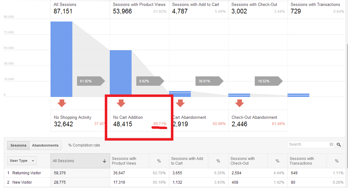
In this case, nearly 90% of this eCommerce site’s traffic left without adding anything to a cart.
Generally, only about 5% of your website’s traffic will make it to your cart page, so while it’s great to implement on-site CRO tools to keep shoppers on your site for as long as possible in the hopes that they’ll complete a purchase, there’s got to me more that can be done to leverage the rest of your site traffic that’s slipped away.
At this point in digital marketing history, most retailers and marketers know about and may be using cart abandonment emails to bring back lost traffic. Cart abandonment campaigns and exit-intent technology powering on-site messaging are just two examples of how you can increase the reach of your overall conversion rate optimization strategy.
But how can you take that same approach of addressing seemingly lost shoppers who’ve expressed high levels of purchase intent and apply it to more of your site traffic to lift conversions?
The answer is Browse Abandonment Emails.
Browse Abandonment Email Campaigns: The Key to Unlocking More Conversions
Browse automated email responses can address visitors at all stages of the purchase decision.
What is browse abandonment?
As you can see, your eCommerce site traffic reaches various steps in the shopping funnel. About 30% reaches a category page; 20% reaches a product page.
When you take a look at this data, you may be asking yourself, how can I effectively convert shoppers at each step of the way rather than losing them?
The most common tactics for getting more site traffic to convert generally address the elements on your actual site.
On-site optimization is great. You can:
But what about when the shopper leaves before completing the purchase? Are you just going to let them get away forever?
Enter Browse Abandonment Email Campaigns.
Similar to cart abandonment email campaigns, browse abandonment campaigns help you engage with these shoppers through automated emails that bring them back to your site. This helps you recapture the site traffic you nearly lost.
How much more?
They can be used to reach up to 5x more shoppers, bringing them back to your site to complete a purchase.
These emails are great because you can send them to the shoppers who drop off at various steps in the shopping funnel, creating more engagement and conversion opportunities, and therefore, getting more out of your site traffic.
Here’s an example.
If a shopper left after visiting your homepage, you can send a Homepage Browse Campaign.
If a shopper viewed a category but never went on to check out individual products, you can send a Category Browse Campaign.
If a shopper viewed specific products on your site yet never added any to their cart, you can send a Product Browse Campaign.
Another point in the shopping funnel you can address is your site search. If a shopper searched for a term or product keyword on your site yet never continued in their shopping journey, you can send a Site Search Abandonment Campaign, too.
Take a look at how well browse abandonment campaigns perform:
Browse abandonment email had a conversion rate six times that of newsletter email.
In this case, browse campaigns converted almost 7x higher than all other channels and campaigns, including the site’s newsletter.
Automated email had a 3x the conversion rate of the sitewide average and was the highest converting channel.
Here, the conversion rate of automated email responses beat the conversion rate of all channels by more than three to one.
What makes these automated emails so effective?
For one, these campaigns engage the shoppers who dropped off earlier on in your shopping funnel, so your reach is much greater than other email campaigns.
It gets better.
Browse abandonment emails can be highly personalized, which means they can work extremely well for any online retailer. Given that 81% of shoppers report they are highly likely to purchase from a site that sent them personalized emails, these behaviorally-triggered and highly personalized messages work.
Now that you know how browse abandonment campaigns work, I’m going to show you examples of the 4 automated emails we spoke about earlier so that you can send them to your shoppers and convert more browsers into buyers.
Capturing Emails For Automated Responses
So how do we capture emails when users are just browsing?
The simplest answer is that there is no correct answer. There are literally hundreds of lead capture strategies, with new technologies coming out every day.
That said, here are a few different methods you might use to grab browser emails:
It’s also possible that you already have the user’s email address through previous engagement or the way they arrive at your site.
For example, if you run a cross-promotion with a 3rd party’s email subscribers, you can set it up so that when they click-through from the email to your website, you automatically receive their email address.
Regardless of how you collect the email address, these are some of the best automated email responses you can send to visitors after they leave your site.
Automated Campaign #1: Homepage Browse Abandonment Email
Choxi showcases its best deals for homepage automated email responses.
Homepage browse emails are a great way to engage with shoppers who landed on your homepage but never went on to explore your site further. Invite them back with product recommendations that showcase your site-wide top sellers.
Automated Campaign #2: Category Browse Abandonment Email
J. Crew can lead visitors back to the category page they favored with abandonment email.
You can send category browse emails to the shoppers who expressed interest in a category, brand or department on your site but did not proceed to view any individual products.
Peak the interest of these shoppers by displaying product recommendations that are related to the category they viewed and additional options that include site-wide top sellers.
Automated Campaign #3: Product Browse Abandonment Email
French Connection uses automatic email responses to bring prospects back to the products they dwelt on.
Product browse emails are very similar to cart abandonment emails in that you can use them to engage with abandoning shoppers who expressed a high level of purchase intent. The kicker here is that there are a lot more of your shoppers looking at products than those who click “add to cart” so your conversion potential here is much greater.
Invite these “warm leads” back to your site by displaying the product they viewed plus related product recommendations.
Automated Campaign #4: Site Search Abandonment Email
In this Calvin Klein example, shoppers get automated emails that reflect their search activity.
Site Search emails are important because they allow you to reach out to shoppers who were clearly searching for something on your site yet for some reason they did not find what they were looking for.
Use these emails to invite back those lost shoppers and help them find what they were looking for.
The Expert CRO Strategy That Most Merchants Aren’t Using
By now, you may be asking yourself, if browse abandonment emails perform so well, why aren’t more online retailers using them as part of their CRO strategies?
Larger retailers like Amazon have been sending personalized email messages like these for ages, but smaller guys, not so much since it used to take large development and marketing teams and even larger budgets to implement strategies like this one.
Luckily, things are now changing.
With more automated personalization tools for email available to eCommerce businesses, you can now send highly-targeted, behaviorally triggered browse abandonment email campaigns to your shoppers, no matter how big or small your business might be.
This year, optimize your business for higher conversions by using the most effective marketing channel to leverage more of your site traffic, and reap the rewards all year long.
Why Animated Videos Increase Viewer Attention
Conversion Marketing StrategyIs there magic in the animated video that is all-the-rage on the web? Should you invest in this style of video to communicate powerful messages to your visitors? Will this investment translate into higher conversion rates?
We set out to collect some data to help answer these burning questions. After all, we’re scientists.
To give you an example of what we’re talking about, here’s a video created for us by NinjaTropic to to introducing readers to AB testing as part of our comprehensive AB testing guide.
This video summarizes AB testing in just under a minute and a half. The goal of this particular article is to establish us as the source for information on this transformational tool of websites. This should make our visitors more eager to subscribe, learn and grow.
In other words, we want to generate leads that will one day turn into sales. Just like you.
Why did we think that an animated video would outperform a simple “talking head” video? Because science told us it might.
Using Animation in Video Marketing to Generate Leads and Sales
Here’s a more traditional video that explains what we’ve learned about animated video and why you should consider it.
Based on their popularity, it seems that video of a “drawn” cartoon with voice over is a great way to keep viewers engaged. We wanted to know why that was, and we wanted to know if that meant they would also be more likely to convert if they were on your website and being asked to take an action.
Eye Tracking Study
We ran an eye tracking study, which sought to answer these things, and what we found out was very interesting.
For hand-drawn video, the motion of the pen drawn on a whiteboard while somebody’s speaking, or of a cartoon moving, pulls the attention of the visitor. It has a very high level of engagement.
Something else we thought was very interesting was that when you include cartoons of people, which is pretty common in these kind of videos, they get the same kind of attention that a real human face attracts. The effects of the cartoon face is very much the same as a videotaped face, like the one of me talking above.
The human mind is drawn to faces and eyes, we like to watch them. Even if there’s something else going on, we always seem to return to the eyes.
Does Animated Video Convert Better?
When we did this study, we also coupled it with a split test. We tested this kind of video with talking head video like this, and with what we call slide video, which you might see given in a webinar, with static images.
What we found out was that if you put this video on a landing page, in which you have a call to action and a form to complete, the animated video converted better. In other words, more people were willing to go and fill out the form and take the next step than with talking head video or slide video.
See Eye-tracking Videos in the Full Report
Is Animated Video More Expensive?
So, if you’re considering video that’s going to call people to action, you really should consider animated or whiteboard video for your landing page. While hand-drawn video can be more expensive to produce, companies like NinjaTropic are driving the cost down with advanced tools and experienced animators.
The real question is whether any additional production cost is more than the increase in leads and sales you may get from it. The only way to know is to test it.
Watch all videos in this series.
The 4-Step Process For Drastically Increasing Inbound Calls
Conversion Optimization, Lead GenerationPhone calls don’t get cold.
Phone calls are answered and voice mails are returned. There is no CRM icebox where your contacts can be sent to chill while everyone updates their lead reports.
Even if you have highly sophisticated marketing automation campaigns that move people through the sales funnel, none of them is as efficient and successful as a human being — listening, answering questions, and handling objections.
In our experience, inbound calls are worth between 500% and 1,000% (that’s five to ten times) more in revenue than a completed contact form.
Your business wants more calls. Your sales team wants more calls.
Today, I’m gong to give you a 4-step process for drastically increasing your inbound calls.
Understanding Your Inbound Callers
Before we attempt to increase calls, we must first understand who our callers are.
There are two kinds of people coming to your website who need to talk to someone. They won’t be satisfied by completing a form or reading a report.
We know something about these two kinds of people.
The first kind has a Myers-Briggs type index including NT, iNtuiting and Thinking. Well-known consultants Bryan and Jeffrey Eisenberg call them Competitives. They are on a mission to find the things that make them better. They expect things to work logically and abhor sloppiness. They are smart and goal-oriented.
The second kind has a Myers-Briggs type index that includes N and F, iNtuiting and Feeling. The Eisenbergs call them Humanists. They don’t do business with companies, they do business with people. They seek relationship and connection. Trust and empathy are the things they look for.
When you say, “Let’s put a phone number on our site because someone might actually call,” you are thinking of these visitors. The problem is, that adding a phone number as an afterthought is exactly what these visitors don’t want. The Competitive sees it as sloppy. The Humanist sees it as stand-offish.
Increasing inbound calls is both about appealing to these users AND making it easier for everyone else to call your business as opposed to contacting you via different channels.
Leverage Your Growing Mobile Traffic
If you are equipped to accept phone calls, you have an advantage over businesses that can’t. Too many businesses are ignoring their mobile traffic because it converts at a quarter to one-half the rate of their desktop traffic.
We have more than one client whose mobile conversion rate is higher than their desktop conversion rate. This is because they accept calls.
Buried deep inside every mobile phone is a phone. That’s why we call them mobile phones. With the right testing program, we can find the right calls to action and proper placements to turn tepid mobile traffic into gold.
Regardless of where the calls are coming from, there are some important steps to take when optimizing for phone calls.
The 4-Step Process For Drastically Increasing Inbound Calls
Now that you understand your inbound callers and leveraged your mobile traffic, let’s dive into the proven 4-step process for increasing your inbound calls and generating more sales leads.
Step #1: Improve Your Website Data Tracking
In order for this to work, dear marketer, you first need to get credit for these calls. Instead of slapping the company sales number on the website, you need to be able to measure calls sent from the site. Inexpensive services will give you a unique number. We use Grasshopper for our 800 number service. Google Voice is a source of local phone numbers. Counting calls will be largely done by hand.
To tie calls back into an analytics package, we’ve worked with a number of services, including IfByPhone and Marketing Optimizer. Others on the market include Mongoose Metrics, LogMyCalls, and RingRevenue. This allows you to calculate a conversion rate with more accuracy.
The ways these packages work are different and beyond the scope of this column. Nonetheless, they let you take credit for real activity in sales.
Step #2: Perfect Your Offer
We too often think that those who would prefer a call will think of calling. It ain’t true. Someone predisposed to call still needs to understand why they should call and what to expect. The only number that doesn’t need a call-to-action is 9-1-1.
Those who bother to write an invitation alongside their phone numbers resort to engaging messages such as, “Call,” “Call us,” “Call us today,” or the daring “Contact us.” None of these offers a why or tells you what to expect. Adding an exclamation point doesn’t help.
Home Instead Senior Care is really working hard to get visitors to pick up the phone.
There are four things that you can use to make your phone number more enticing to those who would call:
1. Alignment means that your “call-to-call” mirrors the need of the visitor. Often, it is sufficient to match the invitation in the ad or link what brought them to the page.
2. Adding Emotion shows that you relate to their real non-logical pain or desire.
In the example above, “Struggling with caring for a parent” would be aligned, but not emotional.
“Feeling guilty about caring for a parent?” definitely carries emotion. If you think that this kind of message is too bold, think again. We had a 43% increase in calls for an invitation that read, “Ready to stop lying to yourself? We can help. Call …”
Emotion is a powerful tool.
3. The visitor wants Clarity about what will happen if they call. Who will be on the end of the line? Will they be an expert? Will they try to sell me or educate me? Can I call on weekends? Be clear about what will happen on the call.
4. Finally, you must build the Value of the call. Like all good calls-to-action, the call-to-call must reek of WIIFM (“what’s in it for me”). It has to promise enough to the visitor that they would prefer to call you over any alternative. Lay it out there.
Step #3: Put Things In The Right Place
Just sticking the number in the upper right corner isn’t going to get you those calls that make you powerful. The number should be there, as this is where callers look. But the other two places that make the phones ring are:
The following image shows a wireframe of a typical content page with proper placement of calls-to-call. We’ve tested them all over the page.
Ask for the inbound call in the headline and again about three-quarters of the way down the page.
We tested messages at the top, left, right, bottom and middle. These are the places that worked for us on several sites. Bigger and bolder text can also increase your calls.
Step #4: Make Your Contact Forms Long & Unattractive
You may have noticed an item on the wireframe image above: “Long, ‘Nasty’ Form.”
To maximize the number of calls you get and cast fewer of your visitors into the frigid desert of the CRM, make your forms long, and ask for some personal info. Yes, this is the opposite of what we tell you to do when you want visitors to fill out a form.
This will cook your noodle. When trying to maximize the number of calls we get, a long, nasty form works better than no form at all. That’s right. No form generates fewer calls.
I think this highlights the way our visitors assign a price to their time and attention. On its own, a phone call may seem “expensive.” However, when a long, nasty form is on the page, it makes the cost of taking action by form more “expensive.” The call looks cheap by comparison.
This is a pricing exercise, but the cost isn’t money. It’s time and attention.
The power of a ringing phone gets noticed. If visitors to your site start calling your sales team, it will be noticed. You need to be able to measure the calls and toot your own horn as well. Unlike leads, calls have a power beyond a graph in a PowerPoint presentation. To become an indispensable marketer, make the phone ring.
Bonus: Make Click-to-Call Prominent on Mobile
Maximizing phone calls from the web means maximizing your mobile traffic. There is an entire separate set of strategies for getting more mobile calls.
Visitors on a mobile phone are coming with a completely different mindset from those coming on a desktop computer or tablet. To understand how to engage these visitors, download Designing for the Mobile Web 2.0.
Increasing Inbound Calls Conclusion
There are three kinds of visitors visiting your website:
When you focus your strategies on getting group 3 to call, you can enjoy significantly higher sales rates, bigger average order values and new customers that are more satisfied with their first buying experience.
Make calls a key part of your focus, and harvest more of those fickle visitors coming on mobile phones.
9 Business Tagline Examples That Drove Multi-Million Dollar Growth
Conversion OptimizationTaglines and slogans can get a bit of a bad rap in the conversion world.
When the goal is immediate conversion, we know from years of providing Conversion Optimization Services that a targeted, well-written value proposition will beat a vague tagline every day of the week.
But that doesn’t mean taglines aren’t important.
In fact, depending on your company size and marketing strategy, a tagline can have an even greater impact on your total revenue than your highest converting value proposition. The key is to understand when taglines are important, why they are effective, and how to write a winner.
Today, we’re going to cover all that plus look at 9 tagline examples that helped drive multi-million dollar growth.
21 Quick and Easy CRO Copywriting Hacks
Keep these proven copywriting hacks in mind to make your copy convert.
"*" indicates required fields
When & Why Taglines Are Important
Just so we’re on the same page, a tagline is a catchphrase or slogan used to advertise a brand. It’s a short phrase or series of phrases, often presented in conjunction with the brand logo, that is intended to add meaning to the brand.
So, when is it important?
The simplest way to put this is that if branding is very important for you business, your tagline will also be very important.
Now, you might say, “Branding is important for every business,” and while you wouldn’t be wrong, the spectrum from “important” to “very important” is actually quite large.
Let me explain.
Business #1 sells clay coasters on Amazon. Their #1 marketing goal is to get their Amazon listings to show up at the top of both Amazon and Google’s algorithms for that product category, and they spend 90% of their marketing budget on PPC.
Branding really isn’t that important for Business #1.
Not everyone needs to invest in a compelling tagline.
Business #2 sells luxury cars. Their #1 marketing goal is to be top of mind year-round for consumers making between $85k – $300k per year, and they spend 75% of their marketing budget on television ads.
Branding is VERY important for Business #2.
Taglines can really help if you need to stay in your prospects’ minds.
These two examples demonstrate both ends of the branding spectrum, with most businesses falling somewhere in between.
That said, a good tagline will often demonstrate similar traits to a good value proposition. The two aren’t mutually exclusive. They just have different purposes.
A value proposition’s goal is to explicitly describe why the product is the best available option for the consumer and should be purchased immediately. A tagline’s goal is to attach significant, lasting meaning to the brand in a way that resonates with the consumer.
So how do we create a compelling tagline?
How To Create A Compelling Tagline
There are 3 primary qualities every brand tagline should have:
Your tagline is your chance to immortalize your company’s purpose in a brief phrase or series of phrases. It first and foremost needs to reflect your mission.
Your tagline is also a prime opportunity to reflect your brand’s persona or personality. It’s important that your tagline communicates an idea about not just what you do but who you are as a brand.
Finally, the goal of your tagline is to resonate with your target audience and connect your brand to a powerful set of positive emotions and ideas.
1. Skyrocketing Business Profits: SoulCycle “Find Your Soul”
Co-Founders Elizabeth Cutler and Julie Rice wanted to create an exercise experience that was fun, exciting, and felt like a community. Noticing a void in the market, they opened the first SoulCycle in a former New York funeral home in 2006. Since their scrappy beginnings of handing out fliers for free classes (it was against building regulations to put up any signage), they’ve expanded to 85 locations and continue to expand to new locations in 2017.
SoulCycle’s tagline:
“Take Your Journey. Change Your Body. Find Your Soul.”
Soul Cycle’s tagline focuses very much on their target customers – fitness enthusiasts who see exercise as something physical, mental, and spiritual. The statement exudes a sense of excitement and empowerment for riders, and implies that something metaphysical can come out of an intense 45 minute stationary bike session.
The tagline is sometimes shortened to simply “Find Your Soul”, which emphasizes the brand’s mission of connected, community-based workouts.
Tagline examples: SoulCycle doesn’t say “find a cycle,” they say “Find your soul”
The key idea here is that SoulCycle plays into the innate human desire of being part of a community. It’s exceptionally smart, because how we relate to others and the world around us affects our buying decisions. This explains Soul Cycle’s customer loyalty, which has skyrocketed the business’ profits.
This tagline isn’t just a tagline either. It is reflected in everything the brand does. Cyclists ride by candlelight in ‘epic spaces’ where they feel like they’re part of a ‘tribe’, and instructors constantly howl motivational phrases and speeches at the riders.
The Business Results
Even with a costly fee of $35+ per session and minimal discounts for monthly memberships, SoulCycle has still found its niche in the world of standard gym equipment.
2. TOMS: One For One
TOMS shoes started when founder Blake Mycoskie went to Argentina in 2006 and saw children running around without shoes. He also took note of the Argentinian traditional shoe, the soft alpargata that TOMS shoes are modeled after. He came back to America with a vision of the “buy one, donate one” and had 250 samples made. He approached American Rag to sell the shoes, and the LA Times picked up the story. The story created a demand for nearly 10 times as many shoes as what was in stock.
TOMS shoe company was officially born.
TOMS Socially Conscious Tagline
“One for One”
Tagline examples: Tom’s pioneered the One for One business model and the tag line says it all.
TOMS tagline is incredibly powerful because of the message it communicates. Buy one pair of shoes, and one additional pair of shoes is donated to a child in need.
Not only is this a brilliant business model, as 62% of modern consumers are willing to pay more for socially or environmentally conscious goods, allowing TOMS to sell $4 worth of shoes for $40, but it also directly counters the often vague language and spending that accompanies most charities. The consumer knows exactly what is happening. The get a pair of shoes they want, and a child in Africa gets a pair of shoes they need.
This tagline hits on all the right notes. It communicates the mission and resonates with the target audience. You could even argue that it communicates a straightforward personality.
Not only that, but 86% of those customers tell their friends and family, giving socially conscious businesses like TOMS plenty of free advertising.
The phrase is also crystal clear: it describes the company’s business model in 3 words.
The Business Growth Results
The “One for One” tagline and business model has been a huge success for TOMS:
Fastest Growing Private Company in the U.S.: “Discover a different nite out”
Powerful business tagline examples: Paint Nite is not a painting class, it’s a different nite out.
Paint Nite’s tagline is deceptively powerful. It’s communicating something very specific to it’s customer base comprised of 90% women.
By offering a “different nite out”, they’ve attracted a crowd that still want to get out, socialize, and have some libations but outside the usual scene of bars or clubs. This is a brilliant strategy as the bar and club scenes have experienced declining popularity with millennials. One study found that those under 35 felt that the traditional night out is too impersonal and too exhausting.
Paint Nite met this need by creating a fun group environment where participants have common ground to talk to one another. Sitting and painting while sipping wine requires a lot less energy than drinking and dancing until closing time, and this “differentness” is reflected beautifully in their slogan.
The Results:
It turns out Paint Nite is on to something, as demonstrated by their remarkable success:
4. Canada Goose: Canadian Craftsmanship
Canada Goose began nearly 60 years ago and became popular in the 1980’s when their red down-filled coat (aka Big Red) was developed for scientists at Antarctica’s McMurdo Station. Its popularity increased further in Europe due to its decision to keep manufacturing in Canada, and Americans took to the brand when celebrities like David Beckham and Kate Upton were spotted sporting their signature coats.
Canada Goose’s tagline:
“Our uncompromised craftsmanship defines Canadian luxury.”
Even when it was vogue to move manufacturing overseas for cost reduction, CEO Dani Reiss knew that keeping the manufacturing in Canada was a huge selling point for customers, so Canada Goose reaffirmed its value proposition around that selling point.
The above tagline is more of value proposition mixed with a tagline, and a simpler version with only “Canadian Craftsmanship” can be found on the site as well.
Tagline examples: Canada Goose, Craftsmanship.
This tagline is a great example of matching mission to customer in as little as two words. “Canadian Craftsmanship” speaks volumes about both the products being produced as well as the consumers who purchase them. This focus on quality craftsmanship is further enforced by the brand’s lifetime guarantee on it’s signature products.
The Results:
Canada Goose coats are not only known for their high quality but also for being some of the warmest on the market. Because of their commitment to quality, expressed beautifully in their tagline, they achieved incredible success.
5. GoPro: Be A Hero
GoPro is the brainchild of Nick Woodman who noticed that the only way to capture a surfer’s tricks was from land or on a jetski. He bootstrapped the company by selling belts decorated with beads and shells out of his van, and the prototype was born.
GoPro’s tagline:
GoPro actually has two primary landing taglines.
Both of these taglines do a great job of representing the brand, albeit in different ways.
Business tagline examples: GoPro, Be a HERO.
GoPro was invented for the purpose of capturing extreme sports like skydiving or snowboarding, and their taglines encapsulate that, inviting users to “be a hero” and take extreme action, capture their exploits on film, and then share their adventures with the world.
These taglines are very customer focused, which fits with GoPro’s marketing strategy. GoPro’s marketing revolves around user generated content, and their taglines help to invite new users to participate in sharing their GoPro captured activities with their friends.
The Results:
While GoPro has recently been having to compete with smartphone cameras and mounts, they are still a massive success:
6. Stella Artois: Be Legacy
Stella Artois has a nearly 700 year history, so their taglines have evolved over the better part of a millennium.
Here’s a brief history of how the brand has evolved:
Stella has been around since 1336 and was originally brewed as a pricey, limited edition treat for Christmas. That was until 1981 when they turned their price point into a positive with a “Reassuringly Expensive” tagline. The statement worked and Stella Artois successfully flipped the narrative from “too expensive” to “classy”.
Stella Artois turned high price into a selling point.
That was until football fans realized that Stella contained a higher percentage of alcohol than other beers and began drinking it to get drunk. It caused a rift between the company’s brand and public perception as fans were pictured rioting with a Stella in hand.
To turn their image around, they repositioned themselves in 2008 with a new tagline: “A thing of beauty”. The marketing campaign displayed their ‘9 Step Preparation Guide’ that implied the consumer needed skill and a certain amount of grace to pour the perfect pint of Stella.
Stella Artois tagline:
“Be Legacy”
Last year saw another revamp in their marketing, as the company sought to make its beer appear not only more classy, but more personal.
Stella’s new tagline shows off their brand personality by reaching back into their history to the beginnings of Sebastian Artois, a man who sold all of his belongings to buy the brewery down the street.
Tagline examples that drove multi-million dollar growth: Stella Artois, Be Legacy.
They also preface their tagline with the phrase, “what will you be remembered for?”. It does a great job of targeting an emotion behind their beer that isn’t partying on a boat. You drink their beer to live life.
The Results:
Not many products survive for centuries, yet Stella Artois’ has used their branding to achieve success and longevity:
7. BuzzSumo: Find Shared Content and Key Influencers
BuzzSumo allows people to find the most popular content around a given keyphrase. Instead of manually searching websites for your keyword, Buzzsumo amalgamates the most popular content for that keyword, how many social shares it received, and who shared it.
BuzzSumo’s tagline:
“Find the most shared content and key influencers”
Tagline examples: BuzzSumo’s tagline is found in its interface.
This tagline doubles as a value proposition. It’s a no fluff explanation of the real value being provided by the brand. Do you want to find the most shared content? Are you looking for key influencers? Well, then you’re in the right place.
The Results:
Even though Buzz Sumo is a young business (not even 3 years old), it has gained incredible traction:
8. Headspace: Treat Your Head Right
Headspace began with a meeting between two men. Andy Puddicombe, an Englishman, became a monk after having the traumatic experience of losing two friends and a step-sister. He wanted to bring the technique of mindfulness to the masses, and created a meditation app called “Jeeves”.
At the same time, Richard Pierson, another Englishman, was burned out from his job. To help calm his anxiety, a friend of his had recommended Jeeves. Inspired by the app, he approached Puddicombe with a proposition – he’d market the meditation app in return for one-on-one meditation lessons.
The men tapped into the 1.2 trillion dollar mindfulness industry in 2010, when they brought meditation to where most people were spending their time – their phones.
Headspace’s Tagline:
“Treat Your Head Right”
Tagline examples: Headspace’s tagline makes mental health common sense.
Traditionally, the general public in North America has viewed meditation as something exclusive to monks, hippies, or other niche groups. Headspace has helped change this perception withe their broad outreach.
Through their approachable brand personality, exemplified through their tagline, they showed that meditation isn’t some ethereal experience meant only for “mystics”, but rather, something anyone can do to “treat their head right” as part of an everyday mental health routine.
The Results:
The app’s approach to meditation worked. Headspace has gained huge traction over the last few years:
9. Dollar Shave Club: Shave Time. Shave Money.
Dollar Shave Club was born out of a party conversation between Mark Levine and Michael Dubin, where they shared their frustrations on the high cost of razor blades. They came up with the idea to send blades via a monthly subscription box for $1 (with $2 shipping). The pair launched Dollar Shave Club’s website in 2011.
Dollar Shave Club’s tagline:
“Shave Time. Shave Money.”
Business tagline Examples: Dollar Shave Club’s tagline is the perfect pun
Dollar Shave Club showcases brand personality incredibly well in their tagline, website, and across all of their marketing campaigns, branding their company as a club for common sense, sarcastic smart alecks… you know… what every guy aspires to be.
Up until Dollar Shave Club’s existence, many had griped about the absurd cost of disposable razor blades, but very little had been done about it. Dollar Shave Club cashed in on the strategic idea of delivering blades bought in bulk but repackaged for individual use, capturing the sentiment that we all need to save time and money, even in the smallest of ways.
The Results:
Questioning consumer norms paid off for Dollar Shave Club in big ways:
12,000 subscribers in 48 hours
. The add also attracted $1 million in investment in the company.
$1 billion by Unilever.
Conclusion: Business Tagline Example Takeaways
Now that we’ve seen what a winning tagline looks like, let’s review the key qualities you should include in yours:
Create a tagline that reflects these qualities, and you’ll have secured a key piece in your branding campaign.
Need help climbing into the heads and hearts of your visitors to understand what they need and then testing your way to a powerful tagline? It might be time to hire a Conversion Agency to help take you to the next level.
21 Quick and Easy CRO Copywriting Hacks
Keep these proven copywriting hacks in mind to make your copy convert.
"*" indicates required fields
10 Copywriting Tips You Think You Know (But You’re So Very Wrong)
Conversion OptimizationWithout copywriting, your business has… well, nothing.
Unfortunately, most people (and dare I say most copywriters) are just awful at writing copy. They can tell you all the right principles and even write a fantastic blog post on the best copywriting tips, yet when it comes to actually writing the copy, all that knowledge goes out the window.
So that’s what brings us together… today.
We’ve already discussed the psychology of persuasive writing, but in this post we’re going to focus on some incredibly practical and insanely important copywriting tips that most everyone can recite in their sleep yet somehow rarely make it the published landing page.
Summary
Copywriting Tips Conclusion
You can’t afford to get these wrong.
1. Take Your Readers Through A Narrative
They say that good storytellers make the best salespeople, and that’s not a hard concept to believe.
We all know those people – the people who have a way with words and make anything they’re talking about interesting. When you hear someone telling a story (and telling it well), it’s easy to feel like you’re a part of it. We get sucked into the flow of words, thoughts, and ideas.
The psychological term for this phenomenon is called “neural coupling“, and it describes how the listener’s brain patterns tend to mirror that of the speaker during communication. This coupling occurs when the listener is engaged with the flow of communication and breaks when they get distracted or are unable to comprehend what’s being communicated to them.
Now, notice this point didn’t read “tell a story”.
Storytelling has a place in marketing, but when we’re writing copy for a website landing page, telling a story in the traditional sense isn’t always the best use our limited space.
Instead of story, think narrative.
A narrative is an account of connected events, with connected being the key word here. It’s very, VERY important that every piece of copy on your landing page is connected.
Many landing pages I see today consist of a bunch of copy segments that cover a range of topics and hit on everything the site owner thought would be important to cover. In the worst cases, the site owner selected a WordPress template and then hired a copywriter to fill in the text spots.
There is no flow. There is no connection. There is no chance to create that neural coupling effect with the reader.
Instead of creating multiple segments, think through the journey you want to take your readers on. Where are they when they land on your page? Where do you want them to be when they get to your final Call to Action (CTA)?
To help you get started, here’s the narrative template I like to use with many of my clients:
Connecting your landing page in a narrative flow will go a long way in engaging readers with your message.
2. Simplify & Condense Whenever Possible
You have a limited amount of space and time to communicate your value and capture your reader’s’ interest.
55% of visitors spend less than 15 seconds viewing a landing page before deciding to leave. It’s incredibly important that you effectively communicate your core value proposition within that brief window.
You already know the importance of a great value proposition, but this condensed approach shouldn’t end after the fold. Each segment of your landing page needs to be treated as though you have an extra 15 seconds to compel the reader forward to the next section.
At no point do you the luxury of babbling. At no point can you take the reader for granted.
Every word on a landing page needs to be optimized. Every sentence needs to be intentional, clear, and concise, from the opening headline to the closing CTA.
This does NOT mean your page should be brief. It’s important that you say everything you need to say. It simply means that you should communicate everything you need to communicate in as few words as possible. Every segment needs to be the optimal version of itself.
3. Keep The Visual In Mind
When writing the copy for a landing page, it’s important to remember that the copy will be viewed within the context of a visual design.
Reading a landing page is not at all like reading a letter, a blog post, or even an email. Images, video, visual design elements, and even interactive features can be a big part of the user experience. The copy is still THE most important element, but it will be viewed in the context of the page’s design.
It’s important that you keep this visual experience in mind when writing the copy.
In other words, NO WALLS OF TEXT.
In other words, don’t do this…
This company description doesn’t talk about the reader
Visual elements like those I just recommended allow the eye to easily track from point to point without distraction. While the copy is king, it needs to play nice with the design to ensure its narrative is easy to read, follow, and comprehend.
This is why I always recommend my next point…
4. Collaborate With The Designer
When creating a new landing page, you should always have your copywriter and designer work together from the beginning. This should be standard practice for ANYONE hiring a copywriter… and yet, in my experience as a freelance copywriter, it’s very rare.
Too often, copywriting is viewed as a “fill in the gaps” activity that occurs after the website design is finalized.
This is a massive mistake. The purpose of the copy is NOT to fit the design. The purpose of the design is to highlight and facilitate the copy. If your copywriter is filling in lorem ipsum text blocks, you are seriously hampering their ability to create a compelling narrative.
Don’t use latin as a placeholder in your designs. Design should follow copy.
At the same time, copywriters (especially beginning or intermediate copywriters) can be a bit text heavy and ignorant of how to create copy segments that are compatible with modern design, resulting in the problems I mentioned in Point #3.
This is why I always recommend that clients have their copywriters and designers collaborate on landing pages simultaneously. When the two work together, the copy can be highlighted without compromising the visual design.
5. Write With Personality
Look, have you ever talked with someone who has no personality?
Yeah, that’s what it feels like to read formal copywriting.
If you are anything like everyone I’ve ever known, you will nod your head sagely and agree with this point. You probably even have a blog post on your site with this exact copywriting tip proudly displayed in a list similar to this.
This seems to be one of those points that is widely understood yet somehow flies right out the window the moment fingers hit keyboards.
The reality is that most people struggle getting thoughts to paper. By the time they are able to articulate what they’re trying to say, there’s no mental capacity left for personality or nuance, and as a result, the copy comes out sounding formal and stale.
Or worse, it’s nothing more than a paragraph full of buzz words…
This is a paragraph full of buzzwords.
Write copy like you are speaking directly to your target audience. How do they speak? How do they like to be spoken to? If you are talking to doctors, your copy might need to be academic or a bit more formal, but if you are speaking to patients on behalf of doctors, your copy shouldn’t sound like a medical conference presentation.
If you struggle with this, either hire a copywriter, pay for tone-focused editing, or write, write, write until you don’t have to think so much in order to translate your thoughts to words on a page.
6. Write Multiple Drafts
Remember in high school when you had to submit a 1st draft and then a 2nd draft and then a 3rd draft?
There was actually a reason for that, and the reason is that your 1st draft usually sucks.
Don’t believe me? Maybe you’ll believe Ernest Hemingway:
So yeah, stop settling for your first draft like a chump and start taking advantage of the revision process. Even better, create multiple versions of your most important talking points and then get 3rd party feedback on the variations.
And ultimately, you really don’t need to guess perfectly with your copy. The ideal copywriting strategy is to write multiple versions, each optimized around a different conversion hypothesis, and then A/B test them with real site visitors.
Want to know if your copy converts?
7. Prioritize Clarity Over Cleverness
If you were super into Mad Men, you probably suck at digital copywriting.
Prioritize clarity over cleverness, not the Mad Men approach.
Clever copy doesn’t convert. Clear, compelling copy converts (say that 5 times fast).
Your goal as a copywriter is to clearly communicate the value of the offer, the problems it solves, and the benefits of using it to the intended user. If you can be clear and clever, that’s fine, but only one of those will pay you back for the time you spent writing it.
8. Focus On The Emotions Behind The Decision
“Sell the sizzle” and “be emotional” are pretty stereotypical copywriting tips, and while they are not universally applicable, they tend to be correct more often than not.
Human beings very rarely make decisions from a purely analytical standpoint. We are an emotional species and our emotions heavily dictate our behavior.
There are two primary ways in which emotions affect our decision-making:
Immediate emotions are those experienced in the moment the decision is being made. These can be related to the decision itself or they can be the result of other external stimuli.
For example, if you get in a big argument with your spouse, leave angry, and then begin evaluating a purchasing decision, that anger is an immediate emotion effecting your decision-making.
Anticipated emotions are the emotions someone anticipates experiencing as a result of a given decision.
For example, if you are debating whether to purchase a new SaaS product, and you are thinking about all the time it could save you, the associated emotions are anticipated emotions.
When you are writing your copy, it’s important to think through any consistent immediate emotions that might surround your visitors’ journey to you. What motivated them to click that add or search for that keyphrase, and how might that give you a read on their immediate emotional state?
Even more importantly, how can you resonate with the problems your readers are facing and then help them genuinely imagine a positive future with your product?
This is what your copy should be focused on.
9. Write To One Person
One of the biggest mistakes businesses make with their copy is trying to communicate to everyone at once. It’s been quite surprising to me how often a business owner will come to me to write copy, and when I ask them, “Who is your target audience?” they reply, “Everyone”.
Here’s a secret. “Everyone” is NOT your target audience. In fact, The more people you are trying to fit into the same sales pitch, the less effective it will be.
The best copywriting is written to a single reader. It’s focused on a specific customer profile and the interests, needs, and aspirations that come along with that profile.
If you don’t already have that profile defined, all you have to do is go talk to your customers.
A great example comes from Sujan Patel, who spent hours upon hours reviewing customer support logs and talking directly with the customers themselves. The onboarding improvements that came from those conversations resulted in an incredible 250% lift in conversions for his business.
Write your copy to someone specific instead of using a catch-all mentality.
10. Break The Rules & Test The Results
General rules and best practices are great. When you start with what works on average, you will probably end up in a better spot than if you were to just winging it.
That said, if you do what everyone else is doing, you’ll get the results everyone else is getting. Sometimes, it’s beneficial to break the rules and try something new.
But the difference between strategic rule breaking and “winging it” is data. You should always be A/B testing your copywriting, but if you are going to break away from best practices, you absolutely need to begin A/B testing your content.
Copywriting Tips Conclusion
Okay… my sermon is delivered, and now I’m washing my hands of this.
You can’t afford to get these wrong.
Whether you write your own copy or bring in outside help, it’s critically important that you follow all 10 of today’s tips when creating your landing pages and conversion funnels.
Obviously, there are many more important tips for great copy, and I’d love to hear your favorites. Let me know your #1 copywriting tip in the comments.
What Is Behavioral Science and How it Changed Website Design
Conversion-Centered Design, Persuasion ScienceAs data becomes cheaper and more accessible, behavioral science becomes an increasingly important term for anyone serious about marketing and conversion optimization.
Examples of Behavioral Science in our Everyday Lives
Many people think of behavioral science as a field of academic study or the domain of dedicated data scientists, but it’s much broader in scope than that.
In fact… it’s everywhere you look:
The Billboard music charts, the New York Times Bestseller list, the Rotten Tomatoes Freshness Score, social proof, the laugh track on The Big Bang Effect. Behavioral science affects our thoughts and decision making on a daily basis.
So what is behavioral science? How did it change the website design process? And why is it a MAJOR key to increasing a website’s conversion rate?
What Is Behavioral Science?
The simplest definition of behavioral science is that it’s the study of human behavior. For those of us in the digital marketing profession, behavioral science is the science of predicting the future. Understanding how people have behaved in the past will help us understand how people will behave in the future.
It encapsulates multiple fields of study, including psychology, sociology, social neuroscience, and cognitive science, and many others, and it focuses primarily on controlled observation of behavior patterns in response to external stimuli.
Behavioral science differentiates itself from fields like social science in that it is driven by rigorously obtained empirical data, and this data-driven approach is what led us to fall in love with the field here at Conversion Sciences.
Why Behavioral Science Is Instrumental In Website Redesign And Conversion Rate Optimization (CRO)
In the early years of last century (no, not the 1900’s), I was a corporate marketer responsible for generating leads and sales from the relatively new worldwide web. It was my job to create advertising, compose the emails, design the landing pages, develop the content and build the website that would attract people to us and convert these visitors into leads when they arrived at the website.
It was a frustrating job.
Because in the digital world you can do anything. Any image, any copy of any length. I could add video, animations, live chat, ratings and reviews.
Sometimes I would mash the best ideas together into a mush that only served to confused my readers.
Other times, I would have to pick one consistent message. But was it the best one? Really? I didn’t know.
This is why the carousel was born. Marketers couldn’t decide what to put on their home pages, so they just rotated through a bunch of options.
Not a good plan.
This was all frustrating because my only form of research was “launch and see.”
Redesigns have become the primary way businesses test their websites: spend a lot of money, launch and see.
Analyzing Behavior to Increase Website Conversions
Fortunately, I’ve got mad programmer skillz. I wrote a little program that collected data on my visitors. Whenever they arrived at my website, I would store the source of their visit and then track them to see if they completed a form. At the time, I didn’t even know that this was called a conversion.
With this simple program, I was able to track and measure how visitors interacted on our website. I now had data with which to make informed decisions about our site content.
In 2005, Google released Google Analytics, and suddenly, an entire new realm of online behavioral science data was opened up to webmasters at no cost.
Discover How Behavioral Science Can Help Get More Website Conversions
In 2014, Marks & Spencer redesigned their apparel website. Marks & Spencer is a GBP10 billion company running food and apparel stores in the UK and Europe. In 2013 13% of their sales went through the web. That’s about $1.5 billion. With a B.
In 2014, they launched a website redesign. The effort cost GBP150 million. Today that would be about $180 million.
After two years and approximately $180 million spent, Marks and Spencer launched a new website. Source: Digital Tonic.
The UX community–and their designers–thought the redesign was “positive.”
The customers didn’t agree. Upon launch, the site saw an immediate 8% drop in sales. That’s about $10 million per month in lost sales. This number doesn’t take into account the loss of brand trust.
The best way to build brand online is to deliver what your visitors want.
For $180 million, we expect that they did a great deal of research into their customers and visitors. So, what went wrong?
This is the battle being waged in your business. Intuition vs. research. Best practices vs. behavioral science. Left brain vs. right brain. Both are necessary. But if you continue to find yourself struggling to get value from the visitors that you pay to bring to your site, there is an imbalance.
Intuition is our ability to apply our experience to new situations. We admire those who can discern the important aspects of something without study.
When behavioral data was expensive to acquire, most campaign planning and development time was spent in the domain of intuition. Any research was done at the beginning of the process, and this was primarily qualitative data based on surveys and focus groups.
Then the designers and developers applied the data to the best of their ability relying heavily on their intuition to make thousands of little decisions necessary to complete a project.
The “Mad Men” way of designing a website.
It is at the end of this process that true behavioral data is collected. It’s called results. If the results were positive, then the campaign can be replicated and continued. If the results were disappointing, then the campaign would be scratched, and the process would start over.
What Using Behavioral Science Data in Website Development Looks Like
What does a campaign development process look like in an era of cheap behavioral data. For most businesses, it looks the same. But for industry leaders, it looks like this:
This is how we design a website when data is abundant and cheap. Like today.
Qualitative data is collected at the beginning. But now we can go back and test components of the campaign again and again. And we collect inexpensive quantitative behavioral data.
Intuition has its place and always will. But now we have balance. At several points along the development path, we can answer specific questions about our campaign.
Conclusion: How to Apply Behavioral Science to Increase Website Conversions
Every marketer will need to add behavioral science in their diet. What is behavioral science and how does it lead to winning campaigns?
We’re going to be diving deeper into behavioral sciences in the coming months.
We’ll be discussing the rules of behavioral science, examining case studies, and providing practical strategies for application.
Anatomy Of An Optimized Checkout Experience
Conversion OptimizationDo you know how much money you’re losing to shopping cart abandonment?

Do you know how much more money you could be earning with an optimized checkout experience?
The statistics don’t lie. The average shopping cart abandonment rate currently stands at nearly 70%. That means 7 out of 10 highly qualified leads – people who like your product enough to click “Add to cart” – are being lost during the checkout process for one reason or another.
There is no better place to stop your optimization efforts than the checkout process. Today, we’re going to cover the most common reasons customers abandon ship during checkout and review the anatomy of an optimized checkout experience with the help of this incredible infographic from our friends at SurePayroll.
Let’s look at some of the key takeaways for eCommerce store owners and optimizers. If your goal is create an optimized checkout experience, the follow points are a must read.
The Top 4 Reasons Customers Abandon Shopping Carts
There are a lot of reasons a given visitor might abandon your website during checkout. Using the data listed above, we can see some major themes about what most influences cart abandonment.
1. Extras Costs & Price Ambiguity
According to consumers, the #1 reason for cart abandonment BY FAR is hidden costs that don’t show up until they have begun the checkout process. In a similar vein, the 4th most cited reason was that consumers were unable to ascertain the total cost of the transaction before starting checkout.
What this tells us is that consumers want to know EXACTLY what to expect when they begin checkout and they absolutely do not want any new information thrown at them along the way.
In some niches, costs like taxes or shipping might be expected and acceptable, while in other niches, they will be considered new information. In all cases, however, extra fees and other costs that aren’t disclosed ahead of time will often result in cart abandonment.
2. Overly Complicated Checkout Process
As we see in the infographic, consumers hate complicated checkouts. They don’t want to create an account. They don’t want to fill in layers of unnecessary information. They don’t want to jump through 5 rounds of hoops.
They want to pay you money, get their stuff, and leave.
The longer and more complicated your checkout process is, the more primed buyers will cancel their transaction instead of paying you money.
3. Checkout Has Errors
If you can’t complete checkout… you can’t complete checkout.
Usability testing and eliminating errors should always be your #1 priority. It’s simple. There’s no guesswork or strategy involved. If you’ve been dragging your feet on this, you are literally throwing away money.
Eliminate checkout errors now.
4. Lack Of Trust In The Website Or Brand
Trust is a very important piece of ecommerce. Thanks to the Wild-West-like landscape of the internet’s opening decade, many consumers have a deeply ingrained level of mistrust towards any brand or website they haven’t already bought from.
While the landscape is much cleaner today, and consumers have many levels of protection in place, those feelings of mistrust tend to surface during the checkout process.
When it’s time to actually pay money, consumers want to be confident that they will get what they paid for. During this process, any signals that can cause skepticism will likely result in cart abandonment. Even just a lack of positive trust signals can be enough to cause abandonment.
It’s important to plant a continuous stream of encouragement, proof, and other trust signals within your checkout process.
How To Reduce Abandonment & Create An Optimized Checkout Experience
Now that we’ve discussed some of the primary reasons consumers abandon ship during checkout, let’s discuss how to reduce abandonment and create an optimized checkout experience for your customers.
1. Tell Users What To Expect Before Checkout
One of the best ways to reduce care abandonment is to tell users exactly what to expect before checkout and then avoid springing new information on them during the checkout process.
For some niches, this is as simple as including the full price on the landing page. For other niches, this can be more complicated.
The travel industry has gotten pretty good at this. In a situation where there are numerous fees in place, they will included all of costs in the price users see, and make a point of clarifying that rate covers all included costs:
If the cost will depend on a future variable, then you can either clarify that a future cost is still on the table – “Shipping cost not included” – or you can change your business model to eliminate variables for the user.
2. Simplify And Streamline The Checkout Process
The checkout process should feel simple and intuitive. Sometimes there are unnecessary steps or requirements that need to be eliminated, but at the same time, putting everything on one page isn’t always the answer.
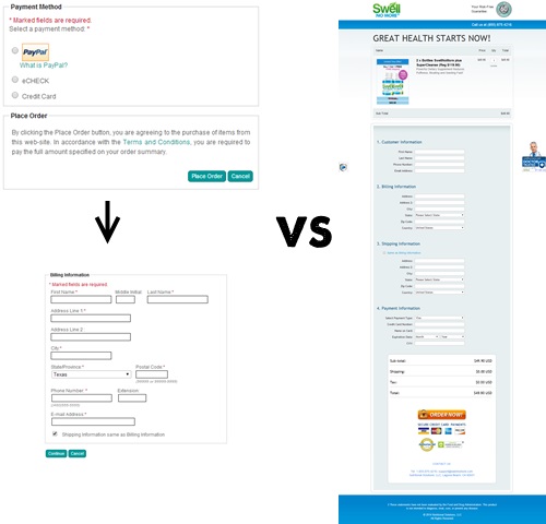
In the example below, the two-step checkout on the left converted better than the one-step checkout on the right. This is likely due to the one-page checkout overwhelming the visitor with 15+ lines of data to enter, while the 2-part checkout broke things down into more manageable sections.
When it comes to optimizing your checkout experience, it’s very important that your are incorporating a proven A/B testing framework. Simpler is usually better, but the specifics of implementation can be tricky to predict.
Here are some great examples to pull from: 8 Ecommerce Testing Examples You Should Have Tried Already
3. Eliminate All Checkout Errors
As I mentioned before, this is really simple conceptually. Eliminate errors.
Remember that while things might be running smoothly on the Chrome browser in your desktop computer, when you change browsers and devices, errors can pop up, and there are a lot of different devices being used out there.
One of Conversion Sciences clients had a strange error that only appeared for Internet Explorer visitors. The spinning “thinking” icon appeared after the visitor selected their state. But instead of disappearing after updating checkout information, a new spinning icon was added. This happened every few seconds.
This checkout error only happened on Internet Explorer. Every few seconds, a spinning icon was added to the page.
An AB test revealed that this error was costing them $1,500,000 per year. Ouch.
Here’s an in-depth look at some of the shopping carts bugs that can popup in your code.
4. Build Trust Throughout The Checkout Process
It’s easy to forget that “conversion” isn’t the moment someone clicks “Buy Now” on your landing page.
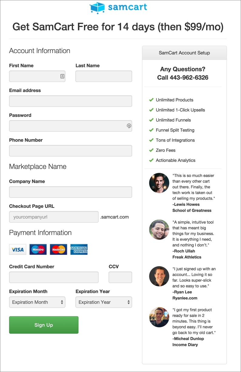
It’s not a true conversion until the money has been transferred.
Accordingly, we need to view the checkout process as an extension of the landing page, and just like we want to establish and build trust on the landing page and the preceding funnel, we want to continue building trust during the checkout process itself.
There are many ways to do this, but one of my favorites can be seen below:
In this example from SamCart, the user is shown a phone number for immediate customer service, as well 4 customer testimonials with included pictures.
Instead of just hoping the user goes through with the purchase, SamCart is actively building trust on the checkout page by displaying other customers who were happy with their purchase and reminding the user that if they have any trouble, help is only a call away.
Conclusion
The checkout experience is one of the more complicated optimization puzzles you’ll tackle, which is why sound A/B testing is such an instrumental part of the process.
I hope today’s infographic has provided with you some insightful ideas for how you can optimize your website’s checkout process and increase revenue for your business.
20 Landing Page Best Practices to Kickstart Your Conversion Lift
Landing Page OptimizationIn today’s post, we’ll cover 20 proven landing page best practices, backed up by case studies, statistics, and data that will help you kickstart your conversion lift.
Listen. We both know that “best practices” don’t mean much.
… right?
If you aren’t A/B testing, you are leaving a ton of money on the table.
True.
BUT here’s the deal.
AB testing is a time-consuming method of conversion optimization. It’s effective, but if you can simply click “edit” and make an obvious improvement, start there.
This is why “best practices” can be very handy. They let you apply what others have learned and get quick wins when nothing is working. Plus, when you begin implementing a solid A/B testing framework, landing page best practices can give you some great ideas for your first round of hypotheses to consider testing.
Today, we’ll cover 20 proven landing page best practices complete with case studies, statistics, and data.
20 Landing Page Best Practices to Kickstart Your Conversions
Let’s begin.
1. Start with a great headline to boost conversions 41%
The headline is perhaps the most crucial element of your entire landing page. Why? Let’s ask David Ogilvy, famous advertising revolutionary, his thoughts on headlines:
If this has changed in the digital age, it has only gotten worse. Now, let me hammer it home with a case study…
BettingExpert is an online betting forum where tipsters can share their experience and tips. They ran an a/b test on their headlines with three variations: One with a question, one with a benefit, and one utilizing loss aversion.
Three similar headlines on this page delivered very different results.
As you can see, the benefit headline (which spoke directly to it’s target reader’s dreams and aspirations) boosted conversions by 41.14%.
2. Add credible and strong testimonials to boost trust 12X
Have you ever seen a testimonial like this:
You may even have used something like that in the past.
The thing is, testimonials and social proof work. Studies show nearly 70 percent of online consumers look at a review prior to making a purchase and reviews are 12-times more trusted than product descriptions and sales copy from manufacturers.
Frankly, most customers will write a poor review or testimonial, though they mean well.
So, use it. But, you’re probably better off asking your customers to share about their experience with you. Then crafting a strong testimonial that reflects what they said and get permission from your customer to publish it. Better yet, ask them for video testimonials.
Pro Tip: Use exact numbers in your testimonials if you can. This works due to a principle in psychology known as Ambiguity Aversion, which states that humans prefer known risks over unknown risks (i.e. we like to know what we’re getting into). Robbie Richards does this well on his blog.
A good testimonial example.
3. Action-oriented copy could increase click rates by 93%
If you’ve ever written a paper in high school, your English teacher probably told you to write in “active” voice, not “passive” voice. Why?
Because passive voice has a weak quality, is bland, and can be boring. Active language excites, energizes, and drives action. See what I did with the previous two sentences?
It turns out that your English teacher was right. Here’s why.
The company L’Axelle sells underarm sweat pads, and ran an A/B test on the product landing page. Their original page used passive headline attempting to integrate the benefit, “Feel fresh.” The second used direct language and strong verb “Put an end to sweat marks!” With language like this, the exclamation point is probably redundant.
Version A
Version A of landing page with passive call to action.
Version B
Version B of landing page with active call to action.
That simple change in copy lead to a 93% increase in clicks, for a total conversion rate of 38.3%.
4. Optimize your Landing Page: Use contrasting CTA colors to grow sales 35.81%
This seems so mundane and simple (and sometimes, it is). However, a simple change in the CTA button color can have surprisingly large effects on landing page conversion rates.
A major eCommerce site that sells hand-painted porcelain wanted to grow their business (who doesn’t?). They tested one super simple change: They made the “ADD TO CART” button green instead of blue. The result?
A 35.81% increase in sales (yes, sales, not just clicks).
Increasing the contrast of the call to action increased conversions.
Now, why did this work? Not because green is a particularly compelling color.
The blue didn’t stand out at all, whereas the green pops. Our focus, then, is not on particular colors being better for CTAs than others, but on ensuring a color contrast to draw the eye.
Wondering what color to use? Try picking the opposite color (from your brand’s or landing page’s main color) on this color wheel:
Designers use the color wheel to select complimentary and contrasting colors.
In other words, if your main color is yellow, try a blue or purple CTA. If your main color is green, try a purple or red CTA.
5. Command 31.03% more people to click with actionable CTA copy
You had to have seen this coming – if action-oriented copy in your headlines and body increase click-thru rates, of course they’d work in your call to action (CTA) copy as well. The CTA is usually located on the button or link on which the visitor must click.
But, don’t take my word for it. Let’s take a look at a case study:
WriteWork offers essays and writing guides for students. Their original checkout page CTA (shown below) simply said “Create My Account”. Who wants to create another account?
However, when they changed the text to say “Create Account & Get Started”, they saw a nice 31.03% increase in conversions. Not too shabby, eh?
New call to action copy delivered a significant conversion increase in this AB test.
6. Use faces, but not near a CTA (unless they’re a top industry influencer)
The human brain is drawn to faces, eyes in particular. We have a tendency to look at faces before anything else on a webpage. This can be a good thing… or it can hurt conversions.
When it comes to using faces on a landing page, they can add credibility and trust. However, they can also distract the reader from a message or call to action button.
To get around this, only use faces of people the user is bound to recognize and trust (such as an authority in your industry) near CTAs. For maximum effect, have them looking at, and potentially even pointing to, your CTA.
Of course, you still want to put pictures of you and your team to help build trust – just don’t place them near the call-to-action button.
In a case study, Medalia Art was able to boost clicks 95.4% by replacing the images of art on their home page to images of the artists.
The images of artists outperformed products in this AB test case study.
7. Format like a boss
Just as formatting makes your blog posts more engaging, so too does formatting make your landing pages easier to navigate and understand.
What do I mean by formatting?
Great formatting makes your landing page easier to skim–and you know most of your visitors are only going to skim–making the most important points immediately apparent.
Just as people prefer better-looking people, people prefer better-looking websites because they associate beauty with perceived trust and credibility.
Want an example? Basecamp redesigned their landing page and found a 14% increase in conversions.
Basecamp tested formatting in this landing page AB test.
Here’s one more example, for good measure: Swedish company Unionen saw a 15.8% click-through boost when they bullet-pointed their benefits:
Version A:
Version A: AB test version with a block of text with the main call to action.
Version B (15.9% Increase):
Version B: You don’t have to read Swedish to know that bulleted text and white space won.
8. Landing Page Best Practices: use spellchecker already
Having grammatical or spelling errors in your copy can seriously hurt conversion rates. It makes you appear unprofessional at best, and like a scam at worst.
Want a real-life example of how badly a small mistake can harm your business? Take a look at this case study from Practical Ecommerce on a website selling tights – correcting their spelling from “tihgts” to “tights” on their product category page shot conversions up 80%.
Bad spelling can destroy visitor trust.
In a world where tools like Grammarly and built-in spell checkers exist, there’s just no excuse not to have immaculate grammar and spelling. Take an extra ten minutes to read through your page to ensure no errors get though.
Pro Tip: I actually like to read my writing out loud at least once. This helps me catch any errors and get a better idea of the flow and overall sound of things.
9. Consider adding multiple CTAs
Multiple CTAs?! Are you crazy?
Before you scroll down and leave me a nasty comment, hear me out. I’m not talking about having a variety of buttons and forms leading to different places.
Rather, on longer pages, you should have multiple buttons and/or opt in forms that lead to the same outcome.
Having more than one chance for the customer to opt in allows them to scroll through and click at their own pace. If they don’t click your above-the-fold CTA, for example, they’ll have another chance in the middle or at the end of the article.
That said, too many buttons can cause your visitors to get decision fatigue, becoming tired of too many choices and leaving the page.
10. Ditch the sharing buttons (unless you only have one other option)
One of the 21 persuasion techniques for conversion optimization was something called the “Hobson’s +1 choice effect”. This effect essentially states that having over two choices can cause anxiety and negative feelings, but we also want to have the choice to choose.
As such, if you only have one option on your landing page (the CTA), adding a “Tweet this” button can help convert your potential customers, according to the choice effect. However, if you already have multiple offers, CTAs, or links in your offer, social buttons can add to the noise and reduce conversions.
In one case from Taloon.com, removing social sharing buttons from their product pages increased conversions by 11.9%.
Removing social sharing buttons increased conversion rate.
However, I’d like to point out two key elements here:
I’ve already said it, but I’ll say it again: you have to test these things to find out exactly what works for your product, audience, and business.
11. Highlight your guarantees to build trust
Purchasing is an emotional decision, which is then backed by logic. Therefore, once you’ve sold your target audience emotionally on your product or service, you must then provide them with logical reasons to actually get through the checkout page.
One way you can do that is to highlight your guarantees.
A money-back guarantee is an amazing way to get people to commit. It’s truly risk-free. If they don’t like it, they can get their money back.
Neil Patel increased sales of his course by 21% when he highlighted a 30-day money back guarantee.
It doesn’t have to be money back, either. Other guarantees you can try include:
Don’t be afraid to test different guarantees, just as you we talked about testing different offers. You may find a free trial–a $1 trial to avoid credit card complications–converts better than the money back guarantee.
Pro Tip: Another way to build trust is by adding an SSL certificate to your site. That’s the green lock that says “secure” next to it. This shows your visitors their information is safe.
12. Use the inverted pyramid method (keep the most important stuff at the top of the page)
The inverted pyramid is a writing style coined by journalists. It means keeping all of the key benefits and most important takeaways at the top of the page, then getting into the details as you get further down the page.
It looks like this:
The structure of the inverted funnel.
(Source)
So, your attention-grabbing claims and statistics should be used at the top of the page to get visitors engaged, then your body copy, as you go down the page, should build anticipation for your product, at which point you give your CTA.
Of course, not all landing pages will be long enough to use the inverted pyramid method, but for longer pages it works wonders. After all, only about half of all your visitors will ever even reach the bottom of your account – you need to entice them.
Percent of article content viewed.
Use the other best practices mentioned in this post, like formatting and imagery, to ensure you have the most important stuff first.
13. Add related imagery and videos for 80% more conversions
Images aren’t just for formatting. They can be used to convey your main benefits and to help users understand what your product or service is about.
One study by eyeviewdigital even found that using video on landing pages can increase conversions by 80%. Check out their case studies if you’re interested in learning more.
When it comes to images and video, however, there are two things to keep in mind:
If you’re in need of some images to add to your site, check out Unsplash. They have free high-res photos anyone can use. You can also use a tool like Canva to edit the images. For free.
14. Remove any extra links
You’ve probably heard this tip before. “Remove navigation links so your visitors have to make a decision.”
However, with only 16% of all landing pages following this practice, does it really work?
HubSpot tested it to find out. They created two landing pages: One with a navbar, social sharing links, and footer, and one without any of the three.
Test removing navigation on your landing page.
The results? Up to a 28% increase in conversions. They even tracked every change and put the results in a nice little chart:
In this case study, navigation hurt conversions on most pages or didn’t help at all.
In other words, it’s worth a shot to remove extra links. It may not always work, and it may not be worth losing the clicks to other parts of your website, but it had potential to increase sign-ups.
15. Keep your landing page consistent with your brand and ads
The first job of the landing page is to keep the promise made in an ad, email, social post or link. Any variation can cost you conversions.
Consistency is key to a great many things, from blogging to getting fit. It’s necessary to succeed, and people love seeing it.
Especially on landing pages.
I can think of no better example than Optimizely’s case study on their PPC ads. They ran two tests:
In the first one, the Headline was kept the same, regardless of the ad copy they used. In the second test, they matched the landing page headline to the ad copy.
Test A:
Test A: One landing page attempts to keep three different promises. Unsuccessfully.
Test B:
Test B: These landing pages keep the specific promises made in each add.
The results? A 39.1% increase in conversions.
Of course, the headline isn’t the only thing you should keep consistent. Also try to:
Keeping things consistent ensures people aren’t confused when navigating your site, and they know get what they expected to get when they click your ads.
16. Achieve a 214% increase in conversion rate by asking for more information
One of the landing page best practices you often hear is to reduce the number of form fields as much as possible. It’s true, a shorter landing page form reduces friction for the customer and has been shown to increase conversion rates. Particularly on a mobile device.
BUT (there’s always a catch, isn’t there?), asking for more information better qualifies your leads and, in many cases, shows them you’re actually capturing the information needed.
Let me give you an example.
Advanced Grass is an artificial grass solution. They were able to achieve a 214% increase in conversions by splitting up their lengthy opt-in form into two parts: contact information (like email address and phone number) and qualifying information.
Part 1:
Part 1 of the multi-step lead generation form.
Part 2:
Part 2 of the multi-step lead generation form.
By simply splitting their form into two parts, they are taking advantage of the psychological principle of commitment and consistency, well known in the marketing world thanks to Dr. Robert Cialdini’s book Influence: The Psychology of Persuasion.
Basically, Cialdini found that people are more likely to take additional steps towards something if they’ve already committed to the first step. In the case of advanced grass, they already committed to entering their contact info, so they’re more likely to enter the few extra details.
Additionally, asking for the right information builds trust. How could you give an accurate quote for your artificial grass if the company didn’t know how many square feet you need or what kind of project it is?
The bottom line? You may ask for more info, but split your form into two steps.
17. 10X clicks by testing different offers.
Sometimes in our landing pages, we’re focusing on entirely the wrong offer. Maybe people don’t want a ‘free trial’ or ‘free consultation’. What about a free eBook or a free tool, instead?
I didn’t pull those examples out of my you-know-where. WordStream actually increased conversions 10 times over by changing their offer from a “Free Trial” of their software to giving away a free tool they created: The Google AdWords Performance Grader.
WordStream found success by changing their offers.
Of course, creating your own tool requires time, capital, and finding a good developer, unless you happen to be one. Here are some other offers you can try:
The key is to offer something highly relevant to what your software does and that’s very valuable, meaning you didn’t slop it together in five minutes. Put some thought into it.
18. Boost engagement by 102% using scarcity
If you’ve been building landing pages for any amount of time, you’ve surely heard of using scarcity as a tactic to increase sign ups.
Using scarcity means limiting resources in order to get your visitors to take action right away.
For example, putting an expiration date on a coupon, limiting an offer to a certain number of customers, and announcing that you only have a few items left in stock are all versions of scarcity.
Going back to Cialdini, scarcity is one of his psychological principles of persuasion. People place more value on that which is limited.
Let’s look at a case study by KISSmetrics:
Hiten Shah decided to reduce the free trial period from 30 days to 14 days – and he found a 102% boost in engagement. In other words, twice as many people took action and used the free trial during the 14 days than the 30 days.
More people signed up during the 14-day free trial than the 30-day trial.
So, use scarcity on your own pages by including a countdown timer on your page or offering a limited number of products.
19. Pay attention to “the fold” to lift conversions 220%
You think I’m going to tell you to put your call-to-action above the fold, don’t you?
Well, you shouldn’t necessarily do that. This is one of the most common of landing page best practices.
Instead, pay attention to the fold. While there is research that supports above-the-fold CTA, there is research against it as well.
Most engagement happens right at or just below the fold. Let me explain…
Most engagement happens right at the fold or just below it.
As you can see in the chart above, people view the topmost area of the page the least, and view the area “just above the fold” the most (i.e. right where you begin to need to scroll).
Joanna Wiebe of Copy Hackers and Airstory had this to say:
So, where should you really place your opt-in form or CTA?
It depends on the complexity of your offer (and thus, the amount of information needed to explain it). This chart by KISSmetrics explains it perfectly:
Offer complexity affects the placement of your call to action on the page.
Let me give you a more direct example. Marketing Experiments tested one of their client’s CTA placements above- and below-the-fold. Below-the-fold actually resulted in 220% more conversions, likely due to the complexity of their product.
In this case, placing the call to action near the bottom of the page increased conversions.
(Source)
20. Don’t rely on these landing page best practices. Test.
All of the best practices on this list can (and probably have) been broken with exceptions at one point or another. Like I said in the very beginning of this post – best practices make a lot of assumptions. Use them, but don’t be afraid to go against them.
In the words of Mark Twain:
“When you find yourself on the side of the majority, it’s time to pause and reflect.”
I’ll leave you with one final case study to prove just how important it is to a/b test your landing pages. Convert Verve, who’s examples you saw in some of the practices above, ran a simple test on the checkout page of one of their clients – removing the green arrow pointing to their CTA button.
As it turns out, removing that green arrow actually reduced conversion rates by 12.29%. Who would have thought? Of course, if you followed along above, it makes sense – removing the arrow reduces the chance for the button to draw the eye.
Removing the arrow reduced conversion.
20 Landing Page Best Practices to Kickstart Your Conversion Lift: Conclusion
Landing page best practices are just that – best practices. We can take what’s worked for others and copy it for our own use, but ultimately, it comes down to trying different things.
As Mark Zuckerberg says, “Move fast and break things.” Follow expert advice to make your landing pages the best they can be, then start experimenting.
Now, what did I miss? There are surely more landing page tips & tricks out there I didn’t cover here. Drop me a comment and let me know.
And, if you found even one thing useful about this article, please take a moment to share it.
Why Contextual Marketing Is The Next Big Wave In Customer Conversion
Conversion Marketing StrategyQuick question.
Do you remember the 2002 blockbuster movie Minority Report starring Tom Cruise?
In the movie, Tom Cruise walks through a mall while escaping from the police where he is greeted personally by advertising billboards: “John Anderton! You could use a Guinness right now!”
In a later scene, another advertisement is even more target-specific: “How did those turtleneck sweaters you purchased work out for you?”
The movie Minority Report showed an extreme example of contextual marketing.
While the movie is set in 2054, we do not have wait to see the marriage of technology and media. Of course, the technologies shown are not possible right now, the essence of this scene is already possible.
What is the essence?
It is using the convergence of technology and media to provide a context when marketing to consumers.
Simply put, it is marketing the right thing, at the right time, to the right person.
This is the Holy Grail of Marketing. Contextual marketing.
Contextual marketing is a way of offering targeted advertising to the user based on user identity and content searched by them.
It is worthy mentioning that Google is what it is today because of Adwords and Adsense, which was one of the early platforms to offer highly targeting contextual advertising. The advertisements themselves are served by automated systems where the advertisement has direct correlation with the content being viewed on the browser.
Imagine that you’re browsing through a sports website for latest news on your favorite football club. Suddenly, you see an ad popup which displays club merchandise that you can buy. Wondering about a vacation in Europe? You might start seeing ads offering the cheapest flight tickets to France.
You may have recognized this happening already in your daily life. Contextual marketing is a big wave in marketing on which you can surf. Here’s how.
In this article, we will use the 5W1H approach, namely who, what, why, where, when and how.
As we said earlier, contextual marketing is marketing the right thing, at the right time, to the right person. First we shall focus on the why.
Then we will focus on finding the right people and where they are – the who and the where.
Then we will move on to finding the right message and the right time- the what and when.
Lastly, we will figure out how to deliver the message- the how.
What Is Contextual Marketing & Why Is It Important?
To see the difference between contextual marketing and traditional marketing, it’s important to understand how context causes this differentiation.
Can you guess what is the difference between their approach? Marketing before context is product-centric while contextual marketing is customer-centric
Contextual marketing is powerful.
Factors in contextual marketing and some real life examples
Before we dive into the nuts and bolts of contextual marketing, let us first understand what context is.
Definition of Context or Contextual quote by Helge Teno.
Context always changes, more so in this world of ever increased connectivity and change. With the proliferation of smartphones, the factors which define context has increased. Especially in the context of marketing.
What are these factors?
Factors that influence context. Source
The graphic above illustrates the wealth of data that can be harvested for contextual marketing. All of these elements are currently being used by big brands and corporations alike.
Take Amazon for instance.
Amazon has perfected the art of using the information it gathers about us to present information at just the moment we need it, and in a way that feels helpful but not obnoxious.
How do they do it?
A fun example of contextual marketing is the ad tweeted by Oreo during Super Bowl 2013. During the Super Bowl power outage in 2013, at 8:48pm, the company used Twitter to push out an ad which said, ‘You can still dunk in the dark.’ It was a smart, funny and an inexpensive move to link their brand to the awareness of the moment.
Instant contextual marketing from Oreos during a Superbowl blackout.
How To Implement Contextual Marketing
Implementing contextual marketing requires you to embrace and adopt a fascinating intersection of data, automation, mobile devices and social media. Let us discuss these elements in detail one by one.
Mobile and contextual marketing
While contextual marketing can be implemented in any platform, mobile deserves a special mention. The increased convergence of smartphones, apps and social media have led to the biggest explosion of data ever.
The most important factor in mobile contextual marketing is found in the name: Location.
According to a Pew Research Center survey, an overwhelming 74% of adult smartphone owners ages 18 and older say they use their phone to get directions or other information based on their current location. Over 50% of consumers are willing to share data to have a better shopping experience, according to a study by the e-tailing group.
Combine location with past history and user profile and there is much data to be mined, harvested and used for marketing.
Let us see some of the elements of contextual marketing in mobile
When you are searching
Google coined a term in 2015 called micro moments to capture the impact of mobile on our search behaviors. Micro-moments are moments when consumers use their mobile devices to decide where to go, what to do, and what to buy.
This nicely dovetails with the statistic that 68% of smartphone activity is conducted outside homes.
In the mornings, we are in a rush to get to office and would like to enjoy a coffee before the commute. In the evening, we are more likely to want to have snacks. This would trigger a search for ‘Coffee near me’ in the morning and ‘Snacks near me’ in the evening.
Based on these behavior-based contextual triggers, restaurants can cater to both the needs by customizing the suggestions for different times of the day for different people.
In 2016, Bona Hardwood Floor Cleaner, a 90 year old consumer packaged goods brand, used predictive mobile advertising based on beacon data to target shoppers who were due for a shopping trip, as indicated by their weekly store visit habits. Using this data from a number of users, the brand was able to send them offers just before they were predicted to visit the store.
The campaign achieved a ROI of 3.2x, with a 25.3% increase in post-engagement purchase intent and 55% increase in average brand awareness.
Wouldn’t you like to have such numbers in your campaign report?
Takeaways:
What are the advantages?
Where you are searching
As location changes, so does the context.
Most mobile apps have now a built in location feature. The key is to mobilise the ever changing location data to target (or not to target).
Take the example of Google Now.
Using data from search history and location, their app Google Now is a perfect example of targeted marketing. By recognizing repeated actions a user performs on the device like frequent locations, commutes, search queries and other information, Google Now is able to display more relevant information in the form of specialized cards.
These cards cover a multitude of information like traffic and transit times, restaurant reservations, location reminders, nearby attraction, public transit and much more.
Another example that comes to mind is the recent proliferation of apps designed for events.
Tribeca Film Festival, New York’s annual film festival leveraged beacons to keep festival attendees up to date about event happenings, ticket sales and promotions.
Deploying beacons around and inside the event venues, they were able to have a real time, data driven and targeted interaction with the people. App-holders who walked by bus shelters and out-of-home ads (equipped with beacons) with the app open on their device, received notifications alerting them that they could purchase tickets straight from the app.
On the other hand, beacons at the venue were used to push contextual notifications such as the ones asking attendees for their feedback on a particular film when they exited the screening. In addition to that, the film festival also used beacons to offer merchandise discounts by deploying them at the ticket counters.
Takeaways:
What are the advantages?
Who you are
All the automation and fancy software will not help you if you do not know your consumer. As explained earlier, people are willing to give you data if it helps improve their consumer experience. You get a wealth of data on your customers everyday, through your stores, newsletter signups, and loyalty cards.
Leverage this by first consolidating and using all the information into a user profile. This can be combined with mobile app data to offer more targeted experience.
Let’s say a consumer buys a pair of pants from your store. Based on their cart history and purchases, you can send an offer for shirts that will go well with the trousers via app push notification when they are in the vicinity of your store. Mobile apps can also be used for in store contextual marketing and personalization.
This also leverages the who, the when and the where, all of the elements of mobile contextual marketing.
The dark side of context
While we have been harping annoyingly on data, there is one major issue we haven’t addressed.
Privacy.
Several surveys have pointed out consumers’ willingness to share data for value. The key is providing value in return. People don’t mind sharing their data if it results in a better shopping experience.
While the current consumer climate favors your efforts for contextual marketing, it is critical to maintain a balance between privacy and relevance.
Conclusion
Now that we have gone through the elements of contextual marketing, let us round it up in the form of actionable takeaways:
And before we wind up this article, we would like to give you one last tip.
Constantly test your campaign.
Contextual marketing, while new in implementation and scope, is still marketing. And like all endeavours, it needs continuous improvement and learning. It is more of an iterative process that gets you closer and closer to your goal.
So keep learning, keep growing, be helpful but not annoying.
What has been your experience in contextual marketing? What has and has not worked for you? Share your thoughts so we can all learn from each other.