Preston Pilgrim presents 8 successful ecommerce testing examples, highlighting some fairly easy-to-implement wins. This is the type of stuff that you should probably have tested already on your site. If you havent’ tried these, there’s no time like the present.
Ecommerce and conversion CRO are the ultimate match: Lots of moving parts. High traffic volume. When it comes to ROI, the sky’s the limit.
The following examples provide a great overview of what success can look like when you are executing on a proven AB testing framework.
1. Intuit Increases Conversions With Proactive Live Chat
Intuit Enterprise introduced proactive chat in various spots on their website. A small pop-up window with a call to action stating, “Chat now with a QuickBooks Sales Consultant” allowed potential buyers to instantly gain answers to their questions, clearing away roadblocks on the path to a sale.
Adding chat to the checkout process resulted in a 20% increase in conversions and a 43% increase in average order value.
Intuit proactively offers live chat.
Most impressively, when Intuit added proactive chat to the product comparison page, sales increased by 211%.
Proactively offering live chat increased sales for Intuit by 211%
THE LESSON: When you’re thinking about adding chat, think about the areas where your customers are the most likely to have questions. This may be when comparing products, or could be regarding payment options. Put some thought into the correct placement and watch the conversions skyrocket.
On a cautionary note, sometimes, displaying a “live chat” that isn’t actually live can alienate visitors. While it might work for certain audiences, for others, it can come across as misleading. If you are going to display a “live chat” without actually offering live chat services, just make sure to first verify that they aren’t alienating your visitors.
2. SmileyCookie Increases Sales With Optimized Header
SmileyCookie is a niche ecommerce store that sells cookies and gourmet gift baskets. While the site was getting a fairly solid conversion rate, they decided to spend some time optimizing the header bar that was normally used for seasonal promotions.
This is a great place to test your value propositions.
SmileyCookie.com spent time optimizing the bar above their header and below the navigation.
They tested a number of different value propositions, including the following:
Order Today -> Ships Next Business Day
Want to save $5 OFF your next purchase? SIGN UP NOW ->
$6.99 Ground Shipping For Your Entire Order
FREE SHIPPING on any order over $40
Cookies Made Fresh & Hand Iced For You!
Tests included focusing on sales, pricing and value.
It turns out that immediacy was an important value to the largest segment of their visitors. The winning variation “Order Today -> Ships Next Business Day” delivered an impressive 12.61% conversion rate at 95% confidence. Even more importantly, the success of this test brought in an additional $1.01 per visitor for SmileyCookie. THE LESSON: The winning variation gives us some insight into what many ecommerce shoppers are looking for: fast shipping & handling. Any time you can lower uncertainty and solidify expectations, conversions tend to improve.
But an even more important takeaway is SmileyCookie’s investment in testing 5 different options for a large impact area like the site promotional header. No matter how good your predictions are, you will almost always get better results when you are able to test multiple options as opposed to just two.
3. Express Watches Boosts Conversions With Trust Building
Express is a UK company that sells Seiko watches. It’s an industry where buyers have legitimate concerns about purchasing online. What if the watch I buy is a fake?
In answer to this, ExpressWatches A/B tested placing a “price guarantee” stamp or an “authorized dealer” stamp on the product page.
If you’re buying a high-end watch, is price really the most important issue? ExpressWatches questioned “Never Beaten on Price”
Replacing “Never Beaten on Price” with a Seiko authorized dealer badge “borrows” brand trust from Seiko.
This stamp of “authenticity” garnered a sizable 107% jump in sales. THE LESSON: If you’re operating in an industry with fraud risk, proving your authenticity can go a long way. In this case, ExpressWatches “borrowed” trust by tapping into Seiko’s brand authority. What associations logos, media logos and consumer review logos do you qualify to display?
While this split test worked, it’s not a guarantee it will work in all industries. You will need to run your own split tests, try different variations of how you display authenticity and see how it affects your conversions.
This most likely wouldn’t have a significant effect on conversions when dealing with lower priced “commodity” items, but with larger purchases, this type of split test can go a long way!
4. SAP BusinessObjects Increases Conversions With Prominent CTA Button
SAP BusinessObjects replaced its original small blue text “add to cart” link with a large, orange button.
Original:
Where would you click to get a Crystal Reports trial?
Alternate version:
BusinessObjects made the call to action the most visually prominent element on the page.
And conversions increased by 32%! THE LESSON: Make your call to action count by making it visually prominent. Don’t make customers hunt for your “buy” button. Make it front and center and easy to click through and the sales will naturally increase.
I also want to conclude here that just because you make something bigger and stand out more, it doesn’t mean it will convert higher. In some cases, decreasing the size of the button or CTA has had positive impacts on conversions. The main takeaway you need to grab from this case study is to always split test your main CTA’s and buttons. Good designers know how to make something visually prominent.
Button size-Bigger doesn’t always mean more visible.
Button placement-Place it so that the eye is drawn to it.
White space can make a call to action stick out.
Button color-Should be different from the page template
Button text that echoes the value proposition.
5. Horloges Increases Average Order Value With Guarantee
Horloges.nl is a watch dealer in the Netherlands. Their banner originally had information about overnight shipping (“Morgen al in huis”), free shipping (“Gratis verzending”) and their status as an “official” G-Shock dealer.
Horloges.nl changed their banner to make it smaller, and include a 2-year guarantee on watches.
This change caused the average order value to increase by 6%, and total conversions improved by 41%. THE LESSON: Adding a guarantee is an excellent way to increase new customers’ comfort level in purchasing from a new vendor. Consider changing banner ads to make them simpler and easier to read in order to increase their efficacy.
This test changed several variables: the offers, the layout, and the font styling. When you test, start with guarantees and once you find one that works, test out how to present that guarantee on your page. Where can you place it? Where does it stand out? Should you only put it on products pages? These are all things you might want to split test.
6. MALL.CZ Increases Conversions With Larger Images
MALL.CZ is the second largest ecommerce retailer in the Czech Republic. Much like Amazon, they sell a wide variety of products, including kitchen supplies and electronics. Product images are an important component in their purchase process, and the company was curious how increasing image size might influence sales.
MALL.CZ’s original product descriptions emphasized lengthy copy and had a smaller product photo.
The category page for Mall.cz may be difficult to scan with competing images, buttons and badges.
MALL.CZ then tried altering the descriptions to emphasize a large product image above the text:
Increasing image size made the category page visually easier to scan.
This variation resulted in a 9.46% increase in sales. THE LESSON: It can pay off to play around with image sizes and layout. There is some evidence to show that in other circumstances, larger images can actually deter sales, so clearly the issue is product/industry dependent. But if you’re looking for a factor to experiment with, image size has the potential for big rewards.
Aside from image size, playing around with different images in general is another great idea for running split tests.
Option 1: Split test image size, find out what converts at a higher rate.
Option 2: Split test different product images and angles and see what converts higher.
Option 3: Test a 3-D, click-to-rotate type image display, where viewers can get a 360 degree look at the product.
7. Express Watches Further Improves Conversions With Social Proof
Few things can impart safe buying like reading a positive review from a fellow customer. Knowing that other people have purchased the product and had a good experience with the product and retailer is a large factor in influencing customers to click “add to cart”. Express Watches conducted a customer survey and discovered that their customers wanted to know information about price comparison, if the company was trustworthy, and whether the watch would be genuine and not “fake”.
Is a five-start rating enough without the actual reviews on this product page?
ExpressWatch tested this more aggressive presentation of reviews on their product page.
Express decided to answer those questions by adding a Customer Reviews widget on their product pages. Adding the reviews widget, ExpressWatch saw a 58.39% increase in sales. THE LESSON: Social proof is a proven way to overcome visitor objections and push the sale closer to checkout will increase sales. Clear roadblocks by decreasing customers’ worries and adding symbols of trustworthiness.
When you think about the logic of the buyer, it makes sense. When you are injured or sick and you need to see a doctor or therapist, you are most likely going to ask your close relatives or friends if they have any recommendations on a doctor they have used in the past that they have had success with. If they give you a recommendation with positive feedback, it’s most likely you are going to choose that doctor over any other ones in the area. The takeaway, positive feedback can increase conversions tremendously.
Just realize that if you’re showing your reviews to the public, too many negative reviews can lower your conversion rate. At the same time, having a 100% positive review rate will also lower conversions, as this tends to be viewed as being manipulated in some way. Negative reviews are an important part of visitor research.
The best review profile looks like what you’d expect to see if a bunch of people tried out a great product. Most would love it. Some would be unimpressed. And one or two would trash it out of spite.
8. Corkscrew Wines Increases Sales With Prominent Discounts
What good is a sale if you’re not advertising it enough? The whole point of launching a sale is to move product, and in order to do that, customers need to be aware that there’s a deal out there that can’t be missed.
Corkscrew Wines experimented with adding sale information in a red circle, front and center over the product image.
The price is discounted on this product page, but the visitor has to do the math.
If you’re offering a discount, don’t hide it.
The result? A whopping 148.3% increase in sales. Both product description pages showed the same price- but the second simply highlighted the savings. THE LESSON: Let people know when they’re saving money. They’ll want to buy more!
Again, there are many different ways to split test this. In this particular case they are displaying the discount on the bottle and title. Play around with this, try displaying it in different locations, try larger images, try different colors that stand out.
Conclusion
Hopefully, today’s ecommerce testing examples have provided you with some pointers for you next batch of split tests.
Remember that your customers ultimately hold the key to increased sales, and any worthwhile AB testing framework starts with getting a thorough understanding of how they are engaging with your site and what they are feeling in the process.
For further reading, check out Conversion Sciences’ rundown of The 7 Core AB Testing Strategies Fundamental to CRO Success.
Preston Pilgrim is a marketer at Acro Media, a digital agency focused on optimizing Drupal point of sale product pages, contact pages, homepages, and more. Learn more from Preston’s expertise via the Acro Media blog.
The AB test results had come in, and the result was inconclusive. The Conversion Sciences team was disappointed. They thought the change would increase revenue. What they didn’t know what that the top-level results were lying.
While we can learn something from inconclusive tests, it’s the winners that we love. Winners increase revenue, and that feels good.
The team looked closer at our results. When a test concludes, we analyze the results in analytics to see if there is any more we can learn. We call this post-test analysis.
Isolating the segment of traffic that saw test variation A, it was clear that one browser had under-performed the others: Internet Explorer.
Performance of Variation A. Internet Explorer visitors significantly under-performed the other three popular browsers.
The visitors coming on Internet Explorer were converting at less than half the average of the other browsers and generating one-third the revenue per session. This was not true of the Control. Something was wrong with this test variation. Despite a vigorous QA effort that included all popular browsers, an error had been introduced into the test code.
Analysis showed that correcting this would deliver a 13% increase in conversion rate and 19% increase in per session value. And we would have a winning test after all.
Conversion Sciences has a rigorous QA process to ensure that errors like this are very rare, but they happen. And they may be happening to you.
Post-test analysis keeps us from making bad decisions when the unexpected rears its ugly head. Here’s a primer on how conversion experts ensure they are making the right decisions by doing post-test analysis.
Did Any Of Our Test Variations Win?
The first question that will be on our lips is, “Did any of our variations win?”
There are two possible outcomes when we examine the results of an AB test.
The test was inconclusive. None of the alternatives beat the control. The null hypotheses was not disproven.
One or more of the treatments beat the control in a statistically significant way.
Joel Harvey of Conversion Sciences describes his process below:
“Post-test analysis” is sort of a misnomer. A lot of analytics happens in the initial setup and throughout full ab testing process. The “post-test” insights derived from one batch of tests is the “pre-test” analytics for the next batch, and the best way to have good goals for that next batch of tests is to set the right goals during your previous split tests.
That said, when you look at the results of an AB testing round, the first thing you need to look at is whether the test was a loser, a winner, or inconclusive.
Verify that the winners were indeed winners. Look at all the core criteria: statistical significance, p-value, test length, delta size, etc. If it checks out, then the next step is to show it to 100% of traffic and look for that real-world conversion lift.
In a perfect world you could just roll it out for 2 weeks and wait, but usually, you are jumping right into creating new hypotheses and running new tests, so you have to find a balance.
Once we’ve identified the winners, it’s important to dive into segments.
Mobile versus non-mobile
Paid versus unpaid
Different browsers and devices
Different traffic channels
New versus returning visitors (important to setup and integrate this beforehand)
This is fairly easy to do with enterprise tools, but might require some more effort with less robust testing tools. It’s important to have a deep understanding of how tested pages performed with each segment. What’s the bounce rate? What’s the exit rate? Did we fundamentally change the way this segment is flowing through the funnel?
We want to look at this data in full, but it’s also good to remove outliers falling outside two standard deviations of the mean and re-evaluate the data.
It’s also important to pay attention to lead quality. The longer the lead cycle, the more difficult this is. In a perfect world, you can integrate the CRM, but in reality, this often doesn’t work very seamlessly.
Chris McCormick, Head of Optimisation at PRWD, describes his process:
When a test concludes, we always use the testing tool as a guide but we would never hang our hat on that data. We always analyse results further within Google Analytics, as this is the purest form of data.
For any test, we always set out at the start what our ‘primary success metrics’ are. These are what we look to identify first via GA and what we communicate as a priority to the client. Once we have a high level understanding of how the test has performed, we start to dig below the surface to understand if there are any patterns or trends occurring. Examples of this would be: the day of the week, different product sets, new vs returning users, desktop vs mobile etc.
We always look to report on a rough ROI figure for any test we deliver, too. In most cases, I would look to do this based on taking data from the previous 12 months and applying whatever the lift was to that. This is always communicated to the client as a ballpark figure i.e.: circa £50k ROI. The reason for this is that there are so many additional/external influences on a test that we can never be 100% accurate; testing is not an exact science and shouldn’t be treated as such.
Are We Making Type I or Type II errors?
In our post on AB testing statistics, we discussed type I and type II errors. We work to avoid these errors at all cost.
To avoid errors in judgement, we verify the results of our testing tool against our analytics. It is very important that our testing tool send data to our analytics package telling us which variations are seen by which segments of visitors.
Our testing tools only deliver top-level results, and we’ve seen that technical errors happen. So we can reproduce the results of our AB test using analytics data.
Did each variation get the same number of conversions? Was revenue reported accurately?
Errors are best avoided by ensuring the sample size is large enough and utilizing a proper AB testing framework. Peep Laja describes his process below:
First of all I check whether there’s enough sample size and that we can trust the outcome of the test. I check if the numbers reported by the testing tool line up with the analytics tool, both for CR (conversion rate) and RPV (revenue per visit).
In the analytics tool I try to understand how the variations changed user behavior – by looking at microconversions (cart adds, certain page visits etc) and other stats like cart value, average qty per purchase etc.
If the sample size is large enough, I want to see the results of the test across key segments (provided that the results in the segments are valid, have enough volume etc), and see if the treatments performed better/worse inside the segments. Maybe there’s a case for personalization there. The segments I look at are device split (if the test was ran across multiple device categories), new/returning, traffic source, first time buyer / repeat buyer.
How Did Key Segments Perform?
In the case of an inconclusive test, we want to look at individual segments of traffic.
For example, we have had an inconclusive test on smartphone traffic in which the Android visitors loved our variation, but iOS visitors hated it. They cancelled each other out. Yet we would have missed an important piece of information had we not looked more closely.
Visitors react differently depending on their device, browser and operating system.
Other segments that may perform differently may include:
Return visitors vs. New visitors
Chrome browsers vs. Safari browsers vs. Internet Explorer vs. …
Organic traffic vs. paid traffic vs. referral traffic
Email traffic vs. social media traffic
Buyers of premium products vs. non-premium buyers
Home page visitors vs. internal entrants
These segments will be different for each business, but provide insights that spawn new hypotheses, or even provide ways to personalize the experience.
Understanding how different segments are behaving is fundamental to good testing analysis, but it’s also important to keep the main thing the main thing, as Rich Page explains:
Avoid analysis paralysis. Don’t slice the results into too many segments or different analytics tools. You may often run into conflicting findings. Revenue should always be considered the best metric to pay attention to other than conversion rate, after all, what good is a result with a conversion lift if it doesn’t also increase revenue?
The key thing is not to throw out A/B tests that have inconclusive results, as this will happen quite often. This is a great opportunity to learn and create a better follow up A/B test. In particular you should gain visitor feedback regarding the page being A/B tested, and show them your variations – this helps reveal great insights into what they like and don’t like. Reviewing related visitor recordings and click maps also gives good insights.
Nick So of WiderFunnel talks about segments as well within his own process for AB test analysis:
“Besides the standard click-through rate, funnel drop-off, and conversion rate reports for post-test analysis, most of the additional reports and segments I pull are very dependent on the business context of a website’s visitors and customers.
For an ecommerce site that does a lot of email marketing and has high return buyers, I look at the difference in source traffic as well as new versus returning visitors. Discrepancies in behavior between segments can provide insights for future strategies, where you may want to focus on the behaviors of a particular segment in order to get that additional lift.
Sometimes, just for my own personal geeky curiosity, I look into seemingly random metrics to see if there are any unexpected patterns. But be warned: it’s easy to get too deep into that rabbit hole of splicing and dicing the data every which way to find some sort of pattern.
For lead-gen and B2B companies, you definitely want to look at the full buyer cycle and LTV of your visitors in order to determine the true winner of any experiment. Time and time again, I have seen tests that successfully increase lead submissions, only to discover that the quality of the leads coming through is drastically lower; which could cost a business MORE money in funnelling sales resources to unqualified leads.
In terms of post-test results analysis and validation — besides whatever statistical method your testing tool uses — I always run results through WiderFunnel’s internal results calculator which utilizes bayesian statistics to provide the risk and reward potential of each test. This allows you to make a more informed business decision, rather than simply a win/loss, significant/not significant recommendation.”
In addition to understanding how tested changes impacted each segment, it’s also useful to understand where in the customer journey those changes had the greatest impact, as Benjamin Cozon describes:
We need to consider that the end of the running phase of a test is actually the beginning of insight analysis.
Why is each variation delivering a particular conversion rate? In which cases are my variations making a difference, whether positive or negative? In order to better understand the answers to these questions, we always try to identify which user segments are the most elastic to the changes that were made.
One way we do it is by ventilating the data with session-based or user-based dimensions. Here is some of the dimension we use for almost every test:
User type (new / returning)
Prospect / new Client / returning client
Acquisition channel
Type of landing page
This type of ventilation helps us understand the impact of specific changes for users relative to their specific place in the customer journey. Having these additional insights also helps us build a strong knowledge base and communicate effectively throughout the organization.
Finally, while it is a great idea to have a rigorous quality assurance (QA) process for your tests, some may slip through the cracks. When you examine segments of your traffic, you may find one segment that performed very poorly. This may be a sign that the experience they saw was broken.
It is not unusual to see visitors using Internet Explorer crash and burn since developers abhor making customizations for that non-compliant browser.
How Did Changes Affect Lead Quality?
Post test analysis allows us to be sure that the quality of our conversions is high. It’s easy to increase conversions. But are these new conversions buying as much as the ones who saw the control?
Several of Conversion Sciences’ clients prizes phone calls and the company optimizes for them. Each week, the calls are examined to ensure the callers are qualified to buy and truly interested in a solution.
In post-test analysis, we can examine the average order value for each variation to see if buyers were buying as much as before.
We can look at the profit margins generated for the products purchased. If revenue per visit rose, did profit follow suit?
Marshall Downey of Build.com has some more ideas for us in the following instagraph infographic.
Revenue is often looked to as the pre-eminent judge of lead quality, but doing so comes with it’s own pitfalls, as Ben Jesson describes in his approach to AB test analysis.
If a test doesn’t reach significance, we quickly move on to the next big idea. There are limited gains to be had from adding complexity by promoting narrow segments.
It can be priceless to run on-page surveys on the winning page, to identify opportunities for improving it further. Qualaroo and Hotjar are great for this.
Lead quality is important, and we like to tackle it from two sides. First, qualitatively: Does the challenger page do anything that is likely to reduce or increase the lead value? Second, quantitatively: How can we track leads through to the bank, so we can ensure that we’ve grown the bottom line?
You might expect that it’s better to measure revenue than to measure the number of orders. However, statistically speaking, this is often not true. A handful of random large orders can greatly skew the revenue figures. Some people recommend manually removing the outliers, but that only acknowledges the method’s intrinsic problem. How do you define outlier, and why aren’t we interested in them? If your challenger hasn’t done anything that is likely to affect the order size, then you can save time by using the number of conversions as the goal.
After every winning experiment, record the results in a database that’s segmented by industry sector, type of website, geographic location, and conversion goal. We have been doing this for a decade, and the value it brings to projects is priceless.
Analyze AB Test Results by Time and Geography
Conversion quality is important, and Theresa Baiocco takes this one step further.
For lead gen companies with a primary conversion goal of a phone call, it’s not enough to optimize for quantity of calls; you have to track and improve call quality. And if you’re running paid ads to get those phone calls, you need to incorporate your cost to acquire a high-quality phone call, segmented by:
Hour of day
Day of week
Ad position
Geographic location, etc
When testing for phone calls, you have to compare the data from your call tracking software with the data from your advertising. For example, if you want to know which day of the week your cost for a 5-star call is lowest, you first pull a report from your call tracking software on 5-star calls by day of week:
Then, check data from your advertising source, like Google AdWords. Pull a report of your cost by day of week for the same time period:
Then, you simply divide the amount you spent by the number of 5-star calls you got, to find out how much it costs to generate a 5-star call each day of the week.
Repeat the process on other segments, such as hour of day, ad position, week of the month, geographic location, etc. By doing this extra analysis, you can shift your advertising budget to the days, times, and locations when you generate the highest quality of phone calls – for less.
Look for Unexpected Effects
Results aren’t derived in a vacuum. Any change will create ripple effects throughout a website, and some of these effects are easy to miss.
Craig Andrews gives us insight into this phenomenon via a recent discovery he made with a new client:
I stumbled across something last week – and I almost missed it because it was secondary effects of a campaign I was running. One weakness of CRO, in my honest opinion, is the transactional focus of the practice. CRO doesn’t have a good way of measuring follow-on effects.
For example, I absolutely believe pop-ups increase conversions, but at what cost? How does it impact future engagement with the brand? If you are selling commodities, then it probably isn’t a big concern. But most people want to build brand trust & brand loyalty.
We discovered a shocking level of re-engagement with content based on the quality of a visitor’s first engagement. I probably wouldn’t believe it if I hadn’t seen it personally and double-checked the analytics. In the process of doing some general reporting, we discovered that we radically increased the conversion rates of the 2 leading landing pages as secondary effects of the initial effort.
We launched a piece of content that we helped the client develop. It was a new client and the development of this content was a little painful with many iterations as everyone wanted to weigh in on it. One of our biggest challenges was getting the client to agree to change the voice & tone of the piece – to use shorter words & shorter sentences. They were used to writing in a particular way and were afraid that their prospects wouldn’t trust & respect them if they didn’t write in a highbrow academic way.
We completed the piece, created a landing page and promoted the piece primarily via email to their existing list. We didn’t promote any other piece of content all month. They had several pieces (with landing pages) that had been up all year.
It was a big success. It was the most downloaded piece of content for the entire year. It had more downloads in one month than any other piece had in total for the entire year. Actually, 28% more downloads than #2 which had been up since January.
But then, I discovered something else…
The next 2 most downloaded pieces of content spiked in October. In fact, 50% of the total year’s downloads for those pieces happened in October. I thought it may be a product of more traffic & more eyeballs. Yes that helped, but it was more than that. The conversion rates for those 2 landing pages increased 160% & 280% respectively!
We did nothing to those landing pages. We didn’t promote that content. We changed nothing except the quality of the first piece of content that we sent out in our email campaign.
Better writing increased the brand equity for this client and increased the demand for all other content.
Testing results can also be compared against an archive of past results, as Shanelle Mullin discusses here:
There are two benefits to archiving your old test results properly. The first is that you’ll have a clear performance trail, which is important for communicating with clients and stakeholders. The second is that you can use past learnings to develop better test ideas in the future and, essentially, foster evolutionary learning.
The clearer you can communicate the ROI of your testing program to stakeholders and clients, the better. It means more buy-in and bigger budgets.
You can archive your test results in a few different ways. Tools like Projects and Effective Experiments can help, but some people use plain ol’ Excel to archive their tests. There’s no single best way to do it.
What’s really important is the information you record. You should include: the experiment date, the audience / URL, screenshots, the hypothesis, the results, any validity factors to consider (e.g. a PR campaign was running, it was mid-December), a link to the experiment, a link to a CSV of the results, and insights gained.
Why Did We Get The Result We Got?
Ultimately, we want to answer the question, “Why?” Why did one variation win and what does it tell us about our visitors?
This is a collaborative process and speculative in nature. Asking why has two primary effects:
It develops new hypotheses for testing
It causes us to rearrange the hypothesis list based on new information
Our goal is to learn as we test, and asking “Why?” is the best way to cement our learnings.
21 Quick and Easy CRO Copywriting Hacks
Keep these proven copywriting hacks in mind to make your copy convert.
One of these A/B testing strategies is right for your website, and will lead to bigger wins faster.
We have used analysis and testing to find significant increases in revenue and leads for hundreds of companies. For each one, we fashion unique AB testing strategies for each defining where to start and what to test.
However, we will virtually always build out that unique testing strategy off one of seven core strategies that I consider fundamenal to CRO success.
If you are beginning your own split testing or conversion optimization process, this is your guide to AB testing strategies. For each these seven strategies, I’m going to show you:
When to use it
Where on the site to test it
What to test
Pitfalls to avoid
A real-life example
If you have more questions about your testing strategy, contact us and we’ll be more than happy to answer any questions I don’t cover here.
Let’s get started.
1. Gum Trampoline
We employ the gum trampoline approach when bounce rates are high, especially from new visitors. The bounce rate is the number of visitors who visit a site and leave after only a few seconds. Bouncers only see one page typically.
As the name implies, we want to use these AB testing strategies to slow the bouncing behavior, like putting gum on a trampoline.
We want more visitors to stick to our site and not bounce.
When to Use It
You have a high bounce rate on your entry pages. This approach is especially important if your paid traffic (PPC or display ads) is not buying.
You have run out of paid traffic for a given set of keywords.
Where to Test
Most of your attention will be focused on landing pages. For lead generation, these may be dedicated landing pages. For ecommerce sites, these may be category pages or product pages.
The offer that matches the ad, link or social post.
The form that allows the visitor to take action. This may be just a button.
The proof you use on the page that it’s a good decision.
The trust you build, especially from third-party sources.
The images you use to show the product or service. Always have relevant images.
Be Careful
Reducing bounce rate can increase leads and revenue. However, it can also increase the number of unqualified visitors entering the site or becoming prospects.
Example
In the following example, there is a disconnect between the expectation set by the advertisement (left side) and the landing page visitors see when they click on the ad (right side).
Paid ads are often a fantastic tool for bringing in qualified traffic, but if the landing page isn’t matched to the ad, visitors are likely to immediately bounce from the page rather than attempting to hunt for the treasure promised in the ad.
In order to apply gum to this trampoline, Zumba would need to take ad click-throughs to a page a featuring “The New Wonderland Collection”, preferably with the same model used in the ads. The landing needs to be designed specifically for the type of user who would be intrigued by the ad.
2. Completion Optimization
The Completion strategy begins testing at the call to action. For a lead-generation site, the Completion strategy will begin with the action page or signup process. For an ecommerce site, we start with the checkout process.
When to Use It
The Completion strategy is used for sites that have a high number of transactions and want to decrease the abandonment rate. The abandonment rate is the percentage of visitors who start a checkout or registration process, but don’t complete it. They abandon the process before they’re done.
Where to Test
This process starts at the end of the process, in the shopping cart or registration process.
What to Test
There are lots of things that could be impacting your abandonment rate.
Do you need to build trust with credit logos, security logos, testimonials or proof points?
Are you showing the cart contents on every step?
Do you require the visitor to create an account to purchase?
Do your visitors prefer a one-step checkout or a multi-step checkout?
Once you have reduced the abandonment rates, you can begin testing further upstream, to get more visitors into your optimized purchase or signup process.
Be Careful
Testing in the cart can be very expensive. Any test treatments that underperform the control are costing you real leads and sales. Also, cart abandonment often has its roots further upstream. Pages on your site that make false promises or leave out key information may be causing your abandonment rates to rise.
For example, if you don’t talk about shipping fees before checkout, you may have lots of people starting the purchase process just to find out what your shipping fees are.
Example
As we’ve talked about before, best practices are essentially guesses in CRO. We know, as a general rule, that lowering checkout friction tends to improve conversion rates and lower abandonment. But sometimes, it’s actually perceived friction that impacts the checkout experience above and beyond the real level of friction.
For example, one of our clients upgraded their website and checkout experience in accordance with best practices.
The process was reduced from multiple steps to a single step.
The order is shown, including the product images.
The “Risk-free Guarantee” at the top and “Doctor Trusted” bug on the right reinforces the purchase.
Trust symbols are placed near the call-to action button.
All costs have been addressed, including shipping and taxes.
The new checkout process should have performed better, yet it ended up having a significantly higher bounce rate than the previous checkout process.
Why?
After looking at previous checkout experience, we realized that despite it actually requiring more steps (and clicks) on the part of the user, the process was broken up in a such a way that the user perceived less friction along the way. Information was hidden behind each step, so that they user never ultimately felt the friction.
Step #1:
Paypal payment method step 1
Step #2:
Paypal billing information
This is just one of many reasons running AB tests is mandatory, and it’s also a good example of how beneficial it can be for certain business to start with the checkout process, as dictated by the long-term strategy.
3. Flow Optimization
The Flow approach is essentially the opposite of the Completion strategy. With this strategy, you’re trying to get more visitors into the purchase process before you start optimizing the checkout or registration process.
When to Use It
This strategy is typically best for sites with fewer transactions. The goal is to increase visits to the cart or registration process so we start Completion testing at the bottom of the funnel.
Where to Test
Testing starts on entry pages, the pages on which visitors enter the site. This will typically include the home page and landing pages for lead-generating sites. For ecommerce sites category pages and product pages get intense scrutiny to increase Add to Cart actions.
What to Test
With this strategy, we are most often trying to understand what is missing from the product or service presentation.
What questions are going unanswered?
What objections aren’t being addressed?
What information isn’t presented that visitors need?
Is the pricing wrong for the value presented?
We will test headlines, copy, images and calls to action when we begin the GT strategy.
Be Careful
Even though we aren’t optimizing the checkout or registration process, avoid testing clicks or engagement metrics. Always use purchases or leads generated as the primary metric in your tests. It’s too easy to get unqualified visitors to add something to cart only to see abandonment rates skyrocket.
For example, when Groove decided it’s 2.3% homepage conversion rate wasn’t going to cut it anymore, it began the optmization process by revamping its value proposition. The existing page was very bland, with a stock photo and a weak headline that didn’t do anything to address the benefits of the service.
Groove SaaS and eCommerce Customer Support Value Proposition
The new page included a benefits-driven headline and a well-produced video of a real customer describing his positive experience with Groove. As a result, the page revamp more than doubled homepage conversions.
Groove created a ‘copy first’ landing page based on feedback from customers
The point here is that fixing your checkout process isn’t going to do you a ton of good if you aren’t getting a whole lot of people there in the first place. If initial conversions are low, it’s better to start with optimizing your core value proposition than go fishing for problems on the backend of your funnel.
4. Minesweeper
Minesweeper optimization strategies use clues from several tests to determine where additional revenue might be hiding.
Some sites are like the Minesweeper game that has shipped with Windows operating systems for decades. In the game you hunt for open squares and avoid mines. The location of minds is hinted at by numbered squares.
In this game, you don’t know where to look until you start playing. But it’s not random. This is like an exploratory testing strategy.
When to Use It
This testing strategy is for sites that seem to be working against the visitor at every turn. We see this when visit lengths are low or people leave products in the cart at high rates. Use it when things are broken all over the site, then dive into one of the other strategies.
As testing progresses, we get clues about what is really keeping visitors from completing a transaction. The picture slowly resolves as we collect data from around the site.
Where to Test
This strategy starts on the pages where the data says the problems lie.
What to Test
By its nature, it is hard to generalize about this testing strategy. As an example, we may believe that people are having trouble finding the solution or product they are looking for. Issues related to findability, or “discoverability” may include navigation tests, site search fixes, and changes to categories or category names.
Be Careful
This is our least-often used strategy. It is too scattershot to be used frequently. We prefer the data to lead us down tunnels where we mine veins of gold.
However, this is the most common of optimization strategies used by inexperienced marketers. It is one of the reasons that conversion projects get abandoned. The random nature of this approach means that there will be many tests that don’t help much and fewer big wins.
Example
You wouldn’t expect a company pulling in $2.1 Billion in annual revenue to have major breaks in it’s website, yet that’s exactly what I discovered a few years back while attempting to make a purchase from Fry’s Electronics. Whenever I selected the “In-store Pickup” option, I was taken to the following error screen.
This is one of the most important buttons on the site, doubly so near Christmas when shipping gifts becomes an iffy proposition. Even worse, errors like this often aren’t isolated.
While finding a major error like this doesn’t necessarily mean you need to begin the Minesweeper optimization strategy, it’s always important to fix broken pieces of a site before you even begin to look at optimization strategies.
5. Big Rocks
Adding new features — “big rocks” — to a site can fundamentally change its effectiveness.
Almost every site has a primary issue. After analysis, you will see that there are questions about authority and credibility that go unanswered. You might find that issues with the layout are keeping many visitors from taking action.
The Big Rocks testing strategy adds fundamental components to the site in an effort to give visitors what they are looking for.
When to Use It
This strategy is used for sites that have a long history of optimization and ample evidence that an important component is missing.
Where to Test
These tests are usually site-wide. They involve adding fundamental features to the site.
What to Test
Some examples of big rocks include:
Ratings and Reviews for ecommerce sites
Live Chat
Product Demo Videos
Faceted Site Search
Recommendation Engines
Progressive Forms
Exit-intent Popovers
Be Careful
These tools are difficult to test. Once implemented, they cannot be easily removed from the site. Be sure you have evidence from your visitors that they want the rock. Don’t believe the claims of higher conversions made by the Big Rock company salespeople. Your audience is different.
Example
A good example of the Big Rocks strategy in action comes from Adore Me, a millennial-targeted lingerie retailer that catipulted it’s sales by installing Yotpo’s social-based review system. The company was relying primarily on email and phone for customer feedback and identified ratings and user reviews as its “big rock” to target.
The revamped customer engagement system helped spawn tens of thousands of new reviews and also facilitated a flood of user-generated content on sites like Instagram without Adore Me even having to purchase Instagram ads. Type in #AdoreMe and you’ll find thousands of unsponsored user-generated posts like these:
This is a great example of a how certain AB testing strategies can help facilitate different business models. The key is identify the big opportunities and then focusing on creating real, engaging solutions in those areas.
6. Big Swings
Taking big swings can lead to home runs, but can also obscure the reasons for wins.
A “Big Swing” is any test that changes more than one variable and often changes several. It’s called a big swing because it’s when we swing for the fences with a redesigned page.
When to Use It
Like the Big Rock strategy, this strategy is most often used on a site that has a mature conversion optimization program. When we begin to find the local maxima for a site, it gets harder to find winning hypotheses. If evidence suggests that a fundamental change is needed, we’ll take a big swing and completely redesign a page or set of pages based on what we’ve learned.
Sometimes we start with a Big Swing if we feel that the value proposition for a site is fundamentally broken.
Where to Test
We often take big swings on key entry pages such as the home page or landing pages. For ecommerce sites, you may want to try redesigning the product page template for your site.
What to Test
Big Swings are often related to layout and messaging. All at once, several things may change on a page:
Copy
Images
Layout
Design Style
Calls to Action
Be Careful
Big swings don’t tell you much about your audience. When you change more than one thing, the changes can offset each other. Perhaps making the headline bigger increased the conversion rate on a page, but the new image decreased the conversion rate. When you change both, you may not see the change.
Example
Neil Patel is one of those marketers who likes to use the Big Swings strategy on a regular basis. For example, he has tried complete homepage redesigns for Crazy Egg on several occasions.
The first big redesign changed things from a short-form landing page to a very long-form page and resulted in a 30% increase in conversions.
The next big redesign scrapped the long page for another short page, but this time with concise, targeted copy and a video-driven value proposition. This new page improved conversions by another 13%.
And of course, Neil didn’t stop there. Crazy Egg’s homepage has changed yet again, with the current iteration simply inviting users to enter their website’s URL and see a Crazy Egg’s user testing tools in action on their own site. How well is it converting? No clue, but if I know Neil, I can promise you the current page is Crazy Egg’s highest performer to date.
Sometimes the only way to improve conversions is to swing for the fences and try something new.
7. Nuclear Option
I’ll mention the nuclear option here, which is a full site redesign. There are only two good reasons to do an entire site redesign:
You’re changing to a new backend platform.
You’re redoing your company or product branding.
All other redesign efforts should be done with conversion optimization tests, like Wasp Barcode.
Every website is different. The approach you take when testing a site should ultimately be determined by the data you have. Once you settle on a direction it can help you find bigger wins sooner.
21 Quick and Easy CRO Copywriting Hacks
Keep these proven copywriting hacks in mind to make your copy convert.
There is no shortage of AB testing tips, tricks, and references to statistical significance. Here is a proven AB testing framework that guides you to consistent, repeatable results.
How do conversion optimization professionals get consistent performance from their AB testing programs?
If you are looking for a proven framework you can use to approach any website and methodically derive revenue-boosting insights, then you will love today’s infographic.
This is the AB testing framework industry professionals use to increase revenue for multi-million dollar clients:
The Purpose of an AB Testing Framework
It’s easy to make mistakes when AB testing. Testing requires discipline, and discipline requires guiding processes that enforce some level of rigor.
This framework ensures that you, the marketer-experimenter, keep some key principles in mind as you explore your website for increased revenue, leads, and subscriptions.
Don’t base decisions on bad data.
Create valid hypotheses.
Design tests that will make a difference.
Design tests that deliver good data.
Interpret the test data accurately.
Always ask, “Why?”
This is the framework CRO professionals use to stay on their best game.
1. Evaluate Existing Data
Here are the first two questions you need to ask when approaching a new site.
What data is currently available?
How reliable is this data?
In some cases, you will have a lot to work with in evaluating a new site. Your efforts will be primarily focused on going through existing data and pulling out actionable insights for your test hypotheses.
In other cases, you might not have much to work with or the existing may be inaccurate, so you’ll need to spend some time setting up new tools for targeted data collection.
Data Audit
The data audit identifies data that is available to the data scientist. It typically includes:
Behavioral analytics package
Existing customer data, such as sales
Marketing studies completed
UX Studies completed
Product Reviews
Live Chat Transcripts
Customer surveys completed
All of these data sources are helpful in developing a rich list of hypotheses for testing.
Analytics Audit
Since our analytics database is the all-important central clearinghouse for our website, we want to be sure that it is recording everything we need and accurately.
Often, we forget to track some very important things.
Popover windows are invisible to most analytics packages without some special code.
Links away from the site are not tracked. It’s important to know where your leaks are.
Tabbed content lets the visitor get specifics about products and is often not tracked.
Third-party websites, such as shopping carts, can break session tracking without special attention.
Interactions with off-site content are often masked through the use of iframes.
These issues must be addressed in our audit.
Integrations
It is important that as much data as possible is collected in our analytics database. We never know what questions we will have.
For post-test analysis (see below), we want to be sure our AB testing tool is writing information to the analytics database so we can recreate the test results there. This allows us to drill into the data and learn more about test subjects’ behaviors. This data is typically not available in our testing tools.
Data Correlations
Finally, we want to be sure that the data we’re collecting is accurate. For example, if our site is an ecommerce site, we want to be sure the revenue reported by our testing tool and analytics database is right. We will do a correlation calculation of the revenue reported by analytics with the actual sales of our company.
The same kind of correlation can be done for lead generation and phone calls.
We can also use multiple sources of data to validate our digital laboratory. Does the data in analytics match that reported by our testing tool? Is the number of ad clicks reported by our advertising company the same as the number seen in analytics?
Once we have confidence in our setup, we can start collecting more data.
2. Collect Additional Quantitative & Qualitative Data
Once we understand the data already available to us, we’ll need to set up and calibrate tools that can acquire any additional data needed to run effective split tests. For our testing tool, we may choose to run an AA test.
Two important types of data give us insight into optimizing a site.
Quantitative Data
Qualitative Data
Quantitative data is generated from large sample sizes. Quantitative data tells us how large numbers of visitors and potential visitors behave. It’s generated from analytics databases (like Google Analytics), trials, and AB tests.
The primary goal of evaluating quantitative data is to find where the weak points are in our funnel. The data gives us objective specifics to research further.
There are a few different types of quantitative data we’ll want to collect and review:
Backend analytics
Transactional data
User intelligence
Qualitative data is generated from individuals or small groups. It is collected through heuristic analysis, surveys, focus groups, phone or chat transcripts, and user reviews.
Qualitative data can uncover the feelings your users experience as they view a landing page and the motivations behind how they interact with your website.
Qualitative data is often self-reported data and is thus suspect. Humans are good at rationalizing how they behave in a situation. However, it is a great source of test hypotheses that can’t be discerned from quantitative behavioral data.
While quantitative data tells us what is happening in our funnel, qualitative data can tell us why visitors are behaving a certain way, giving us a better understanding of what we should test.
There are a number of tools we can use to obtain this information:
Session recording
Customer service transcripts
Interviews with sales and customer service reps
User testing, such as the 5-second test
3. Review All Website Baselines
The goal of our data collection and review process is to acquire key intelligence on each of our website “baselines”.
Sitewide Performance
Funnel Performance
Technical Errors
Customer Segments
Channel Performance
Sitewide Performance is your overall website user experience. It includes general navigation and performance across devices and browsers.
Funnel Performance deals specifically with the chain of conversion events that turns visitors into leads and then customers. It will include landing pages, optin forms, autoresponders, cart checkouts, etc.
Technical Errors are the broken parts on your website or elsewhere in the user experience. These don’t need to be optimized. They need to be fixed.
Customer Segments deals with how different key customer segments are experiencing your site. It’s important to understand the differences in how long-time users, new visitors, small-ticket buyers, and big-ticket purchasers are engaging with your site.
Channel Performance deals with how various traffic acquisition channels are converting on your site. It’s important to understand the differences between how a Facebook-driven view costing you $0.05 and an Adwords-driven view costing $3.48 is converting when they reach your site.
4. Turn Data Into Optimization Hypotheses
Once you have a thorough, data-backed understanding of the target website, the next step is to design improvements that you hypothesize will outperform the current setup.
As you evaluate these changes for potential testing, run them through the following flowchart: You’ll quickly build a list of potential changes to test, and then you’ll need to prioritize them based on your overall testing strategy.
5. Develop A Testing Strategy
AB testing is a time-consuming process that consumes limited resources. You can’t test everything, so where do you focus? That will depend on your testing strategy.
Ultimately, you will need to develop a tailored strategy for the specific website you are working with and that website/business’ unique goals, but here are a few options to choose from.
Flow vs. Completions
One of the first questions you’ll have to ask is where to start. There are two broad strategies here:
Increase the flow of visits to conversion points (shopping cart, registration form, etc.)
Increase the completions (the number of visitors who finish your conversion process by buying or registering)
If you find people falling out of the top of your funnel, you may want to optimize there to get more visitors flowing into your cart or registration page. This is a flow strategy.
For a catalog ecommerce site, flow testing may occur on category or product pages. Then, tests in the shopping cart and checkout process will move faster due to the higher traffic.
Gum Trampoline Strategy
Employ the gum trampoline approach when bounce rates are high, especially from new visitors. The bounce rate is the number of visitors who visit a site and leave after only a few seconds. Bouncers only see one page typically.
With this strategy, you focus testing on landing pages for specific channels.
Minesweeper Strategy
This strategy is for sites that seem to be working against the visitor at every turn. We see this when visit lengths are low or people leave products in the cart at high rates.
For example, we might try to drive more visitors to the pricing page for an online product to see if that gets more of them to complete their purchase.
Big Rocks Strategy
This strategy is used for sites that have a long history of optimization and ample evidence that an important component is missing. Add fundamental components to the site in an effort to give visitors what they are looking for.
Examples of “big rocks” include ratings and reviews modules, faceted search features, recommendation engines, and live demos.
Nuclear Strategy
This strategy includes a full site redesign and might be viable if the business is either changing its backend platform or completely redoing branding for the entire company or the company’s core product.
The nuclear strategy is as destructive as it sounds and should be a last resort.
But even with the right tools, designing an AB test requires a decent amount of work on the user’s end. Tests need to be designed correctly if you want to derive any meaningful insights from the results.
One piece of this that most people are familiar with is statistical significance. Unfortunately, very few people actually understand statistical significance at the level needed to set up split tests. If you suspect that might be you, check out AB Testing Statistics: An Intuitive Guide For Non-Mathematicians.
But there’s a lot more to designing a test than just statistical significance. A well-designed AB test will include the following elements:
Duration – How long should the test run?
Goal – What are we trying to increase?
Percentage of traffic – What percentage of our traffic will see the test?
Targeting – Who will be entered into the test?
Treatment Design – The creative for the test treatments.
Test Code – Moves things around on the page for each treatment.
Approval – Internal approval of the test and approach.
Tests should be set up to run for a predetermined length of time that incorporates the full cycle of visitor behavior. A runtime of one calendar month is a good rule of thumb.
Test goals, targeting, a display percentages should all be accounted for.
Once the test is designed properly, it’s finally time to actually run it.
7. Run & Monitor Your AB Tests
Running an AB test isn’t as simple as clicking “Run” on your split testing software. Two critical things need to happen once the test begins displaying page variations to new visitors.
Monitor initial data to make sure everything is running correctly
Run quality assurance throughout the testing period
Once the test begins, it’s important to monitor conversion data throughout the funnel, watch for anomalies, and make sure nothing is set up incorrectly. You are running your tests on live traffic, after all, and any mistake that isn’t quickly caught could result in massive revenue loss for the website being tested.
As the tests run, we want to monitor a number of things. For instance:
Statistical significance
Progression throughout the test
Tendency for inflated testing results
Quality of new leads
Conversion rate vs. revenue
Statistical significance is the first thing we have to look at. A statistically insignificant lift is not a lift. It’s nothing.
But even if our results are significant, we still have to look at the progression of data throughout the testing process. Did the variant’s conversion rate stay consistently higher than the control? Or did it oscillate above and below the control? If the data is still oscillating at the end of the test period, we might need to continue testing, even if our software is telling us the results are statistically significant.
It’s also important to understand that any lift experienced in testing will almost always be overstated. On average, if a change creates a 30% lift in testing, the actual lift is closer to 10%.
Finally, it’s helpful to run quality assurance throughout the test period, ensuring that split tests are displaying properly across various devices and browsers. Try to break the site again, like you did during the initial site audit, and make sure everything is working.
Once the tests have run through the predetermined ending point, it’s time to review the results.
8. Assess Test Results
Remember that an AB test is just a data collection activity. Now that we’ve collected some data, let’s put that information to work for us.
The first question that will be on our lips is, “Did any of our variations win?” We all love to win.
There are two possible outcomes when we examine the results of an AB test.
The test was inconclusive. None of the alternatives beat the control. The null hypothesis was not disproven.
One or more of the treatments beat the control in a statistically significant way.
In the case of an inconclusive test, we want to look at individual segments of traffic. How are specific segments of users engaging with the control versus the variant? Some of the most profitable insights can come from failed tests.
Segments to compare and contrast include:
Return visitors vs. New visitors
Chrome browsers vs. Safari browsers vs. Internet Explorer vs. …
Organic traffic vs. paid traffic vs. referral traffic
Email traffic vs. social media traffic
Buyers of premium products vs. non-premium buyers
Home page visitors vs. internal entrants
These segments will be different for each business, but they’ll provide insights that spawn new hypotheses or even provide ways to personalize the experience.
In the case of a statistical increase in conversion rate, it’s very important to analyze the quality of new conversions. It’s easy to increase conversions, but are these new conversions buying as much as the ones who saw the control?
Ultimately, we want to answer the question, “Why?” Why did one variation win, and what does it tell us about our visitors? This is a collaborative process and speculative in nature. Asking why has two primary effects:
It develops new hypotheses for testing
It causes us to rearrange the hypothesis list based on new information
Our goal is to learn as we test, and asking “Why?” is the best way to cement our learnings.
9. Implement Results: Harvesting
This is the step in which we harvest our winning increases in conversion, and we want to get these changes rolled out onto the site as quickly as possible. The strategy for this is typically as follows:
Document the changes to be made and give them to IT.
IT will schedule the changes for a future sprint or release.
Drive 100% of traffic to the winning variation using the AB testing tool. We call this a “routing test.”
When the change is released to the site by IT, turn off the routing test.
It is not unusual for us to create a new routing test so that we can archive the results of the AB test for future reference. As another consideration, beware of having too many routing tests running on your site. We’ve found that some smaller businesses rely on the routing tests to modify their test and have dozens of routing tests running. This can cause a myriad of problems.
In one case, a client made a change to the site header and forgot to include the code that enabled the AB testing tool. All routing tests were immediately turned off because the testing tool wasn’t integrated.
Conversion rates plummeted until the code was added to the site. In one sense, this is a validation of the testing process. We’ve dubbed it a “Light Switch” test.
Conclusion
This is the framework CRO professionals use to consistently generate conversion lifts for their clients using AB testing.
Here are six different ways to AB test content elements and the things you should be measuring.
There is a critical part of your sales funnel that probably isn’t optimized.
When you think about CRO, you think about optimizing your online funnel – your emails, landing pages, checkout process, etc. – in order to acquire more customers.
What you don’t often think about is AB testing your content.
In fact, when it comes to content driven marketing, we rarely see the same commitment to testing, tracking, and optimizing that occurs elsewhere in marketing. Considering that content is found at the top of your sales funnel, the wrong content could be hurting your conversion rates.
Content can be tested in the same way anything else can be tested, and some elements definitely deserve a more CRO-esque approach.
Goals for AB Testing Content
One of the reasons that content is less-frequently tested, is that the goals are often unclear.
Content is great for SEO.
Content is great for educating clients.
Content is great for establishing your brand’s thought leadership.
Content is great for sharing on social media.
Content is also great for getting prospects into the sales funnel. This is typically done by collecting an email address to begin the conversation.
Here are the 6 different elements you should definitely consider testing. You can run any of these tests using these recommended AB testing tools, but I’ve also included some simple WordPress plugins as a viable alternative if you want to try this on a small budget.
1. Split Test Your Headlines
Your headline is arguably the most important piece of your content. It’s the thing that determines whether people click through from your email or social media post.
On average, 80% of your readers never make it past the headline.
Yup, only 2 in every 10 of your readers actually read past the headline. Even fewer make it all the way through the article.
Funny enough, it’s also one of the simplest things to test. It’s so easy.
You already know how to run an AB test. Applying that practice to your headlines is a simple 4-step process. 1. Brainstorm headlines to test. Stephanie Flaxman of CopyBlogger says you should ask yourself three questions to make your headline the best it can be:
Who will benefit from this content?
How do I help them?
What makes this content special?
Use your answer to those three questions to craft a headline that will demand viewer attention and channel readers to your content.
But don’t get too excited – The first headline you come up with will probably suck. Or maybe it will just be mediocre.
The whole point of AB testing is that you don’t have to come up with THE perfect headline. You simply need to come up with a variety of solid options, and then you can see what performs best.
This is why I recommend creating a list of 5-10 possible headlines.
Next, pick your two favorites and move on to step #2. 2. Send both versions to a live audience.
Now it’s time to test the headlines. You want to show one headline to 50% of your traffic and the other headline to the other 50%.
How you accomplish this will depend on how you acquire traffic.
For example, if you primarily drive traffic to your new blog posts via an email list, create your email and then send half of your subscribers the email using one headline and the other half the same email but using the alternate headline.
If your promote via social media, try posting at different times or across different channels using the alternate headlines and see what happens.
If you promote via paid channels, simply create two ads, using a different headline for each, and set up a normal AB test using proper statistical analysis.
Once you’ve run your tests, it’s time to review the data. 3. Analyze the results.
Which headline performed the best?
If your traffic is too low to get statistically significant results, it’s still worth running the tests. Your initial readers typically come from your email list or your most active social followers – aka the people most likely to share your content. Getting a feel for what they respond to is always worthwhile, and you might notice certain trends over time. 4. Implement the one with the most clicks.
Once you have your winner, simply set it as your permanent headline. That’s all there is to it.
But your headline isn’t the only thing that gets people to click.
2. Split Test Your Featured images
Content Marketing Institute, the industry leader in content marketing, found that “ad engagement increased by 65% when a new image was tested versus simply testing new copy.”
Brian Massey summarizes it well here, “Spend as much time on your images as your copy.”
Whether you’re using paid ads in your content marketing strategy or not, the image matters almost as much as the headline (maybe more).
So, how does one select the right featured image?
There is some science behind choosing a featured image. If you think about it, picking one image is harder than picking several. So, pick a couple and let your test results decide for you.
Here are three keys that will help guide your selection. 1. Pick something compelling
Your image should relate to whatever your article is about. That said, being relevant is pretty ambiguous.
This article from Inc is not directly relevant to the content, but our brains are designed to make connections.
As long as you can relate it in some way, you’re probably OK, but you want your image to be compelling. Not any relevant image will do. Roy H. Williams, director of the business school The Wizard Academy, outlines a number of techniques that make images compelling.
Silhouettes: We tend to fill in silhouettes with ourselves or our aspirational dreams.
Portals: Our attention is drawn into doorways, tunnels, windows and openings.
Cropped Images: When we are only given a piece of the image, we fill in the missing parts.
Faces: We stare at the human face. This can work against our headlines. Pro tip: If you use a human face, have them looking at your headline for best resuts.
The above image may not be highly relevant, but it’s use of a silhouette is compelling. 2. Make sure it is relevant to the post
Your headline and featured image should work together to be both relevant and compelling.
Let’s look at some other examples from Inc.
Do you see how they combine relevant images with compelling headlines? It makes it hard not to click on the article.
Finally, the third important factor to consider when choosing an image is… 3. Always use high-quality images
I know you already know this, but I wanted to remind you. Nothing grinds my gears more than a blog post with a terrible, grainy image.
Once you’ve chosen your images, go ahead and start splitting your traffic.
Now you know how to optimize individual posts for conversions, but what about a more general approach to your overall content marketing strategy?
The next element you should be testing is content length.
3. Find Your Ideal Content Length
Now we’re getting into the overall content creation process. Testing your ideal content length will give you an idea to help you create a content template for all your articles going forward.
According to a study done by Medium, the current ideal content length is about 1,600 words; or, around a 7-minute read.
However, this may not be the case for you.
Yes, the average posts that get the most shares are long, in-depth posts. But that doesn’t mean shorter posts don’t get shares as well. And more importantly, that doesn’t mean shorter posts won’t do a better job of driving qualified leads to your business.
The only way to know the optimum length of posts for your audience is to test it. In order to test the ideal length, you can take two different approaches.
The first and simplest option is to try a variety of content lengths over time and look for trends. You could publish a 1,500 word post one week, a 400 post the next week, a 4,000 word guide the following week, and an infographic the 4th week. Rinse and repeat. You should be testing out different content types anyway, and incorporating varying lengths of content within that schedule won’t require much more effort on your part.
The data you want to measure — time on page — is found easily in Google Analytics. This is a free analytics tool that any content marketer should become familiar with.
The second option is to split test a single post by sending segments of users to different length versions of the same post.
In similar fashion, test video length for views and watch times to see how long your videos should be.
4. Take Your Opt-in Forms Seriously
Opt-in or signup forms are a critical part of content marketing and sales funnels. It’s important that they are converting at the highest rate possible.
So what parts of your opt-in form can you test?
First, test the form length.
I’ve seen forms that ask for the whole shebang; everything from your full name to your phone number and more.
Believe it or not, this can work. Just take HubSpot for example. They have a ridiculous amount of free downloads, from templates to eBooks, and every one of them comes with a form like this:
HubSpot Form.
I put three pages into one image because it was too big to fit in one screenshot!
Here’s the kicker: They see tremendous success with this behemoth of a form. I’ve personally filled out at least a half dozen of their forms like this for free downloads.
So, what’s the ideal form length?
Well, take a look at this chart by eloqua.
It seems the optimal number of fields is 7 because you’re getting the most information with the least drop off in conversions.
That said, you can potentially get close to a 60% conversion rate when asking for only a single piece of information.
Oddly enough, the data above suggest that having 7 form fields is better than having only 2. While this is just one study, it could mean that you’ve been asking for too little information and might want to revisit your opt-in forms.
Again, it’s all about testing.
In general, the more form fields you have, the lower your conversion rate will be, but the quality of your list will be.
Once you’ve determined the optimal number of form fields, it’s time to test location. Test placement on the page.
Typically, forms are located:
Place it at the top to clearly indicate that they must complete a form.
Place it at the bottom so that they can take action after consuming your content.
Place it in the sidebar, which is where readers look when they want to subscribe.
Where you place your offers is as important as the length of your forms.
Try multiple locations. Personally, I like to include one in the sidebar, one on exit intent, and one either in the middle of or at the end of my content.
Don’t overwhelm your visitors with too many choices. If you have four different opt-ins, some call-to-actions, related posts, and other things to click on, they may just leave your page altogether.
5. Split Test Your CTAs
Whenever you create a piece of content on your website, be it a blog post, a landing page, or even an about page, you should always ask yourself this question:
Where do we want our readers to do after reading this content?
In other words, “Where are we sending them next?”
A lot of people have no idea how to answer that question. I mean, it’s not obvious – especially when you have a lot of content you could send them to.
You might have any one (or more) of these CTAs in your content:
A lead magnet
Related blog posts
A “start here” page
A sales pitch/landing page
An initial consultation call
A content upgrade
An email subscription
How do you know where to send them?
The answer: Send them to the next stage in your funnel
Depending on your marketing strategy, this might mean immediately collecting a lead, or it could be something else.
Let me give you an example. ChannelApe provides integrations between the systems ecommerce websites use to run their business. ChannelApe offers a free trial for their automatic supplier integration as the next step for anyone reading their list of dropshippers.
This makes sense because anyone interested in a list of dropshippers is probably also interested in integrating those dropshipper’s products with their store.
Notice how ChannelApe uses a bright orange background to help their CTA stand out from the rest of their content. Color is only one of the variables you should test on your CTAs.
In addition to CTA colors, you can also test:
Copy
Images
Offers
Positions
OK, let’s say you want to test the position of your related posts.
I know what you’re thinking.
“Bill, wouldn’t I just put related posts at the end of a blog post?”
Maybe. But what if your readers aren’t getting to the end? You don’t want them to leave, do you?
For that matter… what’s “related”? Are you tagging your posts and pages properly?
And what about the posts getting the most interaction? Don’t you think your readers would like to see those?
Or do you want to drive traffic to certain pages over others, like a “start here” page or a new blog series?
Do you see where I’m going with this?
The process of CRO, be it in your content marketing campaigns, your landing pages, or anywhere else, involves asking yourself questions about your readers in order to better understand how to help them.
Simply repeat this process of asking questions for every variable you may want to include, then put your answers to the test.
Conclusion: AB Test Your Content
Let’s recap:
You want your headlines and featured images to be relevant and compelling.
The “ideal” content length is 1,600 words, but you shouldn’t blindly follow that number.
The position and length of opt-in forms matters.
Always know where you want your visitors to go next in order to effectively use CTAs.
If there’s one thing you should take away from this post, it’s this:
The performance of your content is no less important than any other stage in your funnel. Always test the elements of your content by asking yourself relevant questions about your readers.
Have you ever tried to split test elements of your content before? I’d love to hear. Leave a comment below and let me know!
Bill Widmer is a freelance writer and content marketer. With over two years of experience, Bill can help you get the most out of your content marketing and blog.
10 successful value proposition examples proven by AB testing.
Conversion Sciences has completed thousands of tests on websites of all kinds for businesses of all sizes. At times, we’ve been under pressure to show results quickly. When we want to place a bet on what to test, where do we turn?
Copy and images. These are the primary components of a website’s value proposition.
It’s the #1 factor determining your conversion rate. If you deliver a poor value proposition, there is little we can do to optimize. If you nail it, we can optimize a site to new heights.
So, I have to ask: have you ever taken the time to split test your value proposition?
This article shows you how to identify a poor value proposition, hypothesize a series of better alternatives, and split test them to identify the wining combination of copy, video and images.
Essential Qualities Of A Worthwhile Value Proposition
Your value proposition is the promise you make to prospective customers about the unique value your business will deliver to them.
Your value proposition is a statement, which can be made up of the following elements:
Headline
Subheadline
Copy
Bullet points
Images or Graphics
Video
Words carry tremendous power, but they aren’t the only element you can employ in promising defined value to potential customers. A value proposition can be made up of any of the above elements, as well as others I’ve no doubt failed to mention.
To be effective, your value proposition should include the following characteristics:
Conveys a clear, easily understood message
Speaks to the unique value your business provides
Explicitly targets a specific audience segment
Makes a clear promise regarding the benefits being delivered
Hopefully, these criteria are making you aware of what your value proposition is not. It is not a slogan, creative phrase, or teaser.
The best way to demonstrate this is to show you some real examples of businesses that improved their conversion rates by upgrading their value propositions.
Let’s get started.
Example #1: Groove Increases Conversions By 104%
Groove is simple help desk software. It’s a streamlined product designed to help smaller teams provide personalized customer support without learning and configuring something more complicated like Zendesk.
Groove SaaS and eCommerce Customer Support Value Proposition
After reaching out to several experts for help, they received the following advice:
“You’re talking to your customers the way you think marketers are supposed to talk. It’s marketing-speak, and people hate that… you should talk like your customers do”
With this in mind, the Groove team spent some time talking to various customers over the phone in order to get a feel for how those customers were talking about Groove and the actual words they were using.
They also changed their opening autoresponder email to the following, which ended up generating an astounding 41% response rate and becoming a prime, continuous source of qualitative data for the business:
Groove welcome email established their value proposition.
As a result of this feedback, they created a new “copy first” landing page, with a completely revamped value proposition.
Groove created a ‘copy first’ landing page based on feedback from customers
After testing the new page against the original, Groove found that it converted at 4.3% for an 87% improvement. After running additional tests with more minor tweaks over the next two weeks, the conversion rate ultimately settled at 4.7%, bringing the total improvement to 104%.
Key Takeaways
So what can we learn from Groove’s big win?
Benefit-driven headlines perform better than headlines simply stating the product category.
The subheading is not a good place for a testimonial. You need to explain your value before you bring in proof to verify your claims.
Notice how the new headline explains a bit of the “how and what” while still keeping the customer in focus.
While Groove doesn’t explicitly define the target audience within the headine and subheading, they do accomplish this via the above-the-fold bullet point and video testimonial.
Example #2: Comnio Increases Signups By 408%
Comnio is a reputation management company that helps both consumers and businesses resolve customer service issues.
After transitioning away from a moderately NSFW branding strategy, the company needed a new way to communicate it’s value and attract users. After the page below failed to convert, they contacted Conversion Sciences’ Brian Massey for a CRO strategy consultation.
“My recommendations were to focus on the company less and on what will happen more and to use a hero image that is more relevant. By September 2015, the homepage was taking a different approach, focusing on the service value and defining the steps that make it work.”
Comnio’s new landing page performed at a high rate
This new page was a definite improvement over the previous version, and over the next 30 days, it converted a respectable 3.6% of site visits.
That said, there were still some clear problems, the most obvious being that the opening headline and subheadline were failing to make a clear promise. In order to optimize this page, Comnio implemented the following changes:
Changed the headline to explain what they do (as a benefit, not a feature)
Changed the subheadline to explain the pains/problems Comnio solves for users
Changed the email field placeholder text from “Email address” to “Enter your email address”
Changed the CTA button from “Sign up for free” to “Try Comnio For Free”
Added social sign-up options
Swapped out the position of company logos with the position of user testimonials
Added a gradient line below the hero shot to separate it from the rest of the page
The new page looked like this:
Comnio further refined the landing page with a significantly higher conversion rate
Thanks in large part to a strong headline, this new page converted at an incredible 18.3% over its 30-day test, a 408% increase over the previous version.
It’s also worth noting that 49% of new signups used one the social signup options available on the new page.
Key Takeaways
So what can we learn from Comnio’s huge conversion spike? Whenever this many changes are implemented in one test, it hurts our ability to make specific conclusions, but here’s what I’m seeing:
The new headline isn’t cute, catchy, or cool. It’s a simple, definitive statement, and that’s exactly why it works so well.
Directly addressing emotional customer pain points (no waiting, no repeating yourself) within your value proposition can have a MASSIVE impact on your conversion rate.
Signup friction can significantly decrease your conversion rate. Considering half signups on the new page occurred via the social buttons, it would make sense to assume this feature was a big part of the conversion boost.
Brian also noted that the social signup buttons themselves could have served as social proof, borrowing trust from Facebook and Twitter.
Example #3: Udemy Increases Clicks By 246%
Udemy is a massive marketplace for online courses on everything you can imagine.
And while the company’s meteoric growth is certainly a testament to their product-market fit and understanding of their own value proposition, until somewhat recently, the individual course pages were very poorly optimized.
Until this last year, Udemy course pages looked like this:
Udemy landing page that needed higher conversion rates
If I’m trying to sell my course via this page, there are a number of major problems diminishing my conversion rate.
Udemy is essentially stealing the headline of the page with it’s bold “You can learn anything…” banner. If I’m on this page, I either clicked here through a direct-link or through Udemy’s browser, and in neither case, does it make sense to tell me about Udemy’s 10,000 courses.
With 3 columns, I have no clue where to look first. Where is the value proposition?
I can barely even tell the green rectangle on the right is supposed to be a CTA button.
While Vanessa’s course does have a value proposition, it certainly isn’t laid out in a way that makes it defined or obvious.
Udemny redesigned landing page employing user testing
Unlike the old page, this version has a very clear value proposition, with the headline, subheadline, video and CTA all clearly displayed without distraction.
Brian Massey talks a bit about what makes this page work:
Most importantly, this new landing page receives 246% more click-throughs than the old course landing page.
Udemy also altered their normal course landing pages to incorporate some of these elements, putting the headline, subheadline and promo video front and center, with a much more obvious CTA button and all additional information below the fold.
Udemy used the same techniques to update their course page.
Key Takeaways
So what can we learn from Udemy’s landing page improvements?
Layout is extremely important.
Limiting your hero shot to only the core elements of your value proposition will virtually always serve you better than throwing up a bunch of info and letting the reader decide what to read first.
Unless you are working with some sort of advanced interactive technology, it’s important that you take visitors through a linear journey, where you control the narrative they follow through your page.
Example #4: 160 Driving Academy Increases Leads By 161%
160 Driving Academy is an Illinois based firm that offers truck-driving classes and guarantees a job upon graduation.
In order to improve the conversion rate on their truck-driving classes page, the company reached out to Spectrum, a lead-generation marketing company. Spectrum’s team quickly noted that the page’s stock photo was sub-optimal.
160 Driving Academy original landing page with stock photo.
“… in this case we had a branded photo of an actual 160 Driving Academy student standing in front of a truck available, but we originally opted not to use it for the page out of concern that the student’s ‘University of Florida’ sweatshirt would send the wrong message to consumers trying to obtain an Illinois, Missouri, or Iowa license. (These states are about 2,000 kilometers from the University of Florida).”
Ultimately, they decided to go ahead and test the real student photo anyway and simply photoshopped the logo off the sweatshirt:
Revised landing page with picture of actual student.
The primary goal of this test was to increase the number of visitors who converted into leads via the contact form to the right of the page, and this simple change resulted in an incredible 161% conversion lift with 98% confidence.
The change also resulted in a 38.4% increase (also 98% confidence) in actual class registrations via this page!
Not bad for a simple photo change.
Key Takeaways
So what can we learn from this case study? Yes, stock photos tend to be poor performers, but why?
The answer lies in how our brains respond to images. Essentially, our brains are far more likely to notice and remember images versus words, but these advantages tend not to apply to stock photos, as our brains have learned to automatically ignore them.
We’ve covered 28 different takeaways in this article, and for you convenience, I’ve gone ahead and put them into an easy cheat sheet you can download via the form below.
18-28 Value Proposition Takeaways
Example #5: The HOTH Increases Leads By 844%
The HOTH is a white label SEO service company, providing link building services to agencies and SEO resellers.
Despite having what most would consider a solid homepage, their conversion rate was sitting at a very poor 1.34%. It started with the following value proposition and then followed a fairly standard landing page flow:
The Hoth homepage had a low conversion rate.
While their landing page wasn’t bad as a whole, you may be noticing that their value proposition was a bit vague and hinged primarily on the assumption that incoming users would click and watch the video.
The HOTH team decided to make a big changeup, and completely scrapped the entire landing page, replacing it with a new headline, subheadline and…. that’s it.
The Hoth made a big change to their landing page.
Behold, the brilliant new landing page!
And while you might be tempted to laugh, this new variation converted at 13.13%, an incredible 844% increase from the original!
Key Takeaways
So what can we learn from this?
Your headline can be more important than the rest of your landing page combined
For certain audiences, saying less and creating a curiosity gap might encourage them to give you their contact info
Adding social proof elements to your subheading is something worth testing
Example #6: Conversioner Client Increases Revenue By 65%
So yes, I know that 65% is not quite the 100% I promised you in the headline, but let’s be honest, you aren’t scoffing at a 65% increase in actual revenue.
This case study comes from Conversioner and features an unnamed client whose product enables customers to design & personalize their own invitations, greeting cards, slideshows, etc.
The client’s original homepage looked like this:
The original homepage an invitation service
At first glance, this value proposition really isn’t that bad.
Sure, they are focused primarily with themselves in the headline, but they sort of make up for it in the subheadline by discussing the direct customer benefits, right?
“Delight guests with a unique invite they won’t forget.”
There’s just one really big problem here. These customer benefits have nothing to do with the customer or the benefits.
Stop and think about it.
“Delight your guests”… who talks like that? Nobody. Nobody talks like that. When you are thinking about sending out invites, you aren’t thinking, “Hmmm how can I delight my guests?”
But we aren’t done: “… a unique invite they won’t forget.”
This copy is completely disconnected from the target consumer. Why do people send invites? Is it so their guests will never forget the invites?
No. The best possible invite is one that gets people to your event. That’s it. Your goal is a great party. Your goal is a bunch of fun people at your great party. That’s the primary metric, and it isn’t even addressed in this value proposition.
Which is why the Conversioner team made a change:
The revised homepage of the invitations service
Notice that this new variation doesn’t completely abandon the “what we do” portion of the value proposition. It is still communicating exactly what is being offered from the get-go.
“Create Free Invitations”
But then it speaks to the benefits. It’s free AND it is the start of a great party.
The proof is in the pudding, and this change resulted in a 65% increase in total revenue.
Key Takeaways
So what can we learn from Conversioner’s successful experiment?
Don’t let “benefits” become another buzzword. Focusing on benefits only matters if those benefits are relevant and important to the target audience.
Think through what is motivating your customers outside of the immediate conversion funnel. They aren’t just signing up for your email builder. They are planning an event. Speak to that.
Example #7: The Sims 3 Increases Game Registrations By 128%
I’m guessing you’ve heard of The Sims franchise, but in case you haven’t, it’s one of the best selling computer game franchises in history.
While the third installment was sold as a standalone game, the business model relied heavily on in-game micro-transactions. But in order to begin making these in-game purchases, users needed to first register the game.
The Sims’ marketing team found that once players had registered, they were significantly easier to convert into repeat buyers. Registrations were primarily solicited via the game’s launch screen, but the conversion rate was unsatisfactory.
The launch screen of the Sims 3 game.
As you can see, it’s fairly obvious why nobody was registering.
Why would they? How could they?
“Join the fun!” … what does that mean? If I’m a gamer pulling up the launch screen, I already know how to join the fun. I just click the giant Play button on the left side of the screen. And there is nothing on this screen that would cause me to pause that line of action and consider registering.
Unsurprisingly, this is exactly what WiderFunnel thought when they were hired to improve this page. They quickly realized the need to incentivize users to register and make it very clear what was being requested of them.
Variations A1 & A2: ‘simple’: These two test Variations emphasized the overall benefits of game registration and online play. Much of the control page’s content was removed in order to improve eyeflow, a new headline with a game tips & content offer was added, a credibility indicator was included and the call-to-action was made clear and prominent. Both A1 and A2 Variations were identical except for background color which was white on one Variation and blue on the other.
Variation B: ‘shop’: This Variation was similar to Variations A1 and A2 in that it was focused on the overall benefits of registering and emphasized free content in its offer. In addition, this Variation included links to The Sims 3 Store where players can buy game content and to the Exchange where players can download free content.
Variation C: ‘free stuff’: In this Variation, the headline was changed to emphasize a free content offer and the subhead highlighted a more specific offer to receive free points and a free town upon registering. Links to The Sims 3 Store and the Exchange were also included in this variation but benefit-oriented bullet points were removed to keep copy to a minimum.
Variation D: ‘free town’: This test Variation was focused on a specific offer to receive a free Sims town upon registering. The offer was prominent in the headline and echoed in the background image. General benefits of game registration were listed in the form of bullet points.
Variation E: ‘free points’: As with Variation D, this Variation put the emphasis on a specific offer for 1,000 free SimPoints and the imagery depicted content that could be downloaded by redeeming points.
#4 converted best, bringing in 128% more registrations than the original.
This version of the Sims 3 launch page performed best.
While this isn’t surprising, it serves to illustrate how simple conversion optimization can be. It’s really just a matter of giving people what they want. Sometimes, identifying what that is will be challenging. And sometimes, it will take a bit of digging.
Key Takeaways
So what should we learn from this?
Give the people what they want! What do your users want and how can you give it to them?
Be specific with the benefits you are promising. “Join the fun” is not anything. “Get Riverview FREE” is specific.
Make your CTA obvious. If your #1 goal is to make someone take _______ action, everything about your landing page should make that obvious.
Example #8: Alpha Increases Trial Downloads By 98%
Alpha Software is a software company with a number of product offerings, the most recent of which deals with mobile app development.
The company wanted to improve results for one of it’s product landing pages, pictured below:
The Alpha landing page for mobile app development.
They tested it against the following simplified page:
An alternate design for the Alpha landing page.
This new streamlined version resulted in 98% more trial signups than the original. That’s a pretty drastic improvement considering the changes can be summed up in two bullet points:
Navigation removed
Bullets expanded and tidied up
And this isn’t the only case study where the removal of navigation resulted in an uptick in conversions. It’s actually pretty common.
In a similar test by Infusionsoft, a page with secondary navigation between the headline and the rest of the value proposition…
This InfusionSoft landing page has menus under the headline.
… was tested against the same page, minus the nav bar, with different CTA text:
This version of the Infusionsoft page has no menu below the headline
The simplified page with no extra navigation bar had 40.6% more conversions at a 99.3% confidence level.
While I think the CTA change definitely played a role in these results, it’s very important for marketers to streamline the navigation of their landing pages (and their websites as a whole).
Key Takeaways
So why did I include this in our list?
Distraction is a big deal when it comes to framing your value proposition. Remove distractions, even if that means eliminating basic site navigation options.
Don’t be afraid of bullet points. They tend to be used in hero shots nowadays, but they can be a great option when you can’t get fit everything you need in the headline and subheadline.
Example #9: HubSpot Client Improves Conversions By 106%
For our next to last example, I want to look at a client case study released by HubSpot awhile back. This unnamed client had a homepage converting poorly at less than 2% and had decided it was time to take optimization seriously.
The client looked through several landing page best practices and decided to make some critical adjustments to their page.
The 1st change was to replace the original vague headline with a clear new headline and benefit-driven subheadline:
Two versions of a landing page with different headline designs.
The 2nd change was to add a single, obvious CTA instead of offering a buffet of product options for visitors to select from.
Two versions of a landing page with the call to action higher on the page.
The 3rd change was to move individual product selections down below the hero shot. The new page started with a single value proposition and then allowed users to navigate to specific products.
The result of these three changes was a 106% lift in page conversions.
The results of this landing page AB test.
The main issue I want to address this with study is the question of “Should we try to convert first or segment first?”
In my professional experience, combined with the many studies I’ve reviewed, it’s usually better for every page to have a clear, singular direction to begin with and then go into multiple navigation or segmentation options.
Another test that speaks to this comes from Behave.com (formerly WhichTestWon). The marketing team from fashion retailer Express had an exciting idea to test a new homepage that immediately segmented users based on whether they were looking for women’s clothing or men’s clothing.
This Express homepage tries to segment men and women right away.
They tested this against their original page that pitched the current discount in circulation and offered a singular value proposition:
This Express homepage converted better than the segmented one.
The segmented test page converted poorly compared to the original, with the following results at a 98% confidence level:
2.01% decline in product views, per visit
4.43% drop in cart additions, per visit
10.59% plummet in overall orders, per visit
Key Takeaways
So what can we learn from these two case studies?
Give people a reason to stay before you give them multiple navigation options to select from.
In a similar vein, the less options you give people, the more likely they are to convert in the way you are looking for. Offering a single CTA is always worth testing.
The more of the Who, What, Where and Why you can explain in your value proposition, the better chance you have of resonating with new visitors.
Example #10: TruckersReport Increases Leads By 79.3%
TruckersReport is a network of professional truck drivers, connected by a trucking industry forum that brings in over 1 million visitors per month.
One of the services they provide is assistance in helping truck drivers find better jobs. The conversion funnel for this service began with a simple online form that was followed by a 4-step resume submission process.
Mobile visits (smartphones + tablets) formed about 50% of the total traffic. Truck drivers were using the site while on the road! –> Need responsive design
Weak headline, no benefit –> Need a better headline that includes a benefit, addresses main pain-points or wants
Cheesy stock photo, the good old handshake –> Need a better photo that people would relate to
Simple, but boring design that might just look too basic and amateur –> Improve the design to create better first impressions
Lack of proof, credibility –> Add some
Drivers wanted 3 things the most: better pay, more benefits and more home time. Other things in the list were better working hours, well-maintained equipment, respect from the employer. Many were jaded by empty promises and had negative associations with recruiters.
Using these insights, they created and tested 6 different variations, ultimately landing on the following page:
Three views of the redesigned Truckers Report homepage.
This new page saw a conversion lift of 79.3% (yes, I know I fudged on the 100% think again… sorry not sorry). Instead of trying to explain why, I’ll simply quote Peep Laja:
Prominent headline that would be #1 in visual hierarchy
Explanatory paragraph right underneath to explain what the page is about
Large background images tend to work well as attention-grabbers
Warm, smiling people that look you in the eye also help with attention
Left side of the screen gets more attention, so we kept copy on the left
As per Gutenberg diagram, bottom right is the terminal area, so that explains the form and call to action placement.
Start with the benefits. I can’t say this enough. What does your target audience want most? Tell them about that right off the bat.
Eliminate uncertainty. When you tell people exactly what to expect, it builds trust. Notice the “1. 2. 3.” on the new page. If you are going to require something from the user, tell them exactly what to expect from the beginning.
If you aren’t mindful of how your value proposition is displaying to mobile users, change that now. You can’t afford to ignore mobile traffic, and you should be split testing mobile users separately from desktop users.
10 Value Proposition Examples With 28 Takeaways
Optimizing your value proposition is a low hanging fruit that can have a tremendous impact on your website. It’s also a core consideration in a good AB testing framework.
Hopefully these 10+ value proposition examples will help you along your journey to funnel optimization.
We’ve covered 28 different takeaways in this article, and for you convenience, I’ve gone ahead and put them into an easy cheat sheet you can download via the form below.
Fitt’s Law states that the time it takes to move a mouse to a CTA button is a function of the distance to the button and its size. Just like shooting pool.
According to Fitt’s Law, clicking a button on your site can be modeled like a pool shot. It’s a fun way of saying that you should make buttons big and put them where the visitor expects them to be. If you’re looking for good ideas for testing button design, consider the game of pool.
Most of us have at one time or another found ourselves at the end of a pool cue with “a lot of green” between us and the ball we want to sink. There is a lot of table between the cue ball and the ball we want to hit just right.
Thanks to an excellent article on Entrepreneur.com, I’ve discovered that visitors to our website may be experiencing the same thing. Author Nate Desmond introduced Fitt’s Law, which he states this way:
Fitt’s Law proposes that time required to move your mouse to a target area (like a sign-up button) is a function of (1) distance to the target and (2) size of the target.
In a game of pool, the distance to the target changes constantly. This is equivalent to the distance from where a visitor’s mouse is and where your call to action button is.
In general, the rules of a pool shot are pretty simple.
Fitt’s Law Corollary: The Closer the Cue Ball to the Target Ball, the Easier the Shot
It’s easier to accurately hit a target ball that is close to the cue ball.
It’s counter-intuituve that the distance to the hole doesn’t matter as much as the distance from the cue ball.
If you strike the cue ball hard enough, it doesn’t really matter how far the target ball is from the pocket. What does matter is how far the target ball is from the cue ball. The shot is easier to line up and there is less distance for the cue ball to bend if you add a little accidental spin. When you put spin on the ball, it’s called “English”. Accidental spin is generally called “cussing”.
The Cue Ball is Where the Mouse Is — or Wants — to Be
To continue stretching our metaphor beyond recognition, we can liken the white cue ball to where the mouse is on a web page.
Part of the problem with this approach is that we really don’t know where the visitor’s mouse is on the page when it loads. We might assume it’s in the upper-left corner, where the website address is entered. This is true for only a small percentage of your visitors who enter your site by typing your domain. Others will come from internal links, ads and search results.
You can’t just cram your click target into the upper left corner of your pages.
It’s probably not helpful to put your call to action buttons in the upper left corner of your pages.
For some, it will be where the visitor is looking on the page. For some percentage of our visitors, the location of their mouse predicts where they look on the screen. This would tell you that the most visually interesting items on your page will be magnets for visitor eyes and for the visitor’s mouse.
What are the most visually interesting points on your page? You can determine this by using several eye-tracking predictors like AttentionWizard and Feng-GUI. In the following example, the red circles indicate the most visually attractive aspects of the page, and predict how the visitors’ eyes will explore the page.
The visitors’ eyes don’t come close the the click target “Add to Cart” button.
The Add to Cart button – our target ball – really isn’t close to most of the high-contrast items on the page. The distance from the “mouse” to the button is long. Plus, the button is relatively small and doesn’t stand out from other elements on the page.
Compare that to the following competitor.
The click target is “closer” to where the eyes — and mouse — are likely to be on this page.
In this case, the Add to Cart button is one of the most visually interesting things on the page. Furthermore, it is near other highly-visible elements. The effective “distance” is much smaller and the visual “size” is larger.
This gives us two very helpful rules of thumb:
Make your click targets visually interesting.
Place your click targets close to things that are visually interesting.
We recommend that the click-targets on landing pages and product pages bet the most visually prominent items on the page.
Place Buttons Where They are Expected to Be
Probably a more effective way to reduce the distance between the mouse and a click target is to put your buttons where they are expected to be. We have been trained that the “end” of a page is the lower-right corner. This is where it has made sense to put buttons since the days of Web 1.0. As a result, we expect the lower-right to take us to the next step.
This concept is lost on the following page.
The “Cancel” button is in a disastrous place. Visitors expect the lower-right button to be the next step.
Here, the right-most button – the one most likely to be targeted — is “Cancel”. This button clears out all of the form information. Is there really ever a good reason to clear out a form? No. So don’t make it the lower-right click target.
This is close:
The Add to Cart button is not in the expected place on this ecommerce product page.
This is closer:
The add to cart button here is closer to the desired place. The box around it will deflect visitors’ gazes.
This is closest:
The add to cart button here is the last thing in the lower right part of the page. Perfect next step.
If Something’s In the Way, the Shot is Harder (and so is the click)
One of the major challenges in pool is, of course, other balls. This is also the problem on webpages (not the balls).
The hardest shot is when things are in the way, for pool and webpages.
Designers (should) know how to remove things that make click targets disappear. White space is one technique that removes blocks.
Lot’s of white space around this click target make it easier to see and click.
Solid lines form barriers to the eye’s movement.
Elements crowd out this Add to Cart button, making it almost invisible.
Major and Minor Choices for Button Design
One technique that we use that takes advantage of Fitt’s Law is major and minor choices. We make the choice that we desire less smaller and harder to click. We make the choice we want the visitor to choose big and bright.
Here we see that the designer made the “Learn More” button more visually prominent – making it closer – while making the “Watch video” link more distant – less visually prominent.
Which of these two click targets is “closer” due to the visual attractiveness? The order should probably have been reversed.
Language Makes the Hole Bigger
While there really is no way to get bigger pocket holes on a pool table, there is a way to do so with click targets. The language you use on buttons and in links will make it easier for visitors to take action.
Make your visitors excellent pool players by giving them easy shots.
“Submit” does not generate a large pocket to aim at. The language should tell the visitor what will happen if they click, and what they will get.
Download the eBook
Get Your Free Report
Get Instant Access
Add to Cart
Checkout
Request a Call
These make the visitor a better shot by offering them something of value as a part of the click target.
Some popovers have begun using the inverse of this technique to discourage visitors from abandoning.
Popover.
Give Your Visitors a Better Shot with Better Button Design
If a webpage is indeed like a pool table, it makes sense to give your visitors the best shot at clicking on the right button or link.
Anticipate where your visitors eyes and mouse cursor will be on the page.
Place click targets physically close to these places.
Make click targets visually significant and place them near other visually significant items.
Remove blocks that make click targets disappear. Use white space and eliminate competing elements on the page.
A/B testing statistics made simple. A guide that will clear up some of the more confusing concepts while providing you with a solid framework to A/B test effectively.
Here’s the deal. You simply cannot A/B test effectively without a sound understanding of A/B testing statistics. It’s true. Data integrity is the foundation of everything we do as a Conversion Rate Optimization Agency.
And while there has been a lot of exceptional content written on A/B testing statistics, I’ve found that most of these articles are either overly simplistic or they get very complex without anchoring each concept to a bigger picture.
Today, I’m going to explain the statistics of A/B testing within a linear, easy-to-follow narrative. It will cover everything you need to use A/B testing software effectively and it will make A/B Testing statistics simple.
Maybe you are currently using A/B testing software. And you might have been told that plugging a few numbers into a statistical significance calculator is enough to validate a test. Or perhaps you see the green “test is significant” checkmark popup on your testing dashboard and immediately begin preparing the success reports for your boss.
In other words, you might know just enough about split testing statistics to dupe yourself into making major errors, and that’s exactly what I’m hoping to save you from today. Whether you are executing a testing roadmap in house or utilizing in 3rd party conversion optimization services, you need to understand the statistics so you can trust the results.
Here’s my best attempt at making statistics intuitive.
Why Statistics Are So Important To A/B Testing
The first question that has to be asked is “Why are statistics important to A/B testing?”
The answer to that questions is that A/B testing is inherently a statistics-based process. The two are inseparable from each other.
An A/B test is an example of statistical hypothesis testing, a process whereby a hypothesis is made about the relationship between two data sets and those data sets are then compared against each other to determine if there is a statistically significant relationship or not.
To put this in more practical terms, a prediction is made that Page Variation #B will perform better than Page Variation #A. Then, data sets from both pages are observed and compared to determine if Page Variation #B is a statistically significant improvement over Page Variation #A.
This process is an example of statistical hypothesis testing.
But that’s not the whole story. The point of A/B testing has absolutely nothing to do with how variations #A or #B perform. We don’t care about that.
What we care about is how our page will ultimately perform with our entire audience.
And from this bird’s-eye view, the answer to our original question is that statistical analysis is our best tool for predicting outcomes we don’t know using information we do know. Statistical analysis, the science of using data to discover underlying patterns and trends, allows us to use data from user behaviors to optimize the page’s performance.
For example, we have no way of knowing with 100% accuracy how the next 100,000 people who visit our website will behave. That is information we cannot know today, and if we were to wait until those 100,000 people visited our site, it would be too late to optimize their experience.
What we can do is observe the next 1,000 people who visit our site and then use statistical analysis to predict how the following 99,000 will behave.
If we set things up properly, we can make that prediction with incredible accuracy, which allows us to optimize how we interact with those 99,000 visitors. This is why A/B testing can be so valuable to businesses.
In short, statistical analysis allows us to use information we know to predict outcomes we don’t know with a reasonable level of accuracy.
A/B Testing Statistics: The Complexities Of Sampling, Simplified
That seems fairly straightforward. So, where does it get complicated?
The complexities arise in all the ways a given “sample” can inaccurately represent the overall “population” and all the things we have to do to ensure that our sample can accurately represent the population.
Let’s define some terminology real quick.
A little sampling terminology.
The “population” is the group we want information about. It’s the next 100,000 visitors in my previous example. When we’re testing a webpage, the true population is every future individual who will visit that page.
The “sample” is a small portion of the larger population. It’s the first 1,000 visitors we observe in my previous example.
In a perfect world, the sample would be 100% representative of the overall population. For example:
Let’s say 10,000 out of those 100,000 visitors are going to ultimately convert into sales. Our true conversion rate would then be 10%.
In a tester’s perfect world, the mean (average) conversion rate of any sample(s) we select from the population would always be identical to the population’s true conversion rate. In other words, if you selected a sample of 10 visitors, one of them (or 10%) would buy, and if you selected a sample of 100 visitors, then 10 would buy.
But that’s not how things work in real life.
In real life, you might have only two out of the first 100 buy or you might have 20… or even zero. You could have a single purchase from Monday through Friday and then 30 on Saturday.
The Concept of Variance
This variability across samples is expressed as a unit called the “variance,” which measures how far a random sample can differ from the true mean (average).
The Freakonomics podcast makes an excellent point about what “random” really is. If you have one person flip a coin 100 times, you would have a random list of heads or tails with a high variance.
If we write these results down, we would expect to see several examples of long streaks — five or seven or even ten heads in a row. When we think of randomness, we imagine that these streaks would be rare. Statistically, they are quite possible in such a dataset with high variance.
The higher the variance, the more variable the mean will be across samples. Variance is, in some ways, the reason statistical analysis isn’t a simple process. It’s the reason I need to write an article like this in the first place.
So it would not be impossible to take a sample of ten results that contain one of these streaks. This would certainly not be representative of the entire 100 flips of the coin, however.
Regression toward the mean
Fortunately, we have a phenomenon that helps us account for variance: “regression toward the mean.”
Regression toward the mean is “the phenomenon that if a variable is extreme on its first measurement, it will tend to be closer to the average on its second measurement.”
Ultimately, this ensures that as we continue increasing the sample size and the length of observation, the mean of our observations will get closer and closer to the true mean of the population.
In other words, if we test a big enough sample for a sufficient length of time, we will get accurate “enough” results.
So what do I mean by accurate “enough”?
Understanding Confidence Intervals & Margin of Error
In order to compare two pages against each other in an A/B test, we have to first collect data on each page individually.
Typically, whatever A/B testing tool you are using will automatically handle this for you, but there are some important details that can affect how you interpret results, and this is the foundation of statistical hypothesis testing, so I want to go ahead and cover this part of the process.
Let’s say you test your original page with 3,662 visitors and get 378 conversions. What is the conversion rate?
You are probably tempted to say 10.3% (dividing 378 by 3,662), but that’s inaccurate. 10.3% is simply the mean of our sample. There’s a lot more to the story.
To understand the full story, we need to understand two key terms:
Confidence Interval
Margin of Error
You may have seen something like this before in your split testing dashboard.
Understanding confidence intervals and margin of error.
The original page above has a conversion rate of 10.3% plus or minus 1.0%. The 10.3% conversion rate value is the mean. The ± 1.0 % is the margin for error, and this gives us a confidence interval spanning from 9.3% to 11.3%.
10.3% ± 1.0 % at 95% confidence is our actual conversion rate for this page.
What we are saying here is that we are 95% confident that the true mean of this page is between 9.3% and 11.3%. From another angle, we are saying that if we were to take 20 total samples, we can know with complete certainty that the 19 of those samples would contain the true conversion rate within their confidence intervals.
The confidence interval is an observed range in which a given percentage of test outcomes fall. We manually select our desired confidence level at the beginning of our test, and the size of the sample we need is based on our desired confidence level.
The range of our confidence level is then calculated using the mean and the margin of error.
The easiest way to demonstrate this with a visual.
Confidence interval example.
The confidence level is decided upon ahead of time and based on direct observation. There is no prediction involved. In the above example, we are saying that 19 out of every 20 samples tested WILL, with 100% certainty, have an observed mean between 9.3% and 11.3%.
The upper bound of the confidence interval is found by adding the margin of error to the mean. The lower bound is found by subtracting the margin of error from the mean.
The margin for error is a function of the standard deviation, which is a function of the variance. Really all you need to know is that all of these terms are measures of variability across samples.
Confidence levels are often confused with significance levels (which we’ll discuss in the next section) since optimizers often set the significance level to align with the confidence level, usually 95%.
You can set the confidence level to whatever you like. If you want 99% certainty, you can achieve it, BUT it will require a significantly larger sample size. As the chart below demonstrates, diminishing returns make 99% impractical for most marketers, and 95% or even 90% is often used instead for a cost-efficient level of accuracy.
In high-stakes scenarios (lifesaving medicine, for example), testers will often use 99% confidence intervals, but for the purposes of the typical CRO specialist, 95% is almost always sufficient.
Advanced testing tools will use this process to measure the sample conversion rate for both the original page AND Variation B, so it’s not something you’ll ever have to calculate on your own, but this is how our process starts, and as we’ll see in a bit, it can impact how we compare the performance of our pages.
Once we have our conversion rates for both the pages we are testing against each other, we use statistical hypothesis testing to compare these pages and determine whether the difference is statistically significant.
Important Note About Confidence Intervals
It’s important to understand the confidence levels your A/B testing tools are using and to keep an eye on the confidence intervals of your pages’ conversion rates.
If the confidence intervals of your original page and Variation B overlap, you need to keep testing even if your testing tool is saying that one is a statistically significant winner. This is easier to understand if you look at the probability curves of the two variables.
With a 1.5% higher conversion rate, these Binomial distributions overlap one another.
In this illustration, both variations received 10,000 visits. The p-value of the control (red) is 0.45. The p-value of the test (blue) is 0.465. While B has a 1.5% higher conversion rate, the two graphs overlap significantly. This visually shows there isn’t enough evidence to call B a winner. It doesn’t have statistical significance yet.
Significance, Errors, & How To Achieve The Former While Avoiding The Latter
Remember, our goal here isn’t to identify the true conversion rate of our population. That’s impossible.
When running an A/B test, we are making a hypothesis that Variation B will convert at a higher rate for our overall population than Variation A will. Instead of displaying both pages to all 100,000 visitors, we display them to a sample instead and observe what happens.
If Variation A (the original) had a better conversion rate with our sample of visitors, then no further actions need to be taken as Variation A is already our permanent page.
If Variation B had a better conversion rate, then we need determine whether the improvement was statistically large “enough” for us to conclude that the change would be reflected in the larger population and thus warrant us changing our page to Variation B.
So why can’t we take the results at face value?
The answer is variability across samples. Thanks to the variance, there are a number of things that can happen when we run our A/B test.
Test says Variation B is better & Variation B is actually better
Test says Variation B is better & Variation B is not actually better (type I error)
Test says Variation B is not better & Variation B is actually better (type II error)
Test says Variation B is not better & Variation B is not actually better
As you can see, there are two different types of errors that can occur. In examining how we avoid these errors, we will simultaneously examine how we run a successful A/B test.
Before we continue, I need to quickly explain a concept called the null hypothesis.
The null hypothesis is a baseline assumption that there is no relationship between two data sets. When a statistical hypothesis test is run, the results either disprove the null hypothesis or they fail to disprove the null hypothesis.
This concept is similar to “innocent until proven guilty”: A defendant’s innocence is legally supposed to be the underlying assumption unless proven otherwise.
For the purposes of our A/B test, it means that we automatically assume Variation B is NOT a meaningful improvement over Variation A. That is our null hypothesis. Either we disprove it by showing that Variation B’s conversion rate is a statistically significant improvement over Variation A, or we fail to disprove it.
And speaking of statistical significance…
Type I Errors & Statistical Significance
A type I error occurs when we incorrectly reject the null hypothesis.
To put this in A/B testing terms, a type I error would occur if we concluded that Variation B was “better” than Variation A when it actually was not.
Remember that by “better,” we aren’t talking about the sample. The point of testing our samples is to predict how a new page variation will perform with the overall population. Variation B may have a higher conversion rate than Variation A within our sample, but we don’t truly care about the sample results. We care about whether or not those results allow us to predict overall population behavior with a reasonable level of accuracy.
So let’s say that Variation B performs better in our sample. How do we know whether that improvement will translate to the overall population? How do we avoid making a type I error?
Statistical significance.
Statistical significance is attained when the p-value is less than the significance level. And that is way too many new words in one sentence, so let’s break down these terms and then we’ll summarize the entire concept in plain English.
The p-value, or probability value, tells you the odds of obtaining A/B test results at least as extreme as the result actually observed in your test. A p-value of 0.05 or less means an extreme outcome would be unlikely if the null hypothesis is true.
In other words, the p-value is the expected fluctuation in a given sample, similar to the variance. Imagine running an A/A test, where you displayed your page to 1,000 people and then displayed the exact same page to another 1,000 people.
You wouldn’t expect the sample conversion rates to be identical. We know there will be variability across samples. But you also wouldn’t expect it be drastically higher or lower. There is a range of variability that you would expect to see across samples, and that, in essence, is our p-value.
The significance level is the probability of rejecting the null hypothesis given that it is true.
Essentially, the significance level is a value we set based on the level of accuracy we deem acceptable. The industry standard significance level is 5%, which means we are seeking results with 95% accuracy.
So, to answer our original question:
We achieve statistical significance in our test when we can say with 95% certainty that the increase in Variation B’s conversion rate falls outside the expected range of sample variability.
Or from another way of looking at it, we are using statistical inference to determine that if we were to display Variation A to 20 different samples, at least 19 of them would convert at lower rates than Variation B.
Type II Errors & Statistical Power
A type II error occurs when the null hypothesis is false, but we incorrectly fail to reject it.
To put this in A/B testing terms, a type II error would occur if we concluded that Variation B was not “better” than Variation A when it actually was better.
Just as type I errors are related to statistical significance, type II errors are related to statistical power, which is the probability that a test correctly rejects the null hypothesis.
For our purposes as split testers, the main takeaway is that larger sample sizes over longer testing periods equal more accurate tests. Or as Ton Wesseling of Testing.Agency says here:
“You want to test as long as possible — at least one purchase cycle — the more data, the higher the Statistical Power of your test! More traffic means you have a higher chance of recognizing your winner on the significance level you’re testing on!
Because…small changes can make a big impact, but big impacts don’t happen too often – most of the times, your variation is slightly better – so you need much data to be able to notice a significant winner.”
Statistical significance is typically the primary concern for A/B testers, but it’s important to understand that tests will oscillate between being significant and not significant over the course of a test. This is why it’s important to have a sufficiently large sample size and to test over a set time period that accounts for the full spectrum of population variability.
For example, if you are testing a business that has noticeable changes in visitor behavior on the 1st and 15th of the month, you need to run your test for at least a full calendar month. This is your best defense against one of the most common mistakes in A/B testing… getting seduced by the novelty effect.
Peter Borden explains the novelty effect in this post:
“Sometimes there’s a “novelty effect” at work. Any change you make to your website will cause your existing user base to pay more attention. Changing that big call-to-action button on your site from green to orange will make returning visitors more likely to see it, if only because they had tuned it out previously. Any change helps to disrupt the banner blindness they’ve developed and should move the needle, if only temporarily.
More likely is that your results were false positives in the first place. This usually happens because someone runs a one-tailed test that ends up being overpowered. The testing tool eventually flags the results as passing their minimum significance level. A big green button appears: “Ding ding! We have a winner!” And the marketer turns the test off, never realizing that the promised uplift was a mirage.”
By testing a large sample size that runs long enough to account for time-based variability, you can avoid falling victim to the novelty effect.
Important Note About Statistical Significance
It’s important to note that whether we are talking about the sample size or the length of time a test is run, the parameters for the test MUST be decided on in advance.
Statistical significance cannot be used as a stopping point or, as Evan Miller details, your results will be meaningless.
As Peter alludes to above, many A/B testing tools will notify you when a test’s results become statistical significance. Ignore this. Your results will often oscillate between being statistically significant and not being statistically significant.
Statistical significance. Source: Optimizely.
The only point at which you should evaluate significance is the endpoint that you predetermined for your test.
Terminology Cheat Sheet
We’ve covered quite a bit today.
For those of you who have just been smiling and nodding whenever statistics are brought up, I hope this guide has cleared up some of the more confusing concepts while providing you with a solid framework from which to pursue deeper understanding.
If you’re anything like me, reading through it once won’t be enough, so I’ve gone ahead and put together a terminology cheat sheet that you can grab. It lists concise definitions for all the statistics terms and concepts we covered in this article.
What is AB Testing? How does split testing work? Who should run AB tests? Discover the Conversion Scientists’ secrets to running an A/B test.
AB testing, also referred to as “split”, A/B test or “ABn” testing, is the process of testing multiple variations of a web page in order to identify higher-performing variations and improve the page’s conversion rate.
As the web has become increasingly competitive and traffic has become increasingly expensive, the rate at which online businesses are able to convert incoming visitors to customers has become more and more important.
In fact, it has led to an entirely new industry, called Conversion Rate Optimization (CRO), and the centerpiece of this new CRO industry is AB testing.
More than any other thing a business can do, AB testing reveals what will increase online revenue and by how much. This is why it’s a crucial tool for today’s online business.
What Is Conversion AB Testing?
An A/B test is an experiment in which a web page (Page A) is compared against a new variation of that page (Page B) by alternately displaying both versions to a live audience.
The number of visitors who convert on each page is recorded as a percentage of conversions per visitor, referred to as the “conversion rate”. The conversion rates for each page variation are then compared against each other to determine which page performs better.
What Is An A/B Test?
Using the above image as an example, since Page B has a higher conversion rate, it would be selected as the winning test and replace the original as the permanent page displayed to visitors.
(There are several very important statistical requirements Page B would have to meet in order to truly be declared the winner, but we’re keeping it simple for the purposes of this article. If you prefer to go deep on this topic, check out our ultimate a/b testing guide: everything you need in one place)
How Does Split Testing Work?
Split testing is a conceptually simple process, and thanks to an abundance of high-powered software tools, it is now very easy for marketers to run A/B tests on a regular basis.
1. Select A Page To Improve
The process begins by identifying the page that you want to improve. Online landing pages are commonly tested, but you can test any page of a website. AB testing can even be applied to email, display ads and any number of things..
2. Hypothesize A Better Variation of the Page
Once you have selected your target page, it’s time to create a new variation that can be compared against the original. Your new page will be based on your best hypothesis about what will convert with your target audience, so the better you understand that audience, the better results you will get from AB testing.
3. Display Both Pages To A Live Audience via the A/B Test Tool
The next step is to display both pages to a live audience. In order to keep everything else equal, you’ll want to use split testing software to alternately display Page A (original) and Page B (variation) via the same URL.
4. Collect A/B Test Conversion Data
Collect data on both pages. Monitor how many visitors are viewing each page, where they are clicking, and how often they are taking the desired action (usually converting into leads or sales). Tests must be run long enough to achieve statistically significant results.
5. Select The Winning Page
Once one page has proven to have a statistically higher conversion rate, implement it as the permanent page for that URL. The AB testing process is now complete, and a new one can be started by returning to Step #2 and hypothesizing a new page variation.
And Now, the What is AB Testing Video Guide
Who Should Run AB Tests?
Now that you understand what an A/B test is, the next question is whether or not YOU should invest in running A/B tests on your webpages.
There are three primary factors that determine whether AB testing is right for your website:
Number of transactions (purchases, leads or subscribers) per month.
The speed with which you want to test.
The average value of each sale, lead or subscriber to the business.
We’ve created a very helpful calculator called the Conversion Upside Calculator to help you understand what each small increase in your conversion rate will deliver in additional annual income.
Based on how much you stand to earn from improvements, you can decide whether it makes sense to purchase a suite of AB testing tools and experiment on your own or hire a dedicated CRO agency to maximize your results.
Want To Learn More About AB Testing?
21 Quick and Easy CRO Copywriting Hacks
Keep these proven copywriting hacks in mind to make your copy convert.
Correlation and causation are two very different things. Often correlation is at work while the causation is not. By understanding how to identify them, we can master correlation, causation and the decisions they drive. If you work with or for a Conversion Optimization Agency or are paying for Conversion Rate Services then you’ll want to pay close attention here because getting these two things mixed up can be the primary difference between failure and success.
In 2008, Hurricane Ike stormed his way through the Gulf of Mexico, striking the coasts of Texas and Louisiana. This powerful Category 3 hurricane took 112 lives, making Ike the seventh most deadly hurricane in recent history.
Ike stands alone in one other way: It is the only storm with a masculine name in the list of ten most deadly storms since 1950. For all of his bravado, Ike killed fewer people than Sandy, Agnes, the double-team of Connie and Dianne, Camile, Audrey and Katrina. Here are the top ten most deadly hurricanes according to a video published by the Washington Post.
If we pull the data for the top ten hurricanes since 1950 from
#10-Carol: 1954, 65 Deaths
#9-Betsy: 1965, 75 Deaths
#8-Hazel, 1954, 95 Deaths
#7-Ike 2008, 112 Deaths
#6-Sandy 2012, 117 Deaths
#5-Agnes, 1972, 122 Deaths
#4-Connie and Dianne, 1955, 184 Deaths
#3-Camille, 1969, 265 Deaths
#2-Audrey, 1957, 416 Deaths
#1-Katrina, 2005, 1833 Deaths
There is a clear correlation in this data, and in data collected on 47 other hurricanes. Female-named hurricanes kill 45 people on average, while the guys average only 23.
Heav’n has no Rage, like Love to Hatred turn’d,
Nor Hell a Fury, like a Woman scorn’d. — William Congreve
Now, if we assume causation is at work as well, an answer to our problem presents itself quite clearly: We should stop giving hurricanes feminine names because it makes them meaner. Clearly, hurricanes are affected by the names we give them, and we can influence the weather with our naming conventions.
You may find this conclusion laughable, but what if I told you that secondary research proved the causation, that we can reduce deaths by as much as two thirds simply by changing Hurricane Eloise to Hurricane Charley. It appears that hurricanes are sexist, that they don’t like being named after girls, and get angry when we do so.
Our minds don’t really like coincidence, so we try to find patterns where maybe there isn’t one. Or we see a pattern, and we try to explain why it’s happening because once we explain it, it feels like we have a modicum of control. Not having control is scary.
As it turns out, The Washington Post published an article about the relationship between the gender of hurricanes’ names and the number of deaths the hurricane causes. The article’s title is “Female-named hurricanes kill more than male hurricanes because people don’t respect them, study finds.” The opening sentence clears up confusion you might get from the title: “People don’t take hurricanes as seriously if they have a feminine name and the consequences are deadly, finds a new groundbreaking study.”
The Difference Between Correlation and Causation
Another way to phrase the Washington Post’s conclusion is, The number of hurricane-related deaths depends on the gender of the hurricane’s name. This statement demonstrates a cause/effect relationship where one thing – the number of deaths – cannot change unless something else – the hurricane’s name – behaves a certain way (in this case, it becomes more or less feminine).
If we focus on decreasing hurricane-related deaths, we can make changes to the naming convention that will that try to take people’s implicit sexism out of the picture. We could:
Make all the names either male or female instead of alternating
Choose names that are gender non-specific
Change the names to numbers
Use date of first discovery as identification
Use random letter combinations
Use plant or animal names
What is Correlation?
In order to calculate a correlation, we must compare two sets of data. We want to know if these two datasets correlate or change together. the graph below is an example of two datasets that correlate visually.
Graph from Google Analytics showing two datasets that appear to correlate.
In this graph of website traffic, our eyes tell us that the Blue and Orange data change at the same time and with the same magnitude from day to day. Incidentally, causation is at play here as well. The Desktop + Tablet Sessions data is part of All Sessions so the latter depends on the former.
How closely do these two lines correlate? We can find out with some help from a tool called a scatter plot. These are easy to generate in Excel. In a scatter plot, one dataset is plotted along the horizontal axis and the other is graphed along the vertical axis. In a typical graph, the vertical value, called y depends on the horizontal value, usually called x. In a scatter plot, the two are not necessarily dependent on each other. If two datasets are identical, then the scatter plot is a straight line. The following image shows the scatter plot of two datasets that correlate well.
The scatter plot of two datasets with high correlation.
In contrast, here is the scatter plot of two datasets that don’t correlate.
The scatter plot of two datasets with a low correlation.
The equations you see on these graphs include and R2 that is calculated by Excel for us when we add a Trendline to the graph. The closer this value is to 1, the higher the statistical correlation. You can see that the first graph has an R2 of 0.946 — close to 1 — while the second is 0.058. We will calculate a correlation coefficient and use a scatter plot graph to visually inspect for correlations.
For data that shows a strong correlaton, we can then look for evidence proving or disproving causation.
Errors in Correlation, Causation
Causation can masquerade as a number of other effects:
Coincidence: Sometimes random occurrences appear to have a causal relationship.
Deductive Error: There is a causal relationship, but it’s not what you think.
Codependence: An external influence, a third variable, on the which two correlated things depend.
Errors of codependence result from an external stimuli that affects both datasets equally. Here are some examples.
Math scores are higher when children have larger shoe sizes.
Can we assume larger feet cause increased capacity for math?
Possible third variable: Age; children’s feet get bigger when they get older.
Enclosed dog parks have higher incidents of dogs biting other dogs/people.
Can we assume enclosed dog parks cause aggression in dogs?
Possible third variable: Attentiveness of owners; pet owners might pay less attention to their dogs’ behavior when there is a fence around the dog park.
Satisfaction rates with airlines steadily increase over time.
Can we assume that airlines steadily improve their customer service?
Possible third variable: Customer expectations; customers may have decreasing expectations of customer service over time.
The burden of proof is on us to prove causation and to eliminate these alternative explanations.
How to Prove Causation When All You Have is Correlation
As we have said, when two things correlate, it is easy to conclude that one causes the other. This can lead to errors in judgement. We need to determine if one thing depends on the other. If we can’t prove this with some confidence, it is safest to assume that causation doesn’t exist.
1. Evaluate the Statistics
Most of our myths, stereotypes and superstitions can be traced to small sample sizes. Our brains are wired to find patterns in data, and if given just a little data, our brains will find patterns that don’t exist.
The dataset of hurricanes used in the Washington Post article contains 47 datapoints. That’s a very small sample to be making distinctions about. It’s easier to statistically eliminate causation as an explanation than it is to prove it causation.
For example, people avoid swimming in shark infested waters is likely to cause death by shark. Yet they don’t avoid walking under coconut trees because, “What are the odds” that a coconut will kill you. As it turns out, there are 15 times more fatalities each year from falling coconuts than from shark attacks.
If you’re dealing with less than 150 data points — the coconut line — then you probably don’t need to even worry about whether one thing caused the other. In this case, you may not be able to prove correlation, let alone causation.
2. Find Another Dataset
In the case of hurricanes, we have two datasets: The number of deaths and weather or not the hurricane was named after a boy or a girl.
The relationship between a hurricane’s name and hurricane deaths.
The correlation is pretty obvious. This is binary: either the storm has a man’s name or a woman’s name. However, this becomes a bit clouded when you consider names like Sandy and Carol, which are names for both men and women. We need need a dataset that measures our second metric with more granularity if we’re going to calculate a correlation.
Fortunately, we have the web. I was able to find another dataset that rated names by masculinity. Using the ratings found on the site behindthename.com, we graphed femininity vs. death toll. Because of the outlier, Katrina, we used a logarithmic scale.
There is little statistical correlation between masculinity and death toll. Causation is in question.
I created a trend line for this data and asked Excel to provide a coefficient of determination, or an R-squared value. As you remember, the closer this number is to 1, the higher the two datasets correlate. At 0.0454, there’s not a lot of correlation here.
Researchers at the University of Illinoise and Arizona State University did the same thing as a part of their study, according to the Washington Post story. They found the opposite result. “The difference in death rates between genders was even more pronounced when comparing strongly masculine names versus strongly feminine ones.” They were clearly using a different measure of “masculinity” to reach their conclusion.
What else could we do to test causation?
3. Create Another Dataset Using AB Testing
Sometimes, we need to create a dataset that verifies causation. The researchers in our Washington Post study did this. They setup experiments “presenting a series of questions to between 100 and 346 people.” They found that the people in their experiments predicted that male-named hurricanes would be more intense, and that they would prepare less for female-named hurricanes.
In short, we are all sexist. And it’s killing us.
Running an experiment is a great way to generate more data about a correlation in order to establish causation. When we run an AB test, we are looking for a causation, but will often settle for correlation. We want to know if one of the changes we make to a website causes an increase in sales or leads.
We can deduce causation by limiting the number of things we change to one per treatment.
AB Testing Example: Correlation or Causation
One of the things we like to test is the importance of findability on a website. We want to discern how important it is to help visitors find things on a site. For a single product site, findability is usually not important. If we add search features to the site, conversions or sales don’t rise.
For a catalog ecommerce site with hundreds or thousands of products, findability may be a huge deal. Or not.
We use a report found in Google Analytics that compares the conversion rate of people who search against all visitors.
This report shows that “users” who use the site search function on a site buy more often and make bigger purchases when they buy.
This data includes hundreds of data points over several months, so it is statistically sound. Is it OK, then, to assume that if we get more visitors to search, we’ll see an increase in purchases and revenue? Can we say that searching causes visitors to buy more, or is it that buyers use the site search feature more often?
In this case, we needed to collect more information. If search causes an increase in revenue, then if we make site search more prominent, we should see an increase in transactions and sales. We designed two AB tests to find out.
In one case, we simplified the search function of the site and made the site search field larger.
This AB Test helped identify causation by increasing searches and conversions.
Being the skeptical scientists that we are, we defined another AB test to help establish causation. We had a popover appear when a visitor was idle for more than a few seconds. The popover offered the search function.
This AB test increased the number of searchers and increased revenue per visit.
At this point, we had good evidence that site search caused more visitors to buy and to purchase more.
Another AB Testing Example
The point of AB testing is to make changes and be able to say with confidence that what you did caused conversion rates to change. The conversion rate may have plummeted or skyrocketed or something in between, but it changed because of something you did.
One of our clients had a sticky header sitewide with three calls-to-action: Schedule a Visit, Request Info, and Apply Now. Each of these three CTAs brought the visitor to the exact same landing page.
The choices shown on this page may have overwhelmed visitors.
We hypothesized that multiple choices were overwhelming visitors, and they were paralyzed by the number of options. We wanted to see if fewer options would lead to more form fills. To test this hypothesis, we only changed one thing for our AB test: we removed “Apply Now”.
After this change we saw a 36.82% increase in form fills. The conversion rate went from 4.9% to 6.71%.
Phrased differently: The number of form fills depends on the number of CTAs.
We get the terms Dependent Variable and Independent Variable from this kind of cause/effect relationship.
The number of CTAs is the independent variable because we – the people running the test – very intentionally changed it.
The number of form fills is the dependent variable it depended on the number of CTAs. Changes to the dependent variable happen indirectly. A researcher can’t reach in and just change it.
Make sense?
This is called a causal relationship because one variable causes another to change.
4. Prove the “Why?”
If you have a set of data that seems to prove causation, you are left with the need to answer the questions, “Why?”
Why do female-named hurricanes kill more people? The hypothesis we put forward at the beginning of this article was that girly names make hurricanes angry and more violent. There is plenty of evidence from the world of physics that easily debunks this theory. We chose it because it was absurd, and we hoped an absurdity would get you to read this far. (SUCCESS!)
The researchers written about by the Washington Post came up with a more reasonable explanation: that the residents in the path of such storms are sexist, and prepare less for feminine-sounding hurricanes. However, even this reasonable explanation needed further testing.
The problem with answering the question, “Why?” in a reasonable way is that our brains will decide that it is the answer just because it could be the answer. Walking at night causes the deaths of more pedestrians than walking in daylight. If I told you it was because more pedestrians drink at night and thus blunder into traffic, you might stop all analysis at that point. However, the real reason may be that cars have more trouble seeing pedestrians at night than in the daytime.
Don’t believe the first story you hear or you’ll believe that hurricanes hold a grudge. Proving the “Why” eliminates errors of deduction.
Does Watching Video Cause More Conversions?
We did a AB test for the site Automatic.com in which we replaced an animation with a video that explains the benefits of their adapter that connects your smartphone to your car. In this test, the treatment with the video generated significantly more revenue than the control.
Replacing the animation (left) with a video (right) on one site increased revenue per visit.
Our test results demonstrate a correlation between video on the home page and an increase in revenue per visitor. It is a natural step to assume that the video caused more visitors to buy. Based on this, we might decide to test different kinds of video, different lengths, different scripts, etc.
As we now know, correlation is not causation. What additional data could we find to verify causation before we invest in additional video tests?
We were able to find an additional dataset. The video player provided by Wistia tracked the number of people who saw the video on the page vs. the number of people who watched the video. What we learned was that only 9% of visitors actually clicked play to start watching the video.
Even though conversions rose, there were few plays of the video.
So, the video content was only impacting a small number of visitors. Even if every one of these watchers bought, it wouldn’t account for the increase in revenue. Here, the 9% play rate is the number of unique plays divided by the number of unique page loads.
A more likely scenario is that the animation had a negative impact on conversion vs. the static video title card image. Alternatively, the load time of the animation may have allowed visitors to scroll past before seeing it.
Nonetheless, had we continued with our deduction error, we might have invested heavily in video production to find more revenue when changing the title card for this video is all we needed.
Back to Hurricanes
The article argues: The number of hurricane-related deaths depends on the gender of the hurricane’s name.
Do you see any holes in this conclusion?
These researchers absolutely have data that say in no uncertain terms that hurricanes with female names have killed more people, but have they looked closely enough to claim that the name causes death? Let’s think about what circumstances would introduce a third variable each time a hurricane makes landfall.
Month of year (is it the beginning or end of hurricane season?)
Position in lunar phase (was there a full moon?)
Location of landfall
If we only consider location of landfall, there are several other third variables to consider:
Amount of training for emergency personnel
Quality of evacuation procedures
Average level of education for locals
Average socio-economic status of locals
Proximity to safe refuge
Weather patterns during non-hurricane seasons
I would argue that researchers have a lot more work to do if they really want to prove that femininity of a hurricane’s name causes a bigger death toll. They would need to make sure that only variable they are changing is the name, not any of these third variables.
Unfortunately for environmental scientists and meteorologists, it’s really difficult to isolate variables for natural disasters because it’s not an experiment you can run in a lab. You will never be able to create a hurricane and repeatedly unleash it on a town in order to see how many people run. It’s not feasible (nor ethical).
Fortunately for you, it’s a lot easier when you’re AB testing your website.


8 Ecommerce Testing Examples You Should Have Tried Already
CRO Tests | Multivariate | AB TestingPreston Pilgrim presents 8 successful ecommerce testing examples, highlighting some fairly easy-to-implement wins. This is the type of stuff that you should probably have tested already on your site. If you havent’ tried these, there’s no time like the present.
Ecommerce and conversion CRO are the ultimate match: Lots of moving parts. High traffic volume. When it comes to ROI, the sky’s the limit.
The following examples provide a great overview of what success can look like when you are executing on a proven AB testing framework.
1. Intuit Increases Conversions With Proactive Live Chat
Intuit Enterprise introduced proactive chat in various spots on their website. A small pop-up window with a call to action stating, “Chat now with a QuickBooks Sales Consultant” allowed potential buyers to instantly gain answers to their questions, clearing away roadblocks on the path to a sale.
Adding chat to the checkout process resulted in a 20% increase in conversions and a 43% increase in average order value.
Intuit proactively offers live chat.
Most impressively, when Intuit added proactive chat to the product comparison page, sales increased by 211%.
Proactively offering live chat increased sales for Intuit by 211%
THE LESSON: When you’re thinking about adding chat, think about the areas where your customers are the most likely to have questions. This may be when comparing products, or could be regarding payment options. Put some thought into the correct placement and watch the conversions skyrocket.
On a cautionary note, sometimes, displaying a “live chat” that isn’t actually live can alienate visitors. While it might work for certain audiences, for others, it can come across as misleading. If you are going to display a “live chat” without actually offering live chat services, just make sure to first verify that they aren’t alienating your visitors.
2. SmileyCookie Increases Sales With Optimized Header
SmileyCookie is a niche ecommerce store that sells cookies and gourmet gift baskets. While the site was getting a fairly solid conversion rate, they decided to spend some time optimizing the header bar that was normally used for seasonal promotions.
This is a great place to test your value propositions.
SmileyCookie.com spent time optimizing the bar above their header and below the navigation.
They tested a number of different value propositions, including the following:
Tests included focusing on sales, pricing and value.
It turns out that immediacy was an important value to the largest segment of their visitors. The winning variation “Order Today -> Ships Next Business Day” delivered an impressive 12.61% conversion rate at 95% confidence. Even more importantly, the success of this test brought in an additional $1.01 per visitor for SmileyCookie.
THE LESSON: The winning variation gives us some insight into what many ecommerce shoppers are looking for: fast shipping & handling. Any time you can lower uncertainty and solidify expectations, conversions tend to improve.
But an even more important takeaway is SmileyCookie’s investment in testing 5 different options for a large impact area like the site promotional header. No matter how good your predictions are, you will almost always get better results when you are able to test multiple options as opposed to just two.
3. Express Watches Boosts Conversions With Trust Building
Express is a UK company that sells Seiko watches. It’s an industry where buyers have legitimate concerns about purchasing online. What if the watch I buy is a fake?
In answer to this, ExpressWatches A/B tested placing a “price guarantee” stamp or an “authorized dealer” stamp on the product page.
If you’re buying a high-end watch, is price really the most important issue? ExpressWatches questioned “Never Beaten on Price”
Replacing “Never Beaten on Price” with a Seiko authorized dealer badge “borrows” brand trust from Seiko.
This stamp of “authenticity” garnered a sizable 107% jump in sales.
THE LESSON: If you’re operating in an industry with fraud risk, proving your authenticity can go a long way. In this case, ExpressWatches “borrowed” trust by tapping into Seiko’s brand authority. What associations logos, media logos and consumer review logos do you qualify to display?
While this split test worked, it’s not a guarantee it will work in all industries. You will need to run your own split tests, try different variations of how you display authenticity and see how it affects your conversions.
This most likely wouldn’t have a significant effect on conversions when dealing with lower priced “commodity” items, but with larger purchases, this type of split test can go a long way!
4. SAP BusinessObjects Increases Conversions With Prominent CTA Button
SAP BusinessObjects replaced its original small blue text “add to cart” link with a large, orange button.
Original:
Where would you click to get a Crystal Reports trial?
Alternate version:
BusinessObjects made the call to action the most visually prominent element on the page.
And conversions increased by 32%!
THE LESSON: Make your call to action count by making it visually prominent. Don’t make customers hunt for your “buy” button. Make it front and center and easy to click through and the sales will naturally increase.
I also want to conclude here that just because you make something bigger and stand out more, it doesn’t mean it will convert higher. In some cases, decreasing the size of the button or CTA has had positive impacts on conversions. The main takeaway you need to grab from this case study is to always split test your main CTA’s and buttons. Good designers know how to make something visually prominent.
5. Horloges Increases Average Order Value With Guarantee
Horloges.nl is a watch dealer in the Netherlands. Their banner originally had information about overnight shipping (“Morgen al in huis”), free shipping (“Gratis verzending”) and their status as an “official” G-Shock dealer.


Horloges.nl changed their banner to make it smaller, and include a 2-year guarantee on watches.
This change caused the average order value to increase by 6%, and total conversions improved by 41%.
THE LESSON: Adding a guarantee is an excellent way to increase new customers’ comfort level in purchasing from a new vendor. Consider changing banner ads to make them simpler and easier to read in order to increase their efficacy.
This test changed several variables: the offers, the layout, and the font styling. When you test, start with guarantees and once you find one that works, test out how to present that guarantee on your page. Where can you place it? Where does it stand out? Should you only put it on products pages? These are all things you might want to split test.
6. MALL.CZ Increases Conversions With Larger Images
MALL.CZ is the second largest ecommerce retailer in the Czech Republic. Much like Amazon, they sell a wide variety of products, including kitchen supplies and electronics. Product images are an important component in their purchase process, and the company was curious how increasing image size might influence sales.
MALL.CZ’s original product descriptions emphasized lengthy copy and had a smaller product photo.
The category page for Mall.cz may be difficult to scan with competing images, buttons and badges.
MALL.CZ then tried altering the descriptions to emphasize a large product image above the text:
Increasing image size made the category page visually easier to scan.
This variation resulted in a 9.46% increase in sales.
THE LESSON: It can pay off to play around with image sizes and layout. There is some evidence to show that in other circumstances, larger images can actually deter sales, so clearly the issue is product/industry dependent. But if you’re looking for a factor to experiment with, image size has the potential for big rewards.
Aside from image size, playing around with different images in general is another great idea for running split tests.
Option 1: Split test image size, find out what converts at a higher rate.
Option 2: Split test different product images and angles and see what converts higher.
Option 3: Test a 3-D, click-to-rotate type image display, where viewers can get a 360 degree look at the product.
7. Express Watches Further Improves Conversions With Social Proof
Few things can impart safe buying like reading a positive review from a fellow customer. Knowing that other people have purchased the product and had a good experience with the product and retailer is a large factor in influencing customers to click “add to cart”.
Express Watches conducted a customer survey and discovered that their customers wanted to know information about price comparison, if the company was trustworthy, and whether the watch would be genuine and not “fake”.
Is a five-start rating enough without the actual reviews on this product page?
ExpressWatch tested this more aggressive presentation of reviews on their product page.
Express decided to answer those questions by adding a Customer Reviews widget on their product pages. Adding the reviews widget, ExpressWatch saw a 58.39% increase in sales.
THE LESSON: Social proof is a proven way to overcome visitor objections and push the sale closer to checkout will increase sales. Clear roadblocks by decreasing customers’ worries and adding symbols of trustworthiness.
When you think about the logic of the buyer, it makes sense. When you are injured or sick and you need to see a doctor or therapist, you are most likely going to ask your close relatives or friends if they have any recommendations on a doctor they have used in the past that they have had success with. If they give you a recommendation with positive feedback, it’s most likely you are going to choose that doctor over any other ones in the area. The takeaway, positive feedback can increase conversions tremendously.
Just realize that if you’re showing your reviews to the public, too many negative reviews can lower your conversion rate. At the same time, having a 100% positive review rate will also lower conversions, as this tends to be viewed as being manipulated in some way. Negative reviews are an important part of visitor research.
The best review profile looks like what you’d expect to see if a bunch of people tried out a great product. Most would love it. Some would be unimpressed. And one or two would trash it out of spite.
8. Corkscrew Wines Increases Sales With Prominent Discounts
What good is a sale if you’re not advertising it enough? The whole point of launching a sale is to move product, and in order to do that, customers need to be aware that there’s a deal out there that can’t be missed.
Corkscrew Wines experimented with adding sale information in a red circle, front and center over the product image.
The price is discounted on this product page, but the visitor has to do the math.
If you’re offering a discount, don’t hide it.
The result? A whopping 148.3% increase in sales. Both product description pages showed the same price- but the second simply highlighted the savings.
THE LESSON: Let people know when they’re saving money. They’ll want to buy more!
Again, there are many different ways to split test this. In this particular case they are displaying the discount on the bottle and title. Play around with this, try displaying it in different locations, try larger images, try different colors that stand out.
Conclusion
Hopefully, today’s ecommerce testing examples have provided you with some pointers for you next batch of split tests.
 Preston Pilgrim is a marketer at Acro Media, a digital agency focused on optimizing Drupal point of sale product pages, contact pages, homepages, and more. Learn more from Preston’s expertise via the Acro Media blog.
Remember that your customers ultimately hold the key to increased sales, and any worthwhile AB testing framework starts with getting a thorough understanding of how they are engaging with your site and what they are feeling in the process.
For further reading, check out Conversion Sciences’ rundown of The 7 Core AB Testing Strategies Fundamental to CRO Success.
10 CRO Experts Explain How To Profitably Analyze AB Test Results
Conversion OptimizationThe AB test results had come in, and the result was inconclusive. The Conversion Sciences team was disappointed. They thought the change would increase revenue. What they didn’t know what that the top-level results were lying.
While we can learn something from inconclusive tests, it’s the winners that we love. Winners increase revenue, and that feels good.
The team looked closer at our results. When a test concludes, we analyze the results in analytics to see if there is any more we can learn. We call this post-test analysis.
Isolating the segment of traffic that saw test variation A, it was clear that one browser had under-performed the others: Internet Explorer.
Performance of Variation A. Internet Explorer visitors significantly under-performed the other three popular browsers.
The visitors coming on Internet Explorer were converting at less than half the average of the other browsers and generating one-third the revenue per session. This was not true of the Control. Something was wrong with this test variation. Despite a vigorous QA effort that included all popular browsers, an error had been introduced into the test code.
Analysis showed that correcting this would deliver a 13% increase in conversion rate and 19% increase in per session value. And we would have a winning test after all.
Conversion Sciences has a rigorous QA process to ensure that errors like this are very rare, but they happen. And they may be happening to you.
Post-test analysis keeps us from making bad decisions when the unexpected rears its ugly head. Here’s a primer on how conversion experts ensure they are making the right decisions by doing post-test analysis.
Did Any Of Our Test Variations Win?
The first question that will be on our lips is, “Did any of our variations win?”
There are two possible outcomes when we examine the results of an AB test.
Joel Harvey of Conversion Sciences describes his process below:
“Post-test analysis” is sort of a misnomer. A lot of analytics happens in the initial setup and throughout full ab testing process. The “post-test” insights derived from one batch of tests is the “pre-test” analytics for the next batch, and the best way to have good goals for that next batch of tests is to set the right goals during your previous split tests.
That said, when you look at the results of an AB testing round, the first thing you need to look at is whether the test was a loser, a winner, or inconclusive.
Verify that the winners were indeed winners. Look at all the core criteria: statistical significance, p-value, test length, delta size, etc. If it checks out, then the next step is to show it to 100% of traffic and look for that real-world conversion lift.
In a perfect world you could just roll it out for 2 weeks and wait, but usually, you are jumping right into creating new hypotheses and running new tests, so you have to find a balance.
Once we’ve identified the winners, it’s important to dive into segments.
This is fairly easy to do with enterprise tools, but might require some more effort with less robust testing tools. It’s important to have a deep understanding of how tested pages performed with each segment. What’s the bounce rate? What’s the exit rate? Did we fundamentally change the way this segment is flowing through the funnel?
We want to look at this data in full, but it’s also good to remove outliers falling outside two standard deviations of the mean and re-evaluate the data.
It’s also important to pay attention to lead quality. The longer the lead cycle, the more difficult this is. In a perfect world, you can integrate the CRM, but in reality, this often doesn’t work very seamlessly.
Chris McCormick, Head of Optimisation at PRWD, describes his process:
When a test concludes, we always use the testing tool as a guide but we would never hang our hat on that data. We always analyse results further within Google Analytics, as this is the purest form of data.
For any test, we always set out at the start what our ‘primary success metrics’ are. These are what we look to identify first via GA and what we communicate as a priority to the client. Once we have a high level understanding of how the test has performed, we start to dig below the surface to understand if there are any patterns or trends occurring. Examples of this would be: the day of the week, different product sets, new vs returning users, desktop vs mobile etc.
We always look to report on a rough ROI figure for any test we deliver, too. In most cases, I would look to do this based on taking data from the previous 12 months and applying whatever the lift was to that. This is always communicated to the client as a ballpark figure i.e.: circa £50k ROI. The reason for this is that there are so many additional/external influences on a test that we can never be 100% accurate; testing is not an exact science and shouldn’t be treated as such.
Are We Making Type I or Type II errors?
In our post on AB testing statistics, we discussed type I and type II errors. We work to avoid these errors at all cost.
To avoid errors in judgement, we verify the results of our testing tool against our analytics. It is very important that our testing tool send data to our analytics package telling us which variations are seen by which segments of visitors.
Our testing tools only deliver top-level results, and we’ve seen that technical errors happen. So we can reproduce the results of our AB test using analytics data.
Did each variation get the same number of conversions? Was revenue reported accurately?
Errors are best avoided by ensuring the sample size is large enough and utilizing a proper AB testing framework. Peep Laja describes his process below:
First of all I check whether there’s enough sample size and that we can trust the outcome of the test. I check if the numbers reported by the testing tool line up with the analytics tool, both for CR (conversion rate) and RPV (revenue per visit).
In the analytics tool I try to understand how the variations changed user behavior – by looking at microconversions (cart adds, certain page visits etc) and other stats like cart value, average qty per purchase etc.
If the sample size is large enough, I want to see the results of the test across key segments (provided that the results in the segments are valid, have enough volume etc), and see if the treatments performed better/worse inside the segments. Maybe there’s a case for personalization there. The segments I look at are device split (if the test was ran across multiple device categories), new/returning, traffic source, first time buyer / repeat buyer.
How Did Key Segments Perform?
In the case of an inconclusive test, we want to look at individual segments of traffic.
For example, we have had an inconclusive test on smartphone traffic in which the Android visitors loved our variation, but iOS visitors hated it. They cancelled each other out. Yet we would have missed an important piece of information had we not looked more closely.
Visitors react differently depending on their device, browser and operating system.
Other segments that may perform differently may include:
These segments will be different for each business, but provide insights that spawn new hypotheses, or even provide ways to personalize the experience.
Understanding how different segments are behaving is fundamental to good testing analysis, but it’s also important to keep the main thing the main thing, as Rich Page explains:
Avoid analysis paralysis. Don’t slice the results into too many segments or different analytics tools. You may often run into conflicting findings. Revenue should always be considered the best metric to pay attention to other than conversion rate, after all, what good is a result with a conversion lift if it doesn’t also increase revenue?
The key thing is not to throw out A/B tests that have inconclusive results, as this will happen quite often. This is a great opportunity to learn and create a better follow up A/B test. In particular you should gain visitor feedback regarding the page being A/B tested, and show them your variations – this helps reveal great insights into what they like and don’t like. Reviewing related visitor recordings and click maps also gives good insights.
Nick So of WiderFunnel talks about segments as well within his own process for AB test analysis:
“Besides the standard click-through rate, funnel drop-off, and conversion rate reports for post-test analysis, most of the additional reports and segments I pull are very dependent on the business context of a website’s visitors and customers.
For an ecommerce site that does a lot of email marketing and has high return buyers, I look at the difference in source traffic as well as new versus returning visitors. Discrepancies in behavior between segments can provide insights for future strategies, where you may want to focus on the behaviors of a particular segment in order to get that additional lift.
Sometimes, just for my own personal geeky curiosity, I look into seemingly random metrics to see if there are any unexpected patterns. But be warned: it’s easy to get too deep into that rabbit hole of splicing and dicing the data every which way to find some sort of pattern.
For lead-gen and B2B companies, you definitely want to look at the full buyer cycle and LTV of your visitors in order to determine the true winner of any experiment. Time and time again, I have seen tests that successfully increase lead submissions, only to discover that the quality of the leads coming through is drastically lower; which could cost a business MORE money in funnelling sales resources to unqualified leads.
In terms of post-test results analysis and validation — besides whatever statistical method your testing tool uses — I always run results through WiderFunnel’s internal results calculator which utilizes bayesian statistics to provide the risk and reward potential of each test. This allows you to make a more informed business decision, rather than simply a win/loss, significant/not significant recommendation.”
In addition to understanding how tested changes impacted each segment, it’s also useful to understand where in the customer journey those changes had the greatest impact, as Benjamin Cozon describes:
We need to consider that the end of the running phase of a test is actually the beginning of insight analysis.
Why is each variation delivering a particular conversion rate? In which cases are my variations making a difference, whether positive or negative? In order to better understand the answers to these questions, we always try to identify which user segments are the most elastic to the changes that were made.
One way we do it is by ventilating the data with session-based or user-based dimensions. Here is some of the dimension we use for almost every test:
This type of ventilation helps us understand the impact of specific changes for users relative to their specific place in the customer journey. Having these additional insights also helps us build a strong knowledge base and communicate effectively throughout the organization.
Finally, while it is a great idea to have a rigorous quality assurance (QA) process for your tests, some may slip through the cracks. When you examine segments of your traffic, you may find one segment that performed very poorly. This may be a sign that the experience they saw was broken.
It is not unusual to see visitors using Internet Explorer crash and burn since developers abhor making customizations for that non-compliant browser.
How Did Changes Affect Lead Quality?
Post test analysis allows us to be sure that the quality of our conversions is high. It’s easy to increase conversions. But are these new conversions buying as much as the ones who saw the control?
Several of Conversion Sciences’ clients prizes phone calls and the company optimizes for them. Each week, the calls are examined to ensure the callers are qualified to buy and truly interested in a solution.
In post-test analysis, we can examine the average order value for each variation to see if buyers were buying as much as before.
We can look at the profit margins generated for the products purchased. If revenue per visit rose, did profit follow suit?
Marshall Downey of Build.com has some more ideas for us in the following instagraph infographic.
Revenue is often looked to as the pre-eminent judge of lead quality, but doing so comes with it’s own pitfalls, as Ben Jesson describes in his approach to AB test analysis.
If a test doesn’t reach significance, we quickly move on to the next big idea. There are limited gains to be had from adding complexity by promoting narrow segments.
It can be priceless to run on-page surveys on the winning page, to identify opportunities for improving it further. Qualaroo and Hotjar are great for this.
Lead quality is important, and we like to tackle it from two sides. First, qualitatively: Does the challenger page do anything that is likely to reduce or increase the lead value? Second, quantitatively: How can we track leads through to the bank, so we can ensure that we’ve grown the bottom line?
You might expect that it’s better to measure revenue than to measure the number of orders. However, statistically speaking, this is often not true. A handful of random large orders can greatly skew the revenue figures. Some people recommend manually removing the outliers, but that only acknowledges the method’s intrinsic problem. How do you define outlier, and why aren’t we interested in them? If your challenger hasn’t done anything that is likely to affect the order size, then you can save time by using the number of conversions as the goal.
After every winning experiment, record the results in a database that’s segmented by industry sector, type of website, geographic location, and conversion goal. We have been doing this for a decade, and the value it brings to projects is priceless.
Analyze AB Test Results by Time and Geography
Conversion quality is important, and Theresa Baiocco takes this one step further.
For lead gen companies with a primary conversion goal of a phone call, it’s not enough to optimize for quantity of calls; you have to track and improve call quality. And if you’re running paid ads to get those phone calls, you need to incorporate your cost to acquire a high-quality phone call, segmented by:
When testing for phone calls, you have to compare the data from your call tracking software with the data from your advertising. For example, if you want to know which day of the week your cost for a 5-star call is lowest, you first pull a report from your call tracking software on 5-star calls by day of week:
Then, check data from your advertising source, like Google AdWords. Pull a report of your cost by day of week for the same time period:
Then, you simply divide the amount you spent by the number of 5-star calls you got, to find out how much it costs to generate a 5-star call each day of the week.
Repeat the process on other segments, such as hour of day, ad position, week of the month, geographic location, etc. By doing this extra analysis, you can shift your advertising budget to the days, times, and locations when you generate the highest quality of phone calls – for less.
Look for Unexpected Effects
Results aren’t derived in a vacuum. Any change will create ripple effects throughout a website, and some of these effects are easy to miss.
Craig Andrews gives us insight into this phenomenon via a recent discovery he made with a new client:
I stumbled across something last week – and I almost missed it because it was secondary effects of a campaign I was running. One weakness of CRO, in my honest opinion, is the transactional focus of the practice. CRO doesn’t have a good way of measuring follow-on effects.
For example, I absolutely believe pop-ups increase conversions, but at what cost? How does it impact future engagement with the brand? If you are selling commodities, then it probably isn’t a big concern. But most people want to build brand trust & brand loyalty.
We discovered a shocking level of re-engagement with content based on the quality of a visitor’s first engagement. I probably wouldn’t believe it if I hadn’t seen it personally and double-checked the analytics. In the process of doing some general reporting, we discovered that we radically increased the conversion rates of the 2 leading landing pages as secondary effects of the initial effort.
We launched a piece of content that we helped the client develop. It was a new client and the development of this content was a little painful with many iterations as everyone wanted to weigh in on it. One of our biggest challenges was getting the client to agree to change the voice & tone of the piece – to use shorter words & shorter sentences. They were used to writing in a particular way and were afraid that their prospects wouldn’t trust & respect them if they didn’t write in a highbrow academic way.
We completed the piece, created a landing page and promoted the piece primarily via email to their existing list. We didn’t promote any other piece of content all month. They had several pieces (with landing pages) that had been up all year.
It was a big success. It was the most downloaded piece of content for the entire year. It had more downloads in one month than any other piece had in total for the entire year. Actually, 28% more downloads than #2 which had been up since January.
But then, I discovered something else…
The next 2 most downloaded pieces of content spiked in October. In fact, 50% of the total year’s downloads for those pieces happened in October. I thought it may be a product of more traffic & more eyeballs. Yes that helped, but it was more than that. The conversion rates for those 2 landing pages increased 160% & 280% respectively!
We did nothing to those landing pages. We didn’t promote that content. We changed nothing except the quality of the first piece of content that we sent out in our email campaign.
Better writing increased the brand equity for this client and increased the demand for all other content.
Testing results can also be compared against an archive of past results, as Shanelle Mullin discusses here:
Shanelle Mullin, ConversionXL
The clearer you can communicate the ROI of your testing program to stakeholders and clients, the better. It means more buy-in and bigger budgets.
You can archive your test results in a few different ways. Tools like Projects and Effective Experiments can help, but some people use plain ol’ Excel to archive their tests. There’s no single best way to do it.
What’s really important is the information you record. You should include: the experiment date, the audience / URL, screenshots, the hypothesis, the results, any validity factors to consider (e.g. a PR campaign was running, it was mid-December), a link to the experiment, a link to a CSV of the results, and insights gained.
Why Did We Get The Result We Got?
Ultimately, we want to answer the question, “Why?” Why did one variation win and what does it tell us about our visitors?
This is a collaborative process and speculative in nature. Asking why has two primary effects:
Our goal is to learn as we test, and asking “Why?” is the best way to cement our learnings.
21 Quick and Easy CRO Copywriting Hacks
Keep these proven copywriting hacks in mind to make your copy convert.
"*" indicates required fields
The 7 Core A/B Testing Strategies That Are Fundamentally Essential To CRO Success
CRO Tests | Multivariate | AB TestingOne of these A/B testing strategies is right for your website, and will lead to bigger wins faster.
We have used analysis and testing to find significant increases in revenue and leads for hundreds of companies. For each one, we fashion unique AB testing strategies for each defining where to start and what to test.
However, we will virtually always build out that unique testing strategy off one of seven core strategies that I consider fundamenal to CRO success.
If you are beginning your own split testing or conversion optimization process, this is your guide to AB testing strategies. For each these seven strategies, I’m going to show you:
If you have more questions about your testing strategy, contact us and we’ll be more than happy to answer any questions I don’t cover here.
Let’s get started.
1. Gum Trampoline
We employ the gum trampoline approach when bounce rates are high, especially from new visitors. The bounce rate is the number of visitors who visit a site and leave after only a few seconds. Bouncers only see one page typically.
As the name implies, we want to use these AB testing strategies to slow the bouncing behavior, like putting gum on a trampoline.
We want more visitors to stick to our site and not bounce.
When to Use It
You have a high bounce rate on your entry pages. This approach is especially important if your paid traffic (PPC or display ads) is not buying.
You have run out of paid traffic for a given set of keywords.
Where to Test
Most of your attention will be focused on landing pages. For lead generation, these may be dedicated landing pages. For ecommerce sites, these may be category pages or product pages.
What to Test
The key components of any landing page include:
Be Careful
Reducing bounce rate can increase leads and revenue. However, it can also increase the number of unqualified visitors entering the site or becoming prospects.
Example
In the following example, there is a disconnect between the expectation set by the advertisement (left side) and the landing page visitors see when they click on the ad (right side).
Paid ads are often a fantastic tool for bringing in qualified traffic, but if the landing page isn’t matched to the ad, visitors are likely to immediately bounce from the page rather than attempting to hunt for the treasure promised in the ad.
In order to apply gum to this trampoline, Zumba would need to take ad click-throughs to a page a featuring “The New Wonderland Collection”, preferably with the same model used in the ads. The landing needs to be designed specifically for the type of user who would be intrigued by the ad.
2. Completion Optimization
The Completion strategy begins testing at the call to action. For a lead-generation site, the Completion strategy will begin with the action page or signup process. For an ecommerce site, we start with the checkout process.
When to Use It
The Completion strategy is used for sites that have a high number of transactions and want to decrease the abandonment rate. The abandonment rate is the percentage of visitors who start a checkout or registration process, but don’t complete it. They abandon the process before they’re done.
Where to Test
This process starts at the end of the process, in the shopping cart or registration process.
What to Test
There are lots of things that could be impacting your abandonment rate.
Once you have reduced the abandonment rates, you can begin testing further upstream, to get more visitors into your optimized purchase or signup process.
Be Careful
Testing in the cart can be very expensive. Any test treatments that underperform the control are costing you real leads and sales. Also, cart abandonment often has its roots further upstream. Pages on your site that make false promises or leave out key information may be causing your abandonment rates to rise.
For example, if you don’t talk about shipping fees before checkout, you may have lots of people starting the purchase process just to find out what your shipping fees are.
Example
As we’ve talked about before, best practices are essentially guesses in CRO. We know, as a general rule, that lowering checkout friction tends to improve conversion rates and lower abandonment. But sometimes, it’s actually perceived friction that impacts the checkout experience above and beyond the real level of friction.
For example, one of our clients upgraded their website and checkout experience in accordance with best practices.
The new checkout process should have performed better, yet it ended up having a significantly higher bounce rate than the previous checkout process.
Why?
After looking at previous checkout experience, we realized that despite it actually requiring more steps (and clicks) on the part of the user, the process was broken up in a such a way that the user perceived less friction along the way. Information was hidden behind each step, so that they user never ultimately felt the friction.
Step #1:
Paypal payment method step 1
Step #2:
Paypal billing information
This is just one of many reasons running AB tests is mandatory, and it’s also a good example of how beneficial it can be for certain business to start with the checkout process, as dictated by the long-term strategy.
3. Flow Optimization
The Flow approach is essentially the opposite of the Completion strategy. With this strategy, you’re trying to get more visitors into the purchase process before you start optimizing the checkout or registration process.
When to Use It
This strategy is typically best for sites with fewer transactions. The goal is to increase visits to the cart or registration process so we start Completion testing at the bottom of the funnel.
Where to Test
Testing starts on entry pages, the pages on which visitors enter the site. This will typically include the home page and landing pages for lead-generating sites. For ecommerce sites category pages and product pages get intense scrutiny to increase Add to Cart actions.
What to Test
With this strategy, we are most often trying to understand what is missing from the product or service presentation.
We will test headlines, copy, images and calls to action when we begin the GT strategy.
Be Careful
Even though we aren’t optimizing the checkout or registration process, avoid testing clicks or engagement metrics. Always use purchases or leads generated as the primary metric in your tests. It’s too easy to get unqualified visitors to add something to cart only to see abandonment rates skyrocket.
Example
Businesses that benefit from the GT strategy typically need to relook at their central value proposition on poorly converting landing pages.
For example, when Groove decided it’s 2.3% homepage conversion rate wasn’t going to cut it anymore, it began the optmization process by revamping its value proposition. The existing page was very bland, with a stock photo and a weak headline that didn’t do anything to address the benefits of the service.
Groove SaaS and eCommerce Customer Support Value Proposition
The new page included a benefits-driven headline and a well-produced video of a real customer describing his positive experience with Groove. As a result, the page revamp more than doubled homepage conversions.
Groove created a ‘copy first’ landing page based on feedback from customers
The point here is that fixing your checkout process isn’t going to do you a ton of good if you aren’t getting a whole lot of people there in the first place. If initial conversions are low, it’s better to start with optimizing your core value proposition than go fishing for problems on the backend of your funnel.
4. Minesweeper
Minesweeper optimization strategies use clues from several tests to determine where additional revenue might be hiding.
Some sites are like the Minesweeper game that has shipped with Windows operating systems for decades. In the game you hunt for open squares and avoid mines. The location of minds is hinted at by numbered squares.
In this game, you don’t know where to look until you start playing. But it’s not random. This is like an exploratory testing strategy.
When to Use It
This testing strategy is for sites that seem to be working against the visitor at every turn. We see this when visit lengths are low or people leave products in the cart at high rates. Use it when things are broken all over the site, then dive into one of the other strategies.
As testing progresses, we get clues about what is really keeping visitors from completing a transaction. The picture slowly resolves as we collect data from around the site.
Where to Test
This strategy starts on the pages where the data says the problems lie.
What to Test
By its nature, it is hard to generalize about this testing strategy. As an example, we may believe that people are having trouble finding the solution or product they are looking for. Issues related to findability, or “discoverability” may include navigation tests, site search fixes, and changes to categories or category names.
Be Careful
This is our least-often used strategy. It is too scattershot to be used frequently. We prefer the data to lead us down tunnels where we mine veins of gold.
However, this is the most common of optimization strategies used by inexperienced marketers. It is one of the reasons that conversion projects get abandoned. The random nature of this approach means that there will be many tests that don’t help much and fewer big wins.
Example
You wouldn’t expect a company pulling in $2.1 Billion in annual revenue to have major breaks in it’s website, yet that’s exactly what I discovered a few years back while attempting to make a purchase from Fry’s Electronics. Whenever I selected the “In-store Pickup” option, I was taken to the following error screen.
This is one of the most important buttons on the site, doubly so near Christmas when shipping gifts becomes an iffy proposition. Even worse, errors like this often aren’t isolated.
While finding a major error like this doesn’t necessarily mean you need to begin the Minesweeper optimization strategy, it’s always important to fix broken pieces of a site before you even begin to look at optimization strategies.
5. Big Rocks
Adding new features — “big rocks” — to a site can fundamentally change its effectiveness.
Almost every site has a primary issue. After analysis, you will see that there are questions about authority and credibility that go unanswered. You might find that issues with the layout are keeping many visitors from taking action.
The Big Rocks testing strategy adds fundamental components to the site in an effort to give visitors what they are looking for.
When to Use It
This strategy is used for sites that have a long history of optimization and ample evidence that an important component is missing.
Where to Test
These tests are usually site-wide. They involve adding fundamental features to the site.
What to Test
Some examples of big rocks include:
Be Careful
These tools are difficult to test. Once implemented, they cannot be easily removed from the site. Be sure you have evidence from your visitors that they want the rock. Don’t believe the claims of higher conversions made by the Big Rock company salespeople. Your audience is different.
Example
A good example of the Big Rocks strategy in action comes from Adore Me, a millennial-targeted lingerie retailer that catipulted it’s sales by installing Yotpo’s social-based review system. The company was relying primarily on email and phone for customer feedback and identified ratings and user reviews as its “big rock” to target.
The revamped customer engagement system helped spawn tens of thousands of new reviews and also facilitated a flood of user-generated content on sites like Instagram without Adore Me even having to purchase Instagram ads. Type in #AdoreMe and you’ll find thousands of unsponsored user-generated posts like these:
This is a great example of a how certain AB testing strategies can help facilitate different business models. The key is identify the big opportunities and then focusing on creating real, engaging solutions in those areas.
6. Big Swings
Taking big swings can lead to home runs, but can also obscure the reasons for wins.
A “Big Swing” is any test that changes more than one variable and often changes several. It’s called a big swing because it’s when we swing for the fences with a redesigned page.
When to Use It
Like the Big Rock strategy, this strategy is most often used on a site that has a mature conversion optimization program. When we begin to find the local maxima for a site, it gets harder to find winning hypotheses. If evidence suggests that a fundamental change is needed, we’ll take a big swing and completely redesign a page or set of pages based on what we’ve learned.
Sometimes we start with a Big Swing if we feel that the value proposition for a site is fundamentally broken.
Where to Test
We often take big swings on key entry pages such as the home page or landing pages. For ecommerce sites, you may want to try redesigning the product page template for your site.
What to Test
Big Swings are often related to layout and messaging. All at once, several things may change on a page:
Be Careful
Big swings don’t tell you much about your audience. When you change more than one thing, the changes can offset each other. Perhaps making the headline bigger increased the conversion rate on a page, but the new image decreased the conversion rate. When you change both, you may not see the change.
Example
Neil Patel is one of those marketers who likes to use the Big Swings strategy on a regular basis. For example, he has tried complete homepage redesigns for Crazy Egg on several occasions.
The first big redesign changed things from a short-form landing page to a very long-form page and resulted in a 30% increase in conversions.
The next big redesign scrapped the long page for another short page, but this time with concise, targeted copy and a video-driven value proposition. This new page improved conversions by another 13%.
And of course, Neil didn’t stop there. Crazy Egg’s homepage has changed yet again, with the current iteration simply inviting users to enter their website’s URL and see a Crazy Egg’s user testing tools in action on their own site. How well is it converting? No clue, but if I know Neil, I can promise you the current page is Crazy Egg’s highest performer to date.
Sometimes the only way to improve conversions is to swing for the fences and try something new.
7. Nuclear Option
I’ll mention the nuclear option here, which is a full site redesign. There are only two good reasons to do an entire site redesign:
All other redesign efforts should be done with conversion optimization tests, like Wasp Barcode.
We even recommend creating a separate mobile site rather than using responsive web design.
You should speak to a Conversion Scientist before you embark on a redesign project.
Which A/B Testing Strategy Is Right For You?
Every website is different. The approach you take when testing a site should ultimately be determined by the data you have. Once you settle on a direction it can help you find bigger wins sooner.
21 Quick and Easy CRO Copywriting Hacks
Keep these proven copywriting hacks in mind to make your copy convert.
"*" indicates required fields
Photo Credit: megankhines via Compfight cc, Genista via Compfight cc, chemisti via Compfight cc
The Proven AB Testing Framework Used By CRO Professionals
CRO Tests | Multivariate | AB TestingThere is no shortage of AB testing tips, tricks, and references to statistical significance. Here is a proven AB testing framework that guides you to consistent, repeatable results.
How do conversion optimization professionals get consistent performance from their AB testing programs?
If you are looking for a proven framework you can use to approach any website and methodically derive revenue-boosting insights, then you will love today’s infographic.
This is the AB testing framework industry professionals use to increase revenue for multi-million dollar clients:
The Purpose of an AB Testing Framework
It’s easy to make mistakes when AB testing. Testing requires discipline, and discipline requires guiding processes that enforce some level of rigor.
This framework ensures that you, the marketer-experimenter, keep some key principles in mind as you explore your website for increased revenue, leads, and subscriptions.
This is the framework CRO professionals use to stay on their best game.
1. Evaluate Existing Data
Here are the first two questions you need to ask when approaching a new site.
In some cases, you will have a lot to work with in evaluating a new site. Your efforts will be primarily focused on going through existing data and pulling out actionable insights for your test hypotheses.
In other cases, you might not have much to work with or the existing may be inaccurate, so you’ll need to spend some time setting up new tools for targeted data collection.
Data Audit
The data audit identifies data that is available to the data scientist. It typically includes:
All of these data sources are helpful in developing a rich list of hypotheses for testing.
Analytics Audit
Since our analytics database is the all-important central clearinghouse for our website, we want to be sure that it is recording everything we need and accurately.
Often, we forget to track some very important things.
These issues must be addressed in our audit.
Integrations
It is important that as much data as possible is collected in our analytics database. We never know what questions we will have.
For post-test analysis (see below), we want to be sure our AB testing tool is writing information to the analytics database so we can recreate the test results there. This allows us to drill into the data and learn more about test subjects’ behaviors. This data is typically not available in our testing tools.
Data Correlations
Finally, we want to be sure that the data we’re collecting is accurate. For example, if our site is an ecommerce site, we want to be sure the revenue reported by our testing tool and analytics database is right. We will do a correlation calculation of the revenue reported by analytics with the actual sales of our company.
The same kind of correlation can be done for lead generation and phone calls.
We can also use multiple sources of data to validate our digital laboratory. Does the data in analytics match that reported by our testing tool? Is the number of ad clicks reported by our advertising company the same as the number seen in analytics?
Once we have confidence in our setup, we can start collecting more data.
2. Collect Additional Quantitative & Qualitative Data
Once we understand the data already available to us, we’ll need to set up and calibrate tools that can acquire any additional data needed to run effective split tests. For our testing tool, we may choose to run an AA test.
Two important types of data give us insight into optimizing a site.
Quantitative data is generated from large sample sizes. Quantitative data tells us how large numbers of visitors and potential visitors behave. It’s generated from analytics databases (like Google Analytics), trials, and AB tests.
The primary goal of evaluating quantitative data is to find where the weak points are in our funnel. The data gives us objective specifics to research further.
There are a few different types of quantitative data we’ll want to collect and review:
Qualitative data is generated from individuals or small groups. It is collected through heuristic analysis, surveys, focus groups, phone or chat transcripts, and user reviews.
Qualitative data can uncover the feelings your users experience as they view a landing page and the motivations behind how they interact with your website.
Qualitative data is often self-reported data and is thus suspect. Humans are good at rationalizing how they behave in a situation. However, it is a great source of test hypotheses that can’t be discerned from quantitative behavioral data.
While quantitative data tells us what is happening in our funnel, qualitative data can tell us why visitors are behaving a certain way, giving us a better understanding of what we should test.
There are a number of tools we can use to obtain this information:
3. Review All Website Baselines
The goal of our data collection and review process is to acquire key intelligence on each of our website “baselines”.
Sitewide Performance is your overall website user experience. It includes general navigation and performance across devices and browsers.
Funnel Performance deals specifically with the chain of conversion events that turns visitors into leads and then customers. It will include landing pages, optin forms, autoresponders, cart checkouts, etc.
Technical Errors are the broken parts on your website or elsewhere in the user experience. These don’t need to be optimized. They need to be fixed.
Customer Segments deals with how different key customer segments are experiencing your site. It’s important to understand the differences in how long-time users, new visitors, small-ticket buyers, and big-ticket purchasers are engaging with your site.
Channel Performance deals with how various traffic acquisition channels are converting on your site. It’s important to understand the differences between how a Facebook-driven view costing you $0.05 and an Adwords-driven view costing $3.48 is converting when they reach your site.
4. Turn Data Into Optimization Hypotheses
Once you have a thorough, data-backed understanding of the target website, the next step is to design improvements that you hypothesize will outperform the current setup.
As you evaluate these changes for potential testing, run them through the following flowchart:
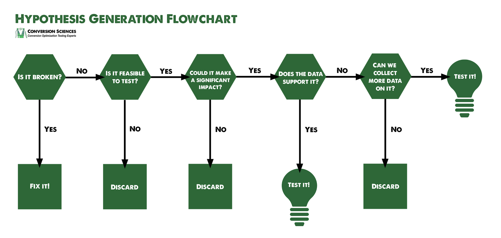
You’ll quickly build a list of potential changes to test, and then you’ll need to prioritize them based on your overall testing strategy.
5. Develop A Testing Strategy
AB testing is a time-consuming process that consumes limited resources. You can’t test everything, so where do you focus?
That will depend on your testing strategy.
Ultimately, you will need to develop a tailored strategy for the specific website you are working with and that website/business’ unique goals, but here are a few options to choose from.
Flow vs. Completions
One of the first questions you’ll have to ask is where to start. There are two broad strategies here:
If you find people falling out of the top of your funnel, you may want to optimize there to get more visitors flowing into your cart or registration page. This is a flow strategy.
For a catalog ecommerce site, flow testing may occur on category or product pages. Then, tests in the shopping cart and checkout process will move faster due to the higher traffic.
Gum Trampoline Strategy
Employ the gum trampoline approach when bounce rates are high, especially from new visitors. The bounce rate is the number of visitors who visit a site and leave after only a few seconds. Bouncers only see one page typically.
With this strategy, you focus testing on landing pages for specific channels.
Minesweeper Strategy
This strategy is for sites that seem to be working against the visitor at every turn. We see this when visit lengths are low or people leave products in the cart at high rates.
For example, we might try to drive more visitors to the pricing page for an online product to see if that gets more of them to complete their purchase.
Big Rocks Strategy
This strategy is used for sites that have a long history of optimization and ample evidence that an important component is missing. Add fundamental components to the site in an effort to give visitors what they are looking for.
Examples of “big rocks” include ratings and reviews modules, faceted search features, recommendation engines, and live demos.
Nuclear Strategy
This strategy includes a full site redesign and might be viable if the business is either changing its backend platform or completely redoing branding for the entire company or the company’s core product.
The nuclear strategy is as destructive as it sounds and should be a last resort.
For additional strategies and a more in-depth look at this topic, check out 7 Conversion Optimization Strategies You Should Consider, by Brian Massey.
6. Design Your AB Tests
Once our hypotheses are created and our goals are clearly defined, it’s time to actually run the AB tests.
Having the right tools will make this process infinitely easier. If you aren’t quite sure what the “right tool” is for your business, check out this article: The Most Recommended AB Testing Tools By Leading CRO Experts
But even with the right tools, designing an AB test requires a decent amount of work on the user’s end. Tests need to be designed correctly if you want to derive any meaningful insights from the results.
One piece of this that most people are familiar with is statistical significance. Unfortunately, very few people actually understand statistical significance at the level needed to set up split tests. If you suspect that might be you, check out AB Testing Statistics: An Intuitive Guide For Non-Mathematicians.
But there’s a lot more to designing a test than just statistical significance. A well-designed AB test will include the following elements:
Tests should be set up to run for a predetermined length of time that incorporates the full cycle of visitor behavior. A runtime of one calendar month is a good rule of thumb.
Test goals, targeting, a display percentages should all be accounted for.
Once the test is designed properly, it’s finally time to actually run it.
7. Run & Monitor Your AB Tests
Running an AB test isn’t as simple as clicking “Run” on your split testing software. Two critical things need to happen once the test begins displaying page variations to new visitors.
Once the test begins, it’s important to monitor conversion data throughout the funnel, watch for anomalies, and make sure nothing is set up incorrectly. You are running your tests on live traffic, after all, and any mistake that isn’t quickly caught could result in massive revenue loss for the website being tested.
As the tests run, we want to monitor a number of things. For instance:
Statistical significance is the first thing we have to look at. A statistically insignificant lift is not a lift. It’s nothing.
But even if our results are significant, we still have to look at the progression of data throughout the testing process. Did the variant’s conversion rate stay consistently higher than the control? Or did it oscillate above and below the control?
If the data is still oscillating at the end of the test period, we might need to continue testing, even if our software is telling us the results are statistically significant.
It’s also important to understand that any lift experienced in testing will almost always be overstated. On average, if a change creates a 30% lift in testing, the actual lift is closer to 10%.
Finally, it’s helpful to run quality assurance throughout the test period, ensuring that split tests are displaying properly across various devices and browsers. Try to break the site again, like you did during the initial site audit, and make sure everything is working.
Once the tests have run through the predetermined ending point, it’s time to review the results.
8. Assess Test Results
Remember that an AB test is just a data collection activity. Now that we’ve collected some data, let’s put that information to work for us.
The first question that will be on our lips is, “Did any of our variations win?” We all love to win.
There are two possible outcomes when we examine the results of an AB test.
In the case of an inconclusive test, we want to look at individual segments of traffic. How are specific segments of users engaging with the control versus the variant? Some of the most profitable insights can come from failed tests.
Segments to compare and contrast include:
These segments will be different for each business, but they’ll provide insights that spawn new hypotheses or even provide ways to personalize the experience.
In the case of a statistical increase in conversion rate, it’s very important to analyze the quality of new conversions. It’s easy to increase conversions, but are these new conversions buying as much as the ones who saw the control?
Ultimately, we want to answer the question, “Why?” Why did one variation win, and what does it tell us about our visitors?
This is a collaborative process and speculative in nature. Asking why has two primary effects:
Our goal is to learn as we test, and asking “Why?” is the best way to cement our learnings.
9. Implement Results: Harvesting
This is the step in which we harvest our winning increases in conversion, and we want to get these changes rolled out onto the site as quickly as possible. The strategy for this is typically as follows:
It is not unusual for us to create a new routing test so that we can archive the results of the AB test for future reference.
As another consideration, beware of having too many routing tests running on your site. We’ve found that some smaller businesses rely on the routing tests to modify their test and have dozens of routing tests running. This can cause a myriad of problems.
In one case, a client made a change to the site header and forgot to include the code that enabled the AB testing tool. All routing tests were immediately turned off because the testing tool wasn’t integrated.
Conversion rates plummeted until the code was added to the site. In one sense, this is a validation of the testing process. We’ve dubbed it a “Light Switch” test.
Conclusion
This is the framework CRO professionals use to consistently generate conversion lifts for their clients using AB testing.
6 Highly Productive Ways To AB Test Content Marketing
CRO Tests | Multivariate | AB TestingHere are six different ways to AB test content elements and the things you should be measuring.
There is a critical part of your sales funnel that probably isn’t optimized.
When you think about CRO, you think about optimizing your online funnel – your emails, landing pages, checkout process, etc. – in order to acquire more customers.
What you don’t often think about is AB testing your content.
In fact, when it comes to content driven marketing, we rarely see the same commitment to testing, tracking, and optimizing that occurs elsewhere in marketing. Considering that content is found at the top of your sales funnel, the wrong content could be hurting your conversion rates.
Content can be tested in the same way anything else can be tested, and some elements definitely deserve a more CRO-esque approach.
Goals for AB Testing Content
One of the reasons that content is less-frequently tested, is that the goals are often unclear.
Content is great for SEO.
Content is great for educating clients.
Content is great for establishing your brand’s thought leadership.
Content is great for sharing on social media.
Content is also great for getting prospects into the sales funnel. This is typically done by collecting an email address to begin the conversation.
Here are the 6 different elements you should definitely consider testing. You can run any of these tests using these recommended AB testing tools, but I’ve also included some simple WordPress plugins as a viable alternative if you want to try this on a small budget.
1. Split Test Your Headlines
Your headline is arguably the most important piece of your content. It’s the thing that determines whether people click through from your email or social media post.
On average, 80% of your readers never make it past the headline.
Yup, only 2 in every 10 of your readers actually read past the headline. Even fewer make it all the way through the article.
Funny enough, it’s also one of the simplest things to test. It’s so easy.
You already know how to run an AB test. Applying that practice to your headlines is a simple 4-step process.
1. Brainstorm headlines to test.
Stephanie Flaxman of CopyBlogger says you should ask yourself three questions to make your headline the best it can be:
Use your answer to those three questions to craft a headline that will demand viewer attention and channel readers to your content.
But don’t get too excited – The first headline you come up with will probably suck. Or maybe it will just be mediocre.
The whole point of AB testing is that you don’t have to come up with THE perfect headline. You simply need to come up with a variety of solid options, and then you can see what performs best.
This is why I recommend creating a list of 5-10 possible headlines.
Next, pick your two favorites and move on to step #2.
2. Send both versions to a live audience.
Now it’s time to test the headlines. You want to show one headline to 50% of your traffic and the other headline to the other 50%.
How you accomplish this will depend on how you acquire traffic.
For example, if you primarily drive traffic to your new blog posts via an email list, create your email and then send half of your subscribers the email using one headline and the other half the same email but using the alternate headline.
If your promote via social media, try posting at different times or across different channels using the alternate headlines and see what happens.
If you promote via paid channels, simply create two ads, using a different headline for each, and set up a normal AB test using proper statistical analysis.
Once you’ve run your tests, it’s time to review the data.
3. Analyze the results.
Which headline performed the best?
If your traffic is too low to get statistically significant results, it’s still worth running the tests. Your initial readers typically come from your email list or your most active social followers – aka the people most likely to share your content. Getting a feel for what they respond to is always worthwhile, and you might notice certain trends over time.
4. Implement the one with the most clicks.
Once you have your winner, simply set it as your permanent headline. That’s all there is to it.
But your headline isn’t the only thing that gets people to click.
2. Split Test Your Featured images
Content Marketing Institute, the industry leader in content marketing, found that “ad engagement increased by 65% when a new image was tested versus simply testing new copy.”

Brian Massey summarizes it well here, “Spend as much time on your images as your copy.”
Whether you’re using paid ads in your content marketing strategy or not, the image matters almost as much as the headline (maybe more).
So, how does one select the right featured image?
There is some science behind choosing a featured image. If you think about it, picking one image is harder than picking several. So, pick a couple and let your test results decide for you.
Here are three keys that will help guide your selection.
1. Pick something compelling
Your image should relate to whatever your article is about. That said, being relevant is pretty ambiguous.
This article from Inc is not directly relevant to the content, but our brains are designed to make connections.
As long as you can relate it in some way, you’re probably OK, but you want your image to be compelling. Not any relevant image will do. Roy H. Williams, director of the business school The Wizard Academy, outlines a number of techniques that make images compelling.
Pro tip: If you use a human face, have them looking at your headline for best resuts.
The above image may not be highly relevant, but it’s use of a silhouette is compelling.

2. Make sure it is relevant to the post
Your headline and featured image should work together to be both relevant and compelling.
Let’s look at some other examples from Inc.
Do you see how they combine relevant images with compelling headlines? It makes it hard not to click on the article.
Finally, the third important factor to consider when choosing an image is…
3. Always use high-quality images
I know you already know this, but I wanted to remind you. Nothing grinds my gears more than a blog post with a terrible, grainy image.
Once you’ve chosen your images, go ahead and start splitting your traffic.
Now you know how to optimize individual posts for conversions, but what about a more general approach to your overall content marketing strategy?
The next element you should be testing is content length.
3. Find Your Ideal Content Length
Now we’re getting into the overall content creation process. Testing your ideal content length will give you an idea to help you create a content template for all your articles going forward.
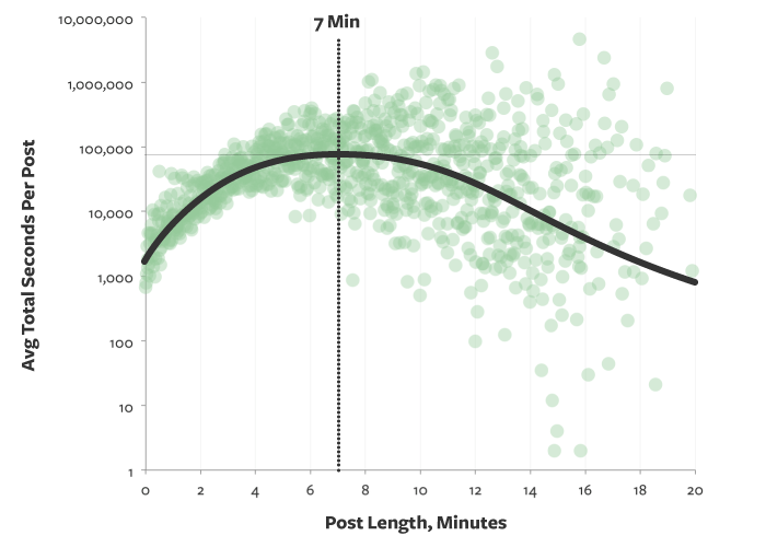
According to a study done by Medium, the current ideal content length is about 1,600 words; or, around a 7-minute read.
However, this may not be the case for you.
Yes, the average posts that get the most shares are long, in-depth posts. But that doesn’t mean shorter posts don’t get shares as well. And more importantly, that doesn’t mean shorter posts won’t do a better job of driving qualified leads to your business.
The only way to know the optimum length of posts for your audience is to test it. In order to test the ideal length, you can take two different approaches.
The first and simplest option is to try a variety of content lengths over time and look for trends. You could publish a 1,500 word post one week, a 400 post the next week, a 4,000 word guide the following week, and an infographic the 4th week. Rinse and repeat. You should be testing out different content types anyway, and incorporating varying lengths of content within that schedule won’t require much more effort on your part.
The data you want to measure — time on page — is found easily in Google Analytics. This is a free analytics tool that any content marketer should become familiar with.
The second option is to split test a single post by sending segments of users to different length versions of the same post.
In similar fashion, test video length for views and watch times to see how long your videos should be.
4. Take Your Opt-in Forms Seriously
Opt-in or signup forms are a critical part of content marketing and sales funnels. It’s important that they are converting at the highest rate possible.
So what parts of your opt-in form can you test?
First, test the form length.
I’ve seen forms that ask for the whole shebang; everything from your full name to your phone number and more.
Believe it or not, this can work. Just take HubSpot for example. They have a ridiculous amount of free downloads, from templates to eBooks, and every one of them comes with a form like this:
HubSpot Form.
I put three pages into one image because it was too big to fit in one screenshot!
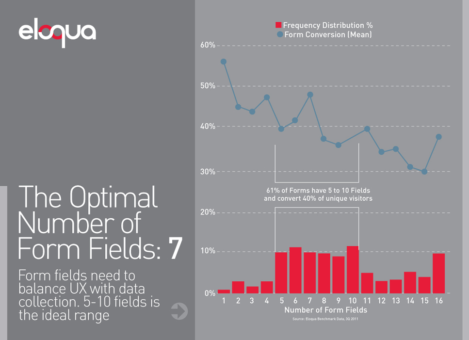
Here’s the kicker: They see tremendous success with this behemoth of a form. I’ve personally filled out at least a half dozen of their forms like this for free downloads.
So, what’s the ideal form length?
Well, take a look at this chart by eloqua.
It seems the optimal number of fields is 7 because you’re getting the most information with the least drop off in conversions.
That said, you can potentially get close to a 60% conversion rate when asking for only a single piece of information.
Oddly enough, the data above suggest that having 7 form fields is better than having only 2. While this is just one study, it could mean that you’ve been asking for too little information and might want to revisit your opt-in forms.
Again, it’s all about testing.
Once you’ve determined the optimal number of form fields, it’s time to test location. Test placement on the page.
Typically, forms are located:
Where you place your offers is as important as the length of your forms.
Try multiple locations. Personally, I like to include one in the sidebar, one on exit intent, and one either in the middle of or at the end of my content.
Don’t overwhelm your visitors with too many choices. If you have four different opt-ins, some call-to-actions, related posts, and other things to click on, they may just leave your page altogether.
5. Split Test Your CTAs
Whenever you create a piece of content on your website, be it a blog post, a landing page, or even an about page, you should always ask yourself this question:
In other words, “Where are we sending them next?”
A lot of people have no idea how to answer that question. I mean, it’s not obvious – especially when you have a lot of content you could send them to.
You might have any one (or more) of these CTAs in your content:
How do you know where to send them?

The answer: Send them to the next stage in your funnel
Depending on your marketing strategy, this might mean immediately collecting a lead, or it could be something else.
Let me give you an example. ChannelApe provides integrations between the systems ecommerce websites use to run their business. ChannelApe offers a free trial for their automatic supplier integration as the next step for anyone reading their list of dropshippers.
This makes sense because anyone interested in a list of dropshippers is probably also interested in integrating those dropshipper’s products with their store.
Notice how ChannelApe uses a bright orange background to help their CTA stand out from the rest of their content. Color is only one of the variables you should test on your CTAs.
In addition to CTA colors, you can also test:
OK, let’s say you want to test the position of your related posts.
I know what you’re thinking.
Maybe. But what if your readers aren’t getting to the end? You don’t want them to leave, do you?
For that matter… what’s “related”? Are you tagging your posts and pages properly?
And what about the posts getting the most interaction? Don’t you think your readers would like to see those?
Or do you want to drive traffic to certain pages over others, like a “start here” page or a new blog series?
Do you see where I’m going with this?
The process of CRO, be it in your content marketing campaigns, your landing pages, or anywhere else, involves asking yourself questions about your readers in order to better understand how to help them.
Simply repeat this process of asking questions for every variable you may want to include, then put your answers to the test.
Conclusion: AB Test Your Content
Let’s recap:
If there’s one thing you should take away from this post, it’s this:
The performance of your content is no less important than any other stage in your funnel. Always test the elements of your content by asking yourself relevant questions about your readers.
Have you ever tried to split test elements of your content before? I’d love to hear. Leave a comment below and let me know!
10 Value Proposition Upgrades That Increased Conversions By At Least 100%
CRO Tests | Multivariate | AB Testing10 successful value proposition examples proven by AB testing.
Conversion Sciences has completed thousands of tests on websites of all kinds for businesses of all sizes. At times, we’ve been under pressure to show results quickly. When we want to place a bet on what to test, where do we turn?
Copy and images. These are the primary components of a website’s value proposition.
It’s the #1 factor determining your conversion rate. If you deliver a poor value proposition, there is little we can do to optimize. If you nail it, we can optimize a site to new heights.
So, I have to ask: have you ever taken the time to split test your value proposition?
This article shows you how to identify a poor value proposition, hypothesize a series of better alternatives, and split test them to identify the wining combination of copy, video and images.
Essential Qualities Of A Worthwhile Value Proposition
Your value proposition is the promise you make to prospective customers about the unique value your business will deliver to them.
Your value proposition is a statement, which can be made up of the following elements:
Words carry tremendous power, but they aren’t the only element you can employ in promising defined value to potential customers. A value proposition can be made up of any of the above elements, as well as others I’ve no doubt failed to mention.
To be effective, your value proposition should include the following characteristics:
Hopefully, these criteria are making you aware of what your value proposition is not. It is not a slogan, creative phrase, or teaser.
The best way to demonstrate this is to show you some real examples of businesses that improved their conversion rates by upgrading their value propositions.
Let’s get started.
Example #1: Groove Increases Conversions By 104%
Groove is simple help desk software. It’s a streamlined product designed to help smaller teams provide personalized customer support without learning and configuring something more complicated like Zendesk.
Groove’s original homepage was converting at only 2.3%.
Groove SaaS and eCommerce Customer Support Value Proposition
After reaching out to several experts for help, they received the following advice:
With this in mind, the Groove team spent some time talking to various customers over the phone in order to get a feel for how those customers were talking about Groove and the actual words they were using.
They also changed their opening autoresponder email to the following, which ended up generating an astounding 41% response rate and becoming a prime, continuous source of qualitative data for the business:
Groove welcome email established their value proposition.
As a result of this feedback, they created a new “copy first” landing page, with a completely revamped value proposition.
Groove created a ‘copy first’ landing page based on feedback from customers
After testing the new page against the original, Groove found that it converted at 4.3% for an 87% improvement. After running additional tests with more minor tweaks over the next two weeks, the conversion rate ultimately settled at 4.7%, bringing the total improvement to 104%.
Key Takeaways
So what can we learn from Groove’s big win?
Example #2: Comnio Increases Signups By 408%
Comnio is a reputation management company that helps both consumers and businesses resolve customer service issues.
After transitioning away from a moderately NSFW branding strategy, the company needed a new way to communicate it’s value and attract users. After the page below failed to convert, they contacted Conversion Sciences’ Brian Massey for a CRO strategy consultation.
Comnio’s landing page failed to convert well
Brian helped the team come up with a new version:
Comnio’s new landing page performed at a high rate
This new page was a definite improvement over the previous version, and over the next 30 days, it converted a respectable 3.6% of site visits.
That said, there were still some clear problems, the most obvious being that the opening headline and subheadline were failing to make a clear promise. In order to optimize this page, Comnio implemented the following changes:
The new page looked like this:
Comnio further refined the landing page with a significantly higher conversion rate
Thanks in large part to a strong headline, this new page converted at an incredible 18.3% over its 30-day test, a 408% increase over the previous version.
It’s also worth noting that 49% of new signups used one the social signup options available on the new page.
Key Takeaways
So what can we learn from Comnio’s huge conversion spike? Whenever this many changes are implemented in one test, it hurts our ability to make specific conclusions, but here’s what I’m seeing:
Example #3: Udemy Increases Clicks By 246%
Udemy is a massive marketplace for online courses on everything you can imagine.
And while the company’s meteoric growth is certainly a testament to their product-market fit and understanding of their own value proposition, until somewhat recently, the individual course pages were very poorly optimized.
Until this last year, Udemy course pages looked like this:
Udemy landing page that needed higher conversion rates
If I’m trying to sell my course via this page, there are a number of major problems diminishing my conversion rate.
While Vanessa’s course does have a value proposition, it certainly isn’t laid out in a way that makes it defined or obvious.
Eventually, Udemy caught-on to this a tested a special layout:
Udemny redesigned landing page employing user testing
Unlike the old page, this version has a very clear value proposition, with the headline, subheadline, video and CTA all clearly displayed without distraction.
Brian Massey talks a bit about what makes this page work:
Most importantly, this new landing page receives 246% more click-throughs than the old course landing page.
Udemy also altered their normal course landing pages to incorporate some of these elements, putting the headline, subheadline and promo video front and center, with a much more obvious CTA button and all additional information below the fold.
Udemy used the same techniques to update their course page.
Key Takeaways
So what can we learn from Udemy’s landing page improvements?
Example #4: 160 Driving Academy Increases Leads By 161%
160 Driving Academy is an Illinois based firm that offers truck-driving classes and guarantees a job upon graduation.
In order to improve the conversion rate on their truck-driving classes page, the company reached out to Spectrum, a lead-generation marketing company. Spectrum’s team quickly noted that the page’s stock photo was sub-optimal.
160 Driving Academy original landing page with stock photo.
The team had a real image of an actual student available to test, but almost didn’t test it out.
Ultimately, they decided to go ahead and test the real student photo anyway and simply photoshopped the logo off the sweatshirt:
Revised landing page with picture of actual student.
The primary goal of this test was to increase the number of visitors who converted into leads via the contact form to the right of the page, and this simple change resulted in an incredible 161% conversion lift with 98% confidence.
The change also resulted in a 38.4% increase (also 98% confidence) in actual class registrations via this page!
Not bad for a simple photo change.
Key Takeaways
So what can we learn from this case study? Yes, stock photos tend to be poor performers, but why?
The answer lies in how our brains respond to images. Essentially, our brains are far more likely to notice and remember images versus words, but these advantages tend not to apply to stock photos, as our brains have learned to automatically ignore them.
For a more in-depth breakdown of this subject, check out this writeup from VWO.
We’ve covered 28 different takeaways in this article, and for you convenience, I’ve gone ahead and put them into an easy cheat sheet you can download via the form below.
18-28 Value Proposition Takeaways
Example #5: The HOTH Increases Leads By 844%
The HOTH is a white label SEO service company, providing link building services to agencies and SEO resellers.
Despite having what most would consider a solid homepage, their conversion rate was sitting at a very poor 1.34%. It started with the following value proposition and then followed a fairly standard landing page flow:
The Hoth homepage had a low conversion rate.
While their landing page wasn’t bad as a whole, you may be noticing that their value proposition was a bit vague and hinged primarily on the assumption that incoming users would click and watch the video.
The HOTH team decided to make a big changeup, and completely scrapped the entire landing page, replacing it with a new headline, subheadline and…. that’s it.
The Hoth made a big change to their landing page.
Behold, the brilliant new landing page!
And while you might be tempted to laugh, this new variation converted at 13.13%, an incredible 844% increase from the original!
Key Takeaways
So what can we learn from this?
Example #6: Conversioner Client Increases Revenue By 65%
So yes, I know that 65% is not quite the 100% I promised you in the headline, but let’s be honest, you aren’t scoffing at a 65% increase in actual revenue.
This case study comes from Conversioner and features an unnamed client whose product enables customers to design & personalize their own invitations, greeting cards, slideshows, etc.
The client’s original homepage looked like this:
The original homepage an invitation service
At first glance, this value proposition really isn’t that bad.
Sure, they are focused primarily with themselves in the headline, but they sort of make up for it in the subheadline by discussing the direct customer benefits, right?
“Delight guests with a unique invite they won’t forget.”
There’s just one really big problem here. These customer benefits have nothing to do with the customer or the benefits.
Stop and think about it.
“Delight your guests”… who talks like that? Nobody. Nobody talks like that. When you are thinking about sending out invites, you aren’t thinking, “Hmmm how can I delight my guests?”
But we aren’t done: “… a unique invite they won’t forget.”
This copy is completely disconnected from the target consumer. Why do people send invites? Is it so their guests will never forget the invites?
No. The best possible invite is one that gets people to your event. That’s it. Your goal is a great party. Your goal is a bunch of fun people at your great party. That’s the primary metric, and it isn’t even addressed in this value proposition.
Which is why the Conversioner team made a change:
The revised homepage of the invitations service
Notice that this new variation doesn’t completely abandon the “what we do” portion of the value proposition. It is still communicating exactly what is being offered from the get-go.
“Create Free Invitations”
But then it speaks to the benefits. It’s free AND it is the start of a great party.
The proof is in the pudding, and this change resulted in a 65% increase in total revenue.
Key Takeaways
So what can we learn from Conversioner’s successful experiment?
Example #7: The Sims 3 Increases Game Registrations By 128%
I’m guessing you’ve heard of The Sims franchise, but in case you haven’t, it’s one of the best selling computer game franchises in history.
While the third installment was sold as a standalone game, the business model relied heavily on in-game micro-transactions. But in order to begin making these in-game purchases, users needed to first register the game.
The Sims’ marketing team found that once players had registered, they were significantly easier to convert into repeat buyers. Registrations were primarily solicited via the game’s launch screen, but the conversion rate was unsatisfactory.
The launch screen of the Sims 3 game.
As you can see, it’s fairly obvious why nobody was registering.
Why would they? How could they?
“Join the fun!” … what does that mean? If I’m a gamer pulling up the launch screen, I already know how to join the fun. I just click the giant Play button on the left side of the screen. And there is nothing on this screen that would cause me to pause that line of action and consider registering.
Unsurprisingly, this is exactly what WiderFunnel thought when they were hired to improve this page. They quickly realized the need to incentivize users to register and make it very clear what was being requested of them.
The team came up with 6 different variations to test. Here’s their direct commentary:
#4 converted best, bringing in 128% more registrations than the original.
This version of the Sims 3 launch page performed best.
While this isn’t surprising, it serves to illustrate how simple conversion optimization can be. It’s really just a matter of giving people what they want. Sometimes, identifying what that is will be challenging. And sometimes, it will take a bit of digging.
Key Takeaways
So what should we learn from this?
Example #8: Alpha Increases Trial Downloads By 98%
Alpha Software is a software company with a number of product offerings, the most recent of which deals with mobile app development.
The company wanted to improve results for one of it’s product landing pages, pictured below:
The Alpha landing page for mobile app development.
They tested it against the following simplified page:
An alternate design for the Alpha landing page.
This new streamlined version resulted in 98% more trial signups than the original. That’s a pretty drastic improvement considering the changes can be summed up in two bullet points:
And this isn’t the only case study where the removal of navigation resulted in an uptick in conversions. It’s actually pretty common.
In a similar test by Infusionsoft, a page with secondary navigation between the headline and the rest of the value proposition…
This InfusionSoft landing page has menus under the headline.
… was tested against the same page, minus the nav bar, with different CTA text:
This version of the Infusionsoft page has no menu below the headline
The simplified page with no extra navigation bar had 40.6% more conversions at a 99.3% confidence level.
While I think the CTA change definitely played a role in these results, it’s very important for marketers to streamline the navigation of their landing pages (and their websites as a whole).
Key Takeaways
So why did I include this in our list?
Example #9: HubSpot Client Improves Conversions By 106%
For our next to last example, I want to look at a client case study released by HubSpot awhile back. This unnamed client had a homepage converting poorly at less than 2% and had decided it was time to take optimization seriously.
The client looked through several landing page best practices and decided to make some critical adjustments to their page.
The 1st change was to replace the original vague headline with a clear new headline and benefit-driven subheadline:
Two versions of a landing page with different headline designs.
The 2nd change was to add a single, obvious CTA instead of offering a buffet of product options for visitors to select from.
Two versions of a landing page with the call to action higher on the page.
The 3rd change was to move individual product selections down below the hero shot. The new page started with a single value proposition and then allowed users to navigate to specific products.
The result of these three changes was a 106% lift in page conversions.
The results of this landing page AB test.
The main issue I want to address this with study is the question of “Should we try to convert first or segment first?”
In my professional experience, combined with the many studies I’ve reviewed, it’s usually better for every page to have a clear, singular direction to begin with and then go into multiple navigation or segmentation options.
Another test that speaks to this comes from Behave.com (formerly WhichTestWon). The marketing team from fashion retailer Express had an exciting idea to test a new homepage that immediately segmented users based on whether they were looking for women’s clothing or men’s clothing.
This Express homepage tries to segment men and women right away.
They tested this against their original page that pitched the current discount in circulation and offered a singular value proposition:
This Express homepage converted better than the segmented one.
The segmented test page converted poorly compared to the original, with the following results at a 98% confidence level:
Key Takeaways
So what can we learn from these two case studies?
Example #10: TruckersReport Increases Leads By 79.3%
TruckersReport is a network of professional truck drivers, connected by a trucking industry forum that brings in over 1 million visitors per month.
One of the services they provide is assistance in helping truck drivers find better jobs. The conversion funnel for this service began with a simple online form that was followed by a 4-step resume submission process.
The initial landing page was converting at 12.1%:
Truckers report landing page.
ConversionXL was brought in to optimize this funnel, and after analyzing site data and running several qualitative tests with a few of the most recommended AB testing tools, they came up with the following insights:
Using these insights, they created and tested 6 different variations, ultimately landing on the following page:
Three views of the redesigned Truckers Report homepage.
This new page saw a conversion lift of 79.3% (yes, I know I fudged on the 100% think again… sorry not sorry). Instead of trying to explain why, I’ll simply quote Peep Laja:
The team also optimized the entire funnel, but since our focus is on value propositions today, I’ll simply direct you to Peep’s writeup for the full story.
Key Takeaways
So what are our value proposition takeaways?
10 Value Proposition Examples With 28 Takeaways
Optimizing your value proposition is a low hanging fruit that can have a tremendous impact on your website. It’s also a core consideration in a good AB testing framework.
Hopefully these 10+ value proposition examples will help you along your journey to funnel optimization.
We’ve covered 28 different takeaways in this article, and for you convenience, I’ve gone ahead and put them into an easy cheat sheet you can download via the form below.
18-28 Value Proposition Takeaways
Fitt’s Law Says Button Design is Like Shooting Pool
Conversion-Centered DesignAccording to Fitt’s Law, clicking a button on your site can be modeled like a pool shot. It’s a fun way of saying that you should make buttons big and put them where the visitor expects them to be. If you’re looking for good ideas for testing button design, consider the game of pool.
Most of us have at one time or another found ourselves at the end of a pool cue with “a lot of green” between us and the ball we want to sink. There is a lot of table between the cue ball and the ball we want to hit just right.
Thanks to an excellent article on Entrepreneur.com, I’ve discovered that visitors to our website may be experiencing the same thing. Author Nate Desmond introduced Fitt’s Law, which he states this way:
In a game of pool, the distance to the target changes constantly. This is equivalent to the distance from where a visitor’s mouse is and where your call to action button is.
In general, the rules of a pool shot are pretty simple.
Fitt’s Law Corollary: The Closer the Cue Ball to the Target Ball, the Easier the Shot
It’s easier to accurately hit a target ball that is close to the cue ball.
It’s counter-intuituve that the distance to the hole doesn’t matter as much as the distance from the cue ball.
If you strike the cue ball hard enough, it doesn’t really matter how far the target ball is from the pocket. What does matter is how far the target ball is from the cue ball. The shot is easier to line up and there is less distance for the cue ball to bend if you add a little accidental spin. When you put spin on the ball, it’s called “English”. Accidental spin is generally called “cussing”.
The Cue Ball is Where the Mouse Is — or Wants — to Be
To continue stretching our metaphor beyond recognition, we can liken the white cue ball to where the mouse is on a web page.
Part of the problem with this approach is that we really don’t know where the visitor’s mouse is on the page when it loads. We might assume it’s in the upper-left corner, where the website address is entered. This is true for only a small percentage of your visitors who enter your site by typing your domain. Others will come from internal links, ads and search results.
You can’t just cram your click target into the upper left corner of your pages.
For some, it will be where the visitor is looking on the page. For some percentage of our visitors, the location of their mouse predicts where they look on the screen. This would tell you that the most visually interesting items on your page will be magnets for visitor eyes and for the visitor’s mouse.
What are the most visually interesting points on your page? You can determine this by using several eye-tracking predictors like AttentionWizard and Feng-GUI. In the following example, the red circles indicate the most visually attractive aspects of the page, and predict how the visitors’ eyes will explore the page.
The visitors’ eyes don’t come close the the click target “Add to Cart” button.
The Add to Cart button – our target ball – really isn’t close to most of the high-contrast items on the page. The distance from the “mouse” to the button is long. Plus, the button is relatively small and doesn’t stand out from other elements on the page.
Compare that to the following competitor.
The click target is “closer” to where the eyes — and mouse — are likely to be on this page.
In this case, the Add to Cart button is one of the most visually interesting things on the page. Furthermore, it is near other highly-visible elements. The effective “distance” is much smaller and the visual “size” is larger.
This gives us two very helpful rules of thumb:
Place Buttons Where They are Expected to Be
Probably a more effective way to reduce the distance between the mouse and a click target is to put your buttons where they are expected to be. We have been trained that the “end” of a page is the lower-right corner. This is where it has made sense to put buttons since the days of Web 1.0. As a result, we expect the lower-right to take us to the next step.
This concept is lost on the following page.
The “Cancel” button is in a disastrous place. Visitors expect the lower-right button to be the next step.
This is close:
The Add to Cart button is not in the expected place on this ecommerce product page.
This is closer:
The add to cart button here is closer to the desired place. The box around it will deflect visitors’ gazes.
This is closest:
The add to cart button here is the last thing in the lower right part of the page. Perfect next step.
If Something’s In the Way, the Shot is Harder (and so is the click)
One of the major challenges in pool is, of course, other balls. This is also the problem on webpages (not the balls).
The hardest shot is when things are in the way, for pool and webpages.
Designers (should) know how to remove things that make click targets disappear. White space is one technique that removes blocks.
Lot’s of white space around this click target make it easier to see and click.
Solid lines form barriers to the eye’s movement.
Elements crowd out this Add to Cart button, making it almost invisible.
Major and Minor Choices for Button Design
One technique that we use that takes advantage of Fitt’s Law is major and minor choices. We make the choice that we desire less smaller and harder to click. We make the choice we want the visitor to choose big and bright.
Here we see that the designer made the “Learn More” button more visually prominent – making it closer – while making the “Watch video” link more distant – less visually prominent.
Which of these two click targets is “closer” due to the visual attractiveness? The order should probably have been reversed.
Language Makes the Hole Bigger
While there really is no way to get bigger pocket holes on a pool table, there is a way to do so with click targets. The language you use on buttons and in links will make it easier for visitors to take action.
Make your visitors excellent pool players by giving them easy shots.
“Submit” does not generate a large pocket to aim at. The language should tell the visitor what will happen if they click, and what they will get.
These make the visitor a better shot by offering them something of value as a part of the click target.
Some popovers have begun using the inverse of this technique to discourage visitors from abandoning.
Popover.
Give Your Visitors a Better Shot with Better Button Design
If a webpage is indeed like a pool table, it makes sense to give your visitors the best shot at clicking on the right button or link.
A/B Testing Statistics: An Intuitive Guide For Non-Mathematicians
CRO Tests | Multivariate | AB TestingHere’s the deal. You simply cannot A/B test effectively without a sound understanding of A/B testing statistics. It’s true. Data integrity is the foundation of everything we do as a Conversion Rate Optimization Agency.
And while there has been a lot of exceptional content written on A/B testing statistics, I’ve found that most of these articles are either overly simplistic or they get very complex without anchoring each concept to a bigger picture.
Today, I’m going to explain the statistics of A/B testing within a linear, easy-to-follow narrative. It will cover everything you need to use A/B testing software effectively and it will make A/B Testing statistics simple.
Maybe you are currently using A/B testing software. And you might have been told that plugging a few numbers into a statistical significance calculator is enough to validate a test. Or perhaps you see the green “test is significant” checkmark popup on your testing dashboard and immediately begin preparing the success reports for your boss.
In other words, you might know just enough about split testing statistics to dupe yourself into making major errors, and that’s exactly what I’m hoping to save you from today. Whether you are executing a testing roadmap in house or utilizing in 3rd party conversion optimization services, you need to understand the statistics so you can trust the results.
Here’s my best attempt at making statistics intuitive.
Why Statistics Are So Important To A/B Testing
The first question that has to be asked is “Why are statistics important to A/B testing?”
An A/B test is an example of statistical hypothesis testing, a process whereby a hypothesis is made about the relationship between two data sets and those data sets are then compared against each other to determine if there is a statistically significant relationship or not.
To put this in more practical terms, a prediction is made that Page Variation #B will perform better than Page Variation #A. Then, data sets from both pages are observed and compared to determine if Page Variation #B is a statistically significant improvement over Page Variation #A.
This process is an example of statistical hypothesis testing.
But that’s not the whole story. The point of A/B testing has absolutely nothing to do with how variations #A or #B perform. We don’t care about that.
And from this bird’s-eye view, the answer to our original question is that statistical analysis is our best tool for predicting outcomes we don’t know using information we do know. Statistical analysis, the science of using data to discover underlying patterns and trends, allows us to use data from user behaviors to optimize the page’s performance.
For example, we have no way of knowing with 100% accuracy how the next 100,000 people who visit our website will behave. That is information we cannot know today, and if we were to wait until those 100,000 people visited our site, it would be too late to optimize their experience.
What we can do is observe the next 1,000 people who visit our site and then use statistical analysis to predict how the following 99,000 will behave.
If we set things up properly, we can make that prediction with incredible accuracy, which allows us to optimize how we interact with those 99,000 visitors. This is why A/B testing can be so valuable to businesses.
A/B Testing Statistics: The Complexities Of Sampling, Simplified
That seems fairly straightforward. So, where does it get complicated?
The complexities arise in all the ways a given “sample” can inaccurately represent the overall “population” and all the things we have to do to ensure that our sample can accurately represent the population.
Let’s define some terminology real quick.
The “population” is the group we want information about. It’s the next 100,000 visitors in my previous example. When we’re testing a webpage, the true population is every future individual who will visit that page.
The “sample” is a small portion of the larger population. It’s the first 1,000 visitors we observe in my previous example.
In a perfect world, the sample would be 100% representative of the overall population. For example:
Let’s say 10,000 out of those 100,000 visitors are going to ultimately convert into sales. Our true conversion rate would then be 10%.
In a tester’s perfect world, the mean (average) conversion rate of any sample(s) we select from the population would always be identical to the population’s true conversion rate. In other words, if you selected a sample of 10 visitors, one of them (or 10%) would buy, and if you selected a sample of 100 visitors, then 10 would buy.
But that’s not how things work in real life.
In real life, you might have only two out of the first 100 buy or you might have 20… or even zero. You could have a single purchase from Monday through Friday and then 30 on Saturday.
The Concept of Variance
This variability across samples is expressed as a unit called the “variance,” which measures how far a random sample can differ from the true mean (average).
The Freakonomics podcast makes an excellent point about what “random” really is. If you have one person flip a coin 100 times, you would have a random list of heads or tails with a high variance.
If we write these results down, we would expect to see several examples of long streaks — five or seven or even ten heads in a row. When we think of randomness, we imagine that these streaks would be rare. Statistically, they are quite possible in such a dataset with high variance.
So it would not be impossible to take a sample of ten results that contain one of these streaks. This would certainly not be representative of the entire 100 flips of the coin, however.
Regression toward the mean
Fortunately, we have a phenomenon that helps us account for variance: “regression toward the mean.”
Ultimately, this ensures that as we continue increasing the sample size and the length of observation, the mean of our observations will get closer and closer to the true mean of the population.
In other words, if we test a big enough sample for a sufficient length of time, we will get accurate “enough” results.
So what do I mean by accurate “enough”?
Understanding Confidence Intervals & Margin of Error
In order to compare two pages against each other in an A/B test, we have to first collect data on each page individually.
Typically, whatever A/B testing tool you are using will automatically handle this for you, but there are some important details that can affect how you interpret results, and this is the foundation of statistical hypothesis testing, so I want to go ahead and cover this part of the process.
Let’s say you test your original page with 3,662 visitors and get 378 conversions. What is the conversion rate?
You are probably tempted to say 10.3% (dividing 378 by 3,662), but that’s inaccurate. 10.3% is simply the mean of our sample. There’s a lot more to the story.
To understand the full story, we need to understand two key terms:
You may have seen something like this before in your split testing dashboard.
The original page above has a conversion rate of 10.3% plus or minus 1.0%. The 10.3% conversion rate value is the mean. The ± 1.0 % is the margin for error, and this gives us a confidence interval spanning from 9.3% to 11.3%.
10.3% ± 1.0 % at 95% confidence is our actual conversion rate for this page.
What we are saying here is that we are 95% confident that the true mean of this page is between 9.3% and 11.3%. From another angle, we are saying that if we were to take 20 total samples, we can know with complete certainty that the 19 of those samples would contain the true conversion rate within their confidence intervals.
The confidence interval is an observed range in which a given percentage of test outcomes fall. We manually select our desired confidence level at the beginning of our test, and the size of the sample we need is based on our desired confidence level.
The range of our confidence level is then calculated using the mean and the margin of error.
The easiest way to demonstrate this with a visual.
Confidence interval example.
The confidence level is decided upon ahead of time and based on direct observation. There is no prediction involved. In the above example, we are saying that 19 out of every 20 samples tested WILL, with 100% certainty, have an observed mean between 9.3% and 11.3%.
The upper bound of the confidence interval is found by adding the margin of error to the mean. The lower bound is found by subtracting the margin of error from the mean.
The margin for error is a function of the standard deviation, which is a function of the variance. Really all you need to know is that all of these terms are measures of variability across samples.
Confidence levels are often confused with significance levels (which we’ll discuss in the next section) since optimizers often set the significance level to align with the confidence level, usually 95%.
You can set the confidence level to whatever you like. If you want 99% certainty, you can achieve it, BUT it will require a significantly larger sample size. As the chart below demonstrates, diminishing returns make 99% impractical for most marketers, and 95% or even 90% is often used instead for a cost-efficient level of accuracy.
Image source
Advanced testing tools will use this process to measure the sample conversion rate for both the original page AND Variation B, so it’s not something you’ll ever have to calculate on your own, but this is how our process starts, and as we’ll see in a bit, it can impact how we compare the performance of our pages.
Once we have our conversion rates for both the pages we are testing against each other, we use statistical hypothesis testing to compare these pages and determine whether the difference is statistically significant.
Important Note About Confidence Intervals
It’s important to understand the confidence levels your A/B testing tools are using and to keep an eye on the confidence intervals of your pages’ conversion rates.
If the confidence intervals of your original page and Variation B overlap, you need to keep testing even if your testing tool is saying that one is a statistically significant winner. This is easier to understand if you look at the probability curves of the two variables.
With a 1.5% higher conversion rate, these Binomial distributions overlap one another.
In this illustration, both variations received 10,000 visits. The p-value of the control (red) is 0.45. The p-value of the test (blue) is 0.465. While B has a 1.5% higher conversion rate, the two graphs overlap significantly. This visually shows there isn’t enough evidence to call B a winner. It doesn’t have statistical significance yet.
Significance, Errors, & How To Achieve The Former While Avoiding The Latter
Remember, our goal here isn’t to identify the true conversion rate of our population. That’s impossible.
When running an A/B test, we are making a hypothesis that Variation B will convert at a higher rate for our overall population than Variation A will. Instead of displaying both pages to all 100,000 visitors, we display them to a sample instead and observe what happens.
So why can’t we take the results at face value?
The answer is variability across samples. Thanks to the variance, there are a number of things that can happen when we run our A/B test.
As you can see, there are two different types of errors that can occur. In examining how we avoid these errors, we will simultaneously examine how we run a successful A/B test.
Before we continue, I need to quickly explain a concept called the null hypothesis.
This concept is similar to “innocent until proven guilty”: A defendant’s innocence is legally supposed to be the underlying assumption unless proven otherwise.
For the purposes of our A/B test, it means that we automatically assume Variation B is NOT a meaningful improvement over Variation A. That is our null hypothesis. Either we disprove it by showing that Variation B’s conversion rate is a statistically significant improvement over Variation A, or we fail to disprove it.
And speaking of statistical significance…
Type I Errors & Statistical Significance
A type I error occurs when we incorrectly reject the null hypothesis.
To put this in A/B testing terms, a type I error would occur if we concluded that Variation B was “better” than Variation A when it actually was not.
Remember that by “better,” we aren’t talking about the sample. The point of testing our samples is to predict how a new page variation will perform with the overall population. Variation B may have a higher conversion rate than Variation A within our sample, but we don’t truly care about the sample results. We care about whether or not those results allow us to predict overall population behavior with a reasonable level of accuracy.
Statistical significance.
Statistical significance is attained when the p-value is less than the significance level. And that is way too many new words in one sentence, so let’s break down these terms and then we’ll summarize the entire concept in plain English.
The p-value, or probability value, tells you the odds of obtaining A/B test results at least as extreme as the result actually observed in your test. A p-value of 0.05 or less means an extreme outcome would be unlikely if the null hypothesis is true.
In other words, the p-value is the expected fluctuation in a given sample, similar to the variance. Imagine running an A/A test, where you displayed your page to 1,000 people and then displayed the exact same page to another 1,000 people.
You wouldn’t expect the sample conversion rates to be identical. We know there will be variability across samples. But you also wouldn’t expect it be drastically higher or lower. There is a range of variability that you would expect to see across samples, and that, in essence, is our p-value.
The significance level is the probability of rejecting the null hypothesis given that it is true.
So, to answer our original question:
We achieve statistical significance in our test when we can say with 95% certainty that the increase in Variation B’s conversion rate falls outside the expected range of sample variability.
Or from another way of looking at it, we are using statistical inference to determine that if we were to display Variation A to 20 different samples, at least 19 of them would convert at lower rates than Variation B.
Type II Errors & Statistical Power
A type II error occurs when the null hypothesis is false, but we incorrectly fail to reject it.
To put this in A/B testing terms, a type II error would occur if we concluded that Variation B was not “better” than Variation A when it actually was better.
Just as type I errors are related to statistical significance, type II errors are related to statistical power, which is the probability that a test correctly rejects the null hypothesis.
For our purposes as split testers, the main takeaway is that larger sample sizes over longer testing periods equal more accurate tests. Or as Ton Wesseling of Testing.Agency says here:
“You want to test as long as possible — at least one purchase cycle — the more data, the higher the Statistical Power of your test! More traffic means you have a higher chance of recognizing your winner on the significance level you’re testing on!
Because…small changes can make a big impact, but big impacts don’t happen too often – most of the times, your variation is slightly better – so you need much data to be able to notice a significant winner.”
Statistical significance is typically the primary concern for A/B testers, but it’s important to understand that tests will oscillate between being significant and not significant over the course of a test. This is why it’s important to have a sufficiently large sample size and to test over a set time period that accounts for the full spectrum of population variability.
For example, if you are testing a business that has noticeable changes in visitor behavior on the 1st and 15th of the month, you need to run your test for at least a full calendar month. This is your best defense against one of the most common mistakes in A/B testing… getting seduced by the novelty effect.
Peter Borden explains the novelty effect in this post:
“Sometimes there’s a “novelty effect” at work. Any change you make to your website will cause your existing user base to pay more attention. Changing that big call-to-action button on your site from green to orange will make returning visitors more likely to see it, if only because they had tuned it out previously. Any change helps to disrupt the banner blindness they’ve developed and should move the needle, if only temporarily.
More likely is that your results were false positives in the first place. This usually happens because someone runs a one-tailed test that ends up being overpowered. The testing tool eventually flags the results as passing their minimum significance level. A big green button appears: “Ding ding! We have a winner!” And the marketer turns the test off, never realizing that the promised uplift was a mirage.”
By testing a large sample size that runs long enough to account for time-based variability, you can avoid falling victim to the novelty effect.
Important Note About Statistical Significance
It’s important to note that whether we are talking about the sample size or the length of time a test is run, the parameters for the test MUST be decided on in advance.
Statistical significance cannot be used as a stopping point or, as Evan Miller details, your results will be meaningless.
As Peter alludes to above, many A/B testing tools will notify you when a test’s results become statistical significance. Ignore this. Your results will often oscillate between being statistically significant and not being statistically significant.
Statistical significance. Source: Optimizely.
The only point at which you should evaluate significance is the endpoint that you predetermined for your test.
Terminology Cheat Sheet
We’ve covered quite a bit today.
For those of you who have just been smiling and nodding whenever statistics are brought up, I hope this guide has cleared up some of the more confusing concepts while providing you with a solid framework from which to pursue deeper understanding.
If you’re anything like me, reading through it once won’t be enough, so I’ve gone ahead and put together a terminology cheat sheet that you can grab. It lists concise definitions for all the statistics terms and concepts we covered in this article.
Intro to AB Testing: What Is An A/B Test?
CRO Tests | Multivariate | AB TestingAB testing, also referred to as “split”, A/B test or “ABn” testing, is the process of testing multiple variations of a web page in order to identify higher-performing variations and improve the page’s conversion rate.
As the web has become increasingly competitive and traffic has become increasingly expensive, the rate at which online businesses are able to convert incoming visitors to customers has become more and more important.
In fact, it has led to an entirely new industry, called Conversion Rate Optimization (CRO), and the centerpiece of this new CRO industry is AB testing.
More than any other thing a business can do, AB testing reveals what will increase online revenue and by how much. This is why it’s a crucial tool for today’s online business.
What Is Conversion AB Testing?
The number of visitors who convert on each page is recorded as a percentage of conversions per visitor, referred to as the “conversion rate”. The conversion rates for each page variation are then compared against each other to determine which page performs better.
What Is An A/B Test?
Using the above image as an example, since Page B has a higher conversion rate, it would be selected as the winning test and replace the original as the permanent page displayed to visitors.
(There are several very important statistical requirements Page B would have to meet in order to truly be declared the winner, but we’re keeping it simple for the purposes of this article. If you prefer to go deep on this topic, check out our ultimate a/b testing guide: everything you need in one place)
How Does Split Testing Work?
Split testing is a conceptually simple process, and thanks to an abundance of high-powered software tools, it is now very easy for marketers to run A/B tests on a regular basis.
1. Select A Page To Improve
The process begins by identifying the page that you want to improve. Online landing pages are commonly tested, but you can test any page of a website. AB testing can even be applied to email, display ads and any number of things..
2. Hypothesize A Better Variation of the Page
Once you have selected your target page, it’s time to create a new variation that can be compared against the original. Your new page will be based on your best hypothesis about what will convert with your target audience, so the better you understand that audience, the better results you will get from AB testing.
Recommended reading: How to Create a Testing Hypothesis That Drive Real Profits: 8 Simple Steps
3. Display Both Pages To A Live Audience via the A/B Test Tool
The next step is to display both pages to a live audience. In order to keep everything else equal, you’ll want to use split testing software to alternately display Page A (original) and Page B (variation) via the same URL.
4. Collect A/B Test Conversion Data
Collect data on both pages. Monitor how many visitors are viewing each page, where they are clicking, and how often they are taking the desired action (usually converting into leads or sales). Tests must be run long enough to achieve statistically significant results.
5. Select The Winning Page
Once one page has proven to have a statistically higher conversion rate, implement it as the permanent page for that URL. The AB testing process is now complete, and a new one can be started by returning to Step #2 and hypothesizing a new page variation.
And Now, the What is AB Testing Video Guide
Who Should Run AB Tests?
Now that you understand what an A/B test is, the next question is whether or not YOU should invest in running A/B tests on your webpages.
There are three primary factors that determine whether AB testing is right for your website:
We’ve created a very helpful calculator called the Conversion Upside Calculator to help you understand what each small increase in your conversion rate will deliver in additional annual income.
Want To Learn More About AB Testing?
21 Quick and Easy CRO Copywriting Hacks
Keep these proven copywriting hacks in mind to make your copy convert.
"*" indicates required fields
Correlation, Causation, and Their Impact on AB Testing
CRO Tests | Multivariate | AB TestingCorrelation and causation are two very different things. Often correlation is at work while the causation is not. By understanding how to identify them, we can master correlation, causation and the decisions they drive. If you work with or for a Conversion Optimization Agency or are paying for Conversion Rate Services then you’ll want to pay close attention here because getting these two things mixed up can be the primary difference between failure and success.
In 2008, Hurricane Ike stormed his way through the Gulf of Mexico, striking the coasts of Texas and Louisiana. This powerful Category 3 hurricane took 112 lives, making Ike the seventh most deadly hurricane in recent history.
Ike stands alone in one other way: It is the only storm with a masculine name in the list of ten most deadly storms since 1950. For all of his bravado, Ike killed fewer people than Sandy, Agnes, the double-team of Connie and Dianne, Camile, Audrey and Katrina. Here are the top ten most deadly hurricanes according to a video published by the Washington Post.
If we pull the data for the top ten hurricanes since 1950 from
There is a clear correlation in this data, and in data collected on 47 other hurricanes. Female-named hurricanes kill 45 people on average, while the guys average only 23.
Now, if we assume causation is at work as well, an answer to our problem presents itself quite clearly: We should stop giving hurricanes feminine names because it makes them meaner. Clearly, hurricanes are affected by the names we give them, and we can influence the weather with our naming conventions.
You may find this conclusion laughable, but what if I told you that secondary research proved the causation, that we can reduce deaths by as much as two thirds simply by changing Hurricane Eloise to Hurricane Charley. It appears that hurricanes are sexist, that they don’t like being named after girls, and get angry when we do so.
Our minds don’t really like coincidence, so we try to find patterns where maybe there isn’t one. Or we see a pattern, and we try to explain why it’s happening because once we explain it, it feels like we have a modicum of control. Not having control is scary.
As it turns out, The Washington Post published an article about the relationship between the gender of hurricanes’ names and the number of deaths the hurricane causes. The article’s title is “Female-named hurricanes kill more than male hurricanes because people don’t respect them, study finds.” The opening sentence clears up confusion you might get from the title: “People don’t take hurricanes as seriously if they have a feminine name and the consequences are deadly, finds a new groundbreaking study.”
The Difference Between Correlation and Causation
Another way to phrase the Washington Post’s conclusion is, The number of hurricane-related deaths depends on the gender of the hurricane’s name. This statement demonstrates a cause/effect relationship where one thing – the number of deaths – cannot change unless something else – the hurricane’s name – behaves a certain way (in this case, it becomes more or less feminine).
If we focus on decreasing hurricane-related deaths, we can make changes to the naming convention that will that try to take people’s implicit sexism out of the picture. We could:
What is Correlation?
In order to calculate a correlation, we must compare two sets of data. We want to know if these two datasets correlate or change together. the graph below is an example of two datasets that correlate visually.
Graph from Google Analytics showing two datasets that appear to correlate.
In this graph of website traffic, our eyes tell us that the Blue and Orange data change at the same time and with the same magnitude from day to day. Incidentally, causation is at play here as well. The Desktop + Tablet Sessions data is part of All Sessions so the latter depends on the former.
How closely do these two lines correlate? We can find out with some help from a tool called a scatter plot. These are easy to generate in Excel. In a scatter plot, one dataset is plotted along the horizontal axis and the other is graphed along the vertical axis. In a typical graph, the vertical value, called y depends on the horizontal value, usually called x. In a scatter plot, the two are not necessarily dependent on each other. If two datasets are identical, then the scatter plot is a straight line. The following image shows the scatter plot of two datasets that correlate well.
The scatter plot of two datasets with high correlation.
In contrast, here is the scatter plot of two datasets that don’t correlate.
The scatter plot of two datasets with a low correlation.
The equations you see on these graphs include and R2 that is calculated by Excel for us when we add a Trendline to the graph. The closer this value is to 1, the higher the statistical correlation. You can see that the first graph has an R2 of 0.946 — close to 1 — while the second is 0.058. We will calculate a correlation coefficient and use a scatter plot graph to visually inspect for correlations.
For data that shows a strong correlaton, we can then look for evidence proving or disproving causation.
Errors in Correlation, Causation
Causation can masquerade as a number of other effects:
Errors of codependence result from an external stimuli that affects both datasets equally. Here are some examples.
Math scores are higher when children have larger shoe sizes.
Can we assume larger feet cause increased capacity for math?
Possible third variable: Age; children’s feet get bigger when they get older.
Enclosed dog parks have higher incidents of dogs biting other dogs/people.
Can we assume enclosed dog parks cause aggression in dogs?
Possible third variable: Attentiveness of owners; pet owners might pay less attention to their dogs’ behavior when there is a fence around the dog park.
Satisfaction rates with airlines steadily increase over time.
Can we assume that airlines steadily improve their customer service?
Possible third variable: Customer expectations; customers may have decreasing expectations of customer service over time.
The burden of proof is on us to prove causation and to eliminate these alternative explanations.
How to Prove Causation When All You Have is Correlation
As we have said, when two things correlate, it is easy to conclude that one causes the other. This can lead to errors in judgement. We need to determine if one thing depends on the other. If we can’t prove this with some confidence, it is safest to assume that causation doesn’t exist.
1. Evaluate the Statistics
Most of our myths, stereotypes and superstitions can be traced to small sample sizes. Our brains are wired to find patterns in data, and if given just a little data, our brains will find patterns that don’t exist.
The dataset of hurricanes used in the Washington Post article contains 47 datapoints. That’s a very small sample to be making distinctions about. It’s easier to statistically eliminate causation as an explanation than it is to prove it causation.
For example, people avoid swimming in shark infested waters is likely to cause death by shark. Yet they don’t avoid walking under coconut trees because, “What are the odds” that a coconut will kill you. As it turns out, there are 15 times more fatalities each year from falling coconuts than from shark attacks.
If you’re dealing with less than 150 data points — the coconut line — then you probably don’t need to even worry about whether one thing caused the other. In this case, you may not be able to prove correlation, let alone causation.
2. Find Another Dataset
In the case of hurricanes, we have two datasets: The number of deaths and weather or not the hurricane was named after a boy or a girl.
The relationship between a hurricane’s name and hurricane deaths.
The correlation is pretty obvious. This is binary: either the storm has a man’s name or a woman’s name. However, this becomes a bit clouded when you consider names like Sandy and Carol, which are names for both men and women. We need need a dataset that measures our second metric with more granularity if we’re going to calculate a correlation.
Fortunately, we have the web. I was able to find another dataset that rated names by masculinity. Using the ratings found on the site behindthename.com, we graphed femininity vs. death toll. Because of the outlier, Katrina, we used a logarithmic scale.
There is little statistical correlation between masculinity and death toll. Causation is in question.
I created a trend line for this data and asked Excel to provide a coefficient of determination, or an R-squared value. As you remember, the closer this number is to 1, the higher the two datasets correlate. At 0.0454, there’s not a lot of correlation here.
Researchers at the University of Illinoise and Arizona State University did the same thing as a part of their study, according to the Washington Post story. They found the opposite result. “The difference in death rates between genders was even more pronounced when comparing strongly masculine names versus strongly feminine ones.” They were clearly using a different measure of “masculinity” to reach their conclusion.
What else could we do to test causation?
3. Create Another Dataset Using AB Testing
Sometimes, we need to create a dataset that verifies causation. The researchers in our Washington Post study did this. They setup experiments “presenting a series of questions to between 100 and 346 people.” They found that the people in their experiments predicted that male-named hurricanes would be more intense, and that they would prepare less for female-named hurricanes.
In short, we are all sexist. And it’s killing us.
Running an experiment is a great way to generate more data about a correlation in order to establish causation. When we run an AB test, we are looking for a causation, but will often settle for correlation. We want to know if one of the changes we make to a website causes an increase in sales or leads.
AB Testing Example: Correlation or Causation
One of the things we like to test is the importance of findability on a website. We want to discern how important it is to help visitors find things on a site. For a single product site, findability is usually not important. If we add search features to the site, conversions or sales don’t rise.
For a catalog ecommerce site with hundreds or thousands of products, findability may be a huge deal. Or not.
We use a report found in Google Analytics that compares the conversion rate of people who search against all visitors.
This report shows that “users” who use the site search function on a site buy more often and make bigger purchases when they buy.
This data includes hundreds of data points over several months, so it is statistically sound. Is it OK, then, to assume that if we get more visitors to search, we’ll see an increase in purchases and revenue? Can we say that searching causes visitors to buy more, or is it that buyers use the site search feature more often?
In this case, we needed to collect more information. If search causes an increase in revenue, then if we make site search more prominent, we should see an increase in transactions and sales. We designed two AB tests to find out.
In one case, we simplified the search function of the site and made the site search field larger.
This AB Test helped identify causation by increasing searches and conversions.
Being the skeptical scientists that we are, we defined another AB test to help establish causation. We had a popover appear when a visitor was idle for more than a few seconds. The popover offered the search function.
This AB test increased the number of searchers and increased revenue per visit.
At this point, we had good evidence that site search caused more visitors to buy and to purchase more.
Another AB Testing Example
The point of AB testing is to make changes and be able to say with confidence that what you did caused conversion rates to change. The conversion rate may have plummeted or skyrocketed or something in between, but it changed because of something you did.
One of our clients had a sticky header sitewide with three calls-to-action: Schedule a Visit, Request Info, and Apply Now. Each of these three CTAs brought the visitor to the exact same landing page.
The choices shown on this page may have overwhelmed visitors.
We hypothesized that multiple choices were overwhelming visitors, and they were paralyzed by the number of options. We wanted to see if fewer options would lead to more form fills. To test this hypothesis, we only changed one thing for our AB test: we removed “Apply Now”.
After this change we saw a 36.82% increase in form fills. The conversion rate went from 4.9% to 6.71%.
Phrased differently: The number of form fills depends on the number of CTAs.
We get the terms Dependent Variable and Independent Variable from this kind of cause/effect relationship.
The number of CTAs is the independent variable because we – the people running the test – very intentionally changed it.
The number of form fills is the dependent variable it depended on the number of CTAs. Changes to the dependent variable happen indirectly. A researcher can’t reach in and just change it.
Make sense?
This is called a causal relationship because one variable causes another to change.
4. Prove the “Why?”
If you have a set of data that seems to prove causation, you are left with the need to answer the questions, “Why?”
Why do female-named hurricanes kill more people? The hypothesis we put forward at the beginning of this article was that girly names make hurricanes angry and more violent. There is plenty of evidence from the world of physics that easily debunks this theory. We chose it because it was absurd, and we hoped an absurdity would get you to read this far. (SUCCESS!)
The researchers written about by the Washington Post came up with a more reasonable explanation: that the residents in the path of such storms are sexist, and prepare less for feminine-sounding hurricanes. However, even this reasonable explanation needed further testing.
The problem with answering the question, “Why?” in a reasonable way is that our brains will decide that it is the answer just because it could be the answer. Walking at night causes the deaths of more pedestrians than walking in daylight. If I told you it was because more pedestrians drink at night and thus blunder into traffic, you might stop all analysis at that point. However, the real reason may be that cars have more trouble seeing pedestrians at night than in the daytime.
Don’t believe the first story you hear or you’ll believe that hurricanes hold a grudge. Proving the “Why” eliminates errors of deduction.
Does Watching Video Cause More Conversions?
We did a AB test for the site Automatic.com in which we replaced an animation with a video that explains the benefits of their adapter that connects your smartphone to your car. In this test, the treatment with the video generated significantly more revenue than the control.
Replacing the animation (left) with a video (right) on one site increased revenue per visit.
Our test results demonstrate a correlation between video on the home page and an increase in revenue per visitor. It is a natural step to assume that the video caused more visitors to buy. Based on this, we might decide to test different kinds of video, different lengths, different scripts, etc.
As we now know, correlation is not causation. What additional data could we find to verify causation before we invest in additional video tests?
We were able to find an additional dataset. The video player provided by Wistia tracked the number of people who saw the video on the page vs. the number of people who watched the video. What we learned was that only 9% of visitors actually clicked play to start watching the video.
Even though conversions rose, there were few plays of the video.
So, the video content was only impacting a small number of visitors. Even if every one of these watchers bought, it wouldn’t account for the increase in revenue. Here, the 9% play rate is the number of unique plays divided by the number of unique page loads.
A more likely scenario is that the animation had a negative impact on conversion vs. the static video title card image. Alternatively, the load time of the animation may have allowed visitors to scroll past before seeing it.
Nonetheless, had we continued with our deduction error, we might have invested heavily in video production to find more revenue when changing the title card for this video is all we needed.
Back to Hurricanes
The article argues: The number of hurricane-related deaths depends on the gender of the hurricane’s name.
Do you see any holes in this conclusion?
These researchers absolutely have data that say in no uncertain terms that hurricanes with female names have killed more people, but have they looked closely enough to claim that the name causes death? Let’s think about what circumstances would introduce a third variable each time a hurricane makes landfall.
If we only consider location of landfall, there are several other third variables to consider:
I would argue that researchers have a lot more work to do if they really want to prove that femininity of a hurricane’s name causes a bigger death toll. They would need to make sure that only variable they are changing is the name, not any of these third variables.
Unfortunately for environmental scientists and meteorologists, it’s really difficult to isolate variables for natural disasters because it’s not an experiment you can run in a lab. You will never be able to create a hurricane and repeatedly unleash it on a town in order to see how many people run. It’s not feasible (nor ethical).
Fortunately for you, it’s a lot easier when you’re AB testing your website.