7 Value Proposition Changes that Delivered a 500% Increase in Leads
How would you find a 508% increase in leads from your most important landing page? Here’s how Comnio did it.
What Makes Up Your Value Proposition
I’m often asked questions like, “What would you test first on a landing page?” and, “What do you test on landing pages that most often increases conversions?” At Conversion Sciences, we ask ourselves these questions almost every time we start designing a test. When we “place a bet” on a landing page test, we are most likely to start with the value proposition.
The catch is this.
Your “value proposition” is communicated by the offer, copy, images and proof. It’s complex.Your “value proposition” is communicated by the offer, copy, images and proof. It’s complex. So, when we say “start with the value proposition,” we’re talking about several potential tests.
Case Study: Comnio
I first came to know Comnio shortly after they had made a change to the over-arching component of their value proposition: the brand promise.
They had originally considered ShtLst.com.
The value proposition starts with, “Keep your company off of peoples’ Sh*t List.” I loved this approach mainly because I got the value prop in a very humorous way. The company uses customer complaints to market their services to companies that need help managing complaints. It’s hard to market a product to corporations that requires (Not Safe For Work) NSFW warnings, however. Here’s the original video (NSFW).
They decided to go with a safer corporate approach, branding the product as Comnio. The more customer complaints they are trusted with, the more businesses they can approach to sell their service.
So, the home page is an important landing page.
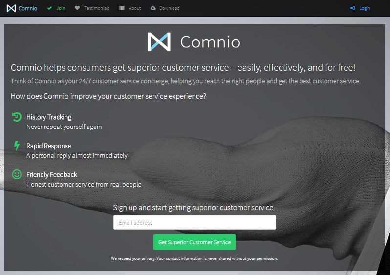
When I spoke with Ross Clurman the site offered a straight-forward value proposition to the consumer.
Visually, the most important parts of this value proposition are:
- The company. Note the large logo and company name top center.
- The features of the service – History tracking, Rapid Response and Friendly Feedback.
- A chance to offer an Email address. The white field is the most visually distinct item on this page.
- The white glove treatment. See the large background image.
The Second Evolution
This value proposition didn’t work well, and this lead Ross to reach out to me for a free consultation.
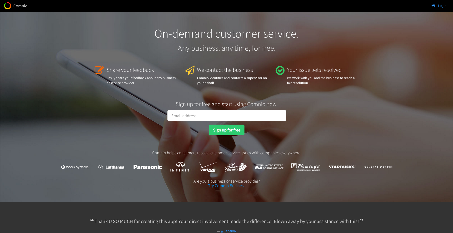
My recommendations for Ross would certainly have been to focus on the company less and on what will happen more and to use a hero image that is more relevant. By September 2015, the home page was taking a different approach, focusing on the service value and defining the steps that make it work.
In this case the “proof” comes in the form of the logos of companies that Comnio has worked with. This can be a very effective way to increase conversions.
In September, the new landing page enjoyed a 3.6% conversion rate with 822 visits over 30 days.
Evolution Number Three
Updated Home Page Design
Again, included full-size version so you can scale down as needed…
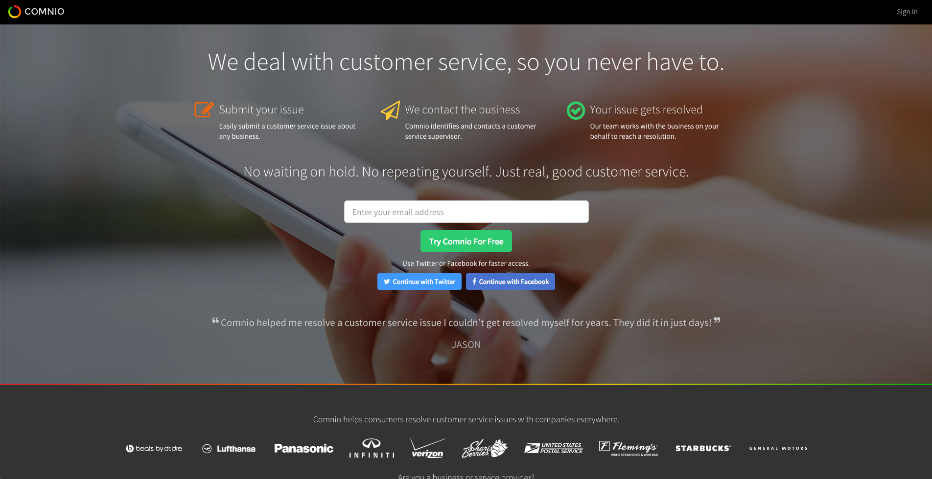
In October of 2015, Ross’s team launched a new version of the page with a different approach to the value proposition. With just over 1000 visits, this page delivered a mind-blowing 18.3% conversion rate. That’s a 508% increase over September’s version.
What They Changed
The Comnio team changed several things to make their value proposition more effective. In their own words, here’s what they changed.
- Changed main tagline to explain what we do (as a benefit, not a feature)
- Added secondary tagline to explain the pains/problems Comnio solves for users
- Changed email [field] placeholder text from “Email address” to “Enter your email address” (a directive to visitors – people respond to being told what to do)
- Changed CTA button from “Sign up for free” to “Try Comnio For Free” (resonates, and sounds like less of a commitment if people don’t feel like they’re “signing up” for something)
- Added social sign-up options
- Swapped out the position of company logos with the position of testimonials from users
- Added a gradient line below hero area to separate it from the rest of the page
Which Elements Made the Difference?
Since all changes were made at once, it’s hard to know which contributed most. One of the changes may have even reduced the ultimate conversion rate. I think that, in this case, all elements work together to make one compelling value proposition. The sum is greater than the parts.
By translating the page into prose, we can see clues as to why.
Speak Your Value Proposition
If we were to write the value proposition of each page as a paragraph, you can see why the latter made more sense to visitors.
September Page
“Comnio offers on-demand customer service for any business at any time for free and it works on your smartphone. Just share your feedback. We contact the business and your issue gets resolved. Signup for free and start using Comnio now. We want your email address to sign up for free. Companies that you recognize use us, like beats by dr. dre, Lufthansa, Panasonic and more. You can trust us because @Kane007 tweeted that they are very grateful to us for helping.”
The italicized text is taken from the background image.
I think that this value proposition sounds like it focuses on the businesses, not end-users.
October Page
“Comnio deals with customer service so you don’t have to and it works on your smartphone. Submit your issue. We contact the business and your issue gets resolved. No waiting on hold. No repeating yourself. Just real, good customer service. Enter your email address to try Comnio for free. Or connect with us on Twitter or Facebook. You can trust us because we took just days to fix a problem for JASON that he’d had for years. We work with companies you recognize like beats by dr. dre, Lufthansa, Panasonic and more.”
The addition of “No waiting. No repeating yourself” really drives the point home that this page is for the consumer, and does it in a way that helps the visitor imagine what they are in store for if they do this themselves.
Overall, the new value proposition is more powerful and logical – about five times more powerful.
Our tests are showing that the contents of testimonials are very important. I believe that the message told by JASON is superior the the tweet by @Kane007, especially since JASON sounds like a person.
Finally, the company logos have been moved from the meat of the value proposition to a supporting role. This removed confusion about who this page is for, companies or consumers.
Social Signup Success
The impact of the social sign-up options in the October page is two fold. First it’s easier to do on a mobile device. Second it puts well-known brands on the page. This is a way of “borrowing” trust from Twitter and Facebook. There may be few social sign-ups, yet more form completions with this approach due to the increased trust on the page. In this case, Ross reports that about 49% of leads used the social sign-up buttons.
The magic question here is, did people who were going to sign-up use the social buttons for convenience, or did the social buttons drive visitors to sign-up who wouldn’t have otherwise done so.
Missing Ingredients
There are some specific elements we like to see in every landing page. The thing missing from this value proposition is proof. At some point they are going to be able to say something like, “15,324 issues resolved successfully.” The number doesn’t have to be that large, in my opinion.
For a potentially disruptive service like this, media mentions would be another nice addition to the page. This delivers more trust building and more proof.
To learn more about what makes landing pages convert at higher and higher rates, watch our free webinar The Science of the Landing Page.
Write Out Your Value Proposition
Whether you’re selling an application, a report or a free consultation, your value proposition should unfold in the visitors’ minds through the words, images and emphasis you place on the page. If your page is compelling written as a paragraph, you can enjoy high conversion rates like Comnio.
If not, test your way through to a value proposition that works.
Feature image by stan via Compfight cc and adapted for this post.



Excellent info Brian!
Thanks, JR.