7 Ways to Get More Software Trials from Your Landing Page [Critique]
What does a landing page have to do to generate more software trials from visitors?
One of the sites I reviewed during my webinar The Science of the Landing Page with Avangate was Mac Mail to Outloook Converter. The primary call to action on this page is to download and try the converter.
Watch the Critique (4:24)
http://conversionsciences.wistia.com/medias/r3fxndpadd?embedType=seo&videoFoam=true&videoWidth=501
You can get a critique of your landing page. Find out how.
The Headline Should Match the Ad
I didn’t have information about what brought the traffic to this page during my critique. If the promise was “Mac Mail to Outlook Converter”, then the headline is perfect. For best results your headline should match the language used in the ad or link that brought the visitor to the page.
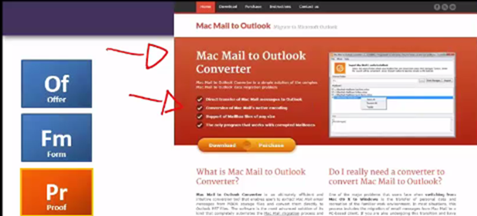
The headline should match the promise made in the ad or link that brought the user to this landing page.
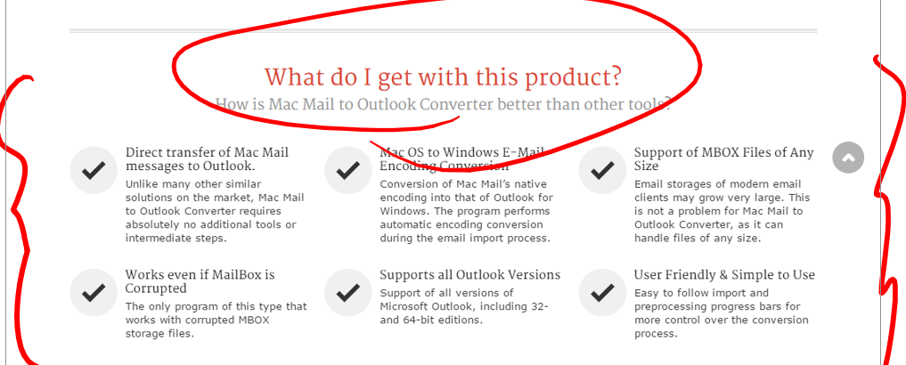
Bullets help people scan the copy before they decide to read. However, one of the bullets here contains a bit of jargon. Terms like “native encoding” can leave non-technical buyers scratching their heads.
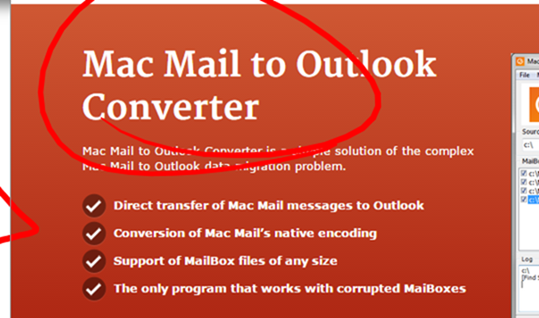
Bullets are easy to scan. Be careful about using jargon.
Handling Objections in Copy
The purpose of copy is to anticipate and handle objections to taking action.The purpose of copy is to anticipate and handle objections to taking action. This page uses quite a bit of space describing the features and benefits of the product.
Don’t forget to answer the question, “What do I get?” This is the key question and applies to products, content offers, free consultations, etc.
How to Use Screenshots Intelligently
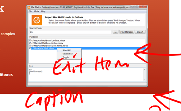
If you put screen shots on your landing pages without explanation, it just looks like… work.
If you use screenshots, explain the point of the image. Why did you choose to show this image to the visitor?
There are three ways to accomplish this.
- Add text to the images
- Add a caption under the images
- Do both
Testimonials Add Proof and Trust
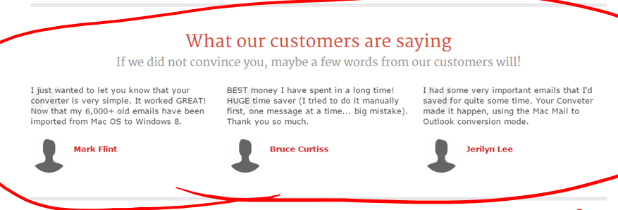
Testimonials are a great way to prove to the reader that your product works.
Testimonials span the gap between proof and trust. Success stories provide proof. I trust this page more because others have had success with the product.
Always Repeat the Offer at the Bottom
Someone who has read to the bottom of the page is probably well-qualified. Repeat the offer there so they can take action.

We call the offer at the bottom of a page the “dripping pan.”
Focus on Software Trials or Purchases. Not both.
The split button approach taken on this page may work against them. When there is more than one offer, it is important to help the visitor choose.
The page features the trial, so Download is the primary call to action. A treatment de-emphasizing the purchase offer may be better:

A mockup of the how this page could “help the visitor choose.”
Choose the Right Button Color
The key when choosing the right button color is to pick a color that is not found elsewhere on the page.
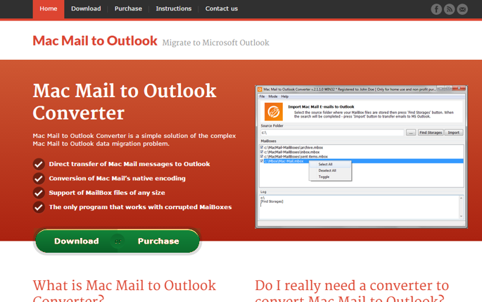
Call to action buttons should stand out on the page. Use color to create contrast with the rest of the page.
Notice how green and blue buttons appear more significant on the page than the orange ones.
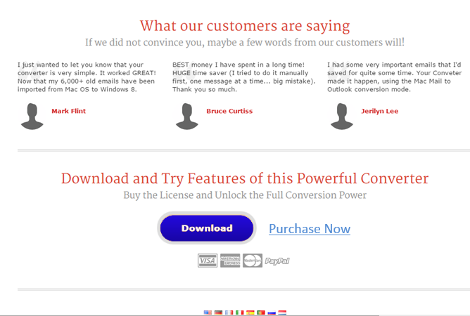
Here is how a blue “dripping pan” would appear on this page.
See all of the Critiques
With a few changes, this landing page could be generating a higher number of software trials for the Mac Mail to Outlook Converter.
If you’d like to see all of my critiques please watch the webinar on demand.

