Correlation, Causation, and Their Impact on AB Testing
Correlation and causation are two very different things. Often correlation is at work while the causation is not. By understanding how to identify them, we can master correlation, causation and the decisions they drive. If you work with or for a Conversion Optimization Agency or are paying for Conversion Rate Services then you’ll want to pay close attention here because getting these two things mixed up can be the primary difference between failure and success.
In 2008, Hurricane Ike stormed his way through the Gulf of Mexico, striking the coasts of Texas and Louisiana. This powerful Category 3 hurricane took 112 lives, making Ike the seventh most deadly hurricane in recent history.
Ike stands alone in one other way: It is the only storm with a masculine name in the list of ten most deadly storms since 1950. For all of his bravado, Ike killed fewer people than Sandy, Agnes, the double-team of Connie and Dianne, Camile, Audrey and Katrina. Here are the top ten most deadly hurricanes according to a video published by the Washington Post.
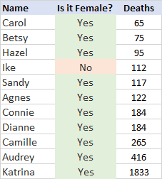
If we pull the data for the top ten hurricanes since 1950 from
#10-Carol: 1954, 65 Deaths
#9-Betsy: 1965, 75 Deaths
#8-Hazel, 1954, 95 Deaths
#7-Ike 2008, 112 Deaths
#6-Sandy 2012, 117 Deaths
#5-Agnes, 1972, 122 Deaths
#4-Connie and Dianne, 1955, 184 Deaths
#3-Camille, 1969, 265 Deaths
#2-Audrey, 1957, 416 Deaths
#1-Katrina, 2005, 1833 Deaths
There is a clear correlation in this data, and in data collected on 47 other hurricanes. Female-named hurricanes kill 45 people on average, while the guys average only 23.
Heav’n has no Rage, like Love to Hatred turn’d,
Nor Hell a Fury, like a Woman scorn’d. — William Congreve
Now, if we assume causation is at work as well, an answer to our problem presents itself quite clearly: We should stop giving hurricanes feminine names because it makes them meaner. Clearly, hurricanes are affected by the names we give them, and we can influence the weather with our naming conventions.
You may find this conclusion laughable, but what if I told you that secondary research proved the causation, that we can reduce deaths by as much as two thirds simply by changing Hurricane Eloise to Hurricane Charley. It appears that hurricanes are sexist, that they don’t like being named after girls, and get angry when we do so.
Our minds don’t really like coincidence, so we try to find patterns where maybe there isn’t one. Or we see a pattern, and we try to explain why it’s happening because once we explain it, it feels like we have a modicum of control. Not having control is scary.
As it turns out, The Washington Post published an article about the relationship between the gender of hurricanes’ names and the number of deaths the hurricane causes. The article’s title is “Female-named hurricanes kill more than male hurricanes because people don’t respect them, study finds.” The opening sentence clears up confusion you might get from the title: “People don’t take hurricanes as seriously if they have a feminine name and the consequences are deadly, finds a new groundbreaking study.”
The Difference Between Correlation and Causation
Another way to phrase the Washington Post’s conclusion is, The number of hurricane-related deaths depends on the gender of the hurricane’s name. This statement demonstrates a cause/effect relationship where one thing – the number of deaths – cannot change unless something else – the hurricane’s name – behaves a certain way (in this case, it becomes more or less feminine).
If we focus on decreasing hurricane-related deaths, we can make changes to the naming convention that will that try to take people’s implicit sexism out of the picture. We could:
- Make all the names either male or female instead of alternating
- Choose names that are gender non-specific
- Change the names to numbers
- Use date of first discovery as identification
- Use random letter combinations
- Use plant or animal names
What is Correlation?
In order to calculate a correlation, we must compare two sets of data. We want to know if these two datasets correlate or change together. the graph below is an example of two datasets that correlate visually.
In this graph of website traffic, our eyes tell us that the Blue and Orange data change at the same time and with the same magnitude from day to day. Incidentally, causation is at play here as well. The Desktop + Tablet Sessions data is part of All Sessions so the latter depends on the former.
How closely do these two lines correlate? We can find out with some help from a tool called a scatter plot. These are easy to generate in Excel. In a scatter plot, one dataset is plotted along the horizontal axis and the other is graphed along the vertical axis. In a typical graph, the vertical value, called y depends on the horizontal value, usually called x. In a scatter plot, the two are not necessarily dependent on each other. If two datasets are identical, then the scatter plot is a straight line. The following image shows the scatter plot of two datasets that correlate well.
In contrast, here is the scatter plot of two datasets that don’t correlate.
The equations you see on these graphs include and R2 that is calculated by Excel for us when we add a Trendline to the graph. The closer this value is to 1, the higher the statistical correlation. You can see that the first graph has an R2 of 0.946 — close to 1 — while the second is 0.058. We will calculate a correlation coefficient and use a scatter plot graph to visually inspect for correlations.
For data that shows a strong correlaton, we can then look for evidence proving or disproving causation.
Errors in Correlation, Causation
Causation can masquerade as a number of other effects:
- Coincidence: Sometimes random occurrences appear to have a causal relationship.
- Deductive Error: There is a causal relationship, but it’s not what you think.
- Codependence: An external influence, a third variable, on the which two correlated things depend.
Errors of codependence result from an external stimuli that affects both datasets equally. Here are some examples.
Math scores are higher when children have larger shoe sizes.
Can we assume larger feet cause increased capacity for math?
Possible third variable: Age; children’s feet get bigger when they get older.
Enclosed dog parks have higher incidents of dogs biting other dogs/people.
Can we assume enclosed dog parks cause aggression in dogs?
Possible third variable: Attentiveness of owners; pet owners might pay less attention to their dogs’ behavior when there is a fence around the dog park.
Satisfaction rates with airlines steadily increase over time.
Can we assume that airlines steadily improve their customer service?
Possible third variable: Customer expectations; customers may have decreasing expectations of customer service over time.
The burden of proof is on us to prove causation and to eliminate these alternative explanations.
How to Prove Causation When All You Have is Correlation
As we have said, when two things correlate, it is easy to conclude that one causes the other. This can lead to errors in judgement. We need to determine if one thing depends on the other. If we can’t prove this with some confidence, it is safest to assume that causation doesn’t exist.
1. Evaluate the Statistics
Most of our myths, stereotypes and superstitions can be traced to small sample sizes. Our brains are wired to find patterns in data, and if given just a little data, our brains will find patterns that don’t exist.
The dataset of hurricanes used in the Washington Post article contains 47 datapoints. That’s a very small sample to be making distinctions about. It’s easier to statistically eliminate causation as an explanation than it is to prove it causation.
For example, people avoid swimming in shark infested waters is likely to cause death by shark. Yet they don’t avoid walking under coconut trees because, “What are the odds” that a coconut will kill you. As it turns out, there are 15 times more fatalities each year from falling coconuts than from shark attacks.
If you’re dealing with less than 150 data points — the coconut line — then you probably don’t need to even worry about whether one thing caused the other. In this case, you may not be able to prove correlation, let alone causation.
2. Find Another Dataset
In the case of hurricanes, we have two datasets: The number of deaths and weather or not the hurricane was named after a boy or a girl.
The correlation is pretty obvious. This is binary: either the storm has a man’s name or a woman’s name. However, this becomes a bit clouded when you consider names like Sandy and Carol, which are names for both men and women. We need need a dataset that measures our second metric with more granularity if we’re going to calculate a correlation.
Fortunately, we have the web. I was able to find another dataset that rated names by masculinity. Using the ratings found on the site behindthename.com, we graphed femininity vs. death toll. Because of the outlier, Katrina, we used a logarithmic scale.
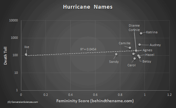
There is little statistical correlation between masculinity and death toll. Causation is in question.
I created a trend line for this data and asked Excel to provide a coefficient of determination, or an R-squared value. As you remember, the closer this number is to 1, the higher the two datasets correlate. At 0.0454, there’s not a lot of correlation here.
Researchers at the University of Illinoise and Arizona State University did the same thing as a part of their study, according to the Washington Post story. They found the opposite result. “The difference in death rates between genders was even more pronounced when comparing strongly masculine names versus strongly feminine ones.” They were clearly using a different measure of “masculinity” to reach their conclusion.
What else could we do to test causation?
3. Create Another Dataset Using AB Testing
Sometimes, we need to create a dataset that verifies causation. The researchers in our Washington Post study did this. They setup experiments “presenting a series of questions to between 100 and 346 people.” They found that the people in their experiments predicted that male-named hurricanes would be more intense, and that they would prepare less for female-named hurricanes.
In short, we are all sexist. And it’s killing us.
Running an experiment is a great way to generate more data about a correlation in order to establish causation. When we run an AB test, we are looking for a causation, but will often settle for correlation. We want to know if one of the changes we make to a website causes an increase in sales or leads.
We can deduce causation by limiting the number of things we change to one per treatment.
AB Testing Example: Correlation or Causation
One of the things we like to test is the importance of findability on a website. We want to discern how important it is to help visitors find things on a site. For a single product site, findability is usually not important. If we add search features to the site, conversions or sales don’t rise.
For a catalog ecommerce site with hundreds or thousands of products, findability may be a huge deal. Or not.
We use a report found in Google Analytics that compares the conversion rate of people who search against all visitors.
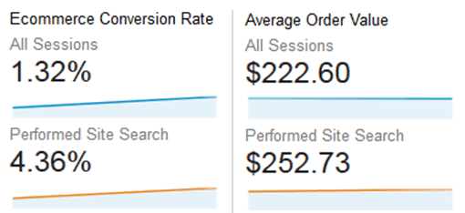
This report shows that “users” who use the site search function on a site buy more often and make bigger purchases when they buy.
This data includes hundreds of data points over several months, so it is statistically sound. Is it OK, then, to assume that if we get more visitors to search, we’ll see an increase in purchases and revenue? Can we say that searching causes visitors to buy more, or is it that buyers use the site search feature more often?
In this case, we needed to collect more information. If search causes an increase in revenue, then if we make site search more prominent, we should see an increase in transactions and sales. We designed two AB tests to find out.
In one case, we simplified the search function of the site and made the site search field larger.
Being the skeptical scientists that we are, we defined another AB test to help establish causation. We had a popover appear when a visitor was idle for more than a few seconds. The popover offered the search function.
At this point, we had good evidence that site search caused more visitors to buy and to purchase more.
Another AB Testing Example
The point of AB testing is to make changes and be able to say with confidence that what you did caused conversion rates to change. The conversion rate may have plummeted or skyrocketed or something in between, but it changed because of something you did.
One of our clients had a sticky header sitewide with three calls-to-action: Schedule a Visit, Request Info, and Apply Now. Each of these three CTAs brought the visitor to the exact same landing page.
We hypothesized that multiple choices were overwhelming visitors, and they were paralyzed by the number of options. We wanted to see if fewer options would lead to more form fills. To test this hypothesis, we only changed one thing for our AB test: we removed “Apply Now”.
After this change we saw a 36.82% increase in form fills. The conversion rate went from 4.9% to 6.71%.
Phrased differently: The number of form fills depends on the number of CTAs.
We get the terms Dependent Variable and Independent Variable from this kind of cause/effect relationship.
The number of CTAs is the independent variable because we – the people running the test – very intentionally changed it.
The number of form fills is the dependent variable it depended on the number of CTAs. Changes to the dependent variable happen indirectly. A researcher can’t reach in and just change it.
Make sense?
This is called a causal relationship because one variable causes another to change.
4. Prove the “Why?”
If you have a set of data that seems to prove causation, you are left with the need to answer the questions, “Why?”
Why do female-named hurricanes kill more people? The hypothesis we put forward at the beginning of this article was that girly names make hurricanes angry and more violent. There is plenty of evidence from the world of physics that easily debunks this theory. We chose it because it was absurd, and we hoped an absurdity would get you to read this far. (SUCCESS!)
The researchers written about by the Washington Post came up with a more reasonable explanation: that the residents in the path of such storms are sexist, and prepare less for feminine-sounding hurricanes. However, even this reasonable explanation needed further testing.
The problem with answering the question, “Why?” in a reasonable way is that our brains will decide that it is the answer just because it could be the answer. Walking at night causes the deaths of more pedestrians than walking in daylight. If I told you it was because more pedestrians drink at night and thus blunder into traffic, you might stop all analysis at that point. However, the real reason may be that cars have more trouble seeing pedestrians at night than in the daytime.
Don’t believe the first story you hear or you’ll believe that hurricanes hold a grudge. Proving the “Why” eliminates errors of deduction.
Does Watching Video Cause More Conversions?
We did a AB test for the site Automatic.com in which we replaced an animation with a video that explains the benefits of their adapter that connects your smartphone to your car. In this test, the treatment with the video generated significantly more revenue than the control.
Our test results demonstrate a correlation between video on the home page and an increase in revenue per visitor. It is a natural step to assume that the video caused more visitors to buy. Based on this, we might decide to test different kinds of video, different lengths, different scripts, etc.
As we now know, correlation is not causation. What additional data could we find to verify causation before we invest in additional video tests?
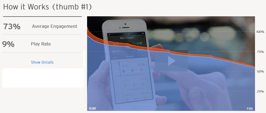
We were able to find an additional dataset. The video player provided by Wistia tracked the number of people who saw the video on the page vs. the number of people who watched the video. What we learned was that only 9% of visitors actually clicked play to start watching the video.
So, the video content was only impacting a small number of visitors. Even if every one of these watchers bought, it wouldn’t account for the increase in revenue. Here, the 9% play rate is the number of unique plays divided by the number of unique page loads.
A more likely scenario is that the animation had a negative impact on conversion vs. the static video title card image. Alternatively, the load time of the animation may have allowed visitors to scroll past before seeing it.
Nonetheless, had we continued with our deduction error, we might have invested heavily in video production to find more revenue when changing the title card for this video is all we needed.
Back to Hurricanes
The article argues: The number of hurricane-related deaths depends on the gender of the hurricane’s name.
Do you see any holes in this conclusion?
These researchers absolutely have data that say in no uncertain terms that hurricanes with female names have killed more people, but have they looked closely enough to claim that the name causes death? Let’s think about what circumstances would introduce a third variable each time a hurricane makes landfall.
- Month of year (is it the beginning or end of hurricane season?)
- Position in lunar phase (was there a full moon?)
- Location of landfall
If we only consider location of landfall, there are several other third variables to consider:
- Amount of training for emergency personnel
- Quality of evacuation procedures
- Average level of education for locals
- Average socio-economic status of locals
- Proximity to safe refuge
- Weather patterns during non-hurricane seasons
I would argue that researchers have a lot more work to do if they really want to prove that femininity of a hurricane’s name causes a bigger death toll. They would need to make sure that only variable they are changing is the name, not any of these third variables.
Unfortunately for environmental scientists and meteorologists, it’s really difficult to isolate variables for natural disasters because it’s not an experiment you can run in a lab. You will never be able to create a hurricane and repeatedly unleash it on a town in order to see how many people run. It’s not feasible (nor ethical).
Fortunately for you, it’s a lot easier when you’re AB testing your website.
- 7 Simple & Effective Ways to Improve Your Email Open Rates - February 23, 2021
- The 3 Most Effective Marketing Strategies For Ecommerce Businesses - December 26, 2020
- Google Ads not Converting? Try These 4 Optimization Tricks - August 6, 2020









thanks for the great article.
I particularly liked the part about removing animation, adding video, and concluding ‘video is good’.
Would love to see and hear more examples on real-world web conversion fallacy and avoid the mistakes :)
Thanks, Stephen. We’ll be offering more examples here on the blog. Stay subscribed!