If you’ve ever heard me speak at a conference, you know I like to wear a white lab coat.

that coat tho…
It’s not a gimmick, and I certainly don’t wear it because of its slimming properties.
No, I wear it because of science.
There is an area of research called Enclothed Cognition. It is the study of the systematic influence that clothes have on the wearer and those around him.
Scientists have studied the lab coat. When someone puts on a lab coat, they score higher on cognitive tests. So, when I put on a lab coat, I will actually make fewer errors than if I was wearing my street clothes.
When I’m wearing a lab coat, I think I’m smarter than I really am.
Scientists have also studied the effect of uniforms and authority. When I wear the lab coat, what I say will carry more weight with you.
Not only do I think I’m smarter than I am, you will think I’m smarter than I really am.
In other words, I am gaining an unfair advantage based on behavioral science. Today, I’m going to show you how your business can gain an unfair advantage in the marketplace using behavioral science.
Why “Creative” Marketing Is A Cover-Up
We tend to have some preconceived notions about what is creative and what is “mathy.”
Beginning in the 1960s, Madison Avenue agencies led companies to believe that the team with the most creative minds would win in the marketplace. Even after these same agencies began installing mainframe computers and monitoring TV viewing habits, they still led companies to believe that it was the creativity – the novelty of the campaigns – that brought success.
No, they didn’t have Google Analytics. Or Omniture. Or brain scans. Or any of the numerous tools that even the smallest business has access to today, but better believe they were using research to make creative decisions.
Yet, when the web became a thing, we continued to embrace this belief that advertising and marketing was a purely creative endeavor.
We do the market studies. We run the focus groups. We send the surveys.
But, ultimately, it is still up to the designers and developers to make the final choices.
Here’s how the typical web design process works.
- A company hires an agency.
- The agency does a market research study with lots of insights about who would buy the company’s products.
- The agency delivers a beautiful report for the executives to ponder.
- The agency then creates three design options, and it asks the company executives — the least qualified people to make design decisions — to pick the best design.
- Finally, they eagerly jot down the executives’ changes and publish the new site.
Everyone is getting their “creative” on.
Meanwhile, someone else is tasked with writing the content, and the content is just pored into spaces in the design.
This is not creative. It’s chaos. And worse, it’s waste.
The problem is that, even when we do research, designers don’t really know which design is going to be the best. There are no longer any boundaries on what we can do digitally. I can create anything, any color, any text, any images. I can add video. I can add live chat.
How can anyone decide with so many choices?
The answer is behavioral data.
It’s not about guessing or being creative. It’s about analyzing how visitors are engaging with a site and then turning that data into testable hypotheses that can be measured against the existing site via a statistically valid testing process.
For a long time, collecting and analyzing data was too costly for small or even mid-sized businesses to consider. But today, it is essentially cheaper to collect and use behavioral data than it is not to.
Let me say that again: It is now cheaper to collect and use behavioral data than it is not to.
While most businesses continue doing launch and see design, the marketplace will reward you from taking a data-first approach.
In many ways, it’s an unfair advantage.
The Two Brains That Drive Behavior
Our brains have two very different personalities, these two personalities are said to live in the two halves of our brains. It’s almost like we have two distinct brains.
The right side of our brain is believed to be the home of the painter in us, the musician, the dancer, the writer, the child. Unrestrained by time or place or social norms, our right brain is capable of creating entire worlds from thin air while chasing butterflies and writing symphonies.
This is all very frustrating to the left side of our brain, which revels in process. It values time and order and systems. It delights in giving thoughts expression as it is where speech is processed and created. It catalogs our past and projects our future. It worries about our businesses and our careers. It balances our checkbooks and then worries about what will happen next month.
Together, the two halves of our brains are crayons and calendars, elephants and emails, moonbeams and money…
For the purposes of business, your right brain is the idea generator. It comes up with way more stuff than we could ever process and execute on. And that’s why the left brain excels at throwing stuff away. When the right brain says “butterflies and symphonies”, the left brain has trouble making sense of it and discards it without further evaluation.
This is why we struggle.
Too often, we let our left brain run our business and this creates an imbalance. Behavioral Science will restore that balance.
You might be thinking that anything called “behavioral science” is something that only the left-brain could love.
This is only somewhat true. Behavioral science is like raw meat to a ravenous left brain. It is a way to tell the future, solving one of our left brain’s biggest problem.
But it’s ALSO a way for the left brain to deal with the right brain.
When the right brain says “butterflies and symphonies”, the left brain will now say, “I don’t know what it means, but I know how to test it.”
This is a fundamental shift in the relationship. Marketing, advertising, or any kind of communication is a dance between the creative right brain and the expressive left brain.
When I started Conversion Sciences in 2007, I didn’t have clients with budgets for high-dollar testing tools. My primary service was to facilitate the understanding of the people coming to my clients’ websites. I spent several weeks with their site and their analytics. I interviewed the employees that knew the clients. I scoured their sites for poor practices and itemized them all.
Then I composed empathetic personas, highlighting the struggles of their prospects, spinning the story of their journey to the site and offering solutions that could be implemented on the website. It awakened their right brains and we had meaningful, connected meetings about these people they called customers!
And then…
… nothing changed.
They dried their eyes, shoved my personas into a drawer and dealt with the fire of the day. I had awakened their right brain, but ultimately the left brain won them over. It didn’t know how to use this information to predict the future.
And then AB testing tools became cheap. I still reviewed our clients’ sites, interviewed their employees and composed my brilliant personas.
But then we tested our ideas.
As it turns out, most of the ideas that came from this in-depth work were wrong. The tests revealed that many, if not most of my ideas did not result in an increase in conversions and revenue. It was a very humbling experience.
But more importantly, it allowed us to start getting predictable results for our clients. Nowadays, we never know which change will improve a client’s conversion rate, but we have framework in place that helps us identify the right tests to run and virtually guarantees we get results in the end.
We can consider bigger and more creative ideas. We have the ability to test almost anything our right brains can come up with. Testing has turned out to be the best way to determine which of our amazing ideas work and which don’t.
At Conversion Sciences, we call this rigorous creativity, and it’s the reason our clients see a 20% average conversion lift.
It’s also the reason anyone, including you, can harness your creativity for the purpose of data-driven optimization. But before you can score, you need to first understand the rules.
The 6 Rules of Behavioral Data
We all make decisions every day based on what other people are doing. You are wired to navigate the world using behavioral data.
When you check Facebook to see how many people like and comment on your most recent post, you’re using your built-in behavioral know-how. When you select a movie based on the Rotten Tomatoes Freshness Score, you are getting your behavioral science on. The New York Times Best Seller list, the Billboard Charts, and the laugh track on The Big Bang Theory are all sources of behavioral data that we use to make decisions every day.
If you don’t believe me, let’s use an example. When my son was 14, he built his own gaming computer. He had meticulously researched every component, from the high-frequency monitor to the mouse pad. His last decision was the motherboard, the foundation of the computer that every element plugs into.
He had narrowed it down to two alternatives. They had the same features and were priced within pennies of each other. Reviewers of the motherboards had given one a four-star rating, and the other a five-star rating.
If we didn’t understand the first rule of behavioral data, we would have simply chosen the five-star motherboard. Five stars is better than four, right? But even at the tender age of 14, Sean was smart enough to see how many reviews had fed those ratings.
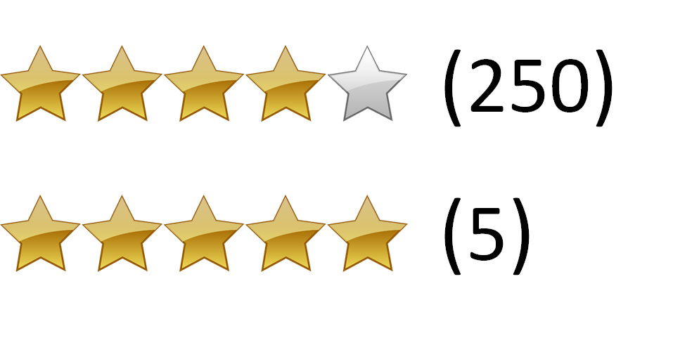
hmmm which one is legit?
The five-star motherboard had five reviews, while the lower-rated four-star motherboard had 250 reviews. You have no doubt about which rating is most reliable. Your little brain, like my son’s, is doing the math. We know that the five-star rating is just as likely to be a three- or two-star rating.
The data isn’t in.
You are intuitively calculating what statisticians call n: The Sample Size of the data collected (the reviews). And you know the first rule of behavioral data.
- Larger Sample Sizes Are Better Than Smaller Sample Sizes
- Data Over Time Is Better Than Data At One Point In Time
- More-Recent Data Is Better Than Less-Recent Data
- Observational Data Is Better Than Self-Reported Data
- Customers & Prospects Are More Believable Than Pretenders
- Quantitative Data predicts the Future Better than Qualitative Data
Well designed A/B tests are created to follow all of the rules of behavioral data. They are designed to deliver observational, recent data, taken over time from a statistically significant sample of prospects that can be quantitatively analyzed.
As a marketer, you can tap into this innate scientific know-how, using it to predict the performance of your campaigns and make them better.
For a deeper look at these rules with accompanying examples and case studies, read: The 6 Rules of Behavioral Data Built Into All of Us.
Research vs. Intuition
In 2014, Marks & Spencer redesigned their apparel website. Marks & Spencer is a £10 billion company running food and apparel stores in the UK and Europe. In 2013 13% of their sales went through the web. That’s about $1.5 billion. With a B.
In 2014, they launched a website redesign. The effort cost £150 million. Today that would be about $180 million.

Even the largest brands can stumble.
The UX community–and their designers–thought the redesign was “positive.”
More research would be needed for us to give a thorough UX opinion but our first thoughts are that it’s a positive redesign.
— ExperienceSolutions
The customers didn’t agree. Upon launch, the site saw an immediate 8% drop in sales. That’s about $10 million per month in lost sales. This number doesn’t take into account the loss of brand trust.
The best way to build brand online is to deliver what your visitors want.
For $180 million, we expect that they did a great deal of research into their customers and visitors. So what went wrong.
This is the battle being waged in your businesses. Intuition vs. research. Best practices vs. behavioral science. Left brain vs. right brain. Both are necessary. But if you continue to find yourself struggling to get value from the visitors that you pay to bring to your site, there is an imbalance.
Intuition is our ability to apply our experience to new situations. We admire those who can discern the important aspects of something without study.
When behavioral data was expensive to acquire, campaign planning and development was dominated by intuition. If we invested in research, it was done at the beginning. This was primarily qualitative data based on surveys and focus groups.
Then the designers and developers would apply the data to the best of their ability, but relied on their intuition to make the thousands of little decisions necessary to complete a project.

When collecting data is expensive, we rely more on the intuition of experts during development.
It is at the end of this process that true behavioral data is collected. It’s called results. If the results were positive, then the campaign can be replicated and continued. If the results were disappointing, then the campaign would be scratched, and the process would start over.
This is the classic launch and see approach.
What does a campaign development process look like in an era of cheap behavioral data. For most businesses, it looks the same. But for industry leaders, it looks like this:

When data is abundant and inexpensive, we can optimize before launch.
Qualitative data is collected at the beginning. But now we can go back and test components of the campaign again and again. And we collect inexpensive quantitative behavioral data.
Intuition has its place and always will. But now we have balance. At several points along the development path, we can answer specific questions about our campaign.
Obviously, it’s important to get this offer right, it makes sense to do a study. I’m going to use this word “study” a lot because it means, “Stop and look for some data.” A study can mean evaluating existing data or collecting new data. It may take months, but can also be done in a few hours.
Offer Selection & Continuity
I’m going to use the term “studies” frequently. A study describes our process of collecting and evaluating behavioral data. Studies are often short processes, but don’t have to be.
We do a study when we ask the question, “Do I have some data to support a decision, or could I collect some data to help me make a decision.”
We do a study when we ask the question, “Do I have some data to support a decision, or could I collect some data to help me make a decision.”
If we decided to do a little study of offer language, where could we look for some behavioral data? Well, any place we make offers.
If you’ve been running ads on Google or Bing, you have a sample of offers. You can compare the click rates and their conversion rates of these ads to learn which offers appealed most to prospects.
For one of our clients, we looked at their Adwords ads and saw that the best performing offered either 20% off or $100 off.
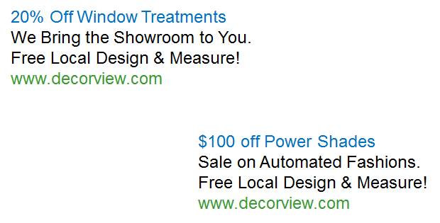
Adwords Ad
These are what we call “Transactional” prospects. Their greatest fear is paying a dollar too much for something. The landing page used for these ads didn’t lead with the discounts, however.
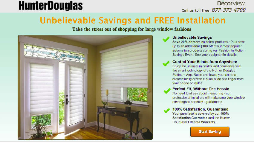
Before
We focused on the $100 off offer and this became part of the primary offer. This page increased leads by 40% after we made this simple change.
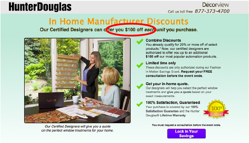
After
Other sources of behavioral data? How about a study of emails with high click-through rates? What offers get the most clicks in your email? This data is kept in any email service for easy evaluation. Pull them into a spreadsheet and see what offers appealed to prospects.
Your ad and email teams should be thrilled to hear from you. At some point, they may come to you to learn what landing page copy is delivering the best conversion rates. They can do a behavioral study of your landing pages.
Why is this data valuable?
- First it is behavioral, not self-reported.
- Second, it is a sample taken from prospects and customers.
- Third, it’s a big sample. It will typically include a sample sizes of thousands of impressions or recipients, and hundreds of clicks.
- Fourth, the data spans months or years. If seasonality is an issue, you will want to zero in on a timeframe of data that matches the timeframe that your landing page will launch.
You’re not guessing. And you’re getting value from the ad spend and email outreach you’ve already invested in.
If these sources don’t exist for you — if this is a new offer or product, then your study may include launching several ads to see what works. The copywriter may recommend some images to support the copy. If you leave the images to the designer, they will scurry over to iStockPhoto and populate your page with ineffective stock photography.
Image and Headline Selection

Wow, great effort on the photos…
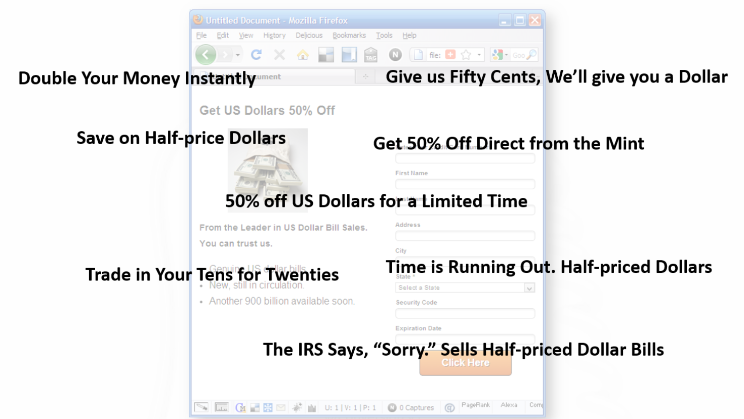
We call this business porn. You can tell business porn is on your site using the caption test. If you can’t write a caption for a picture that makes sense, then it’s probably business porn.
The caption for shaking hands might be, “We want to shake your hand, so we can start sending you invoices.” Headset hotties are all the rage. The caption might read, “I don’t work here, but you should call anyway.” And the caption for a random graph might read, “We don’t know what this measures, but it’s going up and to the right.”
Your visitors know the difference between a studio picture and a picture of your customers or employees. This is a waste of valuable space on our landing pages.
Marketing 101 says, “Show the product.” This is because no one is going to take action on your landing page until they’ve imagined what it will be like to take action. Spend as much time on the images as you do on the copy. Images are a powerful way to advance the value proposition.
You may have several images to choose from. We’ll do a study to help you pick images that work for your copy.
Unfortunately, we rarely know if we’ve chosen the right copy and image.
So many choices, so little time
More likely, we’re struggling with a number of options.
All of these satisfy the offer, but can be expected to perform very differently.
Let’s do a study!
Finding the Right Headline and Hero Image
Why not give ourselves some creative latitude. We could probably come up with some different headlines and images. Why not collect some data on this to narrow down our choices?
We can pretty easily narrow down our choices using a five-second test. This test can be done very inexpensively at UsabiltyHub.com or Verifyapp.com.
The five-second test flashes your page in front of test subjects for five seconds. The subject is then asked questions about what they saw. It’s a good measure of the immediate impact of the copy and images, revealing how well they communicate the offer.
This is a great way to gauge the effectiveness of headlines and images.
Finding the right hero image and headline
Here’s what we learned about a homepage we tested with the five-second test. This is a typical scenario for this company’s products. We then asked them if this company would solve their problem.
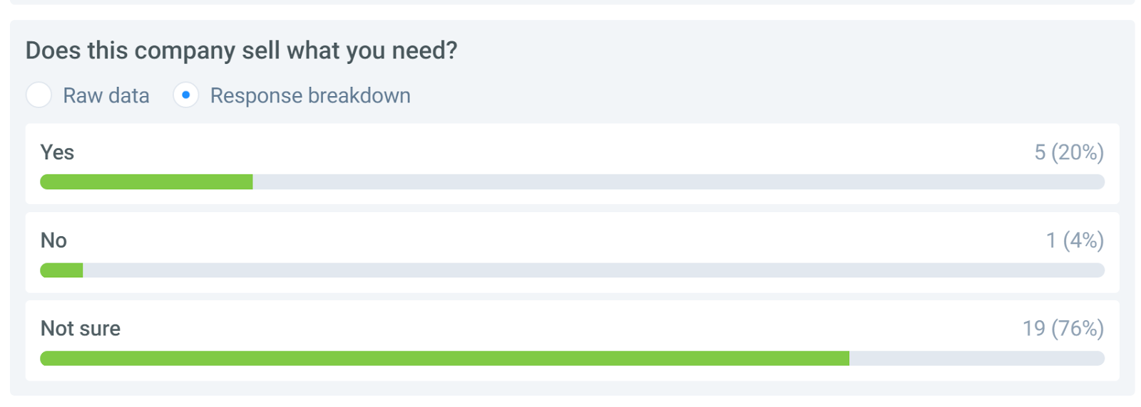
User survey
It is clear that visitors aren’t getting a clear understanding from the home page. This test took two days and cost about $2.50 for each of the 25 respondents.
We can put several versions of our landing page through the test, different headlines, images and copy. Our landing page doesn’t even need to be functional for this kind of test.
Let’s evaluate this data. Sample size? Small. Little n=25. Strangers or customers? This is a sample of people who aren’t necessarily customers, so their input must be taken with a grain of salt. Qualitative or quantitative? This is clearly qualitative, and we were able to ask several more questions to understand their impressions of the page.
For our landing page, we can use this test to narrow down the best two headlines and best two images. Then we can do a more quantitative, behavioral study with a larger sample size to get our best offer and image. Before we dive into that, there are a couple of other elements we’ll want to include in our landing page before we test.
Understanding our Visitors’ Preferences
What could we add to a page that would enhance our visitors’ perception of our credibility? The folks at Stack asked this question using a Question Test from UsabilityHub.com. They wanted to know what kind of social proof would enhance the perception of credibility for their home page: a testimonial or customer logos.
They created three versions of their home page, one without social proof, one with a testimonial and one listing the logos of their well-known clients. Then they asked the question:
Does this company seem credible to you?
The results favored the logos somewhat.

Expedited vs Testimonial vs Social Proof
This information is directional in nature, but it narrowed the choices that could be used in a more rigorous AB test.
This is a great example of using panels to inform decisions. It can be applied to a variety of components of a page.
- Copy length
- Page Layout
- Navigation
- Image choice, size and placement
- Trust symbols
- Proof points
- Headlines
This allows designers to be more creative, since their choices can be easily reduced with a question test.
Helping Visitors Solve Problems
Are visitors finding the information they are looking for on our pages? This was a question that insurance provider RACV wanted to know. It was important that their customers be able to find their roadside assistance number in an emergency.
To gather some data, they did a Click Test from UsabilityHub.com. The click test measures how long it takes a participant to click on the page. In this case, they asked participants to click on the roadside assistance number of their current page. The results showed it took 20 seconds on average for these participants to find and click on the right place.

#buried
The click location is shown by the heatmap in the lower right corner of the page.
Clearly, they needed a redsign. Their new design put the roadside assistance number in a band closer to the top of the screen. They ran another click test and reduced the time it took to find the link to 5 seconds on average.

#lessburied
This was a significant win for RACV.
You will use a test like this to determine how your page is functioning holistically.
- What calls to action are most clickable?
- Are visitors able to find the next step in the process?
- Do you have too many calls to action on a page?
- How is your home page helping visitors choose a path?
Answer these questions and you will deliver a better experience.
Studying Page Layout
Notice that we haven’t yet gotten a designer involved yet. There’s a reason for that. Designers tend to add things to a page that satisfy their ego, or that they believe will satisfy you. They want carousels, animated video backgrounds, sliding logos and such. These are all bad ideas, unless you have some data that suggests otherwise.
A professional design is important to credibility, but the primary job of the layout design is to get our visitors eyes to the important information on the page. In this way, we want our designer to be more of a draftsman, using their knowledge of font, color, white space, positioning, negative space, grids, and visual cues to direct our visitors experience. We don’t need designers to be persuasive or manipulative.
Before we call the designers, let’s find out what is wrong with the layout. The more specific instructions we can give our designer, the more likely we are to keep them from going crazy.
Thanks to the amazing increase in webcam resolution and the steep drop in price, we can track where a persons eyes fall on a monitor with surprising accuracy. This means we can do inexpensive eye-tracking studies.
We did an eye-tracking study in 2012. Back then, we needed a special infrared camera and expensive software. We recruited 23 people from around Austin and brought them into a room one at a time. We calibrated the camera to track their eyes and asked them to watch one of three videos while we tracked, and to then fill out a survey.
This took weeks to setup and days to execute. The camera and special software were not cheap, at $7500. All in the study cost $15,000 to $20,000 in time and materials.

The World’s Least Inexpensive User Test
In 2016 the I was asked to give my opinion on a landing page for inbound.org. They didn’t have any data on the page, so I asked my friends at Tobii (formerly Sticky.ai) to do an eye-tracking study of the mockup. Their technology used everyday webcams to track the viewer’s eyes. These studies cost around $500.
Here’s an example of what they delivered in about a week.
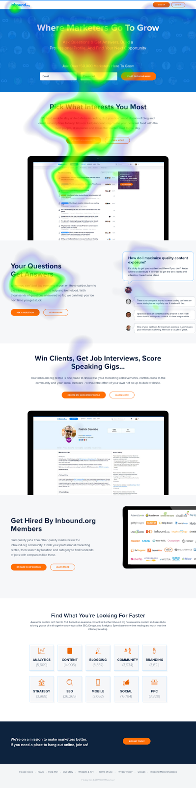
#heatmapsaregreat
This view is called a heatmap view. Like rain in a weather report, this tells us where the eyes of 50 test subjects fell most. Red means that many saw that part of page and lingered. Yellow, less so. Green even less. Clear means that these parts of the page got very little or no attention.
This is helpful information when considering layout. From the data, we speculated that the second section was more interesting to the visitors than the hero offer. Few people were being enticed to scroll down the page. And the big screenshot in the middle was acting as a stop.
Watching these interactions in motion can deliver insights as well. Such videos are automatically generated. I wish we had these back in the day.
“You’re waiting for a train…”
We may choose to iterate our campaign elements now using usability tests and eye-tracking studies, but at some point we are going to declare a version of this page the control and launch it.
Our behavioral science doesn’t stop there.
After Launch
We are going to use a few tools to give us some very helpful data about how this page is performing with real prospects.
- Analytics database
- Click tracking software
- Session recording software
And if we really want to take this decision to the supreme court, some AB testing software.
Analytics is a large database of behavioral information. It sits behind our website collecting the behaviors and details of our visitors — anonymously. It is the best source of quick studies. This is a topic for another post.
Heatmaps
To increase the size of our samples, we can turn to click-tracking software. Instead of tracking where visitors’ eyes go on the page, this tracks their mouse movements and where they click. We get similar information with a much larger samples size.
Is our copy too long? Is key information being missed? This can be answered easily with a scroll tracking report.

Scroll tracking
What elements on a page are getting visitors’ attention? Which are being ignored? With click tracking, we can see the interactions of thousands of visitors in a single heat map. Here’s an example of a pricing page.
Click tracking
These are tools that cost a few hundred dollars a month to have running on your site.
Here’s a heatmap we saw on a college website. Why is this one part of the form red hot?

Heatmap
This field is “Program of Interest.”
Follow the colors
It seems that the site didn’t do a good job of communicating what programs were available. When we added “Program of Interest” to the body of the pages and took the potential students to the right part of the site, information requests went up by 20%. That’s a big deal when you’re selling something that costs hundreds of thousands of dollars.
The Supreme Court of Data
We have a page that we expect to convert well out of the gate. Our big decisions have been supported by research–an offer study, a copy study, a 5-second test and an eye-tracking study– and have been colored by our intuitive abilities as communicators.
With sufficient traffic, there is another kind of study that we consider the Supreme Court of studies. It’s called an AB test or a split test.
Like our other tools, AB testing tools cost $500 a month or less, and our old data friend, Google, has released a free AB testing tool called Google Optimize.
AB testing tools give us the ability to change just about anything we want on a web page without messing with the backend of our website. In other words, we don’t need the developers’ help. These tools manage everything for you.
They split your traffic equally among two or more variations of your page.
They keep track of which variation generates leads or sales.
They do the statistical calculations for you so you know when your sample size is big enough.
And this data follows all of the rules of behavioral data. It is customers and prospects. The tests are done simultaneously, so the history effect is minimized. The samples sizes are large. The data collected is behavioral, not self-reported.
The only thing we don’t get from AB test results is the deep qualitative insights. That is why we continue to do other studies like site feedback like site surveys.
One of our favorites It involves a single-question popover survey on the thank you page, or the receipt page of the site. A typical survey question is:
“What almost kept you from buying today?” or “What almost kept you from signing up?”
The input is free-form text.
In this example, we asked customers why they chose the Lite version of a product over the Pro version.
Why did you give us less money?
The results of this can be very enlightening when asked like this giving us new ideas about what to test.
Designing AB tests is an intensely creative process.
Conclusion: The Gold is in the Data
This is data gold. But it costs like copper.
When you ask every day what data is available to help me make creative decisions, you can be more creative. You can do more with less because you’re not spinning your wheels.
Investing in behavioral data is now cheaper than not investing in behavioral data. Are you excited about behavioral data now?
Many of the results I’ve shown you are from our clients. A Conversion Scientist named Ruth Mayer created them. A year ago, she was working in a flower shop. Today she is is finding revenue at some busy websites.
Do you really thing behavioral data isn’t within your reach?
When it is expensive to do research, we can’t afford to invest very often, but digital data gathering has become very inexpensive, and it allows us to capture what is happening on our websites, advertising networks and mobile apps in real time.
How would a store owner know that people who looked at a pair of shoes also tend to look at a pair of capri pants? They’d have to follow their visitors around with a clipboard. That’s not practical in the real world. It’s common online.
“Market research is for researchers. Behavioral science is for doers.” –BAM
I’m not going to stop until everyone comes to love behavioral data. Like throwing raw meat to your left hemisphere to free up your creative right hemisphere.
Imagine how you would approach the world if you knew you were creating what your audience really wanted.
How will I know if you love data? Let’s do a study…


Behavioral Science & Analysis: How To Turn Psychology Into Sales
Conversion OptimizationIf you’ve ever heard me speak at a conference, you know I like to wear a white lab coat.
that coat tho…
It’s not a gimmick, and I certainly don’t wear it because of its slimming properties.
No, I wear it because of science.
There is an area of research called Enclothed Cognition. It is the study of the systematic influence that clothes have on the wearer and those around him.
Scientists have studied the lab coat. When someone puts on a lab coat, they score higher on cognitive tests. So, when I put on a lab coat, I will actually make fewer errors than if I was wearing my street clothes.
When I’m wearing a lab coat, I think I’m smarter than I really am.
Scientists have also studied the effect of uniforms and authority. When I wear the lab coat, what I say will carry more weight with you.
Not only do I think I’m smarter than I am, you will think I’m smarter than I really am.
In other words, I am gaining an unfair advantage based on behavioral science. Today, I’m going to show you how your business can gain an unfair advantage in the marketplace using behavioral science.
Why “Creative” Marketing Is A Cover-Up
We tend to have some preconceived notions about what is creative and what is “mathy.”
Beginning in the 1960s, Madison Avenue agencies led companies to believe that the team with the most creative minds would win in the marketplace. Even after these same agencies began installing mainframe computers and monitoring TV viewing habits, they still led companies to believe that it was the creativity – the novelty of the campaigns – that brought success.
No, they didn’t have Google Analytics. Or Omniture. Or brain scans. Or any of the numerous tools that even the smallest business has access to today, but better believe they were using research to make creative decisions.
Yet, when the web became a thing, we continued to embrace this belief that advertising and marketing was a purely creative endeavor.
We do the market studies. We run the focus groups. We send the surveys.
But, ultimately, it is still up to the designers and developers to make the final choices.
Here’s how the typical web design process works.
Everyone is getting their “creative” on.
Meanwhile, someone else is tasked with writing the content, and the content is just pored into spaces in the design.
This is not creative. It’s chaos. And worse, it’s waste.
The problem is that, even when we do research, designers don’t really know which design is going to be the best. There are no longer any boundaries on what we can do digitally. I can create anything, any color, any text, any images. I can add video. I can add live chat.
How can anyone decide with so many choices?
The answer is behavioral data.
It’s not about guessing or being creative. It’s about analyzing how visitors are engaging with a site and then turning that data into testable hypotheses that can be measured against the existing site via a statistically valid testing process.
For a long time, collecting and analyzing data was too costly for small or even mid-sized businesses to consider. But today, it is essentially cheaper to collect and use behavioral data than it is not to.
Let me say that again: It is now cheaper to collect and use behavioral data than it is not to.
While most businesses continue doing launch and see design, the marketplace will reward you from taking a data-first approach.
In many ways, it’s an unfair advantage.
The Two Brains That Drive Behavior
Our brains have two very different personalities, these two personalities are said to live in the two halves of our brains. It’s almost like we have two distinct brains.
The right side of our brain is believed to be the home of the painter in us, the musician, the dancer, the writer, the child. Unrestrained by time or place or social norms, our right brain is capable of creating entire worlds from thin air while chasing butterflies and writing symphonies.
This is all very frustrating to the left side of our brain, which revels in process. It values time and order and systems. It delights in giving thoughts expression as it is where speech is processed and created. It catalogs our past and projects our future. It worries about our businesses and our careers. It balances our checkbooks and then worries about what will happen next month.
Together, the two halves of our brains are crayons and calendars, elephants and emails, moonbeams and money…
For the purposes of business, your right brain is the idea generator. It comes up with way more stuff than we could ever process and execute on. And that’s why the left brain excels at throwing stuff away. When the right brain says “butterflies and symphonies”, the left brain has trouble making sense of it and discards it without further evaluation.
This is why we struggle.
Too often, we let our left brain run our business and this creates an imbalance. Behavioral Science will restore that balance.
You might be thinking that anything called “behavioral science” is something that only the left-brain could love.
This is only somewhat true. Behavioral science is like raw meat to a ravenous left brain. It is a way to tell the future, solving one of our left brain’s biggest problem.
But it’s ALSO a way for the left brain to deal with the right brain.
When the right brain says “butterflies and symphonies”, the left brain will now say, “I don’t know what it means, but I know how to test it.”
This is a fundamental shift in the relationship. Marketing, advertising, or any kind of communication is a dance between the creative right brain and the expressive left brain.
When I started Conversion Sciences in 2007, I didn’t have clients with budgets for high-dollar testing tools. My primary service was to facilitate the understanding of the people coming to my clients’ websites. I spent several weeks with their site and their analytics. I interviewed the employees that knew the clients. I scoured their sites for poor practices and itemized them all.
Then I composed empathetic personas, highlighting the struggles of their prospects, spinning the story of their journey to the site and offering solutions that could be implemented on the website. It awakened their right brains and we had meaningful, connected meetings about these people they called customers!
And then…
… nothing changed.
They dried their eyes, shoved my personas into a drawer and dealt with the fire of the day. I had awakened their right brain, but ultimately the left brain won them over. It didn’t know how to use this information to predict the future.
And then AB testing tools became cheap. I still reviewed our clients’ sites, interviewed their employees and composed my brilliant personas.
But then we tested our ideas.
As it turns out, most of the ideas that came from this in-depth work were wrong. The tests revealed that many, if not most of my ideas did not result in an increase in conversions and revenue. It was a very humbling experience.
But more importantly, it allowed us to start getting predictable results for our clients. Nowadays, we never know which change will improve a client’s conversion rate, but we have framework in place that helps us identify the right tests to run and virtually guarantees we get results in the end.
We can consider bigger and more creative ideas. We have the ability to test almost anything our right brains can come up with. Testing has turned out to be the best way to determine which of our amazing ideas work and which don’t.
At Conversion Sciences, we call this rigorous creativity, and it’s the reason our clients see a 20% average conversion lift.
It’s also the reason anyone, including you, can harness your creativity for the purpose of data-driven optimization. But before you can score, you need to first understand the rules.
The 6 Rules of Behavioral Data
We all make decisions every day based on what other people are doing. You are wired to navigate the world using behavioral data.
When you check Facebook to see how many people like and comment on your most recent post, you’re using your built-in behavioral know-how. When you select a movie based on the Rotten Tomatoes Freshness Score, you are getting your behavioral science on. The New York Times Best Seller list, the Billboard Charts, and the laugh track on The Big Bang Theory are all sources of behavioral data that we use to make decisions every day.
If you don’t believe me, let’s use an example. When my son was 14, he built his own gaming computer. He had meticulously researched every component, from the high-frequency monitor to the mouse pad. His last decision was the motherboard, the foundation of the computer that every element plugs into.
He had narrowed it down to two alternatives. They had the same features and were priced within pennies of each other. Reviewers of the motherboards had given one a four-star rating, and the other a five-star rating.
If we didn’t understand the first rule of behavioral data, we would have simply chosen the five-star motherboard. Five stars is better than four, right? But even at the tender age of 14, Sean was smart enough to see how many reviews had fed those ratings.
hmmm which one is legit?
The five-star motherboard had five reviews, while the lower-rated four-star motherboard had 250 reviews. You have no doubt about which rating is most reliable. Your little brain, like my son’s, is doing the math. We know that the five-star rating is just as likely to be a three- or two-star rating.
The data isn’t in.
You are intuitively calculating what statisticians call n: The Sample Size of the data collected (the reviews). And you know the first rule of behavioral data.
Well designed A/B tests are created to follow all of the rules of behavioral data. They are designed to deliver observational, recent data, taken over time from a statistically significant sample of prospects that can be quantitatively analyzed.
As a marketer, you can tap into this innate scientific know-how, using it to predict the performance of your campaigns and make them better.
For a deeper look at these rules with accompanying examples and case studies, read: The 6 Rules of Behavioral Data Built Into All of Us.
Research vs. Intuition
In 2014, Marks & Spencer redesigned their apparel website. Marks & Spencer is a £10 billion company running food and apparel stores in the UK and Europe. In 2013 13% of their sales went through the web. That’s about $1.5 billion. With a B.
In 2014, they launched a website redesign. The effort cost £150 million. Today that would be about $180 million.
Even the largest brands can stumble.
The UX community–and their designers–thought the redesign was “positive.”
The customers didn’t agree. Upon launch, the site saw an immediate 8% drop in sales. That’s about $10 million per month in lost sales. This number doesn’t take into account the loss of brand trust.
The best way to build brand online is to deliver what your visitors want.
For $180 million, we expect that they did a great deal of research into their customers and visitors. So what went wrong.
This is the battle being waged in your businesses. Intuition vs. research. Best practices vs. behavioral science. Left brain vs. right brain. Both are necessary. But if you continue to find yourself struggling to get value from the visitors that you pay to bring to your site, there is an imbalance.
Intuition is our ability to apply our experience to new situations. We admire those who can discern the important aspects of something without study.
When behavioral data was expensive to acquire, campaign planning and development was dominated by intuition. If we invested in research, it was done at the beginning. This was primarily qualitative data based on surveys and focus groups.
Then the designers and developers would apply the data to the best of their ability, but relied on their intuition to make the thousands of little decisions necessary to complete a project.
When collecting data is expensive, we rely more on the intuition of experts during development.
It is at the end of this process that true behavioral data is collected. It’s called results. If the results were positive, then the campaign can be replicated and continued. If the results were disappointing, then the campaign would be scratched, and the process would start over.
This is the classic launch and see approach.
What does a campaign development process look like in an era of cheap behavioral data. For most businesses, it looks the same. But for industry leaders, it looks like this:
When data is abundant and inexpensive, we can optimize before launch.
Qualitative data is collected at the beginning. But now we can go back and test components of the campaign again and again. And we collect inexpensive quantitative behavioral data.
Intuition has its place and always will. But now we have balance. At several points along the development path, we can answer specific questions about our campaign.
Obviously, it’s important to get this offer right, it makes sense to do a study. I’m going to use this word “study” a lot because it means, “Stop and look for some data.” A study can mean evaluating existing data or collecting new data. It may take months, but can also be done in a few hours.
Offer Selection & Continuity
I’m going to use the term “studies” frequently. A study describes our process of collecting and evaluating behavioral data. Studies are often short processes, but don’t have to be.
We do a study when we ask the question, “Do I have some data to support a decision, or could I collect some data to help me make a decision.”If we decided to do a little study of offer language, where could we look for some behavioral data? Well, any place we make offers.
If you’ve been running ads on Google or Bing, you have a sample of offers. You can compare the click rates and their conversion rates of these ads to learn which offers appealed most to prospects.
For one of our clients, we looked at their Adwords ads and saw that the best performing offered either 20% off or $100 off.
Adwords Ad
These are what we call “Transactional” prospects. Their greatest fear is paying a dollar too much for something. The landing page used for these ads didn’t lead with the discounts, however.
Before
We focused on the $100 off offer and this became part of the primary offer. This page increased leads by 40% after we made this simple change.
After
Other sources of behavioral data? How about a study of emails with high click-through rates? What offers get the most clicks in your email? This data is kept in any email service for easy evaluation. Pull them into a spreadsheet and see what offers appealed to prospects.
Your ad and email teams should be thrilled to hear from you. At some point, they may come to you to learn what landing page copy is delivering the best conversion rates. They can do a behavioral study of your landing pages.
Why is this data valuable?
You’re not guessing. And you’re getting value from the ad spend and email outreach you’ve already invested in.
If these sources don’t exist for you — if this is a new offer or product, then your study may include launching several ads to see what works. The copywriter may recommend some images to support the copy. If you leave the images to the designer, they will scurry over to iStockPhoto and populate your page with ineffective stock photography.
Image and Headline Selection
Wow, great effort on the photos…
We call this business porn. You can tell business porn is on your site using the caption test. If you can’t write a caption for a picture that makes sense, then it’s probably business porn.
The caption for shaking hands might be, “We want to shake your hand, so we can start sending you invoices.” Headset hotties are all the rage. The caption might read, “I don’t work here, but you should call anyway.” And the caption for a random graph might read, “We don’t know what this measures, but it’s going up and to the right.”
Your visitors know the difference between a studio picture and a picture of your customers or employees. This is a waste of valuable space on our landing pages.
Marketing 101 says, “Show the product.” This is because no one is going to take action on your landing page until they’ve imagined what it will be like to take action. Spend as much time on the images as you do on the copy. Images are a powerful way to advance the value proposition.
You may have several images to choose from. We’ll do a study to help you pick images that work for your copy.
Unfortunately, we rarely know if we’ve chosen the right copy and image.
So many choices, so little time
More likely, we’re struggling with a number of options.
All of these satisfy the offer, but can be expected to perform very differently.
Let’s do a study!
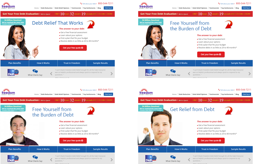
Finding the Right Headline and Hero Image
Why not give ourselves some creative latitude. We could probably come up with some different headlines and images. Why not collect some data on this to narrow down our choices?
We can pretty easily narrow down our choices using a five-second test. This test can be done very inexpensively at UsabiltyHub.com or Verifyapp.com.
The five-second test flashes your page in front of test subjects for five seconds. The subject is then asked questions about what they saw. It’s a good measure of the immediate impact of the copy and images, revealing how well they communicate the offer.
This is a great way to gauge the effectiveness of headlines and images.
Finding the right hero image and headline
Here’s what we learned about a homepage we tested with the five-second test. This is a typical scenario for this company’s products. We then asked them if this company would solve their problem.
User survey
It is clear that visitors aren’t getting a clear understanding from the home page. This test took two days and cost about $2.50 for each of the 25 respondents.
We can put several versions of our landing page through the test, different headlines, images and copy. Our landing page doesn’t even need to be functional for this kind of test.
Let’s evaluate this data. Sample size? Small. Little n=25. Strangers or customers? This is a sample of people who aren’t necessarily customers, so their input must be taken with a grain of salt. Qualitative or quantitative? This is clearly qualitative, and we were able to ask several more questions to understand their impressions of the page.
For our landing page, we can use this test to narrow down the best two headlines and best two images. Then we can do a more quantitative, behavioral study with a larger sample size to get our best offer and image. Before we dive into that, there are a couple of other elements we’ll want to include in our landing page before we test.
Understanding our Visitors’ Preferences
What could we add to a page that would enhance our visitors’ perception of our credibility? The folks at Stack asked this question using a Question Test from UsabilityHub.com. They wanted to know what kind of social proof would enhance the perception of credibility for their home page: a testimonial or customer logos.
They created three versions of their home page, one without social proof, one with a testimonial and one listing the logos of their well-known clients. Then they asked the question:
The results favored the logos somewhat.
Expedited vs Testimonial vs Social Proof
This information is directional in nature, but it narrowed the choices that could be used in a more rigorous AB test.
This is a great example of using panels to inform decisions. It can be applied to a variety of components of a page.
This allows designers to be more creative, since their choices can be easily reduced with a question test.
Helping Visitors Solve Problems
Are visitors finding the information they are looking for on our pages? This was a question that insurance provider RACV wanted to know. It was important that their customers be able to find their roadside assistance number in an emergency.
To gather some data, they did a Click Test from UsabilityHub.com. The click test measures how long it takes a participant to click on the page. In this case, they asked participants to click on the roadside assistance number of their current page. The results showed it took 20 seconds on average for these participants to find and click on the right place.
#buried
The click location is shown by the heatmap in the lower right corner of the page.
Clearly, they needed a redsign. Their new design put the roadside assistance number in a band closer to the top of the screen. They ran another click test and reduced the time it took to find the link to 5 seconds on average.
#lessburied
This was a significant win for RACV.
You will use a test like this to determine how your page is functioning holistically.
Answer these questions and you will deliver a better experience.
Studying Page Layout
Notice that we haven’t yet gotten a designer involved yet. There’s a reason for that. Designers tend to add things to a page that satisfy their ego, or that they believe will satisfy you. They want carousels, animated video backgrounds, sliding logos and such. These are all bad ideas, unless you have some data that suggests otherwise.
A professional design is important to credibility, but the primary job of the layout design is to get our visitors eyes to the important information on the page. In this way, we want our designer to be more of a draftsman, using their knowledge of font, color, white space, positioning, negative space, grids, and visual cues to direct our visitors experience. We don’t need designers to be persuasive or manipulative.
Before we call the designers, let’s find out what is wrong with the layout. The more specific instructions we can give our designer, the more likely we are to keep them from going crazy.
Thanks to the amazing increase in webcam resolution and the steep drop in price, we can track where a persons eyes fall on a monitor with surprising accuracy. This means we can do inexpensive eye-tracking studies.
We did an eye-tracking study in 2012. Back then, we needed a special infrared camera and expensive software. We recruited 23 people from around Austin and brought them into a room one at a time. We calibrated the camera to track their eyes and asked them to watch one of three videos while we tracked, and to then fill out a survey.
This took weeks to setup and days to execute. The camera and special software were not cheap, at $7500. All in the study cost $15,000 to $20,000 in time and materials.
The World’s Least Inexpensive User Test
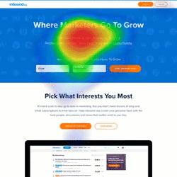
In 2016 the I was asked to give my opinion on a landing page for inbound.org. They didn’t have any data on the page, so I asked my friends at Tobii (formerly Sticky.ai) to do an eye-tracking study of the mockup. Their technology used everyday webcams to track the viewer’s eyes. These studies cost around $500.
Here’s an example of what they delivered in about a week.
#heatmapsaregreat
This view is called a heatmap view. Like rain in a weather report, this tells us where the eyes of 50 test subjects fell most. Red means that many saw that part of page and lingered. Yellow, less so. Green even less. Clear means that these parts of the page got very little or no attention.
This is helpful information when considering layout. From the data, we speculated that the second section was more interesting to the visitors than the hero offer. Few people were being enticed to scroll down the page. And the big screenshot in the middle was acting as a stop.
Watching these interactions in motion can deliver insights as well. Such videos are automatically generated. I wish we had these back in the day.
“You’re waiting for a train…”
We may choose to iterate our campaign elements now using usability tests and eye-tracking studies, but at some point we are going to declare a version of this page the control and launch it.
Our behavioral science doesn’t stop there.
After Launch
We are going to use a few tools to give us some very helpful data about how this page is performing with real prospects.
And if we really want to take this decision to the supreme court, some AB testing software.
Analytics is a large database of behavioral information. It sits behind our website collecting the behaviors and details of our visitors — anonymously. It is the best source of quick studies. This is a topic for another post.
Heatmaps
To increase the size of our samples, we can turn to click-tracking software. Instead of tracking where visitors’ eyes go on the page, this tracks their mouse movements and where they click. We get similar information with a much larger samples size.
Is our copy too long? Is key information being missed? This can be answered easily with a scroll tracking report.
Scroll tracking
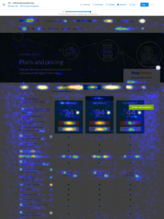
What elements on a page are getting visitors’ attention? Which are being ignored? With click tracking, we can see the interactions of thousands of visitors in a single heat map. Here’s an example of a pricing page.
Click tracking
These are tools that cost a few hundred dollars a month to have running on your site.
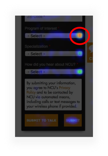
Here’s a heatmap we saw on a college website. Why is this one part of the form red hot?
Heatmap
This field is “Program of Interest.”
Follow the colors
It seems that the site didn’t do a good job of communicating what programs were available. When we added “Program of Interest” to the body of the pages and took the potential students to the right part of the site, information requests went up by 20%. That’s a big deal when you’re selling something that costs hundreds of thousands of dollars.
The Supreme Court of Data
We have a page that we expect to convert well out of the gate. Our big decisions have been supported by research–an offer study, a copy study, a 5-second test and an eye-tracking study– and have been colored by our intuitive abilities as communicators.
With sufficient traffic, there is another kind of study that we consider the Supreme Court of studies. It’s called an AB test or a split test.
Like our other tools, AB testing tools cost $500 a month or less, and our old data friend, Google, has released a free AB testing tool called Google Optimize.
AB testing tools give us the ability to change just about anything we want on a web page without messing with the backend of our website. In other words, we don’t need the developers’ help. These tools manage everything for you.
They split your traffic equally among two or more variations of your page.
They keep track of which variation generates leads or sales.
They do the statistical calculations for you so you know when your sample size is big enough.
And this data follows all of the rules of behavioral data. It is customers and prospects. The tests are done simultaneously, so the history effect is minimized. The samples sizes are large. The data collected is behavioral, not self-reported.
The only thing we don’t get from AB test results is the deep qualitative insights. That is why we continue to do other studies like site feedback like site surveys.
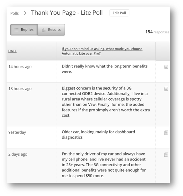
One of our favorites It involves a single-question popover survey on the thank you page, or the receipt page of the site. A typical survey question is:
“What almost kept you from buying today?” or “What almost kept you from signing up?”
The input is free-form text.
In this example, we asked customers why they chose the Lite version of a product over the Pro version.
Why did you give us less money?
The results of this can be very enlightening when asked like this giving us new ideas about what to test.
Designing AB tests is an intensely creative process.
Conclusion: The Gold is in the Data
This is data gold. But it costs like copper.
When you ask every day what data is available to help me make creative decisions, you can be more creative. You can do more with less because you’re not spinning your wheels.
Investing in behavioral data is now cheaper than not investing in behavioral data. Are you excited about behavioral data now?
Many of the results I’ve shown you are from our clients. A Conversion Scientist named Ruth Mayer created them. A year ago, she was working in a flower shop. Today she is is finding revenue at some busy websites.
Do you really thing behavioral data isn’t within your reach?
When it is expensive to do research, we can’t afford to invest very often, but digital data gathering has become very inexpensive, and it allows us to capture what is happening on our websites, advertising networks and mobile apps in real time.
How would a store owner know that people who looked at a pair of shoes also tend to look at a pair of capri pants? They’d have to follow their visitors around with a clipboard. That’s not practical in the real world. It’s common online.
“Market research is for researchers. Behavioral science is for doers.” –BAM
I’m not going to stop until everyone comes to love behavioral data. Like throwing raw meat to your left hemisphere to free up your creative right hemisphere.
Imagine how you would approach the world if you knew you were creating what your audience really wanted.
How will I know if you love data? Let’s do a study…
21 Quick and Easy CRO Copywriting Hacks
Keep these proven copywriting hacks in mind to make your copy convert.
"*" indicates required fields
How To Persuade Landing Page Visitors To Convert
Conversion OptimizationThey came.
They saw.
They left immediately and never returned…
You’ve worked very hard to get visitors to your landing page. You’ve probably spent a lot of money as well. And while you are ready to sell to them now, you might be getting ahead of yourself.
If you want customers to push your buttons, you have to push theirs first.
A lot of ecommerce websites function more or less like this: “Hey, here’s my company… aren’t we neat? Look at these things you can buy.” And that’s why their conversion rate is less than 2%.
If you want to really convert landing page visitors, there are a few things you need to do.
1. Understand Your Visitor’s Journey
Your visitor came from somewhere. That may seem obvious, but it’s important to acknowledge. When they land on your page you don’t want them to have to re-orient them self or re-set their expectations of what happens next.
Your landing page should pay off the promise made on the page that directed your visitor to it, and it should give them a way to take action. Anything else is friction and window dressing. Your goal should be to remove as much of it as you can, while delivering on your promise and providing a good experience for your visitor.
Obviously you are going to want some content in there so your visitor knows they’re in the right place and what they need to do, but beyond that…all that friction is stuff you’re putting in place to serve your needs, not your visitors’, and it will likely hurt you.
But I get that you need to generate leads – that’s not serving the customer, though. So it’s important that you accept up-front that not everything on your landing page is there to help the customer. Knowing how to minimize that self-serving part of the page is how you’ll maximize conversions.
Make sure your landing page has the elements your visitor expects, and that it provides a seamless experiential flow from the referring page. Your landing page URLs have to be unique to each referring source, and the content of the page, while accomplishing your goals, must be designed with the referring page’s content in mind.
That referring page has set up an expectation in your visitor’s mind. Of what they’ll get when they land on your page, what they’ll have to do and what they might have to provide. We call this expectation priming, and it can be overt or subliminal.
2. Prime Your Visitors’ Subconscious
Priming is the use of one kind of stimulus to influence the response to another stimulus. What does that mean? Well, if you read a website about “better sleep” and “tossing and turning” and “frustrating” and “sleeplessness” and “sleep disorder” you can probably guess that the site is about “insignia” even if the site never uses the word.
And how did you know that word should have been “insomnia” and not “insignia”? Because your brain was primed by the sleep-related words to tell you that the word that makes the most sense is different from the word you read, and your brain is constantly trying to make sense of the information it processes, and it will compensate without you thinking about it.
These groups of words that we associate with a specific thing make up its schema, which is just shorthand for the way our brains organize thoughts, behaviors, ideas and the relationships among and between those pieces of information. We’re going to come back to this idea of schemas a few times in this course.
In the meantime, words have the power to make us feel things deep in our subconscious, so reading that insomnia site before bed might make you…unable to fall asleep.
Everything we see, taste, touch, smell and hear is information being passed to the brain through our nervous system. How we interpret those things comes from limbic system of the brain which controls emotions, memories, learning and the regulation of responses to triggers.
In marketing, if we can prime our audience with schemas that trigger specific parts of the brain, we can nudge the subconscious to respond in specific ways. Create anxiety about being able to fall asleep, maybe you can induce insomnia.
Stimulus 1: words about insomnia
Response to Stimulus 1: not feeling sleepy
Stimulus 2: time for bed
Response to Stimulus 2 (under influence of response 1): not feeling sleepy
Priming is also important in your customer journey, mentally preparing your customer for the next step toward their decision. For landing pages the priming process begins before the visitor lands on your page. As a marketer you have to be aware of where the visitor has come from, and which channel led them to your site.
Did they see a link in an email? Did they see a button in an email? Did this visitor click a link on a general website, or was it specifically about something, perhaps a partner’s or influencer’s website? Did they click a display ad? Did they click a paid search result? Did it come from social media?
Each of these routes speaks to the customer having different experiences and expectations up to the moment they landed on your site.
You probably can’t meet every expectation with a single landing page, so you must be prepared to make custom landing pages for each channel – and you should count each influencer and partner website and as its own channel.
3. Create Open Loops
Better known as cliffhangers in the cock-a-doody chapter plays, and those few seconds before the clock pops up on the screen at the end of an episode of 24.

Open loops are an anxiety-inducing Hollywood device that make you just have to tune in the next week. Even before Dr. Phil told us about it, human brains and emotions were programmed to need closure. We want to know how things work out. Leave an open loop and…well, we just can’t resist it. We just have to know. It’s an itch we can’t help but want to scratch.
Your CTA isn’t an open loop. It’s the thing that closes a loop. It’s not an itch you have to scratch. An open loop makes your brain scream “What happens next?” and drives you crazy until you find out.
Some loops get closed quickly, like walking to the vending machine with some change. That loop gets closed when you have a Snickers in your hand. Pretty boring (even if it really satisfies), right?
But what if you increase the stakes? What if you need that candy because a co-worker is hypoglycemic and is in danger of going into diabetic shock in the office unless they get a Snickers? No change. Not really. You might be a little anxious for a minute but that loop still closes pretty quickly when you get the candy bar.
So what if you increased the stakes again? What if the candy machine was out of order? Now we have an open loop and some actual consequences of it staying open. Now it’s compelling.
I know what you’re thinking, you can’t put all that jeopardy on your CTA. And that’s true, which is why you have to acknowledge the first truth: your CTA doesn’t exist in a vacuum. It exists alongside other content on the page, and that’s where you open the loop (you might even open it on the referring page).
Clicking the button is the same as putting the money in the vending machine, and the Snickers is the email they get that confirms their download or subscription has been successful. Loop closed, disaster averted.
So what should your supporting copy say? Well, let’s not get ahead of ourselves? We need to understand how our audience processes the page they’ve landed on.
4. Utilize Visual & Language Processing
Neuroscientists at MIT measured the brain’s ability to process words and images. They found that people were able to accurately, if broadly, describe images that were flashed in front of them for as little as 13 milliseconds.

Now, an example for the sporty among you: a 100 m.p.h fastball can go from the pitcher’s mound to home plate in 412 milliseconds. To get the ball from the mound to the plate in 13 milliseconds, the pitcher would have to pitch at 3,173 m.p.h. – about twice as fast as a bullet or a single frame of a movie being played at 2.5x speed.
For words, though, it’s a different story. We can speak about 120-160 words per minute and remain clear; and listening, we can process between 300 and 500 words per minute, which is why those disclaimers on radio ads work, even though the guy sounds like the chipmunk who failed the audition.
Our brains compensate. Those three words are a central theme to this post.
Amazingly, our brains get used to how words look when they’re written. We expect the word “word” to be a uniform height for about 80% of its shape, and then pop up at the very end. Like this:
It’s this visual word shape (it’s called the Bouma shape, after Dutch researcher Herman Bouma) that helps us process common words as pictures, and then fill in the details. It’s the uncommon or unfamiliar words that kick the language centers of our brains into action to sound out what exactly we’re reading.
Word recognition speeds hover around the 150 millisecond range, with actual comprehension happening around 20 milliseconds later. Recognition of words in sans-serif fonts are an average of about 8 milliseconds faster. So remember next time you want to use Baskerville or Century Old Style or Garamond – they slow down how fast people read compared to Arial, Geneva and Open Sans. And depending on what you’re trying to achieve, that might not be a bad thing.
So remember when you look at a landing page, your brain is way ahead of you processing the images on the page before you can even recognize that there even are words on the page, let alone understand what they say.
Time to process image: 0.013 seconds.
Time to process words: 0.170 seconds.
The hero, header or background image is your first opportunity to prime a schema in your audience. Visuals should always be considered a fundamental part of what you’re trying to communicate and not an afterthought, or something nice to add a pop of color. They have the potential to persuade or confuse your audience. If you treat visuals like language, they will provide powerful support for your writing. The words and concepts we store in schemas are in what we’ll call “semantic neighborhoods,” so let’s talk about that.
5. Semantic Neighborhoods of Words
Let’s talk for a moment about the semantic neighborhoods of words. Here’s a list:
What’s the next word? Is it Tulip or is it Elizabeth?


Well, that all depends on whether you’ve been primed with a schema for girls names or flowers. But those words all exist in the semantic neighborhoods of both “girls names” and “flowers.” And in conjunction with priming, semantic language neighborhoods are tremendously powerful.
Words tend to be related to other words. Not just as synonyms, but as a way for us to discern the meanings of sentences. If you’d been asked to identify not the next word, but what those four words have in common, it would be a lot easier to accurately identify that theme if the fourth word more clearly established what kind of linkage or similarities these words shared.
Is a list of flowers while:
Is a list of girls’ names


So some words are capable of helping us unlock the meaning of others. If primed correctly, some words are capable of unlocking the meaning of others to nudge our brain into doing something.
These groups of words are said to be in the same semantic neighborhood. So just as cats and dogs are in the semantic neighborhood of “pets,” if you were primed with language in the semantic neighborhood of “insomnia” it could make it difficult to fall asleep.
Imagine you are a creative for a coffee brand. You want to put your customer in the semantic neighborhood of “tired” and keep them there so they keep making coffee, using it up faster to make them buy more frequently. Maybe you send them an email about the bad things that can happen when a person gets tired. You put a picture of a hammock on your website. You use the word “bed” in your social media posts. You make sure your content partners are using native advertising for that piece about the top 5 cartoon dogs (including a picture of Droopy). Then get Upworthy to publish that article about the physiological reasons we yawn.
Seriously, I yawned writing that paragraph.
Using schemas and semantic language neighborhoods is like taking your SEO keyword strategy and using it to trigger emotions or memories in your audience instead of making your website rank higher.
6. Design Desire Paths
You’ve probably heard the term “path of least resistance,” and that’s more or less what desire paths are. When things get designed in a way that forces a user to create their own “unofficial” pathway to accomplish their goals, that’s a desire path and a design failure. This kind of friction is usually caused by designers (or the decision makers who have the final say) putting the company’s needs first, and thinking the visitor will use the site the way the designer wants them to, rather than how humans always do: with the least brain effort possible.


Don’t imagine that your landing page visitors are going to use the internet in a way you don’t, just because it’s how you’d like them to use it. For the most part they expect certain things on a landing page: brief copy, a CTA button, maybe some kind of a form to fill out – if they don’t see those things, they’re going to go looking. If your designer places them on the page in a way that makes your visitor have to think about it, they’ll abandon.
We’d all like to think our visitors are happy to provide their email address and shoe size in exchange for an ebook, but realistically…not so much. Assume that after two fields, every mandatory data capture field on your page is going to double your abandon rate.
In UX design, it’s generally accepted that users read in one of two ways:
F shape: from left to right from the top to the bottom, with decaying interest as they cross and descend the page. If this is how your landing page visitors are going to consume the page, you should probably place your most important information in the top left, and the least important in the bottom right.
Diagonally: from top left to bottom right. If this is how your audience will consume your page, then you should avoid putting anything important in the bottom left or top right. Or, put things you want to bury in those spaces.
But how do you know how your visitor will consume your page? You can influence that in a couple of ways. First, by laying out your copy or page elements that way. Second, by the use of images that draw the eye in specific directions.
Remember this picture? Imagine you’re placing a CTA button on the page. Would you place it in the top or bottom half, to the left or right?
Most of the “interesting” part of the picture is in the bottom half. Despite the fact that most of the “free space” is in the top half, the eye is drawn to the bottom because that’s where the subject of the image is.
Since the angle of the sleeper’s arms draws your attention to the bottom right, you might want to place your copy in the top left and your CTA in the lower right. Because that’s where the viewer’s eye is going to go. Putting the CTA in the bottom left would mean the viewer has to exert mental effort to even look at it. You don’t want that. People are lazy, and work makes them abandon pages. Put the important things right in the middle of those desire paths.
There are tools out there that can track mouse activity and even where focus group users’ eyes go. If you can use one to identify the hot zones on your landing page, that’s where you should put your most important elements.
7. Include Targeted Triggers
Making your audience feel anything through the use of words and pictures is hard. Making them feel something specific is even harder. There are seven classic copywriting triggers you should know about:
Fear – All the cool kids are doing it, why aren’t you?
Guilt – You can help; why aren’t you helping?
Value – You don’t want to miss this great deal!
Belonging – You’re one of us; our tribe is the best.
Leadership – Be the best or first to do or know something.
Gratification – Get it right now!
Trust – This works, with no hidden fees, ask our customers.
For some of these, telling people they don’t have what it takes makes defiance a strong trigger.
For example: You wouldn’t want this, you’re not really a leader…
…DEFIANT CLICK.
8. Write Outstanding Copy
Finally, time to talk about the words…
I don’t want to say that the words are the least important thing on your landing page but…they’re the last thing the brain is going to process. Good words will have a heck of a time making up for bad layout, UX design or image selection – first impressions really do count and it shouldn’t all be left to the copywriter to try to save a bad situation.
Humans are lazy. That’s why the brain has to compensate so much. If you make your visitors have to engage their brain to think, you’re asking them to do too much work. And that will result in abansoned visits.
Words are the thing that, once your visitor reads them, will be given the most thoughtful consideration. And that means they can potentially do as much harm as good, so whatever you choose to write, make sure it’s amazing. To keep your visitor’s brain out of the conversation, fewer words is better, but stay away from slogans and meaningless statements. Don Miller of StoryBrand recommends the “grunt test,” which is that if you showed your landing page to a caveman for five seconds, would they be able to tell you what it’s about?
If everything else is in order, by the time the brain reads the words, the job should be mostly-done. But the problem is…when you’re designing the page, you’re going to need to do something you might be unaccustomed to doing: start with the words. Why? Because in the hands of a talented copywriter, the use of psychology, emotional trigger words, descriptors, themes and evocative language are formidable tools that intrigue the brain. Done right, they’ll help your designer build a bridge to the glorious click that your visitor can’t help but cross – and they’ll probably think getting to the click was their idea.
Copywriting, especially conversion rate optimized (CRO) copywriting, is a specific skill. Most writers don’t have it.
Out of every 100 people who think they can write
Maybe. I might be over-estimating.
The point is: Good direct response copywriters are rare. Really rare. It’s not the same discipline as writing grants, white papers, long-form blogs or social media updates. Not all writers are created equal, so don’t think the blogger you’ve hired can write landing pages. They probably can’t.
Here are some things to remember as you write your copy.
Conclusion
I hope you found this helpful. With these tools, you’ll be better equipped to turn incoming visitors into leads and customers.
Remember that the conversion process is intentional. It’s not passive. The more you understand your customer, the better you’ll be able to push their buttons.
Duncan Connor is a content strategist and demand generation expert. Ask him about guest blogging for your website!
The 6 Rules of Behavioral Data Built Into All of Us
Conversion OptimizationWe all make decisions every day based on what other people are doing. You are wired to navigate the world using behavioral data.
When you check Facebook to see how many people like and comment on your most recent post, you’re using your built-in behavioral know-how. When you select a movie based on the Rotten Tomatoes Freshness Score, you are getting your behavioral science on. The New York Times Best Seller list, the Billboard Charts, and the laugh track on The Big Bang Theory are all sources of behavioral data that we use to make decisions every day.
If you don’t believe me, let’s use an example. When my son was 14, he built his own gaming computer. He had meticulously researched every component, from the high-frequency monitor to the mouse pad. His last decision was the motherboard, the foundation of the computer that every element plugs into.
He had narrowed it down to two alternatives. They had the same features and were priced within pennies of each other. Reviewers of the motherboards had given one a four-star rating, and the other a five-star rating.
If we didn’t understand the first rule of behavioral data, we would have simply chosen the five-star motherboard. Five stars is better than four, right? But even at the tender age of 14, Sean was smart enough to see how many reviews had fed those ratings.
Two products with similar features and price. You know which rating to believe.
The five-star motherboard had five reviews, while the lower-rated four-star motherboard had 250 reviews. You have no doubt about which rating is most reliable. Your little brain, like my son’s, is doing the math. We know that the five-star rating is just as likely to be a three- or two-star rating.
The data isn’t in.
You are intuitively calculating what statisticians call n: The Sample Size of the data collected (the reviews). And you know the first rule of behavioral data.
1. Larger Sample Sizes Are Better Than Smaller Sample Sizes
It is rarely feasible to ask every single person who would buy from us what it would take to get them to give us money. Instead, we ask a sample of our audience what they think. If our sample is big enough, we can assume that our entire audience will feel the same way.
The larger the sample size we can generate–little n–the more accurately we can predict how our campaigns and websites will perform.
This is why a “launch and see” approach is so appealing. We feel that we need to launch something to reach a large sample size of potential buyers. Or, we decide to rely on experts to make good decisions about what we should create to sell our businesses.
Campaign development often starts with a creative director. In this case, n=1. If this person gets input from their team, we are getting insights from a handful of people. Our sample size might be five or ten. If we run a focus group or survey, we can get the input from a dozen people or more. Little n might be as high as 20.
These sample sizes are not enough to predict the future statistically. You can see why advertising and web sites designed by small teams can fail. The number of people involved in the research is small.
When we collect online analytics, we are involving hundreds or thousands of people in our development process. Little n is much, much larger. As we all know intuitively, this means the data is more reliable, like the number of reviews of our motherboards.
We are also calculating another statistical value when we look at these ratings and reviews: the total population, or N.
2. Data Over Time Is Better Than Data At One Point In Time
When we consider our two motherboards, and look at the sample sizes, we will naturally infer how many of each had been sold. The 5-star product only has five reviews. Either it had not been on the market long, or it just wasn’t selling well. As a result, we will assume that the population of buyers–N–is small, and that the time over which these reviews were collected was small.
We know intuitively that data collected over a long time is better than data collected over a short time. Things change over time. Even within a week, people buy more or less on weekdays than an weekends.
When we run a focus group, launch a survey, do a marketing study, we’re measuring our audience at one point in time. If you survey swimmers about their preferences for beachwear in January, you might get very different results than if you asked them in July.
When data is cheap, we can measure it year round, all the time. Behavioral data can be collected constantly on our digital properties. With just a few lines of code on your website, your analytics software builds a very helpful behavioral database day and night. Once you have this database, you can decide what part of the year you want to examine. Or use the entire year.
Our friends at Decorview sell high-end window treatments from companies like Hunter Douglas. One might assume that the people that buy luxury household items like this would not be too price sensitive. We found some data that told us the opposite.
When we examined the search ads that Decorview had run, we found that ads featuring discounts were far and away the most clicked. These ad campaigns had been running for months and years, so we tended to trust the data.
Ads featuring discounts generated more clicks for high-end window treatments.
We changed the landing page to feature discounts and saw a 40% increase in leads from an AB test.
Advertising data collected over time helped us create a high-converting landing page.
3. More-Recent Data Is Better Than Less-Recent Data
If, in fact, things and people change over time, then we would tend to trust more recent data vs. old data. This is also way we may retest something we already collected data on last year.
Traditionally, market research has takes time and effort. Most marketing studies were months old before they are applied to a campaign. As the time and cost of research has dropped, we perform studies more often and with more precision.
There is little good reason to use stale data when it is so easy to collect it fresh from the farm.
The personalized childrens book The Little Boy Who Lost His Name had sold a half-million copies, and the publisher had high hopes for the next installment, The Incredible Galactic Journey Home.
The Little Boy Who Lost His Name had sold over 500,000 copies. Source: UsabilityHub.com
Unfortunately, the Incredible Intergalactic Journey didn’t sell nearly as well. The past had not repeated.
Some alternative covers were developed and data collected through UsabilityHub.
Source: UsabilityHub.com
The newly designed cover immediately improved sales. Things had changed since the first book came out, and fresh data was needed.
4. Observational Data Is Better Than Self-Reported Data
When we ask a survey panel or focus group what they think of our creative, they will lie. Humans are very good at rationalizing their decisions, but few know the real psychological reasons why they act the way they do.
Behavioral input, on the other hand, is an observation of people as they act. We don’t necessarily have to ask them why they do something. We can watch.
The classic manifestation of this is the derided popup window. Universally despised by everyone you ask, these little windows will reliably increase leads and subscribers in almost every situation, especially exit-intent popovers. The self-reported data clearly doesn’t support the observational data.
5. Customers & Prospects Are More Believable Than Pretenders
Yelp has come under fire in recent years because of fake reviews. Businesses were hiring people to write glowing reviews about them. It turns out that advertisers want to take advantage of your natural behavioral science abilities to trick you with bad data.
When we see a brand with tens of thousands of likes on Facebook, we take it with a grain of salt. It’s easy to like something. That doesn’t mean these likes came from customers.
When launching surveys, taste tests and focus groups, we want to get subjects that are as much like our customers as possible, but ultimately, it is unlikely they are searching for our product at the time we are asking them their opinion.
This is why keyword advertising is better than display ads. We’re speaking to people who are more likely looking for what we offer.
Behavioral data, by definition, is gathered from the activities of prospects and customers as they interact with our digital properties, our products and our services. They wouldn’t be there otherwise. We can trust that the larger population of prospects will behave similarly.
6. Quantitative Data Is More Reliable Than Qualitative Data
When you look at the star rating for a product and the number of reviews, you are using quantitative data to guide your decision.
When you read the reviews, you are using qualitative data.
Both can be helpful, but only one will predict the future reliably.
Qualitative collection methods allow us to drill down with a few subjects to understand more about their emotions and motivations. We don’t know if these emotions and motivations are representative of the broader market.
Quantitative data gives us more statistical confidence that what we are seeing represents the larger market. However, this data isn’t seasoned with human input. Both are important.
The two can be used hand-in-hand. It’s the quantitative data that ultimately wins the day.
The company Automatic sells a device that plug into most modern cars and connects a car’s computer to your phone. This connection gives drivers the data they need to maintain their automobiles and become better drivers. Automatic launched a “Pro” version of their product that didn’t require your phone to connect to the internet. It had its own 3G connection.
The feature comparison chart that caused more buyers to choose Automatic Lite.
Yet, most people were buying the Lite version. We wanted to find out why.
We asked buyers why they chose the Lite version in a popup survey on the receipt page. We got a lot of feedback, but this comment summed it up best:
A thank-you page survey asked, “What made you choose Automatic Lite over Pro?”
We didn’t stop with this input. We removed the confusing features from the feature list, and designed an AB test to collect some observational data.
Our AB test tested a shorter feature list, eliminating confusing features.
In an AB test, the visitors don’t even realize that they are being tested. We are simply observing the results of their interactions. In this case, our changes increased conversion rates, and increased sales of the Pro unit as a percentage of overall sales.
Final Thoughts
There has been a lot of focus on AB testing as a marketing tool in recent years. This is because AB tests are designed to follow all of the rules of behavioral data. They are designed to deliver observational, recent data, taken over time from a statistically significant sample of prospects that can be quantitatively analyzed.
As a marketer, you can tap into this innate scientific know-how, using it to predict the performance of your campaigns and make them better.
21 Quick and Easy CRO Copywriting Hacks
Keep these proven copywriting hacks in mind to make your copy convert.
"*" indicates required fields
The Complete 110-Point Ecommerce Optimization Checklist You’ve Been Waiting For
Ecommerce CROAt Conversion Sciences, we have an ecommerce conversion optimization checklist that our team goes through when evaluating a new client website. And today, we’re going to share that ecommerce CRO checklist with you. This checklist includes virtually everything you’ll want to consider optimizing. And because we know you’ll want to test what’s working and what’s not, here’s the ultimate A/B Testing Guide to help you put together your very own A/B testing campaign.
This is not a list of everything you should test. It’s a list of everything you should consider testing. Optimizing an ecommerce site requires testing strategy and prioritization. It would take an eternity to test every single item on this list using proper testing procedures and this CRO checklist will help identify and prioritize conversion optimization opportunities.
If there is anything on your site worth testing, I can tell you with 99% certainty that it’s on this list. So, go through it, take your pick and start your ecommerce site conversion optimization work.
Ecommerce Conversion Optimization Checklist Navigation
To make navigation easier, we’ve broken our ecommerce conversion optimization checklist into 8 sections. Select one or simply scroll down to start with #1.
The Complete 110 Point Ecommerce Optimization Checklist
Free. Click to Download
#1. Ecommerce Sitewide Conversion Optimization
Let’s take a look at some sitewide elements on your ecommerce site and make sure they don’t hinder conversions. We’ll cover sticky elements such as, dropdown menus, supernav dropdown menus, navigation order, links and copy, visual cues, value proposition, dropdown or model shopping cart. sitewide search, related items, header and footer content, channel-dependent pages and elements, modals for email collection and discounts, and live chat. Quite a jam-packed section but we did promise a complete 110-point ecommerce optimization checklist.
1. Sticky Elements
Sticky Header
Sticky elements are items that remain fixed on the screen as the users scrolls up or down. The most commonly stickied page element is the header navigation bar. It definitely helps navigate your ecommerce site.
Stickied elements tend to attract focus and distract from other page elements, which means they can work both for and against you. Therefore, they should be included in your testing – especially on your mobile or cross-device testing.
Elements to Consider in a Sticky Header or Footer
In case you were wondering what to turn into a sticky element, here are a few to consider:
Elements that can be added to mobile and desktop stickies.
2. For Best Ecommerce Site Navigation, Check your Dropdown Menus
Dropdown Menu
Dropdown menus are pretty straightforward and a staple of ecommerce sites and websites in general. They offer a quick understanding of the site’s information architecture and ready access to subcategories.
3. “Supernav” Dropdown Menus on Ecommerce Websites
“Supernav” Dropdown Menu
If you look at many of the largest online retailers, you will notice that certain dropdown menus expand into large fields with more items and added visual elements. We called these “supernavs” here at Conversion Sciences and they can be a powerful tool for highlighting specific offers, deals and product categories. They could be difficult for a visitor’s eyes to parse, so test carefully.
4. Site Navigation UX: Hover or Click?
Should your ecommerce dropdown menus open as soon as the user’s mouse cursor hovers over them? Or should they activate upon an actual click? It may not seem like a big difference, but it’s a potential item to test for. If poorly implemented, they can be a barrier to site navigation.
5. Test Navigation Order on Menus and Sub-Menus
One of the most common problems we encounter is sub-optimal navigation ordering. Categories aren’t properly selected and ordered. Menus and menu item placement seems almost random. There is an argument for placing the most clicked navigation items toward the left or top. You can determine this using a heatmap report from CrazyEgg, HotJar, ClickTale and similar user and a/b testing tools.
6. Don’t Forget to Add Navigation Links
Another common problem we encounter is a lack of obvious navigation links to popular products or product categories. Ecommerce stores include feature images and headlines somewhere on the front page, but forget that they need to be added to the primary menus as well. Redundancy is not a vice, and when discussing your bread and butter products, it’s typically a virtue.
7. Change Link Copy
Your main navigation communicates your offering. Choosing the right words helps those who never click on your navigation. When testing navigation language, it is common to see an increase in conversions but no increase in clicks on the navigation elements we’re testing. Thus, ecommerce site navigation is a way to communicate your value proposition and offering.
After determining that all the right links are present, look at the word choice for each link. Is there a more accurate or intuitive way to define that category or other link heading? Could you be more specific? More general? Are certain categories selling like crazy when the user enters the website directly via the product page but rarely being clicked on via navigation?
8. Visual Cues
Visual Cue
Visual cues are visual elements that point the eye in a specific direction. Make sure that your visual cues are working for you rather than against you.
9. Add a Value Proposition to your Ecommerce Site
It’s amazing how many ecommerce websites completely lack any discernible value proposition. While creating a unique value proposition can be a bit more difficult for stores offering numerous products, it doesn’t mean you should skip it altogether. Look for ways to define your value and pitch why visitors should continue shopping on your site at every opportunity.
Value Proposition Quiz
Are you quickly giving the visitor a reason to stay?
10. Shopping Cart Dropdown or Modal
Shopping Cart Dropdown
When a customer clicks on that shopping cart icon in the navigation bar, what happens? Are they taken straight to the checkout page or does clicking trigger a dropdown or modal window display? Customers wishing to review their shopping cart might prefer a dropdown. Customers wishing to get straight to checkout might be annoyed by the extra click. You’ll need to test to know how your visitors are responding.
11. Sitewide Search
Similar to navigation dropdowns, the search bar is a huge part of how visitors interact with an ecommerce website. Should yours be bigger? Should the written prompt be different? How should it fit into your layout? These are all important questions to ask when evaluating your overall navigation layout.
What to consider when optimizing your ecommerce sitewide search.
12. Related Items Based On User History
Upselling will definitely help increase your average order value. Test suggesting alternative or related products to your visitors. Where and how are you suggesting those products?
Related Items Based On User History
13. Online Store Header Content
If a visitor doesn’t find what she’s looking for in the body of a page, she will return to the top of the page. Your header should provide a next step.
Elements to consider in the Header
14. Don’t Forget to Optimize the Footer Content for Conversions
In its lonely home at the bottom of the page, footer elements don’t get seen as much by visitors. Unless they know that’s where they’ll find the link to the information they’ve been searching for. Consider all of the elements you would consider for the header plus contact methods, privacy policy and DMCA, social media accounts, among others. Check your heatmap reports as well. You might be surprised by the number of clicks you’re getting in your footer.
15. Channel-Dependent Pages & Elements
A group of power shoppers was recently discussing one major apparel retailer’s retargeting ads campaign. They unanimously condemned those ads that featured a product that would lead to a page where that product was not even displayed. Keep the promises you make to your visitors.
What can you offer visitors coming in from different traffic channels? Are they directed to channel-specific pages? Are they served dynamic content? This can have a massive impact on your success in converting users from each channel.
16. Email Collection Modal
Email subscribers purchase from your online shop at a significantly higher rate than social followers or new visitors. The question is how do you plan to attract new subscribers? While users claim to find them annoying, popup modals tend to be very effective at converting visitors into subscribers.
Email Collection Modal: Attract new subscribers with a modal window.
17. Discount Modal
Discount Modal
For ecommerce sites, one of the most effective types of modals is the discount modal. Users are already there to buy. Accepting a discount is a no-brainer. This 110-point ecommerce conversion optimization checklist is getting better by the minute, right?
18. Live Chat
Live chat and Chatbots have become effective tools to boost sales for eCommerce stores. It can be auto-prompted or offered in the Help section, and it’s definitely on the list of things we recommend to test on this ecommerce conversion optimization checklist.
Live chat for ecommerce stores.
#2. Ecommerce Site Homepage Optimization Checklist
19. Hero Shot
Your homepage’s hero shot is the above-the-fold area incoming visitors see as soon as they arrive. It’s one of the most important pieces of real estate on your website, and a top priority for split testing.
Ecommerce homepage hero image conversion optimization checklist.
20. Dynamic or Static Heroes?
Dynamic Hero Shot
Should you utilize dynamic elements like sliders or other moving graphics? Or should you keep the page static? It’s important that you catch visitors’ attention here, but what that attention catches on is equally important.
Rotating carousels slow load times and only improve conversion rates if ordered properly and times perfectly. Large video backgrounds can bring a page to its knees, making the site seem slow and cumbersome.
21. Homepage Header Navigation
While many sites choose to keep their navigation consistent across the entire website, if there is any page where customization can be beneficial, it’s the homepage. This is the gateway to your business, and experimenting with different looks and functions on this specific page can be beneficial.
22. Homepage Value Proposition
Just like you need to emphasize your value throughout the website, it is especially important that you present unique value on the homepage, and more specifically within the hero shot. Some ecommerce stores emphasize quality. Others emphasize price. Others emphasize special offers like discounts or free shipping. You’ll need to test to know what works best with your audience.
Unique value proposition on an ecommerce site homepage.
23. Should You Add A Video?
Homepage Video
Promotional videos provide a fairly consistent boost to website conversion rates, although I have yet to see many examples of them being tested on eCommerce stores. If you are struggling to differentiate your brand, it’s definitely something to think about and consider testing for. Be cognizant of increases in load time.
24. Primary CTA
Does your homepage have a primary Call to Action (CTA) or a handful that stand out? If so, how can those be optimized? If not, should you have one or more?
25. Should You Highlight Popular Products?
Online retailer featured popular products.
Should you highlight popular products or products you are looking to push? How prominently? Where on the page?
26. Should You Highlight Special Deals?
If you are advertising a promotion in the marketplace, your main landing pages should mention the promotion. You can highlight special deals on the homepage, category pages, product pages, and even in the cart. Consider a small deals bar, big hero shot, or sidebar displays.
Highlight special deals on your ecommerce site to increase conversions.
27. Should You Include Testimonials?
Customer or influencer testimonials can build trust and advance the value proposition on almost any page of the website.
Website optimization checklist: Believable testimonials can build trust.
28. Should You Highlight Top Categories?
Should you promote specific products or highlight product categories? Should they be displayed in your hero shot or somewhere else on the page?
Online retailer category optimization checklist.
#3. Product Category Optimization
29. Faceted Search
Ecommerce faceted search. Help customers buy from you.
Faceted search allows browsers to adjust their selection criteria on the fly, allowing for very customized searches. If you offer a large inventory and don’t have faceted search, it’s something worth re-evaluating.
Consider testing the order of faceted search categories. Also play with unrolling some categories in the facet menu by default.
30. Sidebar Navigation
Sidebar navigation is one of those things that can help or hurt. While sidebar lists can guide a visitor to the products they are looking for, the tyranny of choice can make a page overwhelming. Sidebar navigation may help on some pages and hurt on others. Our testing indicates that it really depends on your site and your audience.
31. Adjust Image Sizes
In general, more detailed images perform better than stock manufacturer images. Ecommerce layout is all about maximizing the value of limited space. Are your images too small to make an impact? Are they too big, obscuring other important information?
32. Category CTAs
Should you just list your categories or include CTAs to prompt entrance? Are your category CTAs effective or do they need to be improved?
Are your category CTAs effective or do they need to be improved?
33. List View or Grid View?
Product page grid view.
Product list layouts are easier for comparison shopping.
On category and search results pages, visitors will have a preference for grid layouts or stacked list layouts. List layouts are easier for comparison. Grid layouts fit more products onto the screen. You may give visitors an option.
34. Modify Row & Column Count?
For sites with heavy traffic, sometimes something as simple as modifying the number of rows or columns can impact your conversion rate. Should you have 8 products per row or 3?
35. Category Page Product Information
Deciding what to display on category pages is critical and worthy of a series of tests. What product information should you display with each item? The options are almost limitless.
Every audience will react differently.
36. What Type of Information Should Be Filterable?
There are many different ways to classify and categorize products. If you don’t offer enough filters, you can make searching difficult for users. If you offer too many options, you can create unhealthy friction in the browsing experience.
37. Endless Scroll or Pagination?
Do you break categories with hundreds of options into pages or do you use endless scroll? Most large retailers currently use pagination, but that doesn’t mean it’s the right choice for every eCommerce business.
38. Should You Include Special Badges?
Consider including special product badges to increase ecommerce sales.
Editor’s choice, top picks for 2019, new items, bestsellers etc. Should you include special badges or keep all things equal?
Consider some of these.
#4. Product Page Optimization Checklist for Ecommerce Sites
39. Primary Product Image
Your primary product image might just be the most important single element of your product page. Does the image optimally display the product? Is it high quality? Is it big enough?
Product page conversion checklist: Primary product image.
40. Add to Cart Button
Where should the Add to Cart or other CTA button go on the page? How big should it be? What color should it be? What should the copy say?
41. Price Placement
Where should you list the price? How big and bold should it be? Should you make it look discounted even when it isn’t?
42. Product Reviews & Ratings
User reviews have become a core part of eCommerce, as modern consumers place more and more weight in feedback from other consumers. Should you display reviews or ratings? If so, where? How obvious should they be? Should you only show reviews if they meet a certain threshold?
Product page optimization checklist for ecommerce websites: reviews and ratings.
43. Product Value Proposition
Should you dive right into the product description or include a one or two sentence product value proposition?
44. Shipping & Return Policy
Are your shipping and return policies obvious or hard to find? Do they encourage trust in your brand or make users skeptical? Weak policies can result in lower conversions, particularly with first-time customers.
45. Product Sizing Chart
Are you including a sizing chart to help potential buyers understand your product dimensions? If so, is this enhancing the user experience? If not, should you add one?
46. Cart Success Modal or Navigate to Cart?
Cart Success Modal
When a customer selects “Add to Cart”, does a modal popup or does it take them off page and directly to checkout? Modals tend to make it easier for users to continue shopping, while direct checkout navigation is more streamlined when you are expecting a single purchase.
47. Related Item Fields
When users are looking at a product, are you suggesting related or alternative products for them? This is Amazon’s #1 methods for increasing cart size.
Related items. Ecommerce conversion optimization checklist.
48. Detail Sections
Truncated Content
We believe that the Product Page should provide all of the information necessary for the visitor to buy. How you fit this information onto the product page is a question worthy of testing.
The options are many.
Visitors know how to scroll, so it may be find to simply list everything out, like Amazon. The question then becomes, what order?
You may have success with tabs or rollout sections that reveal the information with a click. Heatmap reports will give you an idea of which sections are most important. The most important should be open by default. Sections can be ordered top-to-bottom by visitor interest.
It’s important that key information is displayed pre-click, but it’s also important that non-essential information is available without being distracting.
49. Additional Social Proof
In addition to reviews, there are other forms of social proof that can be experimented with on your product pages. This could look like social sharing, displaying how many customers have already bought the product, influencer testimonials, etc. While reviews are fairly ubiquitous, other specific types of social proof might be even more powerful in your niche.
50. Trust Indicators
Could additional trust indicators improve your product page conversion rate?
Ecommerce product optimization with trust indicators.
51. Add to Wishlist
Wish lists let customers tell you exactly what to sell to them. If you don’t have a wishlist feature on your site, you should probably add one.
52. Additional Image Thumbnails
In addition to the primary product image, it’s important to evaluate additional images and the thumbnails displaying them. Are you including enough additional images? Do the image thumbnails displayed do a good job of showing off the product? Are they in the best possible order?
Ecommerce product information optimization: Additional image thumbnails.
53. Project Scarcity
Are you including signs that indicate the product is scarce or in danger of running out? Whether legitimate or not, projecting scarcity on your product page can sometimes increase the conversion rate.
54. In Stock or Out of Stock?
Should you include copy indicating when a product is in stock or out of stock?
55. Image Hover
Image Hover
Should users be able to explore an image by hovering their mouse over it, or should you require them to click to explore the image?
56. Display Shipping Time
Should you display the estimated shipping time on the product page or wait until the customer begins checkout?
57. Promotion Messaging
Should you display special promotions on the product page, and if so, where?
#5. Shopping Cart Optimization
58. Proceed to Checkout Button
Where should the Proceed to Cart or other CTA button go on the page? How big should it be? What color should it be? What should the CTA copy say?
Ecommerce convert from cart: proceed to checkout.
59. Cart Page or Straight to Checkout?
Should clicking on the shopping cart icon take users to a cart preview page or skip straight to the first page of checkout?
60. Continue Shopping Button
Where should the Continue Shopping button go on the page? How big should it be? What color should it be? What should the CTA copy say?
61. Discount Code Validation
Discount Code Validation
What happens when invalid discount codes are entered? Is the automated validation system bug-free and optimized to keep users engaged with the checkout process? Have you tried giving users who enter invalid codes a small, limited-time discount to encourage them to make the purchase?
62. Product Descriptions
Should you include product descriptions on the cart page? If so, how long should they be?
63. Product Images
How big should the product images be on the cart page? Where on the page should they go? Can you use them as a visual cue to draw users’ eyes to your primary CTA?
64. Upsell Items
Should you include related items, recently viewed items, or other upsell-focused items to the shopping cart page? If so, where on the page should you places them?
Test upsell items when optimizing cart conversion rates.
65. Visual Contrast & Hierarchy
Shopping cart CRO checklist: What will be your visual hierarchy?
You might notice that Amazon’s shopping cart page is very monochromatic. It all sort of looks the same, and while it’s not necessarily confusing, it doesn’t draw your eyes to anything in particular. Meanwhile Yandy.com’s shopping cart has contrasting colors with a very distinct visual hierarchy. The eye is clearly drawn to the checkout box in the middle-right of the page. Which style will work best for you?
66. Payment Options
Are you offering enough payment options? Are you letting your customers know about the options you currently provide? Should you make additional payment options obvious at the beginning of the checkout process like Yandy.com, or should you reveal them more subtlety when it’s time to process payment?
67. Shipping Time
Should you reveal estimated shipping time on the cart page or attempt to use it here as a selling point? Or should you save it for another point in the checkout process?
68. Shipping Cost
Should you display the shipping cost (or lack thereof) on the cart page or save it for elsewhere in the checkout process?
69. Price Display
How should you display product pricing on the cart page? Should it be highlighted? Minimalized? Should discounts be displayed next to the original price?
How to improve shopping cart experience with price display.
70. Project Scarcity
Are you including signs that indicate the product is scarce or in danger of running out? Whether legitimate or not, projecting scarcity on your cart page can sometimes increase the conversion rate.
71. Trust Indicators
Could additional trust indicators improve your cart page conversion rate?
72. Remove Navigation?
One question you have to ask is where in the checkout process (if anywhere) should navigation options be removed. Having general navigation options can sometimes be distracting and prompt cart abandonment. Should you remove navigation on the cart page or after users begin the checkout process?
73. Promotion & Coupon Entry
Should you allow users to enter promo codes and coupons on the cart page or wait to provide that option on the payment processing page or some other page in the checkout process?
74. Cart Visual Design
Could a redesign improve your conversion rate? Are parts of your cart page visually unappealing? Does the page design reflect your brand? Should it be more design heavy or more minimalist?
Shopping cart redesign checklist: choosing a visual design.
75. Quantity Change Functionality
Should users be able to change the quantity of a given item in their cart from the cart page? Adding this functionality often enhances the user experience.
76. Multiple CTAs
How many CTAs are displayed on your cart page? How many should their be? Should their be multiples CTAs for the same link? Should their be multiple different CTAs? You’ll need to test to find out.
77. Add to Wishlist
Should you provide users with the option to add cart items to their Wishlist from the cart page?
#6. Ecommerce Checkout Optimization
78. Guest Checkout
Should you require all users to create an account or allow a guest checkout?
Ecommerce guest checkout optimization guest.
79. Add “Use Billing/Shipping Address” Checkbox
Most consumers have a billing address identical to their shipping address. Including a relevant checkbox that lets them copy/paste improves the user experience. At this point, most consumers expect this feature and will be annoyed if it’s not available, potentially even to the point of abandoning the checkout process.
Optimize the checkout process for conversions: Use billing address.
80. Shipping ETA
Should you display the estimated time of arrival (ETA) before the order is placed? If so, there are quite a few different options and placements for offering shipping options and presenting the ETA.
Test offering shipping options and estimated delivery dates.
81. Validation Errors
Validation Errors
Validation errors and their accompanying notifications are a fundamental part of the checkout user experience. Any errors or sub-optimal elements can significantly hurt your conversion rate. Make sure that error notifications are obvious and specific, helping users quickly enter the correct info and proceed with checkout.
82. Checkout Copywriting
The copywriting throughout your checkout process is incredibly important. It’s not enough to just write something and leave it. If you want optimal results, you have to test.
83. Remove Sitewide Navigation?
One question you have to ask is where in the checkout process (if anywhere) should navigation options be removed. Having general navigation options can sometimes be distracting and prompt cart abandonment. Removing them, however, can sometimes annoy customers. You’ll need to test before you make a call.
84. Create Account Prompts
If you make account creation optional, where should you prompt guests to create an account? Should you prompt them multiple times or just once?
85. Add Trust Indicators
Could additional trust indicators improve your checkout conversion rate?
86. Add Risk Reversal Indicators
Money-back guarantees. Return policies. Quality assurance. Consumers fear risk, particularly when they are first ordering from your business. Highlighting policies that lower risk for the consumer is a great way to increase conversions.
Policies that lower risk for the consumer are a great way to increase conversions. Money-back guarantee.
87. Abandonment Remarketing Strategy
Do you have a pixel collecting data on your checkout page for remarketing ads? If not, you should.
88. Checkout Order Form
When collecting data from users, there is essential data that absolutely MUST be collected to deliver the product, and then there is non-essential data that is helpful for segmentation and marketing. The first category is just a matter of optimization. How can you request that info in the best possible way? The second category requires you to find a balance. How much can you ask for without creating too much friction?
89. Single vs. Multipage Checkout
There are case studies where splitting up the checkout process to multiple pages increased conversions. There are case studies where condensing the process to one page increased conversions. You’ll need to test to find out what works best for your audience.
90. Add Progressing Tracking
Letting users know where they are in the process and how far they have to go can encourage them to stick with you, particularly if your checkout process is longer than two pages. This can take the form of breadcrumbs or a progress bar or some other form of visual progress indication.
Reduce cart abandonment rate if checkout process is longer than two pages. Progressive tracking.
91. Custom Checkout or 3rd Party Solution?
It used to be that a custom built checkout was the only viable solution for creating a top-of-the-line checkout experience, but that simply isn’t the case anymore. Nowadays, there are some very high quality 3rd party solutions that have hundreds of built-in integrations for any service or function you could possibly think of. In fact, if your custom checkout was built more than 5 years ago, it is very likely you will benefit from switching over to a 3rd party solution.
92. Separate Checkout Subdomain?
Should you include your checkout under domain.com/checkout or checkout.domain.com?
93. 1 Column or 2 Column?
Is there any significant performance difference between a single column checkout and a double column checkout?
Test your checkout process performance with Conversion Sciences’ ecommerce optimization checklist.
94. Sticky Order Summary
Will a sticky order summary enhance the experience for consumers and increase conversions?
95. What To Expect Next
Telling visitors what to expect next at each stage of the checkout process can enhance trust and reduce abandonment. How can you do better at setting expectations throughout your checkout process?
96. CTA Buttons
We’ve touched on CTA buttons a number of times already, but they are just as important to test within the checkout process as they are everywhere else.
97. Promotion Code Entry
If you incorporate coupons and discounts into your marketing, it’s important that your promo code entry field is easy to find.
#7. Account Dashboard CRO
99. Order Status
The goal of virtually any ecommerce business is to create repeat customers. You want people coming back to your site as often as possible, and one way to help facilitate this is with an active dashboard that provides up-to-date information on the status of customer orders. Are you providing your customers with the information they want?
Account Dashboard CRO to create repeat business. Order status dashboard.
100. Value Building Copy
The account dashboard is prime real estate for customer retention. It’s the portal through which returning customers will interact with your site or attempt to close their account. It’s a great place to have value building copywriting designed to keep them on your customer list. When was the last time your revisited this copy?
101. Reorder & Upsell CTAs
The dashboard is also a great place to upsell customers with special offers and data-based recommendations. Are you taking advantage of this?
Ecommerce dashboard testing checklist: dashboard upsell.
102. Bulk Order Options
Would some of your customers buy more if they had a bulk order option?
103. Default Subscriptions
For subscription revenue models, are you providing users with a clear path to upgrade or modify their subscription? Are you re-enforcing the value from within the account dashboard or are you trying to retain customers by making cancellation difficult?
#8. Optimizing your Ecommerce Thank You Page Checklist
104. Add Survey
Converting a visitor into a buyer is really just the first step. What you do from here forward is equally, if not more important. Attempting to collect additional information about your new customer is one way to kickstart that next stage in the relationship with a better understanding of the customer.
Optimizing your ecommerce Thank You page.
105. Immediate Upsell
Is the most profitable post-sale option an immediate upsell? Or will that turn off new customers? This is a MUST TEST. Post-sale customers are already in purchase mode and might be in prime position for an upsell, but upselling can also backfire, so again… MUST TEST.
106. Email Signup
While email addresses are often collected during checkout, that doesn’t mean customers want to get your emails. Following up with an incentivized email signup offer prepares customers to receive future emails from you that aren’t strictly order related.
Thank You page email signup.
107. Encourage Social Sharing
Certain niches attract highly engaged customers who will happily advertise their purchase to friends, family, and followers. Are you giving these customers easy access to share about their purchases on social media? Is your open graph data setup correctly so that auto-click sharing generates attractive posts?
108. Account Creation
If you offer guest checkout, the Thank You Page is a great opportunity to prompt customer account creation. Is that the best use of this real estate for your business?
The Thank You Page is a great opportunity to prompt for customer account creation.
109. Encourage Referrals
Referrals are THE highest converting marketing channel in existence. If you can get your customers referring your product to their friends and family, you are virtually guaranteed additional customers. Have you tried utilizing your Thank You Page to encourage referrals?
110. Confirmation Email
Confirmation Email on the Thank You page.
Everything you can do via the Thank You Page you can also do via the confirmation email. Check out our confirmation email writeup here.
Are you still here?
Download the Complete 110-Point Ecommerce Optimization Checklist
The Complete 110 Point Ecommerce Optimization Checklist
Free. Click to Download
How To Create Testing Hypotheses That Drive Real Profits: 8 Simple Steps
Conversion OptimizationWe were contacted recently by a company that offers hundreds of online games all on one site. The site’s home page displayed dozens of colorful tiles, each linking to a game.
Here’s what he wrote back:
(This is verbatim. He uses the word “genera,” which is the plural of the word “genus” and is used to classify populations. I had to look it up. Doesn’t this make you think that conversion science is a genetic thing?)
Many who looked at the site would come to a similar conclusion. Conversion expert Tim Ash says, “The job of the home page is to get people off of the home page.” This means the homepage must “help” me.
I found the following suggestions in my son’s feedback:
No doubt, you are getting suggestions from your team stated in very similar ways.
Let’s craft some hypotheses from our Jr. Conversion Scientist’s statements. Then you can turn your team’s input into something that you can actually test.
1. Follow The Hypothesis Form
A hypothesis takes the form:
Plugging in our first statement, we get:
The testing team won’t know what to do to make the homepage more “home-like.” Here’s how we whittle it down into a testable hypothesis.
2. Only Change One Thing
There are a lot of ways to make a homepage more “home-like.”
We can only change one thing in a hypothesis. We may design a test that presents multiple hypotheses, but each hypothesis must be specific and unambiguous. My son has some more specific suggestions: identify the most played, identify featured games, and list games by category. A more “home-like” homepage may also have side navigation, hero images, and more.
How do we choose?
3. Find Proof In Analytics
Through the site’s analytics data, we should be able to see which games are more popular than others. “Popularity” may be measured by visits to those games’ pages or by the time spent on individual game pages.
However, we know that visitors tend to click on those items near to top-left corner of a page. Is there a correlation between the order that the games are listed and the popularity of the games?
By adding tools like Crazy Egg, Clicktale, and SessionCam, we can see if visitors favor games at the top of the page. These tools offer “scroll maps” which tell you how far down visitors are scrolling.
Finally, we may want to look only at new visitors, since their behavior is often very different from returning visitors looking for a specific game.
Together, this information gives us a more specific hypothesis:
4. Split Hypotheses
Smart readers will realize that the hypothesis above violates our first law: Only change one thing. As written, the hypothesis changes both the order of the games and adds the label “Most popular.” We need to test one or the other. In this situation, we can simply split the hypothesis into multiple hypotheses:
This is more challenging to implement, but is very important.
5. Avoid Predictive Metrics
The site we’re discussing makes money by selling advertising. This means that it generates revenue when gamers click on ads. While a high bounce rate on the home page may indeed lead to fewer ad clicks and lower revenue, it is a predictive metric. This means that it predicts the success of a website, but doesn’t actually measure it.
We like the same metrics that the accountants like: revenue, leads, subscribers and ad clicks.
We will need to track ad clicks on a per-visitor basis, meaning the reports we get from our ad network will not be specific enough. Our approach will be to track ad clicks across the site and use this as our metric of choice. We can set this up in most split testing solutions, such as Optimizely, Convert.com, Visual Website Optimizer, or Test and Target.
If, for some reason, we weren’t able to track clicks, we might select a more specific predictive metric. Measuring visits to game pages or tracking ad impressions for each visitor might estimate reality sufficiently. But, don’t bet on it.
6. Impact As Many Visitors As Possible
Our hypothesis needs to be “big” enough to make a difference. If my brilliant son had said, “They need a better ‘About us’ page,” we would run into trouble as “About us” pages are typically visited by a small portion of visitors.
Pages with little traffic can lie to us. A game page with 20 visits may have generated 10 ad clicks. This indicates a 50% ad click rate, which is huge. But, the samples size of 10 conversions is too small to bank on.
If the sample size is small, only very big improvements can be trusted.
Hypotheses on shopping carts, registration pages, and category pages are more likely to deliver the sample sizes you need to discover winning changes.
7. Pick the Right Outcome
Similar to picking the right metric, you’ll want to pick an outcome that is important to the business.
This business lives by advertising revenue. While getting visitors to play games is an outcome that predicts success, the issue is getting them to play more games during each visit or to play longer when they come.
For this site, ad clicks and ad impressions will be the defining goals. Both of these can be monetized with advertisers that want to reach gamers.
8. Write It Out
If I were to write out the hypotheses from my son’s recommendations, they might look something like this:
Doing This Will Change Your Thinking
It is common for someone to come to you with ideas for improving the website. When they do, you will have a hypothesis checklist to think through.
What impact will it have on the business? If the answer is “can’t tell,” then it’s not a good idea.
How many things would change if we tested the idea? If the answer is, “a lot,” then you have a lot of hypotheses to sort through.
Is there enough traffic to test? You can test low-traffic pages, but the approach is different.
How would we measure the results? If the answer is, “I don’t know,” do some more research.
Is there evidence to support the idea? If not, find something that does.
Knowing how to create a valid split test hypothesis will increase your critical thinking power, help you prioritize your marketing tasks, and give you a way to talk others out of bad marketing ideas.
5 Extreme Personalization Examples That Actually Worked
Conversion OptimizationWe know that the more narrowly our marketing is focused, the more likely people are to respond. The most extreme version of this is 1-to-1 marketing, which while effective, is not really scalable.
Through creativity and technology, however, several companies have been able to utilize extreme personalization at scale, and in doing so, redefine their industries. Today, we’ll be looking at these companies and analyzing 5 extreme personalization examples that actually worked.
1. App Personalization Example: Ayogo Gamifies Personal Health
Ayogo app for gamification, social networks, and digital health
The World Health Organization recently observed that more people will benefit if they follow doctor prescriptions seriously rather than focusing on development of new therapies.
In fact, in the North America and the U.S. alone, over $314B is spent on medication non-compliance – more than what is spent on cancer, heart disease, and diabetes put together.
Enter Michael Fergusson, CEO of Ayogo. The company has designed a platform called Empower that focuses on bringing about behavioral changes in patients through gamifications.
The Execution
Ayogo’s objective while designing Empower was to encourage users to take their prescriptions seriously. While patients typically care enough about their health to visit doctors when something is noticeably wrong, that motivation tends to fall off the longer they are removed from their last doctor’s visit.
In attempt to combat this and help lead people towards better health, Ayogo developed games that have successfully prompted behavioral changes in patients, The Empower app lets users create personalized avatars that symbolize their goals and aspirations. Once the patients get their visual avatar up and running, games and virtual coaching services are available.
The Ayogo app provides aspirational avatars.
One of the best features of the app is that it takes into account patient-to-patient networking as part of its gamification process. This has facilitated better health outcomes during various clinical trials.
The Empower™ platform is currently being adapted for patients suffering from type 2 Diabetes, Obesity & Bariatric surgery preparation, insomnia, and illnesses subject to injection fatigue.
The Data
Avatars in Apps as Personalization Examples Actionable Advice
Gamification has become a popular and highly effective way to drive engagement, and it’s often most successful in ways you would least expect. If you can find a way to gamify a typically unenjoyable activity for your customers, not only will you improve engagement and conversion rates, but you will also differentiate your brand by leaps and bounds.
2. Best Product Personalization Examples: Coca-Cola Has A Bottle For Everyone
With Australia being one of the world’s more developed markets, growth is tough.
No doubt, Coca Cola has been applying every trick in the book to capture the attention of the audience through campaigns such as “Bottle Blast” and all; however, the company never got the required traction. Partly because the Coke campaign had become extremely predictable and mostly because the Australian youth found it hard to relate to a big and iconic brand like Coca Cola. Australians are egalitarian by nature and they really like to cut people to size if anyone seemed too big for their boots.
Coca Cola “Share a Coke” campaign has a bottle for everyone.
The Execution
A campaign called “Share a Coke” was born that spoke to the Australian youth at eye level. The campaign’s USP was that it swapped Coke’s branding on bottles and cans with the 150 most popular first names in Australia. When customers saw their name on the coke bottles, it created a personalized experience, even though these bottles were still mass produced.
The campaign was a big hit that summer, with Coke selling over 250 million bottles and cans and expanding the campaign into more than 70 countries. Teams in Britain, Turkey and China put their own creative spins on the concept, while preserving the simple invitation to “Share a Coke with (insert name).”
Ad for Coca Cola “Share a Coke” campaign.
Actionable Advice for Product Personalization Campaigns
What makes Coke’s campaign so brilliant is that it combines personalization AND automation. By selecting the top 150 names, they created essentially 1-to-1 connections with millions of customers without actually needing to market 1-to-1. When someone saw a coke with their spouse’s name on it, purchased it, and presented it to that spouse, it made for a personally entertaining moment in a way you’d never expect from a soda product.
Look for innovative ways to create a more personal perception even if you are still running a high volume campaign.
3. Case Study: Zappos Has Extreme Customer Service
Zappos has extreme customer service.
In the interconnected, high-feedback landscape of today’s markets, customer services has become a primary selling point for brands. As per a Walker study report, customer experience is set to overtake price and product as the key brand differentiator in the next few years.
Zappos, an online shoe and clothing company, has taken advantage of this shifting landscape by turning customer service into an art form.
In 1999, when Zappos founder Nick Swinmurn was scouting for a good pair of shoes in a mall in San Francisco, he failed to find anything he liked. One shop had the right style. Another had the right color. The third had the right fit.
Disappointed, he went home and searched online for shoes. But then again, he found there were no major online retailer selling specialized shoes.
So in 1999, Nick decided to quit his day job and start an online shoe retail business. In June 1999, ShoeSite.com was born, later converted to Zappos (Spanish word for ‘shoes).
The Execution
Zappos, today an Amazon subsidiary, is one company that goes to extremes to please customers. The company not only offers a wide range of shoes, but also offers free shipping both ways. So if a customer has to return shoes, they can do so freely. Some customers will even order 5 or so pairs of shoes, try them all, and then return the ones they don’t like at no charge.
If that weren’t enough, the company also has an unheard of 365-day return policy backed by a full refund.
But Zappos didn’t stop there. In 2004, they relocated from San Francisco to Las Vegas with the goal of building a large, high-caliber team of phone-based customer care specialists. This shift was a little surprising considering that only 5% of the sales happened through the phone.
Justifying the act, in an HBR article, Zappos founder Nick Swinmurn said: “We receive thousands of phone calls and e-mails every day, and we view each one as an opportunity to build the Zappos brand into being about the very best customer service.”
Here’s Zappos CEO Tony Hsieh’s take on the same:
Quote on happiness by Tony Hsieh CEO of Zappos.
Even the company’s website real estate highly focuses on data gathering and reviews. This case study doesn’t exactly reveal how much the company benefited from the above customization policies, but the fact is there are companies that succeed by putting customers at the core of their business.
Here’s Tony Hsieh’s take on his company’s extreme personalization strategies.
Quote on having fun by Tony Hsieh ofZappos.
The Data
With year over year growth fueled by their commitment to customer service, Zappos ended up selling to Amazon in 2009 as part of a nearly Billion dollar buyout.
Personalized Customer Service Example Actionable Advice
Customer attention is incredibly important and criminally under-emphasized. It is FAR easier to retain customers than it is to create new ones, and past customers will buy more from you when you launch new products or services. It’s easy to take customers for granted as you move on to the next sale, but you should be investing as much time (if not more) enhancing the experience for your existing customers as you do on sales or lead generation.
4. Personalized Experience: Popcorn Metrics Uses 1-to-1 Onboarding
Popcorn metrics uses 1-to-1 onboarding.
Onboarding is one of the most critical parts of the SaaS business model.
When Popcorn Metrics launched, it offered a low-cost product with a 30-day free trial to drive new users. And while initial signups were strong, very few users were converting at the end of the free trial.
The Execution
The company decided to overhaul its onboarding process. While the original process was focused on automation and run primarily via automated emails, the new process offered a more personalized experience that included interviews, Skype chats, videos, and tutorials.
The Data
The new onboarding process was an incredibly strong success for the business, increasing total sales by 367% in just 12 weeks time.
Personalized Experience Actionable Advice
User boarding is an important part of the sales funnel, and while automation might be a priority for you, including personal points of connection can significantly increase the way users respond to your offers and engage with your product.
5. Top Content Personalization Examples: Netflix Uses Algorithms To Recommend Videos
Netflix uses algorithms to recommend videos.
Netlflix has always focused on the user experience, and after adding the digital portion of their service, that focus began searching for ways to enhance personalization. With an ever-expanding digital catalog, the company was struggling to display the right content to its 57 million users while simultaneously allowing them to search out and discover new content for themselves.
Agreed, similar problems are faced by news sites, search engines and online stores as well. But then, Netflix had to deal with different sets of problems as well, such as interface constraints and here in this case, it’s about movies and TV as opposed to other media.
The Execution
In addition to creating a specialized algorithm to send personalized content to users, Netflix also created a new dashboard layout that allowed users to scroll left to right to view additional titles within a category, or scroll up and down to browse various categories chosen based on their viewing habits. The new layout gave users greater control in browsing new titles without sacrificing navigational simplicity.
Netflix welcomes individuals by name on their site.
The Data
While we have no way of knowing exactly how influential this improved UI has been to Netflix’s continued growth, their stock has tripled over the last three years, which indicates their overall approach to the customer’s experience is paying off.
Content Personalization Example Actionable Advice
One key takeaway here is that Netflix understands its audience’s different needs. They’ve identified three separate ways users want to engage with the platform, and they’ve found a way to provide intuitive paths for all three purposes using personalization.
Sometimes users want to search for a specific title they’ve heard about. This activity needs to happen fast, and Netflix provides access to their search with just a single button click.
Often, users simply want to resume shows they are in the middle of watching, and Netflix has made this easy by including “My List” front and center when you login.
Finally, sometimes users just want to browse new titles and explore new shows, and Netflix answers this with an intuitive layout and navigation built around personalized content.
Extreme Personalization Examples Conclusion
From the above case studies you would have easily figured out that personalization or extreme personalization is not industry-specific.
You could apply to any industry. The only thing that one needs to keep in mind is to study your target audience inside-out before you go ahead and apply them.
What other extreme personalization case studies you are aware of?
Let me know with a quick comment.
4 Accessible Growth Hacking Techniques: What To Do When Growth Starts Stalling
Conversion OptimizationStagnation can be scary.
You took the business from 0 users to 500, 2000, 5000… then growth starts stalling. Existing users are leaving. New ones are barely signing up. And you know ‘no growth’ is quite tantamount to ‘dying’. What do you do? Do you need a new marketing strategy? Is there a problem with the product? Did you suddenly drop in the SERPs?
Growth stalls can occur for a number of different reasons. It could be:
But regardless of why your growth has stagnated, what’s most important is how you bounce back, and that’s why today, we’ll be looking at 4 accessible growth hacking techniques you can use to kickstart your business out of a funk.
1. Check For New “Wow” Factors In Your Industry
New entrants or existing competitors often come up with new features your products don’t have. And many times these features become the “wow factors” in your industry. But many companies ignore these factors and fall prey to growth stalls.
A study on the growth experiences of a number of top organizations reveals that a cycle of disdain, denial and rationalization keeps many teams from responding meaningfully to market changes.
But instead of ignoring these competitor-induced changes, adjusting your product ASAP may be your best bet to sustaining growth in any industry. That is, you look at those “wow factors” and learn from them. That’s what your prospects want. If you don’t give them what they want, they will move on to wherever they can get it, and your business will plateau.
Take Windows PC vendors, for example. They enjoyed the vast majority of market share for many years. From 2006 to 2013, Lenovo, HP, Acer, Dell, Asus, and Toshiba kept occupied the top 5 spots for personal computer sales.
PC sales market share – Image source
Apple was barely even in the picture during those years, and the all of sudden, they snatched the 5th spot in 2014 and have held the spot ever since. Why? They identified two wow factors in their space – design and simplicity – and leveraged those factors to quickly gain market share.
Competitors caught on and adapted, and now you can find many different PC vendors offering products with Mac-inspired designs and features.
Mac-inspired design – Image source
See how they all look like Macbooks?
Image source
Describing HP’s strategy to keep its growth and market share amidst all the improvements in Macbooks, the team at Trefis — a financial advisory firm — said “…we believe HP has taken some prudent steps such as the launch of new advanced thin clients at lower prices, to ensure that it maintains its market share.”
But obviously, HP isn’t the only PC brand protecting its share of the market from Apple. Other PC manufacturers that have withstood the test of time understand that looking out for wow factors and adapting to market changes keeps them relevant and in business.
If you are experiencing stagnation in your business, it might be time to adjust. Look at the fastest growing business in your space, and see what you can learn from them.
2. Try Something Different
Growth doesn’t always come from genius. Sometimes all it takes is common sense. If you’ve been doing the exact same thing, but it’s stopped working, it might be time to simply try something new.
For example, PPC agency KlientBoost had spent over a year investing heavily in content marketing. They had pulled in some of the most prolific authors in the marketing space and were churning out well-received articles on a regular basis, but at the end of the day, their strategy wasn’t bringing in leads.
They decided to change things up and doubled the length of all their content, producing 3,000-4,000 word blog posts instead of the usual 1,500-2,000, and over the next year, the company ballooned from $100k MRR to $300k MRR.
You don’t always know if a new strategy will pan out. But guess what? You know EXACTLY how your current strategy is performing. If it’s not working, try something new.
3. Maximize Every Available Resource
Is there anything available to you that you aren’t taking advantage of?
Does your friend have a column on Entrepreneur.com, but you’ve never taken the time to work out a post featuring your business?
Does your quarterly webinar perform well, but you just haven’t bothered to invest in setting up more webinars?
Do you know Facebooks ads work really well in your industry, but you just haven’t gotten around to setting up a campaign yet?
These types of available resources are fine to ignore when business is growing and other strategies are working, but when growth is stagnating, it’s time to maximize these resources before you even consider looking elsewhere.
One example of this in action comes from Benji Hyam of Grow & Convert, who took notice of how poorly Airbnb was utilizing its blog:
These same posts could have been used as a tool to drive brand awareness and growth for Airbnb — if they were on topics that would attract new Airbnb users. But they weren’t. However, Airbnb now seems to have recognized the value their blog can bring and have more recently begun publishing the types of content Benji suggested.
This is an example of a company maximizing an available resource.
Look around. What resources are you currently failing to fully utilize? What has worked for you in the past but you never followed up?
4. Entertain EVERYONE’S Ideas
When growth is stagnating, it’s time to start listening to the people you don’t normally listen to – the people who AREN’T driving your current marketing direction.

Different people in your company bring different skills to the table. Engineers understand your product. Salespeople understand persuasion. Customer services reps know exactly what’s on your customers’ minds.
Instead of hunkering down on the same-old, same-old, look to bring in new perspectives and insights. Listen to everyone willing to offer feedback. Creativity is not exclusive to the field of marketing or growth hacking.
Navalent Ron Carucci puts it this way: “Too often, we think of creativity as an individual pursuit. However, the Latin roots of the word “creative” — which describe a social, communal experience — reveal a fundamental truth: Creativity is founded upon collaboration.”
Collaboration is one of the best possible ways to kickstart growth.
Growth Stagnation Doesn’t Have To Be Permanent
Stagnating growth is nearly impossible to avoid, but it doesn’t have to be permanent. As your marketing strategies begin to decline in ROI, use these 4 simple growth hacking techniques to kickstart growth and resume your climb.
Victor Ijidola is a content marketer and freelance business writer (for hire). He runs Premium Content Shop where he offers premium writing services that drive leads, and has been featured on sites like Inc.com, The Next Web, Kissmetrics and many more.
5 Essential Qualities of a High-Converting Promotional Video
Conversion OptimizationWhat’s the first thing visitors see when they come to your site?
If the answer isn’t a promotional video, you are probably missing out on a sizable chunk of conversions.
In addition the broad trend of increased video consumption – that reached 80% of all web traffic by 2019 – promotional videos in particular are having a significant impact on conversion rates across multiple industries. The addition of promo videos has led to 300% conversion increases in email blasts, 80% boosts on landing pages, and 20% improvements on ads.
But most importantly, users are 64% more likely, on average, to purchase a product after watching a related video.
Of course, not all promotional videos are created equal, so today, we’ll be looking at 5 essential qualities the highest converting videos tend to have in common.
1. They Get Straight to The Point
For most new website visitors, you only have one chance to make a killer first impression. In fact, Diode Digital discovered that 60% of visitors will watch your pomo video before reading any site text and will even share their experience when you present them with a “share this video” button. Even more encouraging, Invodo reports that 92% of mobile video viewers share video. So not only will a solid promo video help with conversions, it can benefit your inbound marketing efforts as well.
This suggest that users are likely to begin watching your promo video, but for how long?
Studies on internet browsing show that the average attention span of browsers in 2015 was 8.25 seconds, down from 12 seconds in 2000. Another study done by Vidyard concluded that if you didn’t gain your audience’s attention in the first 10 seconds, you would lose 20-25% of your viewers.
What this means for you is that the first 10 seconds of your video are critical. You can’t waste time setting up a payoff. You need to get straight to the point.
And this urgency doesn’t just apply to the first few seconds. You can’t afford to waste time at any point in your promo video. According to Wistia, optimal video length is around 2 minutes. Beyond two minutes, there is a significant drop-off in engagement.
Wistia graph on video engagement over time
If for some reason 2 minutes just isn’t going to cut it, you can go up to 12 minutes without seeing the next dropoff in engagement. The most important thing here is the video itself. If you’re holding people’s attention, you can go longer without losing as many viewers. If your video sucks, keeping it to two minutes isn’t going to magically make it effective.
2. They Have Higher Production Quality
With shorter attention spans and a rising volume of videos being made, companies need to make sure that their videos meet a competitive level of production quality.
We have all seen low production quality videos. They sound like garbage. The camerawork is shaky. The editing (if there is any) is about the quality you’d expect from home movies. To increase conversions you have to capture your audience’s attention and nothing says “don’t buy from me” like a low quality promo video.
So what can you do to increase video production quality?
Obviously, the camera you use is important, but with the quality of smartphone cameras these days, virtually everyone has access to a camera that meets the cut for video quality. For our purposes, we are going to focus more on three areas that are often overlooked.
If you don’t do a good job in these three areas, even a $5,000 camera won’t be enough to save your video.
Sound Quality
For recording videos where a subject will be speaking to the camera, you should purchase a lapel microphone. Lapel mics attach directly to the subject’s clothing, making it an ideal choice for recording interview-style footage. These mics will help make the audio more crisp and focused while also reducing sound interference from unwanted sources.
lapel mics don’t have to be expensive
As you can see, these types of mics can be required relatively cheaply, but you’ll want to do your research to find out what you need for your shoot.
Lighting
Proper lighting is another essential component of making high quality promo videos. You don’t want your footage to be under or over exposed, so setting up lights will eliminate any unwanted shadows. Even the most basic lighting set up in a production will make a huge difference on set. The three point lighting technique (shown below) is well known in the video production world and is probably the most versatile lighting technique.
3 point lighting technique
Lighting is one of the biggest differentiators between professional and amateur videos, so even just using this basic technique of three point lighting will improve your video production’s quality immensely.
Video Framing
The rule of thirds is a critical building block to the rules of high quality video composition. It is a simple technique to apply to your video setup that will make a big difference with no extra effort.
To apply this technique, mentally draw a tic-tac-toe board across your screen, like you see below.
The rule of thirds
Now try to keep the subject and other points of attention along those lines. The positioning is pleasing to the eye and allows the viewer to observe the background as well. Like lighting, it’s something you might not be aware of unless you’re looking for it, but if you compare a professional video and an amateur video side by side, it will immediately jump out at you.
3. They Make Your Brand Likeable
Written communication is extremely limited. With video, you have a chance to tap into the non-verbals that are so important to communication.
That can be both a blessing and a curse, however, as it means you must be aware of the more subtle vibes you are sending out in your videos. The buying process, as you know, is not always a rational process. At the end of the day, people trust and buy from people and brands they like. And while it’s difficult to put a metric to likability, in most cases, you still need to achieve it.
Fortunately, the likeability standard doesn’t require rocket science to achieve. Sometimes all it takes is a genuine smile. A split test conducted by Wishpond showed a 10.7% increase in profits when their ad showed someone smiling versus someone not smiling. That’s a huge increase for such a small change. While natural smiles are not always easy to pull off, especially if you are trying to make videos with non-actors, having the participants relax and watch funny videos pre-shoot can help.
Everybody loves a smile
4. They Explain The Product & It’s Value
Educating potential visitors through video is one of the best conversion techniques out there. In fact, 98% of users say they’ve watched an explainer video to learn more about a product or service.That is why 45% of businesses who use video marketing said that they have an explainer video on their home page. Of those businesses, 83% said that their home page explainer video was effective.
When making an explainer video, try to follow this structure:
5. They End With A Clear CTA
The video is over and your viewer watched the entire thing, congratulations!
Now what?
This is where you prompt the viewer to take action. They have demonstrated a clear interest in the video (otherwise they would have bounced after 15 seconds) so now you need to give a clear call-to-action (CTA). A recent study by Quick Sprout showed that conversion rates increased by 144% when you showed a CTA after the video.
Since they are already on your website, you likely want to get them to either purchase or opt-in so you can place them into a funnel. This process should be as simple and straightforward as possible.
One way to add a CTA is to prominently display it outside the video. The key here is that it needs to be be obvious and clearly connected with the video itself.
CTA to the side of the video.
Another option is to actually overlay the CTA on the video itself.
CTA overlay
Summary
A promotional video can be a huge asset to your business, and if you haven’t considered making one before, you should definitely re-evaluate.
Remember that you can always outsource various pieces of the process if fully outsourcing is too expensive, but you don’t feel capable of doing everything yourself. Remember to invest in a competitive level of production quality, be authentic, get to the point, try to be likeable, and add a clear call to action that is simple for your viewers to follow. That recipe alone will put you light years ahead of your competition.
Have you tried running a promo video before? Tell us about your results in the comments.
21 Quick and Easy CRO Copywriting Hacks
Keep these proven copywriting hacks in mind to make your copy convert.
"*" indicates required fields
Facebook Ads Guide Simplified: If You Aren’t Cooking With Tofu, You’re Losing Money
Advertising CRO, Conversion OptimizationFacebook advertising has become the premier B2C online sales platform.
The numbers don’t lie—Facebook raked in $27 billion (with a “b”) in ad revenue just a few years ago. And it’s not hard to see why people are flocking to the platform for their B2C marketing needs—it has vast consumer data through the Open Graph, innovative ad units, and a user-friendly DIY ad creation interface. The platform allows for incredibly sophisticated consumer advertising campaigns.
But you know this, so what’s holding you back? Why is clicking that money-draining “Boost Post” button the furthest that most businesses have ever gone with Facebook advertising?
Friction.
Maybe you opened up the Ad Manager, took one look and thought… “nope” (been there, done that). Maybe you tried to launch a campaign and ran into a bug. Maybe you succeeded in actually getting an ad campaign in motion but didn’t see an ROI (my first three campaigns).
What you probably don’t realize is that the most universally successful way to use Facebook is also one of the absolute simplest ways.
It’s called Tofu, and it’s what I’m going to be teaching you today:
Facebook Ads guide – Simplified.
By the end of this article, you’ll know exactly how to cook Facebook-style Tofu and you’ll finally understand how to turn Facebook ads into a profitable marketing channel for your business.
But before I get into the juicy details, there’s a key concept we need to understand.
Facebook Push Marketing vs. Google Ads Pull Marketing
When somebody conducts a Google search and clicks on one of the ads at the top of the search engine results page (SERP), that’s considered pull marketing. Since the user has already established his intent with the search query, the ad he receives is highly relevant to what he’s looking for. He ‘pulled’ the ad to himself.
Facebook ads, on the other hand, are push marketing. This means that when he sees a Facebook ad in his Newsfeed, it’s actually interrupting what he’s doing—’Liking’ family photos, posting food pictures, getting into political arguments, etc. He’s not on Facebook with the specific intent to buy (or even research) anything.
When it comes to push marketing in the Internet Age, people don’t like to be sold to during their first interaction with your brand—especially on Facebook. They need to develop some form of relationship with the brand first.
Facebook Ads Guide – Simplified
As you already know, content marketing is one of the best ways to develop a relationship with your target market. With content marketing, you are creating and delivering a significant value at the top of your funnel. This Top-of-Funnel… or Tofu… content allows you to develop a trust-based relationships with your target consumers.
The Facebook funnel is ridiculously simple:
This basic sequence is how thousands of businesses right now are driving insane revenue with Facebook ads. And it’s stupid easy to get up and running.
The first step is setting up your Facebook Pixel.
The Facebook Pixel
If you don’t have the Facebook Pixel installed on your website, please do so now. Seriously, I’ll wait. Go on—here’s what it is and how to implement it.
Why you need to install the Facebook Pixel?
For our purposes, the Facebook Pixel allows your Facebook ads to talk back and forth to you website—who clicked which ad, who visited which page, who filled out a form, etc. This is all incredibly useful to your advertising campaigns and reporting.
It’s a really simple 2-step process. Here’s how it works:
Step 1. Use the “Traffic” Objective to Season Your Pixel
Find one of your best top-of-funnel (ToFu) assets in terms of engagement or traffic. These are usually blog posts or publicly viewable resources that offer objective value without attempting to specifically promote your business.
Got the URL? Great.
First, head over to the Audiences tab of Facebook Ads Manager:
Facebook Ads Manager.
Next, click Audiences:
Audience tab of Facebook Ads Manager.
Then select Create Audience > Custom Audience:
Facebook Ads Manager How to create lookalike Audiences.
Select Website Traffic and then enter the URL of your Tofu content:
FB Ads Manager: Use website traffic.
Name your audience, add notes, adjust as necessary, and then click Create Audience:
Ads Manager enter blog post URL.
Now, anybody who visits that blog post (regardless if they came in from a Facebook ad or not) will be tracked by Facebook. Cool.
Next, send some traffic to that blog post!
What you’re looking for at this point is to get the cheapest clicks possible. This will come down to a few more complex factors:
OK, so we’re generating quality traffic efficiently—but where is the money and/or leads?!
Keep reading…
Step 2. Retarget Tofu Visitors With an Offer
If the Tofu asset you sent the traffic to is any good, you’ll have accomplished the following with your target consumers:
You let them read your content and walk away without shoving a sales message at them. Now it’s time to bring them back to you.
Create a new Facebook ad campaign, but this time, instead of using “Traffic” as the Objective, use “Conversions.”
When setting up your audience targeting, instead of using demographic/psychographic data like you did last time, just click Custom Audiences and choose the one you set up earlier. Remember? It’s the one recording people who visit your blog post.
Create a new Facebook ad campaign, but this time, instead of using “Traffic” as the Objective, use “Conversions.”
Now, instead of sending these retargeted users to another blog post, send them to a piece of conversion-oriented content. For advanced marketers, this will likely be a lead magnet, which trades premium content for an email address. From there, they’ll attempt to close the lead or create the sale through email nurturing programs.
If you don’t have a lead magnet and the corresponding email automation system in place, this is the time to use your ecommerce, sales or landing page.
Just make sure that the conversion-oriented asset you send the retargeted traffic to is related to the original ToFu asset! That’s what got them to click in the first place, so stay on topic.
Facebook Ads Guide: Facebook Conversions
Lastly, make sure that you’re using the proper Facebook Standard Events on the conversion page. Standard Events are little extra bits of code that help your website communicate with the Facebook Ads Manager reporting interface.
This is hugely important for the ability to accurately record conversions.
More about Standard Events here.
If you implement your Standard Events properly, you can do a lot of really cool things.
For example, your website can dynamically pass revenue data to Facebook so that you can have your ROI calculations done for you automatically! Pretty nifty for ecommerce stores with a variety of products and price points.
Optionally, if you don’t want to use Standard Events, you can use Custom Conversions to record conversions.
Basically, you tell Facebook that if somebody loads a certain URL (like store.com/umbrella/thank-you) to record a conversion. You’ll miss out on some of the more advanced features, but it’s a good place to start if you don’t have access to the technical skills required to implement Standard Events.
Facebook Ads Guide Bonus Round: Create Lookalike Audiences
You want to hear something embarrassing about me?
I’ve spent countless hours on cold targeting and retargeting strategies for various clients. I like to think I’m kinda good at it.
But roughly 75% of the time, when I let Facebook do the targeting for me, its campaigns out-perform mine!
You might be wondering what I mean by “let Facebook do the targeting for me.”
I’m referring to Lookalike audiences, which are a vastly underutilized tool of the Facebook ads platform.
The purpose of a Lookalike audience is to use a given parameter and let Facebook use the data in its Open Graph to find people who are just like that parameter.
For example, you can ask Facebook to send your ads to people who are similar to your Facebook Page’s audience, an email list you have, or better yet, people who have already bought from you.
Seriously, does it get any better than that? “Hey Facebook—here are a bunch of people who bought my widgets or became leads. Can you send my ads to people who are similar to them?”
To set up a Lookalike audience for people who have bought or converted from you, follow these steps:
To set up a Lookalike audience for people who have bought or converted from you, follow these steps.
Now that you’ve created the audience, choose to target it when you create your next ad campaign (instead of cold targeting or retargeting).
Choose Lookalike Audience.
Test the Lookalike campaign against your other campaigns and see which performs better.
You’ll never actually know exactly what is similar about your conversions and your Lookalike audiences — Facebook keeps that data semi-private. This isn’t ideal, but hey—if you’re getting conversions and making money, it could be worse.
Conclusion: Tofu Is Your Friend
Facebook doesn’t need to be complicated. You can get some truly incredible results with simple Tofu campaigns.
If you follow these steps, you will create a Facebook ad campaign that uses customer experience and natural buyer behavior to drive conversions.
A Comprehensive Guide To Increasing Conversions With User Reviews
Ecommerce CROYou already know that online reviews are a big deal.
But what you may not realize is that you have a TON of available options for taking control of your user review profile. There are some insanely effective ways to acquire and harness user reviews in 2017, and the businesses that are utilizing these strategies are achieving absolutely insane growth.
Today, we are going to cover some of the best strategies for acquiring user reviews and harnessing them to increase site conversion and growth.
But first, let’s look at the data.
What The Data Says About User Reviews
Sometimes different metrics reveal conflicting truths about a given subject. That’s not the case with user reviews. They make a significant impact from any angle we look.
Some of the more revealing statistics include:
If there is any question on the importance of harnessing reviews, this infographic from WebsiteBuilder.org should definitively put it to rest:
Types of User Reviews
When you think about what a review is, you might picture an Amazon product listing, with a star rating out of 5 followed by a few paragraphs of text.
That’s certainly a common version of user reviews in action, but it’s not the only one. In order to understand how many strategies we have available to us for utilizing online reviews, we need to first understand just how many different types of reviews exist.
Here are a few common types of user reviews:
Testimonials
A testimonial is a review written specifically to highlight the upsides of a product and encourage those considering it to make the purchase. A testimonial is given by someone who has actually used the product, but is not intended to be an objective, pro/con analysis of the item. The goal of a testimonial is always to promote the product in question.
Testimonials can be written, recorded as audio, or captured in video and often need to be actively solicited.
Endorsements
Endorsements are essentially the same as testimonials, but instead of being given by an average user, they are given by someone with influence in the business’ niche. That influence can be as widespread as an international celebrity or as targeted as a niche blog.
When an endorsement is given, the endorser’s influence is being intentionally channeled in order to encourage more people to purchase the product. In order to receive an endorsement for your product or service, you will typically need to have provided some level of value to the endorser (through your product/service or in the form of direct payment) or have an existing relationship.
Endorsements for Aaron Orendorff
On-Page Reviews
An on-page review system allows users to publish their reviews of your product, good or bad, directly for public viewing. On-page reviews tend to be more trusted by consumers, as they are theoretically more objective than testimonials solicited by the business.
Businesses that host on-page reviews for their products are taking the risk that negative user feedback will paint their product as a dud for prospective buyers. The upside is that having a positive on-page review profile can communicate significantly more value to potential buyers than hand-picked testimonials.
On-page review for ByJodi.com
Social Media Page Reviews
Certain social media platforms now allow businesses to open up their social pages for user reviews. Similar to on-page reviews, social page reviews can be either positive or negative and offers a risk/reward scenario for business.
On sites like Facebook, reviews are prominently displayed and easily accessible. Business also have the option of disabling reviews on their page for any reason, which lowers risk in the event a page receives too many negative reviews for the owner’s liking.
3rd Party Review Platforms
3rd party review platforms allow users to rate any business in a given category. They tend to be very popular with consumers, as 3rd party control of the site limits chances for businesses to manipulate their review profiles. Businesses are rated on these sites whether they wish to be or not, so the best course of action is usually to claim your listing, ensure listing information is accurate, and then respond to reviews.
3rd party review site listing for Close.io
Blog Post Reviews
The most thorough type of review you can receive is a full blog post dedicated to breaking down your product. These take some serious investment on the part of the user, and thus, typically only happen if their is something in it for the reviewer.
If your product receives a decent amount of search queries, that can be enough to prompt blog post reviewers. Affiliate programs and direct sponsored posts can also result in these types of reviews. If your product makes enough of a splash to be considered one of the top 10 or so on the market, you will probably also find yourself the subject of comparison/contrast reviews and “top _____” lists.
Conversion Sciences review of top A/B testing tools
Youtube Reviews
Similar to blog posts, Youtube has become a popular destination for video reviews on a wide variety of projects. While visual items tend to perform best, anything that can be reviewed via a written post can be reviewed via video.
And just like blog posts, the best way to encourage Youtube reviews is to provide incentives for Youtube reviewers.
Youtube review of Freshbooks.com
There’s More You Can Do Than Sit And Wait
So we know without a doubt that reviews can be a powerful force in our business, and we’ve seen the variety of review types you can use.
The question then becomes, how can we capitalize on these reviews instead of just passively waiting for positive reviews to roll in? Or if we are actively encouraging reviews, what more can we do to harness those reviews versus just hoping they catch people’s attention?
There are two primary objectives at play here:
We’ll look at each objective separately.
4 Ways To Collect A Larger Number of Quality User Reviews
The first step to harnessing user reviews is collecting them in the first place. Here are 4 great ways to do that.
1. Ask customers for reviews during the follow up process.
The easiest and most consistent way to get reviews is simply to ask for them. Give customers some time to experience your product and then include a review request in your follow up process.
The timing is very important here. Yotpo estimates 8.1% of customers will respond to review requests on average, but that number can be significantly increased by optimizing the timing of your requests. While Yotpo uses machine learning to optimize send times, you can optimize open rates to a lesser extent by split testing.
Since email is the preferred method for post-sale follow up, the subject lines will make a big difference as well. Be sure you are using subject line best practices:
Remember that not all reviews are created equal. If your Google My Business profile, for example, is at 3 stars, it might be more helpful to ask that users review that listing as opposed to your Facebook page. On the other hand, if very few people find your business through your GMB listing, it might be more effective to direct users to your on-page review section. It’s up to you to identify where reviews are most important and direct users there.
Here’s a simple follow-up template you can use, courtesy of Grade.us – click here for 6 additional templates.
[su_note note_color=”#7aed8d” text_color=”#000000″ radius=”10″]Hi Jan,
Thanks for choosing [your business]. I wanted to reach out personally and ask about your experience.
What was your experience like? (e.g. amazing, terrible, etc.)
We want to be better. Your feedback helps us accomplish that. If you’re willing, it only takes a minute or two.
Share your review here [link]
Thanks for your trust,
Andrew[/su_note]
It’s also important that your user experience is low-friction for those who choose to click-through and leave you a review. For written reviews, you could use a plugin like Rich Reviews, or if you are interested in capturing video testimonials, you could use an app like VocalReferences.
2. Provide incentives for customers to review.
One option for increasing your review count is to offer incentives for reviewers. By offering a discount, giveaway, upgrade, etc. you can encourage users who wouldn’t normally review to submit their feedback.
You’ll need to be up to speed on local and national laws if you go this direction, and even then, you can only really use this strategy for your own on-page reviews or internal feedback. Trying this strategy to encourage reviews on 3rd party review sites is the quickest way to incur big-time penalties with those types of sites.
As you can see in the JCPenney example below, largest businesses often use sweepstakes entry as their reward system, since this ensures a user’s individual commentary doesn’t in any way affect their chance of winning the reward.
JCPenney review incentive
Another great incentive that doesn’t really feel like an incentive is to hold a contest, where users compete with their own user-generated content. This works particular well with visual products or creative audiences, but it can work for a wide variety of businesses. Contests tend to work best when driven by social media marketing.
3. Send free stuff to reviewers and influencers.
The best, most thorough reviews you can get come in the form of blog posts, but like I mentioned earlier, in-depth, blog-post-length reviews take a lot of work, and simply asking someone to review your product in this manner isn’t typically going to cut it.
In most cases, you’ll need to compensate the reviewer, at minimum, with a free copy of your product. Some reviewers or publications that include reviews will do sponsored posts, but the best, most trusted reviewers won’t go further than accepting a copy of the product and will attempt to provide an unbiased review, for better or for worse.
Sponsored review of YOKO
Unless you are a big brand with an anticipated product release, you probably won’t be able to get the top reviewers in your niche. Instead, you’ll want to focus on finding influencers with small but highly engaged audiences.
Youtube and Instagram are both notably powerful platforms for getting these types of reviews, and Social Media Examiner has a great guide on running influencer campaigns in just this way:
This approach is very targeted, and while it can scale, if you are looking to scale from the start, there is a better option.
4. Setup an affiliate program.
Creating an affiliate program is the easiest way to incentivize every single blogger in your niche at the same time. Everyone has equal opportunity to cash in on your company’s buzz by writing reviews and adding affiliate links.
Unlike sponsored posts, bloggers don’t have to explicitly state that they are writing the article with that incentive in mind. All they are legally required to do is acknowledge somewhere on their site that they include affiliate links on their site. Since affiliate marketing is so commonplace, most readers won’t interpret the presence of affiliate links as a suggestion that the review is biased, which is less the case with sponsored posts.
In other words, if you can get people active in your affiliate program, you end up getting the best of both worlds.
This model is particularly effective for services that require month-to-month payment. For example, ConvertKit chose from the get-go to put it’s growth stock on the affiliate train. They offered 30% recurring affiliate revenue (more than any of their competitors) and then got some big time affiliate marketers on board. If you search for reviews, you will find page after page of blog posts promoting their product.
ConvertKit has a LOT of blog post reviews
These reviews were instrumental in driving ConvertKit from a failing company at the beginning of 2015 to $518,000 MRR to close out 2016.
And as a user of ConverKit since 2015, I can tell definitively that it’s not the quality of the product or even the marketing that is driving growth. It’s a solid product, but what has ultimately been the key driver in its growth is the exponential effect of a well-run affiliate program.
3 Ways To Harness User Reviews For Increased Conversions
So we have our reviews now. What do we do with them? What can we do with them?
Every business model will work a bit differently, but the following three strategies can be applied to virtually any business.
1. Include positive reviews throughout your funnels.
The easiest way to use reviews is simply to plaster them all over your funnels, and you should absolutely be doing that. There are few better ways to improve site conversions than by adding generous helpings of social proof.
And while you no doubt understand how to add a testimonial or review to a landing page, you might not realize how effective it can be to add these reviews to your checkout pages as well. Neil Patel found that just adding a testimonial to his checkout page increased conversions by 6.38%, without any additional optimization.
Testimonial on checkout page
2. Drive the narrative by responding to good & bad reviews.
People don’t like to be scammed. They don’t like receiving poor quality products. They don’t like bad service.
They also don’t like seeing hard working business owners abused. People understand that there are many consumers out there with unreasonable demands and a penchant for unfairly flaming any business that doesn’t submit to their insane demands.
When you are actively engaged with user reviews, you can help drive the narrative about your business instead of having it swept away by individual consumers. You can thank those who leave positive reviews and invite them to purchase form you again. You can respond graciously or cheekily to the ridiculous reviews. And you can learn from the reasonable negative reviews.
Owner responds to a negative review
This will look different for every review type we’ve discussed. For blog posts reviews, you could thank the reviewer for posting and answers questions from readers in the comments. For reviews on your own site, you could make special offers or engage in other forms of customer appreciation.
By being active with reviews instead of passive, you can help shape the narrative on your brand.
3. Upsell reviewers.
This is perhaps the most overlooked strategy here. When someone positively reviews your brand, they are in a prime position to be upsold.
They have literally gone out of their way to mention how great you are or how positive their experience with your brand has been. Now is the time to move them to the next level in your funnel or simply offer them a refill, additional item, or any other form of upsell.
Having great segmentation is important here. Your upsell pitch needs to be hyper-relevant the the reviewer. And how you attempt to upsell will depend on the nature of the review.
If you are requesting a review via email, you could include an upsell offer directly under the review request.
Yotpo review email with upsell
You could also track reviewers and include them in a separate follow up sequence that attempts to upsell them later.
For blog posts or youtube reviews, you could offer a special discount to viewers. There are a lot of possibilities. The only area you will need to be careful with is 3rd party review sites, as they probably won’t want you using their platforms for upsells.
Don’t Sleep On User Reviews
User reviews are a big deal, and harnessing them can have a major impact on website conversions and overall business growth.
I hope you’ve found our comprehensive overview helpful today, and I’d love to hear if you have any additional review strategies that have worked out for you. Let me know in the comments!