Brian Massey, the Conversion Scientist™, shares how to combine data from video hosting services with Google Analytics to measure video impact on your revenue and conversions.
In this episode of The Conversion Scientist Podcast, Brian Massey tells you how to gain insights from third-party tools in Google Analytics. He uses several video hosts as an example to show step by step how to integrate these “In-App” video metrics with Analytics. And how to use Google Analytics to measure the impact of video content on your revenue.
Remember to check the very last section of this article to watch the free eight-part bit-sized video mini-course, “Video that Converts”
When “In-App” Analytics Are Not Enough to Gauge Impact on Conversions and Revenue
We were working on a client that sells a software application. After completing a test, we identified a single change that could increase the number of demo requests by 29%.
What was the change that would cause such a dramatic lift in conversion rate?
We removed a video from their demo request page.
Why? A quick look at the analytics showed that only few visitors were watching the video. We had a hunch that it was probably a barrier to conversions. And it was blocking more important information — information that could persuade more visitors to fill out the form on the page.
Video is just one of the many third-party services commonly implemented on ecommerce websites. Others include exit-intent overlays, live chat, ratings and reviews, faceted search or personalized and predictive product recommendations services.
The vast majority of third-party services will offer “in-app” analytics to help you assess their impact on your visitors’ behavior. Even though these “In App” analytics can provide insight into your online customers, they cannot show you the tools’ impact on leads and sales.
Integration with primary analytics tools, such as Google Analytics, is a must when identifying opportunities to optimize.
Using Google Analytics to Measure the Impact of Video on Revenue
Now, let’s take a deeper look at how integration of third-party analytics with Google Analytics can help answer difficult questions about our video ROI.
In-App Analytics
The vast majority of third-party tools offer useful analytics.
Let’s consider video hosts first. These services host your marketing videos and allow you to embed them on your site, landing pages and/or social media channels. Their promise is simple: faster, more reliable streaming than your basic website servers. Plus in-app video analytics.
We have used a variety of these providers in our video conversion projects, such as YouTube, Vimeo, Ooyala, Wistia and Vidyard. While YouTube is free, it gives your visitors too many opportunities to leave the webpage. The rest require a monthly video hosting fee.
All of these services offer some kind of dashboard with basic in-app analytics. Some of the metrics they share are:
Number of times a video is loaded
Number of times a video is played
Percentage of visitors who clicked Play
Average percentage of video watched
Geo distribution of your video audience
A Wistia Analytics Example
We can see on the Vimeo graph below, the load counts, play counts and social sharing counts for this particular video.
The graph shows how many visitors saw the video, how many watched and how many shared it.
More interestingly, the Wistia report below, on an eight-part video series shows that viewers did not watch them in order. And we can deduce which of the topics captured our visitor’s interest.
Audience Retention Analysis: Vidyard and YouTube Examples
Wistia in-app analytics allows you to compare plays and play rates for multiple videos in a series.
If you are interested in finding which part of a video is less interesting to your video viewers, Vidyard and YouTube have a viewer drop-off graph. You may use it to gather how many stick around until the end.
In this Vidyard chart we can see that almost half of my viewers dropped off within 20 seconds. This video needs a stronger intro.
The results can be quite informative.
Consider this audience retention graph from a YouTube account. See the pronounced viewer drop-off in the first few seconds? Something made more than 10% of video viewers leave within seconds of starting the video. What could it be?
YouTube audience retention graph.
This audience retention visual report can be found inside your YouTube channel, synced with the video you are analyzing.
Our hypothesis was that viewers lost interest due to a vanity logo sequence. And it was costing us viewers.
We picked another video without vanity intro and we noticed a much smaller initial drop-off at the beginning. This supported our hypothesis.
The YouTube chart for the video without a vanity intro shows a slight engagement lift at the very beginning.
Vanity, thy name is logo. Even we at Conversion Sciences have given in to our egos with similarly unpleasant results.
We were chasing our viewers away.
It goes without saying that we no longer use the cool branding sequence in our marketing videos.
Measuring the Impact of Video on your Bottom Line: Integrated Analytics
The biggest barrier in-app analytics have is that they cannot be linked to our revenue metrics, namely leads and sales.
Predictive metrics like Engagement or Attention are not definitive. They can only suggest what might happen.
These are the questions we need answered by our analytics:
Do those customers who view the video buy more often?
Are they more likely to complete a lead form?
Are they buying more or less?
Does their buying behavior change if they only watch part of a video? If so, how?
Which videos generate more sales than others?
Time to bring in this third-party vendor data and integrated with Google Analytics.
The good news is, most of these third-party platforms or applications provide a way to generate Google Analytics events on visitor interaction. Events like watching a video, performing a filtered search or starting a live chat.
Integrating Google Analytics could be as simple as entering your Google Analytics ID, enabling a Google Tag Manager pre-written tag or adding some Javascript tracking code to your page.
Integrate Google Analytics to Measure the Impact of Video on Conversions
Video platforms generally fire Events when somebody plays the video, for the duration of the play and when the video has been watched to completion. Therefore, we don’t have much control over the type of Events the video platform provides.
Nevertheless, this is usually enough for us to create some advanced segments and assess the impact of the video on our sales or lead conversions.
We tested both Wistia and Vidyard in-app analytics integrated with Google Analytics on our eight-part video mini-course.
To see the Events generated by either of the embedded video players, choose Behavior > Events in Google Analytics.
Google Analytics Events menu.
Here you will be able to see which Events are being generated by either of the video platforms. In this case, both send us Events when a video was played and for how long.
A screenshot of the Events sent by Wistia and Vidyard to Google Analytics.
Now, switch from Event Action to Event Label as the Primary Dimension on your Google Analytics report to see which videos are being watched.
Both video analytics are sending the videos that are being viewed.
But all of the above data can be found within the respective tools’ dashboards. Let’s dive into more interesting information by creating Advanced Segments.
Creating a GA Advanced Segment with Wistia’s Events
To measure and isolate sessions in which the visitor played a video, we built an Advanced Segment in Google Analytics. This is particularly useful for online shops. It allows us to find out the impact of these videos on customer’s purchasing habits.
We used Wistia’s Play Event to isolate those sessions in which any of the eight videos in our series was viewed.
By creating an Advanced Segment in Google Analytics, we can look at sessions that include visitors who watched a video.
Our Wistia’s Played Video Advanced Segment includes sessions where a visitor played a video.
Use this segment to filter your ecommerce site Revenue, Conversion and Transaction data. Identify those visitors who watched one or more videos. Now, discover if this affected their buying behavior.
Comparing a buyer who interacted with a video to the “average” site visitor, we observe a drop in conversion rate and average order value.
In this example, the report strongly implies that website buyers who watched the video were less likely to make a purchase and bought less.
A simple integration of you video platform’s data with Google Analytics can derive stronger insights to find out the true impact of video on your bottom-line. Which ones will you find in your analytics now? Is your third-party app helping or hindering your sales or leads?
For more on Google Analytics to Measure the Impact of Video on Your Revenue, Listen to the Podcast
In this episode of The Conversion Scientist Podcast, Brian Massey tells you how to gain insights from third-party tools in Google Analytics. He uses several video hosts as an example.
IF we had to pick one thing that has made Conversion Sciences a successful AB testing agency, it would be this: We are very good at picking what to test.
This isn’t because the team is made up of geniuses (except you Brian, we all know you’re a genius). It’s because we have a consistent methodology for conducting AB testing research. In other words, we do our homework.
With the proper research, we can consistently make better hypotheses, leading to more profitable testing results and a better experience for our visitors.
100 Million Neurons in Our Guts
Would you believe there are 100 million neurons in the human gut? This concentration is second only to our brains, even prompting scientists to refer to it as our “second brain”.
While we don’t use our gut to make conscious decisions, it can greatly influence our mental state and is likely the reason we have “gut reactions” or “gut feelings”.
There are times when “going with your gut” makes sense. That may happen when you don’t have any other options, or when your gut is trying to tell you something but you are unable to rationally identify it. If there is no information available to you, your gut may be a good second opinion for your brain.
On the web, there is rarely a need to go with your gut due to lack of information. So. let’s redefine these terms.
Whenever someone says “My gut reaction is…” you should hear, “I don’t really know. Let’s do some more research.”
Whenever someone says, “I have a gut feeling that…” you should hear, “I don’t have enough information. How can we better inform ourselves before making this decision?”
We are living in a golden age of digital marketing information. With such easy access to research methods, there is no good reason to ever go from the gut on web design, copywriting, value proposition, or conversion optimization.
You don’t need your intestines to design your website.
After all, the primary output of a healthy gut is… well… crap.
What research skills can keep you from resorting to your colon for inspiration?
To answer that question, we worked with KlientBoost to capture many of the key AB testing research methods and enjoy the satisfying feeling of winning AB tests.
Conversion Research Evidence Infographic.
Research + Framework = Growth
AB testing research feeds an AB testing framework for test results that are consistently positive and repeatable. Feed it well, and it will poop out revenue growth month after month. This is the only resemblance to your gut I could think of.
It doesn’t make sense to test an idea without some evidence that it will make a difference. Good research is full of nutrients, vitamins and fiber. And that is the last time I’ll refer to the digestive system in this article.
Before we get into the details, it’s important to understand the core of testing research, and ultimately, the core of conversion optimization itself:
“The definition of optimization boils down to understanding your visitors.” – Brian Massey
Optimization is just a fancy word for bettering our understanding of our customers and giving them more of what they want.
Behavioral data is the best, most reliable source for split testing. With it, we can eliminate tripping points and optimize the visitor’s experience.
We find this data in our analytics databases. But you may notice that much of our AB testing research will not be behavioral. And that is fine.
Generally speaking, there are two types of research:
Quantitative Research
Qualitative Research
Both kinds of research will provide us with good data to form hypotheses and test variations. Let’s review their pros and cons.
Quantitative Research Data for AB Testing
Quantitative data is generated from large sample sizes. Quantitative data tells us how large numbers of visitors and potential visitors behave. It’s generated from analytics databases (like Google Analytics), trials, and AB tests.
The primary goal of evaluating quantitative data is to find where the weak points are in our funnel. The data gives us objective specifics to research further.
There are a few different types of quantitative data we’ll want to collect and review:
Backend analytics
Transactional data
User intelligence
Understanding Qualitative Research
Qualitative data is generated from individuals or small groups. It is collected through heuristic analysis, surveys, focus groups, phone or chat transcripts, and customer reviews.
It can uncover the feelings and reactions of your user experience as they visit a landing page and the motives or reasons why they interact with your website in a certain way.
As qualitative data is often self-reported, we should analyze it with grain of salt. Humans are good at making up rationalizations for how they behave in a situation. These qualitative research studies are not conducted at great scale, therefore reducing their statistical significance. However, it is a great source of test hypotheses for future testing that can’t be discerned from quantitative behavioral data.
There are a number of tools we can use to obtain this information:
Surveys and other direct feedback
Customer service transcripts
Interviews with sales and customer service reps
Session Recording
Heat maps
In summary, quantitative data tells us what is happening in our funnel and qualitative data tells us why visitors behave the way they do. Both types of data give us a better understanding of what we should test.
Usability and User Experience
Why are we going through all this data to perform ab testing research? Because two of our key goals are to evaluate our website’s usability and user experience.
Usability deals with how easy it is for someone to learn and use the functions of our site. If we can make any part of that customer journey easier or more intuitive, we are increasing Usability.
User Experience deals with the emotions and attitudes users experience as they use our site. If we can make the customer journey more enjoyable, we are improving UX or User Experience.
While these two concepts often go hand in hand, they are not the same, and both need to be kept in mind when collecting data.
The Importance of Segmentation
It’s not enough to simply know that “visitors” are doing ____ when they visit a given webpage or flow through a given funnel.
Which visitors?
Are they on mobile or desktop?
Are they here via paid ads or organic search?
Are they using Chrome or Firefox?
Did they click-through via a Facebook post or a Tweet?
Are they a new or returning visitor?
In order to properly understand and evaluate our visitors and customers, divide them into strategic segments to understand the differences across each segment.
It’s especially important to know what these key segments are before we run our AB tests, because otherwise, our tests won’t tell us anything about them.
Follow the Proven System A/B Testing Agencies Use
AB testing research is a fundamental part of any proven CRO framework, and it’s an important part of what separates an ROI-generating A/B testing agency from a waste of money.
As you finish up the year and move into a brand new one, it’s time to take things up a notch. In the past, hundreds of businesses drastically improved their bottom lines via a proven, systematic CRO process.
In May, Amazon announced one of its most significant changes to ever impact Amazon customer service – a steep 20% increase to the annual fee for Amazon Prime members. Amazon began rolling out the increase to renewing Prime members on June 16th.
According to a recent survey by Effective Spend, 54% of Prime members are at risk of canceling their membership due to the fee increase.
Over half of Amazon Prime members are at risk of canceling after the fee increase. (Image Source)
This potential exodus of Prime members presents an excellent opportunity for other online retailers. The survey looks at what these “At-Risk” Prime members care most about when shopping on Amazon, which suggests some key optimizations retailers can make to their own sites to convert Prime dropouts into their own loyal customers.
#1: Focus on Customer Reviews
You guessed it. Customer reviews are still KING! 60% of the At-Risk Members surveyed said that they “always” read customer reviews before purchasing a product on Amazon. Another 30% said that they “often” read reviews before purchasing. At-Risk Members also responded that the content they read in the reviews is more influential than the total number of reviews for a product.
Recommendations for retailers:
While gathering reviews can be a difficult and time consuming task, retailers can identify their top selling and most profitable products and focus on getting a couple of high-quality written reviews for those products. Even a single 5-star review with good written content can go a long way in converting a visitor.
Retailers aren’t bound by Amazon’s customer review rules when gathering reviews for their own websites. Unlike on Amazon, you can provide incentives to customers who leave a review on your own site, such as offering a discount on their next purchase. And, outside of Amazon, you can use any means of communication to reach out to your own customers to request reviews – emails, phone calls, box inserts, etc.
The active wear company Outdoor Voices has built up something of a cult following in a very short time without relying on Amazon. They’ve invested a ton of effort in collecting customer reviews on their site. Furthermore, they do a great job of highlighting some of the best and most insightful reviews for their products right within each product page.
Outdoor Voices has built up a following without relying on Amazon. Images source
#2: Proactively Answer Questions in Product Descriptions
When comparing different types of product page information, At-Risk Prime Members ranked product descriptions as most influential in their purchasing decision. Product descriptions outranked other product page elements, including videos, measurements and instructions.
Recommendations for retailers:
Enhance your product descriptions by exploring customer comments, questions and feedback
Read customer reviews – both positive and negative – to understand what information reviewers are trying to share with their fellow consumers.
Likewise, if you have a Q&A section, don’t just answer customer questions – determine which questions you can proactively answer within your product page content.
Check in with your customer service department to understand what questions they are getting most often from shoppers.
Furniture is a tricky and often stressful product to purchase online, and Wayfair provides a very informative shopping experience, striving to understand what questions customers have had or will have about their products. Many of the product features and details are written as if they are directly answering question that the shopper has. In this example of a sofa with a fold out bed, they ensure that the shopper knows what size the fold out bed is (Queen) and that (Yes!) the mattress is included – two critical details the shopper will need to know before making a final purchase.
Outdoor Voices has built up a following without relying on Amazon. Images source
#3: Use Images to Give More Product Details
The survey found that at-risk Amazon Prime members ranked images as the second most influential form of product information behind the product description. Images tell customers a lot about your product and very efficiently at that!
Recommendations for retailers:
Show the product in context of how it’s going to be used. For example, a cutting knife can be shown cutting food in a kitchen.
Provide an image that gives a size perspective relative to a familiar object, for example, your product pictured next to a house or being held by a person.
Show different angles of the product in case certain features are hidden from one angle that can be seen in another.
Include an image of the packaging along with any accessories included with the item.
Think of the product images as a means of proactively answering customer questions in a visual rather than written format.
Several years ago, Birkenstock famously broke up with Amazon. While they’ve mended ties and are selling on Amazon once again, they’ve enhanced their own site to drive more direct sales. For each shoe product, a shopper can view 5-10 different high-quality images of the shoe, including images of the shoes “in action” on someone’s feet and close-ups of the shoe so that you can see the detail of the material and style. They’ve implemented a responsive color selector, as well, so that each image of the product can be viewed in each color available.
Birkenstock uses images to communicate details and colors on their product pages. Image source
#4: Drive higher AOV with with low-cost products and accessories
The survey revealed that 80% of At-Risk Members are purchasing products from Amazon that are typically under $50. Furthermore, 94% responded that they’ve purchased a product that was less than $10. Amazon Prime members are comfortable purchasing low cost items when shipping fees are a non-issue.
One of the things that Amazon does best is to provide product recommendations and suggestions to help guide customers toward adding more items to their cart.
Retailers can employ similar product suggestion strategies, recommending add-on and accessory items that can expand the revenue on each order and push customers toward the free shipping threshold.
Recommendations for retailers:
Show “purchased together” recommendations to encourage the purchase of complementary products.
Recommend bundle deals that include the primary product along with necessary or popular accessory items.
Proactively suggest re-orders of products that need to be re-purchased frequently while customers are shopping for other items on your site.
UrbanStems is a great example of a site that has the “candy isle” concept down. First, you choose your flowers, then, they suggest multiple add ons (including actual candy!) for around $10 which will all complement your order.
UrbanStems is uses the “candy isle” concept
An honorable mention also goes to H&M. On any given product page, you’ll see a scrolling list of recommended product pairings, including basic items like undergarments to add to your order.
H&M uses a scrolling list of recommended product pairings. Image source
#5: Reduce Risk for your Customer
Without the safety net of their Prime benefits, shoppers are less likely to take risks with their purchasing decisions. The Effective Spend survey found that Prime Loyalists (those unlikely to cancel their membership) are 9% more likely than Non-Members to buy unfamiliar brands. Additionally, Prime Loyalists are 10% more likely to purchase products with less than a 3 star rating compared to Non-Members.
This is understandable given that Prime benefits provide a sort of safety net and reduce the risk of things like paying for expensive return shipping fees.
Retailers should consider ways to reduce risk for their customers and make them feel more confident in their purchasing decisions.
Recommendations for retailers:
Work with customers to get more 5-star customer reviews – as discussed earlier, this is one of the most important ways of building confidence in your product.
Offer free shipping on a customer’s first purchase.
Highlight your “easy returns” process.
Implement a live chat and prominently display it to encourage customers to ask questions that they need answered before they can complete their purchase.
Prominently display your customer service phone number so customers with questions can quickly reach someone.
Competitive Cyclist makes customers feel at ease right from the start, offering a discount off of your first order, a low free shipping threshold, and easy to find help chat and phone support.
Competitive Cyclist offers a discount off of the first order. Image source
If your website has a glorious design and drives huge traffic but you’re still not getting enough leads, you need to get serious about conversion rate optimization and these 46 conversion rate optimization hacks will help you get there.
Conversion rate optimization is a systematic process of increasing the percentage of your website’s visitors that take the desired action on a certain page. This includes optimizing the landing pages and the website overall, using real-time analytics, tested design, and psychological elements, in order to turn your website visitors into customers.
Don’t make a rookie mistake! Not every one of these “hacks” will work for your website.
How to Apply Conversion Rate Optimization Hacks
There is a very defined process for applying conversion optimization hacks. It goes something like this.
List Relevant Conversion Rate Optimization Hacks
List all of the hacks below that apply to your website. I recommend downloading the Conversion Sciences Hypothesis List Spreadsheet.
Toss out the ones that you’ve already tried or tested (delete them from your spreadsheet).
Do Your First Ranking of Conversion Optimization Hypotheses
Rate each of the remaining ones by level of effort (LOE), expected impact, and traffic affected. Our spreadsheet will calculate a weight for each idea.
Those that lie at the top of your list are ready to be researched.
Fix the Conversion Optimization Hacks that are Broken
Is it clear that some of these conversion rate optimization hacks needs immediate attention?
For example Hack 1: Increase Your Page Speed may be near the top of the list. It can have a high impact (based on other studies), and it affects all traffic.
To collect more data, you could look at your bounce rate. A high bounce rate may indicate a slow website, especially on mobile. You could also visit WebPageTest.org and get a grade on your page speed.
If the data says your site is slow, this would be a hack worth fixing. It will have a high value for “proof” in the spreadsheet.
If the data says your site is loading quickly, then you have low evidence and this idea may drop to the bottom of the ranking. Move on.
Other candidates for “just fix it” include
Technical problems on any page
Bad layouts due to responsive web design
#8 Remove CAPTCHA from forms. Don’t has your customers to manage your spam problem.
#16 Let Customers Checkout as Guests
#21 and #24 Reduce Form Fields
Research Your Top Conversion Rate Optimization Hacks
Find ways to research each of the hacks that are at the top of your list.
For example, if hack #16: Let Customers Checkout as Guests is high on your list, you could look at analytics to see if the “Login or Create an Account” page is a big source of abandonment. If it is, it gets more proof points. If not, maybe it isn’t a problem.
You would also implement an exit-intent popup for this “Login or Create an Account” that asked, “What kept you from buying today?” If lots of visitors admit that they didn’t want to create an account, this idea would get more proof points.
AB Test the Most Promising Ones
The most promising ideas that don’t fall into the “fix it” category get an AB test. This will tell you which conversion rate optimization hacks will improve the site and by how much. It is the best data you can collect.
Have a look at Website Builder’s “46 Conversion Rate Optimization Hacks” infographic below and for a list of effective hacks for increasing your conversion rates.
About the Author
Josh Wardini, Editorial Contributor and Community Manager at websitebuilder.org. With a preliminary background in communication and expertise in community development, Josh works day-to-day to reshape the human resource management of digitally based companies.
Big, bold, radical, redesign tests always move the needle the most. That is if you know your market, really really well. But through the years, I’ve found that it’s the little things that count with CRO. Even today I’m excited every time I find an interesting case study that highlights something that you wouldn’t have likely thought about or put together.
When dealing with optimizing a website, for more sales, businesses need to constantly remember that they’re dealing with real people . People with obscure interests and desires that fluctuate and are ruled by the world in which they live.
And most of the time, businesses aren’t going to be able to predict what is driving their visitors or what they’re behavior will be. A lot of times, they really don’t know their customers at all.
They put up a website and just hope it works. Forgetting about the people who browse the site.
But often, it’s these little nuances in your visitor’s motives and behaviors that can drive substantial wins.
You Can Learn A lot Just By Watching
A few weeks ago, I was analyzing visitor sessions for a client who was selling a gluten-free, healthy chocolate chip cookie, these things were huge, about the size of your hand.
Now, I don’t have much of a sweet tooth. But I can tell you that after about an hour of watching these sessions, all I wanted was a chocolate chip cookie!
But then an interesting thing happened. The next morning I started watching sessions at about 7am. Yuck. I couldn’t even conceive of eating anything, let alone a chocolate chip cookie, at such an early hour.
And even more interesting…the visitor sessions that I was watching seemed to fly by. While the previous afternoon visitors seemed to scroll and browse in what seemed to be a normal pattern – things were much different in the early morning hours.
Visitors were in and out at the speed of light. The sessions lasted seconds, not minutes like the day before. And I didn’t happen to see any purchases while doing that morning round of behavior analysis.
Now, these findings aren’t set in stone as a scientific finding. There weren’t enough hours watched on my end to make that type of conclusion. I only watched a full 24 hour days worth.
But if you are selling food products, I would encourage you to watch how people react to your product at different times of day.
Appetites do tend to have surges. And the afternoon is a prime time where cravings really kick in.
If you do see such a pattern, perhaps you can display different messages at different times of day to visitors as a single test.
For example, in the hours where cravings might not be kicking in – or appetites are actually at their lowest, perhaps focus more on selling the health and nutrient aspect if it’s a health food product. Or find some other aspect that doesn’t solely work on it being appetizing. Because it the appetite isn’t there at the moment – it will be harder to sell it.
However, when appetites do spike, there are ways you can capitalize on that.
I’m sure you’ve heard the saying “Never shop on an empty stomach”. That’s because if you do, you might end up buying everything in sight.
That said, it might be wise to spend more of your PPC dollars during the hours in which most people’s appetites surge if you sell a food product.
It’s these forgotten aspects, like appetite patterns, that we might not have thought about that could make a big difference.
Knowing Your Prospect Is The Key
I was working with another colleague on a weight loss website not too long ago. They had done a complete redesign for the client. It was gorgeous. Great graphics. Great information. Great everything really.
But it failed in a split test against the original version. Not so great.
She threw her hands up in the air. She was frustrated and had lost confidence.
I looked over the page and something so small – that could be so big – stuck out to me.
The form to sign up for a free consultation was preceded by text that said something to the effect of “Sign up now for life changing results”.
But from our agency research about people looking to lose weight, we knew that this audience was often terrified of change. If change was what they were looking for, they would have done it years ago and they wouldn’t be in this predicament now.
People are creatures of habit. It’s often what motivates them. Eating habits are strong habits to break. Turning off the TV and running a mile with an extra 100 pounds to carry with you is not an inviting habit this group is longing to do.
In fact “life-changing” might terrify the hell out of these people.
From the client’s perspective, a life change would be incredible and empowering. But, they’re not the ones that have to make the changes. The Prospects are.
It’s all about them. Not us.
The Context Of The Obvious, Or Not So Obvious
After a long discussion about conversion rate optimization (CRO), a colleague told me about an instance where his client was offering visitors a coupon with a significant discount. Only they weren’t seeing it increasing conversions.
He urged his client to run a survey and after a lot of push-back the client finally caved in.
After asking visitors why they weren’t using the coupon…he got a surprising response. The coupon was a printable coupon and the majority of visitors didn’t have a printer.
Wow. Such a simple resolution by just asking a simple question.
Here’s another example of a business not having any idea that their visitors don’t have a device to print off their coupons…until they actually asked.
If you don’t think your audience is driven by their own unique circumstances and their own individual desires, take a look at this case study.
Adonis Clothing offers men’s clothing online. Interestingly enough though, most of the actual shoppers are women purchasing apparel for their husbands or boyfriends. In fact, 80% of the clothing retailer’s repeat customers are women.
With this in mind, their CEO decided to run a rather interesting split test. He had thought about all of the times that his fiancée had encouraged him to grow out his beard a little bit rather than shave.
He wondered if other women found a little bit of stubble or a beard more attractive than a clean-shaven face. And if they did – would they purchase more?
So he took this original page of a clean-shaven male model….
Would you buy from this guy?
And tested it against this page presenting a model with facial hair… .
Most would buy from this hipster
The test version that modeled men with facial hair increased the number of clicks on the “Add to Shopping Bag” button by 49.73% resulting in a 33% increase in orders.
It can be these obscure little things that can actually make a pretty substantial difference.
I once saw another split test where simply adding an active blinking cursor within a form field increased sign up conversions by 17%.
Another interesting split test that I heard about had to actually be done in an unorthodox manner.
The client had currently been using a subdomain where the URL that showed up in the address bar in the browser started out with ww2.
The client thought this could be making visitors skeptical. But there was no real way to test such a nuance to see if it, in fact, was doing so.
So they created a second sub-domain to be tested. In this domain, they used the letter “v” twice to look like a “w”. This way, the URL appeared as “wwvv” in which it looked like the standard 3 w’s.
In conducting this test, the client did, in fact, see that the number 2 in the address bar had made visitors leery and he saw an increase in conversions with the subdomain that read “wwvv”.
Digging For The Gold
I hope these stories got you as excited as when I first heard them. Maybe it’s just me, but I love to discover a really obscure split test that nobody has thought of before.
That said, don’t be afraid to test your ideas. In conversion optimization, it’s all about the big picture and the big ideas mixed with the small details that businesses often miss.
Your audience is unique and they have a unique set of motivators, desires, and fears.
Try to put yourself in their shoes and try to think how your visitors might be thinking. Try to uncover motives. Ask yourself what might make them leery. What are their specific fears?
In asking these questions, you may find a handful of small nuances that could end up with huge results.
As internet marketers, our goal is to convert as many customers as possible with the lowest spend on advertising. Converting Customers in the fashion niche is one thing but understanding how to properly convert your customers varies from niche to niche. Knowing how to analyze data and find the best solutions is something that applies to every market and it is a skill on its own to be able to find the ways of increasing your overall conversions.
Look at it like this: If you were able to change your conversion rate from 1% to 2%, you could halve your advertising budget or double your results. Increasing your rate of conversion by the smallest of amounts can make a huge impact on your online business.
The ideas in this article are strategies that we use on a day-to-day basis at Top Tier Style to analyze how our customers interact on our website. The goal should always be about trying to figure out how to build the best customer experience, the sales will roll in from there…
Visitor Heatmaps
Heatmaps are a great way of easily understanding on a behavioral level how your customers interact with your page. Heatmaps will generally track where your customers click on on a page-by-page basis, and it will show you the average distance that a customer will scroll to when visiting your pages.
This data can be useful because you can pick up and see areas in which you can improve your website. Maybe 60% of your customers are clicking on an image that doesn’t actually link to anything, you could update this and take them to a relevant place.
Or maybe only 20% of your customers are scrolling down a certain amount of your blog post page. From this, you can gather that the content, or part of the content, is low quality and needs to be updated in order to engage your customers at a higher level.
This one is kinda creepy, but absolutely gold if you are willing to spend a good deal of time looking into how your customers are interacting with your website. Recordings on most services can be tracked for all visitors or visitors that are visiting certain pages. It may be less time consuming and more valuable to spend time recording visitors on pages that are getting a low conversion rate with a high amount of traffic.
So, visitor recordings work much as it says in the name, you’ll get access to a screen recording of exactly what your customer does when they are visiting and browsing your website. You’ll get to see where they scroll, where their mouse moves, where they click and even what pages they visit.
This data is amazing because you get to put yourself, as a marketer, in your customer’s shoes and understand what it is that the customer is thinking while they are browsing your site. From this, you can understand a wide range of improvements and you can see exactly what influenced your customer to complete a certain action, or what caused them to drop off and leave your website.
A Data-Driven Approach
Once you have spent time analyzing all of this data and building a website that converts at a much higher level, you can look into implementing tracking with a service like Google Tag manager to analyze the percentage that a user completes a certain action on average within a certain time frame.
For example, you may be running a commerce store and you may want to track the percentage of people that add that product to their cart and what percentage add it to their Wishlist.
If you notice on a particular product that people are adding it to their Wishlist a lot instead of checking out straight away, then you could look into ideas such as running a promotion on that product or allowing a discount if they add it to their cart and check out today.
Summing Up – KNOW YOUR FUNNELS!
Every business has a funnel. Even if you are a local digital marketing agency, you have a funnel. Some funnels are more complex than others, here’s an example of a funnel for an average Plumbing website as compared to lets say an E-Commerce store.
A 2 Stage Funnel for a Local Plumber
Visitor Lands on Landing Page -> Visitor Gets in Touch
A 4 Stage Funnel for an E-Commerce Brand
Visitor lands on Product Page or Category Page -> Visitor Adds Product to Cart -> Visitor gets to Checkout Page -> Visitor Completes their Purchase
Either way, knowing your funnel is important because you can look at the areas in which customers begin to fall off. In the example of the plumber, it’s very simple because the plumber only has their landing page to optimize properly before they get their result, which is for someone to get in touch.
However, in the example of an E-Commerce brand – a visitor needs to follow a number of steps before completing the goal which is to purchase a product. If you are properly tracking the drop-off of your funnels, you may notice that 90% of people fall off at your cart page. By knowing this data, you can narrow in and know exactly what areas to look at the heatmaps or visitor recordings for so that you can begin to repair that section of the funnel and increase the overall conversion rate of your online business.
About the Author
Gary Wilson works as part of the marketing team for Top Tier Style, a fashion brand specializing in clothing and accessories. He works closely to market the website to new customers and analyzes customer data to increase conversions and customer experience through the website.
Don’t kid yourself into thinking that your viewers believe your testimonials are real and genuine. Any website that hosts its own testimonials has the opportunity to molest and curate its own testimonials and every viewer knows it. There are three rules to make testimonials more persuasive that you can start using today.
If everybody knows you can alter and curate your testimonials, is there any point in having them in the first place? Probably not, but if you are dead set on having testimonials on your website, then you need to make testimonials more persuasive.
Before you hire a bunch of writers to create a set of positive testimonials for your website, take a look at these three unusual tactics for making testimonials more persuasive.
Use A Long-Form Testimonial That Goes Into Intimate Detail
Long testimonials make testimonials persuasive
The very idea that a long testimonial is more persuasive than a shorter one seems silly because most people would assume that a longer testimonial is more likely to have been written by the company’s marketing department rather than a genuine customer. However, there is a form of cognitive dissonance that occurs when people read larger testimonials.
Despite the fact that the user probably believes the longer testimonial was written by a member of the website’s own staff, the fact is that the user is still more likely to read the longer review than any of the shorter reviews. This is especially true if the testimonial has headings, and things such as lists, alternative purchases, and pros & cons sections.
Look at Amazon book reviews. The longest reviews are almost always the ones with the most “This was helpful” votes. Even if the review looks like it was written by the author’s friends, it is still more readable and attractive than the hundreds of smaller reviews/testimonials on Amazon.
It is better to have a semi-convincing review that is long and read by the user, rather than a series of smaller very-convincing reviews that are not read by the user.
Name All The Bad Stuff And Convert Them Into Selling Points
Convert bad stuff into selling points make testimonials persuasive
When most people shop online, they do not read the hundreds of positive reviews. They search out the negative reviews. People do this because most people are aware that reviews and testimonials can be bought.
We have all seen the list of positive reviews on Amazon that were written by a marketing department, and then the several recent ones that are negative because they are real. You can use the fact that people search out negative reviews by using negative reviews/testimonials to sell your product or service.
There are two ways you can do this, you may do it by giving negative points and making them illogical, or you may answer negative reviews with selling points. Let’s start with a few examples of negative testimonials that you have added to your website that are actually illogical.
This book on “Sixteen Ways To Cook Beef” was full of tasty ideas, but I was very disappointed that they didn’t offer vegetarian alternatives.
The plumber turned up on time and had the problem fixed in ten minutes, which means there was very little wrong. I should have taken a look at it myself before calling.
Do not use this taxi service. Why is this taxi firm charging per mile? They should charge for the time it takes to get places. I am paying for a taxi’s time and not for how far it takes me.
Alternatively, you can allow negative reviews and then offer replies that create selling points. If done correctly, this can be a very powerful way to sell your product.
Do not make the mistake of asking the reviewer to contact your company via the replies because that is what all of the worst companies say.
Here are a few examples of negative testimonials and their replies that turn negatives into positives.
Testimonial – I received the second-hand DVD and it is scratched. It only works on my PC and not on my DVD player.
Reply – Thank you for letting us know, we will issue a refund right away. Also, we have invested in DVD cleaning machines. Every second-hand DVD we sell will now be cleared of scratches prior to being sent out.
Testimonial – Your writing service doesn’t cover formatting and setting styles. I hate having to set out my essays and I always get it wrong. You should at least offer a paid service so that people like me don’t have to suffer.
Reply – Quite right! We have instituted a new policy. All student customers will now have their essays set out and formatted free of charge whenever an essay is bought or an essay is proofread. Please return your essay and we will format it for free within 24 hours.
Allow Anybody To Leave A Testimonial And A Reply And Have It Post Immediately
A big part of making a testimonial believable is less about what is written and more about how the testimonial came to life. If you can prove to people that what regular people are writing is what is coming up on your testimonial page, then you may be able to convince people that your testimonials are real.
That is why it is important for you to make the testimonial process very easy. Any visitor should be able to leave a testimonial without having to sign in and without having to buy something. It should be clearly obvious to the user that he or she may start writing a testimonial right away, and that the user doesn’t need to have an account.
What is just as important is what happens after the user clicks to submit the review. If the system says that the testimonial is awaiting moderation, then the user will give up on the website and probably continue to believe that the testimonials on the website are curated. However, if the testimonial appears right away on the web page, then the user will have a hard time denying that genuine testimonials must exist on your website.
Many webmasters will not allow people to post directly to their web pages for a number of reasons. The most common reason is that it allows spammers to add content right away, but you can use spam catching software to stop that.
The second most common reason is that it allows users to add troll messages or negative messages into an area where potential customers may see them, but this doesn’t matter.
If your product or your service is a good one, then the troll messages or the negative messages will be dwarfed by the many positive messages. Plus, every Monday there is nothing stopping you from going through your testimonials and deleting a few of the most damning ones. After all, it is not as if your users are going to return every week to see if their testimonial is still there.
People are willing to pay more websites they trust. Establish credibility online to boost your online conversion rate.
When selling anything online people almost always prefer to buy from people and companies that they trust. In fact, many times people are willing to pay more to buy from websites they trust. It’s one of those key components that can boost your online conversion rate in multiples if done right so you need to instantly establish credibility online.
I’ve been working in the field of conversion optimization for 9 years. About 6 years ago, I made the decision to focus my agency primarily on optimizing websites that were specifically in the health field/vertical, mostly dietary supplements.
We niched down to optimizing for the health industry because we started seeing patterns among multiple dietary supplement clients. Those patterns lead us down a path of researching how people buy health supplements differently than they buy any other type of product.
The health field, especially natural health supplements, can be a pretty tough field to sell products directly online. There are a lot of FDA compliant and legal issues to watch out for if you don’t want to be shut down. Although there are certainly more than the fair share of claims out there on the internet that cross the line. That combined with so much misinformation and it’s no wonder that so many people tend to feel a little bit leery about trusting holistic health and supplement products.
The sad thing is, a lot of these products are actually really, really good for you and really beneficial. They’re often derived from natural products that have incredible benefits with minimal side effects.
But how do you get that across? Especially when you can’t afford to do a double-blind scientific test?.
I’ve developed some strong strategies for developing trust and establish credibility online between my clients and their website visitors.
Here are a few ways that you might be able to accomplish the same goals in your specific industry…
To Establish Credibility Online: Be Completely Transparent With Your Audience
One way I do that is by making sure that the website is as transparent as possible. Putting it all out there may show some vulnerability, but it also conveys honesty.
Reveal the ingredients that are in your products by showing the full supplement facts label. Don’t hide behind a “proprietary blend”.
Transparency is key
Also, let them know where those ingredients are sourced from.
What’s the potency, purity, and integrity of the ingredients?
Where are your ingredients sourced from? Where is your dietary supplement manufactured and bottled? Was it made in a GMP facility?
What is your return policy? And provided them with a top-notch FAQ section.
Make Reasonable Claims and Back Them Up With Proof
Some holistic herbs and supplements claim that they can solve every problem under the sun in one little pill – from helping you to lose weight to providing a cure for cancer. (Even though the word “cure” is not allowed by the FDA.)
We all know it’s probably not likely that one pill can solve all these problems. Even if it’s true, trust breakdown with multiple claims or condition solutions. It’s better to focus on the power of one. One story, one problem, one solution. So don’t make broad outrageous claims. And when you do make claims, be sure that you are backing them up with proof.
If you really concentrate your focus on the things your product can do and go into great detail with facts that support that – then it’s more likely that you’ll be believed.
I’m sure you’ve probably heard a million weight loss remedies that will help you lose weight quickly. But when you’re bombarded with so many messages, how do you even begin to know which ones might actually work?
There’s not enough time in the day to try them all out. And who wants to spend the money on each one?
But if you do your research and look closely, some of the suggestions are backed up by actual science.
For example, did you know that grapefruit stimulates the production of a hormone called adiponectin, which is involved in the breakdown of body fat?
Ok, now that’s something to go on, right? Actual science. I’m in.
This is the same kind of confirmation that your visitors need and want. They don’t want to have blind faith and just believe what you say or try a million products to see which really works. Most people don’t have that kind of money or time to spend.
So give them proof. Establish credibility online. It may already be there and you just don’t know it.
Another Example that Fails to Establish Credibility Online
The cookie claimed to be healthy – but the nutrition label that they displayed on their website really wasn’t all that impressive.
It listed some protein and some calcium – but other than that it was hard to justify spending the money.
They went on to list the healthy ingredients – flaxseed and chia seeds which are rich in antioxidants and omega 3’s. And coconut oil that boosts the immune system and helps you lose weight.
But they didn’t bridge the gap so that it made sense. They didn’t tell their visitors why these ingredients were so healthy. In fact, they’re so healthy that they’re often referenced as “superfoods”.
If prospects weren’t aware of these benefits, listing the ingredients meant absolutely nothing. So don’t assume. Don’t assume that they know why something is good for them. Just because you know, doesn’t mean that they do.
To Instantly Establish Credibility Online, Be Vulnerable
This is why you need to make sure that you tell them everything.
And if there’s something that your product or service can’t do. Don’t be afraid or too proud to admit it. By being honest about what you can offer, it really comes off more as trustworthy than incompetent actually. By honestly admitting that you can’t do a particular thing – your visitors will now believe you when you say that you can do other things really well.
Don’t Unintentionally Plant Seeds Of Doubt
This is something that I see often.
Websites try to establish trust by making statements such as “No gimmicks” or “Those other products are scams. We can be trusted.”
While you may actually be very trustworthy, you’ve just reminded your visitors that some of these products are a complete hoax. Possibly even a sugar placebo.
So now that you’ve mentioned “gimmick”… now they’re not so sure about you .
Here’s what happens. Your visitors are going about their business gathering information so they can make an informed decision about your product or service.
When they see words like “gimmick” or “scam” red flags may start to go up. Those thoughts might not have been in their minds in the first place. But since you’ve now put them out their boldly in print… now they are.
Planting these types of thoughts in your visitor’s heads could be very risky. Your very attempt to gain trust in this way may backfire big time.
So those are some of the areas in the health vertical where trust needs to be established in a very specific way. Hopefully, these techniques might help you in your vertical as well.
But be sure that you are also implementing these other critical trust indicators as well.
Social Proof Establishes Credibility Online
Consumers are still looking for the social proof of a third party to help convince them that your products and services are the right choices.
Add testimonials and reviews.
Another way to add social proof is by adding social media count boxes. The boxes that display the number of people that have liked you. Those can’t be faked.
LinkedIn testimonials also can’t be faked. Members are the ones who write the actual recommendation and they are then displayed on your profile.
And if you can get an expert endorsement. You’re golden.
In fact, tout yourself as an expert too. Make the effort to write blog articles that will highlight you as someone who knows what they’re talking about.
If your product or service has an average success rate – boldly highlight that. It’s amazing how often I see businesses forget to include this information.
I once worked with an insurance agency that required prospects to apply for approval to receive a special discount. People are often worried when they’re credit is going to be checked. It adds an additional layer of anxiety that they just don’t want to deal with. So they don’t.
But this agency had a 97% approval rate. But they failed to mention that.
Adding such information makes the reader feel a little bit more secure that they just might be approved. So they take the risk.
Share Details About Yourself
Make sure you are providing an About Us page where you can highlight your team and their credentials.
There are always going to be a percentage of your audience that wants to know more about the people behind your business before they move forward with a transaction.
When I’m analyzing heat maps, it always amazes me just how many people are clicking on About Us links to find out more.
And don’t forget to include real-world data such as a physical address and contact information when you can. Hiding this information can not only be frustrating, but it can also make your visitors question whether or not you are a legitimate business.
How to Instantly Establish Credibility Online: Security
I’m sure you know by now how important it is to create a secure environment if you’re selling online.
To ensure that your website is secure – your website address will start with “https” rather than just “http”. The “s” at the end means “secure”.
Nowadays, it’s also highlighted in the address bar with green text and the actual word “Secure”. So make sure your website’s address looks like this in the address bar.
Security starts at the address bar
Because sometimes you’d be surprised to see what’s displayed here. I was surprised to see this in the address bar for cnn.com.
Unsecured websites hurt credibility
Perhaps they are not selling anything online. But it’s always a good measure to make this read as secured.
Also, make sure that you are are displaying trust seals that verify that you are a legitimate business and also verify that your site is secure.
Visual indicators such as padlocks also help to create a sense of security. Both of these can be really important at the point of checkout where visitors feel most vulnerable.
We Only Buy A Second Time From Those We Trust
Now you see why gaining trust and establishing credibility is an all-encompassing task. A task that’s going to pay off in the end.
So make sure you’re providing all the information you can to help your visitors make an informed decision. Don’t make outrageous claims. And when you do make claims, try to back them up with proof.
Don’t scare visitors away by unintentionally planting seeds of doubt. And don’t forget to include standard trust indicators such as real-world data and security seals and security indicators.
21 Quick and Easy CRO Copywriting Hacks
Keep these proven copywriting hacks in mind to make your copy convert.
Here are 3 conversion optimization examples of how to kill the “slider”.
This is not a post about how carousels kill conversions. They can, but it’s not about that.
This post is about doing what’s best for the people who want to buy from you on your site.
Every CRO and savvy eCommerce manager I have ever met hates carousels. In fact, we’ve never actually blogged about it because EVERYONE ELSE already did. Bringing up carousel flaws would be akin to bringing up the Hindenburg’s.
What we at Inflow will do, however, is document the death of the carousel. But before we do, let’s talk about its birth.
Blame Yahoo! if you want
It seems like the carousel has been around forever, at least in Internet terms. Broad adoption started in the summer of 2009 after Yahoo introduced it on its homepage.
If your site still has a rotating carousel, perhaps you still have a Nokia phone? You can check your email on it, you know!
From that point on, every website felt free to:
Whisk away copy while it was still being read
Randomly change calls to actions
Remove control from the user actions
Create “banner-blindness”
Periodically attract attention no matter how irrelevant to the viewer.
Slow page load time with multiple big images
So, for some, it might not be a surprise that there is a better way to structure an eCommerce homepage.
The death of the (unnecessary) carousel
In our 2018 Best in Class Comparative Matrix for eCommerce, we saw only 6 out of 10 sites still used the homepage hero carousel. That number is less than half of what it was 2 years earlier.
The reason why is simple: it was never the best option for most of the sites that did it, and that statement is still pretty much true.
Optimization Away from Carousels
So, how does a site transform its homepage from having a carousel? Here are three conversion optimization examples for removing carousels.
Zappos.com
Before
A year ago, Zappos was sporting a left category nav, hero carousel and a couple of static promo areas to the right. That made it jam-packed with options.
After
Zappos simplified things by ditching the carousel, the left nav on the homepage and instead focusing the homepage on the things customers want most. They are still testing this bad boy with over 5 major variants identified, so check back in February to see the winning combination. ;)
So apparently, Zappos.com never needed a slider. Note that they kept the slides, but moved 2 of them to the bottom of the site in favor of stuff users most want (a lot of which was not even on the homepage of this eCommerce behemoth just a year ago).
There’s a big lesson here for those willing to learn it and kill their carousel.
UnderArmour.com
Before
Under Armour had a carousel last year, alternating between two and three slides.
After
Over the past year, they have MADE ONLY ONE CHANGE on their homepage. That was to ditch the carousel.
Williams Sonoma
Before
Williams Sonoma made some minor navigation changes over the past year and added lazy-load to the homepage, which widened it a bit.
After
For the most part, the only significant change to the homepage was REMOVING THE CAROUSEL.
Take-Away
If you were to take the lead from these 3 best in class sites, you would blindly get rid of your eCommerce site’s carousel. But wait!!!
You can see below that there are still 6 out of 20 Best-in-Class eCommerce sites that are standing by their carousel. You bet they have tested their homepage over the past year.
So Why?
The answer is that the carousel, as they have it, is right for them and their audience. For now, at least, until something tests better.
About the author: Keith Hagan is an award-winning conversion optimization expert and Director of Conversion Services at Inflow. Keith’s insights have been featured in well-known publications, such as Moz, HuffPo, Forbes and more.
Lead generation is the lifeblood of online business and most lead generation is done via email collection.
If you grow a list of prospects who’re interested in your promotions, your business grows too. However, before you make money from your list you’ve got to get people on it. Whether you want people to download your lead magnet, sign up for your latest webinar or volunteer to test your product, you first need to persuade them to part with their highly guarded personal details – that’s no small feat.
No wonder the average opt-in rate across industries is hovering around a mere 2%. After investing a fortune in Facebook advertising, PPC ads, outsourced content, content management software, site design, and more, you only net two leads per 100 visitors. Two leads… NOT customers mind you.
Surely, your business deserves better.
Today, we’re going to cover the eight elements of a high converting opt-in page so you can boost your opt-in conversion rates and get a better return on your content marketing investment.
Ready to dive in?
Element #1: A short pre-headline to draw them in
When your prospect arrives on your opt-in page she wants to know if she’s in the right place. If she feels lost, she’ll click away. Use the apex of your page to make her stick around.
And, depending on who you ask, you have five seconds or less to do that. But how do you do it? Here’s three ways to instantly attract your reader when she lands on your page so she stays on.
#1. Name the target audience
For example, Attention dog owners, Attention Content Marketers etc.
When you name your audience you get a nod from the prospect, “Yep that’s me.” Handled correctly, this small first yes will ultimately lead to the big yes of a signup later on.
#2. Name the type of lead magnet
For example, Free Special Report, Free Training Webinar etc.
The specificity of your offer increases desire and the likelihood of the prospect staying on so as to get it.
#3. Name the referral site
Naming the referral site on your page makes your prospect feel like a diva and warm up to you and your offer.
Amy Harrison rolls out a red carpet for her Copyblogger readers. She makes them feel the love by welcoming them: specifically, heartily, personally.
#1. To help your prospects understand your offer…fast.
#2. To alienate those who are not a good fit for your offer.
#3. To attract those who are perfectly suited to your offer.
#4. To build rapport with your audience in an instant.
A great pre-head will keep readers on your signup page.
Element #2: A benefit-rich headline to make them want to read more
Once your prospect hangs around, use your headline to show her how your offer will benefit her and improve her life. Promptly address her concerns so she lingers on the page or you’ll lose her by the door. Quickly address her pain, paint the desired future for her, or pique her curiosity so she can’t help herself but read on.
In short, tell your prospect what’s in it for her.
Jacob McMillen’s headline is ultra-specific and has a solution that’s tailor-made for cash-strapped businesses – that’s a big benefit that’ll keep his target audience glued to the page.
Source
Not only that. Your headline must also tie in nicely to the traffic source. That way the prospect’s conversion journey becomes smoother thus generating better results for your business. Jacob McMillen does this superbly as the source page to the above landing page shows:
Notice how his CTA, the last words in his bio, are the first words on the landing page? This way the byline is perfectly coupled to the landing page thus increasing conversions. When a reader clicks his bio and lands on the landing page she smoothly continues her conversion journey – because of harmony between the two pages, conversions are likely to be higher.
On the flip side, a copy mismatch between the source page and the signup page tanks conversions.
Element #3: A few lines of crisp copy to pull them further down the page
You’ve done well if your prospect is still on your page thus far.
Your next few lines should give specific points about your offer. Show her how your offer will scratch her itch or push her towards her dream. Do that and she’s more likely to give you her details.
Use bullet points or short paragraphs. Your bullets should be:
Clear- use simple direct language so the prospect easily grasps your offer.
Crisp- keep your points brief and to the point to keep the prospect engaged.
Catchy- use attention-getting words to give details about your offer.
Smartblogger nails their bullet copy on this sign-up page for an upcoming webinar.
The three bullets tell you exactly what you’ll get on the webinar in a simple engaging way without laboring the point. If you’re going for the minimalist approach even a single line will do. The amount of copy on the body of your opt-in page depends on three key factors.
#1. How aware is your prospect about you and your offer? The more aware she is about you and what you do the less copy you need and vice versa.
#2. What works best for your niche? Study the most successful signup pages in your niche and do likewise.
#3. How complex is the problem you’re trying to solve for the prospect? The more complex the problem, the more copy required to convince prospects to sign up.
Element #4: A pro-looking image to help them visualize what they’ll get
Our brains process images up to 60,000 times faster than text.
To woo your prospect so she says yes to your proposal (offer), show her what she’ll get. Use a picture of the product or of people expressing the feeling you’re targeting. Pictures of animals work well too if your context allows it.
John Nemo’s book shot dominates his opt-in page on purpose. You can almost smell the LinkedIn cash splashed on the cover.
A word of warning about pics: don’t just include a picture because you like it…that won’t help your cause. Only include a picture if it’s relevant to your offer.
Element #5: A signup field(s) to capture their personal details
You’re almost there now… your prospects cursor is hovering over the signup field. Now comes the big question…how much info do you want from her?
Numerous tests show that, in most cases, the fewer the signup fields, the higher the conversion rates. That’s why most sites simply ask for an email address and/or name only as shown in the Marketing Sherpa lead generation graphic below.
Of course, you can ask for more than that if you want a more targeted list. Although your conversions may dip, the quality of your list will improve. Ask for what you need and no more. This makes filling the fields more desirable. You can always ask for more details later.
But, as with everything digital, conduct split tests to see what works for you and your audience instead of blindingly jumping on the bandwagon. In many cases, tests have shown that increasing the number of fields actually raised conversions.
Element #6: A bit of social proof to earn their trust
It’s natural. No one wants to go first. People do what they see other people do. That’s why social proof is a vital ingredient to the success of your page. Here are some three quick-and-easy ways of incorporating social proof into your signup page:
#1. Display your list numbers if they’re substantial
To nudge people over the sign-up line, you can use big numbers associated with your following. However, be careful as numbers can be a double-edged sword. If your numbers are small, social proof will still work, but against you! No-one wants to be a part of something small and insignificant.
Social Media Examiner uses their massive list to good effect to inspire people to join their list.
Surely, on seeing the 620 000+ social media marketing peers on Social Media Examiner’s list, a prospect will be enticed to sign up.
#2. Splash customer testimonials generously on the page
Testimonials multiply your clout score thus making it easy for people to take up your offer. Henneke Duistermaat, of Enchanting Marketing, does a neat job.
Not only does she head the page with a rich list of big sites she’s been featured on, she sandwiches her offer between two testimonials from heavyweights in her niche. Prospects are more likely to trust her word and gobble up her course.
#3. Point to influencer endorsements and press mentions
To get prospects to sign-up for a free trial, Get Response leads with an imposing figure of their current users and then they underline their authority in their space by quoting two influencers.
This is likely to cause more people to take their software for a spin.
Element #7: A privacy statement to assure them their info is safe
Because cyber-crime is rampant, your prospect is uneasy. Hardly a day goes by without someone being scammed or spammed online. Allay her fears…wrap your arm around her and let her know you’re not one of the bad guys. Tell her you won’t peddle her email address nor send the alien stuff she didn’t ask for.
A brief statement such as ‘We respect your privacy and will never share your info’ is enough as Neil Patel does.
Feel free to get creative with the phrasing. Or, if you’re not feeling inspired, simply write ‘privacy policy’ and link to your full-blown privacy policy. And, oh, a privacy statement also serves a more personal and practical purpose: failure to include one might land you in trouble with the law.
Basically, your privacy statement should assure your visitors that their info is safe. Only when they feel you’re trustworthy will they be swayed to give you their personal information.
Element #8: A strong call to action (CTA) to compel them to click
Your call to action marks the finishing line of the sign-up race. Give it some thought.
Your button copy should be specific, simple and reader-focused. Tell the prospect exactly what she’ll get if she signs up. Don’t try to be cute, clever, or cryptic, or you’ll lose out. And please, don’t make the rookie mistake made by many content marketers – using the dismal default CTA copy e.g. signup, subscribe, or download.
Don’t leave your visitors wondering what they are clicking the button for.
Sign up. For what?
Subscribe. To what?
Download. What?
A simple formula, coined by Joanna Wiebe, will help you ace your button copy. Just fill in the blank: I want my reader to __________________.
Your answer becomes your CTA. For example:
I want my reader to:
Book a free call…becomes…Book my free call.
Get a free quote…becomes…Get my free quote.
Reserve a spot on webinar…becomes…Reserve my webinar spot.
Here’s a great example of powerful button copy pulled from this very site’s homepage:
Book a Consultaion Now is a proper Call to Action, or CTA
The CTA is clear, simple, direct, benefit-focused, and urgent – all the hallmarks of a powerful call to action that converts.
Make the desired action simple and easy smoothly guiding the prospect towards your goal without much work or resistance. Use energetic verbs and the first or second person to make the CTA personal and bump up your conversions. Once your reader clicks on your button, you’ve won and now have a precious lead in your funnel.
Opt-in pages are crucial to the overall success of your business that you should seriously consider outsourcing the task if you don’t have the time or the expertise to craft them yourself.
Conclusion
Getting signups is an essential bridge in your inbound digital marketing efforts. It’s the magic link that turns browsers into subscribers, subscribers into buyers, and buyers into brand evangelists. In short, it’s the gateway into your funnel. As a serious growth-focused business owner, take time to work all these elements into your page so you increase the likelihood of success. Then you’ll hear the sound of clicks not crickets for a change.


Use Google Analytics to Measure the Impact of Video on Your Bottom Line
Web AnalyticsIn this episode of The Conversion Scientist Podcast, Brian Massey tells you how to gain insights from third-party tools in Google Analytics. He uses several video hosts as an example to show step by step how to integrate these “In-App” video metrics with Analytics. And how to use Google Analytics to measure the impact of video content on your revenue.
Remember to check the very last section of this article to watch the free eight-part bit-sized video mini-course, “Video that Converts”
When “In-App” Analytics Are Not Enough to Gauge Impact on Conversions and Revenue
We were working on a client that sells a software application. After completing a test, we identified a single change that could increase the number of demo requests by 29%.
We removed a video from their demo request page.
Why? A quick look at the analytics showed that only few visitors were watching the video. We had a hunch that it was probably a barrier to conversions. And it was blocking more important information — information that could persuade more visitors to fill out the form on the page.
Video is just one of the many third-party services commonly implemented on ecommerce websites. Others include exit-intent overlays, live chat, ratings and reviews, faceted search or personalized and predictive product recommendations services.
The vast majority of third-party services will offer “in-app” analytics to help you assess their impact on your visitors’ behavior. Even though these “In App” analytics can provide insight into your online customers, they cannot show you the tools’ impact on leads and sales.
Using Google Analytics to Measure the Impact of Video on Revenue
Now, let’s take a deeper look at how integration of third-party analytics with Google Analytics can help answer difficult questions about our video ROI.
In-App Analytics
The vast majority of third-party tools offer useful analytics.
Let’s consider video hosts first. These services host your marketing videos and allow you to embed them on your site, landing pages and/or social media channels. Their promise is simple: faster, more reliable streaming than your basic website servers. Plus in-app video analytics.
We have used a variety of these providers in our video conversion projects, such as YouTube, Vimeo, Ooyala, Wistia and Vidyard. While YouTube is free, it gives your visitors too many opportunities to leave the webpage. The rest require a monthly video hosting fee.
All of these services offer some kind of dashboard with basic in-app analytics. Some of the metrics they share are:
A Wistia Analytics Example
We can see on the Vimeo graph below, the load counts, play counts and social sharing counts for this particular video.
The graph shows how many visitors saw the video, how many watched and how many shared it.
More interestingly, the Wistia report below, on an eight-part video series shows that viewers did not watch them in order. And we can deduce which of the topics captured our visitor’s interest.
Audience Retention Analysis: Vidyard and YouTube Examples
Wistia in-app analytics allows you to compare plays and play rates for multiple videos in a series.
If you are interested in finding which part of a video is less interesting to your video viewers, Vidyard and YouTube have a viewer drop-off graph. You may use it to gather how many stick around until the end.
In this Vidyard chart we can see that almost half of my viewers dropped off within 20 seconds. This video needs a stronger intro.
The results can be quite informative.
Consider this audience retention graph from a YouTube account. See the pronounced viewer drop-off in the first few seconds? Something made more than 10% of video viewers leave within seconds of starting the video. What could it be?
YouTube audience retention graph.
This audience retention visual report can be found inside your YouTube channel, synced with the video you are analyzing.
Our hypothesis was that viewers lost interest due to a vanity logo sequence. And it was costing us viewers.
We picked another video without vanity intro and we noticed a much smaller initial drop-off at the beginning. This supported our hypothesis.
The YouTube chart for the video without a vanity intro shows a slight engagement lift at the very beginning.
Vanity, thy name is logo. Even we at Conversion Sciences have given in to our egos with similarly unpleasant results.
We were chasing our viewers away.
It goes without saying that we no longer use the cool branding sequence in our marketing videos.
Measuring the Impact of Video on your Bottom Line: Integrated Analytics
The biggest barrier in-app analytics have is that they cannot be linked to our revenue metrics, namely leads and sales.
Predictive metrics like Engagement or Attention are not definitive. They can only suggest what might happen.
These are the questions we need answered by our analytics:
Time to bring in this third-party vendor data and integrated with Google Analytics.
The good news is, most of these third-party platforms or applications provide a way to generate Google Analytics events on visitor interaction. Events like watching a video, performing a filtered search or starting a live chat.
Integrating Google Analytics could be as simple as entering your Google Analytics ID, enabling a Google Tag Manager pre-written tag or adding some Javascript tracking code to your page.
Integrate Google Analytics to Measure the Impact of Video on Conversions
Video platforms generally fire Events when somebody plays the video, for the duration of the play and when the video has been watched to completion. Therefore, we don’t have much control over the type of Events the video platform provides.
Nevertheless, this is usually enough for us to create some advanced segments and assess the impact of the video on our sales or lead conversions.
We tested both Wistia and Vidyard in-app analytics integrated with Google Analytics on our eight-part video mini-course.
To see the Events generated by either of the embedded video players, choose Behavior > Events in Google Analytics.
Google Analytics Events menu.
Here you will be able to see which Events are being generated by either of the video platforms. In this case, both send us Events when a video was played and for how long.
A screenshot of the Events sent by Wistia and Vidyard to Google Analytics.
Now, switch from Event Action to Event Label as the Primary Dimension on your Google Analytics report to see which videos are being watched.
Both video analytics are sending the videos that are being viewed.
But all of the above data can be found within the respective tools’ dashboards. Let’s dive into more interesting information by creating Advanced Segments.
Creating a GA Advanced Segment with Wistia’s Events
To measure and isolate sessions in which the visitor played a video, we built an Advanced Segment in Google Analytics. This is particularly useful for online shops. It allows us to find out the impact of these videos on customer’s purchasing habits.
We used Wistia’s Play Event to isolate those sessions in which any of the eight videos in our series was viewed.
By creating an Advanced Segment in Google Analytics, we can look at sessions that include visitors who watched a video.
Our Wistia’s Played Video Advanced Segment includes sessions where a visitor played a video.
Use this segment to filter your ecommerce site Revenue, Conversion and Transaction data. Identify those visitors who watched one or more videos. Now, discover if this affected their buying behavior.
Comparing a buyer who interacted with a video to the “average” site visitor, we observe a drop in conversion rate and average order value.
In this example, the report strongly implies that website buyers who watched the video were less likely to make a purchase and bought less.
A simple integration of you video platform’s data with Google Analytics can derive stronger insights to find out the true impact of video on your bottom-line. Which ones will you find in your analytics now? Is your third-party app helping or hindering your sales or leads?
For more on Google Analytics to Measure the Impact of Video on Your Revenue, Listen to the Podcast
In this episode of The Conversion Scientist Podcast, Brian Massey tells you how to gain insights from third-party tools in Google Analytics. He uses several video hosts as an example.
Subscribe to Podcast
Link to Article on Marketing Land
Watch the free eight-part bit-sized video mini-course
Since you are a student of our Conversion Course, you get the entire mini-course Video that Converts.
An important eight-part series on creating marketing videos that convert visitors to leads and sales from Conversion Sciences.
Special thanks to Vidpow for producing the videos in our Video that Converts Mini-course.
21 Quick and Easy CRO Copywriting Hacks
Keep these proven copywriting hacks in mind to make your copy convert.
"*" indicates required fields
AB Testing Research: Do Your Conversion Homework
CRO Tests | Multivariate | AB TestingThis isn’t because the team is made up of geniuses (except you Brian, we all know you’re a genius). It’s because we have a consistent methodology for conducting AB testing research. In other words, we do our homework.
Like we talked about in our our rundown of the best AB testing tools, “your AB tests are only as good as the hypotheses you are testing.”
With the proper research, we can consistently make better hypotheses, leading to more profitable testing results and a better experience for our visitors.
100 Million Neurons in Our Guts
Would you believe there are 100 million neurons in the human gut? This concentration is second only to our brains, even prompting scientists to refer to it as our “second brain”.
While we don’t use our gut to make conscious decisions, it can greatly influence our mental state and is likely the reason we have “gut reactions” or “gut feelings”.
There are times when “going with your gut” makes sense. That may happen when you don’t have any other options, or when your gut is trying to tell you something but you are unable to rationally identify it. If there is no information available to you, your gut may be a good second opinion for your brain.
On the web, there is rarely a need to go with your gut due to lack of information. So. let’s redefine these terms.
We are living in a golden age of digital marketing information. With such easy access to research methods, there is no good reason to ever go from the gut on web design, copywriting, value proposition, or conversion optimization.
You don’t need your intestines to design your website.
After all, the primary output of a healthy gut is… well… crap.
What research skills can keep you from resorting to your colon for inspiration?
To answer that question, we worked with KlientBoost to capture many of the key AB testing research methods and enjoy the satisfying feeling of winning AB tests.
Conversion Research Evidence Infographic.
Research + Framework = Growth
AB testing research feeds an AB testing framework for test results that are consistently positive and repeatable. Feed it well, and it will poop out revenue growth month after month. This is the only resemblance to your gut I could think of.
It doesn’t make sense to test an idea without some evidence that it will make a difference. Good research is full of nutrients, vitamins and fiber. And that is the last time I’ll refer to the digestive system in this article.
The Heart of AB Testing Research
Before we get into the details, it’s important to understand the core of testing research, and ultimately, the core of conversion optimization itself:
Optimization is just a fancy word for bettering our understanding of our customers and giving them more of what they want.
Behavioral data is the best, most reliable source for split testing. With it, we can eliminate tripping points and optimize the visitor’s experience.
We find this data in our analytics databases. But you may notice that much of our AB testing research will not be behavioral. And that is fine.
Generally speaking, there are two types of research:
Both kinds of research will provide us with good data to form hypotheses and test variations. Let’s review their pros and cons.
Quantitative Research Data for AB Testing
Quantitative data is generated from large sample sizes. Quantitative data tells us how large numbers of visitors and potential visitors behave. It’s generated from analytics databases (like Google Analytics), trials, and AB tests.
The primary goal of evaluating quantitative data is to find where the weak points are in our funnel. The data gives us objective specifics to research further.
There are a few different types of quantitative data we’ll want to collect and review:
Understanding Qualitative Research
Qualitative data is generated from individuals or small groups. It is collected through heuristic analysis, surveys, focus groups, phone or chat transcripts, and customer reviews.
It can uncover the feelings and reactions of your user experience as they visit a landing page and the motives or reasons why they interact with your website in a certain way.
As qualitative data is often self-reported, we should analyze it with grain of salt. Humans are good at making up rationalizations for how they behave in a situation. These qualitative research studies are not conducted at great scale, therefore reducing their statistical significance. However, it is a great source of test hypotheses for future testing that can’t be discerned from quantitative behavioral data.
There are a number of tools we can use to obtain this information:
In summary, quantitative data tells us what is happening in our funnel and qualitative data tells us why visitors behave the way they do. Both types of data give us a better understanding of what we should test.
Usability and User Experience
Why are we going through all this data to perform ab testing research? Because two of our key goals are to evaluate our website’s usability and user experience.
While these two concepts often go hand in hand, they are not the same, and both need to be kept in mind when collecting data.
The Importance of Segmentation
It’s not enough to simply know that “visitors” are doing ____ when they visit a given webpage or flow through a given funnel.
Which visitors?
In order to properly understand and evaluate our visitors and customers, divide them into strategic segments to understand the differences across each segment.
It’s especially important to know what these key segments are before we run our AB tests, because otherwise, our tests won’t tell us anything about them.
Follow the Proven System A/B Testing Agencies Use
AB testing research is a fundamental part of any proven CRO framework, and it’s an important part of what separates an ROI-generating A/B testing agency from a waste of money.
As you finish up the year and move into a brand new one, it’s time to take things up a notch. In the past, hundreds of businesses drastically improved their bottom lines via a proven, systematic CRO process.
References
Think Twice: How the Gut’s “Second Brain” Influences Mood and Well-Being
Make Ex-Amazon Prime Members Your New Loyal Customers
Ecommerce CROIn May, Amazon announced one of its most significant changes to ever impact Amazon customer service – a steep 20% increase to the annual fee for Amazon Prime members. Amazon began rolling out the increase to renewing Prime members on June 16th.
According to a recent survey by Effective Spend, 54% of Prime members are at risk of canceling their membership due to the fee increase.
Over half of Amazon Prime members are at risk of canceling after the fee increase. (Image Source)
This potential exodus of Prime members presents an excellent opportunity for other online retailers. The survey looks at what these “At-Risk” Prime members care most about when shopping on Amazon, which suggests some key optimizations retailers can make to their own sites to convert Prime dropouts into their own loyal customers.
#1: Focus on Customer Reviews
You guessed it. Customer reviews are still KING! 60% of the At-Risk Members surveyed said that they “always” read customer reviews before purchasing a product on Amazon. Another 30% said that they “often” read reviews before purchasing. At-Risk Members also responded that the content they read in the reviews is more influential than the total number of reviews for a product.
Recommendations for retailers:
The active wear company Outdoor Voices has built up something of a cult following in a very short time without relying on Amazon. They’ve invested a ton of effort in collecting customer reviews on their site. Furthermore, they do a great job of highlighting some of the best and most insightful reviews for their products right within each product page.
Outdoor Voices has built up a following without relying on Amazon. Images source
#2: Proactively Answer Questions in Product Descriptions
When comparing different types of product page information, At-Risk Prime Members ranked product descriptions as most influential in their purchasing decision. Product descriptions outranked other product page elements, including videos, measurements and instructions.
Recommendations for retailers:
Furniture is a tricky and often stressful product to purchase online, and Wayfair provides a very informative shopping experience, striving to understand what questions customers have had or will have about their products. Many of the product features and details are written as if they are directly answering question that the shopper has. In this example of a sofa with a fold out bed, they ensure that the shopper knows what size the fold out bed is (Queen) and that (Yes!) the mattress is included – two critical details the shopper will need to know before making a final purchase.
Outdoor Voices has built up a following without relying on Amazon. Images source
#3: Use Images to Give More Product Details
The survey found that at-risk Amazon Prime members ranked images as the second most influential form of product information behind the product description. Images tell customers a lot about your product and very efficiently at that!
Recommendations for retailers:
Several years ago, Birkenstock famously broke up with Amazon. While they’ve mended ties and are selling on Amazon once again, they’ve enhanced their own site to drive more direct sales. For each shoe product, a shopper can view 5-10 different high-quality images of the shoe, including images of the shoes “in action” on someone’s feet and close-ups of the shoe so that you can see the detail of the material and style. They’ve implemented a responsive color selector, as well, so that each image of the product can be viewed in each color available.
Birkenstock uses images to communicate details and colors on their product pages. Image source
#4: Drive higher AOV with with low-cost products and accessories
The survey revealed that 80% of At-Risk Members are purchasing products from Amazon that are typically under $50. Furthermore, 94% responded that they’ve purchased a product that was less than $10. Amazon Prime members are comfortable purchasing low cost items when shipping fees are a non-issue.
One of the things that Amazon does best is to provide product recommendations and suggestions to help guide customers toward adding more items to their cart.
Retailers can employ similar product suggestion strategies, recommending add-on and accessory items that can expand the revenue on each order and push customers toward the free shipping threshold.
Recommendations for retailers:
UrbanStems is a great example of a site that has the “candy isle” concept down. First, you choose your flowers, then, they suggest multiple add ons (including actual candy!) for around $10 which will all complement your order.
UrbanStems is uses the “candy isle” concept
An honorable mention also goes to H&M. On any given product page, you’ll see a scrolling list of recommended product pairings, including basic items like undergarments to add to your order.
H&M uses a scrolling list of recommended product pairings. Image source
#5: Reduce Risk for your Customer
Without the safety net of their Prime benefits, shoppers are less likely to take risks with their purchasing decisions. The Effective Spend survey found that Prime Loyalists (those unlikely to cancel their membership) are 9% more likely than Non-Members to buy unfamiliar brands. Additionally, Prime Loyalists are 10% more likely to purchase products with less than a 3 star rating compared to Non-Members.
This is understandable given that Prime benefits provide a sort of safety net and reduce the risk of things like paying for expensive return shipping fees.
Retailers should consider ways to reduce risk for their customers and make them feel more confident in their purchasing decisions.
Recommendations for retailers:
Competitive Cyclist makes customers feel at ease right from the start, offering a discount off of your first order, a low free shipping threshold, and easy to find help chat and phone support.
Competitive Cyclist offers a discount off of the first order. Image source
46 Conversion Rate Optimization Hacks
Conversion OptimizationIf your website has a glorious design and drives huge traffic but you’re still not getting enough leads, you need to get serious about conversion rate optimization and these 46 conversion rate optimization hacks will help you get there.
Conversion rate optimization is a systematic process of increasing the percentage of your website’s visitors that take the desired action on a certain page. This includes optimizing the landing pages and the website overall, using real-time analytics, tested design, and psychological elements, in order to turn your website visitors into customers.
Don’t make a rookie mistake! Not every one of these “hacks” will work for your website.
How to Apply Conversion Rate Optimization Hacks
There is a very defined process for applying conversion optimization hacks. It goes something like this.
List Relevant Conversion Rate Optimization Hacks
List all of the hacks below that apply to your website. I recommend downloading the Conversion Sciences Hypothesis List Spreadsheet.
Toss out the ones that you’ve already tried or tested (delete them from your spreadsheet).
Do Your First Ranking of Conversion Optimization Hypotheses
Rate each of the remaining ones by level of effort (LOE), expected impact, and traffic affected. Our spreadsheet will calculate a weight for each idea.
Those that lie at the top of your list are ready to be researched.
Fix the Conversion Optimization Hacks that are Broken
Is it clear that some of these conversion rate optimization hacks needs immediate attention?
For example Hack 1: Increase Your Page Speed may be near the top of the list. It can have a high impact (based on other studies), and it affects all traffic.
To collect more data, you could look at your bounce rate. A high bounce rate may indicate a slow website, especially on mobile. You could also visit WebPageTest.org and get a grade on your page speed.
If the data says your site is slow, this would be a hack worth fixing. It will have a high value for “proof” in the spreadsheet.
If the data says your site is loading quickly, then you have low evidence and this idea may drop to the bottom of the ranking. Move on.
Other candidates for “just fix it” include
Research Your Top Conversion Rate Optimization Hacks
Find ways to research each of the hacks that are at the top of your list.
For example, if hack #16: Let Customers Checkout as Guests is high on your list, you could look at analytics to see if the “Login or Create an Account” page is a big source of abandonment. If it is, it gets more proof points. If not, maybe it isn’t a problem.
You would also implement an exit-intent popup for this “Login or Create an Account” that asked, “What kept you from buying today?” If lots of visitors admit that they didn’t want to create an account, this idea would get more proof points.
AB Test the Most Promising Ones
The most promising ideas that don’t fall into the “fix it” category get an AB test. This will tell you which conversion rate optimization hacks will improve the site and by how much. It is the best data you can collect.
Have a look at Website Builder’s “46 Conversion Rate Optimization Hacks” infographic below and for a list of effective hacks for increasing your conversion rates.
About the Author
Josh Wardini, Editorial Contributor and Community Manager at websitebuilder.org. With a preliminary background in communication and expertise in community development, Josh works day-to-day to reshape the human resource management of digitally based companies.
It’s The Little Things That Count With CRO
Conversion OptimizationBig, bold, radical, redesign tests always move the needle the most. That is if you know your market, really really well. But through the years, I’ve found that it’s the little things that count with CRO. Even today I’m excited every time I find an interesting case study that highlights something that you wouldn’t have likely thought about or put together.
When dealing with optimizing a website, for more sales, businesses need to constantly remember that they’re dealing with real people . People with obscure interests and desires that fluctuate and are ruled by the world in which they live.
And most of the time, businesses aren’t going to be able to predict what is driving their visitors or what they’re behavior will be. A lot of times, they really don’t know their customers at all.
They put up a website and just hope it works. Forgetting about the people who browse the site.
But often, it’s these little nuances in your visitor’s motives and behaviors that can drive substantial wins.
You Can Learn A lot Just By Watching
A few weeks ago, I was analyzing visitor sessions for a client who was selling a gluten-free, healthy chocolate chip cookie, these things were huge, about the size of your hand.
Now, I don’t have much of a sweet tooth. But I can tell you that after about an hour of watching these sessions, all I wanted was a chocolate chip cookie!
But then an interesting thing happened. The next morning I started watching sessions at about 7am. Yuck. I couldn’t even conceive of eating anything, let alone a chocolate chip cookie, at such an early hour.
And even more interesting…the visitor sessions that I was watching seemed to fly by. While the previous afternoon visitors seemed to scroll and browse in what seemed to be a normal pattern – things were much different in the early morning hours.
Visitors were in and out at the speed of light. The sessions lasted seconds, not minutes like the day before. And I didn’t happen to see any purchases while doing that morning round of behavior analysis.
Now, these findings aren’t set in stone as a scientific finding. There weren’t enough hours watched on my end to make that type of conclusion. I only watched a full 24 hour days worth.
But if you are selling food products, I would encourage you to watch how people react to your product at different times of day.
Appetites do tend to have surges. And the afternoon is a prime time where cravings really kick in.
If you do see such a pattern, perhaps you can display different messages at different times of day to visitors as a single test.
For example, in the hours where cravings might not be kicking in – or appetites are actually at their lowest, perhaps focus more on selling the health and nutrient aspect if it’s a health food product. Or find some other aspect that doesn’t solely work on it being appetizing. Because it the appetite isn’t there at the moment – it will be harder to sell it.
However, when appetites do spike, there are ways you can capitalize on that.
I’m sure you’ve heard the saying “Never shop on an empty stomach”. That’s because if you do, you might end up buying everything in sight.
That said, it might be wise to spend more of your PPC dollars during the hours in which most people’s appetites surge if you sell a food product.
It’s these forgotten aspects, like appetite patterns, that we might not have thought about that could make a big difference.
Knowing Your Prospect Is The Key
I was working with another colleague on a weight loss website not too long ago. They had done a complete redesign for the client. It was gorgeous. Great graphics. Great information. Great everything really.
But it failed in a split test against the original version. Not so great.
She threw her hands up in the air. She was frustrated and had lost confidence.
I looked over the page and something so small – that could be so big – stuck out to me.
The form to sign up for a free consultation was preceded by text that said something to the effect of “Sign up now for life changing results”.
But from our agency research about people looking to lose weight, we knew that this audience was often terrified of change. If change was what they were looking for, they would have done it years ago and they wouldn’t be in this predicament now.
People are creatures of habit. It’s often what motivates them. Eating habits are strong habits to break. Turning off the TV and running a mile with an extra 100 pounds to carry with you is not an inviting habit this group is longing to do.
In fact “life-changing” might terrify the hell out of these people.
From the client’s perspective, a life change would be incredible and empowering. But, they’re not the ones that have to make the changes. The Prospects are.
It’s all about them. Not us.
The Context Of The Obvious, Or Not So Obvious
After a long discussion about conversion rate optimization (CRO), a colleague told me about an instance where his client was offering visitors a coupon with a significant discount. Only they weren’t seeing it increasing conversions.
He urged his client to run a survey and after a lot of push-back the client finally caved in.
After asking visitors why they weren’t using the coupon…he got a surprising response. The coupon was a printable coupon and the majority of visitors didn’t have a printer.
Wow. Such a simple resolution by just asking a simple question.
Here’s another example of a business not having any idea that their visitors don’t have a device to print off their coupons…until they actually asked.
If you don’t think your audience is driven by their own unique circumstances and their own individual desires, take a look at this case study.
Adonis Clothing offers men’s clothing online. Interestingly enough though, most of the actual shoppers are women purchasing apparel for their husbands or boyfriends. In fact, 80% of the clothing retailer’s repeat customers are women.
With this in mind, their CEO decided to run a rather interesting split test. He had thought about all of the times that his fiancée had encouraged him to grow out his beard a little bit rather than shave.
He wondered if other women found a little bit of stubble or a beard more attractive than a clean-shaven face. And if they did – would they purchase more?
So he took this original page of a clean-shaven male model….
Would you buy from this guy?
And tested it against this page presenting a model with facial hair… .
Most would buy from this hipster
The test version that modeled men with facial hair increased the number of clicks on the “Add to Shopping Bag” button by 49.73% resulting in a 33% increase in orders.
It can be these obscure little things that can actually make a pretty substantial difference.
I once saw another split test where simply adding an active blinking cursor within a form field increased sign up conversions by 17%.
Another interesting split test that I heard about had to actually be done in an unorthodox manner.
The client had currently been using a subdomain where the URL that showed up in the address bar in the browser started out with ww2.
The client thought this could be making visitors skeptical. But there was no real way to test such a nuance to see if it, in fact, was doing so.
So they created a second sub-domain to be tested. In this domain, they used the letter “v” twice to look like a “w”. This way, the URL appeared as “wwvv” in which it looked like the standard 3 w’s.
In conducting this test, the client did, in fact, see that the number 2 in the address bar had made visitors leery and he saw an increase in conversions with the subdomain that read “wwvv”.
Digging For The Gold
I hope these stories got you as excited as when I first heard them. Maybe it’s just me, but I love to discover a really obscure split test that nobody has thought of before.
That said, don’t be afraid to test your ideas. In conversion optimization, it’s all about the big picture and the big ideas mixed with the small details that businesses often miss.
Your audience is unique and they have a unique set of motivators, desires, and fears.
Try to put yourself in their shoes and try to think how your visitors might be thinking. Try to uncover motives. Ask yourself what might make them leery. What are their specific fears?
In asking these questions, you may find a handful of small nuances that could end up with huge results.
Converting Customers in the Fashion Niche
Conversion Optimization, Ecommerce CRO, Web AnalyticsStraight facts from an Online Fashion Brand
As internet marketers, our goal is to convert as many customers as possible with the lowest spend on advertising. Converting Customers in the fashion niche is one thing but understanding how to properly convert your customers varies from niche to niche. Knowing how to analyze data and find the best solutions is something that applies to every market and it is a skill on its own to be able to find the ways of increasing your overall conversions.
Look at it like this: If you were able to change your conversion rate from 1% to 2%, you could halve your advertising budget or double your results. Increasing your rate of conversion by the smallest of amounts can make a huge impact on your online business.
The ideas in this article are strategies that we use on a day-to-day basis at Top Tier Style to analyze how our customers interact on our website. The goal should always be about trying to figure out how to build the best customer experience, the sales will roll in from there…
Visitor Heatmaps
Heatmaps are a great way of easily understanding on a behavioral level how your customers interact with your page. Heatmaps will generally track where your customers click on on a page-by-page basis, and it will show you the average distance that a customer will scroll to when visiting your pages.
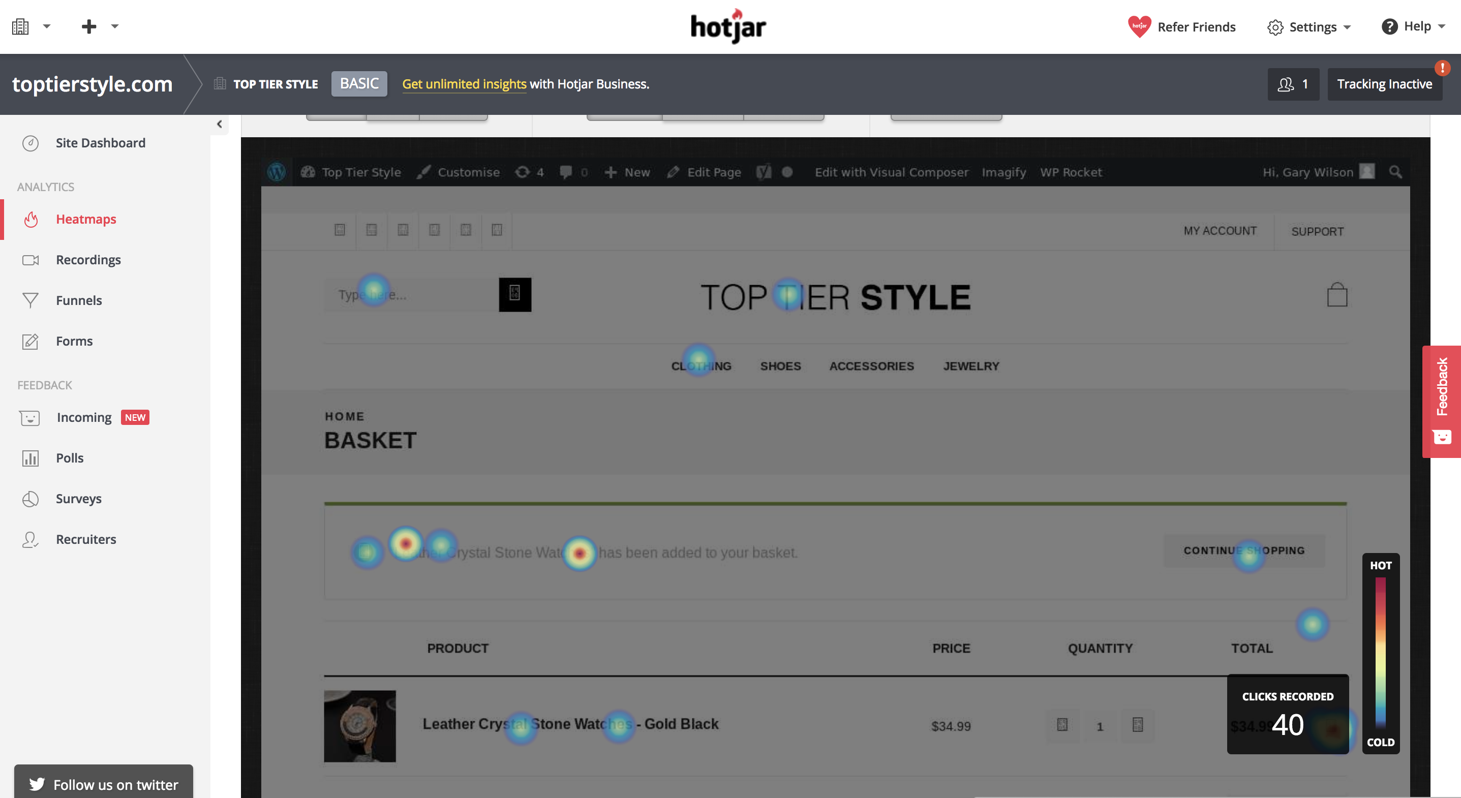
This data can be useful because you can pick up and see areas in which you can improve your website. Maybe 60% of your customers are clicking on an image that doesn’t actually link to anything, you could update this and take them to a relevant place.
Or maybe only 20% of your customers are scrolling down a certain amount of your blog post page. From this, you can gather that the content, or part of the content, is low quality and needs to be updated in order to engage your customers at a higher level.
Heatmaps can be tracked on your website using services such as HotJar, Lucky Orange or CrazyEgg.
Visitor Recordings
This one is kinda creepy, but absolutely gold if you are willing to spend a good deal of time looking into how your customers are interacting with your website. Recordings on most services can be tracked for all visitors or visitors that are visiting certain pages. It may be less time consuming and more valuable to spend time recording visitors on pages that are getting a low conversion rate with a high amount of traffic.
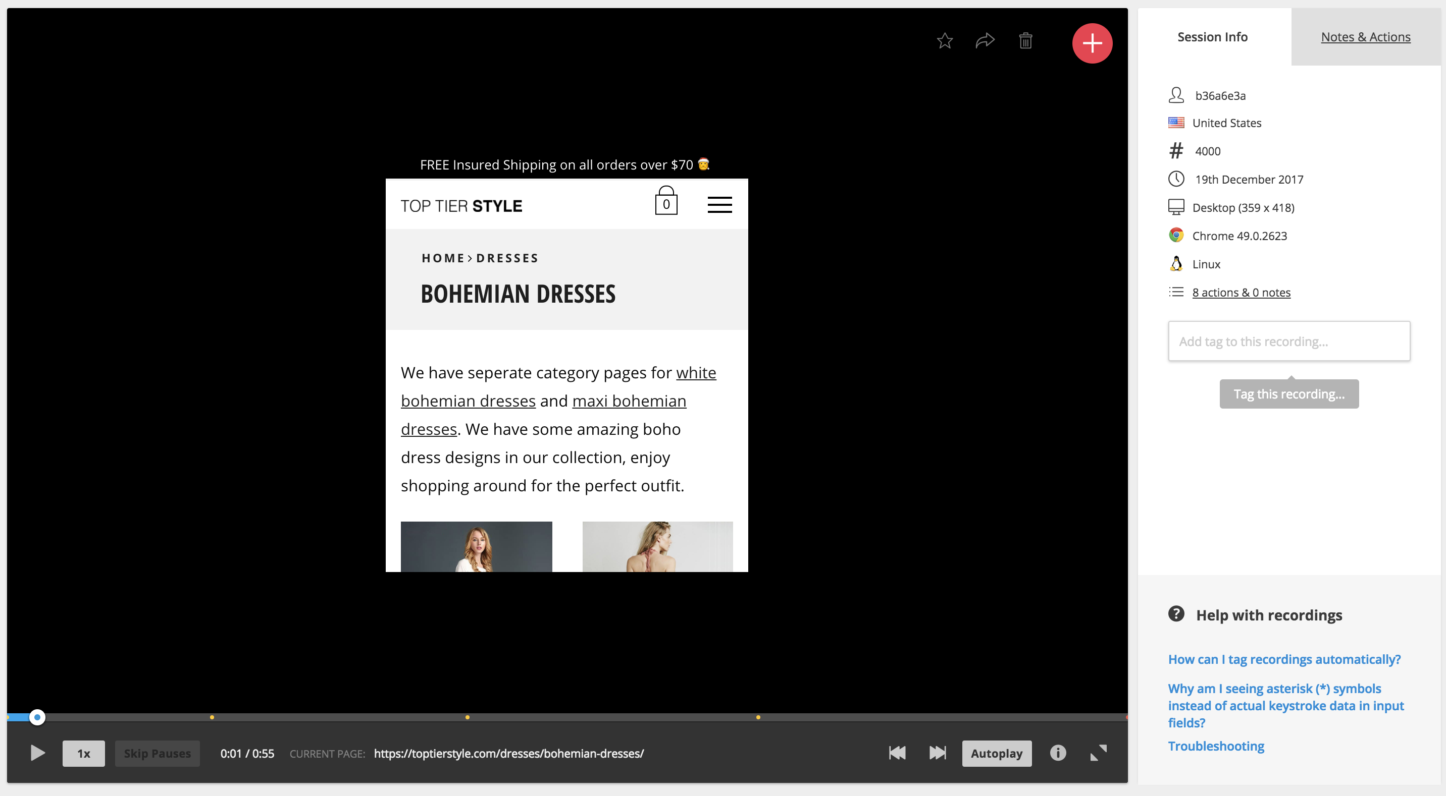
So, visitor recordings work much as it says in the name, you’ll get access to a screen recording of exactly what your customer does when they are visiting and browsing your website. You’ll get to see where they scroll, where their mouse moves, where they click and even what pages they visit.
This data is amazing because you get to put yourself, as a marketer, in your customer’s shoes and understand what it is that the customer is thinking while they are browsing your site. From this, you can understand a wide range of improvements and you can see exactly what influenced your customer to complete a certain action, or what caused them to drop off and leave your website.
A Data-Driven Approach
Once you have spent time analyzing all of this data and building a website that converts at a much higher level, you can look into implementing tracking with a service like Google Tag manager to analyze the percentage that a user completes a certain action on average within a certain time frame.
For example, you may be running a commerce store and you may want to track the percentage of people that add that product to their cart and what percentage add it to their Wishlist.
If you notice on a particular product that people are adding it to their Wishlist a lot instead of checking out straight away, then you could look into ideas such as running a promotion on that product or allowing a discount if they add it to their cart and check out today.
Summing Up – KNOW YOUR FUNNELS!
Every business has a funnel. Even if you are a local digital marketing agency, you have a funnel. Some funnels are more complex than others, here’s an example of a funnel for an average Plumbing website as compared to lets say an E-Commerce store.
A 2 Stage Funnel for a Local Plumber
Visitor Lands on Landing Page -> Visitor Gets in Touch
A 4 Stage Funnel for an E-Commerce Brand
Visitor lands on Product Page or Category Page -> Visitor Adds Product to Cart -> Visitor gets to Checkout Page -> Visitor Completes their Purchase
Either way, knowing your funnel is important because you can look at the areas in which customers begin to fall off. In the example of the plumber, it’s very simple because the plumber only has their landing page to optimize properly before they get their result, which is for someone to get in touch.
However, in the example of an E-Commerce brand – a visitor needs to follow a number of steps before completing the goal which is to purchase a product. If you are properly tracking the drop-off of your funnels, you may notice that 90% of people fall off at your cart page. By knowing this data, you can narrow in and know exactly what areas to look at the heatmaps or visitor recordings for so that you can begin to repair that section of the funnel and increase the overall conversion rate of your online business.
About the Author
Make Testimonials More Persuasive
Conversion Optimization, Persuasion ScienceDon’t kid yourself into thinking that your viewers believe your testimonials are real and genuine. Any website that hosts its own testimonials has the opportunity to molest and curate its own testimonials and every viewer knows it. There are three rules to make testimonials more persuasive that you can start using today.
If everybody knows you can alter and curate your testimonials, is there any point in having them in the first place? Probably not, but if you are dead set on having testimonials on your website, then you need to make testimonials more persuasive.
Before you hire a bunch of writers to create a set of positive testimonials for your website, take a look at these three unusual tactics for making testimonials more persuasive.
Use A Long-Form Testimonial That Goes Into Intimate Detail
Long testimonials make testimonials persuasive
The very idea that a long testimonial is more persuasive than a shorter one seems silly because most people would assume that a longer testimonial is more likely to have been written by the company’s marketing department rather than a genuine customer. However, there is a form of cognitive dissonance that occurs when people read larger testimonials.
Despite the fact that the user probably believes the longer testimonial was written by a member of the website’s own staff, the fact is that the user is still more likely to read the longer review than any of the shorter reviews. This is especially true if the testimonial has headings, and things such as lists, alternative purchases, and pros & cons sections.
Look at Amazon book reviews. The longest reviews are almost always the ones with the most “This was helpful” votes. Even if the review looks like it was written by the author’s friends, it is still more readable and attractive than the hundreds of smaller reviews/testimonials on Amazon.
It is better to have a semi-convincing review that is long and read by the user, rather than a series of smaller very-convincing reviews that are not read by the user.
Name All The Bad Stuff And Convert Them Into Selling Points
Convert bad stuff into selling points make testimonials persuasive
When most people shop online, they do not read the hundreds of positive reviews. They search out the negative reviews. People do this because most people are aware that reviews and testimonials can be bought.
We have all seen the list of positive reviews on Amazon that were written by a marketing department, and then the several recent ones that are negative because they are real. You can use the fact that people search out negative reviews by using negative reviews/testimonials to sell your product or service.
There are two ways you can do this, you may do it by giving negative points and making them illogical, or you may answer negative reviews with selling points. Let’s start with a few examples of negative testimonials that you have added to your website that are actually illogical.
Alternatively, you can allow negative reviews and then offer replies that create selling points. If done correctly, this can be a very powerful way to sell your product.
Do not make the mistake of asking the reviewer to contact your company via the replies because that is what all of the worst companies say.
Here are a few examples of negative testimonials and their replies that turn negatives into positives.
Allow Anybody To Leave A Testimonial And A Reply And Have It Post Immediately
A big part of making a testimonial believable is less about what is written and more about how the testimonial came to life. If you can prove to people that what regular people are writing is what is coming up on your testimonial page, then you may be able to convince people that your testimonials are real.
That is why it is important for you to make the testimonial process very easy. Any visitor should be able to leave a testimonial without having to sign in and without having to buy something. It should be clearly obvious to the user that he or she may start writing a testimonial right away, and that the user doesn’t need to have an account.
What is just as important is what happens after the user clicks to submit the review. If the system says that the testimonial is awaiting moderation, then the user will give up on the website and probably continue to believe that the testimonials on the website are curated. However, if the testimonial appears right away on the web page, then the user will have a hard time denying that genuine testimonials must exist on your website.
Many webmasters will not allow people to post directly to their web pages for a number of reasons. The most common reason is that it allows spammers to add content right away, but you can use spam catching software to stop that.
The second most common reason is that it allows users to add troll messages or negative messages into an area where potential customers may see them, but this doesn’t matter.
If your product or your service is a good one, then the troll messages or the negative messages will be dwarfed by the many positive messages. Plus, every Monday there is nothing stopping you from going through your testimonials and deleting a few of the most damning ones. After all, it is not as if your users are going to return every week to see if their testimonial is still there.
How to Instantly Establish Credibility Online
Conversion OptimizationWhen selling anything online people almost always prefer to buy from people and companies that they trust. In fact, many times people are willing to pay more to buy from websites they trust. It’s one of those key components that can boost your online conversion rate in multiples if done right so you need to instantly establish credibility online.
I’ve been working in the field of conversion optimization for 9 years. About 6 years ago, I made the decision to focus my agency primarily on optimizing websites that were specifically in the health field/vertical, mostly dietary supplements.
We niched down to optimizing for the health industry because we started seeing patterns among multiple dietary supplement clients. Those patterns lead us down a path of researching how people buy health supplements differently than they buy any other type of product.
The health field, especially natural health supplements, can be a pretty tough field to sell products directly online. There are a lot of FDA compliant and legal issues to watch out for if you don’t want to be shut down. Although there are certainly more than the fair share of claims out there on the internet that cross the line. That combined with so much misinformation and it’s no wonder that so many people tend to feel a little bit leery about trusting holistic health and supplement products.
The sad thing is, a lot of these products are actually really, really good for you and really beneficial. They’re often derived from natural products that have incredible benefits with minimal side effects.
But how do you get that across? Especially when you can’t afford to do a double-blind scientific test?.
Here are a few ways that you might be able to accomplish the same goals in your specific industry…
To Establish Credibility Online: Be Completely Transparent With Your Audience
One way I do that is by making sure that the website is as transparent as possible. Putting it all out there may show some vulnerability, but it also conveys honesty.
Reveal the ingredients that are in your products by showing the full supplement facts label. Don’t hide behind a “proprietary blend”.
Transparency is key
Also, let them know where those ingredients are sourced from.
Make Reasonable Claims and Back Them Up With Proof
We all know it’s probably not likely that one pill can solve all these problems. Even if it’s true, trust breakdown with multiple claims or condition solutions. It’s better to focus on the power of one. One story, one problem, one solution. So don’t make broad outrageous claims. And when you do make claims, be sure that you are backing them up with proof.
If you really concentrate your focus on the things your product can do and go into great detail with facts that support that – then it’s more likely that you’ll be believed.
I’m sure you’ve probably heard a million weight loss remedies that will help you lose weight quickly. But when you’re bombarded with so many messages, how do you even begin to know which ones might actually work?
There’s not enough time in the day to try them all out. And who wants to spend the money on each one?
But if you do your research and look closely, some of the suggestions are backed up by actual science.
For example, did you know that grapefruit stimulates the production of a hormone called adiponectin, which is involved in the breakdown of body fat?
Ok, now that’s something to go on, right? Actual science. I’m in.
This is the same kind of confirmation that your visitors need and want. They don’t want to have blind faith and just believe what you say or try a million products to see which really works. Most people don’t have that kind of money or time to spend.
So give them proof. Establish credibility online. It may already be there and you just don’t know it.
Another Example that Fails to Establish Credibility Online
For example, we were recently analyzing a landing page for a healthy chocolate chip cookie.
The cookie claimed to be healthy – but the nutrition label that they displayed on their website really wasn’t all that impressive.
It listed some protein and some calcium – but other than that it was hard to justify spending the money.
They went on to list the healthy ingredients – flaxseed and chia seeds which are rich in antioxidants and omega 3’s. And coconut oil that boosts the immune system and helps you lose weight.
But they didn’t bridge the gap so that it made sense. They didn’t tell their visitors why these ingredients were so healthy. In fact, they’re so healthy that they’re often referenced as “superfoods”.
If prospects weren’t aware of these benefits, listing the ingredients meant absolutely nothing. So don’t assume. Don’t assume that they know why something is good for them. Just because you know, doesn’t mean that they do.
To Instantly Establish Credibility Online, Be Vulnerable
And if there’s something that your product or service can’t do. Don’t be afraid or too proud to admit it. By being honest about what you can offer, it really comes off more as trustworthy than incompetent actually. By honestly admitting that you can’t do a particular thing – your visitors will now believe you when you say that you can do other things really well.
Don’t Unintentionally Plant Seeds Of Doubt
This is something that I see often.
While you may actually be very trustworthy, you’ve just reminded your visitors that some of these products are a complete hoax. Possibly even a sugar placebo.
So now that you’ve mentioned “gimmick”… now they’re not so sure about you .
Here’s what happens. Your visitors are going about their business gathering information so they can make an informed decision about your product or service.
When they see words like “gimmick” or “scam” red flags may start to go up. Those thoughts might not have been in their minds in the first place. But since you’ve now put them out their boldly in print… now they are.
Planting these types of thoughts in your visitor’s heads could be very risky. Your very attempt to gain trust in this way may backfire big time.
Other Standard Ways To Establish Trust
So those are some of the areas in the health vertical where trust needs to be established in a very specific way. Hopefully, these techniques might help you in your vertical as well.
But be sure that you are also implementing these other critical trust indicators as well.
Social Proof Establishes Credibility Online
Add testimonials and reviews.
Another way to add social proof is by adding social media count boxes. The boxes that display the number of people that have liked you. Those can’t be faked.
LinkedIn testimonials also can’t be faked. Members are the ones who write the actual recommendation and they are then displayed on your profile.
And if you can get an expert endorsement. You’re golden.
In fact, tout yourself as an expert too. Make the effort to write blog articles that will highlight you as someone who knows what they’re talking about.
If your product or service has an average success rate – boldly highlight that. It’s amazing how often I see businesses forget to include this information.
I once worked with an insurance agency that required prospects to apply for approval to receive a special discount. People are often worried when they’re credit is going to be checked. It adds an additional layer of anxiety that they just don’t want to deal with. So they don’t.
But this agency had a 97% approval rate. But they failed to mention that.
Adding such information makes the reader feel a little bit more secure that they just might be approved. So they take the risk.
Share Details About Yourself
There are always going to be a percentage of your audience that wants to know more about the people behind your business before they move forward with a transaction.
When I’m analyzing heat maps, it always amazes me just how many people are clicking on About Us links to find out more.
And don’t forget to include real-world data such as a physical address and contact information when you can. Hiding this information can not only be frustrating, but it can also make your visitors question whether or not you are a legitimate business.
How to Instantly Establish Credibility Online: Security
I’m sure you know by now how important it is to create a secure environment if you’re selling online.
To ensure that your website is secure – your website address will start with “https” rather than just “http”. The “s” at the end means “secure”.
Nowadays, it’s also highlighted in the address bar with green text and the actual word “Secure”. So make sure your website’s address looks like this in the address bar.
Security starts at the address bar
Because sometimes you’d be surprised to see what’s displayed here. I was surprised to see this in the address bar for cnn.com.
Unsecured websites hurt credibility
Perhaps they are not selling anything online. But it’s always a good measure to make this read as secured.
Also, make sure that you are are displaying trust seals that verify that you are a legitimate business and also verify that your site is secure.
Visual indicators such as padlocks also help to create a sense of security. Both of these can be really important at the point of checkout where visitors feel most vulnerable.
We Only Buy A Second Time From Those We Trust
So make sure you’re providing all the information you can to help your visitors make an informed decision. Don’t make outrageous claims. And when you do make claims, try to back them up with proof.
Don’t scare visitors away by unintentionally planting seeds of doubt. And don’t forget to include standard trust indicators such as real-world data and security seals and security indicators.
21 Quick and Easy CRO Copywriting Hacks
Keep these proven copywriting hacks in mind to make your copy convert.
"*" indicates required fields
Conversion Optimization Examples: Homepage Carousel vs None
Conversion Optimization, Ecommerce CROHere are 3 conversion optimization examples of how to kill the “slider”.
This is not a post about how carousels kill conversions. They can, but it’s not about that.
This post is about doing what’s best for the people who want to buy from you on your site.
Every CRO and savvy eCommerce manager I have ever met hates carousels. In fact, we’ve never actually blogged about it because EVERYONE ELSE already did. Bringing up carousel flaws would be akin to bringing up the Hindenburg’s.
What we at Inflow will do, however, is document the death of the carousel. But before we do, let’s talk about its birth.
Blame Yahoo! if you want
It seems like the carousel has been around forever, at least in Internet terms. Broad adoption started in the summer of 2009 after Yahoo introduced it on its homepage.
If your site still has a rotating carousel, perhaps you still have a Nokia phone? You can check your email on it, you know!
From that point on, every website felt free to:
So, for some, it might not be a surprise that there is a better way to structure an eCommerce homepage.
The death of the (unnecessary) carousel
In our 2018 Best in Class Comparative Matrix for eCommerce, we saw only 6 out of 10 sites still used the homepage hero carousel. That number is less than half of what it was 2 years earlier.
The reason why is simple: it was never the best option for most of the sites that did it, and that statement is still pretty much true.
Optimization Away from Carousels
So, how does a site transform its homepage from having a carousel? Here are three conversion optimization examples for removing carousels.
Zappos.com
Before
A year ago, Zappos was sporting a left category nav, hero carousel and a couple of static promo areas to the right. That made it jam-packed with options.
After
Zappos simplified things by ditching the carousel, the left nav on the homepage and instead focusing the homepage on the things customers want most. They are still testing this bad boy with over 5 major variants identified, so check back in February to see the winning combination. ;)
So apparently, Zappos.com never needed a slider. Note that they kept the slides, but moved 2 of them to the bottom of the site in favor of stuff users most want (a lot of which was not even on the homepage of this eCommerce behemoth just a year ago).
There’s a big lesson here for those willing to learn it and kill their carousel.
UnderArmour.com
Before
Under Armour had a carousel last year, alternating between two and three slides.
After
Over the past year, they have MADE ONLY ONE CHANGE on their homepage. That was to ditch the carousel.
Williams Sonoma
Before
Williams Sonoma made some minor navigation changes over the past year and added lazy-load to the homepage, which widened it a bit.
After
For the most part, the only significant change to the homepage was REMOVING THE CAROUSEL.
Take-Away
If you were to take the lead from these 3 best in class sites, you would blindly get rid of your eCommerce site’s carousel. But wait!!!
You can see below that there are still 6 out of 20 Best-in-Class eCommerce sites that are standing by their carousel. You bet they have tested their homepage over the past year.
So Why?
The answer is that the carousel, as they have it, is right for them and their audience. For now, at least, until something tests better.
This is why we test.
8 Elements of a High Converting Squeeze Page
Conversion Optimization, Conversion-Centered DesignLead generation is the lifeblood of online business and most lead generation is done via email collection.
If you grow a list of prospects who’re interested in your promotions, your business grows too. However, before you make money from your list you’ve got to get people on it. Whether you want people to download your lead magnet, sign up for your latest webinar or volunteer to test your product, you first need to persuade them to part with their highly guarded personal details – that’s no small feat.
No wonder the average opt-in rate across industries is hovering around a mere 2%. After investing a fortune in Facebook advertising, PPC ads, outsourced content, content management software, site design, and more, you only net two leads per 100 visitors. Two leads… NOT customers mind you.
Surely, your business deserves better.
Today, we’re going to cover the eight elements of a high converting opt-in page so you can boost your opt-in conversion rates and get a better return on your content marketing investment.
Ready to dive in?
Element #1: A short pre-headline to draw them in
When your prospect arrives on your opt-in page she wants to know if she’s in the right place. If she feels lost, she’ll click away. Use the apex of your page to make her stick around.
And, depending on who you ask, you have five seconds or less to do that. But how do you do it? Here’s three ways to instantly attract your reader when she lands on your page so she stays on.
#1. Name the target audience
For example, Attention dog owners, Attention Content Marketers etc.
When you name your audience you get a nod from the prospect, “Yep that’s me.” Handled correctly, this small first yes will ultimately lead to the big yes of a signup later on.
#2. Name the type of lead magnet
For example, Free Special Report, Free Training Webinar etc.
The specificity of your offer increases desire and the likelihood of the prospect staying on so as to get it.
#3. Name the referral site
Naming the referral site on your page makes your prospect feel like a diva and warm up to you and your offer.
Amy Harrison rolls out a red carpet for her Copyblogger readers. She makes them feel the love by welcoming them: specifically, heartily, personally.
Source
Your pre-headline has four main purposes:
#1. To help your prospects understand your offer…fast.
#2. To alienate those who are not a good fit for your offer.
#3. To attract those who are perfectly suited to your offer.
#4. To build rapport with your audience in an instant.
A great pre-head will keep readers on your signup page.
Element #2: A benefit-rich headline to make them want to read more
Once your prospect hangs around, use your headline to show her how your offer will benefit her and improve her life. Promptly address her concerns so she lingers on the page or you’ll lose her by the door. Quickly address her pain, paint the desired future for her, or pique her curiosity so she can’t help herself but read on.
In short, tell your prospect what’s in it for her.
Jacob McMillen’s headline is ultra-specific and has a solution that’s tailor-made for cash-strapped businesses – that’s a big benefit that’ll keep his target audience glued to the page.
Source
Not only that. Your headline must also tie in nicely to the traffic source. That way the prospect’s conversion journey becomes smoother thus generating better results for your business. Jacob McMillen does this superbly as the source page to the above landing page shows:
Notice how his CTA, the last words in his bio, are the first words on the landing page? This way the byline is perfectly coupled to the landing page thus increasing conversions. When a reader clicks his bio and lands on the landing page she smoothly continues her conversion journey – because of harmony between the two pages, conversions are likely to be higher.
On the flip side, a copy mismatch between the source page and the signup page tanks conversions.
Element #3: A few lines of crisp copy to pull them further down the page
You’ve done well if your prospect is still on your page thus far.
Your next few lines should give specific points about your offer. Show her how your offer will scratch her itch or push her towards her dream. Do that and she’s more likely to give you her details.
Use bullet points or short paragraphs. Your bullets should be:
Smartblogger nails their bullet copy on this sign-up page for an upcoming webinar.
Source
The three bullets tell you exactly what you’ll get on the webinar in a simple engaging way without laboring the point. If you’re going for the minimalist approach even a single line will do. The amount of copy on the body of your opt-in page depends on three key factors.
#1. How aware is your prospect about you and your offer? The more aware she is about you and what you do the less copy you need and vice versa.
#2. What works best for your niche? Study the most successful signup pages in your niche and do likewise.
#3. How complex is the problem you’re trying to solve for the prospect? The more complex the problem, the more copy required to convince prospects to sign up.
Element #4: A pro-looking image to help them visualize what they’ll get
Our brains process images up to 60,000 times faster than text.
To woo your prospect so she says yes to your proposal (offer), show her what she’ll get. Use a picture of the product or of people expressing the feeling you’re targeting. Pictures of animals work well too if your context allows it.
John Nemo’s book shot dominates his opt-in page on purpose. You can almost smell the LinkedIn cash splashed on the cover.
Source
A word of warning about pics: don’t just include a picture because you like it…that won’t help your cause. Only include a picture if it’s relevant to your offer.
Element #5: A signup field(s) to capture their personal details
You’re almost there now… your prospects cursor is hovering over the signup field. Now comes the big question…how much info do you want from her?
Numerous tests show that, in most cases, the fewer the signup fields, the higher the conversion rates. That’s why most sites simply ask for an email address and/or name only as shown in the Marketing Sherpa lead generation graphic below.
Source
Of course, you can ask for more than that if you want a more targeted list. Although your conversions may dip, the quality of your list will improve. Ask for what you need and no more. This makes filling the fields more desirable. You can always ask for more details later.
But, as with everything digital, conduct split tests to see what works for you and your audience instead of blindingly jumping on the bandwagon. In many cases, tests have shown that increasing the number of fields actually raised conversions.
Element #6: A bit of social proof to earn their trust
It’s natural. No one wants to go first. People do what they see other people do. That’s why social proof is a vital ingredient to the success of your page. Here are some three quick-and-easy ways of incorporating social proof into your signup page:
#1. Display your list numbers if they’re substantial
To nudge people over the sign-up line, you can use big numbers associated with your following. However, be careful as numbers can be a double-edged sword. If your numbers are small, social proof will still work, but against you! No-one wants to be a part of something small and insignificant.
Social Media Examiner uses their massive list to good effect to inspire people to join their list.
Source
Surely, on seeing the 620 000+ social media marketing peers on Social Media Examiner’s list, a prospect will be enticed to sign up.
#2. Splash customer testimonials generously on the page
Testimonials multiply your clout score thus making it easy for people to take up your offer. Henneke Duistermaat, of Enchanting Marketing, does a neat job.
Source
Not only does she head the page with a rich list of big sites she’s been featured on, she sandwiches her offer between two testimonials from heavyweights in her niche. Prospects are more likely to trust her word and gobble up her course.
#3. Point to influencer endorsements and press mentions
To get prospects to sign-up for a free trial, Get Response leads with an imposing figure of their current users and then they underline their authority in their space by quoting two influencers.
Source
This is likely to cause more people to take their software for a spin.
Element #7: A privacy statement to assure them their info is safe
Because cyber-crime is rampant, your prospect is uneasy. Hardly a day goes by without someone being scammed or spammed online. Allay her fears…wrap your arm around her and let her know you’re not one of the bad guys. Tell her you won’t peddle her email address nor send the alien stuff she didn’t ask for.
A brief statement such as ‘We respect your privacy and will never share your info’ is enough as Neil Patel does.
Source
Feel free to get creative with the phrasing. Or, if you’re not feeling inspired, simply write ‘privacy policy’ and link to your full-blown privacy policy. And, oh, a privacy statement also serves a more personal and practical purpose: failure to include one might land you in trouble with the law.
Basically, your privacy statement should assure your visitors that their info is safe. Only when they feel you’re trustworthy will they be swayed to give you their personal information.
Element #8: A strong call to action (CTA) to compel them to click
Your call to action marks the finishing line of the sign-up race. Give it some thought.
Your button copy should be specific, simple and reader-focused. Tell the prospect exactly what she’ll get if she signs up. Don’t try to be cute, clever, or cryptic, or you’ll lose out. And please, don’t make the rookie mistake made by many content marketers – using the dismal default CTA copy e.g. signup, subscribe, or download.
Don’t leave your visitors wondering what they are clicking the button for.
Sign up. For what?
Subscribe. To what?
Download. What?
A simple formula, coined by Joanna Wiebe, will help you ace your button copy. Just fill in the blank: I want my reader to __________________.
Your answer becomes your CTA. For example:
I want my reader to:
Here’s a great example of powerful button copy pulled from this very site’s homepage:
Book a Consultaion Now is a proper Call to Action, or CTA
The CTA is clear, simple, direct, benefit-focused, and urgent – all the hallmarks of a powerful call to action that converts.
Make the desired action simple and easy smoothly guiding the prospect towards your goal without much work or resistance. Use energetic verbs and the first or second person to make the CTA personal and bump up your conversions. Once your reader clicks on your button, you’ve won and now have a precious lead in your funnel.
Opt-in pages are crucial to the overall success of your business that you should seriously consider outsourcing the task if you don’t have the time or the expertise to craft them yourself.
Conclusion
Getting signups is an essential bridge in your inbound digital marketing efforts. It’s the magic link that turns browsers into subscribers, subscribers into buyers, and buyers into brand evangelists. In short, it’s the gateway into your funnel. As a serious growth-focused business owner, take time to work all these elements into your page so you increase the likelihood of success. Then you’ll hear the sound of clicks not crickets for a change.