We’ve all seen the numbers. Visual content outperforms text-only content by a landslide.
Need a refresher?
- Content generates up to 94% more views if combined with compelling visual elements and graphics. (MDG Advertising)
- 40% of people will respond better to visual information than to plain text. (Zabisco)
- High quality infographics are 30 times more likely to be read than text articles. (Ansonalex)
While I’ve known these stats for some time, I didn’t feel like there was much I could do about it until recently. I would make sure to break my articles up with nice subheadings and insert quality stock photos or original photography when I had it, but that was about as visual as I got. “After all,” I thought, “I’m a writer—not a designer.”
How I Became More Visual
Things changed when I started writing a weekly column for a client whose company designs and builds custom homes. The column was to appear as sponsored content on a well-known luxury living blog. My goal was to conduct interviews and research on the latest trends in home design and present my findings in 500+ word articles along with some beautiful photography of the client’s work.
My logic was simple: The photography was already performing extremely well on social media. The pictures would be the hook, and people would stay for the insightful article.
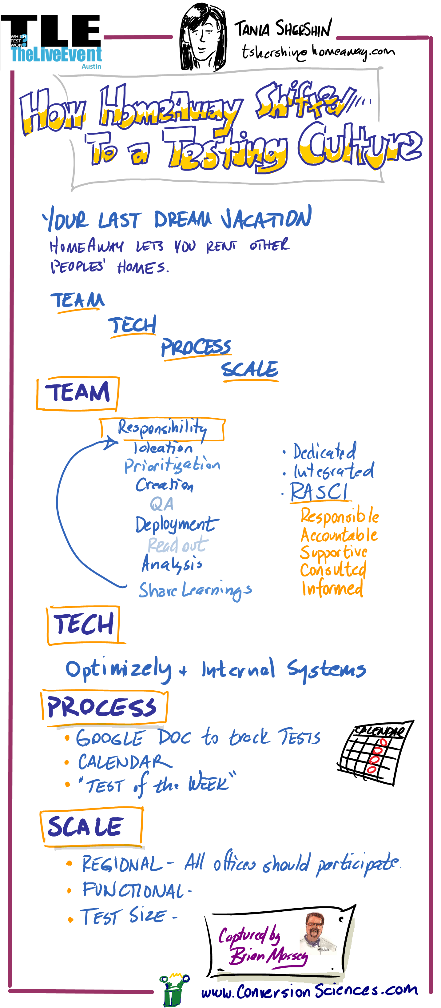
The first article of the campaign. It goes on for over 600 words.
While this approach already seemed to be working on the client’s on-site blog, it didn’t have the effect I wanted it to on the sponsored column.
In fact, my first article performed pretty badly, despite all the effort I had put into conducting interviews, despite the great quotes and useful information I used—even despite the photos that had been shared thousands of times on social media. The first article—a piece that used anecdotes and advice from the client about finding inspiration for your home—received 84 views upon publication and continues to be one of the lowest performing posts of the campaign, with a total of 220 views.
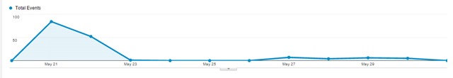
The tiny blip made by my first article. We used tracking pixels to watch traffic on Google analytics. As you can see, traffic did not pick up after posting.
Then I started using Illustrator
I had been fumbling around with the program for several months, but never felt like I had time to use it properly. My approach had always been to write the best copy I could and to let a designer help out if they had time. But this time I was determined to do something—anything—different so that the column would prove worthwhile.
So I went ahead and designed some images for my next two posts—just some simple, vector-based elements to use as featured images and between subheadings. They weren’t great, but they were presentable, and the articles performed slightly better than the last.
I wasn’t sure if the slight increase in views warranted the extra time it took to create new visuals, but I decided to give it one more shot.
I’m glad I did.
Taking a cue from fashion magazine style collages, I cobbled together a collage using pieces of our original photography and used it as the central element of the next post. The post received 524 views on the first day of publication—over six times more views than my initial post. Even better, the post continues to rack up views, with 1,626 views to date.

My first post on the site to be primarily visual.
Since posting that article, I have continued to create similar content for this campaign (and others) that have performed just as well.
My next post also used a collage. It received 504 views on the first day of publication. Interestingly enough, this article was on the same topic as my initial failed article—how to find home design inspiration. The difference was all in how the information was presented.

Spikes in traffic from my first two collage posts done in Illustrator.

A few months later, new posts continue to create spikes in traffic, and we begin to gain a consistent viewership between postings.
While I don’t have all the answers to this change in performance, I attribute the success of the collage articles to two things: 1. their overall presentation, and 2. their particular appeal to my audience.
Overall Presentation
- They stand out from surrounding posts in the blog roll.
- In a sea of photographs, a small piece of graphic design can really stand out.
- They look original.
- Readers who are already engaged with the client’s brand may have already seen our best photography. These images made them brand new.
- They look useful and cohesive.
- A simple collage with numbered items promises practical, bite-sized content. Plus, people want to be shown how information relates. Sometimes, placing a great photo next to text isn’t enough.
Appeal to the Audience
- They mimic the look of luxury magazine and blog articles.
- In researching our audience, I checked out several sites that our demographic enjoys. (Facebook’s recent expansion of its search function is great for this task.) They gave me examples of the kind of short-form blog posts that our target audience typically reads.
- They account for the audience’s browsing behavior.
- If your prospective customers are visually inclined, too much text is a nuisance. By creating visual content, I was able to provide the kind of bite-sized articles that that my audience expected in that context.
Growing your capabilities will make you more perceptive.
There are probably several lessons to be learned from this incident, including one about knowing your audience. But the one I want to stress is this: learning how to design will make you a better writer.
How do I know? I’m not just basing this claim on the spike in traffic that came after I started creating visuals. I’m also basing it on the fact that now, when I set out to create content, I don’t ask myself, “How can I best express this idea through copy?” I ask, “What is the best way to express this idea? Period.”
I am also better able to take into account the browsing behavior of my audience. I wouldn’t be writing this out as a 1,000+ word article if I didn’t think that the audience of The Conversion Scientist was willing to read longer articles. Similarly, the content you create should cohere with the browsing behavior of the people you want to reach. No matter how great your writing is, you will never convince a non-reader to read—at least, not through a piece of content marketing.
Because I can now create a broader variety of content I also think much more about the behavior of my audience. That’s why learning Illustrator has not only made me more versatile—it has also made me more perceptive. If copy is only a small part of the equation, I can combine my strengths as a writer with my (developing) ability to design to create content that is cohesive, concise, and valuable.
 Colleen Ahern is a copywriter and content marketing strategist at Page Agency. She created the Page Agency Blog, where she writes about the rapidly evolving world of content marketing and social media. Follow her on Twitter @ColleenAhern.