I was directed by a Facebook notification to a quotation so important that it deserved its own graphic panel. Clearly, this was a quote that needed to be read. As I read I thought, “This guy and I think a lot alike. Who is this Plato of the conversion world?” At the end was my name, and the quote had been taken from one of my recent blog posts on conversion and design. You could hear the air squealing into my already inflated head.
So infatuated was I with myself, that I immediately shared the – quotegraph? – with my entire network, and I’m writing a blog post about it. Who would have created such a honeypot for my ego? What entity would benefit from such bold action?
It was the very smart marketers at Unbounce. Their service provides easy ways to develop landing pages and to test different versions of those landing pages. Who spends their time recommending – nay demanding – that businesses use targeted landing pages to increase leads and sales? I do, as well as many other marketing experts, some of whom have already been targeted by Unbounce flattery.
If you’re reading this and this is your first introduction to the people at Unbounce, then tell us in the comments. That will be a testimonial to how effective this technique can be.
And it’s cheap.
I (and other experts) provide the content. All Unbounce had to do was lay the quote out all big and bold, and post it on Facebook. Very smart.
Will this also end up on my Pinterest page? Oh, yes.
Steal this idea for your industry.
[bookpromo]
The Dollar Shave video went mega viral because it is “funny”, right?
But to understand why and how it is funny you need to break it down and analyze what motional strings it is playing. Only then will you truly understand its success.
Michael is fed up. Who isn’t?
The major emotional theme of the video is “Fed up-ness”. At the heart of this Fed up-ness lies of course Dollarshave’s value proposition to customers who are fed up with paying for overpriced razor blades. But there’s more.
The whole body language of CEO Michael Dubin says “I’m fed up”. He just can’t sit or stand still, he needs to move, he’s on a mission. He’s fed up with political correctness as he proclaims that the blades are F***ing great. He’s fed up with over-paid tennis players. I think he’s even fed up with being fed up.
This goes right into the core of the American peoples’ feelings. Not only are they fed up with the Razor blade monopoly, they’re fed up with Washington, they’re fed up with no jobs. They’re also fed up with being fed up.
Michael takes matters into his own hands
By doing so he becomes an agent for the aspirations of Gillette-enslaved Americans. When they buy blades from Dollarshave, they’re not customers, they’re proactive change agents who can create change and fortune by their own actions. Together with Michael they enact their shared American dream.
Remember the payoff in the video?
“Isn’t it about time?”
It’s not a product or service statement. Actually not even a statement. It’s just about how you feel when you’re fed up and want to take matters into your own hands. Like Michael.
Michael is one of us, not one of them
Look at Michael’s office. It’s a mess. You’ll find similar offices all over the country. Except of course at Madison Avenue. It’s as far from that as you can possibly get. In any case Michael seems to spend most of his time in the warehouse.
Michael would not pay an agency tons of cash to make this video. If you know a little bit about video production you can see it’s professionally made. Still it’s created to preserve an amateurish look and feel. That’s not by coincidence.
And Michael obviously can’t play tennis.
Michael is American
Ok, the flag at the end is obvious, but when you think of it the American theme runs right through the video.
There’s an homage to the ancestors (Grandpa with Polio). The evil villain is a foreigner (a Swiss tennis player). There’s a reference to the Vanderbilts.
It might not be as obvious to you as it is to me (I’m Swedish), but it’s there for sure.
Michael talks to….. Yeah, Michaels
Michael is a former marketing exec. Does he need to save dollars on his shaving in order to be able to keep the kids in school? I don’t think so. He just thinks it’s about time.
So when crafting the video for the launch campaign Michael needed to decide what people he should appeal to. – “What is the persona of my early adopter?”, is the question he must have been asking himself.
And I think the answer is – “People like myself!”. People who think the Swiss Army knife approach of Gillette is starting to look ridiculous. People who don’t need to save on their shaving. People who just have this feeling that something should change. Not for rational money-saving reasons, but for emotional reasons.
Others will come later. Who really need to save on their shaving. Who wants more proof of the quality of the blades. Then we’ll see other campaigns designed for them. But for now Michaels want to wake up thousand of Michaels around the country.
Michael creates an Experience
I listened to Jared Spool at Conversion Conference SF a couple of months ago. He said that every innovation goes through three phases; Technology, Features and Experience, being the final one.
Gillette is clearly about Features, with their vibrating handle, flashlight, 10 blades and backscratcher (according to Michael). They’re trying to sell us a Shaving Experience which is an Experience around the use of the product.
Michael, on the other hand, spends exactly 5 seconds to talk about the features of the products in the 94 seconds video. Dollarshave creates an Experience around how we see ourselves as individuals and how we want to live our lives. This is infinitely stronger.
We react much stronger to messages about our identity than our actions. I guess Michael knows this.
So if and when you decide to buy those blades you’re not just shaving – You’re participating in a collective experience designed to enforce your self-image as a strong and active American who thinks “It’s about time”. John Ekman is the Chief Conversionista of Conversionista! He is regarded as a Swedish authority on Conversion Rate Optimization. According to John, a Conversionista is someone deeply and crazily passionate about improving Conversion Rates. You can find more inspiring posts on John’s blog.
Website design is only great if it’s making you money. It’s not about the colors, the shapes, the sliders and flashy bits, though that’s the fun part many businesses sadly get hung up on. People don’t come to your site for entertainment or art—unless you sell art.
They come to you for a solution.
The purpose of your website is to help them find you, connect with you and pay you money to solve their problems. That’s conversion. That’s why you built the site in the first place. Your site’s main job is to make this very easy for them to do. So the best design isn’t the one that makes your company look cool and edgy and sophisticated. It’s the design that supports conversion, has room for good copy and powerful calls to action that make people click the big orange button. Want to know more?
Read more in my column on Search Engine Lan
d
These are the stories that caught my eye last week. If you are a curious marketer looking to learn more about conversion, please subscribe my weekly recommended reading list, For Further Study.
The Product Page 2012: 7 Must-Test Elements
Feb 27, 2012 08:22 am
@TheGrok says “Test your product headline to be benefit oriented as opposed to just product name.” I hadn’t considered that. Good lists always tell you something you hadn’t thought of and Bryan has such a list for Online Stores and Publication sites who feature their offerings on Product Pages. Product pages are the money pages on your site, and are one of the first places to look for optimization opportunities.
The Shocking Truth About How Web Graphics Affect Conversions
Feb 27, 2012 01:14 am
@KISSMetrics – David Ogilvy is experiencing something of a renaissance these days as his experience and research in offline marketing are proving true in online marketing. And we need him. Images are an abused medium on the Web, and this article points out mistakes that you are probably making.
There are some real nuggets here, such as “Captions under images are read on average 300% more than the body copy itself” Ask your designer what research he has for his decisions.
This is an important article, and you should read it before you blindly follow the advice of lazy designers.
Sandra Niehaus and Sara Sturtevant of Closed Loop Marketing offer three methods for getting inside your visitor’s heads to design an online experience that persuades and converts.
BJ Fogg is a Psychologist, Innovator and Director, Stanford Persuasive Technology Lab. He gave an inspirational and interactive keynote presentation at Conversion Conference West 2012 using props instead of slides. His props included a magician’s robe, and a kayak paddle as a wand.
Clearly, he knows something about how to communicate. Part of his presentation involved the audience teaching his B=MAT behavioral model to not one, but two others. You’ll find that model in this instagraph that I captured in real time. FULL SIZE VERSION
Part of persuasive writing is crafting killer conversion copy. On today’s interview, I ask Joanna Wiebe for her opinion on the matter. Check it out.
I’ve been putting the finishing touches on my Conversion Conference presentation entitled Creating Killer Conversion Copy: Emails, Landing Pages, PPC Ads and More.
Writing Killer Conversion Copy with Joanna Wiebe of CopyHackers.com [Audio]
I asked Joanna Wiebe of CopyHackers.com to give me her opinion on writing copy that converts. She clearly has an opinion. I thought Scott Stratten was the epitome of a Canadian Diva. Then I met Joanna. (She’ll be mortified that I wrote that.)
Does a copywriter for the Web have to understand design? How about analytics?
How can I choose a copywriter that is going to increase conversions?
What is Joanna’s process for creating copy that tests well over and over?
For more on social media strategy, sign up to get a copy of my up-coming book: The Customer Creation Equation: Unexpected Formulas of the Conversion Scientist.
Engaging the visiting mind is a key challenge of Conversion Scientists. It is also a key capability of video. However, there is something magnetic about drawn video. It is unclear exactly why.
Is it the symbolic nature that keeps our attention?
Is it the emergent nature of drawings as they are drawn?
Is it just that this format is unique?
Here is just eighteen seconds of drawn video I did for TEDx Austin reflecting their 2012 theme “Beyond Measure.”
In your rush to get as many Likes, Follows, Connections and +1’s as you can, have you thought about how you are going to turn those fans and friends into leads and sales? This 13 minute video introduces you to the tools you need. You’ll learn:
What are the components of social conversion?
What is a Social Media Landing Page?
What is the difference between an on-network and off-network strategy?
What can you do with Facebook applications to increase conversion rates?
No parent relishes having “the talk” about conversion rates. No one wants to tell their kids: “Kids, conversion rates are still only around 2 percent” or tell them the naked truth about all the sites out there that were never optimized. Or point out that they’re hanging with the wrong crowd when it comes to web development and creation.
But if we don’t tell the kids about the benefits of hanging with fake people—called personas—who will?
We have to just pick the right time and be ready to be vulnerable.
When confronted with a difficult question like “Daddy, should I put up a squeeze page?” we can just say: “I just don’t know. Let’s explore that together.”
As hard as this is, it’s better they learn about value propositions from you than off the street. Check out my article on Search Engine Land: 7 Things to Teach Your Children About Conversion to learn how to do this the right way.


Want Attention? Appeal to the Egos of Experts with Quotes
Persuasion ScienceI was directed by a Facebook notification to a quotation so important that it deserved its own graphic panel. Clearly, this was a quote that needed to be read. As I read I thought, “This guy and I think a lot alike. Who is this Plato of the conversion world?”
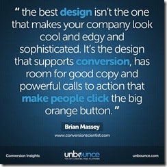 At the end was my name, and the quote had been taken from one of my recent blog posts on conversion and design. You could hear the air squealing into my already inflated head.
So infatuated was I with myself, that I immediately shared the – quotegraph? – with my entire network, and I’m writing a blog post about it. Who would have created such a honeypot for my ego? What entity would benefit from such bold action?
It was the very smart marketers at Unbounce. Their service provides easy ways to develop landing pages and to test different versions of those landing pages. Who spends their time recommending – nay demanding – that businesses use targeted landing pages to increase leads and sales? I do, as well as many other marketing experts, some of whom have already been targeted by Unbounce flattery.
If you’re reading this and this is your first introduction to the people at Unbounce, then tell us in the comments. That will be a testimonial to how effective this technique can be.
And it’s cheap.
I (and other experts) provide the content. All Unbounce had to do was lay the quote out all big and bold, and post it on Facebook. Very smart.
Will this also end up on my Pinterest page? Oh, yes.
Steal this idea for your industry.
[bookpromo]
The Secret Behind the Success of the DollarShave Video
Conversion Marketing StrategyThe Dollar Shave video went mega viral because it is “funny”, right?
But to understand why and how it is funny you need to break it down and analyze what motional strings it is playing. Only then will you truly understand its success.
Michael is fed up. Who isn’t?
The major emotional theme of the video is “Fed up-ness”. At the heart of this Fed up-ness lies of course Dollarshave’s value proposition to customers who are fed up with paying for overpriced razor blades. But there’s more.
The whole body language of CEO Michael Dubin says “I’m fed up”. He just can’t sit or stand still, he needs to move, he’s on a mission. He’s fed up with political correctness as he proclaims that the blades are F***ing great. He’s fed up with over-paid tennis players. I think he’s even fed up with being fed up.
This goes right into the core of the American peoples’ feelings. Not only are they fed up with the Razor blade monopoly, they’re fed up with Washington, they’re fed up with no jobs. They’re also fed up with being fed up.
Michael takes matters into his own hands
By doing so he becomes an agent for the aspirations of Gillette-enslaved Americans. When they buy blades from Dollarshave, they’re not customers, they’re proactive change agents who can create change and fortune by their own actions. Together with Michael they enact their shared American dream.
Remember the payoff in the video?
“Isn’t it about time?”
It’s not a product or service statement. Actually not even a statement. It’s just about how you feel when you’re fed up and want to take matters into your own hands. Like Michael.
Michael is one of us, not one of them
Look at Michael’s office. It’s a mess. You’ll find similar offices all over the country. Except of course at Madison Avenue. It’s as far from that as you can possibly get. In any case Michael seems to spend most of his time in the warehouse.
Michael would not pay an agency tons of cash to make this video. If you know a little bit about video production you can see it’s professionally made. Still it’s created to preserve an amateurish look and feel. That’s not by coincidence.
And Michael obviously can’t play tennis.
Michael is American
Ok, the flag at the end is obvious, but when you think of it the American theme runs right through the video.
There’s an homage to the ancestors (Grandpa with Polio). The evil villain is a foreigner (a Swiss tennis player). There’s a reference to the Vanderbilts.
It might not be as obvious to you as it is to me (I’m Swedish), but it’s there for sure.
Michael talks to….. Yeah, Michaels
Michael is a former marketing exec. Does he need to save dollars on his shaving in order to be able to keep the kids in school? I don’t think so. He just thinks it’s about time.
So when crafting the video for the launch campaign Michael needed to decide what people he should appeal to. – “What is the persona of my early adopter?”, is the question he must have been asking himself.
And I think the answer is – “People like myself!”. People who think the Swiss Army knife approach of Gillette is starting to look ridiculous. People who don’t need to save on their shaving. People who just have this feeling that something should change. Not for rational money-saving reasons, but for emotional reasons.
Others will come later. Who really need to save on their shaving. Who wants more proof of the quality of the blades. Then we’ll see other campaigns designed for them. But for now Michaels want to wake up thousand of Michaels around the country.
Michael creates an Experience
I listened to Jared Spool at Conversion Conference SF a couple of months ago. He said that every innovation goes through three phases; Technology, Features and Experience, being the final one.
Gillette is clearly about Features, with their vibrating handle, flashlight, 10 blades and backscratcher (according to Michael). They’re trying to sell us a Shaving Experience which is an Experience around the use of the product.
Michael, on the other hand, spends exactly 5 seconds to talk about the features of the products in the 94 seconds video. Dollarshave creates an Experience around how we see ourselves as individuals and how we want to live our lives. This is infinitely stronger.
We react much stronger to messages about our identity than our actions. I guess Michael knows this.
So if and when you decide to buy those blades you’re not just shaving – You’re participating in a collective experience designed to enforce your self-image as a strong and active American who thinks “It’s about time”.
John Ekman is the Chief Conversionista of Conversionista! He is regarded as a Swedish authority on Conversion Rate Optimization. According to John, a Conversionista is someone deeply and crazily passionate about improving Conversion Rates. You can find more inspiring posts on John’s blog.
"My favorite part of the design is the money."
Conversion OptimizationWebsite design is only great if it’s making you money. It’s not about the colors, the shapes, the sliders and flashy bits, though that’s the fun part many businesses sadly get hung up on. People don’t come to your site for entertainment or art—unless you sell art.
They come to you for a solution.
The purpose of your website is to help them find you, connect with you and pay you money to solve their problems. That’s conversion. That’s why you built the site in the first place. Your site’s main job is to make this very easy for them to do. So the best design isn’t the one that makes your company look cool and edgy and sophisticated. It’s the design that supports conversion, has room for good copy and powerful calls to action that make people click the big orange button. Want to know more?
Read more in my column on Search Engine Lan
d
Product Page Testing and Shocking Web Graphics: For Further Study
CRO Tests | Multivariate | AB TestingThe Product Page 2012: 7 Must-Test Elements
Feb 27, 2012 08:22 am
@TheGrok says “Test your product headline to be benefit oriented as opposed to just product name.” I hadn’t considered that. Good lists always tell you something you hadn’t thought of and Bryan has such a list for Online Stores and Publication sites who feature their offerings on Product Pages. Product pages are the money pages on your site, and are one of the first places to look for optimization opportunities.
read more
The Shocking Truth About How Web Graphics Affect Conversions
Feb 27, 2012 01:14 am
@KISSMetrics – David Ogilvy is experiencing something of a renaissance these days as his experience and research in offline marketing are proving true in online marketing. And we need him. Images are an abused medium on the Web, and this article points out mistakes that you are probably making.
There are some real nuggets here, such as “Captions under images are read on average 300% more than the body copy itself” Ask your designer what research he has for his decisions.
This is an important article, and you should read it before you blindly follow the advice of lazy designers.
read more
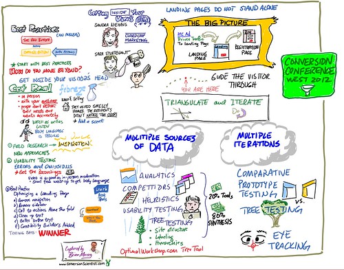
Designing from Inside the User's Head-Conversion Conference [INFOGRAPH]
Conversion-Centered DesignSandra Niehaus and Sara Sturtevant of Closed Loop Marketing offer three methods for getting inside your visitor’s heads to design an online experience that persuades and converts.
I captured this instagraph at Conversion Conference West 2012.
FULL SIZE
Understanding Behaviors at Conversion Conference with BJ Fogg
Conversion Marketing StrategyBJ Fogg is a Psychologist, Innovator and Director, Stanford Persuasive Technology Lab. He gave an inspirational and interactive keynote presentation at Conversion Conference West 2012 using props instead of slides. His props included a magician’s robe, and a kayak paddle as a wand.
Clearly, he knows something about how to communicate. Part of his presentation involved the audience teaching his B=MAT behavioral model to not one, but two others. You’ll find that model in this instagraph that I captured in real time.
FULL SIZE VERSION
Writing Killer Conversion Copy with Joanna Wiebe of CopyHackers.com [Audio]
Persuasion ScienceI’ve been putting the finishing touches on my Conversion Conference presentation entitled Creating Killer Conversion Copy: Emails, Landing Pages, PPC Ads and More.
Writing Killer Conversion Copy with Joanna Wiebe of CopyHackers.com [Audio]
Download | Subscribe
We cover a lot of ground in the podcast.
For more on social media strategy, sign up to get a copy of my up-coming book: The Customer Creation Equation: Unexpected Formulas of the Conversion Scientist.
The Magnetic Effect of Drawn Video
Conversion-Centered DesignEngaging the visiting mind is a key challenge of Conversion Scientists. It is also a key capability of video. However, there is something magnetic about drawn video. It is unclear exactly why.
Is it the symbolic nature that keeps our attention?
Is it the emergent nature of drawings as they are drawn?
Is it just that this format is unique?
Here is just eighteen seconds of drawn video I did for TEDx Austin reflecting their 2012 theme “Beyond Measure.”
Why do you think this format works?
http://youtu.be/sVU3SN2H_kA
This video was done in about an hour and a half idea to done using a Windows Tablet PC, Microsoft OneNote, and Camtasia for recording and editing.
This is inspired by the RSAnimate drawing videos found on YouTube.
The folks at How It Works Media develop cartoon-based messaging for businesses.
The Net Pool from HowitworksMedia on Vimeo.
Social Moonshine: Converting Social Media Connections to Leads and Sales
Lead GenerationIn your rush to get as many Likes, Follows, Connections and +1’s as you can, have you thought about how you are going to turn those fans and friends into leads and sales? This 13 minute video introduces you to the tools you need. You’ll learn:
Watch on YouTube
This was originally presented at PubCon Las Vegas and you can see me at PubCon Hawaii in 2012.
If You Don’t Tell Your Kids About Conversion, Who Will?
Conversion OptimizationBut if we don’t tell the kids about the benefits of hanging with fake people—called personas—who will?
We have to just pick the right time and be ready to be vulnerable.
When confronted with a difficult question like “Daddy, should I put up a squeeze page?” we can just say: “I just don’t know. Let’s explore that together.”
As hard as this is, it’s better they learn about value propositions from you than off the street. Check out my article on Search Engine Land: 7 Things to Teach Your Children About Conversion to learn how to do this the right way.