There are few challenges more daunting than mailing to a purchased email list. In fact, I usually recommend against it. Nonetheless, it is often the only way to access a specialized audience, and list purveyors continue to lie about the value of their list.
If you are creating landing page for an offer to a purchased mailing list, you will have to work extra hard.
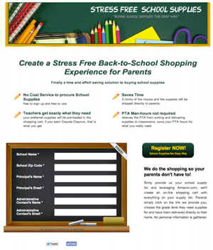
The top portion of the Stress Free School Supplies Page works hard, but fails to nail the “lead.”
Such is the case with Stress Free School Supplies. The owner of the business is a former teacher and understands the problem schools have in getting parents to purchase the necessary supplies for the year.
Her offer is that she will create a custom list on Amazon.com for each school. This allows parents to buy everything they need with a click. Her business will also provide the flyers and emails needed for reaching out to parents.
Her audience is a purchased list of school administrators, whose job it is to solve this parents / supplied problem.
Any competent landing page will:
- Makes an offer.
- Provides a way to take action, typically using a form.
- Delivers tangible proof.
- Earns your visitors trust.
- Shows relevant images.
For a “cold” email list the page must master two of these components: the Offer and Trust.
The initial questions for those who receive are, “How does this work?” and “Can I trust you?” Only then do you get permission to make the sale.
An Offer that Makes Visitors Want to Stay
 The offer is the primary value proposition, the reason the visitor should buy — or at least the reason they should keep reading. For a cold email list, the offer must reach out and grab the reader by the throat.

Is the offer relevant to the reader?
Currently the primary offer reads “Create a Stress Free Back-To-School Shopping Experience for Parents.” This headline is directed more towards parents than it is to school administrators.
While I’m sure that school administrators love their kids’ parents, I bet we would do better if we wrote a headline that addressed their pain, rather than the parents’ pain. The key to a great headline is understanding the administrators’ pain.
- That students will be showing up to school without proper supplies.
- Teachers will have to accommodate unprepared students during a chaotic time.
Establishing Trust
Trust in this case has two components:
- How does this work?
- Are you legitimate?
“How it works” is buried in this case; the paragraph below the offer is dense, non-specific and lacks clarity.
Amazon is a powerhouse brand, familiar and trusted. Since Stress Free School Supplies is an affiliate, we suggested “borrowing trust” from Amazon and using their logo on the page. Currently the logo is buried in the fine print low on the page.

Why is this logo buried low on the page?
We also suggested logos from any PTA associations she may belong to as well as any business associations (BBB). Another suggestion was to put a face to the company. Doing this increases lead generation conversion rates because people know they will be dealing with a real person not a computer automated recording and begins building that trust.
We usually do not recommend social media icons on landing pages. Stress-Free School Supplies needs trust symbols, and we suggested she keep them on the page. However, we recommend moving them to a less prime location than directly under the form.
Enticing Action
The for is the way school administrators to taking action. The goal of the form is to make it easy for administrators to sign up for the service without looking like a “squeeze” page.
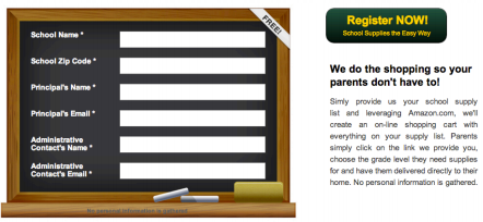
The submit button for this form is in a strange and confusing place.
This form currently has six blanks, including 2 emails and a zip code. The more personal information you request on a form, the more abandonment you will experience. We suggested to her that requiring only their email would help to heighten form fills. But, the main issue with this form is not the blanks, but the button to submit the form.
The call-to-action button was lost on this page. It was up and to the right of where we had just finished filling out the form. If someone had scrolled down while filling out the form, they may miss this entirely. We suggested moving the CTA button under the form, which they have recently done.
Providing Proof
Currently the proof is given by testimonials and the FAQs. However, The FAQs are at the bottom of the page, so 50% of people won’t make it that far and the testimonials are lost in a milky way around a vibrant picture that grabs the eyes attention to it, not the testimonials. A suggestion would be to put pictures of the individuals to these testimonials to drawl the eye and create an emotional response. Another good example of proof would be adding the number of orders filled.
Show the Product
What do the images on this landing page do for conversion? Bottom Line:“The goal of the images are to help me visualize owning and having whatever it is you offer.” The image in the page header is of school supplies. An image near the middle of the page shows… school supplies. This is not really why administrators sign up. Here the image takes away from the testimonials near it.
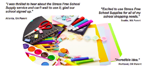
The Caption for this image may be “This is what school supplied look like!”
In Summary, this landing page needs to knock the offer out of the park and establish trust quickly. It’s the value proposition to its viewers through better targeted copy and adding an image that will explain the process.
For more information, please read: Discover the Chemistry Behind a Successful Landing Page [Infographic]


Effective Luxury Landing Pages: Page Critique
Landing Page OptimizationWell-heeled travelers will enjoy a private guided tour of the world’s various wine-making regions. Colin Simpson of Into the Vineyard arranges these advantures for them. Into the Vineyard tours are tailored and personalized to the individual, setting themself apart from other packaged, run-of-the-mill wine vacations.
The Into the Vineyard luxury landing page
Colin came to us with a landing page built on Unbounce.
They have had fairly good success with these landing pages, boasting conversion rates of over 5% and more. Colin had a number of questions for Conversion Sciences about how to optimize his landing page to see a lift in conversion rate while maintaining high lead quality.
Many of our suggestions are included in the annotated infographic image included in this post. However, one of his questions was one that we are asked all the time. Its answer is important for you to understand when you create your own landing pages.
Is the placement of the form too far down the page?
The short answer is “No.” This may be contrary to the above-the-fold or very-close-to-the-fold rule many of you follow, but there are good reasons to place your form towards the bottom of your landing page.
Into the Vineyard offers a luxury item and appropriately uses a value-building approach. Furthermore, part of the value of their offer is the ability to customization the product. Bombarding visitors with a form too early not only gives them no time to appreciate the luxury of the offer but also may elicit feelings of impersonality.
This is something to consider if you are in the luxury market. Even if a form placed “below the fold” produces a lower volume of leads than would one above the fold, you may find these leads to be better qualified. They have not only read your content to the bottom but they also know what they are going to receive in exchange for their information.
Laying out the steps of the process puts many visitors at ease. The use of the red arrow draws the visitor to take action.
We saw this strategy work very well in split testing for a similar company, a company that sells golf tours to Scotland and England. A landing page that added the steps of the process after filling out the form generated a 300% increase in leads. Note that this was not the only change to the page.
The bottom line is that the content of your landing page must make a clear offer, regardless of form placement, and your copy must support the offer, not just your product or company. Into the Vineyard does an excellent job of explaining what will happen if a person fills out the form.
The long answer to Colin’s question is “I’m not sure, let’s test it.” One of the awesome perks of using the Unbounce tool to create landing pages is its A/B testing feature.
For most online websites, A/B testing is the most reliable way to know where to place a form on your page to maximize leads and sales.
When you create your own landing pages, consider your market. Are you in the luxury market where your visitors may need a little more information to get excited and convert? Or, are you using this landing page to give the visitor a freebie in exchange for their information?
These two situations will lend themselves to different form placement. If you have the traffic, test the difference because no two business are the same and what works may not work for all.
More recommendations
Luxury Products Landing Page Critique
5 Components of a Landing Page for a "Cold" Email List: A Critique
Landing Page OptimizationThere are few challenges more daunting than mailing to a purchased email list. In fact, I usually recommend against it. Nonetheless, it is often the only way to access a specialized audience, and list purveyors continue to lie about the value of their list.
If you are creating landing page for an offer to a purchased mailing list, you will have to work extra hard.
The top portion of the Stress Free School Supplies Page works hard, but fails to nail the “lead.”
Such is the case with Stress Free School Supplies. The owner of the business is a former teacher and understands the problem schools have in getting parents to purchase the necessary supplies for the year.
Her offer is that she will create a custom list on Amazon.com for each school. This allows parents to buy everything they need with a click. Her business will also provide the flyers and emails needed for reaching out to parents.
Her audience is a purchased list of school administrators, whose job it is to solve this parents / supplied problem.
Any competent landing page will:
For a “cold” email list the page must master two of these components: the Offer and Trust.
The initial questions for those who receive are, “How does this work?” and “Can I trust you?” Only then do you get permission to make the sale.
An Offer that Makes Visitors Want to Stay
Is the offer relevant to the reader?
Currently the primary offer reads “Create a Stress Free Back-To-School Shopping Experience for Parents.” This headline is directed more towards parents than it is to school administrators.
While I’m sure that school administrators love their kids’ parents, I bet we would do better if we wrote a headline that addressed their pain, rather than the parents’ pain. The key to a great headline is understanding the administrators’ pain.
Establishing Trust
Trust in this case has two components:
“How it works” is buried in this case; the paragraph below the offer is dense, non-specific and lacks clarity.
Amazon is a powerhouse brand, familiar and trusted. Since Stress Free School Supplies is an affiliate, we suggested “borrowing trust” from Amazon and using their logo on the page. Currently the logo is buried in the fine print low on the page.
Why is this logo buried low on the page?
We also suggested logos from any PTA associations she may belong to as well as any business associations (BBB). Another suggestion was to put a face to the company. Doing this increases lead generation conversion rates because people know they will be dealing with a real person not a computer automated recording and begins building that trust.
We usually do not recommend social media icons on landing pages. Stress-Free School Supplies needs trust symbols, and we suggested she keep them on the page. However, we recommend moving them to a less prime location than directly under the form.
Enticing Action
The for is the way school administrators to taking action. The goal of the form is to make it easy for administrators to sign up for the service without looking like a “squeeze” page.
The submit button for this form is in a strange and confusing place.
This form currently has six blanks, including 2 emails and a zip code. The more personal information you request on a form, the more abandonment you will experience. We suggested to her that requiring only their email would help to heighten form fills. But, the main issue with this form is not the blanks, but the button to submit the form.
The call-to-action button was lost on this page. It was up and to the right of where we had just finished filling out the form. If someone had scrolled down while filling out the form, they may miss this entirely. We suggested moving the CTA button under the form, which they have recently done.
Providing Proof
Currently the proof is given by testimonials and the FAQs. However, The FAQs are at the bottom of the page, so 50% of people won’t make it that far and the testimonials are lost in a milky way around a vibrant picture that grabs the eyes attention to it, not the testimonials. A suggestion would be to put pictures of the individuals to these testimonials to drawl the eye and create an emotional response. Another good example of proof would be adding the number of orders filled.
Show the Product
What do the images on this landing page do for conversion? Bottom Line:“The goal of the images are to help me visualize owning and having whatever it is you offer.” The image in the page header is of school supplies. An image near the middle of the page shows… school supplies. This is not really why administrators sign up. Here the image takes away from the testimonials near it.
The Caption for this image may be “This is what school supplied look like!”
In Summary, this landing page needs to knock the offer out of the park and establish trust quickly. It’s the value proposition to its viewers through better targeted copy and adding an image that will explain the process.
For more information, please read: Discover the Chemistry Behind a Successful Landing Page [Infographic]
Throw the Self-Help and Dummy Books out the Window. We Have 9 Mantras for CRO Success!
Conversion OptimizationThe audience for any website is unique.
In fact, it would be presumptuous to conclude that two websites selling the same or similar product are going to have equal successes. If this were the case, where would the challenge be? And what would we be doing for a living?
This is why we let your website visitors decide what works best. Seems legitimately reasonable to us. Your website’s success is measured by conversions. Whether that is a completed purchase, email obtained or newsletter subscriptions.
But how do we work through this process? Is there a specific protocol that we follow? Guided questions that we ask ourselves?
We live by a few mantras; truisms if you will. These 9 mantras assist and guide us through the decision making process, ultimately leading us to CRO victory for your website.
We proudly want to share these with you. We don’t keep them locked in a vault like Pepsi or Buschs’ Baked Beans, so here are our 9 CRO mantras. Enjoy!
The Nine CRO Mantras of the Conversion Scientist!
Nine CRO Mantras of The Conversion Scientist
Let us make your accountant smile.
You can get a free strategy session with a Conversion Scientist. We’ll help you see the possibilities for your visitors.
Predicting the Unpredictable Consumer
Conversion Marketing StrategyIn this presentation, I talk about predicting the future.
The problem with predicting the future, even using CRO, is that our visitors are very unpredictable. Here are some of the assumptions we use to predict the future that just don’t work.
Because, really, all of us are predicting the future. When we’re building our sites and we’re putting our ads out, we’re trying to predict what that ad or that site is going to do for our business.
We’re all trying to predict the future and we’re not very good at it.
Podcast: Play in new window | Download
Subscribe
How to Know Your Audience like a Psychologist
Conversion Marketing StrategyIf Psychology is the practice of understanding a person through their actions and behaviors, isn’t website optimization pretty much the same thing?
The folks who invited me to speak at the Chinwag Psych Conference in London think so. Here’s why.
What a person says they are feeling and thinking doesn’t let a psychologist know what is going on in their subconscious. It’s the subconscious that drives our behaviors more than our rational, conscious minds.
No, the psychologist has to read between our words, evaluate our unconscious behaviors to begin to see deeper.
A Conversion Scientist can ask a web audience what they expect from a website and why the did or did not buy. The answers will be rationalizations, and often will contradict the actual actions of these visitors.
We have to read between the lines, watching their online behavior. Our analytics database is like our couch. In the end, both the psychologist and the Conversion Scientist must speculate as to why people behave the way they do.
The psychologist may recommend additional therapy. They may prescribe medication. If they are good, they will monitor the patients to see how the treatment worked.
After seven years of website optimization, I may need medication.
The Conversion Scientist may prescribe building trust, stronger language, more social proof, better images and more. And we always measure the effectiveness of these “treatments.”
So, if you’re in London on May 15, you should come and see an amazing lineup of psychologist-marketers. Nathalie Nahai, Craig Sullivan, André Morys, and Bart Schutz round out my list of favorites.
P.S. Get nine articles that I’ve personally selected to round out your knowledge of website optimization. Signup right here.
Nine Articles that will Make You Awesome
Conversion OptimizationWe publish a lot on our blog every week. That’s a lot to keep up with.
And then there is everyone else offering brilliant, helpful and overwhelming tips and how-to articles.
We’ve made things simpler, and (we hope) a little fun. We’ve created a mini course from articles on the Conversion Scientist. We’ve selected the nine articles that we think you really should read. We even included several Audio selections for your commute to work.
Each time you read or listen, you will collect points. Collect enough points and earn a badge.
Earn your Ph.D. in Conversion Awesomization, we’ll give you a special prize.
Three Levels of Learning
We have nine articles organized into three levels of learning. You can earn four badges you can earn.
Now is the time to start. Go ahead and get your Student Badge. Within a few days, you will be a Ph.D. in Conversion Awesomization.
What Makes Shoppers Click? A Lesson in E-Commerce Consumer Psychology (INFOGRAPHIC)
Ecommerce CROCheckout abandonment rates stand at an average of 67.4%.

This eye opening statistic reveals that a significant amount of online businesses are letting valuable sales slip through their fingers due to errors within the checkout stage itself. The modern day consumer is spoiled by choice, they can easily compare prices, they judge a website and brand within seconds and they will make quick judgments on whether to make a purchase or not with any slight site error or cause for doubt leading to a loss of interest, and lost sales.
Online brands must work increasingly harder to encourage their consumers to make a purchase. Brands must understand how their consumers respond to their website design and layout as well as offering top customer service, quality products and competitive prices – not an easy challenge.
Vouchercloud has developed this infographic to help online businesses gain an understanding of what puts consumers off from making a purchase – leading to checkout abandonment. It gives an insight into the mind of the ever demanding online consumer in a bid to help businesses improve their sales.
About the Author:
Emma works for vouchercloud. She works with brands to plan and develop effective coupon marketing campaigns which will boost profits and increase brand exposure. She enjoys all aspects of marketing and the challenges of producing a successful campaign which will be well received by consumers. Her key responsibilities are to develop and launch these campaigns with her team. You can reach vouchercloud on Twitter & Facebook.
The Conversion Scientist Shares his Secrets with The Web Psychologist [AUDIO]
Conversion OptimizationI do a lot of interviews. I love doing them, especially when they are on my favorite subject: me.
However, I must admit feeling a bit of trepidation at the thought of being interview by “The Web Pshychologist“, Nathalie Nahai. After all, her job is to peel back the layers of your marketing program until she finds the core issues that keep you from success.
I wasn’t sure I wanted my onion peeled.
My fears were confirmed as Nathalie guided me through some revealing questions using humor and genuine curiosity. I revealed some of my biggest secrets.
Yes, these are questions you will want to know the answer to.
Listen to the entire interview
Subscribe to Podcast
21 Quick and Easy CRO Copywriting Hacks
Keep these proven copywriting hacks in mind to make your copy convert.
"*" indicates required fields
Converison Calculator: The Next Ten Percent
CRO Tests | Multivariate | AB TestingThose who are successful have a certain way of looking at things. They are committed to the end goal, but focused on the next ten percent.
The next ten percent is the next face to scale on the climb, the next set of downs in the game, or the next year of raising a healthy kid.
The next ten percent is more than another step or a rung on the ladder. It’s a complete process that, when repeated results in success. Why ten percent? Because ten percent makes a difference. It’s a reasonable goal, but not necessarily an easy one.
You can get your first ten percent once by luck or fortune. Success comes from getting that ten percent time after time.
It’s invigorating.
For us, the next ten percent is the next cycle of website tests. Ten percent is a reasonable goal. Repeat the process five times and you will see a 50% increase in website performance. If revenue is your goal, that’s 50% more revenue. If leads make your business go, then expect 50% more leads. Grow your revenue per visit by just 7% a month and you’ll double your revenue in one year.
We’d like to introduce you to our ten-percent at a time process. We call it the Conversion Catalyst.
It’s a proven system to get you that next step month after month.
Reply to this email or give us a call at 888-961-6604.
Brian Massey
The Social Video Starter Guide [INFOGRAPHIC]
Conversion Marketing StrategyThis is a guest post by Ivan Serrano.
Now more than ever, a quality video can often do a better job at getting clicks to your site and getting sales than any other form of marketing. The reasoning is simple: people are less likely to be distracted while watching and listening to a video, compared to text, where there’s no need to pause for fear of missing something, one can just tab over to respond to a message and never tab back.The phrase “too long; didn’t read” has entered the lexicon of internet users worldwide, highlighting the importance of keeping things brief, so that’s what we’ll do here.
If you want to keep a customer’s attention and turn idle curiosity into hard sales, social video is the platform to use to get it done. Whether you brave the masses of YouTube or take this advice to the extreme and market your business through Vine, get acquainted with the major social video channels with our graphic below by 1800numbernow.com.
About the Author
Ivan Serrano, a journalist and business enthusiast, enjoys sharing his knowledge within the business communities through his writing. In addition to covering social media marketing, he also likes to discuss globalization, business communications, and developing technology.