As a scientist, I’m obsessed with data in every aspect of my life. I calculate wait times in lines based on number of customers and speed of the checkout clerk. I check multiple spreadsheets and websites to optimize cash back rewards and airline points before purchasing anything.
So when I decided it was time to look for a lab coat that matches mine, joining an online dating site with plenty of data points was the perfect choice for me.
My Online Dating Profile: The Most Romantic of Landing Pages
An online dating profile is essentially a lead generation landing page, so it’s the perfect platform to create an optimization project that’s entertaining to read about as well as fairly practical for me: a single woman looking for a dating partner.
Before we can attract the ideal date (or customer), we need to know how to measure “ideal”. Most of our visitors won’t be the ideal. We need to have a good understanding of our base qualifications and the deal-breakers that mark a visitor as outside our target market.
One of the most difficult questions a business can answer is, “Who do I not want to focus on?” or, “Who am I willing to let go of to better serve my best prospects?” If we try to speak to everyone with our value proposition, it gets watered down so much that we don’t engage any visitors effectively.
This is essential for efficiency in time and cost of acquisition.
You don’t want your sales staff spending hours with leads that will never be customers.
And I don’t want to spend hours with men that will never be a good date for me.
With this in mind, I’m putting aside the idea of a “match” in favor of looking for “leads”. However, not everyone is a good “lead” for me.
For this experiment to work I needed to be armed with a list of traits that could easily be spotted from a dating profile or early interaction, and a site with a lot of data points to examine.
I chose the free site okcupid because it has a large user base in my target market (Austin, TX) and uses both quantitative and qualitative data points which will make sussing out a qualified lead much easier.
With all this data at my fingertips, the job I have before me is to put together a rating system that will allow me to quantitatively judge what is a fairly subjective task.
But how do I do that?
The (Quite Literal) Formula for Love
For a dating landing page, I need to be able to numerically rate a lead – someone who messages me – instead of using my intuition, and I need to be able to gauge whether I’m attracting the kind of person I want to spend time with. Otherwise, I’m just congratulating myself on receiving mountains of messages with no regard to quality.
We experience the same challenges on landing pages. Our conversion rate tells us how many visitors respond to an offer, but we need another way to determine whether or not our page is engaging qualified prospects: quantity and quality.
Fortunately, my work as a data-driven analyst has prepared me for the task… I hope.
For my lead rating system, I will rate the profile based on observable evidence in his profile and initial message.
I’ve organized my rating system into three different levels:
- Free of deal-breaker traits (db) rated as a 0 or 1
- Traits that are of importance to me (ti) rated on a scale from 0 to 1
- Traits that are of critical importance to me (tomg) rated on a scale from 0 to 1
Note: this is weighted more heavily in our formula
It all boils down to this First Date Probability formula:
P(first date) = db x (∑ti x 2∑tomg)
Deal-Breakers
The deal-breaker variable is binary. If a curious courter has even one deal-breaker trait, his First Date Probability goes to zero.
In both the dating world and the business world, deal-breakers are pretty important. They quickly eliminate prospective paramours from the running early on. Businesses, however, don’t often incorporate these all-or-nothing deal-breakers in lead scoring algorithms.
What are the deal-breakers in your online business? We all want web prospects that have a problem you can solve, and who have the money to pay for it.
Common business deal breakers include:
- Title: They don’t have the authority to make the decision.
- Purchase Timeframe: They aren’t ready to buy in a reasonable time.
- Location: We can’t service their city.
- Language: We can’t communicate with them.
- Budget: They can’t afford us.
At my company, we really can’t do scientific optimization unless a prospect gets 200 transactions or leads from the web in a month. For us, this is a deal-breaker.
Asking about deal breakers in your lead generating landing page forms is one way to let visitors know that they are in the wrong place. They won’t waste your time and you won’t waste theirs.
Deal-breakers for me include:
- Younger than 25 or older than 45
- Already in a relationship or not interested in monogamy
- Living outside of Austin, Texas
- Smokers
I would score these with a zero if I find them in his profile.

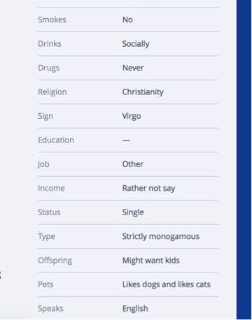
Finding evidence of my deal-breakers is pretty easy on okcupid as these are simple questions provided in a basic profile. Either you’re a smoker, or you’re not. Here are some of my answers, totally spelled out for me – 37, non-smoker, Strictly Monogamous, Lives in Austin, Texas.

If a lurking Lothario contacts me who is prison-bound for living out the storyline of Psycho, I will say “no” to a date and consider none of the other attributes. If these items are present, the inquirer receives an appropriate rating of 0.
For our experiment, anyone who contacts me outside of this range will still be considered a lead, but they’ll just be an unqualified lead. In business, these are the folks we just can’t help. They might get a short, polite email or a referral to a more suitable business.
Important Traits (ti)
This next group of traits aren’t deal-breakers. I’m willing to make compromises here, though they’re still important.
In my formula, I will find a value for important traits (ti) by finding the sum of rated items. Some items will get a negative rating, meaning a score of one will be subtracted from the total.
- Negative Rating: If there is a religious mismatch, a prospective Romeo will get a negative rating. It’s important that we have similar values.
- College graduate – Tells me he values and respects education. And he can read. I’m most turned on by smarts, so someone with a well exercised brain is a must.
- Adventurousness – Not afraid to try new kinds of foods, sky-diving, road trips — almost anything you couldn’t do in your cubicle.
- Love of travel – Traveling is part of being adventurous, but it’s also a distinct part of my rating system. I have friends all over the country and would like to hear more about interesting places.
- Appreciates dry/sarcastic humor – My sarcastic voice sounds a lot like my regular voice (bonus points for Joss Whedon fanboys and knowing where that line comes from)
- Creative and appreciates art – Creative hobby a plus! (I dance, love the theater, paint and write – I want someone that can come with me to the theater or an art museum.)
- Healthy/physically active lifestyle – It isn’t about body type; it’s about lifestyle. I’d love to find someone who will join me at the gym or go hiking with me.
You can that rating leads based on these traits isn’t going to be as straightforward as the deal-breakers, but it can still be pretty clear whether someone is stacking up well.
This snippet of standardized questions helps me get an idea of how this person feels about his religious beliefs. It’s actually a two part question answered by choosing your answer from a drop down menu. Part one is choosing the religion, and part two is where you choose the degree to which you follow the religion.

This question is open-ended, but this guy still managed to cover one of my important traits and also a critically important trait by mentioning his dog.
It won’t always be easy to assign a value, however. Sometimes I’m going to have to look at the profile as a whole to make a decision. This next profile gave me some mixed messages.

When you answer standardized questions on okcupid, it will use your answers to rank you among other users of the site. In the bar graph above, the midline represents the average okcupid user, so this person is much less into exercise than the average person.
But he has also indicated that he rides his bike often in his response to an open-ended question. Since I’m looking for someone who lives a healthy lifestyle, maybe not exercising is ok. It could mean that he just really hates going to the gym, but he loves being an active person.
Critically Important Traits (tomg)
- 27-37 years of age
- Loves dogs – I own a giant dog named Remus and he’s here to stay.
- Negative Rating: Negativity and pessimism.
- Career oriented – My ideal match has his own career and professional direction because he’ll understand my own ambition, and we’ll be able to encourage and support each other.
- Enjoys quiet evening at home – I love being downtown or out where the action is, but I need quiet and mellow to recharge and be my best.
If this person contacted me, he would be a strong lead based on this small part of his profile. Humor? Check. Career oriented? Check! Education? Check. There are many personality traits I’m looking for that I didn’t include in my rating system because I wasn’t sure I’d be able to find solid evidence without meeting in person, but this guy is also demonstrating some strong elements of the Type A personality I really like.
Deciding whether someone is negative or pessimistic will be another item that requires looking at the big picture. It’s one of those “know it when you see it” traits, but strong indicators are lists of unacceptable attributes in another person and making repeated comments about how past relationships have ended poorly.
Scoring Qualified Leads
So now what? We have a bunch of leads that aren’t obvious mismatches. How do we determine which ones to spend our time and energy on? Who will have the highest ROI?
For our experiment we’ll count a lead as anyone that initiates contact. We’ll then rank our leads based on the following system:
Qualified lead: Scores a one on all deal-breakers (meaning there aren’t any deal-breakers I could find)
These are the profiles I’ll take time to look at and see if they’re worth spending time on.
Ideal candidate: Scores zero on all negative ratings and ones across the board other than that. We can skip the screening portion and start lobbying hardcore.
Candidate Level 1: Scores in the top third of my formula.
I will devote time and energy talking to this person and getting to know him with an emphasis on setting up an in-person meeting sooner rather than later.
Candidate Level 2: Scores in the middle third of my formula.
I will respond to his message and ask leading questions. He may have other qualifications that are not on the list that appeal to me, so he might be worth an in-person meeting.
Candidate Level 3: Scores in the bottom third of my formula.
These are the leads that are worth talking to if times are lean. If lead flow is up, and we’re swimming in qualified leads, these will fall to the bottom of the pile. We’ll get to them if we have the time and resources to do so.
Case Study
To see how well my equation works on a real person, I’m putting it to the test. The screenshots below are from a single profile. He hasn’t messaged me, so he doesn’t count as a lead for my experiment, but he should be good practice for my rating system.
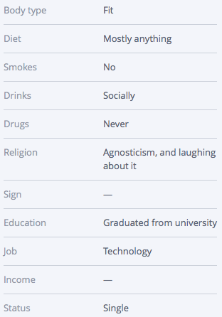
I’ve started with profile basics looking for deal breakers.

Deal-Breaker Traits
- Younger than 25 or older than 45: 1
- Already in a relationship or not interested in monogamy: 1
- Living outside of Austin, Texas: 1
- Smokers: 1
He’s off to a good start, so now I’m moving on to look for important traits. Some of them popped up in his profile basics.
Important Traits
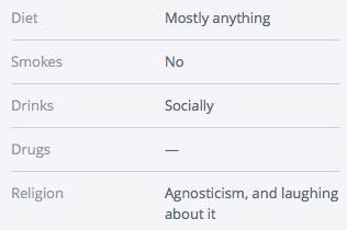
- Negative Rating – Religious mismatch: 1
- College graduate: 1
He’s agnostic, and I’m Episcopalian. We might be able to make it work, however, which is why this trait isn’t a deal breaker.
- Adventurousness: 1
- Love of travel: 1
- Healthy/physically active lifestyle: 1
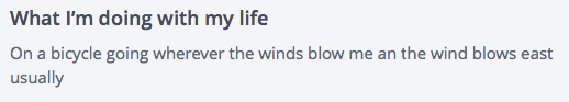
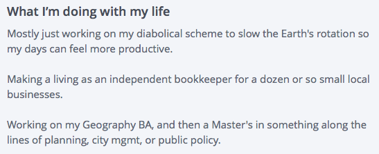
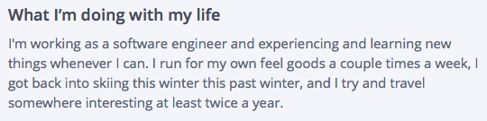
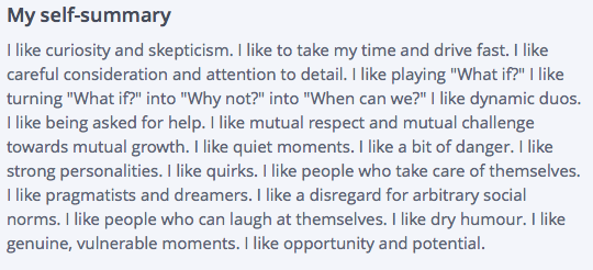
He describes himself as fit in his profile basics which made me think he probably leads a pretty healthy lifestyle, but this paragraph made me certain.
He also has a tone here that seems humorous when he says he runs for his own “feel goods”. I wanted to give him a score of one based on that line, but it seemed like it would be based on fairly thin evidence. His self-summary gave me more data to make me think a score of one is appropriate.
- Appreciates dry/sarcastic humor: 1
- Creative and appreciates art: 0
I looked for responses to questions about art, photos that could be in a museum, mentions of favorite artists, but I didn’t see anything artistic.
He didn’t nail all of my Important Traits in his profile, but I still found evidence of most of them. Now for Critically Important Traits.
Critically Important Traits
- 27-37 years of age: 1
- Loves dogs: 1
- Negative Rating – Negativity and pessimism: 0
I found his age and pet ownership status in his profile basics.
Of course I can’t prove the null hypothesis with negativity since I’m trying to figure out whether he isn’t a positive person, so it’s possible that he’s a pessimist. That’s what makes this trait one of the more difficult ones to score – but there wasn’t enough evidence to give him anything other than a zero.
- Career oriented: 1
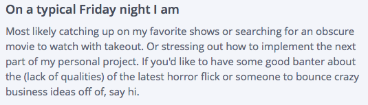
- Enjoys quiet evening at home: 1
If he wants to spend Friday night talking about business ideas, I can say with confidence that he’s a career oriented person. Takeout, movies, and TV shows all sound like a solid night in to me.
Now I can plug in some numbers into my formula.
P(first date) = db x (∑ti x 2∑tomg)
db = 1
∑ti = 3
∑tomg = 4
P(first date) = 1 x (3 x 2(4))
P(first date) = 24
He is a candidate level one using my criteria. Let’s hope he sends me a message!
Attracting Ideal Qualified Leads
It may turn out that people aren’t up front about something I thought they would be or that a particular flaw that bugs me turns out to be so common that I would be remiss to keep paying attention to it. So I may need to make adjustments here and there in my description of an ideal lead.
The process of creating my rating system, however frustrating, was a good experience because knowing what I’m looking for is half the battle. I now know what I’m aiming for in my profile/landing page, and I can share things about myself more strategically. I won’t be lying on my dating profile, so when I say I’m being strategic, I’m not changing who I am to meet someone – I’m simply emphasizing certain things about myself and not mentioning other things.
Best foot forward, right? Your landing pages should do the same. If you’re a family-oriented small business, but your ideal lead isn’t, why share that information? It’s still important, of course, but it’s ok to withhold information that doesn’t get right to the point.
Now you know quite a lot about what I’m looking for, but you know relatively little about me personally. To find out more, you know what to do: subscribe to my series! You know you want to…


Conversion Optimization has been Around as Long as Commerce
Ecommerce CROWe came across this infographic from ecommerce-platforms.com, The History of Commerce from Cattle to Bitcoin, and realized that conversion optimization has been around as long as commerce. Conversion optimization is the art and science of making more money from what you have. It is about getting more currency from the investments you’ve already made. Today we tend to associate optimization with websites and traffic, but making more from what you have goes back as far as 9000 BC.


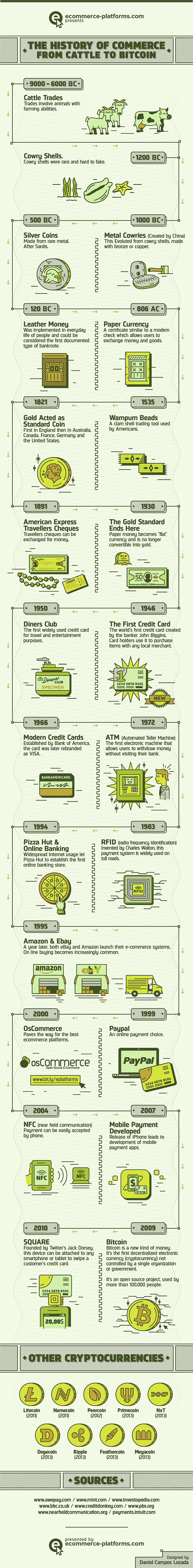
Take for example, cattle trading.
Farmers and shepherds optimized their herds by encouraging procreation. This made more “currency” from the stock they had. To this end, they were known to play romantic music and light candles to encourage an amorous atmosphere. In extreme situations, the shepherds were known to get the animals drunk, hoping for a hookup or two.
Unfortunately, this didn’t work with cowry shells. It was never clear what would make mollusks feel more amorous toward each other. So, optimizers invested in snorkeling gear hoping to find more of the rare shells. While it was centuries before the technology was perfected, this is considered the origin of SCUBA diving.
This is also most likely the origin of the phrase “For just a few clams.”
When leather money was invented, conversion optimization consisted of stretching the skins, hoping to get more from each leather bill.
We refer to this kind of optimization when we talk about “Stretching your dollar.”
As early as the 1500s, native Americans used VWO (Visual Wampum Optimizer) to get more from their money. This is an early forerunner of the Visual Website Optimizer tool we use today.
With the invention of Travelers Cheques, the slogan, “Don’t leave home without them” entered the American vernacular.
Savvy optimizers knew the way to hang on to more of their money was to not spend it. They adopted a new version of the slogan, “Don’t leave home.” Unfortunately, a whole generation of young adults seems to have adopted this motto, much to the chagrin of their parents.
The banks got into the optimization game with the invention of ATMs. They were able to charge us for the privilege of giving us our own money. Optimization revealed that banks can charge higher ATM fees when the machines were placed in strategic locations.
For example, banks learned that they could charge as much as $10 in fees for machines placed near car impoundment lots and in Las Vegas casinos.
With the advent of Bitcoin, optimization has come full circle. In 9000 BC, optimization was all about farming. Bitcoin is created from “farms” of computers doing near impossible calculations.
And, based on the unpredictable behavior of Bitcoin entrepreneurs, alcohol would almost certainly have to be involved.
Today, the best way to get the most from your investment in traffic and web properties is to call a Conversion Scientist. During our href=”/contact-conversion-sciences/”>free consultation, we’ll tell you exactly how to optimize your online business and get an “unfair” advantage over your competition.
How would you have optimized the currency from the other eras in the infographic? Tell us in the comments.
History of Commerce: From Cattle to Bitcoin, infographic created by Ecommerce Platforms.
5 Smart Calls-to-Action That Make Visitors Click
Conversion-Centered DesignCompanies will typically spend $92 to bring customers to their site, but only $1 to convert them. Traffic is only half the solution to a successful online business.
If you’re putting 90% of your effort into driving traffic to your site, and minimal effort into optimizing your site for conversions then you may as well throw off the lab coat right now.
Like any great scientific experiment, you need to include the right elements to create a winning formula. And when it comes to a winning conversion formula, nothing screams “Sale!” more than a good call-to-action (CTA).
On paper the equation looks easy. Create a clear CTA for a product that delivers, and you’ll achieve sales.
So why is it that 47% of websites don’t have a CTA that can be found within 3 seconds or less? You shouldn’t expect a customer to take action if you haven’t made it abundantly, painfully, overwhelmingly clear what you want them to do. This is one reason many sites are losing the precious visitors they’ve struggle to bring to the site.Take a look at these smart calls-to-action with tips on how to use them effectively – from the homepage – right through to the sale.
#1. How to get people to sign up for an account: Basecamp
Basecamp’s CTA
Basecamp is a product that has enjoyed amazing online success year after year. Look at the Basecamp homepage and notice where your eyes are drawn first. Yup, it’s the call-to-action. It stands out like a sore thumb.
The minimalist design of the page really makes the sign up button pop. It’s a huge block of color, surrounded by white space. The key here is that the dark color of blue isn’t used anywhere else on the page, so it is the most visually “important” thing on the page.
Your pages should make it visually clear what path the visitor should take in order to move to the next step in their journey to conversion.
#2. How to get people interested in your product: MyOwnBike
CTA to design your bike on MyOwnBike
Smart CTAs even transcend language barriers. You don’t have to speak Germany to understand what it wants you to do.
As soon as you jump on the MyOwnBike homepage, you are invited to start designing your own bike via some persuasive writing techniques.
Again, a minimalist design is centered around the product image with a prominent call-to-action begging the visitor to click. And once clicked, the visitor gets to design their own bike and watch it transform in front of their very eyes – making it fun and engaging.
It’s a no-nonsense approach that relies solely on design to show the visitor what they should do next.
#3. How to push people to the product page: Asos
Shopping option CTAs on Asos
Sometimes, the CTA need only put the visitor on the right path. The CTA on the homepage of Asos does an excellent job of getting the visitor into the right part of the site. Visitors are split into two, males and females. To tackle this problem, Asos features two huge CTAs that lets the visitor pick which gender they would like to shop for.
This is a smart and simple way to move shoppers through to the category pages, where they’ll hopefully refine their search further and find exactly what they’re looking for.
The usual principles of a strong call-to-action apply, of course. The page uses liberal amounts of white space. Branding and navigation elements are black. This ensures the ‘View Women/View Men’ buttons clearly stand out in a vibrant blue color.
#4. How to push people to the checkout: Amazon
Your CTAs shouldn’t compete. One CTA should is ideal, but you often need to add more than one CTA. This is where it becomes a little trickier to refine your CTAs. Competing CTAs cause confusion and friction. A secondary offer on the page may cannibalize conversions from the primary, more desirable offer.
The Amazon product page uses color and position to achieve this on its product pages.
Two examples of Amazon’s primary and secondary CTAs
When a shopper is debating whether to buy they have two options:
The clear option is for the shopper to add the product to their basket so they can checkout. But if the visitor is hesitating, the ‘add to wish list’ button gives the visitor a back up option. Rather than losing that visitor to a competitor, Amazon chooses to provide a lower-commitment option.
The color and button size of the primary CTA sends powerful signals about what a visitor should do. And if you look at the contrast between the primary and secondary calls-to-action, you can see how much more attractive the primary option is.
The key here is to use a clear visual hierarchy with your primary and secondary CTAs, to push them towards the sale.
#5. How to make the sale: BarkBox
Once you click ‘get started’ on the BarkBox homepage, the journey from the product to the checkout page is simple, clear and most importantly, engaging.
First, using fun illustrations you select the size of your dog.
Barkbox’s visual tactic leading you to the sale
The call to action here is “Select Dog Size.” It is not presented on a button or link.
The next step asks visitors to select a monthly plan. Notice how the most expensive plan is highlighted as the best value.
Barkbox’s monthly plans
You’re then given the option to treat your dog to a toy. Notice how the ‘Yes Please’ option is highlighted automatically.
Barkbox’s upgrade option offers both a positive and negative call to action.
In general humans are reluctant to say “No,” so the negative call to action, “No, thank you.” may actually reinforce the primary call to action, “Yes, please!”
The site then asks for an email address.
The call to action is “Create Your Account”
By clicking on, “Next,” you’ll be taken to the shipping and payment page. This page is crucial to closing the sale, and as you can see from BarkBox, they really hit the nail on the head. They don’t ask for more details than necessary, and they don’t include any hidden charges – a reason why 70% of shoppers on most sites abandon their carts.
The form asks for minimal information to complete the sale
The key takeaway here is that calls to action rarely stand alone. The process of purchasing is a series of calls to action, each of which may or may not be a button or link.
Top tip for your checkout page: If you need to use a multi-step process then use a visual progress indicator like a progress bar so customers can manage their expectations regarding how long it will take.
Closing Thoughts
As you can see from these powerful examples, the CTA is clear, each standing out clearly on the page, and each having an intended purpose. By using contrasting colors, on a clean and simple web page, you’ll make your CTAs stand out and guide your visitors to the sale.
Looking for more awesome ways to supercharge your website? Download this eBook for 10 ways to convert shoppers into buyers.
About the Author
Bryan Robinson is a Digital Business Analyst in charge of Marketing for the Commerce division at Spark Pay. He specializes in Lead Generation, PPC and SEM, while also overseeing content production for Spark Pay online store. He has also started and flipped his own eCommerce websites for over 10 years.
The Conversion Optimization Tools Your Competition Will Dominate With [AUDIO]
CRO Tests | Multivariate | AB TestingThe fight for online leads and sales has traditionally been fought at the search engine. That is changing.
Web analytics, bid management, competitive intelligence, ad testing and ad management tools are all common staples of any serious paid search effort. Return on ad spend (ROAS) is being tracked all the way through the sign up or purchase process and ad strategies are being adjusted accordingly.
Quietly, the battle for online leads is moving to a new front. This new front is measured by revenue per visit, and it’s kissing cousin, conversion rate. Like the tide that floats all boats, website optimization is being seen as the way to reduce all marketing costs by dropping the acquisition cost of new prospects and customers.
Why do we say this is happening quietly? That is the conclusion we came to when examining an unusual data set from SpyFu.com. We were able to determine which businesses had conversion optimization tools installed on their website. This, we reasoned, gave us a pretty good idea of which businesses would dominate in the world of online marketing — assuming they were actually using the tools.
Subscribe to Podcast
In one report, 73% of businesses are spending between $500 and $5000 per month on paid search ads. Almost a quarter are spending between $5000 and $50,000 per month. Yet, only 14% of businesses have at least one website optimization tool installed.
Who are going to be the winners in this new front? Where does your business fit in this statistic?
6 Ways Successful Videos Use Stories
Conversion Marketing StrategyIn October of 2014 iNature Skincare, a small skincare company, sought to increase visits to their website and grow recognition of their products. They sponsored a video called “Comfortable” proposed by an independent filmmaker.

It was a gamble.
The video went viral, with over 4 million views on YouTube in the first two weeks.
The video has now delivered almost six million views, is embedded on over 268 sites (now 269), and enjoys tens of thousands of likes, shares, subscribers and tweets.
iNature reached out to us shortly after the video launched. They were not seeing a consummate increase in sales on their website. Four million views had not turned into a windfall for them.
What happened?
Story is Powerful
We use stories in our writing when we want to engage and move our readers to action.
Karl Jung believed that our collective unconscious contains the seed of stories universal to us all from the moment of birth.
Fairy Tales follow similar story patterns, regardless of the culture or era they are told.
Tapping the power of stories in our marketing messages is powerful, so powerful it can overshadow our products, as it did iNature.
What is story and how can we weave it into our videos?
1. Conflict
A story is a journey. The most rudimentary is the journey from conflict to resolution. The players can be almost anyone or anything. The conflict can be internal.
Conflict sets up a desire to find resolution, provided we find the conflict relevant. I think that this is why the most effective testimonial videos begin with, “When I first heard about this, I wasn’t sure it was for me.” We get engaged when we relate to that moment of indecision, that moment of conflict.
2. The Unexpected
Story can foil two areas of our brain that keep our messages from getting through.

Pierre Paul Broca discovered the part of the brain just in front of your left ear that stores shortcuts for information. Most notably, the shortcut for the familiar and known is to ignore the input.
When Broca’s area gets stimulated by the unfamiliar, it reaches out to an are of the brain discovered by Carl Wernicke. This part of the brain associates what we see and hear with our memories to give meaning to them.
3. Resolution
Resolution is the moral of the story. It’s the destination in which conflict is put in perspective and we can rest knowing we have seen the end.
If the message is relevant – like a story – Wernicke’s area tells Broca to pay attention. The resolution cannot be predictable. It cannot be irrelevant.
The following video doesn’t tell a story in the way we think of stories. However, it includes the unexpected, a conflict and a resolution. It contains the basic arc of a story in a non-traditional way.
Unexpected + Relevant = Salient
Broca is clearly woken up at seeing sets of twins dressed identically, sitting in a large room with wires running out in front of them. Wernicke becomes interested when the conflict is setup.
Chewing gum may not have a social stigma attached to it after all. Really?
This video uses humor to drive to the resolution, in which we learn that 73% of surveyed preferred the gum chewers.
4. The Brand or Product is a Character in the Story
This is hard. How do you cast your product or brand in a role in your video? It isn’t enough to be the sponsor if you want the story to be associated with the business.

Beldent does this in it’s Almost Identical video above. The product makes a brief appearance, but it is a crucial one. The gum makes the test possible.
The product doesn’t always have to make an appearance, but needs a role. The Chrysler 300 has a supporting role in the following Vine, but it is the device that makes the conflict – and thus the resolution – possible.
Let the 300 HP of the Chrysler 300 do the talking w/ Kenzie Nimmo . #300Seconds
5. There is a Way To Continue Participation
A clear call to action and a way to continue participating is key to successful videos.
Here is a story video with all of the elements we’ve discussed.
The Unexpected occurs when Ken tells us that he paints on paper towels.

The Conflict is setup when Ken tells us that he doesn’t have much “runway” and is in competition with his famous father.
The Resolution is provided by the makers of Bounty when they setup an art showing in Chelsea.
Bounty clearly plays a role in this video as canvass for Ken’s work.
Finally, it is clear that the makers of Bounty wants us to continue sharing about this on Facebook. There is a hint that there might be more stories to explore.
I think the folks at Bounty produced a beautiful story, but it’s missing a final element.
6. Something to Cement the Story into Memory
Emotion, Humor, Twists, Anticipation: these are the things that will cement the story into memory.
Beldent used humor to cement it’s message.
Bounty tried to use sentimentality to bring the emotion.
iNature Skincare’s Comfortable video delivers on this level, with a twist, humor and the kind of optimism we can only learn from children.
What is Missing?
If the Comfortable video delivers on the emotional component, why was it not more successful for the sponsoring brand?
If any element is missing, a video may not deliver success to the brand or product.
In my opinion, the Comfortable video failed its sponsor by not including the brand as a character. In the story of the woman who struggled with acne and eczema (1:14), would an iNature product have been too obvious? Perhaps.
The other element missing is the call to action. iNature gets a thank you from the filmmaker, and their website is listed.
iNature Skincare didn’t have a strong call to action.
However, this link is not clickable. The call to action “Check them out here:” doesn’t tie back to the film. iNature is a sponsor, not a character in the play.
What are Your Favorite Video Stories
We all can relate to the journey from conflict to resolution. Tell us in the comments which videos you like that contain the six elements:
UX vs. CRO: Where Should You Spend Your Redesign Dollars?
Conversion Marketing StrategyYou’ve decided it’s time to undertake a website redesign. Should you focus on improving UX (user experience), or should CRO (conversion rate optimization) be your priority? Are they mutually exclusive? Is there a time when one is more important than the other?
Sarah Jabeen from DiscoverSTEAM tackles this issue with Brian the Conversion Scientist in a UX vs CRO (replay).
You’ve probably guessed that Brian has CRO in his corner; Sarah will be leading with UX.
Watch the discussion.
You’ll still walk away with valuable information you can incorporate into your site redesign including:
Watch the replay. I hope I have you in my corner.
Nail the Top of Your Landing Page for Surprising Results [VIDEO]
Landing Page OptimizationThe long-scrolling flat style landing page is all the rage this year. This style of landing page suffers from some problems, however.
With the right approach, you can make these pages high-converting landing pages. Here’s how.
In my recent CrazyEgg Webinar How to Reverse-Engineer a High-Conversion Landing Page, I reviewed twelve landing pages using my “backward landing page” framework.
One stood out.
Here’s an excerpt of that presentation featuring the Body Language for Entrepreneurs landing page from Udemy.
21 Quick and Easy CRO Copywriting Hacks
Keep these proven copywriting hacks in mind to make your copy convert.
"*" indicates required fields
Nail the Top of the Landing Page
The purpose of the top of the page is to give the visitor reasons to explore the rest of the page. It’s the headline, the offer and the hook for the page.
Include all Supporting Components
Five components and one contaminant to avoid in a landing page.
There are five basic components – Offer, Form, Proof, Trust and Image – and one contaminant to avoid (Abandon) in a landing page, which I outline in the CrazyEgg video.
The Body Language for Entrepreneurs includes all of them at the top, with no opportunities to abandon, such as social media icons, site navigation, or search.
Offer
Your offer is the promise and pricing that this page provides a visitor. A complete offer is perhaps the most critical element of the landing page equation.

Form
The landing page should quickly make it clear that the visitor can take action to get closer to solving their problem. The form should have a way to act and an effective call to action.
The call to action should answer the question, “What will happen if I complete the form and click the button?”

Proof
Support the claims made in your value proposition with proof.

Trust
Building trust builds credibility and authority. Your logo plays a role on a landing page: a trust-building role.


Often symbols can be used to borrow trust from other entities. This is what Body Language for Entrepreneurs did.
Image
A lot of space was dedicated to red buildings in this theme.
If you’re going to slow the load speed of your landing page with a big background image, you better make it count. Designers like to use stylish backgrounds for effect. That’s fine, but not on a landing page.
Images should advance the value proposition. In the Body Language for Entrepreneurs landing page, they show the presenter. That’s relevant. Will I enjoy spending five hours with this person? Do they look credible? It’s all answered with the background image?
Furthermore, they use video, which is image at 30 frames per second. Consider video if you don’t have an effective image that explains your value proposition.
Abandon
There is only one link in the upper area of the Body Language for Entrepreneurs page. It lets the visitor see all of the 56 reviews in the Proof section.
It actually doesn’t qualify as Abandon because it opens in a popover window. The visitor never leaves the page. Very smart.
The Udemy logo is NOT linked. Very smart.
Keep the visitors you paid good money to acquire. Don’t send them elsewhere or they will be gone forever.
Does This Design Really Work?
I asked Adam Treister, Growth Marketing Manager at Udemy to tell me how he arrived at this design and how this page was performing for him.
It was no accident.
Adam documents the process in his excellent Udemy course User Experience Design: The Accelerated UX Course.
The original page looked like this:
The original Udemy landing page for ad traffic.
After several iterations using UserTesting.com, VerifyApp.com, Google Consumer Surveys, and CrazyEgg, they tested the profile photo using PickFu.com. Finally, Adam’s team did a split test using Optimizely.
How did this process work for them? They saw a 246% increase in clicks with the new page. That’s not a typo.
Why This Might Not Work on Your Landing Pages
Every audience is different. They have different goals, needs for information, and are coming on a variety of different platforms. Images and words are powerful
The best way to ensure that your landing page works is to test the components: Offer, Form, Proof, Trust, and Image.
If your landing page is generating at least 150 transactions a month, Conversion Sciences will provide the complete testing team to find the highest-converting combination. Get a complete testing team for the price of a part-time employee.
Request a consultation and we’ll let you know how to make your landing pages surprise you.

"Isn't Mobile-friendly Like Being Pregnant?" Questions about the Mobile Web
Conversion-Centered DesignElliott asked the question, “Isn’t mobile-friendly like being pregnant?” during my SEMRush webinar Mobile Test Results: What Mobile Web 2.0 Will Look Like. His point was that Google, with its Mobilegeddon update, will grade you as mobile friends or not.
I would turn that question around. “Is your mobile website Google-friendly and is it visitor-friendly?” The two are different. Basically, Elliott, your mobile website needs to be pregnant with twins.
The primary metric for a Google-friendly site is rank in search and ad placement. The primary metric for a visitor-friendly mobile site is how much money your business is making from mobile visitors.
Following are some additional questions that we didn’t have time to answer during the webinar. You can watch the webinar in its entirety right here on this page.
More Questions
You keep mentioning responsive design. I’m looking at adaptive: how will adaptive fair in the Mobile Web 2.0 world?
Shelle, we believe that it doesn’t matter as long as you can customize the mobile experience – and specifically the small-screen experience. For example, this site is built on a responsive design. It is easy for us, however, to add and remove content based on the screen size: desktop, phone or tablet.
What is the difference between “responsive” design and “adaptive” design?
We call a website “adaptive” if it changes based on the form-factor of the device viewing it. Websites that offer separate “m.domain.com” sites are adaptive. While the domain doesn’t have to change, the template that the site displays does. The desktop website and mobile website are separate sites, though they read from the same content database.

We call a website “responsive” when the mobile site is a version of the desktop site that morphs to fit smaller screens. Typically, page elements are resized, removed and restacked using CSS and JavaScript.
The litmus test for us is this: Was the mobile site designed by humans to optimize the mobile experience, or is the template making the decisions about how to present page elements? The former is adaptive, the latter is responsive.
With some work, a responsive site can be customized to be as effective as a dedicated adaptive mobile site. It’s not about the technology. It’s about the fundamental differences between the mobile offering and desktop offering.
In the following graphic, we see a desktop site and a mobile site. Forms work well on the desktop, but not as well on mobile. Here click-to-call buttons have replaced the form for the mobile site.
Mobile users will more often be looking for directional information. Maps should be integrated into mobile sites where appropriate.
Mobile sites need mobile-specific calls to action and mobile-specific content.
Is Google treating [adaptive] mobile websites the same as responsive ones?
Guy’s question is difficult to answer definitively, but it appears that both approaches meet its requirement. Google’s Webmaster’s Mobile Guide actually recommends responsive designs.
We believe that if you’re serious about mobile business, you’ll put the resources behind maintaining two experiences. It appears that Google is looking at font size, button target size, and similar clues to mobile-friendliness.
Will banner ads survive on mobile?
Jan asks a good question. Only the future will tell. Banner ads, however, have followed us across all media, from print, to billboard, to web pages and now to mobile devices. How effective they will be is yet to be seen. Jan commented, “Can we nuke that stupid ‘Game of War’ pop-up?”
Mobile devices offer many more opportunities to present offers. Notifications, map interfaces and text messages come first to mind. We’ll have to see where banner ads stand against these other forms of advertising.
What about the Google Mobile Site Test? Is that the same?
Wasim, I recommend that we all do some research with Google’s Mobile-Friendly Test. Both of our responsive sites have passed this test. Try some of your competitors adaptive and responsive sites to see how they fair in Google’s eyes.
We’re Still Figuring out What Mobile Web 2.0 Will Look Like
The conclusions we’re coming to are based on tests we’ve done so far. We all have more to learn, and every website will be different. Subscribe to The Conversion Scientist Blog to learn what we’re discovering with our tests.
A Formula for Rating Lead Quality [A Dating Landing Page]
Landing Page Optimization, Lead GenerationAs a scientist, I’m obsessed with data in every aspect of my life. I calculate wait times in lines based on number of customers and speed of the checkout clerk. I check multiple spreadsheets and websites to optimize cash back rewards and airline points before purchasing anything.
So when I decided it was time to look for a lab coat that matches mine, joining an online dating site with plenty of data points was the perfect choice for me.
My Online Dating Profile: The Most Romantic of Landing Pages
An online dating profile is essentially a lead generation landing page, so it’s the perfect platform to create an optimization project that’s entertaining to read about as well as fairly practical for me: a single woman looking for a dating partner.
Before we can attract the ideal date (or customer), we need to know how to measure “ideal”. Most of our visitors won’t be the ideal. We need to have a good understanding of our base qualifications and the deal-breakers that mark a visitor as outside our target market.
One of the most difficult questions a business can answer is, “Who do I not want to focus on?” or, “Who am I willing to let go of to better serve my best prospects?” If we try to speak to everyone with our value proposition, it gets watered down so much that we don’t engage any visitors effectively.
This is essential for efficiency in time and cost of acquisition.
And I don’t want to spend hours with men that will never be a good date for me.
With this in mind, I’m putting aside the idea of a “match” in favor of looking for “leads”. However, not everyone is a good “lead” for me.
For this experiment to work I needed to be armed with a list of traits that could easily be spotted from a dating profile or early interaction, and a site with a lot of data points to examine.
I chose the free site okcupid because it has a large user base in my target market (Austin, TX) and uses both quantitative and qualitative data points which will make sussing out a qualified lead much easier.
With all this data at my fingertips, the job I have before me is to put together a rating system that will allow me to quantitatively judge what is a fairly subjective task.
But how do I do that?
The (Quite Literal) Formula for Love
For a dating landing page, I need to be able to numerically rate a lead – someone who messages me – instead of using my intuition, and I need to be able to gauge whether I’m attracting the kind of person I want to spend time with. Otherwise, I’m just congratulating myself on receiving mountains of messages with no regard to quality.
We experience the same challenges on landing pages. Our conversion rate tells us how many visitors respond to an offer, but we need another way to determine whether or not our page is engaging qualified prospects: quantity and quality.
Fortunately, my work as a data-driven analyst has prepared me for the task… I hope.
For my lead rating system, I will rate the profile based on observable evidence in his profile and initial message.
I’ve organized my rating system into three different levels:
Note: this is weighted more heavily in our formula
It all boils down to this First Date Probability formula:
P(first date) = db x (∑ti x 2∑tomg)
Deal-Breakers
The deal-breaker variable is binary. If a curious courter has even one deal-breaker trait, his First Date Probability goes to zero.
In both the dating world and the business world, deal-breakers are pretty important. They quickly eliminate prospective paramours from the running early on. Businesses, however, don’t often incorporate these all-or-nothing deal-breakers in lead scoring algorithms.
What are the deal-breakers in your online business? We all want web prospects that have a problem you can solve, and who have the money to pay for it.
Common business deal breakers include:
At my company, we really can’t do scientific optimization unless a prospect gets 200 transactions or leads from the web in a month. For us, this is a deal-breaker.
Asking about deal breakers in your lead generating landing page forms is one way to let visitors know that they are in the wrong place. They won’t waste your time and you won’t waste theirs.
Deal-breakers for me include:
I would score these with a zero if I find them in his profile.


Finding evidence of my deal-breakers is pretty easy on okcupid as these are simple questions provided in a basic profile. Either you’re a smoker, or you’re not. Here are some of my answers, totally spelled out for me – 37, non-smoker, Strictly Monogamous, Lives in Austin, Texas.
If a lurking Lothario contacts me who is prison-bound for living out the storyline of Psycho, I will say “no” to a date and consider none of the other attributes. If these items are present, the inquirer receives an appropriate rating of 0.
For our experiment, anyone who contacts me outside of this range will still be considered a lead, but they’ll just be an unqualified lead. In business, these are the folks we just can’t help. They might get a short, polite email or a referral to a more suitable business.
Important Traits (ti)
This next group of traits aren’t deal-breakers. I’m willing to make compromises here, though they’re still important.
In my formula, I will find a value for important traits (ti) by finding the sum of rated items. Some items will get a negative rating, meaning a score of one will be subtracted from the total.
You can that rating leads based on these traits isn’t going to be as straightforward as the deal-breakers, but it can still be pretty clear whether someone is stacking up well.


This snippet of standardized questions helps me get an idea of how this person feels about his religious beliefs. It’s actually a two part question answered by choosing your answer from a drop down menu. Part one is choosing the religion, and part two is where you choose the degree to which you follow the religion.
This question is open-ended, but this guy still managed to cover one of my important traits and also a critically important trait by mentioning his dog.
It won’t always be easy to assign a value, however. Sometimes I’m going to have to look at the profile as a whole to make a decision. This next profile gave me some mixed messages.
When you answer standardized questions on okcupid, it will use your answers to rank you among other users of the site. In the bar graph above, the midline represents the average okcupid user, so this person is much less into exercise than the average person.
But he has also indicated that he rides his bike often in his response to an open-ended question. Since I’m looking for someone who lives a healthy lifestyle, maybe not exercising is ok. It could mean that he just really hates going to the gym, but he loves being an active person.
Critically Important Traits (tomg)
If this person contacted me, he would be a strong lead based on this small part of his profile. Humor? Check. Career oriented? Check! Education? Check. There are many personality traits I’m looking for that I didn’t include in my rating system because I wasn’t sure I’d be able to find solid evidence without meeting in person, but this guy is also demonstrating some strong elements of the Type A personality I really like.
Deciding whether someone is negative or pessimistic will be another item that requires looking at the big picture. It’s one of those “know it when you see it” traits, but strong indicators are lists of unacceptable attributes in another person and making repeated comments about how past relationships have ended poorly.
Scoring Qualified Leads
So now what? We have a bunch of leads that aren’t obvious mismatches. How do we determine which ones to spend our time and energy on? Who will have the highest ROI?
For our experiment we’ll count a lead as anyone that initiates contact. We’ll then rank our leads based on the following system:
Qualified lead: Scores a one on all deal-breakers (meaning there aren’t any deal-breakers I could find)
These are the profiles I’ll take time to look at and see if they’re worth spending time on.
Ideal candidate: Scores zero on all negative ratings and ones across the board other than that. We can skip the screening portion and start lobbying hardcore.
Candidate Level 1: Scores in the top third of my formula.
I will devote time and energy talking to this person and getting to know him with an emphasis on setting up an in-person meeting sooner rather than later.
Candidate Level 2: Scores in the middle third of my formula.
I will respond to his message and ask leading questions. He may have other qualifications that are not on the list that appeal to me, so he might be worth an in-person meeting.
Candidate Level 3: Scores in the bottom third of my formula.
These are the leads that are worth talking to if times are lean. If lead flow is up, and we’re swimming in qualified leads, these will fall to the bottom of the pile. We’ll get to them if we have the time and resources to do so.
21 Quick and Easy CRO Copywriting Hacks
Keep these proven copywriting hacks in mind to make your copy convert.
"*" indicates required fields
Case Study
To see how well my equation works on a real person, I’m putting it to the test. The screenshots below are from a single profile. He hasn’t messaged me, so he doesn’t count as a lead for my experiment, but he should be good practice for my rating system.
I’ve started with profile basics looking for deal breakers.
Deal-Breaker Traits
He’s off to a good start, so now I’m moving on to look for important traits. Some of them popped up in his profile basics.
Important Traits
He’s agnostic, and I’m Episcopalian. We might be able to make it work, however, which is why this trait isn’t a deal breaker.
He describes himself as fit in his profile basics which made me think he probably leads a pretty healthy lifestyle, but this paragraph made me certain.
He also has a tone here that seems humorous when he says he runs for his own “feel goods”. I wanted to give him a score of one based on that line, but it seemed like it would be based on fairly thin evidence. His self-summary gave me more data to make me think a score of one is appropriate.
I looked for responses to questions about art, photos that could be in a museum, mentions of favorite artists, but I didn’t see anything artistic.
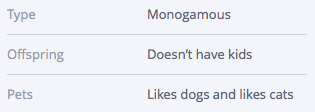
He didn’t nail all of my Important Traits in his profile, but I still found evidence of most of them. Now for Critically Important Traits.
Critically Important Traits
I found his age and pet ownership status in his profile basics.
Of course I can’t prove the null hypothesis with negativity since I’m trying to figure out whether he isn’t a positive person, so it’s possible that he’s a pessimist. That’s what makes this trait one of the more difficult ones to score – but there wasn’t enough evidence to give him anything other than a zero.

If he wants to spend Friday night talking about business ideas, I can say with confidence that he’s a career oriented person. Takeout, movies, and TV shows all sound like a solid night in to me.
Now I can plug in some numbers into my formula.
P(first date) = db x (∑ti x 2∑tomg)
db = 1
∑ti = 3
∑tomg = 4
P(first date) = 1 x (3 x 2(4))
P(first date) = 24
He is a candidate level one using my criteria. Let’s hope he sends me a message!
Attracting Ideal Qualified Leads
It may turn out that people aren’t up front about something I thought they would be or that a particular flaw that bugs me turns out to be so common that I would be remiss to keep paying attention to it. So I may need to make adjustments here and there in my description of an ideal lead.
The process of creating my rating system, however frustrating, was a good experience because knowing what I’m looking for is half the battle. I now know what I’m aiming for in my profile/landing page, and I can share things about myself more strategically. I won’t be lying on my dating profile, so when I say I’m being strategic, I’m not changing who I am to meet someone – I’m simply emphasizing certain things about myself and not mentioning other things.
Best foot forward, right? Your landing pages should do the same. If you’re a family-oriented small business, but your ideal lead isn’t, why share that information? It’s still important, of course, but it’s ok to withhold information that doesn’t get right to the point.
Now you know quite a lot about what I’m looking for, but you know relatively little about me personally. To find out more, you know what to do: subscribe to my series! You know you want to…
What 80% of Ecommerce Shoppers Want From Your Site [INFOGRAPHIC]
Ecommerce CROWhat are online shoppers looking for? No matter what you’re selling, knowing the answer to this question is the first step to figuring out how to give them what they want.
Though 50% of the people in a survey said they wanted more shipping options, our tests have shown that too many choices reduces sales.The Conversion Scientists here spend their time testing ecommerce sites, and they know that the recommendations in this infographic can work for your online store. But not always.
For example, you should be careful about offering more shipping options.
Online shopping is constantly growing, and now over two thirds of consumers shop online at least once a month. A whopping 0% never shop online, that is, 0% of people who respond to shopping surveys. Don’t you love statistics?
Numbers like that are pretty solid motivation to figure out exactly what’s going to make a person press the buy button, and an illuminating infographic sharing tips and trends for eStores is a great place to start.
It probably comes as no surprise that offering free shipping helps nudge people into spending money, but it may be surprising just how much it matters. For 80% of online shoppers, free shipping makes them more likely to buy something. More than three fourths of online shoppers will add items to their shopping cart if it means not paying for shipping.
With the US spending billions of dollars in ecommerce, how much money are you losing by not offering free shipping?
Customers are also much more likely to convert if they know they can easily return an item they no longer want.
This is another factoid with a catch. You must state your “shipping both ways” return policy such that the visitors see and understand it. This usually takes some testing of language and placement. Too many ecommerce sites have an amazing return policy that is invisible to their shoppers.
Of online shoppers, at least half of them will use their smartphone or tablet to make purchases over the course of three months. Having a mobile strategy is crucial to serving those potential customers, especially since many of them won’t do any comparison shopping if they’re using an app to shop.
Will any of these ideas work on your ecommerce site?
Feature Image Photo Credit: Fosforix via Compfight cc
Conversion Rate Optimization is Good for a Laugh with Joanna Wiebe and Brian Massey [WEBINAR]
Conversion-Centered DesignWhy are these conversion rate optimization experts laughing?
At first, the questions sounded pretty serious: “How often should you be emailing your customers?” “What’s the best wording for a CTA (call to action)?” “What should every conversion rate optimization team include?”
Brian Massey and Joanna Wiebe of Copyhackers teamed up to answer questions like these in their off-kilter but on-track Ask Me Anything About CRO webinar. If you didn’t get to watch the original broadcast, then don’t worry. This was too much fun not to share here.
These conversion optimization experts are having too much fun.
Who’s on their CRO Dream Team?
Brian says,
“A CRO Dream Team includes a data scientist, a front-end developer, and a designer who won’t get all creative-y” and will just design what you’re looking for. It doesn’t hurt to have an investor paying the bills either. Joanna’s team also includes a traffic guru, analytics guru, UX pro, copywriter, and a conversion director.CRO tips for email marketing.
Bottom line: send more emails. One of the biggest problems that Brian has seen is that companies simply aren’t sending enough of them.
If you’re worried about spamming your subscribers, dial up the value on what you’re sending them. You will be training your customers that your emails are worth opening, so no matter how often they see something from you in their inbox, it will be worth reading.What should a CTA say to increase clicks?
It turns out, the magic word for a successful CTA is “get”, as in “Get a free quote”. Visitors to your site are trying to accomplishing something, and the wording on a CTA should be telling them how to do it. Using first person on a CTA button also does well – as in “I want to…”. Make sure you tie the wording into the headline on your page so that your messages match.
Watch the Recorded Webinar
For answers to more questions – like how many product options you should include on your page, how to show trustworthiness on a landing page, and how to make sense of heat mapping data – and some landing page critiques, watch the recorded webinar above.