Building a smooth customer journey is key to business and revenue growth. Here’s how to create a sales funnel that works in just 5 minutes.
You may not believe you already have one or more sales funnels in place, but all businesses do. Maybe it’s not working as expected. Or perhaps you would like to make it more effective. Follow these steps to create a sales funnel in 5 minutes that will have customers buying from you in no time at all.
What Is a Sales Funnel?
But first things first. Let’s quickly refresh the definition of a sales funnel.
A sales funnel is a hypothetical or ideal journey you would like a prospect to travel to become a lead or a customer. This is why sales or revenue funnels are also called “customer journeys” or “customer blueprints”.
They can be as simple as a one step Click to Call Google Ad, where the button is your opt-in point or as complex as need be. Especially for those businesses where lots of lead nurturing is needed for prospects to convert.
Call only ads are best used when there’s a sense of urgency to the offer. Isn’t this one of the shortest sales funnels ever?
Keep in mind, while you are building your sales funnel, that the best functioning ones are those that reduce friction. That is, they do not add unnecessary barriers or hurdles to the sales process.
Ready, Set, Let’s See How to Create a Sales Funnel in 5 Minutes
One of the sales models that is most frequently used in customer blueprints and customer journey mapping is the AIDA model, which stands for Attention, Interest, Desire, and Action. Developed by E. St. Elmo Lewis in 1898, it maps how people make purchasing decisions. And, in spite of the technological developments, its importance and effectiveness has not diminished as humans have not changed their buying decision making process since then.
Whatever tactics you use to qualify leads and drive them closer to taking the desired action will change accordingly to where the lead is within the funnel: top (TOFU), middle (MOFU) or bottom (BOFU). It essential to understand how the funnel works from the moment you make the first contact (TOFU) with your ideal future customers to the moment where you convert those leads (BOFU). Keep in mind that each one of these components depends on the others.
Creating a sales funnel is as simple as defining the desired action and the target audience and then drawing the path between those two. And as complex as making it function successfully.
Here’s how to create a sales funnel (or improve the one you have) in 5 minutes.
AIDA model applied to customer journey mapping.
To Create a Sales Funnel First you Need to Generate Awareness
Attracting attention or generating awareness works best when you know your target audience media habits. You’ll be more successful if you advertise your brand, your products and/or services where the majority of your prospects already are.
These prospects may be currently looking for what your product or service provides or they may not. Those potential leads that are intently searching for a service similar to yours will notice relevant messages much more than those that are not.
For example, if someone is ready to upgrade to a new car, they will feel as if there are more automobile ads than usual. It’s because they are more aware. Generating awareness for your brand might be easier in this case. Funny how the brain works.
On the other hand, you may generate awareness amongst prospects with related needs. They are not looking for what you sell exactly. For example, while browsing their Facebook feed or reading a blog post, a person looking for a higher paying job may stumble upon a college or university they didn’t previously know existed.
Once you know where to find the vast majority of your audience, you can decide on a way to generate awareness about your brand. Usually these tactics range from PPC campaigns, TV or radio ads, billboards, blog posts, trade show participation, referrals, direct mail, email campaigns, online search results, all the way to super outrageous publicity stunts. You get the idea. Don’t craft the copy or the creative yet.
Have you chosen a tactic to introduce your prospects to your brand? Great! You’ve got the first step of your sales funnel covered. (Don’t overthink it) Move on to the next step.
Guiding customers through the buying stages: how to create a sales funnel that works in 5 minutes.
Second Step: The Interest Awakens
To create a solid sales funnel, you have to drive your prospects to click, call, download, sign-up, or visit you. And even though this happens at the last stage, you need to present the reasons why your are worthy of consideration in order to make it happen.
Do you have an eCommerce site and are offering free shipping? Is your SaaS fulfilling a productivity need that is important to your lead? Or do your cars flaunt the features your prospective buyers are searching for?
You need to know your customers and their behaviors, habits, and motivations to cut through the noise and to offer them something they recognize as useful or relevant.
This is the time to entice and convince them as to why they need your product or service.
Third Step: Pick Me! Pick Me! or the Sales Funnel Desire Stage
You presented your benefits properly and showed value to your prospect. Now it’s time to elicit desire. Congratulations! You are in the middle of the funnel (MOFU).
Keep an eye on your goal, your lead has to desire your product or service above any other.
Hence, you should keep educating and positioning your brand as the solution to their needs and problems. This is the stage where you shine a spotlight on those benefits. Testimonials, case studies, product comparisons, and customer reviews work well here.
This is also the stage where you match your product or service benefits to the prospect’s needs to clear up any barriers to the sale. This is a critical stage in which website traffic often fails to convert.
It seems to go without saying that any good sales funnel ends with a purchase. The biggest mistake people make when using the AIDA model, though, is to assume the sale will happen organically once the other steps have fallen into place. It won’t. Unlike an actual funnel, what goes into a sales funnel doesn’t always reemerge at the end. And people tend to not take action unless they’re asked. So, pay attention to your calls to action – the worst mistake sales people make is not ask for the close.
What’s your call to action? How will you prompt them to fill out the form, complete their shopping cart purchase, have a one-on-one call or meeting or do whatever final action you want them to take to complete their customer journey?
Purple mattress on exit intent pop up offer (BOFU).
Maybe you’ll offer them a free assessment, or a last minute discount if they complete the transaction right away. Take a minute to decide as the BOFU stage is the most crucial since it’s where you ask for the sale.
Ta Da! 5 minutes to build a sales funnel without writing a single line of copy — yet.
Would you rather have the conversion scientists identify your customer journeys to help you build your funnels? Then, check out our Conversion Rate Optimization Audit Services.
Sales Funnel Examples
Now that we’ve created our customer journey, let’s take a look at a couple of sales funnel examples for inspiration.
I think we covered one with the call only PPC ads example. Great for a local business like a personal injury attorney or a plumber, locksmith or any organization whose concern is to make the phone ring. Another requirement for successfully using this type of sales funnel is a sense of urgency to your product or service.
Purple mattress provides visitors with a humorously informational and convincing MOFU tactic on their landing pages with their zany videos backed by scientifically proven data. We may be a bit skewed as they also wear lab coats but go ahead, play the video and tell us what you think – unless you decide to buy a mattress first. ;)
A typical lead generation sales funnel example that remains mostly on the TOFU stage is to offer a Free Book, Research or White Paper to visitors – organic or paid. Take them to the next stages of the funnel by offering a one-time offer or a free consulting session. Keep qualifying the lead and close it with a call or an in person meeting.
Every industry has them. Your company may be one of them. They are the whack-a-mole companies, sticking their virtual neck out, and striving to do things better, driving online sales with an evolving ecommerce conversion marketing strategy.
And they often get whacked.
But the companies I’m talking about hunker down in their holes and plan their next chance to pop out again, with more force. It’s in their blood. The Internet is becoming the place they stage their emergence.
These whack-a-mole companies may sell products that range from the common to the mundane. Zappos was a whack-a-mole company. They started out in online sales of shoes. In ten years, Zappos outshone their competitors and sold an almost $1 billion business to Amazon.
Wikipedia calls Whac-a-mole a “Redemption Game”
The GoodLife Team is a whack-a-mole company in the very competitive real estate market. They are small by the standards of their peers, but like Zappos, I expect them to pop out of their hole with such force that they will leave the table altogether, flying free of the hammers that seek to drive them back.
Patience and Impatience: Ecommerce Conversion Marketing Strategy for Online Sales
Whack-a-mole companies are both patient, and remarkably impatient. They are remarkably impatient to try new things. They aren’t careless. Successful whack-a-moles seek to find out what works and what doesn’t quickly.
Yet, they are patient in the long run. They know that they’re going to get whacked a few times, and they prepare for the blows. Theirs is a journey of learning and persistence.
I am drawn to these kind of companies. It is them that I find myself writing for.
Ecommerce Whack-a-moles
If you are a budding whack-a-mole in your industry and want to turn the Web into a powerful sales channel, find out how the highest-converting sites on the Web use ecommerce marketing strategy to maximize conversion rates and online sales. “Conversion” is the magic that makes you stronger than your competitors.
The E-commerce Pattern: Core Conversion Marketing Strategies
Here are the three strategies that are conversion deal-breakers for e-commerce web sites. Get these strategies right, and you should be able to optimize your way to higher conversion rates. Get any of these wrong, and you will find yourself struggling to improve.
The third of the five “core” conversion marketing patterns is the e-commerce pattern. The two patterns I’ve already discussed are the Brochure site and the Portal site. As a refresher, the Brochure pattern is a known as the “sales support” pattern. The purpose is to provide information during the sales process and tell prospects how to get more information. The Portal pattern, also known as the “advertising model” and “subscription model,” monetizes content.
For this discussion, I assume a site is generating reasonably qualified traffic and that the offering has a demand in the marketplace.
The E-commerce pattern
Also known as “online shopping,” “eRetail” and “eTail,” e-commerce sites are designed to handle the online purchase of a product or service. For purposes of this discussion, you are building a site with the e-commerce pattern if:
You accept payment on your website for a product or service
The buyer consumes the product offline. The “site as a service” pattern is targeted at businesses that deliver their product directly through the site.
You are selling more than one item, more than one version of an item, or more than one product line. A single item site should look at the Portal Pattern, or the up-coming “Considered Purchase” pattern.
My goal here is to explore three strategies that are conversion deal-breakers for e-commerce websites. Get these strategies right, and you should be able to optimize your way to higher conversion rates. Get any of these wrong, and you will find yourself struggling to improve.
Category pages
For sites that feature dozens or thousands of products, it is critical that visitors at all stages of the buying process find their way to specific items on your site. Category pages are the traffic cops, driving shoppers to the right product areas and eventually to the products they seek.
Are category pages more important than the home page? For visitors who are just becoming aware of your online brand, the home page serves as the top-level category page, or the “featured products” category page. A quick survey of the highest converting retail sites on the web reveal some interesting similarities in their category page and category page design.
The home pages are filled with specific offers. The page is essentially designed like a circular you would find in your newspaper.
Intuitive categories are displayed to help visitors dive deeper into the site.
Some sites use a BAH (big ass header) that cycles through offers. Flash banners can sink your conversion rate unless you are using them to provide specific offers.
Pricing is put front and center on product “ads.”
Copy is included with the products that are displayed. Even if there is only space for a few words, some value proposition is put forward with each product. A product image and the price often isn’t enough.
Search is present on every page.
Defining the right categories is critical. Most of the high-converting sites have between five and eight categories in their top-level navigation. Office Depot gets it down to four. More refined categories are listed in the left column; “specials,” “best sellers,” “brands,” etc.
For e-commerce sites that don’t have the brand strength of these large retailers, it is tempting to spend space talking about the company and its unique value proposition. Keep this brief. Avoid the temptation to add ancillary items to navigation, such as “about us.” Let your offers and categories do the talking for you.
In summary, specific offers, smart category choices and search are the hallmarks of strong category pages.
Product pages
Just as landing pages are crucial to increase the conversion rate of advertising efforts, well designed product pages are crucial for the e-commerce website. With best search engine optimization practices, product pages become the landing pages for searching shoppers.
Product pages typically ask the visitor to “add to cart” and “buy now.” These should be the most tested pages on your site.
The elements that make for a great product page differ from industry to industry, but there are some rules of thumb.
Show the product. There is a correlation between the conversion rate of a page and the number and quality of product images available.
Provide all of the information a visitor needs to say “yes.” Price, shipping, return policy, ratings and reviews; what you include on your product page depends on what you’re selling, and to whom.
Test to find the right balance of information. Providing too much information can distract buyers from clicking “buy now,” and even introduce reasons not to buy.
Product pages serve two masters: people who are already exploring your site and those who have landed there due to a search engine query. Test these pages to find your best converting product page design.
Shopping cart
E-commerce shopping carts have traditionally been a thorny issue with conversion scientists and web site optimizers. Too many businesses choose shopping cart software that is rigid and difficult to customize. Many of the most popular shopping carts on the market seem to have been designed by engineers, and they don’t consider that buyers may be on the brink of abandoning the transaction.
The purchase process is the needle point for your success. The wary shopper is always on the lookout for red flags, reasons to reconsider their purchase decision. Alarms are sounded by what is missing from your shopping cart pages.
The shopping cart is often used as an information resource. Prospects will add a product and then start the checkout process to uncover information that they didn’t find elsewhere on the site.
What are my shipping options and what will it cost me?
What will tax be?
Are there any catches?
Is the product in stock?
Provide this information on your product pages to reduce these informational probes into your shopping cart and decrease your abandonment rates.
Flexibility is the key with shopping cart systems. They should be easy to customize, provide places for “reinforcing” copy, and be able to answer questions like those above. If your shopping cart can support A/B split testing, all the better.
The shopping cart is so important, that almost any business should consider replacing their system if they can’t easily and quickly change the sequence, layout, button location, button text, page copy, promotion codes, trust badges, etc. As with product pages, small changes in these elements can result in big increases in conversion rates.
As of this writing, I can’t recommend any shopping carts systems that meet these criteria. Please offer your recommendations in the comments.
There are a variety of tactics to be explored within each of these make-or-break strategies: category pages, product pages and the purchase process. There are other strategies that may be equally important, and I welcome your input through the comments. Building an email list is one such strategy that comes immediately to mind. It can be a powerful conversion tool for businesses whose customers purchase frequently. I’ll write more about this strategy in my next installment when we talk about the “considered purchase” pattern.
It gives you the force to fly free of your industry Whac-a-mole table by slashing your online sales costs.
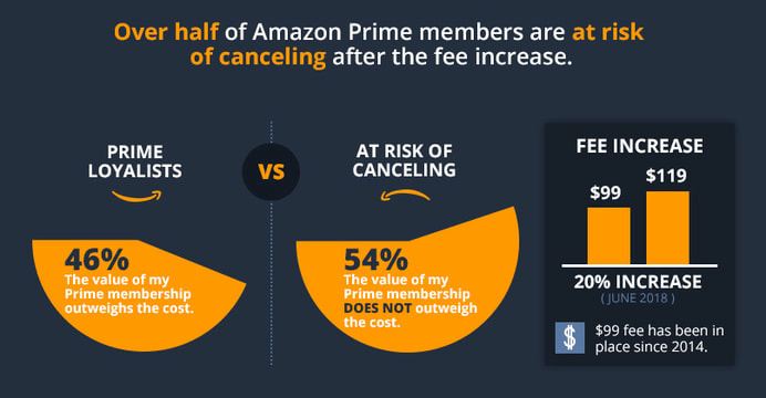
In May, Amazon announced one of its most significant changes to ever impact Amazon customer service – a steep 20% increase to the annual fee for Amazon Prime members. Amazon began rolling out the increase to renewing Prime members on June 16th.
According to a recent survey by Effective Spend, 54% of Prime members are at risk of canceling their membership due to the fee increase.
Over half of Amazon Prime members are at risk of canceling after the fee increase. (Image Source)
This potential exodus of Prime members presents an excellent opportunity for other online retailers. The survey looks at what these “At-Risk” Prime members care most about when shopping on Amazon, which suggests some key optimizations retailers can make to their own sites to convert Prime dropouts into their own loyal customers.
#1: Focus on Customer Reviews
You guessed it. Customer reviews are still KING! 60% of the At-Risk Members surveyed said that they “always” read customer reviews before purchasing a product on Amazon. Another 30% said that they “often” read reviews before purchasing. At-Risk Members also responded that the content they read in the reviews is more influential than the total number of reviews for a product.
Recommendations for retailers:
While gathering reviews can be a difficult and time consuming task, retailers can identify their top selling and most profitable products and focus on getting a couple of high-quality written reviews for those products. Even a single 5-star review with good written content can go a long way in converting a visitor.
Retailers aren’t bound by Amazon’s customer review rules when gathering reviews for their own websites. Unlike on Amazon, you can provide incentives to customers who leave a review on your own site, such as offering a discount on their next purchase. And, outside of Amazon, you can use any means of communication to reach out to your own customers to request reviews – emails, phone calls, box inserts, etc.
The active wear company Outdoor Voices has built up something of a cult following in a very short time without relying on Amazon. They’ve invested a ton of effort in collecting customer reviews on their site. Furthermore, they do a great job of highlighting some of the best and most insightful reviews for their products right within each product page.
Outdoor Voices has built up a following without relying on Amazon. Images source
#2: Proactively Answer Questions in Product Descriptions
When comparing different types of product page information, At-Risk Prime Members ranked product descriptions as most influential in their purchasing decision. Product descriptions outranked other product page elements, including videos, measurements and instructions.
Recommendations for retailers:
Enhance your product descriptions by exploring customer comments, questions and feedback
Read customer reviews – both positive and negative – to understand what information reviewers are trying to share with their fellow consumers.
Likewise, if you have a Q&A section, don’t just answer customer questions – determine which questions you can proactively answer within your product page content.
Check in with your customer service department to understand what questions they are getting most often from shoppers.
Furniture is a tricky and often stressful product to purchase online, and Wayfair provides a very informative shopping experience, striving to understand what questions customers have had or will have about their products. Many of the product features and details are written as if they are directly answering question that the shopper has. In this example of a sofa with a fold out bed, they ensure that the shopper knows what size the fold out bed is (Queen) and that (Yes!) the mattress is included – two critical details the shopper will need to know before making a final purchase.
Outdoor Voices has built up a following without relying on Amazon. Images source
#3: Use Images to Give More Product Details
The survey found that at-risk Amazon Prime members ranked images as the second most influential form of product information behind the product description. Images tell customers a lot about your product and very efficiently at that!
Recommendations for retailers:
Show the product in context of how it’s going to be used. For example, a cutting knife can be shown cutting food in a kitchen.
Provide an image that gives a size perspective relative to a familiar object, for example, your product pictured next to a house or being held by a person.
Show different angles of the product in case certain features are hidden from one angle that can be seen in another.
Include an image of the packaging along with any accessories included with the item.
Think of the product images as a means of proactively answering customer questions in a visual rather than written format.
Several years ago, Birkenstock famously broke up with Amazon. While they’ve mended ties and are selling on Amazon once again, they’ve enhanced their own site to drive more direct sales. For each shoe product, a shopper can view 5-10 different high-quality images of the shoe, including images of the shoes “in action” on someone’s feet and close-ups of the shoe so that you can see the detail of the material and style. They’ve implemented a responsive color selector, as well, so that each image of the product can be viewed in each color available.
Birkenstock uses images to communicate details and colors on their product pages. Image source
#4: Drive higher AOV with with low-cost products and accessories
The survey revealed that 80% of At-Risk Members are purchasing products from Amazon that are typically under $50. Furthermore, 94% responded that they’ve purchased a product that was less than $10. Amazon Prime members are comfortable purchasing low cost items when shipping fees are a non-issue.
One of the things that Amazon does best is to provide product recommendations and suggestions to help guide customers toward adding more items to their cart.
Retailers can employ similar product suggestion strategies, recommending add-on and accessory items that can expand the revenue on each order and push customers toward the free shipping threshold.
Recommendations for retailers:
Show “purchased together” recommendations to encourage the purchase of complementary products.
Recommend bundle deals that include the primary product along with necessary or popular accessory items.
Proactively suggest re-orders of products that need to be re-purchased frequently while customers are shopping for other items on your site.
UrbanStems is a great example of a site that has the “candy isle” concept down. First, you choose your flowers, then, they suggest multiple add ons (including actual candy!) for around $10 which will all complement your order.
UrbanStems is uses the “candy isle” concept
An honorable mention also goes to H&M. On any given product page, you’ll see a scrolling list of recommended product pairings, including basic items like undergarments to add to your order.
H&M uses a scrolling list of recommended product pairings. Image source
#5: Reduce Risk for your Customer
Without the safety net of their Prime benefits, shoppers are less likely to take risks with their purchasing decisions. The Effective Spend survey found that Prime Loyalists (those unlikely to cancel their membership) are 9% more likely than Non-Members to buy unfamiliar brands. Additionally, Prime Loyalists are 10% more likely to purchase products with less than a 3 star rating compared to Non-Members.
This is understandable given that Prime benefits provide a sort of safety net and reduce the risk of things like paying for expensive return shipping fees.
Retailers should consider ways to reduce risk for their customers and make them feel more confident in their purchasing decisions.
Recommendations for retailers:
Work with customers to get more 5-star customer reviews – as discussed earlier, this is one of the most important ways of building confidence in your product.
Offer free shipping on a customer’s first purchase.
Highlight your “easy returns” process.
Implement a live chat and prominently display it to encourage customers to ask questions that they need answered before they can complete their purchase.
Prominently display your customer service phone number so customers with questions can quickly reach someone.
Competitive Cyclist makes customers feel at ease right from the start, offering a discount off of your first order, a low free shipping threshold, and easy to find help chat and phone support.
Competitive Cyclist offers a discount off of the first order. Image source
As internet marketers, our goal is to convert as many customers as possible with the lowest spend on advertising. Converting Customers in the fashion niche is one thing but understanding how to properly convert your customers varies from niche to niche. Knowing how to analyze data and find the best solutions is something that applies to every market and it is a skill on its own to be able to find the ways of increasing your overall conversions.
Look at it like this: If you were able to change your conversion rate from 1% to 2%, you could halve your advertising budget or double your results. Increasing your rate of conversion by the smallest of amounts can make a huge impact on your online business.
The ideas in this article are strategies that we use on a day-to-day basis at Top Tier Style to analyze how our customers interact on our website. The goal should always be about trying to figure out how to build the best customer experience, the sales will roll in from there…
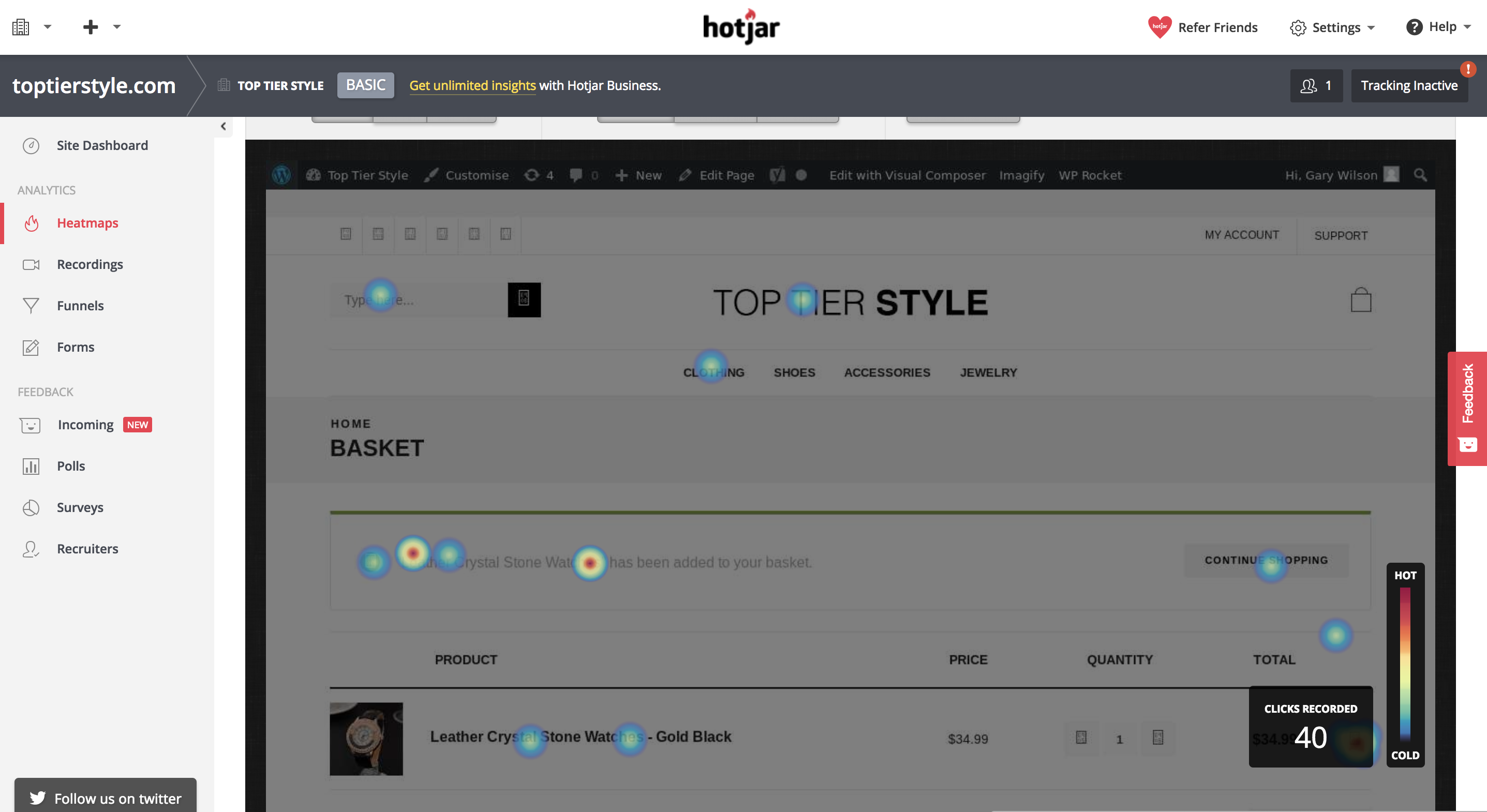
Visitor Heatmaps
Heatmaps are a great way of easily understanding on a behavioral level how your customers interact with your page. Heatmaps will generally track where your customers click on on a page-by-page basis, and it will show you the average distance that a customer will scroll to when visiting your pages.
This data can be useful because you can pick up and see areas in which you can improve your website. Maybe 60% of your customers are clicking on an image that doesn’t actually link to anything, you could update this and take them to a relevant place.
Or maybe only 20% of your customers are scrolling down a certain amount of your blog post page. From this, you can gather that the content, or part of the content, is low quality and needs to be updated in order to engage your customers at a higher level.
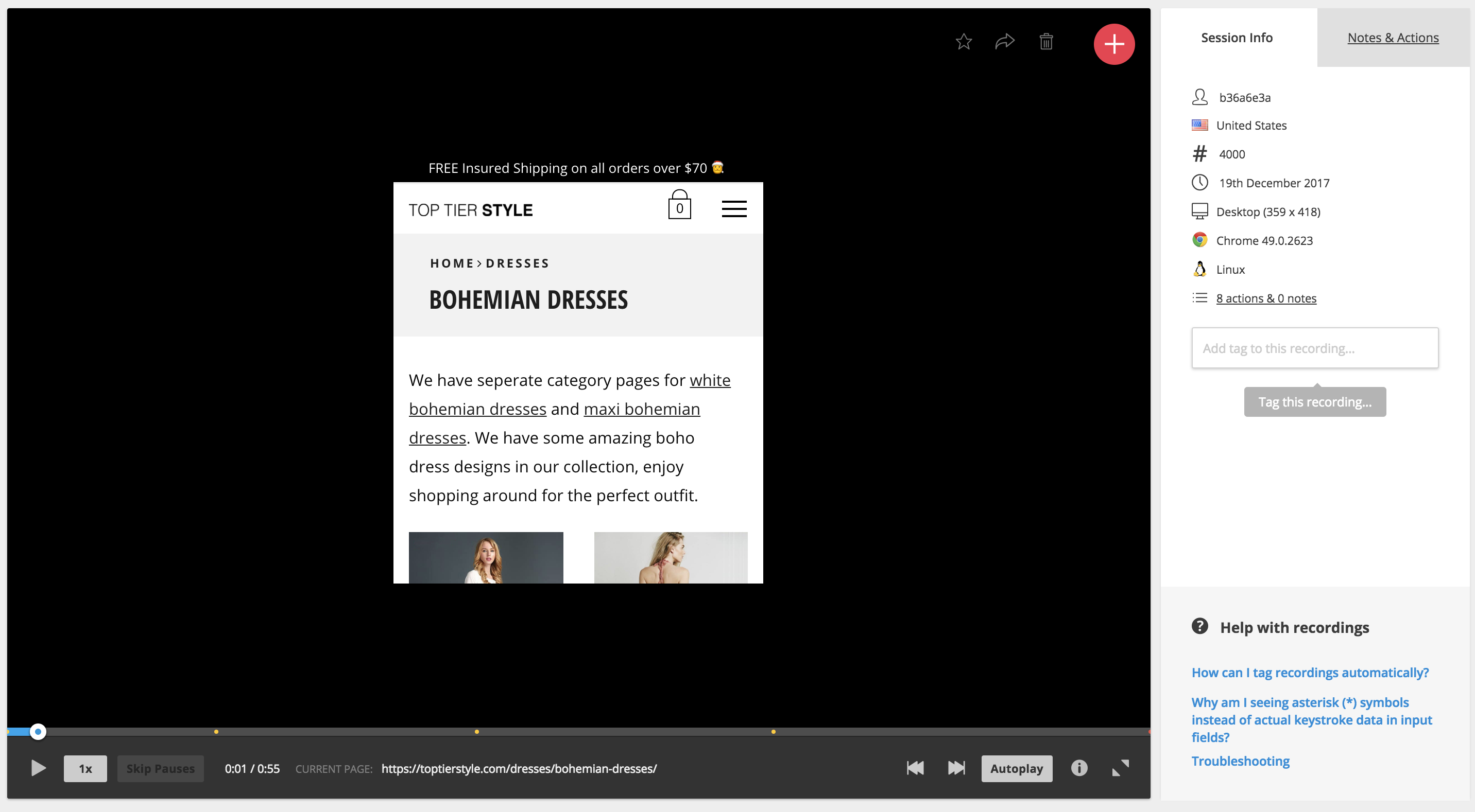
This one is kinda creepy, but absolutely gold if you are willing to spend a good deal of time looking into how your customers are interacting with your website. Recordings on most services can be tracked for all visitors or visitors that are visiting certain pages. It may be less time consuming and more valuable to spend time recording visitors on pages that are getting a low conversion rate with a high amount of traffic.
So, visitor recordings work much as it says in the name, you’ll get access to a screen recording of exactly what your customer does when they are visiting and browsing your website. You’ll get to see where they scroll, where their mouse moves, where they click and even what pages they visit.
This data is amazing because you get to put yourself, as a marketer, in your customer’s shoes and understand what it is that the customer is thinking while they are browsing your site. From this, you can understand a wide range of improvements and you can see exactly what influenced your customer to complete a certain action, or what caused them to drop off and leave your website.
A Data-Driven Approach
Once you have spent time analyzing all of this data and building a website that converts at a much higher level, you can look into implementing tracking with a service like Google Tag manager to analyze the percentage that a user completes a certain action on average within a certain time frame.
For example, you may be running a commerce store and you may want to track the percentage of people that add that product to their cart and what percentage add it to their Wishlist.
If you notice on a particular product that people are adding it to their Wishlist a lot instead of checking out straight away, then you could look into ideas such as running a promotion on that product or allowing a discount if they add it to their cart and check out today.
Summing Up – KNOW YOUR FUNNELS!
Every business has a funnel. Even if you are a local digital marketing agency, you have a funnel. Some funnels are more complex than others, here’s an example of a funnel for an average Plumbing website as compared to lets say an E-Commerce store.
A 2 Stage Funnel for a Local Plumber
Visitor Lands on Landing Page -> Visitor Gets in Touch
A 4 Stage Funnel for an E-Commerce Brand
Visitor lands on Product Page or Category Page -> Visitor Adds Product to Cart -> Visitor gets to Checkout Page -> Visitor Completes their Purchase
Either way, knowing your funnel is important because you can look at the areas in which customers begin to fall off. In the example of the plumber, it’s very simple because the plumber only has their landing page to optimize properly before they get their result, which is for someone to get in touch.
However, in the example of an E-Commerce brand – a visitor needs to follow a number of steps before completing the goal which is to purchase a product. If you are properly tracking the drop-off of your funnels, you may notice that 90% of people fall off at your cart page. By knowing this data, you can narrow in and know exactly what areas to look at the heatmaps or visitor recordings for so that you can begin to repair that section of the funnel and increase the overall conversion rate of your online business.
About the Author
Gary Wilson works as part of the marketing team for Top Tier Style, a fashion brand specializing in clothing and accessories. He works closely to market the website to new customers and analyzes customer data to increase conversions and customer experience through the website.
Here are 3 conversion optimization examples of how to kill the “slider”.
This is not a post about how carousels kill conversions. They can, but it’s not about that.
This post is about doing what’s best for the people who want to buy from you on your site.
Every CRO and savvy eCommerce manager I have ever met hates carousels. In fact, we’ve never actually blogged about it because EVERYONE ELSE already did. Bringing up carousel flaws would be akin to bringing up the Hindenburg’s.
What we at Inflow will do, however, is document the death of the carousel. But before we do, let’s talk about its birth.
Blame Yahoo! if you want
It seems like the carousel has been around forever, at least in Internet terms. Broad adoption started in the summer of 2009 after Yahoo introduced it on its homepage.
If your site still has a rotating carousel, perhaps you still have a Nokia phone? You can check your email on it, you know!
From that point on, every website felt free to:
Whisk away copy while it was still being read
Randomly change calls to actions
Remove control from the user actions
Create “banner-blindness”
Periodically attract attention no matter how irrelevant to the viewer.
Slow page load time with multiple big images
So, for some, it might not be a surprise that there is a better way to structure an eCommerce homepage.
The death of the (unnecessary) carousel
In our 2018 Best in Class Comparative Matrix for eCommerce, we saw only 6 out of 10 sites still used the homepage hero carousel. That number is less than half of what it was 2 years earlier.
The reason why is simple: it was never the best option for most of the sites that did it, and that statement is still pretty much true.
Optimization Away from Carousels
So, how does a site transform its homepage from having a carousel? Here are three conversion optimization examples for removing carousels.
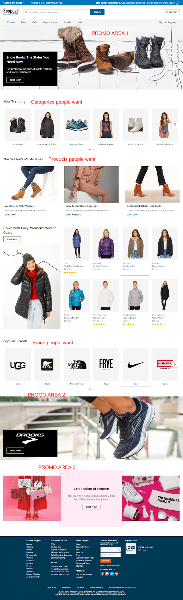
Zappos.com
Before
A year ago, Zappos was sporting a left category nav, hero carousel and a couple of static promo areas to the right. That made it jam-packed with options.
After
Zappos simplified things by ditching the carousel, the left nav on the homepage and instead focusing the homepage on the things customers want most. They are still testing this bad boy with over 5 major variants identified, so check back in February to see the winning combination. ;)
So apparently, Zappos.com never needed a slider. Note that they kept the slides, but moved 2 of them to the bottom of the site in favor of stuff users most want (a lot of which was not even on the homepage of this eCommerce behemoth just a year ago).
There’s a big lesson here for those willing to learn it and kill their carousel.
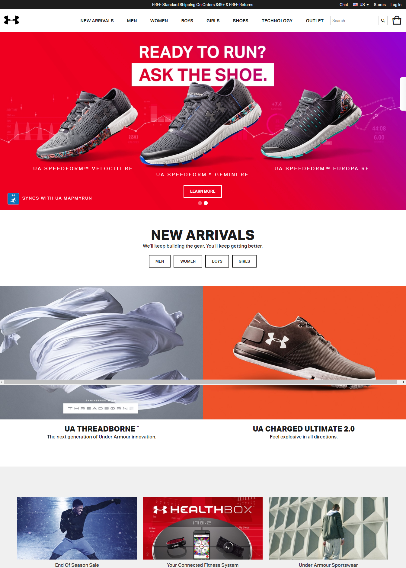
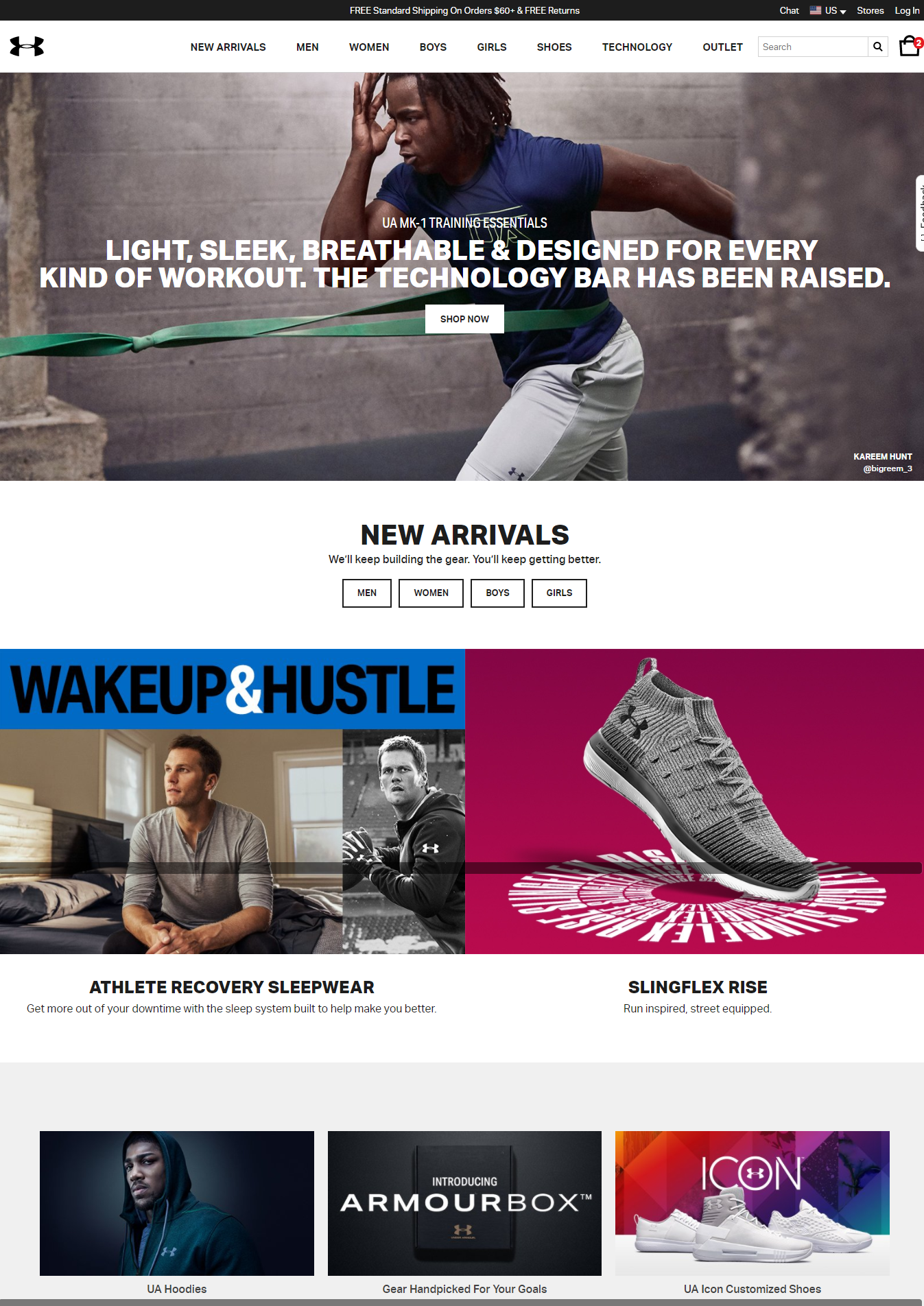
UnderArmour.com
Before
Under Armour had a carousel last year, alternating between two and three slides.
After
Over the past year, they have MADE ONLY ONE CHANGE on their homepage. That was to ditch the carousel.
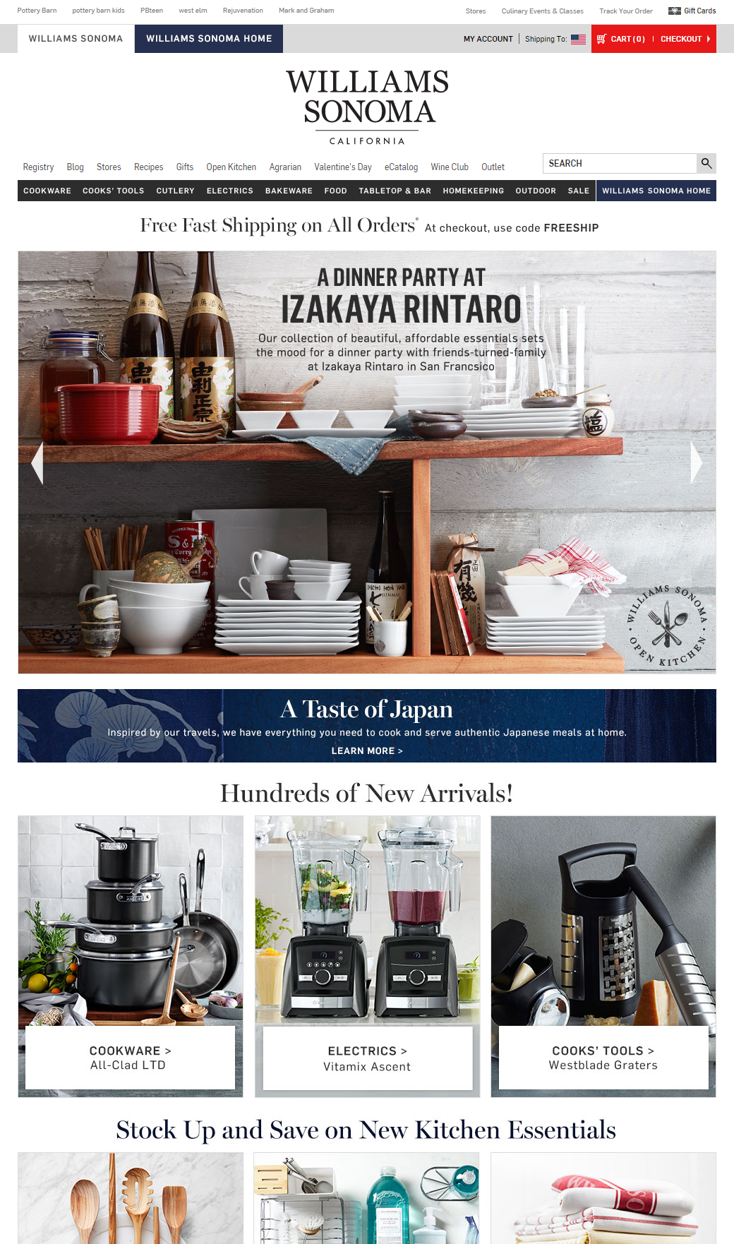
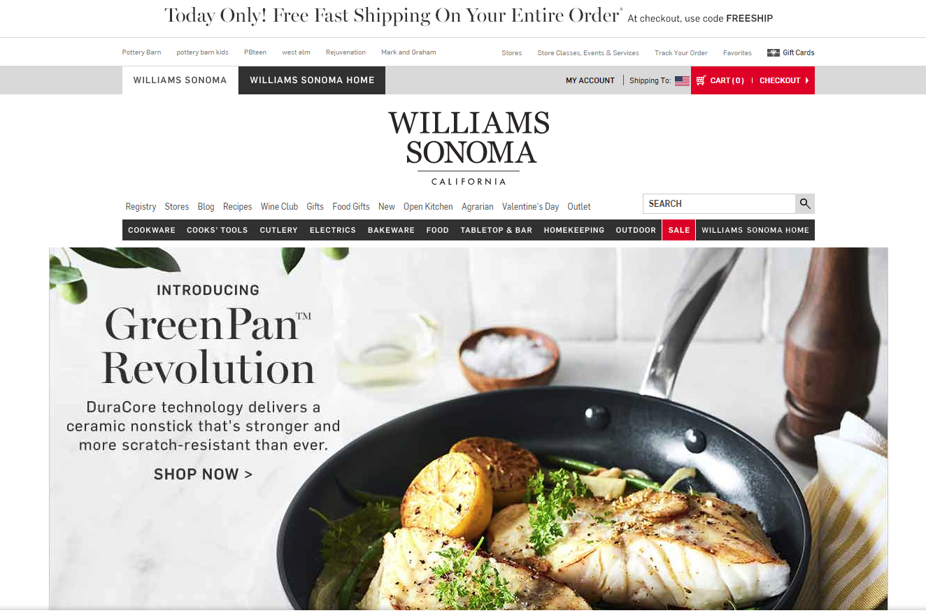
Williams Sonoma
Before
Williams Sonoma made some minor navigation changes over the past year and added lazy-load to the homepage, which widened it a bit.
After
For the most part, the only significant change to the homepage was REMOVING THE CAROUSEL.
Take-Away
If you were to take the lead from these 3 best in class sites, you would blindly get rid of your eCommerce site’s carousel. But wait!!!
You can see below that there are still 6 out of 20 Best-in-Class eCommerce sites that are standing by their carousel. You bet they have tested their homepage over the past year.
So Why?
The answer is that the carousel, as they have it, is right for them and their audience. For now, at least, until something tests better.
About the author: Keith Hagan is an award-winning conversion optimization expert and Director of Conversion Services at Inflow. Keith’s insights have been featured in well-known publications, such as Moz, HuffPo, Forbes and more.
Do online reviews really matter, and do they make a difference to your business? The answer is yes, they absolutely do.
Consumers increasingly use reviews left by other consumers as part of their pre-purchase research efforts, and a bad review can have serious effects on your sales.
Herd shopping psychology plays an ever effect on consumers’ behavior online. Groupon is a wonderful example of that, with deals kicking in only if a certain amount of people pay for them. Research shows that the more people have already opted in on a deal, the likelier it is new visitors will commit to it.
User reviews are not so far removed from this phenomenon.
Over 80% of people said that positive reviews would encourage them to purchase a product. The same number of people changed their minds about purchasing after reading as little as one or two negative reviews.
Fake & Negative Reviews
Unfortunately, fake reviews exist, and they exist in a massive abundance. Competitors have been known to leave bad reviews on products posing as disgruntled customers, That is why more needs to be done to help consumers identify a fake review.
You are bound to get a negative review at some point during your business career. That’s simply the reality and nature of the world. It can be devastating for a business, but most people recognize that everyone makes mistakes. A couple of bad reviews aren’t going to put the nail in your coffin and close your business down.
Here are just some of the facts why online reviews are not to be ignored:
68% of millennials trust online reviews, with positive ones producing an 18% average uplift in sales
Consumer reviews are more trusted than descriptions that come from other manufacturers, nearly 12 times more.
90% of consumers read less than 10 reviews before forming an opinion about a business which means these decisions being made are made quickly, without much hesitation.
The top five industries to be affected negatively by online reviews are restaurants, hotels, doctor’s offices, hospitals and hair salons.
Negative reviews aren’t all bad; these have been known to create a buzz around your business and increase its exposure, unlike fake reviews that have been so outlandishly obviously fake and ridiculous that they go viral.
Want to learn more about how online reviews can make or break your business? Check out our infographic.
User Reviews are the King
About the Author
Josh Wardini, Editorial Contributor and Community Manager at websitebuilder.org. With a preliminary background in communication and expertise in community development, Josh works day-to-day to reshape the human resource management of digitally based companies.
These guys test the hell out of landing pages and they are masters of online sales conversion
We call them affiliate marketers, infopreneurs or online goo-roos. They push health care products, supplements, exercise tapes, and get-rich-quick schemes. At their best they are sophisticated landing page optimizers and savvy search engine technicians. At their worst they are spammers, forum trolls and comment leeches. These are the “bad boys” of online sales conversion (and they’re not all boys).
While many of us wouldn’t want to associate the hard-hitting big-promise experience with our brands, there is much to learn from these pages, and I tackled the task of cataloging some of the best techniques in my short presentation for the Uber Advanced PPC Panel at PubCon South in Dallas.
Affiliate Marketers Conversion Tips to Improve Online Sales Conversion
If you’re in the uber advanced PPC session, I am assuming you have the basics of conversion wired.
Your ads are driving people to landing pages and not the home page. The words in the heading on the landing pages match the words you used in your ads and you are doing perhaps some sort of testing to find that combination of things that works best.
When you increase your conversion rates, it makes your PPC math work better. If you can double your conversion rate from one to two percent, you have fewer acquisition costs so you can plow that money back into your bids or just reduce your spend because it doesn’t cost you as much to get a customer or lead.
So, if you are doing those things, I thought we would look at some more advanced things.
We call them affiliate marketers, infopreneurs. Some of them give the industry a bad name. But one thing is for sure, these guys test the hell out of their pages. So I thought we would look at some of their pages and review some of these affiliate marketers conversion tips.
I call them the bad boys of conversion.
Overcome your fear of long-form copy: Squeeze pages
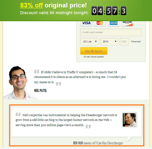
This is a gentleman named Perry Belcher. He was indicted for selling health supplements that were ineffective to elderly people. Or at least that’s the way the DEA spun it. He received a 10 year probation, six months banned from the Internet. Shortly thereafter, he had like fifty thousand Twitter followers. This guy knows how to build an audience.
And these are the guys that get the bad reputation. But I’ve had the chance to meet Perry. He actually lives in Austin and he tests the heck out of his pages.
Let’s look at his sales page or squeeze page.
We associate these pages with spam because there are people out there using spam to drive traffic to these pages. Most of these information marketers actually build very qualified lists, and that’s why they get conversion rates as high as 70 percent on these pages.
But these are all squeeze pages. They’re called squeeze pages because they are designed to get an email address, they are designed to build their lists.
Understand the incredible importance of the headline
This particular page is from a gentleman named Ben Settle. He’s a copywriter and teaches people how to create copy on landing pages that convert well. This was 20,000 pixel high. And this is kind of the rule.
What can we learn from them, though?
Number one, the hard hitting headline in red and centered. This may not work for our clients brand, but a hard hitting, active headline is a great way to get people engaged in the page.
If we have soft headlines, they won’t read the rest of the text. The job of the headline is to get them to read that first paragraph, and then your copy can carry them along. Be clearly relevant.
And in the case of pay per click, make sure that your headline is relevant to the ad they clicked on. You want to keep your promise.
A study of four diets reveals the key to weight loss success isn’t the diet, but how closely you follow it.
Properly bolding, highlighting can boost your online sales conversion rates
This is for hypnosis products. And this is what I’m seeing a lot. The alternating bold, not bold bulleted lists being used all over the place by people who know how to convert.
The key here is to help your reader through the copy so you don’t have to necessarily use the alternating bold list. But using subheads frequently down the page allows the scanner to get into your message and pick the parts of the page that they’re particularly interested in and increases your conversion.
From the Master of Direct Mail Sales Conversion: The Johnson box
Frank Johnson, was the creator of the Johnson box. He also created the 3 page direct mail letter.
You’ve got the cut out, the coupon style look.
I’m an Aggie, which is Texas version of Polack, and I’ve actually tried to cut them out of my screen before. It isn’t pretty.
The take away here is that we want designers to make us look cool and unique from a conversion standpoint. The designer has to be good at getting the eye to our primary messages.
And inside the Johnson box, you put an important copy point. That’s where you put your offers because it is just tested and tested to continue to pull the eye. How can this be effective? It continues to work.
Explore the magic of testimonials
Testimonials will work in almost any industry. There is a science to the testimonials. The pictures will significantly increase the value of the testimonials, especially since we’re all looking for avatars in our social media.
Use testimonials. Testimonials work. Add them to your landing pages.
The guarantee or risk reversal
Zappos has this amazing guarantee. “Return the shoes at any time in a year and we’ll pay shipping both ways.”
They make it easy for you to buy four or five different sizes of the same shoe, keep the one you want and ship all the others back.
Risk reversal. Have a guarantee or a promise that removes the risk from the person taking action.
We respect your privacy is an example of risk reversal and lead generation. That tells me, “oh, the risk is lower because these guys have a privacy policy and they’re not going to spam me or sell my name to somebody else”.
One of the most tested calls to action on the Internet: The Belcher button
Or the buy button. This is the Belcher button. He claims that this has been tested through five million or more impressions and this is the control that continues to work.
Test your buttons and your call to action to increase online sales conversion rates.
So, you’ve got the price crossed out, new price, add to cart this color specifically, that particular shade, the credit card icons have to be there. And you also have to have the link below the button.
This is actually a full image, but people recognize the underlying as a link. So they know that there’s something to click there, whereas they might not recognize the button.
So, test your buttons and your call to action and you might consider starting with this design. Notice it’s in a Johnson box.
Boost your Online Sales Conversion with Lead Generation
If you’re selling something, you might consider putting something early on, something that will generate a lead. If they’re not going to buy, you might as well go ahead and get the lead.
Now, the downside of that is they fill out their information as a lead could actually reduce your buy conversions. Make use of pop overs, literally putting a box, something that has a higher contrast, that will draw the eye. And incidentally, there has to be some sort of an offer there. So you want to deliver something white paper, promise of a newsletter. There has to be something of value in that.
Capturing abandons
So they come, they don’t take action and they’ve decided to go away. Can we get another shot at them? If they try to close or navigate away from the page, they get an on exit intent message. Ask them once again, are you sure you want to leave? And you have to use these according to how easily irritated your audience is.
The abandoned cart email
If you can capture the information about the person when they clicked add to cart, if you require an email address, you can then use that email to get another chance at them.
“Hey, we saw that you left your card empty.” You can sweeten the deal with a discount. Very, very effective. A great way to get more out of the traffic that you’re driving to your site with pay per click.
Leverage Ad Retargeting on your Paid Campaign
Surfers are five to 80 times more likely to click on an ad after they’ve been to the site.
For each visitor that clicks on the ad, five to ten will come back through search or type your brand name in or your domain name in, within an hour of seeing that ad.
So this stuff can be very, very powerful. Again, you’re taking your investment in PPC and you are just making sure that that visitor has every opportunity to buy your product because it’s in their best interest.
So real quickly, the takeaways from this. Don’t be afraid of long copy and storytelling, great copywriters do an amazing job of this stuff on these long pages.
Consider asking for contact info even when if you want the sale. Pop overs might be something you want to try.
Consider offers for information as well as promotional ads. So just like the newsletter that you’re starting to get a lead, consider doing that instead of just asking them to buy the product.
Use design to draw the eye to your offers. Our friend the Johnson box is an example.
Every communication is a test. And these guys got good at this because they tested. Everything you send out should be a test, at least measure it. And if you can, try doing two versions of it. And I’m talking about emails, web pages and ads.
Don’t sell products that don’t work or you’re going to end up like this guy. And as I was doing some research on Perry, I came to this law resource. And what did I get? I got a pop up.
Don’t be fooled by the panel name. Christine Churchill, David Szetela and Wister Walcott dove deep into PPC topics. My angle was that improving conversion rates means more to spend on PPC.
Listen for yourself.
Enjoy the full audio right here.
Subscribe to Podcast
Either way, I promise you will immediately find some new things to test on your pages.
You want to optimize your ecommerce site, but where do you begin? What do you look for? What page elements are worth evaluating? This Uber complete 110-point ecommerce conversion optimization checklist holds the answer.
At Conversion Sciences, we have an ecommerce conversion optimization checklist that our team goes through when evaluating a new client website. And today, we’re going to share that ecommerce CRO checklist with you. This checklist includes virtually everything you’ll want to consider optimizing. And because we know you’ll want to test what’s working and what’s not, here’s the ultimate A/B Testing Guide to help you put together your very own A/B testing campaign.
This is not a list of everything you should test. It’s a list of everything you should consider testing. Optimizing an ecommerce site requires testing strategy and prioritization. It would take an eternity to test every single item on this list using proper testing procedures and this CRO checklist will help identify and prioritize conversion optimization opportunities.
If there is anything on your site worth testing, I can tell you with 99% certainty that it’s on this list. So, go through it, take your pick and start your ecommerce site conversion optimization work.
To make navigation easier, we’ve broken our ecommerce conversion optimization checklist into 8 sections. Select one or simply scroll down to start with #1.
Let’s take a look at some sitewide elements on your ecommerce site and make sure they don’t hinder conversions. We’ll cover sticky elements such as, dropdown menus, supernav dropdown menus, navigation order, links and copy, visual cues, value proposition, dropdown or model shopping cart. sitewide search, related items, header and footer content, channel-dependent pages and elements, modals for email collection and discounts, and live chat. Quite a jam-packed section but we did promise a complete 110-point ecommerce optimization checklist.
1. Sticky Elements
Sticky Header
Sticky elements are items that remain fixed on the screen as the users scrolls up or down. The most commonly stickied page element is the header navigation bar. It definitely helps navigate your ecommerce site.
Stickied elements tend to attract focus and distract from other page elements, which means they can work both for and against you. Therefore, they should be included in your testing – especially on your mobile or cross-device testing.
Elements to Consider in a Sticky Header or Footer
In case you were wondering what to turn into a sticky element, here are a few to consider:
Website Top Navigation Menu
Directional Navigation (Main Shopping Categories)
Search Icon or Search Field
Add to Cart / View Cart
Click to Call button / Subscribe / Live Chat
Company Logo
Social Links
Elements that can be added to mobile and desktop stickies.
2. For Best Ecommerce Site Navigation, Check your Dropdown Menus
Dropdown Menu
Dropdown menus are pretty straightforward and a staple of ecommerce sites and websites in general. They offer a quick understanding of the site’s information architecture and ready access to subcategories.
3. “Supernav” Dropdown Menus on Ecommerce Websites
“Supernav” Dropdown Menu
If you look at many of the largest online retailers, you will notice that certain dropdown menus expand into large fields with more items and added visual elements. We called these “supernavs” here at Conversion Sciences and they can be a powerful tool for highlighting specific offers, deals and product categories. They could be difficult for a visitor’s eyes to parse, so test carefully.
4. Site Navigation UX: Hover or Click?
Should your ecommerce dropdown menus open as soon as the user’s mouse cursor hovers over them? Or should they activate upon an actual click? It may not seem like a big difference, but it’s a potential item to test for. If poorly implemented, they can be a barrier to site navigation.
5. Test Navigation Order on Menus and Sub-Menus
One of the most common problems we encounter is sub-optimal navigation ordering. Categories aren’t properly selected and ordered. Menus and menu item placement seems almost random. There is an argument for placing the most clicked navigation items toward the left or top. You can determine this using a heatmap report from CrazyEgg, HotJar, ClickTale and similar user and a/b testing tools.
6. Don’t Forget to Add Navigation Links
Another common problem we encounter is a lack of obvious navigation links to popular products or product categories. Ecommerce stores include feature images and headlines somewhere on the front page, but forget that they need to be added to the primary menus as well. Redundancy is not a vice, and when discussing your bread and butter products, it’s typically a virtue.
7. Change Link Copy
Your main navigation communicates your offering. Choosing the right words helps those who never click on your navigation. When testing navigation language, it is common to see an increase in conversions but no increase in clicks on the navigation elements we’re testing. Thus, ecommerce site navigation is a way to communicate your value proposition and offering.
After determining that all the right links are present, look at the word choice for each link. Is there a more accurate or intuitive way to define that category or other link heading? Could you be more specific? More general? Are certain categories selling like crazy when the user enters the website directly via the product page but rarely being clicked on via navigation?
8. Visual Cues
Visual Cue
Visual cues are visual elements that point the eye in a specific direction. Make sure that your visual cues are working for you rather than against you.
9. Add a Value Proposition to your Ecommerce Site
It’s amazing how many ecommerce websites completely lack any discernible value proposition. While creating a unique value proposition can be a bit more difficult for stores offering numerous products, it doesn’t mean you should skip it altogether. Look for ways to define your value and pitch why visitors should continue shopping on your site at every opportunity.
Are you quickly giving the visitor a reason to stay?
Are you the cheapest, highest quality, or do you have the biggest selection?
Do you have a generous return policy or warranty?
Do you serve a niche in the marketplace?
Do you have a unique brand voice?
10. Shopping Cart Dropdown or Modal
Shopping Cart Dropdown
When a customer clicks on that shopping cart icon in the navigation bar, what happens? Are they taken straight to the checkout page or does clicking trigger a dropdown or modal window display? Customers wishing to review their shopping cart might prefer a dropdown. Customers wishing to get straight to checkout might be annoyed by the extra click. You’ll need to test to know how your visitors are responding.
Pro tip: Be sure to instrument your cart dropdown or overlay for tracking by analytics. It’s part of the purchase funnel.
11. Sitewide Search
Similar to navigation dropdowns, the search bar is a huge part of how visitors interact with an ecommerce website. Should yours be bigger? Should the written prompt be different? How should it fit into your layout? These are all important questions to ask when evaluating your overall navigation layout.
What to consider when optimizing your ecommerce sitewide search.
12. Related Items Based On User History
Upselling will definitely help increase your average order value. Test suggesting alternative or related products to your visitors. Where and how are you suggesting those products?
Related Items Based On User History
13. Online Store Header Content
If a visitor doesn’t find what she’s looking for in the body of a page, she will return to the top of the page. Your header should provide a next step.
Elements to consider in the Header
Company Logo
Value Proposition
Return Policy (if it’s part of your unique value proposition)
Navigation
Phone Number
Search
Click to call (Mobile)
Subscribe
Live Chat
Checkout/Cart
Clearance
Login
Sitewide Promo / Offers / Specials
14. Don’t Forget to Optimize the Footer Content for Conversions
In its lonely home at the bottom of the page, footer elements don’t get seen as much by visitors. Unless they know that’s where they’ll find the link to the information they’ve been searching for. Consider all of the elements you would consider for the header plus contact methods, privacy policy and DMCA, social media accounts, among others. Check your heatmap reports as well. You might be surprised by the number of clicks you’re getting in your footer.
15. Channel-Dependent Pages & Elements
A group of power shoppers was recently discussing one major apparel retailer’s retargeting ads campaign. They unanimously condemned those ads that featured a product that would lead to a page where that product was not even displayed. Keep the promises you make to your visitors.
What can you offer visitors coming in from different traffic channels? Are they directed to channel-specific pages? Are they served dynamic content? This can have a massive impact on your success in converting users from each channel.
16. Email Collection Modal
Email subscribers purchase from your online shop at a significantly higher rate than social followers or new visitors. The question is how do you plan to attract new subscribers? While users claim to find them annoying, popup modals tend to be very effective at converting visitors into subscribers.
Email Collection Modal: Attract new subscribers with a modal window.
17. Discount Modal
Discount Modal
For ecommerce sites, one of the most effective types of modals is the discount modal. Users are already there to buy. Accepting a discount is a no-brainer. This 110-point ecommerce conversion optimization checklist is getting better by the minute, right?
18. Live Chat
Live chat and Chatbots have become effective tools to boost sales for eCommerce stores. It can be auto-prompted or offered in the Help section, and it’s definitely on the list of things we recommend to test on this ecommerce conversion optimization checklist.
Live chat for ecommerce stores.
#2. Ecommerce Site Homepage Optimization Checklist
19. Hero Shot
Your homepage’s hero shot is the above-the-fold area incoming visitors see as soon as they arrive. It’s one of the most important pieces of real estate on your website, and a top priority for split testing.
Should you utilize dynamic elements like sliders or other moving graphics? Or should you keep the page static? It’s important that you catch visitors’ attention here, but what that attention catches on is equally important.
Rotating carousels slow load times and only improve conversion rates if ordered properly and times perfectly. Large video backgrounds can bring a page to its knees, making the site seem slow and cumbersome.
21. Homepage Header Navigation
While many sites choose to keep their navigation consistent across the entire website, if there is any page where customization can be beneficial, it’s the homepage. This is the gateway to your business, and experimenting with different looks and functions on this specific page can be beneficial.
22. Homepage Value Proposition
Just like you need to emphasize your value throughout the website, it is especially important that you present unique value on the homepage, and more specifically within the hero shot. Some ecommerce stores emphasize quality. Others emphasize price. Others emphasize special offers like discounts or free shipping. You’ll need to test to know what works best with your audience.
Unique value proposition on an ecommerce site homepage.
23. Should You Add A Video?
Homepage Video
Promotional videos provide a fairly consistent boost to website conversion rates, although I have yet to see many examples of them being tested on eCommerce stores. If you are struggling to differentiate your brand, it’s definitely something to think about and consider testing for. Be cognizant of increases in load time.
24. Primary CTA
Does your homepage have a primary Call to Action (CTA) or a handful that stand out? If so, how can those be optimized? If not, should you have one or more?
25. Should You Highlight Popular Products?
Online retailer featured popular products.
Should you highlight popular products or products you are looking to push? How prominently? Where on the page?
26. Should You Highlight Special Deals?
If you are advertising a promotion in the marketplace, your main landing pages should mention the promotion. You can highlight special deals on the homepage, category pages, product pages, and even in the cart. Consider a small deals bar, big hero shot, or sidebar displays.
Highlight special deals on your ecommerce site to increase conversions.
27. Should You Include Testimonials?
Customer or influencer testimonials can build trust and advance the value proposition on almost any page of the website.
Website optimization checklist: Believable testimonials can build trust.
28. Should You Highlight Top Categories?
Should you promote specific products or highlight product categories? Should they be displayed in your hero shot or somewhere else on the page?
Online retailer category optimization checklist.
#3. Product Category Optimization
29. Faceted Search
Ecommerce faceted search. Help customers buy from you.
Faceted search allows browsers to adjust their selection criteria on the fly, allowing for very customized searches. If you offer a large inventory and don’t have faceted search, it’s something worth re-evaluating.
Consider testing the order of faceted search categories. Also play with unrolling some categories in the facet menu by default.
30. Sidebar Navigation
Sidebar navigation is one of those things that can help or hurt. While sidebar lists can guide a visitor to the products they are looking for, the tyranny of choice can make a page overwhelming. Sidebar navigation may help on some pages and hurt on others. Our testing indicates that it really depends on your site and your audience.
31. Adjust Image Sizes
In general, more detailed images perform better than stock manufacturer images. Ecommerce layout is all about maximizing the value of limited space. Are your images too small to make an impact? Are they too big, obscuring other important information?
32. Category CTAs
Should you just list your categories or include CTAs to prompt entrance? Are your category CTAs effective or do they need to be improved?
Are your category CTAs effective or do they need to be improved?
33. List View or Grid View?
Product page grid view.
Product list layouts are easier for comparison shopping.
On category and search results pages, visitors will have a preference for grid layouts or stacked list layouts. List layouts are easier for comparison. Grid layouts fit more products onto the screen. You may give visitors an option.
34. Modify Row & Column Count?
For sites with heavy traffic, sometimes something as simple as modifying the number of rows or columns can impact your conversion rate. Should you have 8 products per row or 3?
35. Category Page Product Information
Deciding what to display on category pages is critical and worthy of a series of tests. What product information should you display with each item? The options are almost limitless.
Product Image
Product title
Product description
Star rating
Price
Product options
Stock availability
Video or animation
Badging
Every audience will react differently.
36. What Type of Information Should Be Filterable?
There are many different ways to classify and categorize products. If you don’t offer enough filters, you can make searching difficult for users. If you offer too many options, you can create unhealthy friction in the browsing experience.
37. Endless Scroll or Pagination?
Do you break categories with hundreds of options into pages or do you use endless scroll? Most large retailers currently use pagination, but that doesn’t mean it’s the right choice for every eCommerce business.
38. Should You Include Special Badges?
Consider including special product badges to increase ecommerce sales.
Editor’s choice, top picks for 2019, new items, bestsellers etc. Should you include special badges or keep all things equal?
Consider some of these.
New
Editor’s choice
Clearance
Popular
Best Seller
Limited Time
Hot Item
Free Shipping
Save 25%
#4. Product Page Optimization Checklist for Ecommerce Sites
39. Primary Product Image
Your primary product image might just be the most important single element of your product page. Does the image optimally display the product? Is it high quality? Is it big enough?
Where should the Add to Cart or other CTA button go on the page? How big should it be? What color should it be? What should the copy say?
41. Price Placement
Where should you list the price? How big and bold should it be? Should you make it look discounted even when it isn’t?
42. Product Reviews & Ratings
User reviews have become a core part of eCommerce, as modern consumers place more and more weight in feedback from other consumers. Should you display reviews or ratings? If so, where? How obvious should they be? Should you only show reviews if they meet a certain threshold?
Product page optimization checklist for ecommerce websites: reviews and ratings.
43. Product Value Proposition
Should you dive right into the product description or include a one or two sentence product value proposition?
44. Shipping & Return Policy
Are your shipping and return policies obvious or hard to find? Do they encourage trust in your brand or make users skeptical? Weak policies can result in lower conversions, particularly with first-time customers.
45. Product Sizing Chart
Are you including a sizing chart to help potential buyers understand your product dimensions? If so, is this enhancing the user experience? If not, should you add one?
46. Cart Success Modal or Navigate to Cart?
Cart Success Modal
When a customer selects “Add to Cart”, does a modal popup or does it take them off page and directly to checkout? Modals tend to make it easier for users to continue shopping, while direct checkout navigation is more streamlined when you are expecting a single purchase.
47. Related Item Fields
When users are looking at a product, are you suggesting related or alternative products for them? This is Amazon’s #1 methods for increasing cart size.
Related items. Ecommerce conversion optimization checklist.
48. Detail Sections
Truncated Content
We believe that the Product Page should provide all of the information necessary for the visitor to buy. How you fit this information onto the product page is a question worthy of testing.
The options are many.
Visitors know how to scroll, so it may be find to simply list everything out, like Amazon. The question then becomes, what order?
You may have success with tabs or rollout sections that reveal the information with a click. Heatmap reports will give you an idea of which sections are most important. The most important should be open by default. Sections can be ordered top-to-bottom by visitor interest.
It’s important that key information is displayed pre-click, but it’s also important that non-essential information is available without being distracting.
49. Additional Social Proof
In addition to reviews, there are other forms of social proof that can be experimented with on your product pages. This could look like social sharing, displaying how many customers have already bought the product, influencer testimonials, etc. While reviews are fairly ubiquitous, other specific types of social proof might be even more powerful in your niche.
50. Trust Indicators
Could additional trust indicators improve your product page conversion rate?
Ecommerce product optimization with trust indicators.
51. Add to Wishlist
Wish lists let customers tell you exactly what to sell to them. If you don’t have a wishlist feature on your site, you should probably add one.
52. Additional Image Thumbnails
In addition to the primary product image, it’s important to evaluate additional images and the thumbnails displaying them. Are you including enough additional images? Do the image thumbnails displayed do a good job of showing off the product? Are they in the best possible order?
Ecommerce product information optimization: Additional image thumbnails.
53. Project Scarcity
Are you including signs that indicate the product is scarce or in danger of running out? Whether legitimate or not, projecting scarcity on your product page can sometimes increase the conversion rate.
54. In Stock or Out of Stock?
Should you include copy indicating when a product is in stock or out of stock?
55. Image Hover
Image Hover
Should users be able to explore an image by hovering their mouse over it, or should you require them to click to explore the image?
56. Display Shipping Time
Should you display the estimated shipping time on the product page or wait until the customer begins checkout?
57. Promotion Messaging
Should you display special promotions on the product page, and if so, where?
#5. Shopping Cart Optimization
58. Proceed to Checkout Button
Where should the Proceed to Cart or other CTA button go on the page? How big should it be? What color should it be? What should the CTA copy say?
Ecommerce convert from cart: proceed to checkout.
59. Cart Page or Straight to Checkout?
Should clicking on the shopping cart icon take users to a cart preview page or skip straight to the first page of checkout?
60. Continue Shopping Button
Where should the Continue Shopping button go on the page? How big should it be? What color should it be? What should the CTA copy say?
61. Discount Code Validation
Discount Code Validation
What happens when invalid discount codes are entered? Is the automated validation system bug-free and optimized to keep users engaged with the checkout process? Have you tried giving users who enter invalid codes a small, limited-time discount to encourage them to make the purchase?
62. Product Descriptions
Should you include product descriptions on the cart page? If so, how long should they be?
63. Product Images
How big should the product images be on the cart page? Where on the page should they go? Can you use them as a visual cue to draw users’ eyes to your primary CTA?
64. Upsell Items
Should you include related items, recently viewed items, or other upsell-focused items to the shopping cart page? If so, where on the page should you places them?
Test upsell items when optimizing cart conversion rates.
65. Visual Contrast & Hierarchy
Shopping cart CRO checklist: What will be your visual hierarchy?
You might notice that Amazon’s shopping cart page is very monochromatic. It all sort of looks the same, and while it’s not necessarily confusing, it doesn’t draw your eyes to anything in particular. Meanwhile Yandy.com’s shopping cart has contrasting colors with a very distinct visual hierarchy. The eye is clearly drawn to the checkout box in the middle-right of the page. Which style will work best for you?
66. Payment Options
Are you offering enough payment options? Are you letting your customers know about the options you currently provide? Should you make additional payment options obvious at the beginning of the checkout process like Yandy.com, or should you reveal them more subtlety when it’s time to process payment?
67. Shipping Time
Should you reveal estimated shipping time on the cart page or attempt to use it here as a selling point? Or should you save it for another point in the checkout process?
68. Shipping Cost
Should you display the shipping cost (or lack thereof) on the cart page or save it for elsewhere in the checkout process?
69. Price Display
How should you display product pricing on the cart page? Should it be highlighted? Minimalized? Should discounts be displayed next to the original price?
How to improve shopping cart experience with price display.
70. Project Scarcity
Are you including signs that indicate the product is scarce or in danger of running out? Whether legitimate or not, projecting scarcity on your cart page can sometimes increase the conversion rate.
71. Trust Indicators
Could additional trust indicators improve your cart page conversion rate?
72. Remove Navigation?
One question you have to ask is where in the checkout process (if anywhere) should navigation options be removed. Having general navigation options can sometimes be distracting and prompt cart abandonment. Should you remove navigation on the cart page or after users begin the checkout process?
73. Promotion & Coupon Entry
Should you allow users to enter promo codes and coupons on the cart page or wait to provide that option on the payment processing page or some other page in the checkout process?
74. Cart Visual Design
Could a redesign improve your conversion rate? Are parts of your cart page visually unappealing? Does the page design reflect your brand? Should it be more design heavy or more minimalist?
Shopping cart redesign checklist: choosing a visual design.
75. Quantity Change Functionality
Should users be able to change the quantity of a given item in their cart from the cart page? Adding this functionality often enhances the user experience.
76. Multiple CTAs
How many CTAs are displayed on your cart page? How many should their be? Should their be multiples CTAs for the same link? Should their be multiple different CTAs? You’ll need to test to find out.
77. Add to Wishlist
Should you provide users with the option to add cart items to their Wishlist from the cart page?
#6. Ecommerce Checkout Optimization
78. Guest Checkout
Should you require all users to create an account or allow a guest checkout?
Ecommerce guest checkout optimization guest.
79. Add “Use Billing/Shipping Address” Checkbox
Most consumers have a billing address identical to their shipping address. Including a relevant checkbox that lets them copy/paste improves the user experience. At this point, most consumers expect this feature and will be annoyed if it’s not available, potentially even to the point of abandoning the checkout process.
Optimize the checkout process for conversions: Use billing address.
80. Shipping ETA
Should you display the estimated time of arrival (ETA) before the order is placed? If so, there are quite a few different options and placements for offering shipping options and presenting the ETA.
Test offering shipping options and estimated delivery dates.
81. Validation Errors
Validation Errors
Validation errors and their accompanying notifications are a fundamental part of the checkout user experience. Any errors or sub-optimal elements can significantly hurt your conversion rate. Make sure that error notifications are obvious and specific, helping users quickly enter the correct info and proceed with checkout.
82. Checkout Copywriting
The copywriting throughout your checkout process is incredibly important. It’s not enough to just write something and leave it. If you want optimal results, you have to test.
83. Remove Sitewide Navigation?
One question you have to ask is where in the checkout process (if anywhere) should navigation options be removed. Having general navigation options can sometimes be distracting and prompt cart abandonment. Removing them, however, can sometimes annoy customers. You’ll need to test before you make a call.
84. Create Account Prompts
If you make account creation optional, where should you prompt guests to create an account? Should you prompt them multiple times or just once?
85. Add Trust Indicators
Could additional trust indicators improve your checkout conversion rate?
86. Add Risk Reversal Indicators
Money-back guarantees. Return policies. Quality assurance. Consumers fear risk, particularly when they are first ordering from your business. Highlighting policies that lower risk for the consumer is a great way to increase conversions.
Policies that lower risk for the consumer are a great way to increase conversions. Money-back guarantee.
87. Abandonment Remarketing Strategy
Do you have a pixel collecting data on your checkout page for remarketing ads? If not, you should.
88. Checkout Order Form
When collecting data from users, there is essential data that absolutely MUST be collected to deliver the product, and then there is non-essential data that is helpful for segmentation and marketing. The first category is just a matter of optimization. How can you request that info in the best possible way? The second category requires you to find a balance. How much can you ask for without creating too much friction?
89. Single vs. Multipage Checkout
There are case studies where splitting up the checkout process to multiple pages increased conversions. There are case studies where condensing the process to one page increased conversions. You’ll need to test to find out what works best for your audience.
90. Add Progressing Tracking
Letting users know where they are in the process and how far they have to go can encourage them to stick with you, particularly if your checkout process is longer than two pages. This can take the form of breadcrumbs or a progress bar or some other form of visual progress indication.
Reduce cart abandonment rate if checkout process is longer than two pages. Progressive tracking.
91. Custom Checkout or 3rd Party Solution?
It used to be that a custom built checkout was the only viable solution for creating a top-of-the-line checkout experience, but that simply isn’t the case anymore. Nowadays, there are some very high quality 3rd party solutions that have hundreds of built-in integrations for any service or function you could possibly think of. In fact, if your custom checkout was built more than 5 years ago, it is very likely you will benefit from switching over to a 3rd party solution.
92. Separate Checkout Subdomain?
Should you include your checkout under domain.com/checkout or checkout.domain.com?
93. 1 Column or 2 Column?
Is there any significant performance difference between a single column checkout and a double column checkout?
Test your checkout process performance with Conversion Sciences’ ecommerce optimization checklist.
94. Sticky Order Summary
Will a sticky order summary enhance the experience for consumers and increase conversions?
95. What To Expect Next
Telling visitors what to expect next at each stage of the checkout process can enhance trust and reduce abandonment. How can you do better at setting expectations throughout your checkout process?
96. CTA Buttons
We’ve touched on CTA buttons a number of times already, but they are just as important to test within the checkout process as they are everywhere else.
97. Promotion Code Entry
If you incorporate coupons and discounts into your marketing, it’s important that your promo code entry field is easy to find.
#7. Account Dashboard CRO
99. Order Status
The goal of virtually any ecommerce business is to create repeat customers. You want people coming back to your site as often as possible, and one way to help facilitate this is with an active dashboard that provides up-to-date information on the status of customer orders. Are you providing your customers with the information they want?
Account Dashboard CRO to create repeat business. Order status dashboard.
100. Value Building Copy
The account dashboard is prime real estate for customer retention. It’s the portal through which returning customers will interact with your site or attempt to close their account. It’s a great place to have value building copywriting designed to keep them on your customer list. When was the last time your revisited this copy?
101. Reorder & Upsell CTAs
The dashboard is also a great place to upsell customers with special offers and data-based recommendations. Are you taking advantage of this?
Would some of your customers buy more if they had a bulk order option?
103. Default Subscriptions
For subscription revenue models, are you providing users with a clear path to upgrade or modify their subscription? Are you re-enforcing the value from within the account dashboard or are you trying to retain customers by making cancellation difficult?
#8. Optimizing your Ecommerce Thank You Page Checklist
104. Add Survey
Converting a visitor into a buyer is really just the first step. What you do from here forward is equally, if not more important. Attempting to collect additional information about your new customer is one way to kickstart that next stage in the relationship with a better understanding of the customer.
Optimizing your ecommerce Thank You page.
105. Immediate Upsell
Is the most profitable post-sale option an immediate upsell? Or will that turn off new customers? This is a MUST TEST. Post-sale customers are already in purchase mode and might be in prime position for an upsell, but upselling can also backfire, so again… MUST TEST.
106. Email Signup
While email addresses are often collected during checkout, that doesn’t mean customers want to get your emails. Following up with an incentivized email signup offer prepares customers to receive future emails from you that aren’t strictly order related.
Thank You page email signup.
107. Encourage Social Sharing
Certain niches attract highly engaged customers who will happily advertise their purchase to friends, family, and followers. Are you giving these customers easy access to share about their purchases on social media? Is your open graph data setup correctly so that auto-click sharing generates attractive posts?
108. Account Creation
If you offer guest checkout, the Thank You Page is a great opportunity to prompt customer account creation. Is that the best use of this real estate for your business?
The Thank You Page is a great opportunity to prompt for customer account creation.
109. Encourage Referrals
Referrals are THE highest converting marketing channel in existence. If you can get your customers referring your product to their friends and family, you are virtually guaranteed additional customers. Have you tried utilizing your Thank You Page to encourage referrals?
110. Confirmation Email
Confirmation Email on the Thank You page.
Everything you can do via the Thank You Page you can also do via the confirmation email. Check out our confirmation email writeup here.
Are you still here?
That was a lot to cover, and there is no way you’re going to remember it all. If you think this is something you’ll use in the future, go ahead and download the checklist PDF below.
Download the Complete 110-Point Ecommerce Optimization Checklist
The Complete 110 Point
Ecommerce Optimization Checklist
You already know that online reviews are a big deal.
But what you may not realize is that you have a TON of available options for taking control of your user review profile. There are some insanely effective ways to acquire and harness user reviews in 2017, and the businesses that are utilizing these strategies are achieving absolutely insane growth.
Today, we are going to cover some of the best strategies for acquiring user reviews and harnessing them to increase site conversion and growth.
But first, let’s look at the data.
What The Data Says About User Reviews
Sometimes different metrics reveal conflicting truths about a given subject. That’s not the case with user reviews. They make a significant impact from any angle we look.
Some of the more revealing statistics include:
Consumers spend 31% more on average when the business has excellent reviews.
According to Google, business listings that have 3+ start reviews receive 87% of total clicks.
Given equal pricing, guests are 3.9 times more likely to choose the higher rated hotel.
Customers who view user-generated content have a 133% higher conversion rate.
59% of consumers won’t buy after reading 3 negative reviews
If there is any question on the importance of harnessing reviews, this infographic from WebsiteBuilder.org should definitively put it to rest:
Types of User Reviews
When you think about what a review is, you might picture an Amazon product listing, with a star rating out of 5 followed by a few paragraphs of text.
That’s certainly a common version of user reviews in action, but it’s not the only one. In order to understand how many strategies we have available to us for utilizing online reviews, we need to first understand just how many different types of reviews exist.
Here are a few common types of user reviews:
Testimonials
A testimonial is a review written specifically to highlight the upsides of a product and encourage those considering it to make the purchase. A testimonial is given by someone who has actually used the product, but is not intended to be an objective, pro/con analysis of the item. The goal of a testimonial is always to promote the product in question.
Testimonials can be written, recorded as audio, or captured in video and often need to be actively solicited.
Endorsements
Endorsements are essentially the same as testimonials, but instead of being given by an average user, they are given by someone with influence in the business’ niche. That influence can be as widespread as an international celebrity or as targeted as a niche blog.
When an endorsement is given, the endorser’s influence is being intentionally channeled in order to encourage more people to purchase the product. In order to receive an endorsement for your product or service, you will typically need to have provided some level of value to the endorser (through your product/service or in the form of direct payment) or have an existing relationship.
Endorsements for Aaron Orendorff
On-Page Reviews
An on-page review system allows users to publish their reviews of your product, good or bad, directly for public viewing. On-page reviews tend to be more trusted by consumers, as they are theoretically more objective than testimonials solicited by the business.
Businesses that host on-page reviews for their products are taking the risk that negative user feedback will paint their product as a dud for prospective buyers. The upside is that having a positive on-page review profile can communicate significantly more value to potential buyers than hand-picked testimonials.
On-page review for ByJodi.com
Social Media Page Reviews
Certain social media platforms now allow businesses to open up their social pages for user reviews. Similar to on-page reviews, social page reviews can be either positive or negative and offers a risk/reward scenario for business.
On sites like Facebook, reviews are prominently displayed and easily accessible. Business also have the option of disabling reviews on their page for any reason, which lowers risk in the event a page receives too many negative reviews for the owner’s liking.
3rd Party Review Platforms
3rd party review platforms allow users to rate any business in a given category. They tend to be very popular with consumers, as 3rd party control of the site limits chances for businesses to manipulate their review profiles. Businesses are rated on these sites whether they wish to be or not, so the best course of action is usually to claim your listing, ensure listing information is accurate, and then respond to reviews.
3rd party review site listing for Close.io
Blog Post Reviews
The most thorough type of review you can receive is a full blog post dedicated to breaking down your product. These take some serious investment on the part of the user, and thus, typically only happen if their is something in it for the reviewer.
If your product receives a decent amount of search queries, that can be enough to prompt blog post reviewers. Affiliate programs and direct sponsored posts can also result in these types of reviews. If your product makes enough of a splash to be considered one of the top 10 or so on the market, you will probably also find yourself the subject of comparison/contrast reviews and “top _____” lists.
Conversion Sciences review of top A/B testing tools
Youtube Reviews
Similar to blog posts, Youtube has become a popular destination for video reviews on a wide variety of projects. While visual items tend to perform best, anything that can be reviewed via a written post can be reviewed via video.
And just like blog posts, the best way to encourage Youtube reviews is to provide incentives for Youtube reviewers.
Youtube review of Freshbooks.com
There’s More You Can Do Than Sit And Wait
So we know without a doubt that reviews can be a powerful force in our business, and we’ve seen the variety of review types you can use.
The question then becomes, how can we capitalize on these reviews instead of just passively waiting for positive reviews to roll in? Or if we are actively encouraging reviews, what more can we do to harness those reviews versus just hoping they catch people’s attention?
There are two primary objectives at play here:
How can you collect more reviews & better quality reviews?
How can you harness those reviews for the purpose of increasing conversions and driving growth?
We’ll look at each objective separately.
4 Ways To Collect A Larger Number of Quality User Reviews
The first step to harnessing user reviews is collecting them in the first place. Here are 4 great ways to do that.
1. Ask customers for reviews during the follow up process.
The easiest and most consistent way to get reviews is simply to ask for them. Give customers some time to experience your product and then include a review request in your follow up process.
The timing is very important here. Yotpo estimates 8.1% of customers will respond to review requests on average, but that number can be significantly increased by optimizing the timing of your requests. While Yotpo uses machine learning to optimize send times, you can optimize open rates to a lesser extent by split testing.
Since email is the preferred method for post-sale follow up, the subject lines will make a big difference as well. Be sure you are using subject line best practices:
Keep it short and sweet.
Use a familiar sender name.
Use personalization tokens.
Do tell them what’s inside.
Start with action-oriented verbs.
Create a sense of urgency.
Use numbers.
A/B test your subject lines.
Remember that not all reviews are created equal. If your Google My Business profile, for example, is at 3 stars, it might be more helpful to ask that users review that listing as opposed to your Facebook page. On the other hand, if very few people find your business through your GMB listing, it might be more effective to direct users to your on-page review section. It’s up to you to identify where reviews are most important and direct users there.
Here’s a simple follow-up template you can use, courtesy of Grade.us – click here for 6 additional templates.
[su_note note_color=”#7aed8d” text_color=”#000000″ radius=”10″]Hi Jan,
Thanks for choosing [your business]. I wanted to reach out personally and ask about your experience.
What was your experience like? (e.g. amazing, terrible, etc.)
We want to be better. Your feedback helps us accomplish that. If you’re willing, it only takes a minute or two.
Share your review here [link]
Thanks for your trust,
Andrew[/su_note]
It’s also important that your user experience is low-friction for those who choose to click-through and leave you a review. For written reviews, you could use a plugin like Rich Reviews, or if you are interested in capturing video testimonials, you could use an app like VocalReferences.
2. Provide incentives for customers to review.
One option for increasing your review count is to offer incentives for reviewers. By offering a discount, giveaway, upgrade, etc. you can encourage users who wouldn’t normally review to submit their feedback.
You’ll need to be up to speed on local and national laws if you go this direction, and even then, you can only really use this strategy for your own on-page reviews or internal feedback. Trying this strategy to encourage reviews on 3rd party review sites is the quickest way to incur big-time penalties with those types of sites.
As you can see in the JCPenney example below, largest businesses often use sweepstakes entry as their reward system, since this ensures a user’s individual commentary doesn’t in any way affect their chance of winning the reward.
JCPenney review incentive
Another great incentive that doesn’t really feel like an incentive is to hold a contest, where users compete with their own user-generated content. This works particular well with visual products or creative audiences, but it can work for a wide variety of businesses. Contests tend to work best when driven by social media marketing.
3. Send free stuff to reviewers and influencers.
The best, most thorough reviews you can get come in the form of blog posts, but like I mentioned earlier, in-depth, blog-post-length reviews take a lot of work, and simply asking someone to review your product in this manner isn’t typically going to cut it.
In most cases, you’ll need to compensate the reviewer, at minimum, with a free copy of your product. Some reviewers or publications that include reviews will do sponsored posts, but the best, most trusted reviewers won’t go further than accepting a copy of the product and will attempt to provide an unbiased review, for better or for worse.
Sponsored review of YOKO
Unless you are a big brand with an anticipated product release, you probably won’t be able to get the top reviewers in your niche. Instead, you’ll want to focus on finding influencers with small but highly engaged audiences.
Youtube and Instagram are both notably powerful platforms for getting these types of reviews, and Social Media Examiner has a great guide on running influencer campaigns in just this way:
Find authentic influencers
Hire by fit, not followers
Track response to links
Offer coupon codes
Create titles that drive niews
Optimize video for SEO
This approach is very targeted, and while it can scale, if you are looking to scale from the start, there is a better option.
4. Setup an affiliate program.
Creating an affiliate program is the easiest way to incentivize every single blogger in your niche at the same time. Everyone has equal opportunity to cash in on your company’s buzz by writing reviews and adding affiliate links.
Unlike sponsored posts, bloggers don’t have to explicitly state that they are writing the article with that incentive in mind. All they are legally required to do is acknowledge somewhere on their site that they include affiliate links on their site. Since affiliate marketing is so commonplace, most readers won’t interpret the presence of affiliate links as a suggestion that the review is biased, which is less the case with sponsored posts.
In other words, if you can get people active in your affiliate program, you end up getting the best of both worlds.
This model is particularly effective for services that require month-to-month payment. For example, ConvertKit chose from the get-go to put it’s growth stock on the affiliate train. They offered 30% recurring affiliate revenue (more than any of their competitors) and then got some big time affiliate marketers on board. If you search for reviews, you will find page after page of blog posts promoting their product.
ConvertKit has a LOT of blog post reviews
These reviews were instrumental in driving ConvertKit from a failing company at the beginning of 2015 to $518,000 MRR to close out 2016.
And as a user of ConverKit since 2015, I can tell definitively that it’s not the quality of the product or even the marketing that is driving growth. It’s a solid product, but what has ultimately been the key driver in its growth is the exponential effect of a well-run affiliate program.
3 Ways To Harness User Reviews For Increased Conversions
So we have our reviews now. What do we do with them? What can we do with them?
Every business model will work a bit differently, but the following three strategies can be applied to virtually any business.
1. Include positive reviews throughout your funnels.
The easiest way to use reviews is simply to plaster them all over your funnels, and you should absolutely be doing that. There are few better ways to improve site conversions than by adding generous helpings of social proof.
And while you no doubt understand how to add a testimonial or review to a landing page, you might not realize how effective it can be to add these reviews to your checkout pages as well. Neil Patel found that just adding a testimonial to his checkout page increased conversions by 6.38%, without any additional optimization.
Testimonial on checkout page
2. Drive the narrative by responding to good & bad reviews.
People don’t like to be scammed. They don’t like receiving poor quality products. They don’t like bad service.
They also don’t like seeing hard working business owners abused. People understand that there are many consumers out there with unreasonable demands and a penchant for unfairly flaming any business that doesn’t submit to their insane demands.
When you are actively engaged with user reviews, you can help drive the narrative about your business instead of having it swept away by individual consumers. You can thank those who leave positive reviews and invite them to purchase form you again. You can respond graciously or cheekily to the ridiculous reviews. And you can learn from the reasonable negative reviews.
Owner responds to a negative review
This will look different for every review type we’ve discussed. For blog posts reviews, you could thank the reviewer for posting and answers questions from readers in the comments. For reviews on your own site, you could make special offers or engage in other forms of customer appreciation.
By being active with reviews instead of passive, you can help shape the narrative on your brand.
3. Upsell reviewers.
This is perhaps the most overlooked strategy here. When someone positively reviews your brand, they are in a prime position to be upsold.
They have literally gone out of their way to mention how great you are or how positive their experience with your brand has been. Now is the time to move them to the next level in your funnel or simply offer them a refill, additional item, or any other form of upsell.
Having great segmentation is important here. Your upsell pitch needs to be hyper-relevant the the reviewer. And how you attempt to upsell will depend on the nature of the review.
If you are requesting a review via email, you could include an upsell offer directly under the review request.
Yotpo review email with upsell
You could also track reviewers and include them in a separate follow up sequence that attempts to upsell them later.
For blog posts or youtube reviews, you could offer a special discount to viewers. There are a lot of possibilities. The only area you will need to be careful with is 3rd party review sites, as they probably won’t want you using their platforms for upsells.
Don’t Sleep On User Reviews
User reviews are a big deal, and harnessing them can have a major impact on website conversions and overall business growth.
I hope you’ve found our comprehensive overview helpful today, and I’d love to hear if you have any additional review strategies that have worked out for you. Let me know in the comments!
Discover how top retailers hit 10% conversion rates by using these eCommerce optimization tips that increase trust and interest from customers.
The global average conversion rate for eCommerce stores is 2.32%. Some online stores, however, manage to get rates as high as 10%. Just how do they do it?
Some may attribute it to the quality of their products. Others might point to the quality of their traffic. But if you dig deeper, you’ll find that the world’s top retailers invest in creating an optimized experience for their customers.
For a store struggling to convert browsers into customers, there’s a lot to be learned from these eCommerce retailers. So in this post, I’ll show you how some of the world’s best performing stores use conversion rate optimization to get more customers.
1. Retail Conversion Tips: Reassure eCommerce Customers of their Financial Safety
Curious to find out how the world’s top retailers grow their conversion rates? A third of your customers hesitate to punch in their credit card details because of recent data breaches at major retailers. Reassuring customers that that their credit card information is safe at all times is a proven way to improve conversion rates.
For example, when you try to checkout on Alibaba.com, you see a bunch of badges assuring the buyer of the store’s security credentials:
Alibaba’s security credentials
On NewEgg.com, you’ll see similar badges on the site’s footer:
New Egg’s credentials
On ThinkGeek.com, there’s a separate section on its website detailing the site’s payment security protocols:
Think Geek’s payment security protocols
WalMart.com has a separate section on its website to educate customers about its privacy and security policies.
Some of your customers prefer to use their credit cards, some others like to use their existing Paypal balance. By limiting available payment options, you make it harder for customers to finish their purchase. In fact, one survey found that 56% of customers expect multiple payment options at checkout.
Take a look at the number of payment options Alibaba offers through Alipay:
Alibaba payment options
Note that Alipay also localizes the payment form. If you’re accessing the site from China, you’ll see methods that American customers don’t.
Note that Alipay also localizes the payment form. If you’re accessing the site from China, you’ll see different methods available to you than a US-based customer
Amazon isn’t far behind either. It also offers multiple payment options on its checkout page:
Amazon’s payment options
Most payment processors will let you accept payments via credit cards, debit cards and even bank transfers. You can also integrate Paypal on the checkout page to give customers another option to buy your products.
3. Great eCommerce Optimization Tips: Make Cart Contents Visible at all Times
“What items are in my cart right now?” This is a question your customers have likely asked themselves as they browse through your products.
To get an answer, they have to click on the ‘Cart’ icon and navigate away to another page. This halts the customer momentum and creates friction in the purchase process.
Remove this friction by making the contents of your visible at all times.
For example, once you add a product to your cart on Quiksilver.com, you can see the cart contents by simply moving your mouse over the cart button.
Hover view of shopping cart on Quicksilver
Macy’s does the same. After adding a product to the cart, the cart contents are shown by hovering the mouse over the shopping bag icon.
Hover view of Macy’s shopping cart
Customers easily see what all they’ve already added to their cart without navigating away from the page.
4. Enhance Trust by Emphasizing Awards, Testimonials and Certifications
With revenues of $2.6B, NewEgg is one of the largest private companies in America. Yet, NewEgg uses several trust markers on its site to assure customers of its legitimacy.
Scroll to the site’s footer and you’ll see a link to its awards and rankings. On this page, NewEgg offers a comprehensive list of all the recognition it has received:
NewEgg’s many awards and certifications
In an industry (computer parts sales) where authenticity is crucial, such external validation helps assure that customers of the retailer’s trust worthiness.
NorthernTool.com takes a different approach – it highlights how the business has been “family owned and operated” for 30 years in its footer:
Northern Tool offers assurance by stating how long it has been operating
Try creating a similar page on your site listing any public recognition you might have received. This can be a blurb from a prominent publisher, an award, or a testimonial.
5. Retail Conversion Tips: Use HTTPS/SSL to Enhance eCommerce Security
After the recent string of data breaches at major retailers, your customers are obviously nervous about data security.
Adding a SSL certificate to your site – particularly the checkout pages – can help restore some of their confidence.
This is particularly true for users on modern browsers like Chrome or Firefox which highlight SSL certificates in the address bar.
Take a look at the SSL certificate visible on NewEgg after you add a product to your cart:
New Egg’s SSL certificate
This is a quick, cheap way to give your store a much needed security boost.
6. Humanize your Company to Increase Trust
If you scroll down to the footer at Overstock.com, you’ll see something unique: a link to the CEO’s Twitter feed.
Overstock gives you an easy way to access its CEO
Remember: people like buying from other people, not faceless corporations. For large businesses like Overstock, this is a particularly big problem. Adding the CEO’s Twitter feed on the homepage shows that there are real people with real values behind the business.
That’s just one way to humanize your store. Another way is to tell customers your origin story, your mission and your key people on your About page.
Here’s how Zappos does it:
Zappos humanizes itself by proving it has a sense of humor
By calling its CEO/COO/VPs “monkeys”, Zappos tells the customer that it doesn’t take itself too seriously.
Zappos takes this far beyond the About page. It also offers customers and other business owners tours of its offices, conducts Q&A sessions to help them understand Zappos’ culture, and shares its reading lists and core values with site visitors.
Sharing information about your company’s culture has a humanizing effect
You don’t have to go that far, of course. Even something simple as a company blog can go a long way in creating more trust.
For example, take a look at Patagonia’s employee blog: The Cleanest Line.
Patagonia’s employee blog shares their outdoor adventure experiences and insights; it doesn’t directly sell any Patagonia products
7. eCommerce Optimization Tips: Offer Unique Methods to Visualize or Test Products
Putting up high resolution imagery is old hat in conversion optimized design. To stand out from the competition, you have to find more compelling ways to help customers test or visualize your products.
MyHabit’s (an Amazon deals site) 360-degree videos are a great example of this. The video plays seamlessly when a customer hovers over the video button, showing off the product in rich detail.
360 degree views on My Habits
Not all products require a video or 360-degree images though. For stores with limited items, creating dedicated landing pages is a great idea as well.
See how Apple does it for all its products:
Apple uses clean and unusual shots to display its products
Of course, not all product presentations have to be visual in the traditional sense. Costco sells printers by mailing prospective customers a sample page from the printer.
A mailed test page is a clever way to show customers how the product performs without setting up a physical store
This is a clever way to show the customer how the product actually performs without actually setting up a physical store.
8. Assure Customers of Free Shipping at a Single Glance
In a survey of holiday shoppers, 93% of respondents said that free shipping drove them to take action. Free shipping also ranked as the second biggest factor in eCommerce purchases.
Telling customers front and center about your shipping policies is a good way retain visitors. Place this declaration in a highly visible area above the fold, preferably before customers have even had a chance to browse through your products.
For example, ASOS shows its shipping policies right below the navigation menu:
ASOS’s prominent shipping policies
This tells both local and international customers whether it’s actually worth spending time on your store.
JCPenney does something similar – you can see exactly how much you need to spend to get free shipping.
JCPenney’s shipping policy
This acts as an incentive as well. Customers who are unwilling to pay for shipping might bump up their order value to avail free shipping benefits.
Stores with physical locations can go a step beyond free shipping and highlight in-store pickup on their homepages as well.
For example, on Macy’s, you’ll see a big banner advertising its order-online, pickup in-store policy:
It’s also a good idea to highlight your return policy if you’re selling products customers are anxious buying online. For example, AutoZone gives customers assures customers that they can return their purchases in any store, no questions asked.
AutoZone’s shipping polices
9. Create Product Pages that Fit your Customer Personas
Your customers will use your store in different ways. Some will dig through technical specs, while others will browse through dozens of reviews before pulling the trigger.
Creating product pages that fit each of your customer personas is crucial for a high-converting eCommerce experience.
For example, NorthernTool.com gives visitors an option to print out reviews for the product:
Being able to print easily is important for Northern Tool’s personas
This is necessary since a lot of NorthernTool’s customers are older people who prefer to read on paper instead of a computer/smartphone screen.
In contrast, NewEgg’s customers are very tech savvy. To appeal to these users, NewEgg gives a detailed rundown of each product’s technical specifications:
Technical depth might overwhelm users on another site, but New Egg’s personas demand it in order to make a purchasing decision
Such technical depth might overwhelm users on another store, but for NewEgg’s savvy customers, this is a necessity for making a purchase decision.
10. eCommerce Optimization Tips: Help Customers Buy with Guides, Ideas and How-Tos
Creating content that helps customers choose products offers three benefits:
Helps your store get social shares and traffic.
Increases eCommerce conversion rates by helping customers choose a product that fits their requirements.
Increases average order value by recommending higher priced products to customers.
This strategy is particularly effective for stores that sell difficult-to-buy products such as DIY supplies, computer components, etc.
For example, Lowe’s creates a ton of content aimed at helping DIY enthusiasts. This content is displayed prominently on the nav bar under “Ideas & How-Tos”.
Lowe’s free how-to guides
eBay takes things one step further by letting users create guides of their own. Such user-generated content (UGC) helps eBay attract a massive amount of targeted search traffic.
User generated content UGC helps eBay attract a massive amount of targeted search traffic
Kate Spade ditches the buying guide in favor of a Tumblr blog. This blog curates styles, pictures and even quotes that help customers choose while also propagating the Kate Spade brand.
Kate Spade Tumblr
For a number of upcoming retailers, content is the foundation of their entire store. For example, men’s fashion retailer MrPorter was originally a blog that turned into a store. Even today, its online magazine is the central focus of the store.
MrPorter’s online magazine
Creating such helpful content can be a potent strategy for getting more traffic, more conversions and bigger orders.
10 eCommerce Conversion Optimization Tips from the World’s Top Retailers Summary
Globally, conversion rates for eCommerce stores vary considerably. While a few stores struggle to get 2-3% conversion rates, top retailers convert as many as 10 out of every 100 visitors.
To get such high conversion rates, top retailers use a number of tactics. These range from mitigating customer risk to creating quality content that helps people choose the right products. By using similar tactics on your store, you can radically increase conversion rates and boost your revenue without a change in your traffic or product-line.
Key Takeaways
Use security badges, multiple payment options and third-party rankings, awards and certifications to underscore your store’s safety and trustworthiness.
Reduce friction in the buying process by making your cart visible at all times.
Tell customers about your shipping and return policies as soon as they land on your site.
Create product pages that address FUDs specific to your customer personas.
Create content that helps customers buy in order to get higher conversion rates and more traffic.
We may request cookies to be set on your device. We use cookies to let us know when you visit our websites, how you interact with us, to enrich your user experience, and to customize your relationship with our website.
Click on the different category headings to find out more. You can also change some of your preferences. Note that blocking some types of cookies may impact your experience on our websites and the services we are able to offer.
Essential Website Cookies
These cookies are strictly necessary to provide you with services available through our website and to use some of its features.
Because these cookies are strictly necessary to deliver the website, refusing them will have impact how our site functions. You always can block or delete cookies by changing your browser settings and force blocking all cookies on this website. But this will always prompt you to accept/refuse cookies when revisiting our site.
We fully respect if you want to refuse cookies but to avoid asking you again and again kindly allow us to store a cookie for that. You are free to opt out any time or opt in for other cookies to get a better experience. If you refuse cookies we will remove all set cookies in our domain.
We provide you with a list of stored cookies on your computer in our domain so you can check what we stored. Due to security reasons we are not able to show or modify cookies from other domains. You can check these in your browser security settings.
Other external services
We also use different external services like Google Webfonts, Google Maps, and external Video providers. Since these providers may collect personal data like your IP address we allow you to block them here. Please be aware that this might heavily reduce the functionality and appearance of our site. Changes will take effect once you reload the page.
Google Webfont Settings:
Google Map Settings:
Google reCaptcha Settings:
Vimeo and Youtube video embeds:
Privacy Policy
You can read about our cookies and privacy settings in detail on our Privacy Policy Page.