trust

People are willing to pay more websites they trust. Establish credibility online to boost your online conversion rate.

When selling anything online people almost always prefer to buy from people and companies that they trust.  In fact, many times people are willing to pay more to buy from websites they trust. It’s one of those key components that can boost your online conversion rate in multiples if done right so you need to instantly establish credibility online.

I’ve been working in the field of conversion optimization for 9 years.  About 6 years ago, I made the decision to focus my agency primarily on optimizing websites that were specifically in the health field/vertical, mostly dietary supplements.

We niched down to optimizing for the health industry because we started seeing patterns among multiple dietary supplement clients.  Those patterns lead us down a path of researching how people buy health supplements differently than they buy any other type of product.

The health field, especially natural health supplements, can be a pretty tough field to sell products directly online. There are a lot of FDA compliant and legal issues to watch out for if you don’t want to be shut down. Although there are certainly more than the fair share of claims out there on the internet that cross the line.  That combined with so much misinformation and it’s no wonder that so many people tend to feel a little bit leery about trusting holistic health and supplement products.

The sad thing is, a lot of these products are actually really, really good for you and really beneficial.  They’re often derived from natural products that have incredible benefits with minimal side effects.

But how do you get that across?  Especially when you can’t afford to do a double-blind scientific test?.

I’ve developed some strong strategies for developing trust and establish credibility online between my clients and their website visitors.

Here are a few ways that you might be able to accomplish the same goals in your specific industry…

To Establish Credibility Online: Be Completely Transparent With Your Audience

One way I do that is by making sure that the website is as transparent as possible.  Putting it all out there may show some vulnerability, but it also conveys honesty.

Reveal the ingredients that are in your products by showing the full supplement facts label. Don’t hide behind a “proprietary blend”.

To Establish Credibility Online Be Completely Transparent With Your Audience,

Transparency is key

Also, let them know where those ingredients are sourced from.

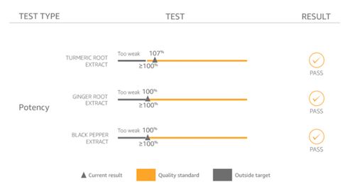
  • What’s the potency, purity, and integrity of the ingredients?
  • Where are your ingredients sourced from? Where is your dietary supplement manufactured and bottled? Was it made in a GMP facility?
  • What is your return policy? And provided them with a top-notch FAQ section.

Make Reasonable Claims and Back Them Up With Proof

Some holistic herbs and supplements claim that they can solve every problem under the sun in one little pill –  from helping you to lose weight to providing a cure for cancer. (Even though the word “cure” is not allowed by the FDA.)

We all know it’s probably not likely that one pill can solve all these problems. Even if it’s true, trust breakdown with multiple claims or condition solutions. It’s better to focus on the power of one.  One story, one problem, one solution. So don’t make broad outrageous claims. And when you do make claims, be sure that you are backing them up with proof.

If you really concentrate your focus on the things your product can do and go into great detail with facts that support that – then it’s more likely that you’ll be believed.

I’m sure you’ve probably heard a million weight loss remedies that will help you lose weight quickly.  But when you’re bombarded with so many messages, how do you even begin to know which ones might actually work?

There’s not enough time in the day to try them all out.  And who wants to spend the money on each one?

But if you do your research and look closely, some of the suggestions are backed up by actual science.

For example, did you know that grapefruit stimulates the production of a hormone called adiponectin, which is involved in the breakdown of body fat?

Ok, now that’s something to go on, right? Actual science. I’m in.

This is the same kind of confirmation that your visitors need and want. They don’t want to have blind faith and just believe what you say or try a million products to see which really works. Most people don’t have that kind of money or time to spend.

So give them proof. Establish credibility online. It may already be there and you just don’t know it.

Another Example that Fails to Establish Credibility Online

For example, we were recently analyzing a landing page for a healthy chocolate chip cookie.

The cookie claimed to be healthy – but the nutrition label that they displayed on their website really wasn’t all that impressive.

It listed some protein and some calcium – but other than that it was hard to justify spending the money.

They went on to list the healthy ingredients – flaxseed and chia seeds which are rich in antioxidants and omega 3’s.  And coconut oil that boosts the immune system and helps you lose weight.

But they didn’t bridge the gap so that it made sense.  They didn’t tell their visitors why these ingredients were so healthy.  In fact, they’re so healthy that they’re often referenced as “superfoods”.

If prospects weren’t aware of these benefits, listing the ingredients meant absolutely nothing.  So don’t assume. Don’t assume that they know why something is good for them. Just because you know, doesn’t mean that they do.

To Instantly Establish Credibility Online, Be Vulnerable

This is why you need to make sure that you tell them everything.

And if there’s something that your product or service can’t do.  Don’t be afraid or too proud to admit it. By being honest about what you can offer, it really comes off more as trustworthy than incompetent actually. By honestly admitting that you can’t do a particular thing – your visitors will now believe you when you say that you can do other things really well.

Don’t Unintentionally Plant Seeds Of Doubt

This is something that I see often.

Websites try to establish trust by making statements such as “No gimmicks” or “Those other products are scams.  We can be trusted.”

While you may actually be very trustworthy, you’ve just reminded your visitors that some of these products are a complete hoax.  Possibly even a sugar placebo.

So now that you’ve mentioned “gimmick”… now they’re not so sure about you .

Here’s what happens.  Your visitors are going about their business gathering information so they can make an informed decision about your product or service.

When they see words like “gimmick” or “scam” red flags may start to go up.  Those thoughts might not have been in their minds in the first place. But since you’ve now put them out their boldly in print… now they are.

Planting these types of thoughts in your visitor’s heads could be very risky. Your very attempt to gain trust in this way may backfire big time.

That said, this type of copy should be tested with your audience to see if it yields positive or negative results.

Other Standard Ways To Establish Trust

So those are some of the areas in the health vertical where trust needs to be established in a very specific way. Hopefully, these techniques might help you in your vertical as well.

But be sure that you are also implementing these other critical trust indicators as well.

Social Proof Establishes Credibility Online

Consumers are still looking for the social proof of a third party to help convince them that your products and services are the right choices.

Add testimonials and reviews.

Another way to add social proof is by adding social media count boxes.  The boxes that display the number of people that have liked you. Those can’t be faked.

LinkedIn testimonials also can’t be faked.  Members are the ones who write the actual recommendation and they are then displayed on your profile.

And if you can get an expert endorsement.  You’re golden.

In fact, tout yourself as an expert too.  Make the effort to write blog articles that will highlight you as someone who knows what they’re talking about.

If your product or service has an average success rate – boldly highlight that.  It’s amazing how often I see businesses forget to include this information.

I once worked with an insurance agency that required prospects to apply for approval to receive a special discount. People are often worried when they’re credit is going to be checked. It adds an additional layer of anxiety that they just don’t want to deal with.  So they don’t.

But this agency had a 97% approval rate.  But they failed to mention that.

Adding such information makes the reader feel a little bit more secure that they just might be approved. So they take the risk.

Share Details About Yourself

Make sure you are providing an About Us page where you can highlight your team and their credentials.

There are always going to be a percentage of your audience that wants to know more about the people behind your business before they move forward with a transaction.

When I’m analyzing heat maps, it always amazes me just how many people are clicking on About Us links to find out more.

And don’t forget to include real-world data such as a physical address and contact information when you can.  Hiding this information can not only be frustrating, but it can also make your visitors question whether or not you are a legitimate business.

How to Instantly Establish Credibility Online: Security

I’m sure you know by now how important it is to create a secure environment if you’re selling online.

To ensure that your website is secure – your website address will start with “https” rather than just “http”.  The “s” at the end means “secure”.

Nowadays, it’s also highlighted in the address bar with green text and the actual word “Secure”.  So make sure your website’s address looks like this in the address bar.

Security starts at the address bar

Security starts at the address bar

Because sometimes you’d be surprised to see what’s displayed here.  I was surprised to see this in the address bar for cnn.com.

Unsecured websites hurt credibility

Unsecured websites hurt credibility

Perhaps they are not selling anything online.  But it’s always a good measure to make this read as secured.

Also, make sure that you are are displaying trust seals that verify that you are a legitimate business and also verify that your site is secure.

Visual indicators such as padlocks also help to create a sense of security.  Both of these can be really important at the point of checkout where visitors feel most vulnerable.

We Only Buy A Second Time From Those We Trust

Now you see why gaining trust and establishing credibility is an all-encompassing task.  A task that’s going to pay off in the end.

So make sure you’re providing all the information you can to help your visitors make an informed decision.  Don’t make outrageous claims. And when you do make claims, try to back them up with proof.

Don’t scare visitors away by unintentionally planting seeds of doubt.  And don’t forget to include standard trust indicators such as real-world data and security seals and security indicators.

21 Quick and Easy CRO Copywriting Hacks to Skyrocket Conversions

21 Quick and Easy CRO Copywriting Hacks

Keep these proven copywriting hacks in mind to make your copy convert.

  • 43 Pages with Examples
  • Assumptive Phrasing
  • "We" vs. "You"
  • Pattern Interrupts
  • The Power of Three

"*" indicates required fields

This field is for validation purposes and should be left unchanged.


This is the next segment of our series on how a dating profile is like a business landing page. This series is written by Conversion Scientist Megan Hoover.

A few weeks ago when I decided it was time to optimize my dating life, I took the first step by creating a list of the qualities I’d like to attract with my profile. It’s an approach I also take in optimizing websites. I need to understand the qualities of an ideal business prospect, one that is likely to convert on the site.

Once I knew who I was looking for, I had to figure out how I’d find him in the sea of non-contenders. I came up with the (quite literal) Formula For Love.

P(first date) = db x (∑ti x 2∑tomg)

Here, P is the probability of a first date. The variable db is a one or zero, zero if there is a deal breaker. The variables ti and tomg are scores for traits that are important, and very important respectively.

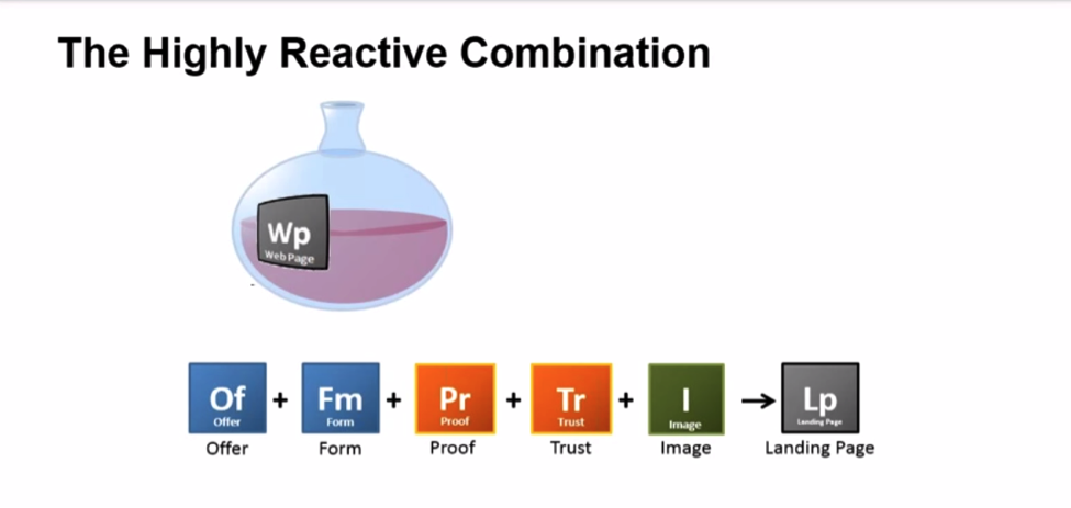
Now that I know how I’ll qualify a lead, it’s time to get out my beakers and scales and use the chemistry of landing pages formula to create the landing page of me – aka fill out the big scary blank profile that will attract the kind of man I’d like to go out with.

The chemistry of the landing page

The chemistry of the landing page

A blank page. It might be time to refill our wine glasses. Go ahead, I’ll wait.

The dating site I’ve chosen, OkCupid, gives me a series of open ended questions to fill out. There’s the vague “Self-Summary” section, the slightly less vague “What I’m doing with my life” section followed by a few more sections with more directed prompts: “The six things I could never do without”, “I’m really good at”, “The first thing people usually notice about me”, and “My favorite books, movies, shows, etc.”.

At the very end of the template is my offer and a way to take action, which I will discuss below.

Avoid Distractions

As a girl faced with the daunting task of creating a dating profile, the template is a huge relief. If you’ve ever been tasked with creating a landing page — or writing a blog post — you’ve probably been intimidated by the blank page, too. Your palms sweat, you get up 15 times to use the restroom and refill your coffee. So a corporate web template is the blank-page-sweaty-palm cure, right? It’s not so blank.

It may help with your dating profile, but it’s not a good idea for a business landing page. In the formula for creating a winning landing page, a template is not your friend. In fact, it’s likely to cause a massive chain reaction that will cause the whole experiment to fail.

Like a dating profile, a business landing page should be singularly focused. If you start with your corporate template, it’s already full of stuff like unrelated navigation and social media icons. In other words, it’s full of distractions that can take a visitor away from your primary purpose.

If the right guy is on my dating profile, I want him to message me, not go check me out on Facebook.

If he does, the chances of me converting my dream guy into a date go way down.

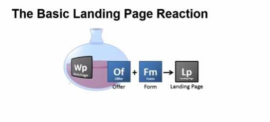
We want to start our landing page with a clean slate, a pure webpage. Then add an offer and a form.

The Basic Landing Page Reaction

Have a Great Offer

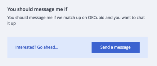
I’m stuck using a template on OKCupid, against my scientific knowledge. At least OkCupid’s template gives me a form with the call to action “Send a message” and a place to create an offer: the “You should message if” section.

Soft call to action

As a marketer, it’s my job to make the offer compelling so that my dream suitors click that little blue button and make first contact.

Rule number one of a landing page is that the offer should keep a promise.

Don’t break the promise that got your visitor to the page. In the case of a dating profile, the promise is a my main profile photo, user name, age and location. I’ll need to choose a photo that best represents my personality and will line up with what I present in my profile.

Promise: Trail loving Austin adventurer with a mountain bike.

Promise: Trail loving Austin adventurer with a mountain bike.

Offer: A tour of the best mountain biking trails in Austin.

Offer: A tour of the best mountain biking trails in Austin.

The Offer Should Match the Ad

For your business, make sure to think about where your visitors are coming from. Are they coming from an ad where the image displays a purple t-shirt? Then they should see a purple t-shirt on the landing page. Did you advertise 50% off of $1 bills, then your landing page needs to offer 50% off of $1 bills. Keep your promise.

Forms that Convert and Qualify

What about the form? I’m still using OkCupid’s template, so I don’t have any control over the form. In a perfect world I customize my form to help me pre-qualify some of my leads. Consider what information you actually need or want from you leads/purchasers. Sometimes, asking for more information can raise the barrier to entry and lower the number of leads you’ll receive.

  • Is phone number AND email necessary? Or would one suffice?
  • Full address or just zip code?
  • What about a bare bones form?
  • Can I get away with just a name and email?

Think carefully about what information is absolutely necessary for the next step as you create your form. And don’t be afraid to A/B test form length and content. Sometimes more is better, but sometimes less is. Start with a well thought out form with all relevant information to get your visitor to the next step and then test more or less information.

So now what? I’ve got an offer and I’ve got a form. I’m done right?

Technically, yes, I’ve got a dating profile and you’ve got a landing page, but will it convert?

Unlikely.

It’s time for us to dig out our goggles because we’re about to heat things up and add the catalysts.


21 Quick and Easy CRO Copywriting Hacks to Skyrocket Conversions

21 Quick and Easy CRO Copywriting Hacks

Keep these proven copywriting hacks in mind to make your copy convert.

  • 43 Pages with Examples
  • Assumptive Phrasing
  • "We" vs. "You"
  • Pattern Interrupts
  • The Power of Three

"*" indicates required fields

This field is for validation purposes and should be left unchanged.


Provide Proof

Put your protective gloves on for this one, we’re about to add a dash of proof.

We have to demonstrate that what we’re saying is true. Have you sold 13 billion hamburgers? Say that. It’s even better if you say 13,982,534,121 hamburgers sold. Do you have a customer that is well known or willing to lend you a quote or their logo?

I asked a few ex-boyfriends if they’d give a reference, but thought better of actually posting those on my profile.

Since posting logos or quotes on a dating profile isn’t going to work, I have to rely heavily on copy to provide proof. The more specific I get the better proof I’ll provide. Instead of saying, “I enjoy mountain biking” I can say, “I ride my Contessa Scott every Sunday at Walnut Creek Park”.

Instead of “I enjoy volunteering with animals,” I would say “Jake the Tank is my favorite four-legged Jog-a-Dog companion.”

I can utilize profile photographs. “I love to travel” is vague, but a photo of me on top of the Great Wall of China is better proof of that enjoyment. We’ll talk more about images in a minute.

Proof makes visitors feel more comfortable taking action by overcoming their objections. It’s the logical argument that supports an emotional decision.

So what are my potential dates’ objections? Do I have anything in common with this person? If I message her will she respond? Is she looking for the same thing I am? Will I be wasting my time by messaging her? Is she even a real person?

In your business, what are your visitors’ potential objections? What would stop a visitor from filling out your form or making a purchase on your site?

In the online dating world a big red flag is a blank profile. How serious is a guy if he can’t even be bothered to write a few paragraphs about himself? The same goes for businesses. A blank page with nothing but a form isn’t enough for a visitor to take you seriously.

When writing copy for a landing page there should be just enough to overcome objections and no more. Dating profiles are no different. Data shows that shorter profiles in a conversational style get far more attention than long resume-style profiles do.

Build Trust

My most powerful trust builder will also be copy. The tone of my copy needs to be friendly and approachable, overcoming the fear of rejection, and I need to make sure I mention exactly what I’m looking for and some specific things my ideal date would have in common with me.

Some common visual ways to add trust to your business landing pages are your company logo, recognized affiliate logos – Visa/Mastercard are common in eCommerace – and certifications. Do you have a Better Business Accreditation? What about Norton antivirus?

A word of caution on trust symbols: too much can come off sketchy. Have you ever been to a site that just rams trust down your throat with pop-ups, stickies, and giant logos? It starts to feel like you’re on a used car lot and not one of the fancy “certified pre-owned” ones.

In my dating profile I’ll need to avoid ramming my niceness, smarts or creativity down anyone’s throat. If I mention in each section that “I’m super nice” by the time they get the message portion they might be wondering if I’ve just set them up to receive a really insulting reply.

OkCupid has another trust tool that often gets overlooked: the “how often do they respond” bar. If one of the biggest fears of dating is rejection, having a yellow or green bar can up the chances of a person messaging. Being too selective with replies can tear away trust that you’re serious or could send the signal that only models with Ph.Ds should apply.

OkCupid's trust tool shares how often everyone responds to messages

OkCupid’s trust tool shares how often everyone responds to messages

Do you respond within 24 hours to all inquires? Do you have a chat or phone number customers can utilize? These types of communication standards go a long way to assure visitors that they can trust your business.

We’ve overcome most of our visitors’ major objections by building trust with copy and images, and they’re almost ready to contact us or buy from us. How can we push them over the edge?

Show the Product

The final component of a landing page is the images. Studies show that it is the most important component of a dating profile, and it’s the first thing on a dating profile.

Rule number 1 for images – Show the product.

One of the biggest fears people have in online dating is their date looking totally different in person than they do online. I can build trust by choosing recent photos without any fancy filters and by adding a date to my photos to assure nervous suitors that I probably haven’t gained 100 pounds since March of 2015, and that I look okay without the wonders of photoshop.

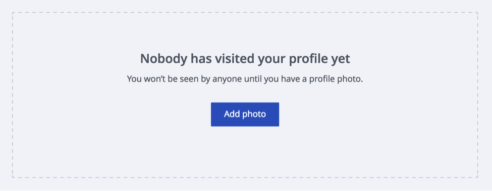
This is true for both online dating sites and your business landing page. OkCupid won’t even show my profile to users if I don’t have a photo.

Without an image, my dating landing page doesn't exist.

Without an image, my dating landing page doesn’t exist.

If your product is tangible it’s pretty easy. But if you offer a service or a downloadable PDF it might be more difficult. Choose an image that allows visitors to imagine what it will be like after they’ve completed the offer.

Video is classified just an image delivered at 30 frames per second usually with audio.

The same goes for my dating profile. To attract the kind of man I want to date I need to choose images that are fun, active, and show me – no photos of that hot friend I talked about earlier. I need my potential suitors to be able to imagine meeting me in person and having a good time doing something we both love. Your photos should capture the same feelings.

A Complete Page

If you want to get a reaction from your visitors, you have to have all of the components. We started with a pure webpage (or as pure as possible) and added and created an offer and a form thinking carefully about how our potential customers/suiters arrived at this landing page. We spruced the landing page up with a bit of proof and trust and carefully added appropriate images. Voila! We’ve mixed up the perfect landing page (aka dating profile) to attract the customer we want – in my case someone to hold my lab coat.

If you’re finding my project entertaining, you should also check out Amy Webb’s Ted Talk and book.


21 Quick and Easy CRO Copywriting Hacks to Skyrocket Conversions

21 Quick and Easy CRO Copywriting Hacks

Keep these proven copywriting hacks in mind to make your copy convert.

  • 43 Pages with Examples
  • Assumptive Phrasing
  • "We" vs. "You"
  • Pattern Interrupts
  • The Power of Three

"*" indicates required fields

This field is for validation purposes and should be left unchanged.


High shopping cart abandonment rates are frustrating. So, we rounded up 10 eCommerce checkout usability techniques to charm your visitors into shopping on your site again and again!

There are many good reasons for shopping online rather than in person. But, even for those who regularly navigate the pitfalls of the Internet rather than the crowds at the malls, there are some frustrations that send customers screaming into another room, vowing to never again push the “Proceed to Checkout” button.

Well, maybe not really, but there are frustrations for online buyers that are better avoided if your intent is to maintain a healthy conversion rate. Statistics show that online shopping carts are often abandoned. Frequently cited complaints from regular shoppers include the following:

  • Unexpected add-on charges during checkout
  • High shipping charges
  • Complicated checkout procedures
  • Inefficient or time-consuming processing
  • Excessive security checks or, conversely, concerns about security
  • Unacceptable delivery options

If you suspect that your conversion rate should be higher, but you are unsure how to boost your sales figures, there are some relatively simple strategies you can try.

A usability study of the top 100 e-commerce sites produced the following statistics: There were an average of 5.08 steps required for checking out, and 24% of the sites required previous account registration.

Logical and not surprising, right? Other findings, however, were a bit surprising. Two-fifths of the sites asked for validation of addresses, half requested the same information twice or more, and even the top 100 sites violate eCommerce checkout usability techniques and guidelines about one-third of the time.

So, what’s a customer to do? Mutter a few angry words and flee the site seem to be common reactions.

“Keep It Simple” tops all eCommerce Checkout Usability Techniques

The KISS principle was a catchword for all sorts of business advice back in pre-Internet days, but it applies very well to online checkout. Your customers are busy people, and they want to run into your virtual store and be on to other pursuits in a minimum amount of time. It’s your merchant responsibility to help them do that. Your return? Their money and their eternal gratitude. And, likely, return visits!

Consider the following improvements to your site and your checkout procedures if your conversion rate is slipping. Monitor the results, and see what works for you. Think like your busy customers, and seek to make checkout as simple, as user-friendly, and as efficient as it should be.

The Effect of Language

A key skill most face-to-face salespeople have to master is “asking for the sale.” The way you direct your customers through your checkout process can make a difference.

Make it clear: Rather than a “Submit” or a “Next” button, consider a “Payment Options” icon or a “Pay Now” button. Having clear calls to action gives the user no reason to think and also gives them clear instruction on what to do next and also what to expect.

Consider a Single-Page Checkout for your eCommerce Site

A single page checkout may seem more complicated than breaking it down into several steps and pages. However, this simple move into a single page checkout may improve purchases greatly. UX Magazine reported that a French e-commerce site changed from a multi-page checkout to a single page checkout and conversions increased by 67%!

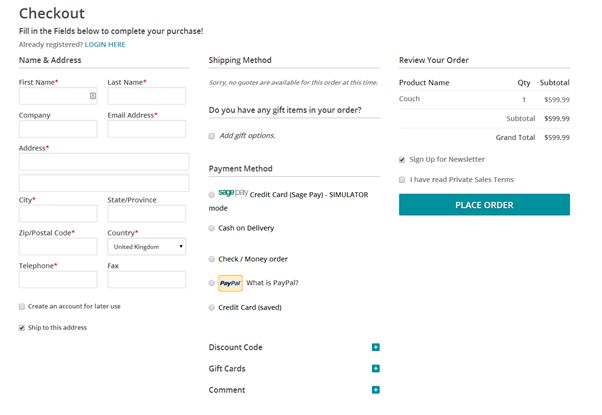
An example of a one page eCommerce checkout.

An example of a one page checkout.

Editor’s Note: We find that your audience may have a different preference when it comes to single-step checkout. Try both on your visitors before committing to one or the other.

Provide Several Payment Options

The kinds of payment available will depend on the price of your product line and your buyer profile. But offering choices is good and is likely to increase your customer base. So consider them carefully. Having options for credit cards and services similar to PayPal, for example offer the user more diverse payment options.

The key here is to let your visitors pay in the way they trust most= by offering payment choices. eCommerce checkout usability techniques.

The key here is to let your visitors pay in the way they trust most= by offering payment choices. eCommerce checkout usability techniques.

Make it Easy for First-time Buyers and for One-time Buyers

While requiring an account in order to purchase makes sense from your side of the fence, it can be an unnecessary bother for the customer who simply wants to order an item and move on. If you require a lengthy account set-up, you may lose a quick sale, whereas from a quick sale there is a good possibility that you might gain a repeat customer.

After issuing the sales confirmation, ask if the customer would like to open an account, you will be surprised how often the answer is yes at that point. After all, they are already invested into your company if they feel that the level of service that they have received is good and timely, this increases dramatically.

Keep buyers on your site, and be consistent with your branding

If you direct customers away from your site in order to register check out or complete the payment procedure, you may lose them. Just don’t do it!

Third-party shopping carts can make a visitor feel like they’re getting scammed. They often suffer from limited customizability as well.

Only Request Essential Information

Don’t raise suspicions by asking for anything that is unrelated to this specific sale. You can collect background information at another time, in another place — or not. But, the business at hand is completing a transaction, and anything that distracts from that goal has no place on the checkout page.

Instill Trust

Gain your customer’s confidence by having an SSL Certificate; reassure your buyers that you do not share any personal information, and comply with the standards of the PCI Security Standards Council. Display your security badges proudly on your site.

Improve Site speed

Make sure your site is up to date, that the loading speed is fast and that operation is efficient. A savvy online buyer with money to spend will not tolerate wait time.

Even boutique sellers should have state-of-the-art Internet connectivity and be lightning-fast (as much as possible) around the world. It is a shrinking globe after all, and e-commerce is global.

The checkout page should be as attractive and as well-designed as the rest of your website.

Ask for Needed Information only Once

If your site requires a second set of address details for ‘Billing Address’ on your checkout form for example, auto-fill the form to save the customer time and effort.

You will gain a loyal fan base by making the procedure so unexpectedly efficient.

Try Free Shipping

Try free shipping to lower shopping cart abandonment.

Try free shipping to lower shopping cart abandonment.

This seems to be the best catalyst for increasing sales. It is, from all reports, more of an incentive to a buyer than special offers, price reductions or “bundling” offers. If you can’t offer free shipping to everyone all the time, try it on a limited basis. And always be upfront about your shipping charges: Don’t spring those charges only on the checkout page.

Finally, take a lesson from the old-timers: Ask for the sale. Issue a clear call to action on your website in the product descriptions or on an appropriate page. Take a lesson from sites like Amazon. Be unambiguous with buttons such as “Add to Basket,” “Continue Shopping,” or “Checkout Now.” For the success of your business, learn how to simplify your checkouts.

Author Bio: Owen Sondergaard is an avid blogger and data enthusiast. Owen writes for CAMO Software who provides multivariate analysis software solutions.

We have begun tracking the Heartbleed Bug across the Internet, and wanted to update you with information to help you minimize the impact on your conversion rate and your sales.
The Heartbleed bug is a major setback for ecommerce sites, online services, and subscription sites, even if your site is not affected by the bug.
Heartbleed is an error in an encryption library used by many companies. This library, called Open SSL, is used to encrypt information such as your username and password between your browser and your servers so others can’t listen in. Because of the Heartbleed bug, others have probably been listening.
Visitor Trust Has Been Shaken
Basically, any site that has a login could be using this buggy Open SSL library to encrypt our login information.
It doesn’t matter if your site isn’t affected. The perception is that every site is affected.
Your visitors are now approaching your site with less trust.
Even if you aren’t affected by the Heartbleed bug, visitors will approach you with higher levels of trepidation.
You need to act.

Make it Easy to Change Passwords

Restoring trust to a person who is frustrated by the amount of work this bug has created for them is critical. If you take it seriously, you can gain trust faster than competing sites.
As we speak, your visitors are deleting their memorized passwords and cookies. They are going to come to your site as a stranger.
They may have forgotten their passwords. This is OK, as it is recommended that we all change all of our passwords. Nonetheless, you should make it easy for visitors to recover and change their password.
Your forgotten password functionality should contain a few important features.


  1. Your new password feature must be working. Test it.
  2.     

  3. The verification email must come quickly, even immediately.
  4.     

  5. Do you use a complicated Captcha function on the form that takes their new password? Eliminate Captchas or keep it simple.
  6.     

  7. Show the password as they type it. Technically, this is less secure. Someone can watch over their shoulder. However, this prevents errors that frustrate customers.

Make it easy for them to recover their account and change their password. That builds trust.

Announce That Visitors are Safe

Once you’re sure that your site is not vulnerable (either through a patch or because you don’t use the broken SSL libraries) you need to make it clear to your visitors that this is the case.
Again: even if your site never suffered from the bug, you need to let visitors know that their info is safe.

Heartbleed Patch LogoProvide a visible sign that visitors aren’t in danger.

The Heartbleed logo is going to become well known among those who are concerned. In the image at left, I’ve incorporated the logo into a “Heartbleed Safe” badge. The logo will draw the eye and the message is that they can buy from you and login without worry.
Clicking the badge should take the visitor to a page telling them how to change their password. You can also advise them to delete their cookies and passwords in their browser. This will make them safer, and make it harder for them to do business on your competitors’ sites, if the competition hasn’t read this column.
Give them the basics on Heartbleed. Some resource are given below.
Don’t Forget Email. Be sure the send an email to your subscribers or account holders. Link them to the resource page you created for the badge.

Resources

Announcements are or should soon be coming from host platforms such as InfusionSoft, Drupal, Joomla. We have announcements from Amazon and Yahoo that may apply to you. If you are on Shopify, people are talking about Heartbleed. If your code is on Github, you need to take action.
We’ll update this list as new resources come online.
 
UPDATE: We have confirmed that split testing tools Optimizely and Visual Website Optimizer have patched their systems. It is a good time to update you passwords with them.
Heartbleed.com
There are several sites that allow users to check your site for the Heartbleed bug. These systems may not be 100% accurate and may finger your site incorrectly. Make sure your site is OK.
LastPass Heartbleed Checker
Filippo.io Heartbleed Checker


Brian Massey
 

Apple has joined the posers.
“We love our customers!”
“We are the leader!”
“We start by asking, ‘How will it make you feel?'”
Apple was one of those brands that just didn’t have to say how they worked. They created products we didn’t expect and then showed us the products — with the same style that they built them.
This commercial is beautiful, a stylistic way to make an important point.
But it’s all about them. Not me.

I don’t think this bodes well for Apple.
If you can show how you’re different, remarkable or interesting don’t say it. If you have to say it, it probably isn’t true.

[bookpromo]

Nine conversion techniques from the 1920s to try today | Econsultancy

Jan 23, 2013 08:11 pm

Comments:

  •  @eConsultancy brings the excellent teaching of Claude Hopkins Scientific Advertising into our online world. It’s almost conversion steampunk until you realize that we haven’t invented very much original.And we’ve left some smart ideas behind.Enjoy these nine tips and you should be able to find a free PDF of Hopkins’ book somewhere on the Web.If not, email me.

by: Brian Massey
read more

Which Site Seal do People Trust the Most? (2013 Survey Results) – Articles – Baymard Institute

Jan 23, 2013 07:07 am

Comments:

  • When you place the logos of third parties on your site, you are “borrowing” the trust they have created for yourself. Such logos include client logos, website certified logos, associations you belong to, and even the credit card company logos found on checkout pages.Here is an interesting study on which common trust symbols are perceived as most trustworthy.

by: Brian Massey
read more

[bookpromo]

What makes people trust your Website more? As you know building trust with your visitors is critical to maximizing conversion. Here is some research that helps us to understand what makes visitors trust our site.
Here are some highlights.

An 11-minute Summary of Webpreep’s Research on the Web

1:43-People trust more attractive websites.
2:21-Attractive websites are those that follow conventions.
3:05-Biggest source of frustration? Ability to find relevant information.
3:31-Website owners must increase the relevance of their information.
5:00-The best way to retain customers is to provide relevant information.
Why Relevancy is dropping across the Internet.
6:10-How an Internet store is different from a physical store.
8:02-People who are on Facebook are more likely to recommend companies that they see on Facebook.
9:30-Satisfaction is what it is all about, affecting conversion and referral behavior.
10:00-Clam chowder

© Copyright 2007 - 2024 • Conversion Sciences • All Rights Reserved