Marketers have always relied on testing.
But let’s be honest. It’s probably only in the last few years that they’ve begun discussing conversion rates rather than golf scores over a beer.

The Austin #CRO community is a dedicated bunch:
@peeplaja @jtrondeau @mercertweets @bmassey
The level of measurement and testing that we now have wasn’t even possible in the “old” days. Now that it is, CRO (conversion rate optimization) is clearly a “thing”.
And yes, I’ve got the data to back that up!
According to Econsultancy, in the last five years, the number of companies using A/B testing has more than doubled. Two-thirds (67%) of the companies surveyed use A/B testing, making it the top optimization method used today. Compare that to five years ago, when only a third of businesses were testing.
You might say it’s the golden age of conversion optimization.
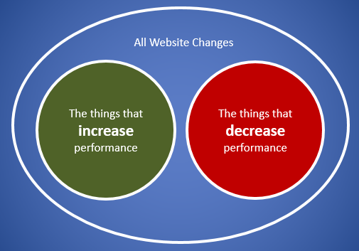
Cool thought, I know. And it sounds like it should benefit businesses across the board. But that’s not what we’re seeing.
Whenever any tactic becomes a “thing,” it gets adopted by newbies and wanna-bes as well as the pros. So beware! You could be paying good money for “website optimization” services from an agency who just learned last month how to run a test.
The Truth About Testing and Website Optimization
The truth is, CRO is hard. You can’t learn it in a month, and you won’t be an expert until you’ve done it for years.
Let me say that again: It takes YEARS to become a pro.
What does that mean? It means lots of agencies are making mistakes without even knowing it because they’re so new to the game. Here are some of the mistakes we see most often.
1. “Best practices” landing pages
Best practice is NOT the same thing as conversion rate optimization. PPC agencies, SEO agencies, UX and UI people—they’re all claiming to do CRO.
But calling it CRO doesn’t make it so. Here’s what Brian Massey told me the other day:
“Here at Conversion Sciences, we’ve stopped doing best practices consulting because it’s so unreliable. Even if someone asks for it, we won’t sell it to them.
As brilliant as we are, when we implement best practices, we’ll be wrong on half of them.
Every audience is different. You have to test to know what’s working. Period. End of story.”
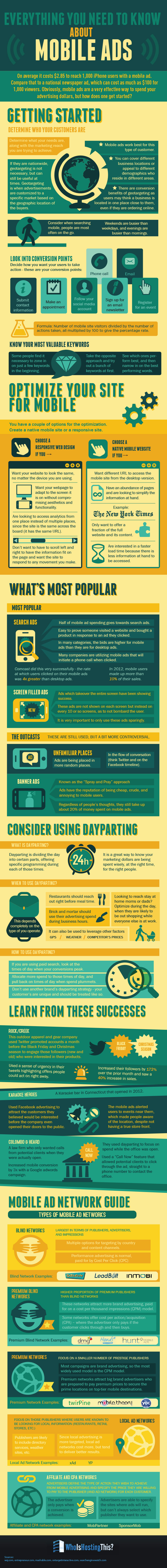
As an example, best practice says videos are good and sliders, or carousels, are bad. It says that sliders distract visitors, are hard to read, ya-da-ya-da-ya-da. Not so, according to a DeviceMagic case study, published by VWO.
This test pitted a slider against a video to see which would work better on the home page.
DeviceMagic was pretty sure the sliders were a better fit for their purposes, but they knew better than to make the change without testing. Interestingly, the video seemed to be an early winner. But after reaching statistical significance, the slider was the clear winner.
- Conversions from homepage to signup page increased 35%.
- Subsequent signups increased 31%.
Another example comes from one of my own projects. I had been commissioned to rewrite a collection of landing pages and, sadly, discovered that we were using best practice as our guide. The results? We nailed SEO, but conversions dropped to half of what they were before the rewrite.
Agencies fall into the same trap. They hear that something is working on another website, and they adopt it, no questions asked.
A landing page built on best practices rather than a solid testing strategy isn’t going to get you the results you’re looking for.
If it does, it was just dumb luck!
2. Testing the Wrong Things
When you rely on hearsay rather than data, it’s easy to make another mistake as well—testing the wrong things.
Experienced Conversion Scientists™ know which data gives them the insights they need. And they know which tools will give it to them.
Some agencies try to shave expenses by cutting out the data-collection tools—things like click testing, heatmaps and user-session recording tools. As a result, they don’t have the data to make smart decisions about what to test. These agencies pick something out of the blue to test instead of using analytics to figure it out.
In other words, they’re testing for the sake of testing.
Science should be based on hypotheses, not guesses or busy work. So you gotta ask, if your tests aren’t based on data, what’s the point?
Honestly, that’s the case for a lot of tests. Alex Turnbull, Groove’s founder, gives a great example of this. He lists some tests that are often considered “easy wins.” But for Groove, he says, they were pointless.
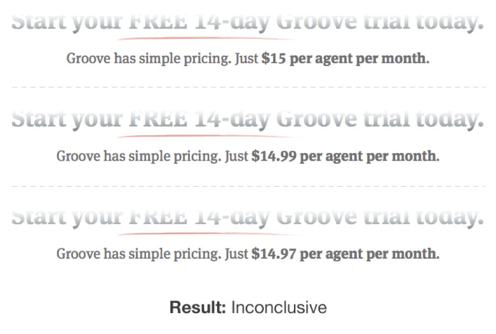
Typically, these tests are the first tests newbies try to run, not because they’re relevant to the website or the audience, but because they seem like easy wins. Remember: trust the data, not someone else’s results.
3. Reliance on Self-Reported Data
Data is important. But you can’t depend on just any data.
Self-reported data—such as responses from focus groups, user testing, surveys, and forum feedback—is gathered from people’s stories, not their behavior.
The problem is people lie.
They may not mean to, but they do. If you ask them how they spend their money, they give a best-case scenario or what they wish to be true. Not the absolute truth.
Compare their answers to your analytics and you get another story. The real story.
That’s why Conversion Scientists don’t put much stock into self-reported data. Qualitative data (self-reported) is great for generating hypotheses, but it needs to be validated with testing.
Here’s where you need to be careful: A lot of agencies (especially UX and UI) redesign a site using only self-reported data. A true Conversion Scientist uses analytics and split testing to verify assumptions before deciding they’re true.
The Marks & Spencer 2014 redesign proves the point: Costing £150 million (about $230 million), this redesign took two years and led to an 8% decrease in online sales.
Based on the fact that this project took two years, I’m guessing that most decisions were made from self-reported data plus the design team’s own opinions.
It’s unlikely A/B testing was involved because testing delivers incremental changes rather than one massive change. And it allows you to mitigate technical errors, because you know for certain whether the changes you’re making are helping.
DigitalTonic says it well in their analysis of the redesign:
“Drastic changes can never be monitored meaningfully and you won’t be able to separate the variables that are causing the positive or negative impact on conversions. With testing on your current site prior to redesign, you will hit a local maxima meaning that you have optimised the site as best as you can in its current incarnation. It’s at this stage that you would take the learnings and move towards the global maxima with the redesign process.”
The issue here is really about behavioral versus attitudinal data. Look at this chart, which illustrates the landscape of 20 popular research methods, and you can see why this is such a common mistake. Self-reported data looks like a scientific approach.
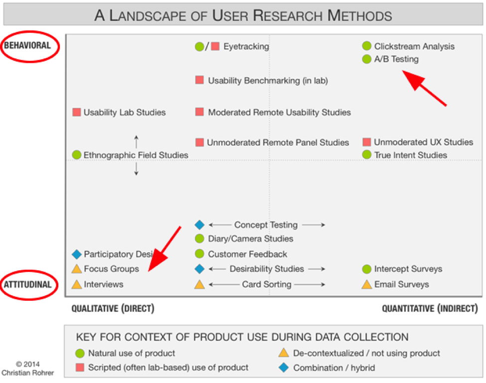
Behavioral versus attitudinal testing
Surveys and focus groups give useful information, but since the data is both attitudinal and qualitative, it should never be the foundation for testing.
Use it to help you develop smart hypotheses. Use it to understand your users better. But alone, it’s not valid. Behavioral (or quantitative) data is your most reliable source of information.
As Christian Rohrer states, “While many user-experience research methods have their roots in scientific practice, their aims are not purely scientific and still need to be adjusted to meet stakeholder needs.”
4. Not Understanding the Scientific Process
Agencies are time and materials companies. They bill by the hour. Understandably, they want every hour of their employees’ time to be accounted for and assigned to a winning project.
The problem is, this focus on the bottom line can actually dampen results.
Scientists need time to be curious, follow their hunches and understand the reason things are happening. A successful A/B testing agency needs to give them that time, even if some of those hunches turn out to be pointless.
In the long run, it’s cheaper to eliminate hypotheses early, before testing. If experienced Conversion Scientists are given time to “play,” they can usually do that with analysis alone, saving time and money.
In other words, a few hours of analysis beats 2 weeks of testing every time.
True inspiration requires time. Time to follow dead ends. Time to dive into the data. Time to think and ask questions. If your agency doesn’t allow that, be aware, you’re probably not getting the best results.
5. Offering a Completely Done-For-You Model
This one sounds more like a premium service than a mistake. But when it comes to CRO, it reads more like a mistake.
Some agencies believe they have more “job security” if they make the client completely dependent on them. So they do it all: collect the data, make the hypotheses and, supposedly, deliver results.
Alone.
There’s no collaboration with clients. Which means they’re only using half the information they should be using to create hypotheses.
Here’s the thing: The best results come when the agency and client work together. The agency has the expertise to collect the data, but the client has the intimate knowledge of the customer. It takes both.
Seriously. If your agency is doing everything for you, they may be creating issues rather than solving them.
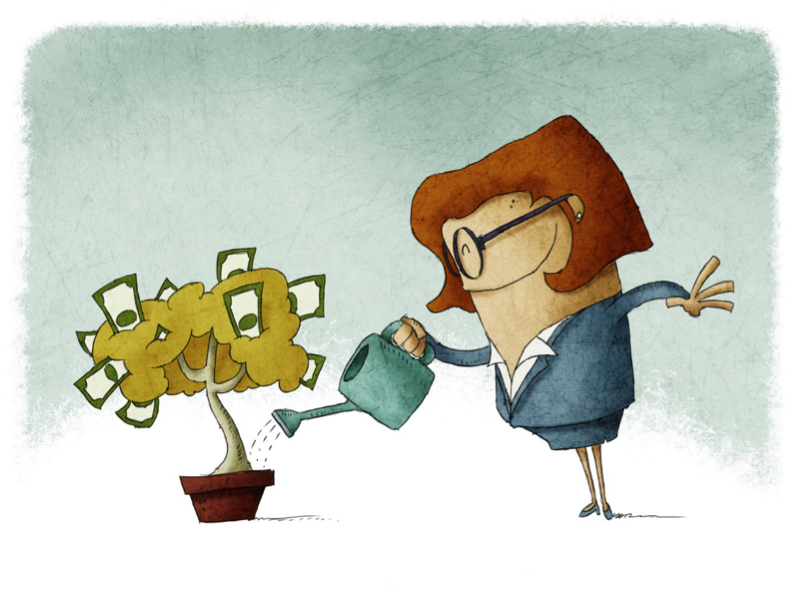
Does your agency see you as a money tree? Collaboration, rather than DFY services get the best results.
6. Not Bothering to Influence the Client Culture
Similarly, some agencies appear to collaborate with the client, but they draw the line before influencing client culture.
In reality, there’s a huge advantage to having an agency work so closely with you that they actually change the way you do things.
True collaboration involves getting together on a frequent basis and discussing ideas. Over time, you begin to see the thought process that goes into each website optimization effort. You begin to understand how to make decisions based on data and to value the insight numbers can give you.
When that happens, whether you consider yourself a numbers person or not, you’re hooked.
That’s the point at which you stop making random marketing decisions. Instead, you call your agency and ask what data needs collecting and when you can start testing. (Congratulations! You’re a conversion geek!)
As we talked about before, a done-for-you or non-collaborative service may not be giving you the best results—and they may be charging premium rates to do so.
Always remember, you’re the resource for testing. Not many agencies actually try to influence your company’s culture. Make sure yours does.
7. Not Staffing for CRO
This is a biggie. An agency that doesn’t staff for CRO shouldn’t offer CRO. You see, the best Conversion Scientists are skilled in two areas. They’re good with numbers and they’re excellent communicators.
Good with numbers. Getting high marks in high-school math isn’t enough. Conversion Scientists are masters of data and statistics.
They know when numbers are reliable and when they’re not. So they know how long to run a test and when the results are statistically valid. They know when the math is bad, which means you can be sure you’re getting positive results.
But being good with numbers isn’t everything. Great Conversion Scientists are also…
Excellent communicators. All too often, Web developers are recruited to do analytics, and sure they understand the numbers—but not much else.
It takes a conversion optimizer to turn data into stories. Frankly, that’s where the magic happens.
At Conversion Sciences, the team spends much of their time going through the numbers to tease out the stories. If there’s a hole in the plot, they design a test to figure out what’s missing. The goal is to find the story in the data—and tell that story well.

Conversion optimizers are fortune tellers
If you think about it, conversion optimizers are really fortune tellers. They predict the future based on the data your site gives them. Is your agency converting analytics to customer stories? If not, you may be dealing with Web developers rather than conversion optimizers.
8. Failing to Test Before Going Live
Pros test and validate everything before going live. That avoids costly mistakes like Finish Line’s 2012 Web redesign, which cost the chain around $3.5 million in sales and a huge hit to its reputation.
Four days before Black Friday, Finish Line launched a freshly redesigned website, supposedly planning to “reinvent the shopping experience.” Instead, customers complained about lost orders and other technology glitches, and Finish Line had to revert back to the old design just prior to the Christmas shopping season.
Granted, that level of mistake isn’t likely for smaller brands, but bad usability can still impact reputation and profitability.
My guess is a brand agency was responsible for that redesign. It would have been smarter to work with conversion optimizers, who understand how to use data to decide on incremental changes, validating each one before moving on to the next.
9. Making Rookie Mistakes
Since CRO is now a “thing,” everyone and their office cat now offer website optimization services. Most don’t know the difference between conversions and sales, which means they’re making a lot of mistakes.
Now don’t get me wrong. We all make our fair share of junior mistakes when we’re starting out—things like delivering results without statistical validity, not analyzing traffic enough, and the like.
But this is the “golden age” of conversion optimization. Don’t you want pro results?
Again, not everyone who claims to be a conversion optimizer is. Unless your team is experienced and has a structured approach for improving conversions, they’re likely making some mistakes that could be easily avoided—if they were more experienced.

Pro CROs use a structured approach to improving conversions.
Download a free copy of our eBook Four Rookie CRO Mistakes to Avoid at All Costs.
Website Optimization Mistakes Bottom Line
As you can see, mistakes are more common than not. That’s because website optimization is hard work.
If you want to get the big results CRO promises, you need an agency that has the experience and know-how to do it right. Period. (BTW, I recommend talking with Conversion Sciences about whether they can help.)
What CRO fails have you seen? And what are you doing to keep from making bonehead testing mistakes? Share in the comments below.
